


Second Presbyterian Church is a welcoming community of faith where Jesus Christ transforms lives.
A congregation of Presbyterian Church (U.S.A.), Second Presbyterian Church has a long-standing tradition of helping others. This emphasis was fostered by our founding minister, Henry Ward Beecher, a leading thinker and activist in the 1800s. Today we support missions at home and abroad with our time, talents and treasures. We welcome each person’s individual gifts and talents as an opportunity to share God’s love and grace with others in need.
As Second Presbyterian Church remains dedicated to serving the community, it is essential that our design, media, and communications leave lasting impressions that invite people into the church, providing greater opportunities to carry out our mission.
This guide outlines principles and standards designed to assist our staff, volunteers, contractors, and external partners in sharing our mission with clarity and consistency.
Min print height:
0.6 in, 15 mm
Min digital height: 27 px
Min print height: 0.6 in, 15 mm
Min print height: 1 in, 25 mm
Min digital height: 46 px
Min digital height: 27 px
It is important that the logo always gets used correctly and that the appearance of it remains consistent across all print and digital media. Here are some examples that should be avoided:
Do not change the color of the shield or any of the text within the logo.
Do not rotate or flip the logo.
Do not distort or skew the logo.
Do not place the logo on a background that alters the readability of the text.
Do not frame the logo.
Color plays an integral role in our branding. We use a version of blue that we have given the name Second Presbyterian Blue to represent our brand.
The color blue evokes feelings of trust, peace, and faith - all values that are central to our mission. The calming and inviting nature of blue reflects our commitment to being a welcoming space for all, fostering a sense of belonging and spiritual growth within our community.
Typography is a key element of our visual communications, ensuring that all media is consistent and communicates the message the same way in every format. To ensure this consistency, Second Presbyterian Church uses a select group of preferred typefaces.
Acumin Variable Concept
AaBbCcDdEeFfGgHhIiJjKkLlMmNnOo
PpQqRrSsTtUuVvWwXxYyZz
1234567890
Acumin Pro
AaBbCcDdEeFfGgHhIiJjKkLlMmNnOo
PpQqRrSsTtUuVvWwXxYyZz 1234567890
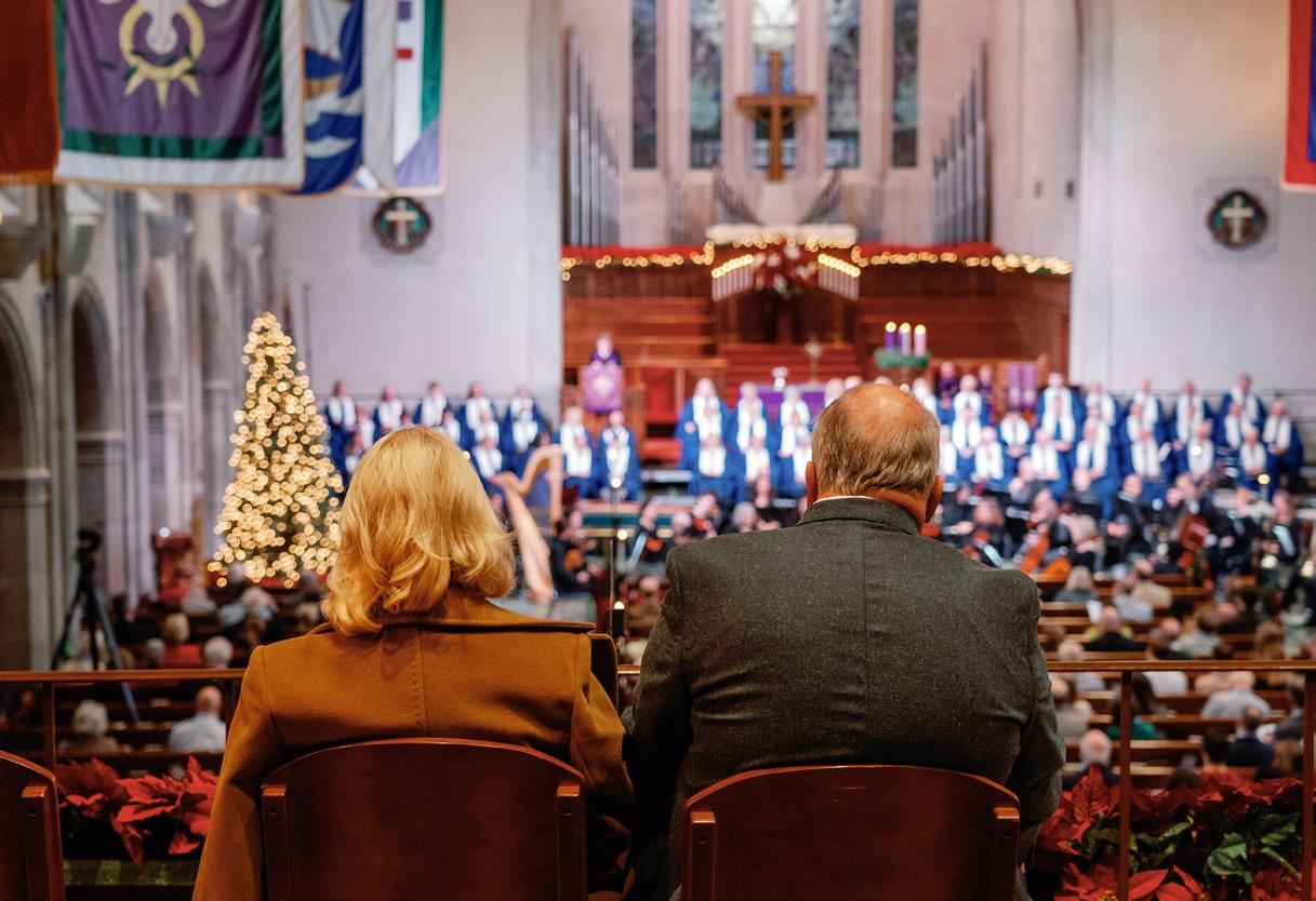
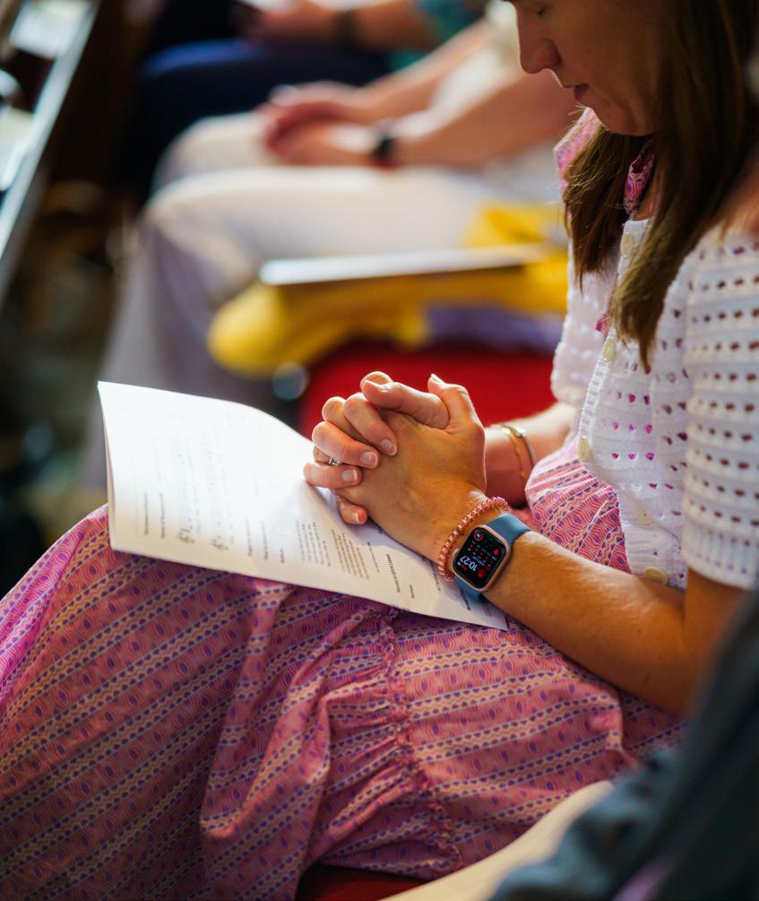
Imagery is a powerful tool used to convey the reality of the mission of Second Presbyterian Church. In direction reflection of our mission, it is important to capture moments that represent our welcoming community, faith in action, and the transformation experienced by those who experience Second.


Images of compassionate and genuine human interaction.
Images of worship, prayer, or service. Images that convey the emotional shift experienced during interactions at Second.


When mentioning our brand in text, it is important that the brand identity is maintained through acceptable versions and abbreviations of the name.
Yes: Second Presbyterian Church, Second Church, Second No: 2nd, Second Pres, 2PC
Website and Email
In web and email addresses, capitalize the first letter of each word. Omit the www before web addresses.
Web: SecondChurch.org/Worship
Email: JSmith@SecondChurch.org
Phone Numbers
Use dashes between prefix and line number, and parentheses before area codes.
Yes: (317) 253-6461
No: 317.253.6461
Address
For external communications and print media, we use our full address including name, address, phone number, and website. We separate each element with a pipe symbol ( | ). The address may be split across 2-3 lines of text depending on space available.
Use the Oxford comma: a list of three things should have two commas.
Yes: The sanctuary has windows, pews, and bibles.
No: The sanctuary has windows, pews and bibles.
We do not hyphenate text to ensure readability and maintain a clean and easily understandable design.
Yes: Second Presbyterian Church is a welcoming community of faith where Jesus Christ transforms lives.
No: Second Presbyterian Church is a welcoming community of faith where Jesus Christ transforms lives.
Capitalize pronouns for God. Capitalize Zoom, but do not capitalize website, internet, or online. Elder and deacon are capitalized only when preceding a person’s name.
Yes: Deacon John Smith is leading tonight’s meeting.
No: John Smith has been a Deacon at Second.
Typically only include month and numeral, but may include day of week if necessary for communication. Do not add “th,” “rd,” “st” after the numeral. Years are generally not included, unless needed for clarity.
Yes: May 31, October 3, or Friday, April 7.
No: May 31st, October 3rd, or Friday, April 7th 2024.
Second’s style is to use AM or PM. Do not include a :00 for events on the hour.
Use “space dash space” between times if an event spans several hours. Only one “AM” or “PM” is needed if the event occurs only in morning, afternoon, or evening,
Yes: 6 AM or 7:30 PM, 9 AM - 1 PM, 1 - 3 PM
No: 6 a.m. or 7:30P.M., 9:00 AM - 1:00 PM, 1 PM-3PM
