Centurion Digital Bank and Financial Institution: A New Era of Banking. In a world where technology evolves at lightning speed, Centurion Digital Bank and Financial Institution stands as a beacon of trust and innovation. Founded on the principles of security, professionalism, and cutting-edge technology, Centurion is not just another digital bank; it is a revolution in the way we perceive and experience banking.
Our Mission: Safety and Innovation
At Centurion, we understand that your financial security is paramount. That’s why we’ve built our platform with the latest in cyber-security measures, ensuring that your data and transactions are protected at all times. Our commitment to safety is unwavering, giving you peace of mind as you navigate the digital banking landscape.
Embracing the Future
We pride ourselves on being at the forefront of digital banking technologies. From AI-driven financial advice to seamless mobile banking experiences, Centurion leverages the latest advancements to provide you with a banking experience that is both intuitive and efficient. Our state-of-the-art technology ensures that you have access to your finances anytime, anywhere, with just a few taps on your device.
Professionalism Meets Freshness
Centurion is where professionalism meets a fresh, modern approach. Our team of financial experts is dedicated to providing you with personalized service that caters to your unique needs. We believe that banking should be straightforward and hassle-free, which is why we’ve designed our services to be user-friendly and accessible to everyone.
Unique and Unmatched
What sets Centurion apart from other banks is our unique blend of tradition and innovation. While we embrace the latest technologies, we also hold steadfast to the values of trust, integrity, and customer-centric. Our goal is to create a banking experience that is not only secure and efficient but also enjoyable and empowering.
Join the Centurion Family
As we embark on this journey, we invite you to join the Centurion family. Experience the future of banking with a partner who prioritizes your safety, values your trust, and is committed to providing you with the best in digital banking. Welcome to Centurion Digital Bank and Financial Institution – where your financial future is secure, innovative, and uniquely yours.
“Design can be art. Design can be aesthetics. Design is so simple, that’s why it is so complicated.”
- Paul Rand
Tone Of Voice
Character
• Professional
• Kind
• Efficient
• Tech Savvy
• Inclusive
Language
• Clear and Concise
• Friendly and approachable
• Supportive and reassuring
• Innovative and forward thinking
Our Tone
Tone
• Professional yet warm
• Confident and trustworthy
• Empathetic and Understanding
• Dynamic and modern
Brand Tone of Voice
Purpose
• Empower customers
• Build trust
• Promote inclusive
• Drive Innovation
Colours
Brand colors are specific colors chosen by the company to represent their brand identity. These colors are used consistently across all marketing materials, products, and communications to create a recognizable and cohesive visual identity. Brand colours help with:
• Recognition: Consistent use of brand colors helps customers easily recognize the brand.
• Emotion: Different colors can evoke different emotions and perceptions. For example, blue often conveys trust and professionalism, while red can evoke excitement and urgency.
• Differentiation: Unique brand colors can help a brand stand out from competitors.
• Consistency: Using the same colors across all platforms ensures a unified brand image.
Colour Pallet
Primary Colours
Name: Tyrion/Imperial Purple
Pantone - 7421 C
RGB:
R - 102
G - 2
B - 60
CMYK:
C - 0
M - 0.9804
Y - 0.4118
K - 0.6
Hex: #66023C
Name: Golden Yellow
Pantone - Yellow C
RGB:
R - 255
G - 233
B - 0
CMYK:
C - 0
M - 13
Y - 100
K - 0
Hex: #FFDF00
Name: Paper White
Pantone - White
RGB:
R - 100
G - 100
B - 100
CMYK:
C - 0
M - 0
Y - 0
K - 0
Hex: #FFFFFF
Secondary Colours
Name: Cadmium Red
Pantone - 723
RGB:
R - 227
G - 0
B - 34
CMYK:
C - 0
M - 100
Y - 85
K - 11
Hex: #E30022
Name: Bronze
Pantone - 723
RGB:
R - 170
G - 169
B -73
CMYK:
C - 0
M - 38
Y - 76
K - 20
Name: Silver
Pantone - 429
RGB:
R - 170
G - 169
B -73
CMYK:
C - 2
M - 2
Y - 0
K - 32
Name: True Black
Pantone - Black 6 C
RGB:
R - 35
G - 31
B - 32
CMYK:
C - 0
M - 0
Y - 0
K - 100
Hex: #CD7F32
Hex: #AAA9AD
Hex: #231F20
Colour usage
Primary Brand Colours
Use of primary colours helps people instantly recognize a brand. Colours evoke emotions and can influence how people feel about a brand. A unique color scheme helps distinguish a brand from its competitors, making it stand out in a crowded market. Using the same colors across all marketing materials and logos ensures a cohesive and professional appearance, reinforcing the brand’s identity.
Secondary Brand Colours
Secondary brand colors complement the primary colors. They provide additional options for design elements, allowing for more flexibility and creativity in marketing materials. Secondary colors can help create visual hierarchy, guiding the viewer’s attention to specific areas or information. Using a broader color palette adds depth and interest to designs, making them more engaging and visually appealing.
Logo
A brand logo is a visual symbol or design that represents a company, product, or service. It is a key element of a brand’s identity and is used to create recognition and association in the minds of consumers. Logos can include text, images, or a combination of both, and they are often designed to convey the brand’s values, personality, and mission.
Main Logo
enturionC Digital Bank
Financial Institution
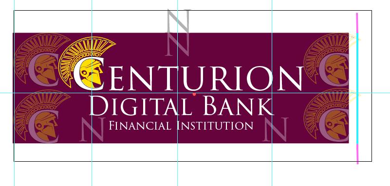
Tyrion Purple- The full logo for Centurion Digital Banking and Financial Institution is set upon a field of Tyrion Purple. This is the same shade of purple that was used by the Roman nobility made from rare sea shells along the coast of the Mediterranean empire. It portrays power, strength, and control.
The Golden helm- encompassed within the “C” give it a military feel, a guardian, a protector, that represents the brands goals to safeguard your on-line activity.
Trajan Font- Specifically designed to emulate Roman script. It gives the text and ancient feel to new technologies.
Logo Spacing
It is important that the Main Logo not be overcrowded. Being on the field of purple gives it it’s ability to be spaced evenly and without encroachment. But it is also important not to overcrowd the purple field. The purple surroundings are not limited to these dimensions, but the spacing of the logo and full text are spaced strategically and should not be changed. The purple background could continue on indefinitely with no maximum, but at a minimum, the spacing should be taken into account so as to not overcrowd the logo.
Monograms & Badges
CDB
CSometimes, the main logo might be inappropriately large or unnecessary. Particularly on small items and places where the full words are not needed. This is the domain of the brands monograms. More compact, versatile, and packs the same style into a smaller space. Examples of where a monogram might be used instead of the full logo is merchandise, apparel, stationary, stickers, etc
Badges also help emulate the story of Centurion Digital Bank. As a digital guardian. The sigil on a shield serves as a visual reminder of the companies goals.
Logo Variations
The logos give an appropriate feel for the brand. But sometimes you are limited by space, color, and contrasts on your given backgrounds and what is available. For this reason, it is important to have variations of the logo so that you are ready for any scenario you might encounter.
Neuropol X - Regular Digital Ornamental AaBbCcDdEeFfGg HhIiJjKkLlMmNnOo PpQqRrSsTtUuVv
When To Use Typefaces
Trajan Pro 3 (Semibold)- This font should be used for headers and titles. An example of this is how this font is used in this style guide. Excellent and powerful text that portrays the bold of the brand. But limited to capitalized letters.
Times New Roman- Used for body text. Times New Roman is a classic and standardized text of popular platforms such as Microsoft Word. It is familiar, comfortable, and carries great accessibility and ease of reading. Versatile with both capitalized and noncapitalized letters, it is perfect for a company that needs a professional looking font for a professional feel.
Neuropol X (Regular)- Being a digital service, we need a font that sacrifices some readability and steps out of the box for some fun. This font emulates the digital feel when used with online resources and can be considered fun and “out of the box.” This font can be used to help aid in Centurion Digital Bank’s digital presence.
Trajan Heading
Times New Roman (A bunch of body text).
Times New Roman (A bunch of body text).
Times New Roman (A bunch of body text).
Times New Roman (A bunch of body text).
Times New Roman (A bunch of body text).
Times New Roman (A bunch of body text).
Times New Roman (A bunch of body text).
Times New Roman (A bunch of body text).
Neuropol X
A digital ad that is eye catching and engaging.
Example
Font Specs
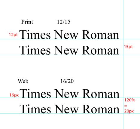
Print: Typically, body text is set between 10 to 12 points. For professional documents, 12-point Times New Roman is a common standard. Line Spacing in print, “leading” is the space between lines of text. It should be set to enhance readability, typically around 120-145% of the font size. For example, if your font size is 12pt, the leading should be around 14.4pt to 17.4pt.
Web: On websites, body text is often set between 15 to 25 pixels. Line Height: Similar to leading in print, line height in web design is the space between lines of text. A common rule of thumb is to set the leading to 120% to 150% of the point size.
How To Use The Brand
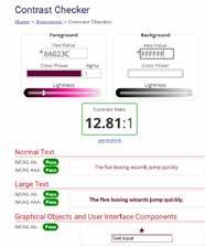
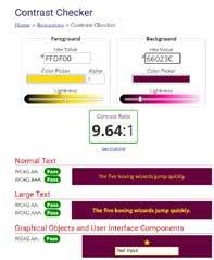
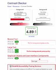
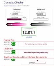
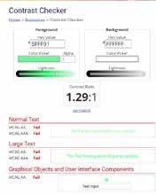
HTU the colors
It is important that the brand colours be used and are not substituted with colours they may not be recognizable to customers. It is also important that colours used, even the brand colours, are not hidden by clashing contrasts
Financial Institution
Financial Institution
The logos are the visual mascot of the brand. It holds a place in the minds of customers and potential customers and becomes a staple. When used outside of the branding guide by altering the shape, structure or crowing/overlapping in any way, the logos lose their power and no longer effective at representing the brand.
CI am giving the logo space
CI am on top of the logo
HTU the Typography
It is very important to use the typography appropriately. Proper spacing and uncrowded text. It is also important to place the text in appropriate placed on the page and not to mix the typefaces in a way that compromises Centurion Digital Bank’s professional image.
Trajan Heading-
Then use Times New Roman for any body text. Make sure the spacing is appropriate as outlined in the section “Font Specs” earlier in this guide. Be sure that no other typography is overlapping or overcrowding the body copy. Make sure the tone of your text reflects the values of Centurion Digital Bank at all times. Consistency is the key to a professional appearance.
Neuropol X should always be separated from other text with plenty of space. It is a decorative font and designed to stand alone
Trajan Heading-Should be larger than its accompanied body text
This form of Times New Roman is far too crowded. The leading is too tight and therefore no longer fits the guides set out by Centurion Digital Bank. Just as it is too crowded, you also do not want too large of leading in the body text. Worst case scenario is when the body text is presented without uniformity.
Neuropol X should be spaced much further away from other, more readable text. As you can see here, it clashed too heavily with other text on the page
Implementations
Mock-ups of brand collaterals are essential tools for visualizing and refining the brand’s identity across various materials. This section provides an overview of how visual aids can be used to preview designs for printed merchandise and business essentials. By creating realistic representations of these collaterals, you can ensure consistency in design, layout, and messaging before final production. This process helps in identifying any potential issues and making necessary adjustments, ultimately leading to a cohesive and professional brand presentation.
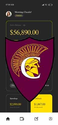
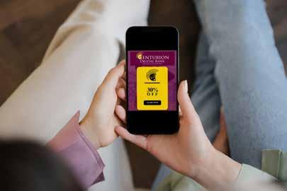
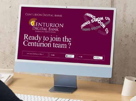
For Web- Mobile
It is important for Centurion Digital Bank to have a strong online presence and provide examples for its excellence in cutting-edge technology in cyber-security and platform deliveries. Because of this responsibility, it is extra important that Centurion Digital Bank adhere to the branding guidelines and use the brand correctly and efficiently with its online assets. Social media, web applications, landing pages and resources should all take care to follow the strict guide of consistent aesthetics.
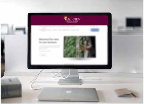
For Web- Desktop
Whitespace: Helps to reduce clutter and improve readability. It allows users to focus on the content without feeling overwhelmed.
Margins: In this example, margins are used to create separation between different sections of the web-page.
Padding: Here, padding is applied to provide breathing room within elements, making text and images more comfortable to view and interact with.
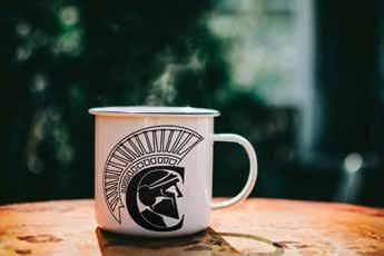
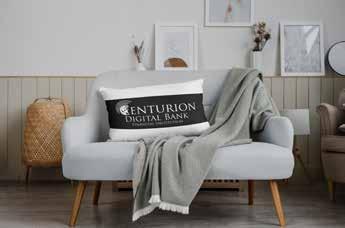
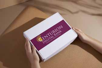
For Print - Merch
Print collaterals play a crucial role in showcasing the brand within this style guide by providing tangible examples of how the brand’s visual identity is applied across various materials.
By including print collaterals in a style guide, we provide a comprehensive reference that helps maintain a cohesive and professional brand image across all touch points.
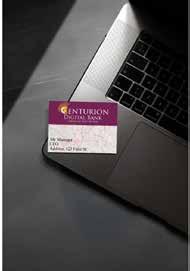
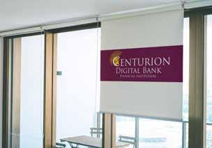
For Print - Office
Consistency: Demonstrates the consistent use of brand elements such as logos, colors, and typography.
Application: How the brand’s design principles are applied in real-world scenarios
Quality: High-quality print materials reflect the brand’s commitment the attention to detail. Guidance: They serve as practical examples for designers and marketers, ensuring that all printed materials align with the brand’s standards.
Congratulations on reaching the end of this style guide! We hope you found the insights and tips helpful in refining the process. Remember, style is about clarity, consistency, and ensuring your message resonates with the audience. As we continue to apply these principles, don’t be afraid to adapt and evolve your approach to fit your unique voice. With a solid foundation in place, you’re well-equipped to produce the brand that is both professional and engaging. Keep these guidelines in mind, and happy branding!