ORCHID CITY BRAND BOOK | BRANDBOOK


2ORCHID CITY BRAND BOOK |

ORCHID CITY BRAND BOOK
3
|
This document is the Brand Book for the ORCHID CITY BRASS BAND and contains all the approved items necessary for the brand. It is created to be used and distributed to all media partners, printing houses, organizational departments, and the marketing team.

Who we are and what we believe in are the main elements in creating a comprehensive understanding of the true ORCHID CITY identity. In order to sustain a strong brand, it is important to look past the logo, the name, the colors, and the brand presentation. Our offering – and our brand – is unique and complex. It is up to us to communicate it effectively.
OUR BRAND STANDARDS
Our brand should convey our character and our personality. Our drive during our first 10 years has been to build a team driven by standards of high performance that delivers a unique experience. We are a powerful team that needs a strong identity.
1. BRAND IDENTITY 2. BRAND STRATEGY 3. BRAND VOICE
4ORCHID CITY BRAND BOOK |
5ORCHID CITY BRAND BOOK | IDENTITYBRAND1
OUR WHOSERVICEWEARE
6ORCHID CITY BRAND BOOK |
OUR CULTURE
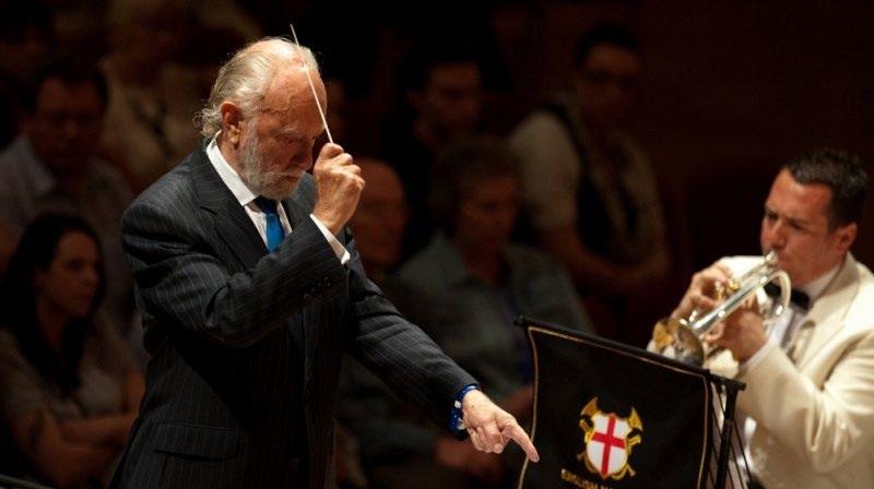
The ORCHID CITY BRASS BAND IS a registered 501(c)(3) non-profit organization. We are a diverse, 30-member, all-volunteer ensemble of top-tier musicians seeking to lead a musical renaissance in the arts community as the original, traditional British-style brass band in South Florida.
ORCHID CITY represents the very best tradition of Brass Band playing. We continually strive to offer our members and audiences the finest possible musical experience.
Despite a proud heritage traceable to the Victorian age, ORCHID CITY keeps an eye toward the future by encouraging new players, new music, and new interpretations of old classics. We recognize and honor our past, but remain a contemporary musical ensemble committed to delivering an experience that is informative, entertaining, and engaging.
7ORCHID CITY BRAND BOOK |
Our mission is to foster and promote the art of brass band music and its performance at the highest artistic level.
VISION STATEMENT
OUR MISSION
MISSION STATEMENT
Our purpose is to bring joy, community, and inspiration through the power of music.
PURPOSE STATEMENT
Our vision is to create and preserve camaraderie and a sense of community among a broad and diverse group of members and musicians who contribute to the cultural fabric of the South Florida community by developing an equally broad and diverse audience, educating the public about the intrinsic value of the genre, and encouraging interest and participation in brass band performance.
We believe that we exist to serve our members and our audience, not the other way around. Enthusiasm, passion, and the love of life are key drivers in what we do individually and collectively. When we connect with our music – and our music connects with our audience, that’s when we feel the most intensely alive. It is during these moments that our inner voice whispers, “this is the real me.”
We are passionate and we have fun. We have a contagious, positive outlook. We give and get deep meaning from our work. We experience life with an ever-increasing depth. We nurture the hearts and souls of each other and those we serve. As Douglas Macarthur said: “Years may wrinkle the face, but to lose our enthusiasm wrinkles the soul.”
The French call it joie de vivre, the joy or love of life. The ORCHID CITY BRASS BAND is brimming with the joy of life.

OURENTHUSIASMCORE VALUES
8ORCHID CITY BRAND BOOK |
Musical ensembles are a symbol for a community. We represent different voices, some soft and others loud. We learn to listen intently to one another and find that, when we do, our collective harmony is enhanced. This harmony touches everyone that hears it. Indeed, musical performances create the space for people of all backgrounds from the community to come together and rise above the lines that are so often used to divide us.
9ORCHID CITY BRAND BOOK |
The 20th-century American novelist, John Gardner, said, “Some people have greatness thrust upon them. Very few have excellence thrust upon them. They achieve it. They do not achieve it unwittingly by ‘doing what comes naturally’ and they don’t stumble into it in the course of amusing themselves. All excellence involves discipline and tenacity of purpose.”
EXCELLENCE
We view every performance as the possibility to unite us all in our shared humanity.
ENGAGEMENT
The driving force behind ORCHID CITY is a tenacity and clarity of purpose that elevates our performance.
10ORCHID CITY BRAND BOOK | STRATEGYBRAND2
PromotionalSocialMediaItems TOUCHPOINTSBRAND WEBSITE Programs & DigitalMaterialsPrintedMediaPosters/BannersAppearancesPublic Performances& OrganizationalVisual/Identity
BRAND STRATEGY
11ORCHID CITY BRAND BOOK |
Our brand is the sum of the services we provide. As we serve our audience on multiple levels, this diversity must be reflected in our brand.
In order to be efficient and powerful, we must communicate our brand in a clear, consistent manner through each one of our touchpoints.
BRAND TOUCHPOINTS
BRAND OFFERING
Celebratory. Dynamic. Approachable. Inspirational.
BRAND PROMISE
The value or experience our stakeholders can expect to receive every single time they interact with us: Connecting Tradition and Innovation.
12ORCHID CITY BRAND BOOK |
OUR BRAND PROMISE
The soul of our brand which makes us consistently authentic. It defines what we stand for, shapes our overall identity, and aims to invoke a particular thought, feeling, or emotion in our audience:
Virtuosity. Artistry. Historically-Informed. Polished.
BRAND ESSENCE
How our presentation will be delivered and what our audience can expect every time they interact with us.
13ORCHID CITY BRAND BOOK | VOICEBRAND3
OUR NAME
A clear tagline can enhance even the most recognizable brand. Our name leaves no doubt as to our market or our service. Our tagline
CONFIDENT CLEAR ENGAGING POSITIVE PROFESSIONAL RELIABLEUNDERSTANDING
ORCHID CITY identifies our direct audience – the greater West Palm Beach area.
– LISTEN BOLDLY – determines the exact consumer we focus on: those who prefer their music like their expresso – smooth and strong.
OUR TAGLINE
COMMUNICATION IS THE KEY ASPECT OF ANY BRAND. THE WAY WE COMMUNICATE SETS THE TONE FOR HOW OUR AUDIENCE FEELS ABOUT US.
OUR VOICE
Our name is unique and easily advertised.
BRAND VOICE
14ORCHID CITY BRAND BOOK |
BRASS BAND uniquely positions our offering within the performing arts sector.
Our voice consists of both messaging and tone. These two communication aspects come together to create an effective strategy when speaking to our customers and fans. We have a goal to create a clear and consistent message that reflects our brand essence.
15ORCHID CITY BRAND BOOK | 16. CORPORATE DESIGN 36. CORPORATE IDENTITY 17. LOGO 18. LOGO STRUCTURE 19. LOGO CLEAR SPACE 20. LOGO VARIATIONS 21. LOGO APPLICATION AREAS 22. MINIMUM LOGO SIZE 23. INCORRECT LOGO USAGE 24. OLD LOGO DESIGNS 25. LOGO BACKGROUND USAGE 26. BRAND PHOTO STYLE 27. BRAND POSTCARD STYLE 28. BRAND PROGRAM COVER STYLE 29. BRAND COLORS 30. BRAND COLORS 31. LOGO COLOR USAGE 32. BRAND TYPOGRAPHY 33. PRIMARY BRAND TYPOGRAPHY 34. SECONDARY BRAND TYPOGRAPHY 35. TYPOGRAPHIC HIERARCHY 37. FAVICON 38. DESKTOP WALLPAPER 39. STATIONARY 40. EMAIL SIGNATURE (DESIGN) 41. EMAIL SIGNATURE (APPLICATION) 42. PROMOTIONAL MATERIALS 43. CUP COASTERS 44. LAPTOP COVERS 45. USB FLASH DRIVES 46. MUSIC FOLIO COVERS 47. PRESENTATION FOLDER COVERS 48. CASUAL BRANDED APPAREL 49. CASUAL BRANDED APPAREL 50. CASUAL CONCERT APPAREL 51. FORMAL CONCERT APPAREL
DESIGNCORPORATE
16ORCHID CITY BRAND BOOK |
ORCHID CITY BRAND BOOK
17
It is very important that the logo always be easy to see and to read. The ORCHID CITY logo should walk across all media. The style you choose will depend on the environment in which the logo appears.
BRAND SYMBOL BRAND NAME
CORPORATE DESIGN | LOGO
|
The logo consists of two (2) elements:
The BRAND SYMBOL (OC orchid)
The ORCHID CITY wordmark is our signature that connects people with the brand. It has a unique typography that is very clear and strong in its shape.

The ORCHID CITY orchid is a 5-petal flower with two of the petals represented by the letters “O” and “C.” The center of the flower is represented by the bell of a cornet – the dominant instrument in a brass band.
The BRAND NAME (wordmark), and
18ORCHID CITY BRAND BOOK |
ORCHID CITY BRASS BAND
Spacing between the BRAND SYMBOL and the BRAND NAME, as well as spacing between the letters of the BRAND NAME, aims to create a balanced and harmonic view. This serves as an escape from any visual imbalance between the ORCHID CITY flower and the wordmark.
CORPORATE DESIGN | LOGO STRUCTURE
The clear space around the logo is an integral part of its design that ensures the logo is clearly and easily seen. To ensure that the ORCHID CITY logo is never disturbed by other elements such as texts, images, or illustrations, a protective area is specified. No letters should be placed within the mentioned areas. Always maintain adequate clear space around it to ensure the visual clarity and effectiveness of the logo.
ORCHID CITY BRASS BAND

3x2x 3x x 3x CORPORATE DESIGN | LOGO CLEAR SPACE
19ORCHID CITY BRAND BOOK |
1. Standalone Logo. This option is used when there are technical problems printing the OC Orchid.


|
ORCHID CITY BRAND BOOK
5. Vertical Logo. This option is used when you can not use the full length Icon or Tagline Logo.
ICON
ICON TAGLINE LOGO
4. Standalone Icon. This option is used on round shaped materials, apparel, or social media profile pictures.
CORPORATE DESIGN | LOGO VARIATIONS ICON STANDALONELOGO
3. Tagline Logo. This option is used in media publications advertising or promoting ORCHID CITY events.


20
VERTICAL LOGO
2. Icon Logo. This option is used on official paperwork, corporate identity, presentations, and catalog covers.
The ORCHID CITY logo appears on various media and printing materials, which have different shapes and sizes. If the usage of the full-length logo causes technical problems, the following can be used:
ICON LOGO
TAGLINE LOGO


When we want to infuse personality and the identity is already used or voiceCompanyVoicemailCampaignsAdvertisingWaterHatsTotebagsNotepadswell-known.orCapsBottles&Marketingjingleorads
ICON, VERTICAL LOGO
STANDALONE LOGO


21ORCHID CITY BRAND BOOK |
The preferred corporate design – using either a black or color OC orchid. Corporate Identity (Business CampaignsAdvertisingPrograms,(Videos,PresentationFlashLeaflets,Bags,Notebooks,Folders,Envelopes,Cards,Letterhead,Pends,Badges,Mugs,ToteT-Shirts,Calendar,Brochures,USBDrives)FormsWebsite,Publications,&Marketing
CORPORATE DESIGN | LOGO APPLICATION AREAS
Used rarely – only for small areas on printing materials where the OC orchid can not be embroidered or reproduced clearly. (If the length is an issue, the VERTICAL is preferred over STANDALONE.the

NecktiesCoastersTStickersPinsFaviconLinkedIn,Instagram,(Facebook,Twitter,etc.).Shirts
Social Media Profile pictures
1.0” [25 mm] 1.0” [25 mm] 1.3” [33 mm] 0.25” [0.6 mm]
22ORCHID CITY BRAND BOOK | CORPORATE DESIGN | MINIMUM LOGO SIZE


WEB 96 PX 96 PX 125 PX 24 PX
DO NOT add outline
DO NOT change color
Here you will find several examples of how you should NOT use the logo.
23ORCHID CITY BRAND BOOK | CORPORATE DESIGN | INCORRECT LOGO USAGE


DO NOT stretch or alter the logo in any way DO NOT add graphics or clipart


DO NOT use our logo as a read through in text


DO NOT add shadow, shading, or gradients
DO NOT add outline
DO NOT use alternative fonts
DO NOT place our log on backgrounds with high contrast elements or which limit legibility
24
ORCHID CITY BRAND BOOK


| CORPORATE DESIGN | OLD LOGO DESIGNS
Always avoid using old versions of the logo.

25ORCHID CITY BRAND BOOK |


LOREM IPSUM DOLOR SIT AMET, CONSECTETUER
IVANA BARANOVA BBb Bass

LOREM IPSUM DOLOR SIT AMET, CONSECTETUER

CORPORATE DESIGN | LOGO BACKGROUND USAGE

| CORPORATE DESIGN | BRAND PHOTO STYLE
ORCHID CITY BRAND BOOK
Our photography style conveys authenticity as if you have captured the subject(s) “in the moment.” Color, composition, and feel should engage viewers and make them feel like they are at the event or in the photo. Use the logo on the left side wherever possible and, depending on the photography, use it either on the bottom or above the subject(s).
26

27ORCHID CITY BRAND BOOK | CORPORATE DESIGN | BRAND POSTCARD STYLE


ORCHID
CITY BRAND BOOK |


28
29ORCHID CITY BRAND BOOK |
COLORSBRAND
30ORCHID CITY BRAND BOOK | CORPORATE DESIGN | BRAND COLORS The color of the corporate design is as important as the logo itself, since it expresses the brand’s personality. To ensure the expression of the color is right for its context, we’ve created a system that includes the PANTONE® colors with an expanded palette of solid shades. #EBEAEE#DCC072 #3F3242 #632E62#92278F #EBEAEE#DCC072#3F3242#632E62#92278F #EBEAEE#DCC072#3F3242#632E62#92278F #EBEAEE#DCC072 #3F3242 #632E62#92278F #EBEAEE#DCC072 #3F3242 #632E62#92278F C80ORCHIDM10 Y25 K0 R0 G170 B190 C80BYZANTINEM10Y25 K0 R0 G170 B190 C80LILACM10 Y25 K0 R0 G170 B190 C80BRASSM10 Y25 K0 R0 G170 B190 C80SILVERM10 Y25 K0 R0 G170 B190
Orchid logo on White background
White logo on Byzantine background
White logo on Orchid background
ORCHID CITY BRAND BOOK

| CORPORATE DESIGN | LOGO COLOR USAGE
31
TYPOGRAPHYBRAND
32ORCHID CITY BRAND BOOK | Abc
ROBOTO
abcdefghikjlmnopqrstuvwxyz 1234567890
Roboto
Roboto
ABCDEFGHIJKLMNOPQRSTUVWXYZBLACK
ABCDEFGHIJKLMNOPQRSTUVWXYZMedium
Roboto
The importance of typography can not be overstated. Typography is the language used to tell our story and draw people into our world. It must tell our story legibly, with the appropriate hierarchy and emphasis, and in a way that makes our brand immediately recognizable and visually appealing. The right typeface – used consistently – clearly communicates our message in our tone of voice and evoking our collective sentiment. Trajana Sans and Roboto are our main fonts.
Roboto
abcdefghikjlmnopqrstuvwxyz 1234567890
CORPORATE DESIGN | PRIMARY BRAND TYPOGRAPHY
ABCDEFGHIJKLMNOPQRSTUVWXYZLight
abcdefghikjlmnopqrstuvwxyz 1234567890
33ORCHID CITY BRAND BOOK |
Roboto
ABCDEFGHIJKLMNOPQRSTUVWXYZ(Body)
ABCDEFGHIJKLMNOPQRSTUVWXYZThin
abcdefghikjlmnopqrstuvwxyz 1234567890
abcdefghikjlmnopqrstuvwxyz 1234567890
abcdefghikjlmnopqrstuvwxyz 1234567890
ABCDEFGHIJKLMNOPQRSTUVWXYZSans
Sans
abcdefghikjlmnopqrstuvwxyz 1234567890
abcdefghikjlmnopqrstuvwxyz 1234567890
SANS
ABCDEFGHIJKLMNOPQRSTUVWXYZ(Headings)
abcdefghikjlmnopqrstuvwxyz 1234567890
Trajana
ABCDEFGHIJKLMNOPQRSTUVWXYZ(Regular)
CORPORATE DESIGN | SECONDARY BRAND TYPOGRAPHY
ABCDEFGHIJKLMNOPQRSTUVWXYZLight
34ORCHID CITY BRAND BOOK |
ROBOTO CONDENSED
TRAJANA
ABCDEFGHIJKLMNOPQRSTUVWXYZMedium
Roboto Condensed
Roboto Condensed
Trajana
Roboto Condensed
abcdefghikjlmnopqrstuvwxyz 1234567890
CORPORATE DESIGN | TYPOGRAPHIC HIERARCHY
TRAJANA SANS
Roboto Light
USE THIS TYPEFACE FOR PRIMARY EMPHASIS Usethistypefaceforsecondaryemphasis
MAIN HEADINGS
Roboto Condensed Medium
A typographic hierarchy is a system that uses typography – the font type, size, and layout of different pieces of text to create a hierarchical division. This shows readers where to easily look for specific kinds of information in order of importance. It is an organizing system for establishing order in a set of data.
35ORCHID CITY BRAND BOOK |
Use this for paragraph or “body” copy. This is where we will detail the great experiences that we plan to offer to our constituents.
Roboto
Subheadings
36ORCHID CITY BRAND BOOK |
IDENTITYCORPORATE
ORCHID CITY BRAND BOOK
Our favicon is an optimized version of our brand symbol, the OC Orchid, which is used to identify the ORCHID CITY BRASS BAND on the web across every mobile operating system.

| CORPORATE IDENTITY | FAVICON
The clear space around the brand symbol and is an integral part of its design that ensures it can be clearly seen and recognized no matter its size.
37
ORCHID CITY

38


BRAND BOOK | CORPORATE IDENTITY | DESKTOP WALLPAPER


39
Website Social Media
|
ORCHID CITY BRAND BOOK
Upcoming Events in which the OCBB will be participating.
CORPORATE IDENTITY | STATIONERY
Emails are part of the corporate identity if sent from an ORCHIDCITYBRASS.ORG domain or by a member on behalf of the ORCHID CITY signature should be comprised of the following: to the OCBB pages

Name Surname Position Logo Links
40

CORPORATE IDENTITY | EMAIL SIGNATURE James Estes (561) 555-1212 | West555jamesestes@orchidcitybrass.orgorchidcitybrass.orgWorldHeadquartersDrPalmBeach,FL00000


ORCHID
President & CEO CITY BRASS BAND Boldly
Emails are part of the corporate identity if sent from an orchidcitybrass.org domain or by a member on behalf of the Orchid City Brass Band. The OCBB signature should be comprised of the following: Name, Surname, Position, Logo, Links to the OCBB Website, Social Media pages, and upcoming Events in which the OCBB will be participating.
Listen
|
ORCHID CITY BRAND BOOK
41ORCHID CITY BRAND BOOK | CORPORATE IDENTITY | EMAIL SIGNATURE

MATERIALSPROMOTIONAL
42ORCHID CITY BRAND BOOK |
ORCHID CITY BRAND


BOOK | PROMO MATERIALS | CUP COASTERS
43

44ORCHID CITY BRAND BOOK | PROMO MATERIALS | LAPTOP COVERS


45ORCHID CITY BRAND BOOK | PROMO MATERIALS | USB FLASH DRIVE


46
BRAND BOOK | PROMO MATERIALS | MUSIC FOLIO COVERS

ORCHID CITY

47ORCHID CITY BRAND BOOK | PROMO MATERIALS | PRESENTATION FOLDER COVERS


48ORCHID CITY BRAND BOOK | PROMO MATERIALS | CASUAL APPAREL T SHIRTS COFFEE MUGS


49ORCHID CITY BRAND BOOK | PROMO MATERIALS | CASUAL APPAREL

CAPS & SHIRTS
50ORCHID CITY BRAND BOOK | PROMO MATERIALS | CASUAL CONCERT APPAREL


51ORCHID CITY BRAND BOOK | PROMO MATERIALS | FORMAL CONCERT APPAREL


52ORCHID CITY BRAND BOOK | orchidcitybrass.com | Copyright 2022