
9 minute read
Oh the “Drama” of it All


Bold sans serifs aren’t always the case, though; strong serifs will always show up in posters, but you will also tend to see textured typefaces to reflect the grit that comes with dynamic action (see the Godzilla Vs. Kong posters on the earlier pages where a slight texture is visible). In older posters you will see more dynamic and decorative typefaces, such as the original Mad Max poster or the iconic Jurassic Park poster.
In today’s market, however, simple yet bold sans serifs or various types of serifs is usually what you’ll see in action posters so as to not draw attention from the dynamic images used in the background. And, of course, all the text at the bottom that we know as the credits will be in an ultra-condensed font that I’m not even sure many people read, and many posters in the 2020s don’t use anymore.
Advertisement
Here’s a quick design fun fact: the original Iron Man poster– you know, the movie that started it all for the powerhouse that is the MCU? – has a very similar layout to the poster for the movie The Rocketeer! The suit/man flying in the right corner, the main character taking up the most space, the love interest dressed to the nines and the villain half shadowed... Coincidence? Probably, but I think it’s fun!
(The Rocketeer, 1991)
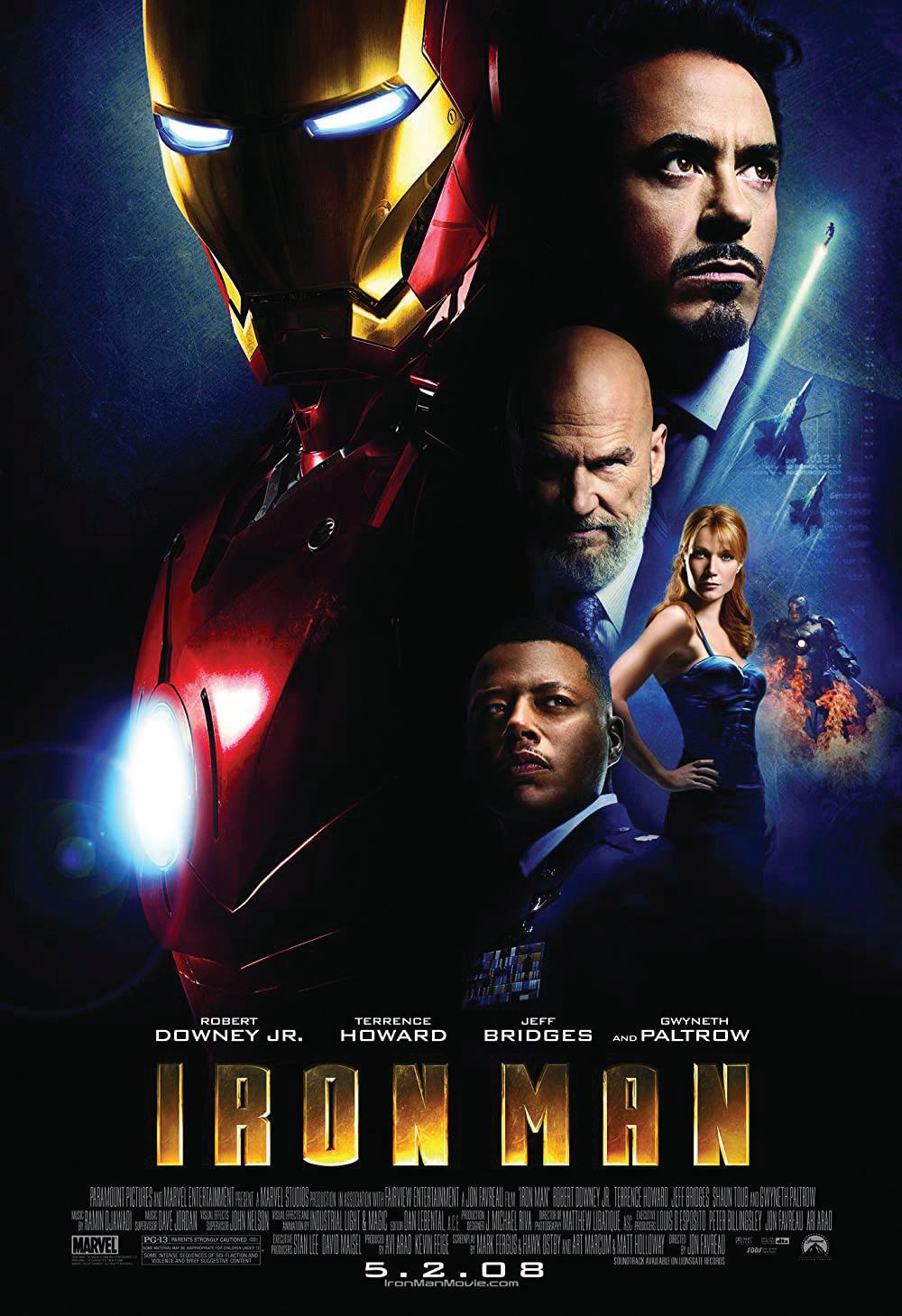
(Iron Man, 2008)
Another broad category, especially in terms of visual media, is the genre of ‘drama’, which is defined as “a category of narrative fiction that’s more serious in tone and has a plethora of subgenres that indicate a certain setting, subject matter, or the overall mood that film may contain” (“Drama (Film and Television)”). In general, you can find crime films, movies that focus on racial relations, and historical dramas amongst this genre (“Drama Films”). Full disclosure: I love historical dramas; I cannot get enough of them. Be it stories from World War II, from the 18th century (1700s for those of you who, like me, always struggle with what times fall under centuries), or even before that, I will watch almost anything if it’s somewhat historically correct and has drama. That aside, the only real main feature that helps define dramas is if it “involves a conflict of some kind (emotional, social, or otherwise) and sees to its resolution in the course of the film” (“Drama (Film and Television)”). Basically, you will see humans at their worst, at their best, and usually in an emotionally charged setting (“Drama Films”). Drama films have been around since the beginning of cinema and the genre has spanned across the globe. Due to the lack of films in the 1910s, however, I have included posters from different countries that still exemplify the major elements found in drama posters.
As previously mentioned, drama movies display the nature of human beings, so it’s very common for these movies to revolve around select characters. Due to this, the poster will showcase the character(s) in question to give the audience an idea of who the story is about (Fussell). While this is a straightforward design, it has been used for decades and has a major impact in conveying the emotional moods of the film. For example, the poster for the 1917 rendition of Great Expectations, conveys a lot of emotion just by the three characters in frame. The atmosphere is tense and an emotional scene is clearly happening by the saddened look on the elderly man’s face and the way the woman looks forlornly at him. Adding to the effect is how she gently touches his arm and how the younger gentleman in the background watches the scene unfold with a worried look. With this poster you can tell that the story focuses on these characters and they are pivotal to the plot, along with the “Are You My Daddy?” at the bottom giving us a hint at the conflict.
The design for the 1939 poster of Gone with the Wind shows this same emphasis on the characters to get the mood across (see page 21). Here you have the main male lead gently holding the main female lead with an intense look on his face. This, paired with the fire in the background, gives you the idea that these two have a fiery passion between them while also most likely conveying some sort of strife going on around them. Right away you know this story deals with romance, perhaps a forbidden one, between the major figures in the layout during a time of conflict, possibly during the Civil War, as the images below the couple reveal.
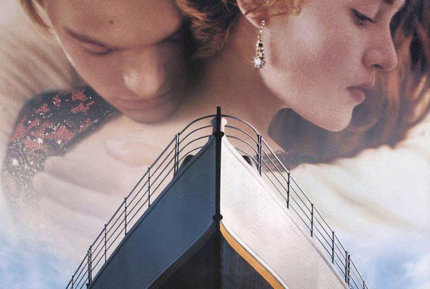
A more recent example of this trend is the classic 1997 Titanic movie poster. Right away we see a couple embracing at the top of the poster. Their forms are faded, as the main focus is on the bow of the ship whose name went down in history, but they are still defined and tell a piece of the story by their actions and expressions alone. You can tell that this will be a love story– perhaps a tragic one based on the general knowledge most people have about the actual Titanic– between two people
of different social classes. The man is wearing a simple shirt, while the woman is wearing an elaborate looking dress and is clearly wearing diamond earrings that are highlighted by a sparkle. While the man is fully involved in the embrace, resting his chin on her shoulder and his eyes closed, the woman’s eyes are open, looking down almost sadly. Through these elements alone, you get the sense that this movie will feature a passionate romance that the woman knows isn’t meant to last, while also hinting at a tragic aspect with the knowledge that they are aboard the Titanic. The ship itself almost splits the two apart visually, evoking the feeling that it is moving forward and upward off the page, trying to separate the two lovers.
While using characters to convey the mood of the poster is a very common element in drama posters, it’s not always the case. Another way to convey not only the mood but the atmosphere that surrounds drama films is through “immersive and dramatic” photography (Fussell). Drama movies are known for beautiful, if not deeply impactful cinematography and camera work with scenes that tend to linger even if you don’t always remember the dialogue. This relates best to more recent
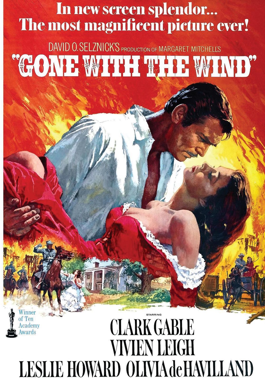
(Gone with the Wind, 1939)
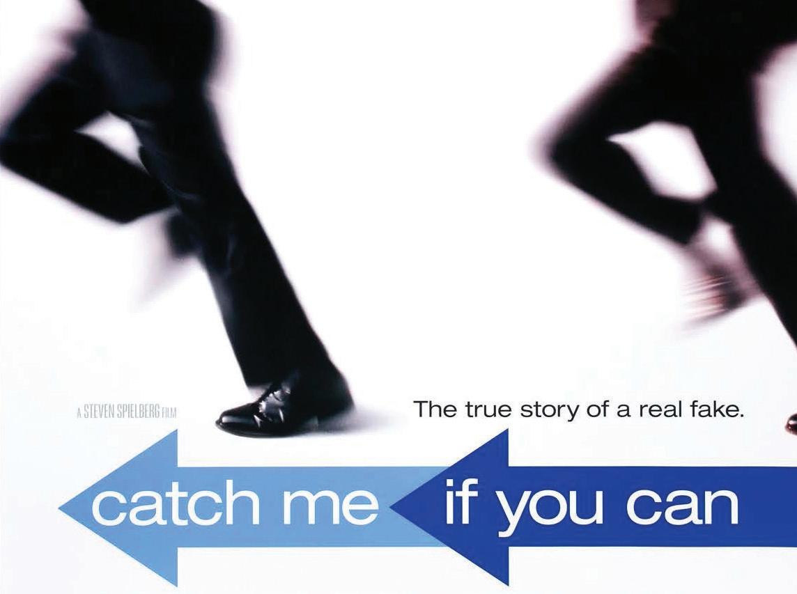
(Catch Me if you Can, 2002)
years as cameras and filming equipment has gotten better, hence why the following posters are mainly after the 2000s. The 2002 poster for Catch Me if You Can will always make me giggle a little as there’s something inherently funny about pictures featuring blurry people running. Here, as mentioned, we have the two actors sprinting across the frame as Hanks, on the right, tries desperately to catch up to DiCaprio on the left. Despite the blurriness of the image, you can still make out that DiCaprio is wearing an airline captain’s uniform, while Hanks is dressed in a regular suit, probably a
detective of some sort given the title of the film. And this is all you need to get a sense of what the film is about: you have a chase going on between a possible con artist and a cop that is both fast paced and humorous, while giving off the sense of being childish with the title being what you hear kids use when being chased around the playground.
2019 shows us how well photography has progressed since the early 2000s, as seen in the poster for 1917. Here you see a beautiful gradient in the sky as the colors fade from a somber blue to a bright orangeyellow at the bottom. These contrast with the olive green of the actor’s military uniform allowing them to stand out and not get lost despite being confined in the numbers 1917 themselves. The colors, while vivid, seem more like a sunset than a sunrise and thus leave the viewer with a sense of sadness, as you get the hint that they are running towards their deaths, as sunsets are often associated with something coming to a close or to an end. This is only furthered by the hint of barbed wire at the bottom of the image, the men clearly running towards the battlefield, and many are aware of just how deadly the Great War was. With today’s technology, this beautiful and cinematic image was able to be placed within the numbers of the year 1917, creating a tense atmosphere and giving off the sense of being trapped. This tells the audience that, despite the awe-inspiring colors, this isn’t a feel-good war movie, but is one that reveals the helplessness of war and how it traps us all.
Finally, you have the poster for the 2021 release of Spencer. With just one woman and the use of negative space, you get the intense feeling of loneliness, something that was noted by Princess Diana when she was a part of the royal family. Here, her white luxurious gown is placed against a black background, void of any information pertaining to the movie, creating a tense contrast that gives the impression of something weighing down on the princess’s back. Meanwhile, current technology allows for the white of the skirt of her dress to be extended to the bottom of the frame, where limited information about the film is found. The emptiness to this shot is overbearing and oppressive, telling the viewer that the movie is going to delve into Diana’s struggles as a royal and the hardships she faced when she married into the royal family. Overall, a tragically dramatic shot that speaks volumes.

(1917, 2019)

(Och Hans Mustru/The Outlaw and His Wife, 1918)
Due to the wide range of films that fall under the umbrella term of “drama”, designs can vary pretty drastically, but, if you couldn’t tell, they aim to be emotionally charged and deeply atmospheric. You’ll see a much wider array of colors used here compared to the action posters, from incredibly vibrant blues to serious monochrome palettes. Humans often associate colors with emotions, so for movies that rely on showing us what it means to be human with the most dramatic flair possible, it only makes sense that poster design has relied on color, or the lack thereof, to make their posters work. Here are some examples that display this:

(The Red Shoes, 1948)

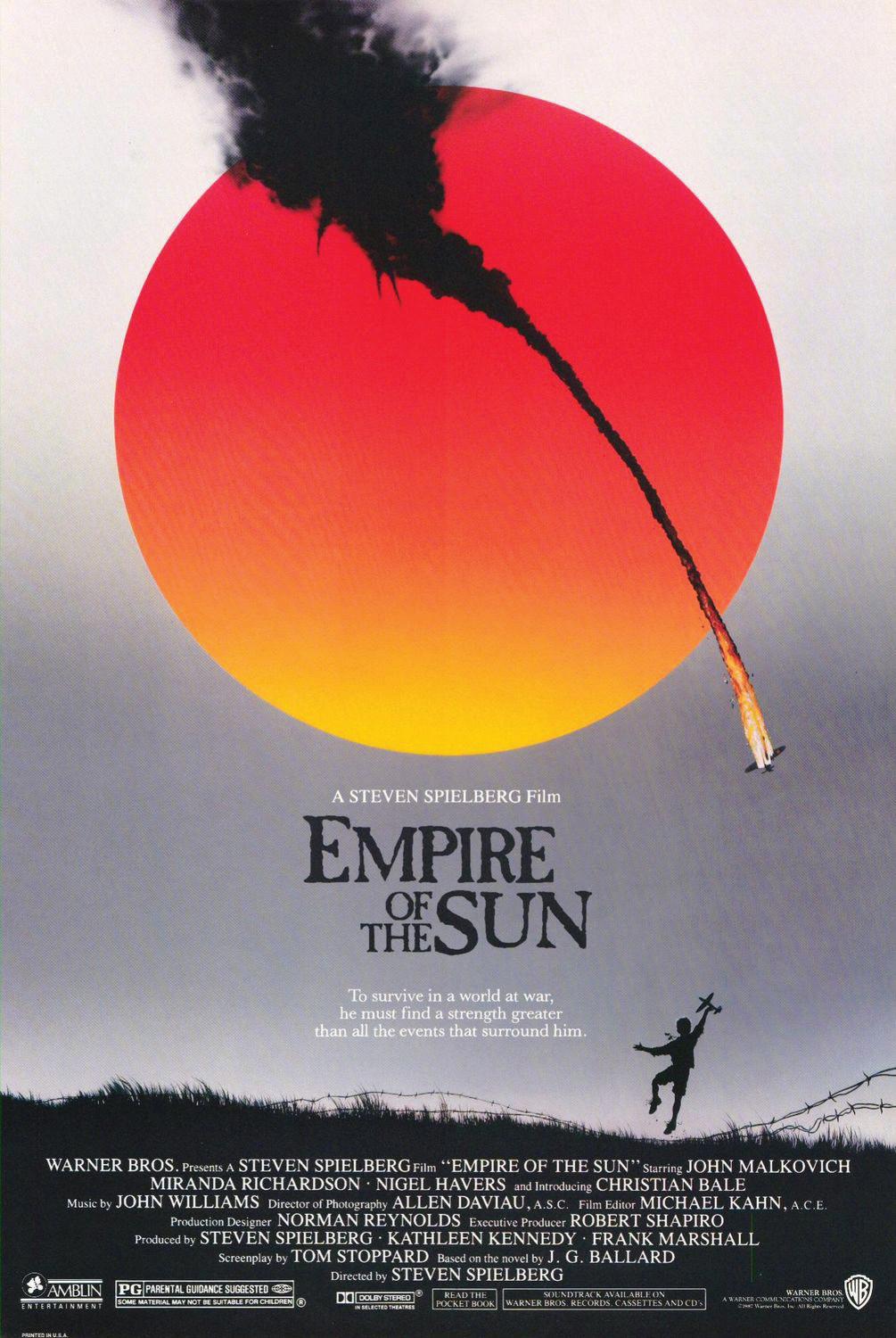
(Anatomy of a Murder, 1959) (Empire of the Sun, 1987)

(Hacksaw Ridge, 2016)


