Scenic Luxury Cruises & Tours has 40 years experience in creating life changing, award-winning river and ocean cruises and handcrafted land journeys. We are a proudly Australian-founded company and our itineraries span more than 60 countries and every continent.
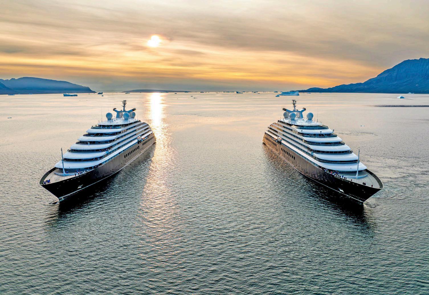
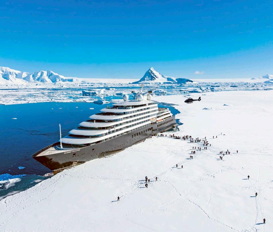
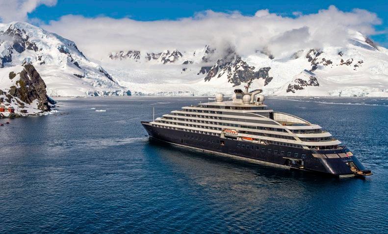
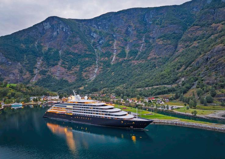
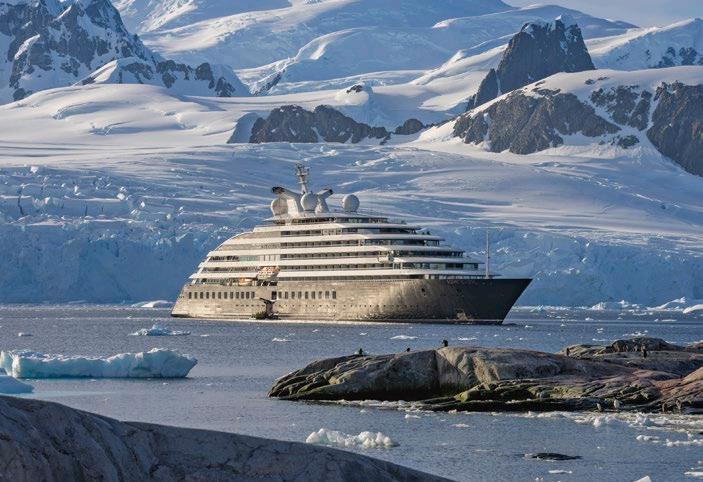
Since 2008, Scenic has set the benchmark for truly allinclusive, 5-star ultra-luxury river cruises in Europe and South East Asia. In 2019, Scenic introduced Scenic Eclipse, a 228-guest 6-star ultra-luxury ship, and launched its sister ship, Scenic Eclipse II in 2023, and recently announced Scenic Ikon will launch in 2028.
Handcrafted & Luxury Land Journeys – Since 1986 Australia, New Zealand, Canada, Africa, Japan, Europe, Egypt and the Middle East.
Scenic Space-Ships – Since 2006
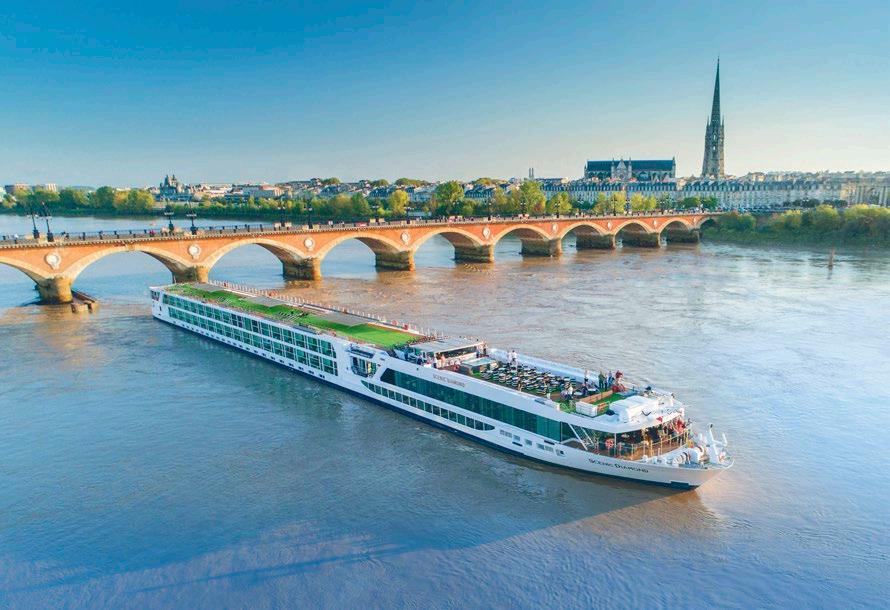
The custom built Scenic Space-Ships launched in Europe in 2008 and on the Mekong River as a boutique, 5-star ship in 2016.
Scenic Discovery Yachts – Since 2019
Scenic Eclipse launched in 2019, and Scenic Eclipse II in 2023 operating worldwide Expedition and Discovery Voyages and Signature Yacht Cruises. Scenic Ikon to be launched in 2028.
Footnote: [Australian-founded] is optional for global markets.
Master Brand
Product Category
Worldwide Ultra-Luxury
Discovery Yacht Cruising
Brand Terminology
Scenic Discovery Yachts
Ship Class
Ship Names
Scenic Discovery Yachts
Scenic Eclipse
Scenic Eclipse II
Scenic Ikon
Other
Scenic Neptune
Scenic Neptune II
Scenic Neptune III
Europe Ultra-Luxury
River Cruising
Scenic Space-Ship
South East Asia Ultra-Luxury
River Cruising
Luxury Land Journeys (Handcrafted for Australia & New Zealand product)
At Scenic, we are committed to continuous innovation, taking all guest feedback seriously and ensuring the guest experience is at the heart of everything we do. When it comes to new destinations, ship design and features, inclusions and styles of travel, many Scenic innovations have evolved from guest feedback (often from our loyalty members searching for new destinations and experiences).
Passionate to the Nth Degree
We love what we do and it shows. At Scenic, we work tirelessly to keep the shine on every aspect of our service, from our staff to crew and partners. We call it the Nth Degree. There is nothing more rewarding than helping people enjoy wonderful experiences and create lasting memories.
Discerning & Humble
We are extremely focused on perfecting and delivering the smallest detail. Our standards are high and uncompromising. We test a hundred sun lounges and amenities for our suites before we choose the styling for our guests. We set the industry benchmark.
Knowledgeable
We are worldly, seasoned travellers. Our Journey Designers in particular are constantly updating and refining their knowledge on every destination, stopover and guest experience to ensure they are worthy of aligning with the Scenic brand. We know every bend in the river, beautiful bays along the coastline, plus iconic, historic and local places across all cities and villages.
Genuine & Assuring
Our brand personality is the essence of who we are, what we stand for and how we are perceived by everyone.
While we’re passionate, we’re also understated in our approach. We are always positive, never bragging or negative. We’re confident of the quality of our brand and experiences, so we don’t feel the need to shout about it –so we never use ‘!’ in our communication.
OUR BRAND STYLE
We are an inclusive luxury brand
We are always striving to innovate and provide the best possible guest experience
We are human and approachable
We are genuine and sincere
We create lifelong travel memories
We enrich the lives of our guests
We connect guests with people, places, culture and wildlife
We are Australian-founded and globally diverse
We are humble and assuring , never boastful or bragging
We use simple phrases and avoid excess, cliches and puns
We facilitate moments of wonder
SCENIC BRAND STATEMENTS
Scenic – Short Form
[Australian-founded] Scenic Luxury Cruises & Tours is renowned for continuous travel and product innovation, always ensuring the guest experience is at the heart of everything we do.
Across our ultra-luxury river cruises and Discovery Yacht voyages and handcrafted land journeys is a deep sense of providing a truly all-inclusive philosophy, which enables our guests to be immersed in their chosen destination and to relax knowing everything is taken care of.
Scenic – Long Form
[Australian-founded] Scenic Luxury Cruises & Tours is renowned for continuous travel innovation, always ensuring the guest experience is at the heart of everything we do. With four decades of experience, Scenic is as passionate about travel and committed to guest satisfaction as it was when it first began in 1986.
Across our handcrafted land journeys, ultra-luxury river cruises and ocean voyages is a deep sense of providing a truly all-inclusive philosophy, which enables our guests to be immersed in their chosen destination and to relax knowing everything is taken care of.
Scenic Group Closer - Long Form
Scenic Luxury Cruises & Tours has almost four decades of experience creating life changing, award-winning river and ocean cruises and handcrafted land journeys that take guests to many of the world’s most fascinating destinations.
We [are a proudly Australian-founded company and] have introduced itineraries that travel to more than 60 countries and every continent. With over 16 years of experience in 5-star river cruises in Europe and South East Asia and seven years delivering 6-star ocean voyages with our Discovery Yachts, Scenic has set the benchmark for truly all-inclusive, ultra-luxury cruises.
Scenic Group also includes Emerald Cruises & Tours and Mayflower Cruises & Tours.
Footnote: [Australian-founded] is optional for global markets.
MASTER WORDMARK
With tagline
The Scenic wordmark is shown here. It comprises the Scenic bespoke logotype with the degree symbol. Where possible, gold is the preferred colour.
When it isn’t possible to use gold, the wordmark should be displayed in black or reversed out.
Tagline is to be used for all external material where the brand is not known or when exposed to people outside the company. It is not required on internal material such as on-ship collateral.
There are exceptions concerning the size of the logo. See page 10 for minimum size requirements.
No tagline
The Scenic wordmark without tagline is shown here.
NB This logo will mostly appear on small items where the tagline won’t fit.
Website tagline
The Scenic wordmark with website tagline is for limited use in advertising environments like TV where only a logo can be supplied.
SHIP WORDMARK
Ship name
The Scenic and Scenic Eclipse wordmarks (special case) is shown here. Logo can also be used in reverse.
tagline
scenic.com.au
Gold
Black
Gold
Website
Black
Black Gold
Black
CLEAR SPACE AND MINIMUM SIZE
Clear space
To ensure the Scenic brand is clearly visible at all times, the area around the brandmark is called ‘clear space.’ Other graphic elements such as text or illustrations should not encroach on this area.
The outlined area demonstrates the minimum clear space required. The measure is derived from the width of the S in the logo. This distance is proportional to all sizes and instances of reproduction.
Minimum size
A minimum size rule exists to maintain legibility of the Scenic logo. The wordmarks shown are at minimum size and should not be reproduced any smaller than indicated.
Any Scenic logo under 35mm in width does not have the tagline.
Any Scenic logo under 25mm in width should appear as solid black.
Solid logo no tagline
The Scenic solid wordmark without tagline is shown here. Should only be used without tagline in black, gold or reverse.
NB This is a general guide. Printing/production techniques should be taken into account when determining minimum size.
CENTERING THE LOGO ON THE PAGE
At times, if you centre the logo on a page based on the entire width (including the degree symbol), it sometimes looks off-centre.
To centre the logo properly, treat the width as just the letters. The mid-point is where the middle bar of the E ends.
This is a guide only and does not always apply. You should use your judgement to centre the logo.
25mm Min 35mm
Black
Min
SCENIC DISCOVERY YACHTS LOGO
Scenic Discovery YachtsTM logos can be used in the brand colours of gold and black, or reverse on black.
Gold Gold
Reverse out of black
Black
Black
Reverse out of black
SCENIC ECLIPSE LOGO
To be used in the brand colours of gold and black, or reverse on black.
With ship graphic
The Scenic Eclipse logo with ship graphic is shown here. Where possible, gold is the preferred colour. When it isn’t possible to use gold, the logo should be displayed in black or reversed out.
The Scenic Eclipse logo with ship graphic is to be used for all external material where the brand is not known or when exposed to people outside the company. It is not required on internal material such as on ship collateral.
There are exceptions when concerning the size of the logo. See page 6 for minimum size requirements.
No ship graphic
The Scenic Eclipse logo with no ship graphic is shown here. This logo is used for on board collateral and selectively for marketing assets where the ship outline is visually prominent (e.g. a video opening frame).
Any Scenic Eclipse logo under 50mm in width does not have the tagline.
Any Scenic Eclipse under 30mm in width should appear as solid black or in special circumstance such as ship signage.
SCENIC IKON LOGO
Scenic Ikon can be used with or without ship graphic. To be used in the brand colours of gold and black, or reverse on black.
With ship graphic
The Scenic Ikon logo with ship graphic is shown here. Where possible, gold is the preferred colour. When it isn’t possible to use gold, the logo should be displayed in black or reversed out.
The Scenic Ikon logo with ship graphic is to be used for all external material where the brand is not known or when exposed to people outside the company. It is not required on internal material such as on ship collateral.
There are exceptions when concerning the size of the logo. See page 6 for minimum size requirements.
No ship graphic
The Scenic Ikon logo with no ship graphic is shown here. This logo is used for on board collateral and selectively for marketing assets where the ship outline is visually prominent (e.g. a video opening frame).
Any Scenic Ikon under 30mm in width should appear as solid black or in special circumstance such as ship signage.
Gold
Black
Black
Gold Black
WORDMARK STAMP & ADDITIONAL SCENIC LOGOS
For use with master wordmark (no tagline)
Never appears alone (without master logo)
The wordmark stamp carries the Scenic tagline and is an integral part of our identity.
It may be used slightly overlapping, alongside, or placed on the same communication, screen or panel as the primary wordmark (no tagline).
Gold is the preferred colour. However, if the stamp is overlapping a gold wordmark, a black or white (reversed) stamp should be used. Stamp minimum size is never smaller than 20mm in diameter. Where the Scenic logo appears smaller than to allow this, the stamp should not be used.
NB Usage will depend on the item being designed or printed and will need to be assessed and approved at time of placement. Contact marketing@scenic.com.au for more details.
Scenic River & Ocean Cruising:
Australia Domestic Land Journeys:
Scenic River & Ocean Cruising:
Australia Domestic Land Journeys:
ADDITIONAL SCENIC LOGOS
Other logos using Scenic wordmark
Global Land Journeys:
Global Land Journeys:
Gold
Black
LOGO MISUSE
What not to do to the Scenic logo
Do not stretch the logo
Do not change the tagline
Do not increase the size of the tagline
Do not use the tagline and the stamp together
Do not divert from the primary colour palette or fill in the logo with an opposite colour
Do not add background, strokes, gradients, drop shadows, reflections, etc to the logo
Do not distort or skew the logo
Do not put the logo on an image and use a colour where you can’t read the logo
TRADEMARKS & BRAND PROTECTED TERMS
Using our brand trademarks correctly is essential to preserving the strength, clarity and ownership of the Scenic identity. Every time we apply our brand terms with consistency and care, we help protect our intellectual property and reinforce recognition across every channel.
The Scenic Trademark
Our primary trademark is the ‘Scenic’ wordmark with the degree symbol. This symbol, along with the name ‘Scenic’, must always remain closely tied to our product names, brand communications and ship titles.
Ensuring this consistent connection strengthens brand recognition and prevents confusion in the industry where similar names may be in use.
Ship Names
All Scenic ship names must begin with ‘Scenic’. This rule applies whether a ship is mentioned on its own or listed alongside others. When referring to multiple ships, we must always keep the ‘Scenic’ in front of their names.
This naming approach helps clearly align each vessel with the Scenic brand and presents our fleet as a unified collection. Ships should always be listed in order of launch date.
For example:
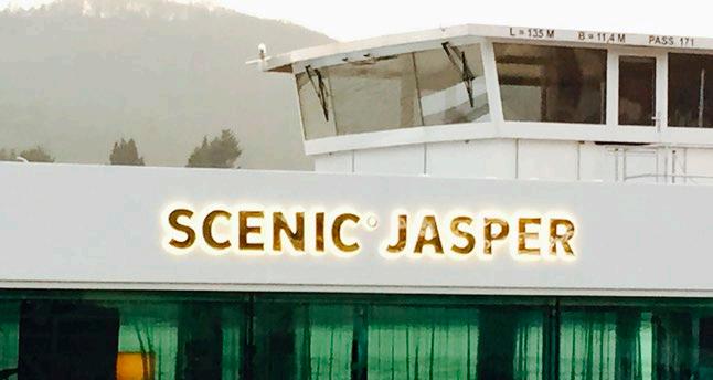
Use: Scenic Jasper, Scenic Opal and Scenic Amber
Do not use: Scenic Jasper, Opal and Amber
Exception to this rule: ‘Scenic Eclipse’ and ‘Scenic Eclipse II’ can be referred to collectively as ‘Scenic Eclipse’, as they are twin ships.
Scenic Discovery Yacht names:
Scenic Eclipse
Scenic Eclipse II
Scenic Ikon
Scenic Space-Ship names:
Scenic Jasper
Scenic Opal
Scenic Amber
Scenic Ruby
Scenic Pearl
Scenic Crystal
Words to avoid:
Scenic Jewel
Scenic Sapphire
Scenic Diamond
Scenic Gem
Scenic Azure
Scenic Spirit
Scenic Jade
Avoid using 'scenic' and 'emerald' as adjectives
For example: A scenic view.. across an emerald ocean.
Protected brand terms:
Scenic Space-Ship
Scenic Discovery Yachts/Yacht
Scenic Enrich
Scenic Freechoice
Scenic Freechoice Dining
Scenic Discovery
Scenic Special Stays
Scenic Sundowners
Scenic Eclipse, The World’s First Discovery Yachts™ (must always be accompanied by the TM)
Do not drop the ‘Scenic’ in front of any of these terms.
For example:
Use: ‘Scenic Space-Ship’
Do not use: ‘Space-Ship’ by itself
New logo for Scenic Group
As ‘Scenic’ needs to be accommodated by the degree symbol, there is a new Scenic Group Logo that needs to be utilised.
Scenic Master Trademark
Logos covered under this trademark
GROUP GROUP
COLOUR PALETTE
PRIMARY PALETTE
The Scenic experience is one of luxury. As such our core colour palette uses Black, White and a splash of Gold To emphasise our level of luxury, foils and metallic inks present a more premium look and feel.
It is important all colours are used in the proportions shown. The colours may vary in hue, shade and intensity depending on the type of paper stock selected (uncoated stock preferred), matte or gloss finish and if digital or offset printing is used and the colour mode of different media types.
To ensure accurate colour reproduction across all modes and media types, the following colour palette has been employed. The recommended colour tints are listed to the right. Pantone (PMS) and CMYK colour values should be used for printed collateral. RGB values are used for television screens and Hex values should be used for digital communications.
For consistency it is essential colours are reproduced as accurately as possible. Care must be taken in selecting the correct colour reference for different applications.
Black
Usage
Body copy
Pantone Black
C0 M0 Y0 K100
R0 G0 B0
Hex #000000
Rich Black
C20 M20 Y20 K100
White
Usage
Reverse out copy
Pantone N/A
C0 M0 Y0 K0
R255 G255 B255
Hex #FFFFFF
Gold
Usage
Headings
Emphasise copy
Bullet points
Pantone 872 M
C22 M33 Y68 K2
R198 G163 B103
Hex #cea962
SECONDARY PALETTE
The secondary colour palette complements the primary palette, adding colour to help bring Scenic communications to life.
There are currently eight colours in the secondary colour palette and their darker equivalents that can be used to brighten up communications.
The colour can also be used as percentage tints to add some variation and also allow for softer colours to be used.
Burgundy
C9 M100 Y54 K43
R158 G42 B47
Hex #900c32
Navy
C100 M60 Y10 K53
R0 G56 B101
Hex #00355f
C21 M15 Y54 K31
R165 G157 B109
Hex #a39d6c
Dark Burgundy
C9 M100 Y54 K70
Hex #60061c
Please note: All Hex codes have been updated
C8 M83 Y55 K5
R229 G106 B84
Hex #d44654
Dark Melon
C8 M83 Y55 K40
Hex #9a343c
Dark Navy
C100 M27 Y10 K80
Green
M31 Y62 K79
#75745a
#0f3127
C100 M13 Y0 K0
R0 G133 B202
Hex #0077b2
Hex #002b41 Dark Sky
C100 M22 Y0 K50
Hex #005580
C0 M22 Y60 K0
R241 G194 B122
Hex #fdd591
G145 B97
#f29061
# f6bb44
#e16c39
REPRODUCTION OF GOLD
The reproduction of the Gold is very important and it is advised that only ONE Gold, and tints of that Gold be used in any on piece of artwork.
Remember, it is just a touch of Gold.
Where necessary a Dark Gold has been created to be used on maps, itinerary dates or anywhere that small type is needed in gold.
NB For legibility, small type is NOT to be printed in Gold, it is advised that Dark Gold be used instead.
Foil
Where possible and if budget allows foil should be used on covers of brochures/direct mail pieces and other hi-impact creative. This foil emphasises the brand’s luxury and also helps the logo stand out when used over a picture. The colour used should be Kurz 381
Gold
Pantone 872 M
C22 M33 Y68 K2
R198 G163 B103
Hex #c6a367
Gold Foil: Kurz 381
Dark Gold
Pantone 462
C36 M53 Y86 K55
R104 G75 B31
Hex #674b1f
DIGITAL COLOUR PALETTE
This digital colour palette should be for all website, eDM, social and online assets.
COLOUR
Hex #C6A467
Black
Hex #000000
Burgundy
Hex #9E2A2F
White
Hex #FFFFFF
Navy
Hex #003865
PRIMARY DESIGN FONT (SERIF)
There are two primary design typefaces that can be used in communication material across the Scenic brand.
They are Superior Title (serif) and Akkurat (sans-serif).
Superior Title - Family
Superior Title - Light and Regular can be used for headings, sub headings and body copy in print publications, press advertisements and general promotional material.
Recommendations – Superior Title
Feature headlines and titles
Subheads and introductions
Introduction paragraphs
Pullout paragraphs
Shorter body copy
Web Graphics – Superior Title
Superior Title must not be used on web graphics where the font size appears less than 20pt.
NB Always use upper case for numerals that appear in the Superior Title font, such as in pricing and body copy
SUPERIOR TITLE
ABCDEFGHIJKLMNOPQRSTUVWXYZ
SUPERIOR TITLE LIGHT
ABCDEFGHIJKLMNOPQRSTUVWXYZ
abcdefghijklmnopqrstuvwxyz
ABCDEFGHIJKLMNOPQRSTUVWXYZ
abcdefghijklmnopqrstuvwxyz
123456789?! @#$%^&*_+
PRIMARY DESIGN FONT (SANS-SERIF)
Akkurat - Family
Akkurat - Light, Regular and Bold and italic versions can be used for headings, sub headings and body copy in print publications, press advertisements and general promotional material.
Recommendations – Akkurat
Support to titles, support to headlines
Subheads
Longer body copy
Web Graphics – Akkurat
Akkurat must be used on web graphics where the font size appears less than 20pt.
For information on how to acquire these fonts, please contact Matthew Yorke matthew.yorke@scenic.com.au
For everyday use, in Word documents, emails and PowerPoint presentations, the two primary fonts are Arial (sans-serif) and Georgia (serif).
Recommendations – Arial Arial for body copy.
Recommendations – Georgia Georgia for headings.
As a general rule, the standard font size for all communication is 10 point. This is for both printed and electronic communications.
Text colour is to be black, background is to remain white and no colours or patterns are to be added.
As a general rule, text is to be left-aligned not justified.
THE DEGREE SYMBOL
The Scenic degree symbol is born from latitude and longitude co-ordinates and becomes for us a visual cue signifying our places and moments of wonder. The degree symbol is our unifying neumonic. A common ingredient that affirms ownership over the content we communicate. The degree symbol sits at the heart of our brand with our wordmark.
The Scenic degree
A destination
A point-in-time
A brilliant memory
A unique experience
A locator for wonder
The degree symbol can be used as an anchoring point above headlines, left aligned above paragraphs, or as a discreet background pattern.
DISCOVER
Both on board and on shore, luxury comes standard with Scenic. Scenic’s state-of-theart Space-Ships offer 5-star luxury – from a scented bath drawn by your to every gourmet meal expertly created our on board chefs. Our staff ensure we what you want before you do.
Weaving their way like a thread across the tapestry of Europe, connecting countries, cultures and traditions is the diverse and historic river system which the Scenic Space-Ships have made their own.
ALWAYS KEEP YOUR SENSE OF WONDER
PRIMARY USE ICONS
A portfolio of icons has been created to help guests simply identify the many diverse elements offered by Scenic. They are featured in Scenic brochures as a reference guide outlining services, experiences, dining options and travel details.
All icons include the degree symbol. Reversed and mono versions of the icons are available.
LONGITUDE AND LATITUDE
The Scenic degree symbol is born from latitude and longitude co-ordinates. Latitude and longitude is used to describe or locate a destination.
They predominantly appear in brochures, but can be used in DMs and other marketing material to highlight the location of a hero image.
They must be written in the correct format and single digit numbers must always be displayed with a ‘0’ (eg. ‘02’ ‘06’ ‘09’ etc).
Everyone must use the same website for coordinates to ensure consistency. Longitude and latitude coordinates can be found at:
This is how the co-ordinates of the longitude, latitude will appear:
www.gps-coordinates.net/ N 43° 56’ E 04° 48’
The numbers in pink (below) will be cut to give a shortened version. The S or N will appear at the beginning of the first co-ordinates. The E or W will appear at the beginning of the second co-ordinates.
27° 10’ 30.054’’ N 78° 2’ 31.758’’ E
This will appear as: Taj Mahal, Agra N 27° 10’ E 78° 02’ DESIGN
N 27° 10’ E 78° 02’
The city followed by the country must appear with the longitude and latitude like the above format:
NEW DESIGN TREATMENTS
Typography and colouring heading should be split by colour using the black and gold colour palette.
Gold is used for emphasis on the more emotive words in the headline.
River Cruise Highlights
Follow bold aromas of black currant, plums and an earthiness on the most delectable river cruise through the Bordeaux wine region.
The Scenic Discovery Yacht difference ....is in the details
Discover the benefits of ultra-luxury cruising.
Ultra-Luxury
Europe River Cruising
IMAGE SELECTION
Cropping
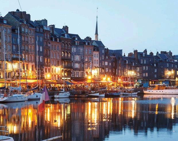
What you leave out is as important as what you leave in. Cropping helps focus attention on the message in your image.
• Unusual crops create interest and intrigue
• Emphasise scale with wide crops
• Crop in on specific detail to tell that story
• Include people in shot if they add to the story
• Choose how your subject interacts with the background
Colour
Strong use of colour can create excitement and get noticed, and used sparingly can allow other elements to stand out. Too much colour everywhere can be overwhelming – don’t overdo it.
Filters
• When enhancing images, avoid adding coloured filters over photos.
• All images should be ‘natural’ and pleasing to the eye.
• For example, do not use black and white filters, or any other type of solid colour filters over the image.
Mood
Think about the mood you need to create
• how it could add to the sense of Wonder; what will make it more unusual and unexpected.
• Travel slowly and linger so you can capture images others will linger over also
• Mix light and bright with dark and mysterious – don’t forget to shoot pictures at night
• Shoot from the side to create strong dramatic diagonals
• Capture that classic picture but during the most interesting time of day
• Consider the seasons and time of year
Senses
Imagery needs to appeal to the viewers’ senses. Help them to ‘experience’ the subject matter by telling stories using your senses.
• Hands and eyes help to focus attention
• Think about what you can see, hear, smell, feel and taste, then capture it
• Think about what you are doing, reading, listen to, watching and eating or drinking
Surprise
Capturing those one-off unexpected moments can be the difference between a good picture and a great picture. Sure, you need to be in the right place at the right time, but think about how your image can include some of this:
• Source unusual events and ‘out of the norm’ moments
• Reportage (capturing real moments) are easy to relate to
• Be spontaneous – the smartphone is a brilliant companion
• Use random encounters to celebrate happenstance
• Shoot in local markets – they’re always teeming with activity
Detail
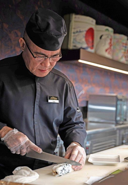
Don’t get so caught up in the big things – the sweeping landscapes and sprawling cities – that you forget the tiny details; the craftsmen at work, closeups, the weave of a fabric...
• Help viewers reach out and touch them by allowing them to see things that they wouldn’t ordinarily see.
• Behind the scenes shots
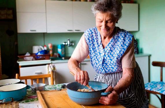
• The wrinkles on an elder’s face
• Lipstick marks on a coffee cup
• Someone going about their everyday work
THE ‘WOW’ TEST
Imagery is an important element in the travel industry and we are committed to delivering quality experiences – so our imagery needs to reflect this.
Here is a simple test that enables you to see if images stand up to the brand value of wonder. Ideally your image will answer yes to more than one of the following questions:
Question 1.
Is the image dramatic and eye-catching, not everyday?
Question 2.
Are the colours and lighting in the image rich, striking or moody rather than bland and flat?
Question 3.
Is the cropping drawing you into the image, giving you a sense of intrigue?
Question 4.
Can you read something more into the image by way of a bigger story happening?
VISUAL IMAGERY
Wonder Moments - Macro
The visual imagery for the Scenic brand is a constant evolution.
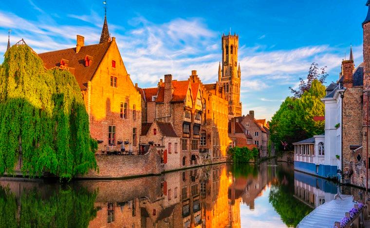
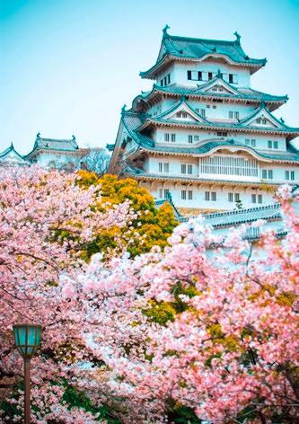
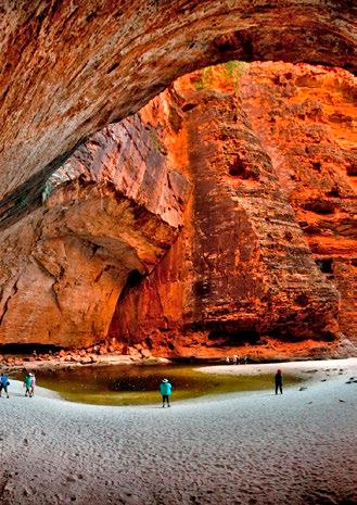
When shooting or selecting stock photography for Scenic, the imagery for macro moments (ie the landscape and surrounds) should be clean and realistic. Colours should not be over saturated (bright unrealistic colours). Ideally a whole sense of the area should be shown through the image, as if its a moment in time that has stopped you in your tracks, creating a real life wonder moment.
For wonder moments, the longitude and latitude is always included to reference for the viewer exactly where they need to go to experience that moment for themselves.
To engage the reader, landscape macro images should convey a story and a sense of the experience.
VISUAL IMAGERY
Service and Experience Moments - Micro
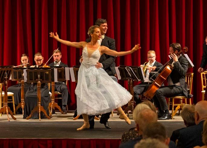
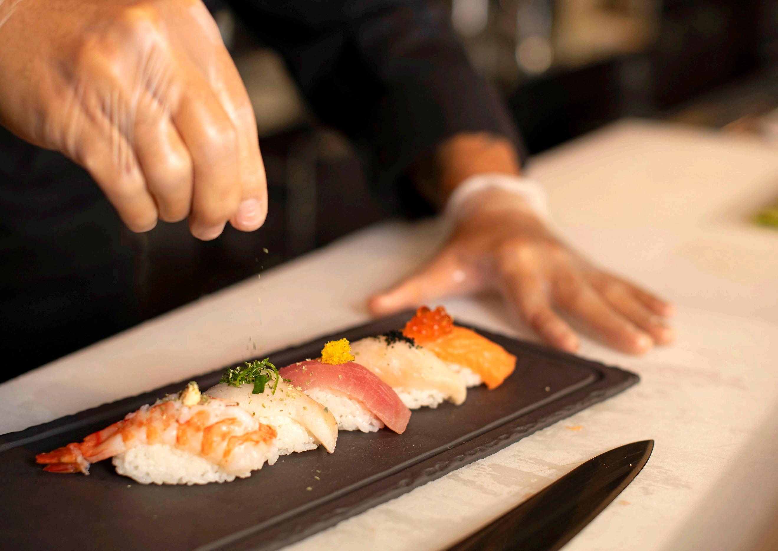
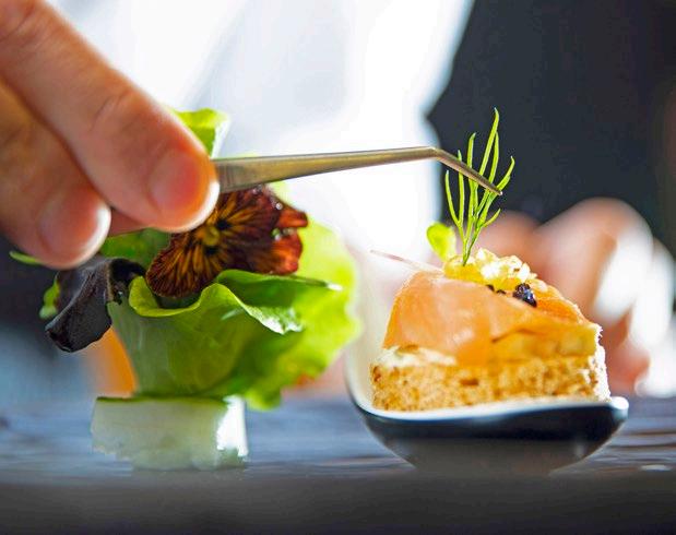
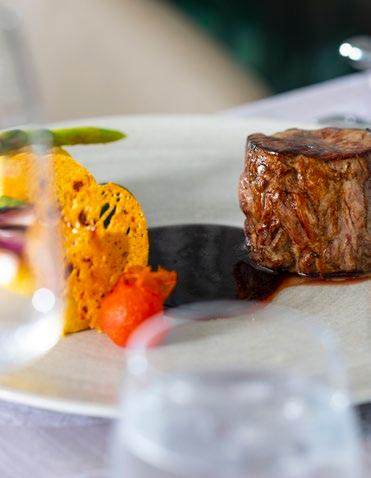
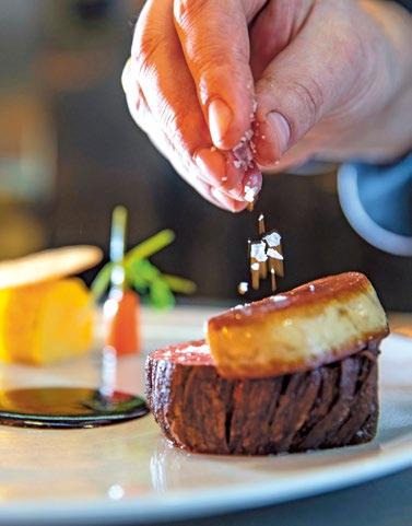
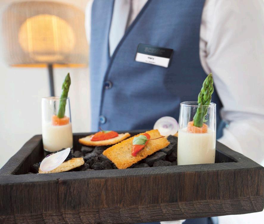
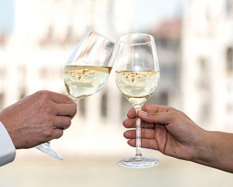
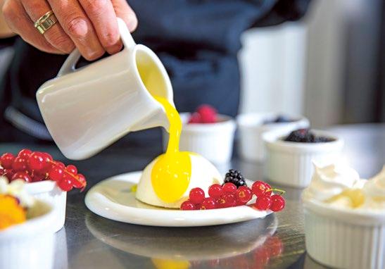
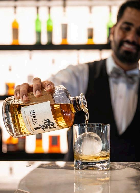
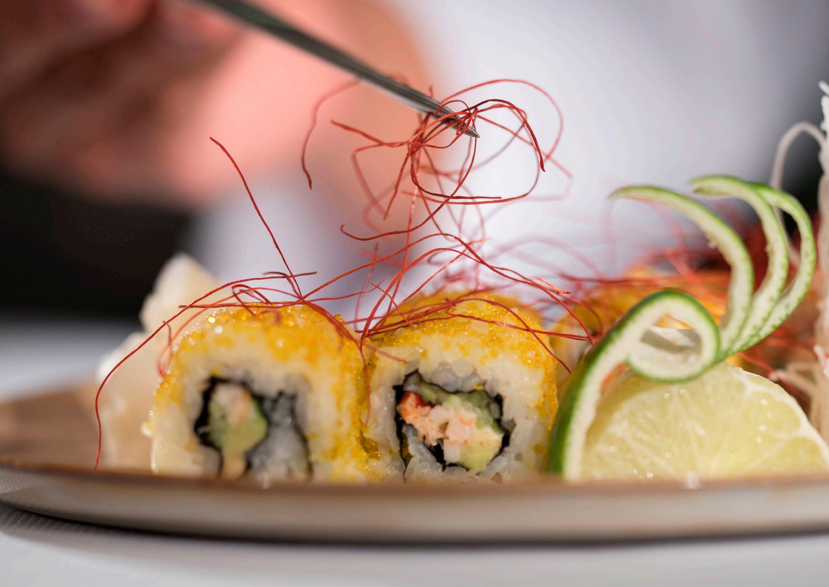
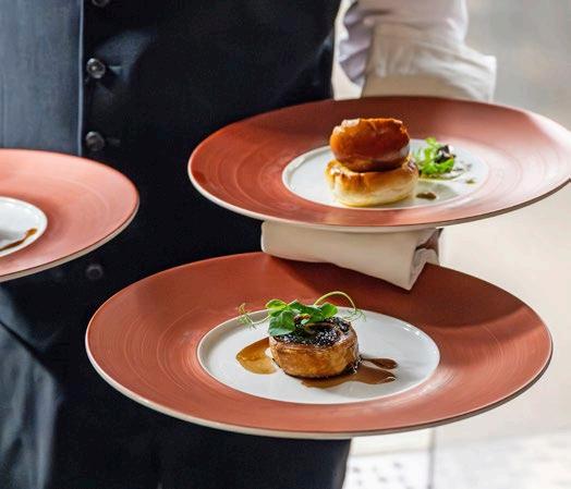
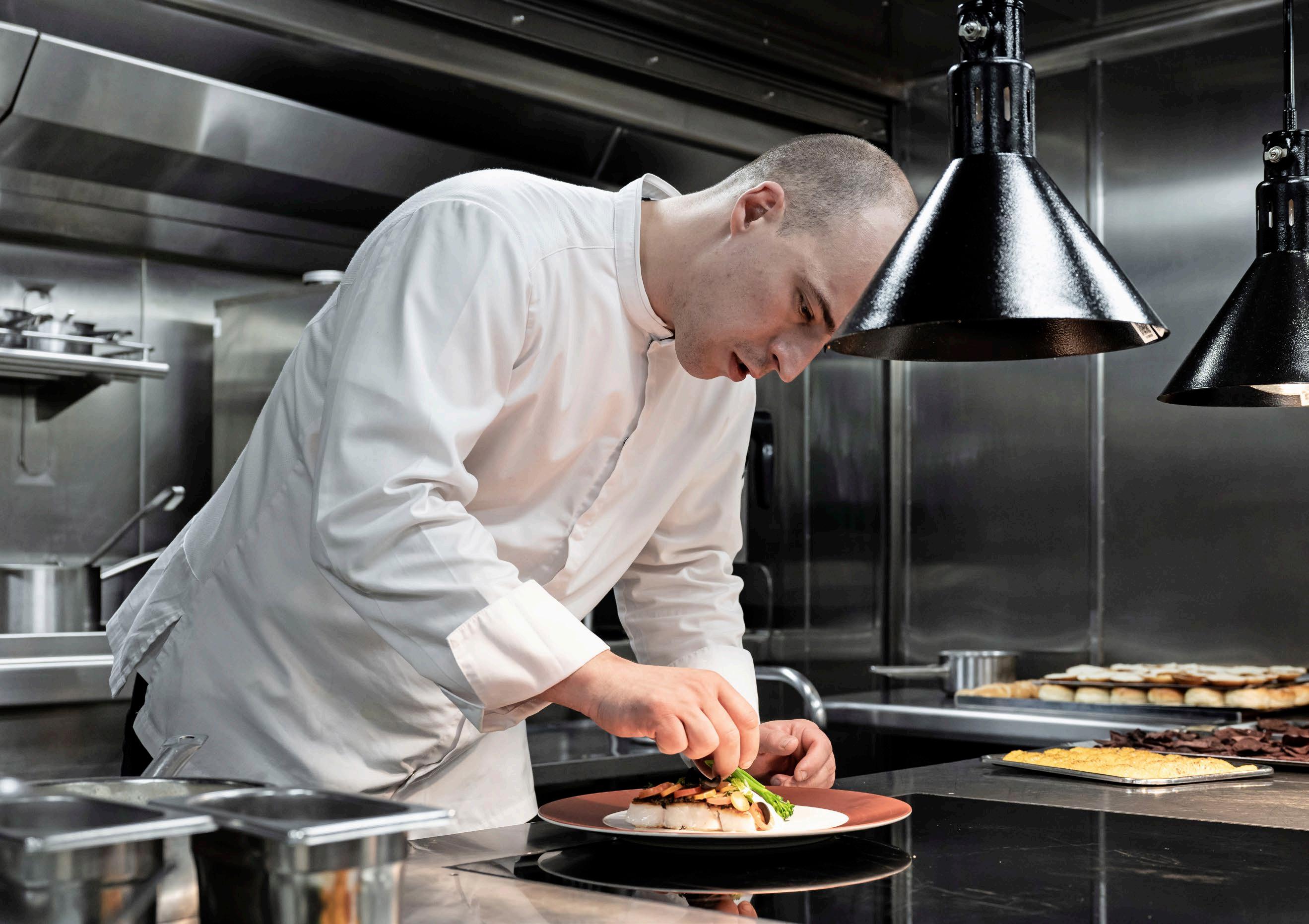
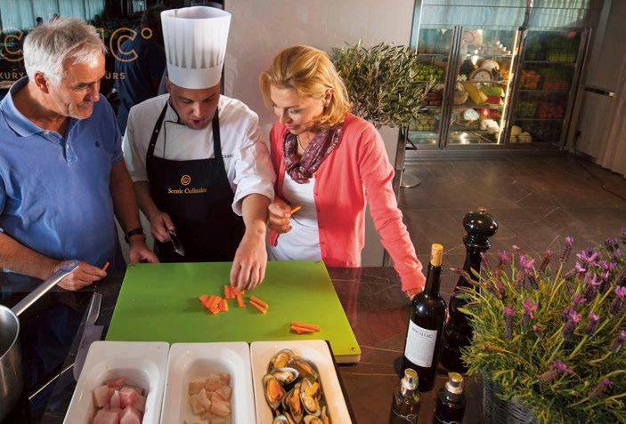
Capture the details that make up wonder, tight shots of the elements that express luxury, intimacy, the details of the experience.
When shooting or selecting stock imagery, it should feel aspirational, showcasing the very best moments of wonder.
Lighting should be soft and rich.
We can use shallow focus to draw the eye.
Wonder moments will always include the longitude and latitude.
Micro images should focus in on the fine details and ideally capture an action, rather than it be a static image.
VISUAL IMAGERY
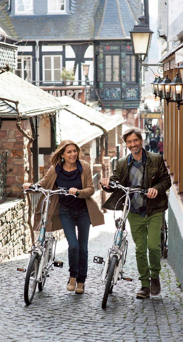
People - guest and on ship examples
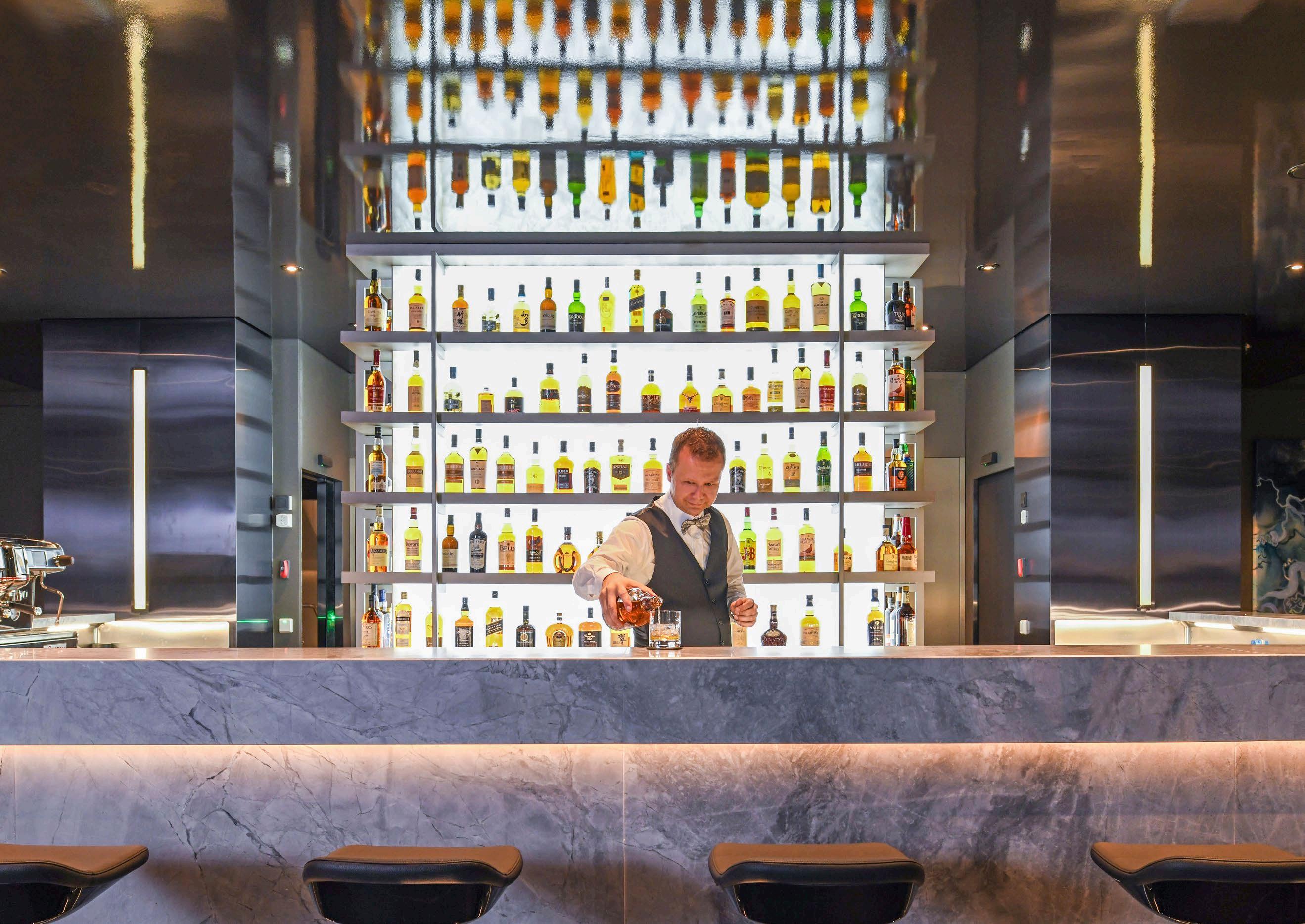
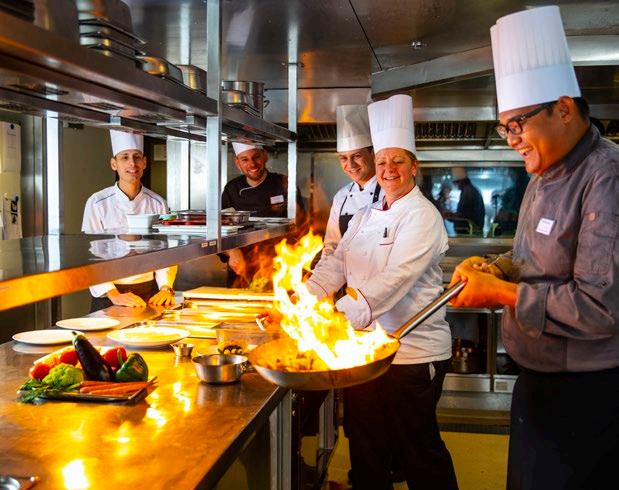
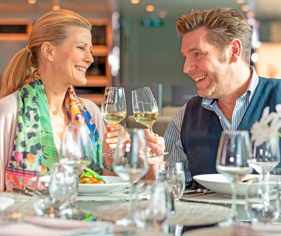
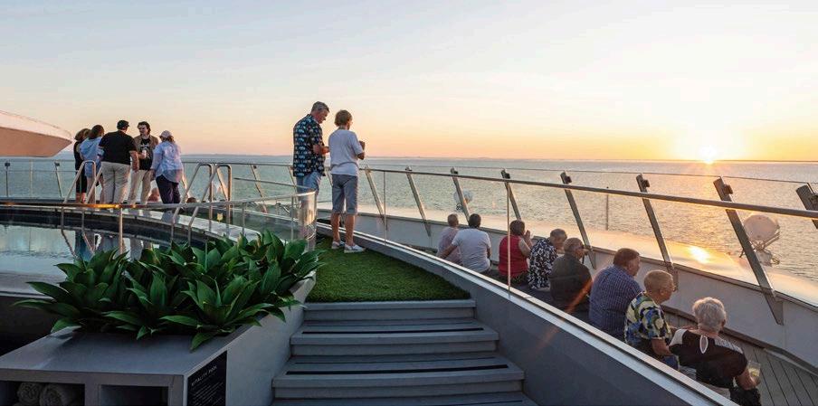
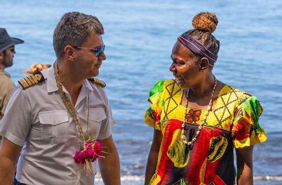
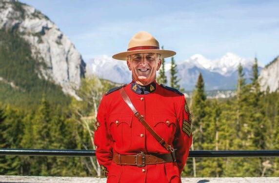
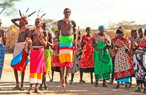
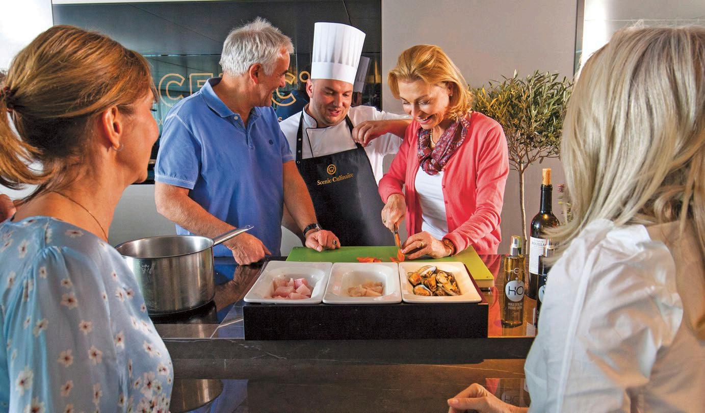
Placing people inside an image helps the viewer more easily connect with an experience. From a distance people can help to show scale; up close and personal they help to tell a story.
Vary your viewpoint eg. over the shoulder or first person point-of-view
– Include other travellers nothing says travel like travellers
– Approach people for more engaged portraits
– Add layer for meaning by juxtaposing subjects eg. up close face, backdrop landscape
– Showing people small helps create a feeling of grand scale
– Keep it real and honest try more reportage than posed
– the people that you find interesting – others will too
– Capture both portrait and landscape orientations to ensure the images are versatile for different uses
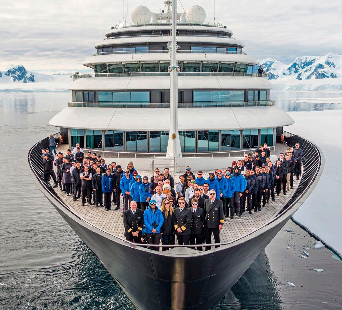
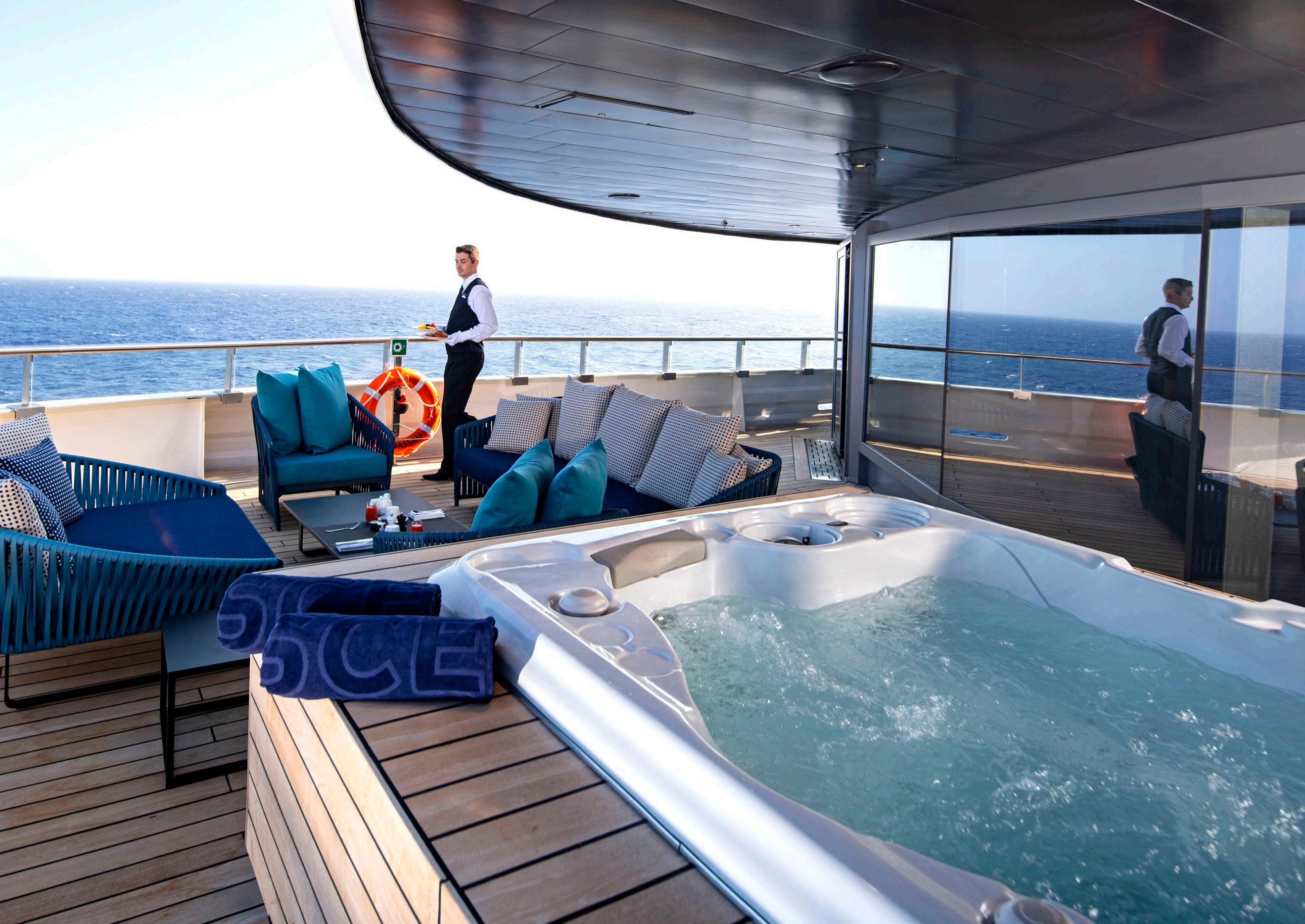
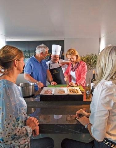
Images of guests or staff should always be captured in the moment without feeling staged. Select images that capture the space and scale of the ships.
VISUAL IMAGERY
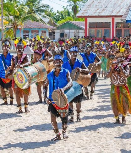
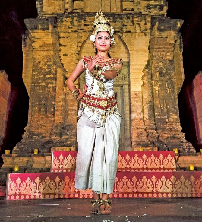
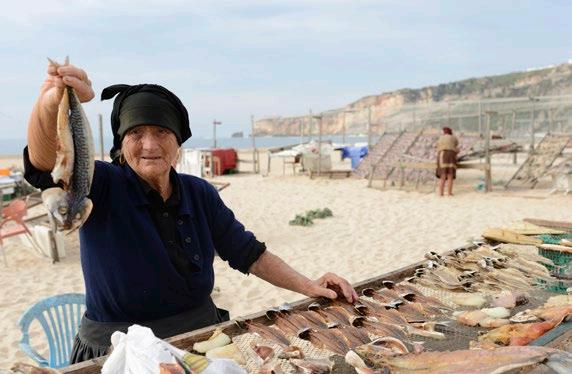
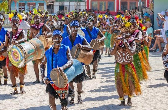
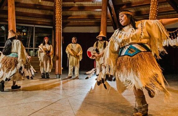
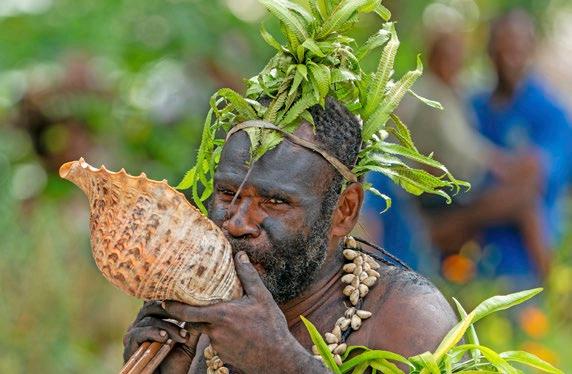
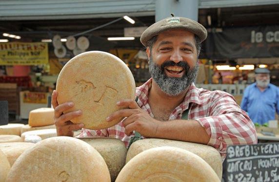
Wonder Moments - Micro (on shore local characters and artisans)
VISUAL IMAGERY
Some points to consider before selecting imagery or briefing a photographer.
Capture the essence of wonder
VISUAL IMAGERY
Some points to consider before selecting imagery or briefing a photographer.
Capture that classic picture but during the most interesting time of day
VISUAL IMAGERY
Some points to consider before selecting imagery or briefing a photographer.
Light should be soft and rich
VISUAL IMAGERY
Some points to consider before selecting imagery or briefing a photographer.
Capture the feeling, not just the event
VISUAL IMAGERY
Some points to consider before selecting imagery or briefing a photographer.
Capture the details that make up wonder
VISUAL IMAGERY
River Cruising Ships
Some points to consider before selecting imagery or briefing a photographer.
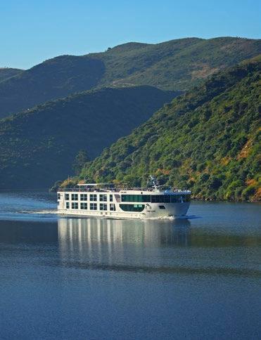
Front and side profiles are preferred.
Avoid using rear shots as the hero image, unless a destination landmark is the focus (for example, a castle).
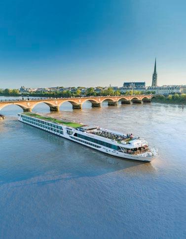
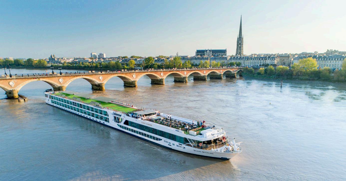
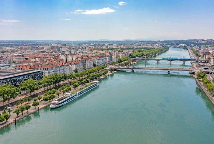
Show the Scenic Space-Ship cruising, not docked. Capture the macro wonder with wides showing scale, breath-taking scenery
VISUAL IMAGERY
Discovery Yachts
Some points to consider before selecting imagery or briefing a photographer.
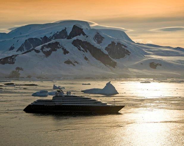
Front and side profiles are preferred (avoid using rear photos and aerials looking directly down as the hero).
The Discovery Yacht’s outline should be clear. Avoid white-on-white clashes (for example, no snow behind the upper half, white area of Scenic Eclipse).
Show the Discovery Yacht cruising, not docked or in an industrial port. The hero shot should always showcase the ship in the best way.
Visuals should be bright with blue skies where possible, unless showing a sunrise/sunset scene.
Capture the macro wonder with wides showing scale, breath-taking scenery
VISUAL IMAGERY
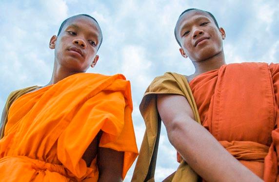
Guests & People
Some points to consider before selecting imagery or briefing a photographer.
It is preferred not to use images of the backs of people’s heads for hero shots.
Look for scenes that show the full, side or partial profiles o faces. This adds a human element and allows our audience to connect with the image.
Use
imagery of people you find interesting
VISUAL IMAGERY
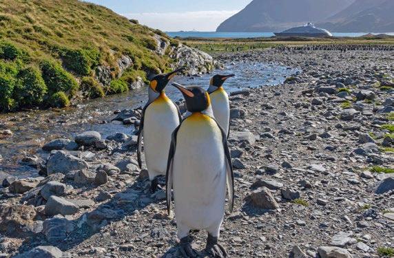
Wildlife
Some points to consider before selecting imagery or briefing a photographer.
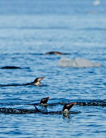
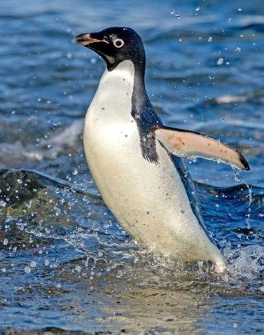
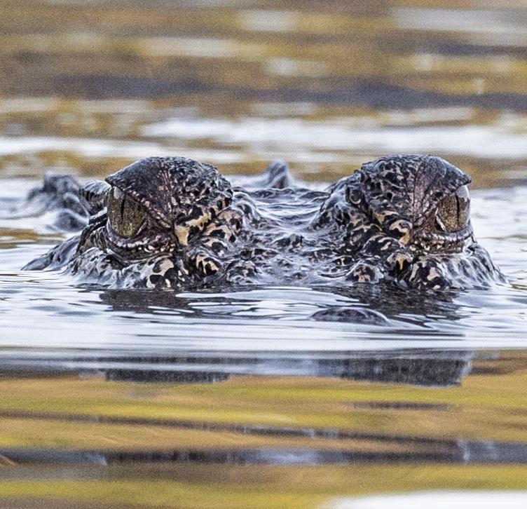
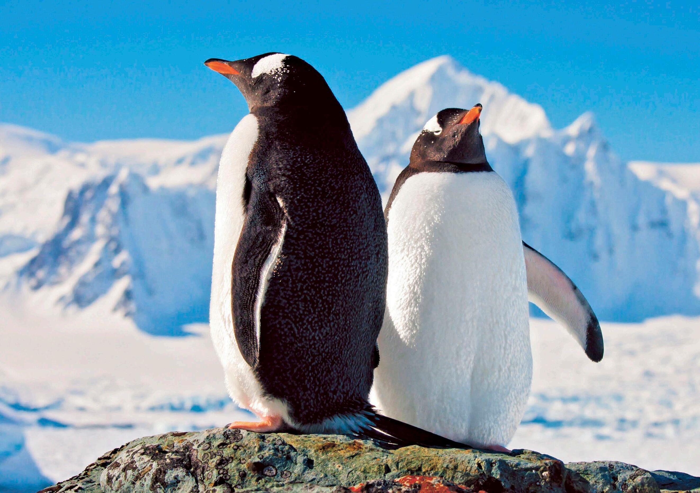
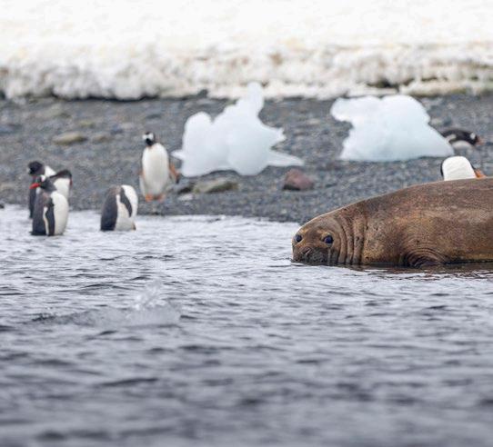
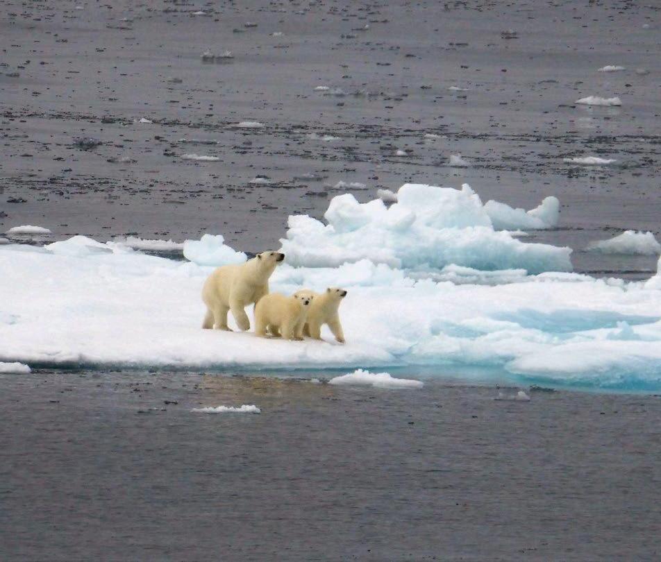
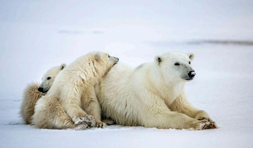
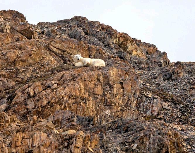
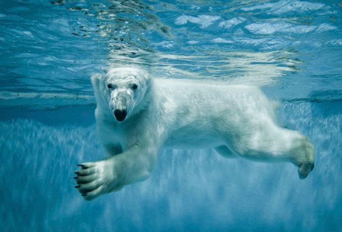
Wildlife should not be too close to guests or guides or underwater. Please check with the latest IAATO and AECO guidelines for Antarctica and the Arctic. In particular for distance rules we should not show polar bears up close.