FINE PRINTS

No.20 - march 2025


No.20 - march 2025
No.20 – march 2025
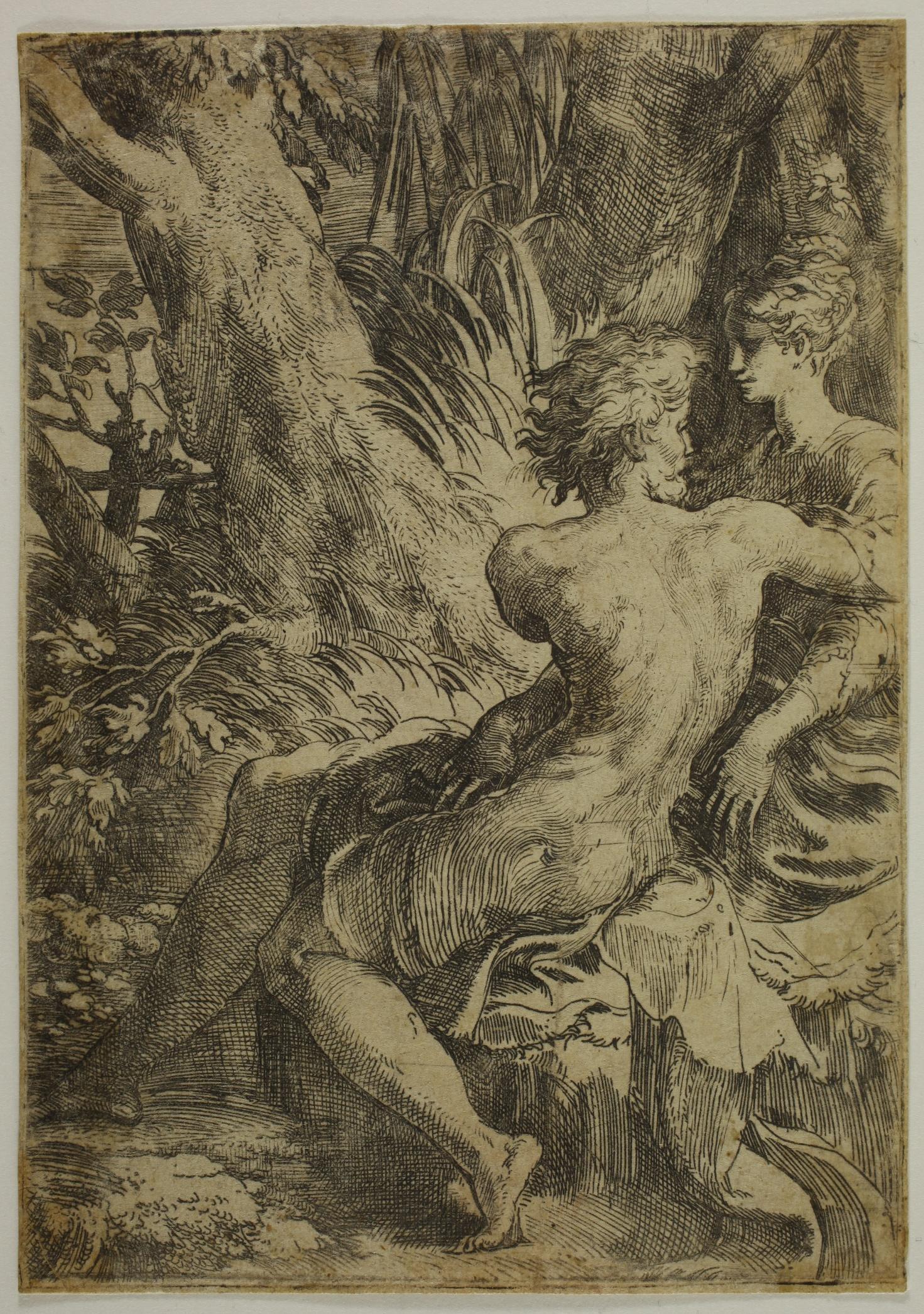
(1503 - 1540)
The Two Lovers - c. 1527/1530
Etching and drypoint, 149 x 104 mm. Bartsch (vol. 16) no. 14, Jenkins (in The Renaissance of etching) cat. 57, 2nd state (of 4).
Impression of the 2nd state (of 4), with a few drypoint strokes added, notably under the man’s right foot and on the reeds and trees in the upper right-hand corner, but before the addition of engraved lines, for example between the man’ s left knee and right calf or to the right of his face. A 2nd state impression in the Graphische Sammlung der ETH Zürich (E47) has a sketch by Parmigianino on the reverse (see Landau and Parshall, p. 269).
Superb impression printed on laid paper. Very good condition. Very minor thinning at the edges on the verso, consolidated by a very thin strip of Japanese paper. Fine, very faint fold at the bottom recto, very slightly soiled. Thread margins all around the platemark.
Provenance :
- Clayton Mordaunt Cracherode (1730 - 1799), Protestant minister and English amateur (Lugt 606)
- Jonathan Blackburne (17211786) (Lugt 2650b). Handwritten inscriptions in his hand appear on the reverse in graphite: the initials C.M.C., accompanied by the date 1761 and the indication n°36-1.
The initials C.M.C. indicate that Jonathan Blackburne’s impression came from Clayton Mordaunt Cracherode.

According to the author of the 2020 revision of the Frits Lugt notice, Jonathan Blackburne was ‘the greatest collector of prints of his time, active in the Liverpool area’ and his collection ‘contained mainly sheets by the Italian School of the 16th and 17th centuries (in particular The Parmesan, the Carracci and Rosa)’. The author of the notice adds: ‘Blackburne inscriptions are not easy to interpret, especially when they begin with initials (which is often the case). None of the auction sales seem to match the initials and years given. It is possible that these were not purchases made at an auction sale but perhaps purchases made directly from a dealer. In this case, the numbers are not lot numbers but may refer to an order or inventory number used by the collector himself’ (translated by us).
- Nathaniel Smith (1738 - 1809) was a London sculptor, print dealer and publisher (Lugt 2297 and 3017). His handwritten mark appears on the verso, in pen and ink: NSmith, accompanied by an indication of purchase price CIG~X and provenance: Blackburne sale 1786.
‘Exemplifying Parmigianino’s total mastery of the etching technique, this print displays the intricate systems of hatching and fine, supple lines he used to define the elegant figures and the vibrant landscape that surrounds them.’ (Catherine Jenkins, p. 138).
A slightly smaller drawing of the same subject in grey chalk with white highlights is in the Albertina Museum in Vienna (no. 2680).
A superb and rare impression from prestigious provenances.
References: Nadine Orenstein, Freyda Spira, Peter Fuhring and Catherine Jenkins: The Renaissance of Etching, 2019; David Landau and Peter W. Parshall: The Renaissance print, 1470-1550, 1994

Honors Rendered to Psyche - c. 1540
Woodcut in chiaroscuro, printed from three blocks in olive, light brown and dark brown, 247 x 229 mm. Bartsch vol. XII, section VII, no. 26; Takahatake, cat. 62-63.
Impression of the first or second state, trimmed to the octagon, without the margins where the monogram of Andrea Andreani and the inscription in mantoua 1602 appear in the 2nd state. These margins have often been trimmed. Naoko Takahatake and Linda Stiber Morenus tell us that Andrea Andreani reprinted Vicentino’s print, first without adding his mark, then with it.
Whether our print is from the 1st or 2nd state, it has all the characteristics of the impressions printed by Andreani:
‘The blocks show losses and are riddled with insect damage, most significantly in the lightest tone. To compensate, Andreani deployed exceptionally liquid inks that, though thinly applied, flowed into the lacunae of the blocks. The extreme channelled squash of these wash-like inks and deep embossment of the sheet reveal the impression was printed on very moist paper with heavy pressure and probably soft packing in the tympan.’ (Naoko Takahatake and Linda Stiber Morenus, p. 163) Andrea Andreani’s technique makes it possible to obtain beautiful impressions from blocks that have begun to wear.
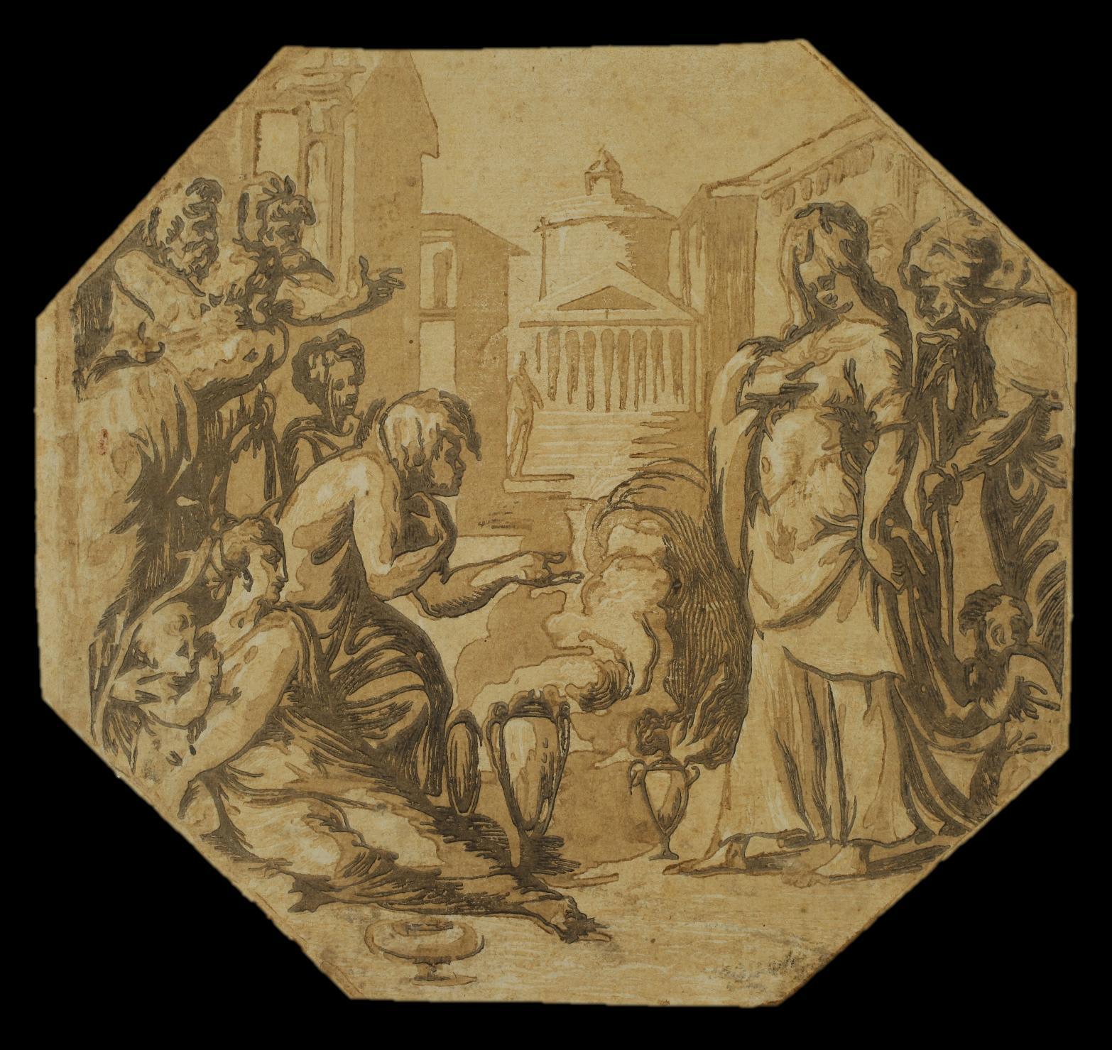
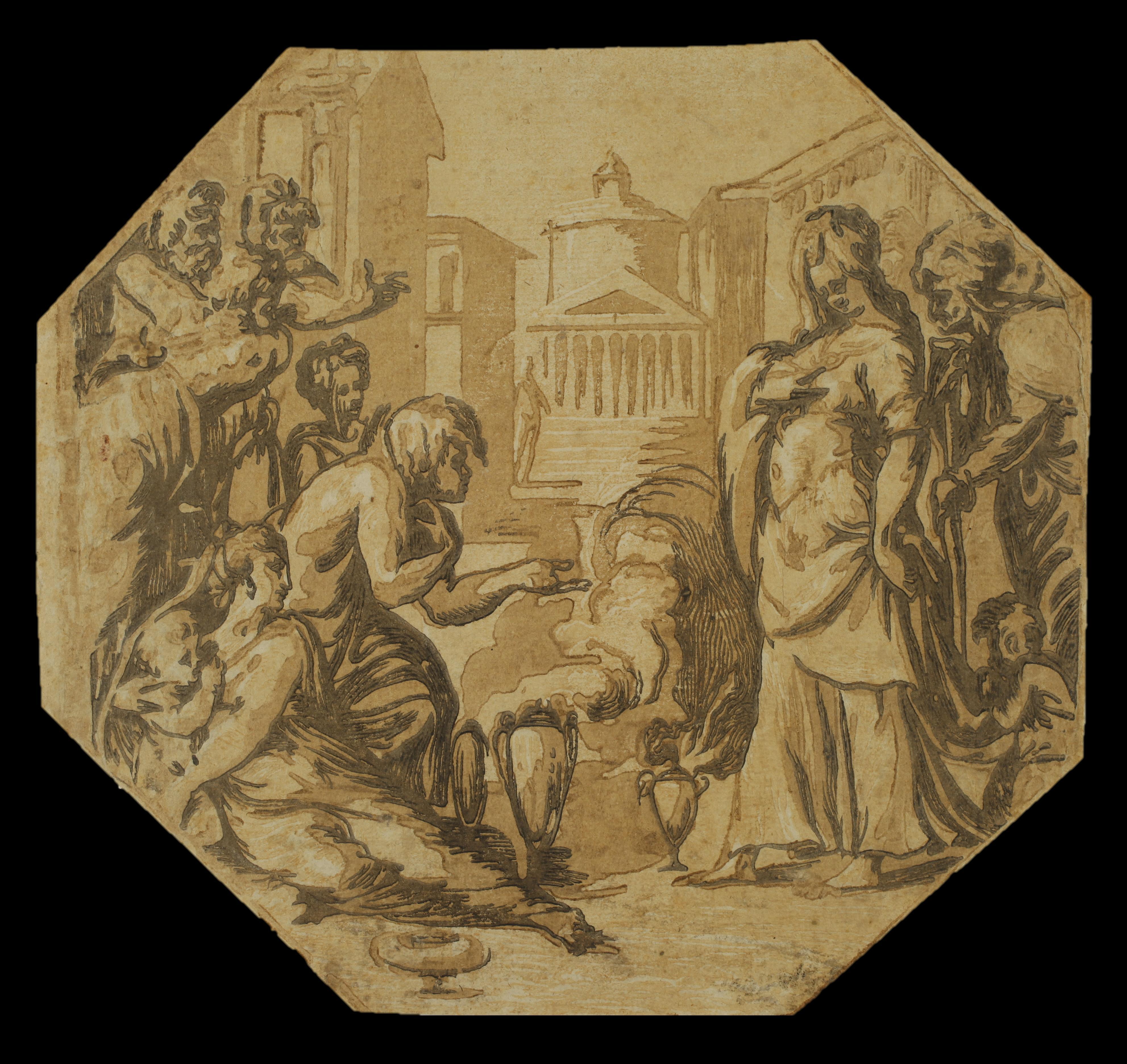
Our impression is particularly well printed if we compare it with other impressions of a similar edition but on which the lighter ink has not spread evenly (see, for example, the impression in the Library of Congress or one of the impression in the Rijksmuseum. Very fine impression printed on laid paper, trimmed as is very often the case to the octagon, the edge of the octagon being visible on only 6 of the 8 sides, and very slightly trimmed in the image on the upper edge. In very good condition; very slight soiling to lower right.
Adam Bartsch describes this print as engraved by Antonio da Trento (active c. 1527 - c. 1540). However, it is attributed on the basis of stylistic criteria to Niccolò Vicentino by Naoko Takahatake (‘Niccolò Vicentino’s “Miraculous Draught of Fishes”’, in Print Quarterly, September 2011, vol. 28, no. 3, p. 258, note 9). She recalls that Pierre Jean Mariette had already given it to Vicentino (Mariette, Notes manuscrites, vol. 2, fol. 86).
The composition is by Francesco Salviati (1510 - 1563). ‘Shortly after his arrival in Venice in the summer of 1539, Francesco Salviati (1510–1563) was at work on Honors Rendered to Psyche, an octagonal painting commissioned to adorn a ceiling in Giovanni Grimani’ s palazzo at Santa Maria Formosa. The palazzo housed an important collection of antiquities and was decorated with ancient themes, including the present subject from Apuleius’ s Metamorphoses depicting the beautiful princess Psyche admired by her citizens.’ (Naoko Takahatake and Linda Stiber Morenus, p. 161).
3. ANONYMOUS, after Giorgio VASARI (1511 - 1574) published by Hieronymus COCK (1518 - 1570)
Engraving, 407 x 294 mm. Riggs 195, Le Blanc 93.
Extremely rare impression with an engraved text printed under the portraits. We have not found this text on any of the very rare impressions that we know of. Timothy Riggs describes only one impression, which is without letter; he seems to ignore this letter, and the dimensions mentioned are reduced to 331 x 289 mm.
One of the British Museum impressions has a blank space below the image, but it is not high enough to accommodate the entire text of our impression, which is the only one we know of where the plate is fully visible and the sheet untrimmed.
The text of our impression and the borders, which extend below the plate, were most likely typeset and printed in the blank space below the image.
There is an awkward copy, also very rare, which includes an engraved letter that is roughly similar to ours. See the impression preserved at the Royal Collection Trust.
Very fine impression printed on laid paper. In very good condition. Three tiny pinholes. Thread margins all around the platemark.
‘This print is based on a painting by Giorgio Vasari for the humanist Luca Martini in 1544. The painter mentions the work in the second edition of the Vite, specifying that copies had been made. The best surviving version - probably the one painted for Martini - is now in the Minneapolis Institute of Arts’. (Cécile Tainturier, in Hieronymus Cock, La Gravure à la Renaissance, p. 145, translated by us).
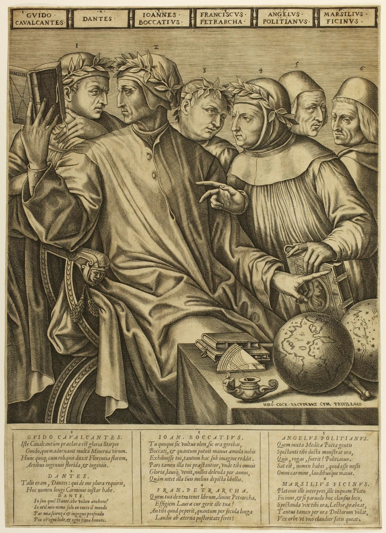

This painting depicts Guido Cavalcanti (1258-1300), Boccaccio (1313-1375) and Petrarch (1304-1374) surrounding Dante Alighieri (1265/67-1321). The four poets are crowned with laurel. On the far left of the painting, Cristoforo Landino (1425-1498), humanist and promoter of the Italian language, and Marsilio Ficino (14331499), Italian poet and philosopher, observe their illustrious elders. In the engraving, Landino’s name has been replaced by that of his contemporary Ange Politien (1454-1494), another poet and philologist. Cécile Tainturier sees this as a mistake on the part of the draughtsman, who provided the printmaker with a preparatory drawing, or as a strategic choice on the part of the publisher, since Ange Politien ‘had been published since the beginning of the 16th century in Antwerp - notably by Plantin - and was perhaps more significant for Cock’. (Hieronymus Cock, La Gravure à la Renaissance, p. 145, translated by us).
This group portrait ‘reflects the debates between humanists in Florence over proper usage in the Tuscan language, the relative merits of Petrarch and Dante as exemplars, and the contending Aristotelian and Neoplatonic interpretations of Dante’s poetry’ (Sharon Gregory, Vasari and the Renaissance Print, p. 300)
The popularity of the painting, of which several copies were soon painted, led to the creation of two engraved versions, one published by Cock, the other probably Italian. Sharon Gregory emphasizes the high artistic quality of the version published by Cock, which was clearly copied by the second version: ‘The features of the poets and their attributes, as presented in Vasari’s painting, are rendered by the engraver with great accuracy and subtlety, and the inscriptions identifying them are clear, with the letters well formed’ (ibid., p. 300).
It is very possible that it was Vasari himself who provided Cock with a preparatory drawing for the engraving, since, as Sharon Gregory points out in Vasari and the Renaissance Print, the sign of Capricorn was added to the engraving on the celestial sphere. Capricorn was the astrological sign used as a personal emblem by Cosimo I of Tuscany, whose patronage Vasari was seeking at the time.

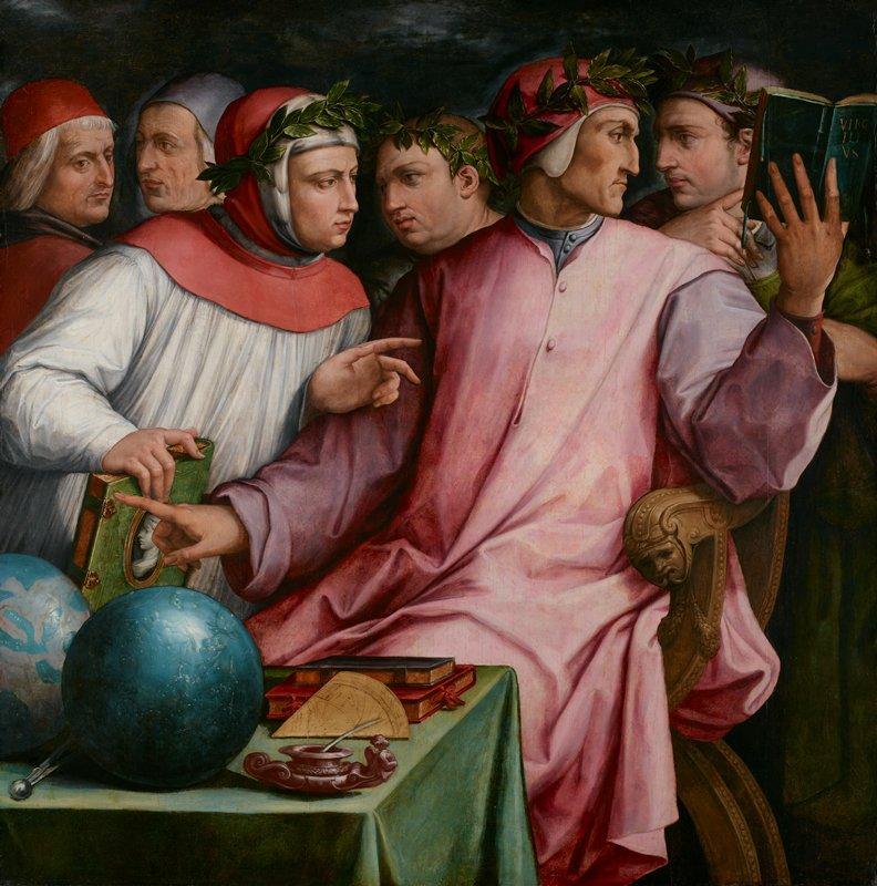
Giogio Vasari : Six poètes toscans oil on panel Minneapolis Institute of Arts
It is thought to be one of the first prints published by Cock around 1550. The plate is mentioned in the inventory of the estate of his widow, Volcxken Diericx, in 1601: Een coperen plaete van ses Philosophen
References: Timothy A. Riggs: Hieronymus Cock: 1510-1570, Printmaker and publisher in Antwerp at the sign of the four winds, 1977; Joris Van Grieken, Ger Luijten, Jan van der Stock, Alessandra Baroni Vannucci: Hieronymus Cock : la gravure à la Renaissance, 2013
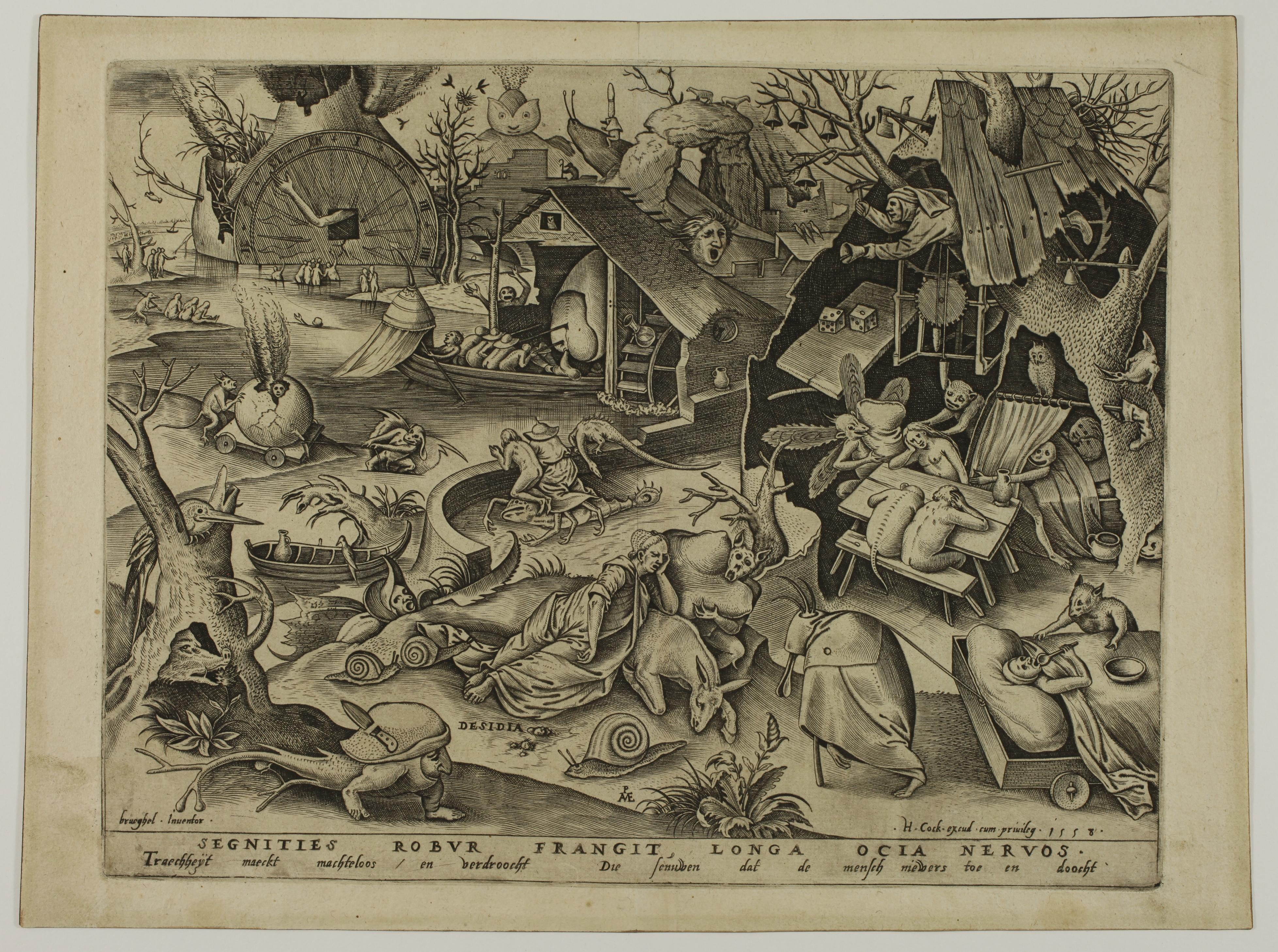

4. Pieter van der HEYDEN (c. 1530 - after 1572) after Pieter BRUEGEL The Elder (c. 1525 - 1569)
Desidia [Sloth] – 1558
Engraving, 227 x 293 mm. New Hollstein (Bruegel) 22.
Plate from the Seven Deadly Sins series.
Superb impression of the only state printed on watermarked laid paper (gothic P), published by Hieronymus Cock (1518 - 1570).
Excellent condition, good margins all around the platemark (sheet: 250 x 335 mm). Minor soiling to the edges of the margins, central vertical soft fold only slightly visible. Rare in this printing quality and condition.
In the lower margin, the Latin inscription SEGNITIES ROBUR FRANGIT, LONGA OCIA NERVOS can be translated as ‘Indolence breaks vigor, prolonged idleness [breaks] energy’. The spelling ‘ocia’ is probably a clerical error for ‘otia’. The Middle Dutch legend Traecheyt maeckt machtelos en verdroocht / Die seunuwen dat de mensch nieuwers toe en doocht is translated as follows by Maarten Bassens (in Bruegel, The Complete Graphic Works, 2019, p. 147): ‘Sloth makes powerless and dries out the nerves until man is good for nothing’.
“The series of Seven Deadly Sins, completed in 1558, is carried out entirely in the style of Hieronymus Bosch and filled with fantastic figures and landscapes.” According to Jürgen Müller, the reasons for this choice were not just commercial (Hieronymus Bosch’ s name and style were already very popular). “It seems more probable that Bruegel adopted Bosch’s style because viewers would instantly associate it with the worlds of sin and folly.” And what’s more, this choice “constitutes a definite rejection of the prevailing style of the Italian Renaissance”. (Jürgen Müller in Nadine Orenstein, Pieter Bruegel the Elder: drawings and prints, 2001, p. 145).
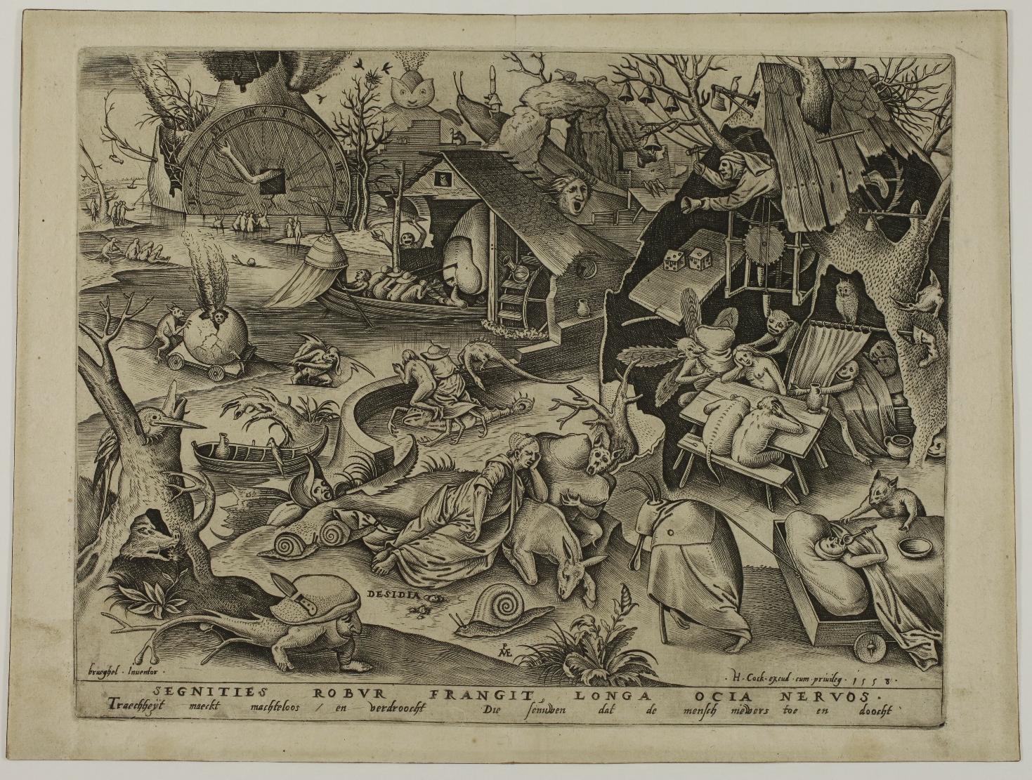

All the plates in the series feature a woman personifying one of the seven canonical deadly sins (anger, sloth, pride, avarice, gluttony, envy and lust), surrounded by scenes illustrating each of these sins in different ways, as well as the punishments the sinner must expect.
In Desidia, Sloth, slumped over a donkey, seems to be fast asleep in the middle of a strange landscape that gives an impression of both heaviness and restlessness.
Three giant snails, symbols of sloth and slowness, surround Sloth; behind them, three figures slumped over a table, their heads in their hands, embody idleness and melancholy. A figure hobbles over to pull a man into bed... Imps are busy all over the place, poking some and offering others pillows... Irony, grating or facetious, is omnipresent and, as usual in Bruegel’s compositions or those of Bosch, many other details remain difficult to interpret.
Bruegel’s preparatory drawing is in the Grafische Sammlung Albertina, Vienna (inv. 7872).
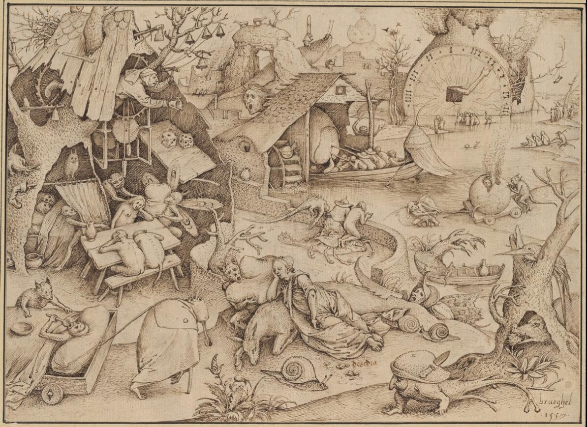

Pieter Bruegel, preparatory drawing for Desidia Grafische Sammlung Albertina, Vienna (inv. 7872)
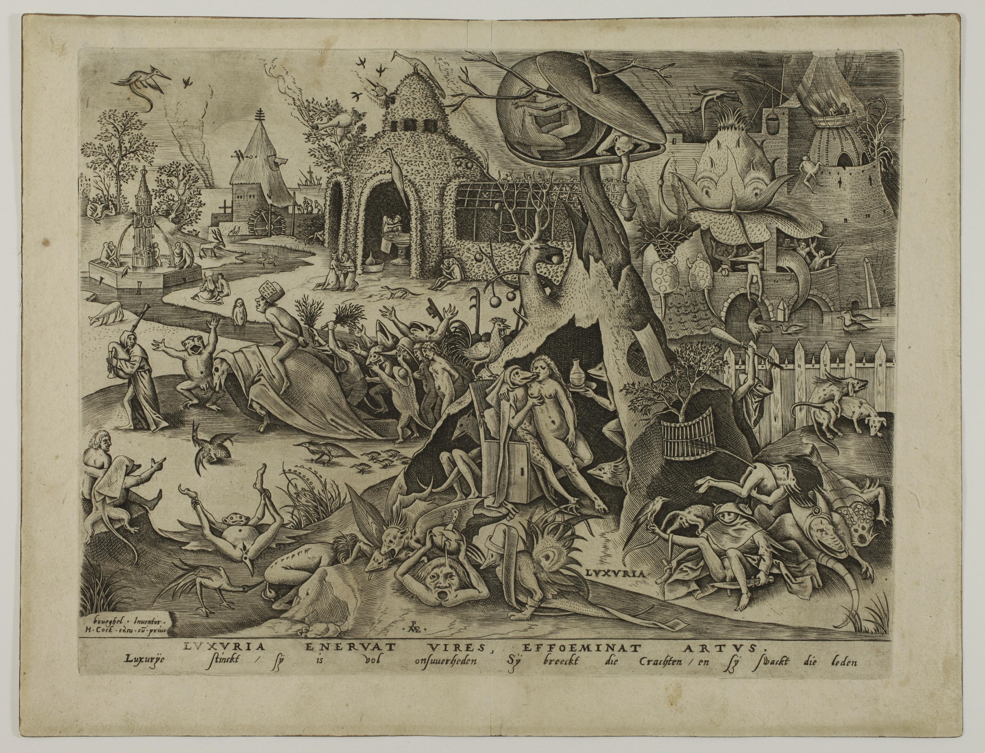

5. Pieter van der HEYDEN (c. 1530 - after 1572) after Pieter BRUEGEL The Elder (c. 1525 - 1569)
Luxuria [Lust] - c. 1558
Engraving, 224 x 294 mm. New Hollstein (Bruegel) 27.
Plate from the Seven Deadly Sins series.
Superb impression of the only state printed on watermarked laid paper (gothic P), published by Hieronymus Cock (1518 - 1570).
Excellent condition, good margins all around the platemark (sheet: 258 x 337 mm). Minor soiling to the edges of the margins, tiny foxmark to the top left of the image, very faint central vertical soft fold. Rare in this printing quality and condition.
The Latin legend LUXURIA ENERVAT VIRES, EFFOEMINAT ARTUS reminds us that ‘Lust exhausts the strength and softens the body’. As for the Middle Dutch caption, ‘Luxurÿe stinckt, sÿ is vol onsuuerheden, Sÿ breeckt die Crachten, en sÿ swackt die leden’, it is translated as follows by Maarten Bassens (in Bruegel, The Complete Graphic Works, 2019, p. 147): ‘Lechery stinks, it is dirty. It breaks [man’s] powers and weakens limbs’.
The cockerel, here an attribute of debauchery, accompanies the personification of Lust, sitting naked on the lap of a demon who kisses and caresses her. Scenes of orgies or scenes with erotic or serious connotations abound around the couple. Many of the details are frankly comical, while others are more grating, such as the face with its eyes trained on the viewer, and where it is unclear whether the arms are legs and the wide-open mouth an anus, or the male figure holding a severed phallus in his right hand and a large knife in his left, with which he threatens his own sex: ‘However moralising the message, this kind of detail, both mocking and obscene, proves that Bruegel does not shy away from a joke’ (Manfred Sellink: Bruegel, lʹ œuvre complet - peintures, dessins, gravures, 2007, p. 93, translated by us).
Bruegel’s preparatory drawing is kept at the Royal Library of Belgium, Brussels.

Vertumnus and Pomona
Etching and engraving, 427 x 250 mm. Passavant 16, Andresen 16. Hollstein 47, 2nd state/2.
Impression of the 2nd state (of 2) with the monogram. Dieter Beaujean (Hollstein) reports a single impression of the 1st state, kept in Berlin.
Very fine impression printed on watermarked laid paper (letter B surmounted by a flower). Good general condition. A horizontal printing crease in the centre; small restorations in the upper corners, three very small restorations on the left edge.
Provenance:
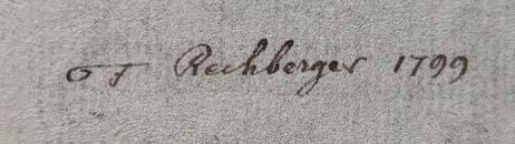

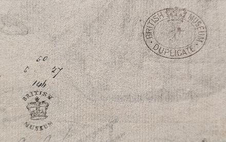
Franz Rechberger (1771 - 1841), painter, engraver and curator of the von Fries Cabinet and the Albertina, Vienna: his handwritten mark written on the back in pen and ink, followed by the date 1799 (Lugt 2133). The sheet also bears the stamped mark of the British Museum (Lugt 301), as well as the stamped mark of the duplicates of the British Museum authorising their release (Lugt 305). The handwritten numbers inscribed above the first of the two British Museum marks indicate the date on which the impression entered their collections (probably 27/5/1850).
Very rare.

One impression is kept at the British Museum, from the Clayton Mordaunt Cracherode collection (acquired in 1799). Dieter Beaujean reports, in addition to the London impression, two other impressions of the 2nd state (kept in Dresden and Rotterdam). One impression is reported by Passavant in the catalogue of the 1861 Munich sale of the Eisenhart collection, no. 669. It is described there as rare.

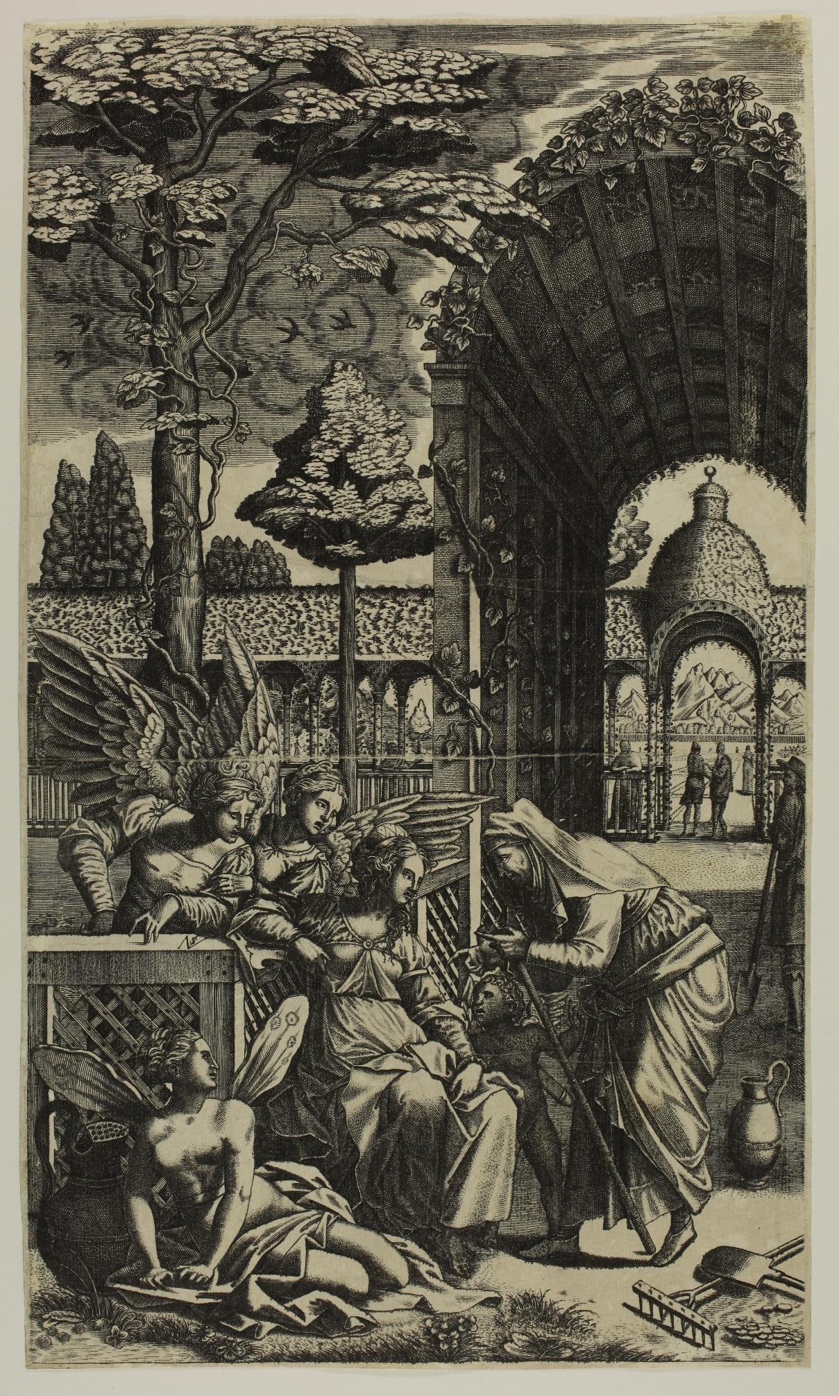
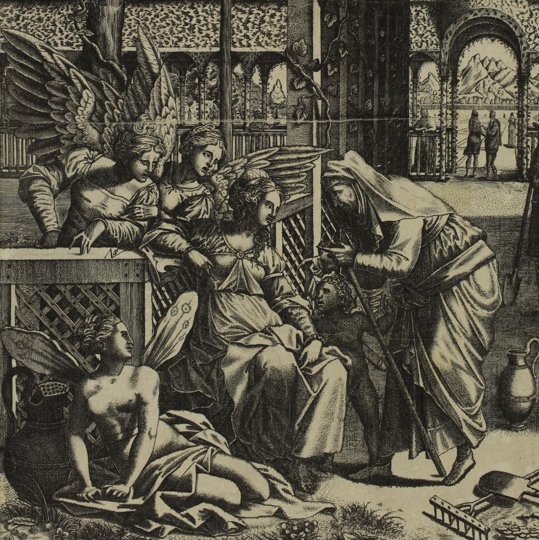
The monogram of Nikolaus Solis appears on the crossbar of the fence, on which two female geniuses are leaning. They are listening to Vertumnus, the god of gardens, disguised as an old woman, extolling the joys of love to the nymph Pomona, whom she has so far rejected.
The influence of Antonio Fantuzzi’s etching Vertumnus and Pomona is clearly evident here. Fantuzzi uses a composition by Rosso Fiorentino that no longer exists, painted in Pomona’s pavilion in Fontainebleau. In Solis’ version, the figure of Vertumnus is very similar to that in Fantuzzi’s print. We also find the elegant pergolas of the garden, Cupid and his arrows, as well as the naked winged figure sitting on the ground in the foreground. The two winged putti in Fantuzzi’s print have, however, been replaced by female figures. But it is above all the overall composition that has been modified, changing from a square format to a surprising vertical format that gives a monumental place to the architecture and a horizon to the scene.
Léon Davent’ s Garden of Pomona , which uses a composition by Primaticcio also painted in the Pavillon de Pomone, may also have been a source of inspiration for Solis.

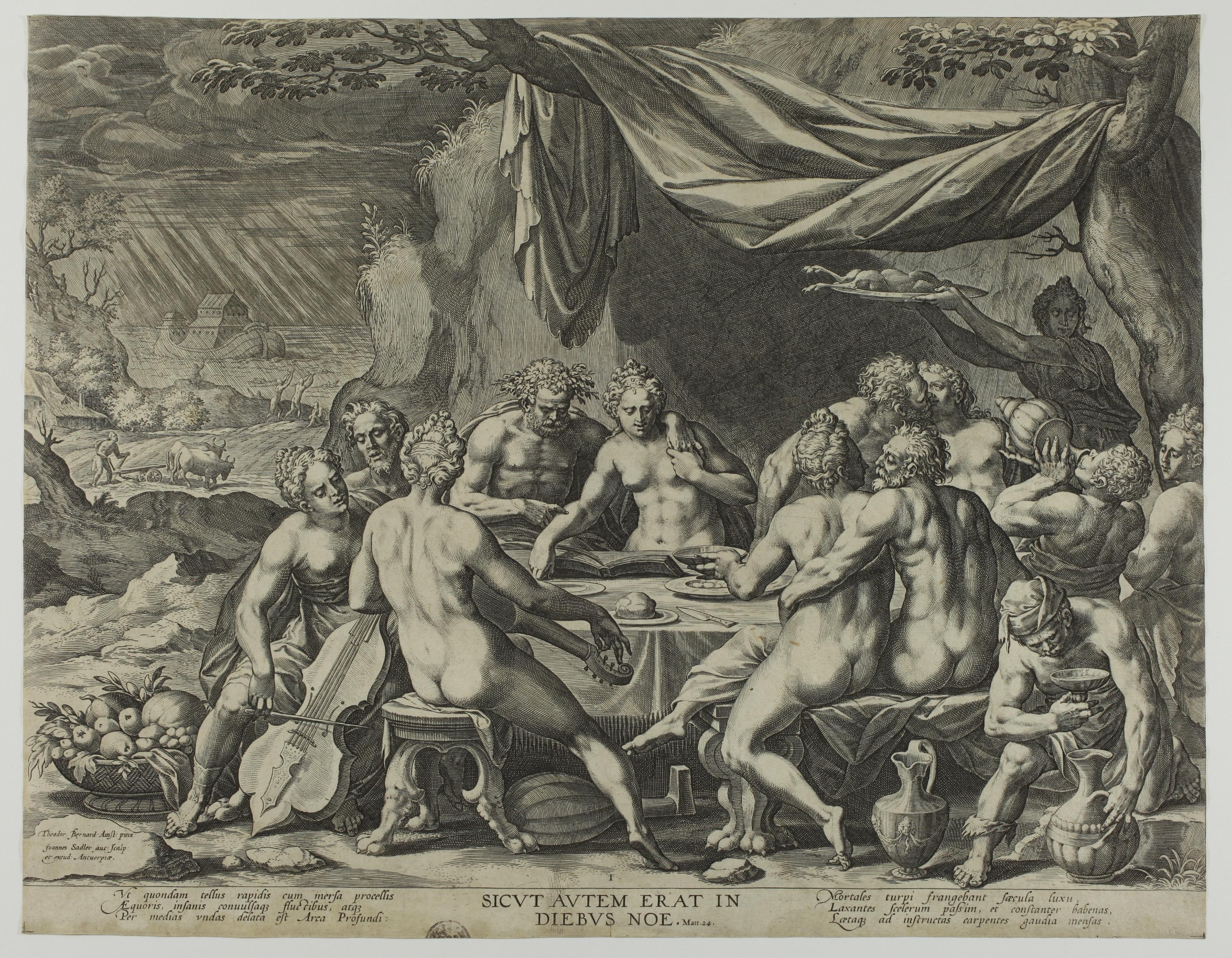
Mankind Before the Flood - c. 1581
Engraving, 348 x 448 mm. Hollstein 264
A very fine impression, printed on laid paper, trimmed to the borderline. Excellent condition. Upper part of a collector’s mark printed on the lower edge of the sheet. Tiny 8 mm cut on the lower edge in the centre. Slight vertical fold.
This print, engraved after Dirck Barendsz (1534-1592), has a counterpart: Humanity Before the Last Judgement (Hollstein 265; see for example the impression in the Staatliche Kunstsammlungen, Dresden). The two prints are composed in the same way: in the foreground, a joyful assembly indulges in the pleasures of food, music and love, seemingly unaware of the coming threat represented in the background: here, the Flood, there, the Last Judgement.
References: J.R. Judson, Dirck Barendsz, Amsterdam, 1970, pp. 12631, no. 72.


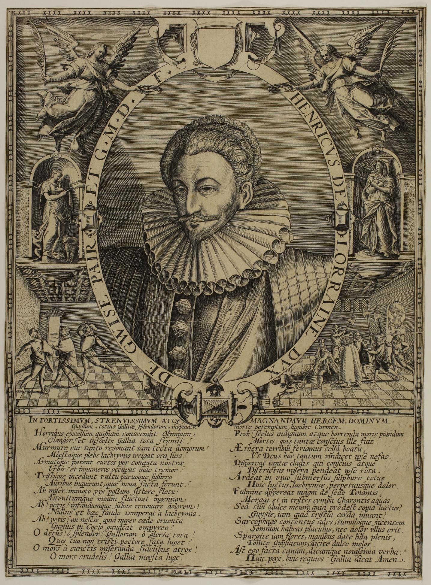
Henri de Lorraine, Duke of Guise
Engraving, 380 x 280 mm. Inventory of the Hennin collection by Georges Duplessis no. 813 (‘Anonymous engraving, wrongly attributed to one of the Wierix’).
Very nice impression printed on laid watermarked paper (watermark : crowned heart); trimmed to the borderline, complete with the subject; very good general condition. Two tiny pinholes have been repaired and there are two small printing creases in the subject.

The portrait of Henri Ier de Lorraine, Duke of Guise, is inscribed in an oval with the caption: HENRICUS DE LORRAINE DUX DE GWISE PAIR ET GMDF (Grand Maître de France).
The frame has two angels crowning the duke at the top, two allegories in the centre and two scenes relating to the assassination of the duke and his brother on 23 December 1588 in Blois on the orders of King Henry III at the bottom.
Very rare


(1584 - 1635)
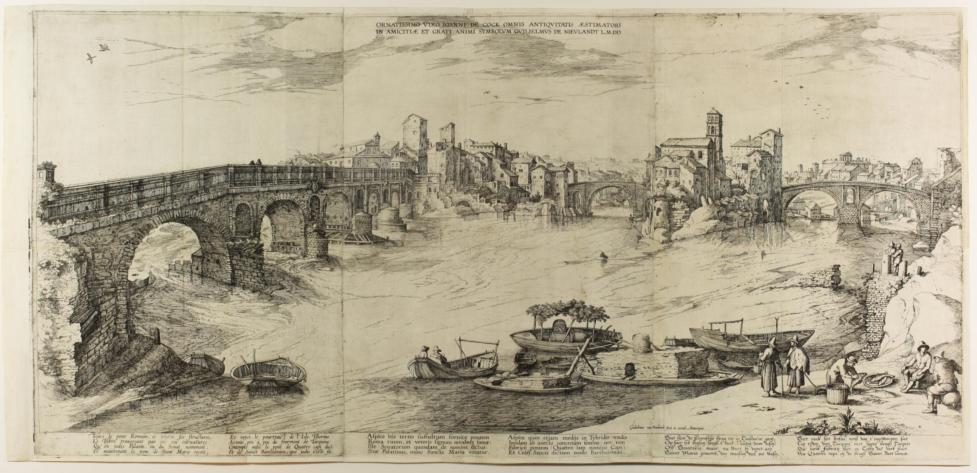
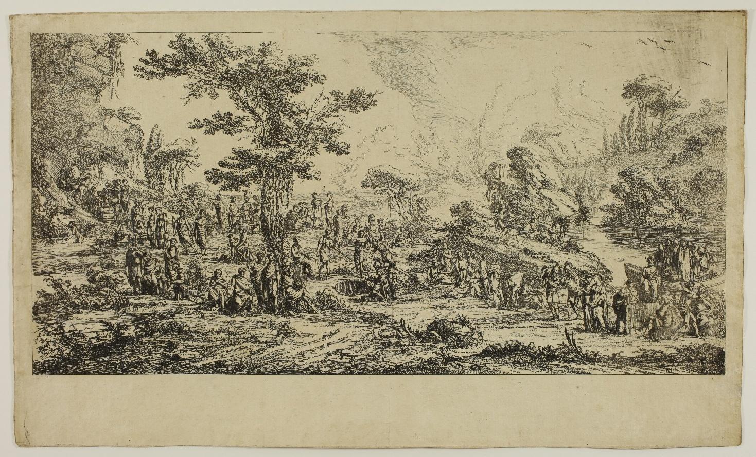
Large view of Rome with the Isle of the Tibre in the Centre –c.1605/1610 (?)
Etching printed from three plates, 415 x 870 mm. Hollstein 9a. This print is composed of three plates printed on three sheets of laid paper joined end to end. Very fine impression. Restored horizontal tear in the middle of the left-hand plate, two restored tears in the central fold of the centre and right-hand plates. Three vertical folds, very small lack in the centre. Small paper fills in the right and lower margins. The print has been backed with japan paper. Thread margins on three sides, good margin on the left (sheet: around 425 x 905 mm).
Very rare. There are two impressions in the Rijksmuseum, Amsterdam (RP-P-1992-114 and RP-P-OB-70.894), one (stained) in the British Museum and one in the Fondation Custodia, Paris.
A painter and printmaker born in Antwerp, Willem van Nieulandt II left his native city to work in Amsterdam and then Rome, where he developed a passion for ancient architecture. He returned to Antwerp in 1605. It was here that he etched and published this impressive panorama. The full-length caption, written in French, Latin and Dutch, indicates the main monuments depicted: ‘Here is the Roman bridge and all its structures, / The Tiber crossing with its six archs: / Which was once known as the Palatine, or Senat Bridge, / and is now known as Sant’ Marie. / And here you can see the view of the Isle Tiberine / Increased little by little by the body of Tarquin: / Contemplate also the bridge known as Quattro capi, / And of Sainct Bartholmieu, which Ceste once made.’ (translated by us)
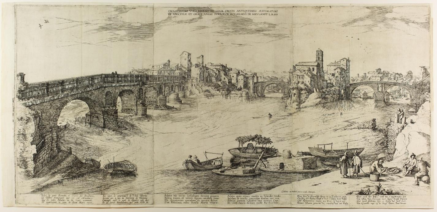

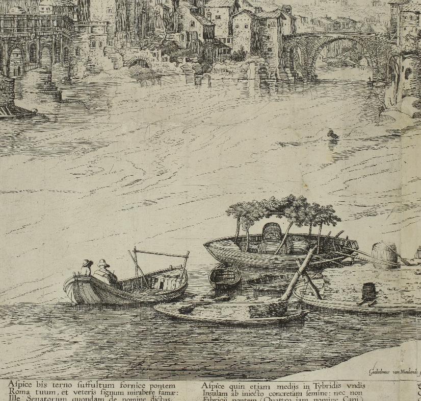
“Another print, remarkable for its size, and not part of any series, depicts the Tiber Island and the Ponte Fabrizio, along with several fishermen and their boats.29 The print covers three plates and is reminiscent of Van Nieulandťs early etching. The clouds in the upper left and the overall rough etching style are very much in line with his earliest work. It is likely to have been his first attempt at using several plates for one print. Like his earlier prints, it includes the information Guilelmus Nieulandt fecit et excud. Antverpiae, but it also bears tides in Dutch, French and Latin, which might indicate that it was intended for a more international market. The print is dedicated to Ioanni de Cock. This De Cock, apparently a friend of Van Nieulandt, could very well be Jan de Cock (before 159 1 - Antwerp 1625/ 26) a fellow landscape painter in Antwerp. No drawing is known for this print, nor does it bear resemblance to any work of the artists whom Van Nieulandt more often copied.” (Willem Adriaan te Slaa, “Willem van Nieulandt II as Printmaker”», Print Quarterly, vol. XXXI, 2014, p. 384).
The panorama, etched in Antwerp, was probably based on studies made there by Van Nieulandt before his return. In fact, Carel van Tuyll van Serooskerken notes that ‘there are several genre figures in this urban view, including fishermen examining their catch, and in the centre, seated in a small boat, a draughtsman seen from behind: a concealed self-portrait?’ (translated by us).
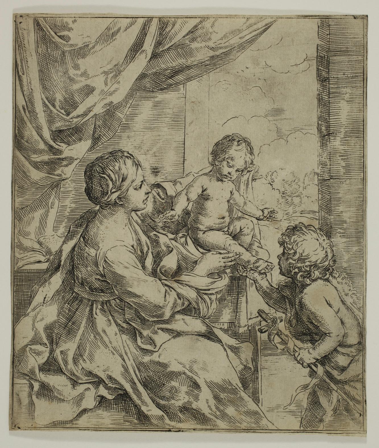
Guido RENI
(1575 - 1642)
The Virgin and Child by a Table, with St John the Baptist as an Infant
Etching, (189 x 159 mm). Bartsch 6, Birke XXXIV.
A very fine impression printed on laid paper, trimmed at the platemark or just outside. Very good condition, rare traces of yellowing in the lower right corner.
Bartsch describes this print as a ‘rare piece’. Veronika Birke counts fifteen to twenty impressions in European and American collections.

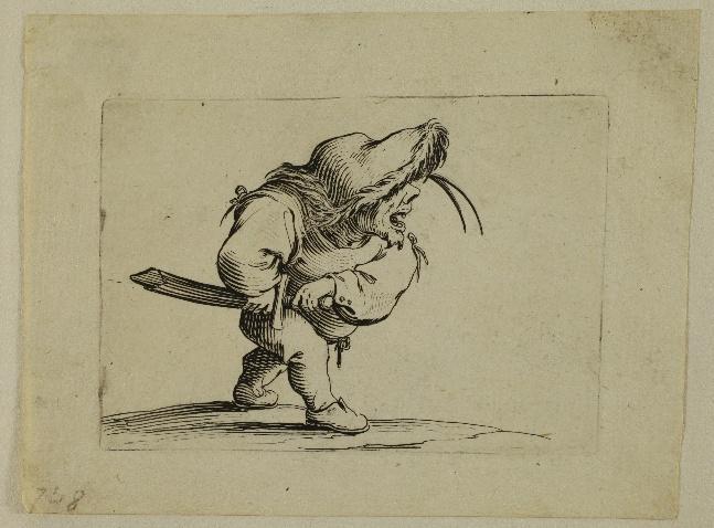
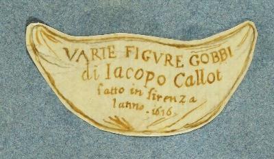
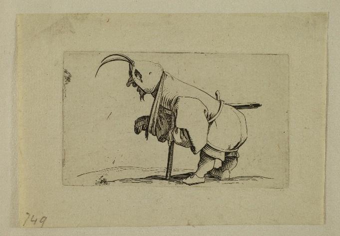
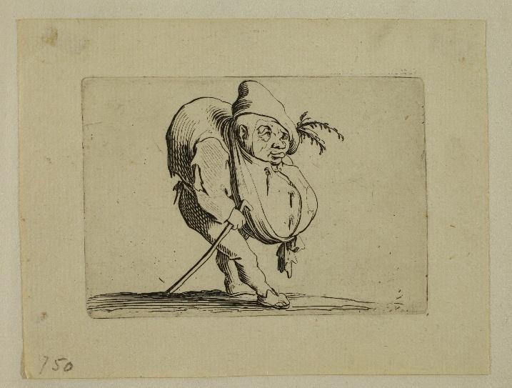
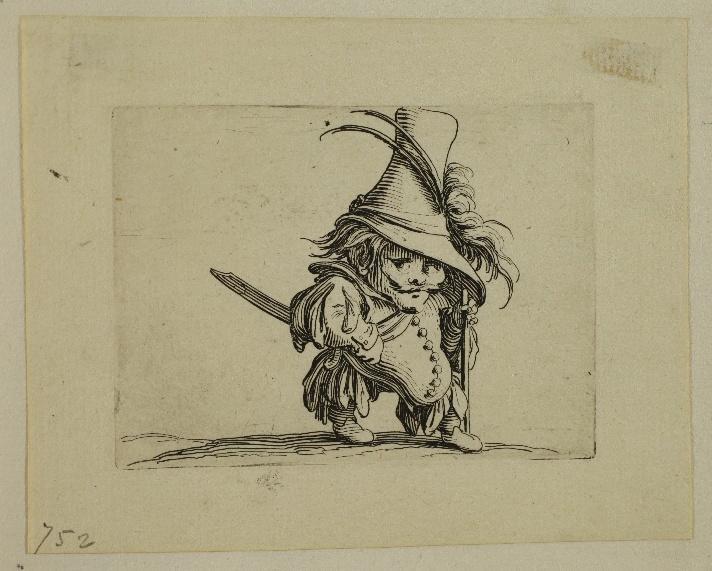
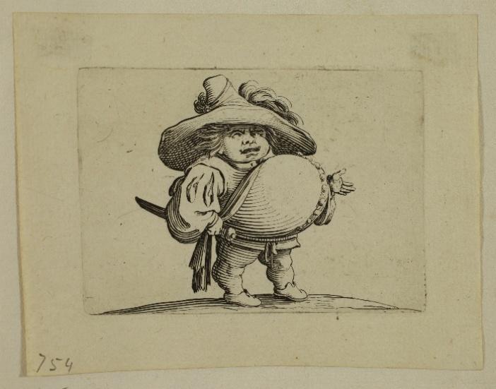
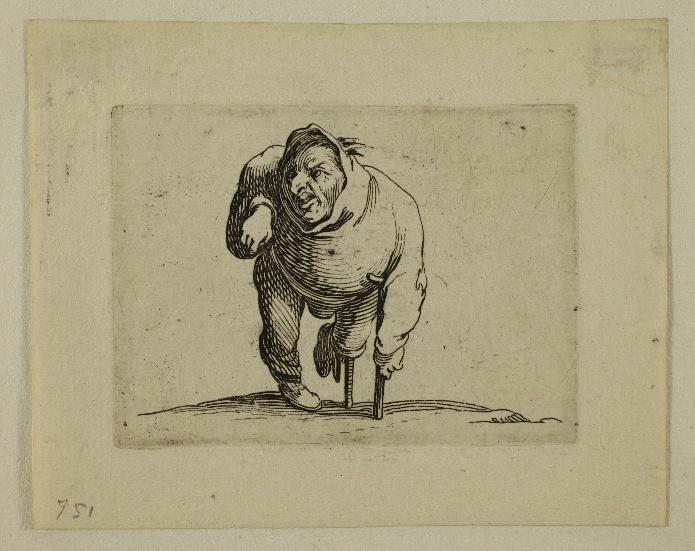
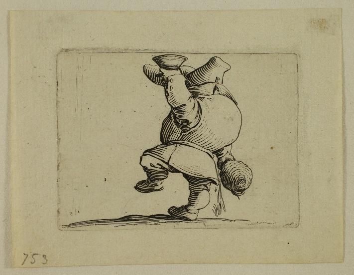
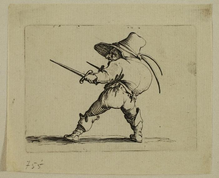
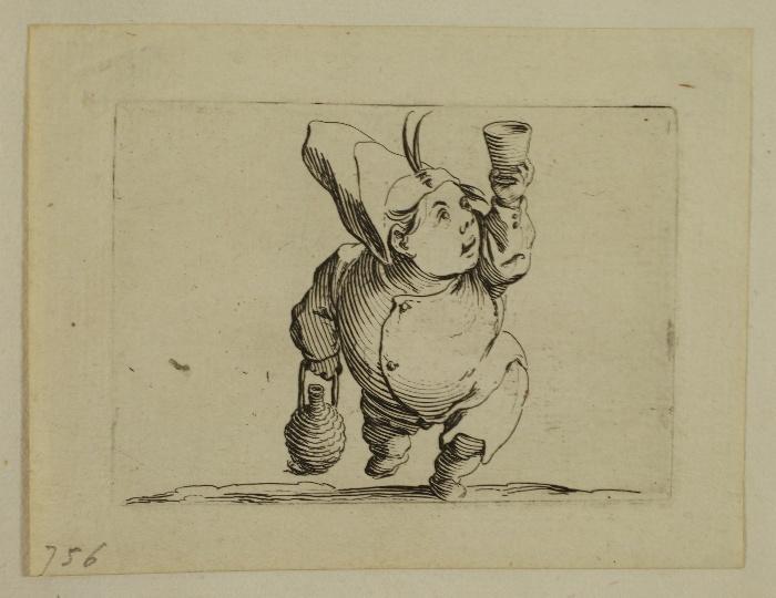
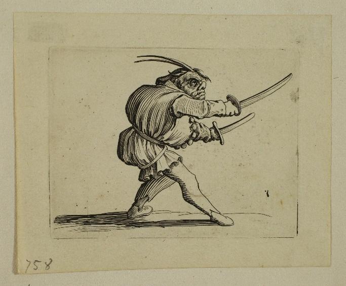
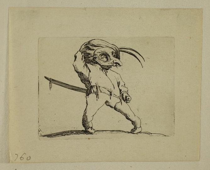
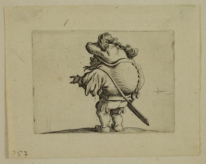
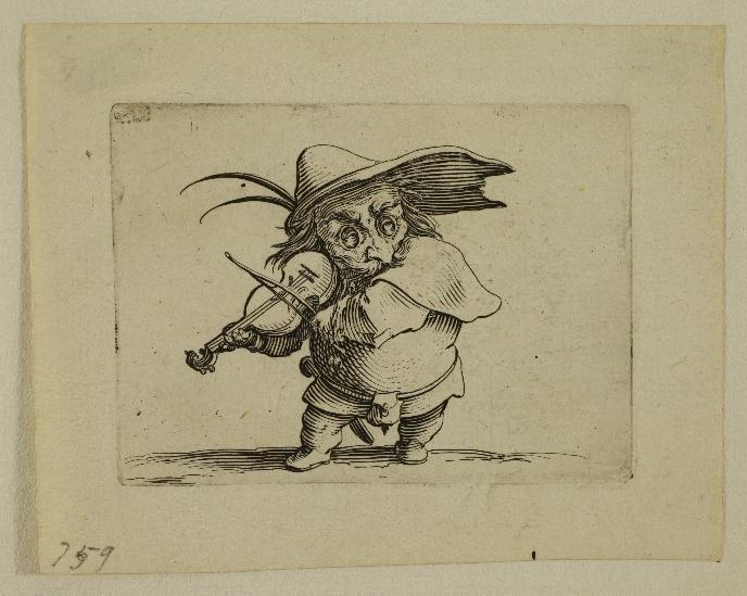
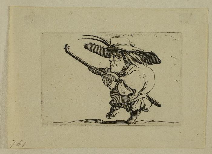
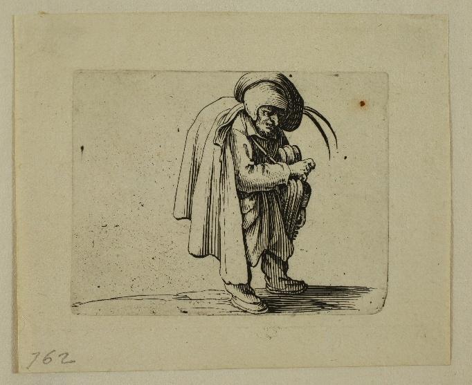
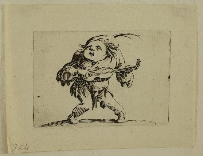
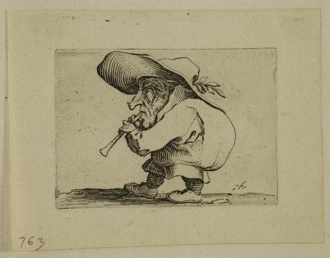
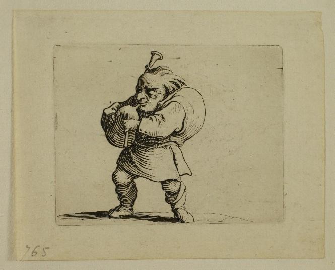
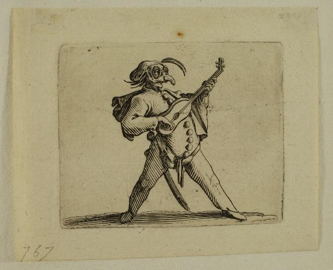
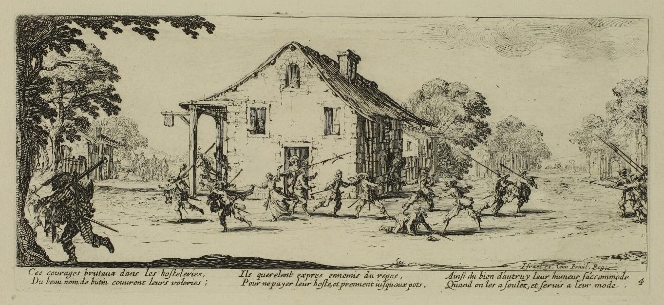
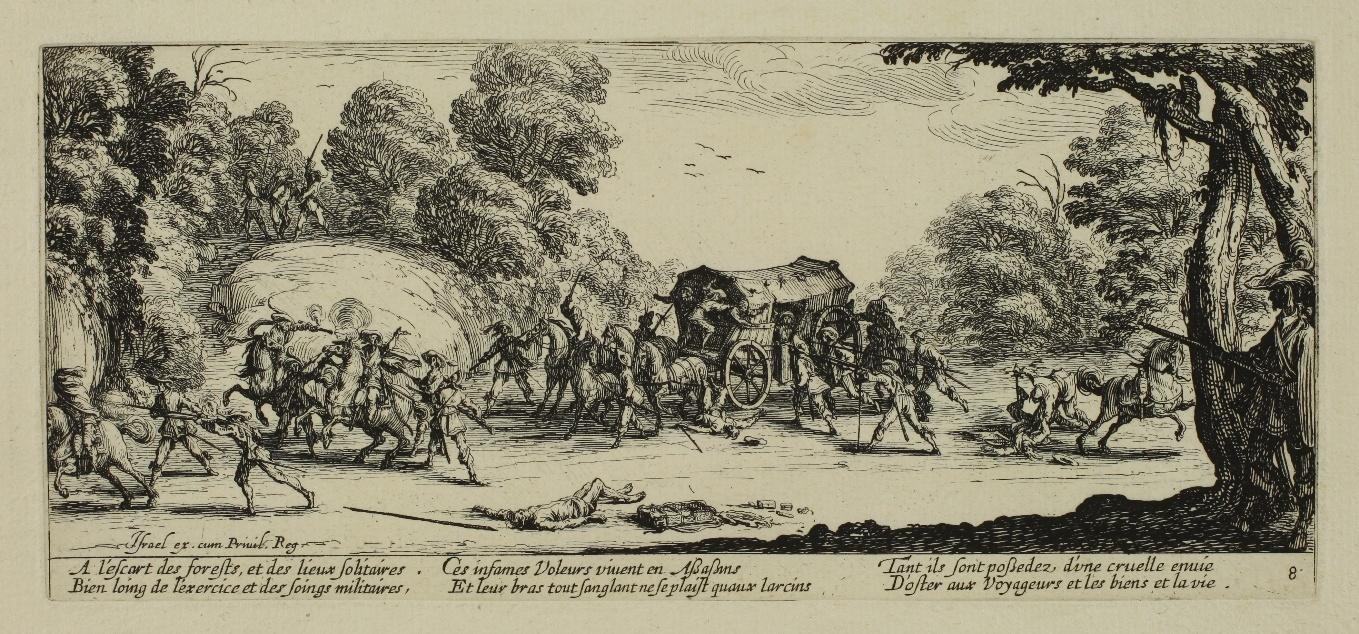
Les Gobbi - 1621-1622
Complete and homogeneous series of 21 plates including one title, first edition. Etching and engraved highlights to accentuate the shaded areas, approximately 85 x 62 mm each. Plates 279 and 407 to 426.
Frontispiece: Lieure 279, 1st state/2 before the address of Israël Silvestre; The Man Preparing to Draw His Sabre: L. 407, only state; The Cripple in the Hood: L. 408, 1st state/2 before the numbering; The Hunchback with the Cane: L. 409, 1st state/2 before numbering; The Cripple with Crutch and Wooden Leg: L. 410, 1st state/2 before numbering; The Drinker seen from the front: L. 411, 1st state/2 before numbering; The Drinker seen from the back: L. 412, 1st state/3 before the ground on the left is erased over a space of one centimetre and before the numbering; The Duelist with Two Sabres: L. 413, 1st state/2 before the numbering; The Duelist with Sword and Dagger: L. 414, 1st state/2 before numbering; The Man with a Large Belly Adorned with a Row of Buttons: L. 415, 1st state/2 before numbering; The Man with a Large Back Adorned with a Row of Buttons: L. 416, 1st state/2 before numbering; The Man with a Falling Stomach and a Very High Hat: L. 417, 1st state/2 before numbering; The Violin Player: L. 418, 1st state/2 before numbering; The Masked Man with Twisted Legs: L. 419, 1st state/2 before numbering; The Lute Player: L. 420, 1st state/2 before numbering; The Hurdy-Gurdy Player: L. 421, 1st state/2 before numbering; The Flageolet Player: L. 422, 1st state/2 before numbering; The Man Scraping a Griddle for a Violin: L. 423, 1st state/2 before numbering; The Bagpiper: L. 424, 1st state/2 before numbering; The Masked Actor Playing the Guitar: L. 425, 1st state/2 before numbering; Le Bancal playing the guitar: L. 426, 1st state/2 before numbering.
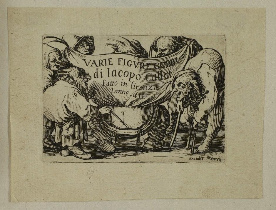


Very fine impressions printed on laid paper. All the plates are mounted with two small paper hinges on sheets of watermarked laid paper (crown, letters C and D, bell; small star) bound in a notebook with blue laid paper cover.
The cover has a title piece that reproduces the cartouche of the title plate of the series, with the handwritten inscription: VARIE FIGURE GOBBI di Iacopo Callot fatto in firenza l anno 1616.

Very good general condition. Margins of 1 to 2 cm on all plates. Tiny stains or traces of glue in the corners of the margins.
The first plate, after the title plate, L’Homme s’apprêtant à tirer son sabre, is listed by Lieure as rare (R.R.). He quotes Meaume, according to whom the plate ‘was lost a few years after it was etched and was never replaced by the artist.’
According to Lieure, the title plate, which bears the date 1616 and the words fatto in firenza, was etched in Italy, while the other plates were etched later, in Nancy. He sees this title plate as ‘a true Rabelaisian piece’.
A colourful series, one of Callot’s best known.


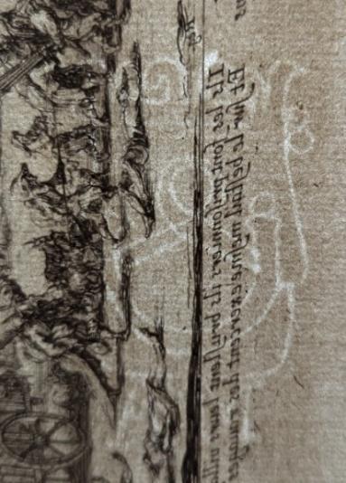
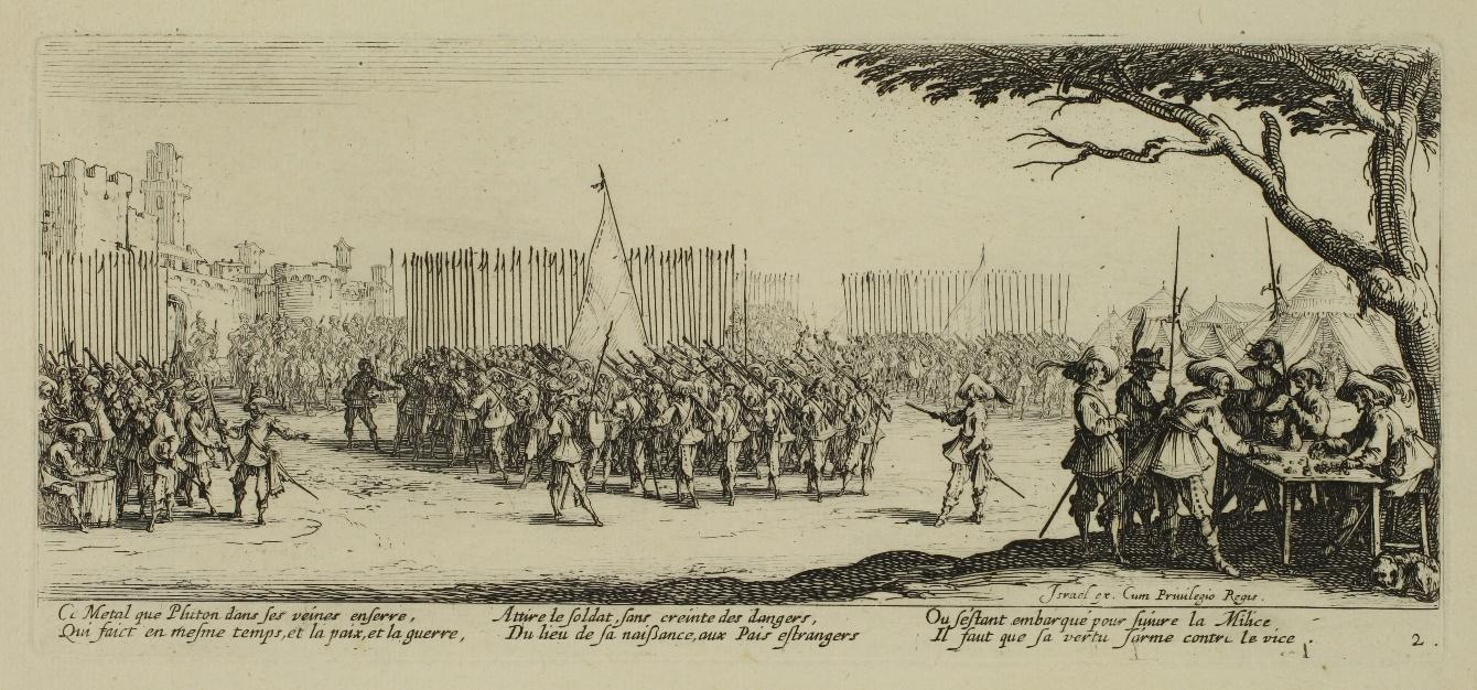
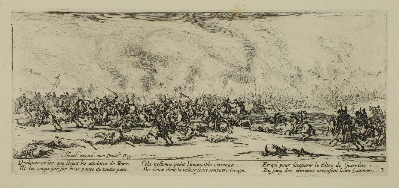
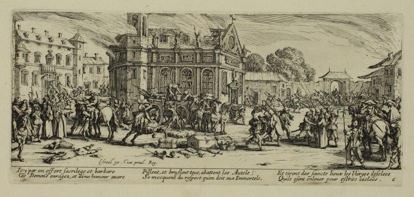
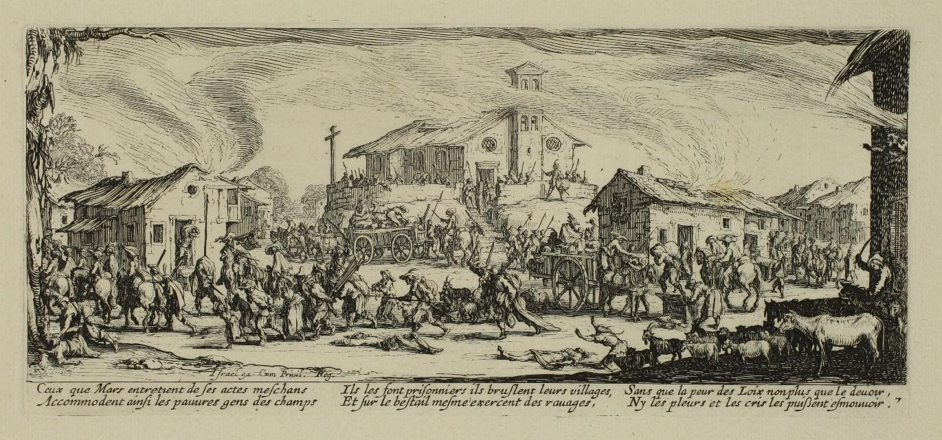
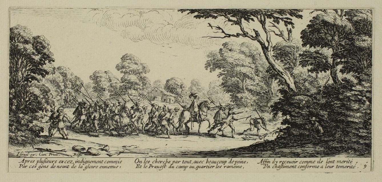
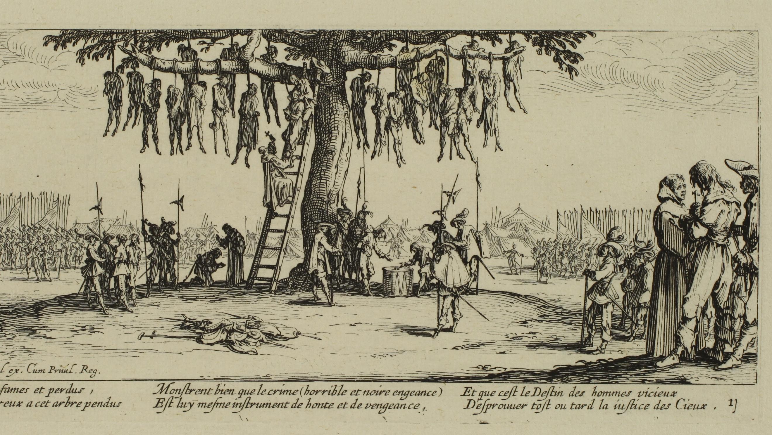
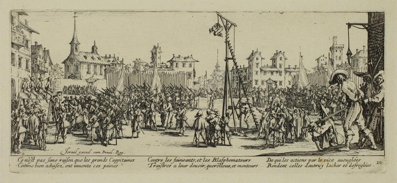
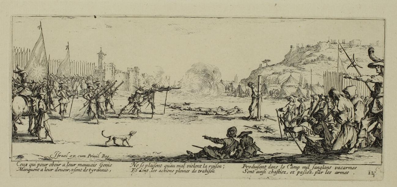
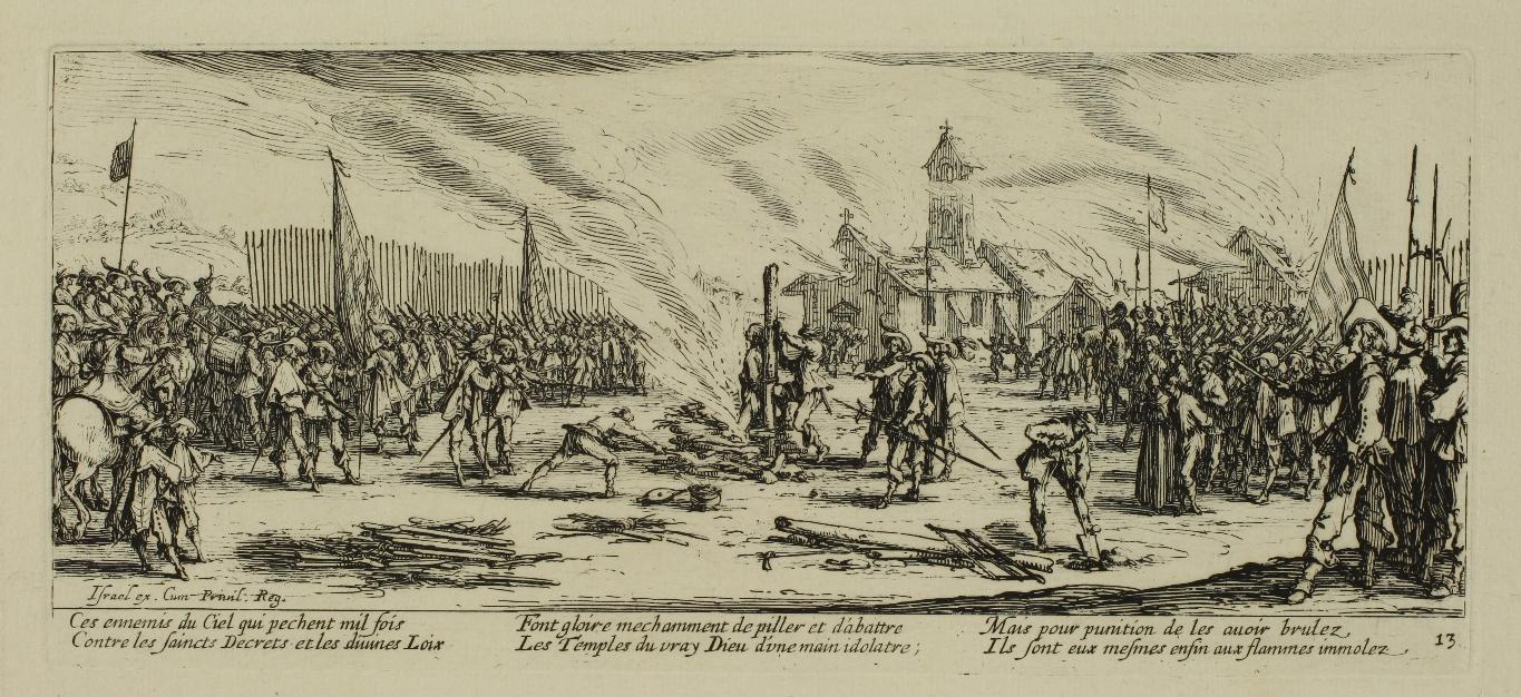
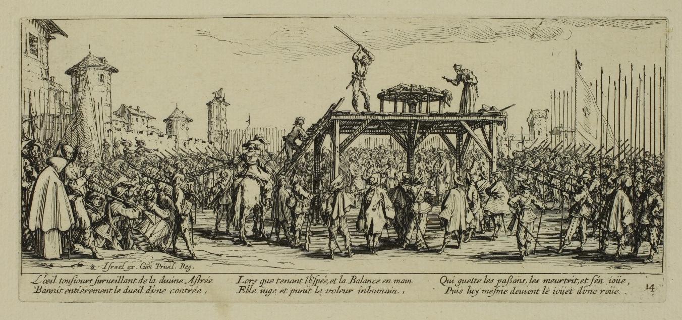
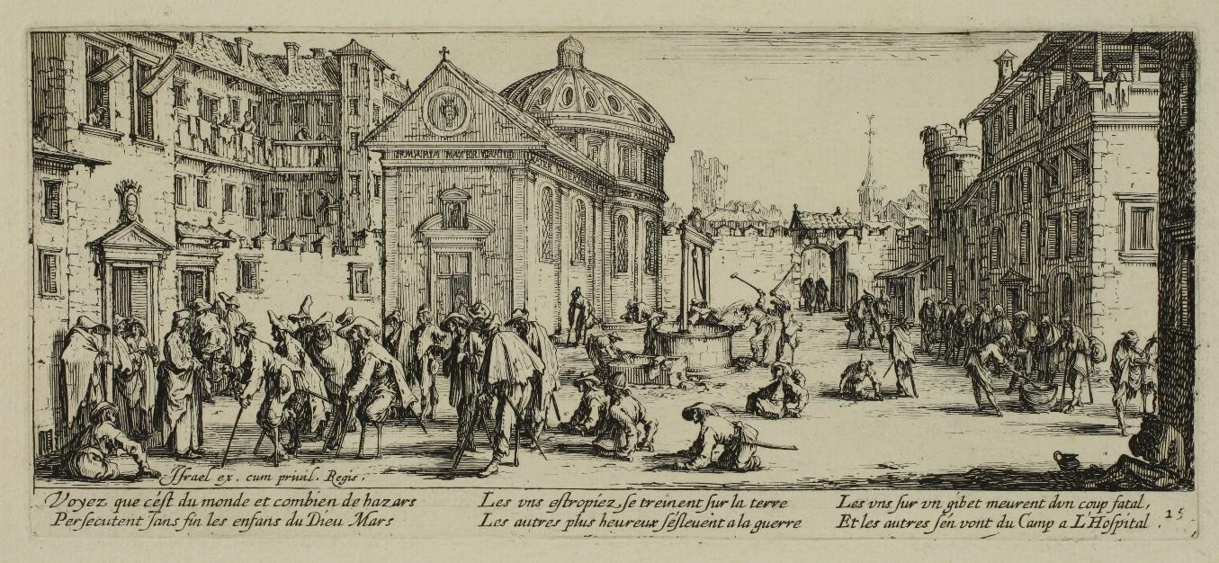
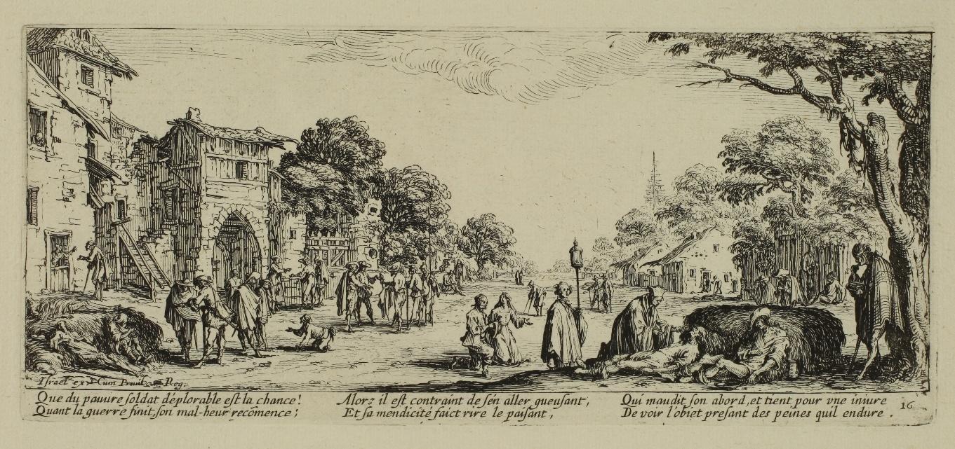
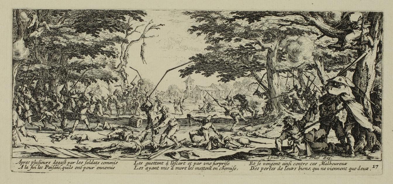
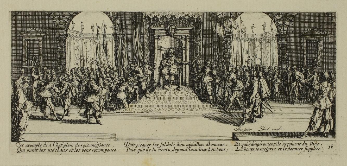
Les Grandes Misères de la Guerre – 1633
Etching, 81 to 90 mm x 185 to 192 mm. Lieure 1339 to 1356.
Complete and homogeneous series of 18 plates, in an edition with the verses, numbers and address of Israël Henriet, before the latter was replaced by the words Callot inv. and fec. The series is made up, as is usual for early uniform sets, of the following states: Lieure 1339 (frontispiece) in 3rd state/3, L. 1340 to 1355 in 2nd state/3, L. 1356 in 3rd state/4. Impressions of the first state, without the verses attributed to the Abbé de Marolles, are extremely rare (RRRR according to Lieure).
Very fine impressions printed on laid watermarked paper (Huchet and Lys in a crowned shield), the backgrounds clearly visible, particularly in La Bataille (L. 1341). Excellent general condition. Large uniform margins. Rare tiny light foxmarks on some plates, tiny loss at the tip of a corner on two sheets.

The Grandes Misères de la guerre series is Jacques Callot’s most famous work and one of the masterpieces of the history of engraving, but its genesis and interpretation have sparked many debates. “One of the most famous print series of early modern Europe is also one of the most enigmatic.” (James Clifton,The Plains of Mars, p. 110). This series of 18 plates is often considered to be the culmination of a project whose first attempt would have been the series of eleven smaller plates of the Petites Misères (The Small Miseries of War), engraved perhaps in 1632, but which remained unfinished and was only published after Callot’s death.
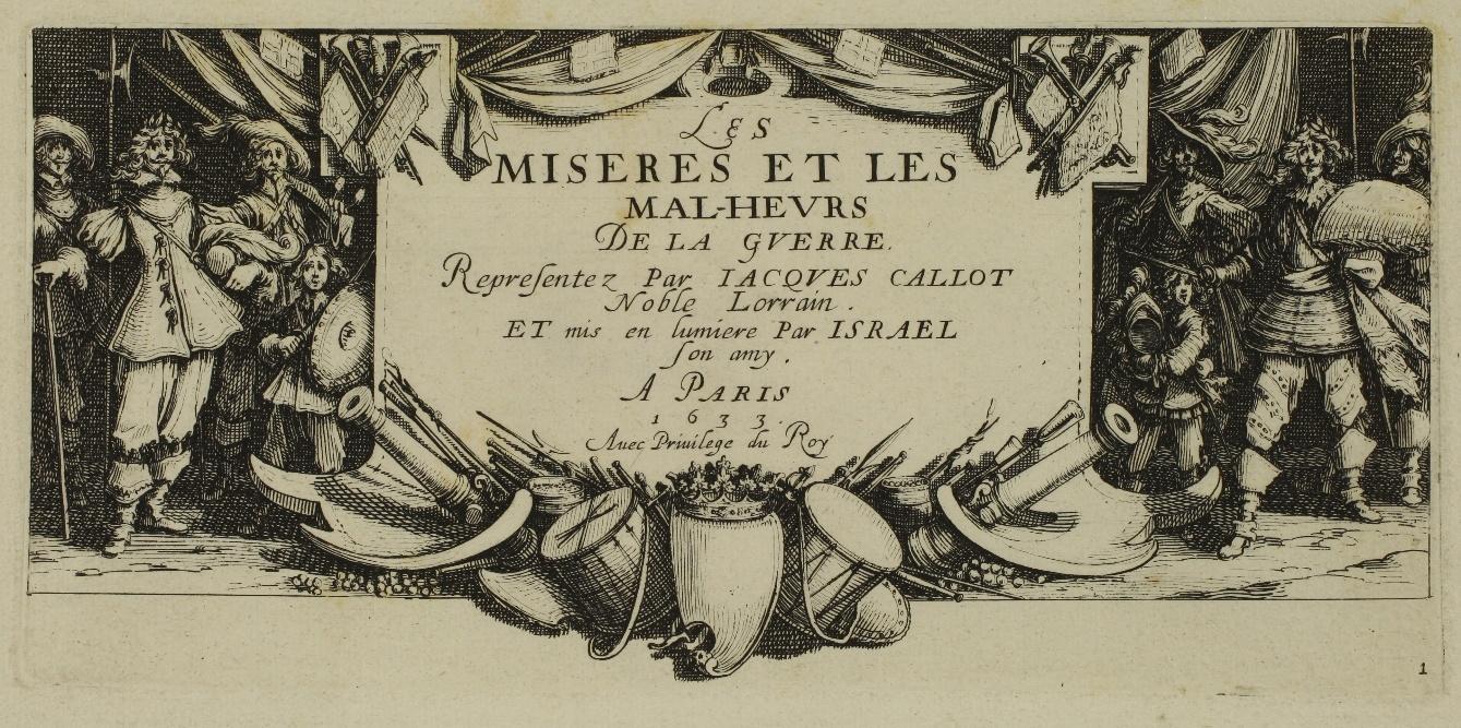


There is very little information on the origins of the second series of the Misères. For instance, it is not known whether a patron commissioned it. The title on the frontispiece, Les MISERES ET LES MAL-HEURS DE LA GUERRE, is confusing: it seems to disapprove of war, whereas careful scrutiny of the plates, their texts and their sequence goes against such simplistic reading. Far from criticizing wars or casting doubt on their legitimacy, the Misères actually deal with soldiers’ discipline in wartime: “Callot’s œuvre is calculated to demonstrate how much the discipline of soldiers and respect for occupied or conquered territories should be the constant concern of those whose mission it is to command armies.”
(Marie Richard, pp. 5-6, our translation). Regarding this, Paulette Choné noted that art historian Filippo Baldinucci (1625-1697)
“who describes each plate praising Callot’s technical mastery and creativity, reminds us that Les Grandes Misères first came to be known under the title La Vita del Soldato. The title of the Misères series in the inventory of the engraver’s estate after his death is, in fact, La Vie des soldats [The Life of Soldiers].” (P. Choné, p. 397, our translation).
The sequence of plates in the series casts light on Callot’s approach. “The engraved scenes are ordered according to rigorous logic which is required in any educational purpose.” (M. Richard, p. 72, our translation). After the title plate, the series opens with the soldier enlisting, and this first maxim: Il faut que sa vertu s’arme contre le vice [He needs to arm his virtue against vice]. The next plate presents a sample of battles during which l’invincible courage des soldats peut se manifester [soldiers have the opportunity to reveal their invincible courage]. Plates 4 to 8 however denounce the cruel abuses perpetrated by soldiers in wartime, as enemies of civil peace, at the expense of certain categories who are in theory protected by law: merchants and travellers, women and children, the clergy, the poor.” (P. Choné, p. 404, our translation). The Misères do not stop there: plate 9 depicts rogue soldiers captured by the regular army and marched back to camp. Plates 10 to 14 answer plates 4 to 8, which described the soldiers’ abuses, by representing the soldiers’ punishments for these excesses: tortures like strappado, hanging, harquebus shooting, burning at the stake, breaking on the wheel.

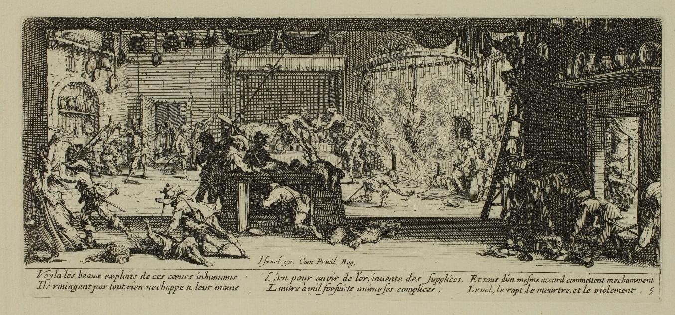


It is to be noted though that the Misères do not focus only on rogue soldiers and their punishments: the next three plates depict the various fortunes of soldiers both good and bad. Some end their days in a hospice, on the side of the road, or even perish under the blows of peasants getting their revenge. Finally, “the conclusion glorifies the severity and the appreciation of a just and wise commander” (P. Choné p. 409 (our translation)) who punit les méchans et les bons recompance [punishes the evil and rewards the good]. That bad soldiers are punished and good soldiers are rewarded seems to be “the most obvious lesson of the Misères”.
Paulette Choné places this work by Callot in the context of the debate that started up again in 1618 as a result of the Thirty Years War: “The Misères closely adhere to contemporary concerns about how armies are recruited, disciplined and punished.” (p. 398, our translation). Callot’s series could thus be seen as a contribution to “the legal foundation of modern States.” (p. 400, our translation).
References: Jules Lieure: Jacques Callot : Catalogue de L’Œuvre Gravé, vol. 2, edited by the Gazette des Beaux-Arts, 1927; Maxime Préaud, Marianne Grivel, Pierre Casselle, and Corinne Le Bitouzé: Dictionnaire des éditeurs d’estampes à Paris sous l’Ancien Régime, 1987; Paulette Choné: « Les misères de la guerre, ou « la vie du soldat » : la force et le droit », in Jacques Callot, exhibition catalog, Musée historique lorrain, Nancy, 13 June-14 September 1992; Marie Richard: Jacques Callot, Une œuvre en son temps, Les Misères et les Mal-heurs de la guerre, 1633, Nantes, 1992; James Clifton and Leslie M. Scatone: The plains of Mars: European war prints, 1500-1825, from the collection of the Sarah Campbell Blaffer Foundation, 2009.


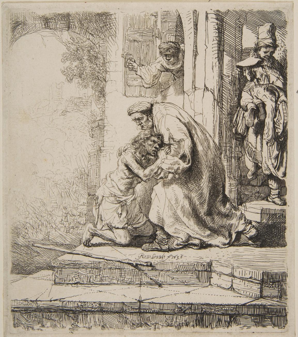
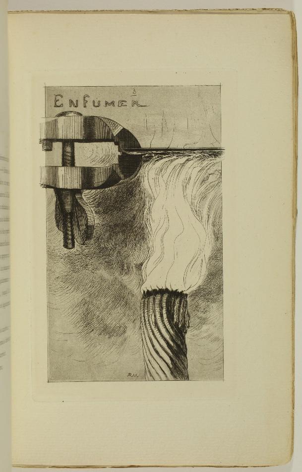
Etching, 158 x 139 mm. Bartsch 91; BB 36-D; New Hollstein 159, 1st state (of 3).
Impression of the 1st state (of 3) before the numerous retouching in the shadows and the addition of horizontal lines on the left part of the lowest step.
Very fine impression printed on laid paper, the shadows, particularly those on and to the right of the son’s left eye, are still very dark. In very good condition. Tiny foxmark on the left leg of the figure on the right, very slight yellowing of the paper. Good margins all around the platemark (sheet: 197 x 174 mm).
The episode depicted is taken from the Gospel of Saint Luke, chapter XV, verses 20-22: ‘20 So he went off and came to his father. But while he was still a long way off, his father saw him and was filled with compassion; he ran to his son, threw his arms around his neck and kissed him. 21 Then his son said to him: My father, I have sinned against heaven and against you; and I am no longer worthy to be called your son. 22 Then the father said to his servants: Bring quickly the best robe and put it on him; and put a ring on his finger, and shoes on his feet.’

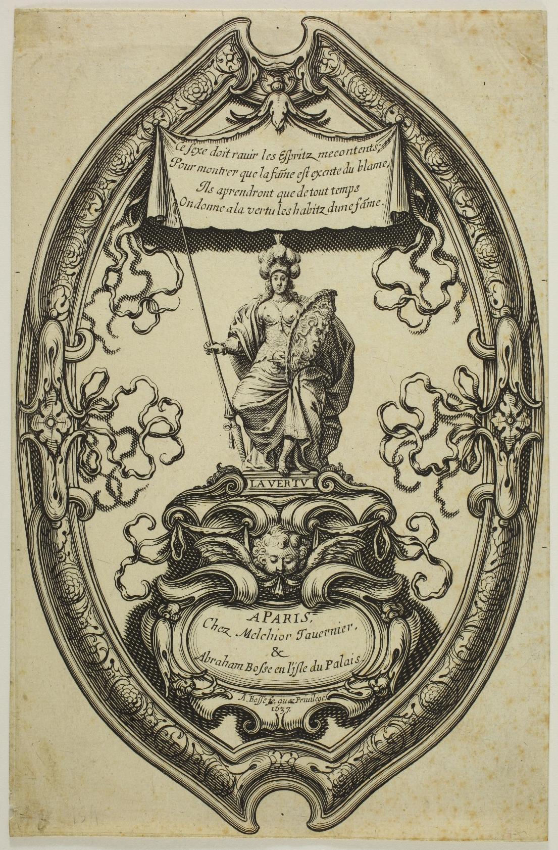
14. Abraham BOSSE (1602/1604 - 1676)
Minerve or La Vertu – 1637
Etching, 205 x 133 mm. Blum 159; Lothe 71.
Very fine impression printed on watermarked laid paper (cardinal’ s coat of arms), trimmed on the platemark. Generally in good condition, with very slight foxmarks, a tiny loss of paper in the lower left margin and a small crease.
Rare print, said to have been designed as a fan or screen.

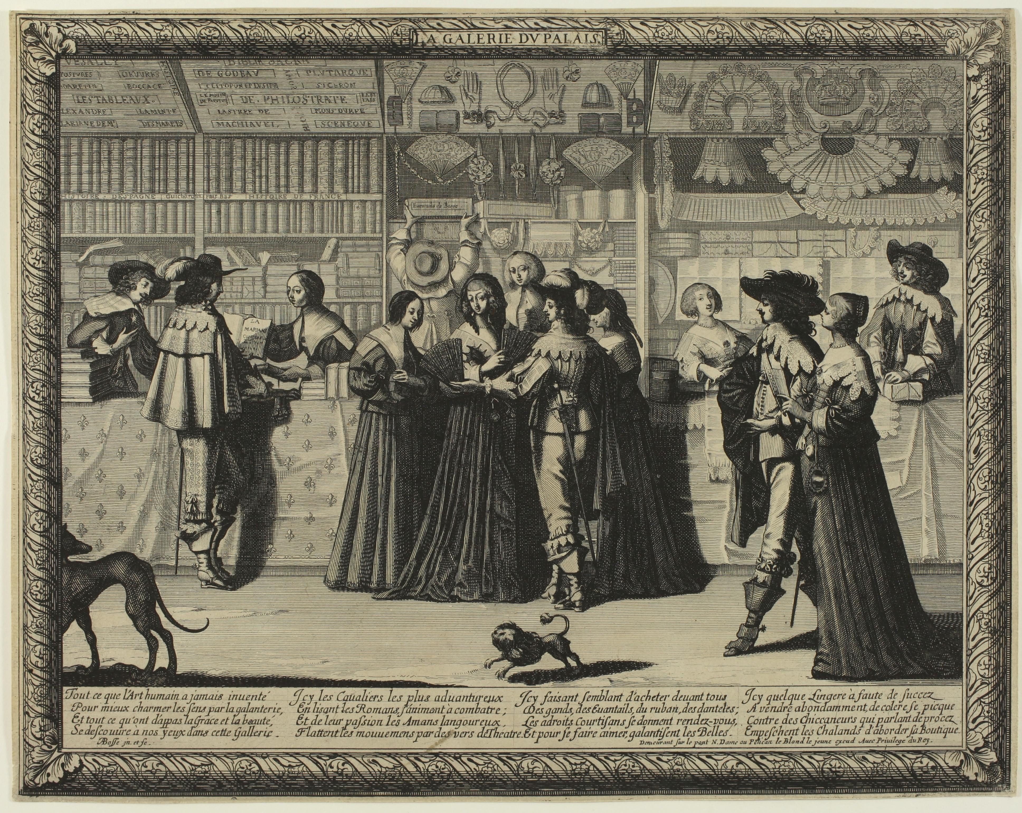
15. Abraham BOSSE
(1602/1644 - 1676)
La Galerie du Palais - c. 1638
[The Shop at the Palais de Justice, Paris]
Etching, 255 x 325 mm. Blum 1065, 2nd state (of 2), Préaud 158, 2nd state (of 2), Lothe 271, 1st state (of 2).
Impression with the words Demeurant sur le pont N. Dame au Pelican etched before the name of le Blond le jeune. According to Blum and Préaud, in particular, this address was added in the 2nd state.
More recently, José Lothe reversed the two states in his catalogue raisonné: ‘2nd state: Leblond’s address has been removed, leaving only his name and a reference to his privilege’. Le Blond the younger is Roland Leblond, born in 1596 and died around 1651/1656.
Very fine impression printed on laid papier, trimmed to the platemark. In very fine condition, a tiny stain in the letter.
‘Gentlemen and ladies stroll past three shops in the galerie du libraire du Palais in Paris. The first, on the left, is that of Augustin Courbé; with his wife, he presents a gentleman with Tristan l’Hermite’s play, the title of which reads: LA/MARIANE/COMEDIE; on the shelves are books arranged by format. Two panels above show the titles available: VESALLY. POSTURES DARETIN. WORKS BY GODEAU. BOCCACE. [...] The adjoining shop is that of a fashion merchant with masks, gloves, ribbons, fans and muffs. A gentleman and three ladies are looking at a fan, and the shopkeeper takes out a box with the words Eventails de Bosse written on it. The third shop, past which a gentleman and his lady pass, sells all sorts of lace and is run by the merchant and his wife.’ (Lothe p. 267).

Maxime Préaud points out that Abraham Bosse makes discreet allusions to his works on several occasions. In the reference to Eventails de Bosse, of course, which recalls Bosse’s publication of three fans in 1637 and 1638, but also in some of the titles of books for which he provided illustrations: La Mariane by Tristan l’Hermite, which the bookseller offered to her customer, was published in its original edition by Augustin Courbé in 1637 with a frontispiece engraved by Bosse.
References: Maxime Préaud, Sophie Join-Lambert (dir.): Abraham Bosse, savant graveur, Paris, 2004; José Lothe: L’œuvre gravé d’Abraham Bosse: graveur parisien du XVIIe siècle catalogue général, 2008.
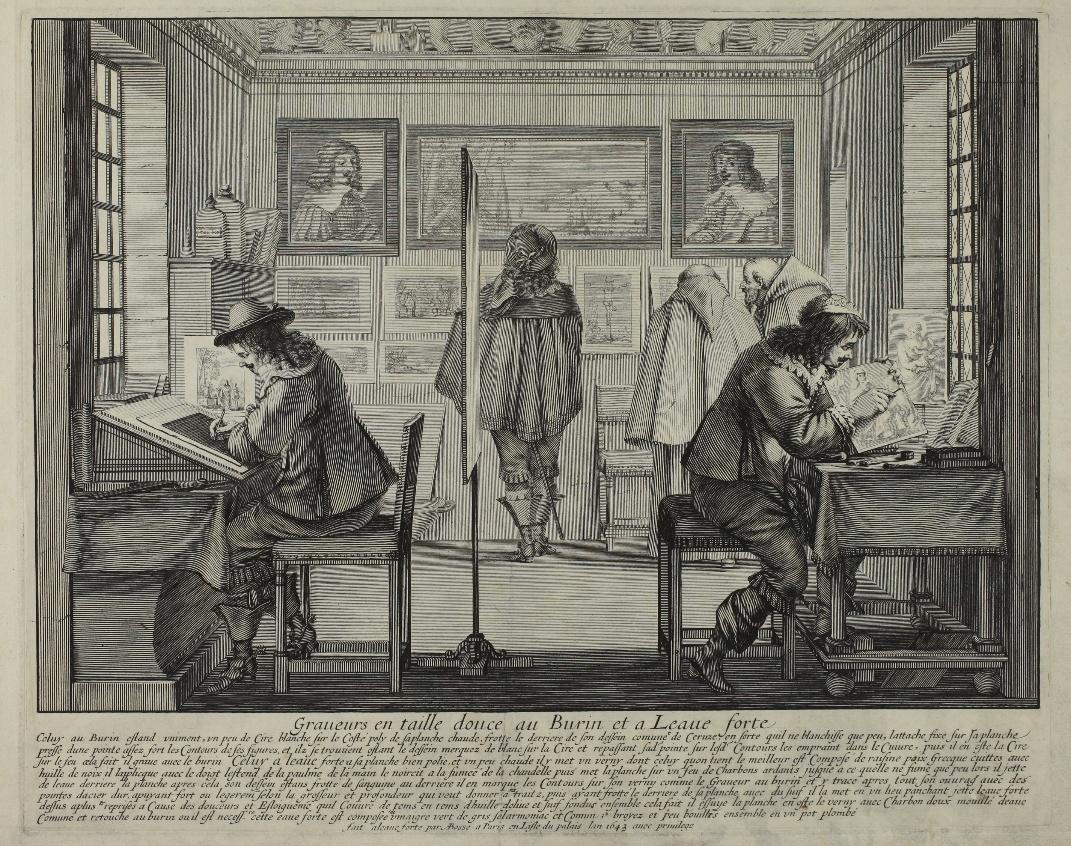
16. Abraham BOSSE (1602/1604 - 1676)
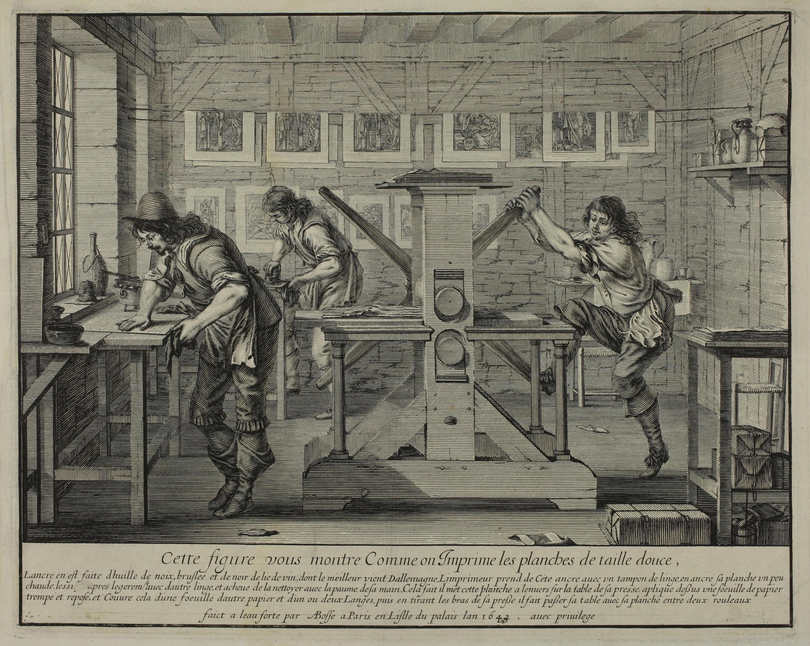
Les Imprimeurs en taille-douce – 1642
[The Intaglio printmakers]
Etching, 325 x 260 mm. Préaud 204; Blum 205; Lothe 254.
Very fine impression of the only state, printed on laid watermarked paper (watermark: arms with fleurs-de-lys).
Very good condition. Fine, almost invisible printing crease. Slight spotting on verso along upper and lower edges of leaf. Small margins around the platemark (sheet: 395 x 303 mm).
The Intaglio Printmakers is one of the most famous prints by Abraham Bosse. He was then working on his important Traité des manières de graver en taille-douce sur l’airain par le moyen des eaux-fortes et des vernis durs et mols. Ensemble de la façon d’en imprimer les planches et d’ en construire les presses [A Treatise on the methods of intaglio printmaking, to etch images on copper by means of acids as well as hard and soft grounds, together with an explanation of the manner of printing such plates and of building presses], for which he obtained a privilege in 1642 and which he published in Paris in 1645. It was the first technical manual of intaglio printmaking. It was a huge success and was translated and widely disseminated in the following years in Germany, in the Netherlands and in England; it was reprinted several times, with additions by Sebastien Leclerc and then by Charles-Nicolas Cochin in the XVIIIth century.
The Intaglio Printmakers, or more accurately Cette figure [qui] vous montre Comme on Imprime les planches de taille douce [This Image [which] Shows How Intaglio Plates are Printed] and that of Graveurs en taille douce au Burin et à Leaue forte [The Engraver and the Etcher], etched one year later, stem from the same pedagogical objective. The letter reads:
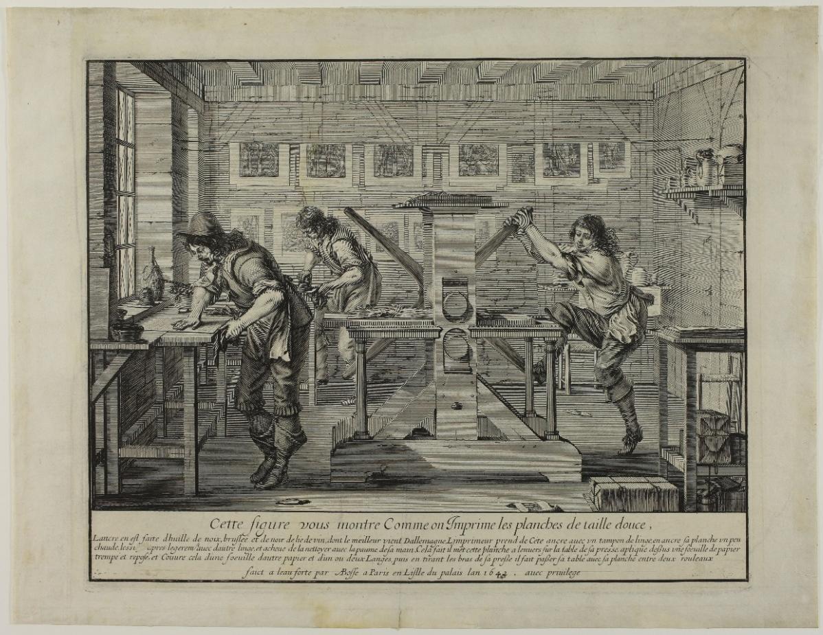

"This figure shows you how intaglio plates are printed / The ink is made of burnt walnut oil and wine black, of which the best comes from Germany. The printer takes some of this ink with a cloth pad, inks his plate while it is somewhat hot [see at the bottom left], wipes it lightly with other cloth(s), and finishes cleaning it with the palm of his hand [see left]. Once this is done, he puts this plate upside down on the table of his press, applies on it a sheet of paper soaked and then let rest for a while, and covers it with another sheet of paper and one or two pieces of cloth, then pulling the arms of his press, he pushes the table with the plate between two rollers." (Préaud, p. 226, translated by us)
References: Maxime Préaud, Sophie Join-Lambert (dir.), Abraham Bosse, savant graveur, Paris, 2004. José Lothe, L’œuvre gravé d’Abraham Bosse, Paris, 2008.
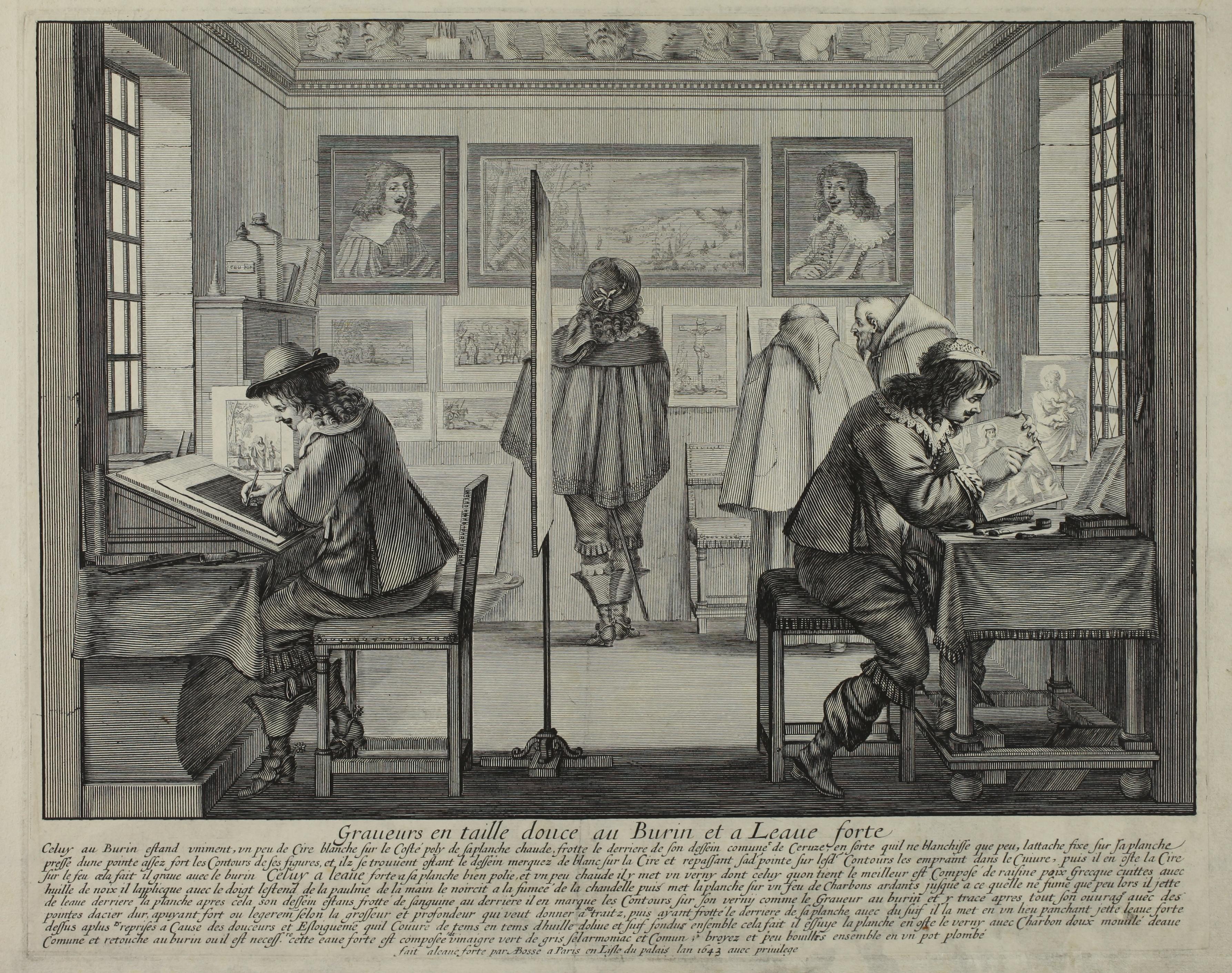
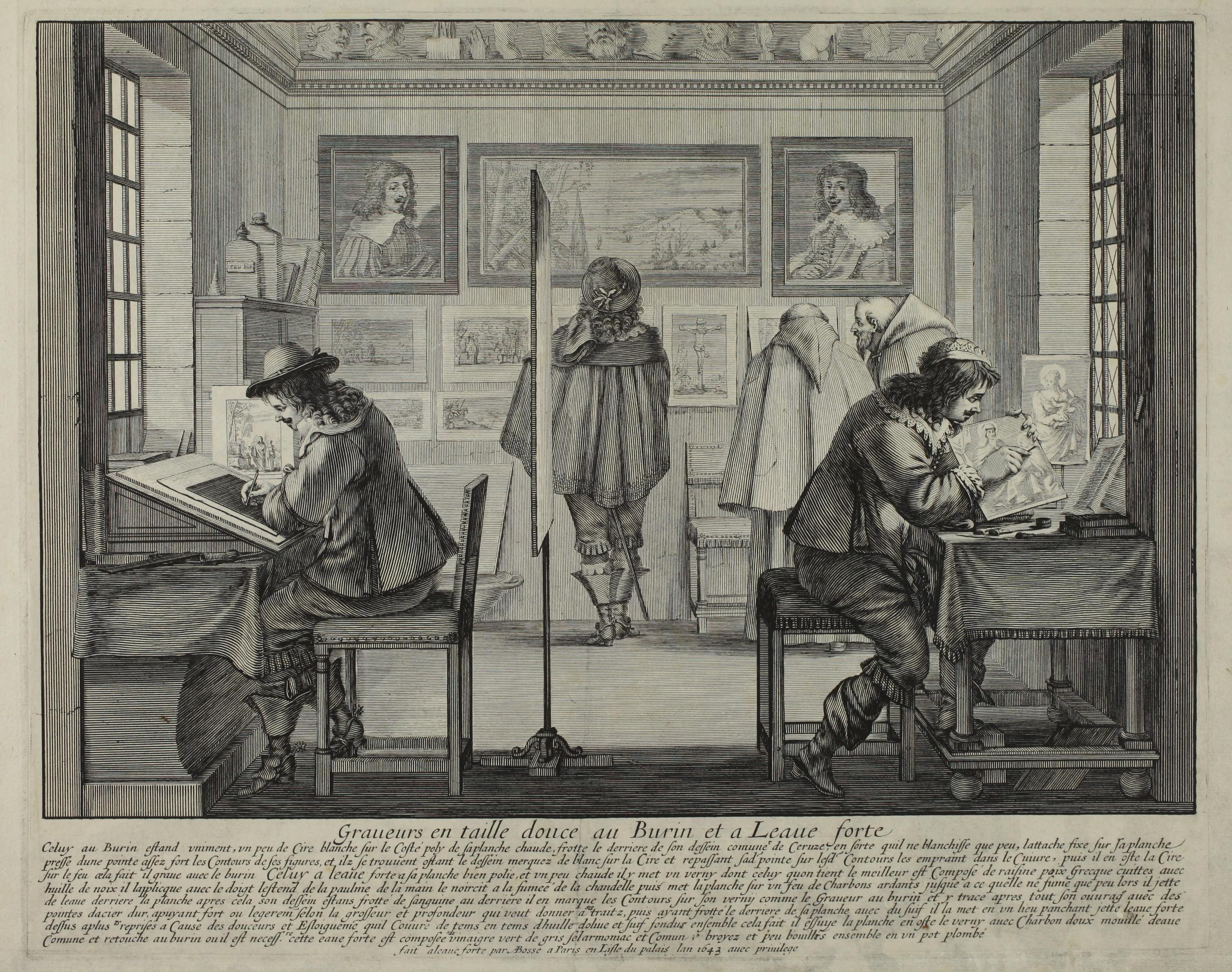
17. Abraham BOSSE
(1602/1604 - 1676)
Graveurs en taille douce au Burin et à l’Eau-forte - 1643
[The Engraver and the Etcher]
Etching with burin, 328 x 260 mm. Blum 356, Préaud 203, Lothe 255.
Very fine impression of the only state, printed on laid watermarked paper (watermark: arms with fleurs-de-lys).
In very fine condition. Very slight traces of soiling in the lower right-hand corner, very faint diagonal printing crease. Small margins around the platemark (sheet: 375 x 285 mm).
In 1643, Abraham Bosse wrote his seminal work, Traité des manières de graver en taille-douce sur l’airain par le moyen des eaux-fortes et des vernis durs et mols. Ensemble de la façon d’en imprimer les planches et d’en construire les presses [Treatise on the art of engraving and etching on bronze, by means of acid and soft and hard ground. Together with the ways of obtaining impressions of those plates and of building presses], for which he obtained a privilege in 1642, and which he published in Paris in 1645.
This was the first ever technical textbook on engraving. It was very successful and was translated and widely distributed in the following years in Germany, the Netherlands and in England; it was reprinted several times, with additions by Sébastien Leclerc and then Charles-Nicolas Cochin in the XVIIIth century.
The plate representing the Graveurs en taille douce au Burin et à Leaue forte [The Engraver and the Etcher], shows the same educational concern as the plate “showing how to print etchings” (qui montre comme on imprime les planches de taille douce), etched by Abraham Bosse the previous year. The workshop and the work of the engraver and the etcher are represented in exacting detail; the same level of care went into an exceptionally long and detailed caption. Maxime Préaud notes that the text goes beyond a simple description of the picture and is a forerunner of the future Treatise. We translate here his modernised version of the caption:

‘The engraver [on the right] spreads an even layer of white wax on the polished side of his hot plate; he rubs the back of his drawing, usually with white lead, so that it will only whiten a little, attaches it to his plate, and then, with the sharp tip of his tool, he follows the outlines of his subject, and those are marked in white on the wax once the drawing is removed; pressing again with the tip and following those same outlines, he scratches them into the copperplate; he then removes the wax, melting it near the fire; once this is done, he engraves the picture with the burin. The etcher [on the left] has his plate well polished and slightly hot; he applies a ground, of which the best, they say, is made of resin and Greek pitch, cooked with walnut oil; he applies it with his finger, spreads it with the palm of his hand, blackens it with soot from a candle, then places the plate on a fire of hot coals until it is only smoking a little; then he splashes the back of the plate with water [to cool it]. After that, his drawing being rubbed with sanguine on the back, he marks the outline on the ground as did the engraver, and then traces his whole work with hard steel tips, pressing hard or lightly according to the thickness and depth he desires to give his strokes, then, having rubbed the back of his plate with tallow, he places it on a leaning surface [like an easel for example], splashes it with acid several times, because of the light tones and distances, which he time and time again covers with olive oil melted together with tallow. Once this has been done, he wipes the plate, removes the ground with soft coal humidified with common water, and where necessary, touches up the design with a burin. The acid is made of vinegar, verdigris, ammonium chloride and common salt, ground and boiled together a little in a leaden pot.’
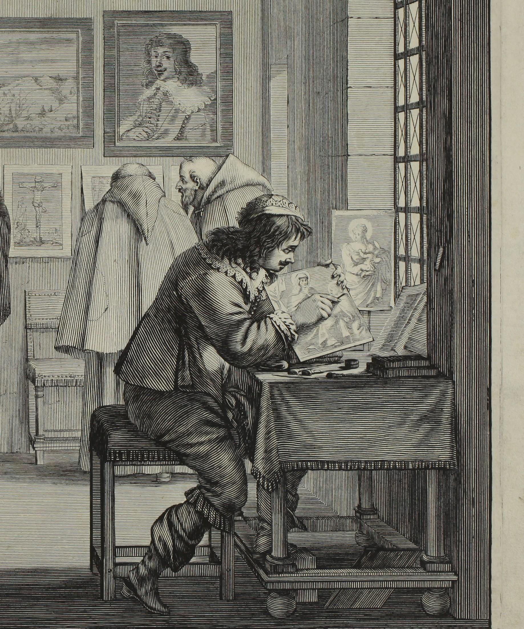
For his print, Abraham Bosse chose etching, a technique which he constantly refined in order to get strokes as neat and clean as those made with a burin. He succeeded perfectly in this case. As noted by Maxime Préaud, the etcher “in a quest for accuracy, went as far as placing a few burin strokes next to the tip of the tool” held by the engraver, but the rest of the plate is entirely done in etching. Etching is the main subject matter of the Traité des manières de graver en taille douce; in the Treatise, Abraham Bosse only devoted two chapters to the technique of engraving. The book contains sixteen illustrations, summarily etched. The plate representing the Printmakers, on the other hand, is similar in its dimensions and its composition to the large genre scenes that made the artist famous in his lifetime. The composition of the Printmakers, as in the plates for the series of the Five Senses or the Four Ages of Man, reminds us of a stage, with the printmakers at the front, while the background is marked by the wall of the workshop, on which are displayed modern and religious prints, which a gentleman and two Capuchin monks are perusing.
Neither a simple genre scene, nor purely an illustration, Printmakers is difficult to categorise. However, along with The Printers, it represents the best example of Abraham Bosse’s art, and of his major contribution to the evolution of the technique of etching in the XVIIth century.
References: Maxime Préaud, Sophie Join-Lambert (dir.), Abraham Bosse, savant graveur, Paris, 2004. José Lothe, L’œuvre gravé d’Abraham Bosse, Paris, 2008.
1700)
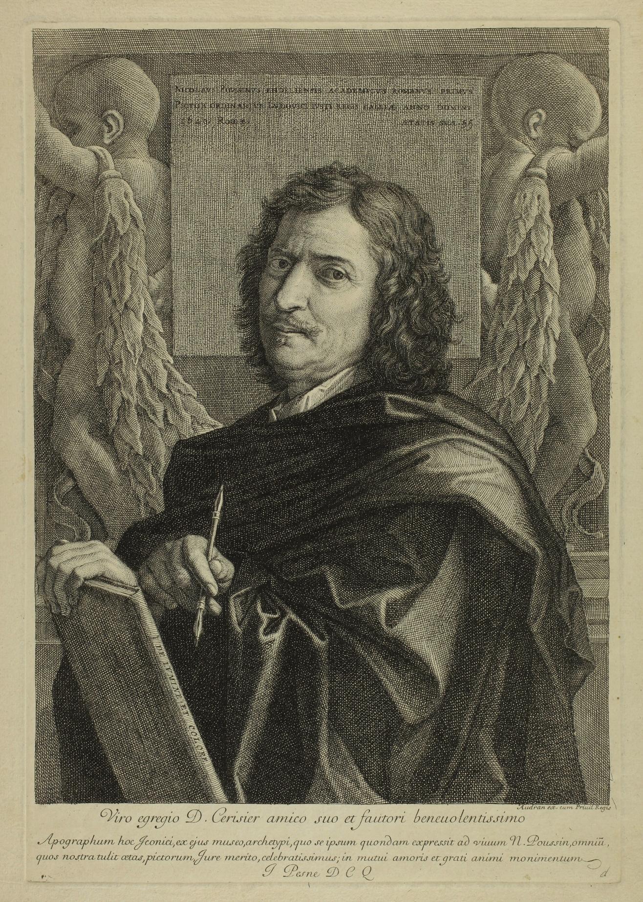
Self-portrait of Nicolas Poussin, known as Self-portrait PointelCerisier - 1659
Etching and engraving, 352 x 245 mm. Robert-Dumesnil 6, 2nd state (of 2); Le Blanc 96.
Impression of the 2nd state (of 2) with the address of Gérard Audran (1640 - 1703). In very good condition, good margins.
The name of the Self-portrait Pointel-Cerisier comes from that of a friend of Poussin, Jean Pointel, banker, silk merchant, and his associate, Jacques Serisier (or Cerisier). Between 1649 and 1650, Poussin produced his only painted two self-portraits, one of which he intended for his friend Paul Fréart de Chantelou, and the other for Jean Pointel. The first self-portrait is kept at the Louvre Museum (inv. 7302), the second at the Gemäldegalerie, Berlin, Staatliche Museen (Ident. Nr. 1488). Both self-portraits were etched by Jean Pesne.
.

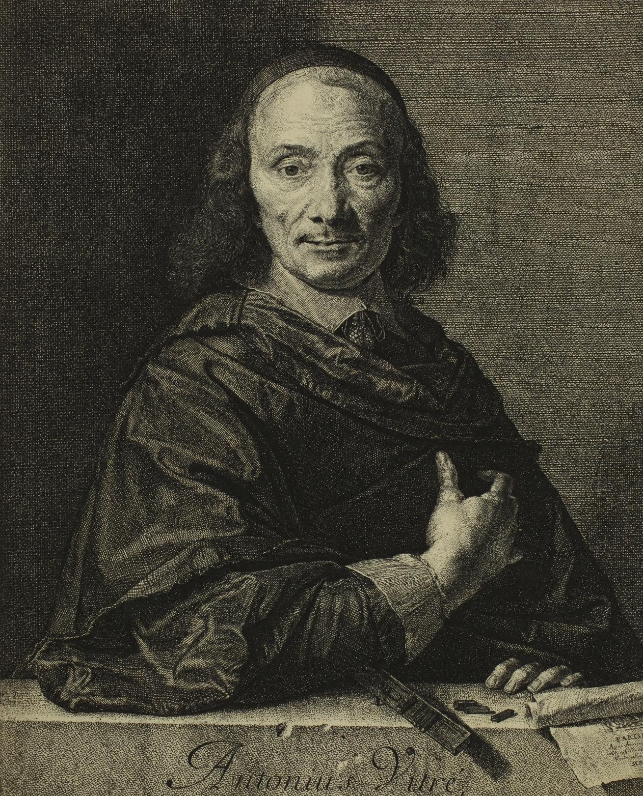
Antoine Vitré, Typographer to the King and Clergy of France Etching, 317 x 219 mm. Robert-Dumesnil 88; Mazel 94, 3rd state (of 3); Hornibrook & Petitjean 49, 3rd state (of 4).
Impression of the 3rd state (of 3 according to Mazel), the small light areas in the upper right corner shaded with new lines. The inscription in pencil avant les tailles sur les cheveux [before the lines on the hair] on the reverse seems to us to be erroneous. The 4th state according to Hornibrook and Petitjean corresponds to a new biting of the plate, which they indicate without locating any impression.
A very fine impression printed on watermarked laid paper (coat of arms with fleurs-de-lys). A number 161 in pen and ink very discreetly added in the upper right corner. Excellent condition.
Provenances:
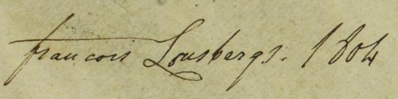
- François Xavier Lousbergs (died 1805), merchant in Ghent; handwritten mark in ink on the reverse accompanied by the date 1804 (Lugt 1694). The print appears in the catalogue of the sale of his prints that took place in Ghent in 1811 (p. 64, number 80, with no indication of state).

- Jules Michelin (1817-1870), painter and etcher; stamped mark in violet ink on verso.
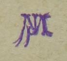
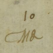
- Other handwritten collector’s mark (CMθ (?) and number 10).


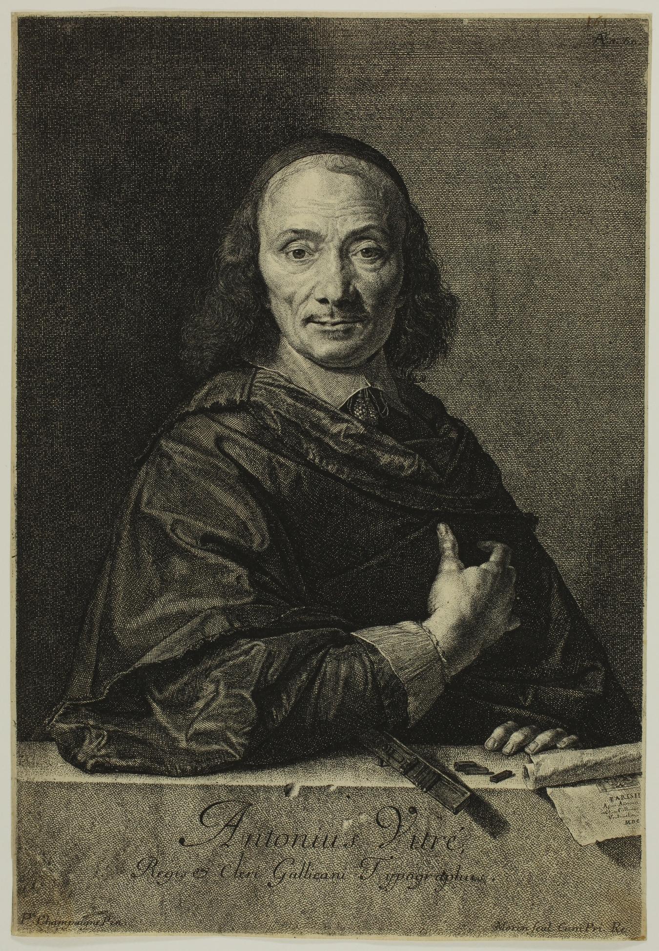

Etched after Philippe de Champaigne (1602 - 1674), ‘this portrait is probably one of Jean Morin’s most accomplished works.’ (Jean Mazel, p. 268, our translation). Antoine Vitré is best known for his use of oriental typefaces. He printed a monumental Polyglot Bible in Hebrew, Samaritan, Chaldean, Greek, Syriac, Latin and Arabic. Jean Morin’s etching shows him leaning against a low wall with a composing stick and printing type, as well as a rolled print.
References: Jean Mazel and Hubert Prouté: Catalogue raisonné de l’œuvre gravé de Jean Morin (ca. 1605-1650), 2004
François-Philippe du
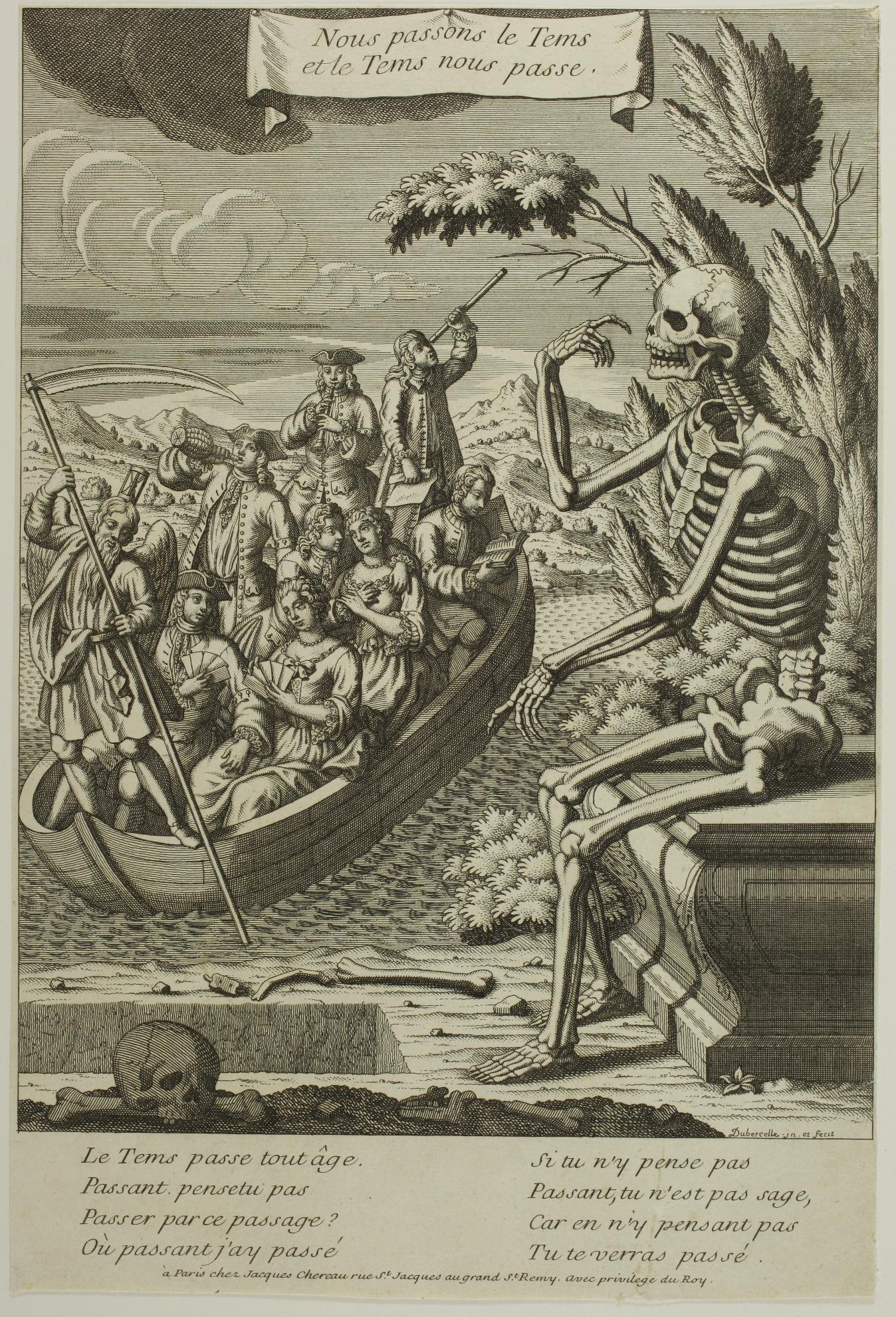
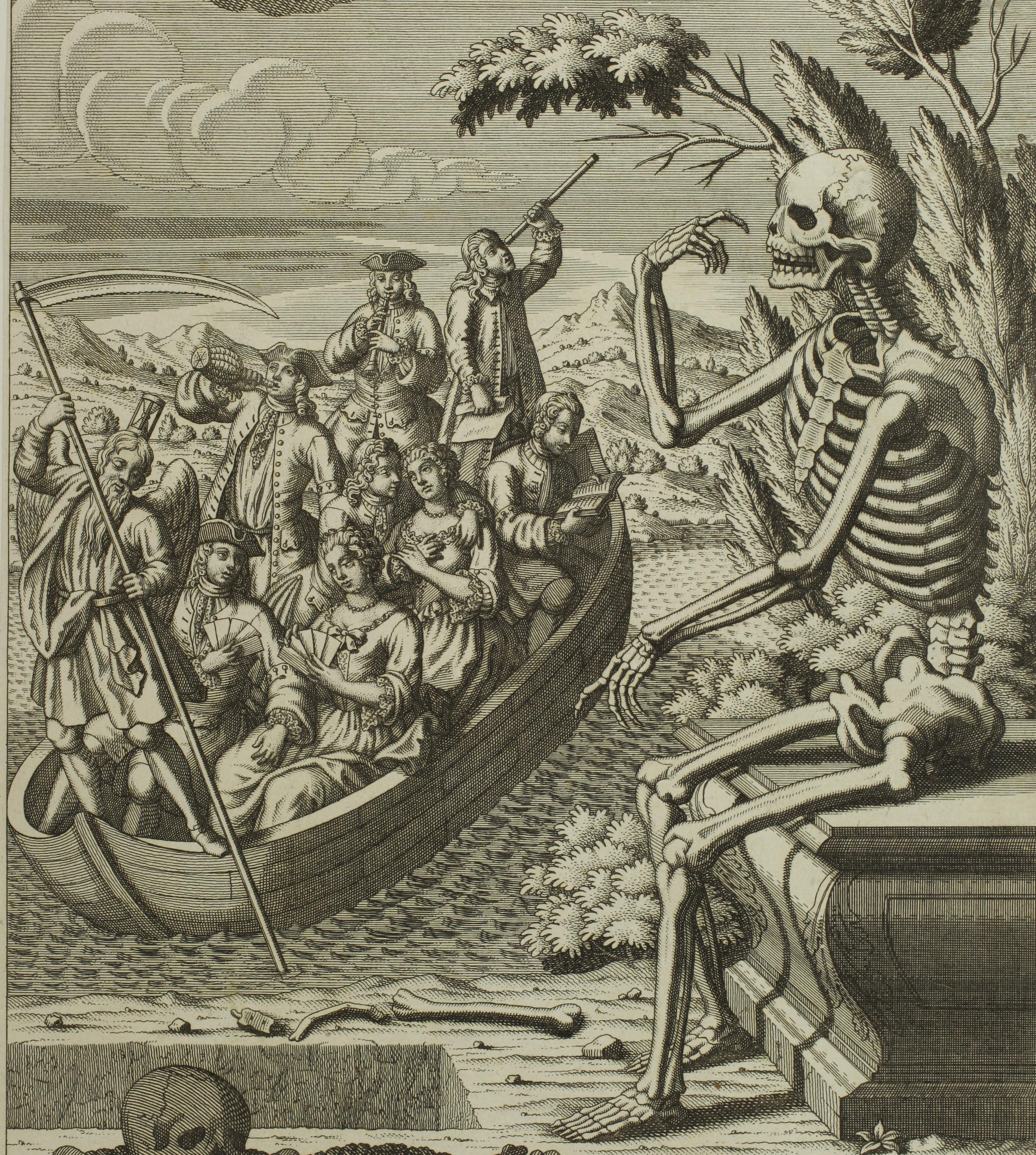
Nous passons le Tems et le Tems nous passe
[We pass the Time and Time ferries us]
Etching, 320 x 215 mm (sheet).
Very fine impression printed on laid paper, trimmed on or just outside the borderline on three sides and under the letter bottom.
In very good condition; tiny tear to right edge; small loss to tip of upper right corner.
Very rare. We have found no mention of this print.
In his boat, reminiscent of the ship of fools and Charon’s boat, Time, scythe in hand and hourglass on his head, leads a group of young people who are carefree and going about their business: one couple is playing cards, another is flirting, one man is drinking, another is playing the flute. Standing at the stern, one man observes the stars through a telescope, another reads.
The letter develops the play on words in the title. Death is addressing the spectator, warning him and inviting him to think about his destiny:
Le Tems passe tout âge. Passant, pensetu pas Passer par ce passage ? Où passant j’ay passé // Si tu n’y pense pas Passant, tu n’es pas sage, Car en n’y pensant pas Tu te verras passé.
Little is known about François-Philippe Dubercelle or du Bercelle, an artist active in the first half of the 18th century.
The Inventaire du Fonds Français lists the illustrations he engraved for works by Lesage (Le Diable boiteux in 1726, Histoire de Gil Blas de Santillane in 1735), by La Grange-Chancel and Gillet de Moyvre, as well as a view of Besançon. He also produced satirical works that earned him imprisonment, as François Courboin explains:

‘M. Funck-Brentano’s publication, Les Lettres de Cachet à Paris, provides us, from 1721 onwards, with a whole series of names of printmakers imprisoned for making or selling Jansenist prints. There are honest people, such as Jean-Baptiste-Nicolas de Poilly, who spent a week in the Bastille (2-9 May 1741), obviously for the principle, but there are also people sentenced for a slightly more complicated Jansenism: François-Philippe du Bercelle, for example, who criticized not only ‘the Constitution’ but also ‘the System’ and who was imprisoned for a year after having represented Mgr. le Régent, le sieur Law et la France, dressed up in paper (17 October 1721 - 30 October 1722)’. François Moureau gives a few details: ‘François-Philippe du Bercelle was imprisoned on 17 October 1719’ for having engraved, among other things, a plate depicting the burial of the Pope’s Constitution, and another depicting M. le Régent, le sieur Law, France dressed up in paper, and several other figures’. This political allegory of the Système affair enabled him to take advantage of the state fortress until 3 October 1722 (Frantz Funck-Brentano, Les Lettres de cachet à Paris, Paris, Imprimerie nationale, 1903, no. 2578). He had engraved these plates after the painter Jean Hubert for Jean-Baptiste Lamesle, one of the booksellers of the Mercure: they accompanied him during his stay in the Bastille (ibid., no. 2579, 2584) (François Moureau ‘Marivaux: un hérésiarque en littérature?’ in Revue d’histoire littéraire de la France, Vol. 112(3), 2012, pp. 517-531).
21. Jacques-Fabien
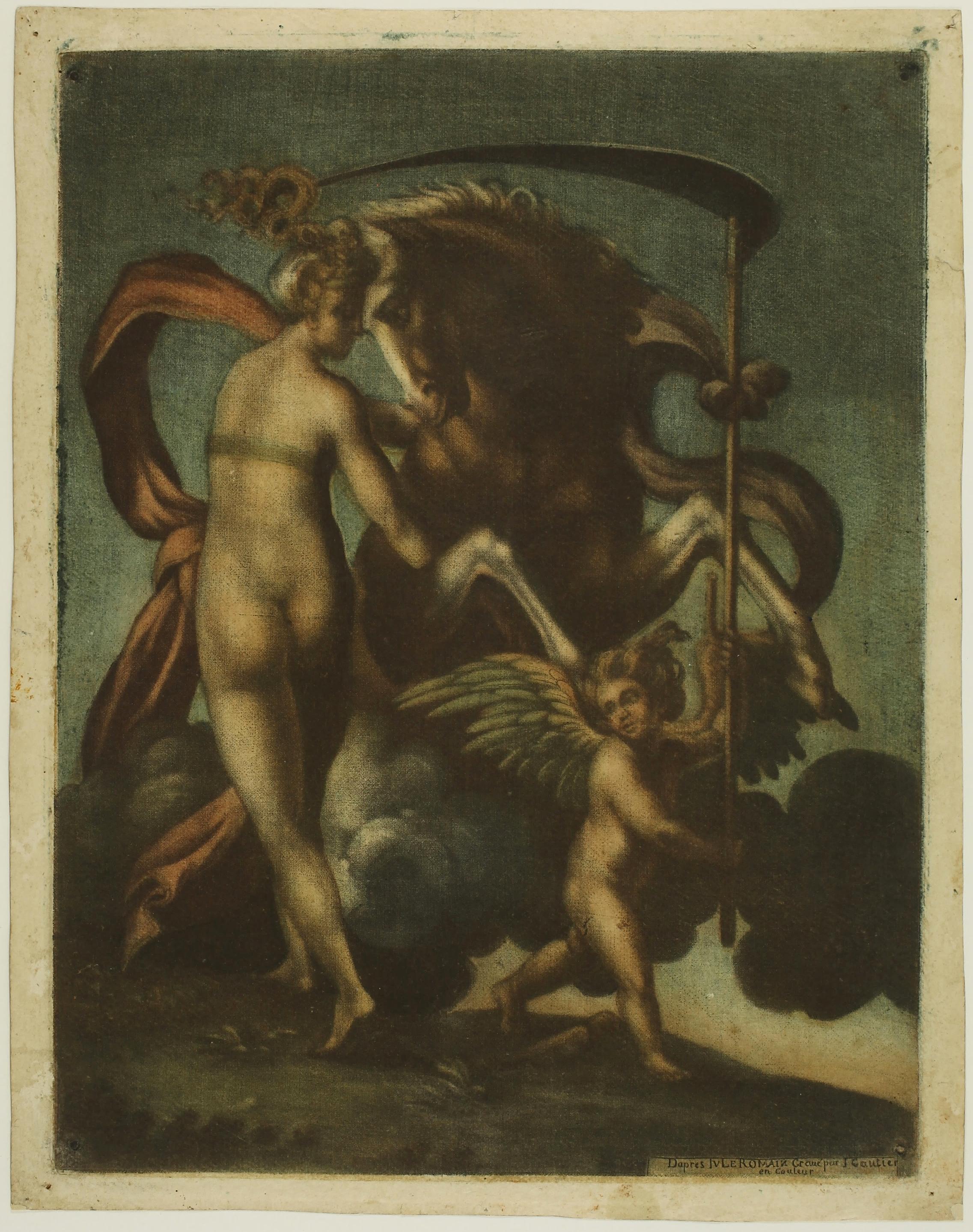
D’AGOTY (1711 - 1786)
Saturne and Philyra - c. 1743
Colour mezzotint printed with four plates, 314 x 240 mm.
Inventaire du Fonds Français 23, Singer 231, De Laborde p. 385.
Inscription engraved in the lower right-hand corner of the plate: Dapres Ivle Romain Gravé par I. Gautier en couleur. [After Giulio Romano, engraved by I. Gautier in colour]
Very fine impression printed on watermarked laid paper (part of a Maltese cross in a circle of pearls). Very good condition. Small margins all around the platemark (sheet: 335 x 265 mm).
The January 1743 volume of the Mercure de France announced that ‘Sieur Gautier, the only Printmaker who had the permission by the King, in the field of coloured Prints, or printed Paintings, has just published four new Pieces. The first after the Parmesan, representing the Daybreak, from the Cabinet of M. l’Abbé Desfontaines, & its counterpart, the Sunrise, after Giulio Romano, from the same Cabinet, of the same size as the originals, which are 12. inches high by nine inches wide.’ Saturn and Philyra is most likely one of the two prints advertised. Its counterpart is Apollon ou le levé du Soleil (see the impression kept at the INHA).
During this period, Jacques-Fabien Gautier d’Agoty used the technique of the mezzotint printed in colour to reproduce paintings, both his own and those of other artists, such as Salvator Rosa, Carracci, Coypel, de Troye, Correggio, etc.


The very fact of offering prints in pairs, as is the case here, was a way for Gautier d’Agoty to appeal to a clientele that was fond of paintings, as Kristel Stiglitz points out: "It was conventional in eighteenth-century houses to hang pictures of a similar size, which were often by the same artist, together as pairs. Printed paintings could serve the same purpose." (Colorful impressions, p. 11)
Impressions of the first colour prints by Jacques-Fabien Gautier d’Agoty are rare. This is certainly due to the complexity of their creation. From 1746 onwards, he abandoned the engraving of printed pictures and devoted himself to producing plates of human anatomy, zoology and botany, which were a great success and for which he is still renowned today.
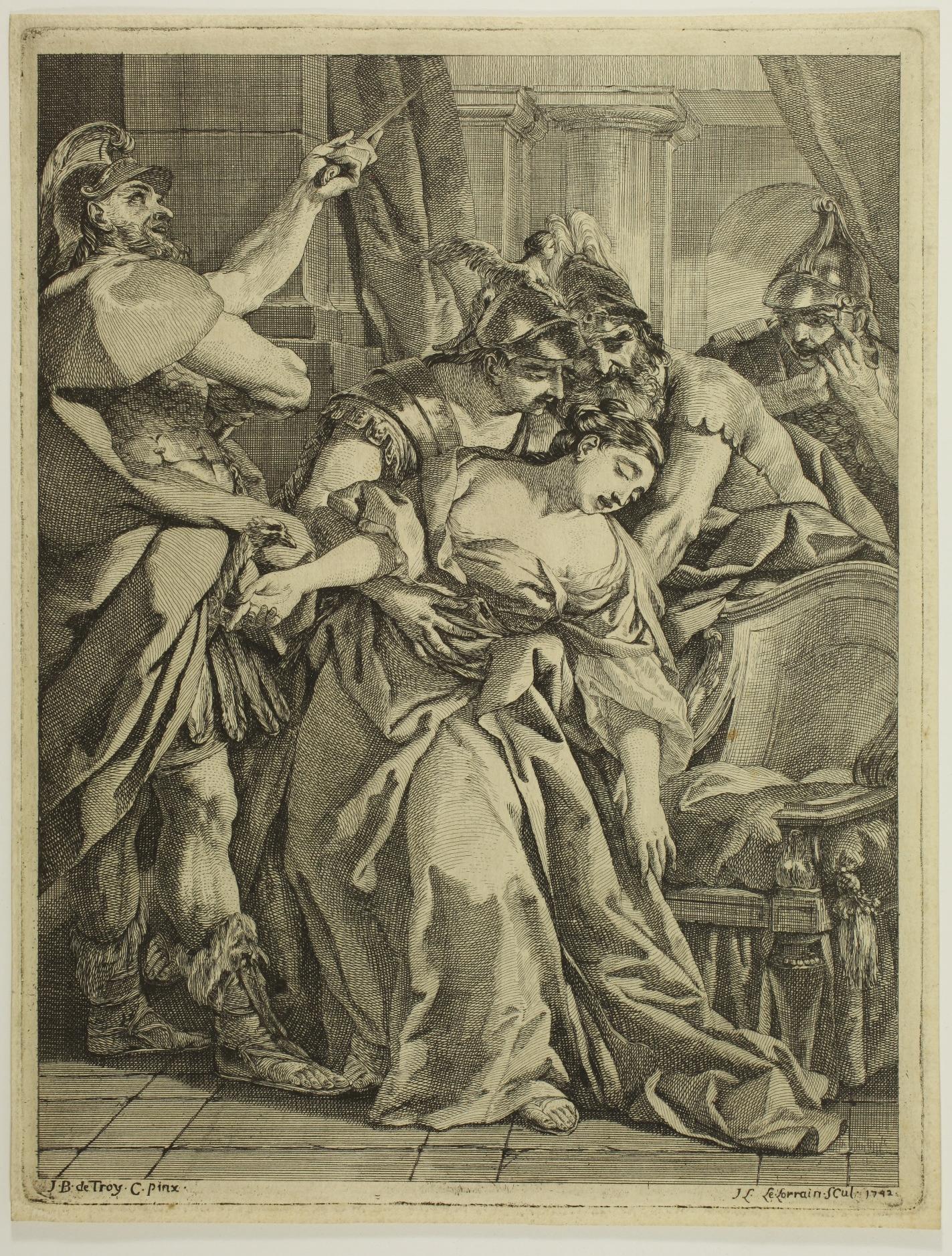
(1715 - 1759)
The Death of Lucretia – 1742
Etching, 291 x 223 mm. IFF 6.
Very fine impression printed on laid paper. Very good condition.
The Death of Lucretia reproduces a painting by Jean-François de Troy in 1742. This painting, now lost, was part of a commission of six paintings made to de Troy by the Cardinal de Tencin during his stay in Rome between 1739 and 1742.
Reference: Daniel Ternois: ‘En marge du ‘Jugement de Salomon’ de Jean-François de Troy’. In: Bulletin des musées et monuments lyonnais, Volume 6, 1978 no. 1, pp. 9-22. (read online)

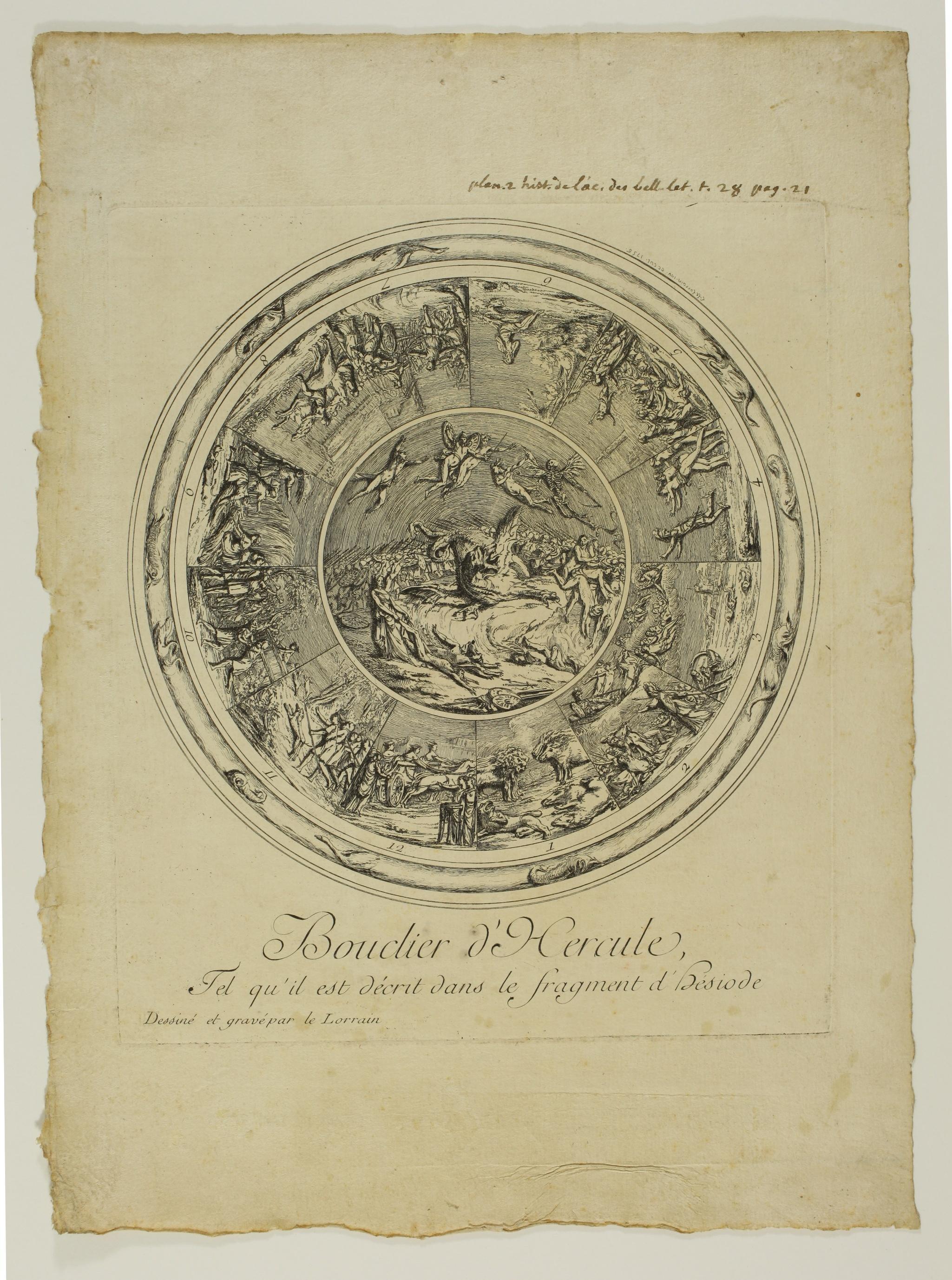
Shield of Hercules and Shield of Aeneas – 1756
Pair of etchings, 248 x 212 mm each. IFF 15 and 16.
Very rare impressions, before any letter for the Shield of Aeneas and before the addition of various inscriptions on the Shield of Hercules (notably the inscription Pl. II Hist. de l’Acad. des Bell. Lettr. [...]).
Very fine impressions printed on laid paper. Small marginal tears on the plate of the Shield of Aeneas and inscription in pen and ink in the upper margin of the Shield of Hercules: Plan. 2 hist. de l’ac.. des bell. let. t. 28 pag 21). Good margins on both plates.
In the Inventaire du Fonds Français, Yves Sjöberg states that these plates in their definitive version, with the complete letter, were inserted, along with two others, in volume XXVII of the Histoire de l’Académie des Belles Lettres to illustrate papers by the Comte de Caylus on subjects of Greek antiquity.
The Comte de Caylus was Le Lorrain’s patron between his return from Rome in 1749 and his departure for Russia in 1758. The two shields are dated 1756, the year Le Lorrain was admitted to the Académie.
Etching, 223 x 388 mm. IFF 18, undescribed state.
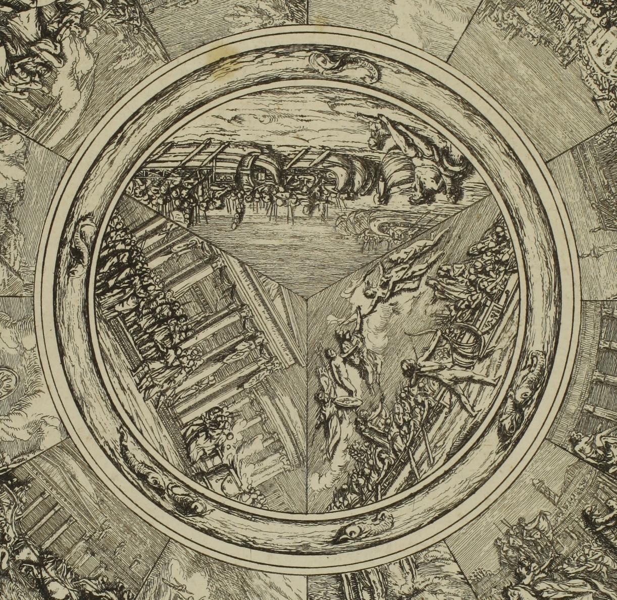
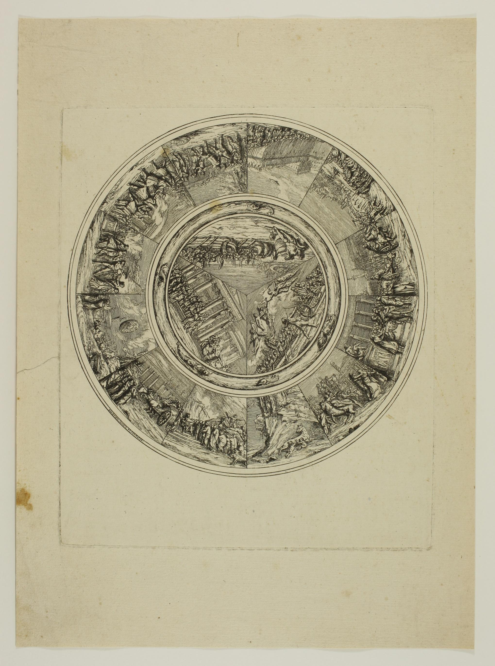
Very rare impression before any letter: before the title, signature and date, and before the addition of the caption in the lower margin detailing the names of the numbered characters in the image (Ariadne and Phaedra, Orpheus, Hector, Paris, Sisyphus, Tantalus, etc.).
A very fine impression printed on laid paper, trimmed on the platemark. Very good condition, slight trace of vertical fold in the centre.
This print, titled Second tableau: La Descente d’Ulysse aux Enfers in its final version, is matched by a Premier tableau: L’Embarquement des Grecs après la Prise de Troie. The two etchings date from 1757 and were subsequently included with the Shield of Hercules and the Shield of Aeneas in Volume XXVII of the Histoire de l’Académie des Belles Lettres to illustrate papers by the Comte de Caylus on subjects of Greek antiquity.

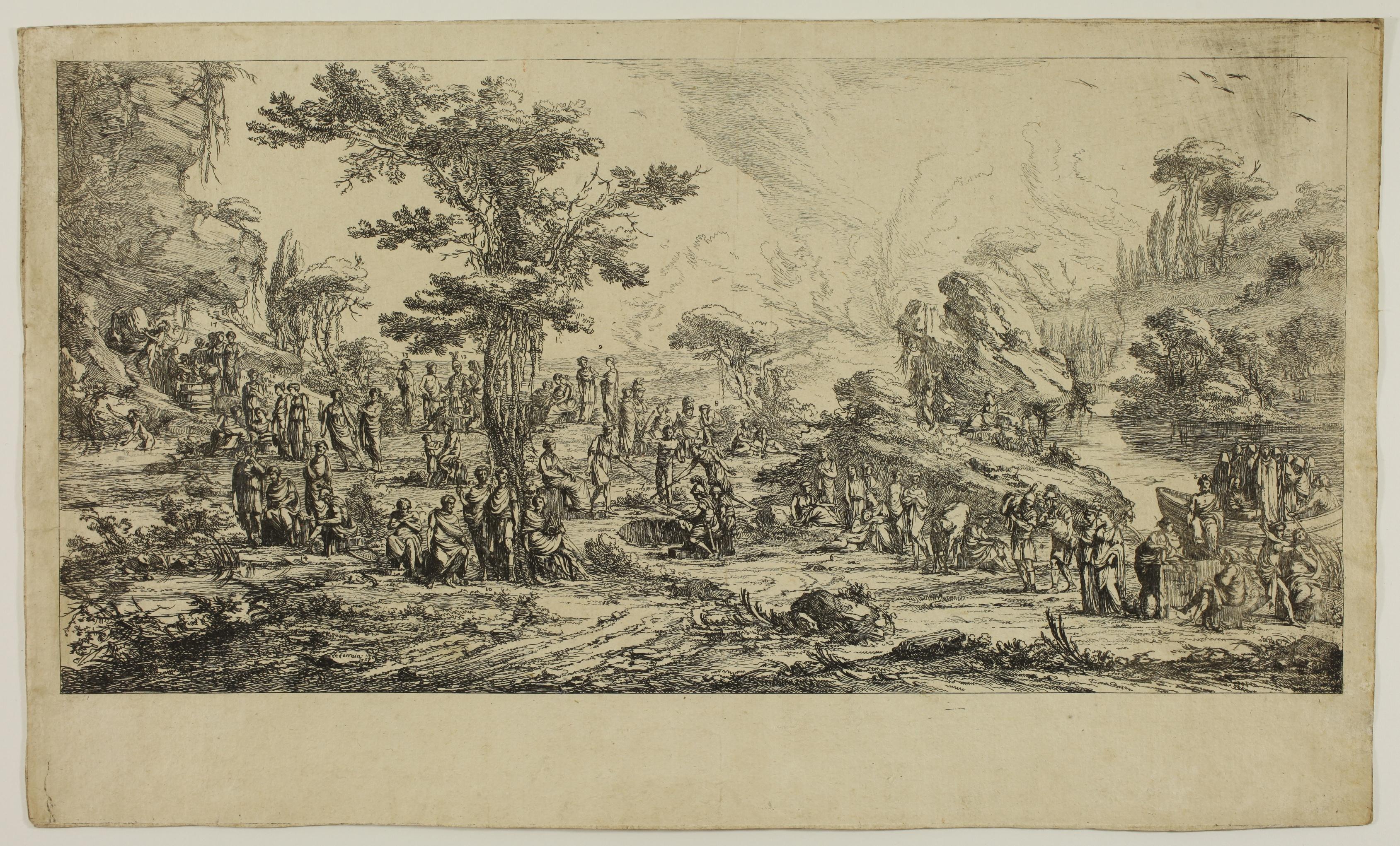
Etching, 295 x 225 mm. IFF 2.
Very fine impression printed on laid paper, trimmed to the platemark or just outside. Very good condition. Slight soiling on verso.
Le Lorrain’s etching reproduces a painting by Jean-François de Troy also dating from 1742. This painting, now lost, has its counterpart in Le Jugement de Salomon painted by de Troy the same year and also etched by Le Lorrain (IFF 1, see the Rijksmuseum impression). The painting is now in the Musée des Beaux-Arts in Lyon.
Jean-François de Troy was director of the Académie de France in Rome during Louis-Joseph Le Lorrain’s stay there between 1740 and 1749. The young artist had won the Prix de Rome in 1739.
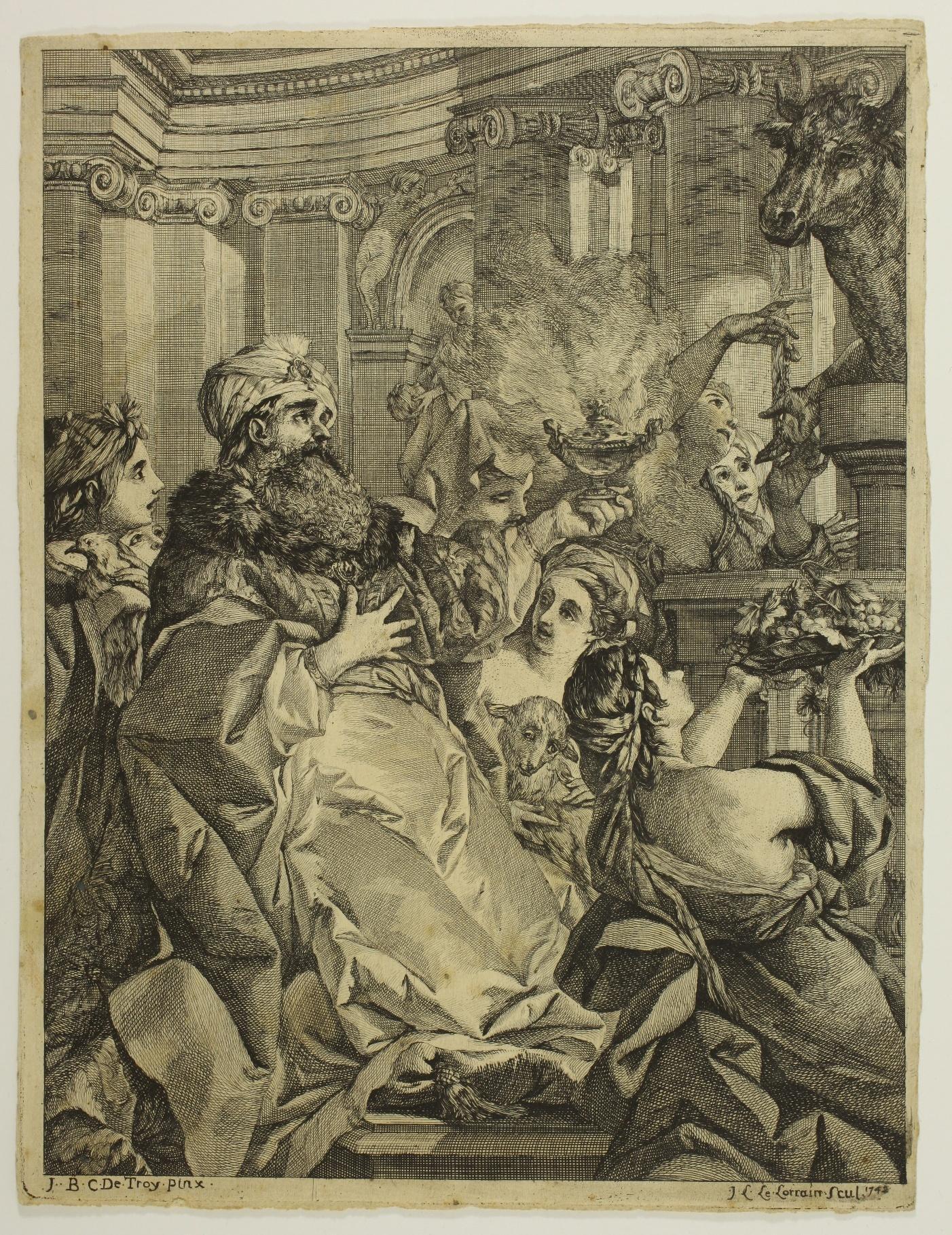

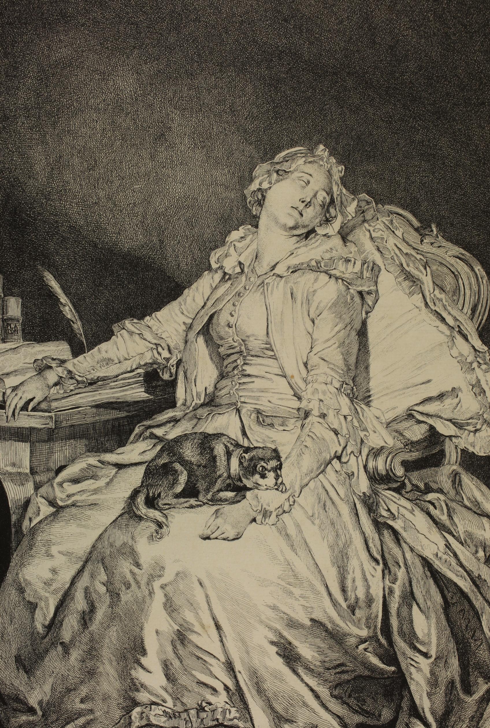
26. Jean-Michel MOREAU, known as Moreau le Jeune (1741 - 1814) after Jean-Baptiste GREUZE (1725 - 1805)
Philosophie endormie – 1777
Etching, 435 x 338 mm (sheet). Bocher 251, 1st state (of 4), Délignières 55, IFF (Aliamet) 55.
Very rare impression of the 1st state (of 4) according to Bocher, à l’eau-forte pure (only etching), the plate unfinished and before any lettering.
This state is before many further works on the whole plate. The most striking detail is that of the young woman ’s bodice, which is still completely buttoned up, whereas it will be half-open on the finished plate.
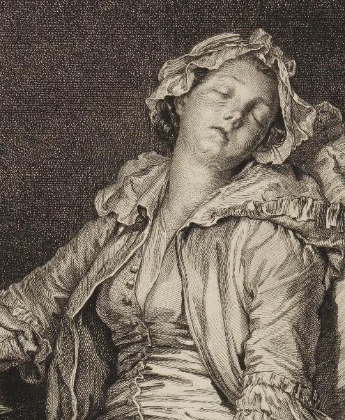
Detail of the unbuttoned bodice on an impression of the final version (Staatliche Kunsthalle Karlsruhe, No.IV 1106)
Very fine impression printed on watermarked laid paper (watermark: letters difficult to read). Trimmed inside the platemark, small margins of the copperplate around the composition. Old inscriptions in pencil in the lower margin: Greuze pinxit // La philosophie endormie // avant la lettre. Very good general condition.
La Philosophie endormie is, in the guise of an allegory, one of the many portraits of Anne-Gabrielle Babuty painted or drawn by her husband, Jean-Baptiste Greuze
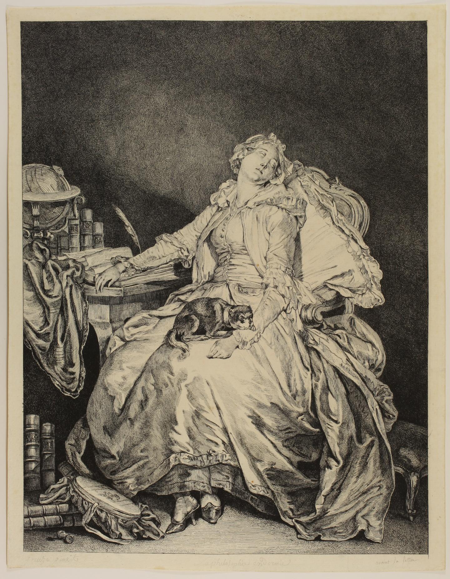
On the prints bearing the letter, the printmaker’s name does not appear, only the name Aliamet, with the mention direxit. It was once thought that the etching was the work of Fragonard, but the name of Moreau le Jeune was quickly accepted. The Bibliothèque nationale de France has two impressions à l’eau-forte pure. ‘The print preserved in the work of Moreau le Jeune bears an essential handwritten note, which reads: Mme Greuze, etched by J. M. Moreau after the portrait of Mr Greuze. Aliamet, of whom Moreau was a pupil at the time, probably confined himself to directing the work and retouching with a chisel. (IFF (Aliamet), p. 43, translated by us).
A very rare and beautiful impression of this important piece.
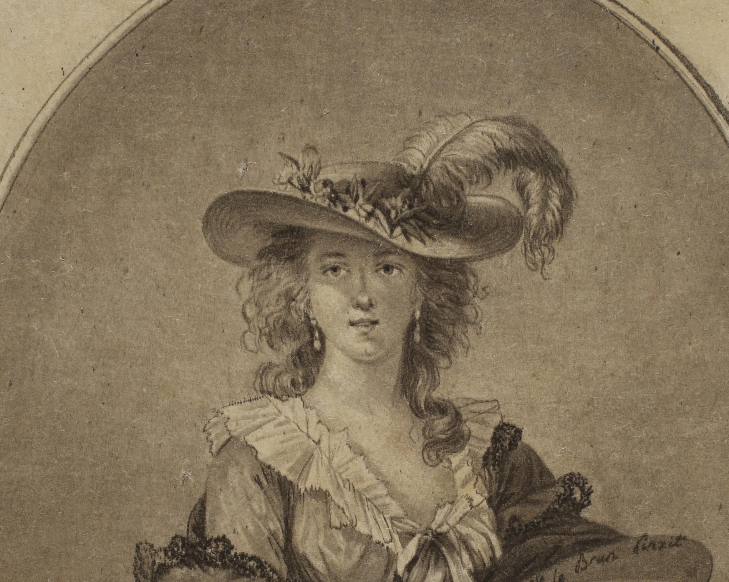
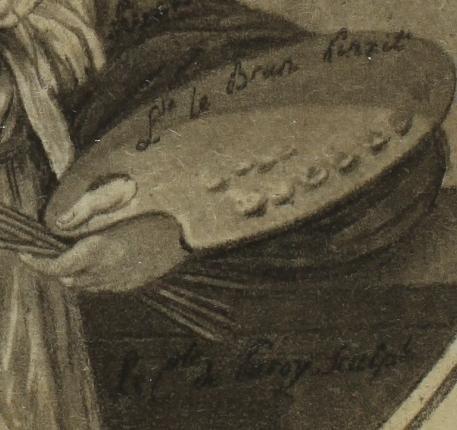
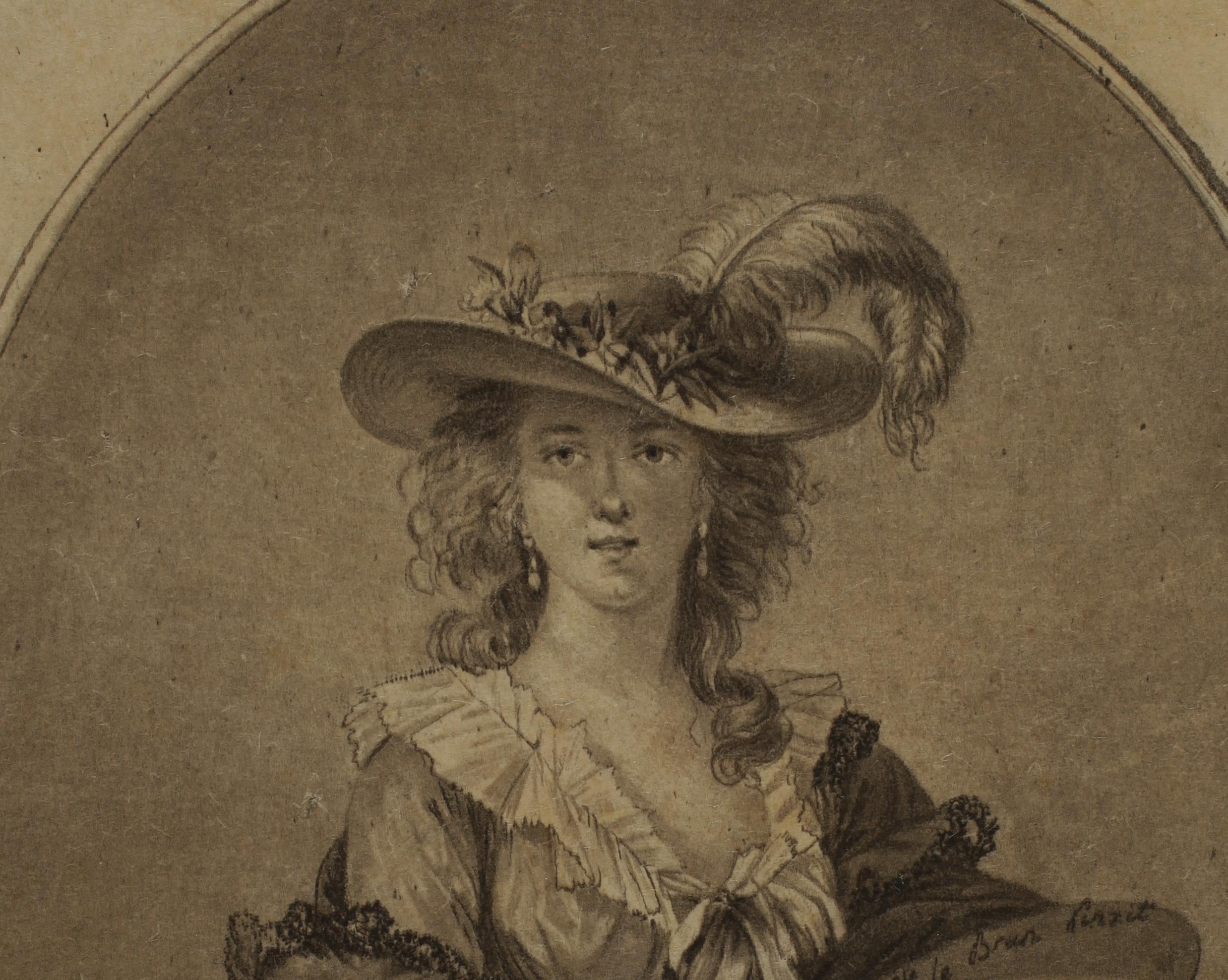
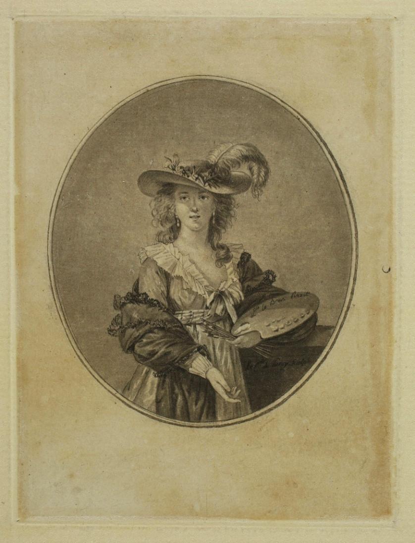
Jean-Philippe-Guy LE GENTIL comte de PAROY (1750 - 1824)
Self-portrait of Elisabeth Louise Vigée Le Brun in a Straw Hat Etching, 78 x 68 mm (oval). Portalis and Beraldi vol. III-1, p. 274.
Very fine impression printed on laid paper, mounted on a sheet of laid paper. Slight yellowing of the sheet. Very good condition.
‘Paroy made a delicious little oval portrait, in etching, of Madame Vigée-Lebrun, to which he gave Madame de Polignac as a twin. These are two exquisite pieces, and no professional artist would have done them better than our amateur. In her amusing Souvenirs, Madame Lebrun gives us proof of her friendly relations with the Comte de Paroy, in connection with the famous Greek supper that she imagined improvising in her home: ‘I imagined dressing us all up in Greek style [...] the Comte de Paroy, who was staying in my house in the rue de Cléry, had a superb collection of Etruscan vases. He came to see me that very day at about four o’clock. I told him about my project, and he brought me a number of bowls and vases, from which I chose...’. (Portalis et Beraldi tome III-1, p. 274, our translation).
The etching by the Comte de Paroy is a very faithful reproduction of Vigée Le Brun’ s Self-Portrait in a Straw Hat, painted in 1782. One version is now in the National Gallery, London. The Comte de Paroy chose to do away with the cloudy background and opted for a small, oval format, making the work look like a miniature. He excelled in small formats, intended to decorate bonbonnières, snuffboxes or even buttons.
Rare. One impression is kept in the Metropolitan Museum of Art.


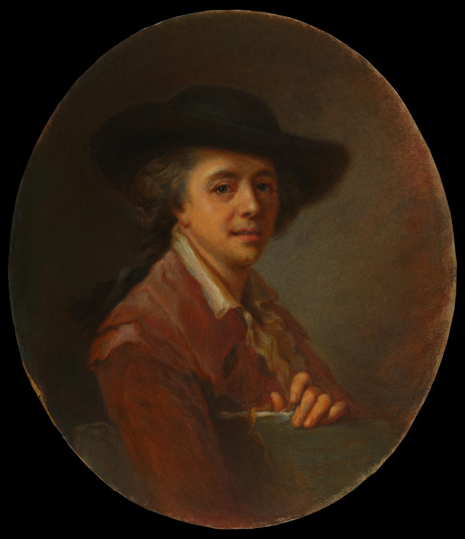
Portrait of Edouard Dagoty, Inventor of Color Print - c. 1784
Exceptional colour pastel, probably preparatory to the mezzotint by the same artist, coming directly from the son of the model, then by descent.
Provenance:
- Pierre Edouard Gautier-Dagoty (1775 - 1871), son of Édouard Gautier-Dagoty;
- Emilie Cuginaud (1820 - 1887), maiden name Gautier-Dagoty, his daughter;
- Marguerite Jeanne Clara Bouchard (1844 - 1921), maiden name Cuginaud, his daughter;
- Antoine Bouchard (1872 - 1939), his son;
Since then it has remained in the family.
This very beautiful pastel is probably a preparatory study for the portrait of Édouard Gautier-Dagoty engraved by Carlo Lasinio, his pupil, around 1784. Both the pastel and the print are based on the portrait painted by Johann Ernst Heinsius (1731-1794), an original or a copy of which is reproduced in Ch. Oulmont, J. E. Heinsius 1740 - 1812 Peintre de Mesdames de France, Paris, 1913, plate 29. The pastel was probably used by Carlo Lasinio as a stage in the development of his print, as the technique of the mezzotint printed in colour requires a good understanding of colours and their arrangement. Four plates were thus used to obtain the impressions of the print in colour.
The composition of the pastel and the print are very similar, and present a lively and harmonious portrait of Édouard Gautier d’Agoty, with a drawing board under his right arm, his face beaming, ready to get to work. The main difference is the absence, in the pastel, of the artist’s right hand holding the pencil holder and brushes.
Carlo Lasinio, born in Treviso in 1759, had learned the technique of colour mezzotint from Édouard Gautier-Dagoty, probably in Florence, where the latter settled at the end of his life. In the caption to his master’s portrait, Lasinio credits him with inventing the process. We know, however, that the inventor of the colour mezzotint printed from several plates was Jacob Christophe Le Blon (1667-1741), who in 1731 received the privilege of exercising alone, with his assistants, the art of "printing paintings with three plates" (Conseil d’État ruling, dated November 12, 1737, cited by Florian Rodari in Anatomie de la couleur, p. 62). Le Blon’s invention was - according to him - based on the Newton disc and research about the spectral decomposition of light. Noting that the three primary colours, blue, yellow and red, when mixed in different proportions, make up all visible natural colours, Le Blon was the first to apply this three-colour method to printmaking, printing an image from three mezzotint plates inked in blue, yellow and red respectively. In this process, each tiny dot plays a part in the reproduction of all the shades of the selected subject’s ‘natural colouring’. After Le Blon’s death in 1741, Jacques Fabien Gautier d’Agoty, who had been a student of Le Blon for a short time, obtained from the king a new thirty-year privilege, and set about developing the color print trade, which his five sons continued, making his real inventor forgotten.
The large Portrait of Edouard Dagoty, drawn in pastel and then engraved by Carlo Lasinio, is one of his finest achievements and a beautiful tribute from the student to his teacher.
References: Hans Wolfgang Singer: « Der Vierfarbendruck in der Gefolgschaft Jacob Christoffel Le Blons : mit Oeuvre-Verzeichnissen der Familie GautierDagoty, J. Roberts, J. Ladmirals und C. Lasinios (Schluß.)». Monatshefte für Kunstwissenschaft 11, no. 2/3 (1918): pp. 52-73; Florian Rodari (ed.): Anatomie de la couleur: l’invention de l’estampe en couleurs, 1996

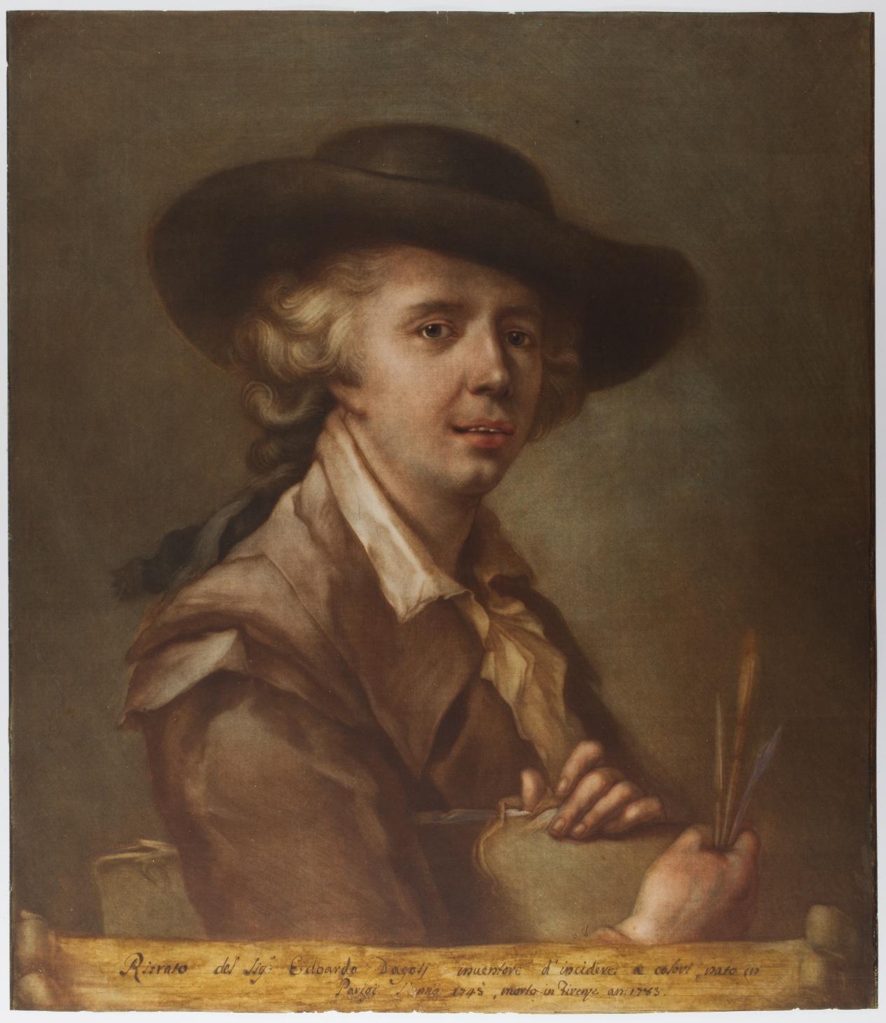
Carlo LASINIO, Portrait of Edouard Dagoty, inventor of color printc. 1784, Colour mezzotint printed from four plates. (visible on our website)
29. Adolphe Martial POTÉMONT, known as MARTIAL (1828 - 1883)
Lettre sur les éléments de la gravure à l’eau-forte – 1864
[Letter on the Elements of Etching]
Etching, around 296 x 200 mm (each plate). Beraldi 19.
Series of four plates published by Cadart and Luquet and printed by Beillet and Forestier. Without the original folder on which a title plate was printed. The four plates, numbered 1 to 4 in the subject, are printed on laid paper. Very small indentation in the subject of the four plates, slight yellowing of the paper, rare foxmarks. Small margins (sheet: 375 x 255 mm).
Rare.
The folder (here missing) is decorated with a frontispiece reproducing in trompe-l’oeil a small unfolded letter accompanied by its envelope. It is a short note written by a man named Martial to Messieurs Cadart et Luquet. He addresses to them a second letter written to him by un eau-fortiste de [ses] amis [an etcher, a friend of his], a man named A. Potémont. The title of this letter is written on the envelope: Lettre sur les éléments de la gravure à l’eau-forte. Martial asks their opinion on the interest of publishing a facsimile, as the author allowed him. These are the four plates imitating the pages of a letter contained in the folder. Adolphe Martial Potémont not only exploits two classic rhetorical devices: the letter within the letter and the double to which he gives his name, but he also uses a trompe-l’œil to give credence to his story: how can one doubt the existence of a letter whose image he shows?
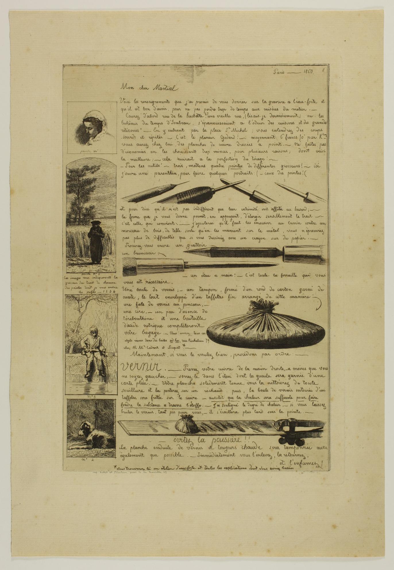

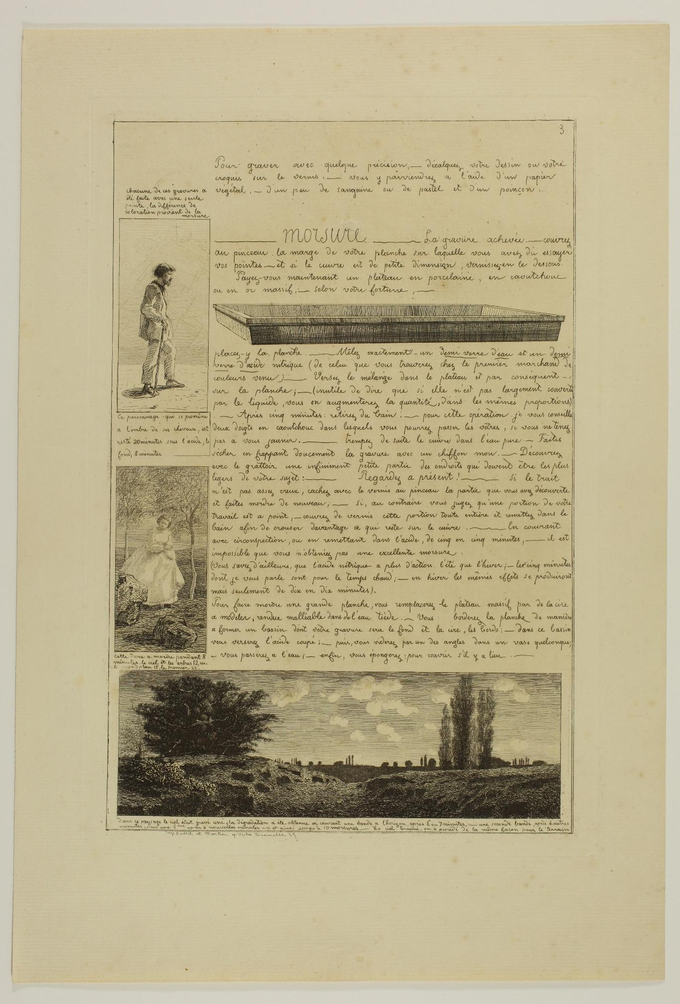
Little is known about the genesis of this "letter". The envelope and the letter signed Martial which serve as the title page of the series bear the date June 1864. The four-page letter signed A. Potémont is dated 1860. It is most certainly the "Traité d’eau-forte par Martial. Résumé en quatre feuilles in-folio" [Treatise about the etching, by Martial. Summarised in four folio sheets] described among the novelties "on sale at MM. Cadart and Luquet" at the end of the 1865 Almanach de la Société des Aqua-fortistes: "This little treatise, presented in the familiar form of a letter to a friend, gives anyone who knows how to draw the professional techniques of etching, with an example etched opposite the explanation. With this treatise, two hours are enough to know everything that is theoretical about etching. Practice and experience do the rest.” (translated by us)
Martial Potémont humorously explains some basic advice that should allow beginners to "not waste too much time on the miseries of this craft" and to soon "resurrect Callot, Israel or Rembrandt!”.
Images of tools and etchings illustrate his point. He describes the necessary equipment and the different stages of etching: preparation of the plate with varnish, etching, biting, printing of proofs and retouching if needed. The copperplates can be bought from a reputable planer, the Godard company, rue de la Huchette, in Paris. As for the tools and products needed, they can be found at Cadart et Luquet, 79 rue de Richelieu, headquarters of the Société des Aqua-fortistes: etching needles of various sizes, scraper, burnisher, hand vice, varnish ball, cotton swab, turpentine and bottle of nitric acid. At the same address, amateurs will find an etching workshop where they can receive advice.
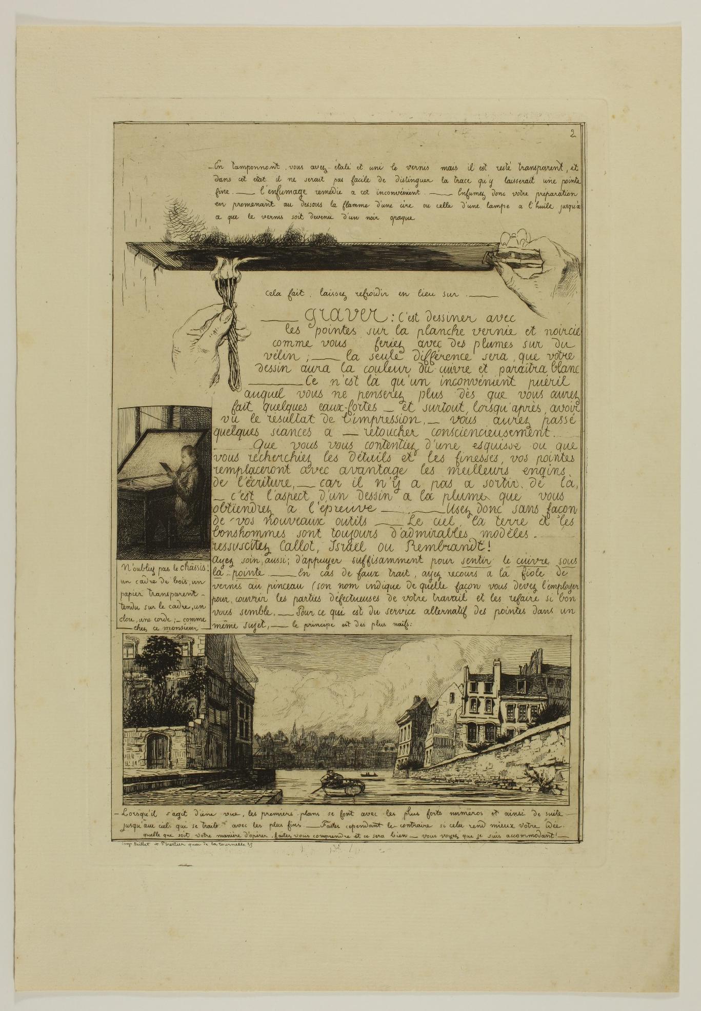

The first stage consists of varnishing the plate held in a vice: it must be cleaned, heated and then coated with varnish using a ball that is melted on the hot plate; the plate must then be smoked: the lines that will be drawn in the varnish that has become black will thus expose the red copperplate and appear in contrast. The second step is the etching, i.e. drawing on the plate with tools of different sizes. It is possible to draw directly or to transfer a drawing onto the plate using vegetable paper and sanguine or pastel. Repentances are allowed by applying varnish with a brush on a failed line.
Potémont recommends using the thickest needle in the foreground to the thinnest in the background in order to create gradations, but he adds jokingly: "Whatever you do, make yourself understood and it will be fine - you see I’m accommodating!" Next comes the bite. After protecting the edges of the plate and possibly the reverse side, it is placed in a basin containing a liquid composed of half water and half nitric acid. Potémont advises biting the plate for five minutes at a time (ten minutes in winter) in order to control the progress of the bite and to gradually cover the parts that have been sufficiently bitten.
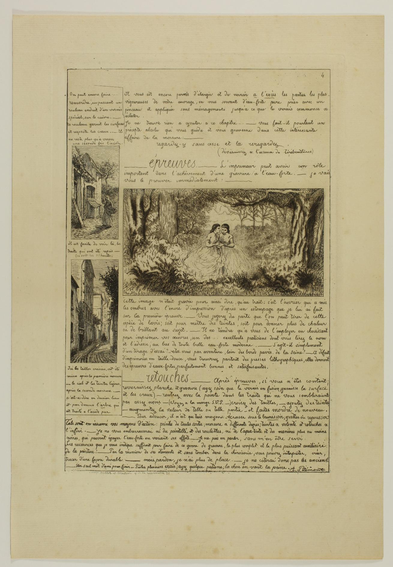
The next step is printing, which can be done at a printer’s or at home if we have a press. Potémont emphasises the importance of printing, and therefore of the printer, using as an example the central illustration on the fourth plate, about which he says: "It was the printer who created the shadows with the printing ink in accordance with the shadows I drew on the first proof".

It should be noted that the impressions of this illustration are very different from one copy of the Letter to another: the areas where a veil of ink has been preserved and those where the plate has been carefully wiped off are not exactly the same on our print and on the two copies in the Rijksmuseum.
If the impressions do not entirely satisfy the artist, writes Potémont, he can retouch his plate either by deepening some strokes or by adding new ones, or by softening certain parts with the burnisher or the scraper, or by pushing back the copper on the back of the plate. Finally, he insists on the patience required by the aquafortist in all the stages of the etching process. When it comes to the bite, the only precept, for those who absolutely want one, would be: "look at it over and over again and look at it again". This is also the final word: "Just one friendly word to finish - make several attempts; have some patience; the thing is worth it."
Reference : Janine Bailly-Herzberg: L’Eau-forte de peintre au dixneuvième siècle. La Société des Aquafortistes, 1862-1867, Paris, 1972.

30. Adolphe Martial POTÉMONT, known as MARTIAL (1828 - 1883)
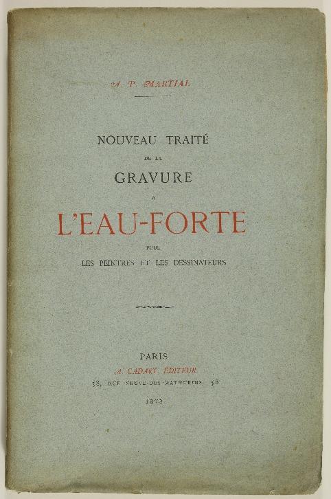
Nouveau traité de la gravure à l’eau forte pour les peintres et les dessinateurs – 1873
[New treatise on etching for painters and draughtsmen]
In-8 paperback, 13 plates printed on laid paper, one on wove paper. Very good overall condition, small angular loss to cover verso.
Published by Alfred Cadart, 58 rue
Neuve-des-Mathurins in Paris, this treatise on etching is a more formal follow-up to the amusing Lettre sur les éléments de la gravure à l’eau-forte by Potémont almost ten years earlier.

The treatise opens with two ‘mot[s] sur l’eau-forte’ [a few words about etching], one by William Bürger (pseudonym of Théophile Thoré-Burger, journalist and art critic) and the other by Théophile Gautier.
William Bürger made an enthusiastic observation: ‘Well, the conquest is made! Etching, almost abandoned since the eighteenth century, has once again become one of the expressions of French art. It now counts as a speciality that ranks highly in exhibitions and is already exciting the curious and collectors. He congratulated himself on the results achieved since 1830 by those who sought to revive etching. Théophile Gautier, for his part, praised this technique, which offers great spontaneity and authenticity while requiring ‘a decisiveness of hand, a sureness of line, a prescience of effect’.
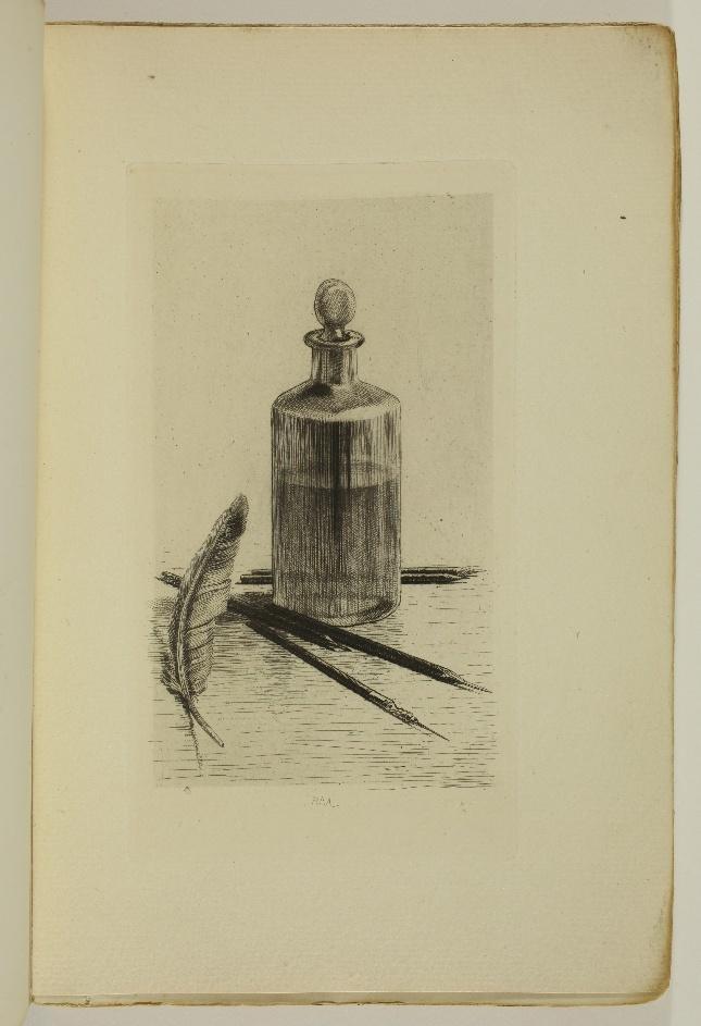


Potémont’s treatise is divided into short chapters: About copperplates, Varnish, Smoking the plate, Scratching the plate, Biting, Reworks and Printing illustrated opposite the text with plates etched by Potémont:
- plate 1 (frontispiece): a flask of acid surrounded by a feather and etching needles.
- plate 2: Varnish: a ball of varnish enclosed in a silk cloth, together with a stamp, placed on a copper plate fixed by a vice;
- plate 3: Smoking the plate: the plate held by the vice is subjected to the action of a flame;
- plates 4 and 5: Scratching the plate: Plate 5 shows a smoked copperplate on which the artist has etched with a needle to expose the copper on its surface; Plate 4 shows an impression from this copperplate;
- plates 6 to 10: Biting: The etching on plate 6 depicts a landscape which Potémont explains was obtained by several successive bitings, a protective varnish being deposited on different areas of the plate between the bitings so that these different areas were finally subjected to bitings of 30, 25, 20, 15, 10 or 5 minutes. Other biting processes were used to obtain the effects shown on plates 7 to 10;
- plates 11 to 13: Reworks: With the help of plates 11 and 12, Potémont explains the retouching permitted by the use of black varnish and white varnish. Plate 13 shows how burnishing can be used to bring out the light in an impression that is too dark.
Finally, a Notice to the reader by Cadart describes the activities of the Société des Aqua-Fortistes and the publications of Illustration Nouvelle. A brief catalogue of the equipment and courses offered by Cadart to printmakers is illustrated with a figure of a Cadart press.


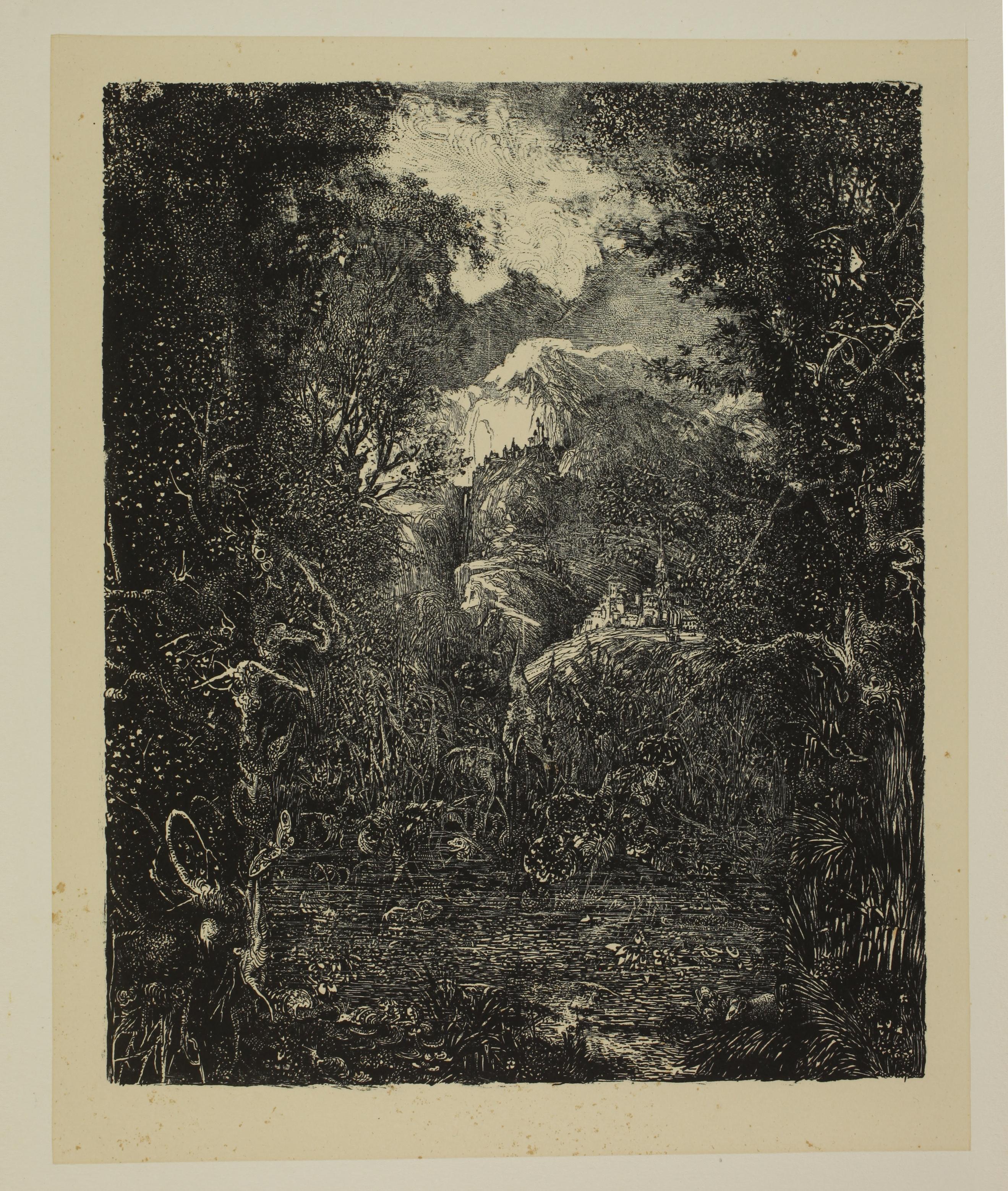
(1822 - 1885)
Les Villes derrière le marécage – 1878
[The Towns behind the Swamp]
Lithograph, 191 x 156 mm. Van Gelder 124 A, II/III ; Préaud 97, 2nd state (of 3).
Impression of the 2nd state (of 3), the image transformed by the addition of numerous details, but before the sky and the pond were lightened.
Superb impression printed on light cream chine appliqué pasted on heavy wove paper. Very rare foxmarks to the edges of the chine appliqué sheet, small light waterstains in the corners of the sheet of laid paper. Full margins (sheet: 503 x 325 mm).
Provenance: Samuel Josefowitz (1921-2015).
States I to III correspond to two different entries in Van Gelder’ s catalogue raisonné: state I is described at number 124 under the title Le Papillon et la Mare [The Butterfly and the Pond], while states II and III, after transformation of the image, are described at number 124 A under the title Les Villes derrière le Marécage [The Towns behind the Swamp].
Le Papillon et la Mare is an illustration project for the eponymous fable from the collection Fables et Contes by Hippolyte de ThierryFaletans, which was published in 1871. Van Gelder writes that this “book would not be worth our attention if it had not earned us a few lithographs by Bresdin (cat. 122-128) - seven in total (taking into account the drawings that were reworked), laboriously executed between the end of March and mid-September 1868 and which the artist retouched on several occasions, some even ten years later”. (Appendices, p. 168)
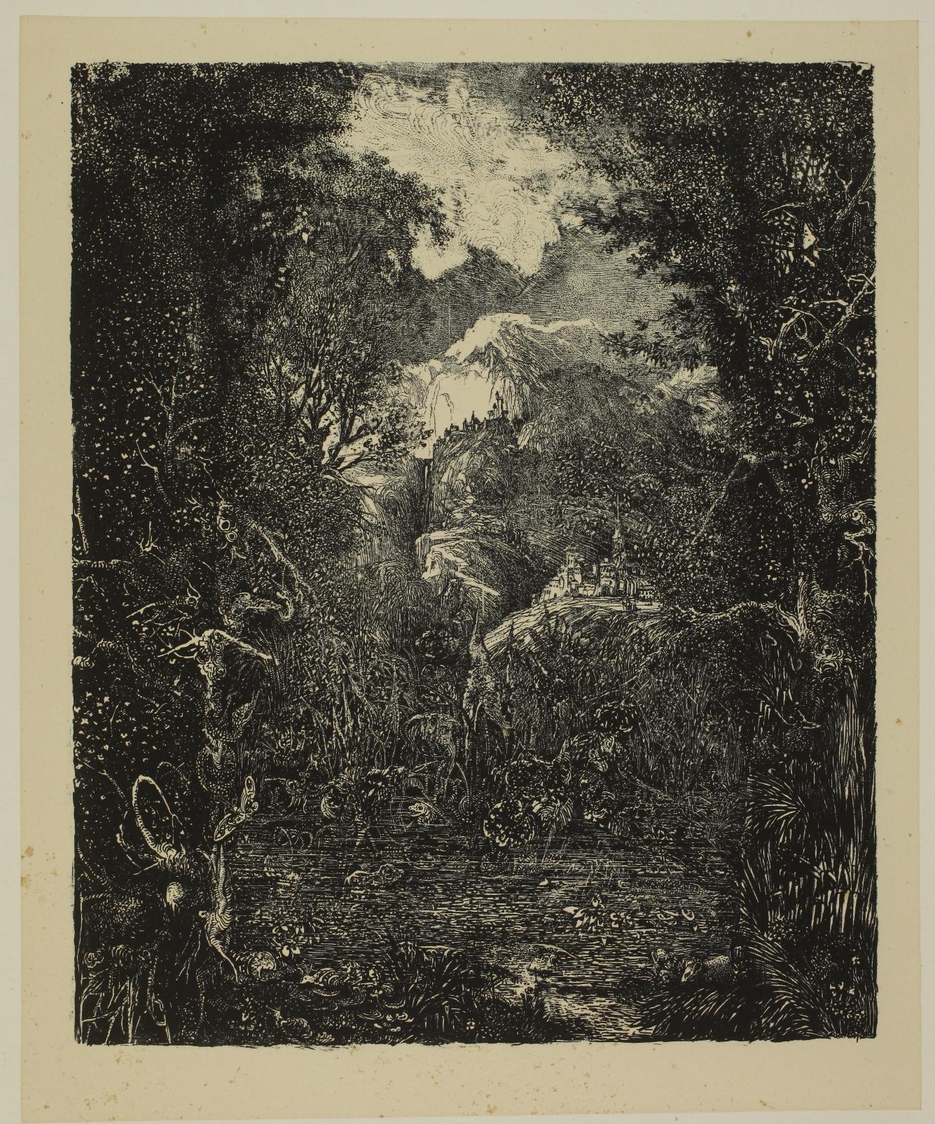

Throughout the period when the illustrations were being designed, communication between the author and the artist was very laborious, even conflictual, as can be seen from the few letters that have survived and are quoted by Van Gelder in his chapter on Hippolyte de Thierry-Faletans’ commission (Appendix III): Thierry-Faletans assailed Bresdin with advice and recommendations, telling him in great detail what he wanted to see in his lithographs; Bresdin complied with his wishes, but also made a few choices that Thierry-Faletans did not understand: in the end, the author refused Le Papillon et la Mare and Bresdin was forced to resume his work on a new stone: this would be Le Papillon et la Mare, version II, Van Gelder no. 125.
Bresdin did not abandon his first stone, however, and reworked it ten years later. Van Gelder writes: "The reworking dates from 1878. An invoice from Lemercier shows that Bresdin had 50 impressions printed. We believe that it was during this printing that Bresdin created the third state, the second being only an intermediate state of which only a few trial proofs probably exist" (translated by us).
Bresdin enlarged his composition on all sides by adding very dense vegetation. He erased the two large butterflies whose wings were spread out on the upper and lower edges of the image and retouched many details. In the third state, the sky and pond have been lightened.
The title Les Villes derrière le marécage was given by Van Gelder. However, he points out that an invoice from Lemercier dated 2 October 1878 calls it Le Rat philosophe. Although the rat is not a character in Thierry-Faletans’ fable, he had mentioned the possibility of adding one on the banks of the pond, in the company of all sorts of small animals. We can see one on the lower edge of the image in the first state, still visible above the tufts of grass in the lower right-hand corner of the third state.
.
(1847 - 1898)
Crapaud Bronze, first version – 1883
Etching, aquatint and drypoint, 238 x 160 mm. Bourcard & Goodfriend 18bis, 1st and 2nd state (of 2).
Set of two extremely rare impressions, printed in brown on the same sheet of laid watermarked paper (Arches). Impression on the left: impression of the 1st state (of 2), before cancellation of the plate. Impression on the right: impression of the 2nd state (of 2), the plate cancelled, with Buhot’s owl added in the upper right corner and with the words Ire planche 12 épr. [1st plate 12 impressions] in the bottom left-hand corner. The sheet is annotated in pencil in the lower margin: Premier essai du Crapaud Planche détruite après 12 épreuves. [Crapaud, first attempt, Plate cancelled after 12 impressions]. And in the lower right-hand corner: ep [?] 4.
Tiny foxmarks, otherwise in perfect condition. Full margins (sheet: 278 x 365 mm).
A similar sheet in the Philadelphia Museum of Art bears a very similar inscription in the lower margin: Premier essai du crapaud et Détruit après tiré à douze épreuves [Crapaud, first attempt, Printed Plate cancelled after 12 impressions].
An impression of the cancelled plate alone is in the New York Public Library. It is annotated Premier essai du Crapaud Bronze de la collection de M. Ph. Burty. Planche détruite après 12 épr [Crapaud Bronze from the collection of M. Ph. Burty, first attempt. Plate cancelled after 12 impressions].
Gustave Bourcard does not assign a number to this first version of the Crapaud Bronze in his catalogue, but he writes at the end of his description of the final version (Bourcard 18, translated by us): ‘There was a first plate, destroyed after very few impressions’. Nor does he mention the existence of any impressions made from the cancelled plate. Number 18bis is attributed by James Goodfriend in his supplement to the catalogue raisonné. He mentions the existence of impressions after the plate had been cancelled.
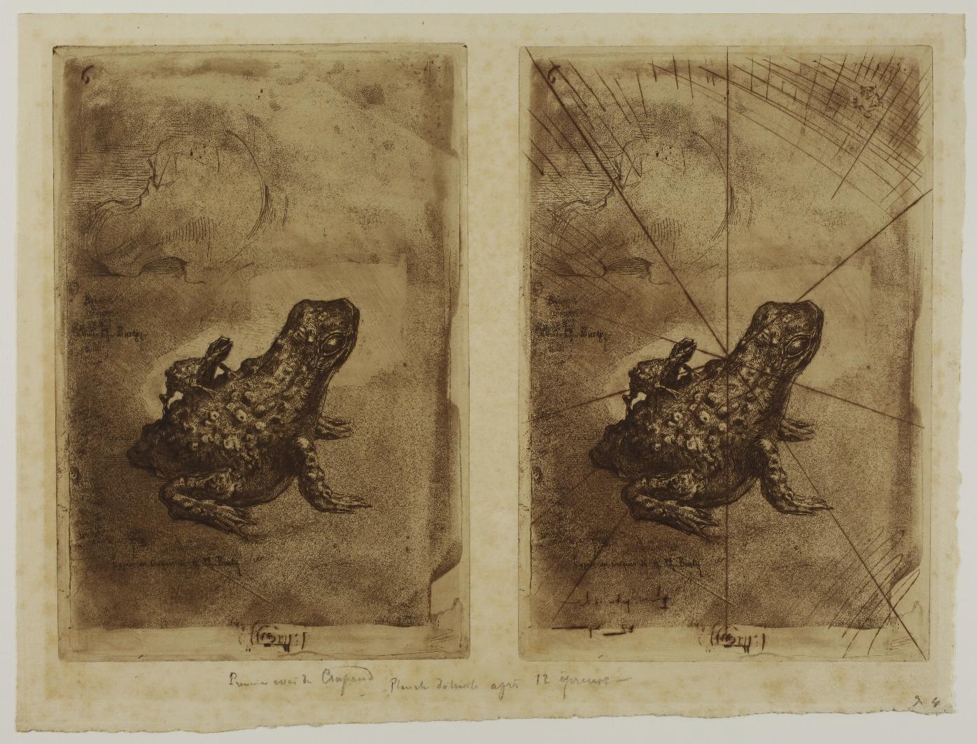

Citing the cancelled impression in the New York Public Library, he points out that his annotation does not make it possible to know whether or not all 12 impressions it mentions are cancelled. However, if we consider that Buhot ‘destroyed’ the plate by cancelling it, we should perhaps understand that the twelve impressions in question came before this cancellation and that the few known cancelled impressions are additional.
The fact that the mention of a print run of twelve impressions is also found on sheets with two impressions printed on it, one cancelled, the other not, suggests that Buhot must have printed trial proofs and decided shortly afterwards to cancel his plate. However, the two versions of the plate are very similar. In the first version, the toad etched at the top of the plate is barely sketched, and the night sky added by Buhot behind the toad in the final version is still missing here. The final plate was published in the Japonisme, dix eaux-fortes, in April 1883.
« On April 10, 1883, the first major retrospective exhibition of Japanese art in the Western world opened in Paris at the Gallery Georges Petit on the rue de Sèze. It was comprised of paintings, ink drawings, bronzes, lacquers and woodblock illustrated albums, all dating from the ninth century through 1868, the year of the Meiji restoration. The exhibition was organized by Louis Gonse, Director of the Gazette des Beaux-Arts ; the art objects themselves were borrowed from the rich private collections of such longtime Japanophiles as Gonse, Philippe Burty, S. Bing, Theodore Duret, and Alphonse Hirsch. » (Phillip Dennis Cate, p. 64).
Around the same time, Félix Buhot published Japonisme, dix eauxfortes, representing a selection of Japanese objects from Philippe Burty’s collection, exhibited at the Galerie Georges Petit. With the exception of Crapaud Bronze, the etchings do not date from 1883 but from 1875, as Buhot specified to Octave Uzanne on 4 April 1883 (quoted by Ph. D. Cate). By publishing the set in April 1883 under the title Japonisme, at the same time as Georges Petit’s exhibition, Buhot intended to participate in a common effort to encourage the general public to discover Japanese art and the studies that intellectuals such as Louis Gonse, Théodore Duret or Philippe Burty had been undertaking for several years.
References: Philippe Burty : ‘Félix Buhot, Painter and Etcher’ in Harper’s New Monthly Magazine, LXXVI, Février 1888, pp. 333-334 ; Phillip Dennis Cate: ‘Félix Buhot & Japonisme’ in The Print Collector’s Newsletter, 1975, vol. 6, no. 3, pp. 64-67.
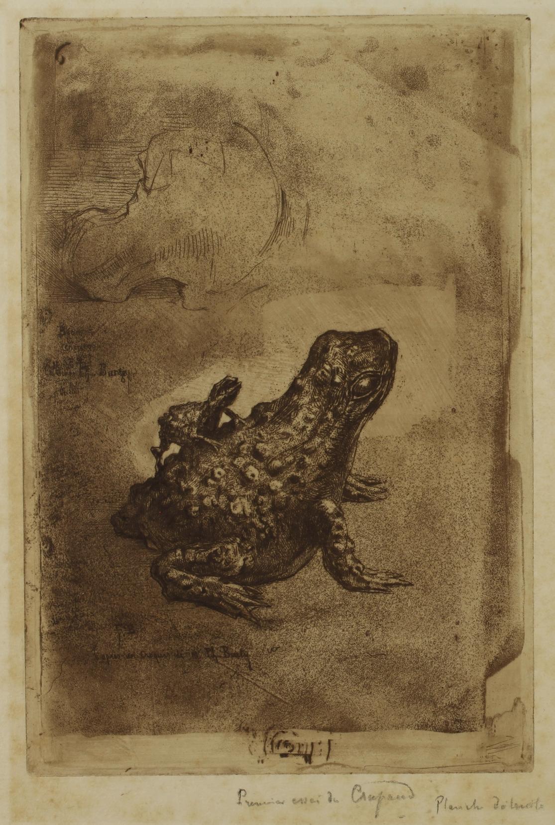

- 1902)
Self-portrait or The Man with the Palette - 1885
Drypoint on zinc plate, 237 x 170 mm. Clément-Janin 72. Very fine impression printed on laid paper. Very good general condition. Good margins.
Clément-Janin indicates that Desboutin engraved all his selfportraits based on his paintings or drawings. This one would have been engraved based on a portrait executed in Florence around 1865.
Clément-Janin also notes that this engraved self-portrait is ‘very rare’.

(1833 - 1898)
La Dame au cochon - Pornokrates - c. 1885 (?)
[The Lady with the pig]
Heliogravure entirely enhanced with watercolour by Rops, in blue, brown, black, pink and yellow, with added details obtained by scratching with a point, 277 to 280 mm x 181 mm (subject). Rouir 969; Ramiro no. 239, p. 184; Mascha 711; Exteens 435.
Superb state proof of the heliogravure, printed on cream Pellée paper and entirely enhanced by Rops.
The sheet bears a dry stamp in the upper right-hand corner: ‘MME] POTTIN À

// INVENTION & PERFECTIONNET 1844 // PAPIER PELLÉE // TOILE DE 5 TEINTE 8’.
The impression is trimmed inside the plate: the dimensions of the sheet are 358 x 275 mm, while those of the heliogravure plate are 385 x 280 mm (dimensions given by Rouir). Very good general condition. Four slight scratches in the subject and some small surface abrasions at the edges of the sheet.
Extremely rare and valuable impression enhanced with watercolour by Rops.
The impression was presented in an old mount annotated in pen: F. ROPS. LA FEMME AU COCHON and Épreuve dessinée complètement en répétition de l’original [Proof drawn completely in repetition of the original.]
Eugène Rouir refers to two states of this heliogravure, both very rare. The first state is the heliogravure not yet retouched, the second is the heliogravure retouched with soft ground etching. Rouir specifies about the 1st state: ‘We have not come across this state reported by Mascha and listed as no. 652 in the sale of his collection.’

Ottokar Mascha in Félicien Rops und sein Werk (1910), describes this 1st state of the heliogravure at no. 711 and provides a reproduction opposite page 284 (see archive.org). However, the poor quality of the reproduction did not allow us to discern the differences with the 2nd state of the heliogravure.
An impression of the 2nd state of the gravure is kept at the Bibliothèque nationale de France. As our impression has been enhanced with watercolour, it is also quite difficult to compare the detail with the impression of the 2nd state of the BnF. However, it appears to us that certain features present on the BnF impression do not appear on ours. For example, on the impression of the 2nd state, the young woman’s stockings are striated with diagonal lines that we do not find on our impression. It is possible that this is a pure heliogravure impression or an intermediate one between the 1st and 2nd states.
Our impression seems to be the one reproduced in issue no. 172 of the magazine La Plume, a special issue dedicated to Félicien Rops in 1896, p. 394: ‘la femme au cochon / D’après une aquarelle originale de F. Rops, sur épreuve d’état de la planche, appartenant à M. O.S...’ [the woman with the pig / From an original watercolor by F. Rops, on a state proof of the plate, belonging to Mr. O.S] (see opposite)
It is worth noting that in our impression, as in the one reproduced in the magazine, the lowest feather at the back of the woman’s hat is covered in black watercolour and now falls downwards, whereas in the non-enhanced impressions it points upwards.
The initials O.S. may refer to Olivier Sainsère (1852-1923), a politician, important art collector and patron of the arts, who owned several original works by Rops.
Félicien Rops frequently used heliogravure to spread his works. However, he endeavoured to make these heliogravures new ‘original’ works. With this in mind, and with extreme attention to detail, he retouched with soft-ground etching the heliogravure plates he had ordered.
Rouir thus quotes a letter from Rops to the Belgian printer Léon Evely in which he informs him that he is sending a retouched photograph of his large pastel Pornokrates for reproduction, asking him: ‘You will return it to me with the plate because I will need it to finish it.’ (Kunel, AAC, II, p. 219-220, quoted by Rouir p. 678)
A photograph retouched in this way by Rops (perhaps the one he refers to in his letter) was sold at Drouot by Binoche et Giquello on 17 April 2013 (lot 121).
Sometimes Rops took this concern for the original work even further by enhancing certain impressions by hand. We have seen that the impressions of the heliogravure of Pornokrates are very rare. Some even rarer impressions have a tiny touch of colour on the flowers and the stockings of the young woman (see, for example, the impression kept at the Los Angeles County Museum of Art).
Our impression is quite exceptional due to the extent of the highlights applied by Rops, which transform the print and thus make it similar to his drawings and watercolours, as well as the paper used, Pellée paper (or Pelée as it is sometimes spelled), which is one of the papers he was particularly fond of for his drawings in the years 1870-1880. It was on this paper that he produced, between 1878 and 1881, some of the drawings in his famous series of Cent légers croquis [One Hundred Light Sketches]. There are a few known cases of heliogravures printed on Pellée paper, such as this print of the Vice Suprême, slightly enhanced with coloured pencils, kept at the Félicien Rops Museum in Namur.
Rops spoke about Pellée paper on several occasions. ‘His Omniana artistique’ (1873) provides a personal definition of Pelée paper, elaborated in comparison with ‘real parchment or calfskin vellum’: ‘Fake parchment is a kind of white donkey skin. It is like Pellée paper: a thick layer of white material that adheres to strong paper, very good for graphite, Conté and lithographic pencils and ink; the tone is much whiter than that of real vellum. It produces very curious effects. N.B. the ink is a little greasy.’ (Michel Draguet, Rops, 1998, p.120) In his letters he also refers to this paper which “gives special very soft tones & interesting works” (letter of 2 January 1878 to Maurice Bonvoisin) and which he had specially sent from
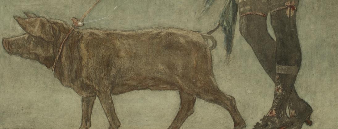

Nantes when he ran out. The surface, which is white or cream in colour and a little thick, allows him to add details by scratching with the point. This is how, in our impression, he very subtly obtains the stars surrounding the young woman and the cherubs. Above all, the tip allows him to redraw the veil that floats around the young woman ’s neck, to define the contours of her body and to bring a touch of luminosity to the shadows, mainly on the young woman’ s back, buttocks, stomach and breasts. Small scratched lines can be found here and there in the subject, for example on the cherubs, bearing witness to a very keen attention to detail.
Created in 1878, Pornokrates is undoubtedly Rops’s best-known work. Executed in pastel, coloured pencil, black chalk, watercolour, gouache, bronzing paint and gold on paper, it is now kept at the Félicien Rops Museum in Namur. Rops was particularly attached to this work, of which he produced several drawn versions and for which, almost twenty years after its creation, he called on the engraver Albert Bertrand to produce a colour engraving in the dimensions of the original.
References: Erastène Ramiro: Catalogue descriptif et analytique de l’œuvre gravé de Félicien Rops, 1893; Ottokar Mascha: Félicien Rops und sein Werk: Katalog seiner Gemälde, Originalzeichnungen, Lithographien, Radierungen, Vernis-mous, Kaltnadelblätter, Heliogravüren usw. und Reproduktionen, 1910; Maurice Exsteens: L’œuvre gravé et lithographié de Félicien Rops, 1928; Eugène Rouir: Félicien Rops, catalogue raisonné de l’œuvre gravé et lithographié, 1987; Michel Draguet: Rops, 1998.
(1864 - 1938)
Self-portrait – 1894
Etching, roulette and aquatint printed with colour registration, 290 x 233 mm. IFF 5/1, Cate and Grivel 60, Zmelty 24.
Very fine impression printed on wove paper, signed and numbered No. 25 in blue pencil. Bears Eugène Delâtre’s red stamp (Lugt 742) in the bottom margin and the annotation in pencil Eugène Delâtre son portrait par lui-même in the lower left corner. Very rare: edition of 30 impressions.
Very good general condition. A few small creases and stains in the large margins (sheet: 362 x 523 mm). Tiny tear in the bottom margin and the tip of the upper left corner missing.
In 1894, Delâtre etched a portrait of his father Auguste examining an impression in his studio, in front of his large intaglio press.
‘Also in 1894, Eugène Delâtre etched his self-portrait in the family workshop, that of the artist and the printer: on one of the sheets of paper pinned to the right-hand wall are the names of three regulars of the place, Charles Maurin, Auguste Lepère and Charles-Louis Houdard. Stylistically, this portrait contrasts sharply with that of his father. Auguste’s portrait, with its Japanese influence in terms of both the use of space and the formal and chromatic synthesis that characterises it, has nothing to do with this self-portrait, which emphasises detail as well as modelling, the result of patient work on shadows and gradations.’ (Nicholas-Henri Zmelty, Impressions à Montmartre, translated by us).
References: Hélène Koehl, Nicholas-Henri Zmelty: Impressions à Montmartre: Eugène Delâtre & Alfredo Müller, 2013; Phillip Dennis Cate and Marianne Grivel: De Pissarro à Picasso: l’eau-forte en couleurs en France, 1992.
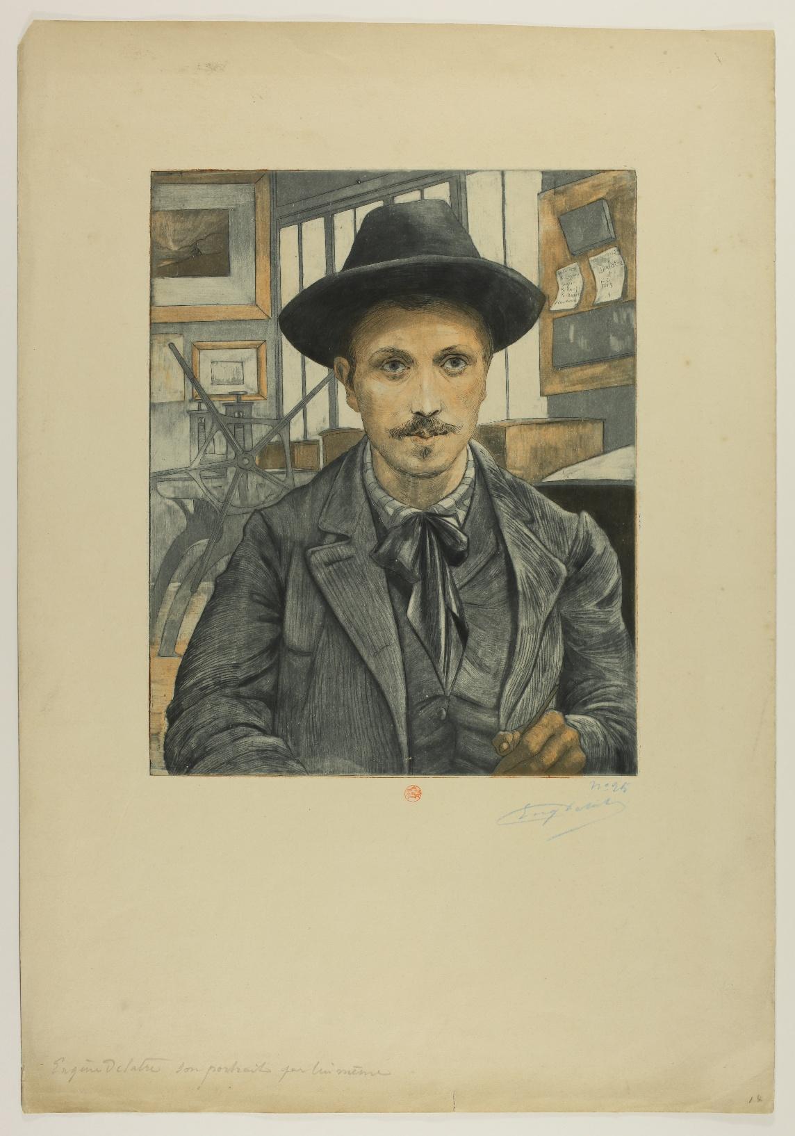

1. Francesco PARMIGIANINO, The Two Lovers - c. 1527/1530
2. Niccolò VICENTINO, Honors Rendered to Psyche - c. 1540
3. ANONYMOUS after Giorgio VASARI, published by Hieronymus COCK, Six Italian writers - c. 1550
4. Pieter van der HEYDEN after Pieter BRUEGEL The Elder, Desidia [Sloth] - 1558
5. Pieter van der HEYDEN after Pieter BRUEGEL The Elder, Luxuria [Lust] - c. 1558
6. Nikolaus SOLIS, Vertumnus and Pomona
7. Johann SADELER I, Mankind Before the Flood - c. 1581
8. ANONYMOUS, Henri de Lorraine, Duke of Guise
9. Willem van NIEULANDT II, Large View of Rome with the Isle of the Tibre un the Centre – c. 1605/1610 (?)
10. Guido RENI, The Virgin and Child by a Table, with St John the Baptist as an Infant
11. Jacques CALLOT, Les Gobbi - 1621-1622
12. Jacques CALLOT, Les Grandes Misères de la Guerre - 1633
13. REMBRANDT HARMENSZOON VAN RIJN, The Return of the Prodigal Son1636
14. Abraham BOSSE, Minerve or La Vertu - 1637
15. Abraham BOSSE, La Galerie du Palais - c. 1638
16. Abraham BOSSE, Les Imprimeurs en taille-douce - 1642
17. Abraham BOSSE, Graveurs en taille douce au Burin et à l’Eau-forte - 1643
18. Jean PESNE, Self-portrait of Nicolas Poussin, known as Self-portrait Pointel-Cerisier - 1659
19. Jean MORIN, Antoine Vitré, Typographer to the King and Clergy of France
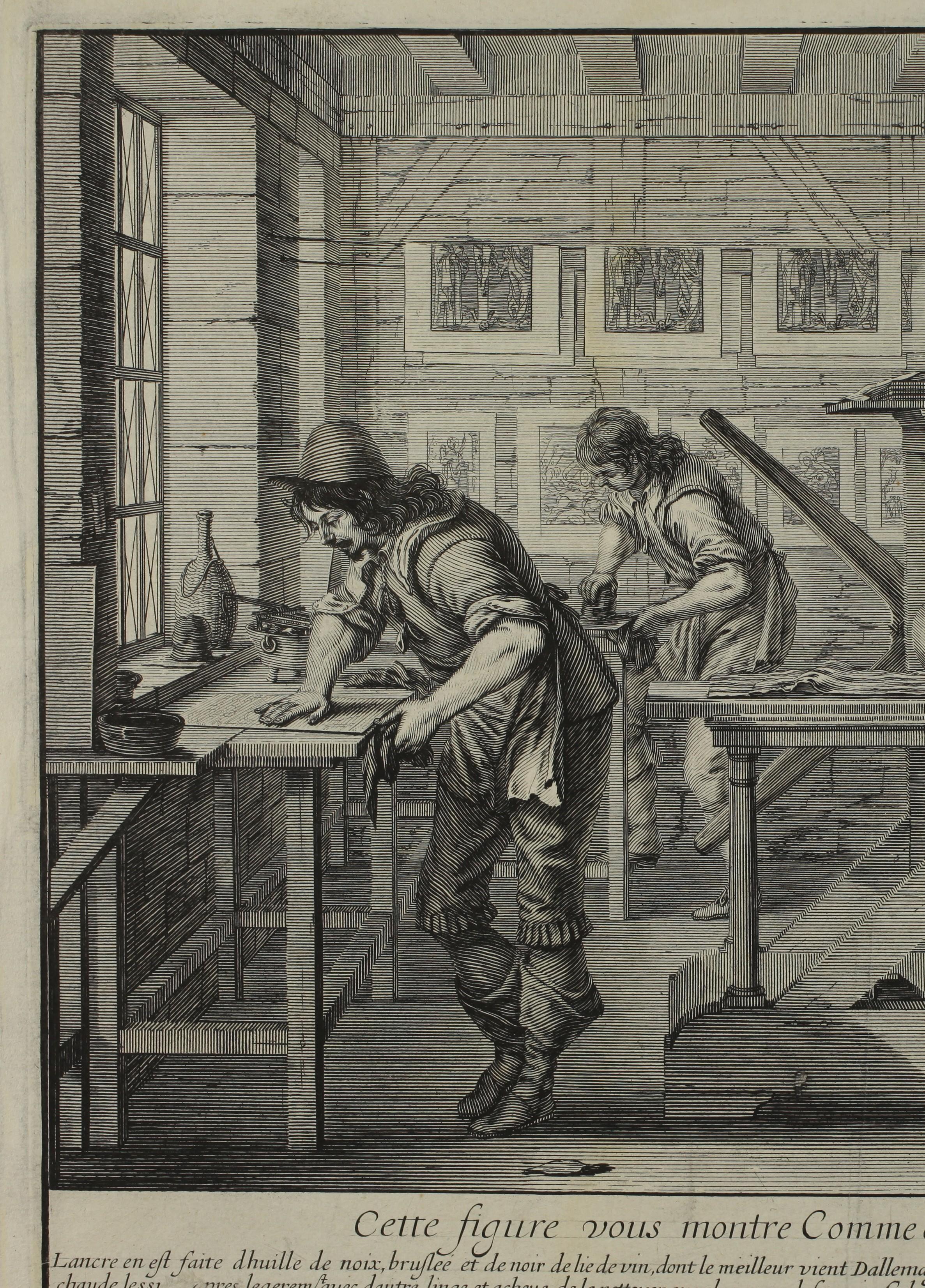
20. François-Philippe du BERCELLE, Nous passons le Tems et le Tems nous passe.
21. Jacques-Fabien GAUTIER D’AGOTY, Saturne and Philyra - c. 1743
22 . Louis-Joseph LE LORRAIN, The Death of Lucretia - 1742
23. Louis-Joseph LE LORRAIN, Shield of Hercules and Shield of Aeneas - 1756
24. Louis-Joseph LE LORRAIN, The Descent of Ulysses into Hell - 1757
25. Louis-Joseph LE LORRAIN, Solomon Worshipping Idols - 1742
26. Jean-Michel MOREAU, known as Moreau le Jeune, after Jean-Baptiste GREUZE, La Philosophie endormie - 1777
27. Jean-Philippe-Guy LE GENTIL, comte de PAROY, Self-portrait of Elisabeth Louise Vigée Le Brun in a Straw Hat
28. Carlo LASINIO, Portrait of Edouard Dagoty, Inventor of Color Print, pastel - c. 1784
29. Adolphe Martial POTÉMONT, known as MARTIAL, Lettre sur les éléments de la gravure à l’eau-forte - 1864
30. Adolphe Martial POTÉMONT, known as MARTIAL, Nouveau traité de la gravure : l’eau forte pour les peintres et les dessinateurs - 1873
31. Rodolphe BRESDIN, Les Villes derrière le marécage - 1878
32. Félix BUHOT, Crapaud Bronze, first version- 1883
33. Marcellin Gilbert DESBOUTIN, Self-portrait or The Man with the Palette1885
34. Félicien ROPS, La Dame au cochon - Pornokrates - c. 1885 (?)
35. Eugène DELÂTRE, Self-portrait - 1894
2025 © Copyright Sarah Sauvin