
W R
Rockwell
Frank Hinman Pierpont In 1934 ROCKWELL BOLD ITALIC 31PT ROCKWELL BOLD 39PT ROCKWELL BOLD 55PT ROCKWELL ITALIC 16PT by the in-house studio of Monotype foundry Rockwell ROCKWELL BOLD ITALIC 64PT Was Created by
Rockwell is a slab serif typeface designed in 1934 by Monotype. The design is based off an earlier slab serif from 1910 known as Litho Antique, which is considered the very first geometric slab serif. The Rockwell family is available in three weights with corresponding italics, as well as a condensed version. An updated version was released by Monotype in 2016 under the name Rockwell Nova.
ROCKWELL
ROCKWELL ROCKWELL ROCKWELL ROCKWELL ROCKWELL ROCKWELL ROCKWELL Rockwell is a slab serif typeface designed in 1934 by Monotype. The design is based off an earlier slab serif from 1910 known as Litho Antique, which is considered the very first geometric slab serif.
The Rockwell family is available in three weights with corresponding italics, as well as a condensed version. An updated version was released by Monotype in 2016 under the name
ROCKWELL ROCKWELL ROCKWELL ROCKWELL
Rockwell has a strong display face for headlines and posters; it is also legible in short text blocks.
ROCKWELL
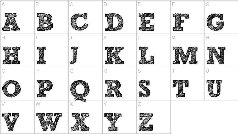
AaBbCcDdEe FfGgHhIiJj KkLlMmNnOo PpQqRrSsTtUu VvWwXxYyZz 1234567890!@ #$%^&*,.~ Alphabet in Rockwell
Rockwell Rockwell Rockwell Rockwell Rockwell Rockwell Rockwell Rockwell Rockwell Rockwell Rockwell Rockwell Rockwell Rockwell Rockwell Rockwell Rockwell Rockwell Rockwell Rockwell
to the
is
with
as well. These
are
for bold titles and catching
W The Rockwell “M”
similar
“W”
its squared serifs
capital letters
perfect
attention
W
The Rockwell “W” is the boldest letter with its three stems and squared serifs making it more unique.
M
Slab serifs in general may remind readers of older poster fonts and Western movie paraphernalia. Early slab serif fonts were created in the nineteenth century, usually from wood, which was notoriously hard to carve into the small details required for intricate type. Slab serif lettering rapidly became very popular in any areas in which wooden faces were commonly used. Later, smaller versions were deliberately cut in metal as an alternative to the regular serif and sans serif fonts available at the time. The modified result, named Rockwell Antique™, was published by ATF in 1931. Later the same year, Benton redrew the font in a heavier style, naming it Stymie™ Bold.
TYPOGRAPHY SPECIMEN BOOK
Slab serifs in general may remind readers of older poster fonts and Western movie paraphernalia. Early slab serif fonts were created in the nineteenth centu ry, usually from wood, which was notoriously
When Frank Hinman Pierpont, in collaboration with Monotype, decided to create and release the Rockwell typeface family in 1934, several unique characteristics, including differences in spacing, letter weight and subtle changes in glyph formation, were included. Even so, the Stymie Bold and Rockwell designs are often confused for one another, not only because of their similarities but because of the fact that in an early Monotype document, the Rockwell font was accidentally referred to as Stymie™ Bold. While there are subtle differences between the two faces, this mistake continues to cause confusion today. of
created centu-
O P
WQ
R T
L B
E
U
F
N
A YH
K Z X C V
D
I S
G J
WESTERN WESTERN WESTEWESTERN WE ERN WESTE NINTEE CENTURY NIN CEN NINTEENTH CEN19 1934 1934 1934 1934 1934 1934 1934 1934 ANTIQUE ANTIQUE ATIQUTIQUE ANTIQ ANTIQUE ALITHO A TIQUE LITHO AN LI ANTIQUE LITHO AN MIE BOLD ATYMIE STMIE BOLD STYMI WESTERN WESTERN WESTE WESTERN WESTERN WESTE NINTEENTH CENTURY NIN CENTURY NINTEENTH CEN 1934 1934 1934 1934 1934 19 1934 1934 1934 1934 1934 19 ANTIQUE ANTIQUE ANTIQU TIQUE ANTIQUE ANTIQUE A LITHO ANTIQUE LITHO AN LITHO ANTIQUE LITHO AN STYMIE BOLD STYMIE BOL STMIE BOLD STYMIE BOLD FRANK HINMAN PIERPONT FRANK HINMAN PIERPONT MONOTYPE MONOTYPE M TYPE MONOTYPE MONOTY ALTERNATIVE ALTERNATIV ALTERNATIVE ALTERNATIV INTRICATE INTRICATE INT
Futura ROCKWELL Compared to other fonts AbCdEfG AbCdEfG Rockwell Bodoni AbCdEfG Rockwell AbCdEfG Palatino AbCdEfG Rockwell AbCdEfG Gill Sans AbCdEfG Rockwell AbCdEfG ROCKWELL