brave the colours
Graphics for architecture and more

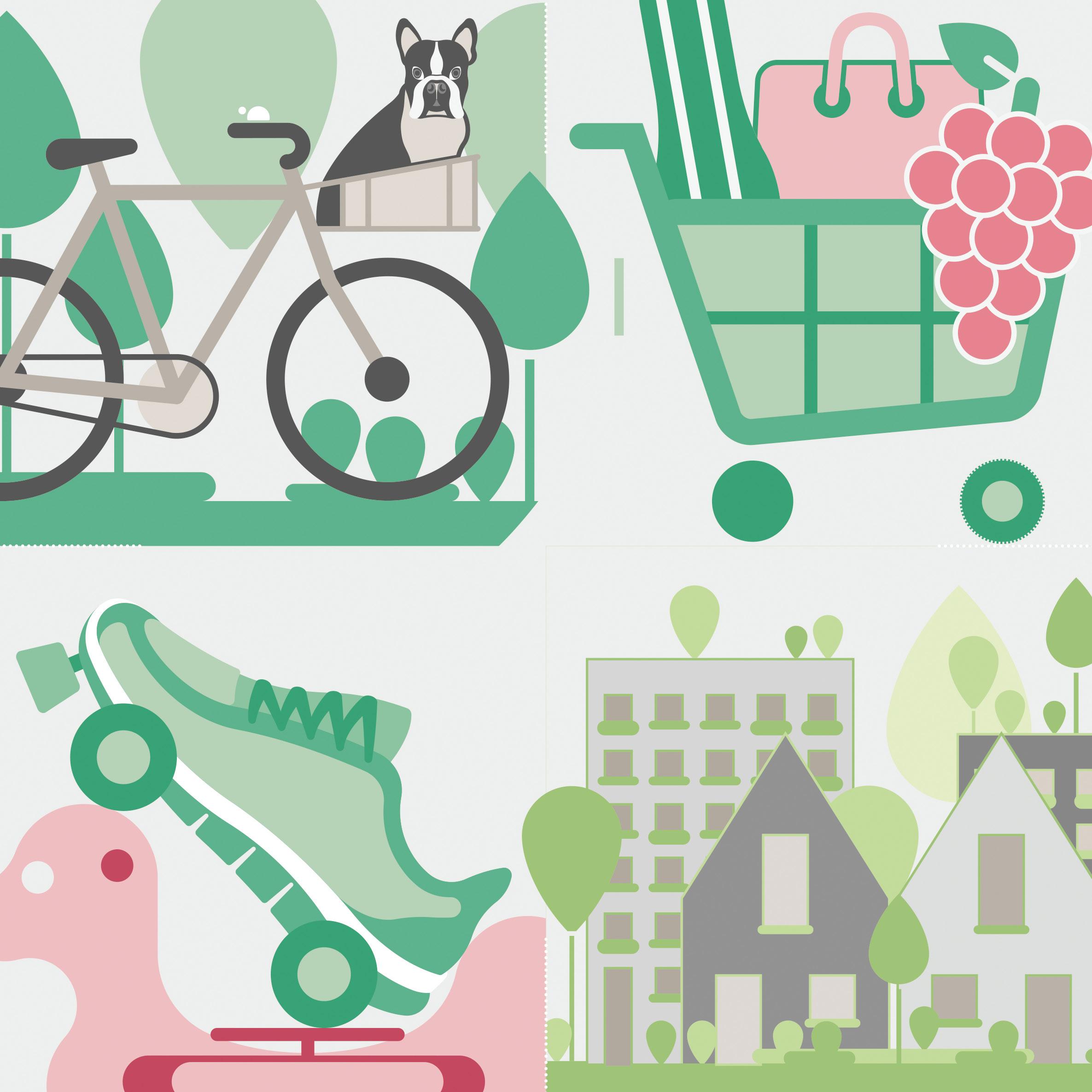
let pictures speak
Icons in conjunction with a few words, are a simple way to allow for effortless communication. It adds a sliver of playfulness which subsequently triggers visual, intellectual and emotional engagement. It also guides the viewer’s attention gently into the intended direction.
This set of icons result from a range of architectural projects representing technical information. It was key to show a visual hierarchy visual hierarchy which appears condensed but digestable.
They also form a framework for a library: easy accessible and modifiable for everyone.
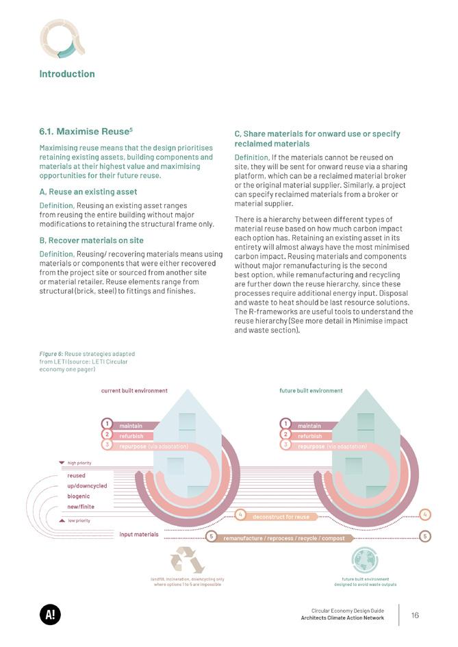
1. vibrant neighbourhood
2. community learning
3. social value & cohesion
4. natural ventilation & lighting
5. education & awareness
6. green views
7. street lighting & planting
8. low energy building
9. biodiversity & sustainability
10. playspace & recreation
11. retaining communities
12. food growth
13. masterplan
14. local accessibility
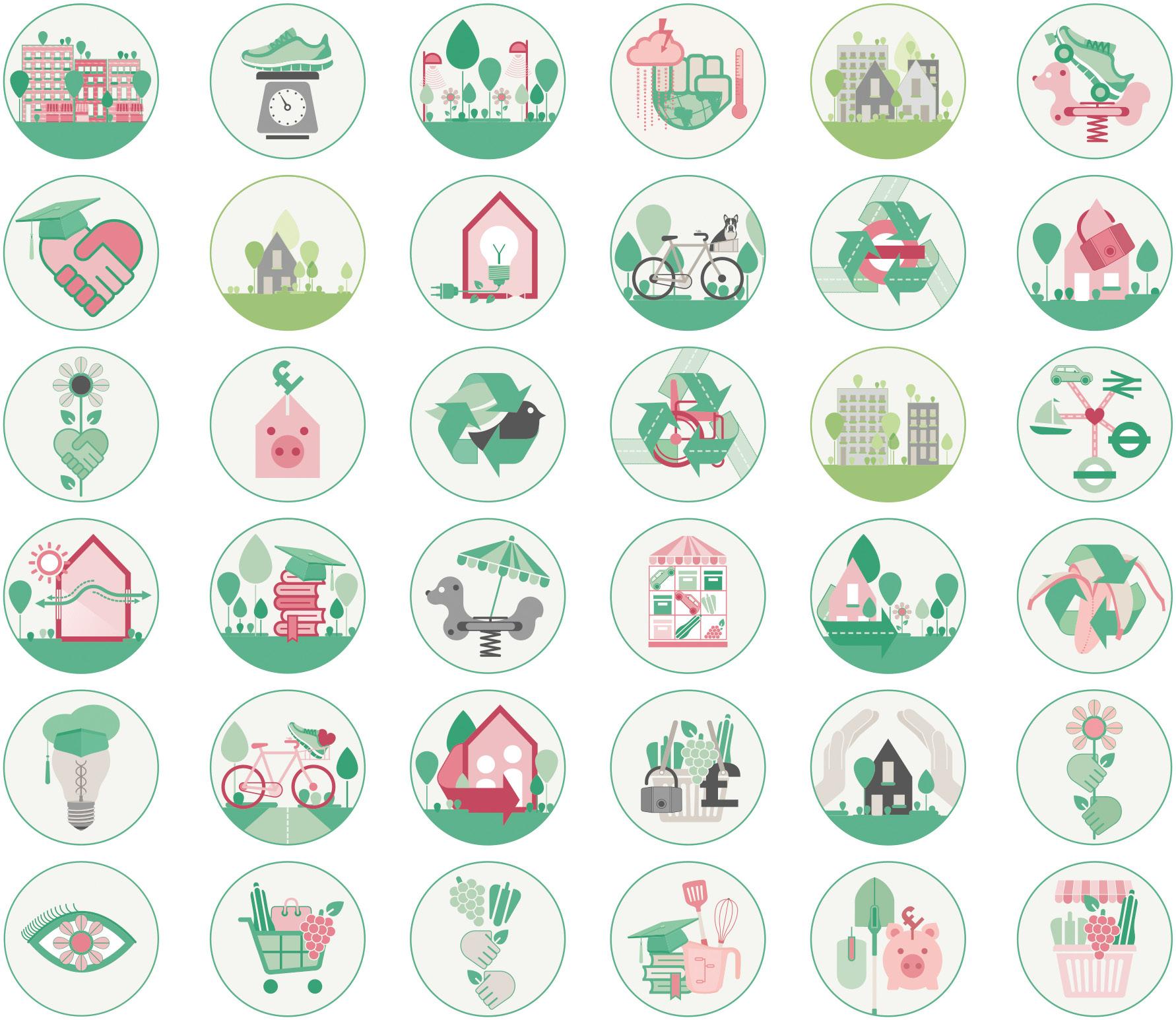
15. plot
16. private amenity access
17. domestic pride & ownership
18. job opportunities
A. health & wellbeing
B. home
C. affordable homes
D. community library & garden
E. public space & social interaction
F. commercial growth
G. climate change resilience
H. permeability & soft mobility
I. wheelchair accessible homes
J. market infrastructure
K. food security & prosperity
L. community education
M. varied playspace
N. safe & secured homes
O. making connections
P. food waste recycling
Q. community gardening
R. market
1 2 3 4 5 6 A B C D E F 7 8 9 10 11 12 G H I J K L 13 14 15 16 17 18 M N O P Q R copyright @ Bell
Architects 2020-22
Phillips
Community engagement growing diagram
Time Commitment
Informal Volunteer Community Growing
Organiser of Community Growing
Commercial Urban Farming
Capital Growth Enterpreneur
Consuming
Regular Volunteer Community Growing
Organiser of Community Cooking
Home Growing
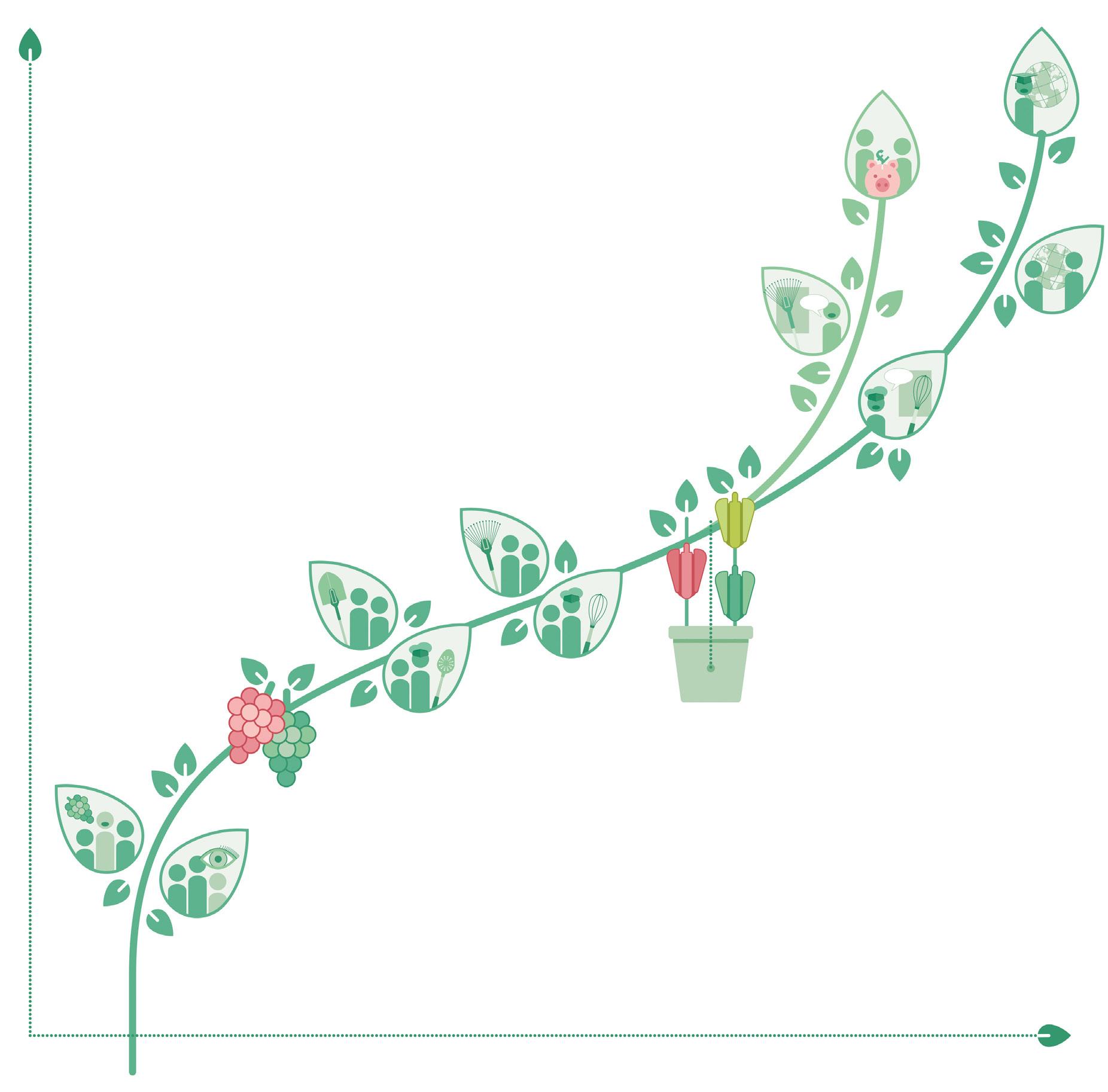
Social Enterprise Community Growing
Observing
Regular Volunteer Community Kitchen
Informal Volunteer Community Kitchen
Levels of Engagement
copyright @ Bell Phillips Architects 2020-21 / in collaboration with Jay Morton & Alix Martin
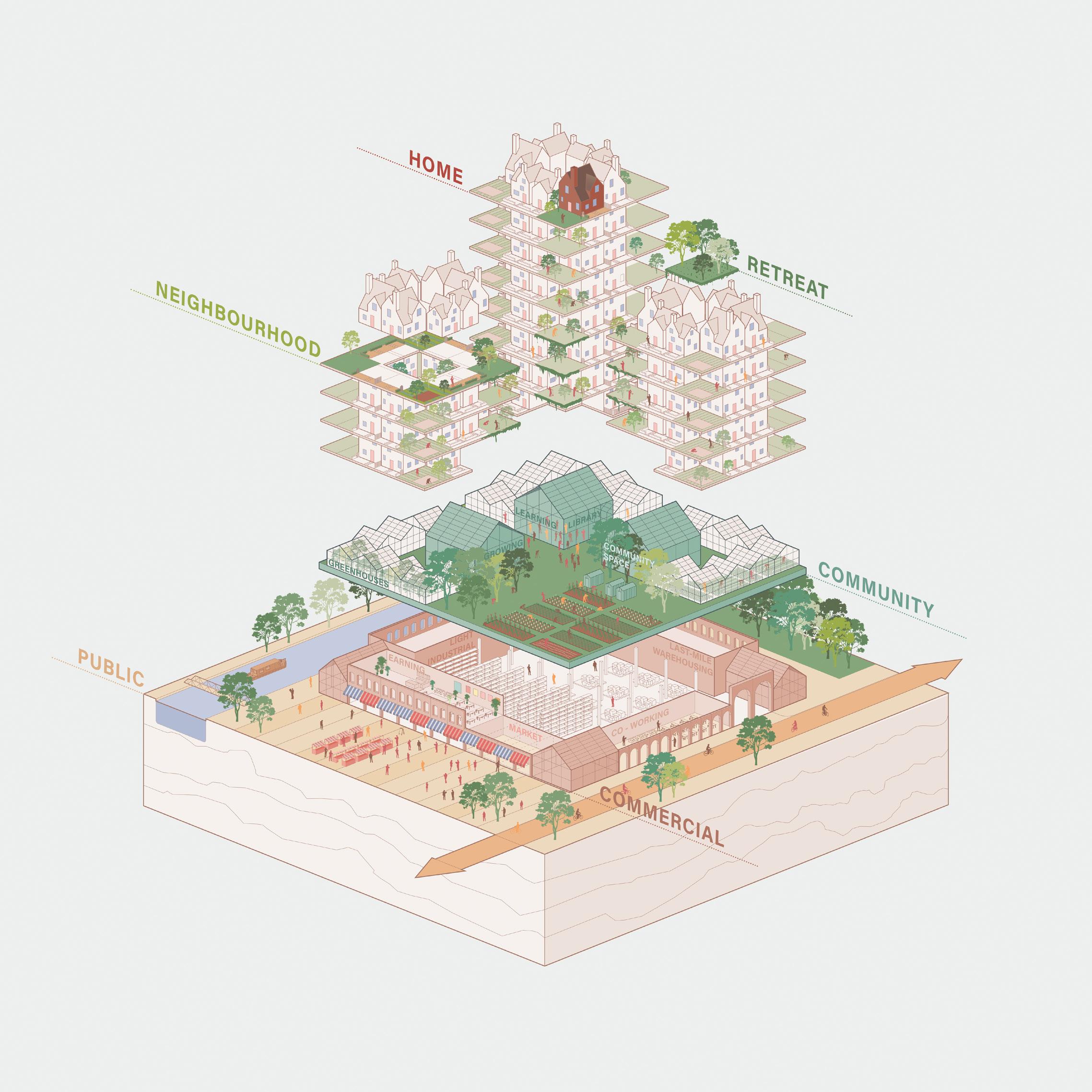
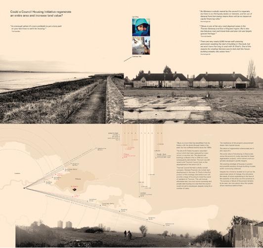
a garden for the city
This concept design was from a competition entry which proposed research on high density living in an urban environment. It focuses on an integrated local food system to allow a growing community a healthy, more sustainable and collective life.
The two reports were created which communicated a high volume of information. That required a common language to tie it all together. The colours and limited shapes and proportions used on graphic elements guaranteed coherence throughout.

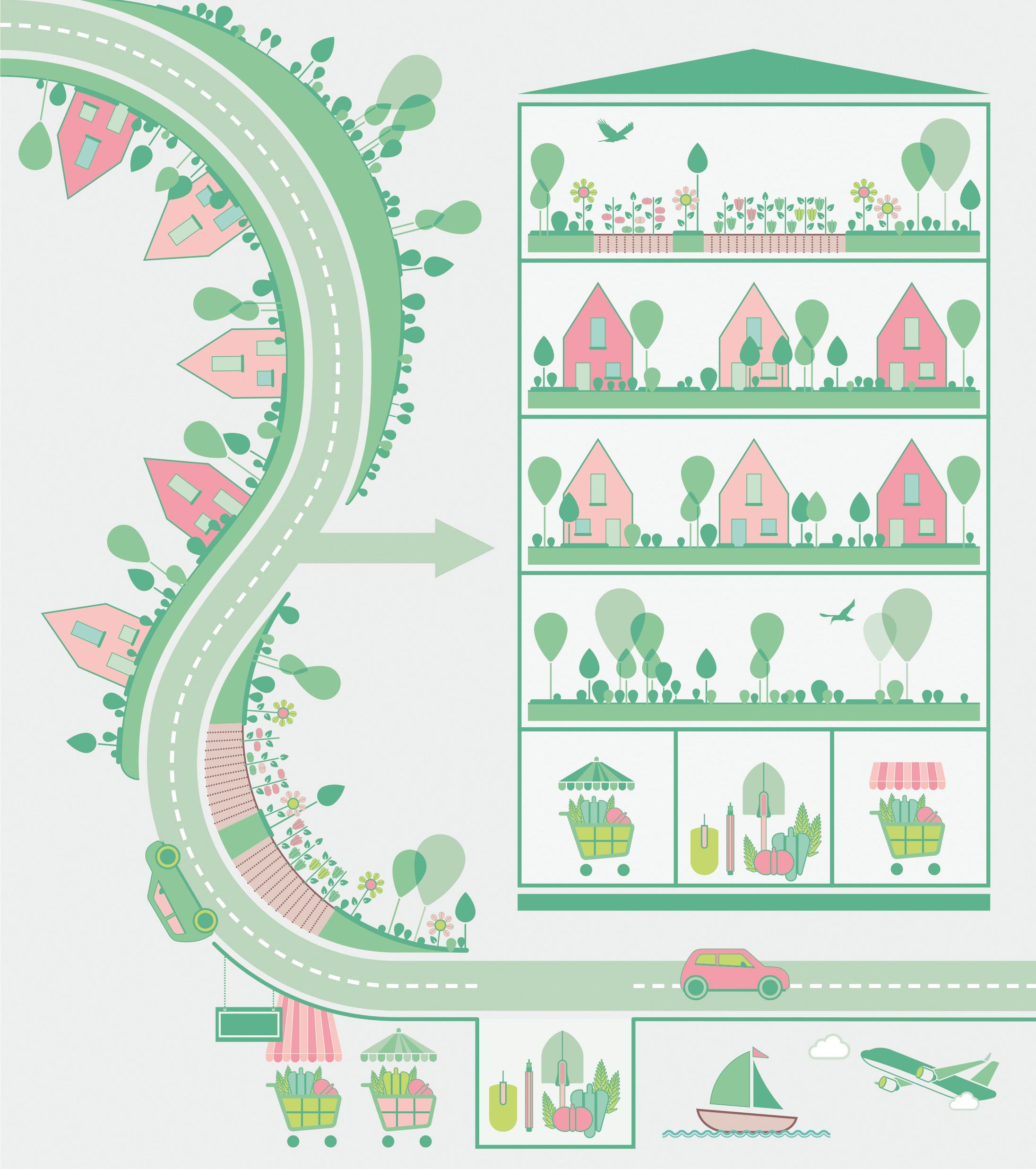
Gardensity concept diagram allotment shop jobs + food shop park allotment gardensity park jobs + food
Biodiversity
Social Value
Health & Wellbeing
 copyright @ Bell Phillips Architects 2020-21
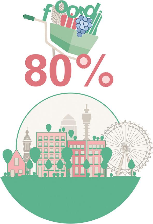
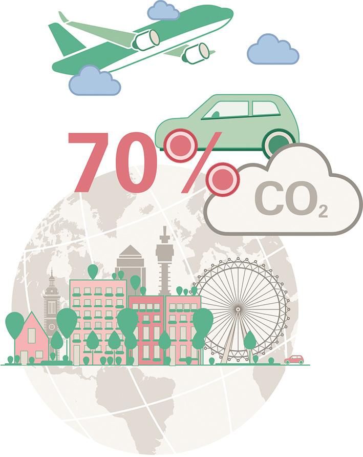
Global CO2 emission of cities
consumption of cities
/ in collaboration with Jay Morton & Alix Martin
Food
&
Wildlife
Playspace & Education
Local food system beneficial for different aspects of life
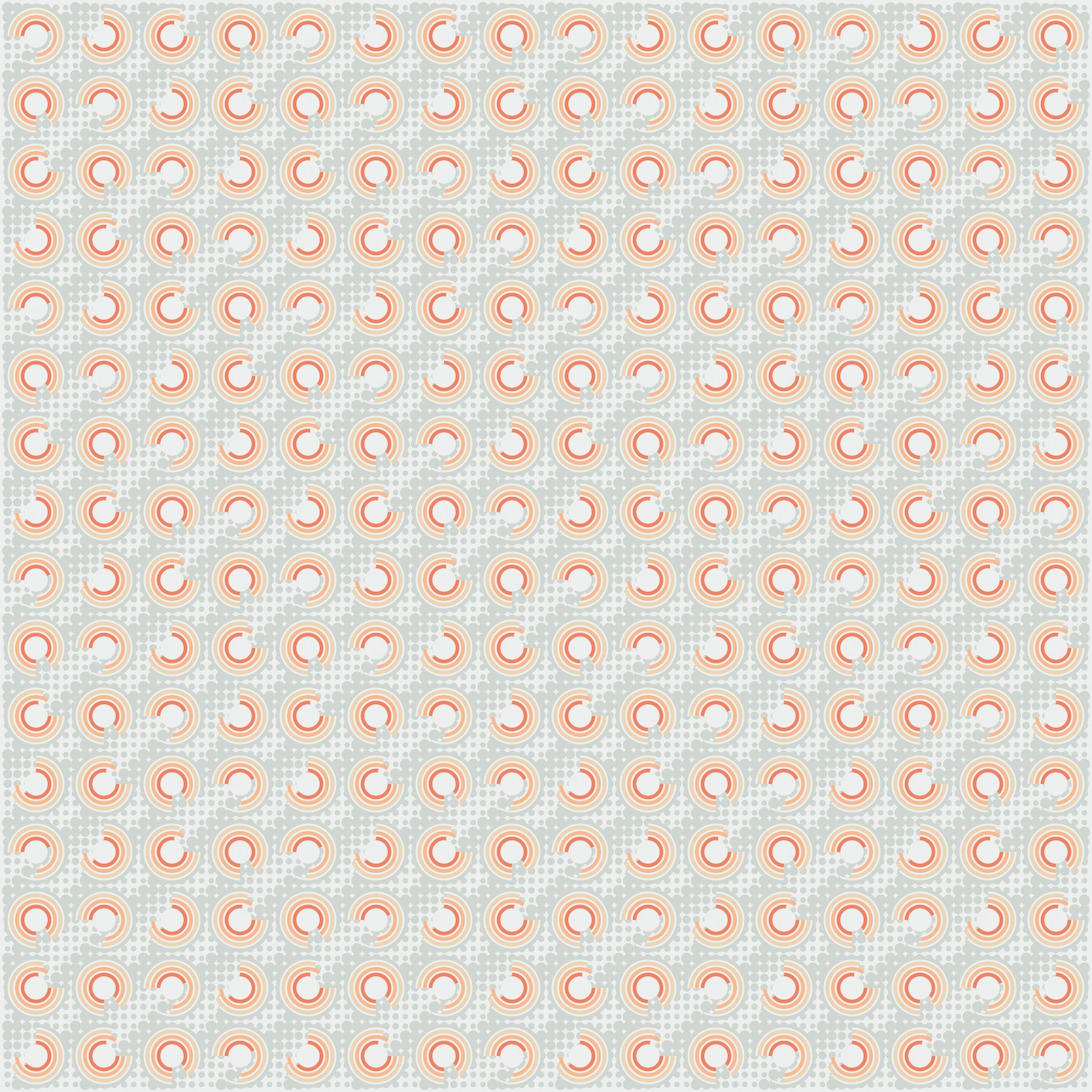
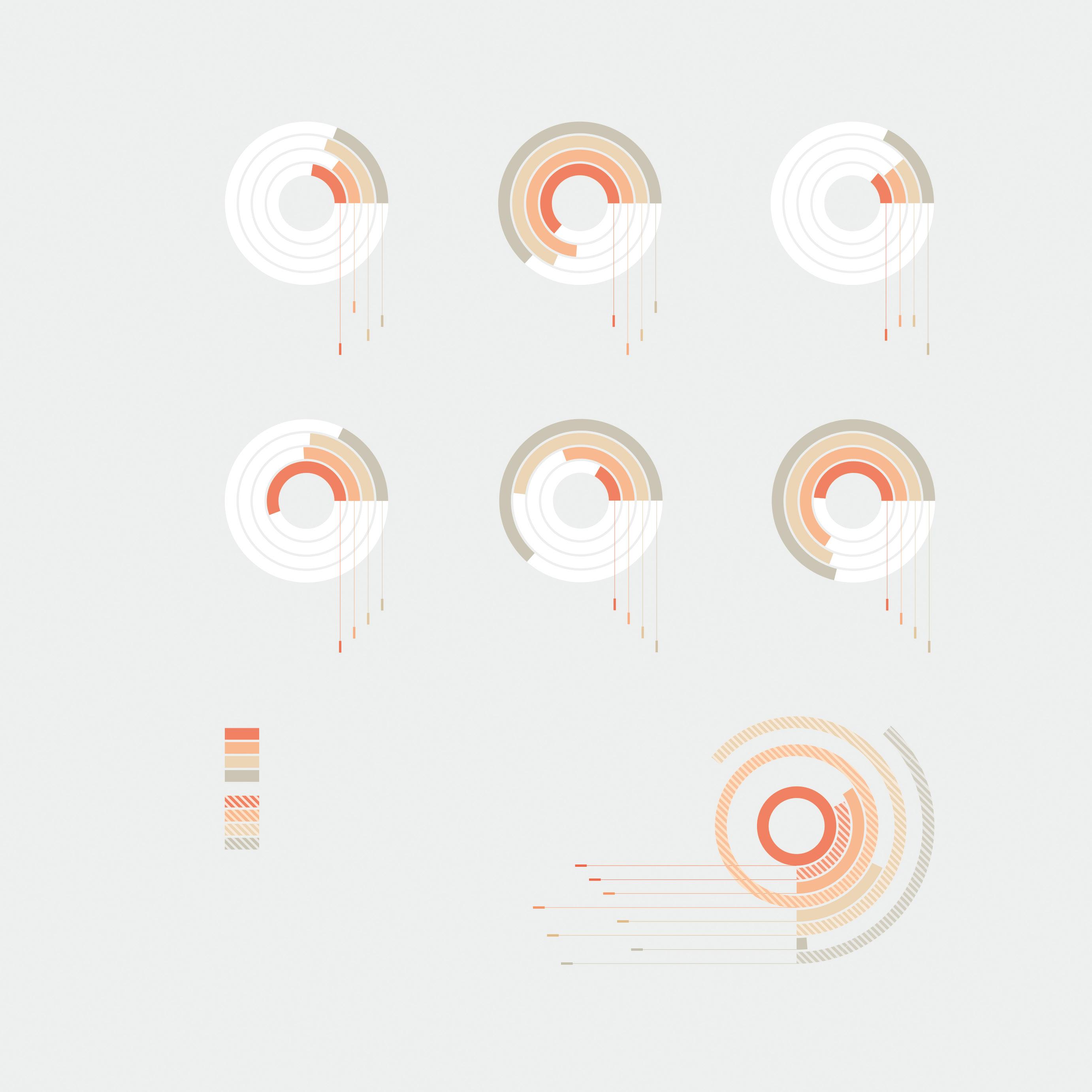
bite size information
Like icons, information graphics are a strong ally in communicating data. It is impossible to imagine a technical output without it. Furthermore, they facilitate the visual identity of a project by highlighting its main focus.
The following pages show a collection of data visualisations: statistics, organigrams, charts, manuals and icons. One example features a document section tracker as an adaptation of the project logo.
Extraction of project related demographic statistics
copyright @ Bell Phillips Architects 2019
all children (0-15) (%) 22.5 20.0 18.9 14.7 working people (16-64) (%) 63.8 68.6 63.2 73.9 older people (65+) (%) 13.8 17.8 11.4 employment rate (16-64) (%) 48.7 69.2 71.2 66.1 households owned (%) 16.8 48.2 63.5 30.6 households social rented (%) 55.8 24.1 17.6 25.9 median household income estimate (£) population density (person per km2) Church Street Westminster London England Church Street Westminster London England 29,700 26,290 10,286 80,760 5,293 51,770 414 30,763
copyright @ Allies and Morrison Architects 2012
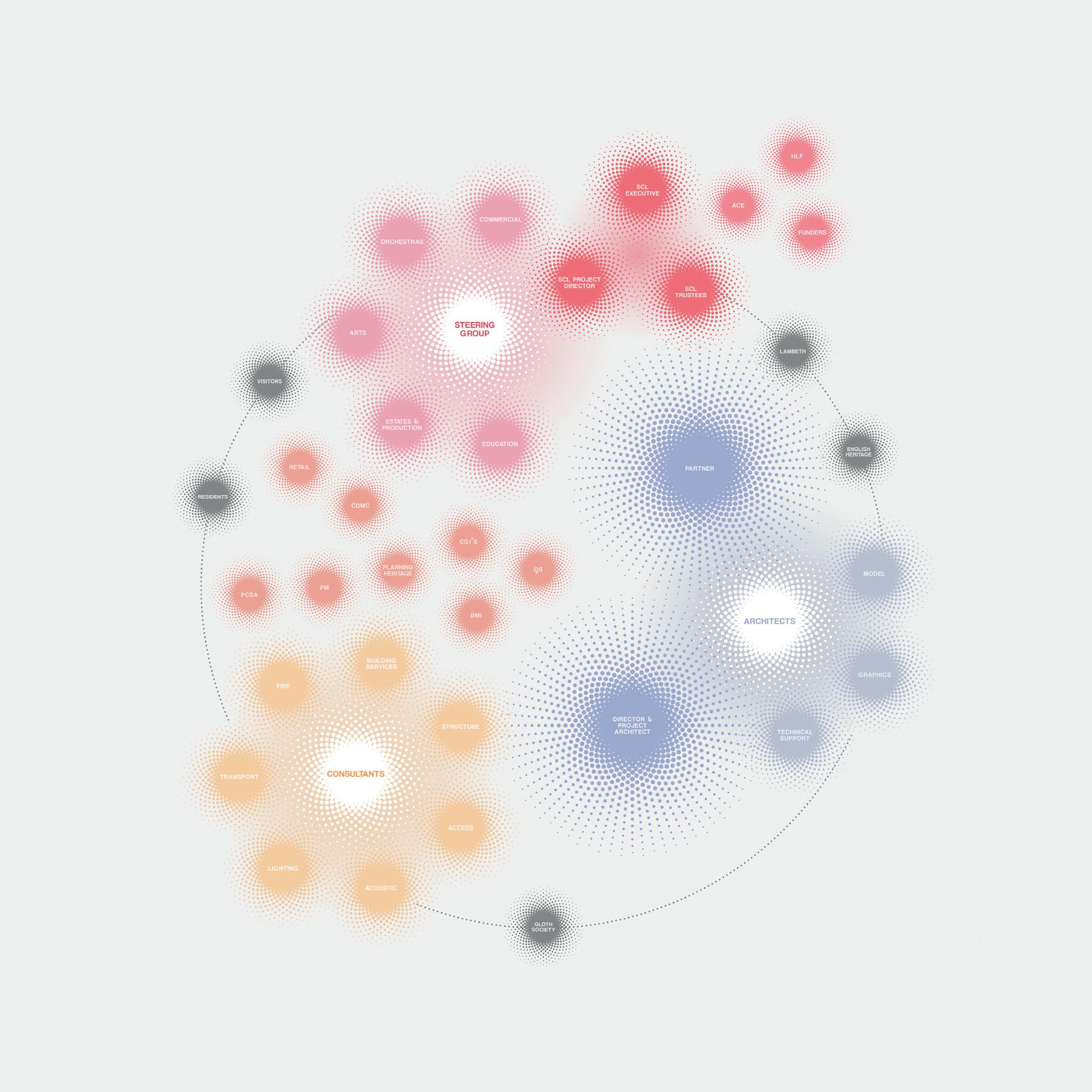
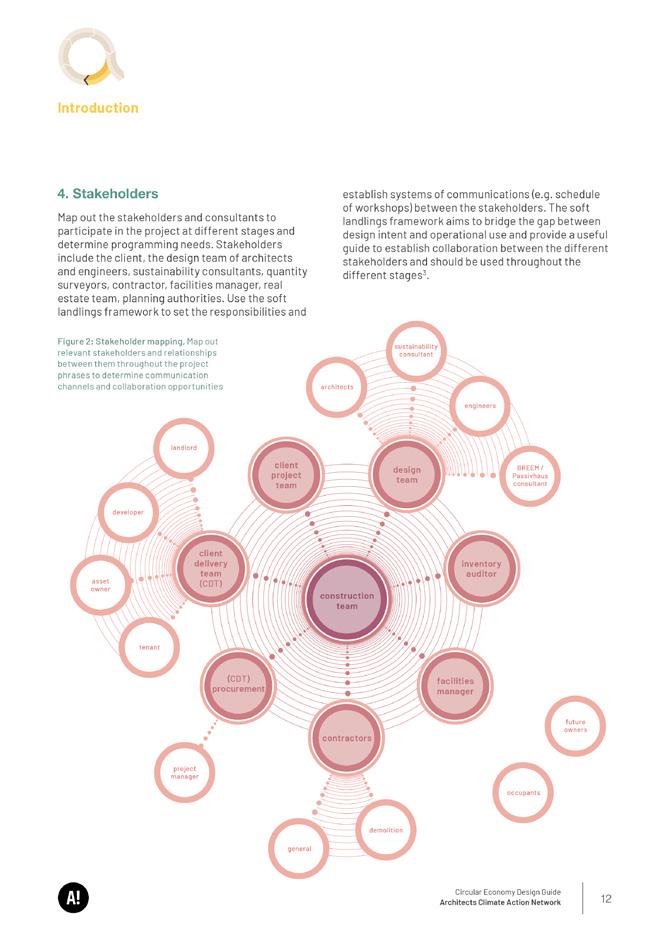
Project team diagram
Mobile pavilion structure allowing for individual use in different locations or reassembly
copyright @ Bell Phillips Architects 2013 / in collaboration with Hari Phillips
Cover design proposal of the document series / section tracker icons / colour strategy offering document complement colour and palette for diagrams / document layout comprising two templates: section opening and further contents pages


Document contents pages showing adapted information graphics
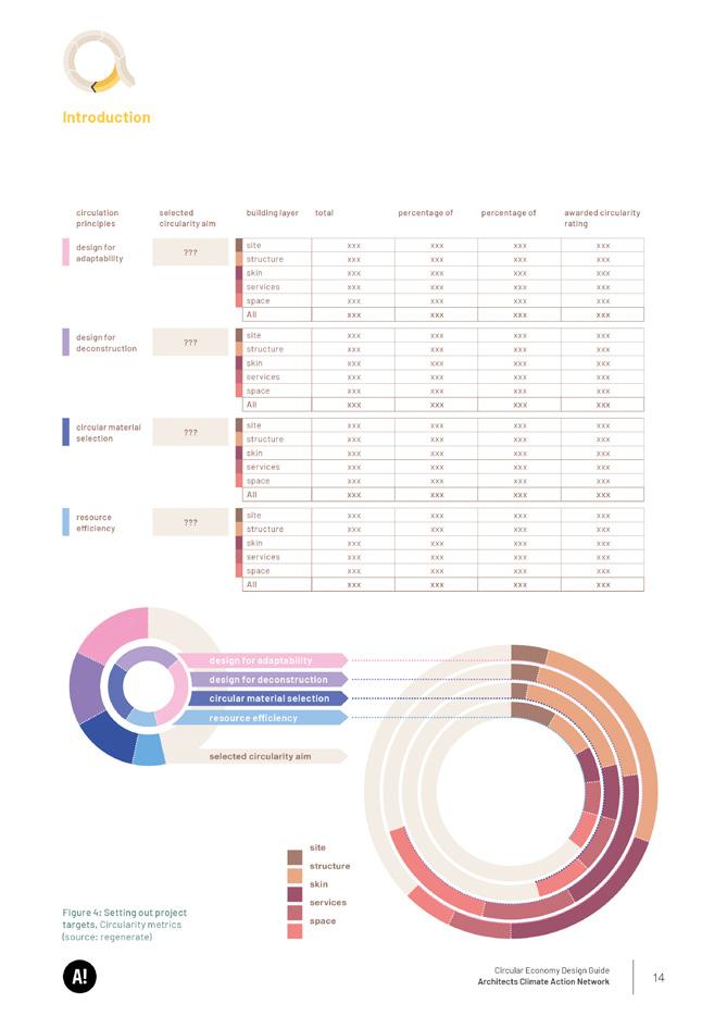
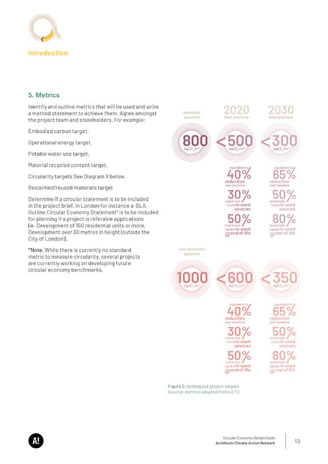
(data source: LETI and regenerate)
copyright @ ACAN 2023 / in collaboration with ACAN team
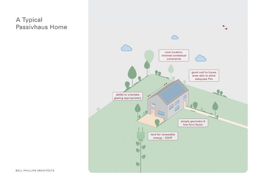
schwein gehabt!
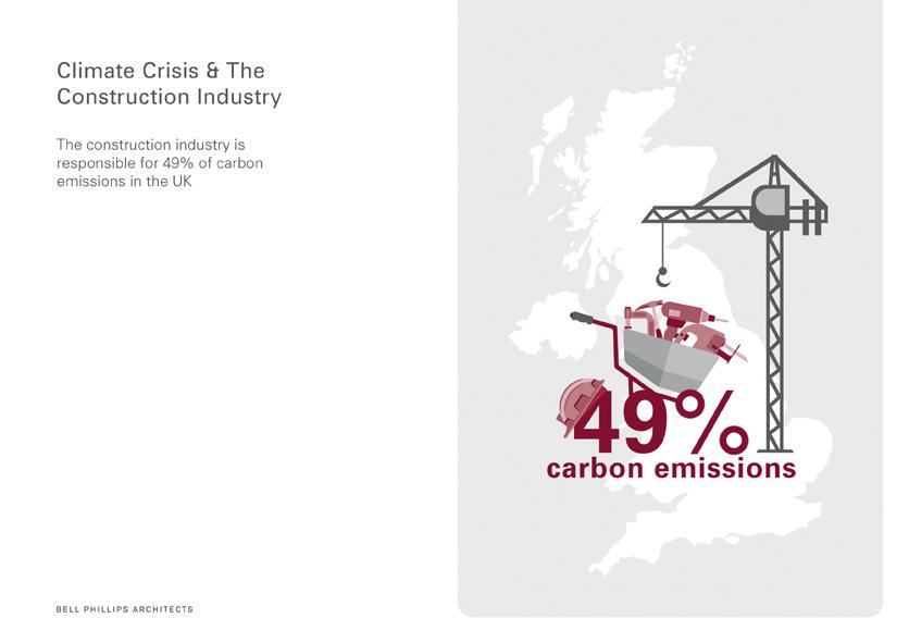
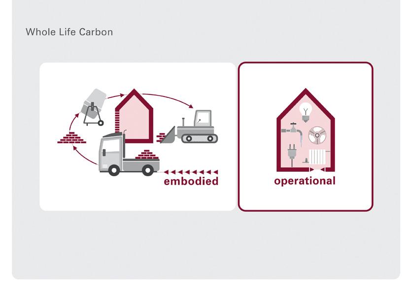
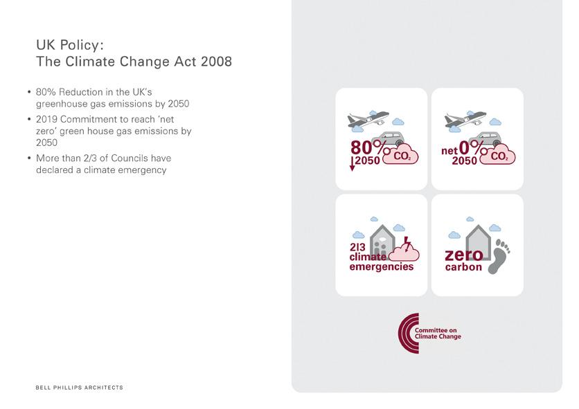
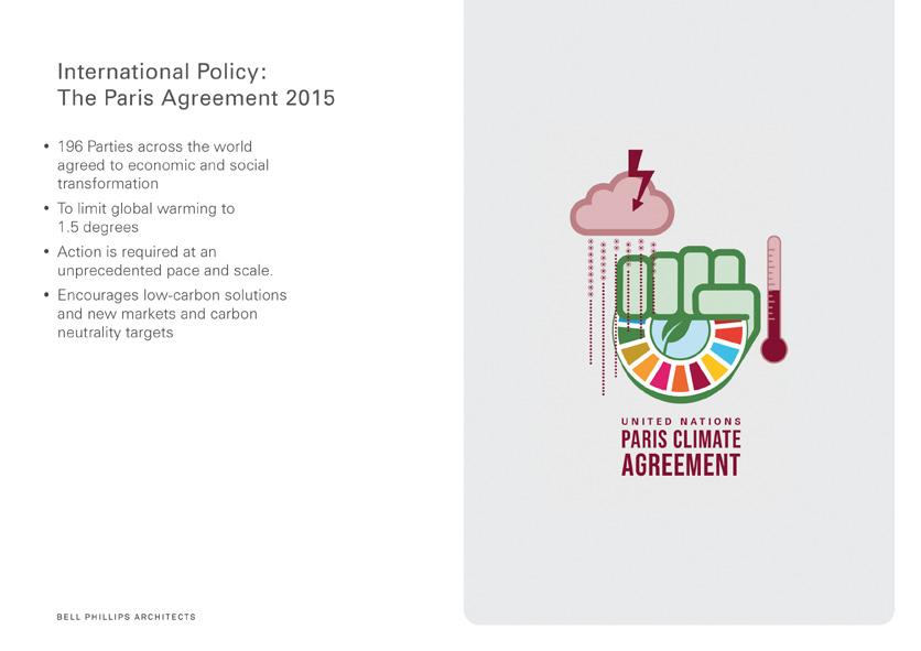
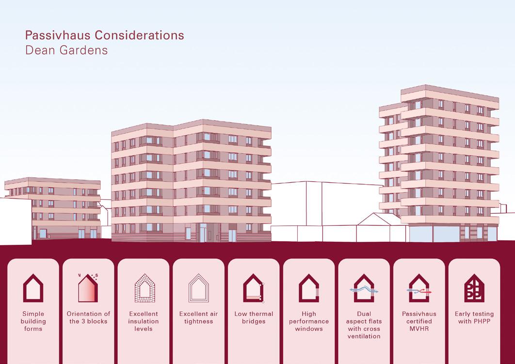
This project was in the form of a seminar which addressed the gap between climate crisis, fuel poverty and the adoption of Passivhaus standards to affordable homes.
The presentation divides into two parts emphasised by two colour themes:the first familiarises the audience with the subject in general while the second half demonstrates with a case study on how Passivhaus standards are achievable.

copyright @ Bell Phillips Architects 2021
General data and Passivhaus requirements
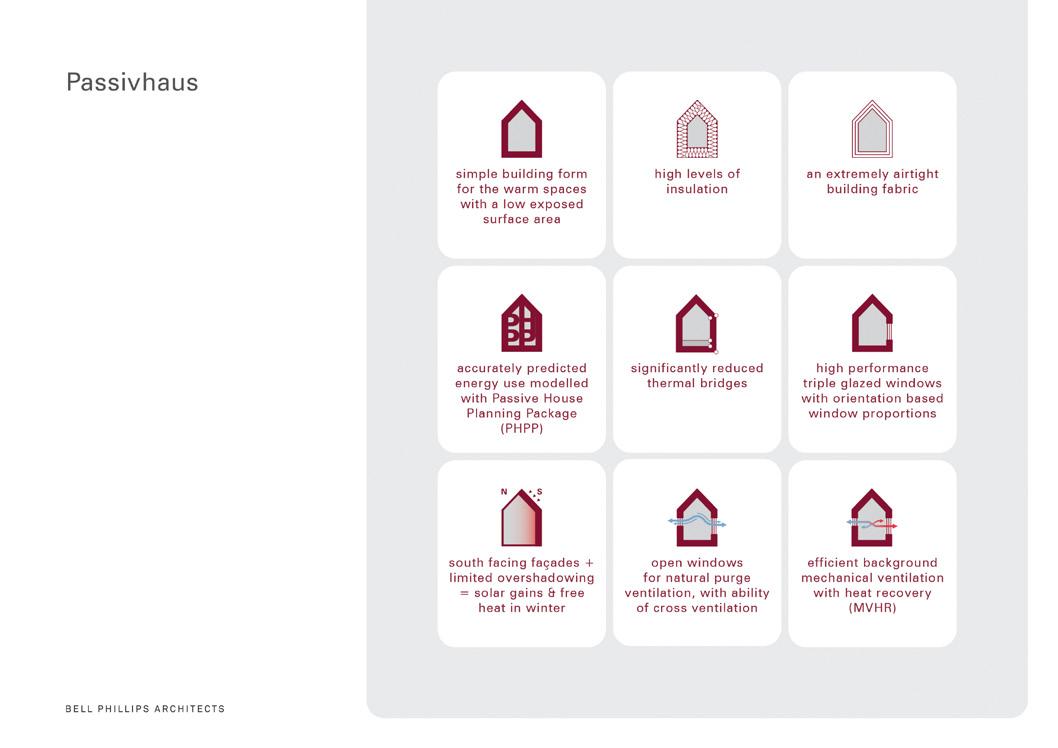


 copyright @ Bell Phillips Architects 2021 / in collaboration with Emma Carter, Richard Brindle, Ashmi Thapar, Ned Scott, George Entwistle / 3D images by darcstudio
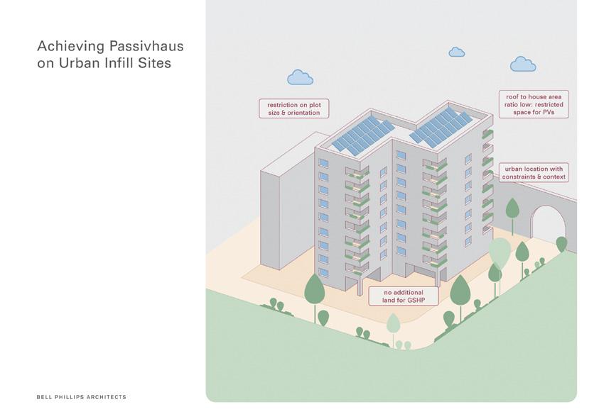
Case study achieving Passivhaus
copyright @ Bell Phillips Architects 2021 / in collaboration with Emma Carter, Richard Brindle, Ashmi Thapar, Ned Scott, George Entwistle / 3D images by darcstudio
Case study achieving Passivhaus
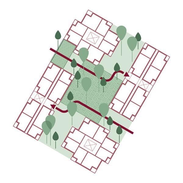
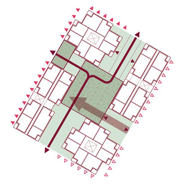
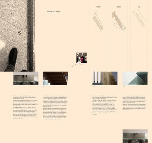
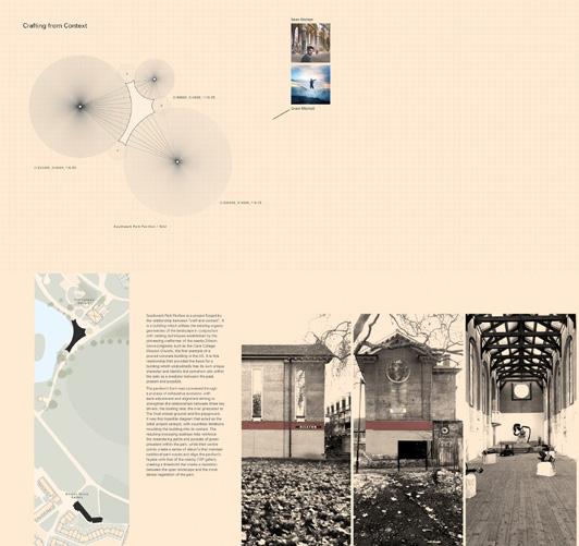
method and means
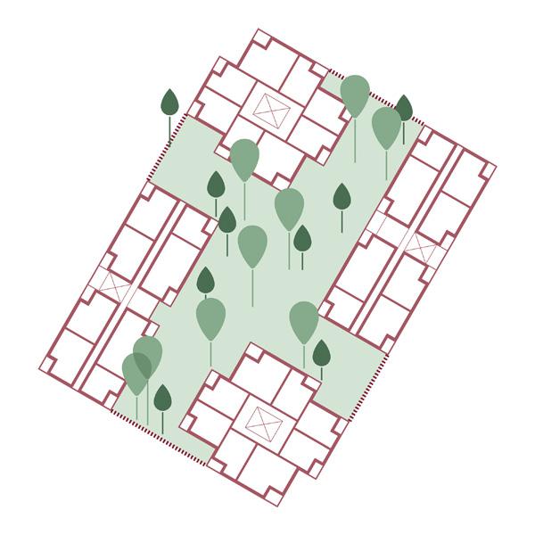
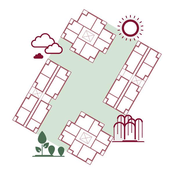
Concept diagrams help to aid decision making and explain why a design approach was chosen but also what obstacles a site is exposed to caused by technical, geographical and demographical issues. Visually, analytical diagrams offer the possibility to become a playing field of colours, patterns, lines and shapes as long as the message communicated remains clear and its context is self-explanatory.

Different flat types
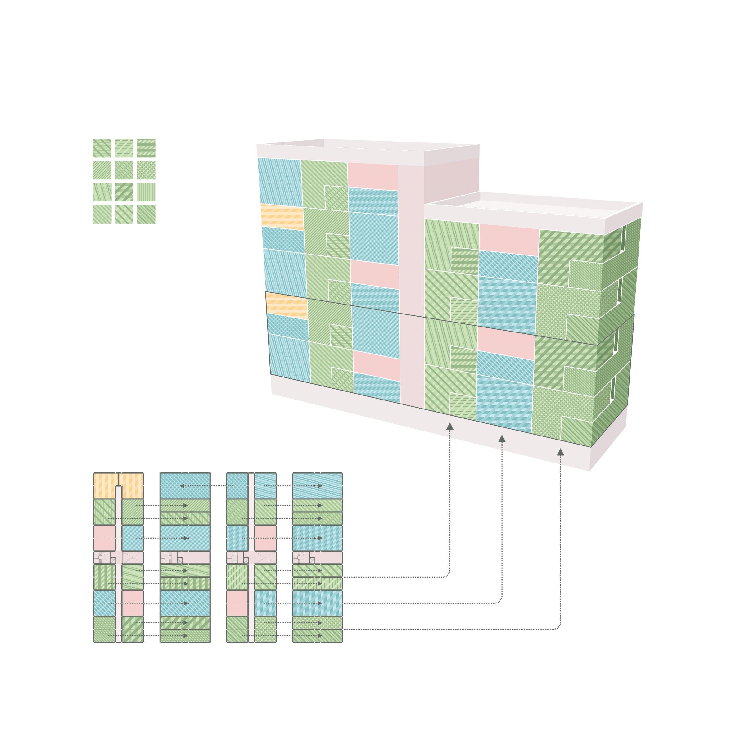
copyright @ Bell Phillips Architects 2021 / in collaboration with Alix Martin 4th 3rd 2nd 1st 4th 3rd 2nd 1st
1 A B 2 C 3 4 D E
copyright @
20212022 / in collaboration with
A. existing site / 1. communal courtyard / B. routes through / 2. green courtyard / C. green connections / 3. active courtyard / D. water features / 4. open courtyard / E. views
Bell Phillips Architects
Emma Carter, Jay Morton, Tim Bell
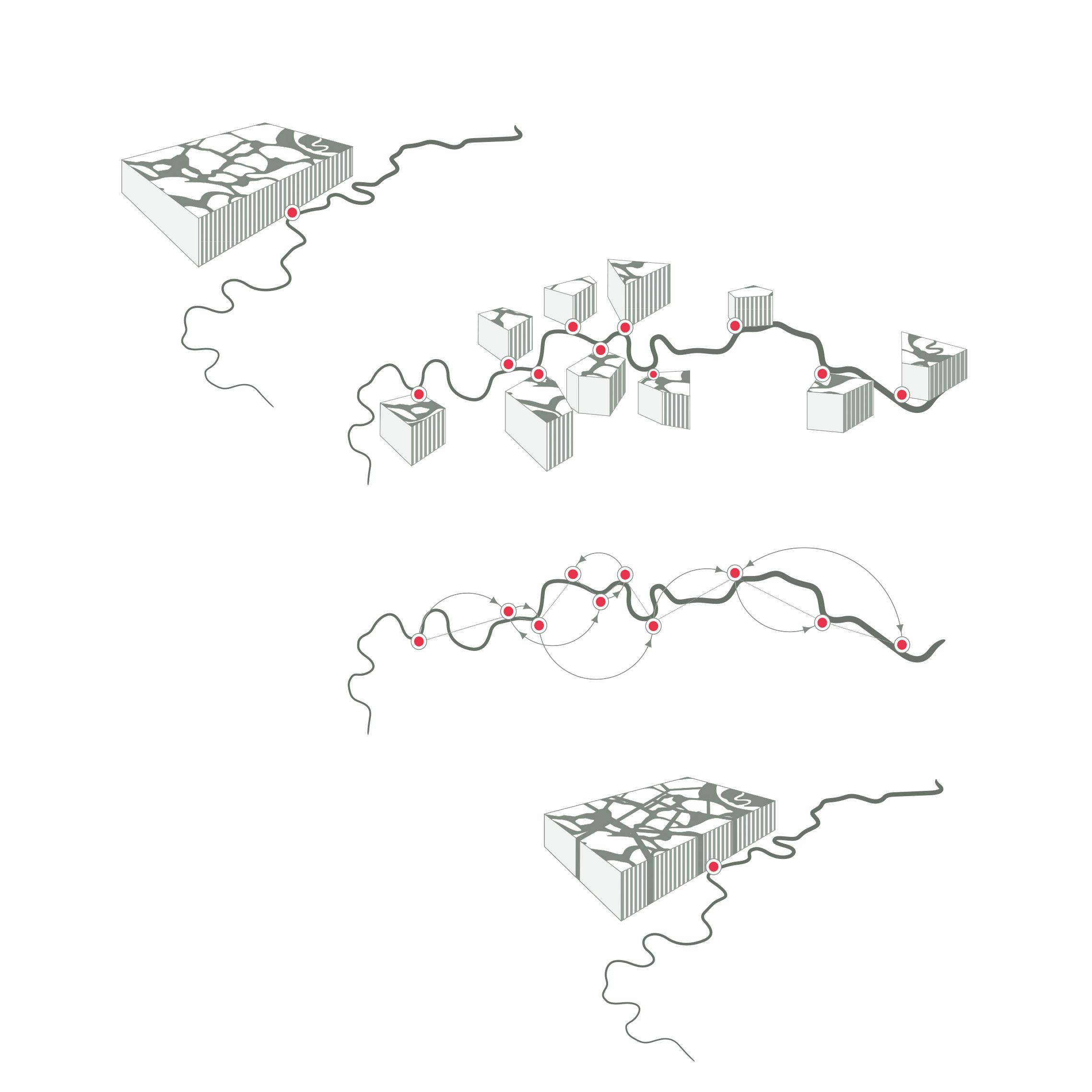
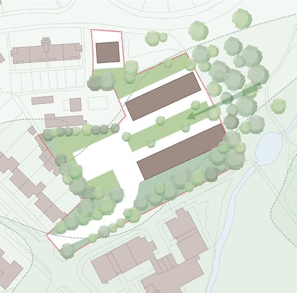
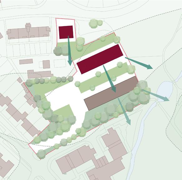
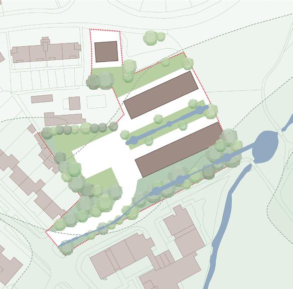
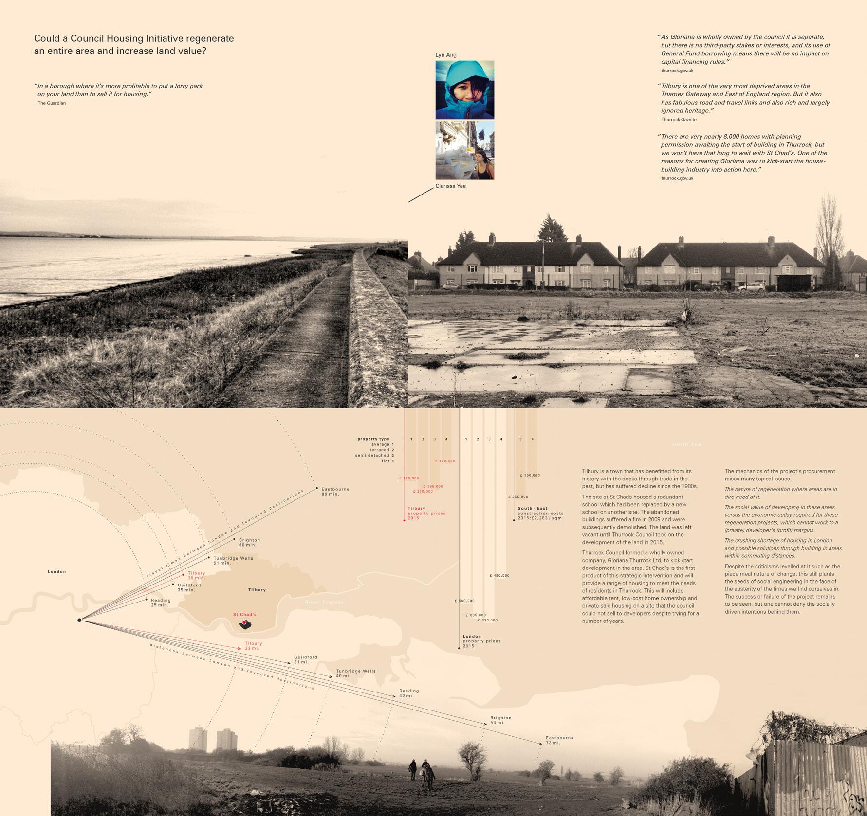
Travel distances between hubs
Routes linking amenities
Pedestrian routes across the green
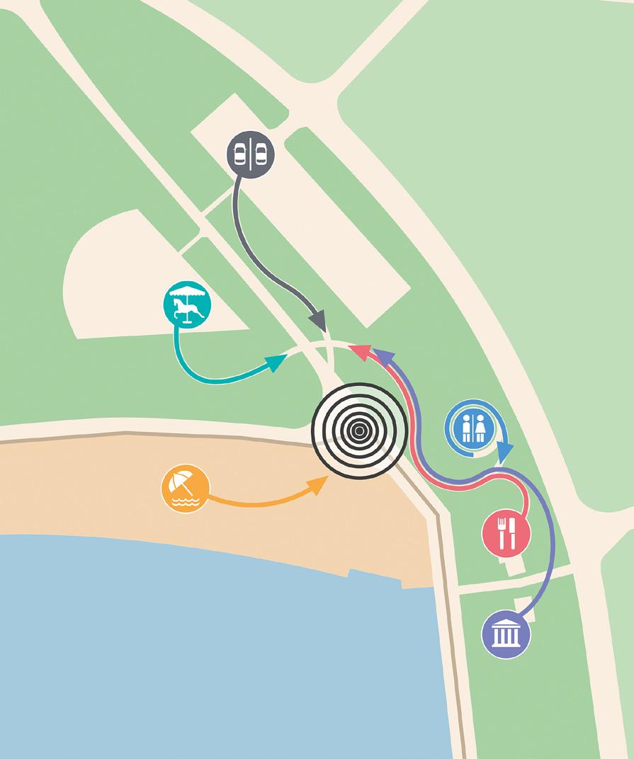
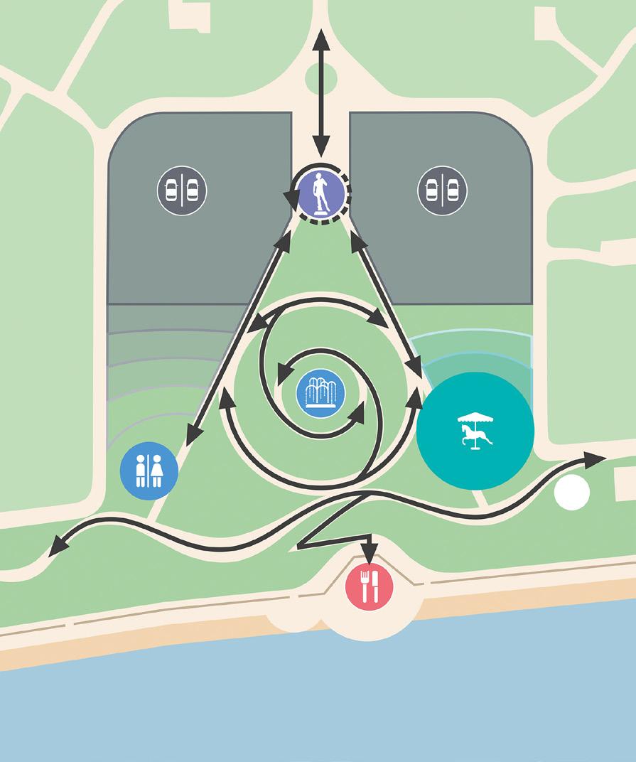
copyright @ Bell Phillips Architects 2017 / in collaboration with Melissa
Dowler
1 min 2 min 4 min 6 min 8 min 2 min 4 min 6 min 8 min 2 min 4 min 6 min 8 min
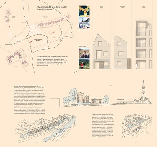
finger on the map
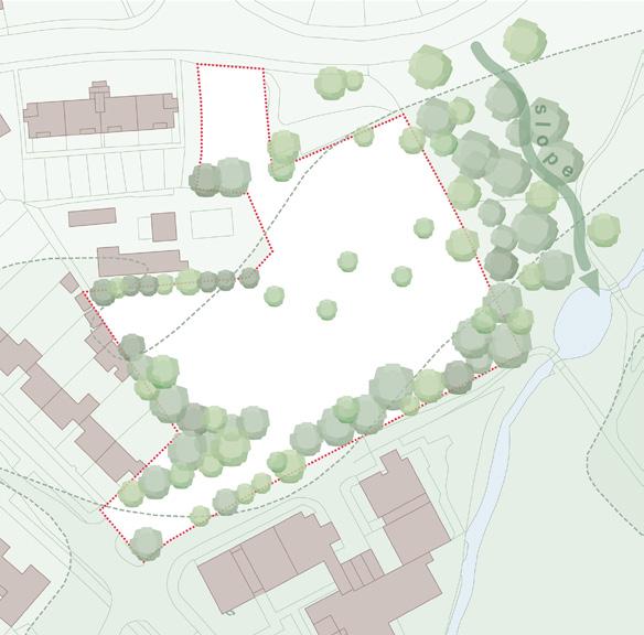
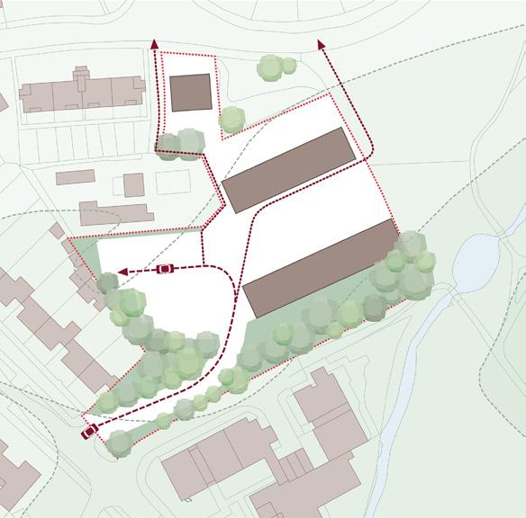
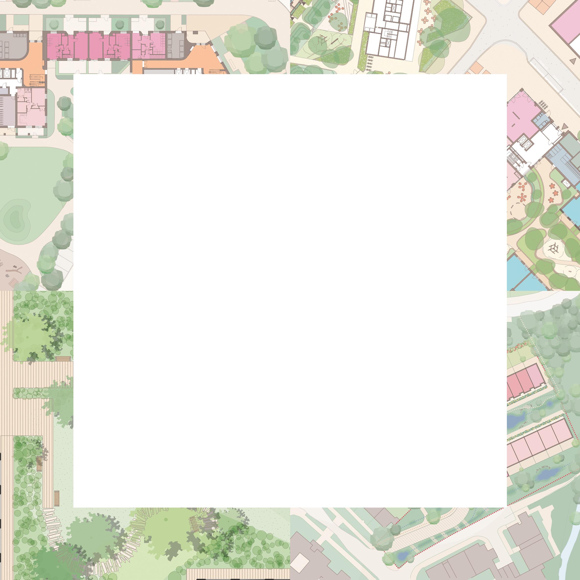
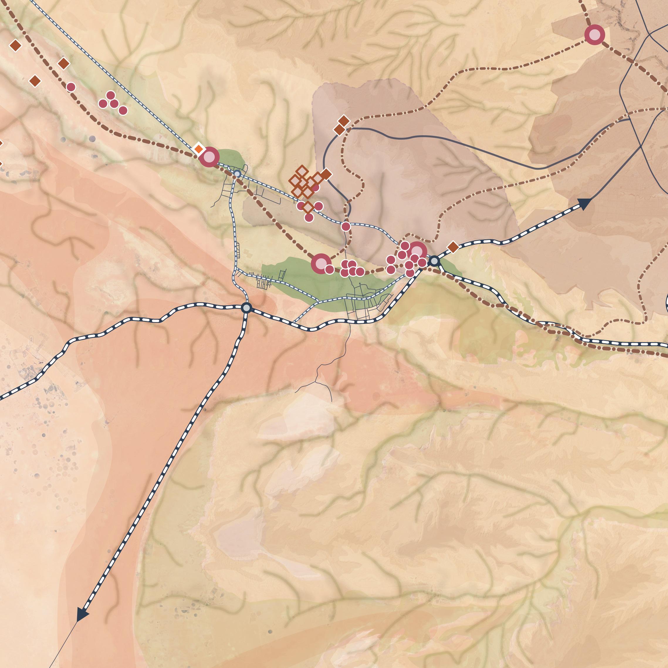
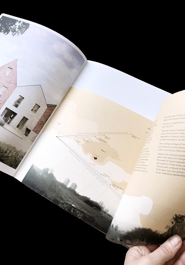
Beyond contributing to a sense of orientation, maps have the incredible ability to tell a whole story about a region pictured: routes, distances, density, demography, terrains, landscapes, localities. They can even show the composition of soils and weather conditions. They are witnesses of time and change.
The maps and plans shown on the following pages range from informative, abstract and reduced to almost decorative with only landscape areas highlighted.
in collaboration with Eline Lu
in collaboration with Emma Carter
in collaboration with Ethan Ly
copyright @ Bell Phillips Architects 20172023
in collaboration with Lina Intaite
copyright @ Allies and Morrison Architects 2011
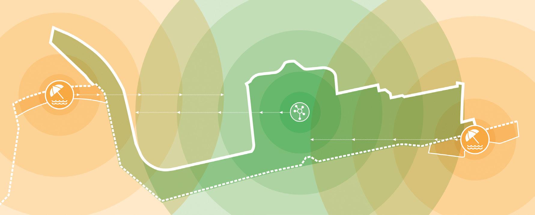
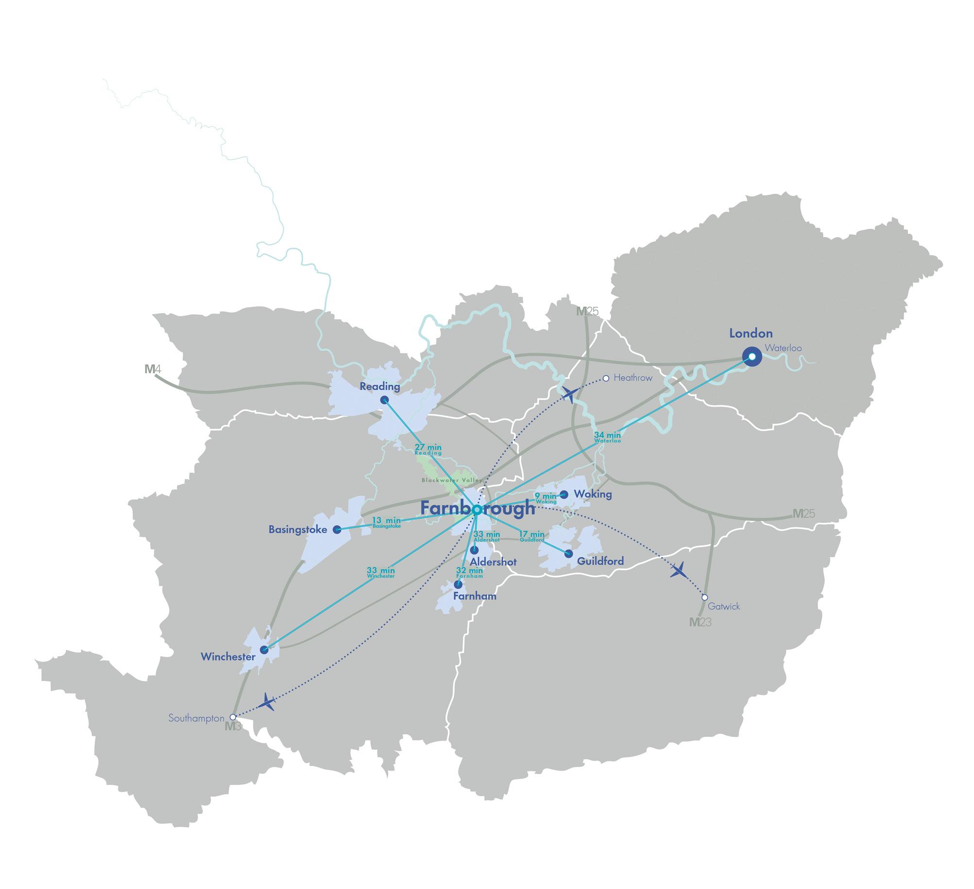
Farnborough as regional connectivity hub
Majority of ethnic groups represented in Church Street, Westminster, before 2020
Cuba
Haiti
Dominican Republic
Puerto Rico
Western Sahara
Mauritania
Morocco
Algeria
France
Tunisia
Italy
Libya
India
Saudi Arabia Yemen
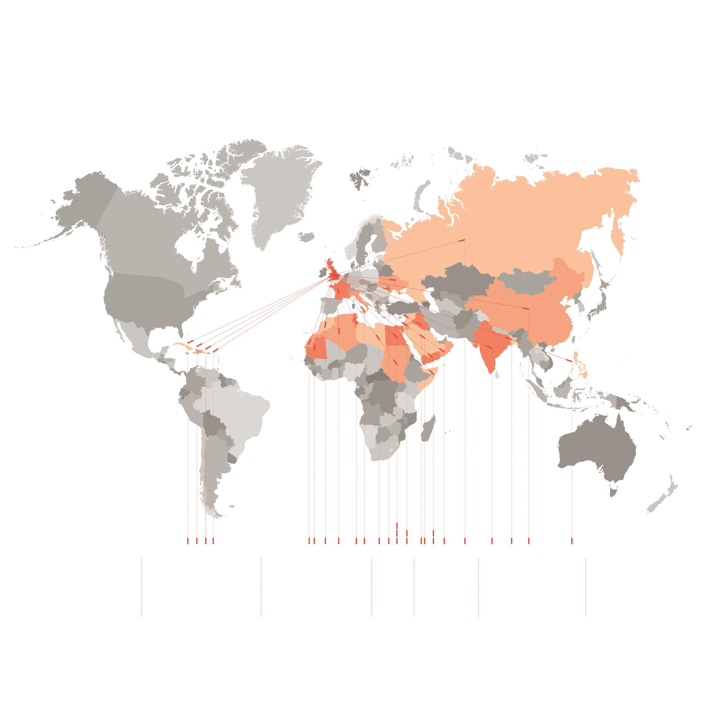
Bangladesh China
Philippines
copyright @ Bell Phillips Architects 2019
Moldova Ukraine Egypt Sudan Syria Jordan Iraq
Somalia Oman Russia
copyright @ Prior+Partners 2023 / in collaboration with Bärbel Gamm Routes, locations of interest, landscape areas
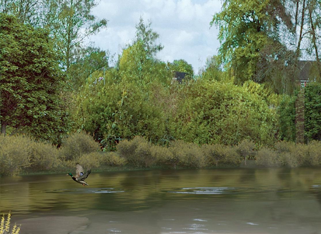
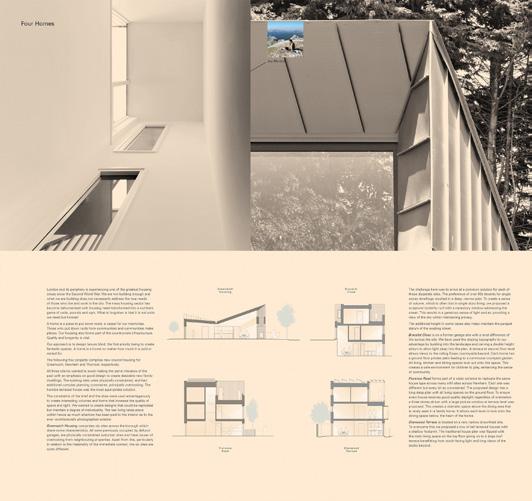
window with a view
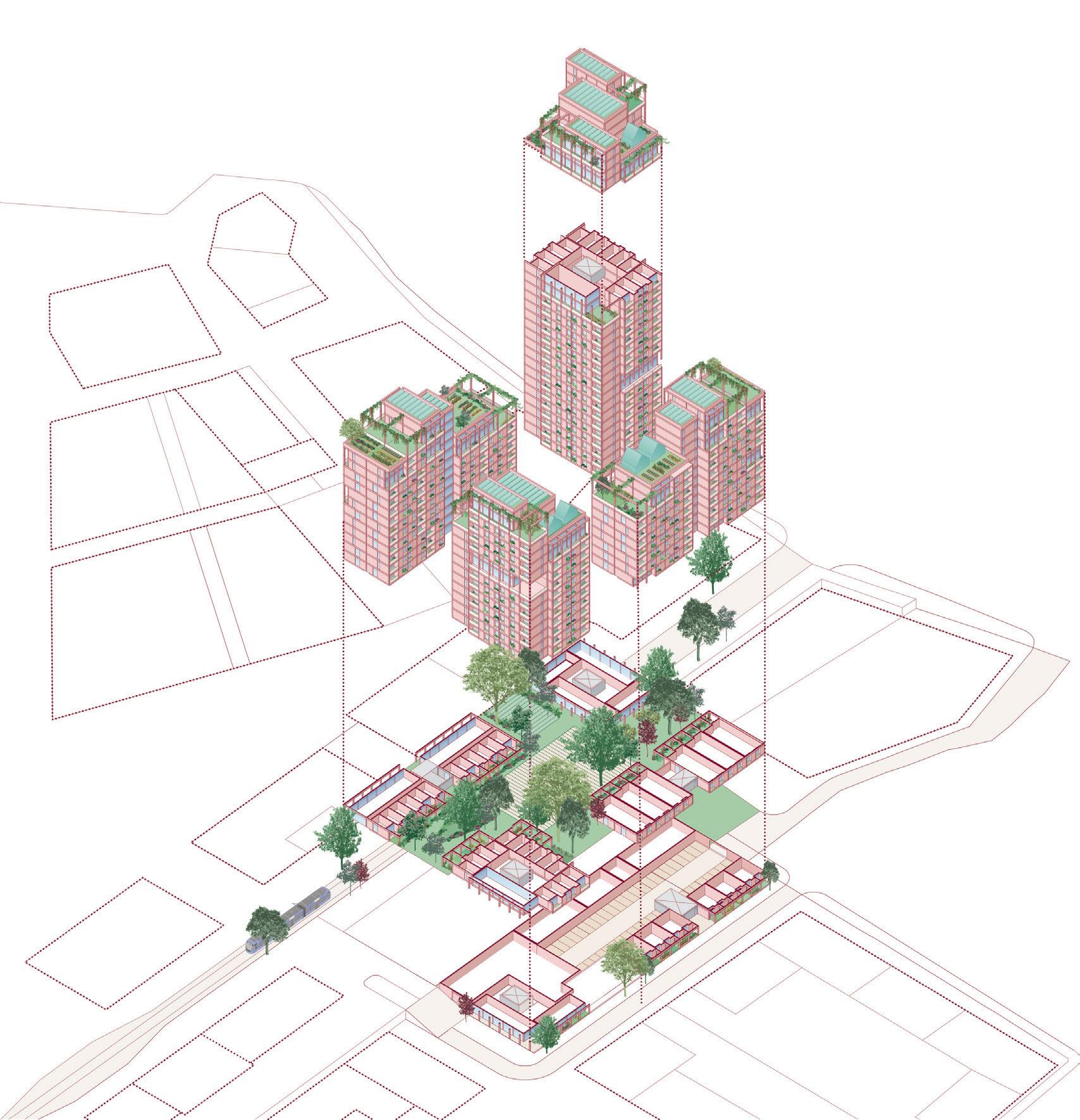
An axonometric projection is a synopsis of a building with its massing, composition, spaces inside and out, enables the viewer to see a three dimensional glance of the future. This type of image is successful at providing both a general understanding of the architecture and showcasing its function in a clear and tangible way..
copyright @ Bell Phillips Architects 2017
Axonometric showing the different levels and their uses
copyright @ Bell Phillips Architects 2020 / in collaboration with Alex Somerville
Axonometric highlighting the landscape and green spaces

copyright @ Bell Phillips Architects 2021 / in collaboration with Anastasija Kostileva
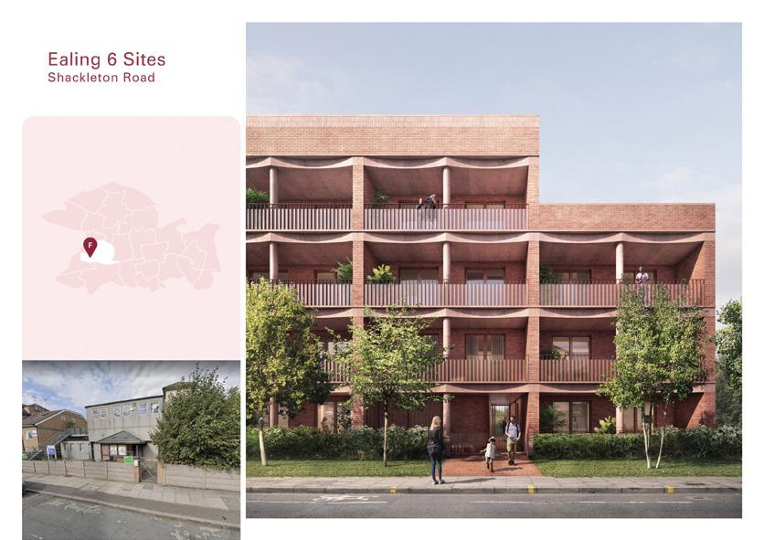
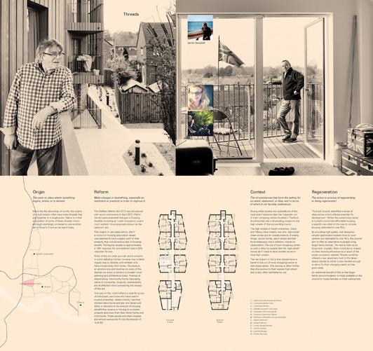
behind facades
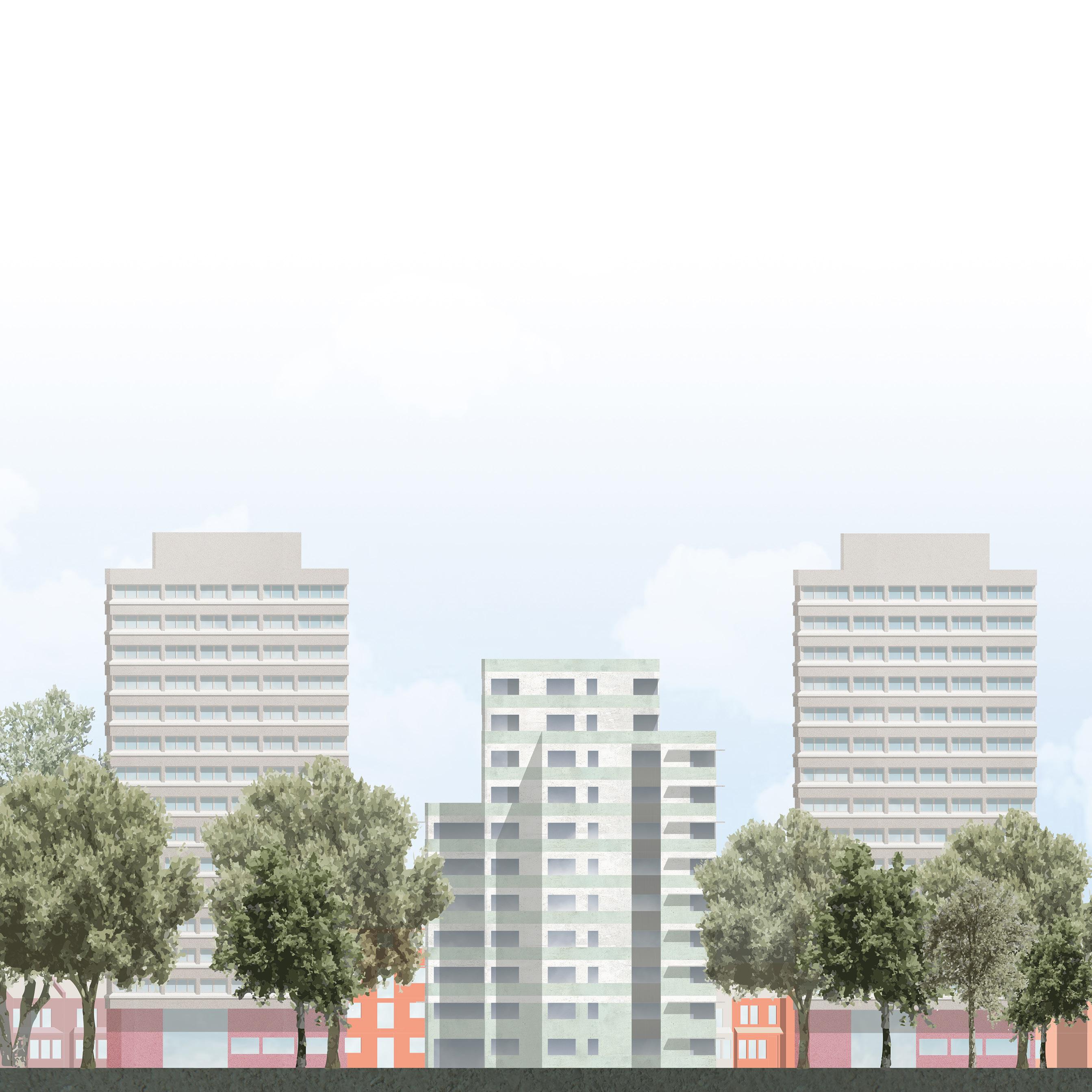
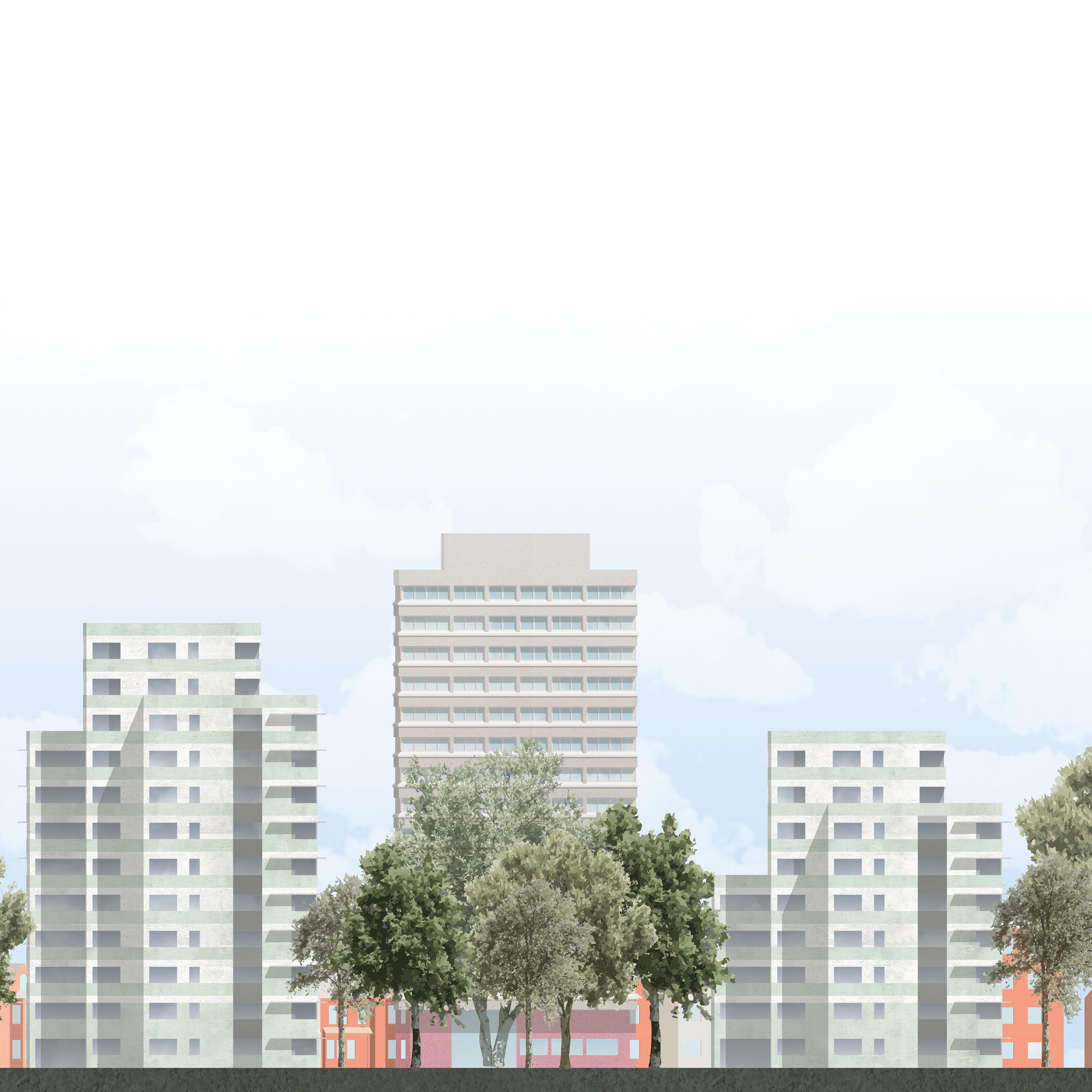
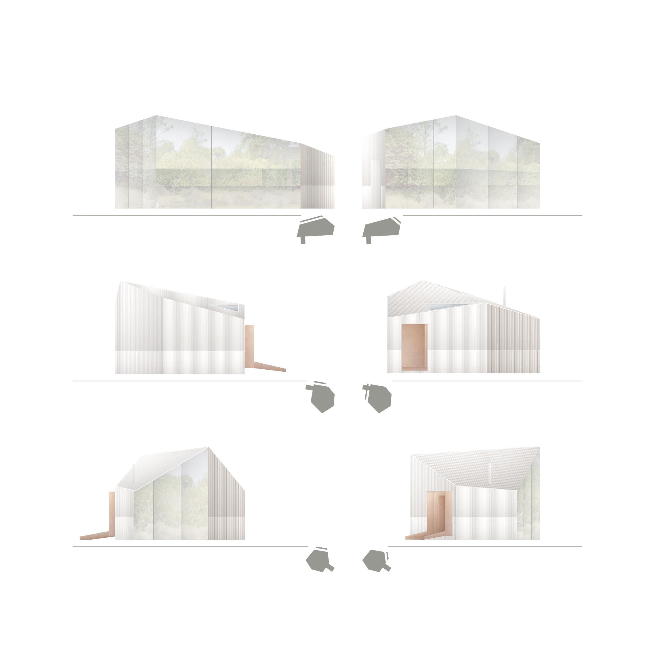
It is somewhat a challenge to create an accurate version of a building when reducing its scale to fit a page or even an A1 sheet. Materiality, colours and proportions translate very differently. However, an elevation has the ability to translate. Rather than being a precise adaptation of reality they spark an impression of how the building is going to look like, standing on its own or sitting within its surroundings.
copyright
/ in collaboration
@ Bell Phillips Architects 2019
with Tom Morgan
Set of pavilions, elevation study
4 person working Hide elevation
4 person working Hide elevation
Meeting room Hide elevation
Meeting room Hide elevation
Informal Hide elevation
Informal Hide elevation
0 500mm 2500mm
copyright @ Bell Phillips Architects 2019 / in collaboration with Banksie Critchley

copyright
2019 / in
@ Bell Phillips Architects
collaboration with Alex Wilford
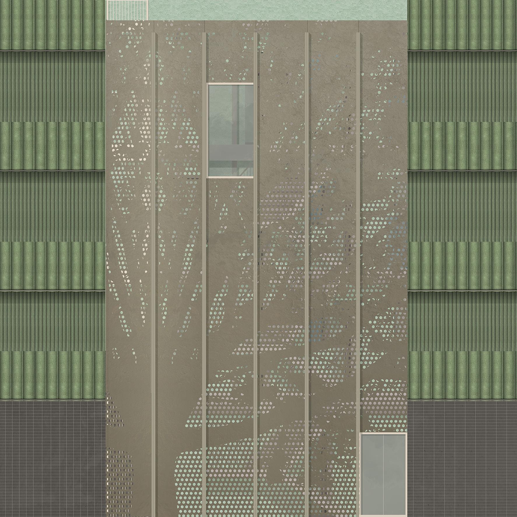
Tree perforation to the staircase
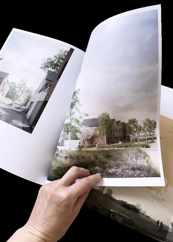
12 stories
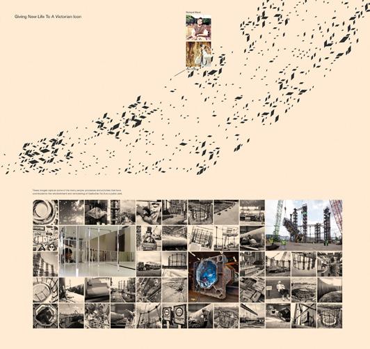
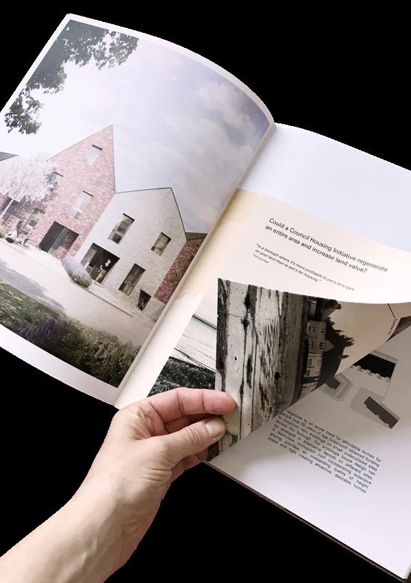
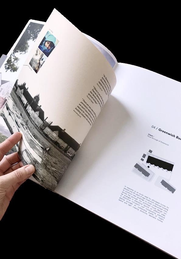
12 years. 12 projects. 12 stories.
Each of the book’s entries is a symbiosis of the project’s best and descriptive images and an inset telling the individual stories of the architect involved.
The two part concept of the book reflects the vital and fruitful collaboration within the practice but also throughout the industry and is accentuated by the different media, individual layouts, graphics and personal syntax.

copyright
2016 / in collaboration with
@ Bell Phillips Architects
marmelade, Melissa Dowler, Hari Phillips, Lyn Ang, Jay Morton, John Lineen, TomMorgan, Annecy Attlee, Naomi de Barr, Tim Bell, Ashmi Thapar, Banksie Critchley, Grant Mitchell, Jamie Campbell, Emma James

1 2 4 3 7 5 8 6 12 11 10 9
Inset front, back & main
3

 A. Book cover
1. St Chad’s intro
2. St Chad’s CGI’s
4. St Chad’s inset main
5. St Chad’s inset back
3. St Chad’s inset cover
A. Book cover
1. St Chad’s intro
2. St Chad’s CGI’s
4. St Chad’s inset main
5. St Chad’s inset back
3. St Chad’s inset cover
/
copyright @ Bell Phillips Architects 2016 / in collaboration with marmelade, Lyn Ang
3D images by Forbes Massie
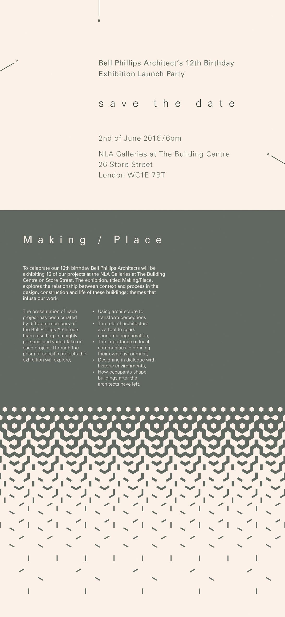
time to celebrate
The publication of the book “12” provided the framework for the practice’s 12th year anniversary. This coincided with a launch party and a week long exhibition was held at the NLA galleries in London.
The following pages feature the invite sent out to clients, colleagues, friends and two of the four sets of boards printed on canvas and mounted to the exhibition walls in the gallery.
Each of the projects corresponds to its appearance and content in the book.

 copyright @ Bell Phillips Architects 2016 / in collaboration with Melissa Dowler, Hari Phillips, Lyn Ang, Tom Morgan, Annecy
Attlee, Naomi de Barr, Emma James / 3D images by Forbes Massie
/ Photos by Kilian O’Sullivan, John Sturrock, Tom Crocker
copyright @ Bell Phillips Architects 2016 / in collaboration with Melissa Dowler, Hari Phillips, Lyn Ang, Tom Morgan, Annecy
Attlee, Naomi de Barr, Emma James / 3D images by Forbes Massie
/ Photos by Kilian O’Sullivan, John Sturrock, Tom Crocker


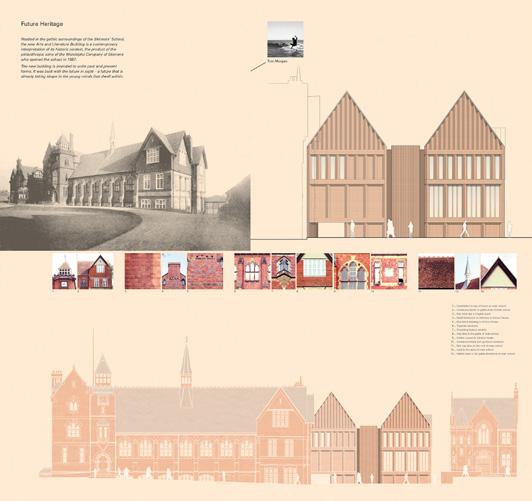
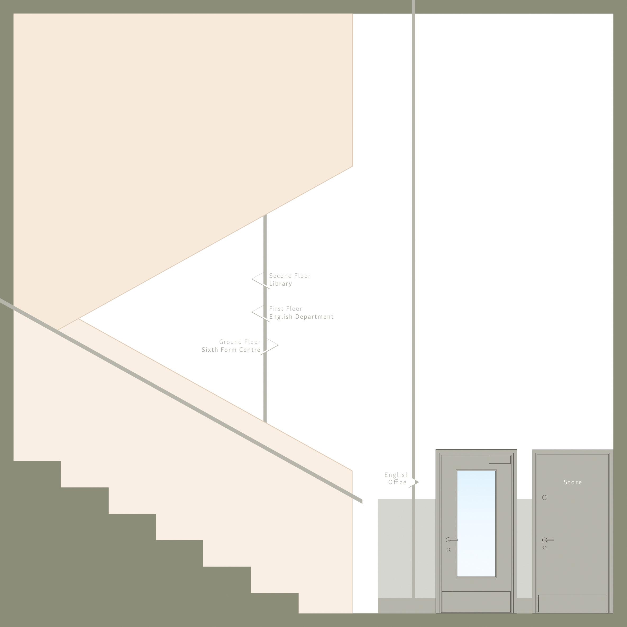
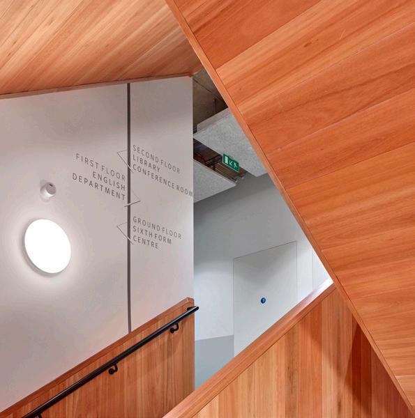
the way to school
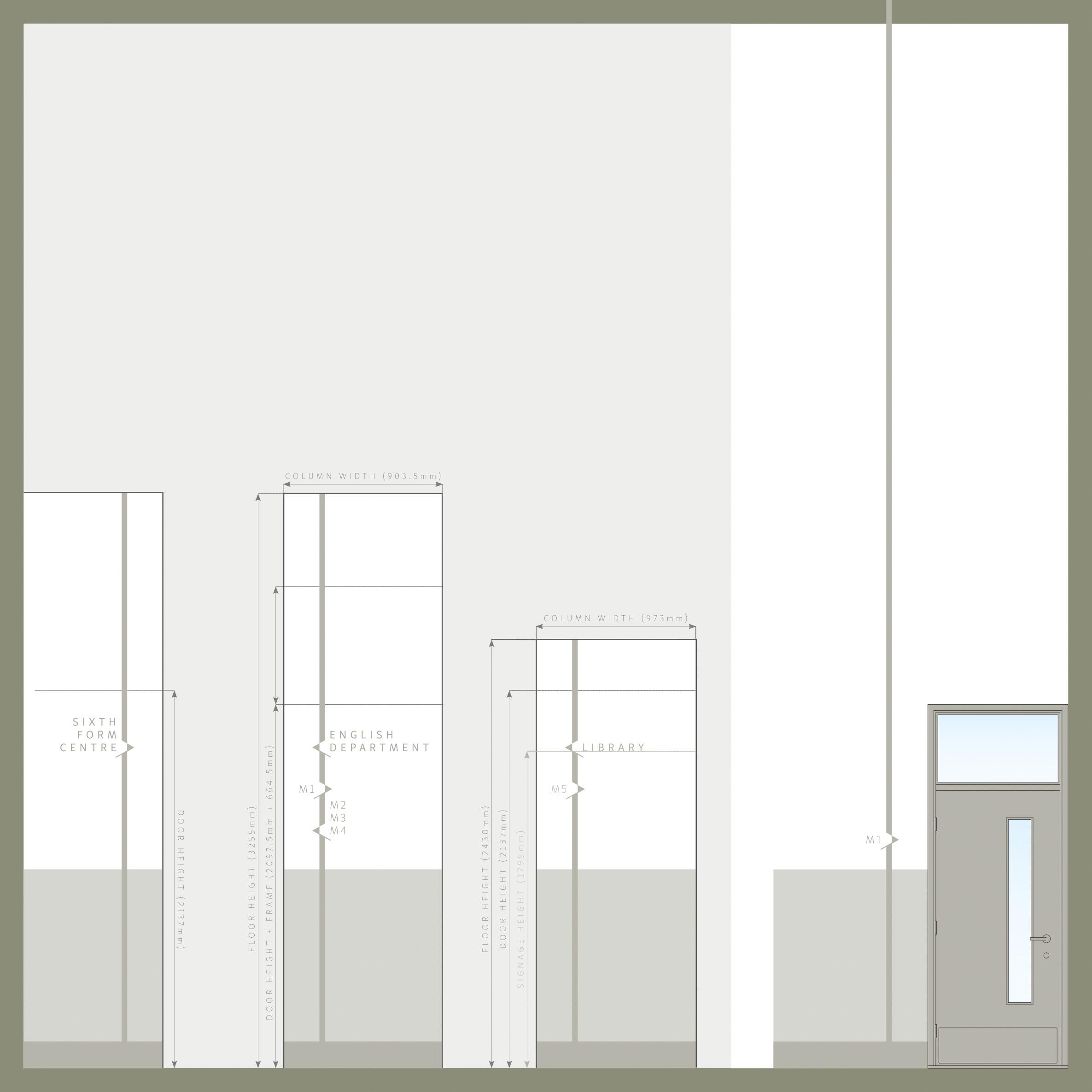
With the completion of the new extension to the Skinners’ School in Tunbridge Wells, accommodating an english department, sixth form centre and a library, the demand for new signage and wayfinding was required.
Two fonts were selected which best characterise the school’s image. This formed the basis of the new signage. Next, a colour palette was created which worked harmoniously with the building’s interior to ensure that the signage was clear without being dominating to the place.

School crest redesign option

The Skinner’s School
Royal Tunbridge Wells
copyright @ Bell Phillips Architects 2018
copyright c Kilian O’Sullivan 2020. All rights reserved.
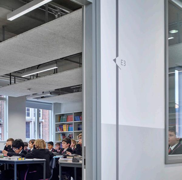
copyright @ Bell Phillips Architects 2018 / in collaboration with Ethan Ly copyright c Kilian O’Sullivan 2020. All rights reserved.
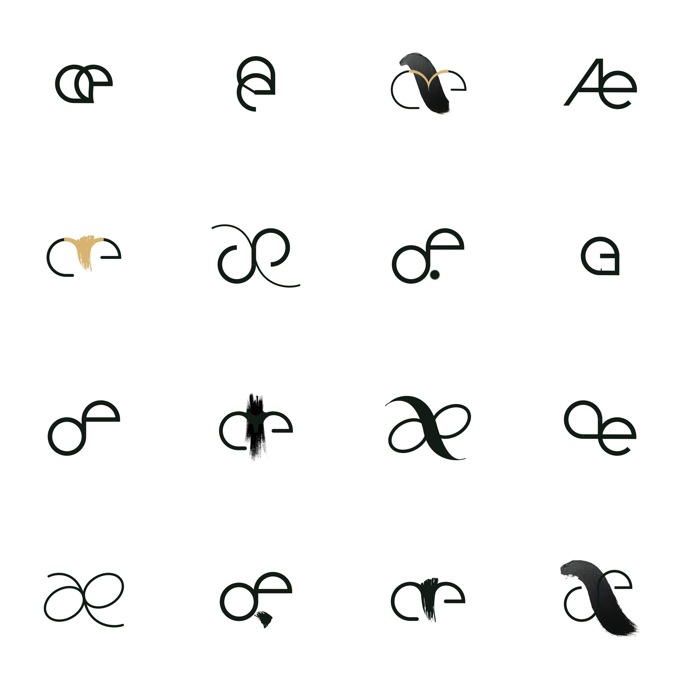
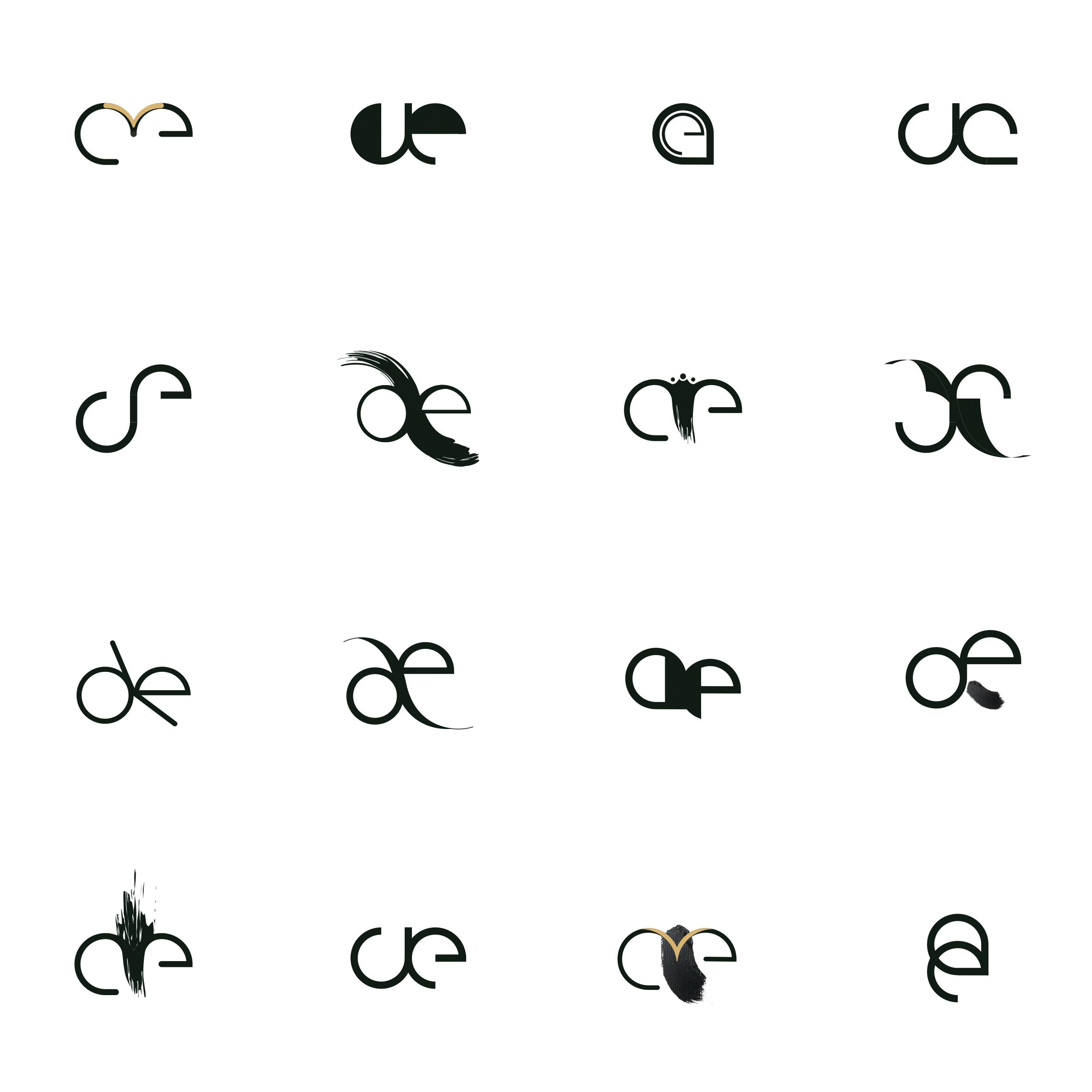
man made
“artæfact” was in need of a logo which inherited the qualities the design studio stands for. Between technical simplicity and expressive warmth, they understand to link the long-established trade of luxury watch design with the boundless field of fine art.
Using the ligature æ in the logo underlines the duality. The representation of the a and the e adapt the classic, engineering element while its background follows the artistic path and joins the two letters to become one glyph at once.


 Portfolio. Sandy Sterzl