“The History, Hazards, and Hopes of Faux-Hebrew Lettering”
Sandra Ittah Professor Brideau
Print, Typography, and Form 18 December 2022
1
2
1999 !
faux-hebrew: From typesets to digitization
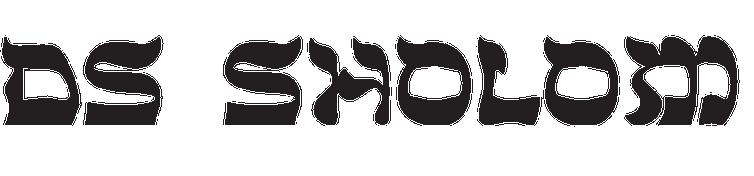
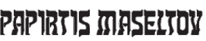
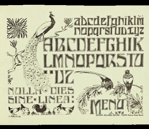
DS Sholom was created in 1999 by designer Nikolay Dubina. DS Sholom is a digitization of Papiritis Shalom, created by Charles Papiritis in 1964. It should be noted that DS Sholom has less contrast than the original design and lacks the dots in ‘CLPU.’ Charles Papiritis is credited with creating the first faux-hebrew typeset, Papiritis Maseltov in 1963 (Fonts in Use). This design gave way to the newfound popular use of faux-hebrew lettering in consumerism, advertising, and cultural goods associated with Judaism.
Although Papiritis Maseltov has been accepted and utilized by the Jewish community, that was not necessarily its intent. According to designer Florian Hardwig, Papiritis was an ethnic typecast artist that created an abundance of ethnic fonts such as Vodka, Shish-Ka-Bob, Taj Mahal, and Buddhist (Silverstein 14). Each associated with different ethnic and cultural identities, these fonts share a similar characteristic: they interpellate marginalized individuals as “other.”
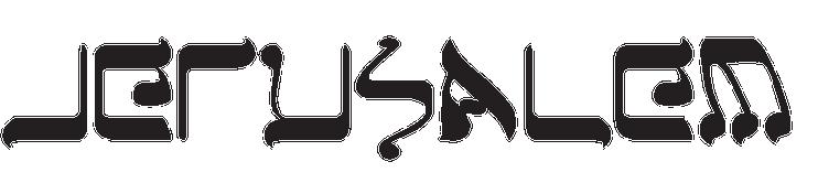
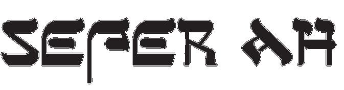
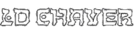
A plethora of faux-hebrew fonts have been introduced since Papiritis’ initial design. Papiritis created several additional faux-hebrew typesets, including Papiritis Temple (shown here in sample text “Hebrew for English). Hebrew Latino was created in 2005 by Gert Wiescher. Jerusalem was designed by Dan Zadorozny in 2003. LD Chaver was designed by Doug Larson in 2008. Lastly, Sefar Ah was created by Andreas Höfeld in 2000 (Fonts in Use).
3
design rooted in religion
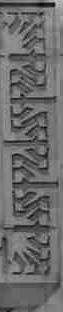
The Hebrew alphabet was in no way an arbitrary creation; it is rooted in ancient tradition and sacred texts, specifically the Kabbalah. The Kabbalah explores Jewish ideologies of mysticism, specifically the relationship between God and the Universe. According to this sacred school of thought, each letter of the Hebrew alphabet is symbolic of a Jewish value. Author Martin Mendelsberg discovered that Hebrew letters are “essences that sustain the structure of the world. The shape, name, and numeric value of each letter have lessons to teach us about our spiritual and religious lives”(142). The shapes and stroke patterns used to form each letter in the Hebrew alphabet possess a unique, abstract and symbolic meaning. Mendelsberg notes a particularly critical character: “Yud is the nucleus of every letter. Its form gives birth, metaphorically, and, in the hands of the scribe, it is the first mark drawn when building any letter. In Kabalistic terms, it is the Soul”(143). It’s not simply a mark on a page to be morphed–instead, it requires decoding. The twelfth and middle letter, the lammed, has a greater height than all other letters. Translated to the English word “learning,” the lammed represents the lightning strike of energy descending down the two sides of the Tree of Life and reminds the Jewish people to treat every life experience as an opportunity for learning and growth (Avital). To appropriate said letters into letters of the roman alphabet strips them of their encoded meanings. Author Ada Yardeni argues that when designing scripts and drawing upon existing scripts, “one has to keep in mind the fact that script serves for communication between people and is connected to a certain culture”(327). Additionally, several letters incorporated into faux-hebrew letterings are taken directly from the hebrew alphabet due to resemblance. Faux-hebrew fonts are often created by adapting existing latin fonts and adding leaflike terminals and strokes. Designers of faux-hebrew fonts often fall ignorant to the unique, historic meaning of the stroke patterns and letters they appropriate.
4
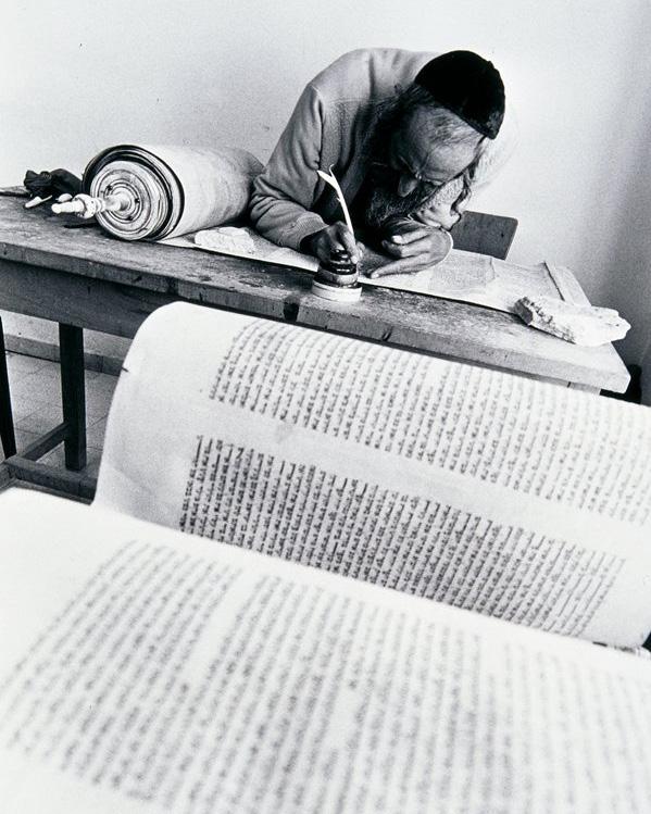 “Torah scribe, jaffa” — photograph by micha bar-am (1971)
a zionist origin
e.m. lilien: artist and advocate
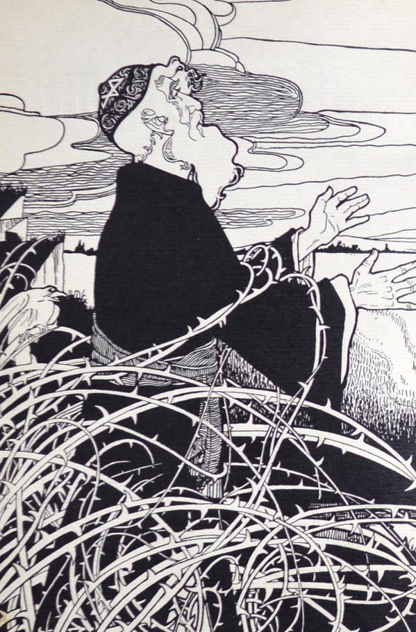
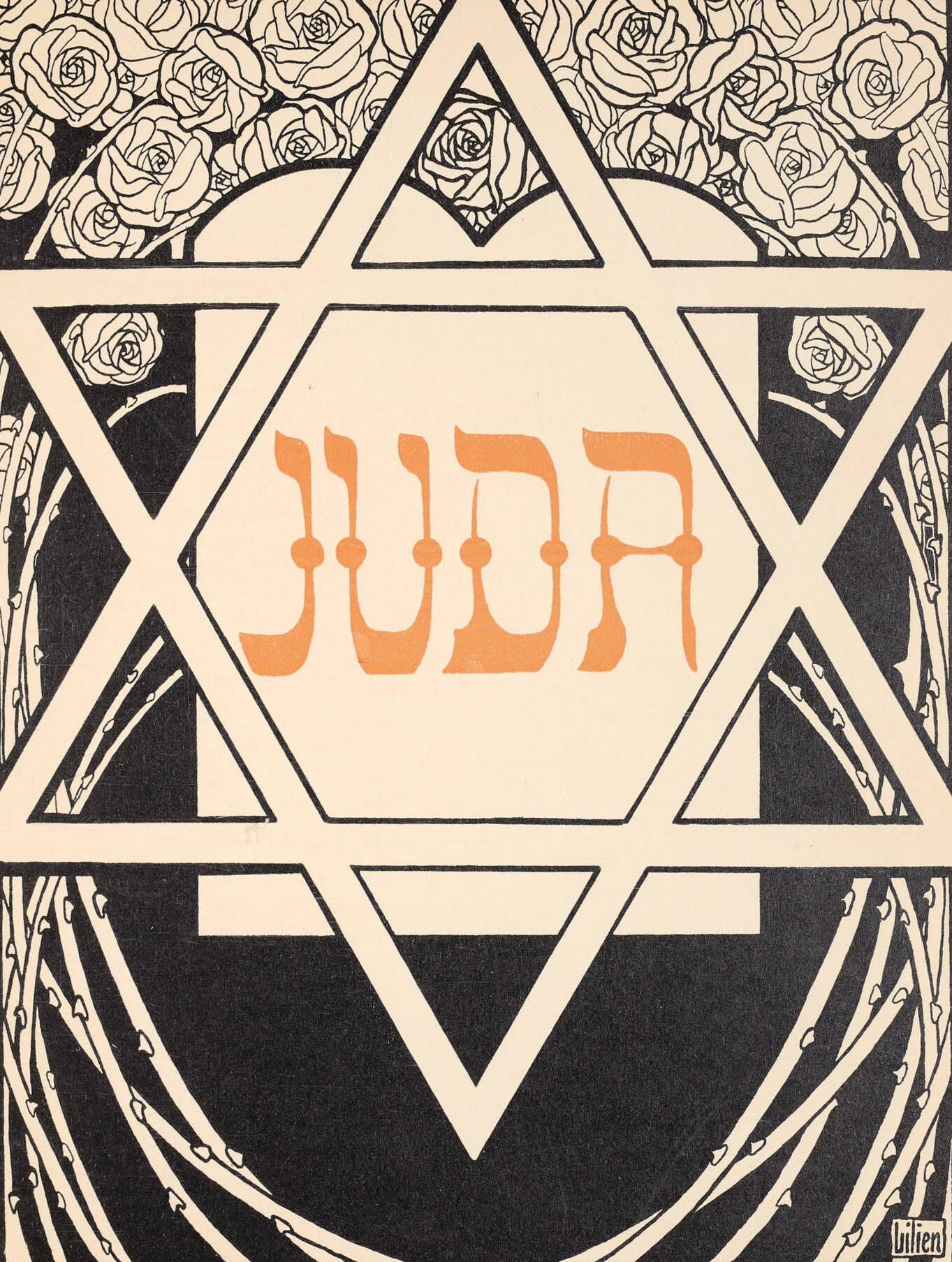
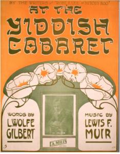
The origins of faux-hebrew can be traced back to the 1900 cover illustration for the biblical poetry book “Juda,” written by Borries Freiherr von Munchausen (Silverstein 9). The cover, displayed here, features a large star of David on the foreground of sacred tablets surrounded by an arch of thorned roses. The focal point, however, is the title itself, “JUDA,” written in faux-hebrew lettering. The novel itself was written by a non-jewish author. The significant figure here is the artist: internationally recognized Jewish printmaker, illustrator, and photographer E.M. Lilien. Lilien is often referred to as the first Zionist illustrator (Leo Baeck Institute). The illustration below, courtesy of the LBI Library Collection, can be found in Lilien’s poetry collection entitled “Der Judische Mai,” or Jewish May. Lilien’s artwork is highly depictive of Zionist themes: the Jewish man, overcome with pride, overlooking a radiant homeland of Israel. Lilien’s artistry and stylization was highly reflective of Art Nouveau. Lilien actively used his artwork to reject the popular stereotypes of Jewish people in choosing to depict Jews as “attractive, strong, and triumphant epic heroes”(Silverstein 9).
Tracing the origin of faux-hebrew lettering to a Jewish individual will be a key component of our future discussion regarding appropriation and appreciation. Faux-hebrew emerged as a design choice that embraced jewish and hebrew culture. Following the diaspora of Jewish people from Israel, Jewish culture and practice fractured, branching out into different languages, countries, and cultures. Faux-hebrew lettering was created to reunite the Jewish people. It created a familiar and shared visual culture, allowing for Jewish literature and cultural objects to remain tied to their original form.
context
Art nouveau
As stated, E.M. Lilien’s artistic style was characterized by the greater design trend of the early 1900s: Art Nouveau. Art Nouveau was driven by a desire to embody nature and the organic, rejecting the modern academic styles simultaneously emerging. Art Nouveau typography is highly decorative, utilizing sweeping curves and ornate details to add a sense of movement and emotion. This can be seen in faux-hebrew lettering, the leaflike terminals and exagerrated curves a reflection of nature. (Britannica)
7
8
identity
cultural objects: linking font and identity
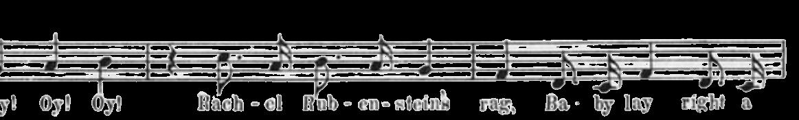
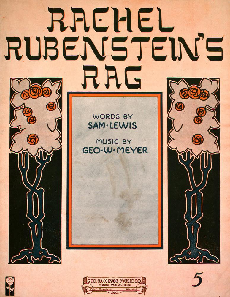
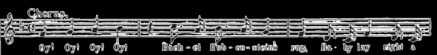
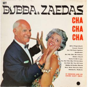
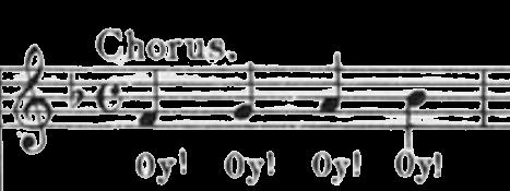
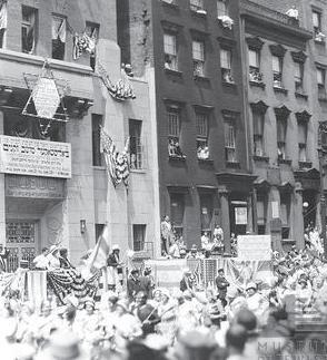
Approximately a decade following Lilien’s introduction of faux-hebrew lettering, the typographic style became prevalent in a new realm of culture: entertainment. Beyond a reemergence, a repositioning of faux-hebrew lettering occurred during what historians refer to as the Vaudeville era. The Vaudeville era connotes the period between the late 19th and early 20th century in which vaudeville, a variety of acts such as comedians, singers, dancers, acrobats, and musicians, was the mainstream, popular form of entertainment in the United States (Britannica). The key characteristic of vaudeville entertainment was its variety; each performance integrated a wide range of artistic works. Faux-hebrew was utilized on the sheet music for theatrical performances during the early 1900s, including the popular production “Rachel Rubenstein’s Rag,” as shown on the left-hand page. This Jewish minstrel song was performed in “Jewface: raggedy dark clothes, a fake bear and a hooked nose…”(Silverstein 5). Faux-hebrew lettering was now being repositioned. It was no longer being utilized to express Zionist sentiment. Instead, it was a cunning teasing tactic. It became intrinsically linked to the Jewish identity. It spoke to consumers, implicitly sharing that the performance depicted Jewish culture. During the vaudeville era specifically, this meant it incorporated the emerging self-deprecating humor, which remains prevalent today, and or Jewface.
The vaudeville era was a period in which many Jewish entertainers left their mark on the industry. This had an everlasting impact on the industry and society at large, both negatively and positively. Jewface, the popular performance style at the time, originated as a practice outside of the Jewish community. However, this soon changed as an influx of Jewish immigrants found refuge in the urban Northeast (Antelyes). Curator Eddy Portnoy explained that, following the 1909 protest of the stage Jew on behalf of the Central Conference of American Rabbis, it was found that Jewface “was almost completely a Jewish experience” in which “the theater managers are Jews, the agents are Jews, the actors are Jews, and the audience is mostly Jewish. In fact, some of the routines are so full of Yiddish that gentiles don’t even understand it” (Zax 3). Jewish performers took advantage of the exposure, utilizing the stage as a platform to raise awareness about the plight of Jewish refugees during World War II and the struggles of assimilation in America. Faux-hebrew became a design choice that effectively portrayed a cultural object as a call to congregation, comedy, and shared culture for Jewish people.
This newfound, widely beloved art form, however, reflects and gave rise to many stereotypes of Jewish people that reign prevalent today. For instance, figures often performed on stage by Jewish actors are caricatures that remain in popular culture: “yidishe mame,” “ethnic vamp,” “nagging wife,” “the bumbling immigrant Jew,” and “a Jew setting his store on fire in order to get insurance money” (Zax 4)(Antelyes). These reflect greater stereotypes of Jewish people, including that they control media and money—stereotypes which have proved extremely harmful. The cultivation of community within America ultimately bolstered existing stereotypes about ethnic American Jewish identities. Faux-hebrew existed at the core of this visual culture, analogous to the content performed and cultural language created.
9
Otherness
constructing associations designed to discriminate
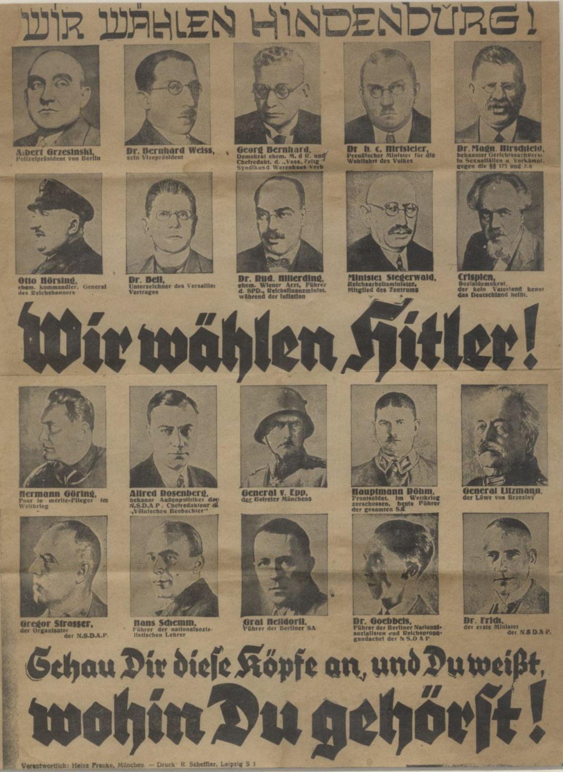
The 1932 Hitler presidential campaign poster shown on the lefthand page depicts two opposing groups: those that support Hitler (“Wir Wahlen Hitler!”) and those that support Hindenburg (“Wir Wahlen Hindenburg!”). 20 portrait images are provided. 10 of said images, in association with support for Hindenburg, portray infamous political figures that cast shame upon Germany. “Wir Wahlen Hindenberg’’ is written in Faux-Hebrew script whereas “Wir Wahlen Hitler” is written in bold German blackletter, directly associating Hitler with national pride and power, and Hindenberg with nationally despised figures as well as Judaism. In this context, Faux-Hebrew and infamous figures combined act as a trope that create a widespread sense of otherness and make Jews appear as sinister or untrustworthy. Hitler was not only shedding a negative light upon his Christian opponent, he was pushing the narrative that Jewish people deserve to be eradicated–all through the use of Faux-Hebrew.
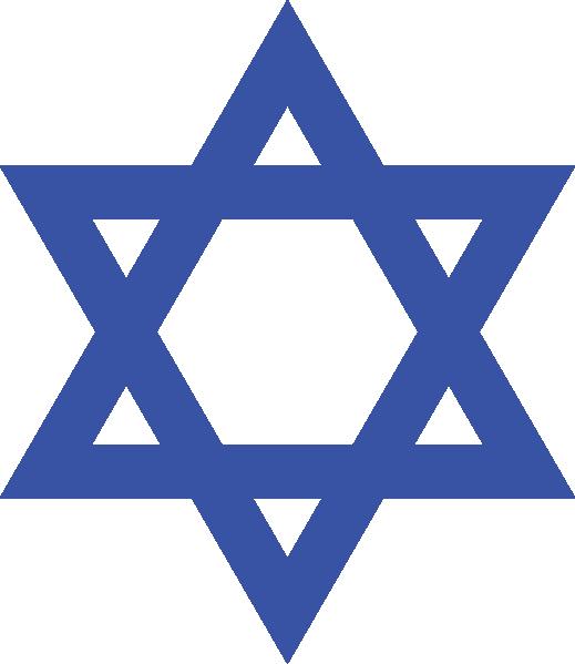
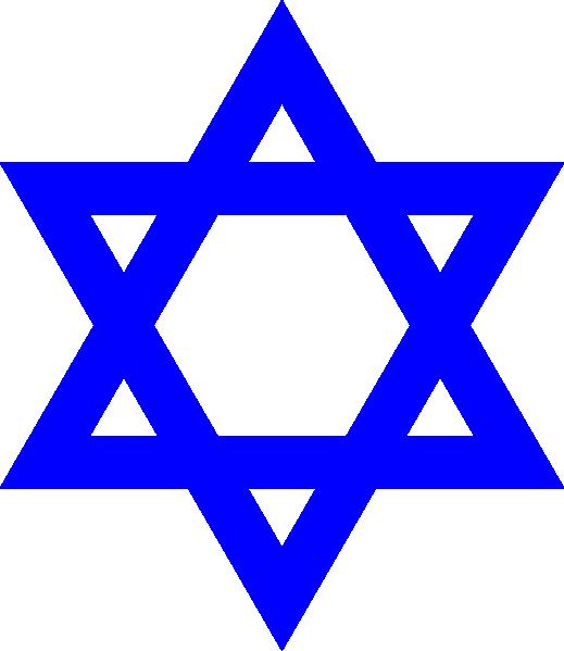
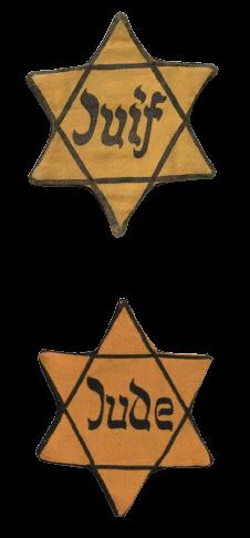
Hitler and the Nazi party, which was actively controlling Germany during the 1930s and early 1940s, implemented strict methods of identification to signify individuals as powerful and or other. The Nazi party solidified the association between Jewish people and Faux-Hebrew fonts in the creation of the yellow Jude star, also referred to as the Jewish badge. It was required that these identification badges–six-pointed, yellow stars of David–were worn on Jewish people’s clothing at all times as a mark of their identity. The badge was a central mechanism by which the Nazi party dehumanized and stigmatized Jewish people. At the center of each badge was the word “Jude” written in the local language in a faux-hebrew script. A target on one’s chest, the yellow Jude star provided for easy identification, degradation, and persecution of Jewish people. This now created a direct, widely known and accepted association between faux-hebrew lettering and Jewish “subhumans.” Anything written in or labeled with hebraic scripture would come to be considered revolting, inferior, and deserving of eradication.
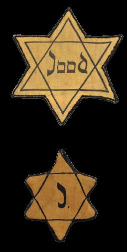
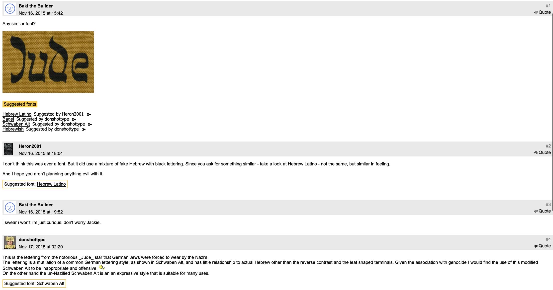
This image displays a forum on dafont.com. User Baki The Builder posted an inquiry regarding the “Jude” identification badges, seeking a font similar to the one utilised by the Nazi party. Several users—assumed type enthusiests— expressed hesitancy toward utilisation of the font and those similar to it. User donashottype blatantly states that they associate the font with genocide.
11
“Yellow Badge” collection courtesy of the jewish museum
unity
trust in a typeface
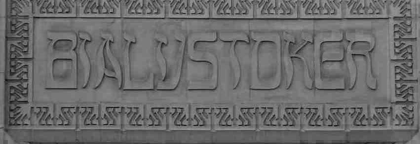
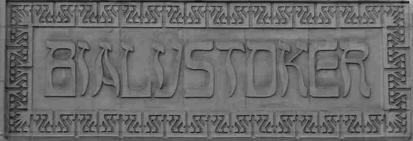
While Hitler and the Nazi party rose to power abroad, faux-hebrew was being used in Jewish-American architecture in the United States. The lettering was a symbol of pride in one’s identification as a Jewish person. Additionally, it was a symbol of unity, calling upon the Jewish people to manifest a proudly practicing community in America. Located in New York City’s Lower East Side, the Bialystoker Home for the Aged opened in 1931 with the support of a local Jewish congregation and the Jewish mutual-aid society. It provided Jewish Americans and immigrants alike with an institution for religious practice, community affairs, recreation, and protected expression. Designed by Harry Hurwit, the architecture of the institution is visibly Zionist, its facade artfully displaying the 12 tribes of Israel and “Bialystoker” in large, skillfully carved Faux-Hebrew letters (Gruber). Hurwit’s design choices embody his goals to unite Jewish people during a time of extreme displacement and promote Zionist ideologies. In cases such as this, the use of faux-hebrew lettering can be considered a form of branding. The lettering itself carries associations—to some, they are negative stereotypes whereas, to others, they are evocative of home and family. These associations served to attract many Jewish members of the community, including newcomers and long-lasting locals. The home was recognized by many as a vital resource of community, warmth, and care for the Jewish people, and specifically the elderly, during this period of persecution and discrimination.


13
New york, ny — the bialystoker home, center photograph courtesy of the jewish museum New york, ny — the bialystoker home, main entrance arch — photograph by samuel gruber
culture
faux-hebrew: culture, community, and comfort
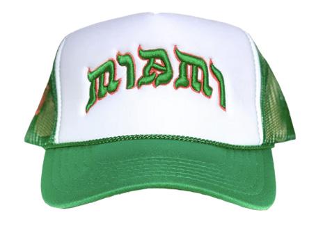
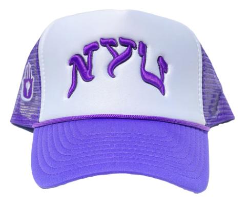

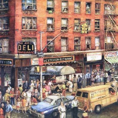
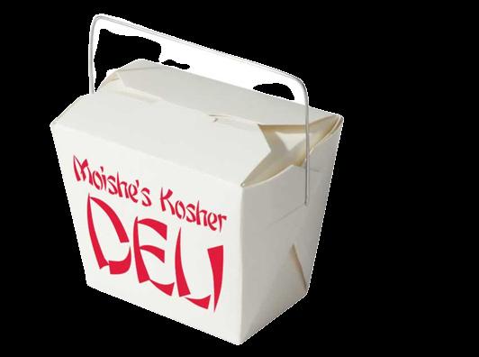
Imagine this scenario: you’re strolling down 2nd avenue in New York City. You come across a 2nd Avenue Deli, except its iconic sign is now written in Times New Roman. How does this make you feel? As a Jewish person, when I witness the beloved 2nd Avenue Deli sign, written in faux-hebrew lettering, I am overcome with feelings of familiarity. The sign itself speaks to my childhood; it mirrors the branding of my favorite comfort snacks and local kosher grocery stores I’d frequent alongside my father. Furthermore, as a kosher individual, I implicitly trust the Deli, assuming they’re certified kosher. This is quite a bias on my behalf. Yet, it’s invaluable. With the presence of traditional kosher delis dwindling by the day, I come to admire that 2nd Avenue Deli has remained loyal to its roots, its logo identical to the original stained-glass lettering. This extends beyond food, souvenirs, apparel, judaica, and more have used faux-hebrew lettering as a mode of communicating directly with Jewish people—in an “insider” fashion rather than a “outsider” fashion. Recently, apparel brand Hamsa Club has risen to popularity, offerring a wide range of college apparel in faux-hebrew.
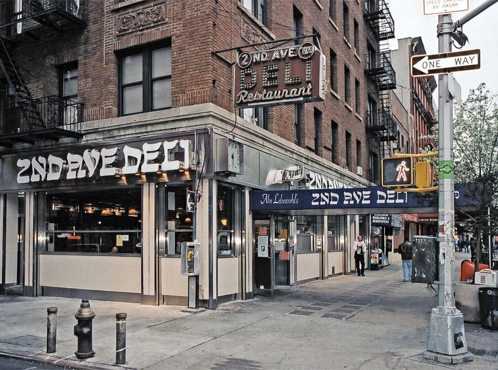
“...the kosher deli, with its flashy lightbulb bordered sign with faux-yiddish letters, had inisted on serving the foods beloved of these same immigrants and their children, in the hopes of bringing them back for a taste of the old neighborhood. Both jews and non-jews made pilgrimages to the deli to soak up the atmosphere of the jewish past.”
(merwin 163)
14
stereotypes
sensible branding or insensitive stereotyping?
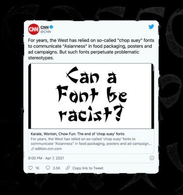
The debate regarding ethnic fonts at large is polarized–and circumstantial. Contrasting opinions are constructed by individual identities, capitalist motivations, and unique, persecutory histories. I would like to introduce a new lens through which we can understand the present-day use of Faux-Hebrew. One particular and widely used category of ethnic fonts, similar to Faux-Hebrew are “chop suey” fonts–created on American soil, grounded in mandarin calligraphy. Despite having no direct relation to Chinese culture, this range of typeface is used to signify Chinese and Chinese American peoples, in both political propaganda and racialized branding. As stated in an article published by PrintMag, “Ethnic type—not just chop suey but all of the varieties—survives for the simple reason that stereotypes, though crude, serve a commercial purpose. They are shortcuts, visual mnemonic devices. There is no room for cultural nuance or academic accuracy in a shop’s fascia”(7).
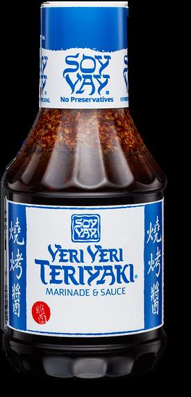
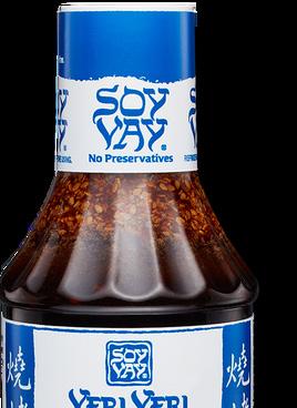
In essence, a brand’s brand is only effective if it speaks to its consumer and portrays its brand personality. Therefore, the seemingly logical answer for how to advertise a restaurant that serves Chinese food in Chinatown would be to use a font inspired by mandarin. This equation for sensible branding, however, becomes more nuanced in the context of a particular (inauthentic) Japanese food product: Soy Vay’s Veri Veri Teriyaki Marinade & Sauce. Rather than using an asian-inspired typeface, this brand uses a faux-hebrew font. Andrew Silverstein concludes, “There’s really nothing Jewish about teriyaki, but the branding works. Jews love Asian food and self-deprecating humor. The lettering takes an inauthentic Asian product and makes it Jewish”(3). I ponder the question of whether this was a cunning marketing tactic toward a niche segment, or simply an offensive assumption on behalf of the designers. This specific design choice, among many others frequently used in consumer goods, reckons with stereotypes surrounding Jewish people. Although some of these stereotypes may be lighthearted, the history of faux-hebrew fonts is not. And–when understood through the context of the Hebrew language–using this font disregards particular Jewish people’s resentment toward it and devalues the deep, spiritual meaning behind the Hebrew alphabet.
When placed in juxtaposition with the products on the lefthand page, however, I bounce back. I hestitate to draw the above conclusions. For instance, the t-shirt, sold by Jewish-operated brand Hamsa Club, reckons with stereotypes about Jewish people. They are not particularly harmful stereotypes. And, more importantly, they are being used by Jewish people in a self-depricating, humorous manner. The college apparel shown on the lefthand page allows students to embrace their Jewish identities on campus and further encourages pride and unity of Jewish people. These are all factors that must be taken into account.
15
conclusion
Redemption
In a time of rising anti-semitism, is it possible to reclaim faux-hebrew lettering as our own and forgive its tainted history? How does this faux-lettering speak to the greater zeitgeist regarding debates of appropriation and appreciation of marginalized cultures?
the facts:
1. Faux-hebrew lettering is inspired by the original typographic stylization of the hebrew language, each stroke possessing an underlying spiritual meaning.
2. The origins of faux-hebrew can be traced back to Jewish artist E.M. Lilien, famous for his Zionist illustrations and art nouveau stylization, shortly followed by the emergence of its use in vaudeville entertainment branding.
3. Faux-hebrew allowed Hitler and the Nazi party to easily classify Jewish people as “other” and “subhuman,” the font itself providing for easy recognition, and therefore persecution, of Jewish people.
4. Faux-hebrew provided for unification amid diaspora during and after the Holocaust, allowing Jewish people to build communities with ease and pride.
5. Faux-hebrew is often used in product design and marketing to speak to Jewish consumers. Although effective, the background of said utilizations often stem from stereotypes about Jewish people.
appropriation, assimilation, and anti-semitism
To conclude, typography is powerful. Evidently, it is a force by which designers can evoke feelings of both desire and disdain in their viewers. Now that I’ve shared an overview of faux-hebrew lettering and its convoluted past, I’d like to introduce myself. My name is Sandra Ittah. I am a Sephardic Jewish person, my father having immigrated to America from Morocco. I was raised in a modern-orthodox household, its interior embodying our Moroccan-Jewish culture. My Sephardic identity places me in a somewhat alienated category—one seldom recognized in popular culture in comparison to our Ashkenazi Jewish counterparts. My culture looks far different from the stereotypical American Jewish identity.
We eat different foods. We’ve got different prayers and contrasting traditions. We possess highly differentiated musical conventions—from pronunciation to rhythm. We don’t share the same humor. Differences aside, however, one major thing we’ve got in common is the Hebrew language. Therefore, both Sephardic and Ashkenazi Jewish people share an emotional and or cultural tie to faux-hebrew lettering. In fact, faux-hebrew has helped me assimilate into American Jewish culture and society. In my experience, I have felt extremely comforted by the sight of this font. For instance, when a restaurant’s branding incorporates faux-hebrew, I come to entrust that it is kosher certified and welcomes my dietary restrictions (although sometimes, this may be a facade). When I pass someone wearing apparel decorated with faux-hebrew writing, I tend to feel a bit more at home. A minority within the minority itself, faux-hebrew allows me to culturally connect with other Jewish people, and for that I am grateful.
16
In recent times, however, I’ve been significantly bothered by the anti-semitism erupting in popular culture. Within recent months, rapper and designer Kanye West has proudly shared a series of anti-semitic rants on his personal social media channels as well as in high-scale news outlet interviews. On December 2, 2022, West released the official logo for his 2024 United States presidential campaign: a swastika embedded in a Star of David. As witnessed during the time of Nazi rule, symbols such as these, and design itself, can prove to be an extremely effective mode of alienation, discrimination, persecution, and genocide.
After conducting the above research on the history of faux-hebrew lettering, I feel somewhat uneasy. I come to question whether or not our sense of shared visual culture is worth persisting in the use of this historically discriminatory design choice. In utilizing faux-hebrew lettering as Jewish people, are we furthering popular culture’s comfort in appropriating it, just as the Jewface performances were performed by Jewish people but furthered harmful stereotypes toward Jewish people? Should we feel comfortable using a font associated with anti-semitism? With direct ties to the genocide of our own people that occurred not too long ago?
The answer is not to be answered in this book. But, I’ll do my best to assess my own opinion toward faux-hebrew, and the actions I will be taking from here on out.
To speak in a broader context, some argue that the use of “ethnic” fonts can be a form of cultural appropriation, as it involves taking elements of a culture that is not one’s own and using them without proper understanding or respect for the culture from which they come. This can be seen as a form of exploitation or disrespect, and can perpetuate harmful stereotypes and misrepresentations of the culture in question. On the other hand, some argue that the use of ethnic fonts can be a way of honoring and celebrating the culture from which they stem. They may see the use of these fonts as a form of cultural appreciation and a way of promoting diversity and inclusion, as well as assimilation and representation. In this view, the use of ethnic fonts can be seen as a way of recognizing and respecting the cultural heritage of the group in question.
Ultimately, the debate regarding the use of ethnic fonts and cultural appropriation is complex and multifaceted, and different individuals and groups may hold different perspectives on the issue. It is important to consider the context in which these fonts are being used and to approach the issue with sensitivity and respect for the culture at hand.
Therefore, I will continue appreciating the use of faux-hebrew lettering that exists within my community. It is a beautiful depiction of the Jewish diaspora. It allows for the roots of Jewish culture to persist—no matter the language, place, or person. It encompasses one of the major pillars of the Jewish ethnicity: to persist despite persecution, to never forget, and to guarantee that there will always be another generation of Jewish people.
Furthermore, I will not tolerate the use of faux-hebrew for the purpose of anti-semitic propaganda and or discrimination of any kind. This is considered an appropriation of the holy letter forms that exist at the foundation of our faith. It is a direct abuse of designer E.M. Lilien’s intent. From this point forward, I will not hesitate to stand up to these acts of appropriation. Although typography may seem harmless, history proves otherwise.
17
