
TYPE SPECIMEN SAMMI
SCHEIDERMAN
CONT ENTS
06 / designer 08 / history 14 / influences 16 / design 24 / examples
The typeface to escape the Nazis and land on the moon.
U U U U U
T T T T T
U U U U U
R R R R R
*
A A A A A * * * *
F F F F F
T HE FATHER OF FUTURA, THE MODERNIST THAT STOOD THE TEST OF TIME.
PAUL RENNER
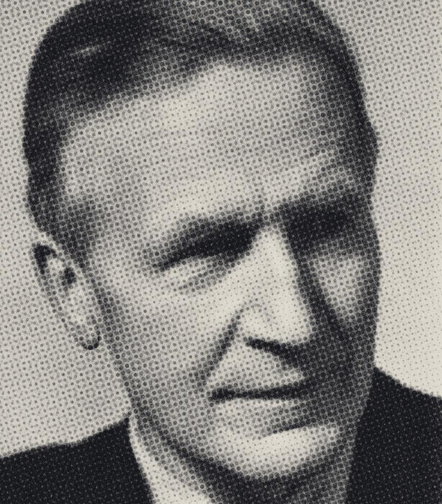

PAUL RENNER
Paul Renner was a twentieth century German graphic designer, type designer, typographer, painter, and teacher. Born on August 9th, 1878 in Wernigerode, Germany, he is best known for creating the iconic typeface Futura.
Renner developed a keen interest in the functionality of modernism and the relationship between form and function. He wrote the groundbreaking book Typographie als Kunst (Typography as Art) and later went on to publish other important works.
Moreover, he was a significant member of the German Work Federation. In 1926, he was granted the position of the head at the Printing Trade School in Münich. He continued his career as an educator by later establishing and becoming director of the Master School for Germany’s Printers.
FUTURA / DESIGNER / 07
The Story of Futura
Futura was drafted in 1924 and finally released to the public in 1927 in Frankfurt, Germany. It was developed to compete with the typeface Erbar, which had been released a year prior.
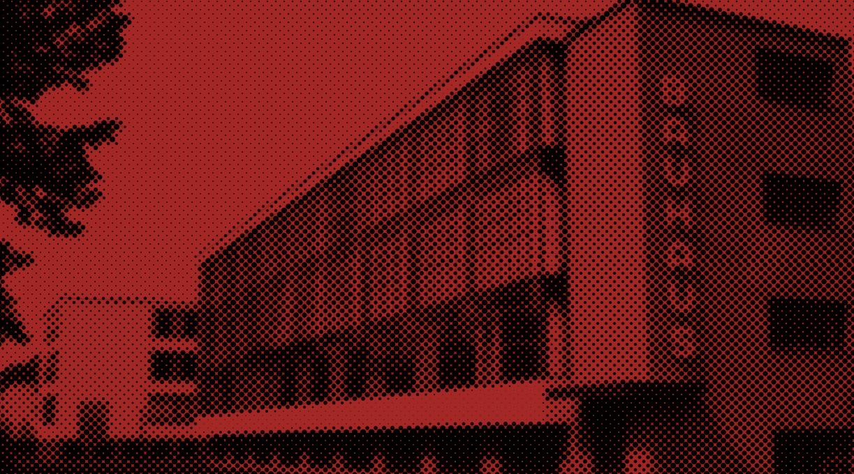
The typeface was commissioned by the Bauer Type Foundry for the New Frankfurt project, which was an affordable modernist housing project that many renowned modernist architects of this time were involved in.
Upon its release, Futura was marketed extensively by the Bauer Type Foundry with the German slogan “die Schrift unserer Zeit,” or “the typeface of today and tomorrow” in English.
Futura was a hit from the start, and the typeface has remained popular ever since. Its combination of classicism and modernity was unique for the time, and it lead to many variations from competing foundries.
Futura’s overt references to geometric shapes and modernism create a simplistic, forward-looking feel. Futura was meant to look like a machine-made typeface through its clean and geometric appearance. It was considered a progressive font, representative of the European avant-garde movement.
AND THE TYPE OF TODAY TOMORROW
FUTURA / HISTORY / 09
ABCDE FGHIJK LMNOP QRSTU VWXYZ
Futura
Bold Caps


Low c s A ch typ R nn
Condensed
BAUHAUS
Although Renner was not overtly associated with the Bauhaus movement, he shared many of the same design characteristics and ideologies.
The Bauhaus is a German artistic movement that is characterized by designs of geometry, abstraction, and angularity, with little to no ornamentation.
Based on geometric shapes, Futura was all about efficiency and functionality. Renner believed function came before form, which is representative of the Bauhaus ideology “function over form.”

The development of Futura took over two years. The first variations of the typeface were based strictly on geometric shapes like circles, rectangles, and triangles.
Renner decided to revise these versions, however, because he felt that the geometrical radicality was taking precedence over the simplicity.
The first typeface versions of what we now know to be Futura have been coined as “Architype Renner.” These early specimens had stricter geometry in the lowercase letters, while Futura today plays with optical illusions to create the perfect geometric effect.
BAUHAUS
FUTURA / INFLUENCES / 15
crossbar below x-height
cut-off terminal extends to baseline
pointed apex
Medium
Futura ascenders above
counters
terminal monoweight stroke
x-height
rise ascender line
circular
horizontal
small
Medium Futura ascenders
FUTURA HAS MANY AND VARIATIONS! WEIGHTS VERSIONS,
FUTURA / DESIGN / 18
Variations of Futura
Since its original release, there have been a ton of variations of Futura that have been released. Futura Bold and Oblique were designed along with many other weights, and Futura Condensed is a condensed version that was released in the 1930s. The last weight variations of Futura to be released were the light and light oblique versions in the 1950s.
Futura is a geometric sans serif with even-width strokes, making it legible even in small point sizes. Moreover, the typeface’s low x-height mimics a classic serif typeface and makes it legible in body text as well. The typeface also features round circular counters and pointed apexes and vertices that extend to the cap height and baseline. This versatile font is extremely symmetric with clean and precise proportions.
FUTURA
FUTURA / DESIGN / 21
SEVEN WEIGHTS+ ITALICS
SEVEN WEIGHTS+ ITALICS
Futura through History
From landing on the moon to being used in Nazi documents, Futura has been seen throughout history since its release. The typeface was originally rejected by the Nazi Party due to the party’s stance on modern art. Later, the Nazi Party reversed their decision and began utilizing Futura for their documents due to its legibility.
The U.S. Army and NASA were also known for using Futura for their documents. In 1969, the Apollo 11 plaque that was planted on the moon used Futura, making Futura the first typeface to land on the moon. The typeface was also featured for Apollo 11 branding.

Futura has also been used for numerous iconic movie posters. The famous director Stanley Kubrick claimed that Futura was his favorite typeface of all time and has featured the typeface in countless of his movie posters such as 2001: A Space Odyssey, The Shining, A Clockwork Orange, and many more. Futura was also a favorite for renowned director Wes Anderson, who used Futura in numerous of his films.
Futura has also been used in other film posters like American Beauty, V for Vendetta, the Help, and Moonlight, to name a few.
A design that was a product of its time, yet became timeless.
FUTURA / EXAMPLES / 25
EXAMPLES


EXAMPLES


FUTURA / EXAMPLES / 28
Futura Now
Futura has been used by artists and designers, most notably the graphic designer Barbara Kruger. She is most known for her collage work that consist of a black-and-white photograph, overlaid with provocative messages utilizing Futura Bold Oblique.
Futura’s clean and simple look has allowed for its use in countless iconic logos, such as Fedex, Ikea, Volkswagen, Domino’s Pizza, Nike, Calvin Klein, and Supreme. Futura has become very common for branding due to its versatility and timelessness. It has been used in a variety of different brands, from sports brands, streetwear brands, automobile companies, and high fashion companies.
REFERENCES
“Absolut Logo.” WikiMedia .
“Calvin Klein Logo.” Freebie Supply .
“David Quay Design.” David Quay Design Grafik Renner Futura Comments .
FedEx. “Fedex Logo.” Static Wikia .
“Gillette Logo.” Freebie Supply .
“Klim Type Foundry · The Future Design Information.” Klim Type Foundry, 20 June 2022 .
“Louis Vuitton Logo.” WikiMedia Commons .
Medina, Jennifer. “The History of Futura.” CUNY Rare Book, 25 May 2020.
Miller, Meg. “Happy 90th Birthday to Futura, the Modernist Typeface That Is Literally Everywhere.” Eye on Design , 28 Sept. 2017.
NASA. “Apollo 11 Landing.” Space.com.
“Nike Logo.” CVNDSH.
“Paul Renner: Biography, Designs and Facts.” Famous Graphic Designers.
“Paul Renner.” Wikipedia.
“PayPal Logo.” Logos World.
“Supreme Logo.” Input.
Supreme. “Supreme Orange Box Tee.” NicePNG.
TypeRoom. “Watch! Futura, an Iconic Typeface for the Bauhaus in All of Us.” TypeRoom, 21AD.
“Volkswagen Logo.” FreePNGLogos.
Yip, Iris. “Futura: Characteristics, Personality, Rhythm & Flow.” Medium, 27 Oct. 2020.
This type specimen book is one of a series of 2 books designed under the direction of Prof. Sarah Edmands Martin by the VCD 2: Typography students at the University of Notre Dame during the Spring semester of 2023.
This volume explores the use and origins of the Futura typeface created by Paul Renner in 1927.
This book has been researched, designed and edited by Sammi Scheiderman.