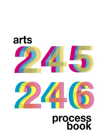
introduction
Hello! My name is Samantha Brennan, and I am a sophomore at the University of South Carolina. I am majoring in studio art and hoping to have a focus in graphic design. I am from a small town New Jersey. I took art classes throughout my high school career and really found a new love for it since coming to this school. I am excited to share my progress from Arts 245 and Arts 246.
Humans of New York Classifications
Type Hike
Sports Rebrand
Logo Mark
Remaking Language
Zine
9 Square Project
Grey Readings
Flowering Typography
Merch Menu
Typographic Design Form and Communication
Brad Vetter1
The evolution of typography has always been an interesting topic to me. As in everything else in life, such as fashion, marketing tactics, designs a lot of things and ideas will reinvent themselves, some with a more modern take on but show similarities to their origin. For example, fashion trends such as bell bottoms have reinvented themselves and become vastly popular within our society now. The text show-
This project was presented to us an exercise, a less intense and more of a practice rather than a project. We were given a plethora of images to choose between, as well as a story that went along with the imagery and a condensed color pallet. I chose the image of a couple, for a few reasons. I initially simply enjoyed their story and the message behind their photo. But then, I really
Some challenges I found when doing this project was most definitely having to keep my body copy and type size below twelve. I feel that in most of my work I do, I have a tendency to make my type huge, out of habit. This exercise forced me to really focus on how to use my restrictions to my advantage, so I ended up double spacing my type and using a distinct text box
A TRUE LOVE LETTER

“I thought we were just going to hang out at his sister’s place today, but when I got there, Jim wasn’t there. But his sister gave me an envelope and told me that Jim was waiting for me at the place where we saw The Nutcracker. But when I got to the theater, only Jim’s parents were there. But they gave me another envelope and told me that Jim was waiting for me at our favorite coffee shop. But when I got to the shop, only MY parents were there. But they gave me another envelope and told me that Jim was waiting for me at the place where we first went row boating. And when I got here, Jim was here. And he gave me one last envelope. And I opened all four envelopes and it said: ‘Will,’ ‘You,’ ‘Marry,’ ‘Me!’”
humans of new york
‘Will,’ ‘You,’ ‘Marry,’ ‘Me!’” Font Size: 22 pt Line Height: 30 pt Letter Spacing: -10 Raleway | Roboto
classifications
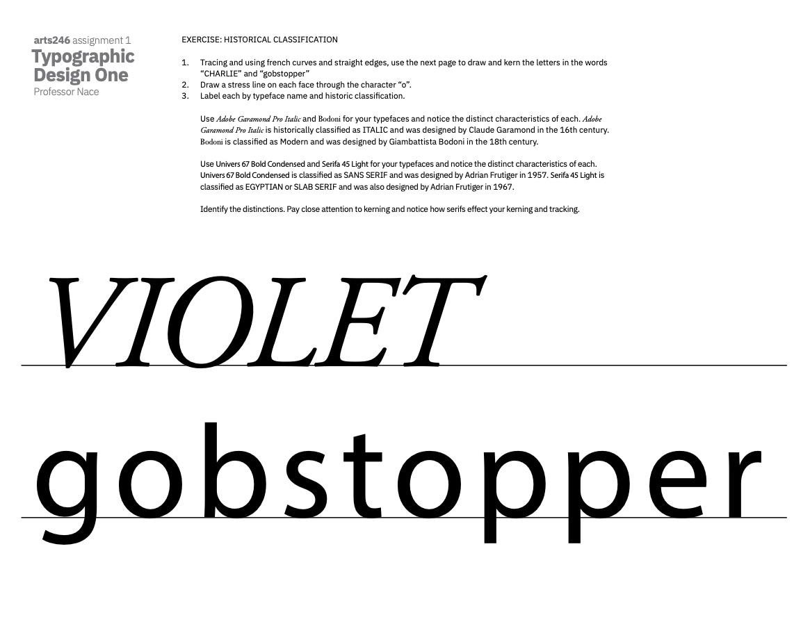
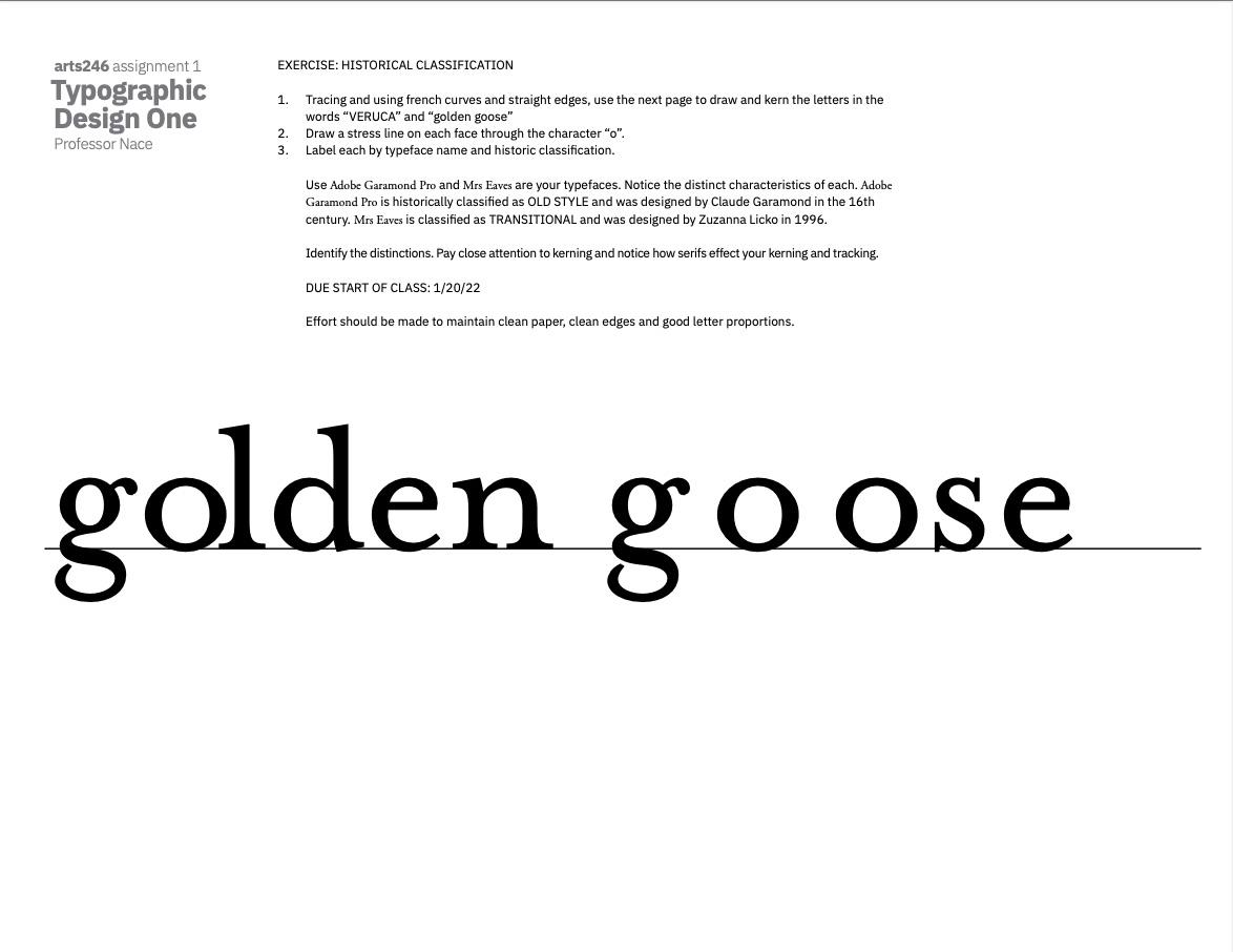
The anatomy of typography up until entering college was all completely new to me. In all honesty, I didn’t even know letters had anatomy and specific parts to them, such as arm, leg, bowls, etc. In arts 245, when looking at logo design and marks, is when we really homed in on using the anatomy of letters to the best of our ability. Something though through the textbook that I want to incorporate into my future is the focus on the contrast and the thickness/thinness of letters. I feel that my brain is custom
Going into this exercise It was recommend when doing this lettering practice to use French curves. I did not have French curves, so I searched my house looking for circular or ovular objects to match the curves of my letters. This ranged from lipsticks, to spoons and more. The simplicity of the assignment, just to redraw the letters in the correct spac-
2
T Y H I
P E K E
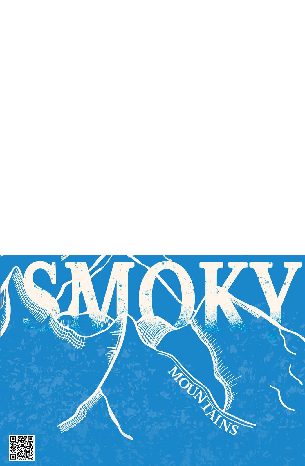
For this project, we are too chose a font and national park to research and create a poster for the park chosen. I am doing The Great Smokey Mountains, and my type and design choice have a major effect not only on each other but how it is perceived within the type on screen. Putting typography or graphic elements on screen versus on is one of the things I struggle with most. I have a hard time putting my elements on photoshop or illustrator on my computer screen, and then when it is printed, I find the scale is completely off, or my grid structure is not perceived.
Initial Poster
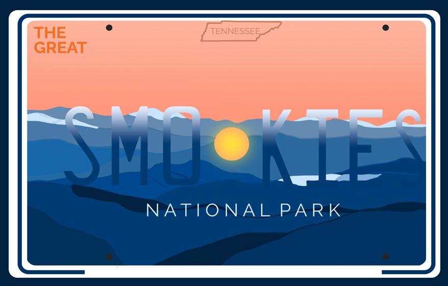
For this project, originally, I wanted to do a license plate design. I had sketched and made my original poster. I began by drawing a mountain range with procreate, and then imported into illustrator and used a typeface that resembled that of the Tennessee license plates. I enjoyed how this piece started to come out, but it didn’t “click”. I felt that it could be stronger compositionally and I truly didn’t feel confident in my work.
Second Draft
I then completely scratched my idea and drew this line work based mountain range that allowed me to have a minimalistic but eye-catching design. I focused more on the typographic elements, such as my use of the typeface Libre Baskerville. I incorporated a texture as well within the mountains.
Third Draft
I used the given color pallet and originally had this deep, clay red color to give into the smoky aspects. However, after critique it read more as fiery and heated smoke as opposed to the cooling and calming clouds that are found at the park itself. I changed to this sky-blue color pallet and incorporated a two tone mountain range.
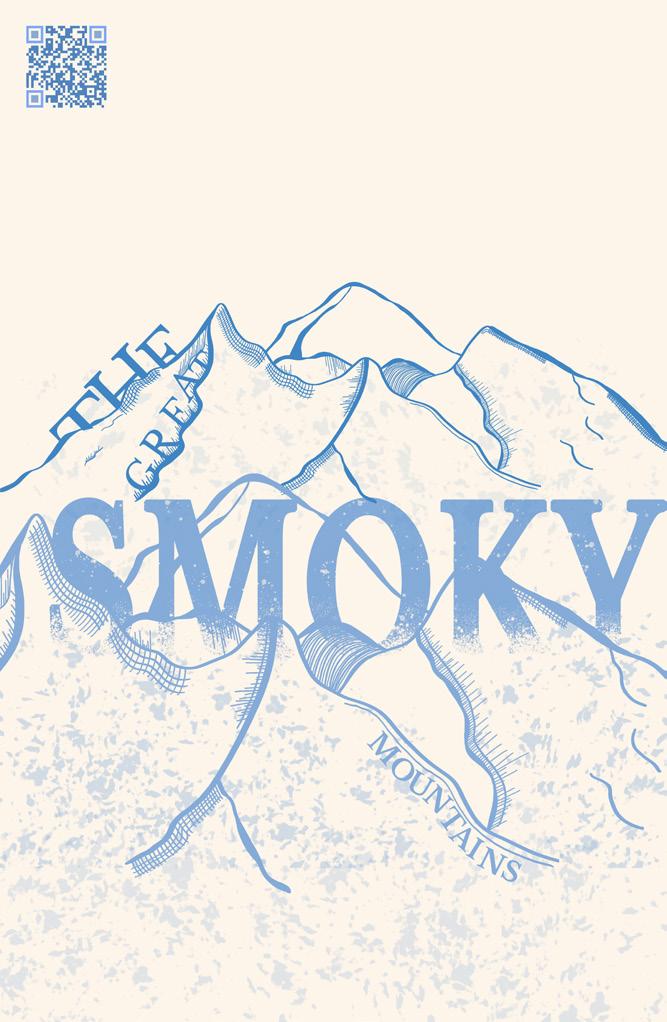

However, it felt unfinished and bare, and not in a minimalistic way. I inverted the colors as well as adding an extremely light gradient into the piece and made my final work. I love my final piece and is a piece I am extremely proud of. I also decided to rearrange the location and placement of the words “The Great” to be more hidden and dynamic within the poster, as opposed to just placing it on top of the mountains. This also forced the poster to not be as centered which is something we are always told to steer away from, and make the composition more engaging for the audience.


overall


B
Final Type Hike Poster and Type Specimen P 19 Pablo Im L
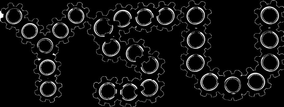
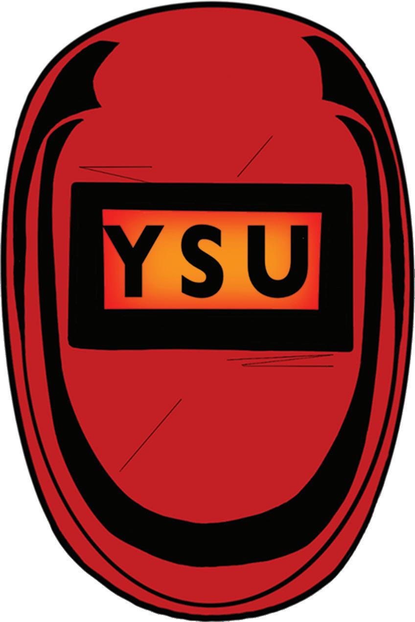
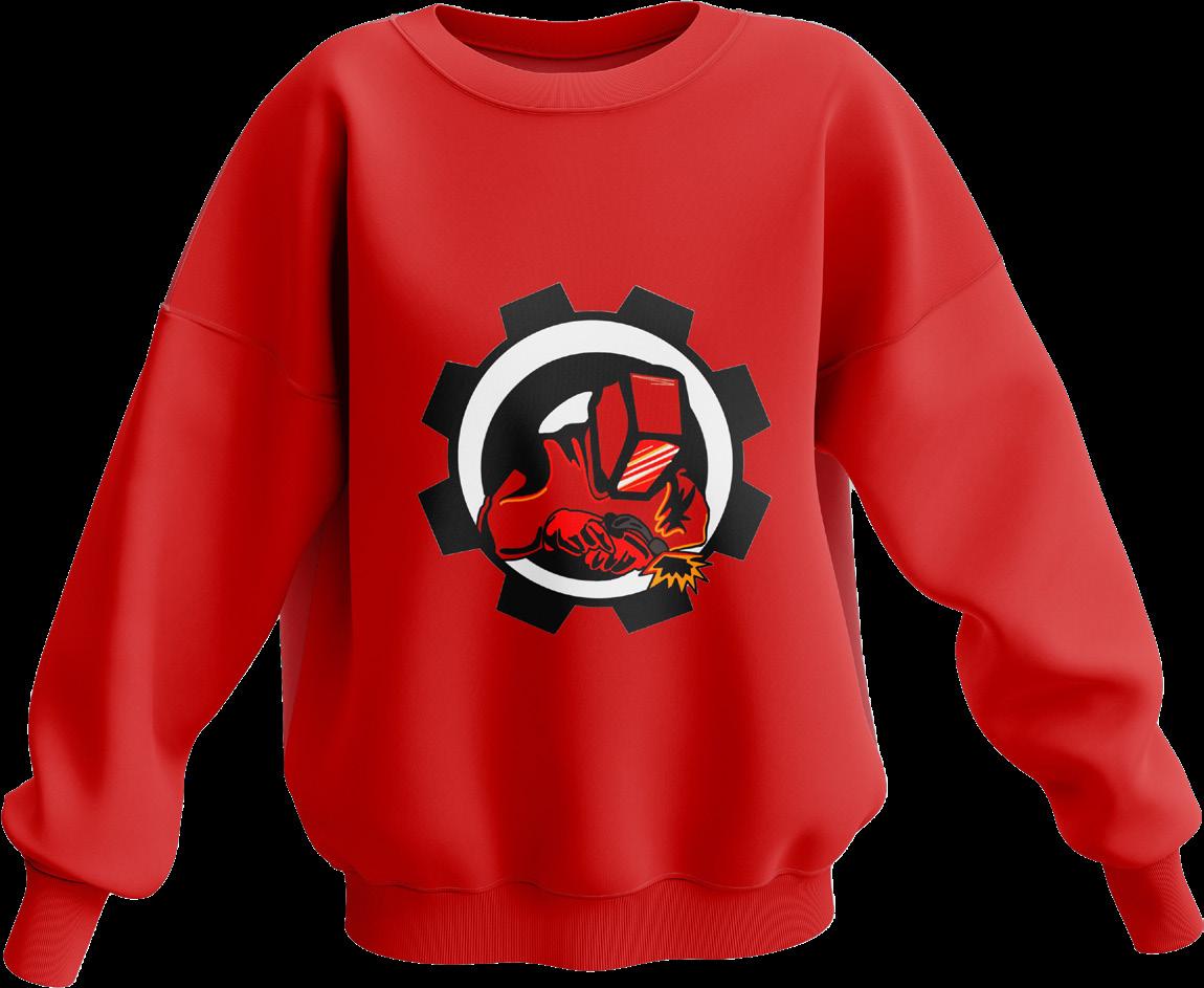
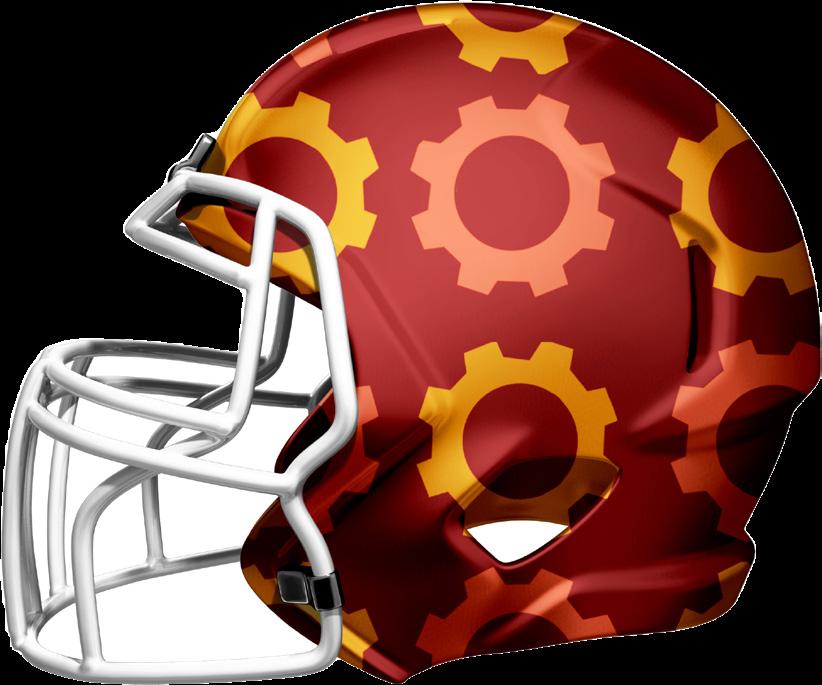
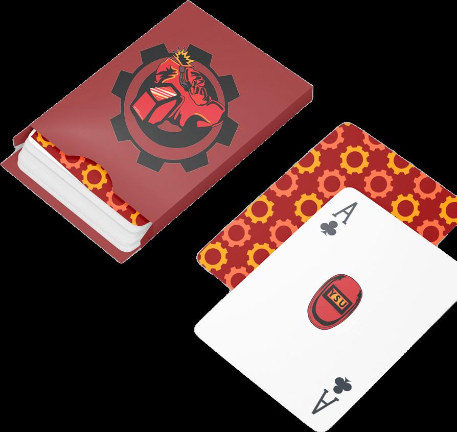
SPORTS REBRAND
overall
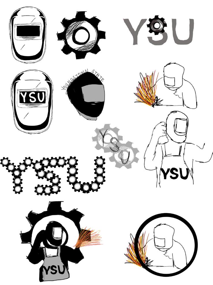
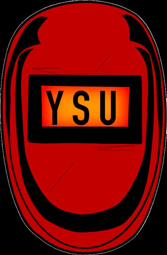
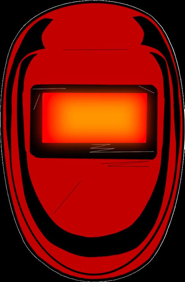
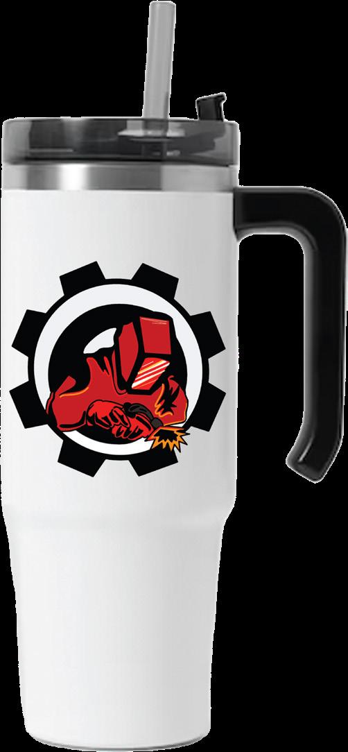
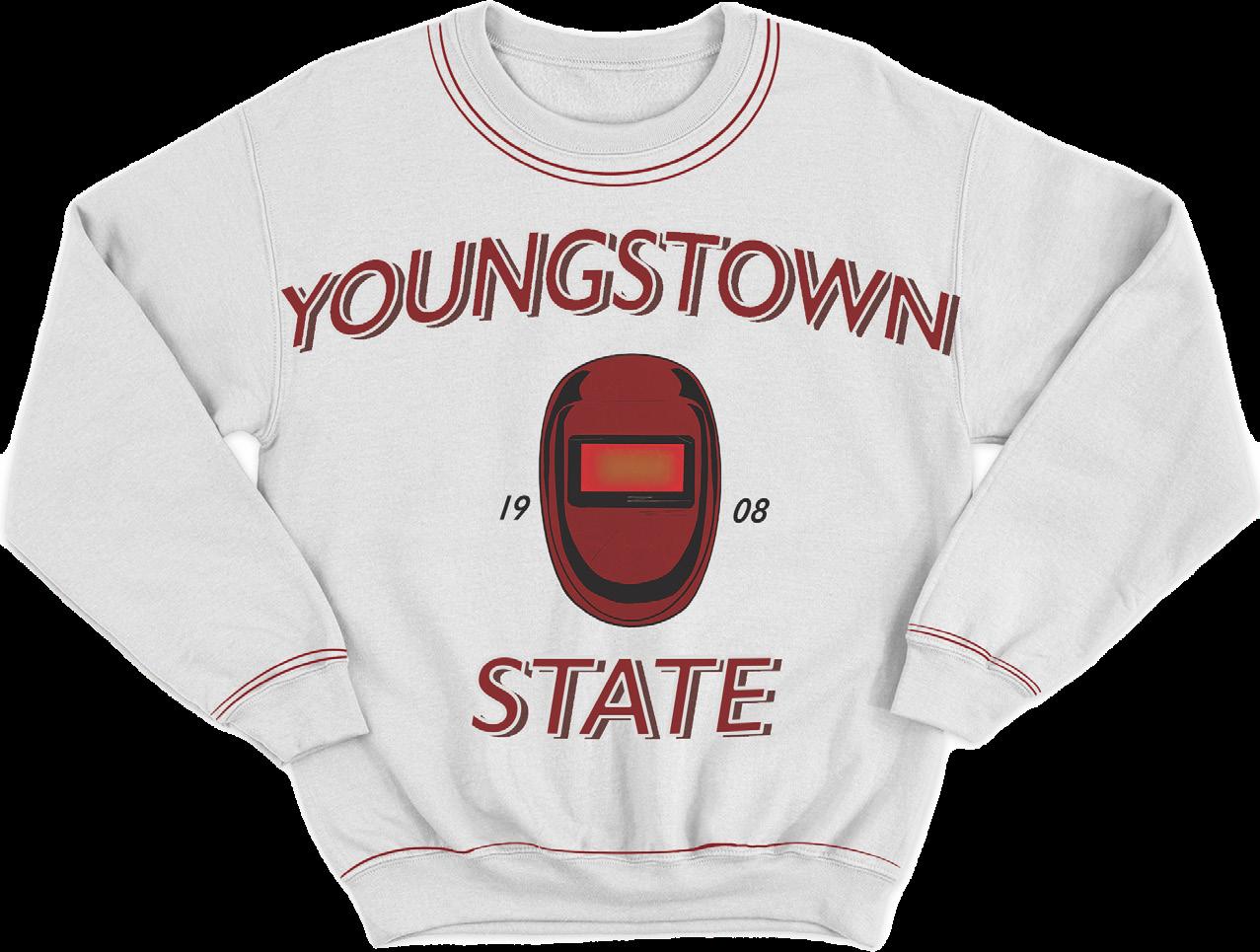
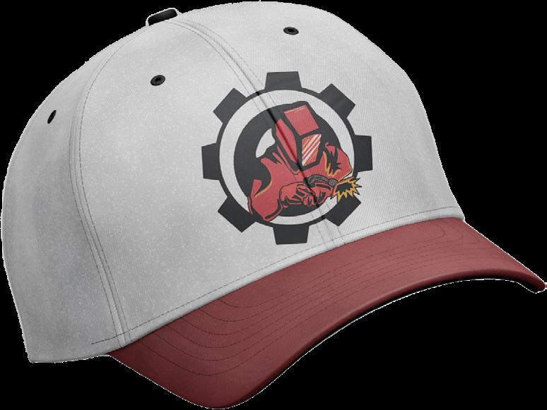
The sports branding project from Arts 245 was a breakthrough project for me. This was my first time dabbling into true real-world design. This was my first time working with mock-ups, a real school or company, and a complete re-do of an already existing logo. The task was to create a new branding and logo for a college/ university.
I began with research of my school, Youngstown State University in Youngstown, Ohio. YSU officially opened as a public college in 1908. As for the athletics program, they are the only Division 1 program that uses a penguin as their nickname and logo. The logo uses red and white and details of black. The school is known for their engineering major and department which I knew I wanted to incorporate.
Initial Sketches
Color Pallet
My sketches all revolved around each other and really did not differ much. To me, they just became much more developed and finalized. I kept it all surrounding the idea of welding and engineering, and changed their name to the Youngstown State welders.
Developed Sketches

Logo and Wordmark Progress
With the addition of color to my logos, they felt extremely flat and almost cartoonish. I had a really hard time with making them look like that polished and professional collegiate logo. I also had an extremely difficult time trying to find the fitting wordmark. I had created a few different drafts of a wordmark and could not get the right one to fit in with the goals of this project.


marv
Memorable:
The entirety of the logo is going to change, including the mascot itself. This will project a new style and adhere to a new demographic. The penguins were the only division 1 penguin, however there is no welders as a mascot, and I believe it will set them apart from others.
Appropriate:
archtype Hero
Motto: “Where there’s a will, there’s a way.”
The new logo and mascot adhere to the history of the town and the background of where their college campus is located, in Youngstown.
Desires: Prove ones with through courageous action
Fears: Weakness, vulnerability, “wimping out”
Examples; Nike, Adidas, FedEx
ethos
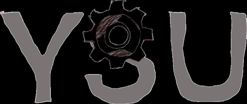
This rebrand of the Youngstown State University, formally known as the penguins are on a fiercer and more competitive look as the YSU Welders. The welders are meant to be seen as a challenger, hence the use of Gill Sans. This font allows for a bold or slim use based on line weight and fits into the archetype with the gear in place of the “O” to showcase the translate the comradery, innovation, and hardworking school that follows the community of the school. The branding of this school is seen as competitive, along with inviting based on the comradery it illustrates. The logos take a traditional take on aspects of welding, while using a modern and warm color pallet.

Primary Logo
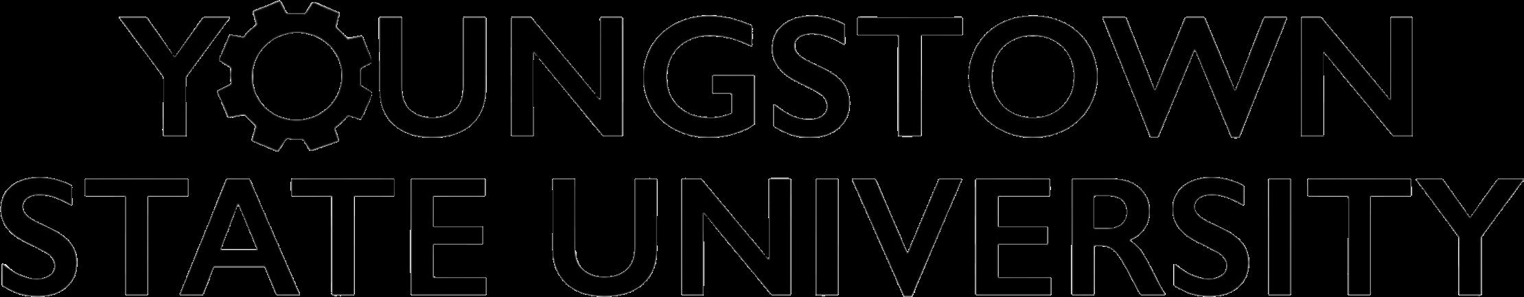
Secondary Logo Wordmark final logos
L O M A
G O R K
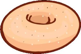
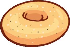
concept
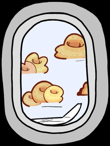
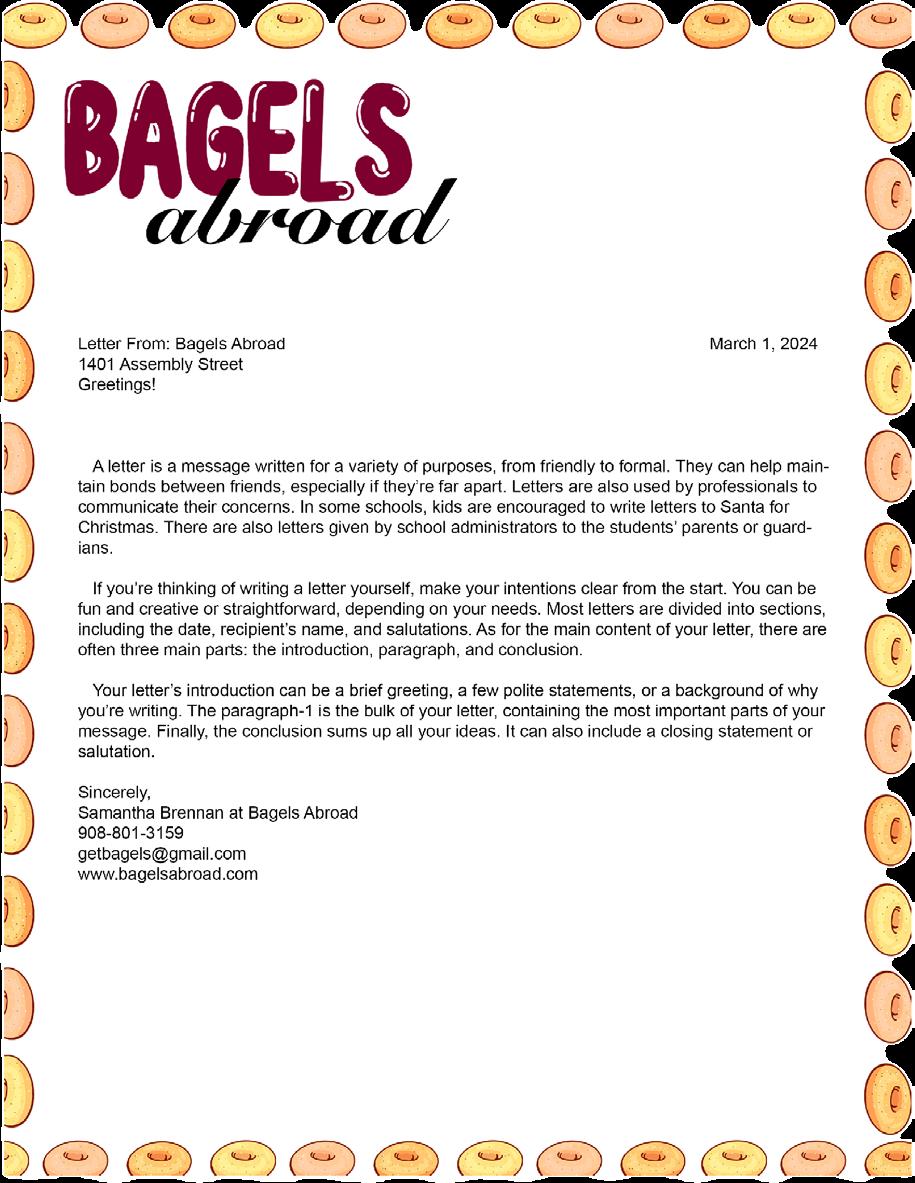
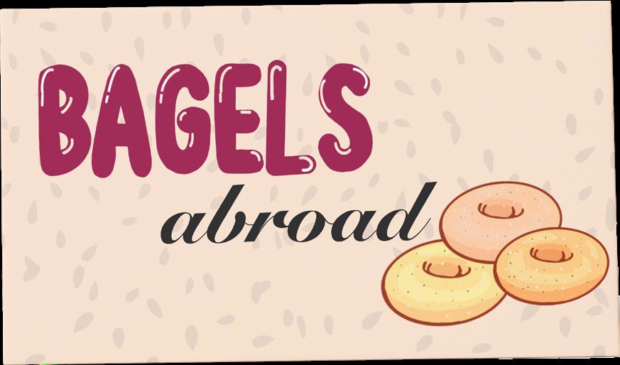
The logomark and stationary project is very different than what I have ever done. Not the actual logo making process, but how we obtained our ideas. We were given two words and had to make mind maps for each word, and somehow connect the ideas. I had come up with a bagel shipping company, called bagels abroad where someone could buy bagels from New Jersey or New York, places known for bagels. By doing the word map activity, it opened up my mind to new ideas that I wouldn’t have thought of before. With that being said, for my bagels abroad logo I wasn’t originally planning on using text, however maybe utilizing negative space and incorporating it into my images could be beneficiary. I was originally going to include maybe the word abroad somewhere within the plane or bagel itself not only
Initial Sketches
I went through an extensive sketching trial and error to this project. I had originally began with drawing a plane where the wheels are bagels. After class critique, people said it was not reading bagel as much as it could.
Wordmark

As for my wordmark, this came much easier to me than the logo itself. I knew that I wanted to have a “bubble” or puffy looking typeface, so I hand drew this lettering to keep it more playful and interactive. For me, when I am eating a bagel I am not looking for perfection on the outside, it is all about the taste.


Developed Sketches
Then, I re-planned my ideas and thought of using the bagels as clouds, and found an old photo I had on my phone of a plane window. I had sketched out a basic yet effective drawing of a bagel. I wanted to keep it simplistic, but still a symbol that could be read from multiple sizes and on all surfaces. I began sketching the clouds as bagels,
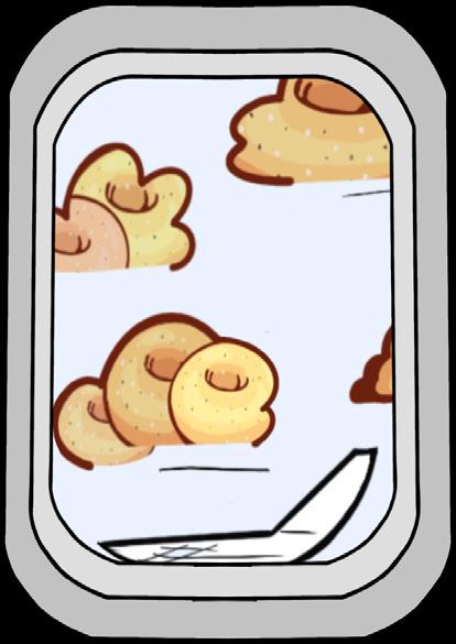
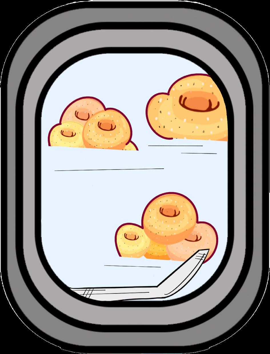
mockups and products final logos
E
A K I N G L A N G U A G E
R
M
While working with my other font, Baskerville I found this one came easier to me and I was able to create. More complex and dynamic looking letter as opposed to the first one. Using the serif of the letters was an advantage I found that helped me format the letter. Q
The making the 27th letter of the alphabet, or remaking language in Arts 245 was a project given to us towards the end of the semester. The goal was to create a new letter form that wasn’t like any other letter in the alphabet using pre-existing letters and different type faces. Learning the anatomy and build of letters is vital to typography and the world of graphic design. There are portions and parts of each letter that compose its anatomy. There are parts such as descenders, ascenders, spines, and counters. For the project, I had a hard time using the parts of the letters to their best capability.
When working with my sans- serif letter typeface Futura, I used Q, J, and O. I used the descender of J to create curvature in a very geometric type. I also used the tail of the Q to form an asymmetrical aspect to my letter and the bowl of the O to form the body of the 27th letter but I found that the similarities in style of the Q and O did not make this process easy. During the progress, I kept finding it just looked like my letters were whole and smashed together as opposed to portions of the letter, as the text expresses. I failed to breakdown the letters initially, which once I did the new letter was much more appealing looking.
concept
O L
Bowl Tails Descender
Stem Bowl Bowl
/JAY-J/
LUH /L- UH/ L
Z I
N E
project information
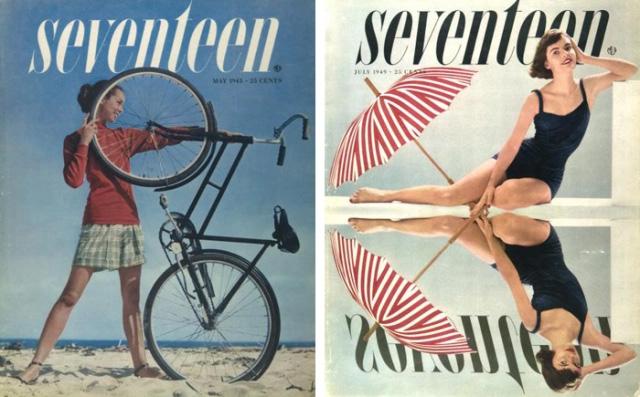
The zine project was on of my favorites from Arts 246. I loved the freedom of being able to choose our designer, and then emulate their style through our design. For me, editorial design and working with a magazine company or in the public relations field is my end goal in my career. . I am choosing to research and study Cipe Pineles, the first woman art director and editor within major magazine corporations. Since advised to only use type within our zine designs and no imagery, I want to focus on a magazine style and aesthetic for the majority of the project to not only emphasize her career but the actual assignment at hand. I want to be able to use type to show the information, not just be something to read about it.
all about Cipe Pineles
In Vienna, Austria Cipe Pineles was born on June 23rd, 1908. She was born as the fourth child of five. She often spent her childhood in the country of Poland as her farther suffered from illness. She attended high school in Brooklyn, New York and studied her college years at Pratt Institute. Her first job during her years of college while studying Graphic Design and Art Directory, was as a teaching instructor for watercolor paintings in a public school in Newark, New Jersey. Post graduation and Great Depression, she worked small jobs within camps and resorts by designing advertisements for said companies. Contempora was her initial start of her career due to high levels of sexism within the industry at the age of 23. She worked there for three years, until her big break after being noticed by Condé Nast, American publisher and business man’s wife. She became the assistant to Dr. M. F. Agha who was the art director of by Condé Nast and his publishing company. Within the time of design evolving, Agha allowed Pineles to flourish on her own. This allowed her to expand her portfolio and self- made work. This then developed into her beginning of her dominating career in major magazine and corporations. She began at Glamour as their art director. She worked with her style and formatted a modern image and use of type. She then worked in an abundance of major magazine firms, such as Vogue for six years and Seventeen Magazine for three years, Charm for nine years and then in 1961 the art director of Mademoiselle in New York. all still developing her playful, feminine, and modernistic style. Pineles set a number of trends and new styles to the world of graphic design. She won an award from The Atlantic Monthly for her story of immigration, as well as becoming the first female member of the Art Directors Club in 1943. Along with that, after her decade of nomination, she was the second woman inducted into the Art Director hall of Fame in 1975. Further, in 1955 she became the first female member of the Alliance Graphique Award. And she was further honored in 1984 by the Society of Publication Designers with the Herb Lubalin Award. She was the ideal trend setter for women in design.
First Draft
vel illum dolore eu feugiat nulla facilisis at vero eros et accumsan et iusto odio dignissim qui blandit praesent luptatum zzril delenit augue duis dolore te feugait nulla facilisi.
Lorem ipsum dolor sit amet, cons ectetuer adipiscing elit, sed diam nonummy nibh euismod tincidunt ut laoreet dolore magna aliquam erat volutpat. Ut wisi enim ad minim veniam, quis nostrud exerci tation ullamcorper suscipit lobortis nisl ut aliquip ex ea commodo consequat.
Lorem ipsum dolor sit amet, consectetuer adipiscing elit, sed diam nonummy nibh euismod tincidunt ut laoreet dolore magna aliquam erat volutpat. Ut wisi enim ad minim veniam, quis nostrud exerci tation ullamcorper
With my final, I ended up removing a lot of the extra type and text that was in my first draft and used more graphic elements and negative space. I included things such as the low opacity squares or the narrow lines. In addition, I included a fully black background in my last square which I feel off set the completely white composition and I think it creates an asymmetric feel to the zine.
My first draft I followed a very magazine style and format. I either utilized the white space or completely filled the page, and I think due to the fact that no imagery could be used I felt I had to fill the entirety of each box. I definitely loved the concept and idea of it, but after critique and working on it I forgot the purpose was for them to be printed and tangible. So, all of that type and text was going to be extremely overwhelming and crowded.
Lorem ipsum dolor sit amet, consectetuer adipiscing elit, sed diam nonummy nibh euismod tincidunt ut laoreet dolore magna aliquam erat volutpat. Ut wisi enim ad minim veniam, quis nostrud exerci tation ullamcorper suscipit lobortis nisl ut aliquip ex ea commodo consequat. Duis autem vel eum iriure dolor in hendrerit in vulputate velit esse molestie consequat, vel illum dolore eu feugiat iusto odio dignissim qui blandit praesent luptatum zzril delenit augue duis dolore te feugait nulla facilisi. Lorem ipsum dolor sit amet, cons ectetuer adipiscing elit, sed diam nonummy nibh euismod tincidunt ut laoreet dolore magna aliquam erat volutpat. Ut wisi enim ad minim veniam, quis nostrud exerci tation ullamcorper suscipit lobortis nisl ut aliquip ex ea commodo consequat. Lorem ipsum dolor sit amet, consectetuer adipiscing elit, sed diam nonummy nibh euismod tincidunt ut laoreet dolore magna aliquam erat volutpat. Ut wisi enim ad minim veniam, quis nostrud exerci tation ullamcorper suscipit lobortis nisl ut aliquip ex ea commodo consequat. hendrerit in vulputate velit esse molestie consequat, vel illum dolore eu feugiat iusto odio dignissim qui blandit praesent luptatum zzril delenit augue duis dolore te feugait nulla facilisi. Lorem ipsum dolor sit amet, cons ectetuer adipiscing elit, sed diam nonummy nibh euismod tincidunt ut laoreet dolore magna aliquam erat volutpat. Ut wisi enim ad minim veniam, quis nostrud exerci tation ullamcorper suscipit lobortis nisl ut aliquip ex ea commodo consequat. Lorem ipsum dolor sit amet, consectetuer adipiscing elit, sed diam nonummy nibh magna aliquam erat volutpat. Ut wisi enim ad minim veniam, quis nostrud exerci tation ullamcorper suscipit lobortis nisl ut aliquip ex ea commodo consequat. hendrerit in vulputate velit esse molestie consequat, vel illum dolore eu feugiat iusto odio dignissim qui blandit praesent ipsum dolor sit amet, adipiscing elit, sed diam euismod laoreet dolore magna aliquam erat volutpat. Ut wisi enim ad veniam, quis nostrud ullamcorper suscipit lobortis nisl ut aliquip ex vel eum in vulputate molestie consequat, dolore eu feugiat nulla facilisis at iusto odio dignissim qui blandit praesent luptatum augue duis dolore te feugait nulla facilisi. ipsum dolor sit amet, adipiscing In Vienna, Austria Cipe Pineles was born on June 23rd, 1908. She was born as the fourth child of five. She often spent her childhood in the country of Poland as her farther suffered from illness. She attended high school in Brooklyn, New York and studied her college years at Pratt Institute. EARLY LIFE EARLY LIFE EARLY LIFE UNIVERSITY Her first job during her years of college while studying Graphic Design and Art Directory, was as a teaching instructor for watercolor paintings in a public school in Newark, New Jersey. Post graduation and Great Depression, she worked small jobs within camps and resorts by designing advertisements for said companies. 23Contempora was her initial start of her career due to high levels of sexism within the industry at the age of 23. She worked there for three years, until her big break after being noticed by Condé Nast, American publisher and business man’s wife. 23 23 23 23 23 23 23 23 Lorem ipsum dolor sit amet, consectetuer adipiscing elit, sed diam nonummy nibh euismod tincidunt ut laoreet dolore magna aliquam erat volutpat. Ut wisi enim ad minim veniam, quis nostrud exerci tation ullamcorper suscipit lobortis nisl ut aliquip ex ea commodo consequat. Duis autem vel eum iriure dolor in hendrerit in vulputate velit esse molestie consequat,
suscipit lobortis nisl ut aliquip ex ea commodo consequat. Duis autem vel eum iriure dolor in hendrerit in vulputate velit esse molestie consequat, vel illum dolore eu feugiat nulla facilisis at vero eros et accumsan et iusto odio dignissim qui blandit praesent She became the assistant to Dr. M. F. Agha who was the art director of by Condé Nast and his publishing company. Within the time of design evolving, Agha allowed Pineles to flourish on her own. This allowed her to expand her portfolio and selfmade work. GLAMOUR This then developed into her beginning of her dominating career in major magazine and corporations. She began at Glamour as their art director. She worked with her style and formatted a modern image and use of type. GLAMOU GLAM VOGUE She then worked in an abundance of major magazine firms, such as Vogue for six years and Seventeen Magazine for three years, Charm for nine years and then in 1961 the art director of Mademoiselle in New York. all still developing her playful, feminine, and modernistic style. MAGAZINE VOGUE MAGAZINE FIRST FEMALE FIRST FEMALE FIRST FEMALE FIRST FEMALE FIRST FEMALE FIRST FEMALE FIRST FEMALE FIRST FEMALE Pineles set a number of trends and new styles to the world of graphic design. She won an award from The Atlantic Monthly for her story of immigration, as well as becoming the first female member of the Art Directors Club in 1943. Along with that, after her decade of nomination, she was the second woman inducted into the Art Director hall of Fame in 1975 Further, in 1955 she became the first female member of the Alliance Graphique Award. And she was further honored in 1984 by the Society of Publication Designers with the Herb Lubalin Award. She was the ideal trend setter for women in design. CIPE Lorem ipsum dolor sit amet, consectetuer adipiscing elit, sed diam nonummy nibh euismod tincidunt ut laoreet dolore magna aliquam erat volutpat. Ut wisi enim ad minim veniam, quis nostrud exerci tation ullamcorper suscipit lobortis nisl ut aliquip ex ea commodo consequat. Duis autem vel eum iriure dolor in hendrerit in vulputate velit esse molestie consequat, vel illum dolore eu feugiat nulla facilisis at vero eros et accumsan et iusto odio dignissim qui blandit praesent luptatum zzril delenit augue duis dolore te feugait nulla facilisi. Lorem ipsum dolor sit amet, cons ectetuer adipiscing elit, sed diam nonummy nibh euismod tincidunt ut laoreet dolore magna aliquam erat volutpat. Ut wisi enim ad minim veniam, quis nostrud exerci tation ullamcorper suscipit lobortis nisl ut aliquip ex ea commodo consequat. Lorem ipsum dolor sit amet, consectetuer adipiscing elit, sed diam nonummy nibh euismod tincidunt ut laoreet dolore magna aliquam erat volutpat. Ut wisi enim ad minim veniam, quis nostrud exerci tation ullamcorper suscipit lobortis nisl ut aliquip ex ea commodo consequat. Duis autem vel eum iriure dolor in hendrerit in vulputate velit esse molestie consequat, vel illum dolore eu feugiat nulla facilisis at vero eros et accumsan et iusto odio dignissim qui blandit praesent luptatum zzril delenit augue duis dolore te feugait nulla facilisi. Lorem ipsum dolor sit amet, cons ectetuer adipiscing elit, sed diam nonummy nibh euismod tincidunt ut laoreet dolore magna aliquam erat volutpat. Ut wisi enim ad minim veniam, quis nostrud exerci tation ullamcorper suscipit lobortis nisl ut aliquip ex ea commodo consequat. Lorem ipsum dolor sit amet, consectetuer adipiscing elit, sed diam nonummy nibh Lorem ipsum dolor sit amet, consectetuer adipiscing elit, sed diam nonummy nibh euismod tincidunt ut laoreet dolore magna aliquam erat volutpat. Ut wisi enim ad minim veniam, quis nostrud exerci tation ullamcorper suscipit lobortis nisl ut aliquip ex ea commodo consequat. Duis autem vel eum iriure dolor in hendrerit in vulputate velit esse molestie consequat, vel illum dolore eu feugiat nulla facilisis at vero eros et accumsan et iusto odio dignissim qui blandit praesent luptatum zzril delenit PINELES In Vienna, Austria Cipe Pineles was born on June 23rd, 1908. She was born as the fourth child of five. She often spent her childhood in the country of Poland as her farther suffered from illness. EARLY LIFE UNIVERSITY Her first job during her years of college while studying Graphic Design and Art Directory, was as a teaching instructor for watercolor paintings in a public school in Newark, New Jersey. 23Contempora was her initial start of her career due to high levels of sexism within the industry at the age of 23. She worked there for three years, until her big break after being noticed by Condé Nast, American publisher and business man’s wife. 23 23 23 23 23 23 23 23 GLAMOUR This then developed into her beginning of her dominating career in major magazine and corporations. She began at Glamour as their art director. She worked with her style and formatted a modern image and use of type. GLAMOU GLAM VOGUE She then worked in an abundance of major magazine firms, such as Vogue for six years and Seventeen Magazine for three years, Charm for nine years. FIRST FEMALE FIRST FEMALE FIRST FEMALE FIRST FEMALE FIRST FEMALE FIRST FEMALE FIRST FEMALE FIRST FEMALE Pineles set a number of trends and new styles to the world of graphic design. She won an award from The Atlantic Monthly for her story of immigration, as well as becoming the first female member of the Art Directors Club in 1943. Along with that, after her decade of nomination, she was the second woman inducted into the Art Director hall of Fame in 1975 Further, in 1955 she became the first female member of the Alliance Graphique Award. And she was further honored in 1984 by the Society of Publication Designers with the Herb Lubalin Award. She was the ideal trend setter for women in design. She attended high school in Brooklyn, New York and studied her college years at Pratt Institute. Lorem ipsum dolor sit amet, consectetuer adipiscing elit, sed diam nonummy nibh euismod tincidunt ut laoreet dolore magna aliquam erat volutpat. Ut wisi enim ad minim veniam, quis nostrud exerci tation ullamcorper suscipit lobortis nisl ut aliquip ex ea commodo consequat. Duis autem vel eum iriure dolor in hendrerit in vulputate velit esse molestie consequat, vel illum dolore eu feugiat nulla facilisis at vero eros et accumsan et iusto odio dignissim qui blandit praesent luptatum zzril delenit augue duis dolore te feugait nulla facilisi. Lorem ipsum dolor sit amet, cons ectetuer adipiscing elit, sed diam nonummy nibh euismod tincidunt ut laoreet dolore magna aliquam erat volutpat. Ut wisi enim ad minim veniam, quis nostrud exerci tation ullamcorper suscipit lobortis nisl ut aliquip ex ea commodo consequat. Lorem ipsum dolor sit amet, consectetuer adipiscing elit, sed diam nonummy nibh euismod tincidunt ut laoreet dolore magna aliquam erat volutpat. Ut wisi enim ad minim veniam, quis nostrud exerci tation ullamcorper suscipit lobortis nisl ut aliquip ex ea commodo consequat. Duis autem vel eum iriure dolor in hendrerit in vulputate velit esse molestie consequat, vel illum dolore eu feugiat nulla facilisis at vero eros et accumsan et iusto odio dignissim qui blandit praesent She became the assistant to Dr. M. F. Agha who was the art director of by Condé Nast and his publishing company. Within the time of design evolving, Then in 1961 the art director of Mademoiselle in New York. All while still developing her playful, feminine, and modernistic style. CIPE PINELES Agha allowed Pineles to flourish on her own. This allowed her to expand her portfolio and selfmade work. Post graduation and Great Depression, she worked small jobs within camps and resorts by designing advertisements for said companies.
Zine
Final
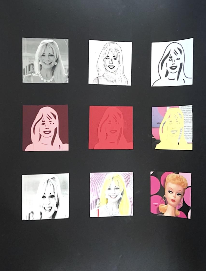
PROJECT 9SQUARE
project information
The nine square project revolved around technicality. We were to choose a celebrity or famous figure to revolve our project around. We had to create an array of images, using exacto knives, different coloring formats, and morphing images using the printer.
Process and Thoughts Final Work
The nine square project was the first assignment of Arts 245, and wow, the most challenging. With full transparency, I am most definitely not a hands-on artist. I attract and gear much better towards digital work and I have since I was in high school. The fundamentals of art while yes, they are important, are so technical and irritate me. I never really had to do hands-on work in high school due to covid. With being home for the pandemic, that’s where I started digital art and found a love for graphic design. With that being said, it completely halted my time with tangible art making. Looking back, my nine square is my least favorite piece I have made in my college years. I chose to focus mine on Margot Robbie as barbie. While it took a lot of time, I felt mine lacked focus and technicality. I feel that my concept and color choices for the paper and contrasting images as well as my textured piece fit really well. I chose a magazine texture for this project, which to me works really well as the whole ideology revolves around Barbie and perfection. On the other hand, my cutting skills lacked and showed. My project was nowhere near as clean as it should have been. This however flowed right into the grey reading project, where I feel the cutting skills had major improvement. I knew I needed to eave myself the time and resources for the grey readings to produce the work I wanted. So, while it was my least favorite project and was nowhere near my standards, it shaped me and taught me vital lessons I will never forget.
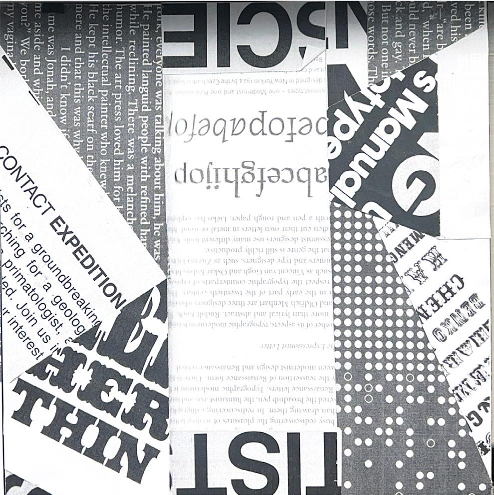
READINGS GREY
project information
The grey readings project was one of the most beneficial for me. The prompt was to take magazine or typographic text and cut them and create three different, clear grids on three different art boards.
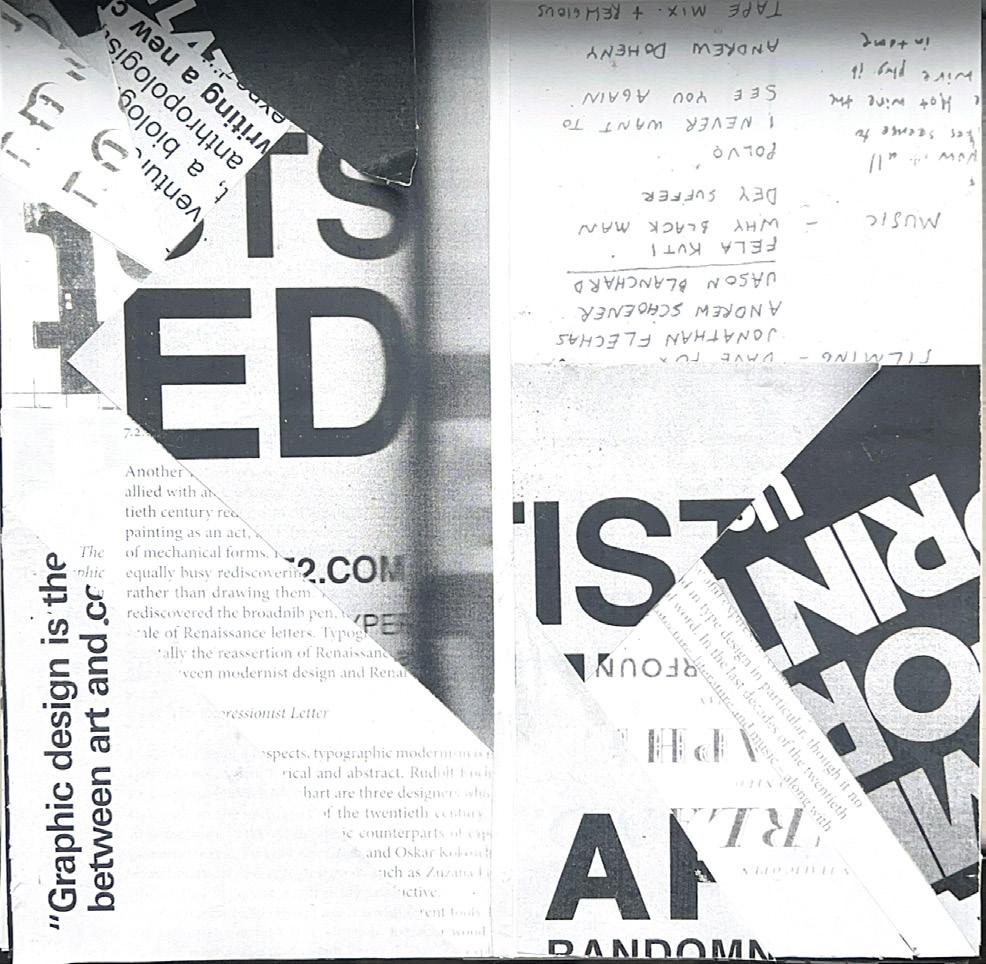
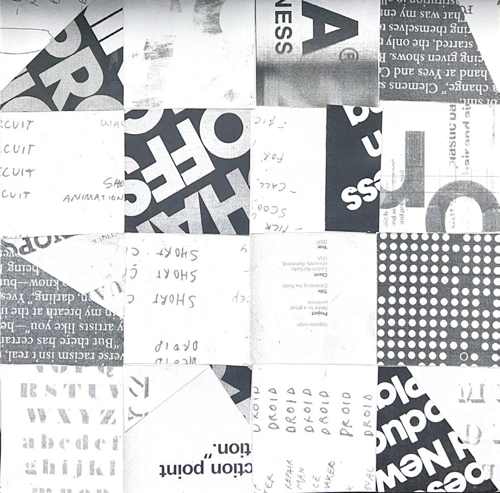
This project for me was essential. Creating and following grids is an extremely vital part to graphic design and something that I struggled with a lot. It is still something I struggle with. A lot of time during critique or one on ones with professors/ classmates, a consistent piece of criticism is that my alignment of text or image to text is off.
The three-square project allowed me to utilize a modular, hierarchal, and column grid. With that, it forced me to use pieces of the magazines or books that all utilized different fonts, texts, and images and make them cohesive with another.
FLOWERING TYPOGRAPHY
sketches
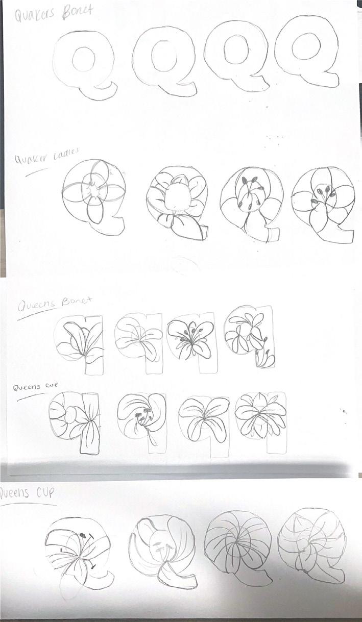
Flowering typography was my first time truly working with Adobe Illustrator. I had used it shortly in high school, but I had never really used all the tools and features that the application has to offer. The project prompt was to select a flower and integrate it into your given letter. The flower however had to start with the same letter as the letter you were given. I was given the letter Q and chose queens cup as my flower.
When beginning this project, I had chosen an array of various flowers as well as placing them into upper and lowercase letter Q’s. With this, I was able to see all f the various options and chose which one I felt would challenge me most, as well as look the best.
With my letter, I chose a lowercase Q to be able to utilize the long stem of the Q as well as the rounded portion of the letter. When sketching my flower of in design, that was my first time I had ever used the pen tool. At this point in sophomore year, I had used photoshop and InDesign but never really tackled illustrator. Looking back, I feel for my first-time using illustrator it was not terrible. It lacks a lot of cleanliness though. I feel now, my work with illustrator has advanced much more. However, using illustrator is not my first choice of sketching or drawing. I am much more comfortable with my iPad and apple pencil, but using illustrator is something I need to work in more and become more advanced in.
final project
directions and information
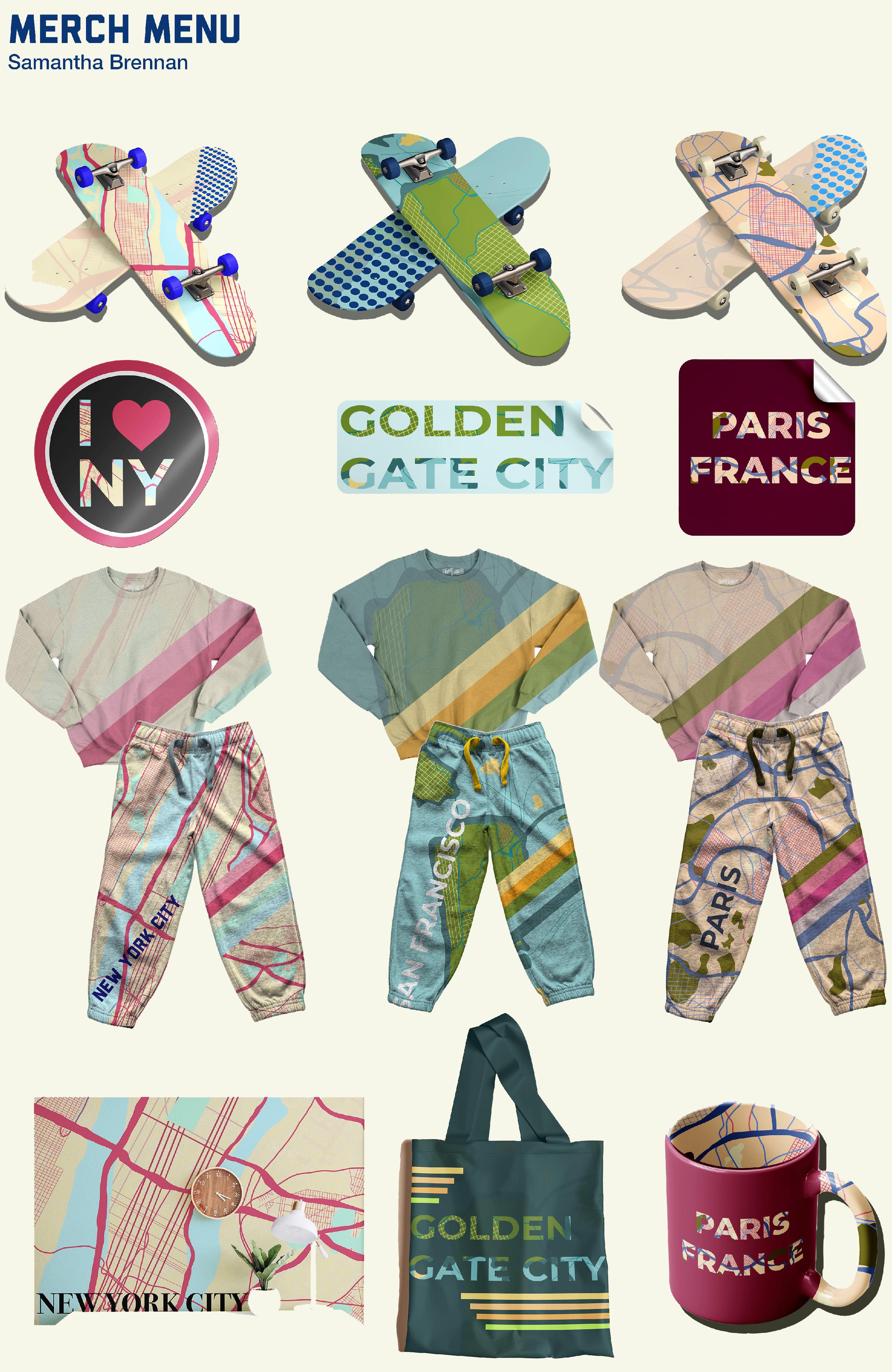
MERCH
MENU
prompt
This project is apart of my illustration course, Arts 266. We were given the prompt to use a single or set of illustrations to create a merch campaign. This was including a t-shirt or apparel design, a sticker, and skateboard mockup, as well as other options that were free range of choice.
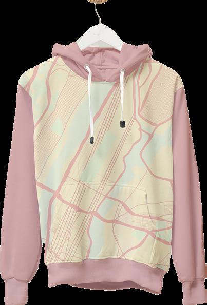
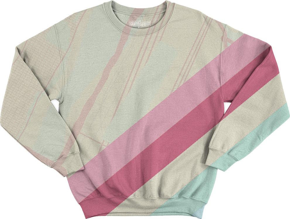
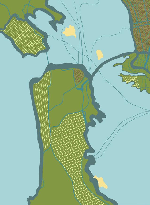
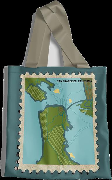
I began with a mood board and expanding my idea from a theme of sketches I had, which was travel and city style drawings. I decided upon drawing my own set of maps of cities. I chose to focus on New York City, Paris, and San Francisco. All three to me varied within aesthetics while also being major cities that are high tourist attractions and have memorable attributions. My three maps all varied but had consistent color pallets and had similar line weight and saturations.
concept
map drawings
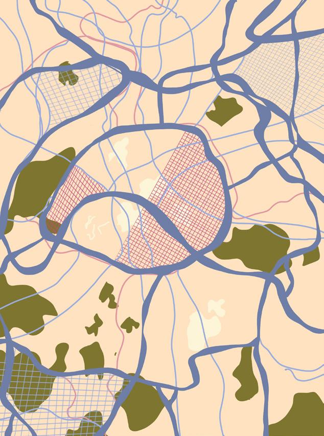
initial versus rework
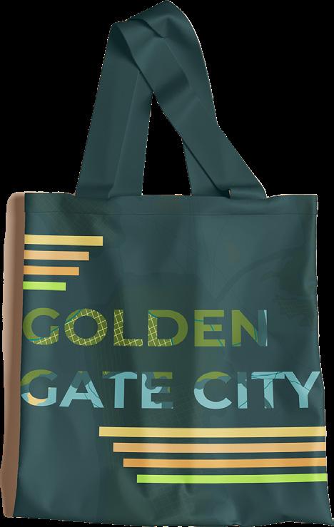
With my mockups, I created a merch menu and different forms of products. I ended up reworking a lot of my pieces and went back in to make them more modernized and fit my theme and menu as a whole more. The main change was the sweat sets and the tote bag. They became much more applicable and on theme with the rest of my menu and is overall a piece and set of design I am extremely proud of and is why I am including in this book.
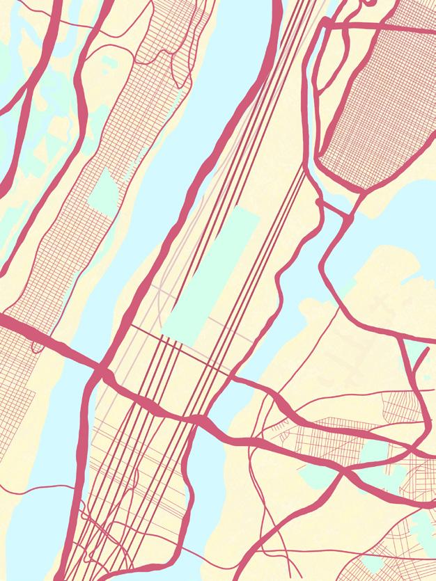
old old new new
readings and 99U
99U Video
The video I chose to watch from 99U was Adam J. Kurtz, “Perfect Isn’t Better”. I really initially attracted to this video because with me and my work I create in my classes, I have a tendency to try and be perfect and make work that is to the eye, seemingly perfect or tries to be. I loved Adams take on the while concept of being 100% true to oneself. Art is subjective and if someone tries to replicate someone else, there’s no point as in the idea that it already exists. I also loved how he expressed his concepts of something being “bad” works. A meme is a prime example of this. A small image with simple text being put on top can create the most interactive and well working in the media.
Chapter 1: Evolution of Typography
The evolution of typography has always been an interesting topic to me. As in everything else in life, such as fashion, marketing tactics, designs a lot of things and ideas will reinvent themselves, some with a more modern take on but show similarities to their origin. For example, fashion trends such as bell bottoms have reinvented themselves and become vastly popular within our society now. The text showcases how certain letters and font styles have developed and been formed overtime. Seeing the vast change from different eras, rushes, and even locational art such as pieces that would be seen in areas like New York city was extremely eye opening
Chapter 2: Anatomy of Typography
The anatomy of typography up until last semester was all completely new to me. In all honesty, I didn’t even know letters had anatomy and specific parts to them, such as arm, leg, bowls, etc. In arts 245, when looking at logo design and marks, is when we really honed in on using the anatomy of letters to the best of our ability. Something though through the textbook chapter this week that I want to incorporate into my future is the focus on the contrast and the thickness/ thinness of letters. I feel that my brain is custom to using bold, or regular type face- never playing around with width or length of letters.
Chapter 4: The Typographic Grid
In this chapter, we see more on typographic grids. This was one of the first things we did this semester. We saw this high in the Humans of New York project, as we had to match the image, heading, subheading, body copy, and colophon all align in an asymmetrical way that was visually appealing to all. In review, the griding used can be seen and viewed in a variety of forms. There’s modular grids, column, hierarchical, and others. Its when a designer takes a large space of a square, and divides it evenly or asymmetrically to create a key like image and place the desired information surrounding.
Chapter 3: Legibility
With this chapter, I found new interesting ideas. Growing up and learning the ways of art, typography, and marketing I feel I was always told to never distort any text, images or parts of a logo. Which that is the case for certain things, not everything has to be exactly how it is originally. As seen on image 3.3, there is a negative space aspect that allows for the text to still be read, but also distorts it so it is more appealing to the eye and viewer. Having plain text or images is so commonly seen, it won’t be intriguing to the viewers.
Chapter 5: Syntax + Communication
This chapter focuses on the syntax and communication. Within this category of typography, it is essentially the basis of design and typographic design. It also dabbles into column and text organization. To me, this is all most seen within magazine or editorial art. I want to work eventually in more the marketing and editing side of art, less the traditional art so this chapter was very educational and interesting for me. For me, when reading this chapter converting it all to magazine and editorial terms was easiest, such as the column organization or letter/ type style. I also loved seeing the use of gestural lettering and art forms, such as image 5-32 with the word “arts”.
Chapter 6: The Typographic Message
This section of the textbook in all honesty was completely new to me. I have obviously seen typography as an art form before, but in this many various ways or different styles. This chapter emphasizes the use of typography as a way to inform and educate while also focusing on the aesthetics and appearance standpoint. For example, figure 6-10 shows the letter E with different “happenings” such as peeling, melting, and scraping. This could be used in magazines or editorial work to emphasize not only the body copy or information at hand that’s being desired to be told, but to aesthetically and visually aid the information as well.
Chapter 7: The Evolution of Typographic Technology
In all honesty, I never really feel that I learned the history of typography, and how the evolvement within the design world came about. I knew there was tactics and main way of creating type was the hand placed type, made by Gutenberg in 1450. We saw examples of this after passing around the small pieces one day in class, but I hadn’t seen it in its large final aspect, as seen in figure 7-3. I also had never seen or even heard of the machine linotype or monotype. In my opinion, the jump from the hands-on machine to the digital aspect, and evolvement of computers was a drastic and intense change that probably took years to adapt to, let alone flourish in.
Chapter 9: Typography in Time + Motion
This chapter is all about type in time and motion. For me, it sounds silly but the first memory I have with type in movement is in star wars. It has the iconic vertical type movement, which in all honesty is an easy way to think about type in motion and media. The chapter also emphasizes the idea of type in time. With this, it is the idea of what is being read first as a viewer, what the eye catches first and if that is what’s desired by the creator. Further, the use of continuity and a condensed composition can be just as strong if not stronger than an extremely developed and detailed piece, as seen in figure 9-10, with the balloon turning into the word “Hello”.
Chapter 11: Typographic Design Process
This chapter revolves around the idea and concept of the world of typography and its evolvement in the world. For me, typography is something that I notice much more now as a graphic design student. I personally gear and find myself being more attracted to the minimalistic, and clean-cut style. I try to incorporate this into my work, and while it doesn’t fully fit each project itself, I find ways to make sure it adheres to my style. A prime example of the type of work I enjoy is figure 11-26. The black and white lettering along with the use of negative space is something I try to emulate.
Chapter 8: Typography on Screen
This weeks chapter revolved around the use of type on screen and in text within screens. Typography revolving being in text or on screen text is one of the things I struggle with most. Within Professor Nace’s class, it is extremely emphasized that body copy should be between 10-12 pt, no bigger and could be smaller dependent on the source. For me, I always feel that I struggle with thinking it is too small on my computer, but when printed it looks entirely different. The chapter it also explains that the pixels within certain typefaces has a big effect on the grain effect and resolution.
Chapter 10: Typographic Design Education
This chapter revolves around graphic design in other medias. The aspects of design are seen in a variety of styles and places. First, the elements of graphic design are seen in local area such as subway stations and movie posters. But in reality, design and art is everywhere. Every billboard, commercial, sign has elements of graphic design that someone had to take the time to create and exemplify. In the chapter, figure 10-10 is an excerpt of a textbook which shows a distinct grid system, as well as typography and imagery that was strategically placed for the viewer to understand and read easily.
speakers
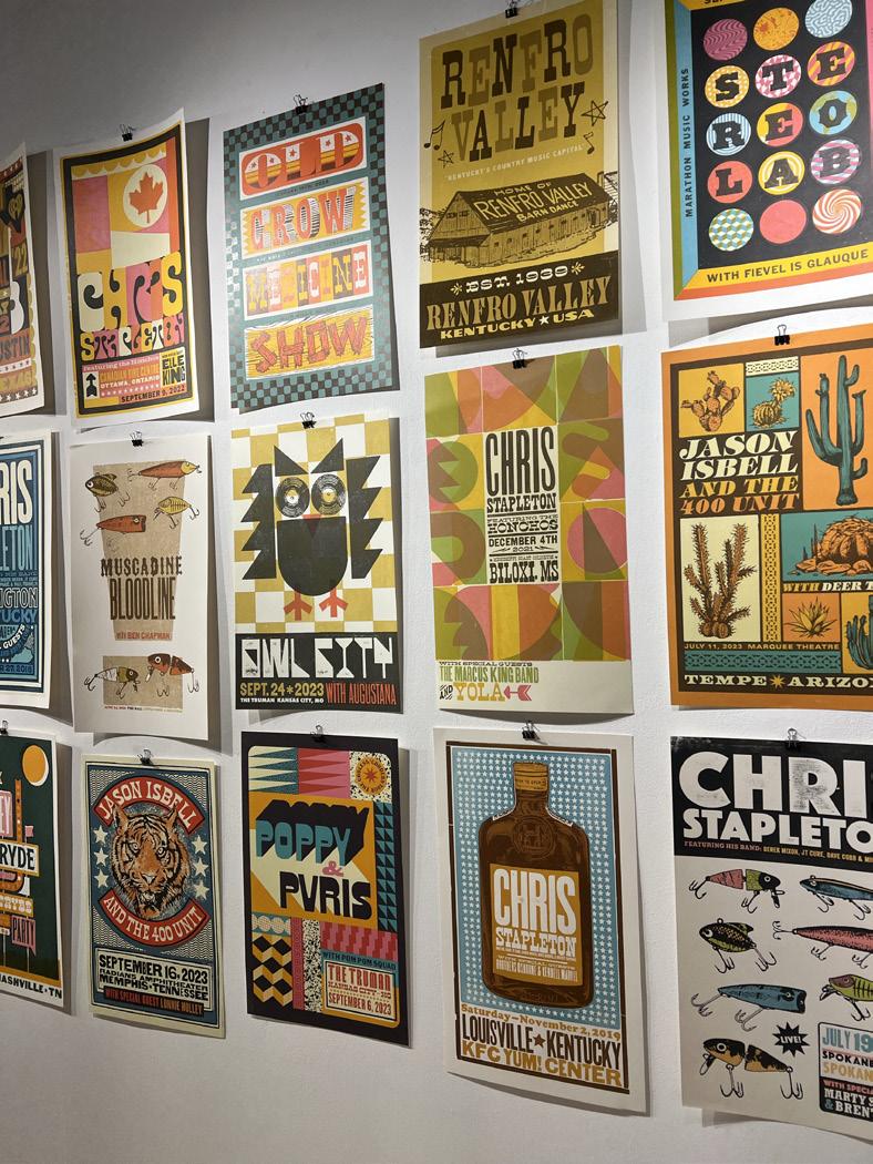
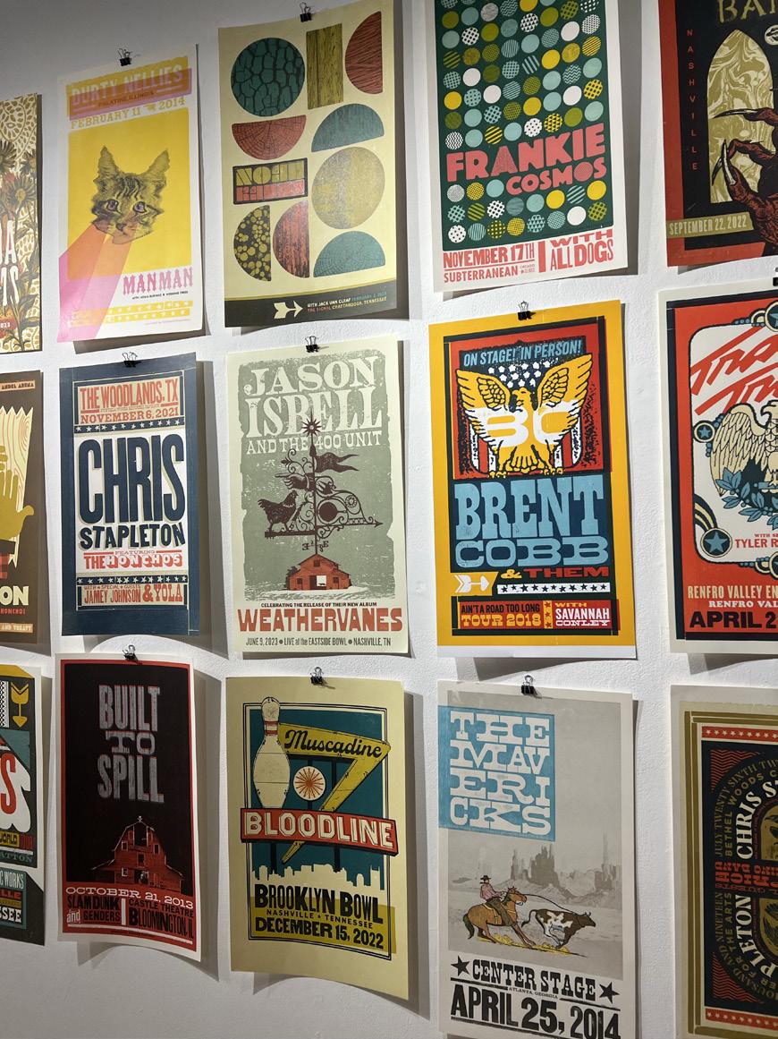
One of the speakers that we heard from this year in Arts 246 was Brad Vetter. Vetter is a designer from Louisville, Kentucky. He is a letterpress printer, designer, and artist as well as an educator. When he came in the spring semester, he displayed an array of works ranging in color, design, and composition. He began his work at the famous Hatch Show Print. He began as a low podium worker, cleaning and sweeping to being an intern. He began to work and print his own material and art. He printed posters for his favorite bands and began to get his name in the world of print making. He then opened his own shop, Brad Vetter design in 2012. He worked digitally and within print making. He uses type and pressers as well as a laser engraver. He states the duration of time and the patience required to create his work.
Brad has worked with brands like Nike, Fossil, Anthropologie, AARP Magazine, Chevy, and Cincinnati Children’s Hospital. He also, as displayed, worked with an array of musical legends and artists such as Chris Stapleton, Noah Kahn, Snoop Dogg, and M83. Brads work for me was extremely inspiring. I really was attracted to his use of color and graphic elements. I think a lot of the time I get caught up in feeling like my work needs to be extremely realistic and detailed, but he showed that utilizing patterns and texture you can achieve a whole new aesthetic. I used his technique and style for inspiration for my type hike project. I utilized his muted, yet saturated color pallets along with using texture within digital art to portray detail while still being not as realistic.
For my time in Arts 245 and 246, as well as my other illustration and art courses, I feel that I really advanced my skill set and knowledge of not only applications such as illustrator and InDesign, nut my knowledge of the art world rely on my compositional ideas and ideas. I feel that for each project presented, I had a strong and well-rounded idea. I feel that my weaknesses were most definitely in any hands-on or hand-crafted work. The nine square project or folding of the zine is where I struggled the most.
final thoughts
I felt that I had two breakthroughs, one in each semester. The first one in arts 245 was the sports rebrand. Not only did my overall concept and logo design I feel fit the rubric and requirements, but the change also I made for the school made sense to me and stayed within the schools morals. I also know that doing the five minutes in person presentation forced me to be able to explain y thought process to a audience and I hope to do that with more projects in the future. My other breakthrough was the logo mark in Arts 246. The simplicity within the design as well as the concept and business idea itself really fit my personality and I had so much fun with that project. Never once was I stuck or felt stooped with the concept, design, or color pallet. I felt that one idea flowed into the next and I created a fun, light-hearted and readable design that could be appreciated. By a large demographic.
I deeply and truly appreciate all the time, patience, and connections I have made with professors this semester as well as the student/ classmate friendships and relationships. I have the up most respect for those around me in these classes and gain so much knowledge and inspiration. Everyone’s differing styles and courses of actions are not only commendable, but enticing to see how others work. I also want to share my gratitude for the board members who took the time to read and review not only mine, but the several other well-rounded and talented submissions.