

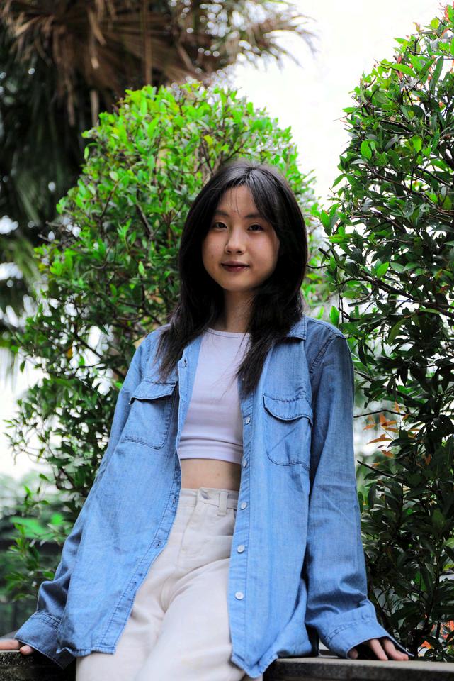
Hi! I’m Sammy, a 3rd year Visual Communication Design student at Sampoerna University. Growing up with a mom who loves handmade crafts sparked my own passion for art and design. This led me to pursue a degree where I’m learning to tell stories and connect with people through graphic design, coding, and video production.
Along the way, I discovered that my passion goes beyond creating visually appealing work. I found myself enjoy digging into problems, understanding people’s needs, and coming up with creative solutions! This gave me a real sense of purpose— knowingthatmydesignscouldmakeameaningfuldifference.
Forme,designisawaytomaketheworldalittlebrighterandmoremeaningful<3!


SAMPOERNAUNIVERSITYOLYMPIC2023
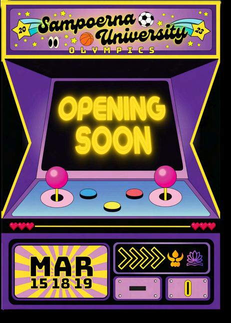
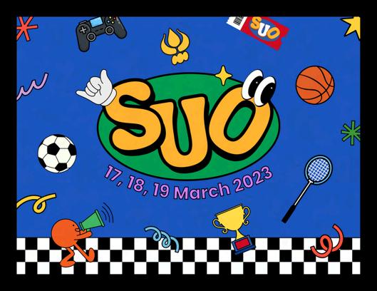
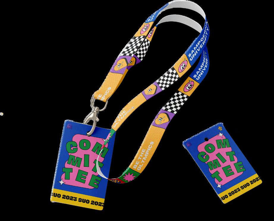
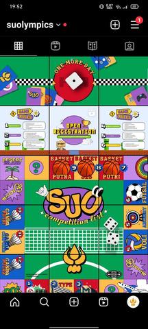

The Sampoerna University Olympic (SUO) is an annual sporting event organized by the BEM KM of Sampoerna University. Together with the team, I designedthe poster, banner, lanyard, ID card, and Instagram feeds. I ensured a consistent, playful, and fun theme throughout all materials, aiming to enhance the event's branding and participant experience.
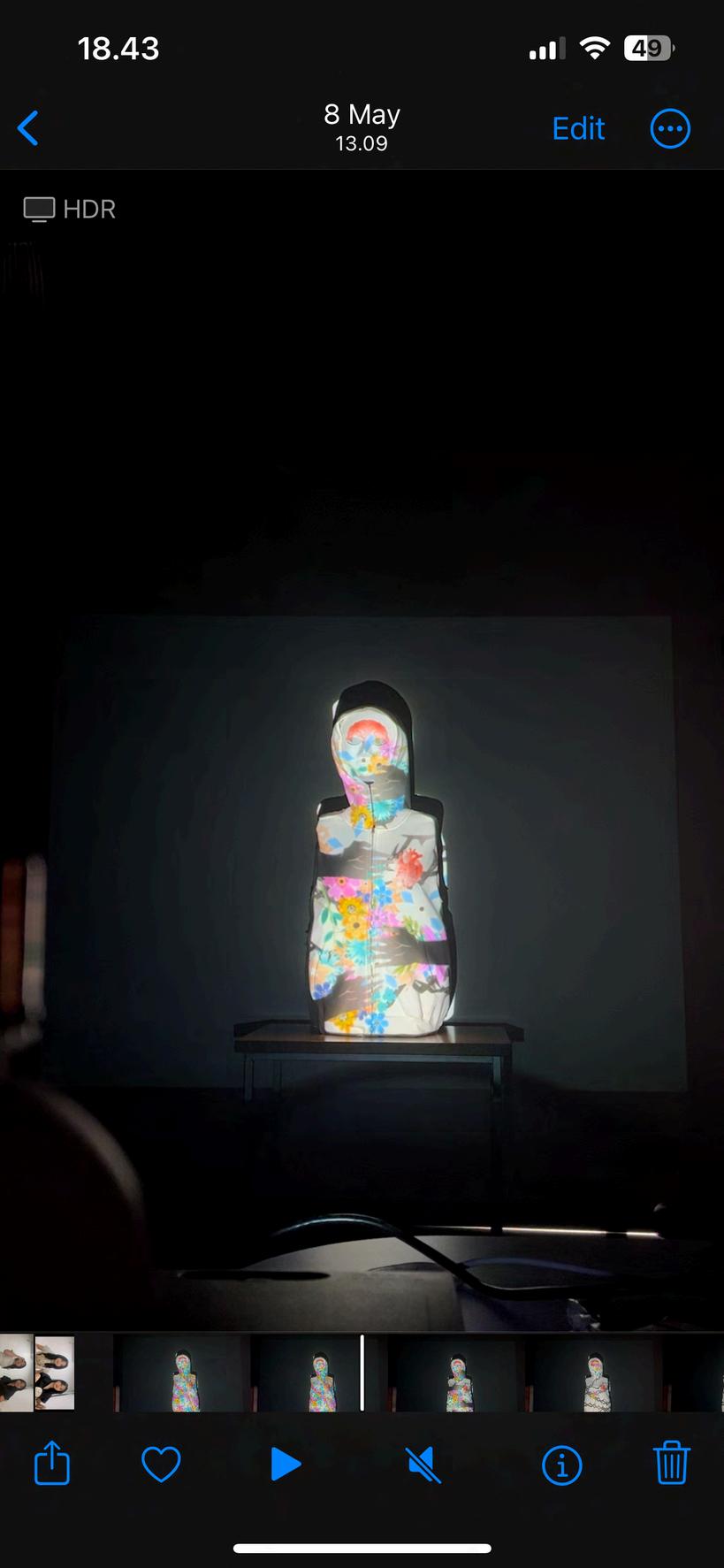
Group Project
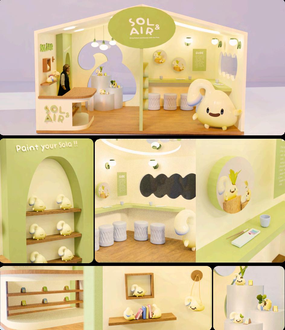
WelcometoSolair Booth!
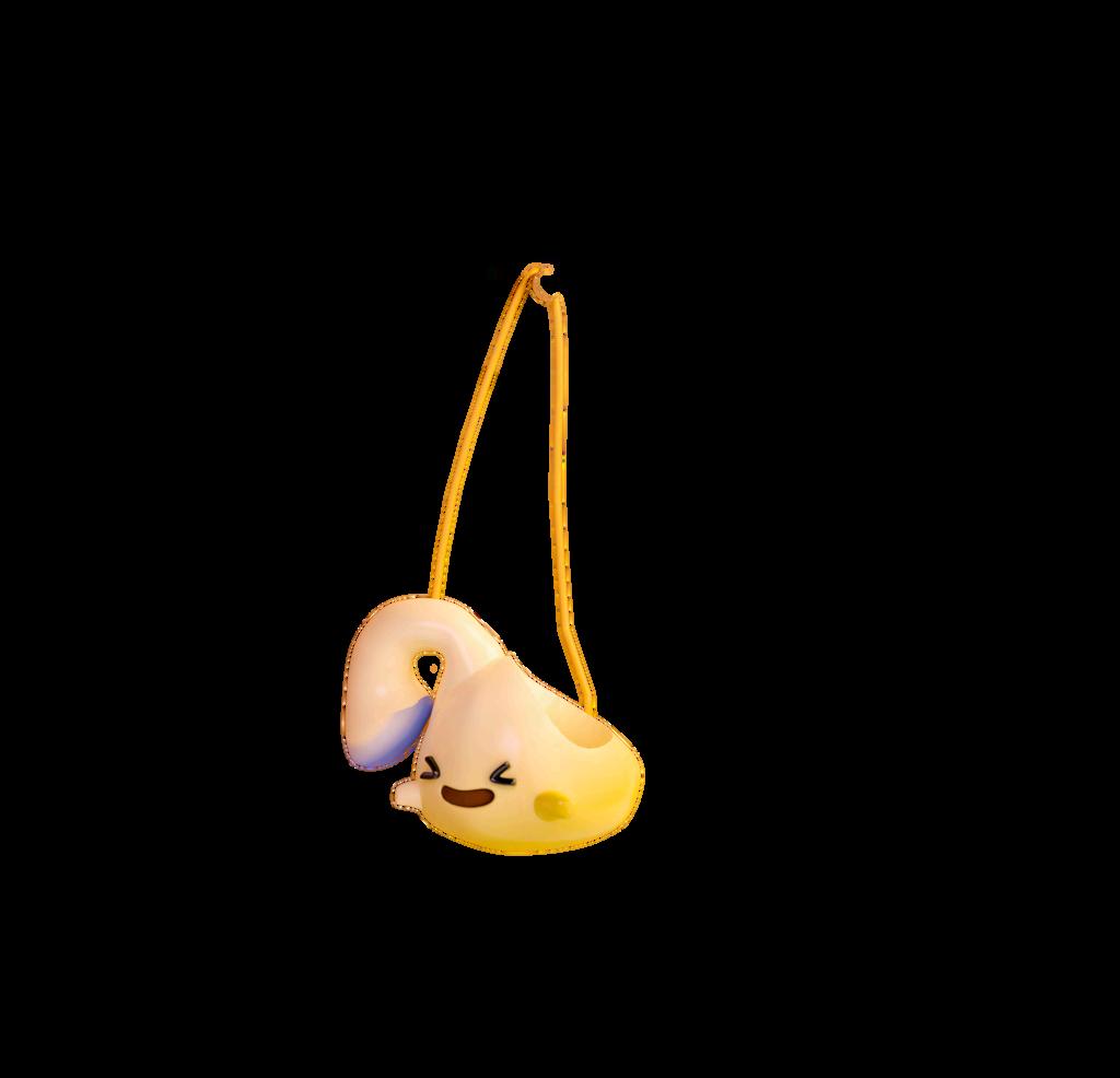
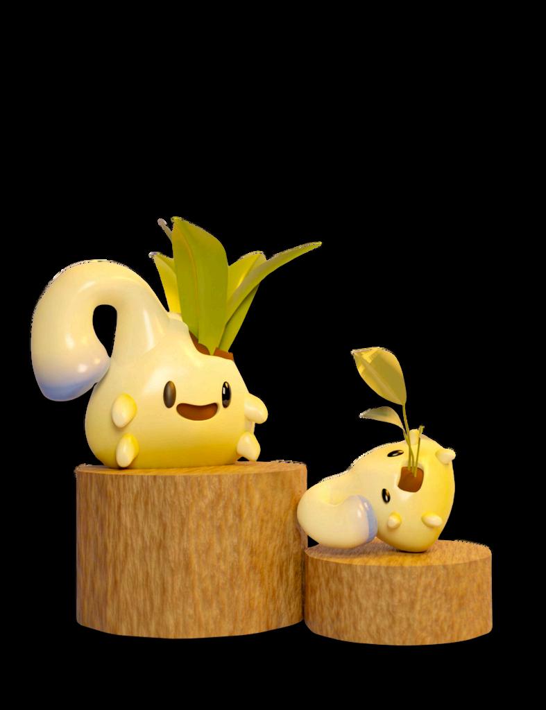
Solairwascreatedwiththeintentionofpromoting healthy plants and stylish pots to brighten your home or workplace. The goal is to inspire daily plant care, making work life more pleasant and stress-free.
TheSolairboothiscarefullydesignedtoprovidean engagingandinteractive experienceforvisitors.It provides a comfortable space for visitors to connectwiththeSolabrandandothercustomers, fosteringahealthiercommunitytogether.
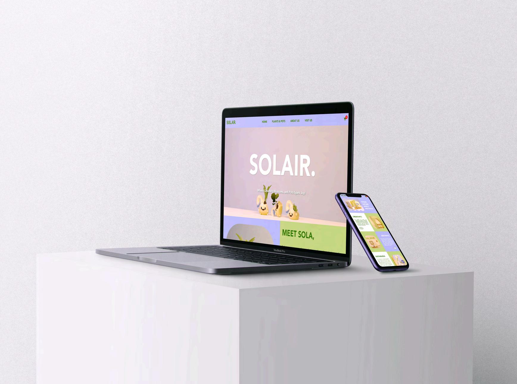
Visit the website here!
The Solair website is designed to bring users closer to the brand with fun and interactive features. It lets you explore products, get handy tips,bookworkshops,andshopeasily,allfromany device. Solo Project
Group Project
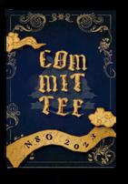
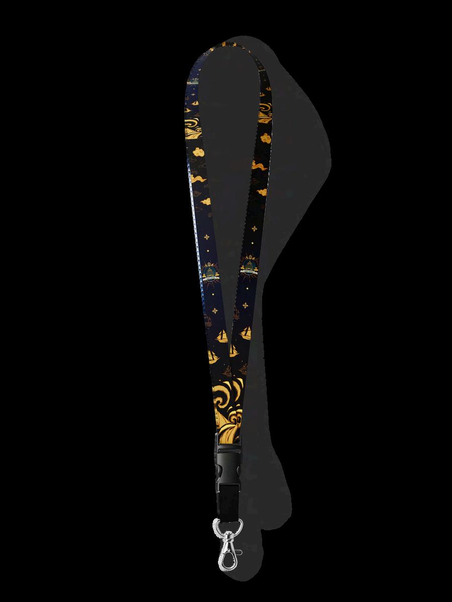
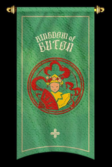
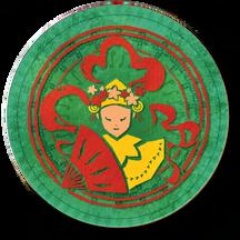
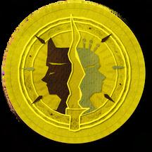
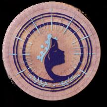
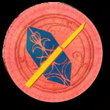
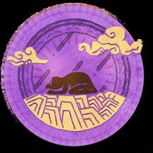
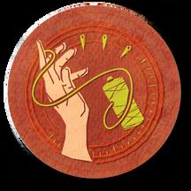
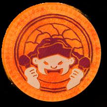
For Sampoerna University's 2023 new student orientation, themed around Indonesian kingdom legends, I designed 7 student group logos that reflect elements of each legend. I also created lanyards and ID cards inspiredbyajourneyfrom sky to sea, using flowing lines to capture Indonesianartistry.
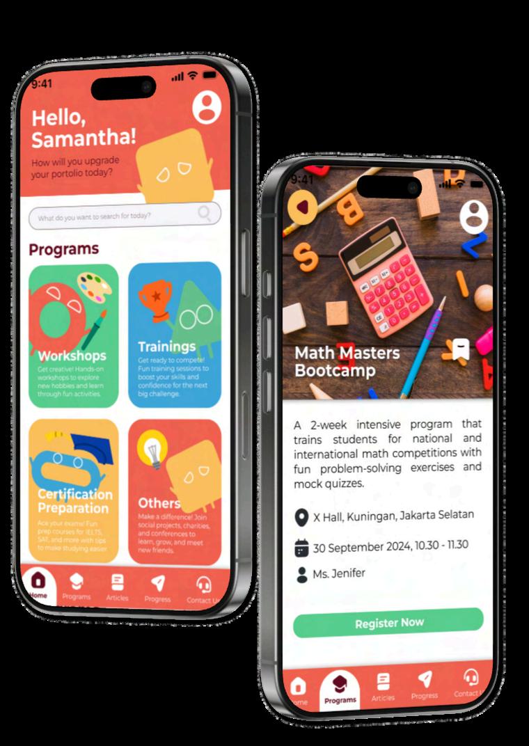
Visit the app here!
Magodangsisan engaging and interactive learning program for kids aged 8-14, designed to increase their interest in building portfolios from a young age. The program offers a variety of courses that prepare students for competitions, develop realworldskills,andprovidecertifications.
By showcasing all of Magodangs’ programs through a colorful interface, gamification feature, and personalized experiences, it connects users to the specific courses they seek and collects data for a direct approach, making it fun and attractive for a youngeraudience.
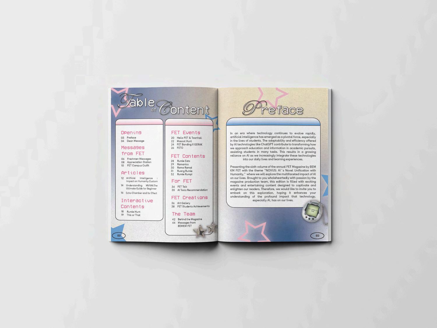
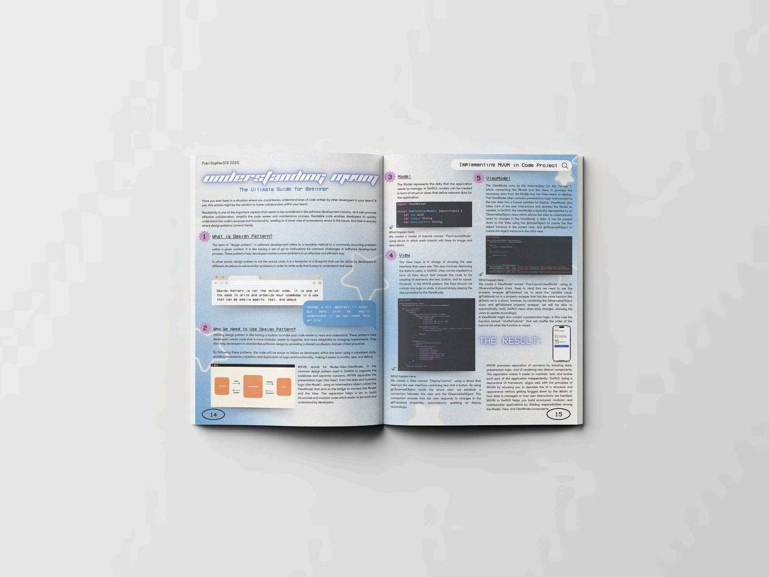
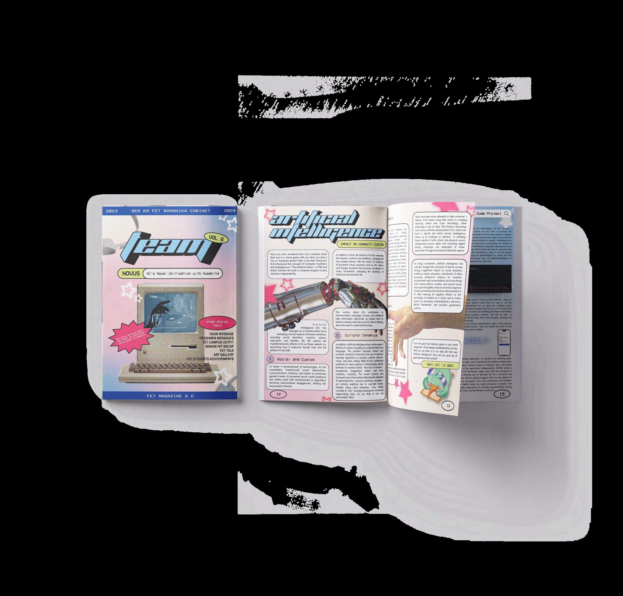
As the project leader and art director for FET Magazine, an annual publication by BEM KM FET at Sampoerna University, my vision was to balance captivating visual elements with engaging content, ensuring readers are drawn to exploreeverypage.
Drawinginspirationfromthe Y2K nostalgic trend and futuristic aesthetics,thisconceptaimedto appeal to the senses of nostalgia while also sparking curiosity and excitement about the futureofArtificialIntelligence
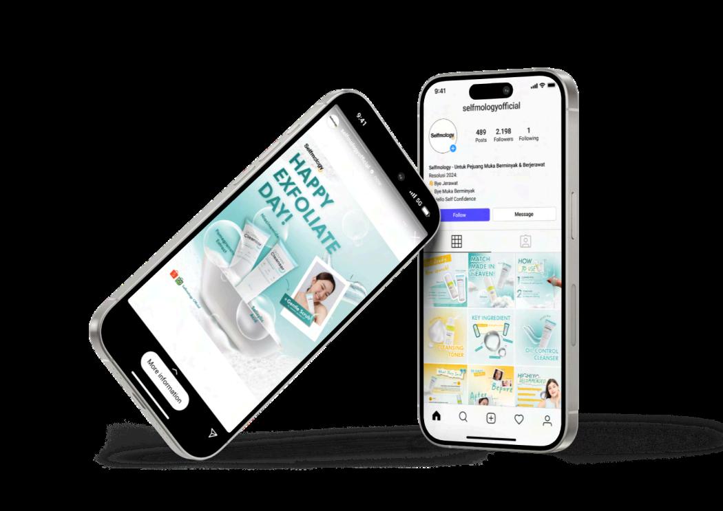
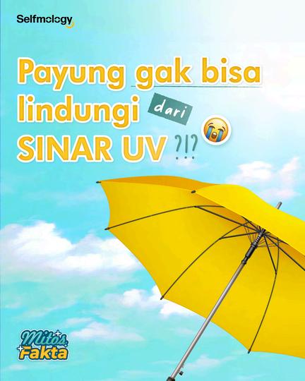

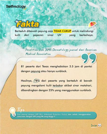
In the Selfmology Design Challenge, the main objective was to create visually appealing and effective content that aligned with Selfmology’s branding and communication goals. I focused on redesigning key posts to better convey promotional, educational, and product launch content.
Inspired by a Selfmology Instagram post, I adopted a similar color palette to create a clean and bright aesthetic for a skincare brand. The bold and fun typography is specifically designed to appeal to young adults, ensuring the brand standsoutinacompetitivemarket.
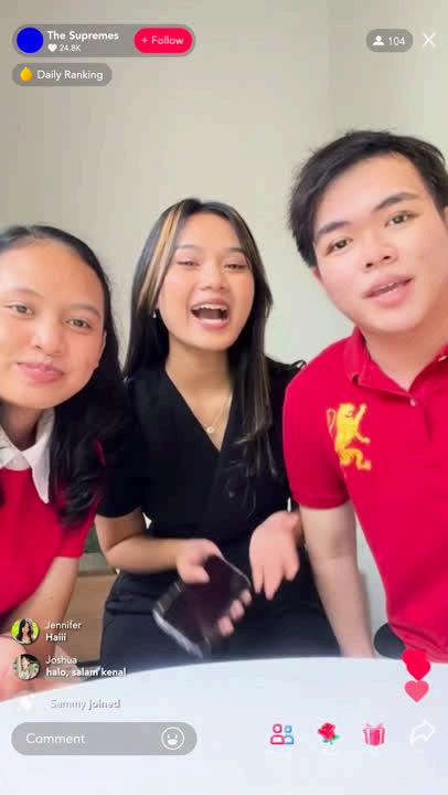
This commissioned project was created for a team participating in a business case competitionwhorequestedanalternativevideo that was more Gen Z-focused and matched theirbusinessplanthemeofdigitalizationusing TikTokLive.
I edited all assets using After Effects, incorporatingelementsandanimationsinspired by TikTok Live to ensure the final result reflectedthethemeeffectively
The “Mencuri Raden Saleh” title sequence uses retro 2D animation with the combination of contrast color which is Sweet Maple and Dark Eclipse to match the film’s suspense and energy, accompanied by the upbeat song “Melukis.” from the official soundtrack. Each element also reflects the characters and storyline, creating a preview that captures the audience'sattentionandcuriosity.