
SELECTED WORKS | 2020-25


SELECTED WORKS | 2020-25
CONTACT
PROFILE

+91 7710098997
grey_scale_studiogrey_scale_studio
ar.sahilnair@gmail.comar.sahilnair@gmail.com behance.net/sahil_nairbehance.net/sahil_nair
linkedin.com/in/sahilsnair/linkedin.com/in/sahilsnair/
Bengaluru, Karnataka, IndiaBengaluru,India


“As an architect, I believe in crafting meaningful user experiences within spaces. My journey began with observing my father, a Civil Engineer, which ignited my passion for architectural planning. In Mumbai, I refined my academic foundation, artistic sensibilities, and architectural skills.
Transitioning to Project Lead at a top architecture firm, I faced challenges coordinating between our office and remote sites. This sparked my interest in UI/UX design, where I leveraged my architectural background to develop intuitive interfaces that streamlined communication.
I realized the commonalities between UX design and architecture, as both focus on enhancing user experience. This inspired me to pursue a Master's in Human-Centered Design, where I aim to deepen my knowledge while blending my artistic skills and architectural expertise.
As a student, I’ m eager to explore the intersection of design and human experience, and contribute something unique, blending both architectural and UX principles."

• AutoCAD
• Photoshop
• ArchiCAD
• Revit
• SketchUp
• V-ray
• Microsoft Office
• Figma
EDUCATION
• Hindi
• Malayalam
• Marathi
• English
• Gujarati
• B. ARCH
• M.DES
HUMAN CENTERED DESIGN
WORK EXPERIENCE
- Pillai College of Architecture
- Srishti Manipal Institute of Art, Design & Technology
HCP - Design Planning & Management Pvt. Ltd.
Architect - Project Lead
Ahmedabad International Airport
Redevelopment of Central Vista, New Delhi
Republic Day Parade Arrangements, New Delhi
Duration | 2015 – 2020 | 2024 - 2026
2.3 Years (2021 – 2023) | | | Post Projects
INTERESTS
• UI/UX Design
• Product Designing
• Logo Designing
• Comic Sketching
• Indian History / Mythology
• Spirituality
• Residential Planning
• Architecture Photography
Gendered Biases


Railway Hygiene


Framed


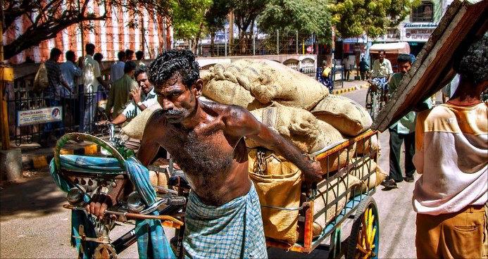
In Western culture, superheroes are cultural icons, embodying hope, morality, and resilience. Yet in India, superheroes remain confined to entertainment, overshadowed by the rise of the "Angry Young Man" archetype. Superstars like Amitabh Bachchan and Rajinikanth who became symbols of escapism and societal triumph.
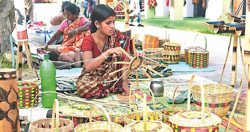
This divergence raises a critical question: why are female superstars so rare in India? Interviews revealed that even progressive minds subconsciously associate "superstar" with male figures, exposing deep-rooted gender biases.
To explore this further, I designed a social experiment to uncover these subconscious biases. The findings were startling, shedding light on the gendered perceptions ingrained in our collective psyche.
Why do such biases persist in a society striving for progress? And how can we redefine our perception of heroes to embrace true equality?


The evolution of my line of inquiry has been a dynamic journey. It began with an exploration prominent superheroes are predominantly male. This initial question soon led to a deeper remain confined to entertainment in India?
In the West, superheroes like Superman emerged during the Great Depression, offering hope with figures like Tom Holland's Spider-Man extending their influence beyond fiction, visiting India has not transcended entertainment. This divergence can be traced to the rise of the Rajinikanth embodying common men with near-superhuman qualities, fighting injustice and
This unique cultural phenomenon raised another question: If superstars play such a significant Google search for "superstar" overwhelmingly highlights male celebrities, a bias mirrored superstar, revealing entrenched gender biases even among educated, progressive individuals.
Recognizing this, I designed a social experiment as a probe to uncover the subconscious shedding light on the deep-rooted gendered stereotypes that influence our everyday lives.
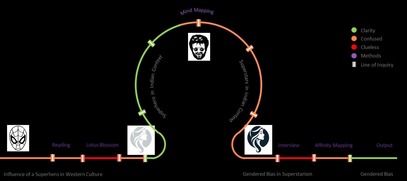
exploration of superheroes, delving into their origins, cultural significance, and why the most deeper curiosity: Why do superheroes have a profound cultural impact in Western countries but
hope and escapism in times of crisis. They became symbols of resilience and moral integrity, visiting hospitals to inspire cancer patients, for instance. In contrast, the superhero narrative in the "Angry Young Man" archetype in Indian cinema, with actors like Amitabh Bachchan and and providing a sense of escapism to audiences.
significant role in Indian society, why are there so few prominent female superstars? A simple in interviews I conducted. Most participants named male figures when asked to identify a individuals.
subconscious biases embedded in our perceptions. The results were both surprising and insightful,

Clarity
Confused
Clueless
Methods
Objective Evolve
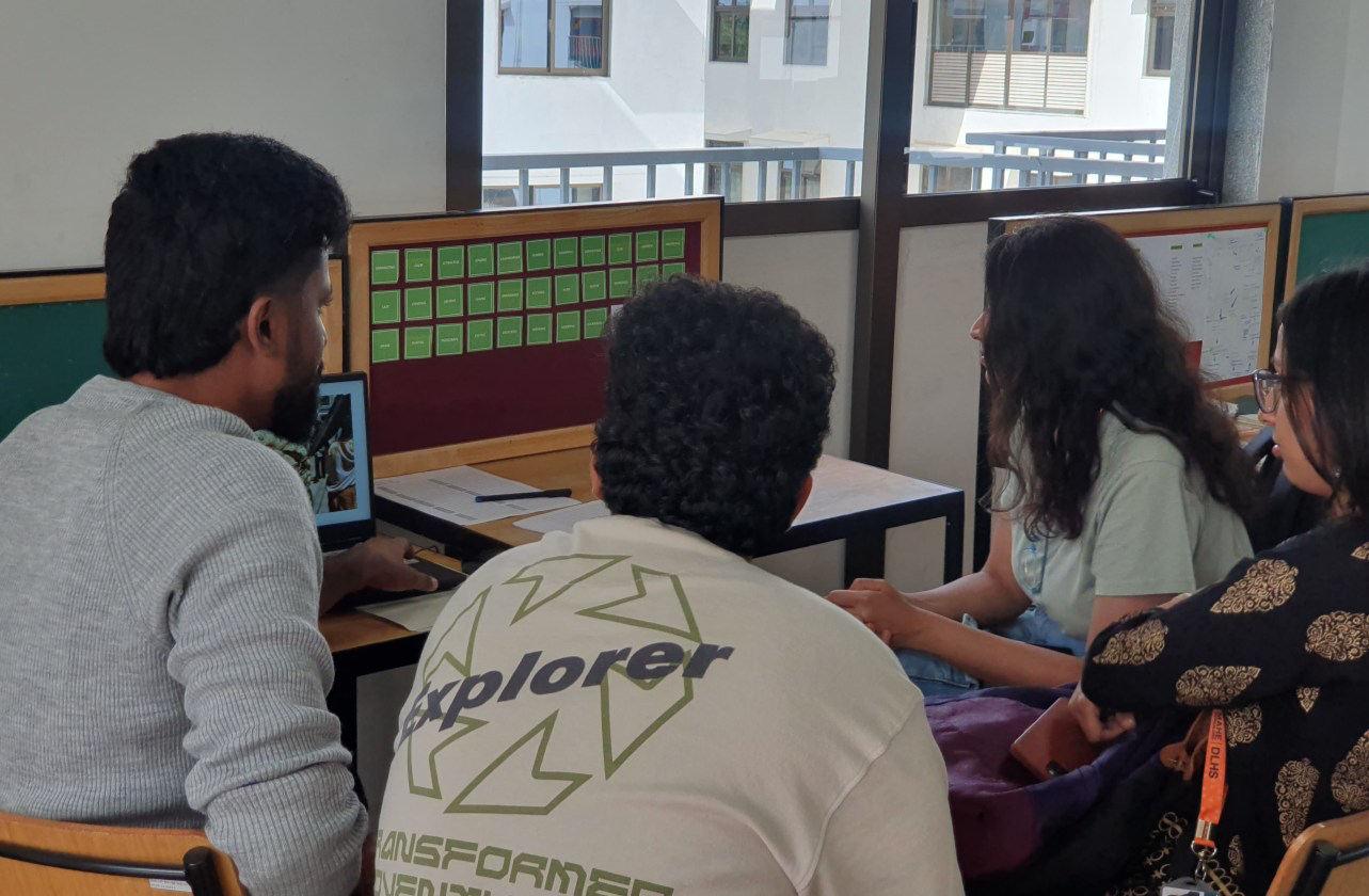
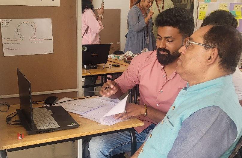
The final output of my research was a social experiment conducted on the SMI campus with participants from various demographics. The goal was to uncover and raise awareness about the gender stereotypes and biases deeply embedded in our subconscious. This visual exercise sought to determine whether individuals in an open-minded environment like ours still held gendered biases or if such biases were limited to narrower circles.
Participants were provided with cue cards containing approximately 30 descriptive words (e.g., "cute," "arrogant," "sweet," "egoistic," etc.) to describe people. They also had the option to create their own descriptors. A series of images depicting men and women performing various tasks was displayed on a screen, and participants were asked to quickly describe the person in each image within 10 seconds using at least three characteristics. Their responses were carefully recorded for analysis, offering insights into subconscious patterns of perception and bias.
The experiment was carefully structured into four distinct stages to uncover subconscious gender biases:
1. Maintain Deception – Participants were intentionally kept unaware of the experiment's true purpose, ensuring their responses were natural and unfiltered.
2. Judging by Action – They were shown images of individuals performing various tasks, with the focus on how participants described the actions and their underlying perceptions.
3. Judging by Appearance – The emphasis shifted to physical appearance, analyzing how it influenced participants' descriptions and assumptions.
4. Guessing the Gender – Participants were asked to guess the gender and profession of the person in the images, revealing deeper, often subconscious, biases rooted in societal conditioning.
This multi-stage approach provided a layered understanding of how gender stereotypes influence everyday perceptions, paving the way for critical discussions on equality and bias.
Participants were shown images of men and women in similar situations and contexts, asking The goal was to assess if their immediate judgments were influenced by gender. The images leaders.
To maintain deception and prevent conscious filtering, I included images of animals and asked described human versus animal images, minimizing gender biases.
I recorded the words participants used to describe the images and compiled a list of character provided insight into how people subconsciously associate traits with gender, revealing societal


asking them to quickly guess the characteristics that came to mind within the first 10 seconds. images displayed men and women in comparable roles, such as professionals, athletes, or asked participants to perform the same exercise. This allowed me to compare how they characteristics mentioned by at least two or more participants. These repeated characteristics societal conditioning that influences perceptions of both genders.
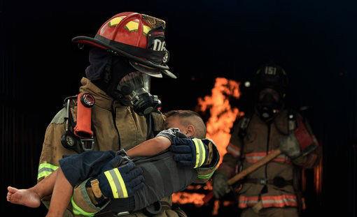

Two images were presented to participants to explore whether they subconsciously associated soldier, with no visible faces or explicit gender indicators. Participants were first asked to identify prompted to assign a name to the person in the uniform.
To avoid filtered or conscious responses, this was framed as a "character development exercise" male names for both characters. This revealed a strong subconscious bias associating these
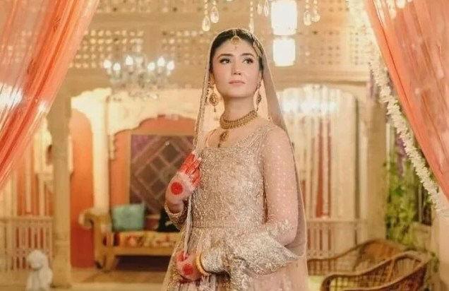
Next, I showed participants an image of Ms. Shehrbano, an Assistant Superintendent of Police heroic act was withheld from the participants during the experiment. I then asked them to
The most common responses were "Modeling," "Corporate HR," "Nurse," "Doctor," and "Entrepreneur." female gender. Notably, none of the participants guessed a role like police officer or law suggests that, even in an open-minded environment, participants still unconsciously align them for roles in law enforcement or other fields typically seen as male-dominated.

associated specific professions with a particular gender. The images depicted a firefighter and a identify the profession of each figure. Once they recognized the soldier or firefighter, they were exercise" rather than directly asking them to guess the gender. Surprisingly, all participants chose these professions exclusively with men.
Police from Pakistan, who had bravely rescued a girl from an enraged mob. The backstory of her guess the profession of the woman in the image.
"Entrepreneur." These answers revealed the professions participants typically associate with the enforcement, even though Ms. Shehrbano’s actions reflected her role in that profession. This align women with more traditionally "feminine" or "nurturing" professions, rather than considering
Indian Railways, one of the largest networks globally, plays a crucial role in daily travel, but hygiene, particularly regarding the bedroll service, commonly known as linen service, remains a significant concern. Despite improvements in food quality and coach cleanliness post-COVID-19, passengers continue to complain about dirty sheets, infrequently washed blankets, and poor handling of used linen, highlighting the need for urgent reform in the bedroll service.
To dig deeper and work on a solution, we started by conducting research through stakeholdermapping , interviewswithrailwayofficials andpassengers , and fieldvisits to understand the existing system and pinpoint areas of concern. Using tools like system mapping , user journeymapping , and productjourneymapping , we deconstructed the entire service, identified pain points, and gained a deeper understanding of the ecosystem. We then brainstormed a variety of ideas, applying blueprints and patternlanguagetechniques to explore potential solutions, ranging from bold to practical approaches. After refining our ideas, we selected the most effective solution and transformed it into a workable, scalable plan that works alongside the current railway and contractor setup, rather than replacing it.
Due to visibility constraints, the maps are not included in this folio. Please access the detailed work via the following Figma link: https://www.figma.com/board/3bGp4xh4WWBw3UjpxB4eMD/ServiceDesign---Railway-Hygiene?t=iLY70a3uEYucGiGA-1

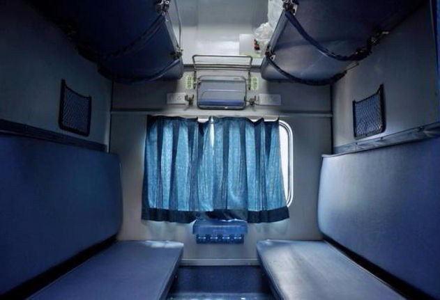
Indian Railways gives the job of managing bedrolls to a private contractor. This contractor is responsible for making sure that enough bedsheets are available and that they are clean and in good condition. Before the journey begins, they place a pack of linen on the metal tray above each window. This pack usually includes one pillow cover and two bedsheets, wrapped in a brown paper cover. A pillow and a blanket are also placed on the seat before passenger's board. Ideally, one fresh pack is kept for every seat.
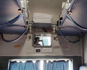
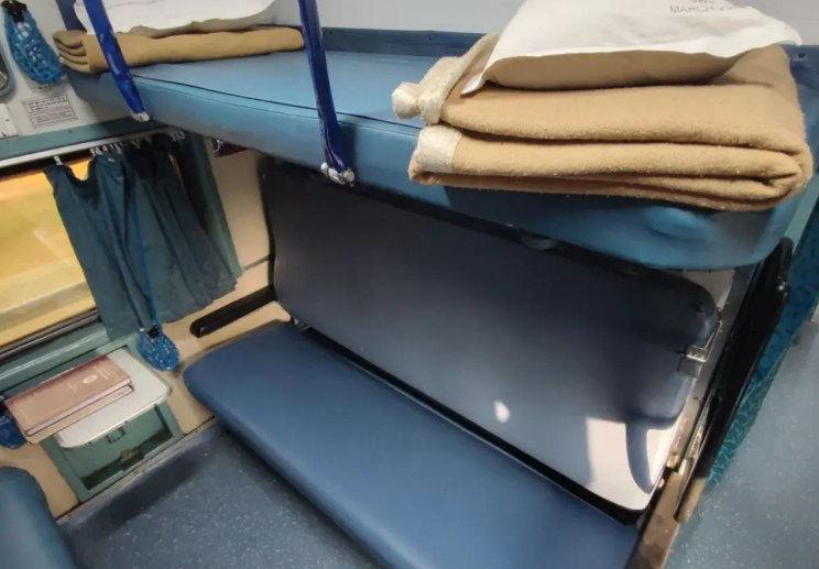
In most cases, the person who gets to the seat first receives the fresh set of bedsheets. But if someone else boards later and the seat was already used, they often have to use the same used sheets, unless there are extras available. If they don’t want to use the used ones, they need to search for the service staff in the coach and request a fresh set. If the staff has any left, they usually hand over a pack from the storage area near the coach entrance.
But here’s the issue. Even if you get a pack, there is no way to tell if the sheets inside are actually fresh or just reused and neatly folded and packed.
To make matters worse, blankets are only washed once a month. That means all passengers, one after another, end up using the same blanket without knowing who used it before. It feels unhygienic and takes away from the comfort of the journey.
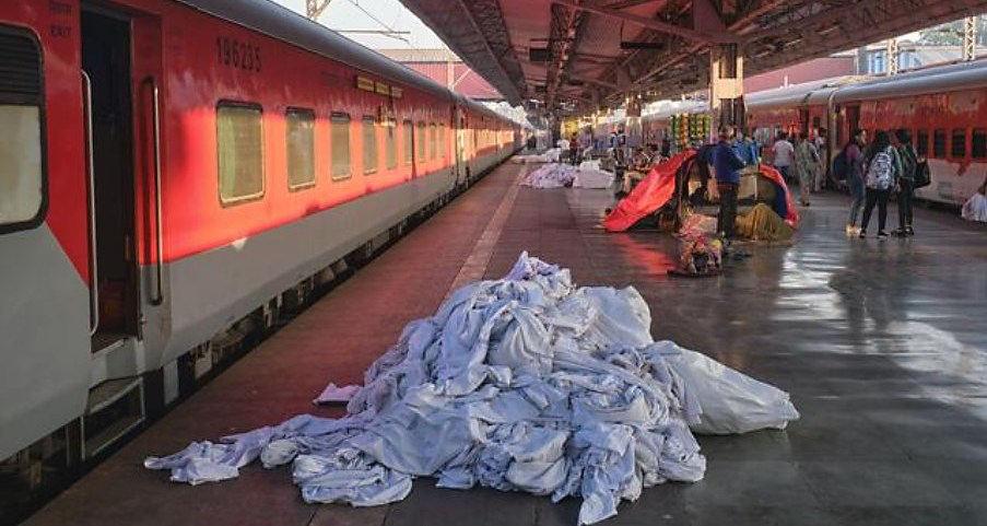
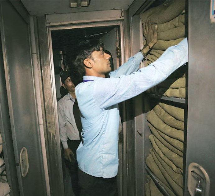
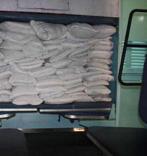
After the train finishes its round trip, the used bedsheets and pillow covers are collected and usually stacked in a messy way before being sent to the laundry. The pillows and blankets, on the other hand, are just put back into the storage areas inside the train compartment.
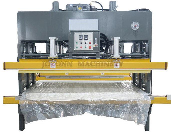
We can use compression technology here. The same kind of machine that’ s used to compress heavy mattresses can also be used to tightly roll and pack our bedrolls after washing. Each set would include two bedsheets and one pillow cover, rolled up and sealed in a biodegradable plastic cover.
This method has a big advantage. Since only a hydraulic machine can create such a tight, compact roll, passengers can feel confident that the linen they’ re receiving is freshly washed and hasn’t been reused.
It also makes storage easier. Because the rolls are much smaller in size, trains can carry more extra linen without taking up too much space. The image below shows the kind of hydraulic compressor and what the tightly packed rolls look like.



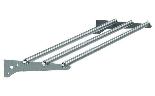
In most trains, there’s a steel tray above the window. This is where the staff places the bedroll packs for passengers to pick up. But the whole system is manual and has no tracking. Anyone can take more than one pack, and someone else might not get any at all. The service staff usually won’t know unless a passenger raises a complaint. It’s a simple setup, but it often leads to confusion and unfairness. The current system has clear flaws and leaves too much room for things to go wrong.
The product is a smart, compact linen vending machine that replaces the old steel tray above the window in train compartments. It can store 10 compressed bedrolls, enough for 8 passengers around one aisle, plus 2 extra for emergencies. Service staff can refill it once before the journey and later if needed. The top of the machine has grooves to keep it useful for passengers to store their belongings, just like they did with the old trays.
Each machine has a sensor inside that keeps track of how many bedrolls are left. It works using weight sensors or item-counting technology. The onboard service staff can monitor the stock through a mobile app. If the number of rolls drops below 5, they get an instant alert.
This system ensures every passenger gets a fresh set without the hassle of chasing down staff on a moving train. Below is a graphic showing how the tracking system will appear on the service staff's device.
TOTAL BED ROLL SET ABOVE 5
TOTAL BED ROLL SET BELOW 5
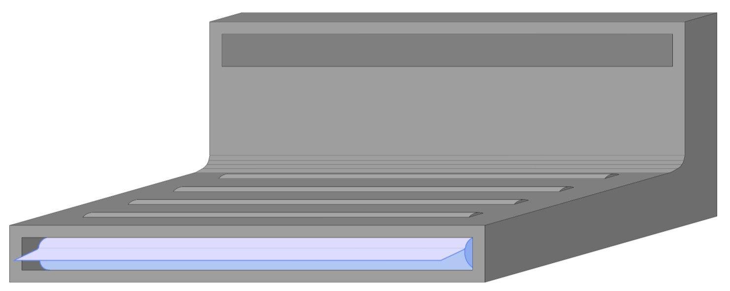
REFILL OPENING
STORAGE SPACE
BED ROLL SET
3D VIEW

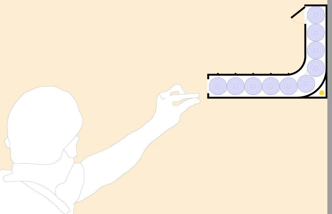
REFIL OPENING
GROOVES FOR STORAGE
COMPRESSED BED ROLL SET
OUTLET OPENING
SENSOR
SECTION

Once the train completes its round trip, it stops for some time to allow cleaning. During this halt, all the used bed sheets and pillow covers are collected and sent to a washing area outside the railway station. However, the blankets are not washed after every trip. Since the current system allows blanket washing only once a month, they are simply folded and stored back inside the train.
These storage spaces are usually located inside specific compartments near the entry doors at the end of the aisles. This arrangement makes it easy for service staff to access and store linens quickly. As a result, the same blankets are reused by several passengers over many journeys without proper cleaning. This practice raises serious hygiene concerns and shows a clear need for better handling and maintenance of linen services in the railway system.
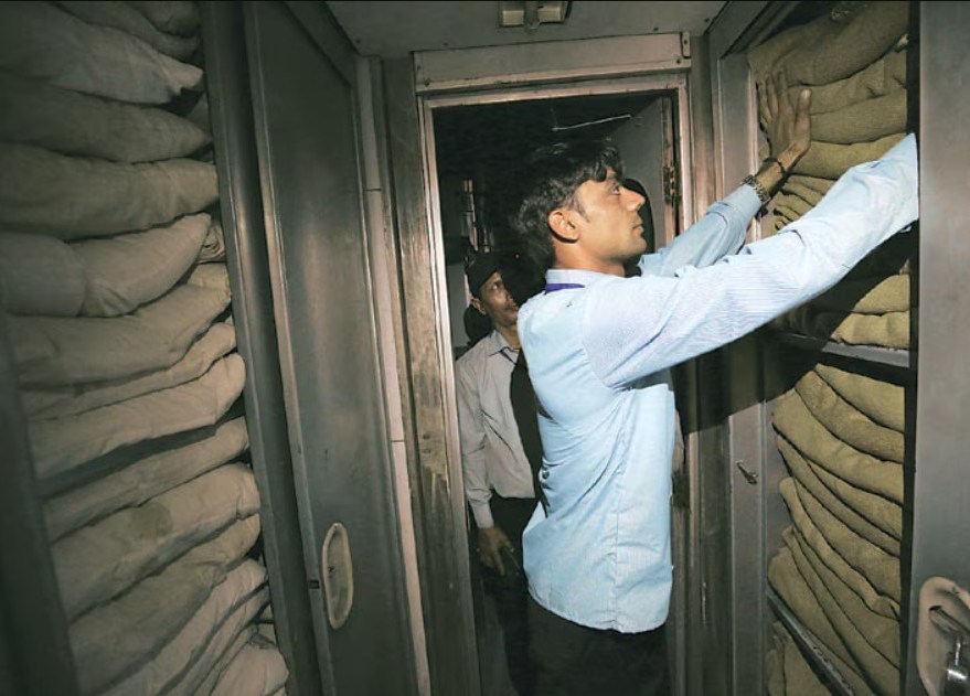
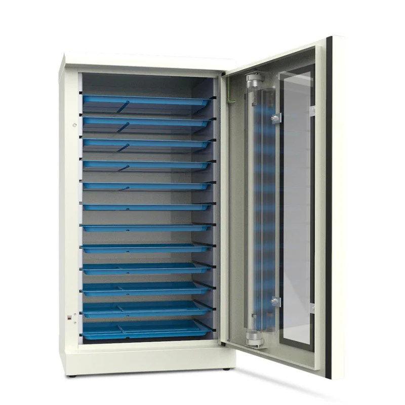
UV technology can sterilize fabrics without using water or chemicals, making the process faster, cleaner, and eco-friendly. It uses ultraviolet light to kill bacteria, viruses, and germs on fabric surfaces.
The simple storage spaces in train compartments can be upgraded into UV sterilization units. This way, blankets can be sterilized between uses without needing a full wash every time. It would take around 10 to 15 minutes to sterilize a blanket, using UV-C light at below 254 nanometers, strong enough to kill germs but safe when properly controlled. For extra safety, the UV process would only run when the train is halted before its next journey.
This system would ensure fresh, hygienic linens for every passenger and fully solve the current hygiene issues.




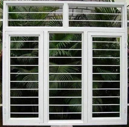
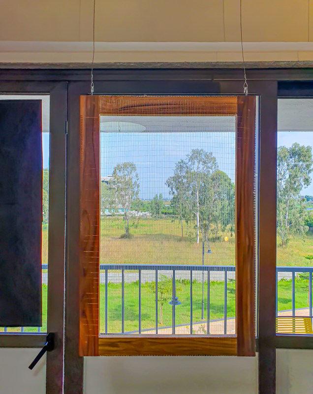
This piece draws inspiration from the urban neighborhoods of Bengaluru, where the presence of grilled windows and fences is an everyday reality. These structures, designed for safety, often evoke an unsettling resemblance to cages. What are we truly protecting ourselves from? Are these grills a necessary safeguard, or do they symbolize the pervasive fears and insecurities of urban life?
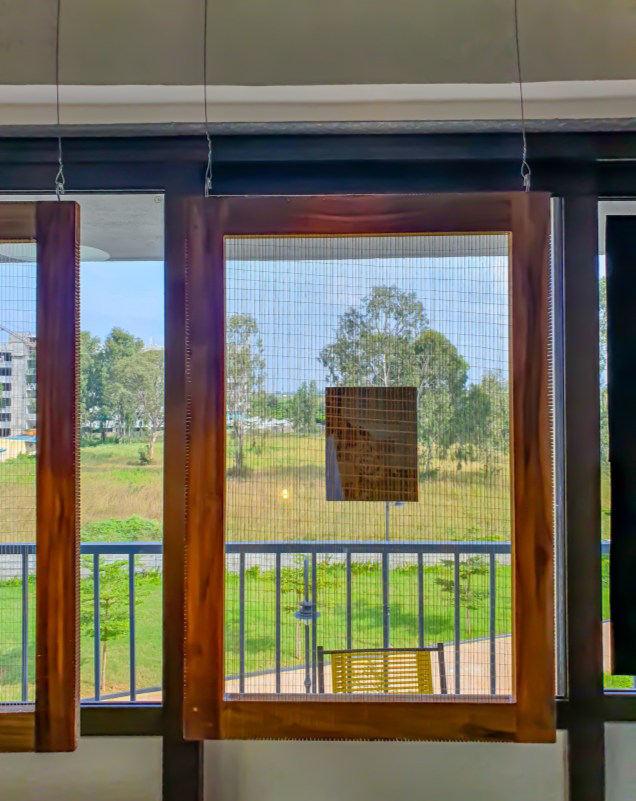
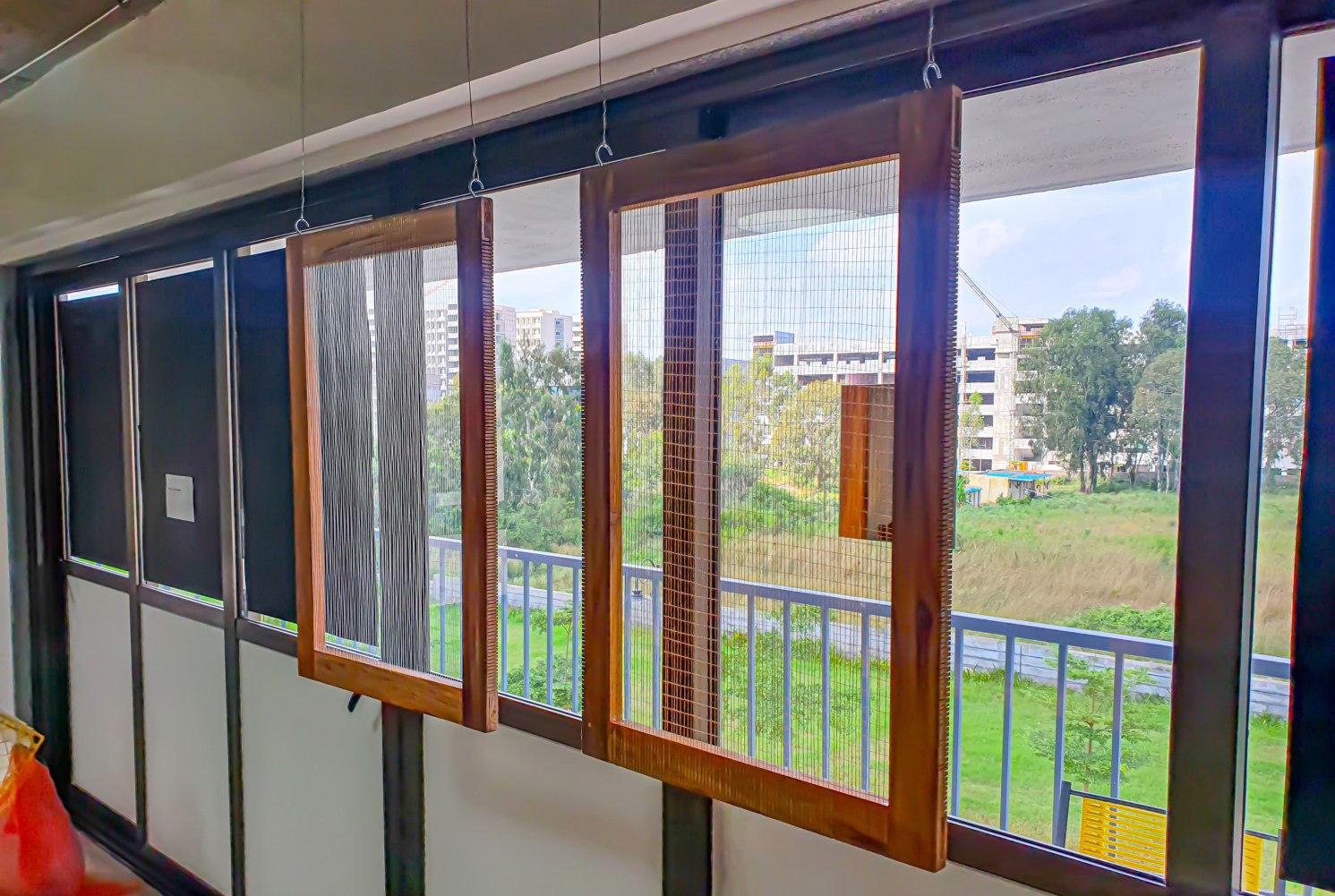
The artwork invites viewers to reflect on the barriers we construct, both tangible and psychological. Using wooden frames that mimic windows and interwoven threads replicating grill patterns, it explores the tension between protection and confinement. The repetitive, predictable designs of urban grills also highlight the monotony of our built environment, raising questions about their true purpose. Are they merely functional, or do they signify a collective inability to imagine spaces that are both secure and open?
Through this visual narrative, the piece challenges the viewer to reconsider the significance of these everyday structures. It encourages a shift in perspective, urging us to envision a world where freedom and security are not opposing forces but harmonious elements of our lives. The work ultimately serves as a metaphor for breaking free from the self-imposed limitations of fear and conformity.

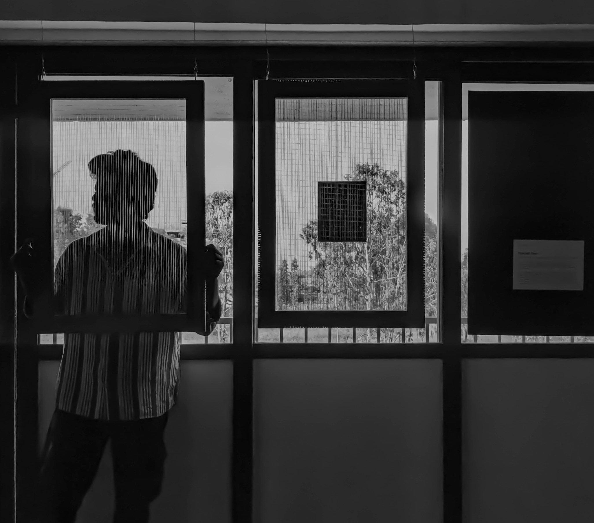
This project was inspired by the subtle yet powerful barriers that shape our urban lives. Fences and grills, often dismissed as mundane architectural elements, started to feel like metaphors for our personal and societal fears. To me, these physical barriers reflect a deeper truth. The visible fences around us are often extensions of the invisible ones we carry within ourselves.
In this exploration, I observed how the density and design of fences and grills vary within apartments in the same residential building. These variations reveal how individual insecurities and priorities materialize in the way we shape and interact with our spaces.
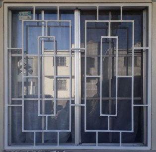
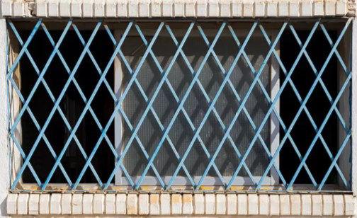
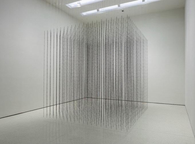
The works of minimalist architects and artists who explore boundaries and confinement heavily influenced me. I also drew inspiration from contemporary artists, majorly from Mona Hatoum , a British-Palestinian multimedia and installation artist who lives in London. Below are a few images of her art installations.
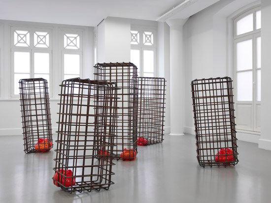
Wood and thread emerged as natural choices. Wood symbolizes the frame. A window to the world, while thread evokes the intricate yet fragile nature of mental and physical barriers. Incorporating materials like fishing net and steel wire added authenticity, representing real-world urban grills.
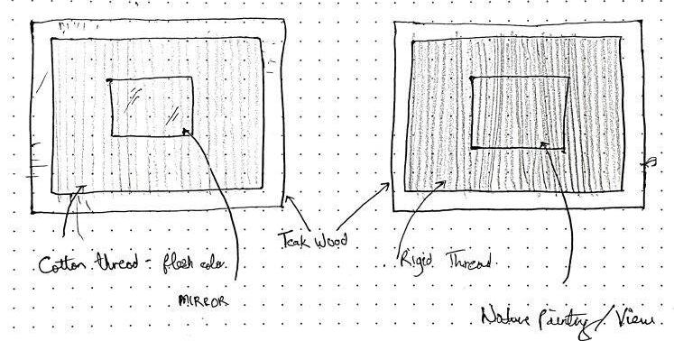
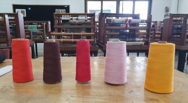
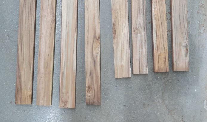
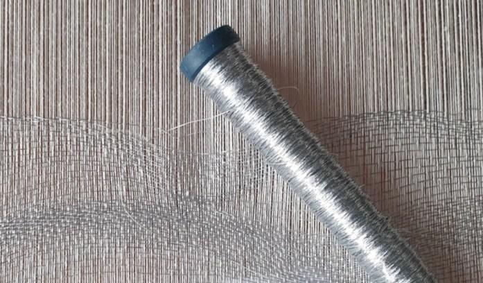
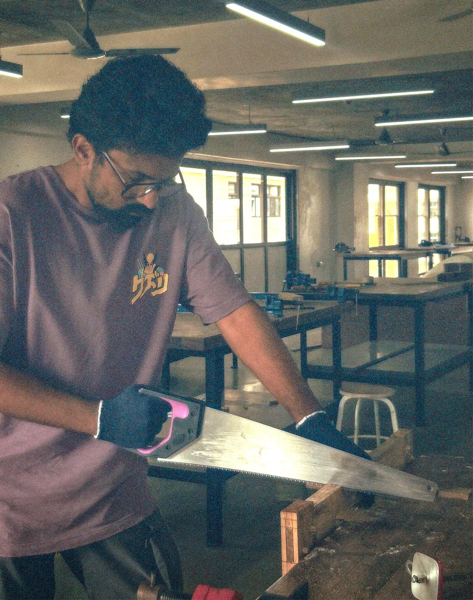
A breakthrough in this project came when I realized how reflections could completely alter the way the work was perceived. By placing a mirror behind the second frame, the focus shifted from external barriers to the internal ones we carry within ourselves. The frames, created with cotton threads in varying shades of human skin tones, further emphasized this connection to our shared humanity. This simple yet powerful addition enriched the concept, encouraging viewers to turn their gaze inward and confront their own invisible barriers.
SAHIL NAIR
The logo is derived from the two initial letters 'S' and 'N' of my name, the author. I firmly believe that this logo perfectly reflects my personality. The reasons for this are as follows:
1. It is influenced by the Devanagari script ‘न, ’ representing the letter ‘Na,’ the initial letter of my second name.
2. It is crafted to resemble a human posture, reminiscent of the attentive stance observed during the initial stage of a race.
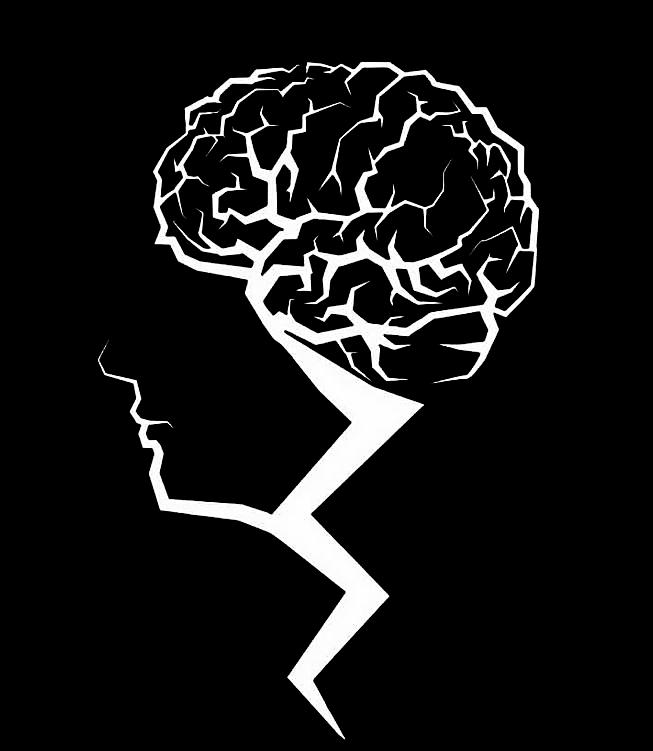
The logo was designed by the author for a startup known as ‘Brain Storm Adda’.
“When you think about the word “brainstorming”, what do you imagine? Maybe a crowd of people who you used to call colleagues, outshouting each other, assaulting the whiteboard, and nearly throwing punches to win control over the projector? Fortunately, brainstorming has a bright side. It’s a civilized process of generating ideas together. At least this is how it appears in the books on creativity
Design’s role in companies is becoming less about visual appeal and more about hitting business goals and creating value for users. Therefore, the need to build teams with diverse perspectives is becoming imperative.”







Bloom & Bell, a fresh entrant into the vibrant market of imitation jewelry. As a burgeoning brand, Bloom & Bell is set to make its mark by offering a unique blend of style, sophistication, and affordability. With a focus on providing exquisite alternatives to traditional jewelry, Bloom & Bell presents a curated collection that reflects the latest trends and timeless elegance.




The Bloom & Bell logo is a fusion of elegance and symbolism. A blooming lotus, India's national flower, graces the top, symbolizing purity and growth. Resting on a holy bell, it blends tradition with sophistication. The lotus and bell subtly form mirrored 'B's, encapsulating our brand initials. This emblem captures the essence of “Bloom & Bell - where affordability meets luxury” .





The color Purple is associated with royalty & luxury and wealth.
The color golden represents the gold jewelry and ads a touch of elegance
It's rich hue and red shade are interpreted as signifying sophistication.
The color silver represents the platinum jewelry and ads a touch of elegance.
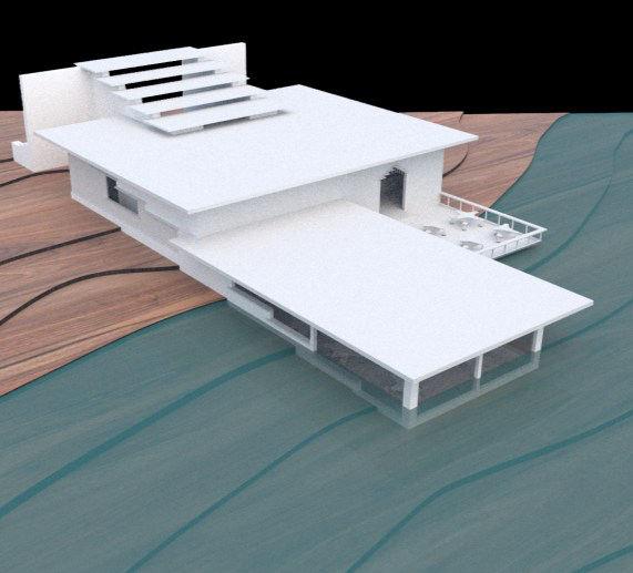
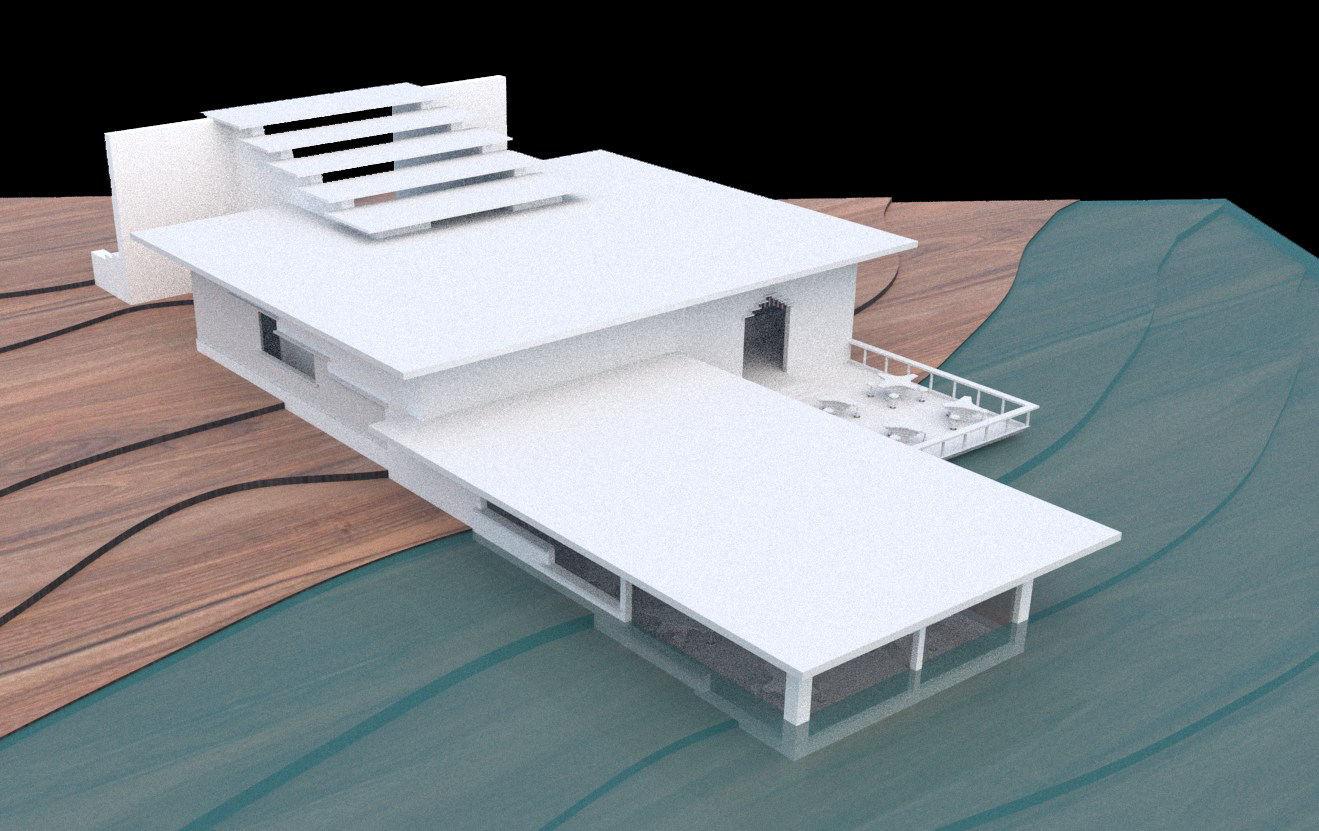
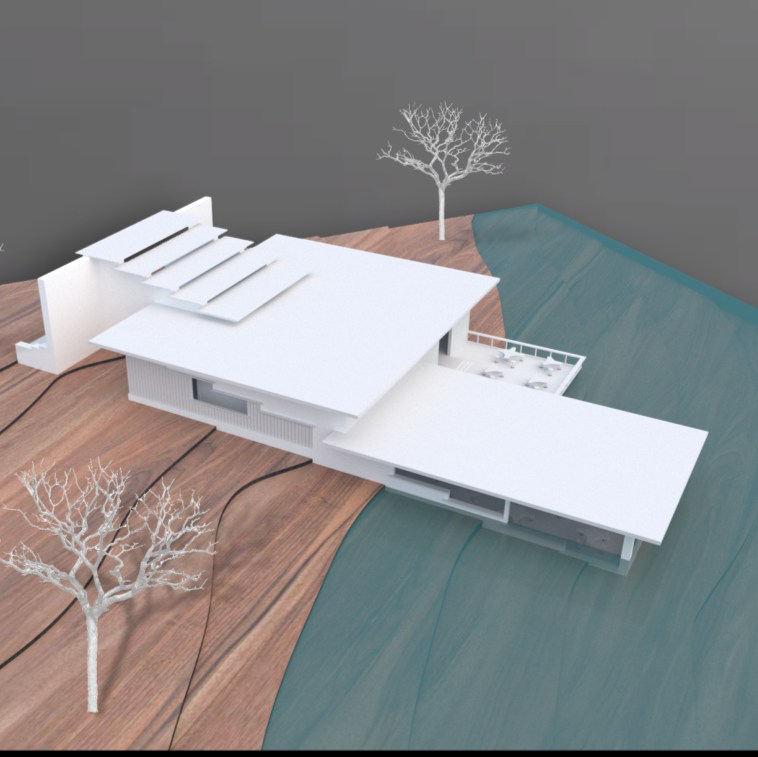
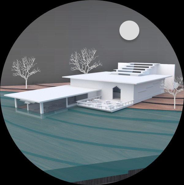
The proposed cafeteria is strategically situated in New Panvel, Maharashtra, offering a picturesque riverside view adjacent to the serene River Kalundre. The site is characterized by its abundant greenery, adorned with a plethora of trees, and features gentle contours, adding to its natural allure.
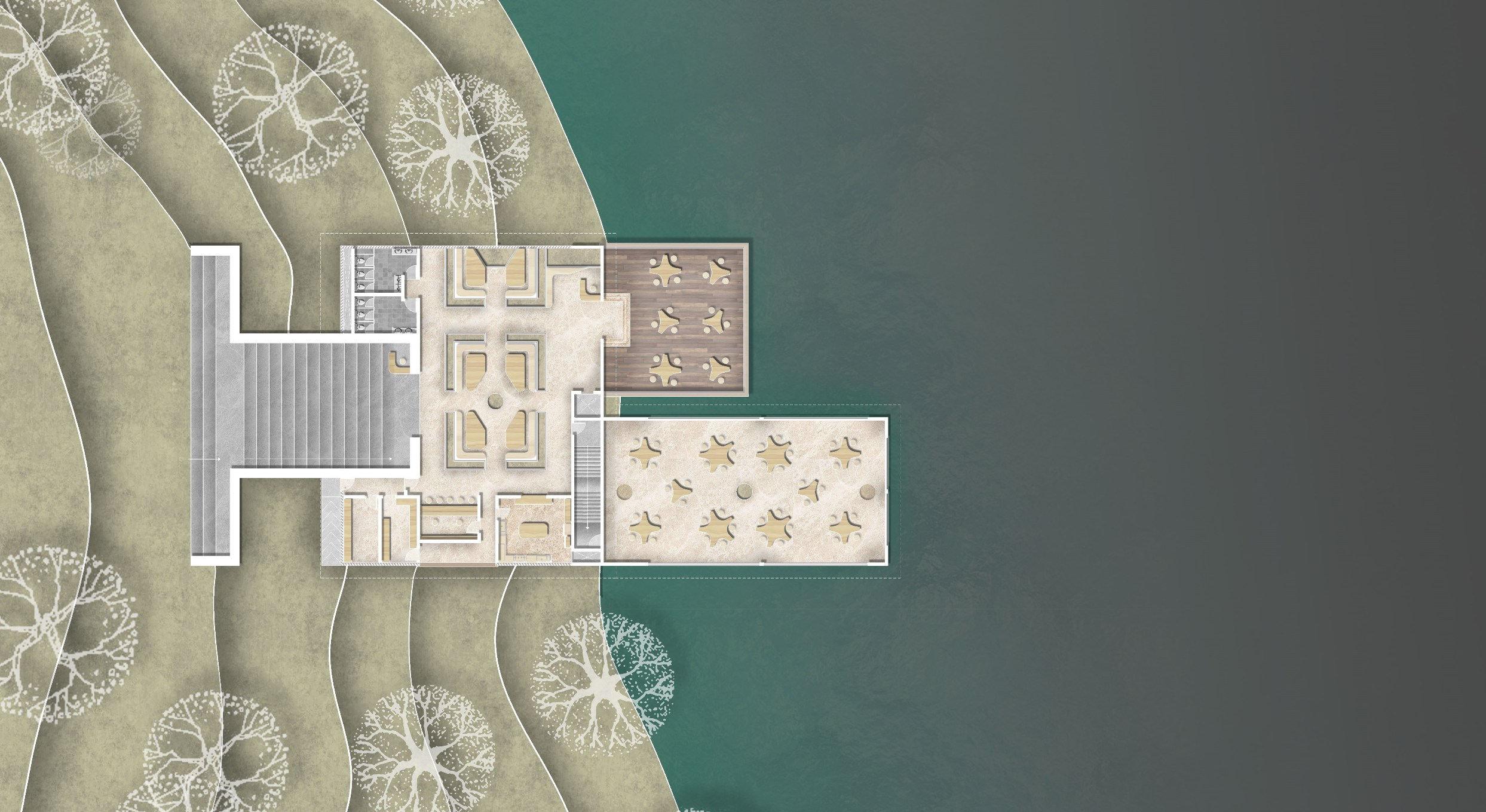
Within a one-kilometer radius from the site, there is a bustling college, a conveniently located railway station, and a cluster of residential societies. Noteworthy is the shared 11.0-meter-wide approaching road with the college, signaling that the primary footfall to the café is anticipated to originate from the college community.
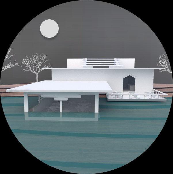
Taking cognizance of these contextual factors, the proposed cafeteria has been thoughtfully designed to offer an immersive experience. With three distinct seating spaces, each curated to provide a unique ambiance, the cafeteria aims to cater to the diverse preferences of its patrons. The overall seating capacity has been calibrated to accommodate up to 100 visitors at any given time, complemented by a dedicated and efficient team of 15 staff members.
This thoughtful approach ensures that the cafeteria is not just a culinary destination but also a communal space, harmonizing with the natural surroundings and catering to the dynamic needs of the college-going populace, nearby residents, and those seeking a delightful retreat by the river.
CONCEPTCONCEPT
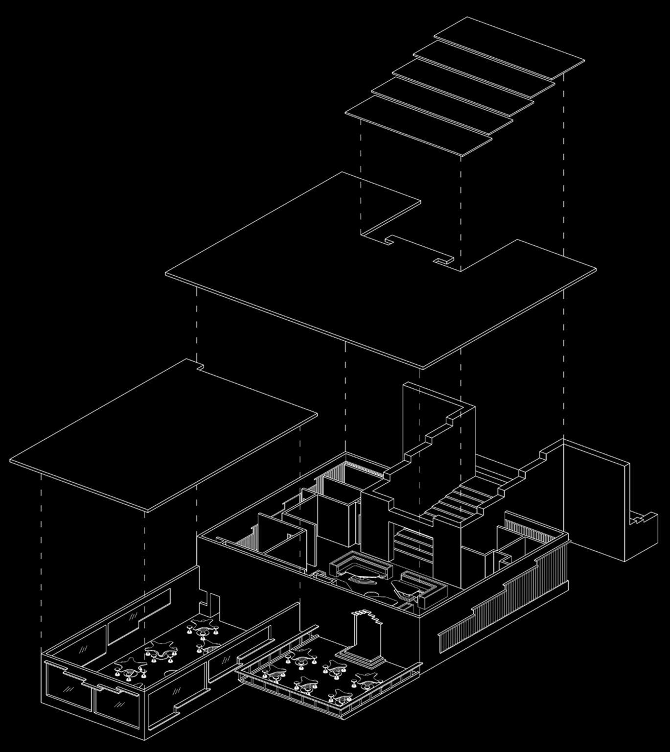
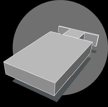
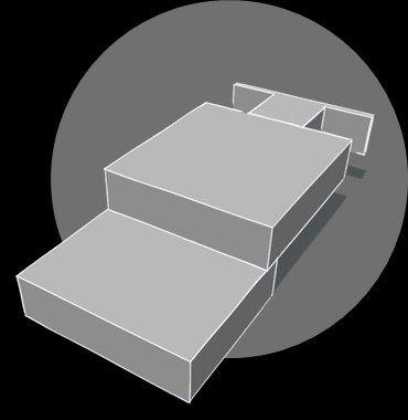
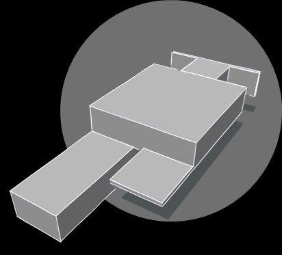
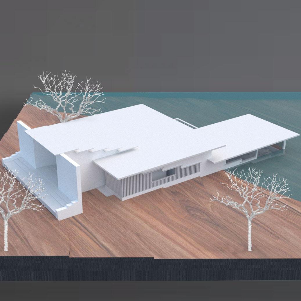
Idea was to design the structure that connects on various levels to merge perfectly with the existing contours. The entrance is to be elegantly defined by a massive stone-walled passage with cutouts on the roof for the light to enter.
To reap the maximum benefits of site, the Cafeteria has three different seating spaces. The spaces are as follows :
1. Internal Seating space
2. External seating space
3. Under-water seating space




B ’

• The entrance to the cafeteria is through a spacious 10.0-meter-wide passage leading to the dining area at a lower level.
• Separate entries, catering to the convenience of handicapped individuals and staff members, are thoughtfully provided at a level0.6 meters.
• Facilitating access to the underwater seating area at an even lower level, a lift and a staircase have been strategically incorporated.
• Wooden louvers grace the facade, enhancing not only the aesthetic appeal but also promoting effective wind circulation within the internal dining space.
• For the seamless serving of food to the lower level, a dedicated dumbwaiter shaft is meticulously designed, connecting the kitchen to the underwater dining area. This feature ensures the efficiency and convenience of the overall dining experience.







Project :
Designing Temporary Arrangements for Republic Day Parade at Kartavya Path
Role :
Firm :
Architect – Project Lead
HCP Design, Planning and Management Pvt. Ltd.
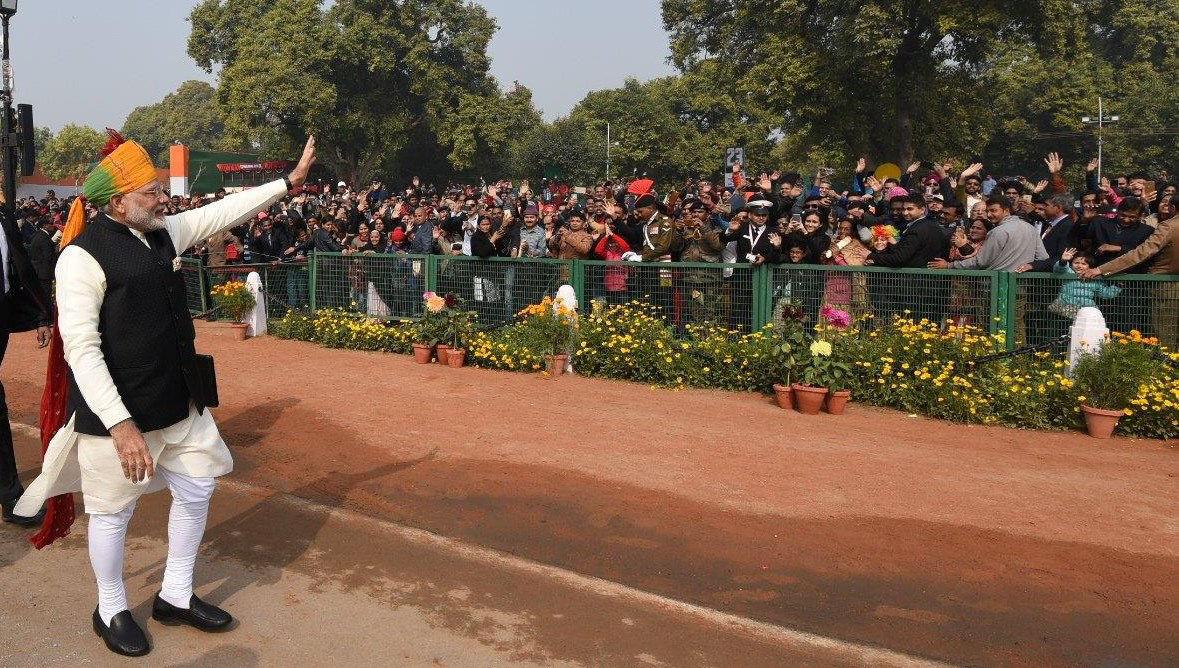
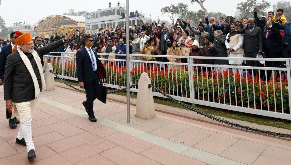
As a designer, I feel proud to have been an integral part of envisioning and redesigning the ephemeral arrangements made for the yearly Republic Day celebration held on Kartvya Path, Delhi.
For the preparations of Republic Day celebration, Delhi's largest public open space and major attraction spot Kartavya Path used to be closed to public for 3 months. The inaccessibility of this mega public space created an urban impediment for the local vendors and visitors.
We worked on the objective of reducing manhours and preparation time, along with revamping the space and enhancing the comprehensive experience of the event. This was achieved with the redevelopment and modular designs and arrangements proposed for the 74th Republic Day celebrations.
Overall, the preparations and dismantling of the arrangements took a total of 20 days as opposed to three months earlier. The space was opened to the public within one week of the Republic Day celebrations.


As the Project Lead at HCP, Design Planning and Management, I take pride in my integral role in envisioning and redesigning the ephemeral arrangements for the yearly Republic Day celebration held on Kartavya Path, Delhi.
Previously, the preparations for the Republic Day Parade (RDP) would result in Kartavya Path, Delhi's largest public open space and a major attraction spot, being closed to the public for three months. This created urban impediments for local vendors and visitors alike. Our objective was to reduce manhours and preparation time while revamping the space and enhancing the event experience. Through the redevelopment and implementation of modular designs and arrangements for the 74th Republic Day celebrations, we achieved this goal. In the process, my team and I had several extensive meetings with our stakeholders, including the Ministry of Defence, Special Protection Group, Delhi Police, Doordarshan, and others. These interactions provided valuable exposure on client management and collaboration.
Overall, the preparations and dismantling of the arrangements were completed in just 20 days, a significant improvement from the previous three-month timeframe. The space was reopened to the public within one week of the Republic Day celebrations, ensuring minimal disruption to the community and enhancing accessibility to this vital public space.
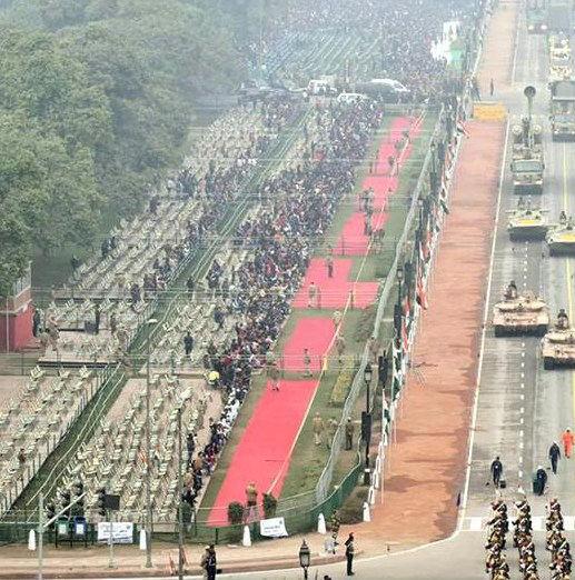
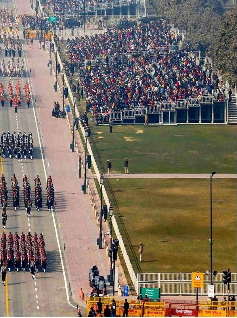
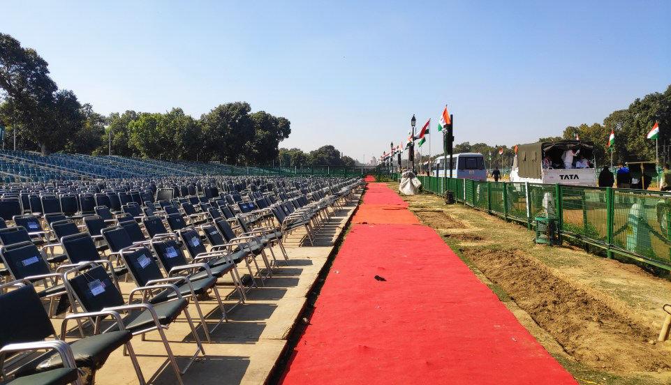
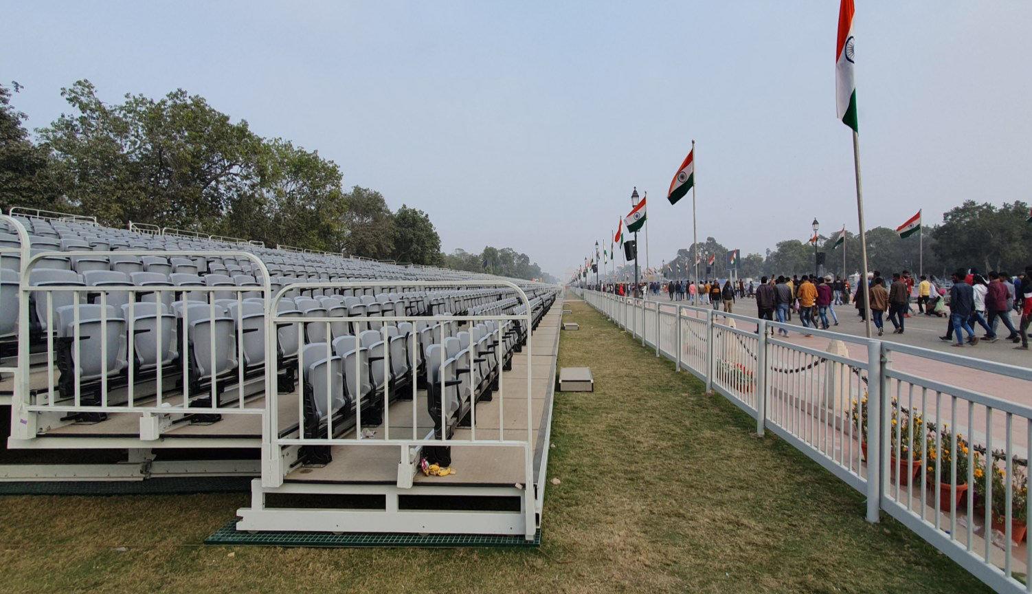
Revamped seating arrangements at RDP improved user experience and lawn preservation. Traditional fixed chairs were replaced with modular bleachers, offering optimal views and easy, lawn-friendly installation.

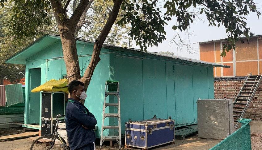
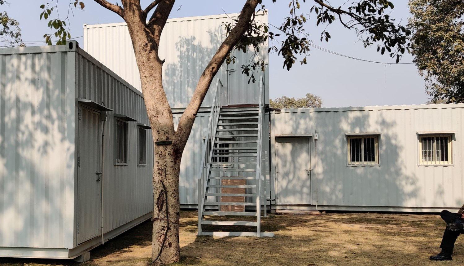
Transformed on-site camp offices at RDP with innovative design solutions. Replaced traditional brick-and-wood structures with portable containers, streamlining construction, demolition, and post-event logistics.
Enhanced VIP viewing experience at Kartavya Path during RDP with our redesigned layout. Upgraded from old, disorganized crowds and outdated railings to a modern, organized setup featuring modular railing systems and improved pathways.
