
1 2 3 4 5 6
Re:LAX app CO Architects Digital Innovation Fellowship
June 2022-December 2022
Saddha Zaw
Report Content
Project Background Fellowship Project Overview
Understanding the User Starting the Design Refining the Design Going Forward
1. Project Background
Los Angeles Public unLibrary
RE:LAX REFUGEE RESOURCE CENTER
Re:LAX is a project that responds to the movement of people in and out of Los Angeles, chasing their respective dreams of surviving and thriving in America. It is a community resource center for refugees and immigrants.

At 75,000 sqft, Re:LAX sits in the El Pueblo neighborhood, in close proximity to Chinatown and the Civic Center. A combination of pragmatic program such as legal, medical offices, as well as recreational program such as yoga studios and media labs are offered.
Steel is the primary structure used, to be able to support a dramatic cantilever over the outdoor amphitheater. The ETFE envelope mimics a cloud-like form, with the goal of conveying transparency and a weightless/ seamless transition for newly arrived immigrants to chase their version of an American Dream.
 exterior render at night
2. Fellowship Overview
As a Digital Storytelling Fellow, I would like to explore the intersection of architecture and user experience design, more specifically how an app can help visitors navigate a space.
UX design is a field that recently sparked my interest, because it is all about optimizing how a user interacts with a product and making it as seamless and intuitive as possible. It is designing for people and for comfort, which is also what architecture is about and the overlap between the two disciplines excites me. I would like to use my current studio project as a case study for the app.
The three main programmatic aspects are:
1. Practical services: doctor, lawyer, translator offices, community kitchen
2. Recreational: yoga studios, meditation garden, childrens’ play area, performance amphitheater
3. Educational: media labs, tech rental, diaspora library
Problem: Thinking from the perspective of a newly arrived immigrant, I’d imagine being intimidated to visit this center at first, possibly overwhelmed by so much programming going on at once. I wouldn’t want to read traditional floor plans to figure out where I need to go.

Proposed solution: Visitors need a mobile app to help them explore and access the center offerings so that they can book appointments, view event calendars, and personalize their Re:LAX experience.
The expected product of this project would be an interactive app prototype that helps the viewer understand the story of my studio project through the lens of a visitor. Architects design the physical space and product designers design the digital, and in my research and project I aim to find out how the two realms of digital & physical can mix to tell the story, not only of the building but also its inhabitants.
What is User Experience Design?
User Experience refers to the interaction between a person (the user) and a product (the experience). Improving user experience might mean designing accessible products that are easy to use and navigate, regardless of a person’s disability, age, gender, or socio-economic background.
3. Understanding the User
User Interview Questions
- Can you describe your experience of arriving in the US for the first time.
- What are some of the initial challenges you faced as a newly arrived immigrant or refugee?

- Is there any way in which you feel you can resolve those challenges?
- What was most helpful when you arrived initially?

- How do you find community?
- What kind of activities help you relax or relieve stress?
Personas
Problem Statement
Bawi is a curious, eager-to-learn senior citizen immigrant who needs a way to look for community offered classes because he needs all the information before going to the center in person.
Sarah is a passionate activist who needs a way to advertise community events because she needs a bigger turnout to build a stronger community and solidarity.
User Journey Maps


[name] is a [user characteristics] who needs [user need] because [insight].
4. Starting the Design
Storyboards
Storyboarding is a tool that is helpful in the initial stages of design. A big picture storyboard shows the importance and need for the app, and illustrates the needs of a user group. A close-up storyboard shows how a user might use the app to complete a certain task.


Crazy 8’s
Crazy 8’s is a brainstorming exercise to help designers come up with multiple possible solutions to a problem. The timer is set for 8 minutes, for 8 possible solutions.
In this exercise, I came up with 8 screens that I believe are important features of the app, starting with the splash screen to welcome users, in different languages. Some other features include directions to get to the center, as well as a calendar of community events. Although these ideas are not flushed out yet, this is a good starting point for me to figure out which features I want to integrate going forward.
Wireframes
After Crazy 8’s, I identified features and design elements I believe I should carry over, and continued to draw homepage wireframes. From 5 iterations, I synthesized the best parts of each to make a 6th wireframe, which I will base my digital wireframe around.


5. Refining the Design
Low-Fidelity Prototype
Transitioning into digital prototyping on Figma, I started by copying the paper wireframes. This helped me familiarize myself with the Figma interface and tools.


After I drew a few screens, I went into prototype mode to link the screens together to create interactions between the different screens. To make iterations, I duplicated the pages to test out different interactions and flows.

 link to figma prototype
Figma prototype screen showing interaction arrows
link to figma prototype
Figma prototype screen showing interaction arrows
High-Fidelity Mockup
After I felt like the low-fidelity prototype was working well enough, I started to transform it into a mockup that would resemble an actual product more.
Since the duration and scope of this project does not cover the branding of the project, it was hard to come up with a beautiful user interface. Normally, there would already be an established design system with fonts, colors, hierarchy to work with.
Here, I just put an example of what the low-fi to hi-fi transition is like. In real UX projects, a usability test would be carried out with the target audience to iteracte further and analyze what works and what doesn’t.
Usability Test
Usability tests are carried out after there is a workable prototype. This is a research method that helps us understand how easy it is for participants to do core tasks in a product.
Key Performance Indicators are metrics used to measure how easy or difficult a task is to complete. For example, time on task is a KPI used to measure how long a user spends to complete a task. Systems Usability Scale is a questionnaire that the user can complete after the usability test to help us understand their experience while testing the prototype.
Below is the note taking template to record observations during a usability test.

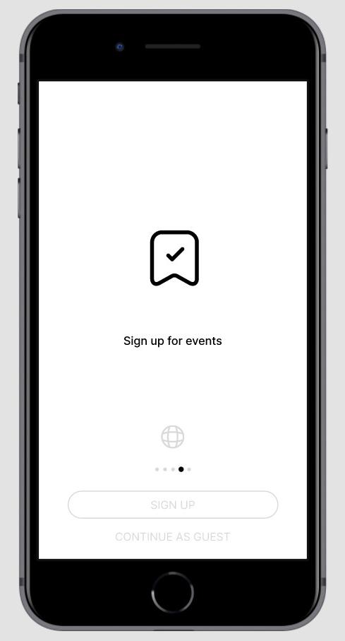
 screenshot of mockup
Going Forward
Reflection
Through this project, I learned the overlap between the two fields of architecture and UX design. Architecture in many ways uses the same concept of designing for the user, creating delightful spaces in the built environment. UX design creates digital products while architecture builds physical spaces. However, with the digital and physical spaces blending together as technology advances at an accelerated rate, I believe there is opportunity and a need for practitioners of both fields to expand their skill-sets. Additionally, the UX design thinking framework is heavily based on having empathy for the user by carrying out interviews and usability tests to repeatedly ideate, prototype and test the product, which I believe architects should practice more of.
Observations of UX Design Process x Architecture Studio Practice

1. Disconnect between designer, stakeholders and inhabitants
- architecture students don’t do enough research to develop empathy for the people they are designing for.
- Developing personas from research finding
- Creating user journey to map out efficient circulation
- Human centered design
2. Intentionally iterating & testing ideas
- Arch students iterate, but sometimes aimlessly without a goal or an understanding of what they’re trying to improve on.
- Testing methods
- Qualitative
- Quantitative
- Level of detail
- Low-fidelity - sketches, gestural models
- Mid-fidelity - study models
- High-fidelity - final models
- Process
- UX: Paper>digital lo-fi wireframes>lo-fi prototype>usability testing>mid-fi>testing> hi-fi
- Arch: sketching>gestural model>critique>plans & sections>critique
3. The overlap is more than I thought
- alternative career paths
- the value of architecture education
4. Documentation is key!
See more: bit.ly/3IE42ej
6.
UX Design Process | Courtesy of Google UX Design coursera course