NARRATIVE SPACE


Website: https://rzhangdesign.cargo.site/
1
Design Statement 5 Context & Concept 10 From Story to Spatial Experience 12 Spatial Components 14 Details 18 Models 20
5
4
Design Statement 55 Developing Process 60 Color Palette 62 LED Artificial Light 63
2
Design Statement 23 Site Analysis 24 Boundary 26 Spiral 30 No Perspective 34 Individual 35
Design Statement 65 Site Analysis 66 Prototype 67 Exhibitions with: Retail Shop 68 Outdoor Dining 70 School 72
Orthographic Drawings & Details 74 Models 76
Design Statement 39 Site Analysis 40 Prototype 42 Section I: Memory 46 Section II: Narrating the Story 48 Section III: Remembering 50 Section IV: Living in the Present 52
6
6.1 Cinderella 79
6.2 Experimental Theatre 80 6.3 The Little Red Flower 82 6.4 Apartment of Sonia 84
Video Animation Link: https://vimeo.com/758326066
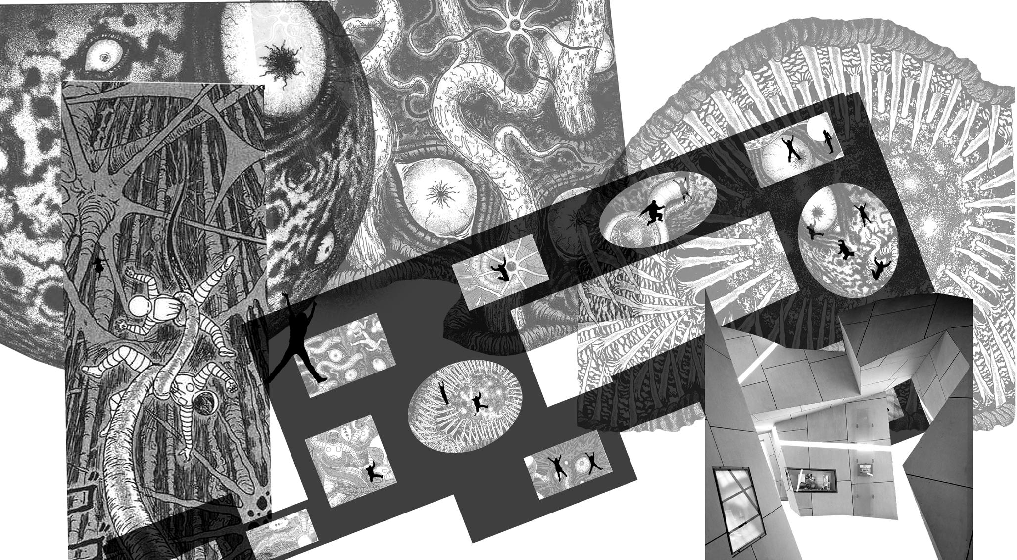
The exhibition of sequential art is becoming increasingly popular. Typical exhibitions show sequential art like regular images, however narrative is the essence of sequential art. This project will find a way to exhibit sequential art forms in a way that respects that they are based in storytelling. I will develop an immersive experience of sequential art. Immersion is also a narrative-based experience, if we combine the immersive experience with the sequential art. Each will enhance the other. My intent is to bring people into the story and make them feel the rhythm of the stories with the help of spatial qualities.
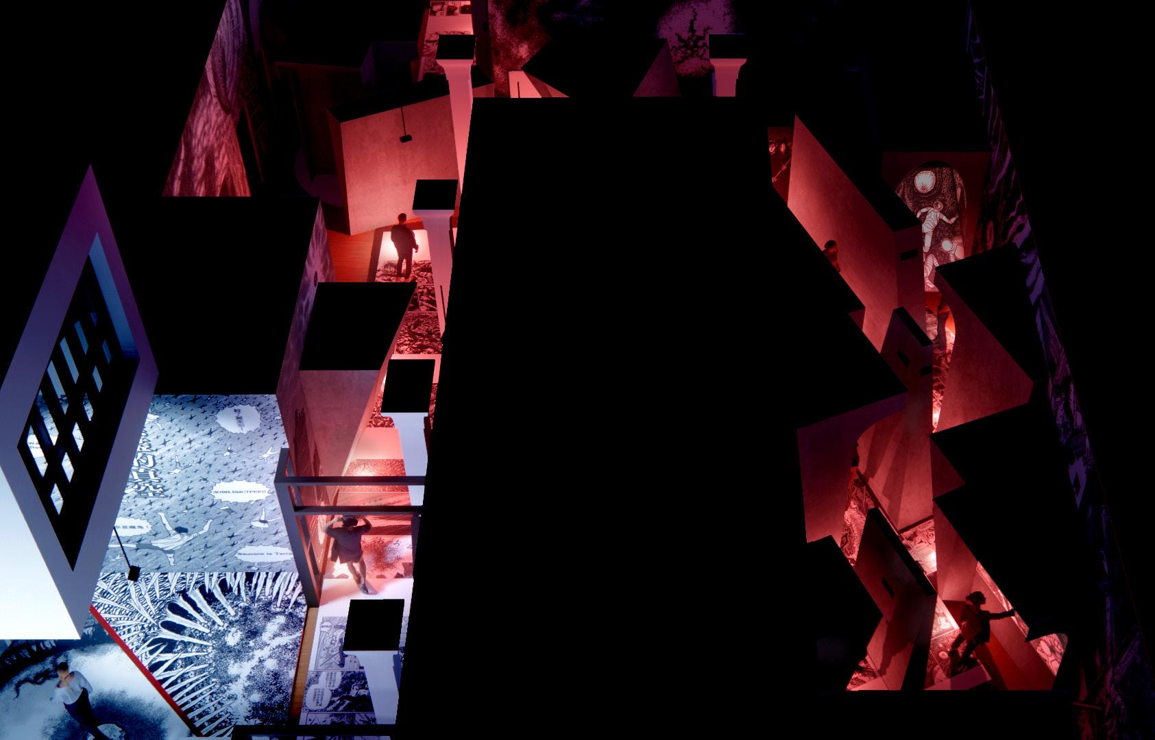
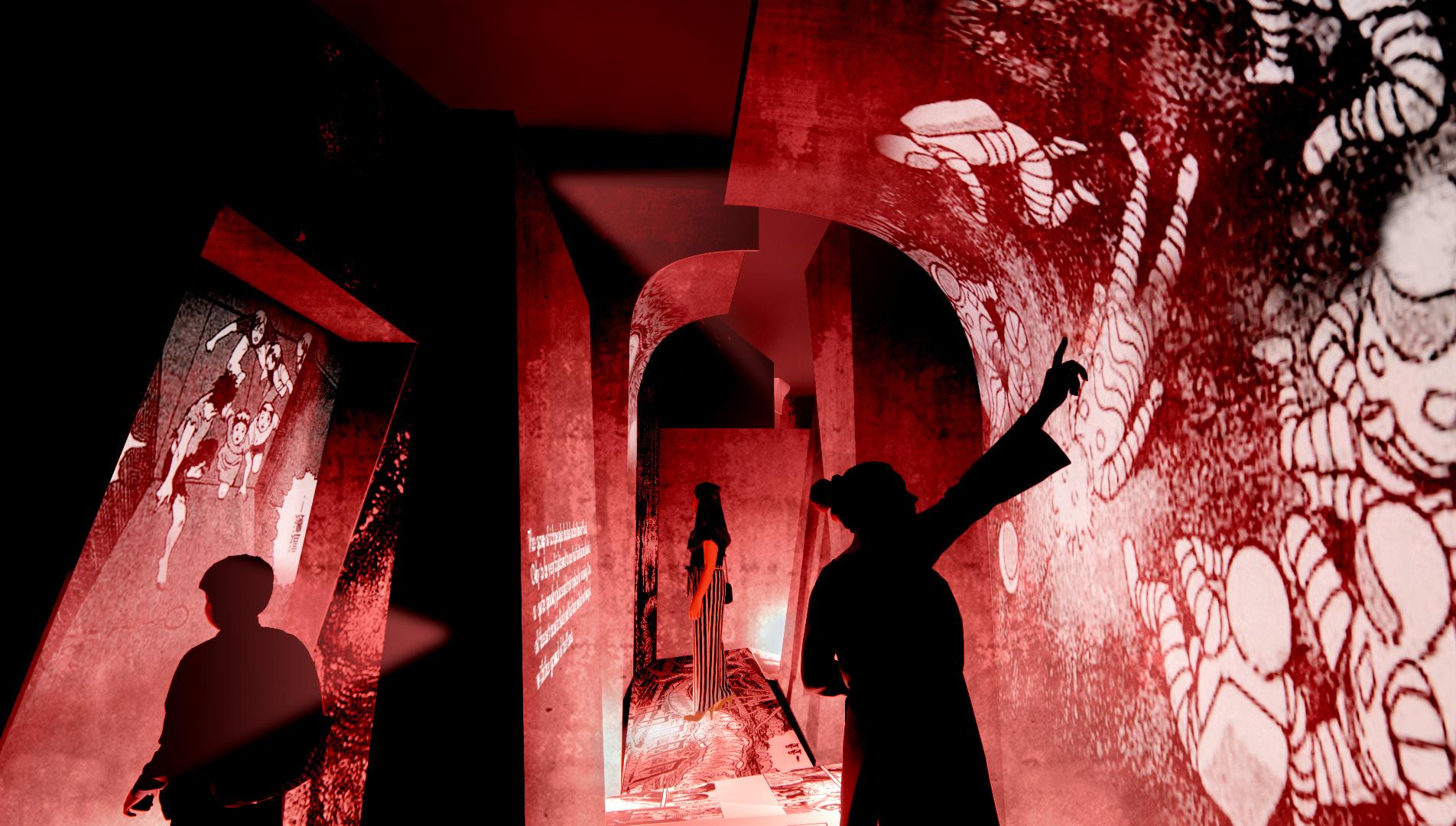
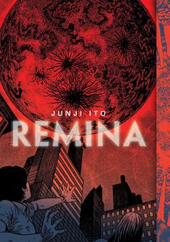
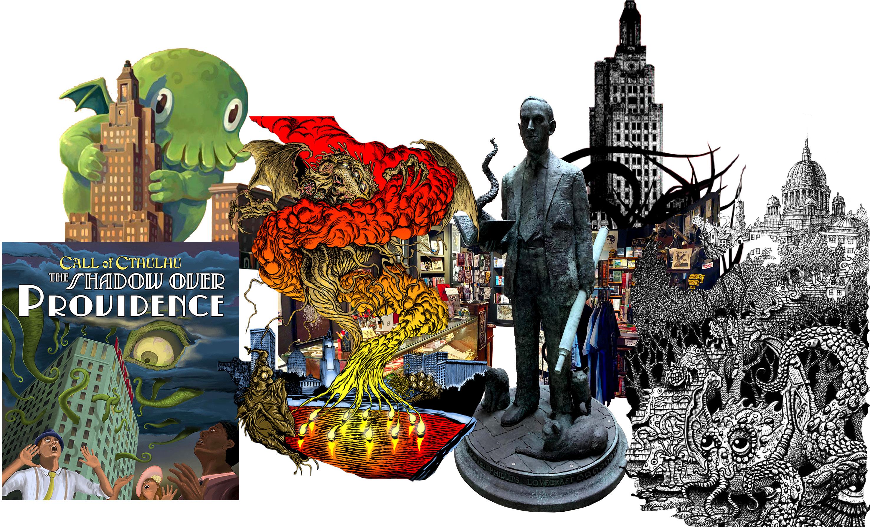
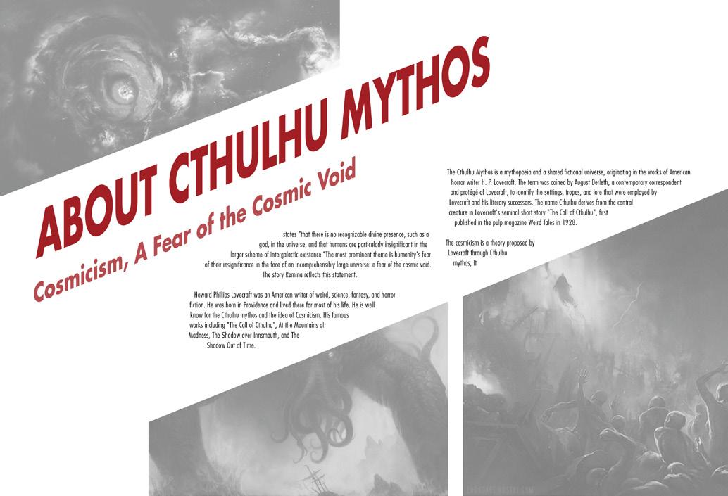
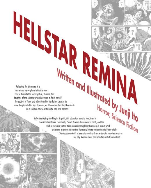
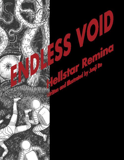
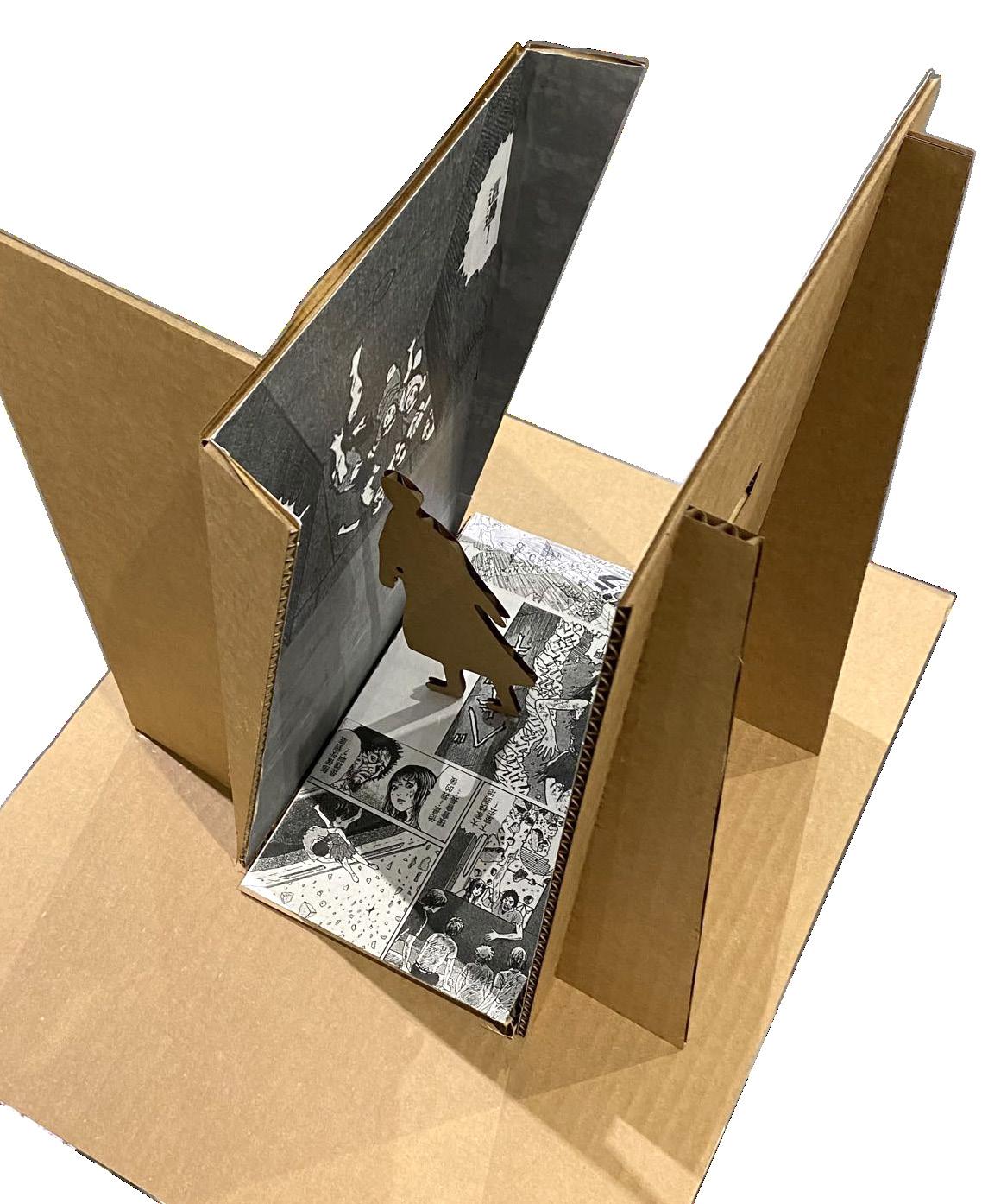
Cthulhu Mythos, which is popular in manga or cartoon works. The school building will attract many students who are interested in manga. This sequential art exhibition will be centered on“Hellstar Remina”, a horror manga by Junji Ito, considering the psychological benefits of the horror experience. Through lighting, eerie sounds and direct interaction with architectural elements such as tilted floors that bring the visitor into close contact with the sequential art of“Hellstar Remina,”a feeling of unease and terror is created. In this way, the intent of the sequential art is achieved.
The site will be the first floor of the CIT building of the Rhode Island School of Design in Providence, the birthplace of the
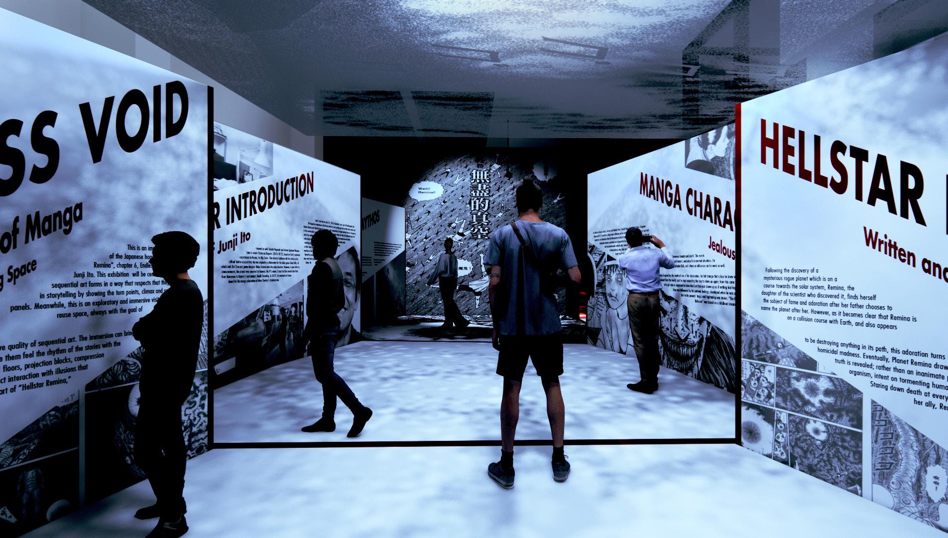

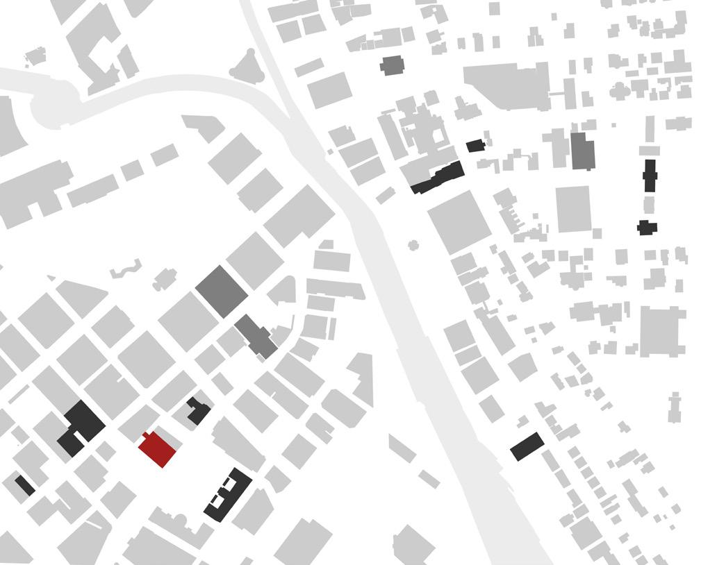
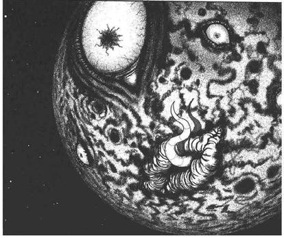

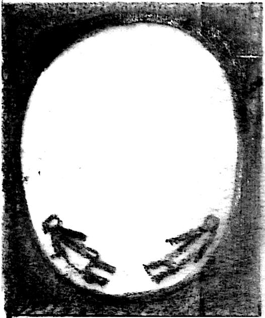
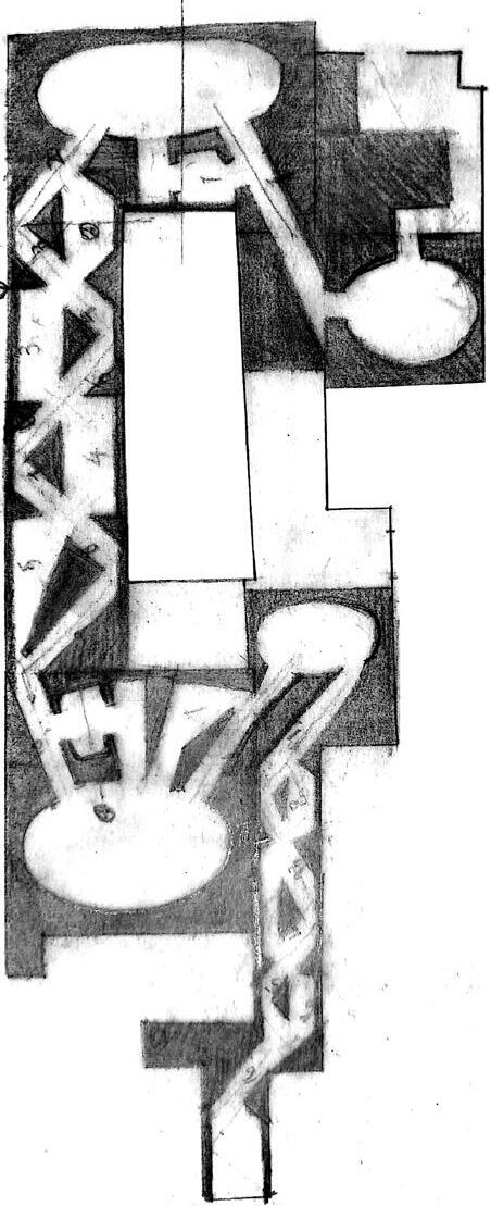
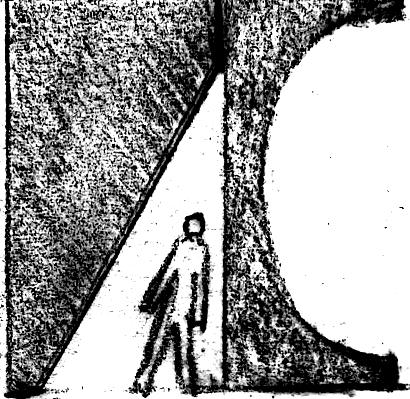
Exhibiting the manga piece in a place with a similar context of the story would be pretty meaningful. The site will situate in Providence, the birthplace of Cthulhu, which is a popular theme in manga pieces.
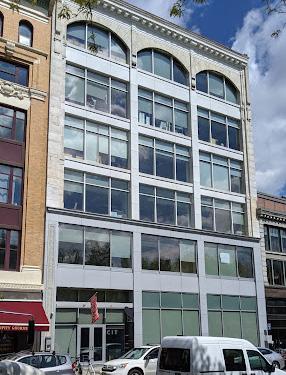
Before
After

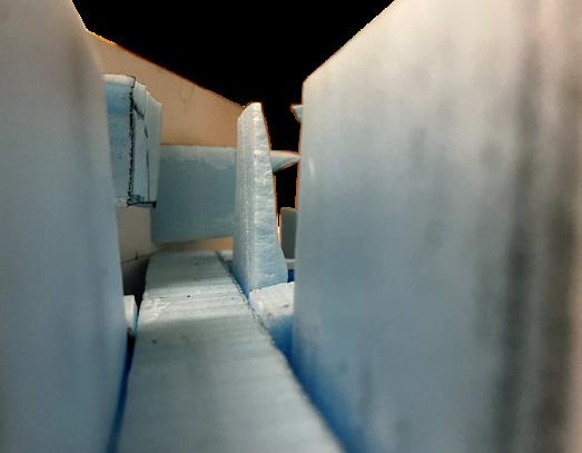
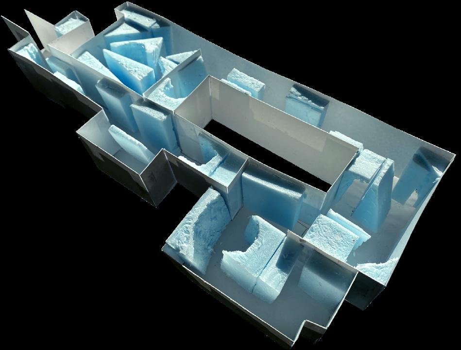
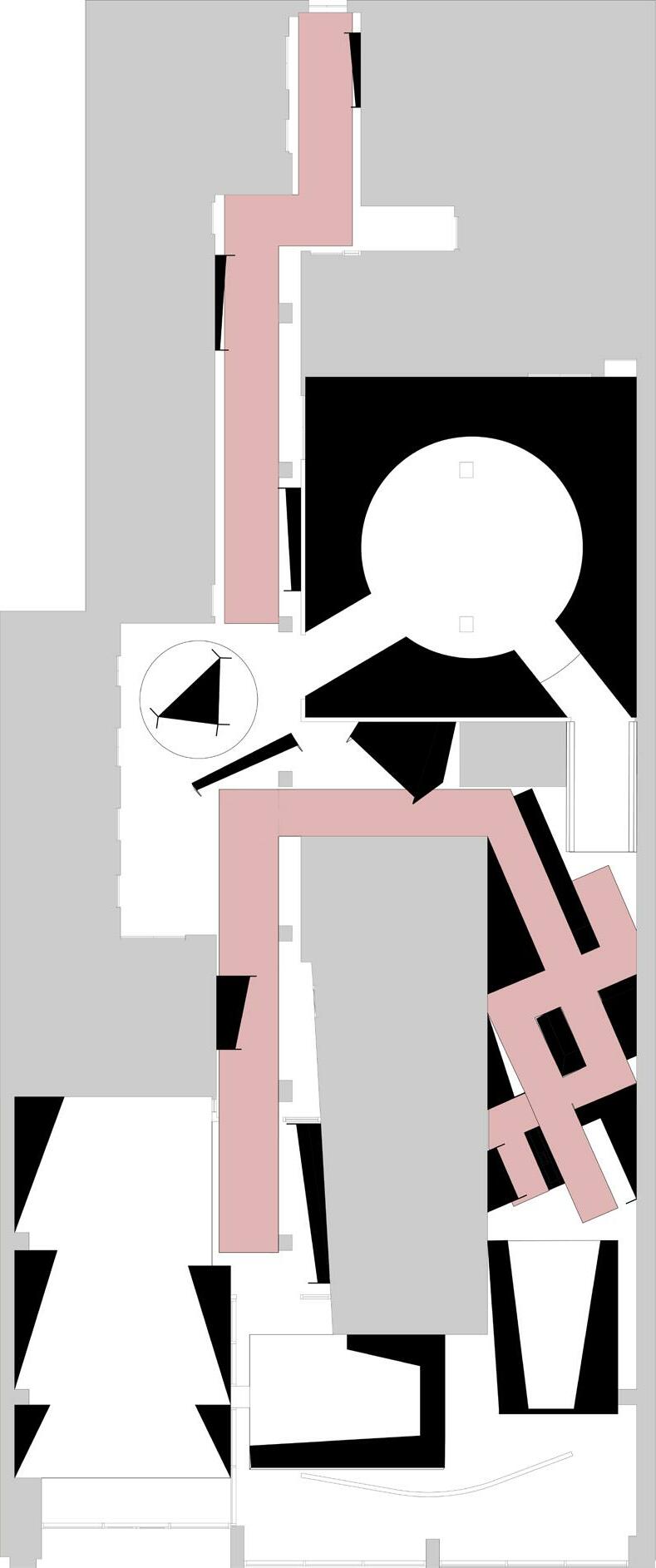
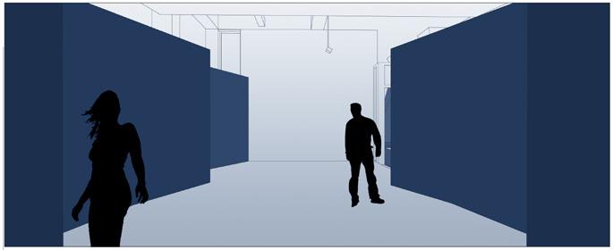
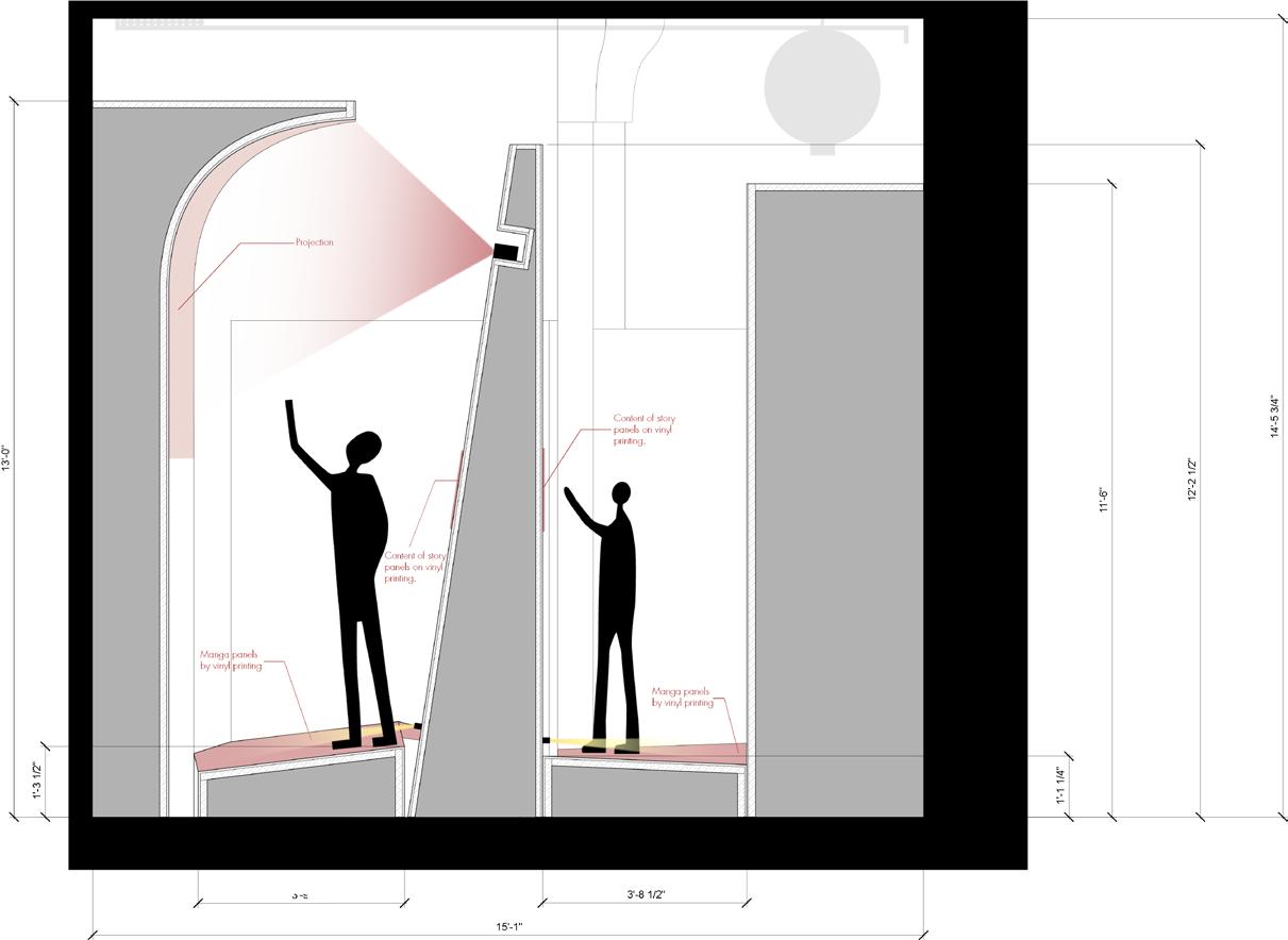
The core of the Cthulhu Mythos is the contrast of gods and the tininess of human beings. So the scale contrast is the main concept of my design. will create the masses in the space and apply projections on them to represent the scale contrast between people and the masses.
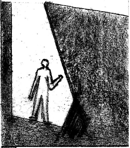
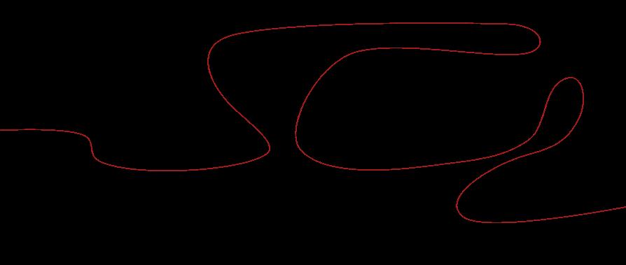
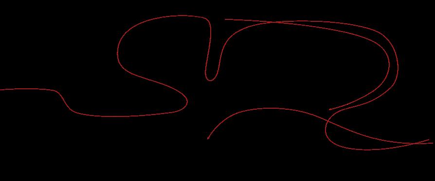
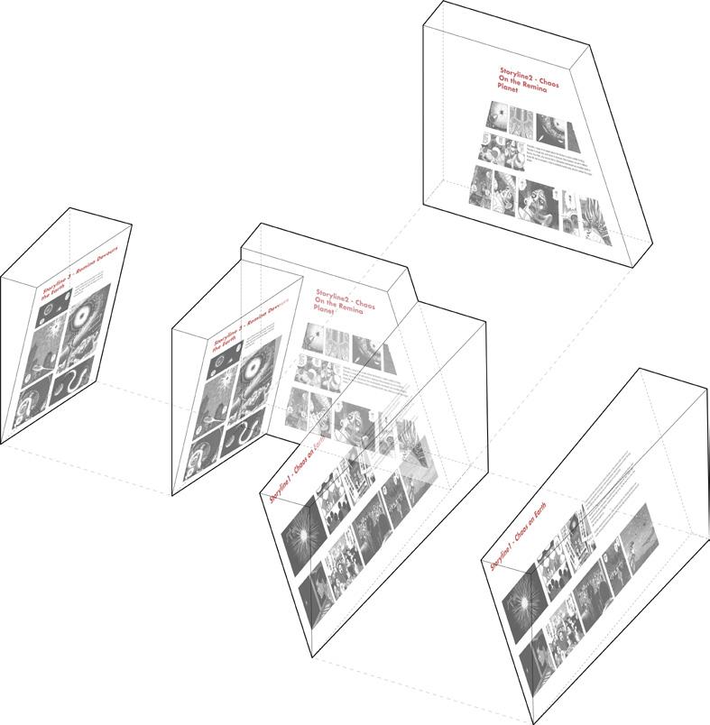
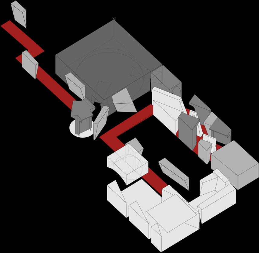
The curves below are the narrative arches of each storyline of this chapter including the Narrative panels, turning points and the climax moments.


Turn Point Climax Narrative Panels


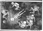




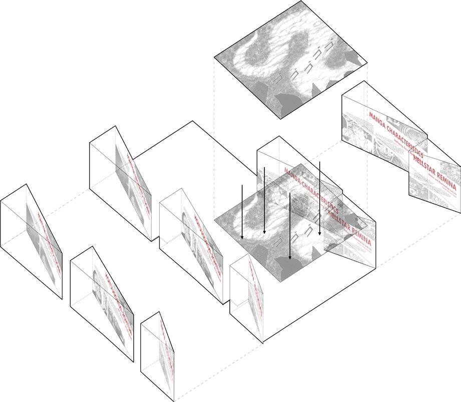

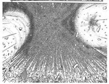
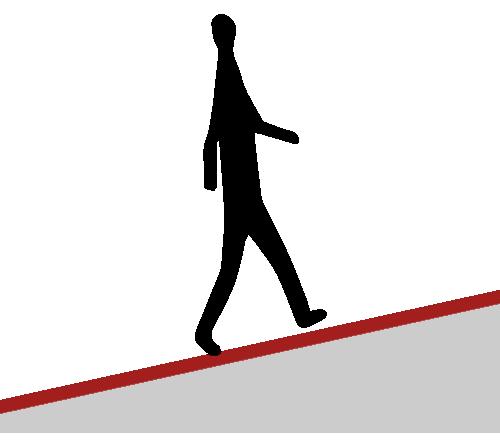
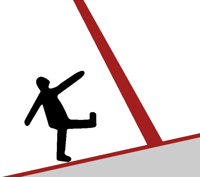
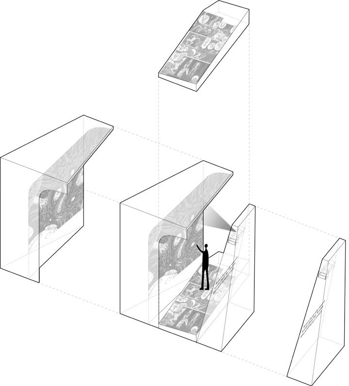
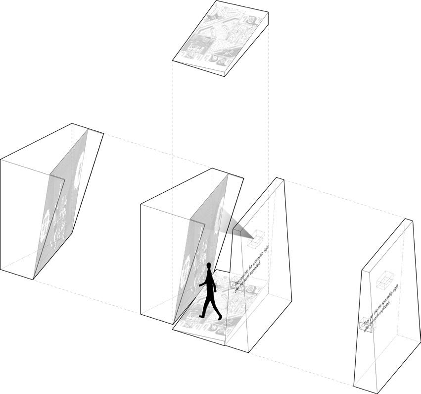
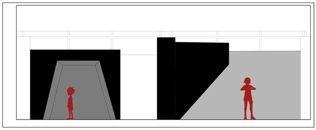
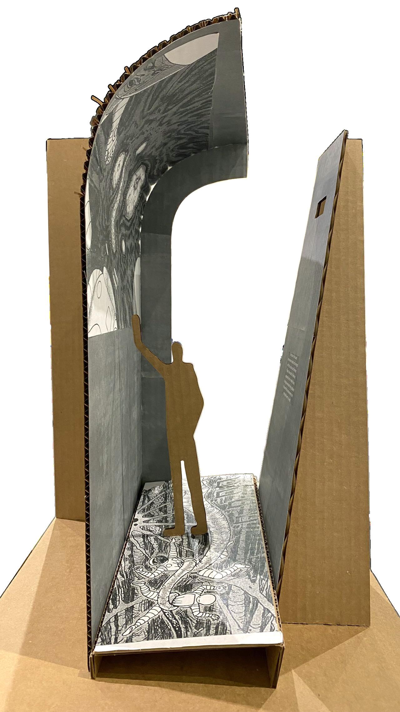
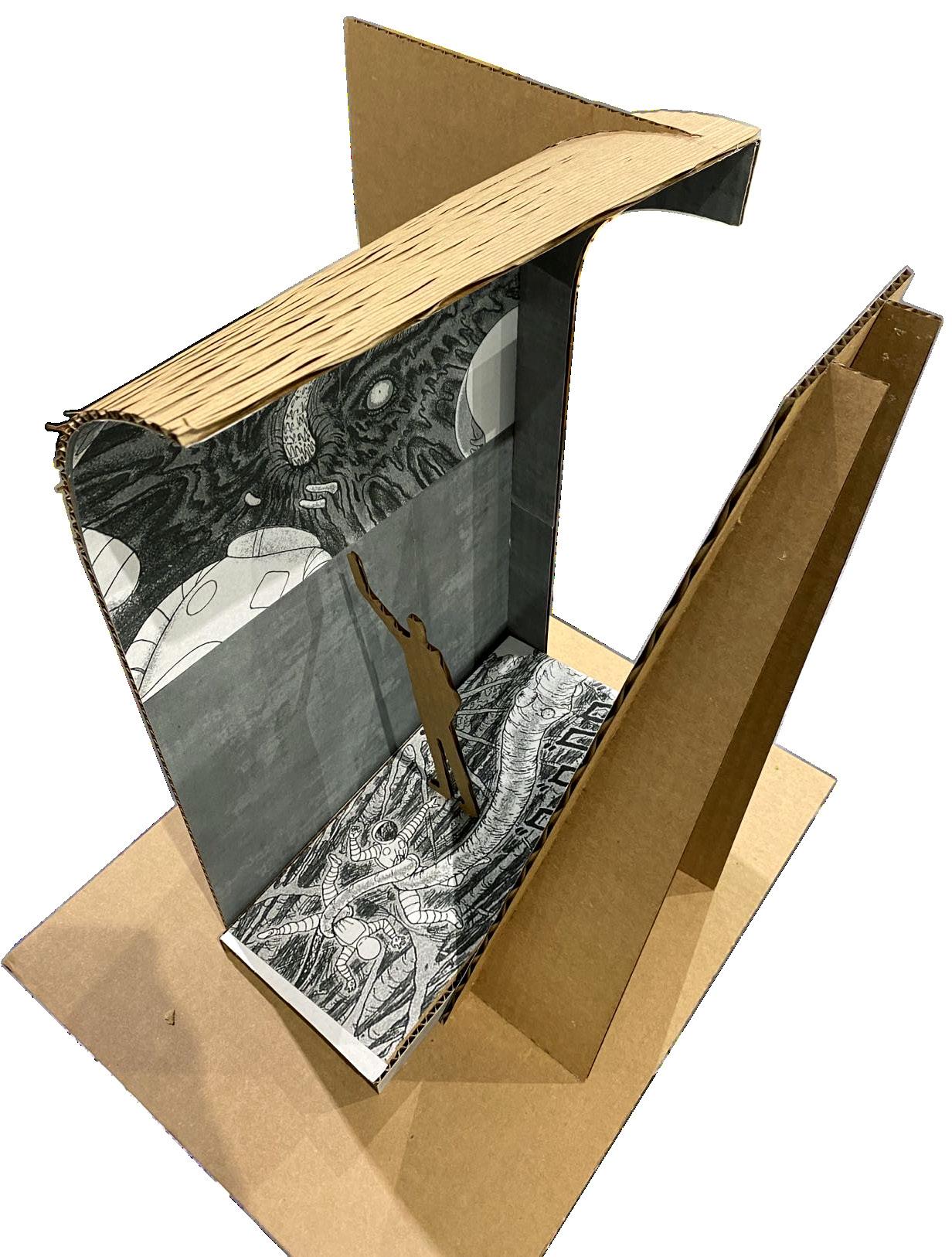
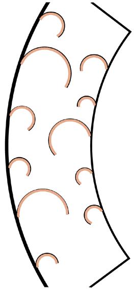
Sequential panels will be shown by printed graphics on the uneven floors like narrative arch.

Turn point will be shown by projection on walls.
Floor
Contents of the Story Panels
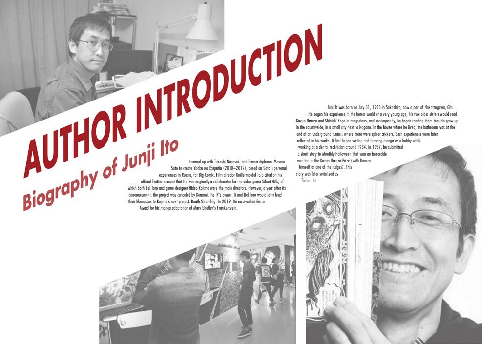
Introduction of the author
Introduction of Previous Chapters


Texture representation


Climax will be shown by an entire space around visitors.

This part includes the Contents of the Story Panels, Introduction of the author, Introduction of previous chapters, Texture representation.




Introduction of the author
These blocks are for the Introduction. Using lighting penetrated through a sandblasting acrylic sheet, we can represent textures by its shadow effect.
Contents of the Story Panels
These blocks were used for the description of previous contents of the story.

These blocks are used to help visitors understand the story better.
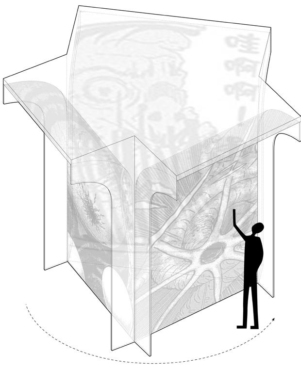
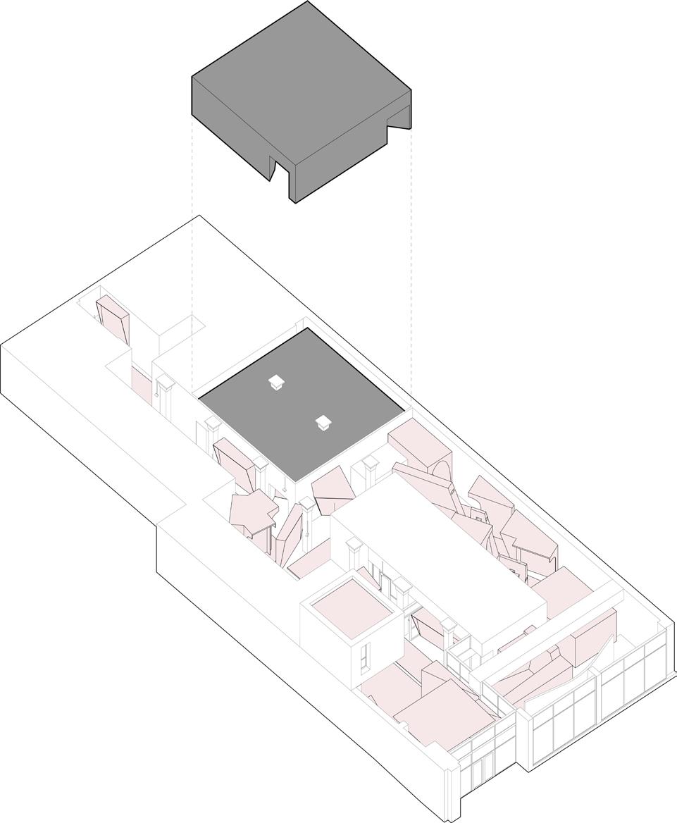
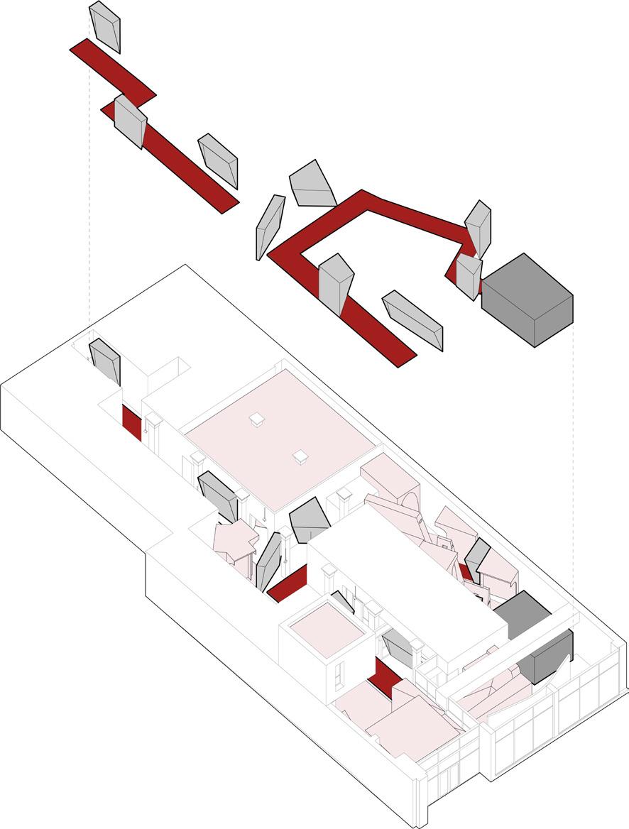
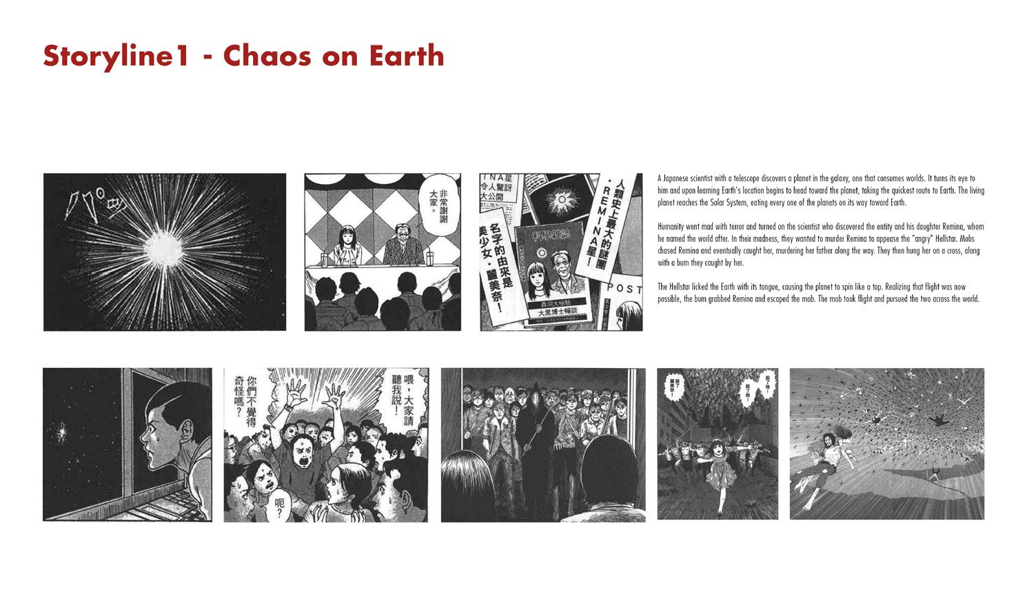
Storyline 1 includes 9 turn points, 1 climax and a multitude of sequential panels.
I will use flat walls to project the turn points
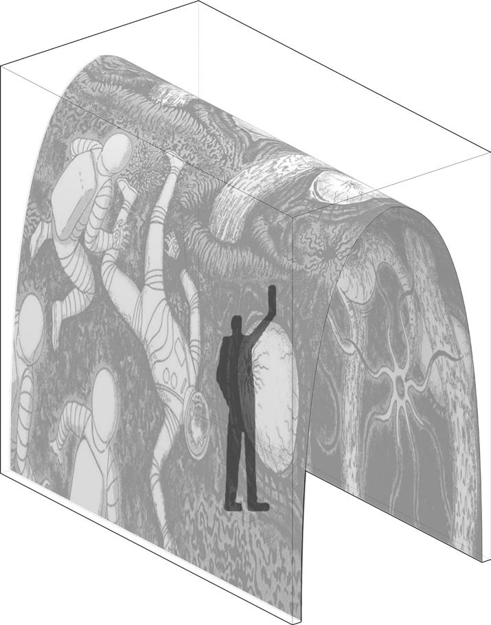
I will use this space to project the climax, as a reflection with the walls for turning points of this storyline.
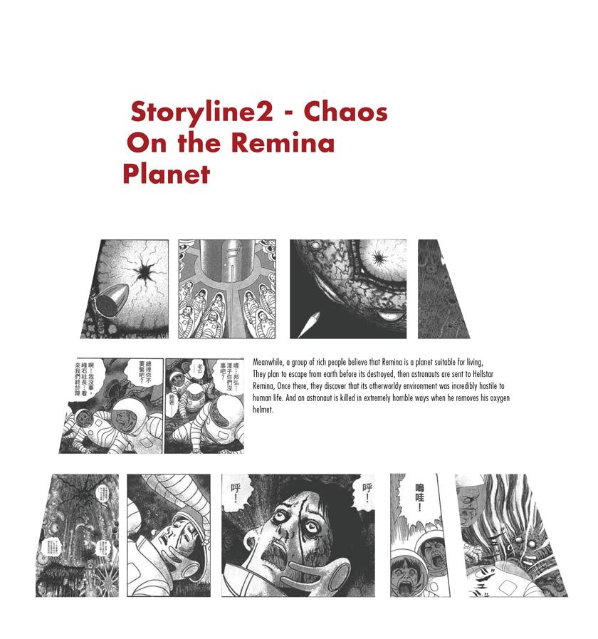
Storyline 2 includes 6 turn points, one climax and a series of narrative panels.
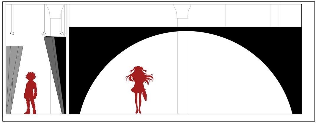
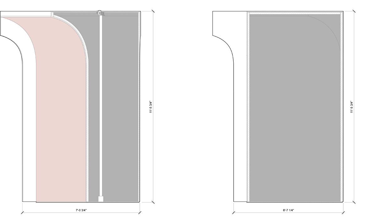
will use curvature wall to project the turn points.
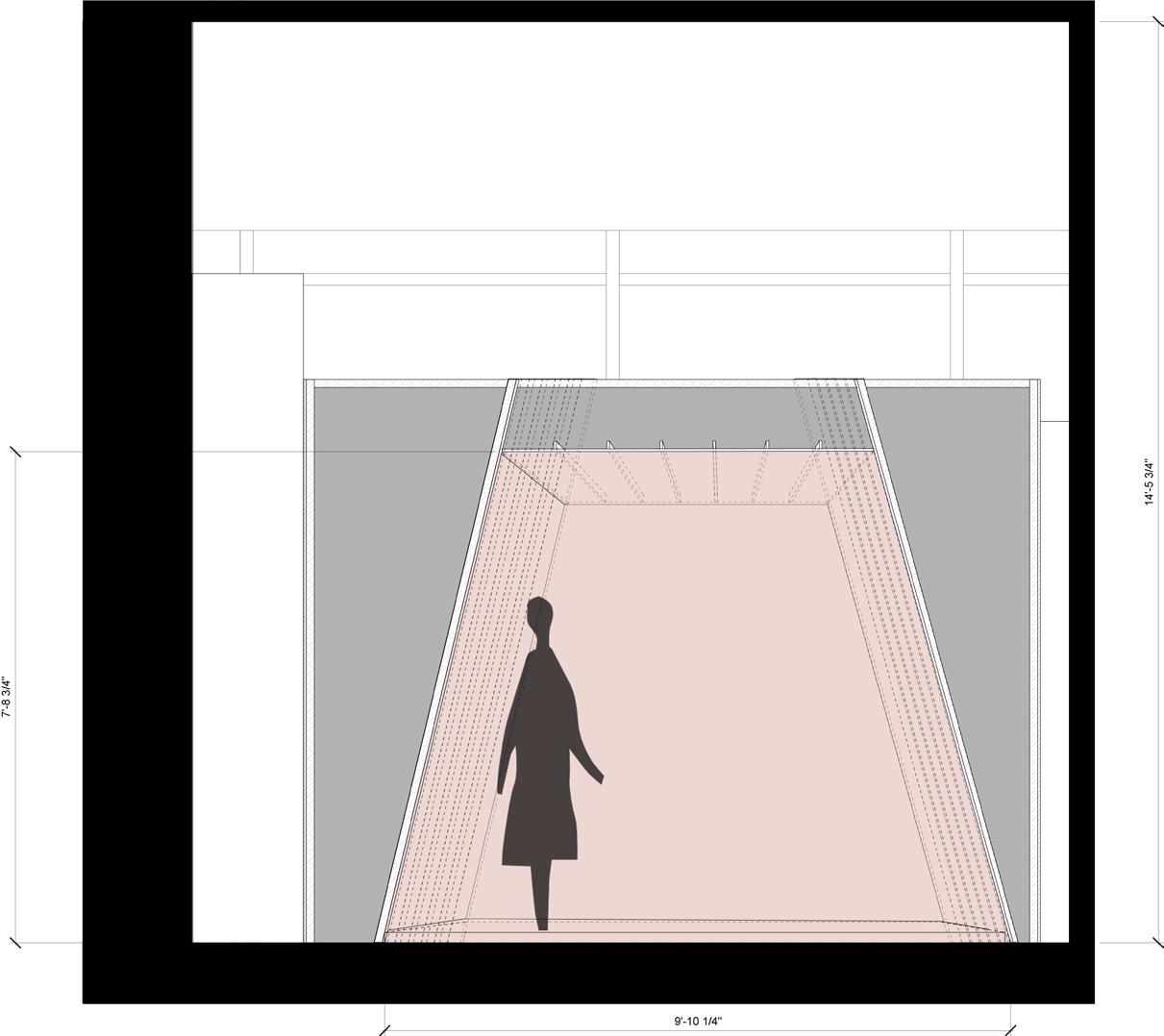
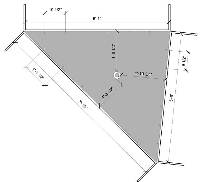
To save spaces and bring more interaction to experience, project the last 3 turn points on 3 surfaces of a Triangular Prism.
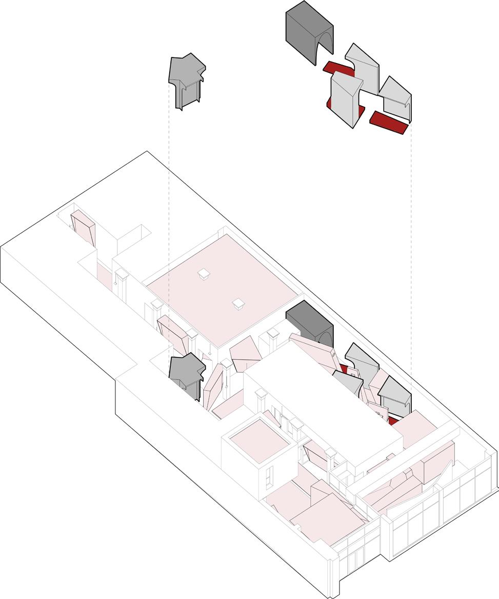
Turn Points
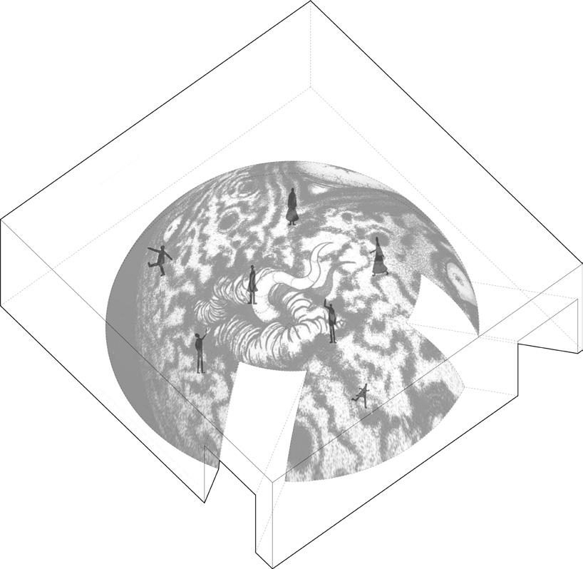
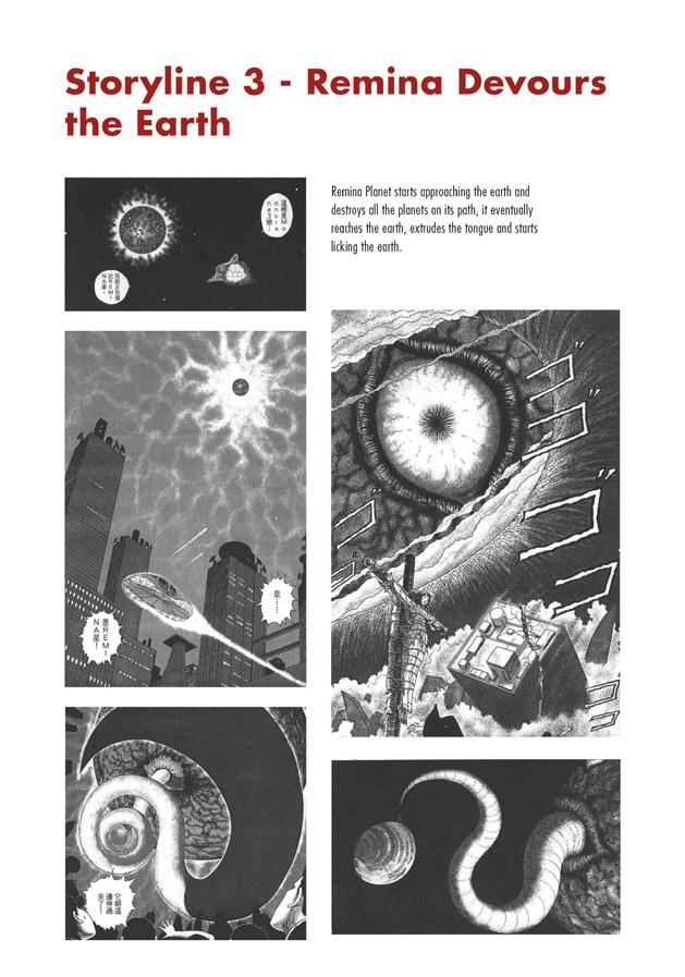
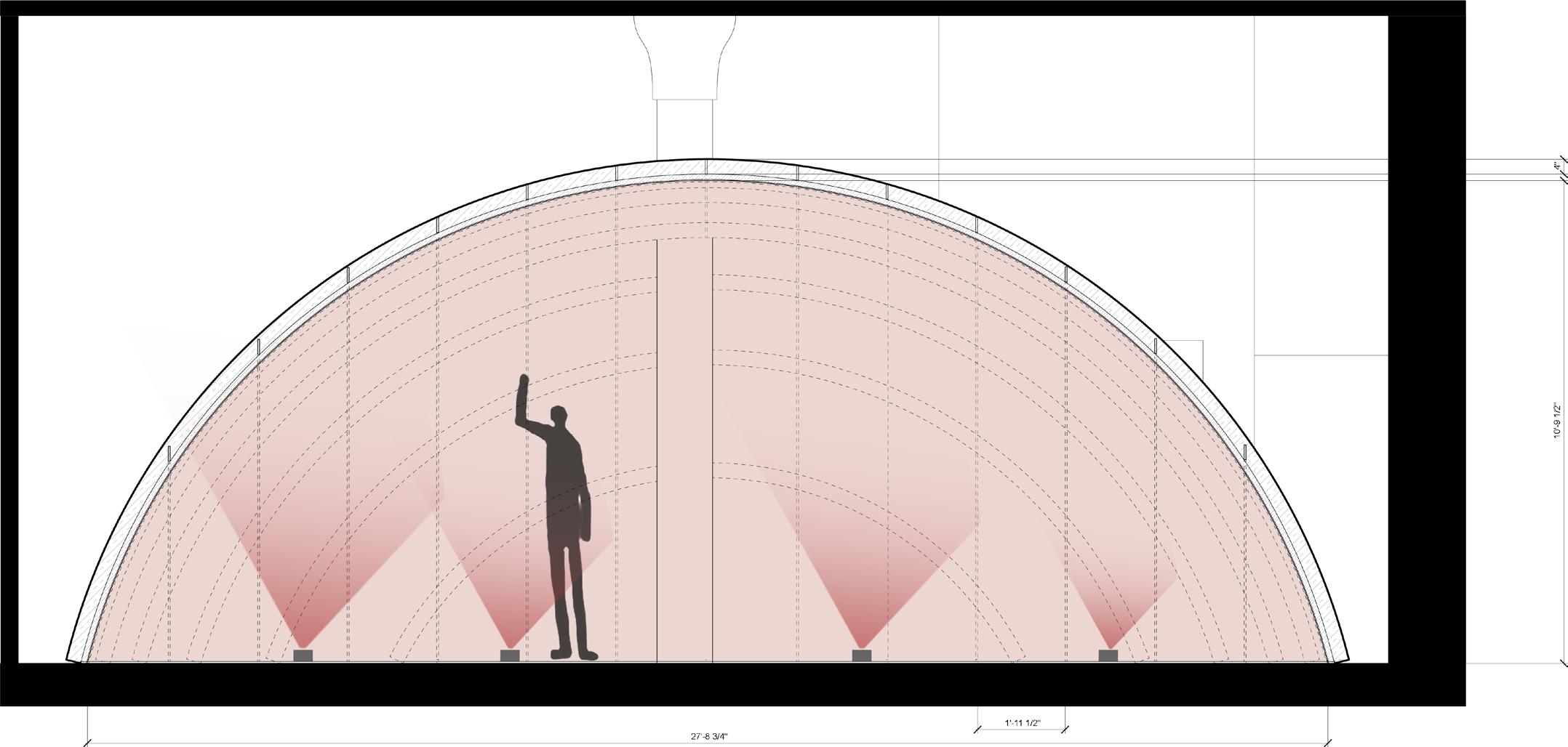
Storyline 3 is a neutral storyline without a turn point or climax, I use a hemisphere space to show the panels.
The projector will be put on the ground, the shadows of visitors will also be parts of the illusion in this experience.
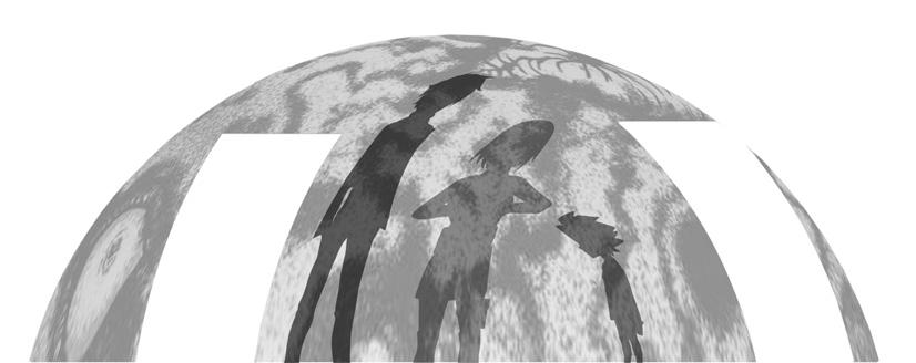
Turn points on Triangular Prism
Climax
The climax will be projected in a space consisting of a curvature wall as a reflection with turn points part.






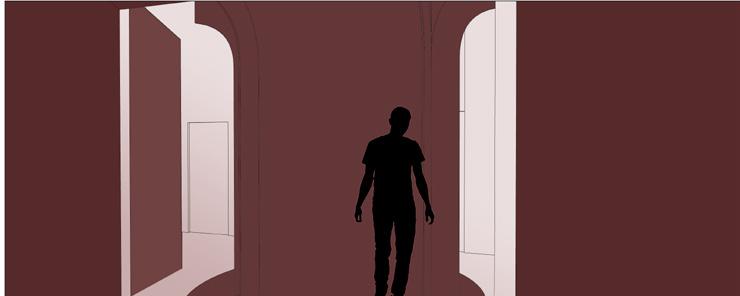
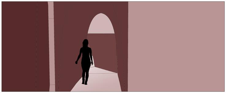

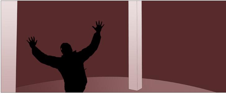
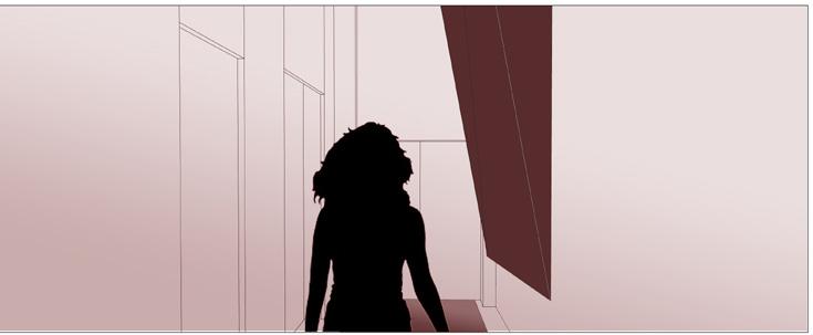


Video Animation Link: https://vimeo.com/760141036
The Hirshhorn Museum and Sculpture Garden is a museum of contemporary art in Washington DC. It's a heritage building in American history, but it's threatened due to its architectural defects. This project aims to solve these issues by intervention. However, since it's still a heritage building, the existing condition cannot be influenced a lot. What can do?
only solve the problem but also illustrate the motion or activities of visitors at these places. In this case I could solve these issues but leave the original building intact. I make an animation to record these three phases: existing condition, brainstorming intervention and realization.
To do that, first of all I would find out the main issues of this museum. To solve them, I would brainstorm to realize these interventions regardless of the existing restrictions. At the end I would realize these interventions with minimal constructions and digital projections which happens at night and leads people to get into an experience different from the original one. The experience would not
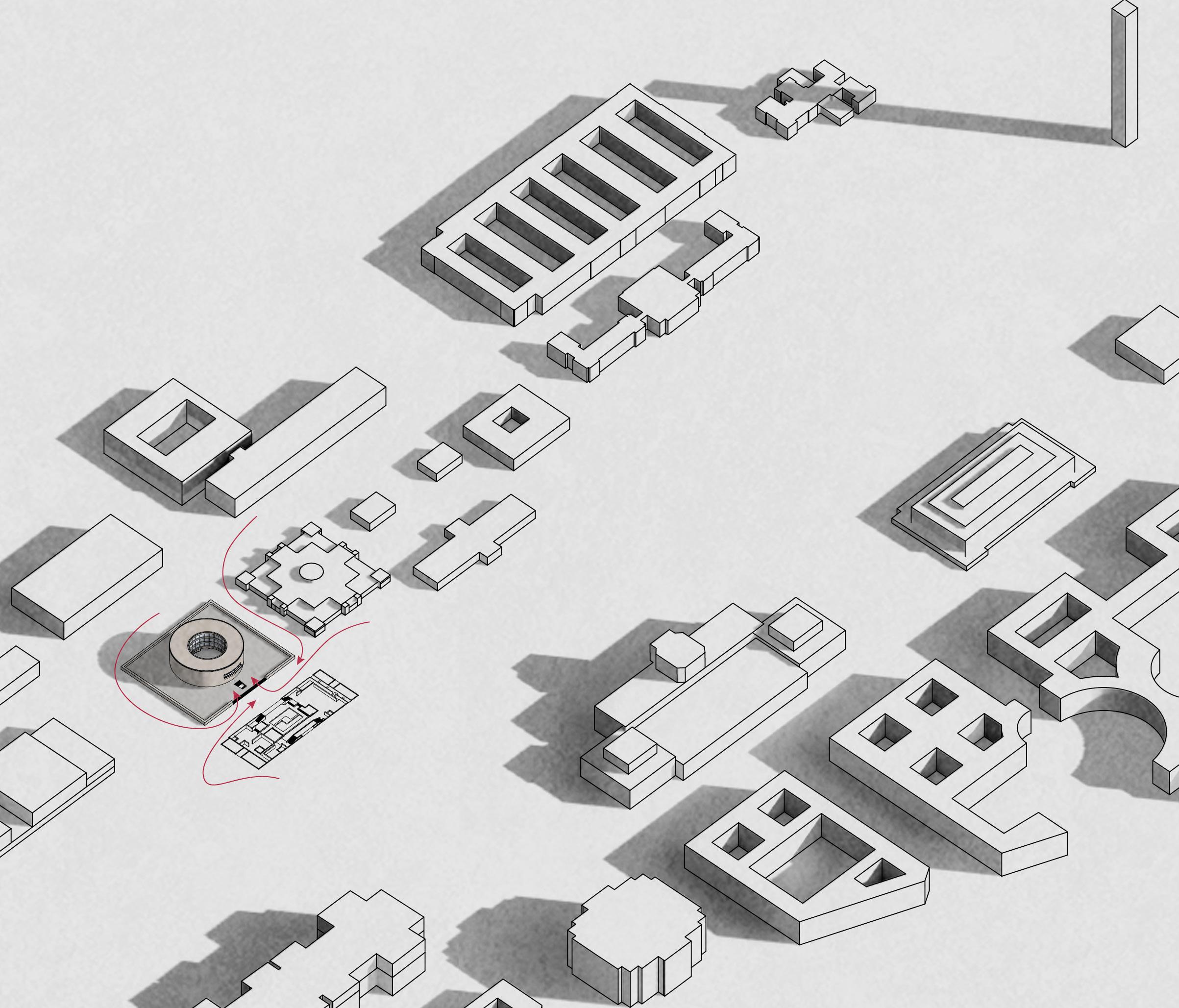
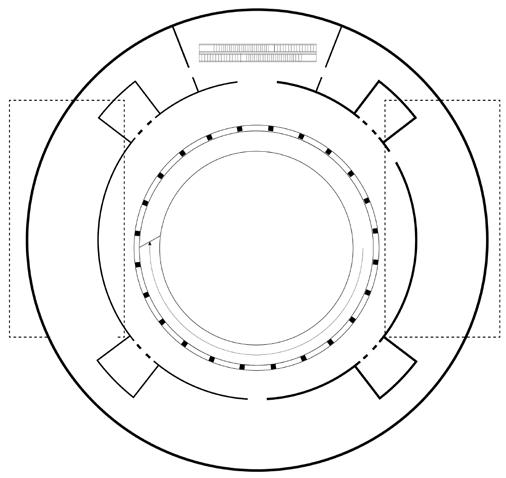
The Hirshhorn Museum and Sculpture Garden is an art museum beside the National Mall, in Washington, D.C. The museum was initially built for the permanent art collection of Joseph H. Hirshhorn. It was designed by architect Gordon Bunshaft and is part of the Smithsonian Institution.
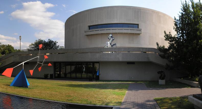
After Hirshorn's death in 1981, exhibitions broadened to include diverse contemporary artworks.
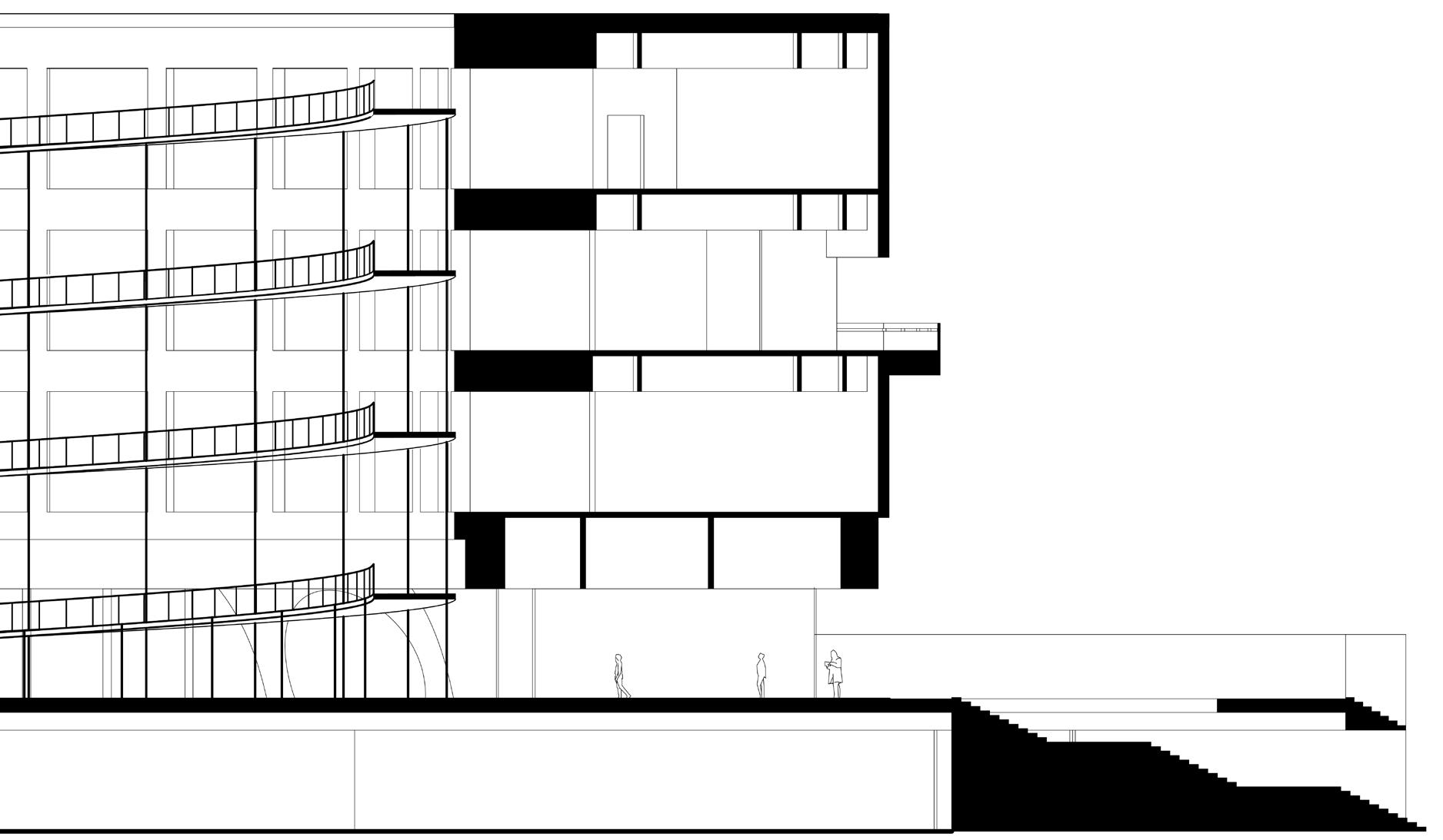
The building itself is an attraction, an open cylinder elevated on four massive "legs." However, the building is threatened nowadays due to its existing problems.

The waffle structures on the base are essential structures to support the entire building. They are exposed outside and form the symbolic structural icons of the museum, which would be used for my intervention.
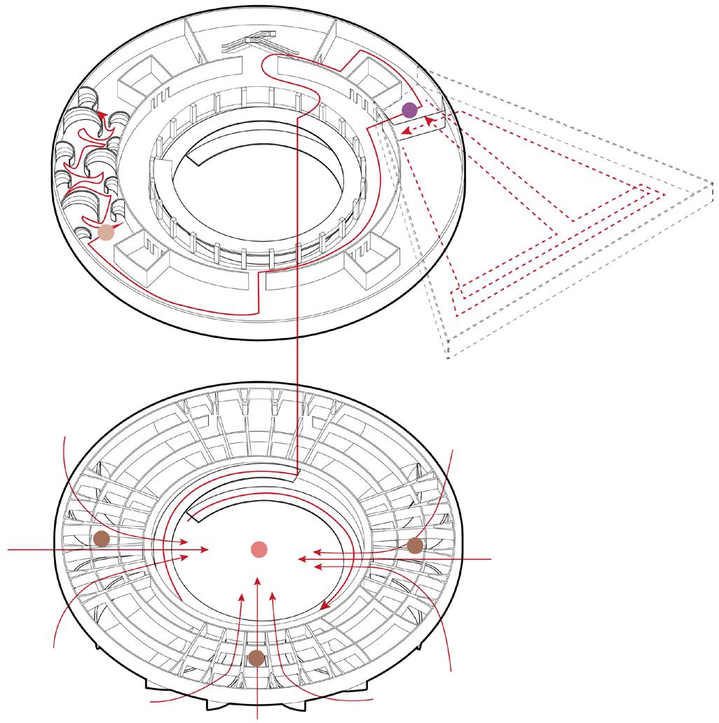
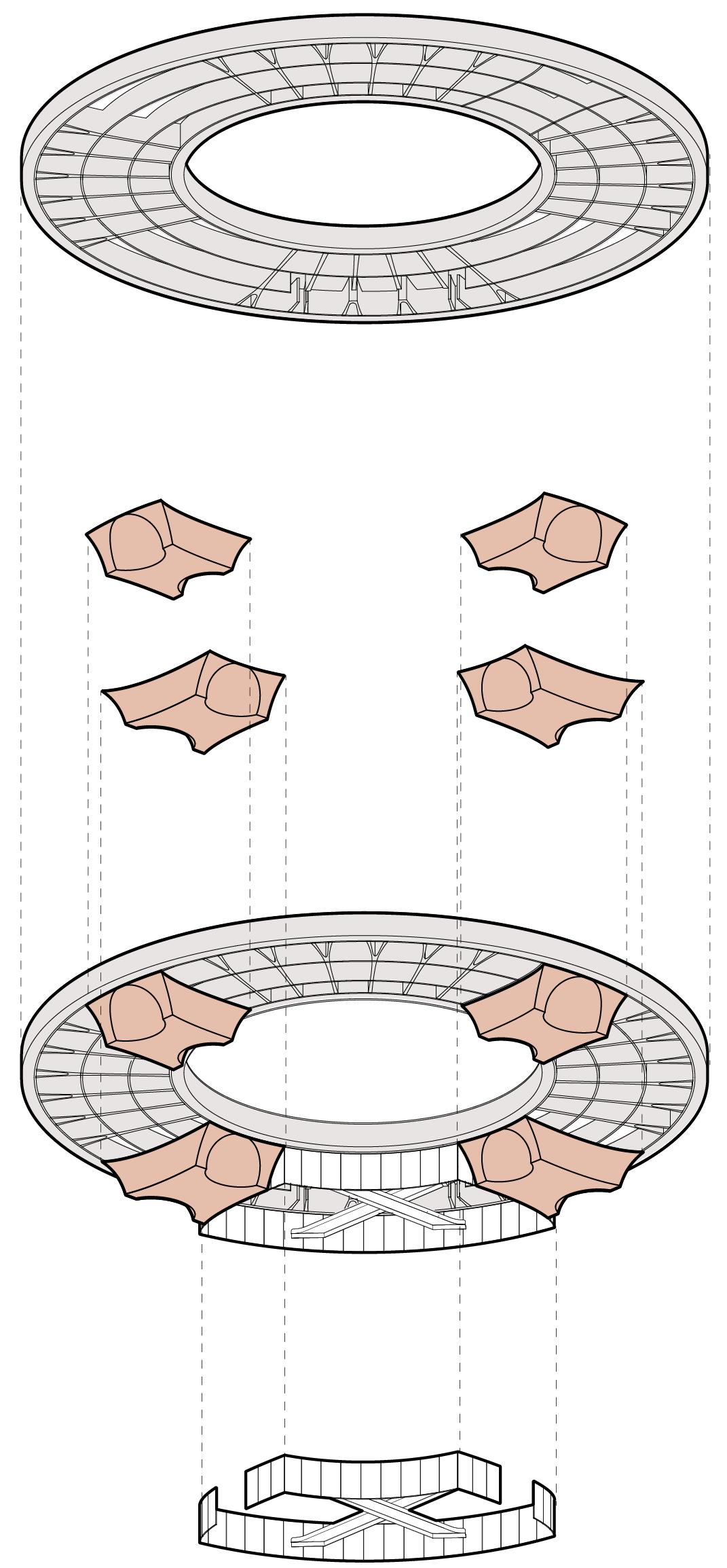
This transformation aims to balance the Hirshhorn area and the public area. created a series of entrances to give an indication to visitors that they are transitioning from public space to the exhibition area of Hirshhorn Museum.


Since the building is floating in the air, it is totally free for people who visit the National Mall to go through the courtyard of Hirshhorn. The boundary between the Hirshhorn area and the public area is not clear enough. However, the courtyard is usually used as an exhibition space. In this case, the collections there are more likely to be damaged, intentionally or unintentionally, due to their exposure.


After
The structure of the base waffle panel has the centripetal characteristic which can be exaggerated to form the entrance.


Besides serving as the entrance, the walls of 3 sides would also be used as a gallery to exhibit the "Circle of Animals' to increase more exterior exhibition experience. Then use the same material as the existing waffle to imitate the extruded parts and put an array of projectors on the ground which follow the shape of the walls to create the projection which shows the motion graphics here.


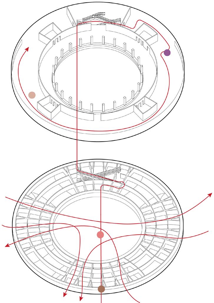
Since the museum is very enclosed, this transformation aims to bring more connection between interior and exterior physically. focus on the French windows in the courtyard so that the exterior windowless wall should remain intact. I change the facade into a continuous spiral and create a spiral ramp alongside it. The ramp rises from the ground so that visitors can go up and enter through the windows.


Besides using escalators on the ground floor, people can also go up through the ramp.
The exterior facade of the museum is a giant concrete wall with no windows, which supports the entire structure. So it can be a giant sceen for digital artworks. However in this case the museum is very enclosed. The only connection to the exterior space is the balcony on the third floor. It's the only exterior moment of the entire museum experience.


After
Visitors enter the museum through the doors transformed from the French windows and continue the interior experience.
After the interior experience, visitors will go back to where they entered, they can choose to go to the next floor either by escalator or through ramp.


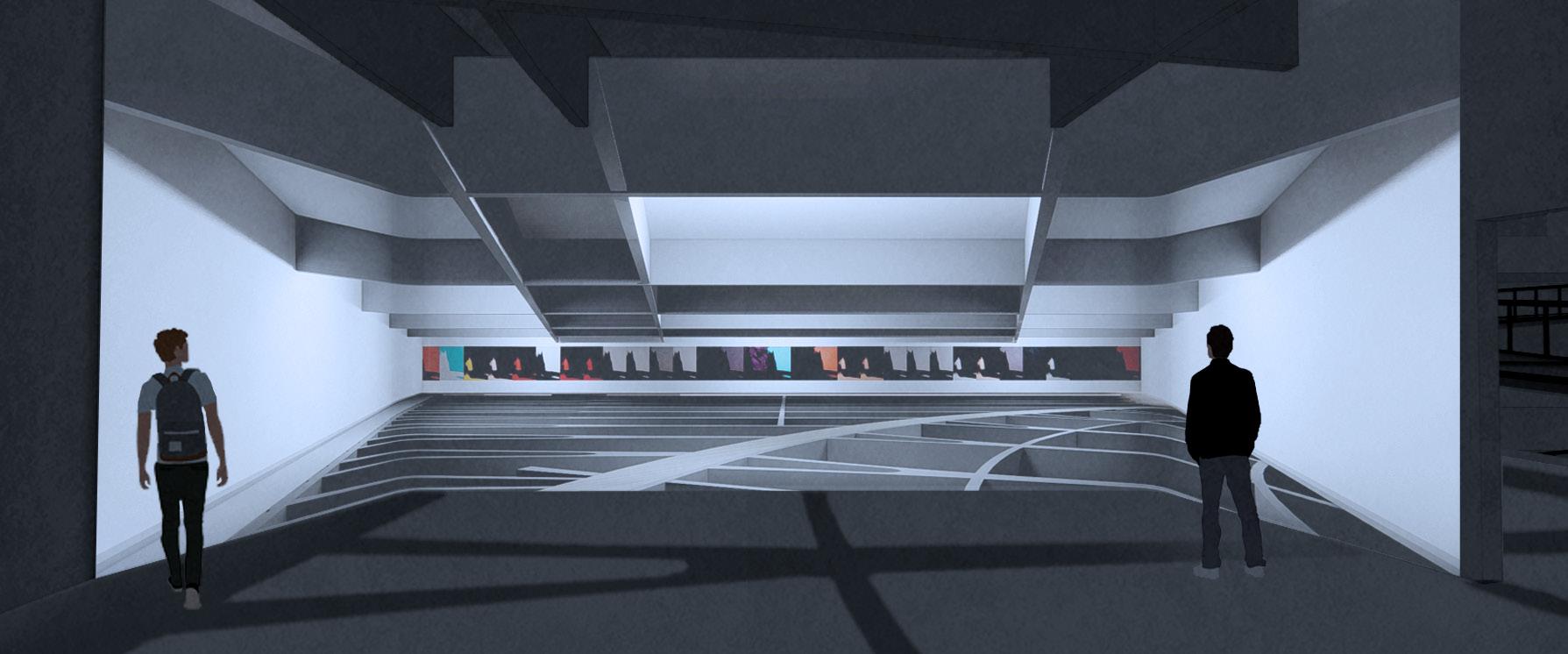
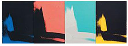
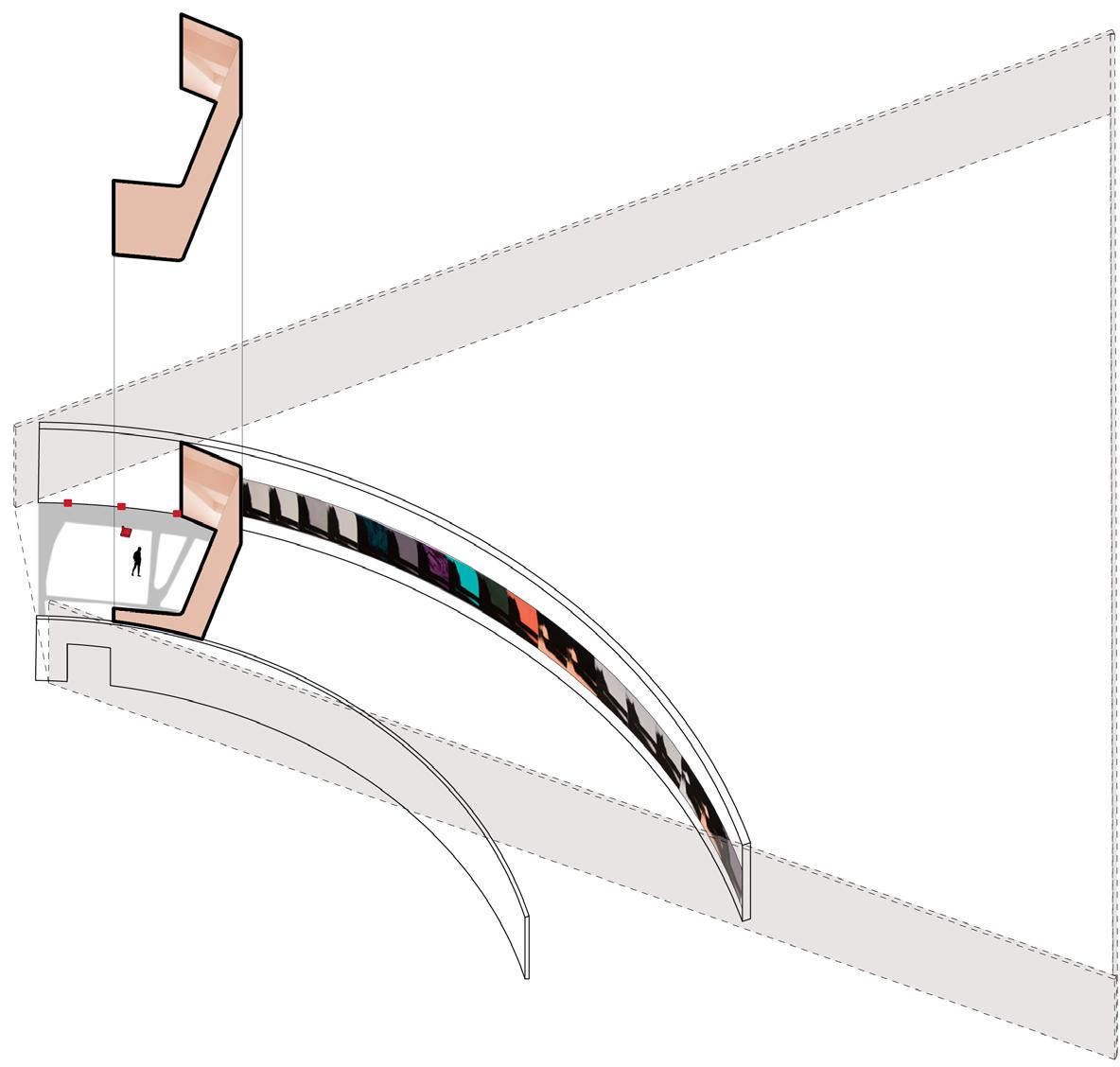
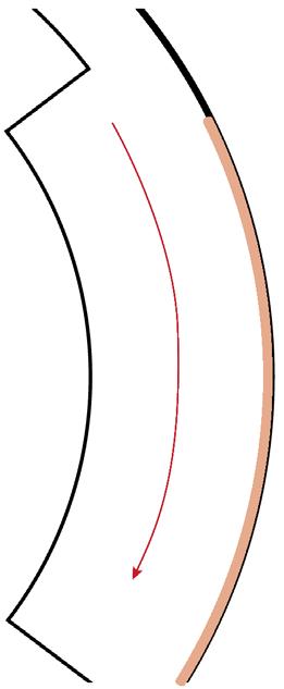
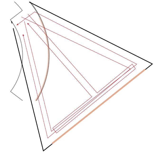
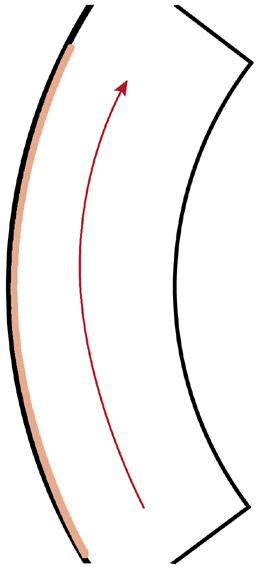
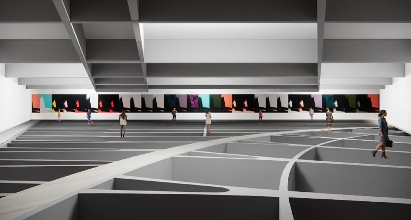
To advance exhibition experience, instead of only seeing the artworks in a perspective view, the perspective effect can also be eliminated so that visitors can face the entire piece to have a better understanding of continuous artworks like the "Shadows" of Andy Warhol. Transforming the corridor into a triangular shape would eliminate the perspective. For interior experience, the waffle base would be revealed to indicate the inspiration for the intervention (based on the structure).
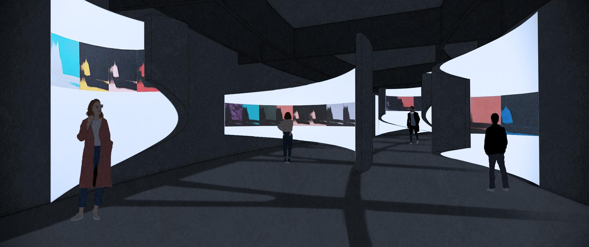
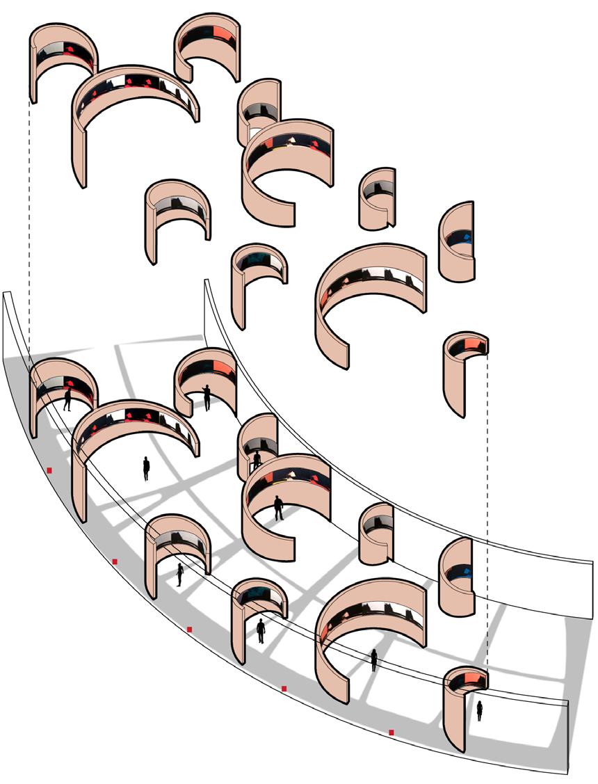
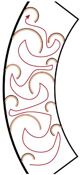
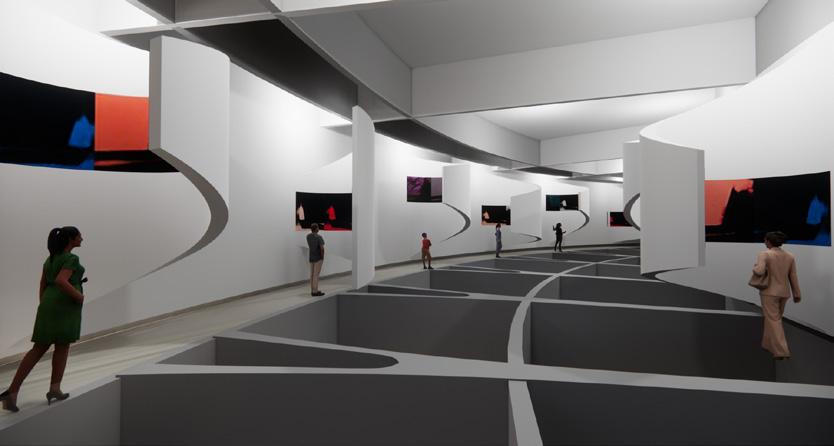
Individual Besides seeing the artworks generally, the continuous artworks can also be watched individually so that visitors can weave the entire piece in their mind with the accumulation of experience. By attaching curved space dividers to the walls and applying artworks to them, it could form an anamorphic image which can force people to concentrate on their focal point when watching them individually.
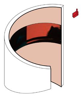

The wall on the second floor of the museum is a continuous ring shape structure, which can be ideal for continuous artworks, but it would be monotonous if the experience is always intact like this. The experience needs some improvement to make it more attractive to visitors.


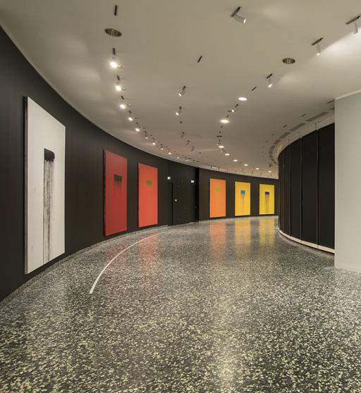

For this collaborative project, I worked with two curators from Brown University. It's a design proposal for an Irish Famine Memorial located in Providence. I carried out the design based on their curatorial proposal, and they gave me feedback to improve it. The project exposed me to dynamics of professional practice and working within a team.
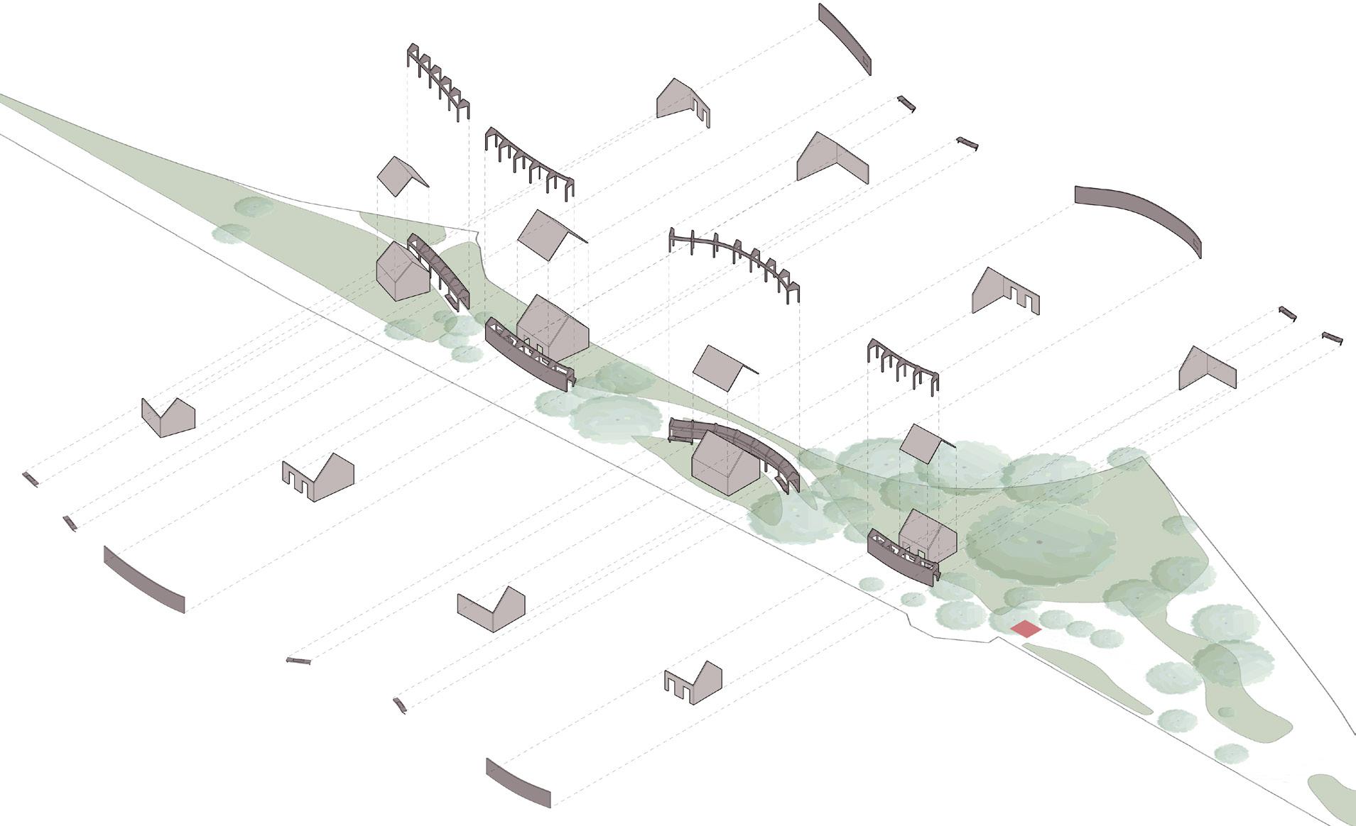
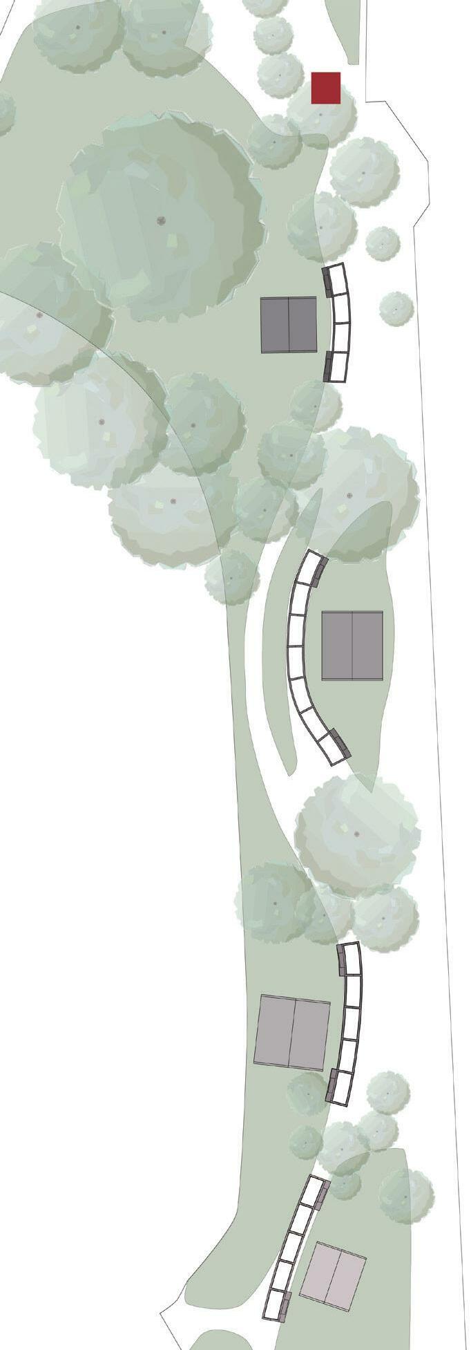
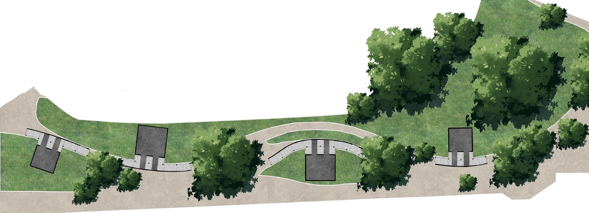
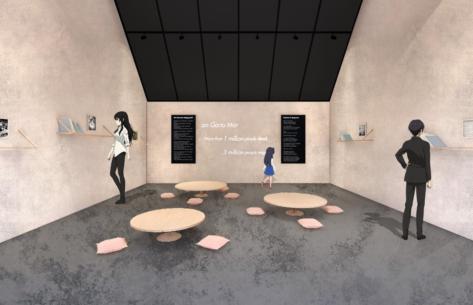
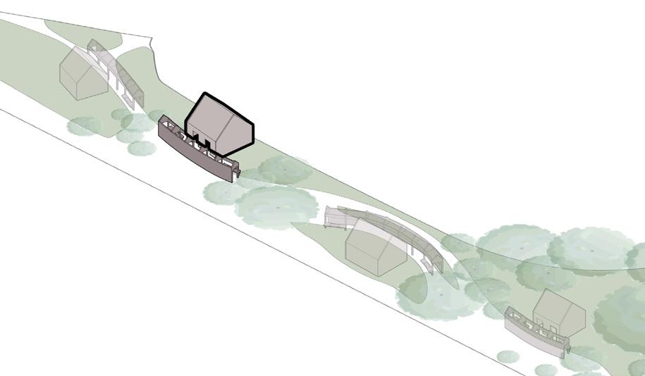
The memorial consists of two parts: corridors and pavilions. The corridors feature reconstructed models of various Irish Famine memorials from around the world in order to compare their intent and execution. We also consider different mediums of remembrance within our the pavilions, which are categorized as: video art, sculpture, and poetry. The Providence memorial was established by
the Irish community living in Rhode Island, therefore we considered collaboration with Irish descendants to be essential. Given the difficulties resulting from the pandemic, we were not able to contact Newport Irish museum facility or others in the community in reality. However, the theoretical side of the exhibition would contain greater contact with the descendants of the Famine.
visitor flow
visitor flow corridors


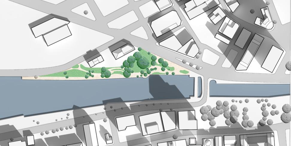
Plan
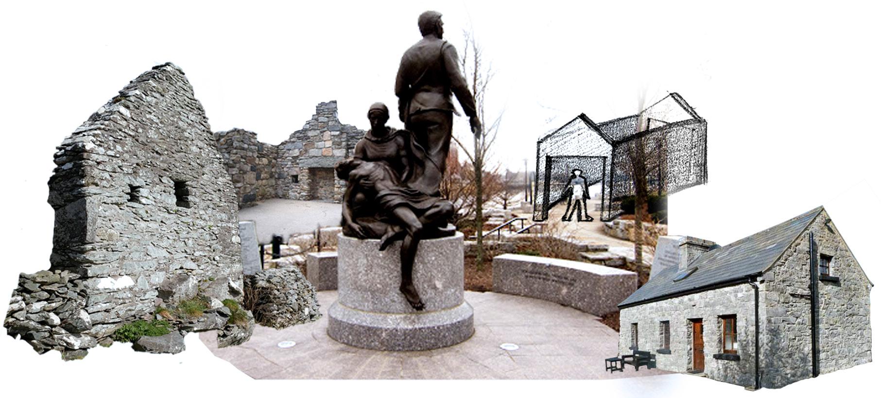
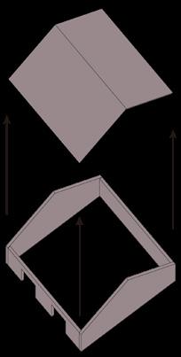
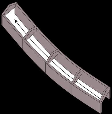
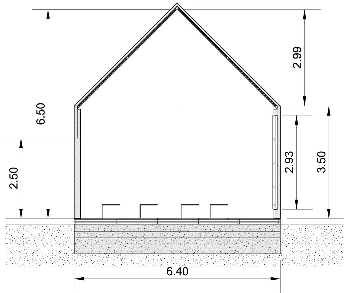
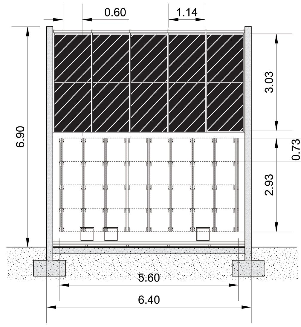
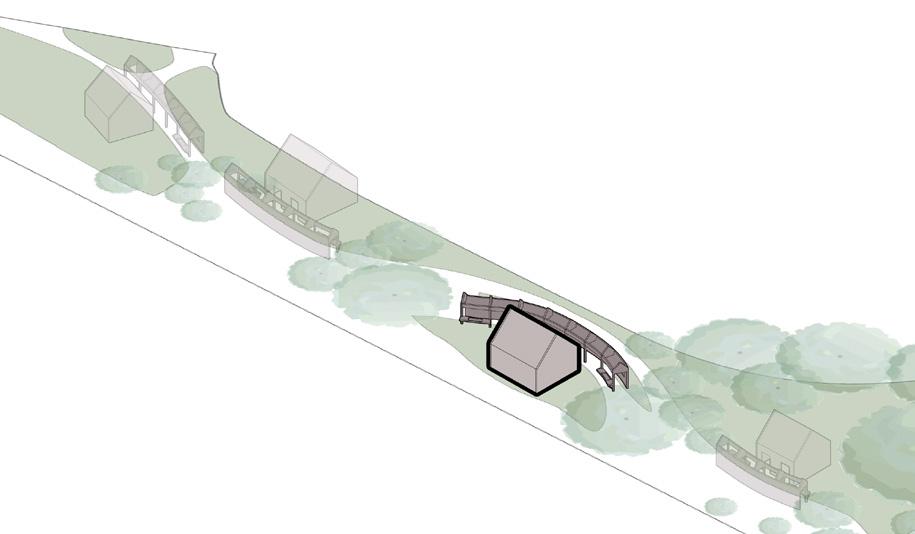
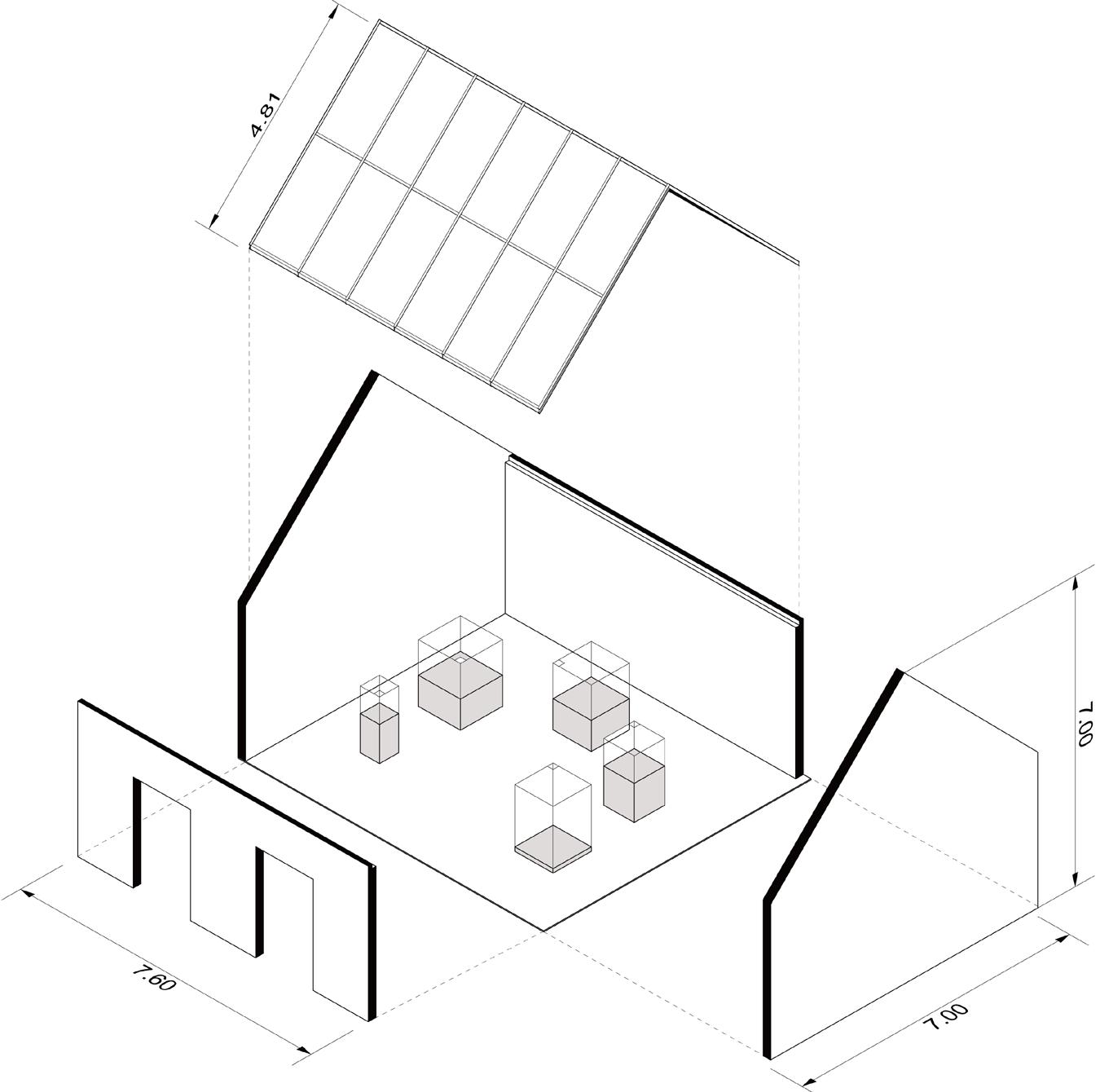
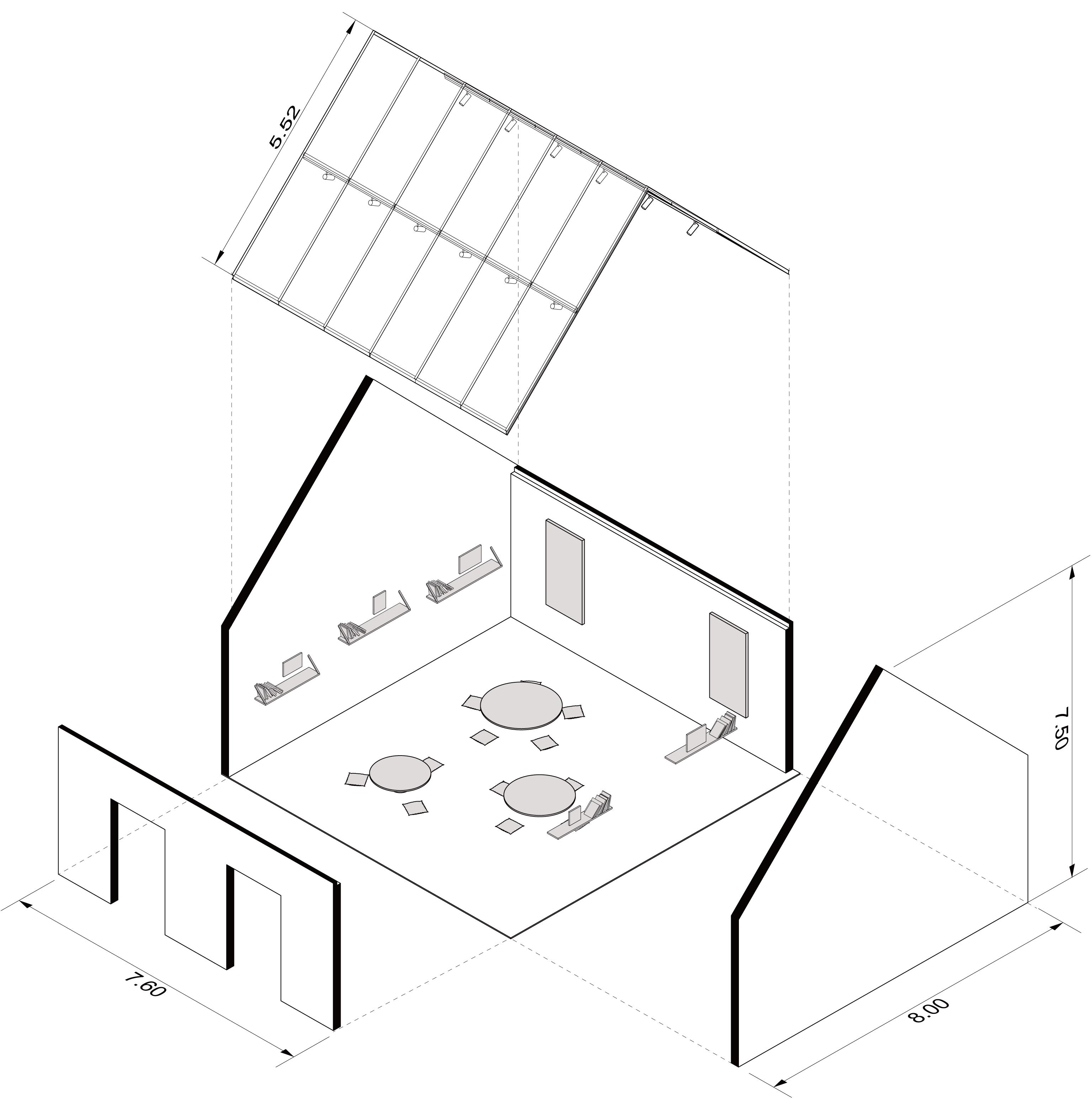
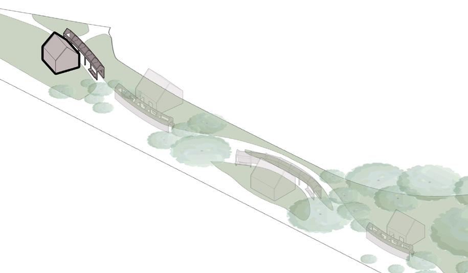
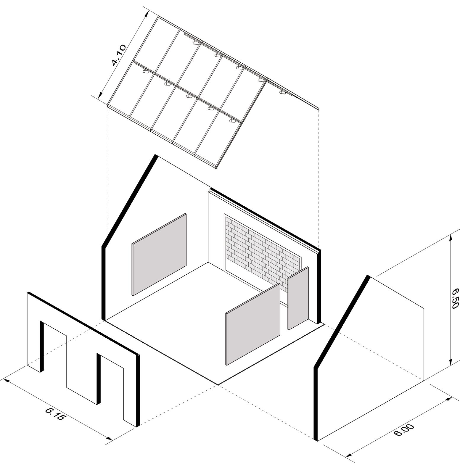
The memorial would consist of 4 sections, each section consisting of 1 corridor and 1 pavilion In this case, would like to create an initial prototype of the memorial. The concept comes from the Irish cottage, which typically use stones as material. In this project I will apply concrete in different forms to the corridors and pavilions.

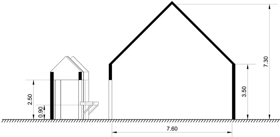
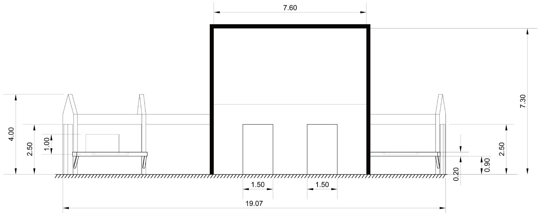
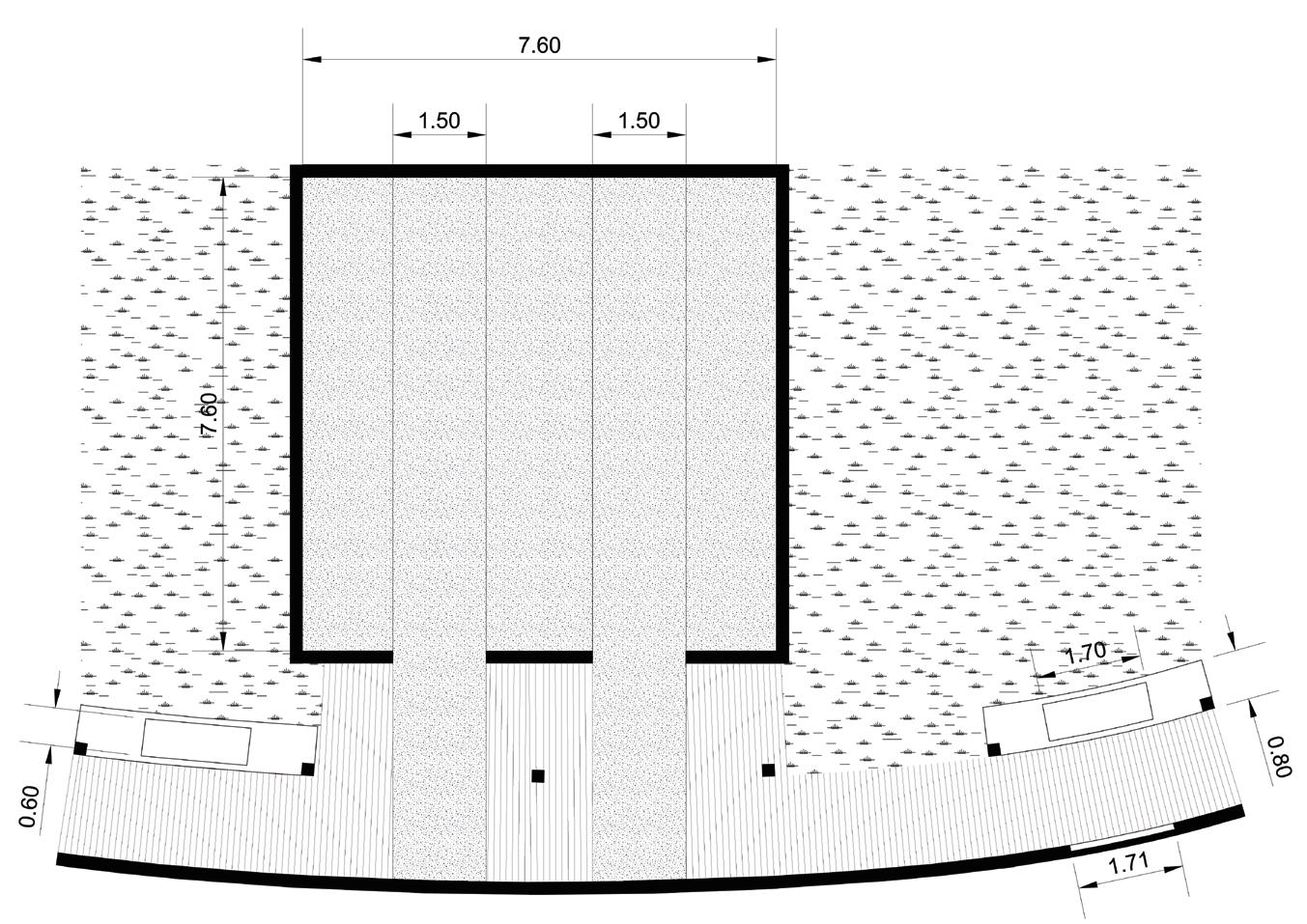
Unit: Meter
Section A Section B
Section B
Section A
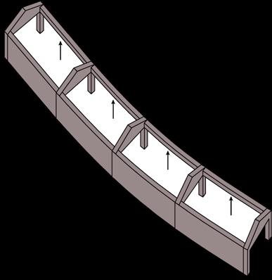
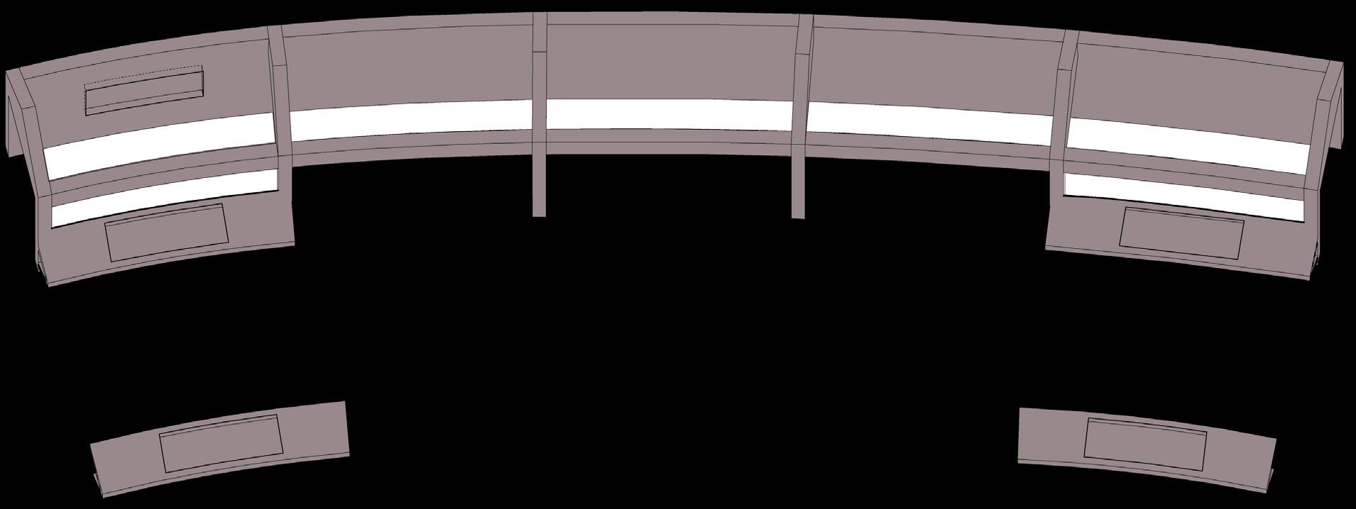
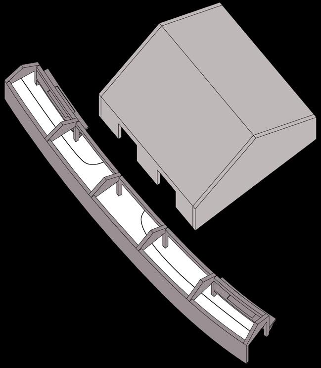


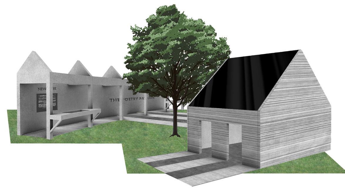
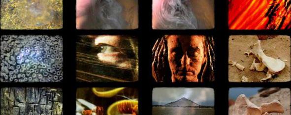

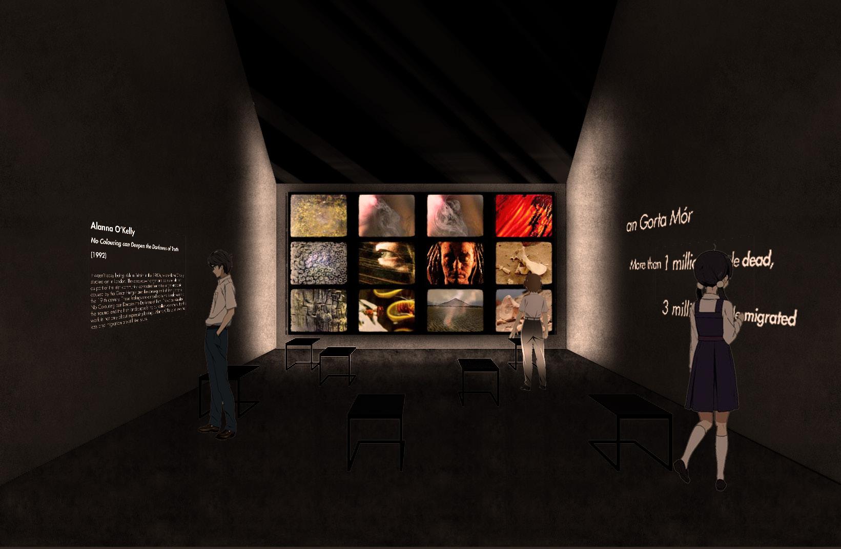
The pavilion presents the work of Alanna O’ Kelley not only as the most representative work of video art on the Great Famine but also as a medium of remembrance. In this work, the artist narrates the story of the Great Famine through a compilation of colorful images of Irish landscapes, female voices singing Famine, and recitation of Irish toponyms, which ignite collective memory.
In this pavilion, the visitors have the opportunity to familiarize themselves with the work of Alanna O’ Kelley and share feelings of anger and trauma with her and their community.
Object no.2
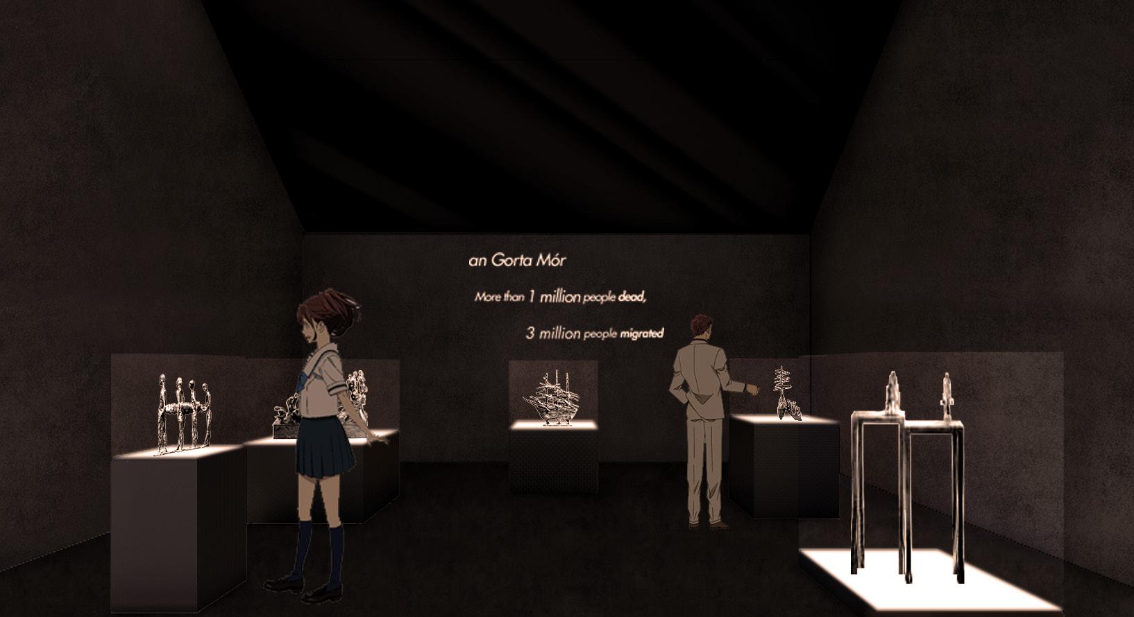
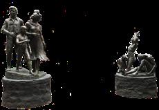
The second section of the exhibition continues narrating the story of the Great Hunger and Irish immigration. How did they reach these lands? In what conditions did they leave and travel ? How was it when they came ashore? Both the New York Hunger Memorial and the sculptures aim to evoke all these questions from the visitor and also, give some answers. Even though sculptures as a medium use the visual, the embodiment of the figures and the representation of the human emotions transverse the visual once the visitor engages with them.
Object no.4


Object no.5


Object no.7 Object no.8
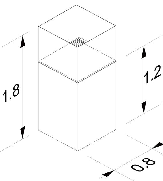
Object no.6 Led Details of Vitrine Led Base of Vitrine
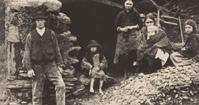
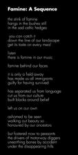
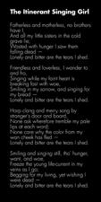
Irish immigration has had already started from the beginnings of the 19th century. However, during and after the years of the Great Hunger, the number of Irish immigrants in the United States reached its peak. Nevertheless, the commemoration of the Great Hunger and the consequent immigration did not begin until the late 20th century. There are a number of reasons for this phenomenon, which are beyond the scope of this short introduction. The fact is that the Irish Community of the USA felt that they could share their trauma after the 1990s. A wealth of memorials, exhibitions, art performances and other works of art narrated the stories, evoked memories, sang the trauma and initiated healing. This section is dedicated to this process, by exhibiting one of the larger memorials and presenting a medium which is so much beloved by Irish people; poetry and singing.

Object no.14
Object no.13
Object no.12
Object no.15
Object no.16

Object no.10
Object no.11


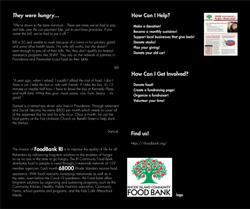
The last section of the exhibition focuses on the present. The RI Irish Famine Memorial is connected with the current community. Famine and struggling for healthy nutrition or finding a purpose in a new country is still a main issue of the present society. Therefore, this section aims in making visitors conscious of the fact that famine and being a refugee is not a problem of the past, but rather a very vivid one.

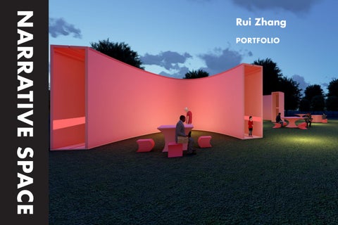
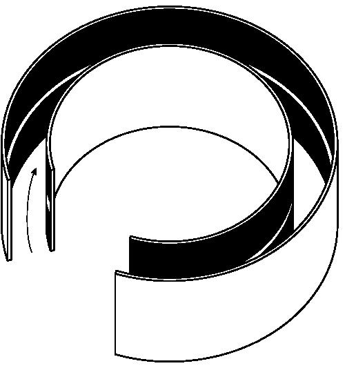
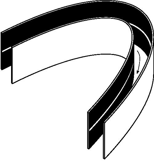
As we know, the light beam could be regarded as linear transmission, but what if we could twist it like a strip? Located in a pavilion in the Serpentine Gallery in London, this project aims allow people to see twisty light with the help of the motion of the sun. The effect is achieved by using a curved wall. When a beam is cast on the wall it will become twisted. In this case, light can play the role not only as a "performer", but also as a leader for visitors in the dark space. The curved walls will form very narrow corridors to make it challenging for people to move forward in this space so they will be rushed to find a way out Meanwhile, to balance the interior and exterior of the pavilion, I created some seats and tables which were inspired from
the shapes of pavilions. I use pink as the main tone of this pavilion to release people from disquiet when crossing it. I simplify the sunlight patterns left on the wall during the day and use led strips to create the similar pattern and apply it on the wall and illuminate the corridor at night.


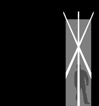
bevel slot for sunlight at noon



To provide visitors with places to sit, along with attempting to balance the interior and exterior of the pavilion, created some seats and tables which were inspired from the shapes of the pavilions.
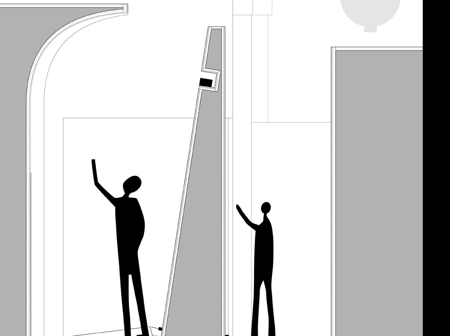
The edge of the cover and the wall are chopped to form a slot to allow sunlight to penetrate and be cast on the wall.
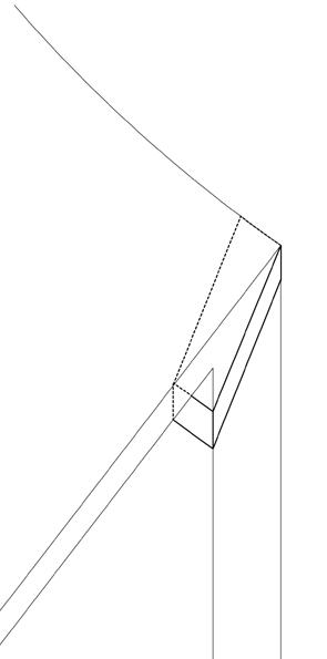
How does cover connect with walls.






Psychologically, pink is a color that can make people feel more relaxed in this disquieting environment.


I simplified the complex sunlight patterns left on the wall during the day and used led strips to create a similar pattern and apply it on the wall in order to illuminate the corridor at night.


Waste recycling is a recurring problem for the public. This project aims to solve these problems by inventing an urban exhibition system to educate the public about recycling. One of the strengths of this exhibition system is that it would be combined with local programs and activities around the area. In this case the project would be interactive so that people would feel more engaged in it.
activities in this zone. There would be 3 types of exhibition systems: exhibitions in tandem with outdoor dining, schools and retail shops.
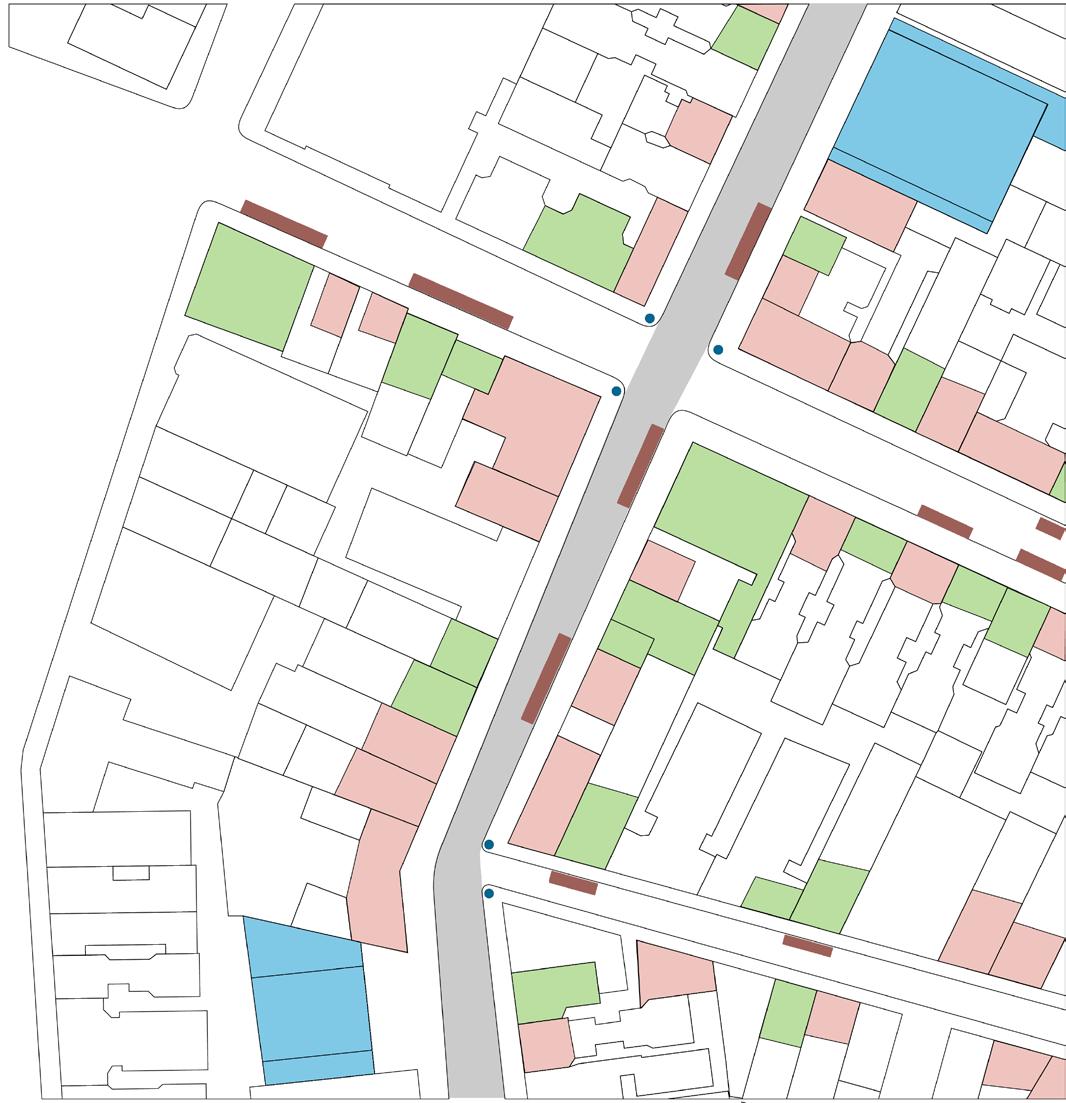
Mott Street is a commercial area in Chinatown. This busy area produces high quantities of waste on a daily basis. It contains all the typical activities including restaurants, retail shops and schools. For this reason, I chose Mott Street to be the experimental place for this exhibition system, which can combine with the
Mott Street is located in Chinatown, as seen in the gray region of the above map. This busy area has all the typical activities. chose this location to be the experimental place for this exhibition system, which can combine with the activities here.
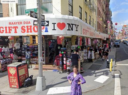
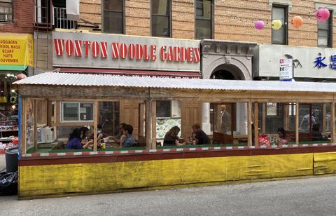
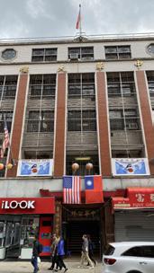

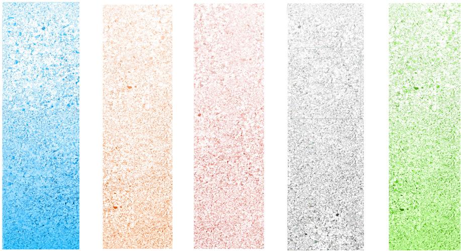

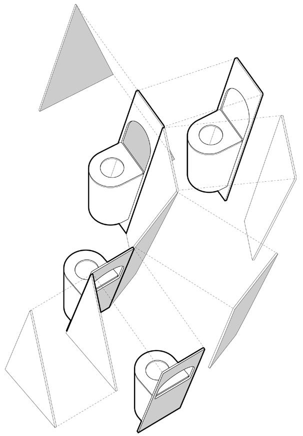
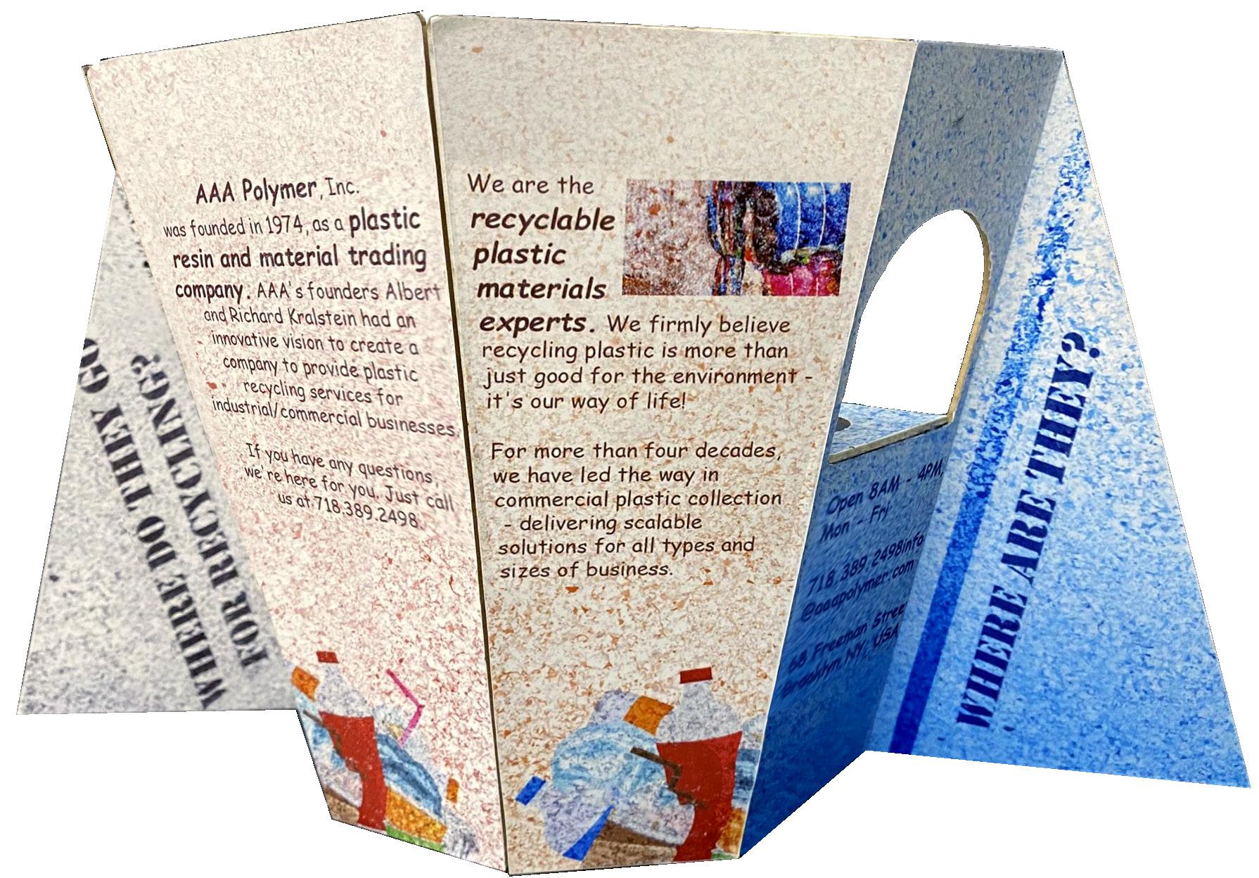
This experimental site is rich in Chinese culture. In this case, the concept comes from Chinese screen panels. These are easy to fold, assemble and transfer to any retail shops or restaurants in, or even outside, Chinatown.
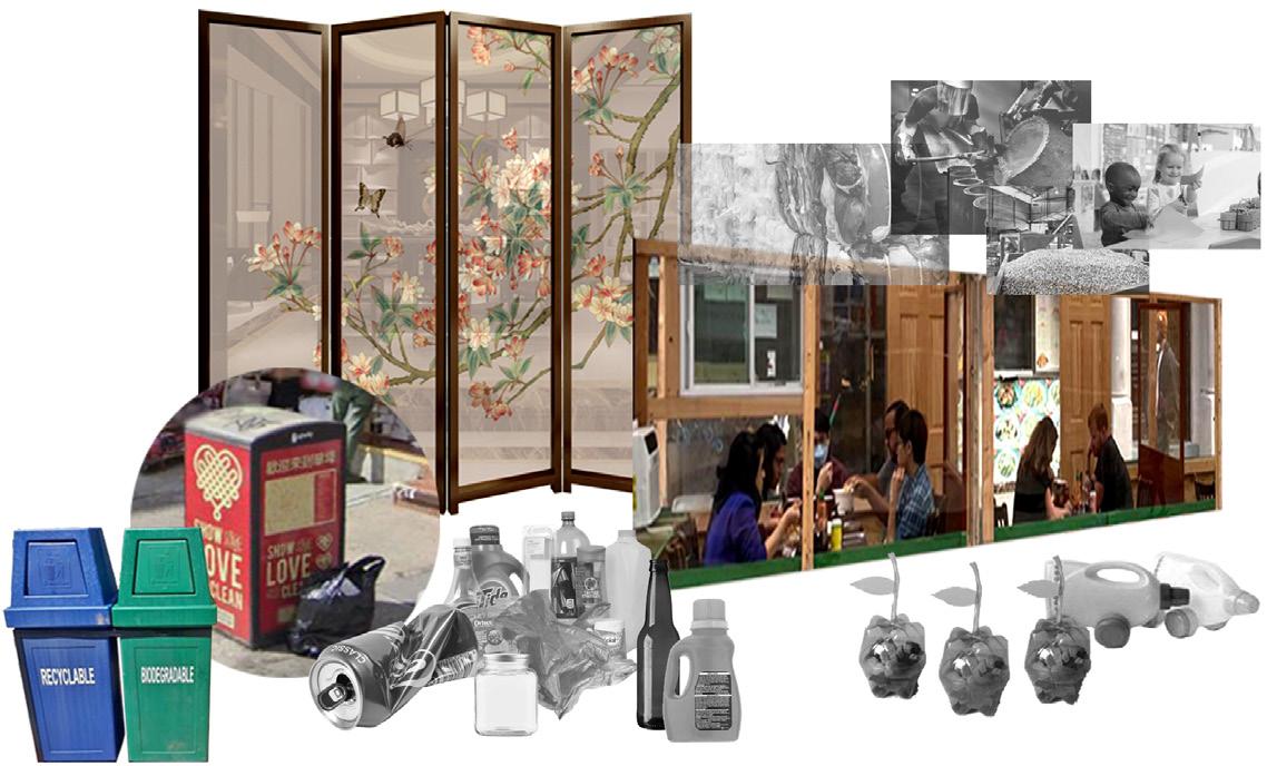

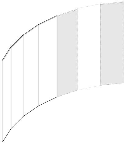
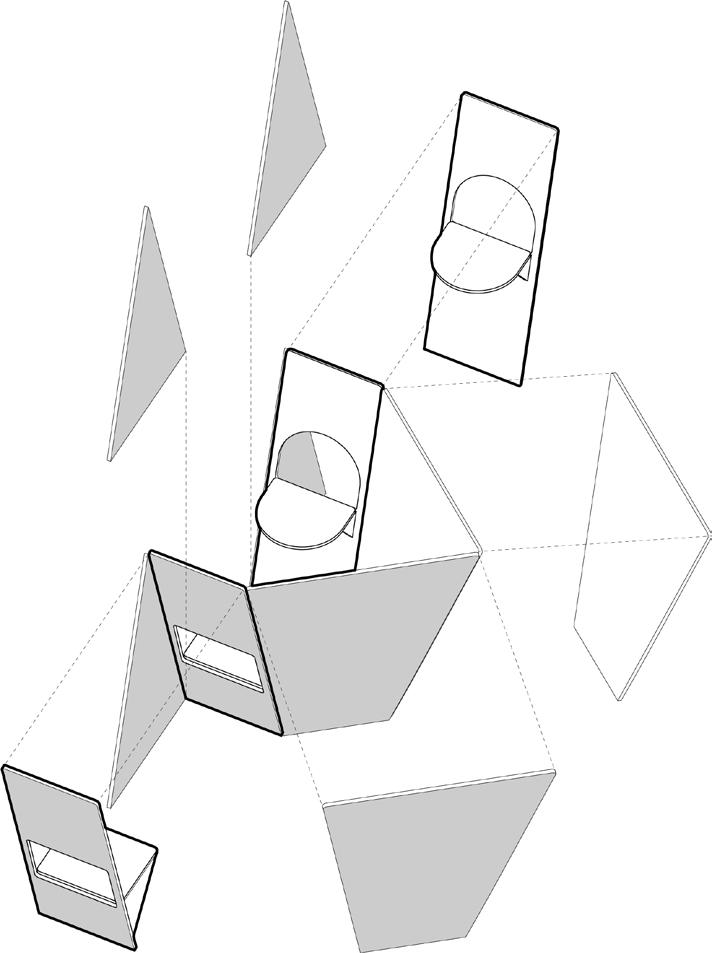
1. The general structures would be connected by these panels piece by piece.
2. These panels would be inclined for stability, and have window cut-outs for different functions.
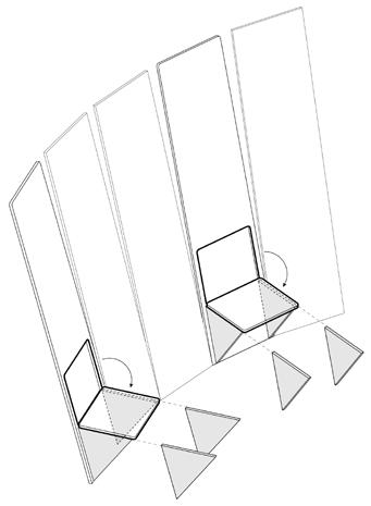
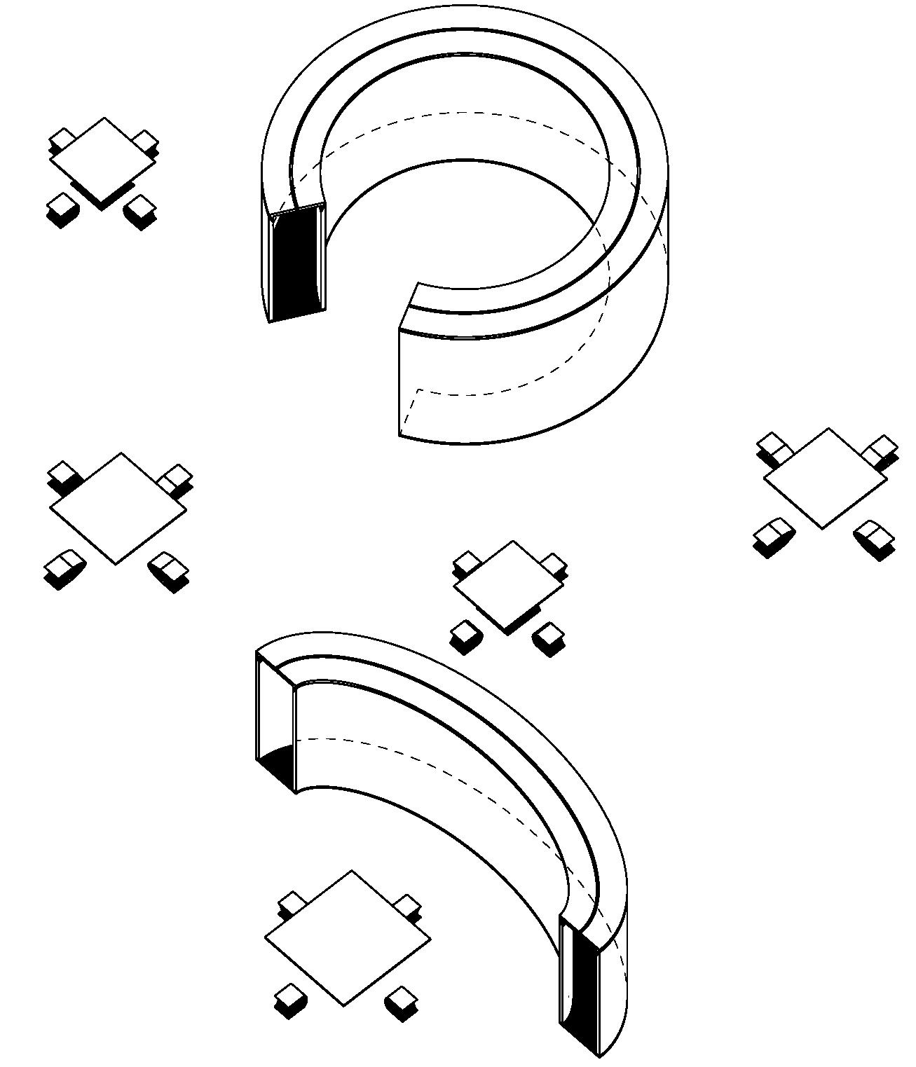
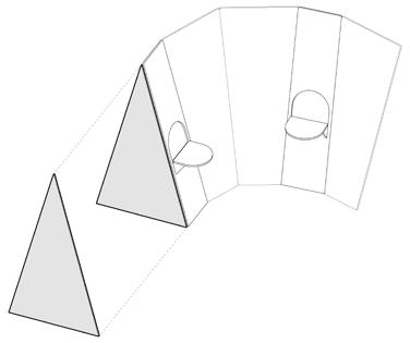
3. These semicircle shelves would serve as showcases or dining tables.
The material comes from the recycled plastic panels below. used the colors from the New York Recycle System, and some colors from the plastic chips on the board to unify them to different tones.

4. These semicircle shelves would be the top of trash bins

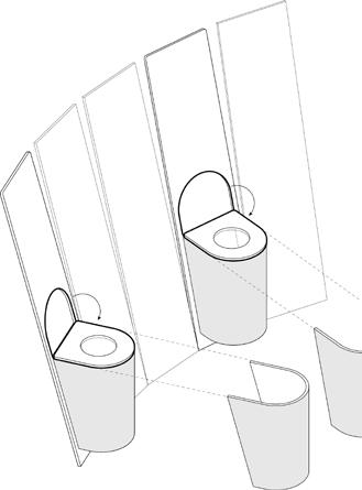
5. These semicircle shelves function as chairs, which can combine with dining tables.
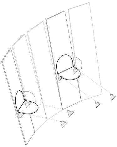
6. The shape of some panels can be changed to seal the slits between them.
7. A vertical triangle panel can be fixed on the ground to stabilize the rest of the panels.
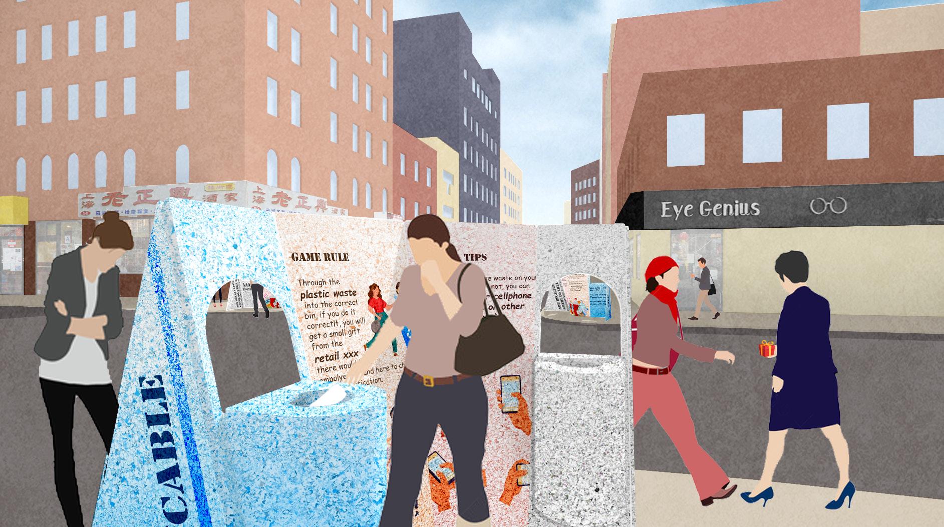
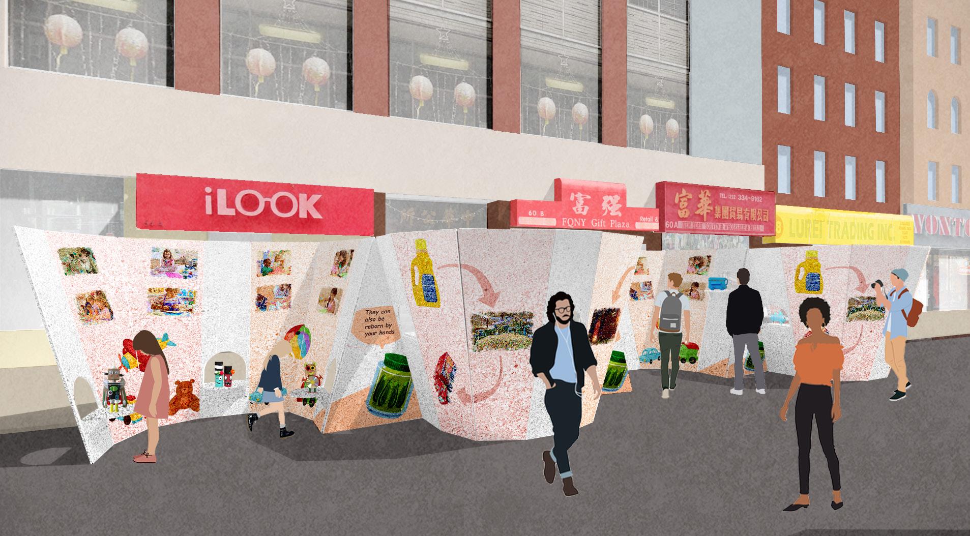
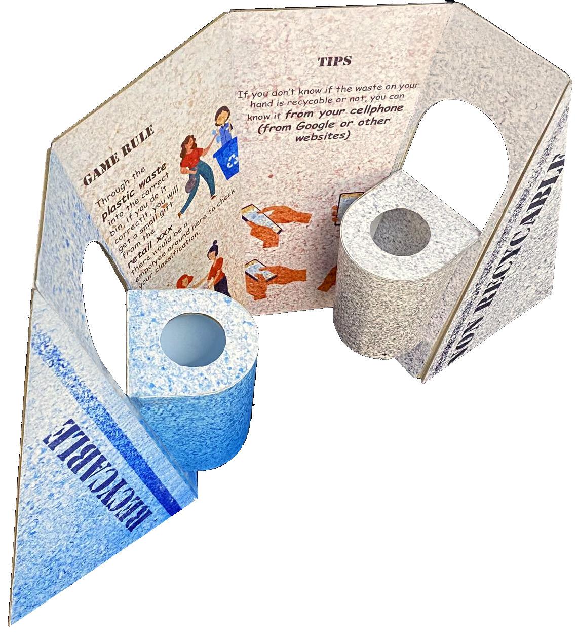
This section will interact with both retail stores and trash bins around the area. It contains 3 types of waste recycling trash bins including plastic, metal and paper. Visitors would practice classifying the wastes by hand, and they would receive gifts from the retailers if they do so correctly. If they are unsure whether or not something is recyclable, they can search it up. There would be also be an employee around to help facilitate this.
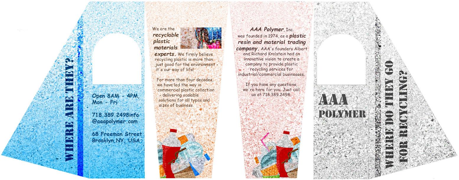
Included on the backside is Information about where these recyclable wastes go after being thrown to different trash bins.

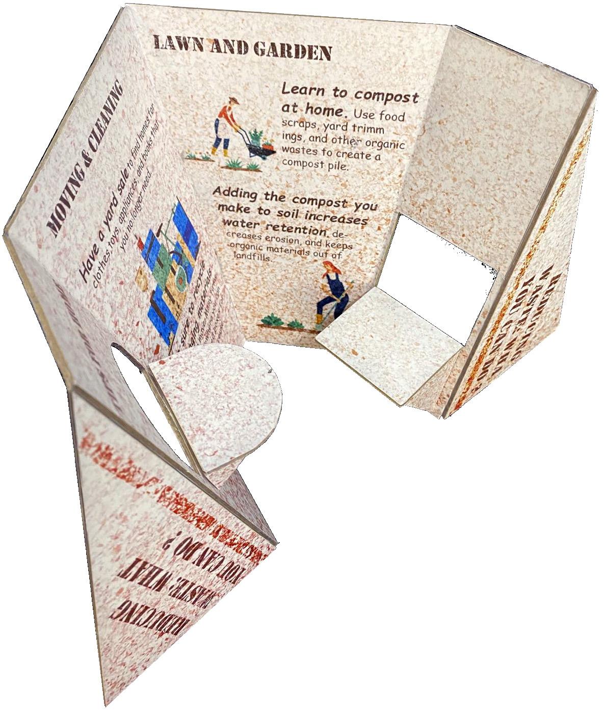
This section will interact with the outdoor dining experience. From the Dining Side, it will be seen by the people who are eating there and it shows tips about how to reduce waste in different places including at home, school, on holiday, in the work place, and in their community.
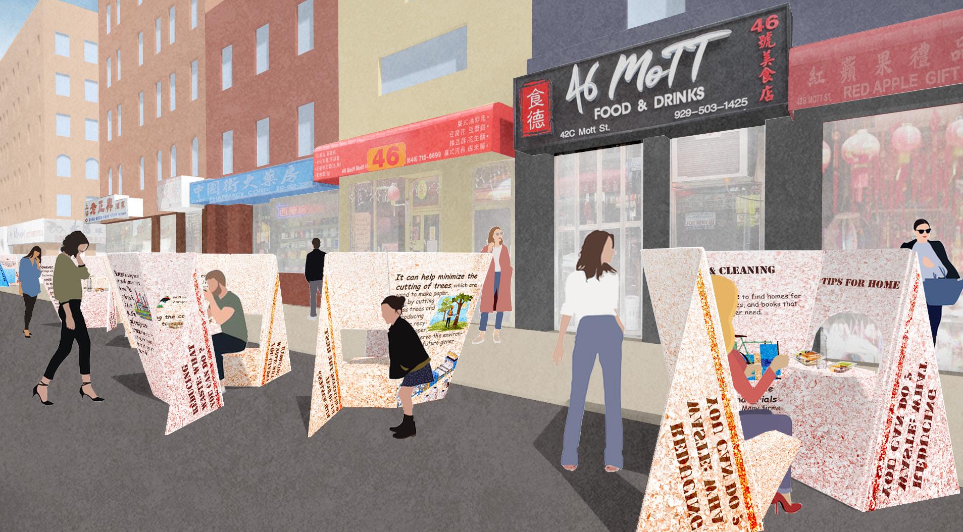
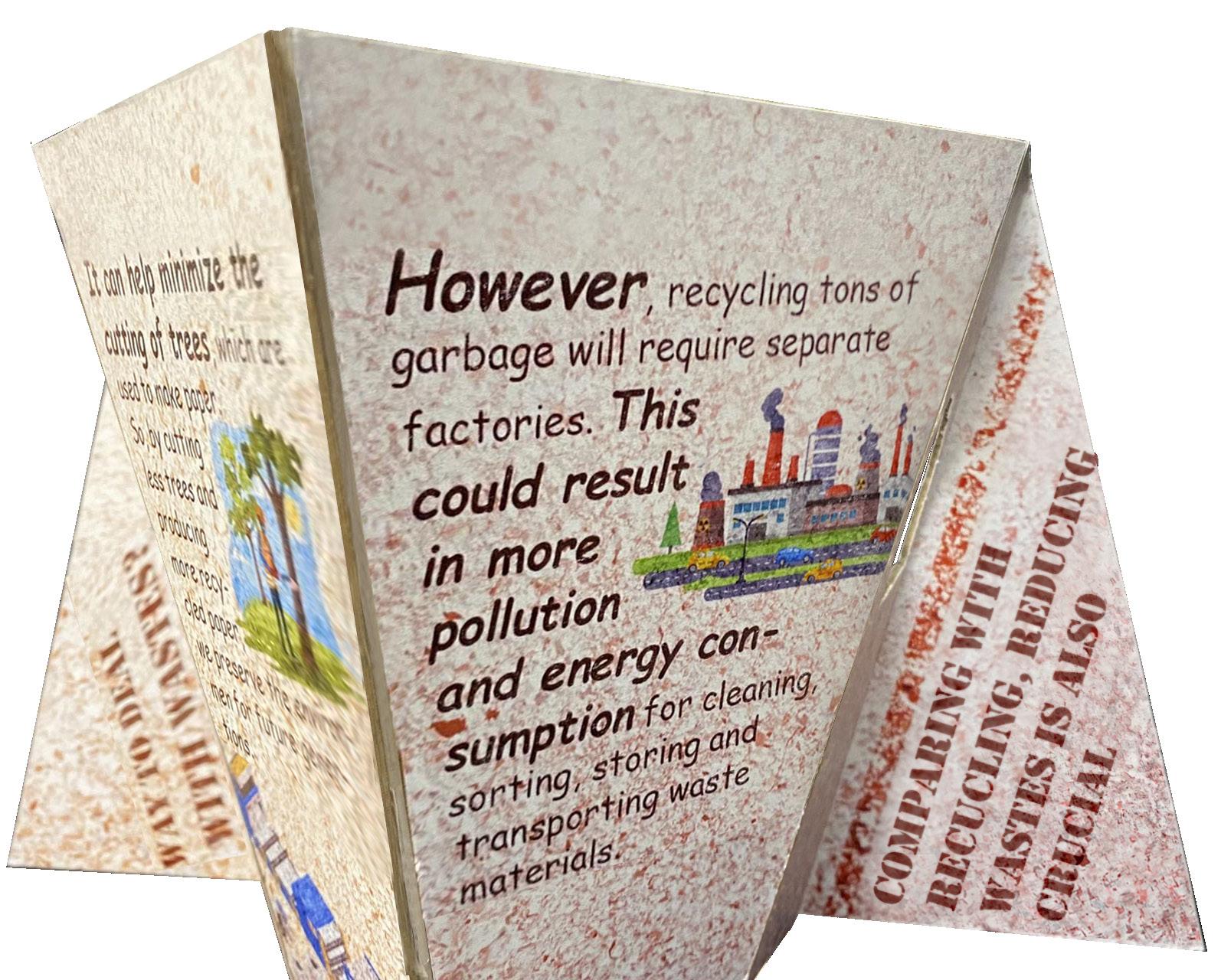
The other side, called the Comparison Side, shows the advantages and disadvantages of recycling and concludes with a slogan, which says that reducing is also crucial, and brings together both sides.


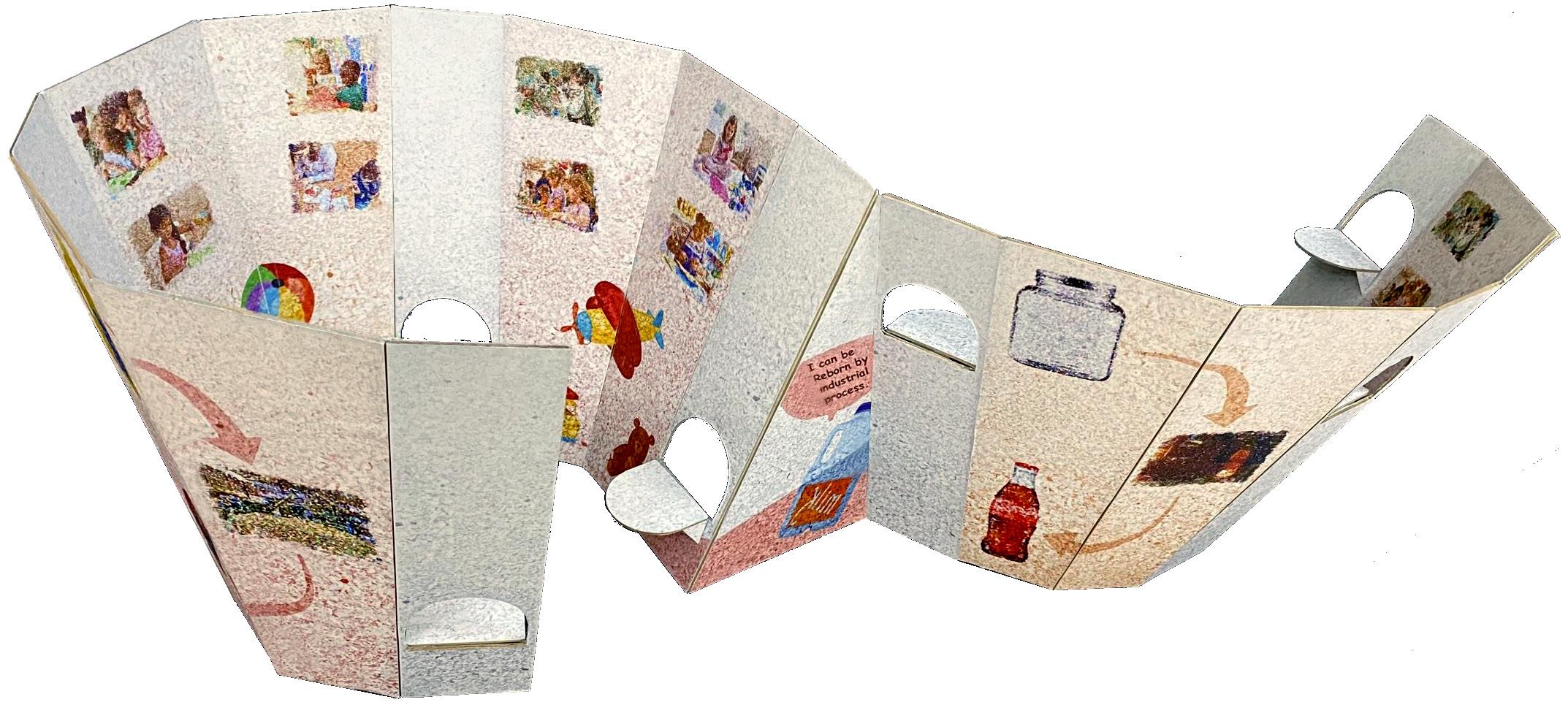
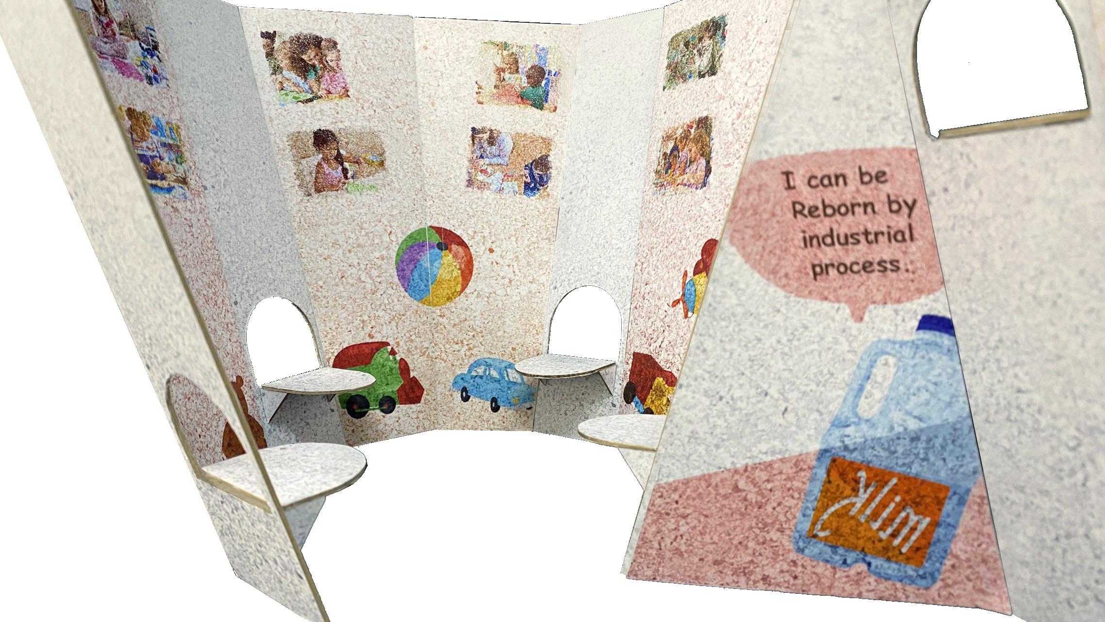
This section will interact with schools. One side of it, called Crafts Side, allows children to exhibit their crafts, made out of waste, to show the aesthetic value of it. The shelves have different heights, which make it more fun and suits the crafts that may be different sizes.
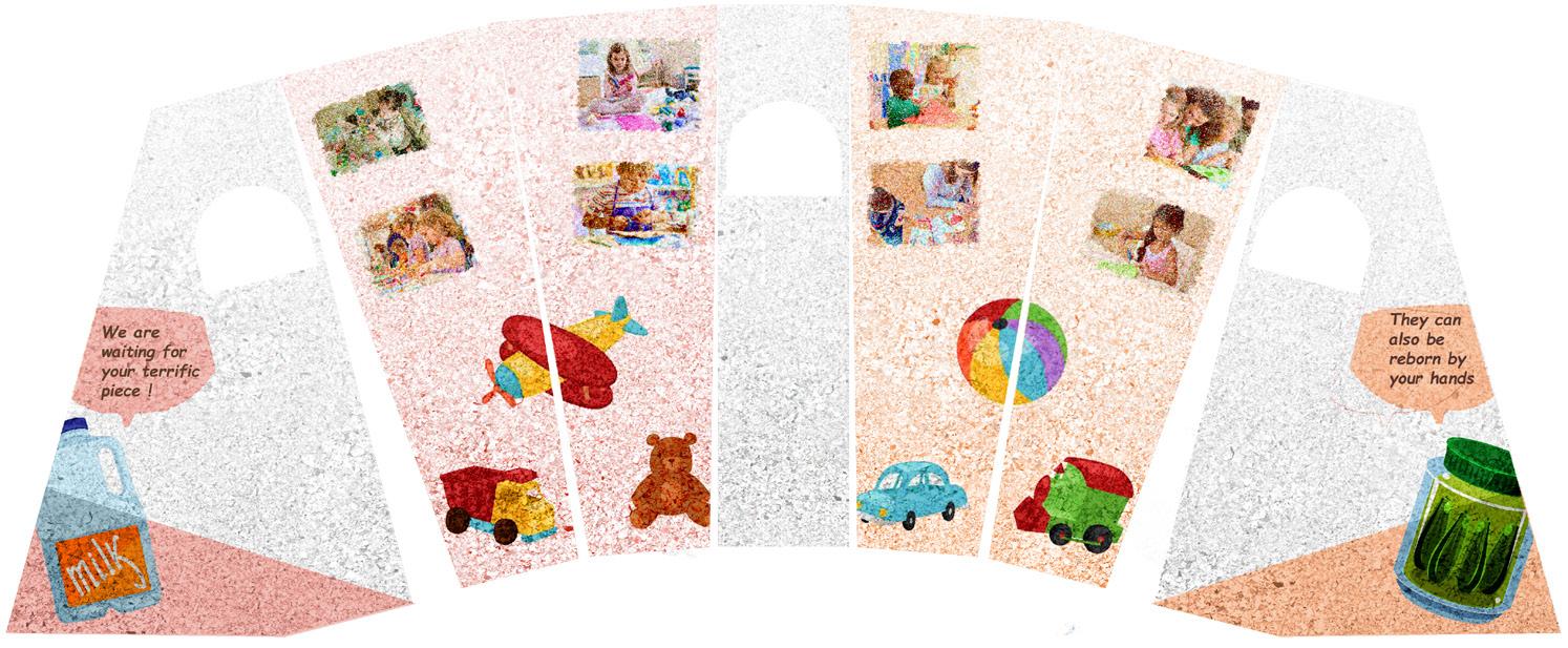
Another side called the Industrial Side, which would demonstrate how the recyclable wastes become new products, which can be considered as a comparison with how children do it. In this case, since all the panels have the same contents, I would like to create a continuous shape to exhibit them instead of separating them into several units.

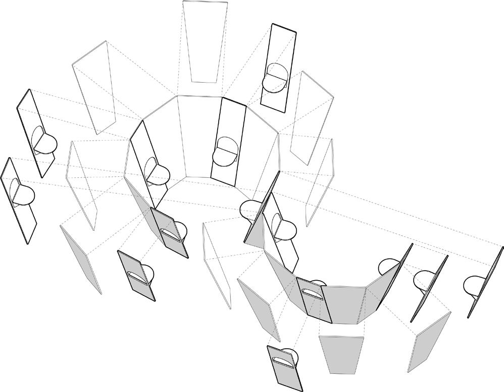

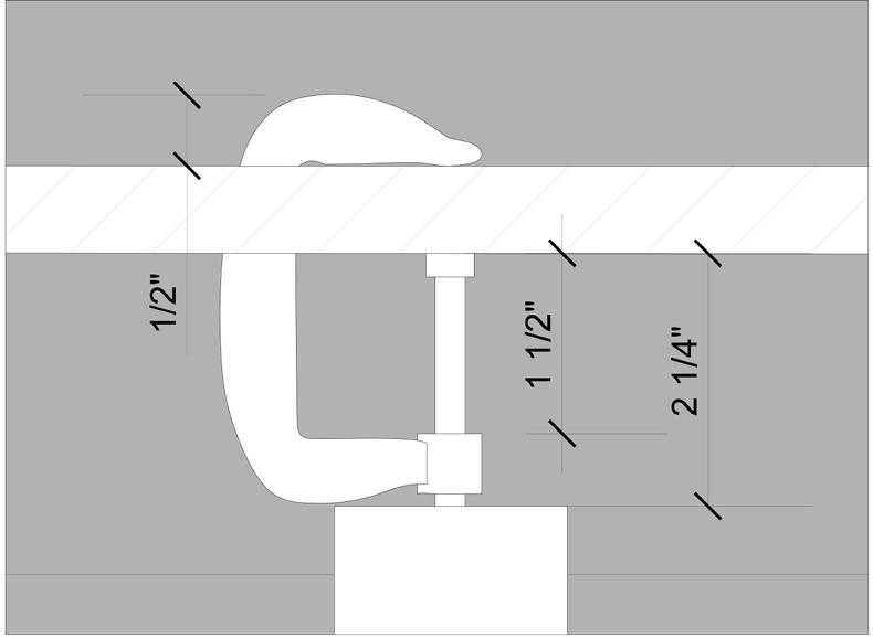
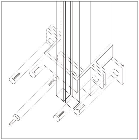
Use 90 degree joints to fix the trash bin pieces, as well as other shelves; use movable joints to connect the top of trash bin or other shelves with exhibition panels.


Use u shape fixer under the triangle panels to fix them on the ground.


Use movable joints to connect panels.





Section 1
Section 2
Section 2 Section 1 Plan


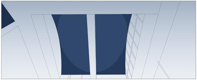
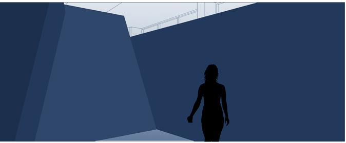
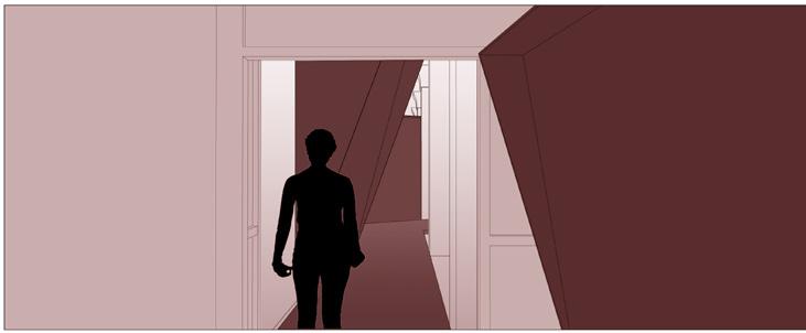
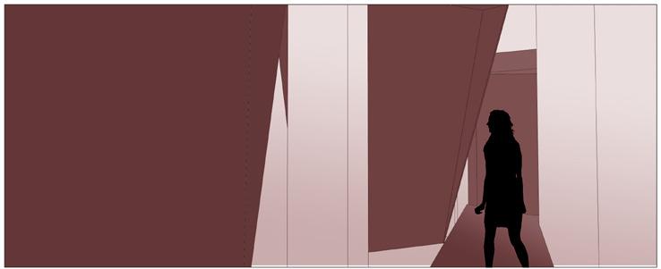
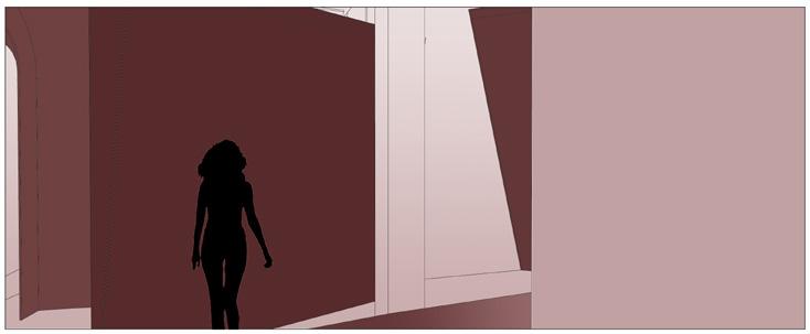
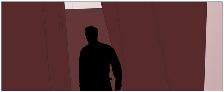
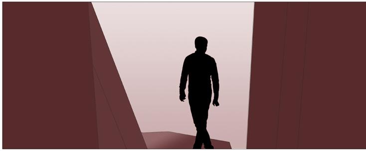
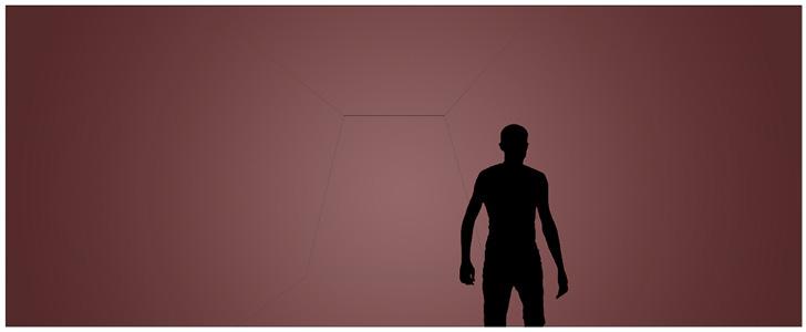
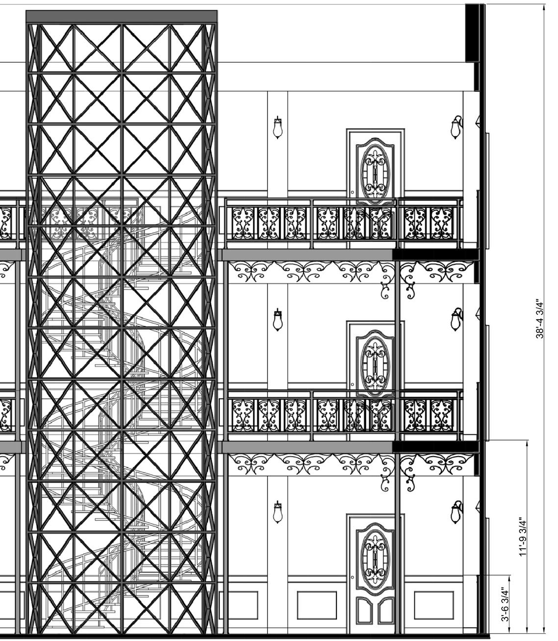
This is a film set work that redesigns the famous apartment lobby scene from "Suspiria," a horror movie directed by Dario Argento in 1977. It was designed according to the descriptions or concepts extracted from screenplay:
A building with three floors, a lobby with in the style of Walter Gropius, with many cusps and funnels, the ceiling is a huge work of stained glass, and the elevator with a huge red diamond on its top.


