Before we dive into my portfolio, let me introduce myself. I’m Rylee, a driven designer with an interest for branding and UI/UX. I graduated from the University of South Carolina, where I built a strong design skill set and got super comfortable with Adobe programs. I love getting to know people, listening to their stories, and turning their ideas into something unique and meaningful. There’s something special about taking someone’s vision — their passion! — and turning it into something eye catching. Beyond design, I value collaboration and communication. I strive to connect with people and truly understand their needs to create work that not only looks great but feels right.
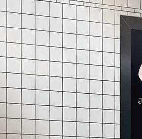
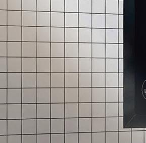
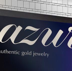
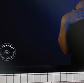
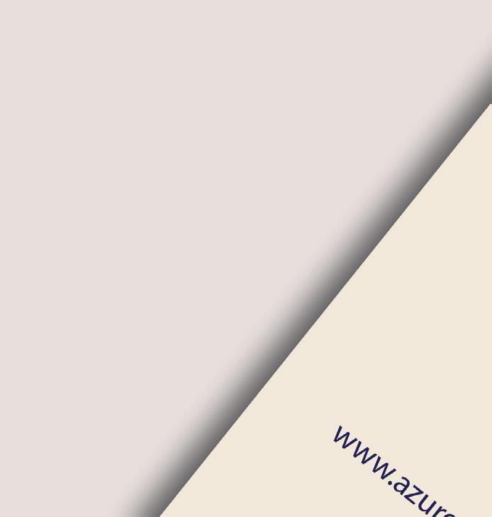
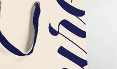
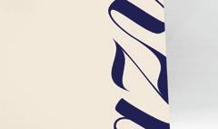
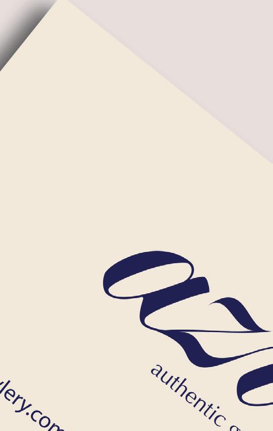
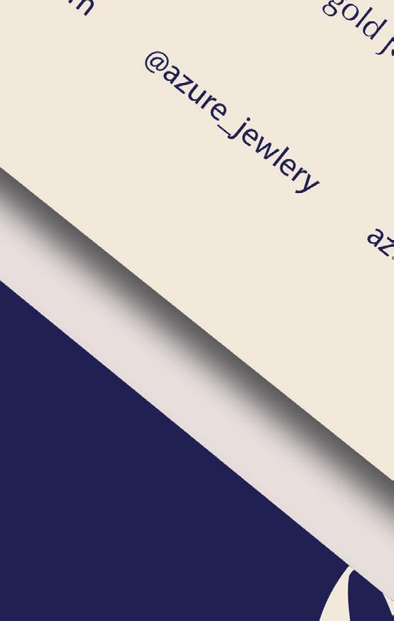
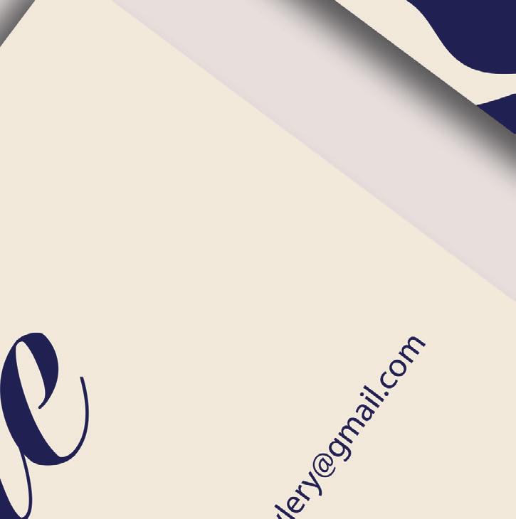
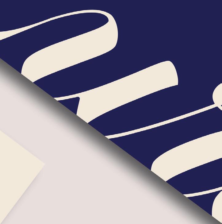
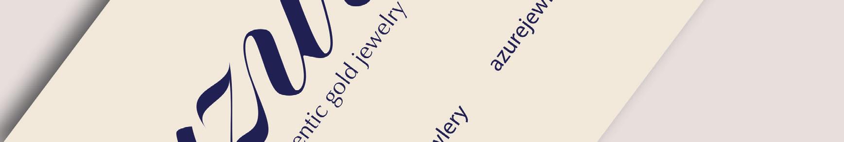
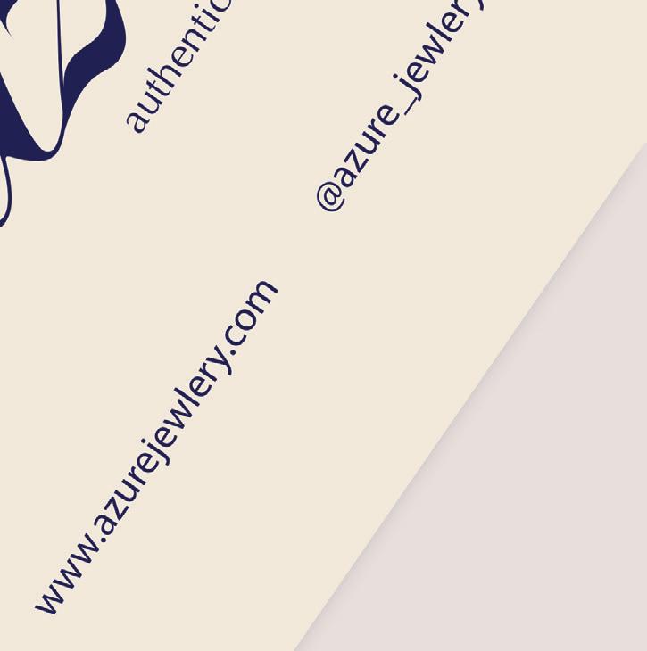
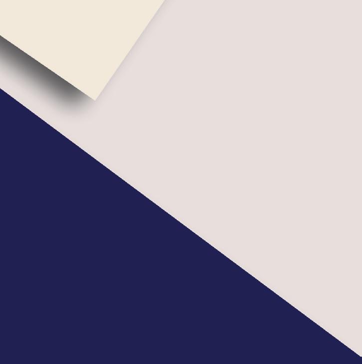
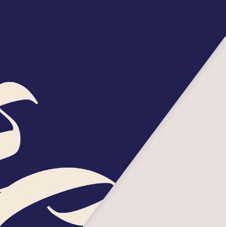
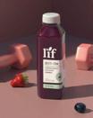
Azure is a conceptual jewelry brand that I developed from the ground up. I independently led the creative direction for the entire project —starting with a logo inspired by the name’s meaning and evolving into a full visual identity. I designed cohesive packaging and ads to support the brand story and art directed a studio photoshoot to capture styled visuals that brought the concept to life.


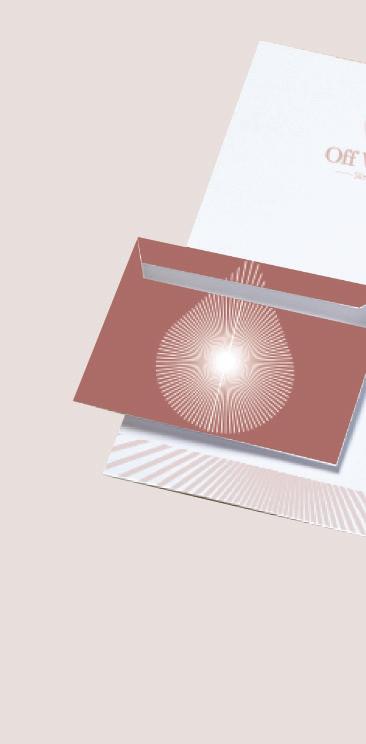
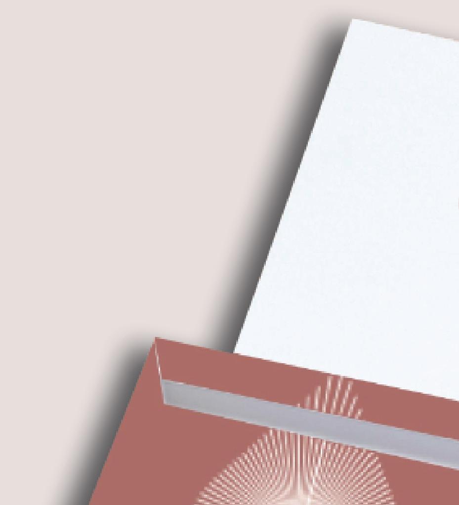
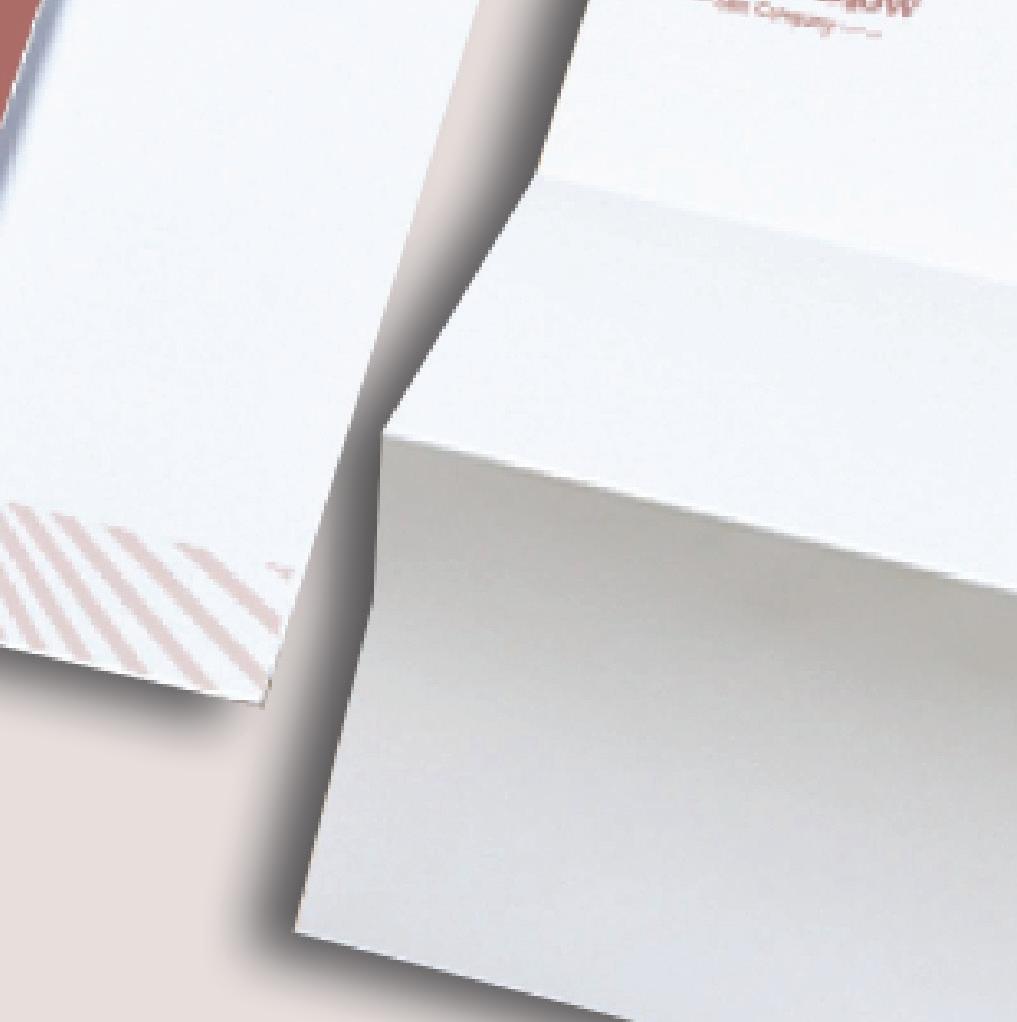
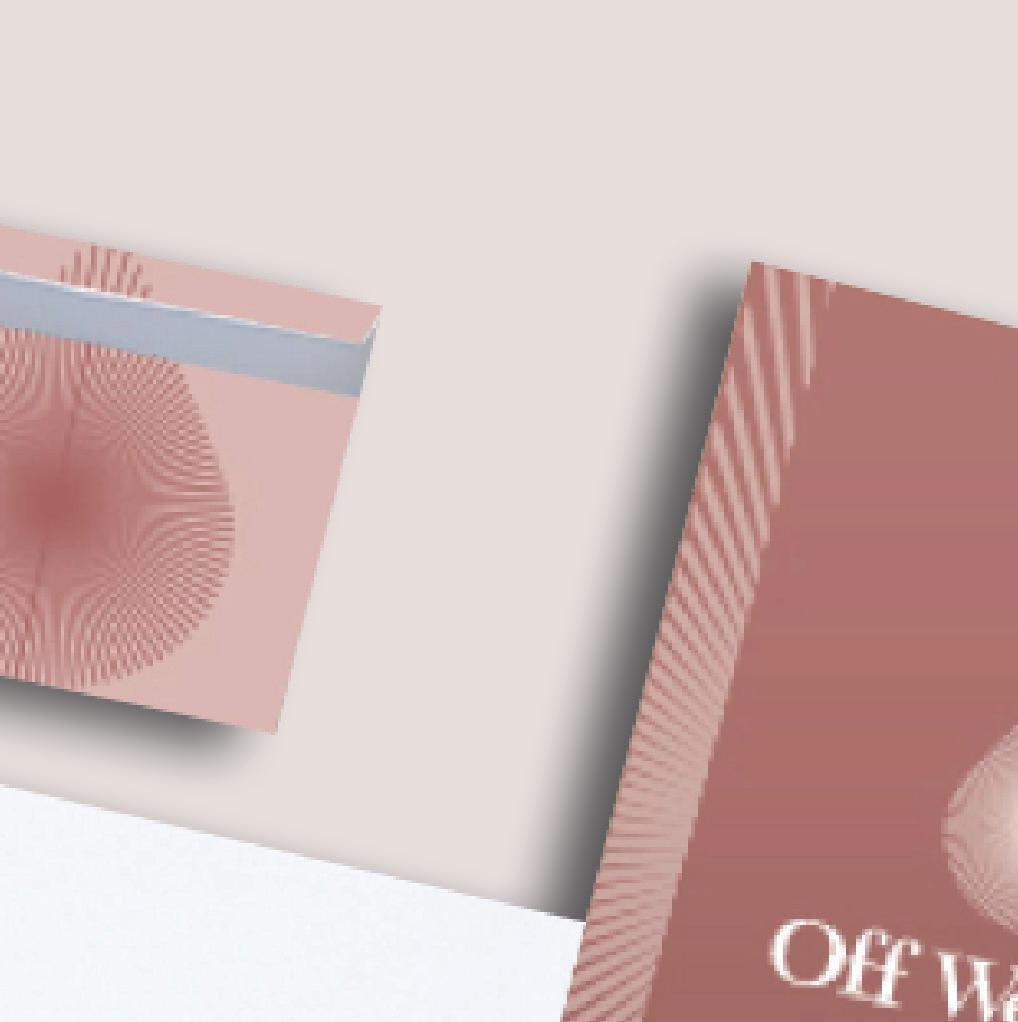
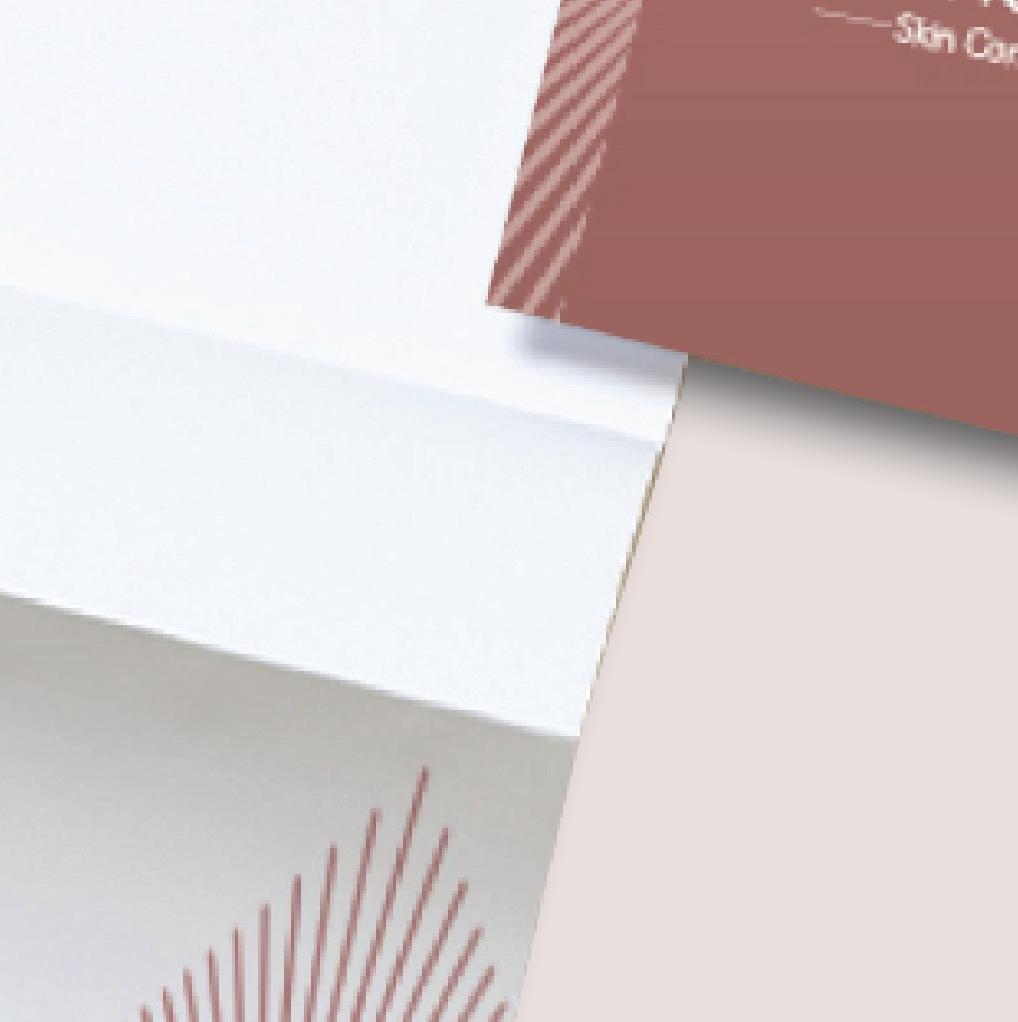
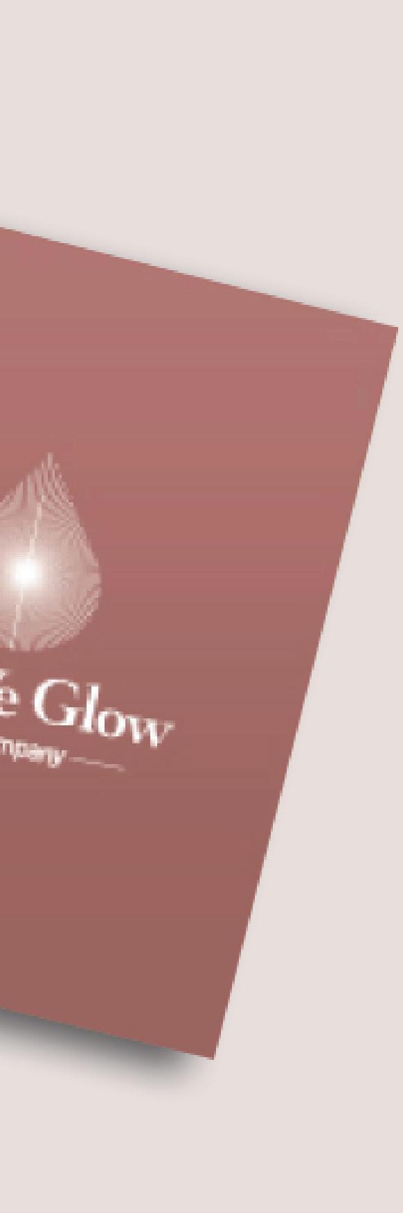
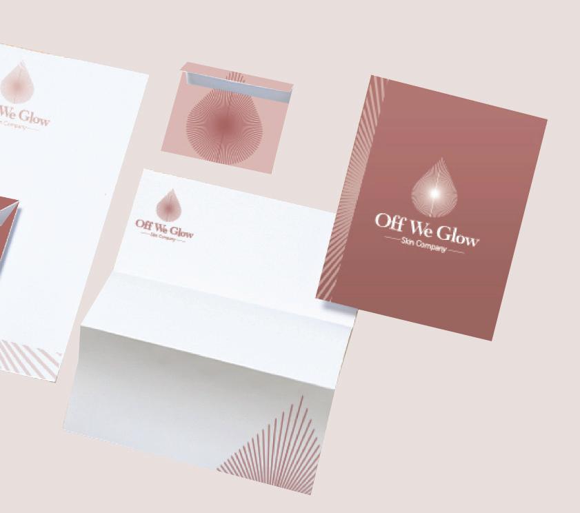
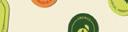
Off We Glow is a conceptual skincare brand built around the idea of radiance, self-confidence, and feel-good simplicity. I independently led the full creative direction for this brand identity project—starting with in-depth exploration of the brand’s voice, target audience, and visual goals. I designed a logo that reflects
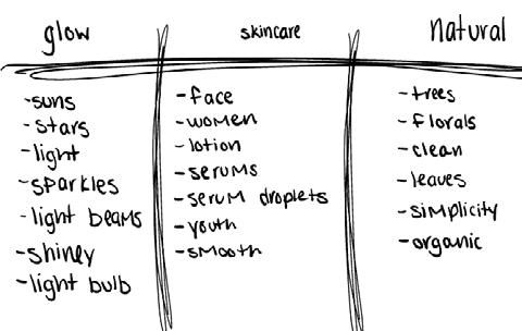
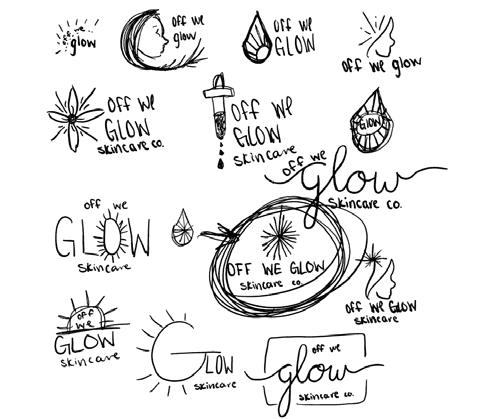
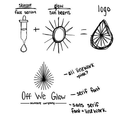
their lifting tone and clean aesthetic, then I developed a cohesive visual system that included a custom color palette, font selections, brand patterns, icons, and supporting graphics. The final brand identity feels fresh, modern, and approachable—which perfectly alignes with the brand’s personality and mission.


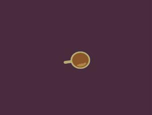
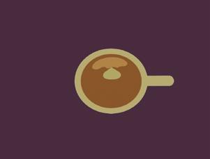
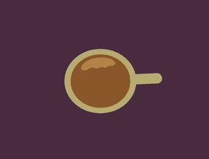
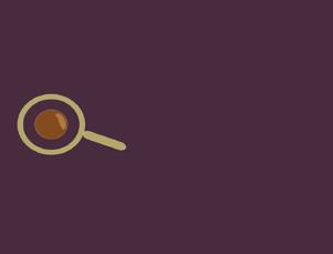
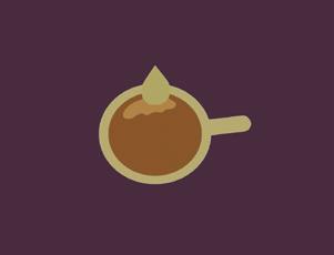
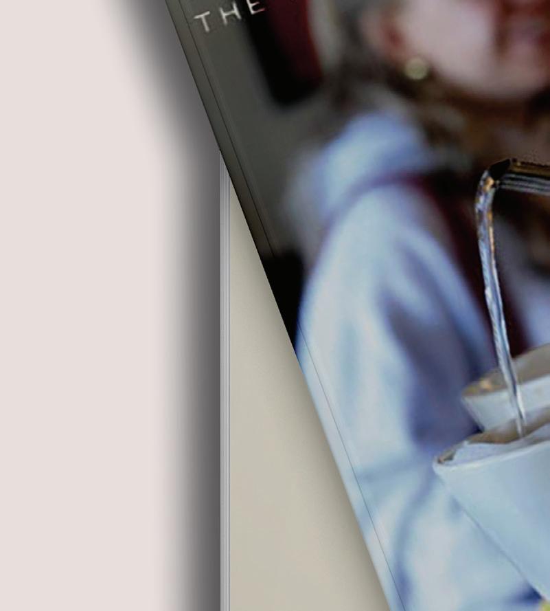
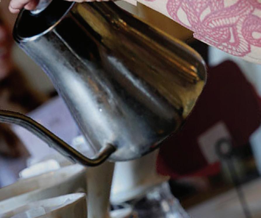
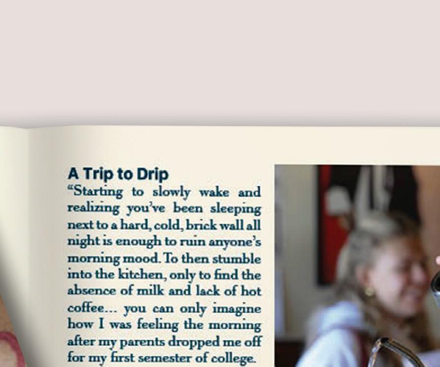
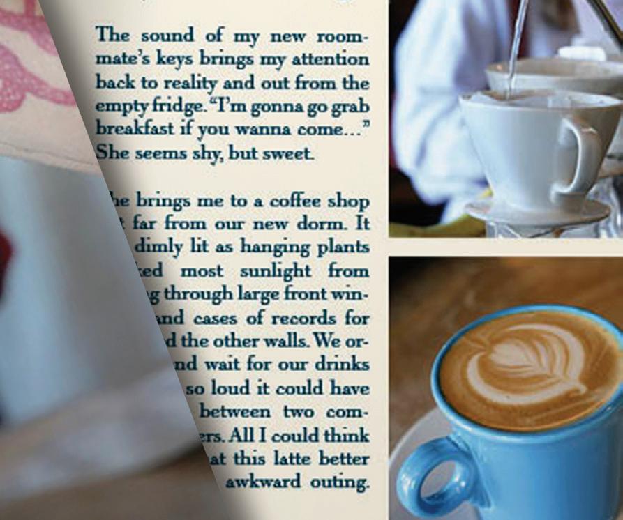
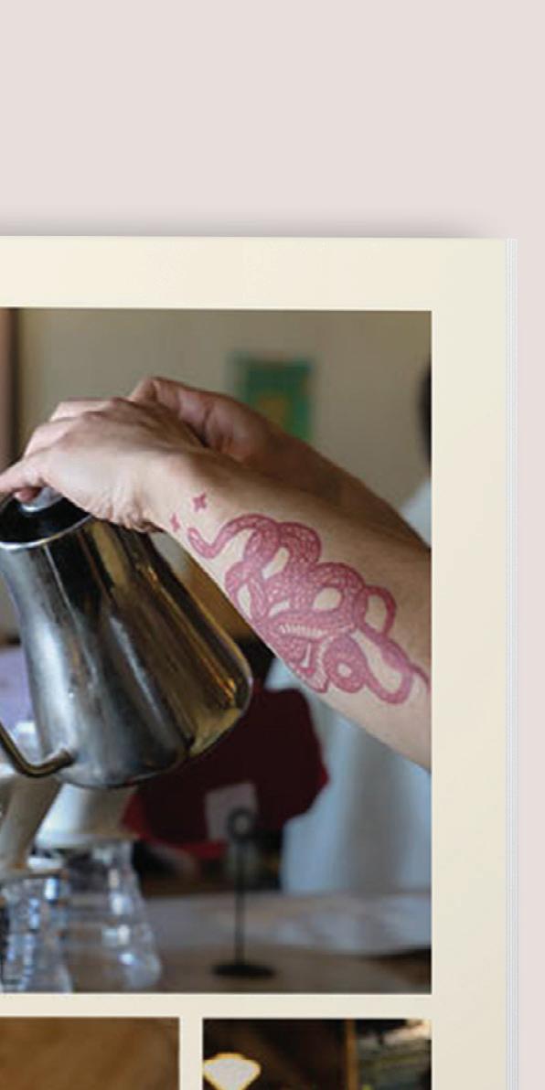
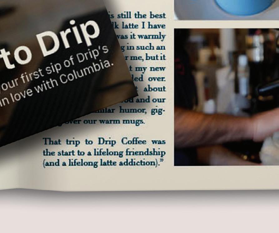
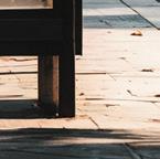
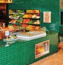
Drip is my favorite local coffee shop in my college town. I single-handedly created a few projects to showcase its unique vibe. I designed a logo animation for their online content, directed a documentary-style photoshoot on location, and designed a magazine cover feature for our local newspaper.


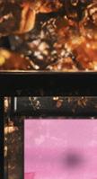
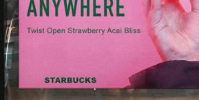
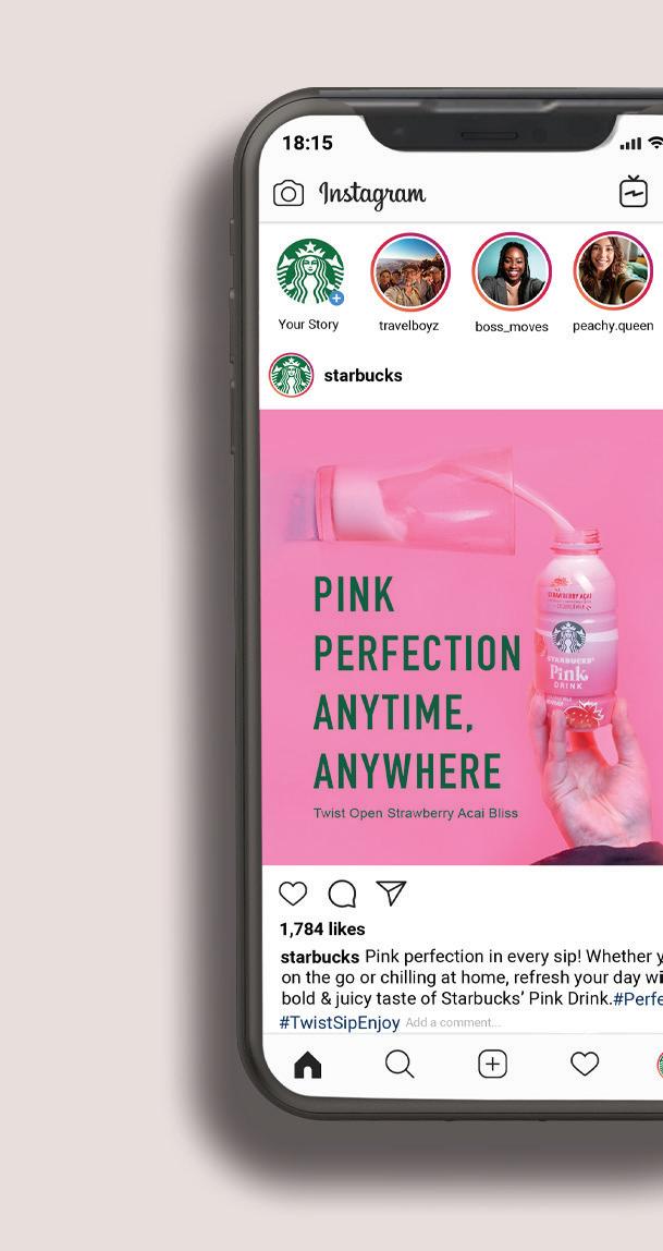
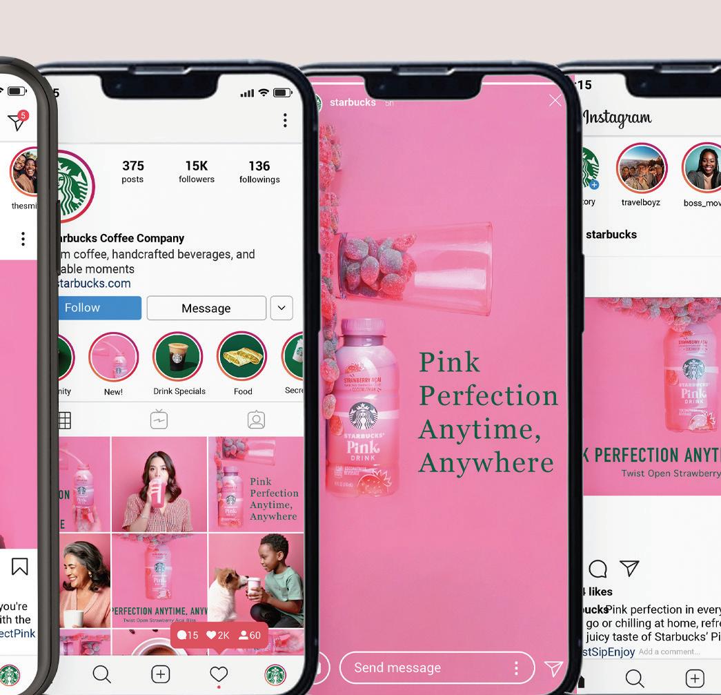
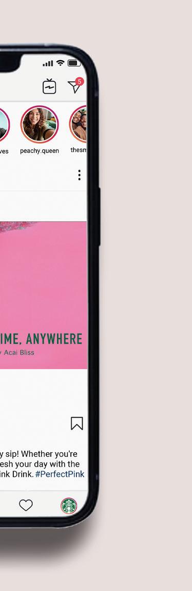
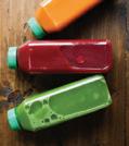
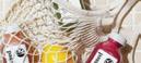
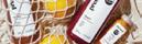
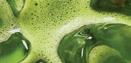
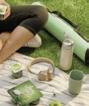
I held a studio product photoshoot focused on colorful, design-forward objectives to make the pink pop. I managed everything from concept and editing to lighting and photography (and


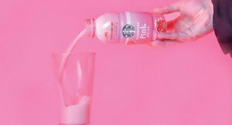


hand modeling too!). After capturing the shots, I edited the images to enhance their color and change orientation to create a set of bold, branded graphics for use in promotional posters and social media content.


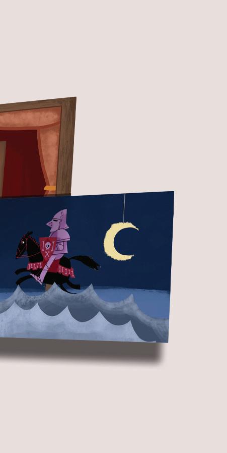
The Bearded Man is a short animated video inspired by a real (and ridiculous) South Carolina law stating that men with beards can’t kiss women in public. This partner-based project gave me the opportunity to wear several hats—I wrote the full script, blending facts with humor and fairytale-style storytelling to bring the concept to life. I also edited all of the audio to match the tone and pacing of the animation we created. I animated the opening scene until the 2 second mark, along with everything from the 23 second mark until the end of the video. This contributes to a significant portion of the overall animation. The project was a fun way to explore quirky subject matter while honing my skills in illustration, audio editing, creative writing, and motion design.

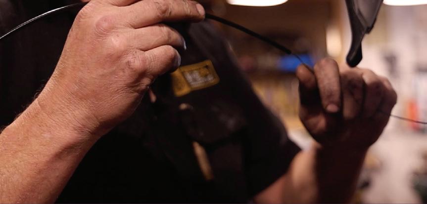
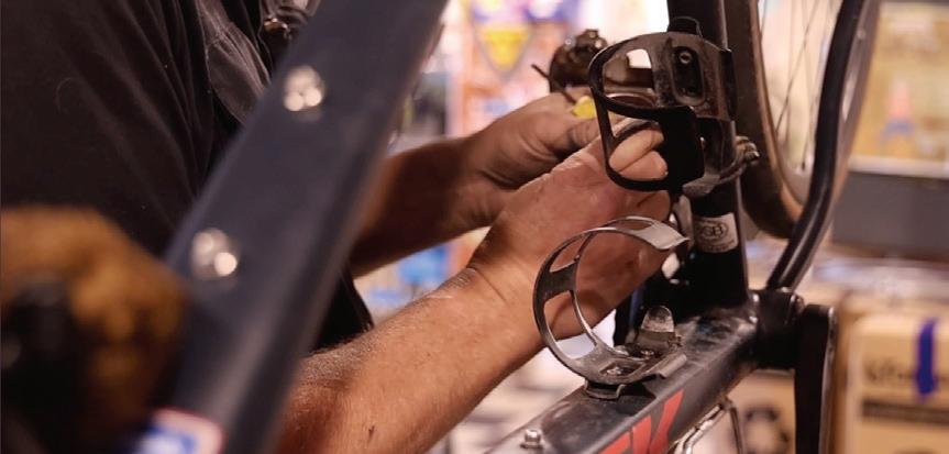
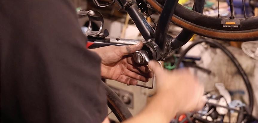
This is a Columbia nonprofit that advocates for bike accessibility and safety. I solo produced a short documentary video to raise awareness of their mission—handling everything from filming and interviews to editing and audio.

This PSA Video was created for the UofSC School of Journalism and Mass Communications, designed to capture the attention of busy college students. I independently animated a bright, eye-catching video that incorporated bold colors and humor, including a meme to make the content more relatable and engaging. The video now plays on loop across campus, helping to communicate important messages in a fun, memorable way. This project allowed me to use my animation skills while crafting content tailored to a specific audience.


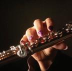
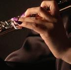
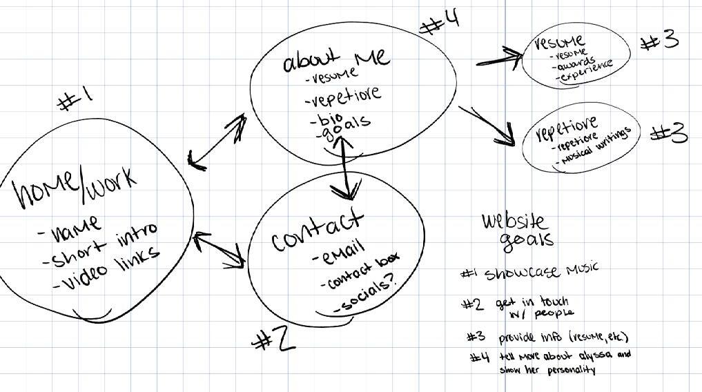
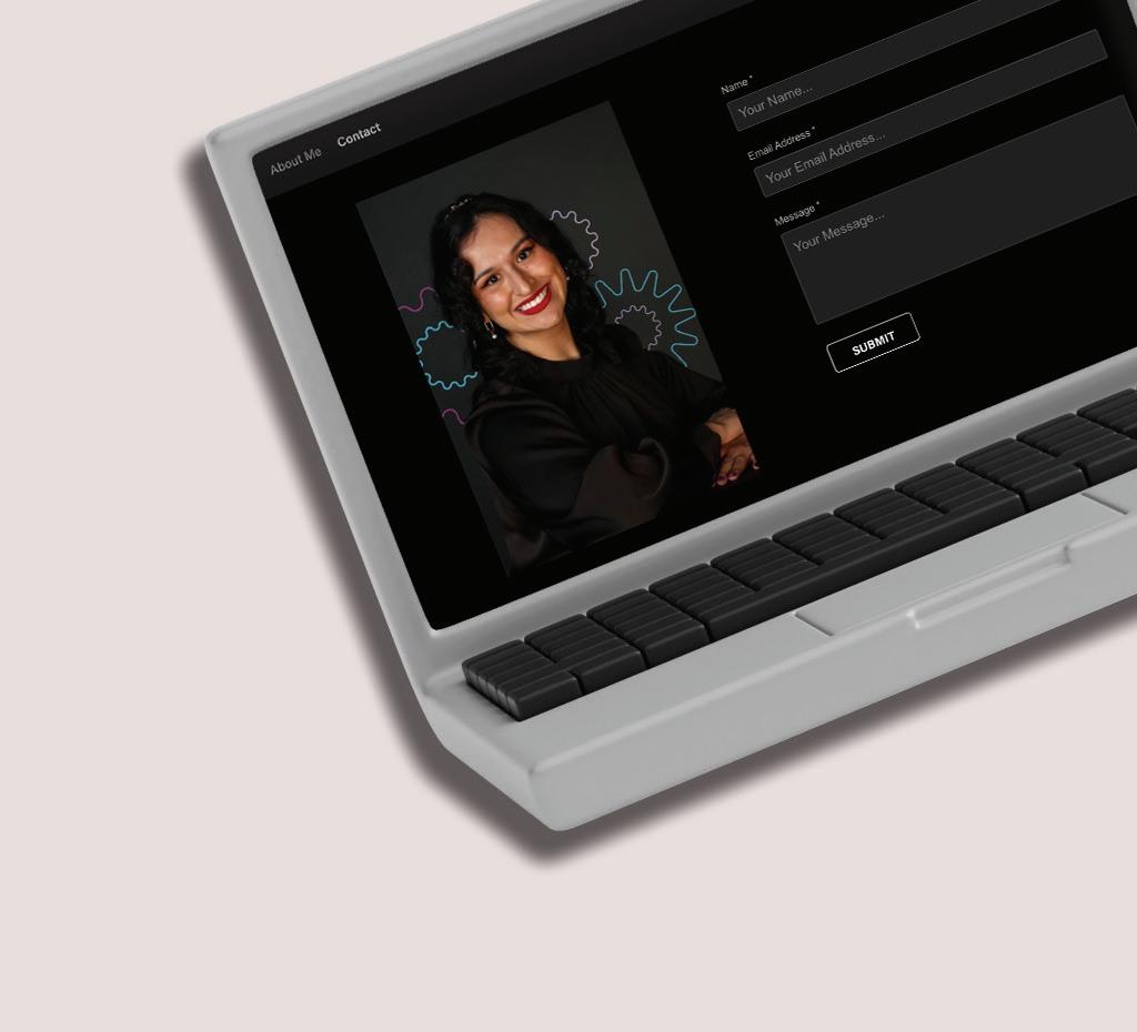
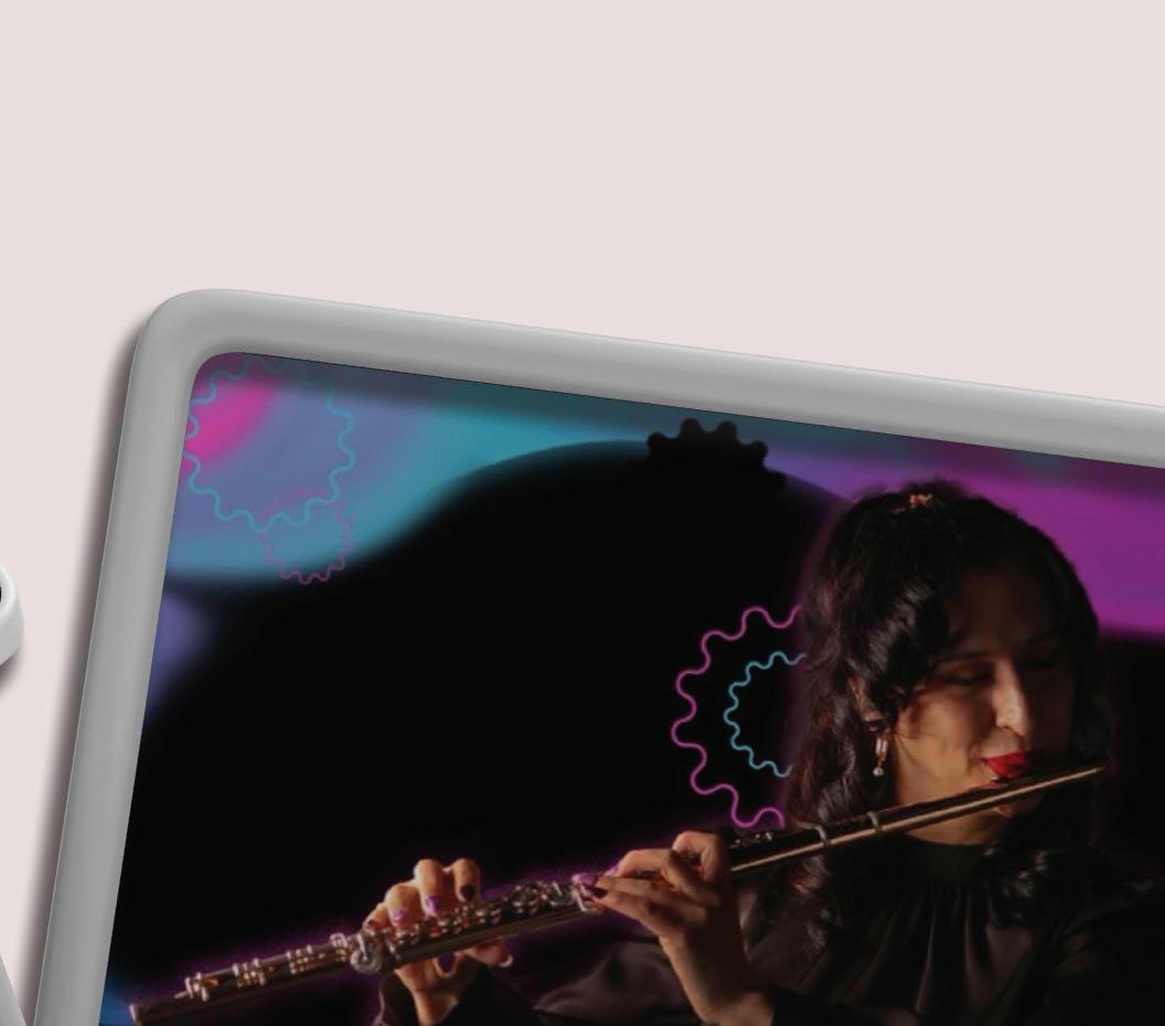
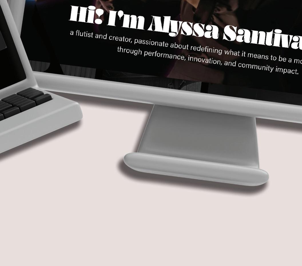
Alyssa Santivanez is a flutist looking to grow her personal brand. I worked with a team to redesign her website, take professional headshots, and refresh her visual identity. I was responsible for mapping out the layout and flow for the entire website. I also gave her creative ways to market herself across platforms.


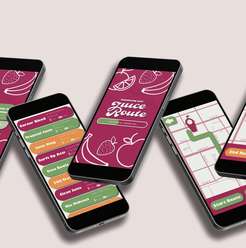
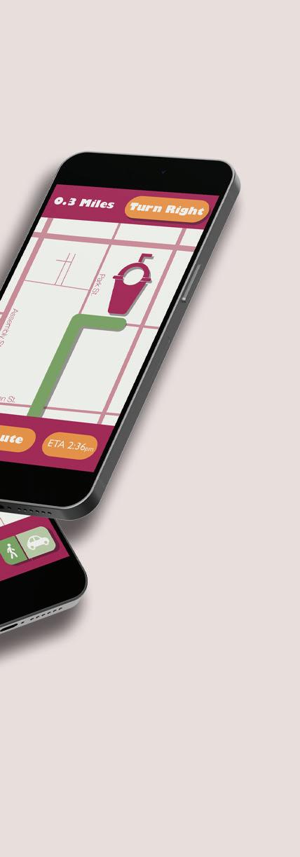
Juice Route is a conceptual app I designed to help users quickly find and navigate to the nearest juice bar. Tailored for a youthful, vibrant audience, the design features a playful aesthetic aimed at young women. I created the logo, brand identity, graphic illustrative elements, and user interface, ensuring both visual appeal and simple functionality. The color scheme and typography reflect the brand’s energetic, health-conscious vibe, while the simple map ensures user flow is a smooth, intuitive experience. The result is a fun, easy-to-use app that makes locating juice bars effortless.
C=29


C=7


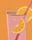


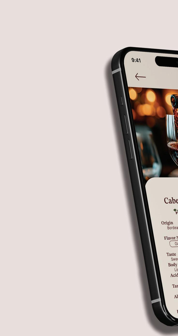
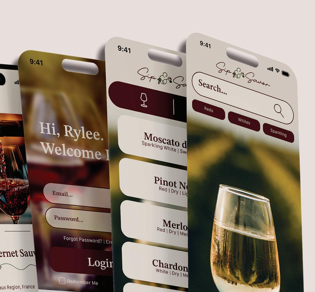
Sip & Savor is a conceptual app I independently created and designed, with the goal of enhancing the wine-tasting experience. I began by mapping out the entire user journey, ensuring the app was intuitive, user-friendly, and visually appealing. After defining the core functionality, I designed a clean, cohesive user interface that aligned with the brand’s identity and values. Every detail, from the color palette to typography, was carefully selected to create a sophisticated yet approachable feel. The result is an app that not only simplifies the wine-tasting process but also engages users with a seamless experience.