The Essentials of Typography
By Rubi Sanchez
 by James
The Essentials of Typography
 By Rubi Sanchez
Project Design by Rubi Sanchez based on Designing with Type
By Rubi Sanchez
Project Design by Rubi Sanchez based on Designing with Type
5th Edition
Craig
TABLE OF CONTENTS
Section 1:Anatomy of Type
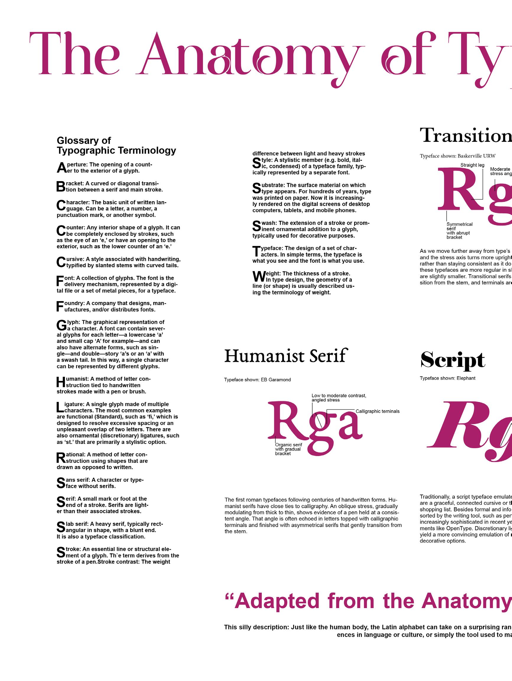
Glossary of Typographic Terminology
15 Type Classification

Section 2:Setting Type Do & Don’t
Type Size
Leading and Tracking, Rags
Line Length,Orphans & Widows
Paragraph Alignment
Section 3: Type Designers
Onc of the “Classic Five” from the Textbook+ their typeface
Contemporary POC Type Designer
Contemporary Female Type Designer
Section 4:Portfolio of Projects
Five Classic Typefaces
Type Arrangements
Grids
Anatomy of Type & Classifications
Historical Event Poster
Ransom Note Collage

1
Glossary of Typographic Terminology
Horizontal stroke Or Crossbar Bracket Diagonal stroke
Apex: The tallest point at which two strokes meet.
Bracket: A curved or diagonal transition between a serif and main stroke.
Bowl: A semi-circular line that meets a stroke at both
Cursive: A style associated with handwriting, typified by slanted stems with curved tails.
Character: The basic unit of written language. Can be a letter, a number, a punctuation mark, or another symbol.
Counter: Any interior shape of a glyph. It can be completely enclosed by strokes, such as the eye of an ‘e,’ or have an opening to the exterior, such as the lower counter of an ‘e.’
Foundry: A company that designs, manufactures, and/or distributes fonts.
Ligature: A single glyph made of multiple characters. The most common examples are functional (Standard), such as ‘fi,’ which is designed to resolve excessive spacing or an unpleasant overlap of two letters. There are also ornamental (discretionary) ligatures, such as ‘st.’ that are primarily a stylistic option.
Font: A collection of glyphs. The font is the delivery mechanism, represented by a digital file or a set of metal pieces, for a typeface.

Apex Bowl
Serif
Sub-
strate: The surface material on which type appears. For hundreds of years, type was printed on paper. Now it is increasingly rendered on the digital screens of desktop computers, tablets, and mobile phones.
Swash: The extension of a stroke
Or prominent ornamental addition to a glyph, typically used for decorative purposes.
Humanist: A method of letter construction tied to handwritten strokes made with a pen or brush
Rational: A method of letter construction using shapes that are drawn as opposed to written.
Sans serif: A character or typeface without serifs.
Serif: A small mark or foot at the end of a stroke. Serifs are lighter than their associated strokes.

Typeface: The design of a set of characters. In simple terms, the typeface is what you see and the font is what you use.
Weight: The thickness of a stroke. In type design, the geometry of a line (or shape) is usually described using the terminology of weight.
Slab
serif: A heavy serif, typically rectangular in shape, with a blunt end. It is also a typeface classification.
Stroke contrast: The weight difference between light and heavy strokes
Style: A stylistic member (e.g. bold, italic, condensed) of a typeface family, typically represented by a separate font.

The Anatomy of Type

Organic serif with gradual bracket
Rga
Low to moderate contrast, angled stress Calligraphic terninals
Humanist Serif
Typeface shown: EB Garamond
The first roman typefaces following centuries of handwritten forms. Humanist serifs have close ties to calligraphy. An oblique stress, gradually modulating from thick to thin, shows evidence of a pen held at a consistent angle. That angle is often echoed in letters topped with calligraphic terminals and finished with asymmetrical serifs that gently transition from the stem.
Curved leg
Moderate vertical contrast
Rga
Straight leg
Grotesque Sans
Closed aperture. stroke turnes Inward
Typeface shown: English Grotesque
When sans serif printing type first appeared in the early to mid-1800s, some found the style so strange they called it grotesque. These typefaces kept the nickname even after they gained popularity and Grotesque (or Grotesk in German-speakers) is now associated with any sans serif in this early style. The characteristics of Grotesque typefaces are similar to those of the Transitional and Rational serifs: regular proportions, relatively static forms based on the oval and fairly closed apertures, with some strokes turning inward.
Rga
Symmetrical serif with abrupt bracket
Moderate contrast, stress angle varies
Transitional Serif
Bulbous terminals
Horazontal terminals
Very wide “R” is a product of normalised letter widiths
Typeface shown: Baskerville URW
As we move further away from type’s calligraphic roots, contrast increases and the stress axis turns more upright and variable within each typeface rather than staying consistent as it does in the Humanist serifs. Letters in these typefaces are more regular in shape and proportion and apertures are slightly smaller. Transitional serifs still have a gradual, bracketed transition from the stem, and terminals are often bulbous
Neo-Grotesque Sans
Typeface shown: Acumin
Neo-Grotesques (Neo-Grotesk in German-speaking parts of Europe) are even more rationalised extensions of the Grotesque style. These typefaces, pioneered by Helvetica and Univers, have very little stroke contrast, horizontal terminals and quite closed apertures. Their homogenized forms are graphically appealing at large sizes, so they often fare better in Display settings.
Rational Serif
Typeface shown: Bodoni MT
At the opposite end of the spectrum from the Humanists. Rational serifs have a strong, vertical contrast between thick vertical stems and fine horizontal hairlines. Because these typefaces are not so much written as constructed, their letterforms are very even in proportion and structure. Serifs are generally symmetrical, and can be bracketed, like Melior and Miller, or thin and abrupt, like the Didones (Bodoni and Didot).
Rga
RgaThin,unbracked serifs Curved leg Moderate to high contrast vertical stress Ball terninals Upturned tail
Rga
Gothic Sans
Simple double-story “a” with diagonally orientated bowl and not tail
“g” is commonly a binocular form
Typeface shown: Franklin Gothic Demi
Some English and American variants of the Grotesque style are known as Gothics. While the differences are sometimes in name alone, there are a few distinctions that can be drawn. These include a large x-height, forms that are simpler and more static, very low contrast, and often a condensed width with an upright stance derived from flat-sided rounds. Typefaces like DIN—designed by engineers for industrial use— could be considered Geometric sans serifs but also share many traits with these Gothics.
Rga
Bracketed serifs
Simplified deails
Contemporary Serif
Typeface shown: Palatino Linotype, SCALA
Large apertures and counters
In the last forty years, type designers have borrowed the most pragmatic aspects of the previous styles to develop a new breed of highly functional Text faces, designed to solve the problems of various substrates and reading environments. These designs generally sport a much larger x-height and lower stroke contrast than traditional serif typefaces, but are otherwise not directly related. They range from the spatially economical Swift
Upturned tail
Rga
Moderate contrast vertical stress
Grotesque Slab
Typeface shown: Brix Slab
Ball terminals
If one were to weigh the typical example of each classification, these bulky beasts would tip the scale furthest. Although they aren’t simply Grotesque sans serifs with slab serifs slapped on, these typefaces reflect the proportions, structure, and stroke contrast of their serif-less counterparts. Ball terminals are common among Grotesque slabs, as are heavy bracketed serifs and closed apertures. The effect of these attention grabbers can be decorative and eye-catching, and is usually very bold.
Narrow “R” from classical capital proportions
Rga
Minimal contrast
Geometric Sans
Round shapes are nearly circular
Single-storey “A” is common

Typeface shown: ArponaSans
Curves made of semi-circles
The most static and clinical of all the classifications. Geometric sans serifs are constructed out of geometric forms with round parts that are circular or square. It’s important to note that, while shapes like the ‘o’ appear to be exactly round, most proper typefaces do not contain perfect circles, but are optically corrected to appear as round as possible while harmonious with other letters. Geometrics have minimal stroke contrast, and italics are commonly slanted versions of the romans rather than cursive in form.
Straght leg Minimal contrast. verical stress
Heavy wedge serifs
Rga
Humanist Sans
Typeface shown: Source Code Variable
Like their serif counterparts, Humanist sans serifs have roots in calligraphy. Their round, dynamic, open forms have higher stroke contrast than the other sans serif classifications (though not as much as most serifs). These typefaces sometimes share the binocular ‘g’ and variable letter widths of their serif sisters. Their italics are true italics with cursive forms of ‘a,’ ‘g,’ ‘e,’ and sometimes a descending ‘f.’
Rga
Rga
Humanist Slab
Typeface shown: Pragmatica Slabserif
Put simply, you could take a Humanist sans serif and add unbracketed, rectangular serifs and get pretty close to a Humanist slab. These typefaces often have less stroke contrast than their sans counterparts, and the serifs are sometimes wedge shaped.

Neo-Humanist Sans
Typeface shown: Magallanes
The digital era gave birth to new sans serifs that share characteristics with other classifications but are individual enough to deserve a label of their own. Many of these have a dynamic structure that could be considered an evolution of the Humanist sans, but stroke contrast is reduced and apertures are even more open. The round shapes of typefaces in this category tend to be more square than their predecessors and x-heights are larger on the whole.
Inscribed/Engraved
Typeface shown:Capellina
Unlike the other serif styles, derived from the stroke of a pen or brush, the typefaces in this category have a closer relationship to letters that are carved or chiselled from stone (also known as Glyphic), or engraved on a hard surface like copper or steel. These typefaces can end their strokes with long, graceful serifs (Trajan), sharp wedge serifs (Modesto) or no serif at all, but a thickening flare instead (Albertus).
Calligraphics strokes and forms Low to moderate contrast Open aperture
Curved leg Minimal contrast Unbracketed serifs
Humanist Structure Minimal stroke contrast Very open apertures
Rga
Flared strokes Shapes are chiselled
Geometric Slab
Round shapes are circular
Minimal contrast,only visiable at junctions
Rga
Unbracketed serifs
These slab serifs share the geometrically round or square shapes of their sans counterparts. Rectangular serifs are unbracketed and generally the same weight as the sterns. In fact, all strokes are essentially of the same weight, lacking any perceptible contrast. The ‘R’ leg is a straight diagonal and ‘g’ is normally of the monocular form.
Typeface shown: Pragmatica Slabserif
decorative options.
convincing emulation of real handwriting and offer a variety of
Discretionary ligatures and contextual alternatives yield a more
recent years thanks to technical developments like Open Type.
brush. Script fonts have become increasingly sophisticated in
Scripts can also be sorted by the writing tool, such as pen or
of a daily shopping list. Besides formal and informal categories.
letters are a graceful, connected cursive or the staccato scribbles

Traditionally, a script typeface emulates handwriting, whether its
Rga
angle.
Usually have a consistent
The typeface. Formal scripts
Slanted can vary throughout
Most scripts are slanted.
Script
Typeface shown: Elephant
2 Standard Type Sizes


Line Lengths Don’t.
The length of a line should be comfortable to read: too short and it breaks up the words or phases; too long and the reader must search for the beginning each line. If you are uncertain about line length, a good rule of thumb is to set the type with 35 to 70 characters per line.
Do.
The length of a line should be comfortable to read: too short and it breaks up the words or phases; too long and the reader must search for the beginning each line. If you are uncertain about line length, a good rule of thumb is to set the type with 35 to 70 characters per line.

Widows & Orphans
Don’t
To read Two unforgivable sins for desgners are leaving uncorrected windows and orphans in a setting
An orphan is a short line that appears at the top of the page it is usually the last line of paragraphy from the preding colum or page, it is more obious and therefore distracting.
Do
To read Two unforgivable sins for desgners are leaving uncorrected windows and orphans in a setting
An orphan is a short line that appears at the top of the page it is usually the last line of paragraphy from the preding colum or page, it is more obious and therefore distracting.
Don’t
There is no rule for just how few words or letters constitute a widow as much depends upon the line length. The longer the line the more noticeable the window. Do
There is no rule for just how few words or letters constitute a widow as much depends upon the line length. The longer the line the more noticeable the window.

Linespacing & Leading
Lline spacing should be 120–145% of the point size.

Linespacing, or leading, like wordspacing, and letterspacing, can be used to improve readability. Your choice of typeface, type, size,line length, and copy will all affect the amount of line spacing. With so many factors involved, you can see why proper line spacing is more a matter of visual judgment than of mathematics
Linespacing, or leading, like word spacing, and letter spacing, can be used to improve readability. Your choice of typeface, type, size,line length, and copy will all affect the amount of linespacing. With so many factors involved, you can see why proper linespacing is more a matter of visual judgment than of mathematics.
KERNING should always be turned on.
Tracking & Kerning

Fonts Recommendation
Do
The easiest and most visible improvement you can make to your typography is to use professional fonts,like those found in FONT RECOMMENDATIONS.
Do
The easiest and most visible improvement you can make to your typography is to use professional fonts,like those found in FONT RECOMMENDATIONS.
Do
The easiest and most visible improvement you can make to your typography is to use professional fonts,like those found in FONT RECOMMENDATIONS.

Avoid goofy fonts, monospaced fonts, most free fonts, and system fonts—especially times new roman and arial.
Avoid Goofy Fonts
DON’T
Tur auT fugiTis nonseque nosapidem quis disTrume volum aliT esecTe dus eTur, ipsam resciis imus eum quides nonsed minveri busdanT liqui Tem ea velenT unToTaT empelessiT inT quam acea dolor siTassunTus ni rerupTaTur, sed quos uT eT rehenimos siTia ilis imusTemperis aperi uT auT esequia que volescimus esT eT omnimin por auT laboriT inTinTi im ip
DON’T
Tur aut fugitis nonseque nosapidem quis distrume volum alit esecte dus etur, ipsam resciis imus eum quides nonsed minveri busdant liqui tem ea velent untotat empelessit int quam acea dolor sitassuntus ni reruptatur, sed quos ut et rehenimos sitia ilis imustemperis aperi ut aut esequia que volescimus est et omnimin por aut laborit intinti im ip

Use curly quotation marks, not straight ones (see straight and curly quotes).
Curly Quotes “ ”
Streight Quotes

" "
Make sure foot and inch marks are straight, not curly.
Use bold or italic as little as possible, and not together.

Never Underline
Never underline, except perhaps for web links.
Underlining is another dreary typewriter habit. Typewriters had no bold or italic styling. So the only way to emphasize text was to back up the carriage and type underscores beneath the text. It was a workaround for shortcomings in typewriter technology.
Bold & Italic
ALL CAPS
All caps are fine for less than one line of text.
PICATUS SINCIISSUM AUT LIQUISSUNT AD QUASSUS SIMPOREPE PORECUM LAM,
Don’t
Picatus sinciissum aut liquissunt ad quassus simporepe porecum lam,

Do
If you don’t have real small caps, don’t use them at all.
SAMLL CAPS
Do
Picatus sinciissum aut liquissunt ad quassus simporepe porecum lam,
Don’t
Picatus sinciissum aut liquissunt ad quassus simporepe porecum lam,

ALL CAPS LETTERSPACING
Use 5–12% extra letterspacing with all caps and small caps.
SMAL CAPS LETTERSPACING

Legible Shapes varied LEGIBLE SHAPES rectangular
Use 5–12% extra letterspacing with all caps and small caps.
WITNESS PROTECTION fake
Witness Protection real
Centered text is acceptable when used for short phrases or titles, like the name on your business cards or letterhead. Or in documents, you can center major section headings like “Introduction” and “Table of Contents”. But if you enjoy centering text, then you should learn to use the hard line break so your lines start in sensible places. OK?
Centered Text One Space
I know that many people were taught to put two spaces between sentences. I was too. But these days, using two spaces is an obsolete habit. Some say the habit originated in the typewriter era. Others believe it began earlier. But guess what? It doesn’t matter. Because either way, it’s not part of today’s typographic practice. If you have to use a typewriter-style font, you can use two spaces after sentences. (These are also known as monospaced fonts.) Otherwise, don’t.

Use centered text sparingly. Put only one space between sentences.
Indents

Use first-line indents that are one to four times the point size of the text, or use 4–10 points of space between paragraphs. Don’t use both.
Bus molorum con et ium volupta turest, eic tota alicide ntiuscil inciis de nimolupis a ipsam aliti commodi aces arumet ese nulloribus eos dolo ium quiaectem. Ugit volorentis voluptatem alignatem nobis doluptam simus enda coreiureiur, est anis nia
Multiple Word Spaces
Don’t use multiple word spaces or other white-space characters in a row.
If you thought that was the limit of word-space geekery, think again. Professional page-layout programs have even more choices. Adobe InDesign, for instance, supports the thin space, but also the third space, quarter space, sixth space, flush space, hair space, figure space, and punctuation space.
Always use hyphenation with justified text.
Hyphenations
In left-aligned text, hyphenation evens the irregular right edge of the text, called the rag. Hyphenation is optional for left-aligned text because the rag will still be somewhat irregular, even with hyphenation. Hyphenation doesn’t improve text legibility. In this case, consider turning it off.

Don’t confuse hyphens and dashes, and don’t use multiple hyphens as a dash.
Hyphens & Dashes
A hyphen is used in phrasal adjectives (listener-supported radio, dog-and-pony show, high-school grades) to ensure clarity. Nonprofessional writers often omit these hyphens. As a professional writer, you should not.
Ampersands
Use ampersands sparingly, unless included in a proper name.
&
Trademarks & Copyright
Symbols
Use proper trademark and copyright symbols— not alphabetic approximations.
© 2023 MegaCorp™

Question mark & Exclamation
In a document longer than three pages, one exclamation point is plenty (see question marks and exclamation points).
Was Munchausen syndrome diagnosed before the 1960s?
Nonbreaking Space
Put a nonbreaking space after paragraph and section marks.
The seller can, under Business Law § 1782, offer a full refund to buyers. But ¶ 49 of the contract offers another option.


Apostrophes
Apostrophes point downward.
In the ’70s, rock ’n’ roll right
Ellipses
Make ellipses using the proper character, not periods and spaces.
losses at . . . banks right
Left

There are five ways of arranging lines of type on page. The first is justified: all the lines are the same length and align both on the left and on the right. The second is unjustified: the lines are of different lengths and align on the left and are ragged on the right. The third is a similar arrangement, expect now the lines align on the right and are ragged on the left. The fourth possibly is centered: the lines are of unequal lengths with both sides ragged. The fith possibility is a random, or asymmetric,arrangement with no prediscable patterns in the placement of the lines, only by the designer’s imagination.
Right
There are five ways of arranging lines of type on page.The first is justified: all the lines are the same length and align both on the left and on the right. The second is unjustified: the lines are of diffferent lengths and align on the left and are ragged on the right. The third is a similar arrangement, expect now the lines align on the right and are ragged on the left.The fourth possibily is centered: the lines are of unequal lengths with both sides ragged. The fith possibilty is a random, or asymmetric,arrangement with no predicable patterns in the placemnt of the lines, limited only by the designer’s imagination.
There are five ways Of arranging lines of type on page. The first is justified: all the lines are the same length and align both on the left and on The right. The second is unjustified: the lines are of diffferent lengths and align on the left and are ragged on the right. The third is a similar arrangement, expect now the lines align on the right and are ragged on the left. The fourth possibly is centered: the lines are of unequal lengths with both sides ragged. The fith possibilty is a random, or asymmetric,arrangement with no predicable patterns in the placement of the lines, limited only by the designer’s imagination.
Justified
There are five ways of arranging lines of type on page. The first is justified: all the lines are the same length and align both on the left and on the right. The second is unjustified: the lines are of diffferent lengths and align on the left and are ragged on the right. The third is a similar arrangement, expect now the lines align on the right and are ragged on the left.The fourth possibly is centered: the lines are of unequal lengths with both sides ragged. The fith possibilty is a random, or asymmetric,arrangement with no predicable patterns in the placement of the lines, limited only by the designer’s imagination.

Center
3 Types of Desingers

JOHN
BASKERVILLE
John Baskerville (1706-1775) was born in wolverly, England, and begain his career as a writer master, but gave it up to make his forture in the japanning business in birmingham. After retring ar the age of forty-four, Baskerville returned to his first love, letterforms, and begain painting as wealthy amateur. Extermely dissatisfied with the stae of English printing and typography.Baskerville decided to print his own books, to show by example what could be done when one took pains with every stage of production. Baskerville is also created by some with being the first to print on “wove” paper, a smoother surface that allowed for finder detail than the traditional “laid” paper with its rougher surface.


LAURA WORTHINGTON
LAURA WORTHINGTON is a typeface designer from Washington State. After training and working as a graphic designer since the mid ‘90s, she turned her lifelong fascination with lettering and typography into a business, publishing her first typeface in 2010. She has since published more than 100 typefaces, and designed custom faces for Fortune 500 companies. Laura’s faces are based on her own hand-lettering and calligraphy, a practice she continues to hone daily. Fonts that are being displayed are some of her own work.

Joshua Darden
Joshua Darden would be one of the smartest and most interesting people you’d ever met — if you ever met him. Though he has received much critical acclaim, he’s been variously called, “a silent hunter”, “a hermit”, and “mythic”. He founded this studio in 2004, establishing a strong brand of critically acclaimed retail font families.


4
PORTFOLIO TYOGRAPHY
TYOGRAPHY
PORTFOLIO

Five Classic Typefaces Baskerville BASKERVILLE
Baskerville, an elegant, well-designed typeface created by the Englishman John Baskerville in 1757, is an excellent example of a Transitional typeface. Transitional typefaces are so called because they form a bridge between the Old Style and the Modern faces. Compared to the Old Style, Transitional typefaces show greater contrast between the thicks and thins, serifs are less heavily bracketed, and the stress is almost vertical. Baskerville characters are very wide for their x-height, are closely fitted, and are of excellent proportions. Baskerville is considered one of the most pleasant and readable typefaces.
The Five Classification Typeface project was to practice and learn the three factors of type. which are letterspacing, wordspacing,and linespacing. I experience with Garamon, Baskervill, Bodoni, Century, and Arial.


Type Arrangements BODONIBODONIBODONIBODONI
Bodoni is a Modern typeface, designed in the late 1700s by the Italian typographer Giambattista Bodoni. At the end of the eighteenth century, a fashion grew for faces with a stronger contrast between the thicks and thins, unbracketed serifs, and a strong vertical stress.
These were called Modern typefaces. All the older faces became known as Old Style, while the more recent faces just prior to the changes were referred to as Transitional. Although Bodoni has a small x-height, it appears very wide and black. Because of the strong vertical stress, accentuated by its heavy thicks and hairline thins, Bodoni should be well leaded.
Second project was about Type Arrangements, that allow to further explore. I chose to do Bodoni, it just a nice touch of replicating and making seem that is bouncing of the page.
BODONIBODONIBODONIBODONI
Grids


The Grid Project focus on organization and structure. I use Bodoni for the title and body copy.


Anatomy of Type & Classifications
The Anatomy of Type is a great tool to learn because it help you understand the 15 classification. For my poster I want to create an elegant style for the viewer to have and have an easier understanding of the context.

Historical Event Poster
For this Historical Poster I want to represent Cinco De Mayo. By representing this event I wanted to use the Skull and a memory for Dia De Los Muertos. Meaning remembering the loves one who have past away.

For this Ransome Note I wanted to have a meaning and have everyone releated to it. Giving a feeling and a loud interpation gives us that sensation of being broken with no money to spare.


Ransom Note Collage

Transitional Serif
Comtemporay Serif

Gothic Sans
Neo-Grotesque Sans
Grotesqu Sans
Humanist Sans
Geometric Slab
Humanist Serif
Geometric Sans

Type
The body copy is set in 10 or 12 - point Times Romen
The heading is set in Auralyess Free Trial and body copy is set in Times New Roman in section 1. The heading is set in Bodoni MT and body copy is set in Times New Roman in section 2.
The heading is set in Rig Solid and body copy is set in Baskerville Old Face, Boucherie Cursive, Dapifer in section 3.
The heading is set in Bodoni MT and body copy is set in Times New Roman in scetion 4.
Deisgner Names
The name John Baskerville
The name LAURA WORTHINGTON
The name Joshua Darden
Place Worked
Background imagery comes form the expectaculy creators at Pexiels.com and Unsplash.com Project Comes From Rubi Sanchez, Art 222 Intro Typography.
Desiger
Rubi Sanchez
Publication Issuu 2023


