A D G’S LOCKDOWN
Kayleigh Erwee
Awareness Campaign
GRAD502/55
Communication Design Studio II
2. Campaign Features & Research
3-4. Designing the Campaign
5-6. Design Assets & Guidelines
7-10. Campaign Collateral
11. References
Contents 1

Kayleigh Erwee
Awareness Campaign
GRAD502/55
Communication Design Studio II
2. Campaign Features & Research
3-4. Designing the Campaign
5-6. Design Assets & Guidelines
7-10. Campaign Collateral
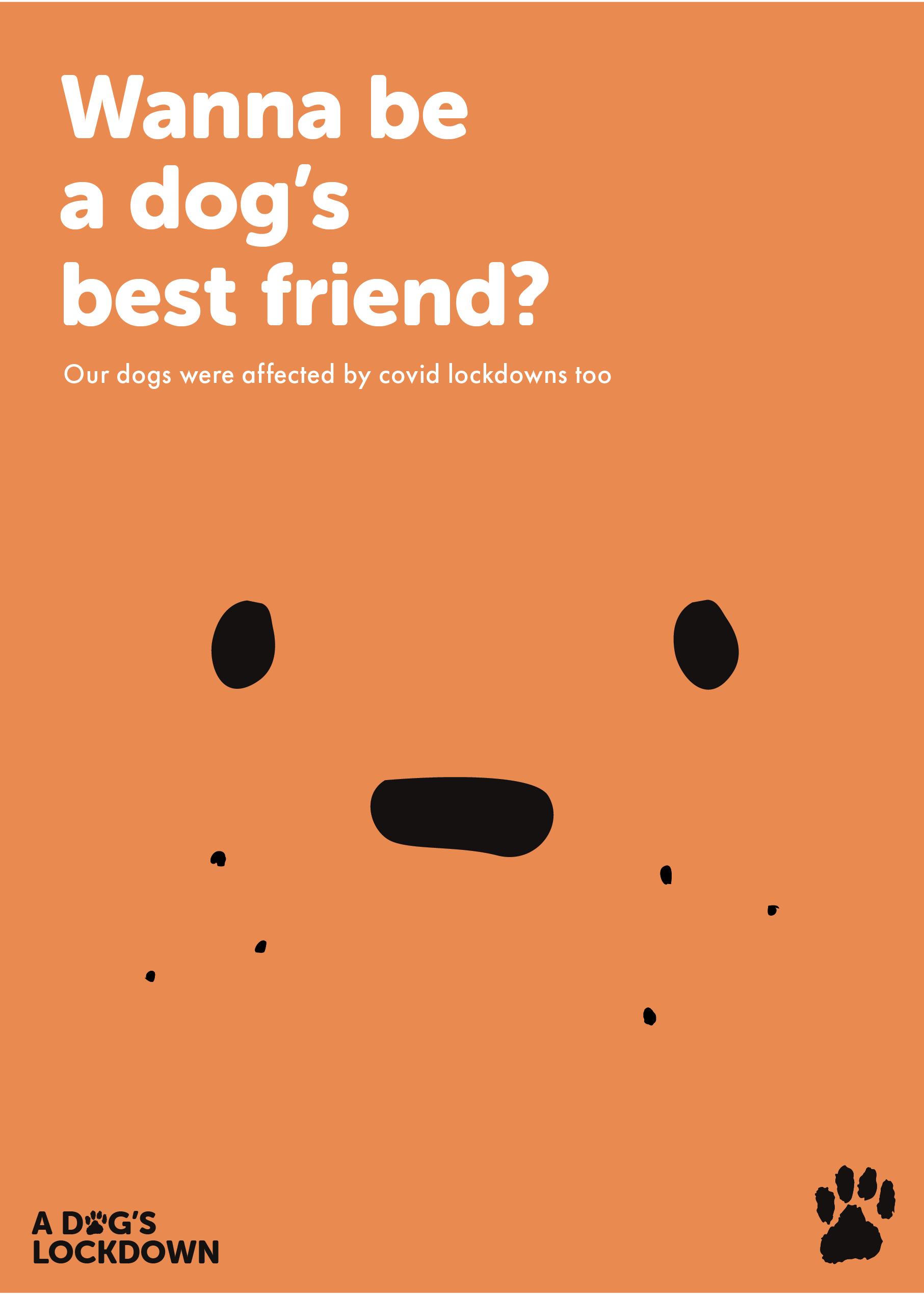
The aim of this campaign is to reduce the amount of dogs being abandoned or suffering negative effects from the Covid lock downs.
The Campaign wants to invoke joy, sympathy and love. Most people love animals, we also want to do the right thing.
Helping out a dog is a way to feel good about ourselves while bringing joy to a dog’s life. The outcomes that this campaign hopes to achieve is primarily, happier dogs. This means dogs that are healthy, have a home where they are loved, and are treated well. Creating awareness on the issue can result in solutions and initiative to do something helpful such as: Desex your dogs, foster dogs, adopt dogs, donate to rescue centres, volunteer to help, and educate owner responsibilities.
The concept of this campaign is to create an encouraging and appealing personality that invokes a sense of morality and compassion in the viewers. The campaign is different to others with its happier and friendlier visual assets. Most campaigns relating to similar topics feature photography and have a serious or commanding tone.
“A Dog’s Lockdown” was inspired by the book and movie titles “A Dog’s Purpose” and “A Dog’s Journey”. It has a neutral tone and incorporates my subject and topic clearly and gives a good idea of what the campaign is about. I decided to use Museo Sans Rounded 900 (All Caps) as my logo typeface for the campaign identity. Museo Sans Rounded has a very friendly and light-hearted feel to it. I wanted to utilise this. I liked how the rounded 900 looked for a header or title. This typeface was inspired by Animals Like Us.
The campaign touches on emotional points and informs people about the facts and topic in a friendly way. This is because Gen Z don’t want to be told what to do. It has an assertive touch to it so that people will realise it is a serious topic. I hope that this combination will create their initiative to do something towards the cause.
To be caring and sincere but also assertive and straight-forward was a tricky challenge. People should still get the impression that they need to do something, however big or small, but without feeling like they are being told what to do. To do this, I used “call to action” titles and questions, that related to our love for dogs and the hope to make ourselves better people.
Keywords:
Adopt, Belonging, Society, Rescue, Concern, Abandon, Value, Companionship
Animals who were adopted during the Covid lockdowns are now being left alone at home or abandoned because their owners are returning to work and can no longer look after them. They were originally adopted to keep the owners company in the lock-downs that kept everybody separated and feeling alone. Now, with the end of lock-downs, the rescue centres of NZ are experiencing high increases of unwanted animals and dogs. Lock-down puppies who got accustomed to having their owner around 24/7 (because of the work from home situations) are developing separation anxiety when their owners return to work and normal life. This causes them to show more destructive behaviours like running away, digging through things, chewing on things, and jumping fences.
To back up this campaign, many sources were researched and taken into consideration. In New Zealand, the rates of dogs in foster care has doubled in 2022 compared with the past 3 years (2019-2021), but the adoption rates have been decreasing (Hendricksen, 2022). This means that there are
numerous amounts of dogs either being kept in a rescue centre, the pound, or loose on the streets. On top of this, rescue centres have to deal with the injured and sick animals as well. The SPCA alone, handles about 35 000 injured or sick animals per a year. (SPCA. n.d.)
The dog population of Auckland has increased by 5.5% from 118,552, in 2021, to 125,016, this year. The amount of dog attacks have increased by a shocking 20.3% (Auckland Council, 2022). A reason for this could be due to the fact that dogs are experiencing anxiety separation and becoming more violent and destructive as a symptom. There have been 8,461 reports of roaming and uncontrolled dogs, and 1,906 incidents of aggressive behaviours. About 4,238 requests to collect a dog that was roaming or being relinquished have occurred, and 5,012 dogs have been impounded this year. Of these impounded dogs, only 3,205 (63.9%) were claimed, which is 7.4% lower than last year’s rates. There has also been a 5% increase in dogs being euthanised at the 3 main government shelters (Auckland Council, 2022).
These statistics support the campaign and the statement that rescue centres across New Zealand are filling up and are unable to accept more dogs. Another issue has been desexing. During lock downs, vets were not able to complete desexing. This means there has been a large increase in litters of puppies this year, and even more dogs that do not have a family.
Chained Dog Rehabilitation & Rehoming wanted to help people desex and care for their dogs in an effort to reduce the amount of unwanted puppies, so they created the initiative “Desex in the City”. “Desexing is the first step in ensuring we can stop these unwanted litters, keep dogs out of pounds and rescues and help dogs live longer, healthier lives.”
~ Chained Dog Rehabilitation & Rehoming (desex in the city, n.d.).
Many articles, rescue centres, and government sources were taken into consideration and used as reference or statistics for the campaign. Other resources for design was “Animals like us”, and similar campaigns with the goal to help dogs in need. These were used to get an idea of how I could effectively portray dogs, and which style would make this campaign stand out from the rest.
A design system is normally created to have consistency and similarity throughout the various media and formats. It can include a colour palette, tone, typography, grids, layout, imagery, illustration, style, photography, motifs, symbols, sketches, elevation, copy writing, animation, info graphics, portraits, and patterns. Having a design system for the campaign was a very important asset. It is basically considered the blueprint or guideline for a project. With the campaign design system I could create a sense of belonging, unity, and familiarity within all the different formats. It also made it easier to generate multiple iterations with better quality than before. This saved me a lot of time, which I could then use on other parts of the campaign.
The primary method of creating and distilling assets for the campaign is hand-drawn assets, that have been digitised in Adobe Illustrator. They were created as rough pencil iterations and then selected by ranking the sketches by most appealing and suited towards the tone, then digitised and refined. Because they started in pencil, creating multiples and variations became a simple and quicker job. Ways of testing these motifs after being refined was to print them alongside other assets and the colour palette.
The target audience is Gen Z because they were the most likely people to have adopted a puppy during lock-downs and are the most likely to adopt in the new future. The secondary audience is Gen Y because they would also be likely to adopt or already own a dog. I want to encourage these groups to do something towards the cause.
The choice of typography was based on the aesthetic, and style of the typeface that ‘Animals like Us’ used in their logo, see figure 1. Softer and rounder fonts like
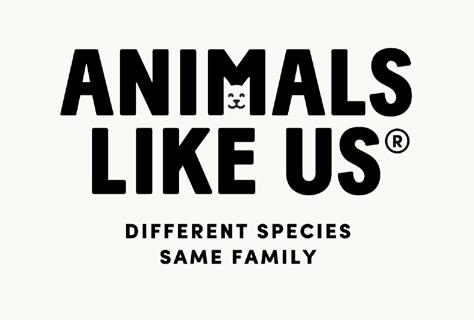
Museo Sans Rounded give a friendly and more approachable tone similar to their typeface. This was the desired effect because the campaign’s overall tone is to be friendly and encouraging rather than victimising, sad, or serious.
There were many fonts used in the experimentation process, but the final font choices are “Museo Sans Rounded 900“ for headers and titles, “Futura PT Medium” for sub-headers or quotes, and “Futura PT Regular/Book” for body text.
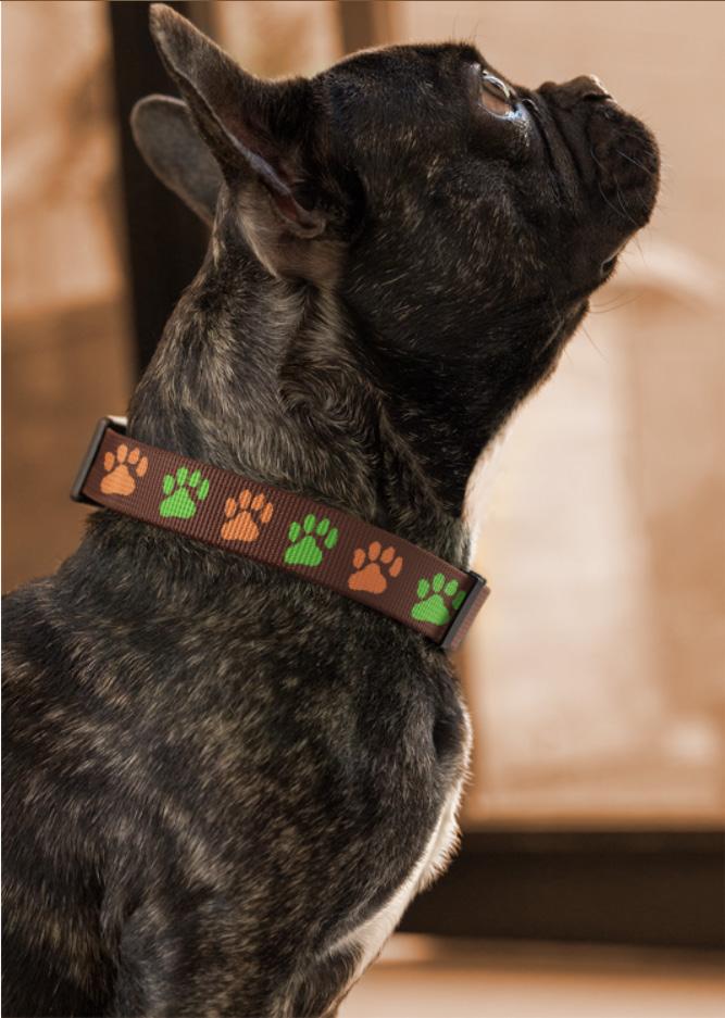
The original palette was chosen because of each association with the colours, yellow being warmth and sunshine, while green is positivity and health. However, this combination was not clear on what the topic of the campaign was and needed to be adjusted. The most common colours found in dogs are brown, black, and white or cream shades. To match this and represent them better, I used dog fur as reference and created a colour palette that represents dogs while having a good contrasting range of colours, and the correct tone. This portrays dogs a lot better than the original colours. The green shade was added to create a better contrast from browns, and to create emphasis or highlight the necessary areas. It was the last colour added because the campaign was looking too flat and brown. It needed a contrasting colour like green to create more depth and catch attention.
The Campaign makes use of Illustration, Typography, Colour, and Pattern. The illustration and iconography were created in a way that looks like a dog hidden
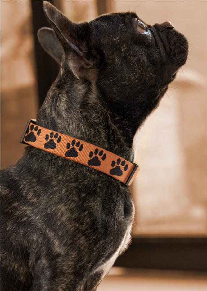
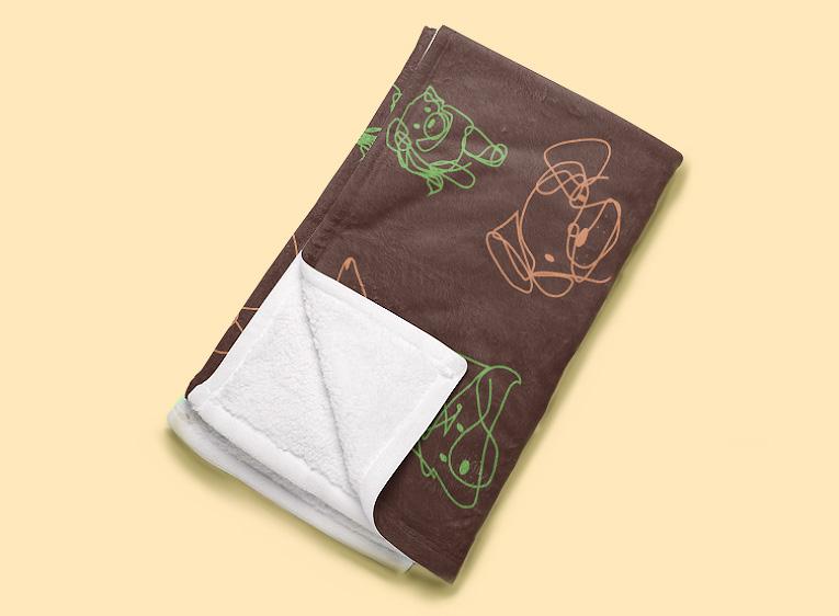
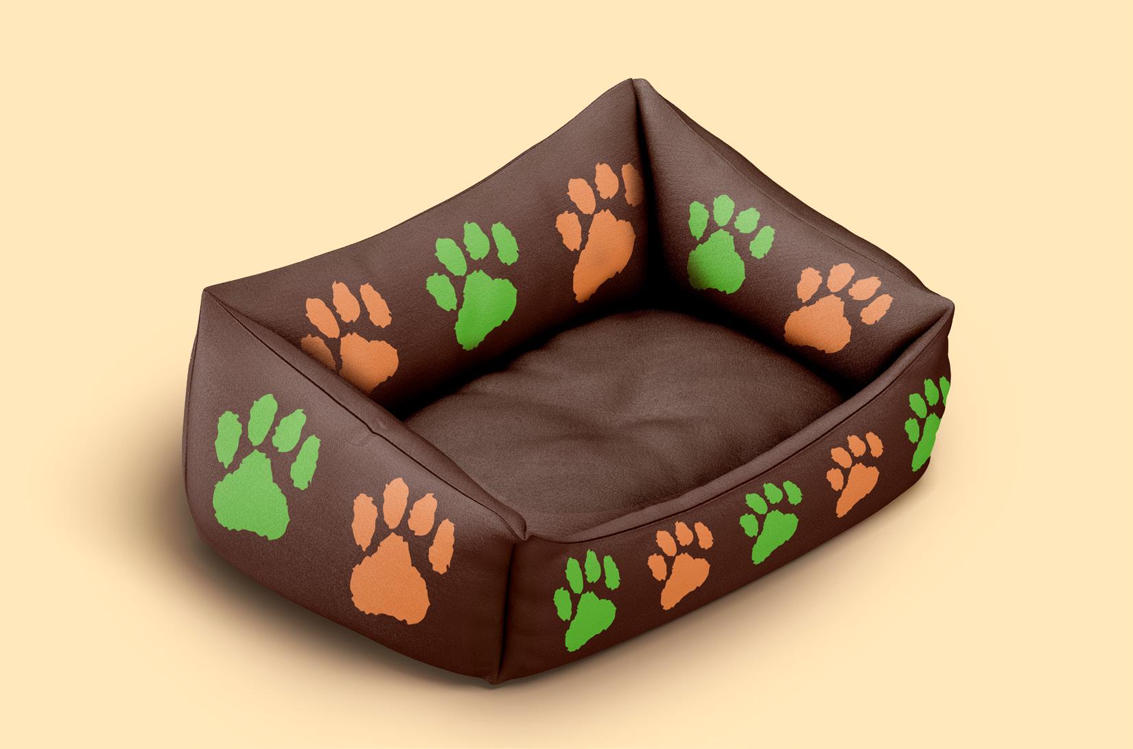
in a scribble or drawn from a scribble. Scribbles can portray chaos and a mess, this was deliberately considered to portray the past and present of an abandoned dog’s life, but in a less depressing way that can appeal to viewers and encourage interaction. Many different type of scribble icons were created to portray different objects in the same style, such as: the pound, dog catchers, dog houses, conversations about dogs, donations, etc.When creating the scribble icons, I created iterations of each designs so that I may have the option to choose which one feels and fits best with the design system and tone. The paw prints are secondary icons that can be used where applicable and as brand emblems etc. These were selected because paw-prints are an iconic symbol for dogs. Patterns were created from the iconography and illustrations that were inserted onto the physical outputs of the campaign.
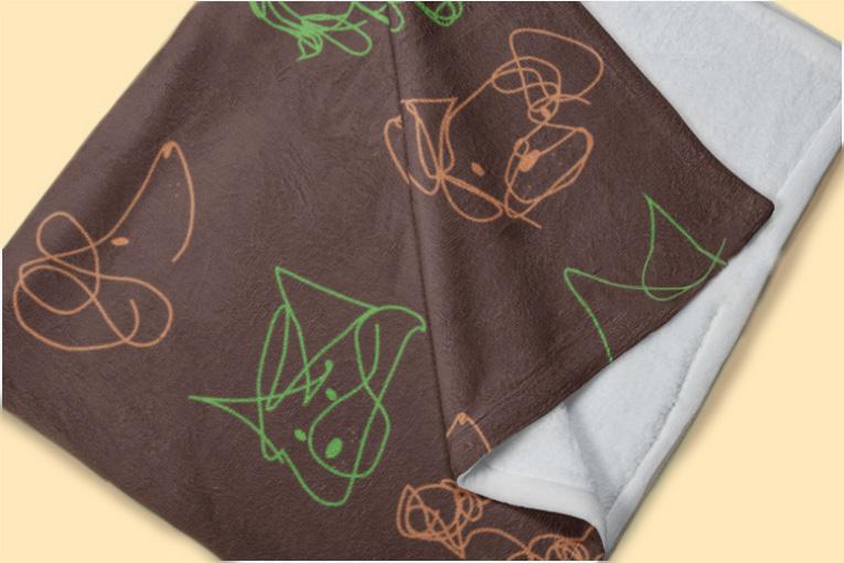
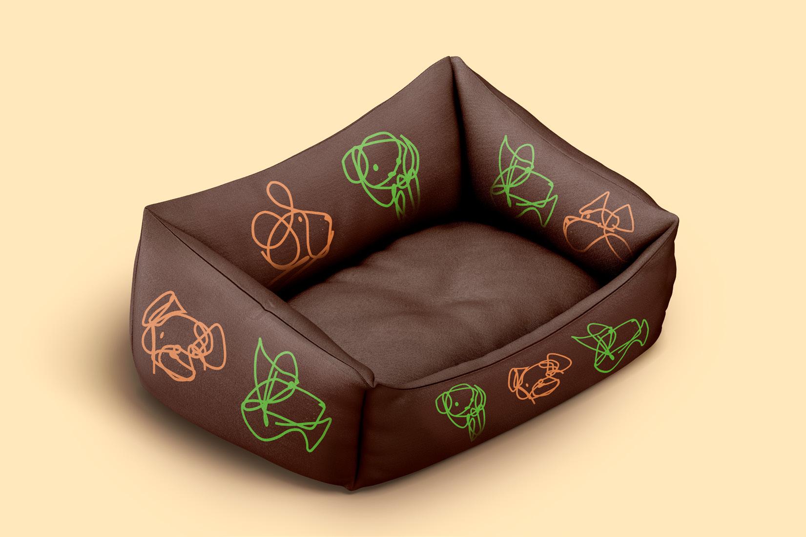
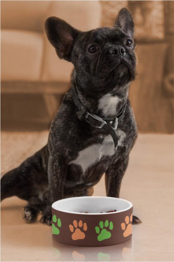
The campaign includes physical objects such as collars, blankets, and dog bowls, but can be expanded to any product for dogs. The idea is that the objects can be purchased when adopting a dog so they have the needed items to live comfortably in their new home. They can also be purchased as gifts for dogs in shelters, or as a personal purchase. The proceeds will go to rescue centres.
I chose blankets, collars and dog bowls because they are the basic needs for a dog, and they encourage a feeling of love and warmth. Collars are associated with having a home and place. The blankets encourage treating your dogs well by giving them warmth or cuddling with them under the blanket. If the campaign was to succeed and expand its range, social media, such as
Instagram, is the next step because it is very popular with Gen Z and Y.
Figure 1 - Animals Like Us LogoGreater Christchurch is an awareness campaign designed to create initiative and achieve carbon zero. The style they used is very sleek and simplistic. They have a simple colour palette and icon style that can be easily applied over multiple formats and systems. The tone is serious but encouraging and approachable. This was a campaign I took as inspiration when designing A dogs lockdown because of the similarities it had and the personality it exudes. If I was ever stuck on how to achieve a specific look or tone, I could always look at this campaign for motivation and ideas.
Animals Like Us is another source of inspiration because of their simplistic and clean approach of design that can be easily applied over multiple formats. They only use one colour, besides B&W. Their logo typeface inspired my own selection because of the simple but friendly affect that it gives off. They also use very simple but cute iconography as their main focus and branding. They have created a very pleasing and friendly design system that doesn’t distract the viewer from their message.
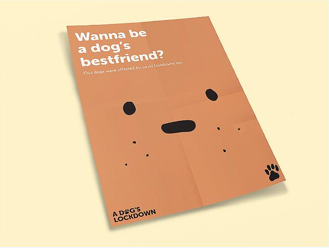
When working on the later stages of the campaign, I did a “Find the grid” activity to help me decide what grids I should be applying. I used these as examples for layout and positioning on awareness posters, and bespoke publications. The awareness posters that I noticed the most, out of the examples, were the ones that had illustration as the main focus or aspect, accompanied by strong typography. They all have good use of negative spacing, and good typography which resulted in clear and calm designs. Most of the examples only had 3-5 colours. They had good margins that did not touch the edges, and the layouts seemed to be mostly in thirds, within the margins. The text was either in the top or bottom third of the margin, and the primary imagery were most commonly in the middle or upper third of the page.
The journey with this campaign has taught me many useful tools for my future. I have learnt how to create a cohesive design system that can be applied over multiple formats and media while keeping consistent with the brand and message. This was something I never thought about and have now realised the importance of a system for designing. Being able to receive feedback on my work helped me to realise where the weaknesses lie and how to improve them. Typography was an aspect I struggled with, and body copy. To achieve the correct tone for the campaign, I needed to test many options and iterations with my peers and audiences to find the most fitting version. I eventually resolved the typography and branding by making the brand identity separate to the title, and by selecting the most appropriate wording for the tone and aim.
#181312 Dark Grey
#552f25 Dark Brown
#663313 Medium Brown
The main icon used throughout the campaign for the brand identity and logo.
The primary imagery used throughout the campaign.
#b35627 Brown Orange
#e78950 Light Brown Orange
#6cbe45 Green
The light brown orange and dark brown are used primarily as backgrounds. The grey, as text or iconography, and the medium brown and orange brown as secondary colours or highlights. Green is a contrasting colour used for emphasis or focus on the subject.
This typeface is used as the campaign logo and brand identity. The “o” in dog is replaced by the paw motif.
Museo Sans Rounded 900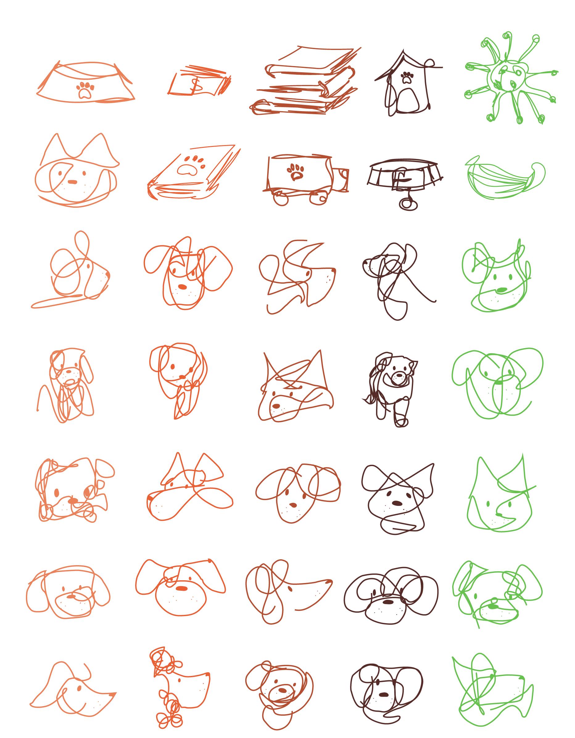
Museo Sans Rounded 900
Display Typeface & Headers
Museo Sans Rounded is used as headers, titles, or display typefaces. The 900 weight is used for main headers and titles, whilst the 700 weight is used for secondary or smaller titles.
Futura PT Medium is used for sub-headings or captions. Futura PT Book is used for body text and paragraphs, while the Medium and Bold can be applied for emphasis on captions, or titles within the paragraphs. Organic shaped text boxes are used, no squares or corners.
With many different types of dogs ending up in shelters, the illustrations aim to portray different personalities and species. These illustrations are the primary imagery for the campaign and can be used where applicable for the topic being discussed.


Wilkes, M. (2021). Lockdown puppies and dogs are now being abandoned in record numbers. Stuff Limited. https://www.stuff.co.nz/life-style/news/127337320/lockdown-puppies-and-dogs-are-now-being-abandoned-in-record-numbers.
Meola, A. (2022). Generation Z News: Latest characteristics, research, and facts. Insider Intelligence. https://www.insiderintelligence.com/insights/generation-z-facts/.
Data for infographics: Hendricksen, L. (2022). Animal shelters struggling with post-lockdown boom in desexed pets. NewsHub. https://www.newshub.co.nz/home/new- zealand/2022/07/animal-shelters-struggling-with-post-lockdown-boom-in-desexed-pets.html.
Animals like us. https://www.animalslikeus.com/.
GreaterChristchurch2050. Greater Christchurch Partnership. https://www.greaterchristchurch.org.nz/.
“You can’t change a dog’s past, but you could rewrite his future” (n.d.) Chained Dog Rehabilitation & Rehoming. https://www.chaineddog.org.nz/.
Auckland Council. (2022). Animal Management Annual Report 2021 - 2022. Auckland Council. https://infocouncil.aucklandcouncil.govt.nz/Open/2022/09/REG_20220913_ AGN_10517_AT.htm.
Hendricksen, L. (2022). Animal shelters struggling with post-lockdown boom in desexed pets. Newshub. https://www.newshub.co.nz/home/new-zealand/2022/07/animal- shelters-struggling-with-post-lockdown-boom-in-desexed-pets.html.
(n.d.) A Promise to our Dog. Saving Hope Foundation. https://savinghope.co.nz/rescued/promise-to-our-dog/.
Desex in the City. (2020-2022). What is Desex in the City?. Chained Dog Rehabilitation & Rehoming. https://www.desexinthecity.co.nz/.
(n.d.) Animal Rescue. SPCA (Royal New Zealand Society for the Prevention of Cruelty to Animals Incorporated). https://www.spca.nz/what-we-do/animal-rescue/.
Figure 1: (n.d.). Animals Like Us. https://www.animalslikeus.com/