brand guidelines
Trifibre Brand Guidelines Version 1.0
Welcome to the Trifibre brand guidelines. Within thisdocument you will find everything that you need to knowabout how our brand should be presented in print anddigital materials, maintaining consistency throughout.Using the Trifibre brand correctly is extremely importantto us, so we request that this guide is always adhered to.
Thankyou!
The Trifibre brand stands for more than a logo and a name, it represents 40+years of packaging solutions and thousands of satisfied customers. Our brandestablishes who we are as an organisation and what we want to be known for.This brand guide will explain exactly how to use the visual identity conciselyand confidently. Our guidelines have been designed to form consistency withinour brand that helps to build more robust and recognisable connections.

Our brand is build on core values that influence every product which isshipped and every word which is spoken. These values are thebenchmark against all our actions under the Trifibre name.
Our experience: With over 40+ years experience under our belt, Trifibre havetackled jobs from all sectors making us confident in what we do. Examplesinclude aerospace, military and medical sectors.
Ease of access: Walking through the broad range of options with the customerin an approachable and friendly manner to ensure that a satisfactory outcome isachieved.
Performance and quality: We understand the nature of this industry and howreliable the products need to be. This is why we invest heavily in securing thehighest quality materials to use within our products.
Simplicity: Business, marketing and other operations should be conducted inthe simplest way possible. This is especially important from a marketing pointof view, the customer should be naturally drawn to our media. All informationshould be clear, concise and condensed.
Trifibre’s brand personality is a set of human characteristics that we feel closelyreflects the company. It is very important that anyone interacting with usexperiences these, and that these are delivered consistantly.
Backed by data: Our excellent performance is reflected through thousands ofhappy customers and 97% + positive feedback. A one stop shop for allpackaging needs.
Efficient: Short turnaround times combined with a responsive support teammeans that products are out the door very quickly, meeting the needs of our customers.
Friendly: Trifibre follows a professional standard but one that is easilyaccessible. The brand personality should reinforce professionalism,experience but also an approachable team that values liasing.
Implementing our branding language should be easy to adopt, both userfriendly and informative. This tone should also be natural and believable,ensure that information is concise and to the point. Repeating key points ormaking text bold is a good way to emphasise.
The logo is arguably the most important component of a brand. Because ofthis, consistent use of the Trifibre logo is vital to reinforcing brand strength andrecognition of who we are and what we stand for as a company.
The Trifibre ‘shield’ logo is a visual representation of us as a brand. The threeshapes of the shield represent our name and the theme of threes. The logoreinforces a sign of strength and trust in the company.
The full colour logo and white-out logo are the preferred logos for use. Black-outversions can be used in certain circumstances however this is very uncommonand colour should always be the first choice.
These logos are available in: CYMK, Pantone and RGB colours.
These logo formats are available in: Vector EPS, JPEG and PNG.
main colour white-out black-out
Our brand colours have been carefully selected to be simplistic yet eyecatching. These colours also take inspiration from our past logos over the past 40+ years.
Our primary corporate typeface is Futura as it is a simple, clean and legibletypeface that compliments our logo. On the Trifibre website,Sofia pro soft is used for the majority of web-based content.
Where the brand name ‘Trifibre’ appearsin text format, it should appear as onesingular word with a Capital ‘T’ being theonly captial. The only excpetion of this ruleis for use in headings (see below).
Heading: Futura Heavy
Subheading located here and would be in this typeface.
Sub-heading: Futura Medium
Trifibre title.
Body text would be in this typeface. Lorem ipsum dolor sit amet, consectetur adipiscing elit. Maecenas eleifend tincidunt ante, non pharetra tortor ullamcorper congue. Vivamus sit amet justo egestas, porttitor urna at, tempus
Section title: Futura Medium
Body text: Futura regular
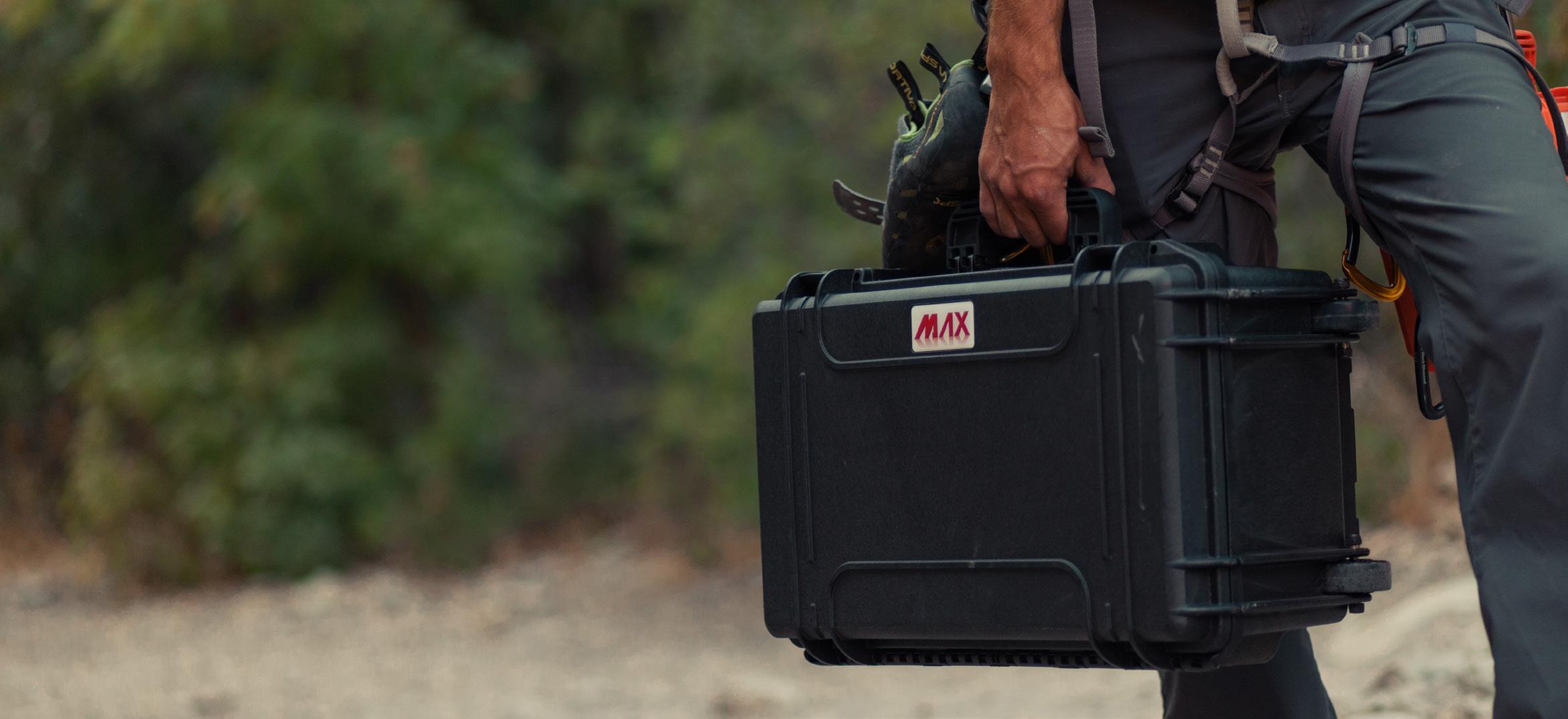
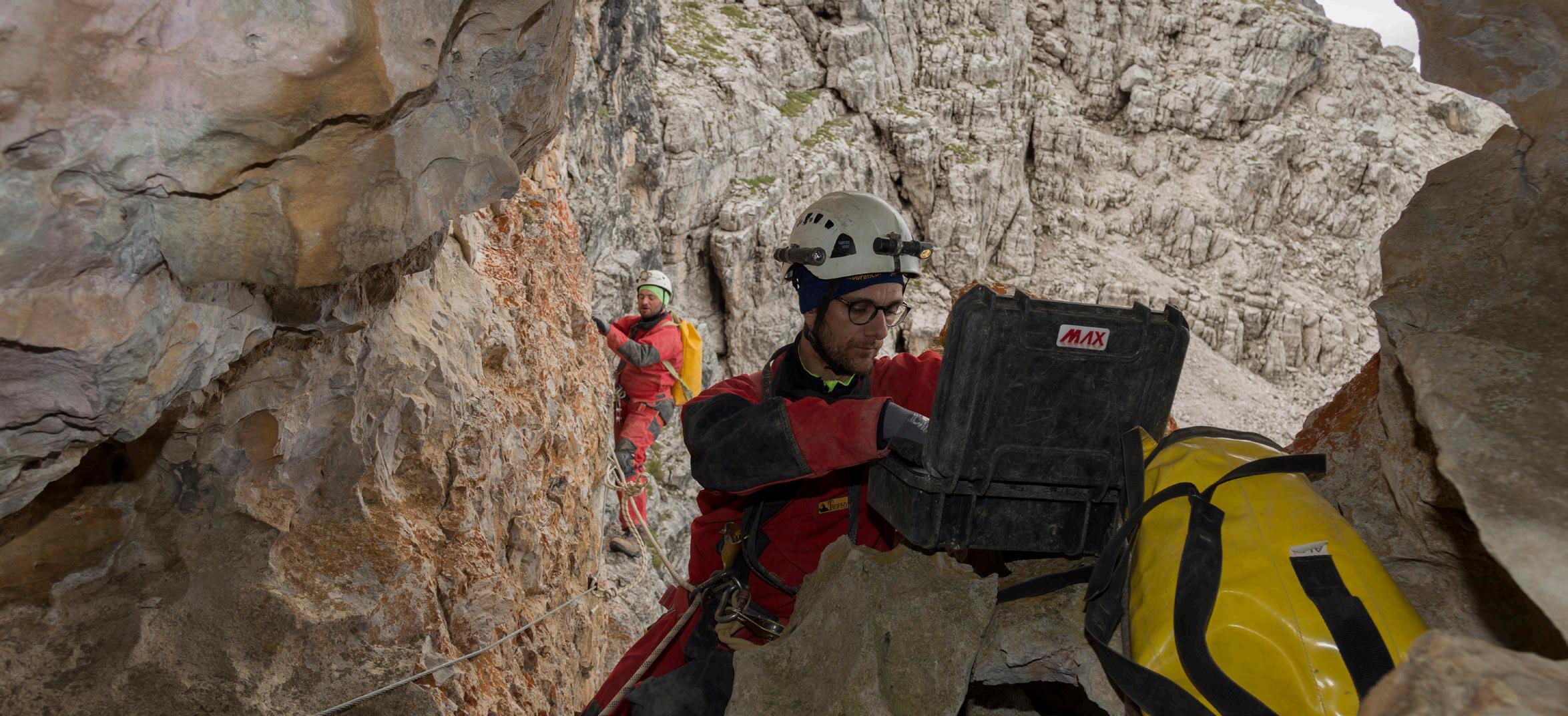
When presenting Trifibre through photography, it is very important to maintainthe brand style and professionalism.
Any imagery should be clear and have appropriate context. Abstract orirrrelevant backgrounds should be avoided. It is also very important that allimages feel authentic and not do not appear posed.
Only use photo editing as a last resort, practical photographs will always lookbetter.