Investigating Chop Suey: Typography as a Cultural Form in Chinese-Australian History and Identity
Xinyuan (Caesar) Li
16
Official Narratives, Lived Realities: The Cultural Work of Design
Regine Abos, Nicola St. John, Alan Fong, Mark De Winne, Kristen Mah
contact rmit.edu.au/designarchives
We acknowledge the people of the eastern Kulin Nation on whose unceded lands we conduct our business and we respectfully acknowledge their Ancestors and Elders, past and present.
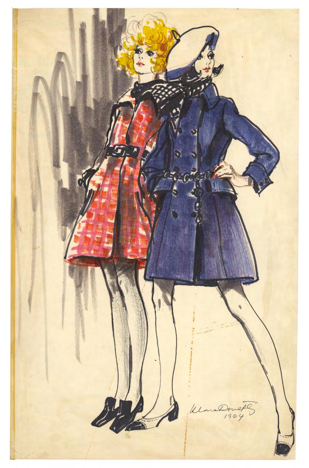
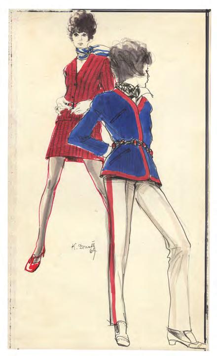
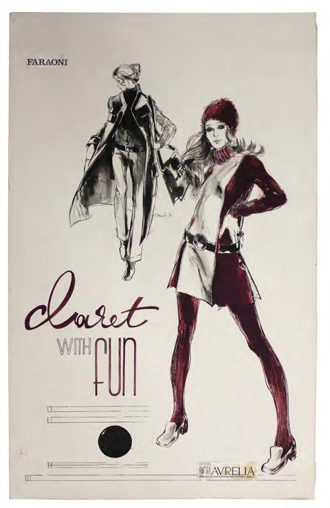
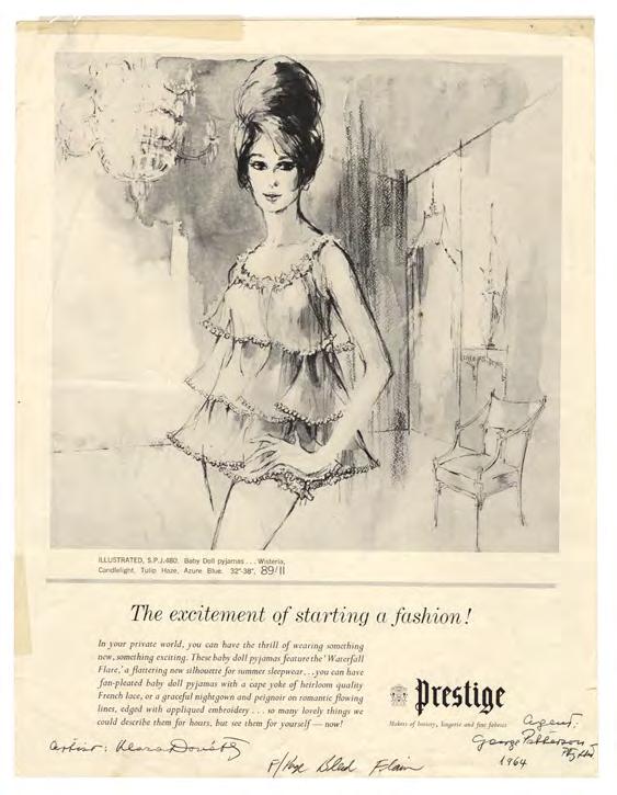
Klára Donáth: Drawing a New Line Through Art, Design and Fashion
Noel Waite
62
Echoes of Elsewhere: The RMIT Master of Communication Design Exhibition 2025 Manav Paul, Rashi Dawar
The many faces of multinational design
To some extent this multinational issue of the Journal was inspired by the International Committee on Design History and Studies [icdhs], which has, since its inception in 1999, sought a more pluralistic Design History or historias del disegnõ1– and a Swedish public historian (but I will return to that). The 14th edition of the International Conference on Design History and Design Studies in New Delhi sought a ‘polylogue among the multiple forms and scales of design embedded in the conference central theme – Cultures of Design.’2
Fifteen nations are represented here in seven articles spanning architecture, fashion and visual communication across 166 years in but a small sample of the global contact and divergence of design. Cultures of design and national identities here are rhizomatic, contesting canons, conventions and disciplinary hierarchies. The approaches are critical, dialogic and conversational, contextual and personal, but, together, they demonstrate the fluid and hybrid movement of design as well as the resilience and resistance of individual and collective design practices.
Xinyuan Li’s curiosity concerning the urban graphic heritage of Melbourne has drawn him into an investigation of a range of archives and museum collections to unpick the relationship of an American typeface with Chinese communities in nineteenth-century colonial Victoria. Here, typography and letter forms are not neutral carriers of language, but expose contested narratives of identity anchored in complex technological, political and social processes. The paradoxes of marginalisation and strategic adaptation are carefully negotiated through critical historical reflection and practice.
At the other end of this expansive chronological spectrum, Singapore Design Week in September this year brought together five designers from Singapore and Australia for the event ‘Nation by Design: Reimagining Singaporean Identity.’ Through exhibiting and interrogating Singapore’s nation branding, they applied a triple helix of practice, education and research to question the relationship between government, industry and society. Their collective aim was not to resolve or flatten, but to interrogate and expand upon the complexities and tensions of the cultural work of design. Yaw Ofosu-Asare begins by questioning the implicit assumption of multinational design being underpinned by a spatial movement of design actors across geographic space. Instead he chooses to focus on the temporal dimension of design, drawing on anthropology and design studies to interrogate the politics of time in a collective case study of three multinational companies or global corporate systems. Safaricom aims to ‘unlock opportunities for the Citizens of the Future’,3 while ikea oscillates between timeless Scandinavian design and a wonderful everyday and muji presents a simultaneous vision of traditional Japanese aesthetics and a sustainable environmental futurity. These temporal paradoxes are questioned in a search for a more just acknowledgement and assignation of global or local design.
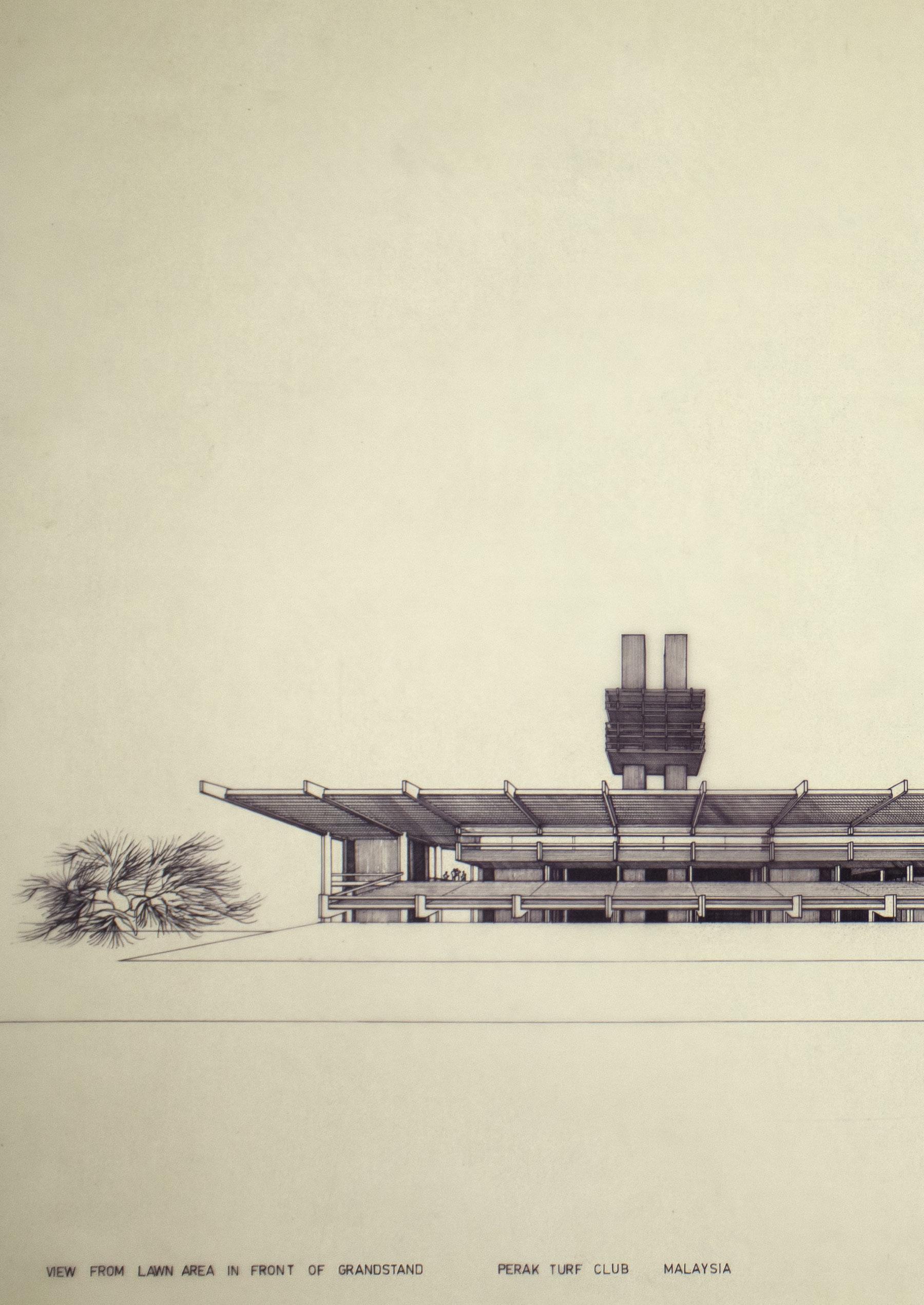
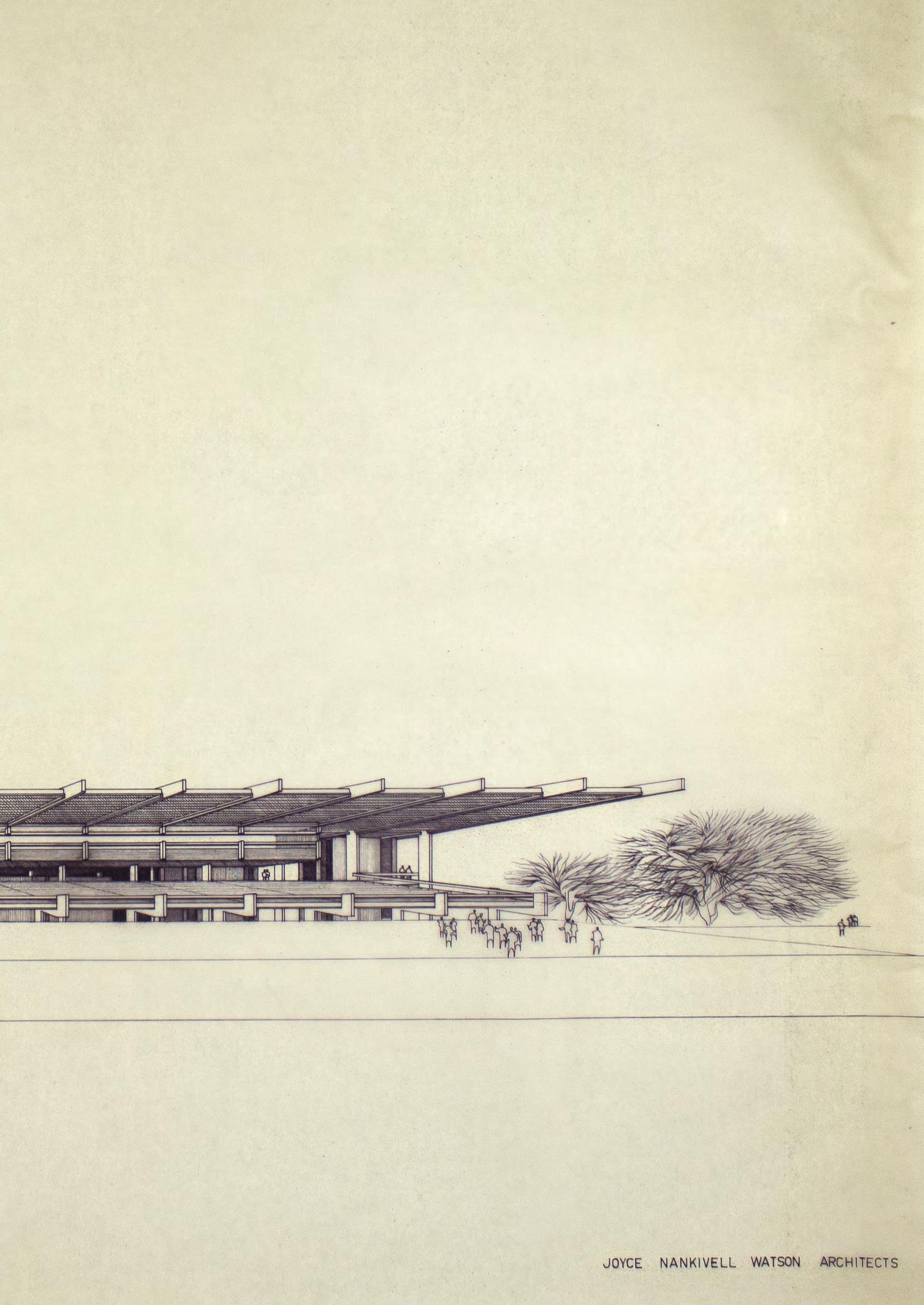
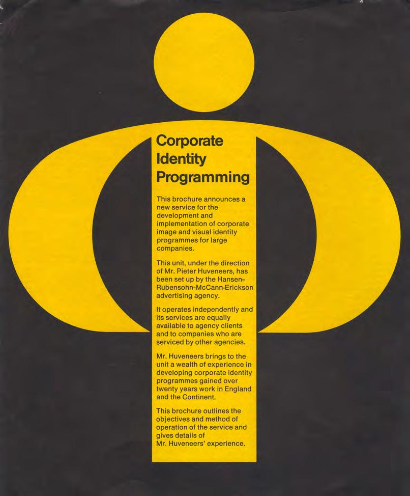
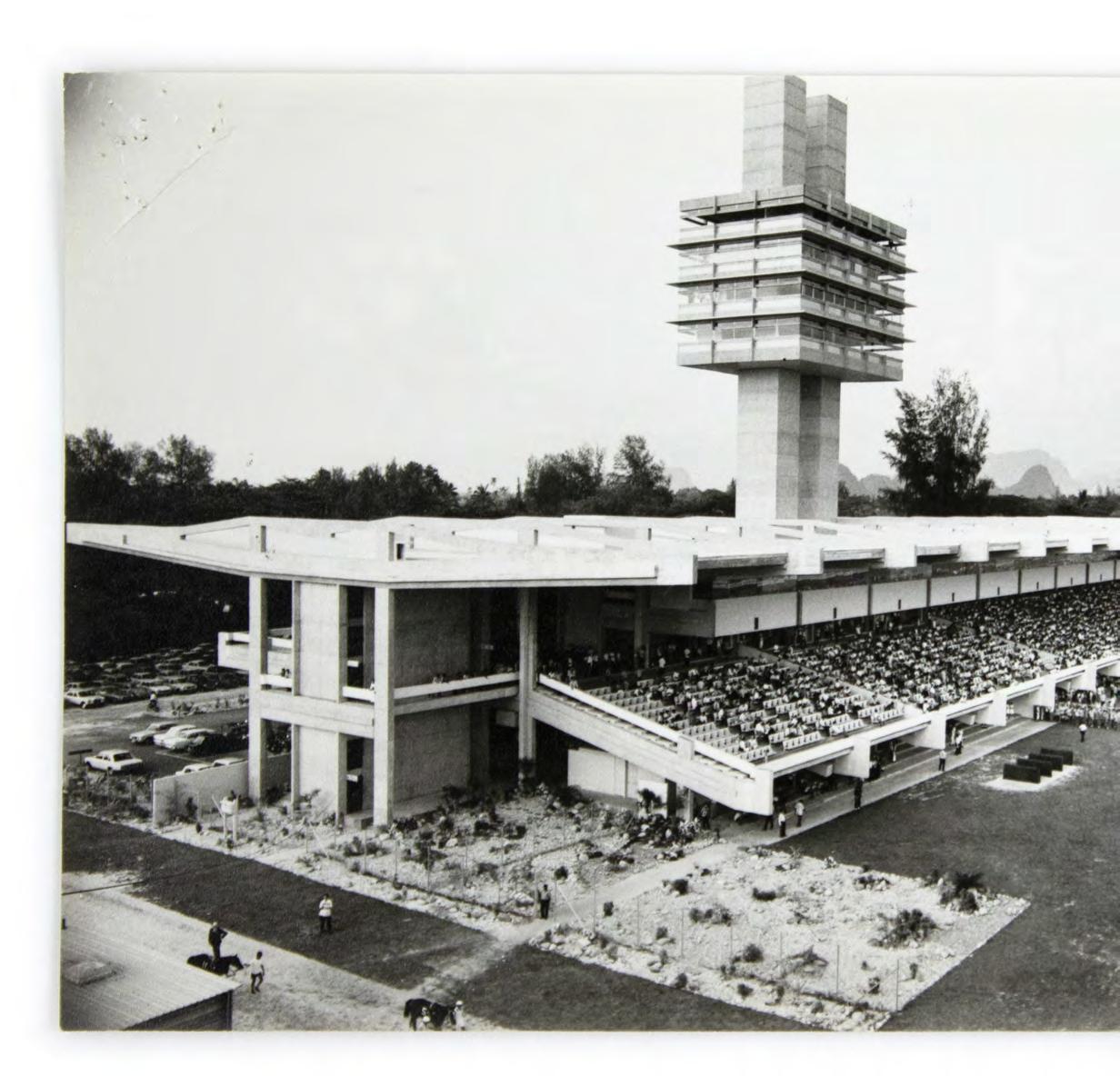
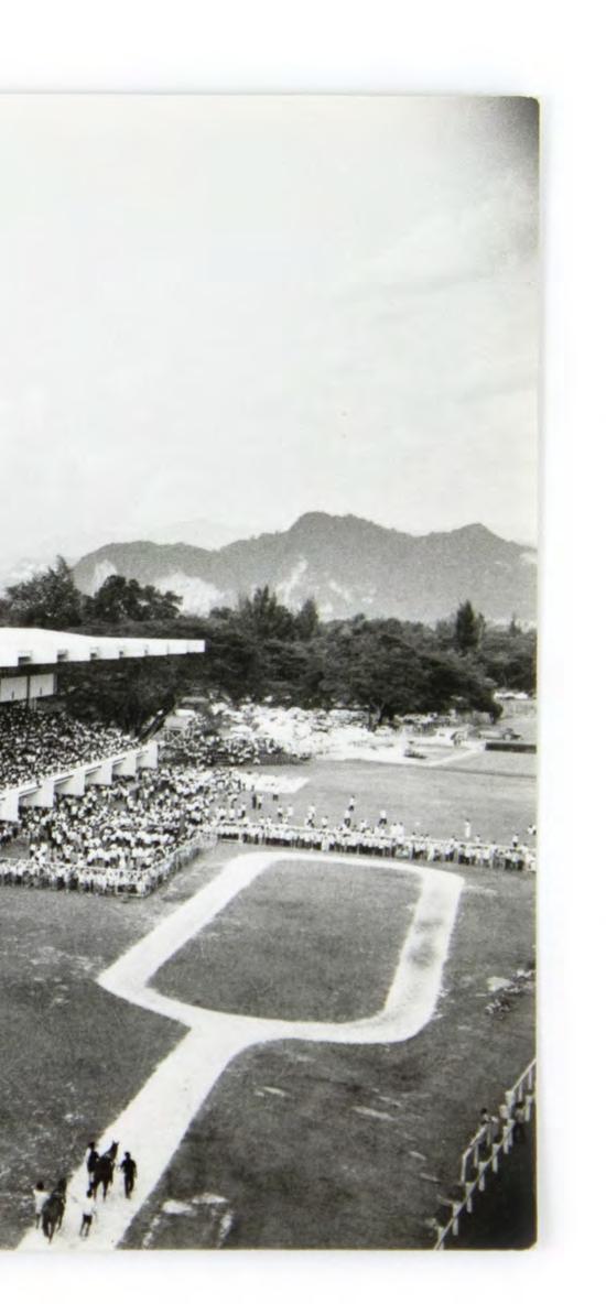
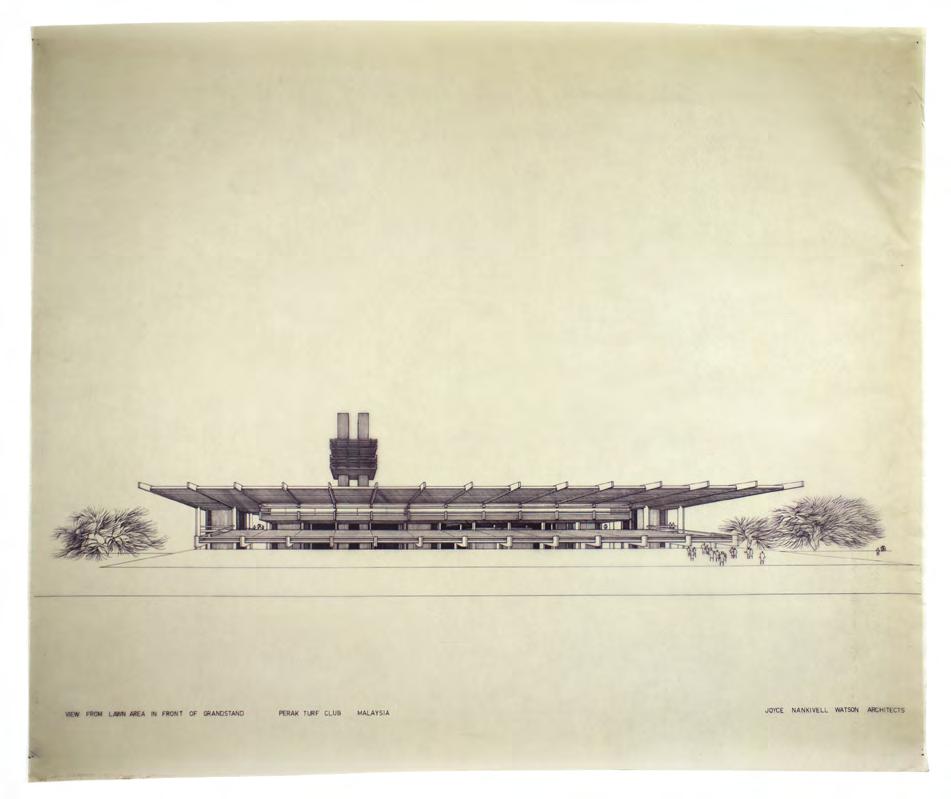
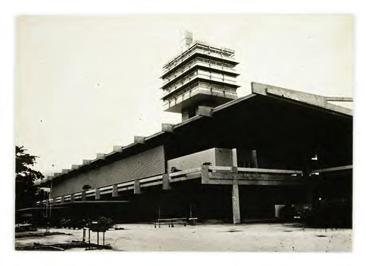
Conrad Hamann’s deep dive into the Bernard Joyce and Bill Nankivell archives held by the rmit Design Archives connect plans, elevations and photographs with an intimate knowledge of architectural practice. Hamann seeks to situate a rich archive in both Australian architectural history, Canberra diplomatic soft power through design and the international geopolitical context of Malaysia. That this links Canberra’s urbanism with diplomatic outposts and embassies and a colonial racecourse complex is all the more interesting for not settling on easy reconciliations between these competing tensions. Overlooked furniture talks back and invites discussion. My own contributions bookend Hamann’s concrete context, but draw on an expansive individual archive of Pieter Huveneers, held by the rmit Design Archives, and a discrete and un-related set of international archives that I have been only been able to access digitally. By contrast, Klará Donáth's story is more of a sketch, drawing primarily from an oral history interview conducted in 1999 and a private collection held by her son, Peter Patay. Huveneers’ experience as the creative director of the General Advertising Department of the multinational Philips demonstrates the tensions of coordinating
advertising design across and between national organisations, but he was adamant that an openness to different languages and cultures was an essential prerequisite for multinational design at such a scale. This was, in part, informed by his experience as a migrant in the United Kingdom in the 1950s. He ensured that when established his own independent design consultancy, Huveneers Pty Ltd, that it was multinational in its makeup.
In this way he could tailor a total corporate programming language that extended from letterhead and business cards to corporate policy for Australian companies to meet the needs of both local, national and international publics.
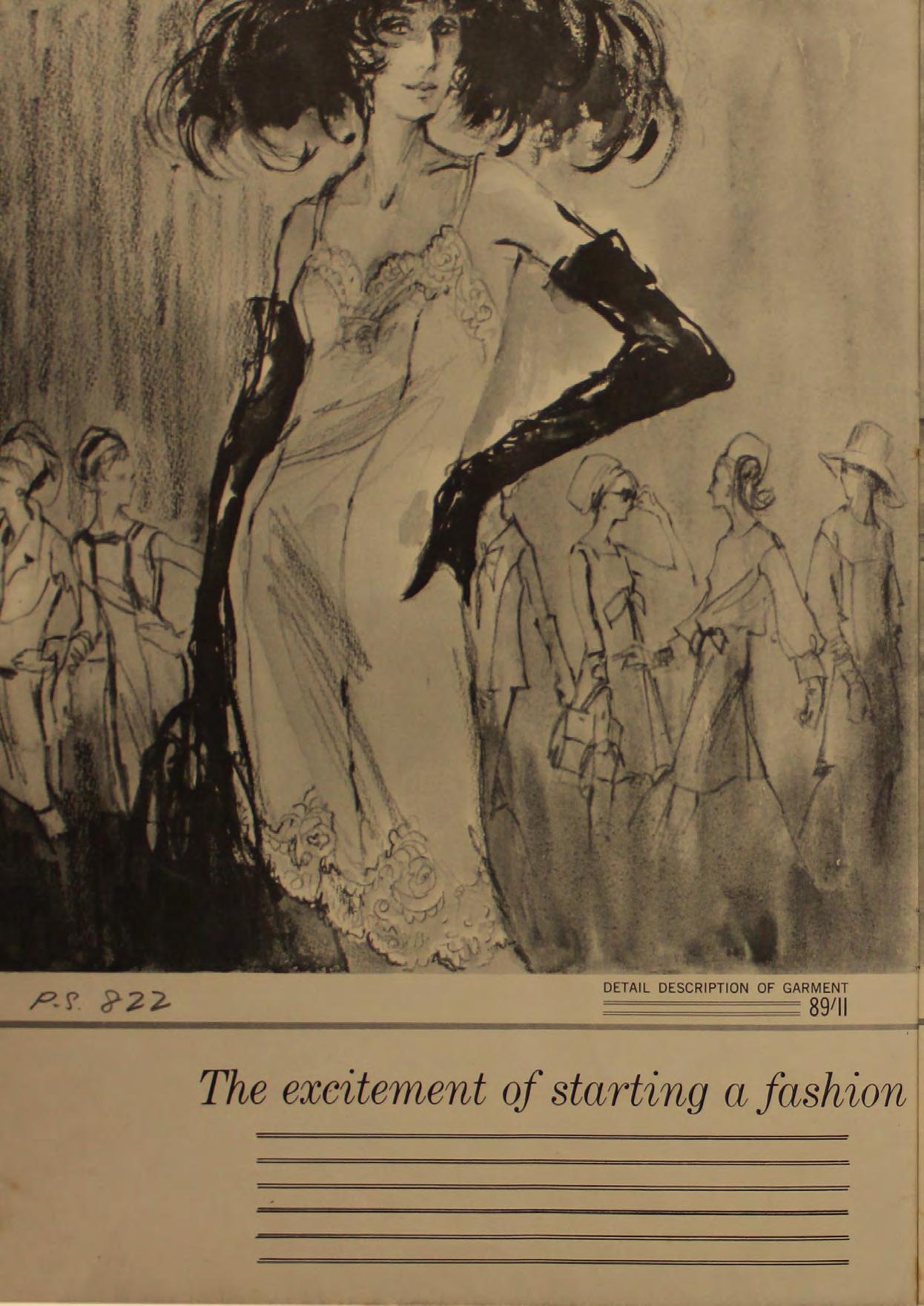
By contrast, Klára Donáth's remarkable personal story of resilience and creative determination reveals the importance of her family, her unexpectedly truncated art education and early practice in Hungary as a theatre designer. Her intimate knowledge of textiles, colour and human form were expressed in the emotional drama of fashion illustration in her adopted country and internationally. The line between Adelaide newspapers and department store advertising and multinational Vogue was not an easy one and her design contribution is worthy of further research and attention to ensure a more pluralistic understanding of design histories in Australia.
Echoes of Elsewhere acts as both archive and exhibition intermediary between contemporary migrant designers living and working in Naarm/Melbourne and the public, engaging people in Melbourne’s diverse creative ecology and sustaining the ongoing project of a more inclusive national and multinational design histories.
In the introduction to this editorial, I alluded to a Swedish author who, in the 1960s, was investigating multinational companies and was struck by how little serious independent research had been carried out on them. Sven Lindqvist’s response was to write Dig Where You Stand: How to do Research on a Job (1978), leading a public history movement which encouraged workers to research and learn their own history, utilising both public archives and oral histories, and the place where they are living. In this way individuals and groups regain control over the understanding of their lives and their inter-connectedness. One of the challenges of digging where you stand is that people move, but it is also vital to account for these movements and their local impacts, as this small but diverse account makes clear. The project of a working history of design is an open-ended one and we hope that this issue’s small sample acts as an encouragement and inspiration for designers to continue to dig, wherever they may stand.
Noel Waite Editor
1 Lucila Fernández & Anna Calvera ‘Historia e historias del diseño / Design History: the whole story’ Experimenta 57, February 2007, 9–10.
2 ICDHS Cultures of Design 10-12 October 2025 New Delhi https:// sites.google.com/view/ icdhs14/home
Investigating Chop Suey: Typography as a Cultural Form in Chinese-Australian History and Identity
Xinyuan (Caesar) Li
Investigating Chop Suey: Typography as a Cultural Form in Chinese-Australian History and Identity
Xinyuan (Caesar) Li
Melbourne is often celebrated as a multicultural city, where diverse visual forms and designs coexist on the streets. As a Chinese international student, I was naturally drawn to cultural expressions that associate with and blend Chinese and Western aesthetics. A form of expression that interests me the most is the letterforms used on some restaurant signage, publications and packaging. These shapes are often perceived as representations of “Chineseness” or “Asianess,” yet felt entirely unfamiliar to me as someone born and raised in China. These somewhat exotic letterforms are called Chop Suey, a style of Latin lettering that imitates the strokes of Chinese calligraphy. Scholarship usually traces its first official registration to the Cleveland Type Foundry in the United States in 1883 . 1 However, earlier examples surfaced in Australia during the 1850s, particularly in caricatures published in Australian newspapers, illustrated magazines and later in commercial advertising such as tea packaging. These typographic forms were associated with racial stigmatisation, stereotyping, commercial branding and broader social tensions affecting Chinese communities in colonial Victoria.
In this article, I examine the emergence of chop-suey-like typefaces in Australia’s gold rush era and their connections to the experiences of Chinese immigrants. Through a careful analysis of historical typographic materials, I investigated how chop-suey-like typefaces became entangled with anti-Chinese sentiment, racial stereotyping, and the commodification of cultural identity. This article aims to highlight typography not merely as a functional carrier of language, but as visual forms that reveal power relations and contested narratives of identity.
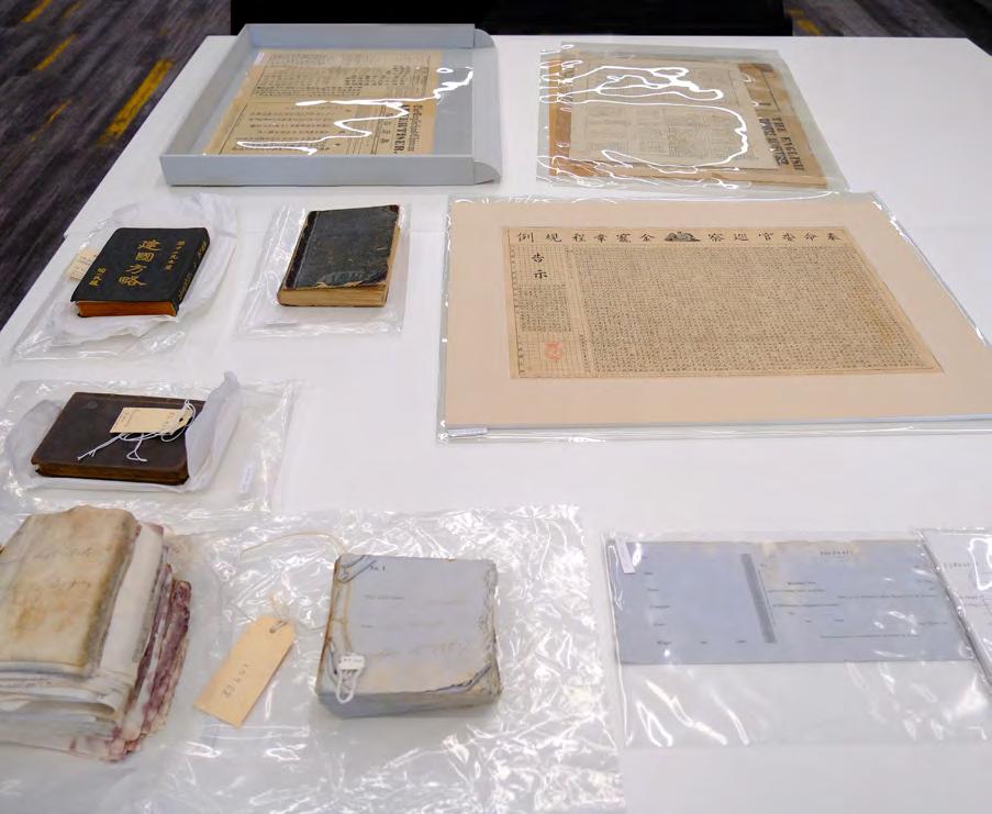
I began my research by conducting a survey of materials relating to Chinese immigrants in the nineteenth century in Australia. To collect historical visual materials, particularly typographic examples, I undertook online searches and visited multiple cultural institutions, including the State Library Victoria, the Australian Centre for Gold Rush Collections and the Golden Dragon Museum. These typographic materials not only helped me understand the contexts of Australian print culture in the nineteenth century, but also support my approach to using typography as a reflective method. From this survey, two recurring themes stand out as central to the development of chopsuey-like typefaces: the Poll Tax and tea products.
Poll Tax: Satire and Caricature
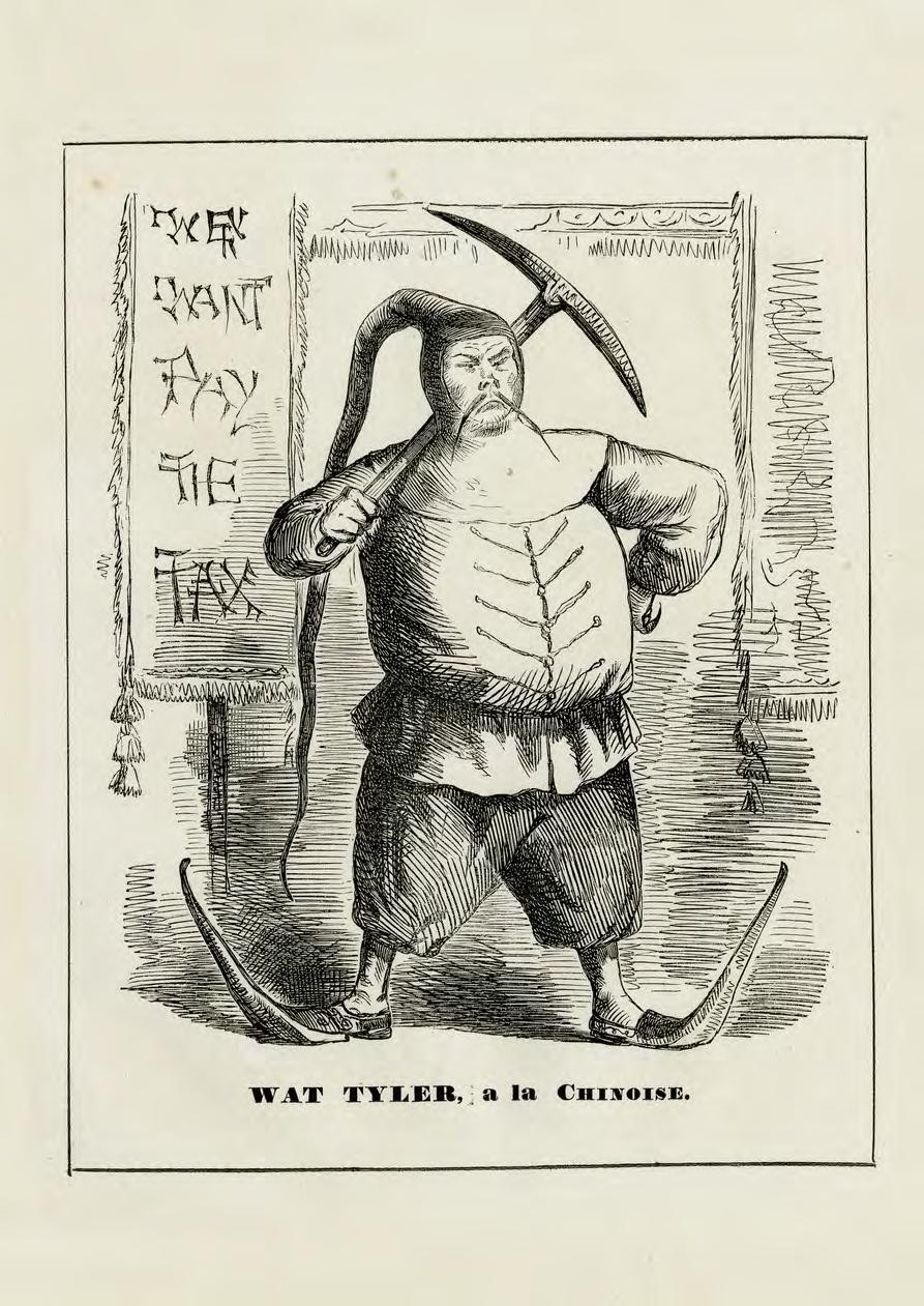
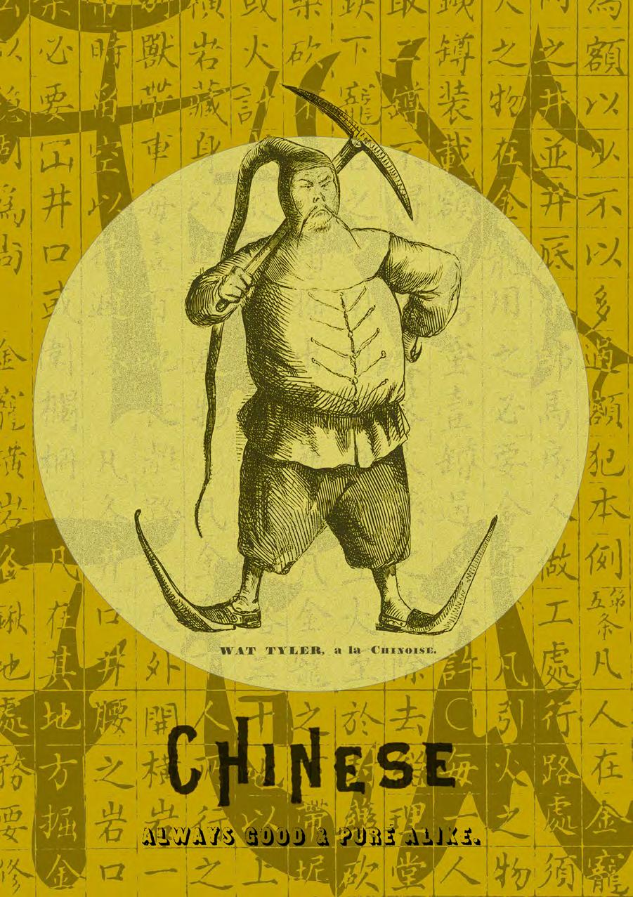
One of the earliest examples I found is an 1859 woodengraved caricature titled “Wat Tyler, a la Chinoise,” published in Melbourne Punch Melbourne Punch was renowned for its distinctive satire and commentary on social, economic and political issues, presented in various formats, from articles and sketches to humorous and satirical writing, verse, jokes and cartoons.2
The magazine targeted a white immigrant readership, aiming to represent and shape the colonial identity, culture, politics and ideology, while explicitly excluding populations such as Chinese immigrants.3 Emerging at a time when rising literacy rates and advances in printing technology stimulated the growth of new periodicals in Victoria, Melbourne Punch distinguished itself as one of the few enduring magazines in colonial Australia.4
At the centre of the image stands a grotesque caricature of a Chinese figure wearing an exaggerated headpiece, long boots, and a handlebar moustache, carrying a hoe on his shoulder, and presented overall as a clown. Beside him, a banner proclaims the distorted slogan “We Want Pay the Tax.”
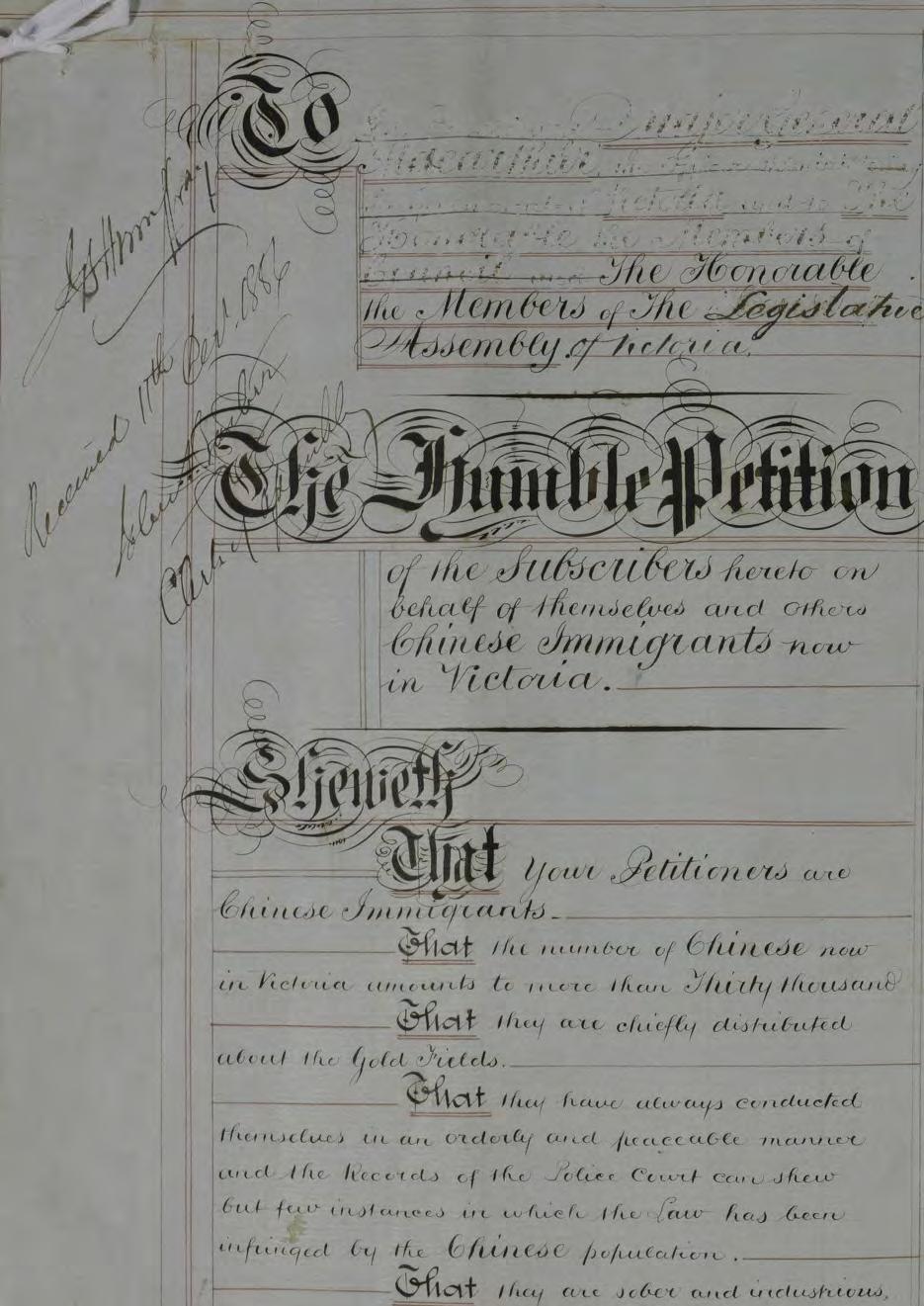
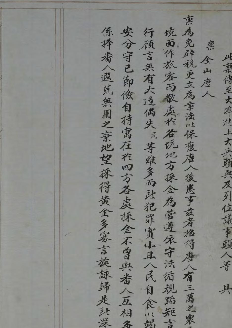
Preceding page Bilingual petition for the repeal of poll tax, 1856, submitted by Chinese immigrants, Public Record Office Victoria, VPRS 3253/ P0000, 1.
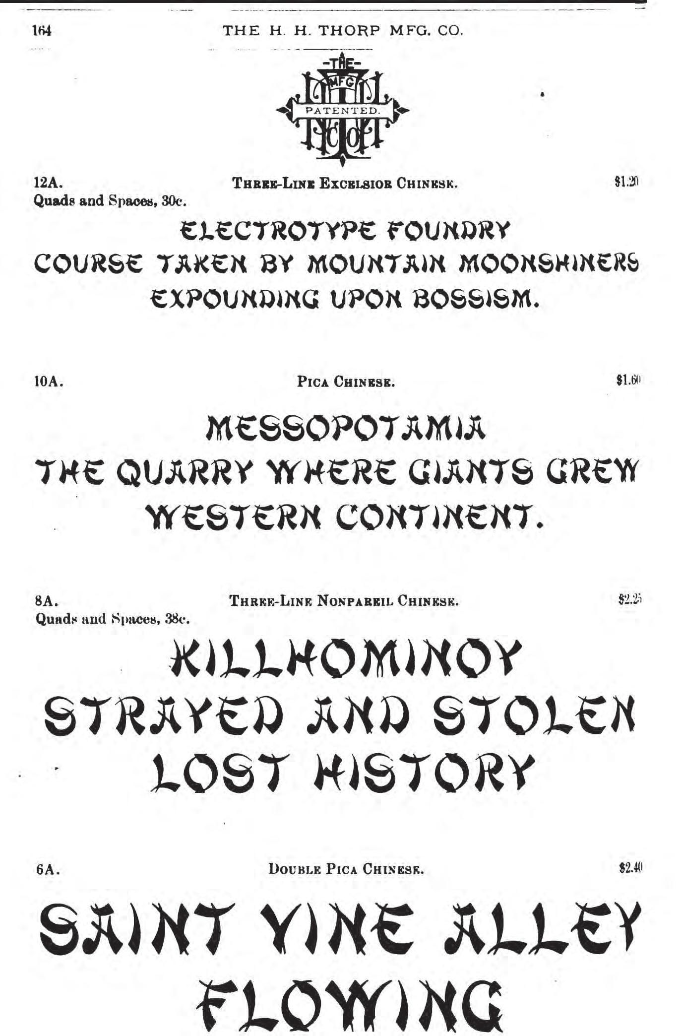
Opposite Type specimen of ‘Chinese’ typeface manufactured by H. H. Thorp, Cleveland Type Foundry, 1885, 164, Ohio State University Collection, courtesy Haithi Trust Digital Library.
Opposite “Wat Tyler, a la Chinoise,” 1859, Melbourne Punch, Art Gallery of Ballarat, purchased with funds from the Hilton White Estate, 2015.
The “Wat Tyler” referred to in the title was the leader of the English Peasants’ Revolt of 1381, when people refused to pay a new poll tax. Wat met with the King and advocated for broader rights, including the abolition of the poll tax. Wat was wounded and afterwards put to death. After his death, the rebels failed and the rights he pursued were never realised.5
It is not a coincidence that Wat’s name was associated with a Chinese figure in this caricature, especially given the established opposition of Chinese immigrants to the poll tax. Since 1854, large numbers of Chinese immigrants had arrived in Victoria. The poll tax in 1855 and the residence fee imposed in 1857 placed heavy burdens on them.6 Many responded by using petitions, protests and non-cooperation to express their opposition.7 The influx of Chinese immigrants also led to hostility and resentment from disgruntled European miners and settlers, with anti-Chinese violence breaking out across a number of places in Australia.8 One of the most notorious examples was the Lambing Flat riots in the 1860s. The “Roll Up” banner is a visual artefact, produced for the riot that intended to drive Chinese miners out of the goldfields through a campaign of violent assaults and attacks.9
Naming this caricature “Wat Tyler” reflects Melbourne Punch’s satirical stance toward Chinese immigrants’ opposition to the poll tax, framing their resistance as ultimately futile. The cartoon, accompanied by the caption “We Want Pay the Tax,” reflects the European settlers’ perception at the time that any form of rebellion from “other” races was destined to fail.
This cartoon not only caricatures and demeans Chinese immigrants visually but also employs typographic forms
as a device to mock “Chineseness.” As a piece of visual satire, it illustrates how, amid cultural, ideological and economic tensions, Chinese immigrants were subjected to a pervasive climate of xenophobia within a colony dominated by a white settler society.
Tea: Commodification of “Chineseness”
Another trajectory of chop-suey-like typography surfaces in commercial contexts. During the nineteenth century, Australia had one of the highest per capita rates of tea consumption in the world.10 The flourishing tea trade and expanding market fuelled intense competition, leading tea companies to adopt new marketing strategies and develop distinctive visual branding.11
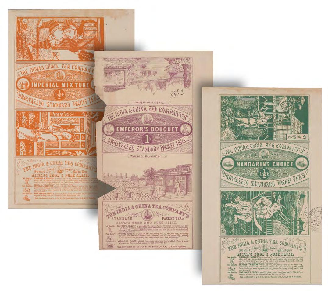
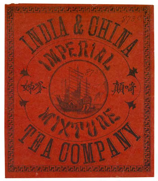
One example is the India & China Tea Company, owned by James Price Goulstone. In 1875, James registered a series of tea label designs in the Victorian Patents Office Copyright Collection.12 The design, though appearing in several monochrome variants, shares consistent characteristics. The title is set in sans serif, with smaller promotional phrases such as “Always good & pure alike” also in the same style. The company name “The India & China Tea Company” and tagline “Unrivalled Standard Packet Teas” are rendered in chop-suey-like letterforms, while product descriptions appear in italic type. Each label also features two illustrations of tea-making processes, Chinese characters, or scenes related to Chinese culture. Existing records suggests that Chinese labourers were involved in the production of boxes of packaged tea.13 However, there is no conclusive evidence showing the authorship of the typography. There is no doubt that the products enjoyed marked success: They were awarded a medal at the 1878 Paris Exposition Universelle, exhibited at the 1880 Melbourne International Exhibition, and circulated in multiple sizes and variants.14
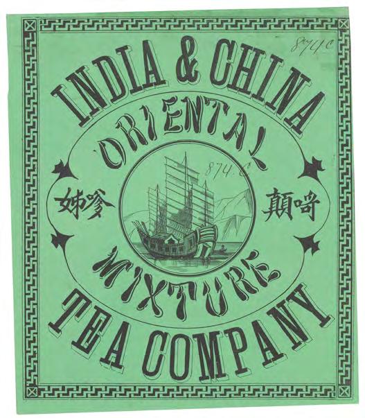
The company also designed another tea package in a similar style. In this label design, the applied letterforms are structurally closer to the Chop Suey typeface. The softened strokes and calligraphic details lend the letterforms a closer resemblance to Chinese visual aesthetics. Ornamental strokes were added to English letters to create depth, a strategy also visible in the chopsuey-like letterforms. While such typographic treatments reflected broader late-nineteenth-century fashions in display lettering, their uneven application specifically demonstrates how designers attempted to evoke a “Chinese” visual idiom using Latin typographic conventions.
In both examples, the India & China Tea Company put great efforts into the package design to appropriate, transfer or even construct the perceived profound and distinctive qualities of “China” onto their products. Although this strategy achieved market differentiation, their attempts to signify “Chineseness” in their design were superficially imitative and misleading. This is particularly evident in another advertisement from the company that was supposed to blend Chinese, Indian, and Japanese motifs into a decorative fantasy landscape. Rather than authentically representing different cultures, the design reduces them to ornamental motifs and typographic caricature, producing a hybrid, inauthentic and culturally ambiguous visual language. These designs for tea products provide a clear example of how commercial design in colonial Australia simultaneously commodified and distorted “Chineseness,” transforming it into a consumable fantasy.
Typographic Reflection
Inspired by these historical materials and using typography as a medium, I attempted to assemble typographic
fragments into a poster to reflect and reinterpret the visual legacy of colonial Australian design of “Chineseness.”
The challenge lay in the complexity and sensitivity of this cultural and visual legacy since these forms carry a history of both marginalisation and strategic adaptation. Different audiences may interpret them in diverse ways—some may view them as empowering or celebratory, while others may see them as stereotypical or derogatory.
I considered how Chop Suey typefaces could be carefully applied and reinterpreted to engage with their complex legacy. To guide my approach, I explored how early Chinese immigrants perceived the Chop Suey typefaces. Linguist, Yu Li noted that during the development of Chop Suey typefaces in Los Angeles Chinatowns, Chinese immigrants initially resisted their imposed use. Over time, however, they began to adopt such forms strategically, using them to promote their restaurants. They leveraged the visual distinctiveness to differentiate their businesses from their competitors.15 While Li’s findings focus on Los Angeles Chinatowns, the fact that Chinese immigrants themselves adopted and adapted these letterforms strategically suggests the expressive potential of using chop-suey-like typefaces to generate positive connotations.
Acknowledging this history of negotiation and paradox, my poster, as a way of reflection, aims to reclaim chop suey forms from their historical entanglements, repurposing them as instruments through which designers can critically engage with colonial history and racialised representation.
The collage poster, titled Always Good & Pure Alike, draws inspiration from the Oriental Tea label. By fragmenting the original design, I transformed a commercial call into a positive message for Chinese migrant workers.
Above Labels for India & China Tea Company, 1875, registered by James Price Goulstone, Victorian Patents Office Copyright Collection, State Library of Victoria.
Left
Labels for The India & China Tea Company’s Unrivalled Standard Packet Teas, 1875, registered by James Price Goulstone, Victorian Patents Office Copyright Collection, State Library of Victoria.
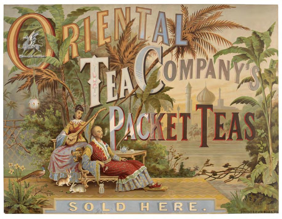
Poster for Oriental Tea Company Packet Teas, c.1881–c.1890, artist Charles Turner, lithographers Troedel & Co, Gift of Troedel & Cooper Pty Ltd 1968, State Library of Victoria.
At the bottom, the text is composed of two elements: the word “Chinese”, taken from a Chinese immigrants’ advertisement in 1874, and a promotional phrase from Oriental Tea packaging, “Always Good & Pure Alike.” The phrase is reinterpreted to suggest the fine qualities of Chinese immigrants. The background features translated official announcements of prohibitions targeting Chinese miners, alongside chop-suey-like typefaces in the words “Tax” and “Tea.” Through digital manipulation, these texts become largely illegible, functioning instead as a textured pattern that evokes cultural memory without relying on readability.
This poster seeks to transform historical symbols of exclusion and commodification into a rich visual story that celebrates resilience while reflecting on the colonial and racialised histories embedded in these letterforms and texts.
Understanding the history and contexts of typography is the first step to breaking rules.16 In tracing the emergence of chop-suey-like typefaces, I explored and examined a range of historical materials, from caricatures to tea label designs between the 1850s and 1870s. Amazed and inspired by the use of chop-suey-like letterforms in these materials to signify “Chineseness,” I experimented with a collage poster with the aim of reimagining this complex visual legacy, crafting a narrative that counters purely stereotypical or culturally ambiguous representations. By transforming somewhat hostile and stereotypical symbols into uplifting and empowering forms that foreground the resilience of Chinese immigrants, the poster demonstrates not only the expressive potential of chop-suey-like letterforms but also the capacity of typography to serve as a lens for cultural negotiation and historical reflection.
endnotes
1 Paul Shaw, “Stereotypes.” Print 62, no. 4 (2008): 109–110.
2 Lurline Stuart, “Melbourne Punch,” Melbourne: The Encyclopedia of Melbourne Online, School of Historical and Philosophical Studies, The University of Melbourne, July 2008, https://www.emelbourne.net.au/ biogs/EM00951b.htm.
3 Shu-chuan Yan, “Kangaroo Politics, Kangaroo Ideas, and Kangaroo Society: The Early Years of Melbourne Punch in Colonial Australia,” Victorian Periodicals Review 52, no. 1 (Spring 2019): 80–102, https://doi.org/10.1353/ vpr.2019.0003.
4 Yan, “Kangaroo Politics,” 2019.
5 The Editors of Encyclopaedia Britannica, “Wat Tyler,” Encyclopaedia Britannica, accessed September 26, 2025, https://www.britannica.com/ biography/Wat-Tyler.
6 Charles A. Price, The Great White Walls Are Built: Restrictive Immigration to North America and Australasia 18361888, (Australian National University Press in association with Australian Institute of International Affairs, 1974), 67–73.
7 Anna Kyi, “‘The Most Determined, Sustained Diggers’ Resistance Campaign’: Chinese Protests against the Victorian Government’s AntiChinese Legislation 1855–1862,” Provenance: The Journal of Public Record Office Victoria, no. 8 (2009), https://prov.vic.gov.au/explorecollection/provenance-journal/ provenance-2009/most-determinedsustained-diggers-resistance.
8 Andrew Markus, Fear and Hatred: Purifying Australia and California 1850–1901 (Hale & Iremonger, 1979), 19–34.
9 Karen Schamberger, “Difficult History in a Local Museum: The Lambing Flat Riots at Young, New South Wales,” Australian Historical Studies 48, no. 3 (2017): 436–441, https://doi.org/10.108 0/1031461X.2017.1331693.
10 Peter D. Griggs, Tea in Australia: A History, 1788–2000 (Cambridge Scholars Publishing, 2020), 37–38.
11 Griggs, Tea in Australia, 2020, 167–168.
12 “The India & China Tea Company’s Unrivalled Standard Packet Teas, 1875,” State Library of Victoria (website), accessed September 26, 2025, https:// find.slv.vic.gov.au/permalink/61SLV_ INST/1sev8ar/alma9939669152207636
13 Peter D. Griggs, “Empires of Leaves: Tea Traders in Late NineteenthCentury and Edwardian Melbourne,” Victorian Historical Journal 87, no. 1 (June 2016), 35.
14 Griggs, Tea in Australia, 2020, 172–174.
15 Yu Li, “The Chop Suey Letterform in Historical Los Angeles Chinatowns,” Social Semiotics 35, no. 2 (2025): 163–207.
16 Fraser Muggeridge, “Typography with Words,” Eye: The International Review of Graphic Design, no. 75 (2010), 26–27.
Official Narratives, Lived Realities: The Cultural Work of Design
A conversation from Nation by Design, Singapore Design Week 2025
Regine Abos, Nicola St. John, Alan Fong, Mark De Winne, Kristen Mah
Official Narratives, Lived Realities: The Cultural Work of Design
A conversation from Nation by Design, Singapore Design Week 2025
Regine Abos, Nicola St. John, Alan Fong, Mark De Winne, Kristen Mah
Design archives are not neutral repositories. They are as much collections of artefacts as sites of encounter between official stories and lived realities, and require incorporating what matters to people, how they experience their worlds, and what stories they decide to share with others. For communication designers, the archive can act as a stage where typography, colour, and image continue to perform. National logos, public campaign graphics, and everyday signage all return to us with uncanny insistence: They ask who we thought we were, who we might still become, and who was left out of the picture?
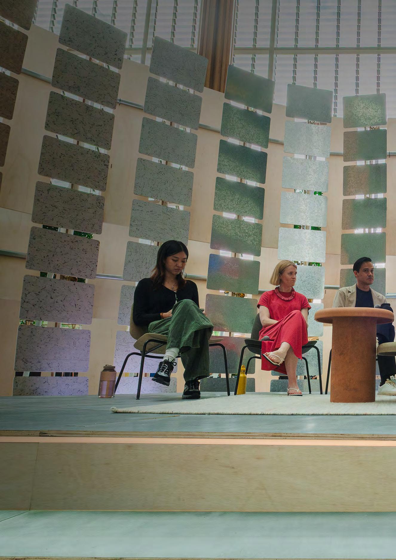
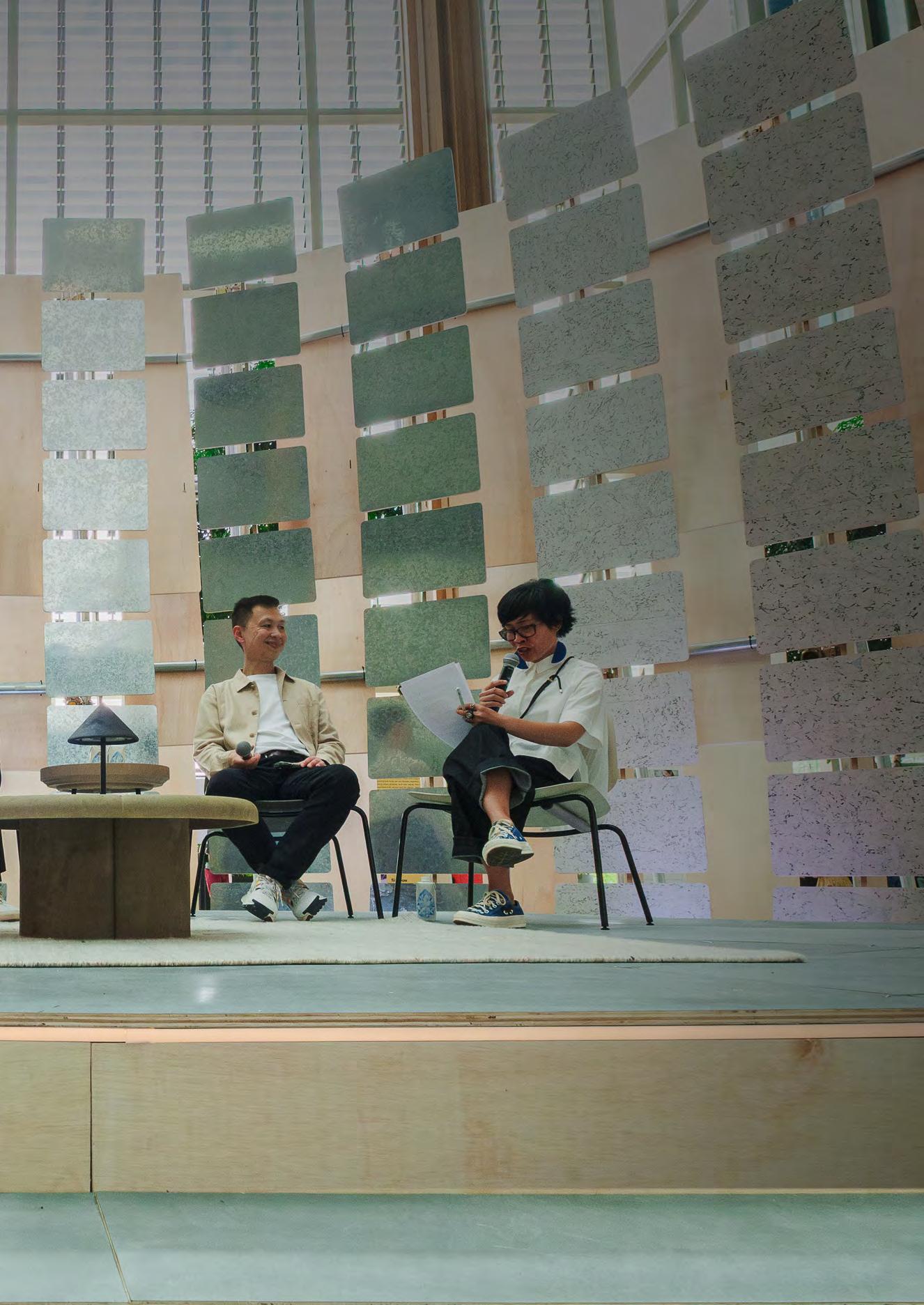
During Singapore Design Week 2025 there was a moderated conversation that sought to foreground the design archive as something live, dialogical and plural, surfacing the ethics and politics at play within representations and intersections of national identities, histories and worldviews. The conversation, presented as part of the “Nation by Design: Reimagining Singaporean Identity” event, sits precisely in this dialogical space. It gathers voices across practice, research, and education. The panellists were: Alan Fong, a Singaporean doctoral researcher at rmit University whose work traces the shifting trajectories of Singapore’s nation branding; Mark De Winne, type designer and co-founder of Type Design Asia, whose project Majulah revives vernacular letterforms; Dr Nicola St John, rmit academic and design researcher, whose teaching brings intersectionality and pluriversality into the classroom; and Kristen Mah, a recent rmit University-sim (Singapore Institute of Management)1 graduate, whose project People are Onions maps intergenerational care and everyday knowledge. The session was convened and moderated by Dr Regine Abos, Program Coordinator of the rmit-sim Bachelor of Design in Communication Design.
The dialogue unfolded at Singapore Science Park, itself a palimpsest of state ambition and cultural reinvention.
Once a hub of industrial research and technology, its gleaming lobbies and architectural arches provided a fittingly speculative backdrop: part Blade Runner, part Star Wars, as Abos joked in her opening. Yet what transpired was less science fiction spectacle than careful excavation: a conversation about how design mediates, translates, and sometimes resists a singular dominant narrative of nationhood.
Several themes anchored the discussion:
> Nation branding and its symbols: Fong analysed how the repetition of motifs (Merlion, orchids, the colour red) creates recognition abroad but risks “symbol fatigue” at
home, urging designers to act as mediators who layer new meanings rather than flatten complexity.
> Typography as vernacular archive: De Winne presented his project Singapore Gothic, documenting anonymous letterforms of shophouses and labour unions, translating them into the typeface Majulah. Here, typography becomes both archival evidence and speculative tool, holding the grit and industriousness of early nationhood.
> Intersectionality and pluriversality: St John demonstrated how introducing intersectionality into the design classroom enables students to design from within their own cultures, resisting dominant industry practices of smoothing outcomes into universal aesthetics. Her students’ reimagining of the intersectionality wheel in Singaporean terms exemplifies pluriversality: many worlds of design knowledge, coexisting.
> Everyday stories as design knowledge: Mah’s project People are Onions highlights elders’ lived wisdom, from wet market expertise to family recipes. By framing reminiscence as design knowledge, she demonstrated how national identity is layered through intimate, intergenerational exchanges.
At stake is how designers mobilise the archive, not as a static repository, but as a site for interrogating and reimagining questions of national identity. Fong and De Winne examine official and unofficial archives—National Day Parade (ndp ) materials, public campaigns, trade union signage, vernacular shop signs—to illuminate the trajectories of nation branding. St John repositions the archive as a pedagogical approach within the design classroom: not as fixed canon or history, but situating personal, family, and local archives as important sites of design knowledges, enabling designing to always be seen as local and situated. Mah, in turn, constructs a living archive of intergenerational stories, where recipes, anecdotes, and casual wisdom are preserved through design.
Previous Pages Participants at “Official Narratives, Lived Realities” panel discussion at Singapore Design Week, September 14, 2025.
These distinct approaches resonate with what cultural theorist Diana Taylor calls the “repertoire” alongside the “archive”: ephemeral acts of telling, teaching, performing, which resist permanence.2 What this panel demonstrated is that design sits between archive and repertoire: a practice of recording, yes, but also of reanimating. Within the context of Singapore Design Week, this suggests that design practice not only documents or curates material but also mediates how cultural memory is enacted in the present.
The panel therefore positions design as an interpretive process, where the archive becomes a generative site for rethinking narratives of national identity and collective belonging.
The conversation also reflects this Journal’s special issue focus on multinational design with/in Australia. The panellists are connected through rmit ’s SingaporeMelbourne Communication Design program, working across contexts marked by colonial histories, migration, and globalised economies. Their discussion exemplifies how design knowledge has always travelled and been translated, whether through archives in one location (such as Singapore’s National Day Parade logos or shophouse signage) or through conceptual frameworks developed elsewhere (such as intersectionality in Australia), that are then taught, adapted and reimagined in the Singaporean context.
In this sense, the conversation itself is an archival act: recording the circulation of design practices across national, cultural, and migratory borders, while foregrounding local and cultural situatedness.
Moderator, Dr Regine Abos (ra): Let’s begin with you, Alan. Your research points out that Singapore’s official branding often falls back on recurring icons: the Merlion, orchids, the colours red and white. These are instantly recognisable abroad, but what happens when repetition at home starts to feel tired?
Alan Fong (af ): That repetition is a double-edged strategy. For an international audience, it works much like the Eiffel Tower for Paris or the kangaroo for Australia. Foreigners who know little about Singapore can latch onto the Merlion or the orchid and say, “okay, that’s Singapore.” But domestically, it’s more complicated. In Singapore’s early years, repetition helped people develop a sense of belonging. They could identify with something familiar—they knew, “I’m part of the orchid, I’m part of the colour red.”
However, over time, this can also create what I call “symbol fatigue,” as people see the same symbols repeatedly. In nation branding, the situation is even more complex because Singapore is home to people of different ages and backgrounds. Some may identify with a particular motif, logo, or colour, but new migrants who have become Singaporeans may not identify as easily.
ra : And what is the role of designer in making citizens feel a sense of belonging—or, perhaps more controversially, a sense of distance from these symbols?
af : The way forward, I believe, is not to dismiss these motifs, but to recognise that designers have the power to layer new meanings on top of existing logos and introduce new elements that reflect different aspects of Singapore—whether cultural, community based or neighbourhood specific. Repetition can be both beneficial and problematic, but we should not remain static. Instead, we should add layers, acting as translators, mediators or interpreters of identities and, most importantly, reinvent new ideas on top of existing motifs.
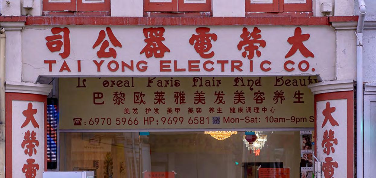
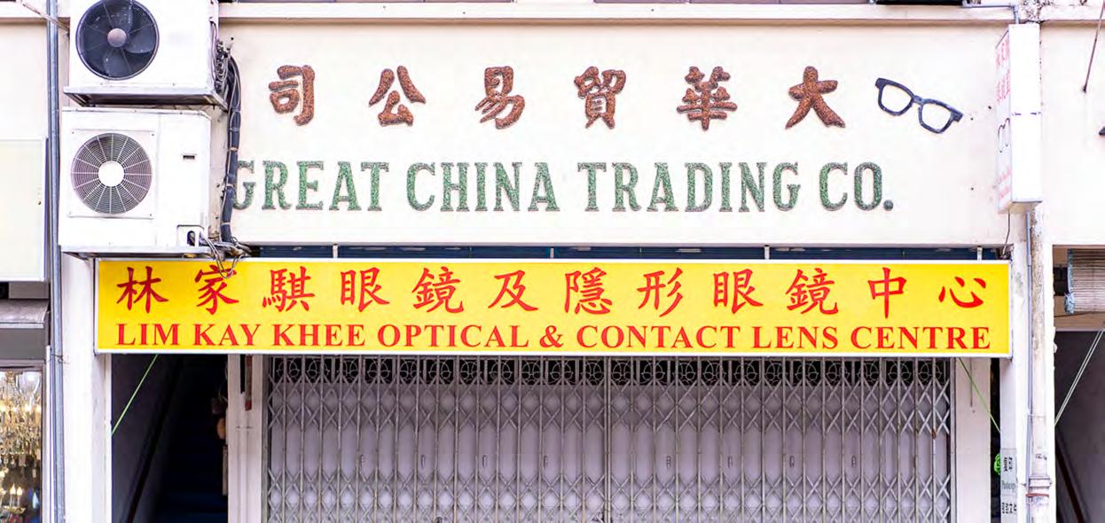
Mark De Winne (mdw ): That’s where vernacular signage, the
This Page
An intersectionality wheel, researcher and designer Nicola St John, 2024.
“Singapore Gothic” I’ve been documenting, offers a counterpoint. These are the unsanctioned letterforms painted by unnamed sign makers on shophouses, unions, wet markets. They don’t repeat one clean narrative; they’re messy, inconsistent, unpolished. Like the “C” in “China” and the “G” in “Trading” in the photo (bottom image, previous pages) have a distinct overbite—big front teeth. But by and large, on so many of these shophouses, you see a sans serif. These are not any sans serif you might find on myfonts.com; they are painted by sign makers who, as far as I know, are unnamed. I do not know any of the sign makers, but to a type designer, they are gorgeous because they represent a specific kind of vernacular. Some people dislike the term, but “found typography”—type designers are obsessed with this.
And yet, for me, they tell a truer story of Singapore’s early decades—blocky, hardworking letterforms. They reflect a lived spirit: the move, as Lee Kuan Yew said, “from third world to first.”3 ra : So perhaps the question isn’t whether repetition is good or bad, but how to honour complexity. Not a single, flattening narrative, but layered stories.
af : Yes, that’s correct. I spoke with migrants and designers to understand the gap between official intent and everyday reception. I also closely analysed nation branding initiatives by examining how colour, type, and symbols shape meaning. The goal is not just to determine what works, but to understand why it works, what it communicates, and whose voices it carries or leaves out.
Through this line of inquiry, I came to see the graphic designer’s role as more than that of an image maker. In fact, graphic designers are translators of abstract concepts, turning policies and hopes into colours, forms, and symbols that people can grasp and relate to. They are also interpreters of national identity, linking familiar icons to shared memories and ensuring that visuals are present in our everyday lives, not just in strategy papers. Additionally, they serve as mediators of state narratives and public perception, opening, clarifying,
questioning, and reframing so that messages are understood and fit the situation. Finally, graphic designers are also reinventors of collective imaginaries, opening new visual possibilities so that more people can see themselves in the national story.
ra : Which makes me think about political campaigns. In New York, Zohran Mamdani recently used old bodega signage in his campaign visuals. It was a deliberate rejection of slick, corporate branding. By drawing on typography people saw every day, he signalled: “I’m one of you.” That’s typography as grassroots politics, not just design.
mdw : Exactly. Letterforms carry affect. Even if you’re not a designer, you know Comic Sans. You probably have an opinion about it. Fonts aren’t neutral; they elicit feelings. That’s why they’re so potent in branding and politics.
But we also have to be careful about over generalising. When I show Majulah, it resonates with people of my generation who grew up with those blocky signs. Younger audiences may not connect to it the same way. That tension is important. Typography speaks to demographics unevenly.
Robert Bringhurst once wrote that letterforms are not only objects of science but of art. They participate in history and add to the narrative, and typography never occurs in isolation. That’s how I think of these forms: not frozen relics, but voices still speaking about who we are.
af : And designers become the ones who listen, translate, and sometimes amplify.
Dr Nicola St John (nsj ): When we talk about national identity through design, the conversation often defaults to official narratives— what Alan has been tracing through campaigns, or what Mark revives in typography. But I want to ask a different question: “Who is a designer, or who gets to be a designer— particularly in Singapore? What languages, neighbourhoods, faiths, and family stories walk into those types of design briefs?”
Too often, design seeks to smooth out
difference. In Singapore, as in many other design industries, this idea of neutrality can often nudge students to smooth out difference in order to appear “professional.” However, intersectionality allows us to map how identities and power intersect. We see, in this intersectionality wheel for example, how race and ethnicity intersect with class and citizenship, or language with faith. The idea is not to rank these different identities, but to understand the relationships that shape who is seen or excluded in design, and the positions from which we design.
When we introduced an intersectional pedagogical approach in our Singapore capstone class, students quickly reworked an intersectional “wheel” to reflect their own identities and experiences.4 They replaced categories that felt less relevant— indigeneity, geography—with things like aspiration, profession, body size, mental health. They weren’t always ready to talk about structural inequality, but they were eager to map their own positionalities. It was messy, sometimes uncomfortable, but transformative.
Kristen Mah (km ): That resonates with me. In my project People are Onions, I wanted to show how intergenerational stories layer into identity. I interviewed elders, cooked with friends’ grandmothers, collected market tips from Ah Mas (grandmothers). These weren’t “design briefs” in the conventional sense. But they were my way of peeling back layers, seeing that national identity isn’t abstract, it’s lived every day in food, language, routines.
When I asked elders to share their recipes or their shopping hacks, it wasn’t just for data. It was to connect, to acknowledge their knowledge as valuable. In a way, I was building a small archive of lived realities.
nsj : Within our Melbourne and Singapore classrooms, we support students to learn that design is not a problem solving endeavour, but is about listening, situating, layering. A pluriversal5 approach to designing doesn’t reject global fluency, but starts with situating design within
students own knowledges, histories, and cultures as the foundation for designing.
Global design competitiveness doesn’t come from assimilating into a single aesthetic. I think it’s important to acknowledge the tension that exists between the local and the global. This tension is not something we should necessarily try to resolve, but rather something we should help students learn to navigate within their practices. It is not a binary issue; instead, it is about working out how to foster a dialogue between these different approaches and understanding where you are positioning your work. This is where concepts like intersectionality and pluriversality can help guide these conversations. I believe design is at its best when it is grounded in some form of cultural or local insight. If you consider the concept of pluriversality—a world where many worlds fit—we can have many “locals” around the world, but if a project is based on human or culturally grounded insight, it will be much stronger. Such a project or campaign may be very successful globally, but it is rooted in a specific place or culture, and it might also resonate globally. That would be my first point. Designers who can take a local or culturally grounded insight and translate it globally are, in my view, truly strong designers.
km : My project People are Onions started from a simple metaphor: People have layers. If you peel them back with curiosity, you uncover histories, humour, resilience—all the things that shape who we are. I wanted to focus on elders. For example, my classmate Chervelle’s grandmother, Ah Ma Lee, has cooked vegetarian dinners every weekday for twenty years. That’s over 5,000 meals.
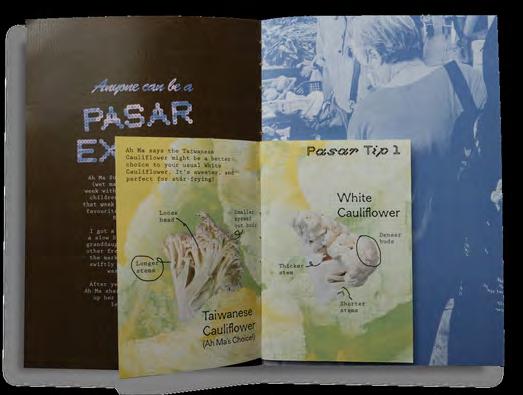
To me, that’s design knowledge: a practice of care, discipline, repetition. It tells us something about community that no National Day logo ever could. So I spent weeks visiting wet markets, eldercare centres, and community spaces. I asked grandparents to share their expertise. One morning, I followed a friend’s grandmother through Kovan market as she explained how to pick the freshest cauliflower. We turned it into a zine: Anyone Can Be a Pasar Expert. It was playful, but it also reframed her knowledge as valuable, even archival.
nsj : Building on Kristen’s concept of “people are onions,” I think it is also helpful to think in terms of layers. Where are you starting? What knowledges are you drawing from, and what is your positionality? What is your own lived experience? Start from there. Go out, talk to the community, gather insights and base your projects on that foundation. It may be something that translates globally—like cooking, for example, which can have broad application but is rooted within, and can be adapted for a particular local context. So, start with positionality. Think about intersectionality, but also consider this kind of local-versusglobal layering. I believe there is definitely room for both.
km : Exactly. I also collected recipes from friends’ mothers and grandmothers. Sambal variations, spice blends—all these everyday practices are archives in disguise. They’re how culture persists, how belonging is tasted and remembered. I collaborated with classmates too. Odelia was making a documentary on dying dialects, and we shared insights about how elders keep languages alive. Together, we saw how design could amplify voices that are otherwise fading from public discourse.
ra : What struck me about your project, Kris, is how it redefines scale. Alan analyses logos at the level of the nation. Mark revives signage at the level of the city. Nicola retools frameworks at the level of pedagogy. You’re zooming right in: the onion layers of a single household, a grandmother’s kitchen, a community library.
Top Anybody can be a Pasar Expert, 2025, designer Kristen Mah, photographer Kristen Mah.
km : When we look at intimate narratives at the scale of family and community, those stories may feel small individually, but I believe a community is really what a nation is—a nation is its people. As designers, being able to make space for and amplify these stories on a larger level is incredibly important. Especially as Singaporeans, our lived realities are also our own realities. As Nicola said, how can we design from our own lived reality?
How do we teach from our friends’ lived realities, our grandparents’ lived realities, knowing that everyone’s experience is different? How can we create this collage of humanness? I believe all of these intimate stories together form a picture of nationhood, because a nation is its people. Designing for intersectionality, as Nicola discussed, is crucial because it allows us to create work that speaks authentically to our experience at a given point in time.
nsj : And curiosity itself is a design method. It’s what I encourage in the classroom: map your own positionality but also go out and ask whose knowledge is missing.
ra : I think we have time for one question from the audience, which I will ask the panel. Do you have any tips or advice on types of research, or how to better research a topic to guide more relevant and effective designs?
nsj : My first suggestion is: Start with yourself. What are the issues affecting your community? What is your positionality, and what are your lived experiences? How do you encounter design in your everyday life? Are you noticing any gaps within your practice—areas where things could be improved, made more inclusive, or designed differently to better reflect you and your community? I would start with this kind of everyday engagement with design. Reflect on your own creative practice: How are you engaging? Are there recurring themes or ideas that keep coming up for you? Sometimes it starts with a small seed or nugget of an idea that keeps resurfacing. Keep returning to those ideas, and that is often all you need to begin
developing a question about how you might want to develop your practice or approach design differently. This could mean approaching your work more critically or experimenting with a different medium. The key is to find what is true to you. And then just go for it.
ra : And Mark, perhaps you could respond to this as a designer in industry? I know you also teach, but as a practicing designer, how do you approach design research? You seem to do it naturally in your practice. Any advice?
mdw : I hesitate to call myself a researcher, but as someone mentioned earlier, it really comes down to being curious. Kris, when you are passionately curious about something, and as Nicola already mentioned, you are drawn to what is meaningful to you. There is no point in researching something that feels abstract or that you are not interested in. That is the first place to start—find what genuinely interests you—and then be open to what is out there.
For me, the Singapore Gothic Majula project began with photographing signs, which was just the first layer. As I had more conversations with other designers interested in this area—like Vikas [Bhatt Kailankaje] and Justin [Zhuang], who are here today—those discussions led us to look at history: What was happening in the nation at different times, what historical images could tell us, and what the past could offer in terms of informing us as researchers? Justin’s work documenting Singapore’s graphic design was especially influential. It helped me see, “this is what we’re seeing on the street, and this is where it came from,” with the archival images Vikas found. Merging these perspectives helped us translate that into graphic design for nation building, such as with the Comfort logo, ntuc , and other examples.
Painting a fuller picture required me to go beyond just photographing signs every weekend; It meant thinking about different sources as well.
af : And research can be translation. In my case, between state narratives and public reception. Designers are
constantly translating, from policy documents into logos, from abstract ideals into colours and shapes. If you approach research as translation, you start to see not just what’s being said, but what’s being heard.
ra : So what I’m hearing from all of you is: curiosity, reflection, collaboration, translation. Research isn’t a separate stage of design. It’s woven into noticing, into paying attention.
That feels like the right place to close. Thank you Alan, Mark, Nic and Kris for your insights.
endnotes
1 Singapore Institute of Management (SIM) has partnered with RMIT University since 1987.
2 Diana Taylor, The Archive and the Repertoire: Performing Cultural Memory in the Americas, (Duke University Press, 2020), https://doi. org/10.1515/9780822385318.
3 Lee Kuan Yew, From Third World to First: The Singapore Story 1965-2000, (Harper, 2000).
4 Nicola St John and Fanny Suhendra, “Towards an Intersectional Communication Design History: A Student-Centred and Culturally Led Pedagogy,” paper presented at International Conferences on Design History and Studies (ICDHS 13), Bogotá, Colombia, October 17–21, 2022.
5 A pluriversal design approach emphasises the acknowledgement and practice of diverse perspectives and knowledge systems in the design process. It seeks to challenge dominant design paradigms based on Western or Eurocentric perspectives and, instead, draws on a range of cultural, social and ecological knowledge systems. Leslie-Ann Noel, Adolfo Ruiz, Frederick M. C. van Amstel, Victor Udoewa, Neeta Verma, Nii Kommey Botchway, Arvind Lodaya, and Shalini Agrawal, “Pluriversal Futures for Design Education,” She Ji: The Journal of Design, Economics, and Innovation 9, no. 2, (2023): 179–96, https://doi.org/10.1016/j.sheji.2023.04.002.
Temporal Multinationalism: How Design Time Travels Across Borders
Yaw Ofosu-Asare
Temporal Multinationalism: How Design Time Travels Across Borders
Yaw Ofosu-Asare
Beyond the Spatial Turn in Design Theory
The study of multinational design has traditionally focused on its movement across geographic space. Dominant theoretical frameworks analyse how products are marketed globally, how design practices adapt to diverse cultural contexts and how national identities are negotiated in a transnational market. This “spatial turn” has yielded valuable insights, revealing the complex interplay between standardisation and localisation, often framed as “glocalisation.” However, this spatial lens overlooks a critical dimension: time. Whose designs are seen as modern or futuristic, and whose are relegated to traditional or past? Earlier critiques in anthropology and museum studies have shown how colonial powers used time as a hierarchy, casting colonised cultures as “primitive” or stuck in the past while Europe embodied the present and future.1 Anthropologist Johannes Fabian termed this the “denial of coevalness,” a persistent and systematic tendency to place the people studied in a time other than the present of the scholar.2 Such chronopolitics, the politics of time, helped preserve imperial authority by freezing other societies as timeless or backward.3
Today, even in ostensibly post-colonial contexts, similar temporal hierarchies persist in how design is marketed and valued worldwide. Temporal multinationalism names the way multinational design systems redistribute heritage, modernity, innovation and futurity across markets, erecting chronopolitical borders that decide who is modern now, who is “timeless” and who is perpetually catching up. Design does not just travel globally in space, it carries classifications of time that are allocated unevenly to different markets and makers. These chronopolitical categorisations shape who gets recognised as an innovator and who gets dismissed as traditional, with real consequences for investment, intellectual property and cultural legitimacy. This article treats corporate campaigns, pr kits, and museum displays as temporal records that widen the archive beyond objects to the discourses that assign time. This approach positions design archives as sites where chronopolitical borders are constructed and contested. To leave these chronopolitical borders unexamined is to accept a design history that naturalises
Northern innovation and Southern tradition, to sustain intellectual property regimes that strip communities of ownership, and to reproduce teaching curricula that silently reinforce colonial hierarchies. Recognising temporal borders is, therefore, not just a matter of critique but of justice.
Method and Materials
This analysis examines temporal framing across three multinational design cases selected for their global reach, multi-regional marketing presence and available archival materials demonstrating clear temporal splits across markets. The corpus includes brand campaigns (ikea’s “Wonderful Everyday” and regional adaptations), corporate communications (Safaricom annual reports, M-Pesa promotional materials), muji Remuji and sustainability communications, museum exhibition materials, style guides, sustainability reports, and visual materials from corporate websites and stores. Analysis employed discourse and visual analysis methods, coding explicit temporal language (“timeless,” “heritage,” “futuristic,” “leapfrog,” “ancient,”
Metropole claims universal modernity; Others are positioned as futurising toward it
Global North remains benchmark; African leadership recoded as workaround
Authenticity commodified and rerouted across markets
“modern,” “traditional”) and examining visual semiotics across regional markets. This approach examines publicly available materials rather than internal corporate strategy, establishing patterns of temporal assignment through comparative textual and visual analysis across different geographic markets for the same products or services.
The Chronopolitics of Design:
Conceptual Framework
Temporal multinationalism refers to the creation of chronopolitical borders, conceptual boundaries that sort design practices into “past” or “future” depending on their origin or target market. Multinational design companies and cultural institutions often act as arbiters of time, branding certain designs as timeless or cutting edge and others as heritage or dated. For example, a high-tech product from Silicon Valley might be universally hailed as futuristic, while a craft technique from the Global South is described as centuries-old tradition. Neither designation is value neutral. Labelling one region’s designs innovative and another’s heritage reinforces a timeline where some cultures lead and others follow behind.
This framework builds upon existing critiques of colonial legacies in design. The concept of the “coloniality of making,” articulated by Frederick van Amstel, provides a crucial starting point. This theory posits a geopolitical division between a “ready-made” world, typically the metropole (Europe), and a “world-to-be-made” (the colonies). In this relationship, the development of the metropole is mutually dependent on the “unmaking” of the colonies.4 Design plays a central role in this process, presenting itself as a neutral, non-political act of creation while simultaneously enforcing hierarchies and erasing indigenous knowledge systems. Following Koselleck, modernity reorganises historical time, widening the gap between a horizon of expectation and a space of experience, in ways that privilege certain “asymmetrical concepts” of progress.5 Building on van Amstel’s “coloniality of making” that distinguishes a metropole of the ready-made from a
colony of the world-to-be-made, temporal multinationalism shows how that spatial hierarchy is reproduced as a temporal one: Some cultures are installed as the future’s authors, others as the past’s custodians. Contemporary multinational design systems reproduce colonial hierarchies through temporal means. The relegation of a design culture to the category of “tradition” effectively de-legitimises its claims to innovation and intellectual property. This constitutes a form of temporal value extraction, the process by which multinational corporations devalue traditional knowledge by classifying it as “heritage” (placing it in a legal and cultural public domain), then appropriate and rebrand these forms as “modern design” to secure IP protection and market value that benefits the appropriating entity rather than the originators.6
When a motif is framed as “heritage,” it often falls outside conventional IP unless covered by instruments like geographical indications, unfair competition law, or sui generis traditional knowledge frameworks. The 2024 adoption of the wipo Treaty on Intellectual Property, Genetic Resources and Associated Traditional Knowledge marks a significant development in this area, though implementation remains ongoing.7 Such temporal labelling has tangible impacts across multiple domains:
> Innovation Recognition: Chronopolitical narratives influence who gets credit as an innovator. If a product from the Global South is framed as just “catching up” (for example leapfrogging), it may not be afforded the same status in design history as a Northern product that is seen as pioneering.
> Investment and Development: How a region’s temporal status is perceived directs investment flows. This pattern can be observed in the differential treatment of regions branded as “traditional” versus those marketed as innovation centres.8
> Intellectual Property Regimes: Temporal labels directly affect legal protection, particularly as international frameworks for traditional knowledge protection continue to develop.
ikea’s Democratic Design: Temporal Segmentation and Universal Modernism
ikea , the Swedish furniture giant, explicitly promotes a concept it calls “Democratic Design”: the idea is that good, well designed products should be accessible to everyone at low prices, built on five dimensions: form, function, quality, sustainability and low price.9 The brand’s mastery of temporal marketing presents these same core values through different temporal lenses in different markets. In Europe and other Western markets, ikea’s branding leans heavily on its Scandinavian heritage and mid-century modernist roots. The company’s narratives celebrate “timeless Scandinavian design,” associating ikea products with the enduring legacy of Swedish modernism. The “Wonderful Everyday” campaign, a mid-2010s uk campaign led by Mother London, visually and emotionally anchors the brand in a stable, comfortable present. Its commercials use humour and warmth to elevate mundane activities into moments of magic.10
As design scholar Tobias Faber notes, Scandinavian modernism positioned itself as universal and rational yet was deeply rooted in Nordic social democratic values and specific climatic conditions.11 The ikea store functions as a site where Swedish design identity is staged as broadly applicable, presenting “distinctively Swedish” traits while universalising them. However, in some regional contexts, the chronopolitical framing adapts notably. In certain marketing and third-party coverage, ikea minimalism is read through local aesthetics. For example, “Japandi” blends of Scandinavian and Japanese design are positioned as the same forms within different temporal storylines. User-generated content campaigns that encourage customisation recast ikea as a co-author of adaptable futures rather than a guardian of timeless norms. This temporal variation reveals a chronopolitical border. In Europe, ikea markets inherited design authority, a stable aesthetic tradition. In other markets, it markets adaptive futurity, customisable solutions for emerging lifestyles. The same flat-pack engineering becomes either “perfected Swedish craft” or “innovative modularity for modern living,” depending on the market’s assigned temporal role.
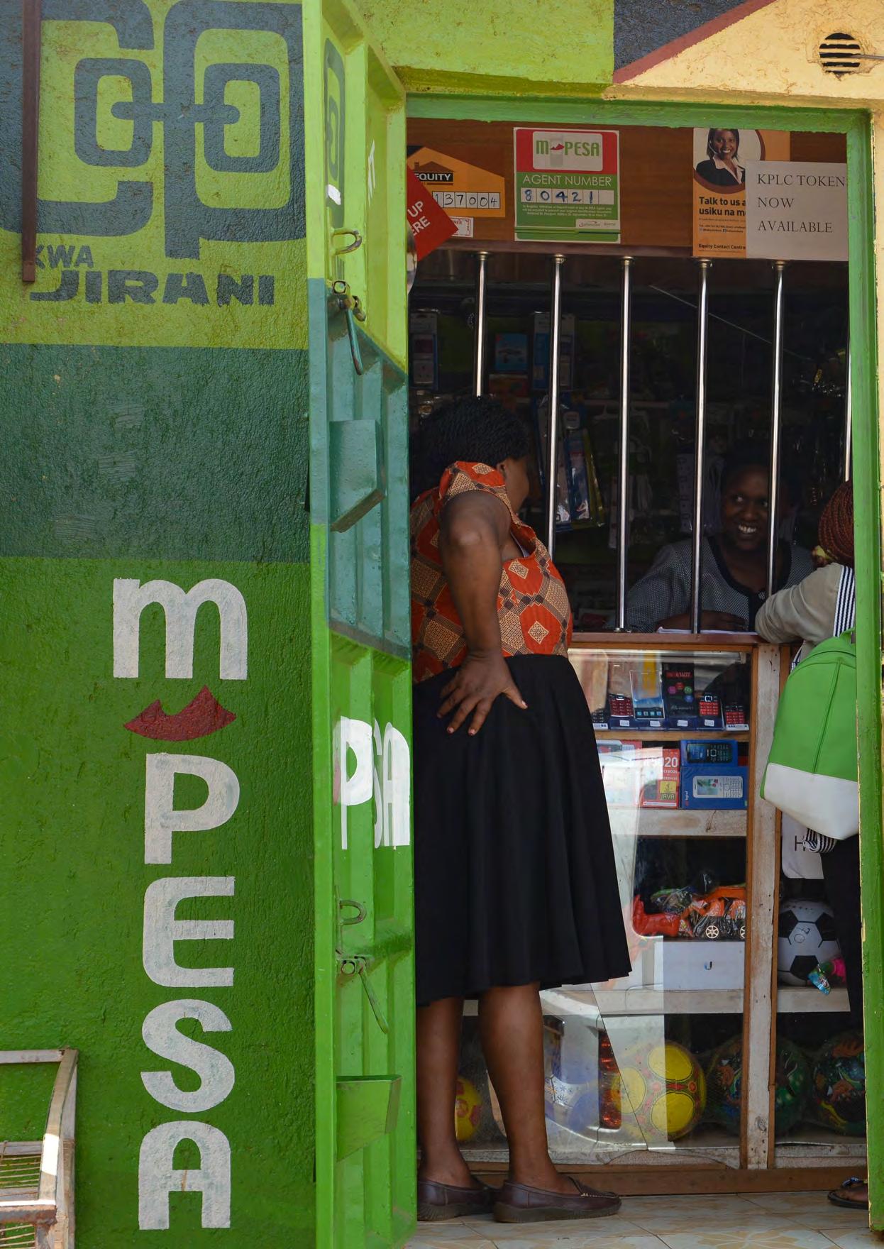
Kenya’s M-Pesa: Leapfrogging and the Chronopolitics of Innovation
Kenya’s M-Pesa mobile money system, launched in 2007 by Safaricom, enables money transfers and banking via basic mobile phones. The service rapidly transformed daily life in Kenya and spread across multiple countries. According to verified imf data from 2019, “Sub-Saharan Africa is the only region in the world where close to 10 per cent of gdp in transactions occur through mobile money.”12 By the early 2010s, M-Pesa’s transaction volumes and diffusion were exceptional by global standards: imf and World Bank materials document sub-Saharan Africa’s world-leading mobile money adoption.13 The global perception of M-Pesa illustrates a chronopolitical narrative imposed from outside. International media and development experts hailed M-Pesa as evidence that African countries could “leapfrog” older technologies. Analysis positioned M-Pesa as allowing Kenya to “skip the landline” and jump to mobile financial services.14 This framing suggests Africa was initially behind and only gained ground through lucky technological jumps rather than systematic innovation. The temporal disparity between these narratives is visually stark:
External “leapfrog” narrative
“Skipping development stages” (World Bank)
Photos of rural kiosks, informal settings
“Bypassing traditional banking”
Reactive adaptation
Safaricom’s leadership narrative
“Pioneering the digital economy” (Annual Report)
Clean graphics, urban imagery
“Leading financial transformation”
Proactive innovation
By contrast, Safaricom’s own annual reports and promotional materials emphasise infrastructure leadership and innovation, using language that positions Kenya as a technology leader rather than a fortunate beneficiary.15
The visual disparity between these temporal narratives is striking: External coverage often depicts rural kiosks and informal settings to illustrate M-Pesa’s network, while Safaricom’s own media uses clean graphics and aspirational imagery to represent digital financial services. The “leapfrogging” metaphor functions as temporal erasure. M-Pesa was a deliberate design solution to specific problems, including expensive and unsafe informal remittance networks. Yet the leapfrog narrative reframes this proactive innovation as a reactive phenomenon possible only because of perceived technological deficit. This temporal reordering diminishes the sophisticated design strategies that built M-Pesa’s agent network and positions Western financial systems as the inevitable endpoint of development.
muji ’s No-Brand Minimalism:
The Commodification of Temporal Authenticity muji , the Japanese retailer whose name means “nobrand quality goods,” deploys a dual temporal strategy, authenticating its past in one market while offering a futuristic ethos in another. The company’s philosophy integrates traditional Japanese aesthetics with contemporary design principles.16 In Japan, muji ’s minimalism is framed as a continuation of traditional aesthetics. The Remuji program, a sustainability initiative operating since 2010 with collection services and retail of re-dyed pieces scaling through the mid-2010s, exemplifies this temporal positioning.17 In regional markets like Hong Kong, promotional materials emphasise collaboration with local workshops, highlighting traditional craft techniques such as natural indigo dyeing and artisanal continuity.18 In some international markets, identical principles are rebranded as post-consumer futurity. muji ’s global sustainability communications focus on technological efficiency and environmental metrics, emphasising corporate sustainability strategies rather than cultural continuity.19 Programs like Remuji therefore literalise continuity in some contexts while emphasising technological innovation and environmental futures in others. This dual temporal identity serves strategic purposes. Domestically, invoking tradition grants cultural legitimacy. Internationally, claiming sustainable futurity provides competitive advantage in markets concerned with environmental impact. muji ’s minimalism becomes simultaneously traditional wisdom and contemporary environmental solution, depending on audience temporal assignment.
Archives as Agents of Temporal Justice
The analysis of multinational design through temporal lenses has direct implications for archival practice. To take temporal multinationalism seriously, archives must shift from treating corporate campaigns, annual reports, and promotional media as disposable ephemera to recognising them as temporal records. These records are not neutral: They actively construct chronopolitical borders, deciding whether a design belongs to the category of heritage, modernity or futurity. Archiving them is therefore not just a matter of preserving advertising history but of documenting how time itself is assigned unevenly across
global markets. The case studies demonstrate why this shift matters. ikea’s marketing illustrates how the same products are temporally segmented: In Europe, they are presented as “timeless Scandinavian design,” while in Asia or hybrid markets they are reframed as “adaptive futurity” through campaigns like Japandi or customisation initiatives. If archives preserve only European campaigns, ikea becomes a story of Nordic timelessness: If only the adaptive campaigns survive, ikea reads as a future-focused global innovator. It is only by holding both narratives together that the archive can reveal the asymmetry of temporal assignment and resist the flattening of design history into a single trajectory. M-Pesa underscores the stakes even more clearly. International coverage, dominated by “leapfrog” metaphors, frames Kenya’s mobile money system as a lucky accident of technological delay. Safaricom’s own annual reports, by contrast, position it as deliberate infrastructural leadership. If archives prioritise global media accounts, M-Pesa becomes a story of belated catch-up; if they preserve only corporate self-presentation, the international chronopolitical erasure disappears. The challenge for archives is therefore to document both framings, not to adjudicate between them, but to hold them in tension so that future researchers can see how Kenyan innovation was simultaneously claimed and denied. In this way, the archive becomes a counterweight to temporal erasure, re-inscribing agency where it was obscured.
muji reveals another kind of archival challenge: the dual temporal identity of a brand across domestic and international markets. In Japan, muji frames its Remuji program as cultural continuity, a revival of artisanal practices and traditional aesthetics. In Europe, the same initiative is rebranded as a futuristic sustainability strategy, heavy with metrics and corporate environmental targets. If archives document only one version, the double life of muji ’s temporal strategy vanishes. Only by collecting both domestic and international campaigns can the archive expose the deliberate commodification of authenticity in one context and futurity in another.
These examples demonstrate that archives are not simply repositories of design objects but active sites for temporal justice. The task is not to decide which narrative is “true,” but to preserve the multiplicity of temporal framings that multinational design deploys. By juxtaposing campaigns across markets, archives can reveal how identical designs are narrated differently, how recognition is granted or withheld, and how cultural legitimacy is unevenly distributed. This requires deliberate collecting priorities: corporate communications that show regional adaptation, reports that embed temporal claims, and promotional materials that reveal how innovation is narrated in divergent registers. To treat such materials as temporal records is to acknowledge that they are evidence of chronopolitical orderings with material consequences for innovation, investment and intellectual property. By documenting these asymmetries, archives become more than keepers of the past: They become agents of temporal justice, making visible the politics of time that underpin global design.
Reorientating Design’s Timeline
Temporal multinationalism reveals how multinational design systems manufacture chronopolitical borders with concrete consequences for who is seen as modern, who is cast as traditional, and who is denied recognition altogether. ikea’s segmentation stabilises European modernism while positioning other markets as aspirational and future orientated. M-Pesa’s “leapfrog” narrative erases Kenyan agency even as it anchors a digital economy. muji ’s dual identity turns tradition into a domestic asset and futurity into an export commodity. Each case demonstrates how time itself is a resource extracted, redistributed and weaponised through design. Recognising these dynamics is not only an analytic task. It calls for rethinking how we attribute value, protect intellectual property and write design history. Temporal multinationalism insists that archives treat marketing campaigns and corporate reports as temporal records, that policymakers craft IP frameworks attentive to temporal erasures, and that educators challenge the singular timelines that still dominate design pedagogy. To ignore these demands is to leave intact the hierarchies that continue to privilege the metropole as author of the future and relegate others to the custodianship of the past. The provocation is clear: Design does not unfold along a universal timeline. It is a field of multiple, coeval temporalities. To acknowledge this is to shift from studying design as a race to modernity, toward recognising it as a contested distribution of time itself. Temporal multinationalism therefore offers not just a lens for critique but a framework for justice, urging scholars, archivists, and practitioners to make visible—and to resist—the chronopolitical borders through which design’s futures are unevenly assigned.
endnotes
1 Christian Kravagna, “Bourdieu’s Photography of Coevalness,” translated by Mary O’Neill, transversal 12 2007 https://transversal.at/transversal/0308/ kravagna/en; and “The Preserves of Colonialism: The World in the Museum,” translated by Tim Sharp, transversal 06 2008 https://transversal.at/ transversal/0708/kravagna/en
2 Johannes Fabian, Time and the Other: How Anthropology Makes Its Object, 2nd ed. (Columbia University Press, 2002).
3 Kravagna, “The Preserves of Colonialism.”
4 Frederick van Amstel, “Decolonising Design Research,” The Routledge Companion to Design Research, eds. Paul A. Rodgers and Joyce Yee (Routledge, 2023).
5 Reinhart Koselleck, Futures Past: On the Semantics of Historical Time, trans. Keith Tribe (Columbia University Press, 2004).
6 van Amstel, “Decolonising Design Research.”
7 World Intellectual Property Organization, “Traditional Knowledge,” accessed 8 January, 2024, https://www.wipo.int/en/ web/traditional-knowledge/tk/index; WIPO Treaty on Intellectual Property, Genetic Resources and Associated Traditional Knowledge (adopted May 24, 2024).
8 “International Monetary Fund, Digital Payment Innovations in Sub-Saharan Africa,” Departmental Paper No. 2025/004 (June 27, 2025), accessed November 10, 2025, https://www.imf.org/en/ publications/departmental-paperspolicy-papers/issues/2025/06/27/digitalpayment-innovations-in-sub-saharanafrica-529198
9 “5 Dimensions of the IKEA Democratic Design,” IKEA, accessed January 8, 2024, https://www.ikea.com/kw/en/this-is-ikea/ design/.
10 “IKEA & Mother London, ‘The Wonderful Everyday’,” Effie Awards UK case profile (2017), accessed November 10, 2025, https://effie.org/partners/united-kingdom/
11 Tobias Faber, A History of Danish Architecture (Arkitektens Forlag, 1978), 156.
12 Amadou N. R. Sy, “Fintech in Sub-Saharan Africa: A Potential Game Changer?” IMF Blog (February 14, 2019), https://www.imf. org/en/Blogs/Articles/2019/02/14/fintechin-sub-saharan-africa-a-potential-gamechanger.
13 N. R. Sy, “Fintech in Sub-Saharan Africa.”
14 Leora Klapper, Saniya Ansar, Jake Hess, and Dorothe Singer, Development Research Group, The World Bank, “Findex Note 1: Sub-Saharan Africa Series: Mobile money and digital financial inclusion.” (2019), accessed November 10, 2025, https://thedocs.worldbank. org/en/doc/4fff8526d366d112cd9fd 96eaf4adbb1-0050062022/original/ FindexNote1-062419.pdf
15 Safaricom PLC, Integrated Report and Financial Statements 2023, accessed September 23, 2025, https://www. safaricom.co.ke/images/Downloads/ Safaricom_Annual_Report_2023.pdf.
Total Identification: Philips and Huveneers Pty Ltd 1965–1972
Noel Waite
During his four years (1965–69) as Creative Director of the General Advertising Department at Philips in Eindhoven, Netherlands, Pieter Huveneers developed his expertise in corporate identity design, initiating an international standardisation of the Philips identity with Wim Crouwel that was the foundation of Philips’s first House Style Manual in 1973. In 1969, he emigrated to Sydney, Australia, to take up a position as Head of Creative Planning at multinational advertising agency Hansen-Rubensohn-McCannErickson. In 1971 he established Huveneers Pty Ltd, specialising in corporate identity design, corporate packaging design and marketing management consulting, developing over seventy corporate identities for major national and multinational companies until his retirement in 1989. The large studio in Sydney was also multinational in its makeup and approach.
Pieter Huveneers’s successful fifteen-year career as a graphic designer and industrial design consultant in the United Kingdom was recognised when he was elected a Fellow of The Royal Society for the Encouragement of Arts, Manufactures and Commerce on November 8, 1965. In October of that year he declined the offer of employment as Chief of the Design Branch of Canada’s Department of Industry to take up a position as Creative Director of the General Advertising Department (gad) of multinational electrical company Philips in Eindhoven. Huveneers was engaged by the soon-to-retire Director of gad, Sies Numann, who described the role as “a complicated job, as the central division has to supply campaigns, ideas, suggestions and artwork to practically all countries where Philips is represented, and for a great number of products manufactured by them.”1
Huveneers was responsible for all aspects of Philips’s visual communications, institutional as well as consumer and technical product advertising, in all media throughout the world, including a number of packaging projects. While he had done similar work as a design consultant for Mullards, Schweppes and Smiths Clocks in the United Kingdom, the scale and scope of Philips’s operation and budgets was considerably larger (including a global workforce of 252,000 in 1965), involving more than 130 countries, each with their own advertising manager, and a budget of 164 million dollars. In 1995, Huveneers recalled his first meeting with Sies Numann in 1965: “I could see that in fact an overview from a central point, a direction for that
company was not present, and I could foresee also therefore, that there must be an awful lot of double work in different countries, say in Europe about 64 countries straight away … it was not coordinated. It was in a way, wasteful from a design point of view.”2
In Philips: A Study of Corporate Management of Design John Heskett explored Philips’s design leadership that began with the employment of architect Louis Kalff in 1925, who was responsible for the aesthetic aspects of advertising, products and some architecture. He had a passion for graphic design and understood the value of consistent communication design aligned to an architectonic conception of the brand that was embodied in the Philips radio with the first waves and stars shield in 1926. In 1928 the Propaganda Centre was established with four independent departments: pc 1 Commercial Propaganda; pc 2 Literary Propaganda (including Press Office); pc 3 Technical Propaganda: and pc 4 Artistic Propaganda, the latter headed by Kalff. “The Centre was intended to coordinate campaigns based on sales programs drafted by the commercial department, acting as an intermediary between the latter and its four constituent departments,” taking account of differences existing in Latin, Anglo-Saxon, German, and South American markets.3
In the 1950s, Philips had a federative character, where advertisers worked in either the gad, product departments or the National Organisations (no s). Under Sies Numann, the gad was responsible for advertising policy decisions
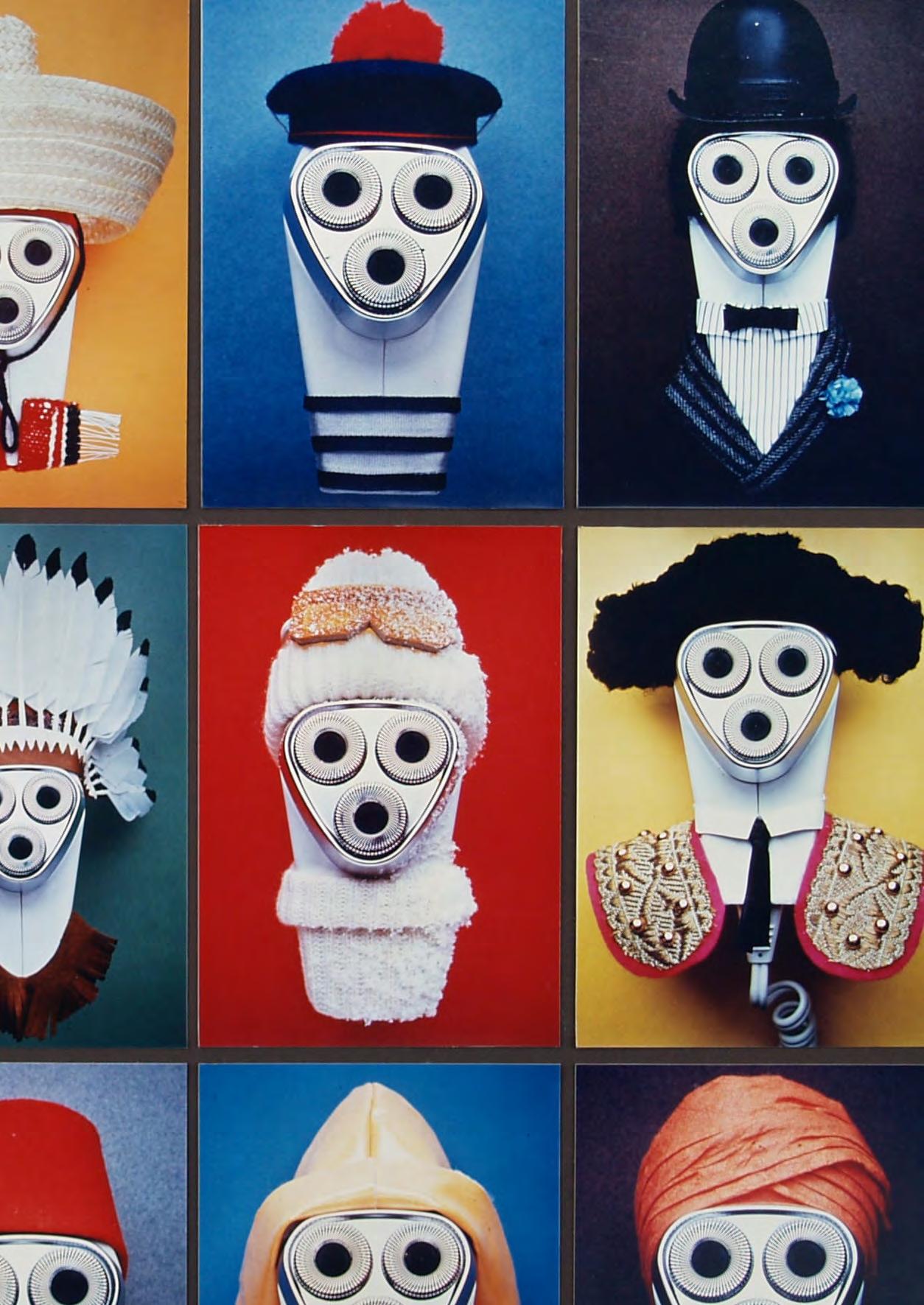
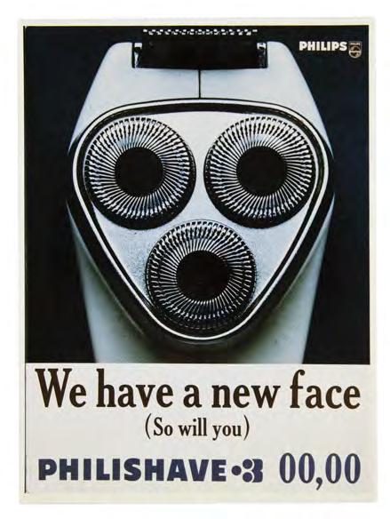
Fifteen framed advertising photographs for Philishave 3 advertising campaign, c.1968, Art Director Pieter Huveneers, courtesy of Tanis Wilson.
and central advertising in which the no s enjoyed a high degree of autonomy. They were mainly responsible for the commercial domain on the respective national level whereas the product departments developed products and technology. In 1960, the Concern Bureau Vormgevig (Industrial Design Bureau), headed by Rein Veersema, was formed to lead the product departments. Veersema was responsible for “the creation of an affinity in the shaping of products, the creation of a ‘family feature,’ identifying Philips as the manufacturer at first glance” and, according to Heskett, “[t]he contribution of Rein Veersema to establishing design as a discipline at Philips was substantial.”4 In 1964, he developed a thirteen point plan, which included:
1. The Concern [Bureau] should make [a] clear statement at the highest level on the policy with respect to design …
12. It is not important who designs, what is designed, or where in the Philips organisation design takes place, as long as it is on the basis of a common position & qualitative policy and rules.
13. A good industrial design policy will never be directed to the prestige of the individual designer of Philips products.5
In June 1966, Pieter Huveneers gave his first speech on creativity in visual communication at the fifth annual Philips Advertising Convention in Ouchy, Switzerland. It followed gad Deputy Manager C.J. van Geel’s speech on the future of Philips advertising, summarised in three points:
1. Quality is more important than quantity, and creative thought is the essence of quality. In the coming years we will need more creativity in our advertising.
2. Our methods for setting up an advertising budget will have to become less rigid. In this respect we will have to concentrate our attention on those products for which extra advertising investment will yield proportionally higher results.
3. There are a number of important considerations which make it necessary that Eindhoven coordinates to a greater extent than previously Philips advertising, in order to obtain the largest possible dividend on our advertising.6
Huveneers addressed the first point, asserting that creativity commences “when briefing is prepared showing the medium envisaged, the type of public at which it is directed, income groups involved, the type of article to be sold, the resistance factors to be considered, the competition to be overcome, the price-level, pricing media, and the budget available.” He urged his audience to “never underestimate the first contact and impression the public receives of a Company,” which builds an image of the company. He went on to expand on his own three qualities for good advertising: Stronger composition requires a very good layout; It has to be modern; It has to be original, concluding that “[i]f a design has all three qualities, and the price of the article and the quality image of the company is good, very good results will be achieved.”7
In terms of building a company image through design, he was scathing of the lack of originality of advertising agencies (which many no s used): “Because we know that there are good designers and better ones and these people specialise in different fields, careful direction of advertising work must be given. In this connection the Design-units, which are becoming more numerous today where freelance designers work in groups, are a welcome stimulant to give the accent in their field of specialisation.”8
He then proceeded to outline three resistance factors to good creativity in advertising: relying on a single agency’s creative direction for all advertising; lack of design judgement in selecting agencies and managing the design process from “commercial people”; and lack of adequate budget to employ the best designers. Given the size of Philips, Huveneers advocated for Philips, and gad in particular, to take an active role in the selection of creative direction in agencies, and to ensure they were continually refreshed by new talent. He also stressed the importance of setting up the right processes for design to encourage originality and risk-taking and the importance of paying professional fees to the best designers. With regards the NOs, he requested general copyright agreements to make greater use of designs and photography across different countries, which would be held centrally at the gad. He concluded by saying: “Since my joining the gad as Creative Director I have started to implement some of my thoughts as now expressed. This process is a continuous one and takes time. We must build a strong Company image for which I also ask your cooperation.”9
Huveneers set about coordinating a new system at gad, developing a professional code of conduct towards suppliers and formal order procedures, and preparing a clearer and more concise briefing process for advertising agencies and designers. This involved agreeing on correct fees and consistent working conditions in advance and supervising the advertising proposals from the NOs in order to stimulate higher quality advertising design to increase sales. This resulted in a steady improvement in personal contact with gad, but also an increased workload for Huveneers. This included the creative direction of the advertising and identity of the flying-saucer shaped Evoluon exhibition building in Eindhoven, which Philips erected to commemorate its seventy-fifth anniversary at a cost of fifteen million dollars.
He was also tasked at this time with compiling advertising case histories and standardising the Philips trade name and emblem that had proliferated inconsistently across its forty-year application in various National Organisations. To do this, he commissioned Total Design and worked closely with Wim Crouwel over the next eighteen months. This was first revealed in the Philips’s Topics internal newsletter on June 1, 1967 with a refined waves and stars emblem and the use of Adrian Frutiger’s Univers typeface. Huveneers concluded: “Now we hope that our standard design will become recognized as the Concern’s new signature of quality.”10 With this first stage complete, the Concern Standardisation Department met on June 6 to instruct Huveneers and the recently appointed director
of the Corporate Industrial Design Centre (cidc ) Knut Yran to develop a proposal for a corporate identity manual with instructions for application. Huveneers already had a good working relationship with Yran, having directed recruitment advertisements for the cidc and joining in packaging design projects. However, Yran had earlier communicated to van Geel: “When it comes to corporate effort or corporate identity manual work, Industrial Design Department are of the opinion that form-giving, packaging and architecture etc, will have to be the decisive elements in the total visual image of a concern, and it will not be logical for those areas of activity to adjust themselves to graphic trends, but that graphic styling can follow product trends more easily.”11
There were legal and technical difficulties with the standard carrier, so Huveneers and Yran met with Wim Crouwel in November and attended a final presentation of the identity design on December 11, 1967. As Yran wearily concluded: “Then we have to start working on a corporate identity manual, so that this will not only be number I-don’t-know-which of wordmark version which everyone around handles in their own way.”12 This was approved by the Board of Management and legal teams and, on March 31, 1968, the Concern Standardisation Department issued Concern Directive un-d 1111 for the implementation of the final wordmark Philips and the Philips shield emblem.
On June 4, 1968, Huveneers was seconded to Germany to join the Philishave working team to develop a 9.5 million (nlg ) advertising campaign for the new triple-headed Philishave SC8130 to be sold worldwide (although it had been test marketed in the direct export markets of Australia and New Zealand in 1956). Previously, this work had been handled by the Intermarco advertising agency, and was acknowledged as a sensitive move, given the relative independence of National Organisations and their diverse relationships with multinational advertising agencies. A provisional campaign had been discussed with Intermarco the previous year, when, eager to defend
their expertise, they argued against the involvement of gad. At issue was the Unique Selling Point of the new electric razor and whether it was speed or closeness of shave. Intermarco’s “half-way” presentation focussed on speed, but this was considered an insufficient platform for a campaign, and the technical aspects of the advantage of floating heads had not been incorporated, nor the micro groove metal ring (which allowed thinner heads for closer shaving). There was also discussion about the validity of the claims for closer shaving and if they could be validated beyond laboratory tests, as Huveneers and his colleague had been using the new product for the last four weeks. After only twenty-two days in Germany, Huveneeers presented his campaign on June 26 to the German and Dutch Directors who received it enthusiastically. His logo for the Philishave consisted of the three circular heads and the number 3, which, if rotated 90 degrees anticlockwise, formed a face, with mouth, eyes, and eyebrows. This humanising strategy was developed through a photo shoot placing a fur beard and moustache on the razor, and was dressed for both a Christmas campaign, as well as a multinational campaign featuring the Philishave dressed in national costumes from a range of countries.
Despite his success in gad leading an integrated campaign, Huveneers had been frustrated with van Geel’s leadership when van Geel took over from Sies Numann in 1967 as head of the gad and chairman of the Philips International Advertising Council. Van Geel shifted the focus to consumer-oriented marketing, leading all parts of the company, such as personnel, legal and finance, as well as elements like research, packaging, distribution and advertising.13 In June 1966, Huveneers requested an Assistant Art Director to enable him to attend to the major international jobs he had been coordinating. Given his advocacy for compelling layouts with strong visual composition, where text copy is an integral part of that composition, he also disagreed with van Geel’s desire to separate copy from visual, “which caused me to see no scope in the future of gad and its central steering body.”14
Throughout this period he had been in discussion with members of the senior management about his desire to set up his own consultancy. He developed a five-year plan for his creative design unit (clearly modelled on Total Design and the Design Research Unit, with which he was familiar), estimating it would take four years to establish a self-sustaining business with fifteen to twenty clients. He also took advice from his former mentor Sies Numann, who gave him the contact of the multinational advertising agency Hansen-Rubensohn-McCann-Erickson in Sydney, who replied there was a shortage of creative design people in Australia and to visit in January 1969.
Huveneers met with Rein Veersema to inform him of his plans, and departed Philips with six months salary and a return airfare, flying to Australia via Canada, New York and New Zealand in order to compare his options. He wrote to potential employers and collaborators of his interest in “corporate Total Design,”15 and was offered a Chair of Design at the University of Montreal, as well as a position in New York, before finally settling on the commercial potential of Australia. The growth of strong national companies looking to expand internationally, the adoption of the metric system in 1971, standardisation of shipping and the development of Asia Pacific trade and flight routes made this an opportune time to strategically research, plan and develop flexible systems for complex organisations operating in global systems.
Hansen-Rubensohn-McCann-Erickson was the Australian division of McCann-Erickson International and a component of the Interpublic group of companies. While Huveneers’s title was Head of Creative Planning, his first task was to fly to Hong Kong to secure the account of China Airlines (Taiwan) for the Ling McCann Agency. This was for the China Airlines inaugural trans-Pacific service from Tokyo to San Francisco using the new Boeing 707-320C planes at the end of 1970. He attended with copywriter Eli Silberman, and immediately succeeded in obtaining the account with his presentation that added an abstract plum blossom to the logo.
Pieter Huveneers was announced as the Director of Hansen-Rubensohn-McCann-Erickson’s new Corporate Identity Programming unit in a brochure published in 1969: “We are now breaking new ground in setting up a special unit to handle corporate identity programming, and are fortunate in having attracted to Australia one of the world’s top professionals in the sphere, Mr Huveneers to head the unit.” The brochure explained that Corporate Identity Programming “starts with a thorough understanding of what a company is and what it now means to the people who work in it, to those who sell and buy its products and those who invest their capital in it” as well as a broader range of publics who come into contact with the company. Short and long term aims of the company are assessed to inform the development of a brand name and the development of a programme which covers such areas as “symbols, slogans, advertising, public relations, packaging and point-of-sale displays, stationery; in short all visual manifestations of a company’s activities.” The importance of design was stressed in the development and projection
of a corporate identity, noting “It is not surprising therefore that most of the professionals who are pre-eminent in this field in the world today, such as Mr Huveneers, have a design background.”16 The third page featured Huveneers’s extensive cv, including his design consultancy in the United Kingdom and his international role at Philips. To demonstrate the embodiment of a corporate identity, Huveneers designed a logo for Corporate Identity Programming on the cover of the brochure from the lower case initials of the unit’s title. The symmetrical figure of a person is composed from the body and head of the ‘i’ with the bowls of the ‘c’ and ‘p’ acting as outstretched welcoming arms. The integration of text as image placed people at the centre of the enterprise.
The Corporate Identity Programming (cip ) unit became effective in 1970, securing the Corporate Identity Programme for aci (Australian Consolidated Industries), achieving a profit of $40,000 in its first year of operation. In addition, Huveneers also advised on long-range planning of creative campaigns, institutional advertising and packaging and product design projects, serving clients and being on the Review Board in the Sydney, Melbourne and Adelaide offices. However, while the cip project for aci retained the account for the advertising agency, the costs were not charged to aci , thereby reducing Huveneers’s profitsharing. However, unlike Philips, he had the services of a
secretary and a studio assistant that was a critical first step for the establishment of his own independent design unit.
In April 1971, Huveneers Pty Ltd was established at a.c Lewis House, 159 Kent Street, Sydney. Huveneers’s logo was a ‘H’ in a rectangular box, forming an hour-glass with the negative space. Huveneers had stated in a press release for the new company that the greatest advantage in a sound corporate identity system is the saving of time for company staff in the preparation and application of company names, trademarks and design for all printed matter.
The introduction of the Australian Metric Conversion Act in 1970 and the establishment of the Metric Conversion Board to oversee the phased transition of industries from the imperial to the metric system by 1974 was a major change affecting printing, paper, packaging, and transportation, but one Huveneers was well placed to advise on. All his corporate identity manuals provided both imperial and metric sizes, with advice on how to stage the shift.
In his own brochure, Huveneers defined Corporate Identity Programming as “the organization and management of a company’s communication resources in a planned and disciplined manner. It is a carefully constructed form of communication behaviour,” listing the following objectives:
> To enable the Organisation to effectively integrate its activities within the total system.
> To create a visual environment which will enable the Organisation’s publics to identify all print, press and electronic communications at a glance.
> To enable the Organisation to clearly identify its areas of activities.
> To sharpen the focus of all visual communications to the Organisation, including promotional materials.
> To create through consistency in appearance, confidence in the Organisation, its policy, its progressiveness, and its service.17
Other benefits outlined included the ability to identify, establish and develop priorities in corporate policy and communicate a company’s aims to all stakeholders or publics, including staff recruitment. Huveneers also provided simplified briefing procedures for consistent advertising and all company communications activities, just as he did at Philips, to assist the integration of the National Organisation and Product Departments. In a section entitled Commerce and Design, Huveneers states, “The successful transfer of commercial needs into design element is the foundation of a sound corporate identity.”18
The procedure involved a number of discussions with senior management to understand the present structure of the organisation and clarify plans and aims for the future. This involved researching the image profile of the company as it was perceived by various publics, and how it might change in the subsequent ten years, as well as relationships with existing services, administration and communication procedures and plans for diversification before identifying and establishing corporate policy priorities. This would then inform the timing of the launch of the new Corporate Identity Programme to allow for trademark registration
and national and international intellectual property legal requirements. As the Huveneers logo demonstrated, timing was essential in that an international trademark would first be registered in New Zealand and then follow the world clock. To ensure the confidential nature of the Programme prior to trademarking, each member of the Huveneers design research team was delegated one item of the corporate identity, with only Huveneers having oversight of the entire Programme: “only those items are collated at my desk, and that out of that comes a program, to safeguard the client, and that is the reason why a program of corporate identity can only be made in a specialised singularly placed organisation.” However, Huveneers strongly believed a design studio should be managed in the same way as any commercial organisation, but that “[w]e make it a point to leave the designing to the designers, and the commercial business to the commercial people, but forming a bridge within this office.”19
The Corporate Identity Programme design would then follow two stages. The first was up to and including a board presentation of the new corporate system, with listed examples of its application that along with a new company logo/name and trademark, would include everything from company colours and typography, advertising and packaging formats, recruitment systems, vehicle identification, and building signs. The second stage consisted of the development and completion of the House Manual, containing the finished format system with clear directives for each category application, ranging from three to seven ring-bound folders, depending on the size and complexity of the organisation. In this stage, a senior executive from the company would be brought into the studio to work with the design team, so they would be able to advise and be familiar with the entire Programme, ready for implementation within the company.
The application of the new corporate identity to packaging did not include the structural design of packaging that, if required, was a separate project carried out by Huveneers Packaging Pty Ltd. This aimed to minimise the cost of production while maximising container efficiency, including for transportation, and ensuring consistent competitive impact and sales appeal at point of sale within the corporate identity guidelines.
The first corporate identity carried out by Huveneers Pty Ltd after Australian Consolidated Industries (aci ) was for ici Australia, which, under Huveneers’s guidance, changed its name from Imperial Chemical Industry of Australia and New Zealand in 1971. Pieter Huveneers had launched the campaign for Perspex for the parent company ici in the United Kingdom in 1955 and consulted for them, and he had also prepared a case study for Philips on the corporate identity for ici carried out by the Design Research Unit (founded in 1943 by Herbert Read, Marcus Brumwell, and designers Misha Black and Milner Gray). He had in his possession the 1969 ICI Housestyle Design Manual, which set a new benchmark for corporate identity in a disciplined visual and managerial organisation. Its 1969 Foreword asserted that the “visual impression made by ici is important … [it] should reflect our aim to be a well-
run company with go-ahead ideas and first-class products.”
The manual’s structure—four volumes covering print, signage, vehicle livery, and miscellaneous applications— codified a philosophy in which every contact point, from a road tanker to a letterhead, contributed to a unified perception of corporate reliability and progressiveness. The manual’s purpose was as much internal as external: by ensuring visual consistency, it promised to improve “our own performance.”20 In this sense, the ici London manual translated industrial modernity into visual order, exemplifying the Design Research Unit’s belief in design as organisational behaviour, not mere graphic decoration.
When the Programme was localised for ici Australia, this British managerial modernism was adapted to the conditions of a newly assertive, post-imperial corporate culture. The ICI Australia Housestyle Design Manual echoed London’s structure and rhetoric but grounded it in local aspiration. The Chairman’s Foreword framed identity as civic representation: “At the time of changing our company name, it is appropriate that we take stock of our position in the community.”21 Here, identity design became a means of expressing technological progress, social responsibility, and national maturity. Typography (Helvetica Medium and Bold), modular grids, and photographic standards reinforced the international style, but the manual’s tone suggested a shift from compliance with a parent brand to confident self-presentation in an Australian context. Huveneers later consultation with ici Australia demonstrated how such manuals could act as living instruments of organisational change, aligning communication, behaviour and self image with different branches of the same company.
Between 1970 and 1971, Huvneeers extended this systemic approach beyond heavy industry to the retail and consumer
sectors, creating identity programmes and manuals for Myer, Target, Red Apple, Paint’n’Paper, and Dulux Australia. These projects applied the logic of ici’s rational order to more fluid commercial environments where consumer trust, emotional engagement, and efficiency of recognition were paramount.
The Myer programme (1971) sought to consolidate a sprawling retail empire under a single corporate face. Using Folio Grotesque typography and a coherent palette of signage, packaging, and advertising elements, the manual aimed “to create a single, consistent, clear and attractive visual identity for the company.”22 The discount division, Target, opened on January 4, 1971 and Huveneers described the cip as “the vital link between the company and the consumer.” Here, identity design was reinterpreted as a mass-market language of confidence and modernity: a means of “visually updating the company and preventing fragmentation of its communications impact.”23 The companion identity for Red Apple Restaurants within Target Centres offered a non-discount complement, humanising the retail environment and demonstrating Huveneers’s grasp of total brand ecosystems, where architecture, signage, and service tone formed one coherent narrative.
In contrast, Paint’n’Paper (1971) and Dulux Australia (1970–71) translated corporate identity into trade and industrial communication. The Paint’n’Paper Corporate Identification Manual—with Helvetica typography and strict colour repetition—was explicit about its purpose: “to create a single, consistent, clear and attractive visual identity for Paint’n’Paper outlets.”24 The Dulux Decorative Paints Packaging Manual extended this discipline to product level, ensuring a “consistent product presentation and further improved communication with our buying public.”25Both programmes exemplified Huveneers’s belief that design could rationalise complex supply chains while articulating brand reliability. His insistence on manuals as instruments of governance—defining procedures, control points, and authorised adaptation—recalled the managerial rigour of ici ’s manuals yet added a distinctly Australasian responsiveness to market realities, including the 1970 metric conversion that his manuals systematically accommodated.
Across this sample collective case study, a coherent ideology emerges: design as system, identity as policy, and corporate image as the total of communicative behaviours. Huveneers’s Australian clients—from aci and ici to Myer and Dulux—sought not just a logo but a tool for integration, efficiency, and cultural positioning. The transition from the institutional gravity of ici to the consumer immediacy of Target and Red Apple demonstrates how corporate identity evolved from industrial to retail modernism, embodying both national confidence and international alignment.
Huveneers’s later reflections, delivered at the 1972 Thredbo Convention of the Australian Association of National Advertisers, distilled these experiences into a philosophy of national design responsibility. “It’s not just a veneer— it’s a Huveneers” he quipped, asserting that design was no superficial gloss but an ethical and economic necessity. He warned against plagiarism and mediocrity, urging
Australian industries to project originality and quality, and “to bring Australia and its industries into the international class.”26 In this culmination, the trajectory from ici London to ici Australia and onward to Myer and Dulux reveals a continuity of purpose: corporate identity as both mirror and agent of modern enterprise—discipline fused with imagination, national progress expressed through the designed coherence of the corporate identity.
Corporate identity design, as conceived and practiced by Pieter Huveneers, demonstrates how design operates not merely as visual styling but made “logic out of graphics” as a form of organisational intelligence.27Through the synthesis of strategy, communication, and design, Huveneers’s work articulated the modern corporation as a coherent, recognisable entity—internally disciplined, outwardly confident, and globally legible. His approach to “Total Identification” was as much commercial and managerial as it was aesthetic: a framework for aligning behaviour, communication, and culture under a single, purposeful system.
Corporate identity design was—and remains—a catalyst for organisational transformation. Its value lies in its capacity to translate complex corporate intentions into visible form, making abstract ideals such as reliability, innovation, and social responsibility tangible to multiple publics. In this sense, design becomes both mirror and motor: reflecting a company’s self understanding while simultaneously shaping it.
Huveneers’s insistence on deep research, disciplined visual systems, rigorous documentation, and the integration of design with commerce, anticipated the contemporary realities of brand governance and stakeholder communication. His practice reminds us that corporate identity design is not an adjunct to marketing (as it became at Philips), but a foundational mode of corporate authorship—a tool through which institutions construct continuity, signal change, and communicate value. The centrality of communication and strategic design to corporate identity also affirms design’s role as an integrative programming language that mediates between industry, society, and the individual imagination. The Corporate Identity Programme, properly understood, is therefore both a practical system and a profound expression of modernity—the designed manifestation of the corporate self in an interconnected world, and a clear application of what Karl Gerstner proposed in Designing Programmes (1964): “the need for businesses to develop a ‘physiognomy, a public face.”28
endnotes
1 Sies Numann, reference letter for Pieter Huveneers, December 12, 1968, RMIT Design Archives Acc. 0011.2019, Box 5, File 5.
2 Anon, interview with Pieter Huveneers transcript tape, June 23 2005 n.pag. RMIT Design Archives Acc. Lot: 0011.2019.
3 John Heskett, Philips: A Study of Corporate Management of Design (Rizzoli/Trefoil Publications, 1989), 10.
4 John Heskett, Philips: A Study of Corporate Management of Design, 20–21.
5 John Heskett, Philips: A Study of Corporate Management of Design, 21–22.
6 Anon, “Quality is more important than quantity, and creative thought is the essence of quality,” The Advertising + Sales Promotion Interchanger (Philips), (May/ June, 1967), 58.
8 Pieter Huveneers speech notes, June 20, 1966, 8.
9 Pieter Huveneers speech notes, June 20, 1966, 11.
10 “Rejuvenated Designs for Name and Emblem,” Announcer (July/August, 1967), 18.
11 Knut Yran , letter to C.J. van Geel, August 22, 1967, RMIT Design Archives, Acc. Lot: 0011.2019, Box 41, File 7 Philips Internal Correspondence 1967–8.
12 Knut Yran, letter to P. Huveneers, December 1, 1967, RMIT Design Archives.
13 See Matthias Höfer, “Reigning in ‘Little Kingdoms’? The Implementation of Marketing Within the Advertising Function of the Philips Company (1959–1977),” Journal of Historical Research in Marketing (2024), doi:10.1108/JHRM03-2024-0015.
28 Karl Gerstner, Designing Programmes (Alec Tiranti, 1964): 42.
15 Pieter Huveneers letter to Ian Whiteman, Hale & Associates Ltd., Ontario, September 5, 1968, RMIT Design Archives, Acc. Lot: 0011.2019, Box 47, File 2 Canada/New York.
White Concrete, Soft Power: Context for Bernard Joyce and Bill Nankivell’s Australian buildings in Kuala Lumpur
Conrad Hamann
The RMIT Design Archives (rda) hold extensive drawings and photographs on a range of major design practices in Australian architecture, both as it applies here and overseas. Among the overseas sites comes the Archive’s holdings on major buildings in central Malaysia by Bernard Joyce and Bill Nankivell, concluding the early phase of Australia’s projection of soft power through design capacity.
This had become a diplomatic initiative during the late 1960s and persisted through to the worldwide recession of the middle and late 1970s. This stemmed in part from Canberra’s monumental reshaping of itself during the 1960s. The architectural aspects of this change were then projected outside Australia from the middle and late 1960s, accompanying a Federal Government push to present Australia as an emerging force in industrial design and more general cultural endeavour.
The Canberra reshaping, at least in institutional buildings, arguably began with Grounds, Romberg and Boyd’s Shine Dome building for the Australian Academy of Science (1956–59) and with several of the buildings at the Australian National University. Robin Boyd’s perceptive assessment of Canberra’s “urbanism,” where he saw the city and its visionary Griffin legacy mired in the residential scale of a garden suburb,1 may have stung a government reaction. The next major move came with Bunning and Madden’s
White Concrete, Soft Power: Context for Bernard Joyce and Bill Nankivell’s Australian buildings in Kuala Lumpur
Conrad Hamann
Australian National Library (1960–68) that set out Canberra as a repository centre of Australian culture and symbolised Canberra’s growing importance beyond the proceedings of federal parliament.
The National Library’s form started as Canberra meant to continue. With white columns and surfaces and white entablature around the roof line, it was a temple-form building similar to monumental buildings in Washington DC: the Lincoln and Jefferson Memorials, Supreme Court, National Art Gallery, and Federal Reserve, all varied legacies of the US Capitol itself. In Canberra it was quickly matched by the similarly white National Carillon (1970), designed by Perth architects Cameron Chisholm and Nicol and donated by Britain. Sited on water near the edge of Canberra’s newly completed lake, which is similar in proportions to Washington’s Potomac Riverfront, the Carillon is placed by a land projection similar to that flanking Washington’s Jefferson Memorial. Nearby are the Defence Department’s
Opposite The Perak Turf Club, Malaysia, c.1970, architects Joyce Nankivell Associates, unknown photographer. Gift of Peter Nankivell, Sarah Hicks and Priscilla Nelson, 2011.
The Perak Turf Club, Malaysia, c.1970, architects Joyce Nankivell Associates, unknown photographer. Gift of Peter Nankivell, Sarah Hicks and Priscilla Nelson, 2011.
Opposite Bottom Left
The Perak Turf Club, Malaysia, c.1970, unknown photographer, architects Joyce Nankivell Associates, unknown photographer. Gift of Peter Nankivell, Sarah Hicks and Priscilla Nelson, 2011.
Opposite Right
Photograph of Bernard Joyce, David Watson, Bill Nankivell, and Kerry Morrow with winning submission for the Perak Turf Club, Malaysia, 1964, photographer Cliff Bottomley, Australian News and Information Bureau. Gift of Peter Nankivell, transferred by Michelle Hamer, 2025.
Russell Offices headquarters (1960ff) and their significantly placed central sculpture, a column monument surmounted by an eagle with wings so stiff and upturned it was dubbed Bugs Bunny: It had as its main theme the Australia-us defence alliance. Partly a gratitude object for support during World War II, the Russell Offices gained new significance as an icon for alliance with the us during the Vietnam conflict, which for Australia lasted formally from 1963 to 1973, out of its initiating decade and into a period where Australia explored the idea it might be part of Asia. This already formed national trade policy with the trade minister “Black Jack” McEwen’s broadening of trade links with Japan, a hedge against Britain joining the European Economic Community. Roy Grounds, initially as a partner in Grounds, Romberg and Boyd, handled Japan’s new embassy (1961ff)2
Soon a veritable procession of Australian architects trooped into and out of Canberra, and it became a consciously design city as much as a political centre. Most of the new buildings were almost invariably white or offwhite concrete, much the same colour as Washington’s monumental and iconic buildings. Their characteristic 1960s modes—megastructure and brutalism—were seen as white cathedrals. Of government projects built in Canberra till c.1995, only Edmond and Corrigan’s Belconnen Community Centre springs to mind as using bright colour other than the white or pale grey favoured in Washington dc . This official suite of monumental buildings culminates in the High Court (1975–80), National Gallery (1973–82) and Federal Parliament (1979–88), but extend to the enormous government offices by John Andrews (1968–74) and McConnel, Smith and Johnson (1978–79) out at the fringe suburb of Belconnen.3 Jobs in Canberra often froze architects like rabbits in a spotlight. But there was enough heroism in the Parliamentary triangle and the Belconnen buildings to be critically successful, though they were periodically condemned as “wasteful government spending”—by the Liberal party largely—who had actually initiated many of them.4
The two Expo exhibitions, in Montreal in 1967 and Osaka in 1970, were comfortably inside the booming late 1960s and shifted the sphere of projected Australian architectural monumentality outside Australia. Both buildings were designed by James McCormack, the Queensland Government architect—their interiors were shaped by Robin Boyd, his former employer—and were committed to projecting Australia as passably sophisticated to overseas onlookers.5 This emphasis marked later exhibitions designed by Boyd and others, and soon extended into complete buildings to project an Australian presence into foreign capitals. This is seen in a wave of Australian High Commission projects, as in Islamabad, Pakistan, by Yuncken Freeman, and embassies in countries outside the Commonwealth, as in Bates Smart’s Washington Embassy (1964–69) or Harry Seidler’s huge Australian Embassy in Paris (1972–74). They were supported by a growing group urging a visibly Australian “style,” generally taken to be an able and comfortably up-to-date practice in international modernism. Ideally, Australia was now house trained and aimed to move in perceived best company with breezy
easefulness. This process compares with the us more directly, shifting its own broadly classicised monumentality, seen in Washington dc , into a series of related embassies abroad, as in New Delhi by Edward Durrell Stone (1956), Dublin by John Johansen (c.1958) and London by Eero Saarinen (1960, now vacated). The difference was that while Australia extended its cathedrals/white modernism and brutalism, it largely left 1960s classicism back in Canberra. Perhaps Australia was less assured than the us in the certainty of classicism’s path. In the US it was reasserted as an official US style through the Reagan era and as recently as 2020.
Post-war Australia had only one purpose-built legation, Australia House in London (1918), by the Scots architects Marshall Mackenzie and Son, that displayed sculpture by Bertram Mackennal and incorporated Bowral Trachyte stone, a staple of Sydney bank buildings. Its main purpose, Rowan Gower has observed, was to embody the solidity of a unified British Empire. Australia’s first wave of non-British embassies was spurred by war fears and used rented offices in Washington, Ottawa, Tokyo (all 1940) and in Chongqing (1941).6 Late pre-war, Australian authorities, possibly stung by pg Wodehouse’s Bertie Wooster recalling the pyramidal mountains of Australian fruit cans at Wembley Imperial Exhibition in 1924, began projecting itself more determinedly in International Expositions such as the New Zealand Centennial in Wellington (Frederick Romberg for Stephenson and Turner, 1939) and the New York World’s Fair (Stephenson and Turner again, 1939). But Australia’s two projective components (an embassy or chancery building and government sanctioned commercial, cultural or technological exhibitions) could only be efficiently combined in purpose-built chanceries.
Here, Australia’s gravitation to tropes and single coordinating images of itself proved a vital impetus, even though early-Australia-as-image concepts were largely negative: witness Robin Boyd (“Australia is the small house,” 1952, and “Australia is Featurism,” 1960), and Donald Horne (“Australia is lucky” and “cannot do anything much except by accident,” 1964).7 A sour Les Murray called them image peddlers, living on rhetorical gloss,8 but their influence was immense and their arguments were often only partly understood. Australia’s Vietnam War participation, troubling more and more Australians as the ’60s continued, may also have aided Australia’s pursuit of soft power and its earlier post-World War II longing for “glad rivalries in arts of peace, true ministries of life.”9
Oddly enough, Joyce and Nankivell’s incursion into Malaysia came on the heels of a completely private-sector involvement in the Perak Racecourse at Ipoh. Ipoh, in the country’s north-west, was a large tin-mining city dominated by remnant British colonisers and an upwardly mobile Chinese population. The racing club there held a competition to replace a tiled roof and cement rendered “British” racecourse complex of 1931, built in the general style of those in Hong Kong/Happy Valley or Singapore/ Bukit Timah. By this time Joyce and Nankivell had left Bogle & Banfield and formed a new partnership, Joyce Nankivell Watson, with David Watson, who taught at the
white concrete, soft power: context for bernard joyce and bill nankivell’s australian buildings in kuala lumpur
University of Melbourne and later edited Architecture Australia. In the competition they were assisted by Kerry Morrow.10 With the new grandstand, they employed a form strongly associated with post-war Japan and its newish architectural movement, Metabolism: of concrete and crimped-steel materials. They added a concrete tower with cantilevered observation floors, as if adapting, logically enough given Joyce’s contact, the multiple cantilevered floors on Kenzo Tange’s Shizuoka Press and Broadcasting tower in Tokyo’s Ginza district, 1967.11 It also resembled a highly cantilevered design by Eero Saarinen, much admired in Japan, for Dulles International Airport (1958-62), built near Chantilly, Virginia—an old Civil War battlefield south of Washington DC. The Joyce Nankivell design was axial and addressed a primarily classical concept of monumentality for the grandstand. Tange had employed Metabolist form in asserting an open-ended architecture where parts and components could be plugged in and removed at will from a central structure. In chronology Metabolism paralleled the British High-Tech design of Archigram, Cedric Price and others, but had greater affinities with a broader context: the raw concrete architecture of Le Corbusier’s later years, and its varied Japanese adaptation by architects such as Tange, Kunio Mayekawa and Togo Murano. Bernard Joyce had travelled to Japan in 1962, where he had specifically studied Tange’s designs.12
When working for Bogle & Banfield in Melbourne, Joyce and Nankivell had assisted in designing a 250-metre 8000seat grandstand for Sandown Racecourse in Melbourne’s south-east, completed in 1965, with a dramatic set of cantilevered beams developed with Irwin Johnson, the same firm who engineered Melbourne’s Olympic Pool and Sidney Myer Music Bowl.13 For Bogle & Banfield, Joyce and Nankivell also designed the Total Car Park in central Melbourne’s Russell Street (1963–65). This placed a three-storey office block sitting on a concrete stem above seven car park levels, each level expressed as timber beams petrified into concrete, a favourite Japanese theme in the later 1950s and discussed at length in Robin Boyd’s book Kenzo Tange (1961). Boyd’s account gained an added edge in Australia with tours of Japan and Asian architecture organised by Hugh O’Neill and others at the University of Melbourne from 1964, and Peter Corrigan, a sometime employee of Joyce and Nankivell, took himself on a trip there in 1963.14
At Ipoh, Joyce and Nankivell ran their window and spandrel detailing, almost identical to the Total Car Park’s, right out to the edges instead of putting it in a large shadow box as they had done in Melbourne. Joyce and Nankivell combined this with the engineering of large cantilevers that they had worked on earlier for Bogle & Banfield and Bill Irwin at Sandown Racecourse. The Sandown grandstand is a direct precursor for the Ipoh Racecourse, which Joyce, Nankivell and David Watson entered privately as competitors, before winning the Malay commission in 1964. rmit ’s Design Archives have most of its essential drawings, and these show modifications to the original competition design in the towers and the back wall areas
of the main grandstand space. The whole structure was built between 1967 and 1971, in raw, often cantilevered concrete and applied steel in crimped sheets, a combination Frederick Romberg had recently used on the University of Melbourne’s Microbiology Building (1965–68).15 Joyce and Nankivell then used these materials as basics for both the High Commission building and the diplomatic staff housing that accompanied it. The grandstand’s image was indeed spectacular, its observation towers projected against Mount Korbu as a backdrop.
Joyce and Nankivell’s choice as the Australian High Commission architects in Kuala Lumpur was fairly logical. Though they were closing their Malaysian office in 1973, when the chancery project was determined, they had the best-known credentials for a major project—in architectural circles at least—for Australians working in Malaysia and the Ipoh racecourse was seen as a significant project. But by then their principal influence was shifting. Though their currency was still Brutalism, off-form concrete, some exposure of piping and other services, and broad, weighty, often chamfered masses. This gained a more distinctly Melbourne-Canberra appearance, as seen in a wide range of contemporary buildings then appearing in both Melbourne and Canberra. These include Robin Boyd’s L-shaped Churchill House offices in Canberra (1970–72), Daryl Jackson and Evan Walker’s Princes Hill High School (1970–73), their Suva Fiji YWCA (1970) or their additions to the University of Melbourne’s Art Gallery (1972). The closest in spirit was arguably Graeme Gunn’s Plumbers’ and Gasfitters’ Union offices (1972–73) in central Melbourne, which used broad and quite plain massing with few of the picturesque elements Jackson and Walker generally used. Gunn’s building also reflected a detailed sense of inner Melbourne’s terrace housing, however, Kuala Lumpur’s intended Australian High Commission had a more difficult physical context.
The site, at one side of Kuala Lumpur’s old Kampung Bharu precinct, was near another old “British” racecourse, the Selangor Turf Club, demolished in 199316 for Cesar Pelli’s Petronas Towers (1994–99) for the state oil corporation and still the world’s tallest twin-tower building. These sit opposite the site for Australia’s High Commission (that is, a British Commonwealth embassy) or chancery. The streets and terrain were suburban, as indeed stretches in central Kuala Lumpur remain, and several nearby streets were incomplete at the time the chancery was begun. The entry street, Jalap Yap Kwan Seng, was not complete either and the site backed onto the Akleh canal, so its only neighbours were, realistically, going to be large office buildings. This prompted Joyce and Nankivell to urge that the diplomatic housing, which in other recent chanceries17 had shared the site, be moved elsewhere.18 At the same time, the planned chancery does not leave suburban, or even colonial form entirely. It is set back from the roadway at front garden depth and its scale, proportions and bearing have most in common with the grand pre-war houses that marked Kuala Lumpur and the Upper Orchard Road racecourse precinct in Singapore. Joyce and Nankivell’s ability here was to also make their new building competitive, via the massive scale of its components, with the series of very large buildings
Opposite Top Left Colour transparencies of the Australian High Commission, Kuala Lumpur, Malaysia, c.1978, architects Joyce and Nankivell Associates, unknown photographer, gift of Peter Nankivell, transferred by Michelle Hamer, 2025.
Opposite Centre Right Colour transparencies of the Australian High Commission, Kuala Lumpur, Malaysia, c.1978, architects Joyce and Nankivell Associates, unknown photographer, gift of Peter Nankivell, transferred by Michelle Hamer, 2025.
Opposite Bottom Interior of the Australian High Commission, Kuala Lumpur, Malaysia, c.1978, architects Joyce and Nankivell Associates, unknown photographer. Gift of Peter Nankivell, Sarah Hicks and Priscilla Nelson, 2011.
that were soon to be facing or flanking it, but long before the Petronas Towers were even mooted.19
The rmit Design Archives have a most interesting drawing, though, of Kuala Lumpur surroundings in c.1974, showing the planned chancery not highlighted, as most presentation renderings would show it, but as one among numbers of other buildings, most fairly recent and in the five to twenty-storey range. This is closer to an Ordinariness and Light study as Peter and Alison Smithson might have drawn it, evoking their particular Brutalist interest in “found urbanism.”20 Through Brutalism Joyce and Nankivell shared some affinity with the Smithsons, reflected in the prominence of exposed metal in their materials and their similar affinity for Mies’s trabeated architecture. Personal contact was decidedly limited though: Bill Nankivell, a thoroughly genial person who was near the Smithsons’ desks when both were working for another architect in London, recalled a taciturn Peter Smithson’s only ever words to him being “fuck off.” This may explain something of the Smithsons’ difficulty in gaining many commissions.21
Joyce and Nankivell’s first chancery design was for a straightforward block with blade columns and a curtain wall, again in rmit ’s collection. This resembled the single-block chancery developed for Jakarta-Menteng, Indonesia (1961–67, replaced), but now incorporated a “Kuala Lumpur plan” developed c.1966 by Clive Wade of the Commonwealth Department of Works (CDW),22 and applied in Godfrey and Spowers’ Singapore Chancery (1976) and in Bangkok’s Australian Embassy, by Ancher, Mortlock, Murray and Woolley (1980).23 Wade’s plan incorporated a “great hall,” a greatly enlarged foyer space that could serve as a large exhibition gallery in Kuala Lumpur. This was quickly supplanted by Joyce and Nankivell’s final L-shaped plan, dominant in later 1974, that grouped the building around an extended patio and inset pond fronting its street, and set a projecting wing above a large foyer exhibition space
with offices above it. These offices continued around the front patio at right angles, above a dining area and assorted plant rooms. Parking was underground, across most of the building’s footprint, and at the back corner was a screened staff area and swimming pool. The office floors had large rooms for senior officials, outer and smaller attached rooms for clerical staff and semi-open areas for transactions such as visa and immigration processing. The foyer exhibition space was by far the largest volume though, running most of the building’s depth and about the area of one gallery within a large urban gallery building of that time. In area these exceeded the car park and a double height theatre auditorium at the rear centre. The Chancery’s “exhibition” purpose is clear enough from the plans, and this general arrangement remained quite stable through the later sketch plans and the working drawings. The principal changes at this stage were elevational, primarily in how the sun deflectors (angled planes) were conceived as a diagonally implanted brise-soleil and surface pattern, and various study designs tried to enhance the pedestrian access to the entry road, Salap Yap Kwan Seng. These varied between balconies and cantilevered awning planes, all intended to be in off-form raw concrete. The sun deflectors were arrayed under a two-storeyed upper level that was held clear from the lower, angled roofline by being hoisted aloft from a core. This was not seen externally, but reads, in essence, as adapting the box-on-a-stem that marked the Total Car Park offices in Melbourne and the stewards’ and officials’ tower at Ipoh racecourse. In that way Joyce and Nankivell linked their earlier but sustained interest in Japanese Metabolism with their now more Melbourne flavoured Brutalism. As they might have been if built in Canberra, the chanceries in Kuala Lumpur and Singapore were predominantly white. Traditional Muslim architecture was suggested with mosaic tiled surfacing, Kuala Lumpur more specifically with a local mixture of
cement render and granite chips. This was appropriate enough for tropical siting, though white or pale grey was also used on Australian diplomacy buildings elsewhere, as in Harry Seidler’s Paris Embassy (1972-77). Joyce and Nankivell’s use of angled sun-screening fins obviated Godfrey and Spowers’ setting back of the main windows in the Singapore Chancery (1976-77), so the upper-level offices became a kind of deepened entablature. This again rendered the Singapore chancery temple-like, but Godfrey and Spowers had gravitated in that direction already. Aside from their lamentable Age Building (1967–68, demolished), their Dallas Brooks Hall (1969, demolished) and administration building at Monash University (1965, also demolished), both chanceries used temple form.
The rmit Design Archives hold late sketch plans, some working drawings and all presentation plans for the Kuala Lumpur chancery which were used in coverage by Architecture Australia and the Constructional Review 24 Sketch and presentation sections and several perspectives are included in the holdings, besides a print of the contextual drawing noted earlier in this essay. Detailed government policy accounts, as with those used by Rowan Gower in his doctoral survey of Australian chancery buildings and their construction policies, come from other government sources. The Joyce and Nankivell correspondence files lack direct correspondence other than contracts, press releases and press excerpts, and they omit detail drawings. But the rda has an exhaustive array of photo bromides and negatives, coloured and monochrome, including all those used in contemporary commentaries. This brings one issue into relief: The archive gives extensive coverage in both drawings and photos of the Chancery’s interiors and especially its furniture design. The chairs and desks shown, with a theme of padded cubes coupled to close-set steel handles of tubing, have no counterparts in standard histories of Australian furniture design and may well have been designed by Bernard Joyce himself: He had lectured and run studios in furniture design at rmit University before leaving when the Perak Racecourse commission came up. These designs repay scrutiny as contemporaries of Grant and Mary Featherston’s Uniroyal Numero IV and VII foam furniture designs, influenced in turn by Gaetano Pesce.25 rmit also has a significant Featherston archive, incorporated into its Aristoc Industries archive donated by Ian Howard.
These furnishings recur in Joyce and Nankivell’s diplomatic housing, again glistening white, built on another Kuala Lumpur site and which complement the chancery design. These were developed at roughly the same time as the chancery building: Joyce and Nankivell persuaded the Malaysian government that having the housing around or alongside the chancery in a unified campus would be overloading the site and would be overlooked by larger surrounding buildings. This was true soon enough. Joyce and Nankivell’s furnishings, as much as the buildings, showcased modern Australian design and living; perhaps as much—over dinner and informal talk—as the chancery itself.
endnotes
1 Robin Boyd, The Australian Ugliness (1960), (Penguin in association with F W Cheshire, 1963), 24–34.
3 These are all illustrated and discussed by Jennifer Taylor in Chapter 6 of her Australian Architecture Since 1960, (Law Book Co, 1986).
4 All these offices were initiated in the 1960s, and the Federal Labor government, gaining office in late 1972, oversaw their completion. Much was made of their expense during Malcolm Fraser’s ascendancy, 1975-82.
5 For the Expo buildings see Peter Raisbeck and Christine Phillips, Robin Boyd: Late Works, (Uro Publications, 2020), 43-72.
6 In these sections I am indebted to details in Rowan Gower’s account of Australia’s embassy program in “Image Building: Examining Australia’s Diplomatic Architecture in the Asian Region, 1960–1990,” (PhD thesis, University of New South Wales, 2019), esp. 6ff.
7 Robin Boyd, Australia’s Home: Its origins, builders and occupiers, (Melbourne University Press 1952); Robin Boyd, The Australian Ugliness, (Cheshire, 1960); Donald Horne, The Lucky Country: Australia in the Sixties, (Penguin Books, 1964).
8 Les Murray’s poem ‘The Image Peddlers’ was primarily directed at Donald Horne’s The Lucky Country, and at Robin Boyd’s The Australian Ugliness
9 Ernest Dodgshun, “What Service Shall We Render Thee?,” Methodist Hymnal, 1954, to music by Ralph Vaughan Williams, 1906: “The service of the Commonwealth is not in arms alone.”
10 ‘The Export Architects’, The Herald (Melbourne, 1964), cutting from Peter Nankivell, transferred by Michelle Hamer, 2025.
11 Discussed at length by Robin Boyd in Kenzo Tange (Braziller, 1961) and his New Directions in Japanese Architecture (Braziller, 1968). Bogle & Banfield had been formed in 1955.
12 For this and other aspects of of architecture in Ipoh, including the Perak Turf Club, 2017-2020, see www.theurbannotes.com/ single-post/2017/10/03/perak-turf-club, viewed July 16, 2022.
13 Victorian Heritage Database Report, Melbourne 2019, H2391. The grandstand’s interior was completed by Mussen McKay in 1964–65.
14 Conversations with Hugh O’Neill, 1981; Conrad Hamann, Cities of Hope; Australian Architecture and Design by Edmond and Corrigan 1962–1992 (Oxford, 1993); revised as Cities of Hope Revisited (Thames and Hudson, 2012.)
15 Documentation is at the State Library of Victoria.
16 The Selangor Turf Club moved to another location.
17 Chancery was the preferred term in captioning the High Commission documents here still maintaining a distinction from “embassy”.
18 Gower, “Image Building,” 169.
19 The Petronus Towers are twin skyscapers in Kuala Lumpur, Malaysia, that stood as the world’s tallest buildings from 1998 to 2004, designed by architect César Pelli.
20 Peter and Alison Smithson, Ordinariness and Light: Urban Theories 1952–60, and their Application in a Building Project 1963–70, esp. “Urban Re-Identification” (MIT Press, 2022).
21 The author and Philip Goad, interview with Bill Nankivell, at Field Architects, Balaclava, c.2008. For Smithson difficulties, customarily attributed to Alison rather than Peter, see: https://dangerousminds. net/comments/englands_eccentric_new_ brutalist_architects_the_Smithsons, viewed July 16, 2022
25 Mary Featherston, “Moulded to Shape,” www.featherston.com.au/moulded-toshape-2014, viewed July 18, 2022.
Drawing a New Line Through Art, Design and Fashion
Noel Waite
Klára Donáth:
Klára Donáth:
Drawing a New Line Through Art, Design and Fashion
Noel Waite
When Klára Donáth arrived in Bonegilla in 1957, having escaped Budapest after the Russian repression of the Hungarian Uprising in 1956, she swapped her food for paper and a pencil and her fellow Hungarian refugee Frank Patay burnt twigs to make charcoal so she could draw her new environment. She recalled it “was absolutely different shapes, colours, textures, everything with different colours, especially the sky, the earth is red, the sky is bright blue, that kind of blue, you never see such a colour [in a] European sky. And I started [taking] to sketching in black and white with pencil and charcoal, but at least it was something and we started to liking it.” 1
Hungary and Poland
Her father, László Donáth, had been a sculptor in Budapest before the Second World War, visiting the Bauhaus in 1931–32, and their home became a gathering place for artists, musicians and writers. At the conclusion of the war, Klára enrolled in the Teachers College to be an art teacher. While more emphasis was put on the practical and theoretical aspects of education, Klára participated in painting studios: “I always felt myself rather at home with paint and brush and canvas or any surface where I can express myself in colour.” She also had the opportunity to attend a two-week textile studio at the Academy of Fine Arts in Warsaw in 1952 that included a one-day masterclass by Polish sculptor and fibre artist Magdalena Abakanowicz. Here she learned the importance of design, both in the sense of a conceptual primary generator expressed as a sketch or plan, but also as an iterative process at the loom in response to the material fibre, “because you actually design when you work and as you proceed you design.”
However, this expansive formal education came to an abrupt end in 1953 when Klára was expelled from the university six months prior to graduating. During a compulsory interview, her scholarship from a Catholic secondary school was rejected and her father was accused of being a member of a pre-war artistic elite by the communist authorities. Even her association with the architectonic ideology of the Bauhaus “was a no-no, the Bauhaus ideas, and the concept of the Bauhaus was a completely new concept for art in the twentieth century, the unifying elements between different mediums, the different practice of three or two dimensions. And somehow organising together, for instance, architecture cannot exist without painting, paintings [can]not be harmonised and [are] kind of independent but very well intonated and a
complementary art form for architecture, sculpture, or three-dimensional constructions [they are] the same, fibre art [is] the same, printing [is] the same, everything comes together as one human creation.”
This was a devastating experience, but Klára quickly obtained a job as a factory clerk to assist her mother, who was undergoing radiation treatment for cancer. However, a former university professor and painter recommended Klára contact Teréz Nagyajtai, who was the head designer at the National Theatre and taught costume design at the College of Applied Arts. Nagyajtai agreed to take Klára on as an intern for six months while she continued to work as a clerk. This remarkable experience enabled Klára to combine her passion for art and design and obtain a job as head designer for four theatre companies. Costume design combined textiles, colour and the human form: “Dress is different, because you design, you completely go along with the person who you dress up, the character on the stage, you need to fit it into the whole drama, for instance, colour is absolutely dominant … and you build up the whole colour system based on the emotional quality of colours, because that is an emotional drama.”
Austria to Australia
However, this promising start was also cut short by the political upheaval of the Hungarian Uprising. The man she had met escaping Hungary through Austria and who had made her charcoal at Bonegilla proposed marriage and a move to Adelaide, where he had obtained work at the Philips factory. Through connections in the Hungarian community, Klára was introduced to the pictures’ editor of The Advertiser newspaper in Adelaide, who was looking for a fashion illustrator for the new women’s page. On Friday, 16th October, 1959, The Advertiser published its
first “Fashion of the Week,” focussing on “The Shirtmaker” with two illustrations signed “KDonath” sketched in an Adelaide store.2 This was the evidence confirming Klára Donáth’s 1999 reflection that her Hungarian art education and costume design experience, “helped me very much in Australia in a completely unexpected way.”
Her sketches accompanied reports from the fashion journalist and they both toured local boutiques—David Jones, John Martin, and primarily independent boutiques— looking for what was new and stylish. The resulting column gave Donáth a by-line and visibility, but it was the halting dialogue with the journalist that gave her the most pleasure: “[S]he asked me about which way you could select out a good one, and I picked out certain pieces of garments and made the sketch on the spot. That appeared in the newspaper with my signature,” she recalled with pride. However, this was the first stage of the process, and Klára then had to go home and transfer the dresses onto a figure or figures to show the fashion in the round.
Klára continued in this role until August 1962, while looking after her newborn son, Peter. This newfound confidence, expressed in her confident female figures, convinced her to prepare a portfolio for the John Martin department store in Adelaide, where she succeeded in getting a full-time job in the advertising studio. Initially, this was not very glamorous “because I needed to illustrate saucepans and all sorts of hardware objects and so on, that went into the newspaper advertisements.” She approached the head of the studio for further opportunities for fashion illustration before the next season and was gratified to be made the fashion illustrator. However, she remained frustrated by narrowly delimited advertising art direction: “For instance, these garments must have four buttons and it must be shown very well for the prospective customers who is reading a newspaper and so on, and that was not really artistic enough in one sense.” In 1961, she exhibited her paintings and works on paper at a sold-out exhibition at the Osborne Gallery in Adelaide and, energised by this success and encouraged by her friends, Klára assembled a new portfolio and moved to Melbourne at the end of 1962. Her last fashion illustration for The Advertiser, now signed “Klara Patay,” was for two Australian manufactured woollen spring coats “following the trends of Paris couturiers.”2 Her illustrations for The Advertiser translate fabric into gesture. They are confident, minimal, and alive with motion, balancing the austerity of post-war tailoring with the freshness of Australia’s expanding fashion culture.
Klára made appointments with all the art directors of the major advertising agencies in Melbourne, but the first one she approached, George Patterson, offered her a position as a permanent freelance illustrator: “I illustrated magazines and fashions and all sorts of really lovely work that satisfied me greatly, but the workload was heavier and heavier because, as I learnt, the art directors were very, very pleased with my work.” This included English fashion designer and illustrator Peter Russell, who reached out and admired her work after seeing it in Vogue. Over the next decade she produced hundreds of images for clients including Vogue (the Australian, French, Italian, and American editions),
Holeproof, Pelaco, Prestige, and department stores Myers and Georges. This extended to the creative freedom of editorial art for magazines:
I created with my figures and the whole arrangement of the figures, not one but many, set them in to the certain environment or perhaps created an atmosphere of the Melbourne Cup … I created atmospheres and that was [something] somehow, even my agent mentioned, ‘Klára just do something, just create some kind of very elegant atmosphere.’ That was complete freedom for me because they have no criteria how to do it, no criteria what sort of garment I need to draw, how to dress up my figures … Well, I dress them up in the way I find is the most elegant, not much detail but the expression of elegance, that was really rendered and represented by the figures I draw.
Her George Patterson period marked a flowering of style and confidence. Working often at night while raising her son alone, she developed a distinctive visual signature— angular silhouettes, elongated forms, and gestural brush lines that evoked both Bauhaus discipline and a theatrical Hungarian folk energy. Like her costume design, her figures narrate an emotional tension, what she described as “balance … how far you can distort a figure, how far you can express rather than describe.” However, after a successful decade in the business, the precarity of competitive seasonto-season freelance work was exhausting. In addition, the rise of fashion photography began to erode the demand for hand-drawn imagery. “Even for the best ones,” she recalled, “that could be a finish for that golden era for illustrators.” In 1971, aged forty-four, Klára Donáth left commercial art to complete her education as an art teacher in Australia.
At John Martin, Donáth learned to integrate art and commerce. The challenge was not only to render garments
beautifully, but to translate them into desire. She brought an artist’s understanding of proportion and composition to advertising illustration—an approach rare in the local industry at the time. Her figures were never mannequins; they moved, conversed, and inhabited the picture space with narrative energy. The 1960s saw an extraordinary shift in the imagery of women. Donáth’s work captured this transition—from the poised elegance of early-sixties couture to the expressive, liberated attitude of the late 1960s. Her figures echo the new rhythm of Australian urban life that belong to a world of cafés, art openings, and city streets rather than 1930s drawing rooms. Though her training was European, Donáth absorbed the vitality of Australian modernity—Pop colour, youth culture, surf tones—and translated it into her own idiom. Critically, her drawings also challenged the male gaze that dominated mid-century advertising. Donáth’s women look back at the viewer on their own terms. Their elegance is active, not decorative and their beauty derives from intelligence and motion. Her decade of work in Adelaide and Melbourne helped define how Australian women saw themselves during an era of rapid social and aesthetic change and contributed to the visual identity of Australian fashion across the 1960s— a fusion of European sophistication and local spontaneity and innovation.
A Line Between Worlds
Klára Donáth’s expanded Australian decade reads as both a personal and cultural reinvention. From The Advertiser illustrations to her international Vogue spreads, she transformed the discipline of fashion illustration into a language of resilience, grace, and belonging. Her line carried memory—the demanding rigour of her Hungarian art and design education, the architectonic modernism of the Bauhaus, the emotional tapestry of theatre—but
also the freedom of a new life. Donáth’s work signifies the migration of modernist sensibilities into local practice and the blending of art, design and evocative fashion communication. Her drawings remain testaments to the artistry of seeing—and to the courage of beginning again with nothing but paper, pencil and vision.
endnotes
1 Klára Donáth-Patay, all quotations from “Interview,” Museums Victoria Collections, April, 8 and 17, 1999, Digital Audio Tape. Reproduced with consent of Peter Patay, September 5, 2025.
2 “Fashion of the Week ... The Shirtmaker” The Advertiser, October 16, 1959, 20.
3 “The Spring Coat” The Advertiser, August 10, 1962, 21.
Echoes of Elsewhere: The RMIT Master of Communication Design Exhibition 2025
Manav Paul and Rashi Dawar
Curated by students in the Master of Communication Design program at RMIT University, Echoes of Elsewhere was a public exhibition presented at the RMIT Media Portal Hall in October 2025. The exhibition explored how migration, belonging and cultural memory shape Melbourne’s creative landscape, positioning design as both archive and an act of exchange where stories of movement and making intersect.
The project emerged from an international group of students, many of whom now call Melbourne home. Their shared experience of living between cultures informed the exhibition’s approach: design not as a fixed outcome, but as a process of adaptation and care. Echoes of Elsewhere invited visitors to consider how personal histories, domestic rituals, and urban encounters all contribute to a collective design language unique to Naarm. On opening night, the atmosphere buzzed with conversation and warmth. The exhibition space became a meeting ground, where design spoke in multiple tongues both literal and symbolic. Visitors encountered voices, photographs, recipes, signs and more, that together mapped a city in constant transformation. What emerged was not a single narrative but a series of echoes, each carrying the texture of elsewhere.
Across the space, works unfolded as layered reflections on home, community and identity. Some explored the texture of domestic life through film, print and interactive assemblage, inviting visitors to build their own sense of home from fragments of colour and shape. Others turned to the language of food, using resin, photography and installation to trace how recipes evolve when they migrate, and traditions take on new flavours with each generation. Together they suggested that memory, much like design, is something that is continually remade through practice. In Elsewhere, video portraits and interviews with Maximilian Bufardeci, Sandra Githinji, Gina Barjeel, and Thy Hà reflected on how migrant designers weave heritage into contemporary practice. Visitors could listen to these voices within the gallery and revisit them later through embroidered qr codes that linked to an online archive. Nearby, a sculptural work inspired by
Gina’s reinterpretation of Palestinian Tatreez embroidery transformed fragments of her garments into printed, rotating blocks; a quiet meditation on tradition in motion.
The city itself appeared throughout the exhibition as a site of visibility and belonging. Photographs and typographic studies of multilingual signage celebrated how communities inscribe identity into public space, while a large participatory map invited visitors to contribute their own cultural markers, creating a living image of Melbourne’s shared origins and diverse presence of a growing international community. Across these many perspectives, Echoes of Elsewhere revealed design as an act of translation between languages, materials and experiences. Each work bridged the personal and the collective, combining research with reflection, memory with invention. The result was an exhibition that refused to fix identity into categories, instead embracing the fluid, evolving nature of cultural expression. The exhibition closed in October but its echoes linger in conversation, in memory, and in practice. Echoes of Elsewhere demonstrated that design, at its most inclusive, is an act of translation: from experience to expression, from displacement to belonging. Its traces remain scattered across memory and documentation, each one a living fragment, reminding us that the real design archive is written daily through the lives of those who shape and reshape this city.
The exhibition was curated and presented by Manav Paul, Rashi Dawar, Tanisha Mehta, Quang Nguyen, Tsui Tze Tracy Wong, (Addie) Yan Chai Cheung, (Sadie) Yuxuan Li, Ning Ding, Qian Dai, (Lynn) Yuwei Zhu, (Sunny) Zening Sun, Aaron Kumar, Sergio Ramirez Llamas, and Siddhant Dharwadkar as part of the Master of Communication Design program at RMIT University. It took shape under the mentorship of Dr Fayen d’Evie and Dr Noel Waite, whose insight and encouragement guided the project from concept to completion.
Contact Us email rmitdesignarchives@rmit.edu.au www rmit.edu.au/designarchives
telephone
+61 03 9925 9946
post
rmit Design Archives
rmit University
GPO Box 2476
Melbourne Vic 3001
@rmitdesignarchives
RMIT Design Archives Journal online
To read the rmit Design Archives Journal online see https://issuu.com/ rmitculturalcollections
Support the RMIT Design Archives Help bring Melbourne's design history to life. Your valued donation helps us develop and care for our collections, deliver educational programs and publish the award-winning rmit Design Archives Journal. rmit.edu.au/giving/ways-to-give/ non-monetary-gifts
Explore the Collections
Search our online catalogue for physical and digital resources. designcollection.rmit.edu.au
The rmit Design Archives has endeavoured to contact the copyright holder of this material. In the event you are the copyright holder of material contained within this edition, rmit is seeking to hear from you in the use of this work. Please contact rmit immediately to discuss permission release and consent. Contact: copyright@rmit.edu.au
Dr Regine Abos is the Program Manager of the Bachelor of Design in Communication Design at rmit University delivered in partnership with the Singapore Institute of Management.
Rashi Dawar is a current Master of Communication Design student at rmit University.
Mark De Winne is a designer, typographer, and co-founder of Type Design Asia.
Alan Fong is a PhD candidate at rmit School of Design.
Dr Conrad Hamann is an architectural historian, and Associate Professor in the School of Architecture and Urban Design, rmit University.
Xinyuan (Caesar) Li is a multimedia designer and a PhD candidate at rmit School of Design.
Kristen Mah is a 2025 graduate of the Bachelor of Design in Communication Design program at rmit University delivered in partnership with the Singapore Institute of Management.
Manav Paul is a current Master of Communication Design student at rmit University.
Dr Yaw Ofosu-Asare is a Lecturer in Communication Design in the School of Design, rmit University.
Dr Nicola St John is a Senior Lecturer in Communication Design in the School of Design, rmit University.
Dr Noel Waite is a Senior Lecturer & Program Manager of the Master of Communication Design in the School of Design, rmit University.