


of contents 04 06 08 10 12 about me values logo colors design elements
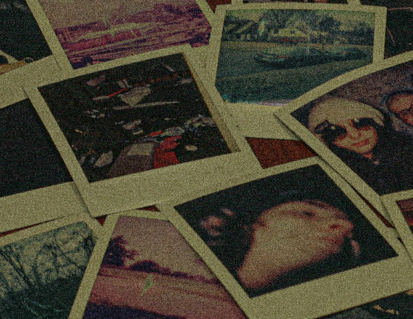
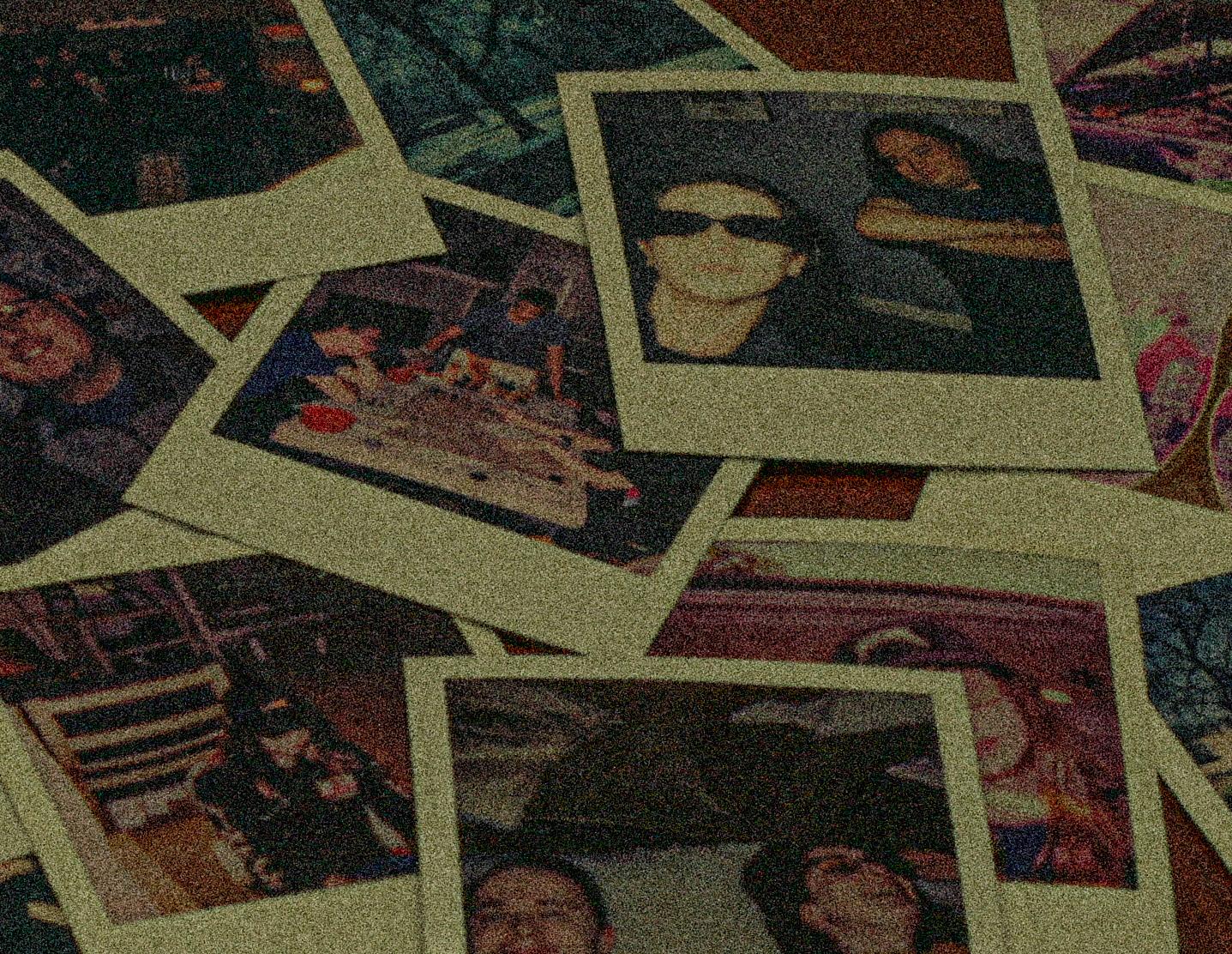
I am a Graphic Designer and Project Manager ready to handle any task thrown at me. I have experience in design and typography, as well as photo and video. I am comfortable with the entire Adobe Suite, from Photoshop to InDesign.
I grew up in a suburb outside of Memphis, riding my bike and playing computer games. I had a simple and quiet life, keeping to myself and reading wherever I went. As I grew older I found comfort and confidence in being myself. I strive to be flexible, whether it be physically, in my work, or in my art.

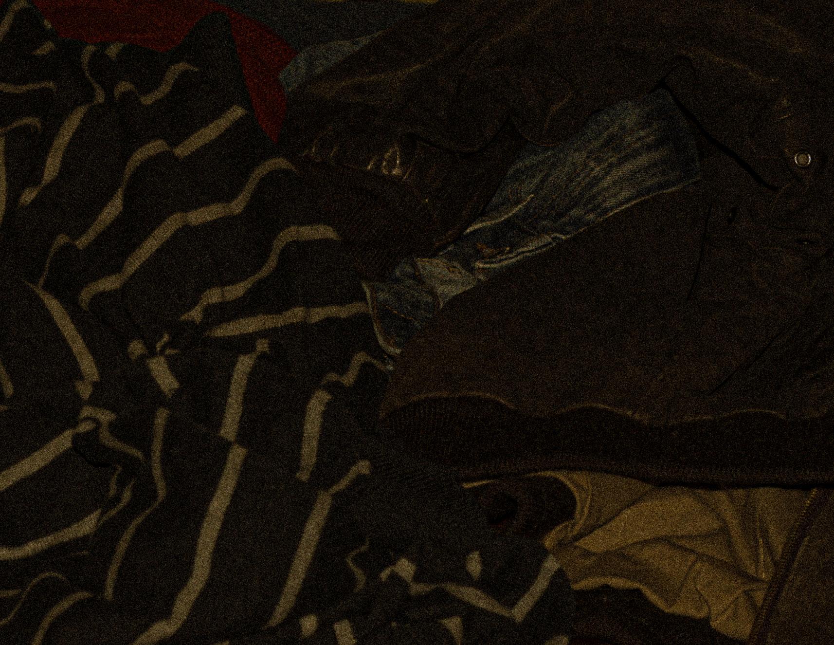
I picked up Graphic Design at fourteen years old. From the moment I picked up a copy of Photoshop 2005, I could tell what kind of power it held. I learned that you can’t get anywhere without taking chances and experimenting. I am always finding new things to explore, and new skills to add to my collection. I want to use my talents for a good cause, while still staying true to myself.


These colors are smooth, with the main focus being on brown and off-white. Green and pink allow for accents that pop.
Caslon 224 was a popular option in vintage advertising. With many variable weights, the black option is striking and bold.
Helvetica is a design staple, and a lot of advertising used it’s condensed form to save space. It’s bold form is well suited for subheadings.

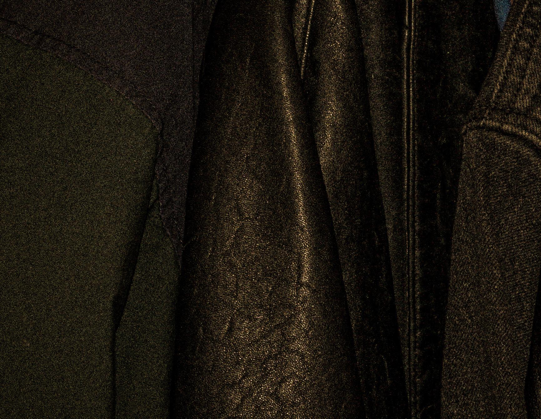
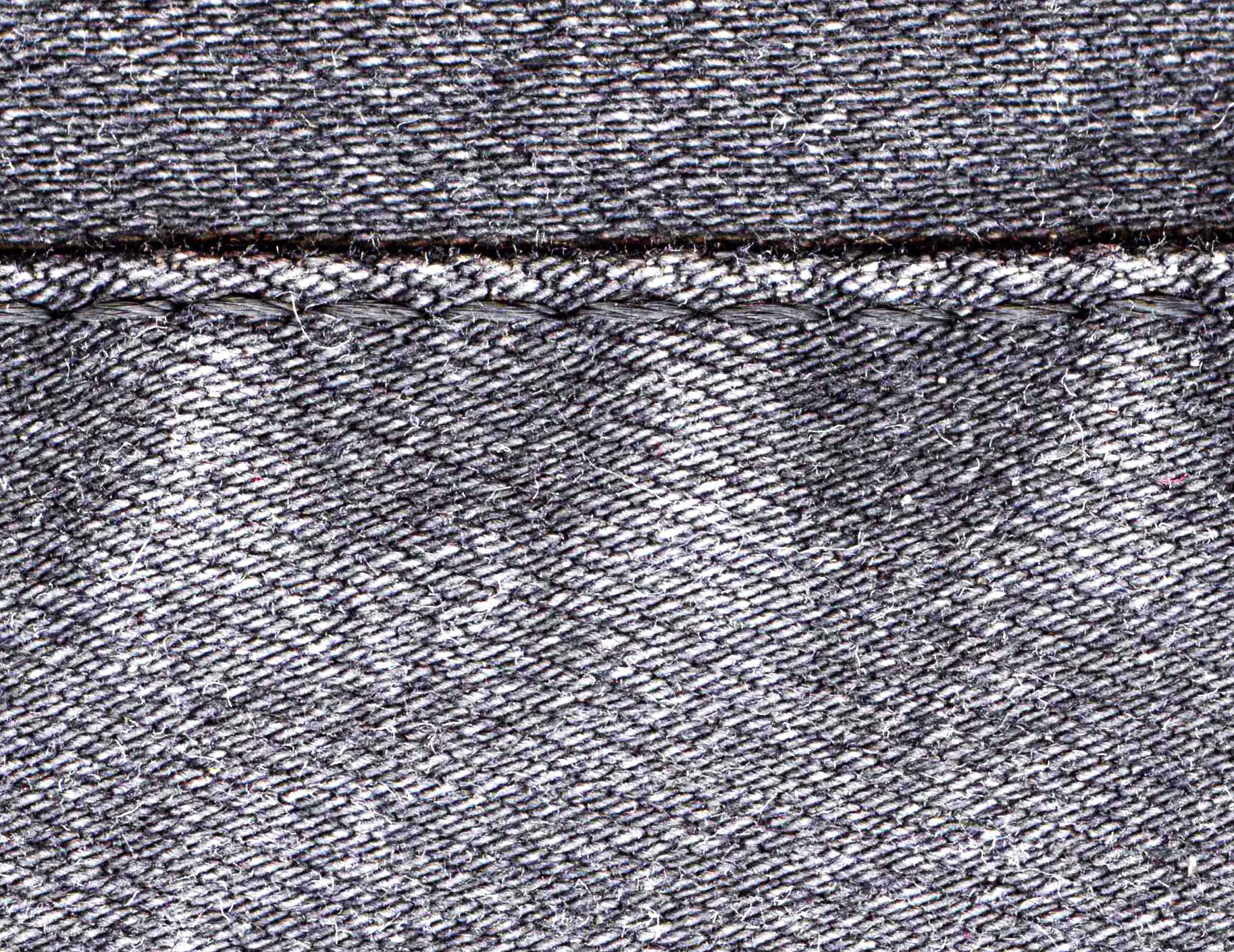
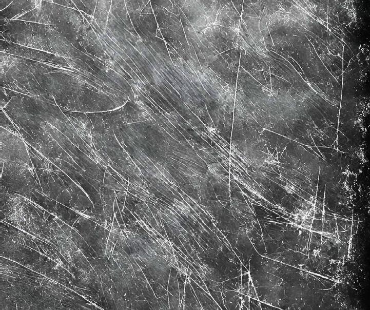
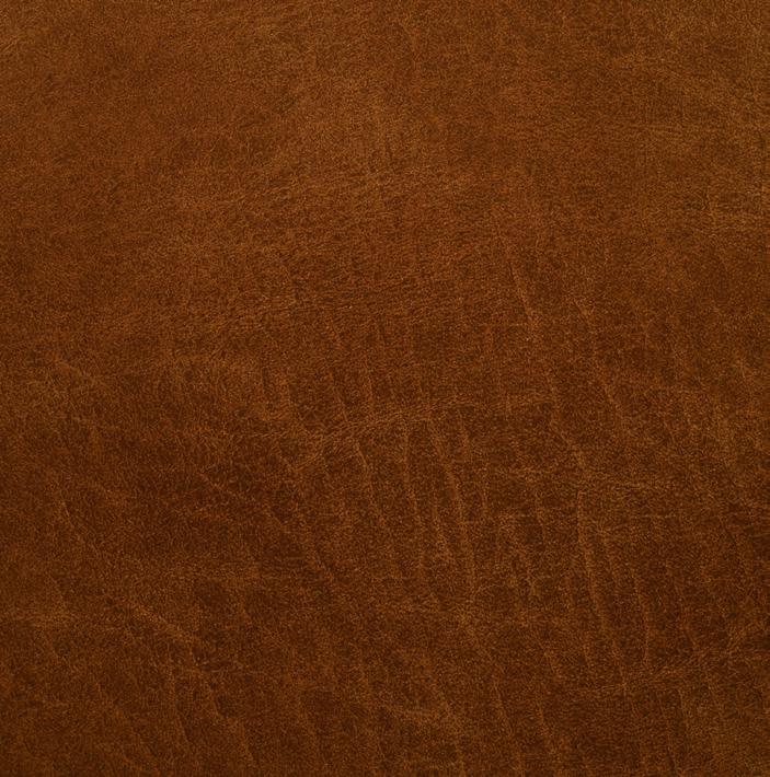
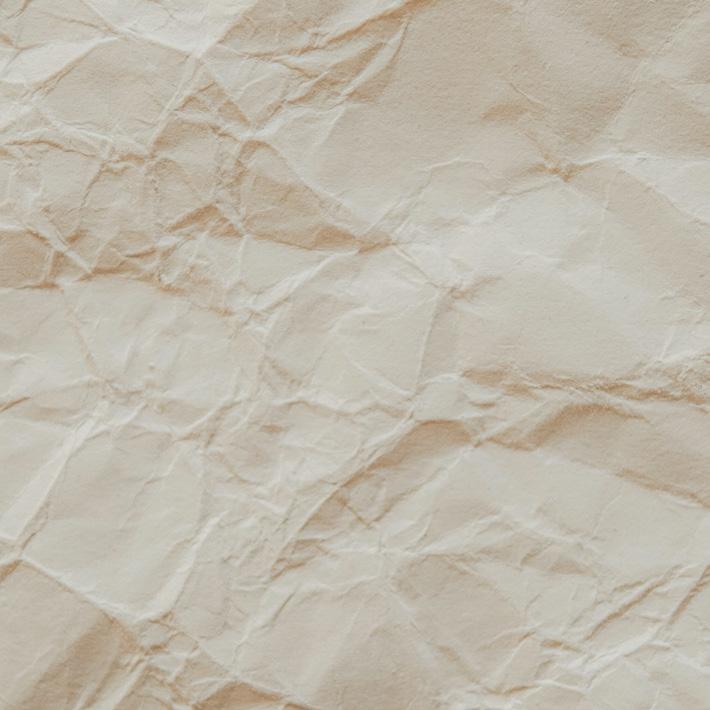
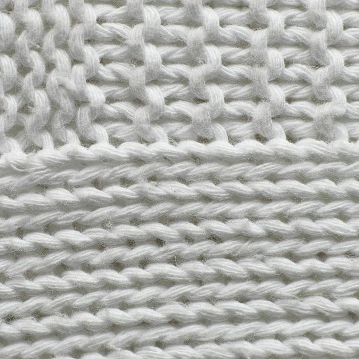
Using texture is a great way to add depth to a design. I enjoy designs that are tangible, leather and paper ground my designs in reality. Backgrounds and overlays ensure that designs aren’t too flat, and gives them a little personality .
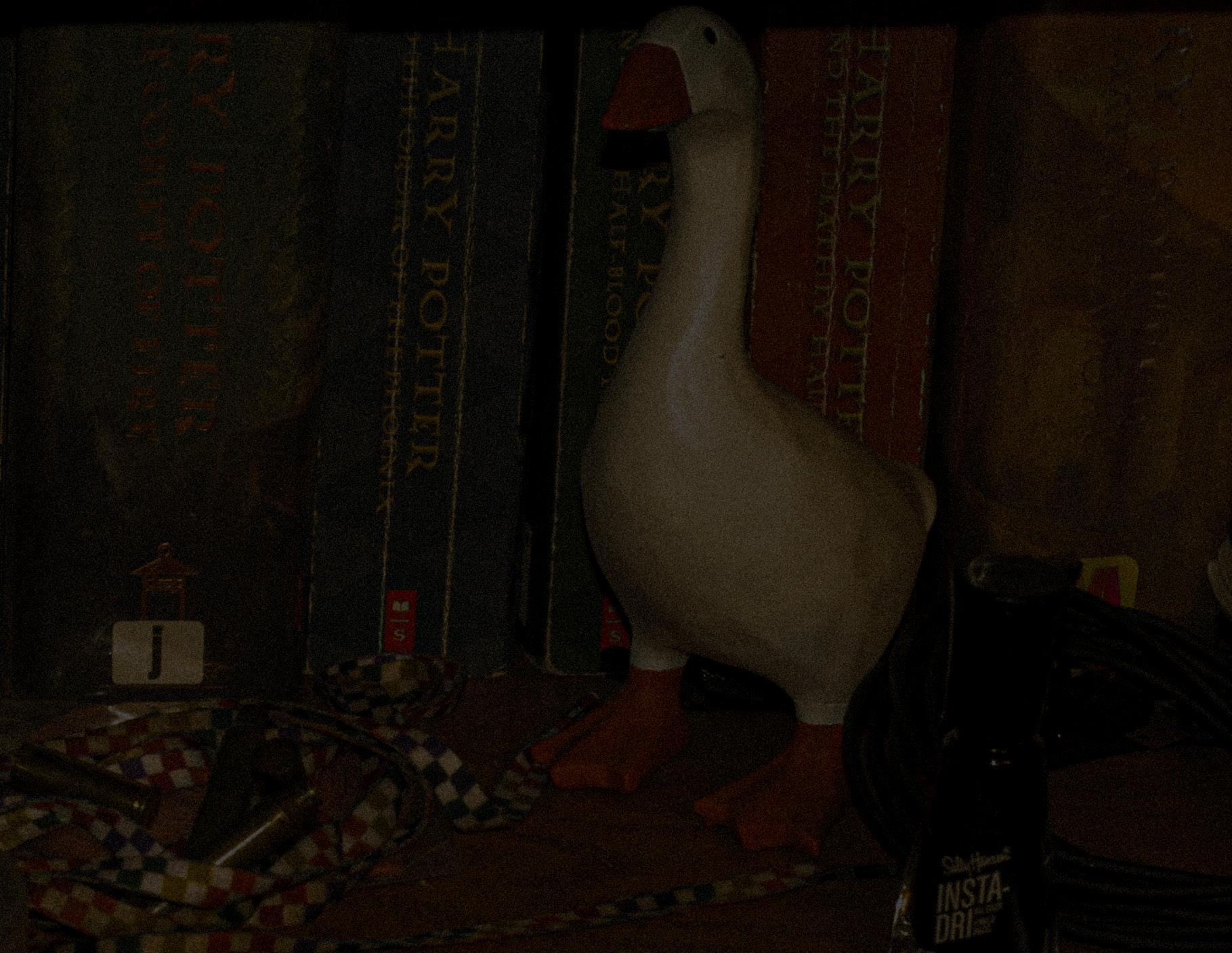
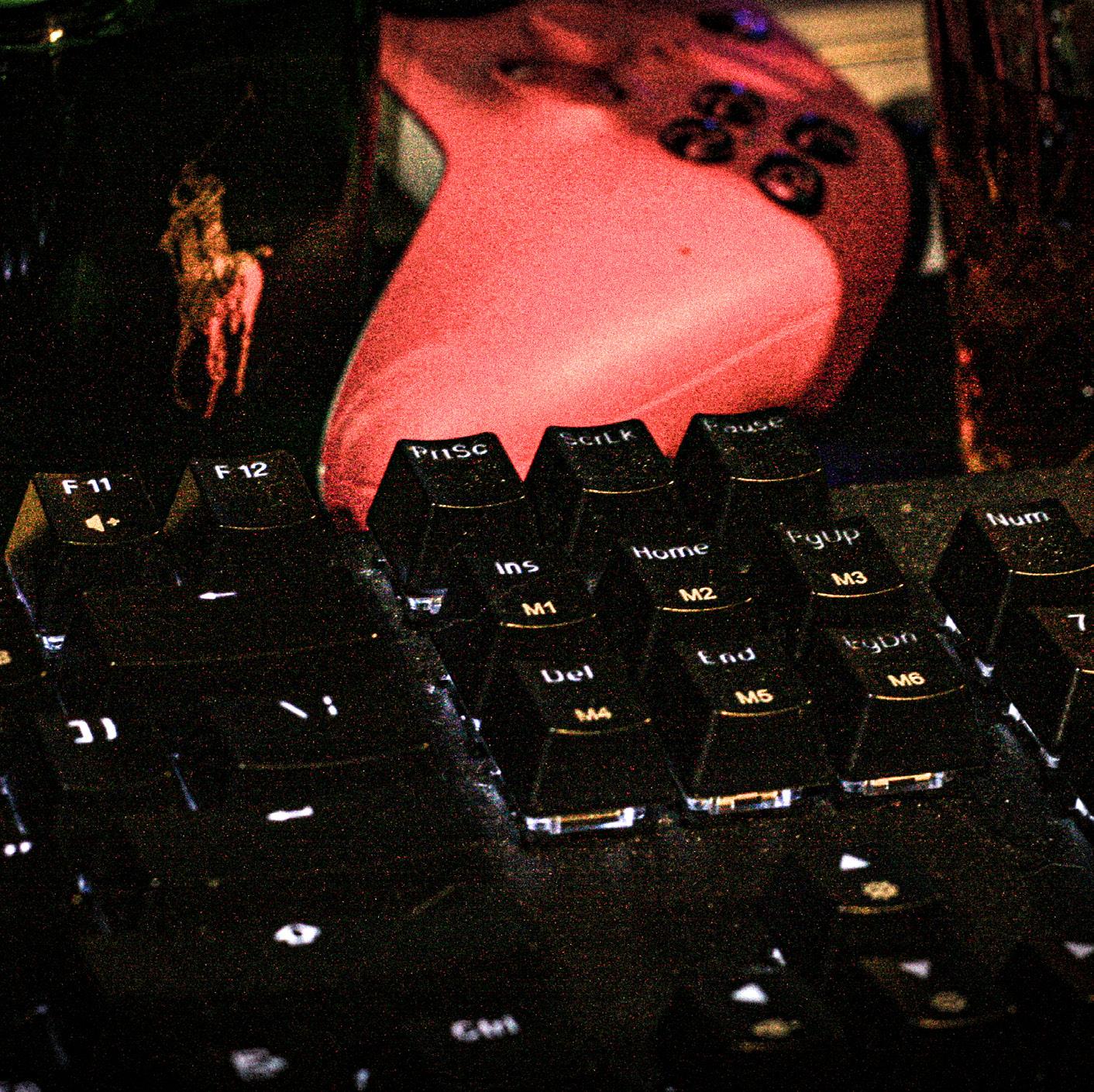
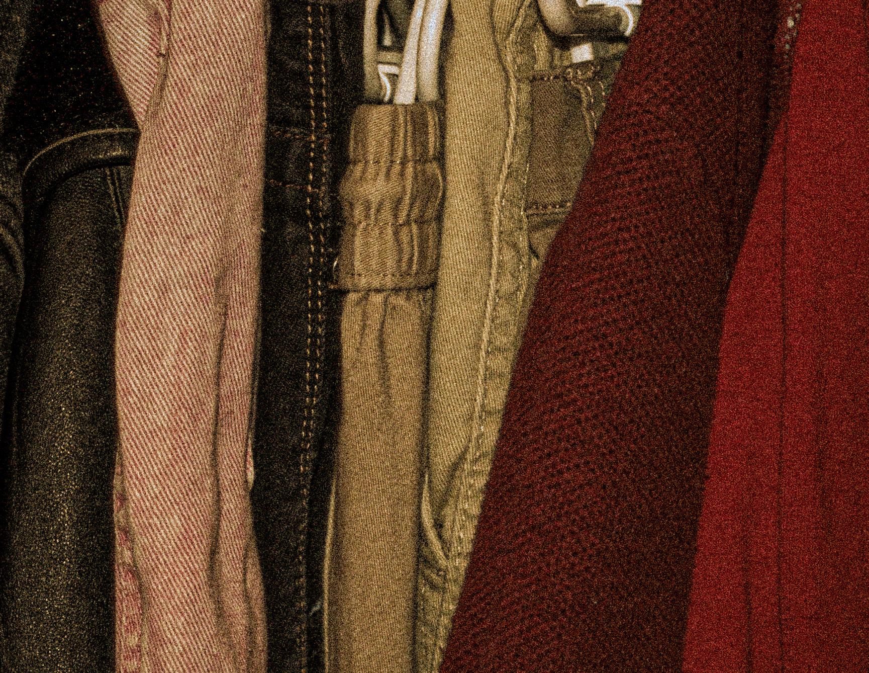
Grain adds a vintage and thrifty feel to my photos. The film effect gives off a retro feel without losing any image quality. The warmer tones also give a more inviting and comfortable feel.