Solutions Manual

Table of Contents Chapter 1 What is statistics? 1 Chapter 2 Data types, data collection and sampling 3 Part 1 Descriptive measures and probability Chapter 3 Graphical descriptive techniques – Nominal data 7 Chapter 4 Graphical descriptive techniques – Numerical data 35 Chapter 5 Numerical descriptive measures 76 Chapter 6 Probability 122 Chapter 7 Random variables and discrete probability distributions 161 Chapter 8 Continuous probability distributions 189 Part 2 Statistical inference Chapter 9 Statistical inference and sampling distributions 217 Chapter 10 Estimation: describing a single population 233 Chapter 11 Estimation: comparing two populations 254 Chapter 12 Hypothesis testing: describing a single population 268 Chapter 13 Hypothesis testing: comparing two populations 320 Chapter 14 Additional tests for nominal data: Chi-squared tests 367 Chapter 15 Simple linear regression and correlation 403 Chapter 16 Multiple regression 446 Part 3 Applications Chapter 17 Time-series analysis and forecasting 481 Chapter 18 Index numbers 539
1 What is statistics?
1.1 a Population: The collection of all measurements of interest in a statistical problem; e.g., heights of all Australians.
b Sample: Any subset of measurements from a population; e.g., heights of 100 selected Australians.
c Parameter: A descriptive measure of the measurements in a population; e.g., average height of all Australians.
d Statistic: A descriptive measure of the measurements in a sample; e.g., average height of 100 selected Australians.
e Statistical inference: A conclusion about a characteristic of a population, based on the information provided by a sample drawn from the population; e.g., testing whether the average height of all Australian adults is greater than 150cm using the sample information based on the heights of 100 randomly selected Australian adults.
1.2 Descriptive statistics consists of graphical and numerical methods used to describe sets of data, both populations and samples. Inferential statistics consists of a body of methods used for drawing conclusions about characteristics of a population, based on information available in a sample drawn from the population.
1.3 a Views on internet banking of the 12 000 customers
b Views on internet banking of the 300 customers surveyed
c Statistic.
1.4 a The complete production run of light bulbs
b 1000 bulbs selected
c The proportion of the light bulbs that are defective in the whole production run.
d The proportion of bulbs that are defective in the sample of 1000 bulbs selected.
e Parameter
f Statistic
g Because the sample proportion (1%) is much less than the claimed 5%, we can conclude with the confidence that there is evidence to support the claim.
1.5 Select a number of graduates (say 100) from each group (Business group and Arts and Science group) and workout the sample mean salaries of the two groups. Compare the two mean values to see whether there is some support for the claim that in general, average salary of business graduates is greater than the average salary of arts and science graduates.
Business Statistics: Australia New Zealand (7th edition) – Solutions Manual © Cengage Learning Australia 2017 1
1.6 a Flip the coin 100 times and count the number of heads and tails
b Outcomes of repeated flips
c Outcomes of the 100 flips
d The proportion of heads
e The proportion of heads in the 100 flips.
f If the sample proportion is close to 0.5, we conclude that there is some support for the claim that the coin is a fair coin.
1.7 a The coin is not a fair coin.
b The coin may be a fair coin. Need more trials (say, 1000) to confirm this.
c If it is not a fair coin, the answer is no. The number of heads and tails can be anywhere between 0 to 100, out of 100 trials (for example, 60 heads and 40 tails, or 30 heads and 70 tails). If it is a fair coin, one would expect the number of heads and tails to be close to 50, out of 100 trials.
Business Statistics: Australia New Zealand (7th edition) – Solutions Manual © Cengage Learning Australia 2017 2
2 Types of data, data collection and sampling
2.1 Numerical: a Kilometres commuted to work
b Age of students in a statistics class.
Ordinal: a Fortnightly Australian family income
i Under $1500
ii $1500–2000
iii $2000–2500
iv $2500 or over.
b Patient’s condition: excellent, good, fair or poor.
Nominal: a Country of origin of Australians
b Type of car owned.
2.2 a Numerical
b Nominal
c Ordinal
d Numerical.
2.3 a Nominal
b Nominal
c Numerical
d Ordinal
e Numerical.
2.4 a Numerical
b Nominal
c Nominal
d Ordinal
e Numerical
f Ordinal.
2.5 a Ordinal
b Numerical
c Nominal
d Numerical
e Numerical.
2.6 a Numerical
b Ordinal
c Nominal
d Numerical
e Ordinal
f Nominal.
Business Statistics: Australia New Zealand (7th edition) – Solutions Manual © Cengage Learning Australia 2017 3
2.7 a Nominal
b Numerical
c Nominal
d Numerical
e Ordinal.
2.8 a Numerical
b Ordinal
c Nominal
d Numerical
e Nominal
f Ordinal.
2.9 a Numerical
b Numerical
c Nominal
d Ordinal
e Numerical.
2.10 a Ordinal
b Ordinal
c Ordinal
d Numerical.
2.11 Primary data are published by the original source. Secondary data are published by someone other than whoever originally collected and published the data. Secondary data sources often summarise much of the original data, resulting in a loss of some information.
2.12 a Australian Bureau of Statistics; Year Book, Australia (annual); rate of unemployment, population
b Reserve Bank Bulletin (monthly); interest rate, exchange rate
c CIA Fact Book (annual); electricity consumption, flags of the world
Note: The two specific pieces of information contained in the latest issue of these publications will, of course, vary considerably, unless the instructor is more specific about the information requested.
2.13 In an observational study, there is no attempt to control factors that might influence the variable of interest. In an experimental study, a factor (such as regular use of a fitness centre) is controlled by randomly selecting who is exposed to that factor, thereby reducing the influence of other factors on the variable of interest.
2.14 a This is an observational study, because no attempt is made to control factors that might influence cola sales, such as store location or store type.
b Randomly select which stores (both grocery and convenience) receive cola in bottles to reduce the influence of factors like location. Separately analyse the two types of stores in order to reduce the influence of store type.
Business Statistics: Australia New Zealand (7th edition) – Solutions Manual © Cengage Learning Australia 2017 4
2.15 a Randomly select 4000 people over the age of 50. Compare the proportion of smokers who have lung cancer with the proportion of non-smokers who have lung cancer.
b The study described in part a is observational, because we haven’t controlled who smoked.
2.16 a A survey can be conducted, for example, by means of a personal interview, a telephone interview, or a self-administered questionnaire.
b A personal interview has a high response rate relative to other survey methods, but is expensive because of the need to hire well-trained interviewers and possibly pay travel-related costs if the survey is conducted over a large geographical area. A personal interview will also probably result in fewer incorrect responses arising from respondents misunderstanding some questions. A telephone interview is less expensive, but will probably result in a lower response rate. A self-administered questionnaire is least expensive, but suffers from lower response rates and accuracy than personal interviews.
2.17 Five important points to consider when designing a questionnaire are as follows:
The questionnaire should be short.
Questions should be clearly worded and unambiguous.
Consider using dichotomous or multiple-choice questions, but take care that respondents needn’t make unspecified assumptions before answering the questions.
Avoid using leading questions.
When preparing the questions, think about how you intend to tabulate and analyse the responses.
2.18 a The sampled population will exclude those who avoid large department stores in favour of smaller shops, as well as those who consider their time too valuable to spend participating in a survey. The sampled population will therefore differ from the target population of all customers who regularly shop at the mall.
b The sampled population will contain a disproportionate number of thick books, because of the manner in which the sample is selected.
c The sampled population consists of those eligible voters who are at home in the afternoon, thereby excluding most of those with full-time jobs (or at school).
2.19 We used Excel to generate 40 three-digit random numbers. Because we will ignore all randomly generated numbers over 800, we can expect to ignore about 20% (or about 8 to 10) of the randomly generated numbers. We will also ignore any duplications. We therefore chose to generate 40 three-digit random numbers, and will use the first 25 unique random numbers less than 801 to select our sample. The 40 numbers generated are shown below, with a stroke through those to be ignored.
Business Statistics: Australia New Zealand (7th edition) – Solutions Manual © Cengage Learning Australia 2017 5
6 357 456 449 862 154 55 412 475 430 999 912 60 207 717 651 10 294 327 165 576 871 990 354 390 540 893 181 496 870 738 820 32 963 160 32 231 86 970 46
2.20 We used Excel to generate 30 three-digit random numbers. Because we will ignore any duplicate numbers generated, we generated 30 three-digit random numbers and will use the first 20 unique random numbers to select our sample. The 30 numbers generated are shown below.
2.21 The operations manager can select stratified random samples where the strata are the four departments. Simple random sampling can be conducted in each department.
2.22 Stratified random sampling is recommended. The strata are the school of business, the faculty of arts, the graduate school and the all the other schools and faculties would be the fourth stratum. The data can be used to acquire information about the entire campus but also compare the four strata.
2.23 A stratified random sampling plan accomplishes the president’s goals. The strata are the four areas enabling the statistics practitioner to learn about the entire population but also compare the four areas.
2.24 a Sampling error refers to an inaccuracy in a statement about a population that arises because the statement is based only on sample data. We expect this type of error to occur because we are making a statement based on incomplete information. Nonsampling error refers to mistakes made in the acquisition of data or due to the sample observations being selected improperly.
b Nonsampling error is more serious because, unlike sampling error, it cannot be diminished by taking a larger sample.
2.25 Three types of nonsampling errors:
Error due to incorrect responses
Nonresponse error, which refers to error introduced when responses are not obtained from some members of the sample. This may result in the sample being unrepresentative of the target population.
Error due to selection bias, which arises when the sampling plan is such that some members of the target population cannot possibly be selected for inclusion in the sample.
2.26 Yes. A census will probably contain significantly more nonsampling errors than a carefully conducted sample survey.
Business Statistics: Australia New Zealand (7th edition) – Solutions Manual © Cengage Learning Australia 2017 6
169 470 744 530 554 918 318 858 698 203 383 938 836 116 123 936 539 154 110 630 856 380 145 692 909 269 811 274 553 749
Part 1
Descriptive measures and probability
3 Graphical descriptive techniques – nominal data
3.1
Business Statistics: Australia New Zealand (7th edition) – Solutions Manual © Cengage Learning Australia 2017 7
a b
3.2 a A bar chart would be appropriate.
b A pie chart would be appropriate.
Business Statistics: Australia New Zealand (7th edition) – Solutions Manual © Cengage Learning Australia 2017 8
3.3 A pie or bar chart can be used; however, a pie chart is more suitable here.

3.4 A pie or bar chart can be used; however, a pie chart is more suitable here.
Business Statistics: Australia New Zealand (7th edition) – Solutions Manual © Cengage Learning Australia 2017 9
3.5
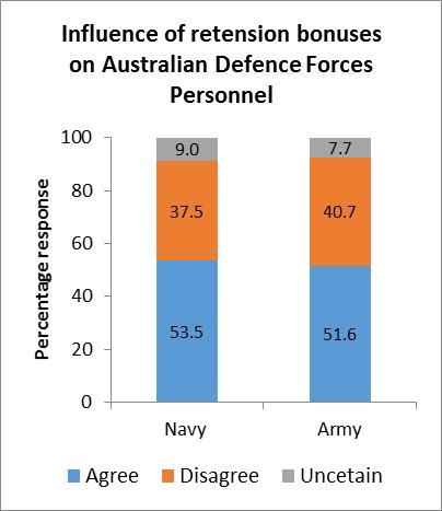
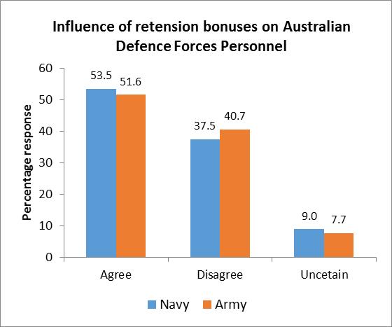
3.6 To compare the responses of the navy and army personnel a bar chart could be used. On the other hand, to compare the responses within the navy and within the army personnel, a component bar chart could be used. A component bar chart can also be used to compare the responses of the navy and army personnel as well. 3.7
Business Statistics: Australia New Zealand (7th edition) – Solutions Manual © Cengage Learning Australia 2017 10
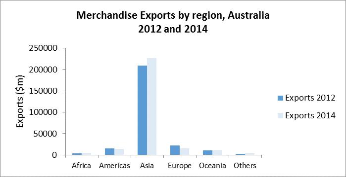
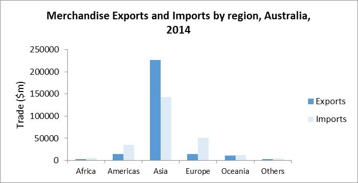
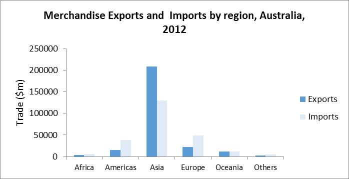
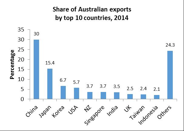
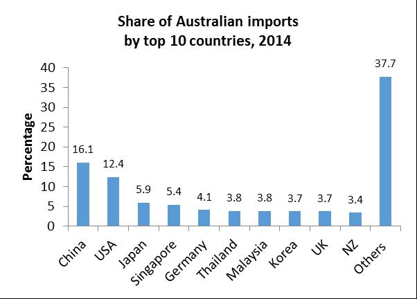
3.8. To compare the exports and imports in a particular year to and from the 6 trading partner regions, bar charts in (i) and (ii) would be useful. To compare the exports during 2012 and 2014, bar chart (iii) would be useful. Similarly, to compare the imports during 2012 and 2014, bar chart (iv) would be useful.
Business Statistics: Australia New Zealand (7th edition) – Solutions Manual © Cengage Learning Australia 2017 11
(i) (ii)
(iii)
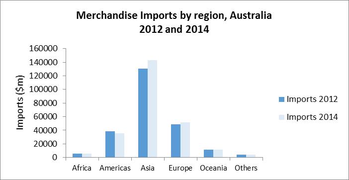
Business Statistics: Australia New Zealand (7th edition) – Solutions Manual © Cengage Learning Australia 2017 12 (iv)
3.9 A bar chart would be appropriate.
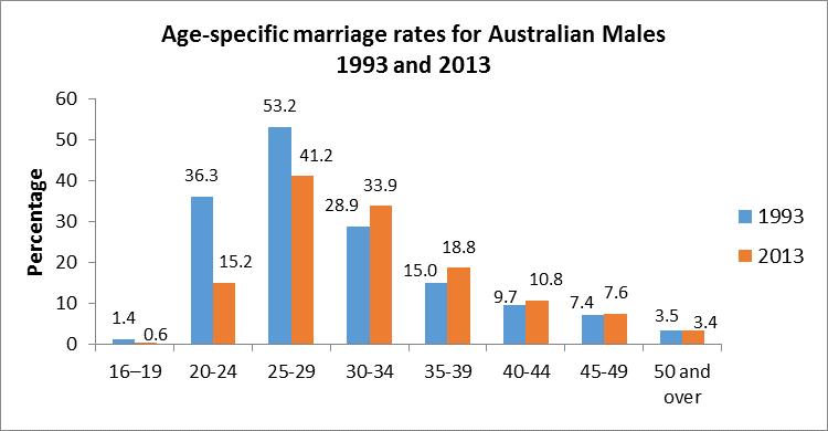
3.10 a Appropriate graph to compare the marriage rates for males would be a bar chart using data for Males only.
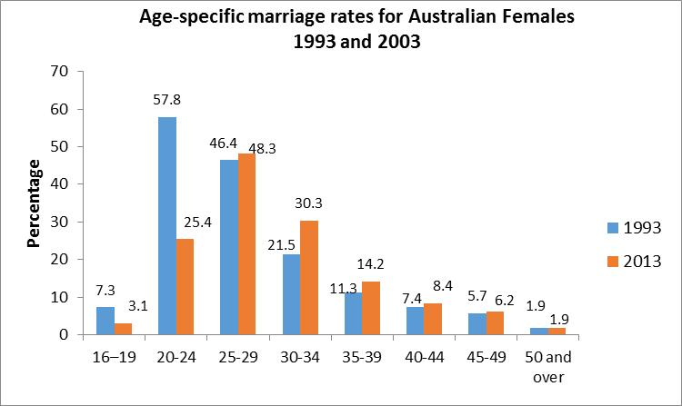
b Appropriate graph to compare the marriage rates for females would be a bar chart using data for Females only.
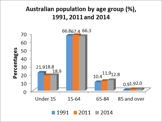
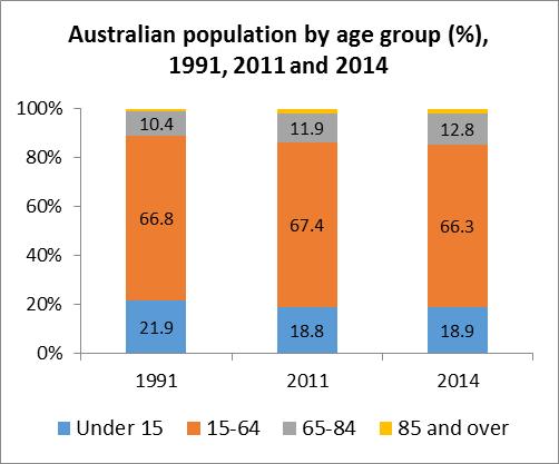
c Among the age groups for males, the marriage rate has fallen for the 16-19, 20-24, and 25-29 age groups, while it has increased for all the age groups 30 years and over between 1993 to 2013. For females, the marriage rate has fallen for the 16-19 and 20-24 age groups, while it has slightly increased for the 25-29 group and increased for all age groups 30 years and over between 1993 and 2003. This shows that the age at marriage has increased between 1993 and 2013 for both males and females That is, more and more males and females are waiting longer to get married.
d A bar chart is more appropriate as the aim is to directly compare the marriage rates between the years 1993 and 2014, among males and females separately.
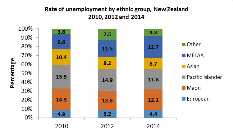
3.11 A bar chart would be appropriate to compare the rate of unemployment during the three years, 2010, 2012 and 2014 for each ethnic group A component bar chart would be appropriate to compare the level of unemployment among the ethnic groups for each year.

Business Statistics: Australia New Zealand (7th edition) – Solutions Manual © Cengage Learning Australia 2017 13
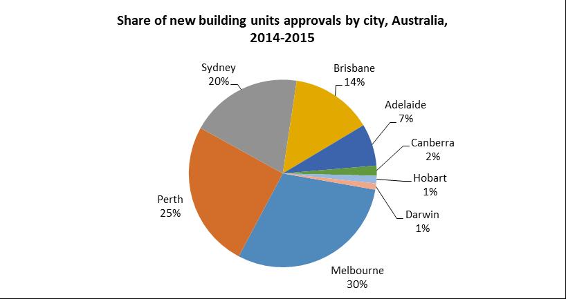
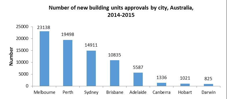
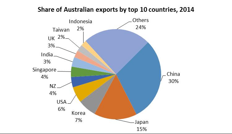
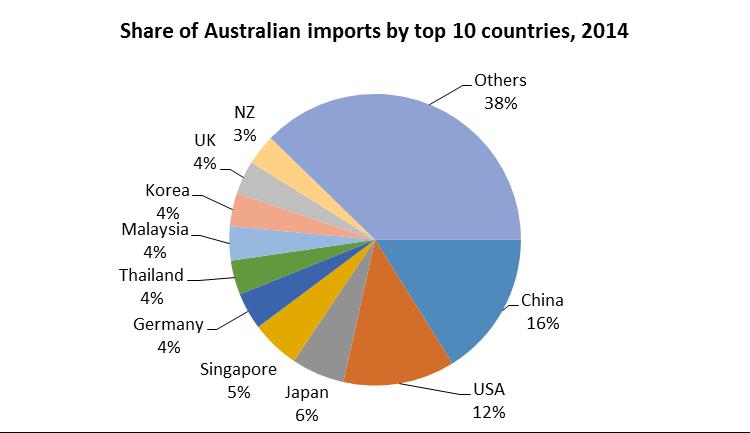
3.12 a Since the information is given in percentage shares, either a bar chart or pie chart would be appropriate. As the countries are different, a comparison of imports and exports is not possible
Business Statistics: Australia New Zealand (7th edition) – Solutions Manual © Cengage Learning Australia 2017 14
b The bar chart or a pie chart would be useful as the information is already in percentages (shares). However, a pie chart would be more appropriate to easily see the major contributors to Australian exports and imports.


3.13 Pie charts (a) are helpful to compare the share of all forms of energy sources between and within Australia and New Zealand. Pie charts (b) for the non-renewable energy sources for Australia and New Zealand would be appropriate for comparison of the contribution of non-renewable energy sources within and between the two countries Separate pie charts (c) for the renewable energy sources for Australia and New Zealand would be appropriate for comparison of the contribution of renewable energy sources within and between the two countries (a)


Business Statistics: Australia New Zealand (7th edition) – Solutions Manual

15
© Cengage Learning Australia 2017
Coal 76% Oil 8% Natural gas 13% Nuclear 0% Hydroelectric 1% Biofuel 2% Other (solaretc) 0% Energy sources, Australia,
Coal 17% Oil 18% Natural gas 23% Nuclear 0% Hydroelectric 14% Biofuel 7% Other (solaretc) 21% Energy sources, New Zealand,
Hydroelectric 14% Biofuel 78% Other (solaretc) 8% Renewable energy sources, Australia, 2009 Hydroelectric 33% Biofuel 17% Other (solaretc) 50% Renewable energysources,NewZealand,2009 (c) Coal 78.0% Oil 8.4% Natural gas 13.6% Nuclear 0.0% Non-renewable energy sources Australia, 2009 Coal 29.6% Oil 30.6% Natural gas 39.8% Nuclear 0.0% Non-renewable energy sources New Zealand, 2009
2009
2009 (b)
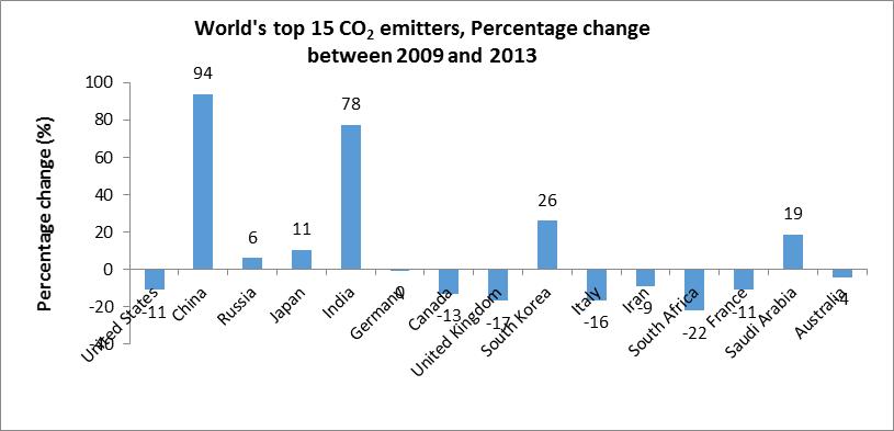
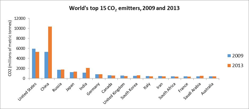
3.14 A bar chart would be appropriate. To see how countries are performing in terms of reducing CO2 emissions, a bar chart of percentage change in emissions from 2009 to 2013 for the 15 countries would be appropriate.
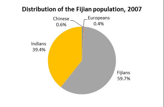
The top CO2 emitters in the world in 2013 are China followed by the US, India, Russia and Japan in that order. Between 2009 and 2013, China, India, South Korea, Saudi Arabia and Russia have increased their CO2 emissions while US and all other countries including Australia have reduced their CO2 emissions
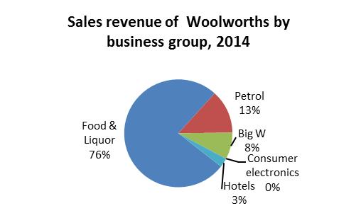
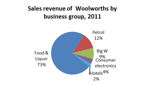
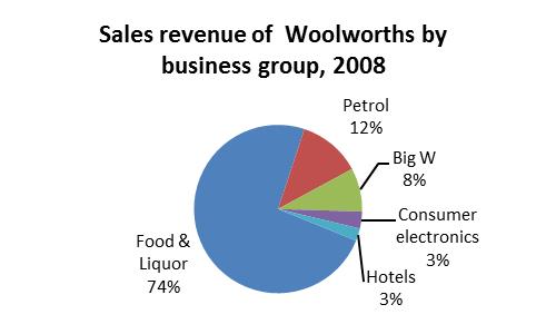
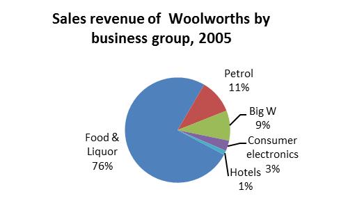
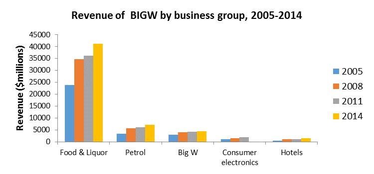
3.15 Pie charts, one for each year, are useful for comparison of the share contribution of revenues from various Woolworths business groups during the four years. A bar chart would be useful to compare the values of each business group during 2005, 2008, 20011 and 2014.
Business Statistics: Australia New Zealand (7th edition) – Solutions Manual © Cengage Learning Australia 2017 16
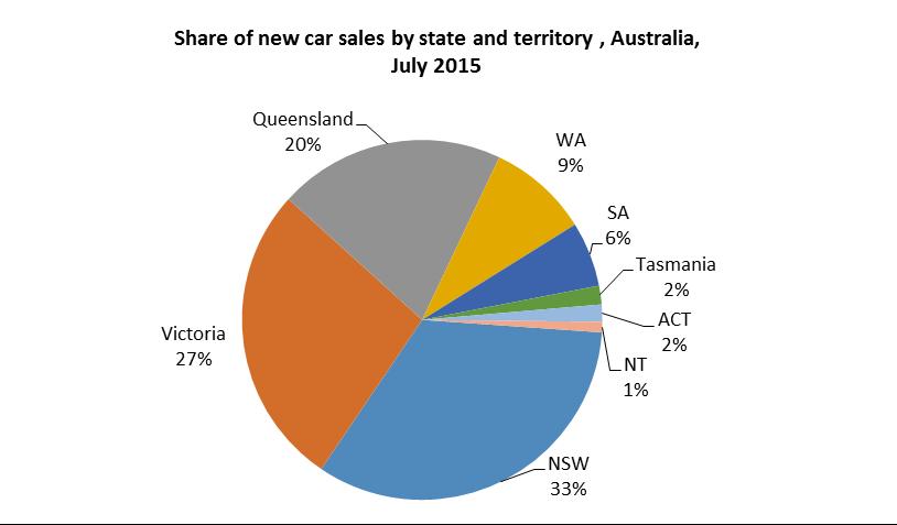
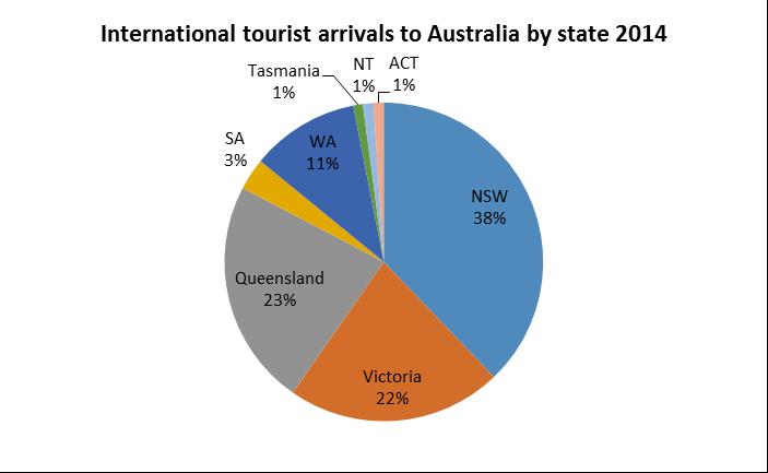
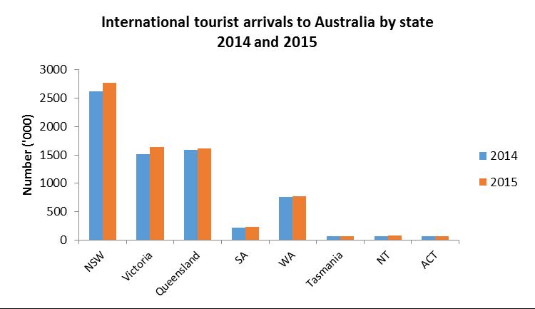
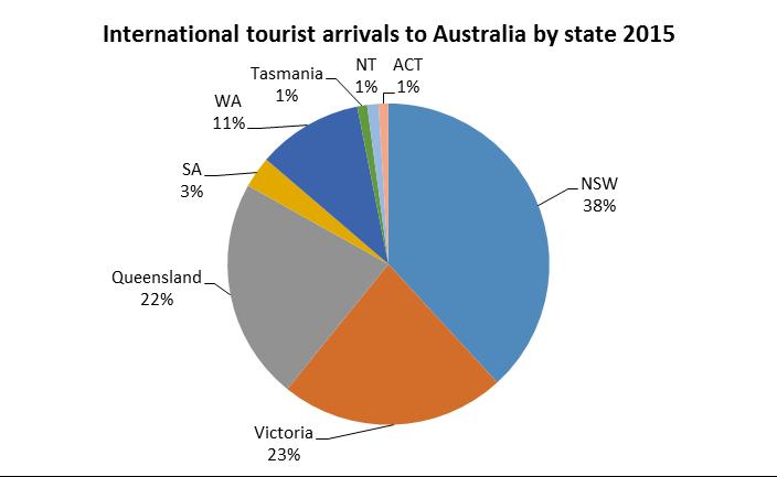
3.16 A bar chart would be appropriate to compare the change in the number of tourist arrivals from 2014 to 2015. The tourist arrivals to NSW and Victoria have increased in 2015 from 2014. Tourist arrivals to other states and territories have remained nearly the same. A pie chart would be useful to analyse the share of tourist arrivals to the different states and territories in Australia The share of tourist arrivals to the different states and territories have stayed nearly the same in 2014 and 2015.
Business Statistics: Australia New Zealand (7th edition) – Solutions Manual © Cengage Learning Australia 2017 17
Business Statistics: Australia New Zealand (7th edition) – Solutions Manual © Cengage Learning Australia 2017 18 b 3.17 Business Statistics Australia New Zealand 7th Edition Selvanathan Solutions Manual Full Download: http://testbanktip.com/download/business-statistics-australia-new-zealand-7th-edition-selvanathan-solutions-manual/ Download all pages and all chapters at: TestBankTip.com