RICARDO
“IT DOESN’T REPEAT ITSELF BUT IT RHYMES”

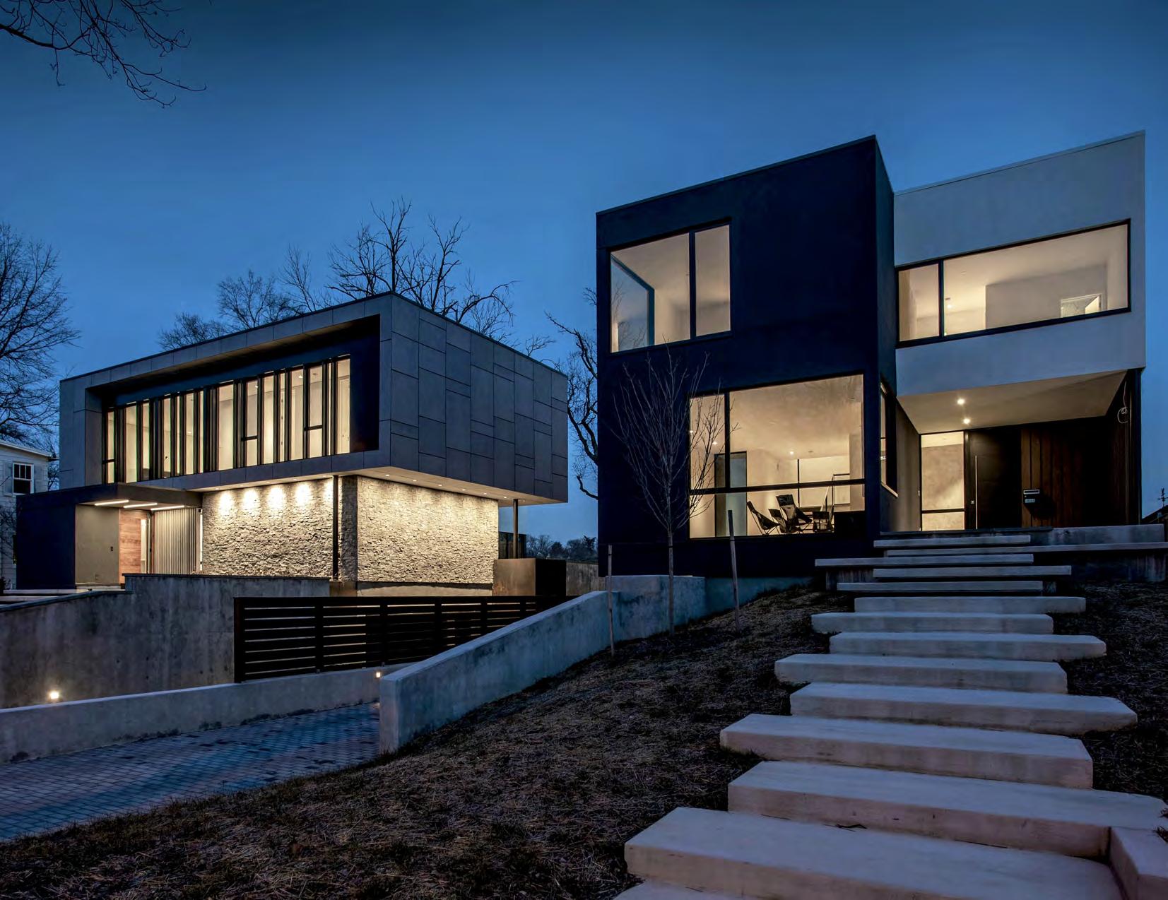
A complex of modern homes sharing the same design principles but unique in their own right. And just like fraternal twins, the client’s home, namely HOUSE N, and the investment home, HOUSE S, came to live.
PROJECT Housing development with two single-family residences
PROGRAM
1 home (2 story + bsmt)
4 beds / 5.5 baths
1 home (2 story + cellar)
4 beds / 4.5 baths
LOCATION Washington District of Columbia United States
FIRM Grupo7 Architecture+Interiors
DESIGNERS Jim Cronenberg
José Tohá
Alfredo Muñoz
Ricardo Guisse
ROLE Design, drafting, 3D modeling, project management

PHASES Design development, construction documents, contract administration
BUILDER Added Dimensions
BUILT Fall 2018-Summer 2020
PROJECT DESCRIPTION
This project required the demolition of the existing home and garage, and the subdivision of the lot into two: one for the client, and one for an investment property. The design of the client’s home was influenced by her captivation for MidCentury Modern European homes.


It was the best of times, it was the worst of times... and then there were two houses. The End. But actually the story goes like this: In 2016, a very candid and sporty woman came in contact with my bosses Jim and José with the intention of building her home in Washington, DC. After purchasing an existing home, the original inquiry basically entailed razing it to make room for a new one. Just as the project got moving and designed, I got brought in.
As the project developed, there was an instant revelation that the site may be too big for just one home. Our client has never been fond of large lawns, otherwise she “would bring the goats to do the mowing,” her words. Our team wondered: how about we divide the lot and build two houses instead? This idea not only reduced the yard space, but allowed for an investment property. Of course, as the idea became the plan, now it was time to further develop the design of her house (HOUSE N), and come up with something for the second house (HOUSE S).

AFTER COVID BEFORE COVID

We hoped that HOUSE S will be a net gain for the client... and essentially “kill the bills” for her actual house. And so, as we entered 2017, developing HOUSE N was very fun at the beginning. The design entailed two volumes perpendicularly intersecting each other. In the open exterior space, a pool was added. This design was later replicated for HOUSE S but horizontally.
Then came the garage, to which it was agreed that should be tucked in the basement level somehow. At first, front driveway was designed which sloped to the garage, but it looked too intrusive to our clean façade. Then our civil engineer, who was helping us splitting the lot, mentioned that the city will not allow us to have two easements. This became problem for our second house and also meant that both houses will have to share one driveway.
This led to creatively placing the easement in the middle of the two properties, and splitting it as it approached each house. Genius! That allowed us having the garage entrance on the side of HOUSE N, keeping it still in the basement, and providing us with the clean façade we wanted. This was later replicated in HOUSE S.
Because of this maneuver, the basement resulted in a small footprint. So in order to increase the livable spaces for the rest house, a series of cantilevers were introduced. With the help of our lively structural engineer, the impressive feat created almost an unimaginable outcome of a cantilevered second floor over the cantilevered first floor.


When we started construction during the summer of 2018, we had a wet and rocky start. We experienced an incredible amount of rain, preventing us from pouring our foundation. The delay was so great, that it wasn’t until the fall when we finally were able to have the basement built. And that wasn’t all. Everything was moving along up just fine until the steel order. As soon as the tariffs with China dropped, steel imports were affected almost immediately. Thus, representing another heavy delay (no pun intended) until the spring of 2019. After a huge sigh of relief, the house was finally taking shape. Construction continued swiftly as the wood framing and beams came along, then later the windows and doors. But by this time, the project was just starting to catch up. As the client’s house was underway, once the design of the second house wrapped, it started construction right around 2019. Most of the construction went smoothly, thankfully because the same contractor was involved, and the team was highly knowledgeable to replicate the same style and constructibility.
Then 2020 rolled in, and at this point what can possibly go wrong! The interiors were just getting finished when all of the sudden the pandemic hit. And just as COVID-19 ended the world, sadly so did my participation in the project.
Despite the circumstances, I was able to visit the home later in the year. As my maskedself approached the steps, I received a very socially-distanced and warmed welcome from the client. It was humbling to know that I was missed during the final days of construction, that she was happy with her house, and that a buyer was found.
In the end, as 2021 started, both homes had new families enjoying them as my bosses, colleagues, and myself intended and work hard to achieve. I remember enjoying the fact that her happiness is a result of providing a good service, and that we allowed for two new homes to start new stories and memories.


Officina or “workshop” in Italian, combines a market, restaurant and bar under one roof, creating a celebration of Italian industrial craft, exquisite design, and delicious cuisine.
PROJECT Tenant improvements to new 3-story building
PROGRAM Cafe, bar, market, event space, private room, and terrace
LOCATION Washington District of Columbia United States
FIRM Grupo7 Architecture+Interiors
DESIGNERS Jim Cronenberg
José Tohá
Alfredo Muñoz
Pete Lazzari
Paul Carlson
Monica Mesa
Ricardo Guisse
ROLE Design, drafting, digital rendering, 3D modeling
PHASES Design development, construction documents
BUILDERS Winmar Construction
BUILT Winter 2018-Summer 2019
PROJECT DESCRIPTION
As part of a large development in the DC’s southwest waterfront, the design of this project took place just before the new building shell started construction. This allowed modifications to the interiors as dictated by our design, which were to the advantage of our client as the future tenant.

From the Renaissance times to the Post-WWII era, Italy has always been known as the hub of high-end fashion, industrial design, architecture, and fine craft. This acknowledgement diligently provides the basis for the design of this 3-level market, restaurant, and cafe-bar.
Our client, a chef from Italian descent, ventured in amplifying the Italian food experience in Washington, DC in one large building. Officina, or “workshop” in Italian, represents this idea of a multifaceted program under one roof. For instance, the market would supply the restaurant with curated meats for a charcuterie directly from the butcher, or the wine would be brought directly from the crate to the bar.
As a result, this orchestrated array of programs blends together for the chef’s artful display of the craft and sophistication of Italian cuisine. And thus, a modern food workshop comes alive!


Photo by StudioMB

Photo by MKSK

1ST FLOOR


2ND FLOOR


3RD FLOOR


PROJECT Single-family residence
PROGRAM 3 story + basement 4 beds / 3.5 baths
LOCATION Washington District of Columbia United States
FIRM Studio Guisse
DESIGNER Ricardo Guisse
ROLE Design, drafting, project management
In Washington, DC, most typical row house renovations tend to adapt their alterations within the confines of a box, perhaps due to regulations. But this house design broke away from the box without breaking any city rules.
PHASES Schematic design, design development, construction documents, permitting, contract administration
BUILDER Covey Construction
BUILT Fall 2020-Winter 2023
PROJECT DESCRIPTION
The existing row house was very neglected and only allowed for 3 bedrooms and 1 1/2 bathrooms. This renovation expanded it to 4 bedrooms, 3 bathrooms and 2 powder rooms. Plus a third floor addition for a media room. This was as a result of the daunting unrestricted creative freedom from the homeowners, leading to a complete gut and rebuild of the house, and to the design adventure it unfolded.


It all started when the clients’ original concern was accessing the basement level from the rear without compromising an area for a patio. After maneuvering different stair configurations, it just seem more practical to do one single flight. But even at the shortest run possible, the top of the stairs went straight into the back alley. In order to accommodate the stairs footprint, the bottom landing pushed the basement to angle in. This simple gesture was then recreated at each level, pushing each corner inward and outward, resulting in this playful zig zag facade.

The angular movement not only plays out in the exterior but also inside each of the spaces. Several surprises and opportunities came up, such a small balcony for the guest room and the shape of the powder rooms. Even the media room at the very top plays with the angles, as they verge inward to form a natural home theater. In a way, form blends function.
It was often joked around that this aesthetic was influenced by the clients’ black-and-white cat Zeki. But in reality, all interior walls were decided to be kept in white to emphasize the architecture of the house. In contrast, a palette of black and grey colors with walnut wood species was used, in addition to a few accents of brass fixtures, brushed dark stainless steel appliances, and pink accents, as an homage to DC’s iconic cherry blossoms.
The heart of the home is the kitchen, which in itself became the most important focal point. We came up with an all-black palette that consisted of three elements: Matte cabinets, shiny countertops, and brushed metals and appliances. The stairs became a stand-alone architectural feature were treated with a walnut screen going three levels, and used the same species for the front of the kitchen island and for the seats. While the nature of the interior design maintains a modern look and feel, it still allows for flexibility for the clients’ preferred furnishings.
In the end, the house was widely welcomed by the neighborhood. A neighbor in particular, the one right behind the house, mentioned that she enjoys seeing it directly from her kitchen every morning, since it faces it directly accross. As for the clients, they are happy and proud of having an iconic fixture on their street.


With root words in Greek “filos,” meaning friend, and “timi,” meaning honor, Philotimo roughly translates in English to “honor your friends.” The concept was inspired by Greece’s culinary culture, which was crafted by chef Nicholas Stefanelli. In his words, his homage goes “well beyond the olive groves and the shores of the shimmering Aegean.”
PROJECT Tenant improvements to new 1 story + mezzanine
PROGRAM Cafe, bar, restaurant, event space, private room
LOCATION Washington District of Columbia United States
FIRM Grupo7 Architecture+Interiors
DESIGNERS Jim Cronenberg
José Tohá
Alfredo Muñoz
Monica Mesa Ricardo Guisse
ROLE
Drafting, digital rendering, 3D modeling
PHASES Design development, construction documents
BUILDER Winmar Construction
BUILT Summer 2018-Spring 2020
PROJECT DESCRIPTION
Located in the heart of downtown Washington, DC, this project was a tenant fit out within the new Midtown Center building designed by SHoP Architects. The large open space not only allowed a bar, restaurant, and bar, but also an event space, and a private room. The visual presence of the space allowed for a grand design which could be seen from across the street.


A rather large space located within the confines of SHoP Architects’ Midtown Center, this project is in a corner of the building that is largely visible from 15th street and L streets NW, a busy intersection in downtown Washington, DC.


In order to convey the project’s high-end dining experience, the renderings needed to be of the highest quality. After receiving the building’s model, we added our footprint.
Once construction completed, our client was incredibly grateful that we stayed true to the concept and experience he wanted. The renderings dictated our goals clearly and the restaurant community waited with lots of anticipation the grand opening. As a celebration of Greek culture and cuisine, our team was honored to have collaborated in such endeavor.


White walls and big glass windows... that sounds like a set of a boring modern utopia. Or... a great clean canvas for design opportunities. With the greatest views of the surrounding neighborhood on Galloway street, this little apartment a nice little gal on the block.
PROJECT Apartment
PROGRAM 2 beds / 2 baths
LOCATION Washington District of Columbia United States
FIRM Studio Guisse
DESIGNER Ricardo Guisse
ROLE Interior design
PHASES Schematic design, design development, staging
BUILT Winter 2021-Summer 2021
PROJECT DESCRIPTION
This project had a personal angle to it, as it did not only involved just furnishing an apartment for yours truly and his partner, but create a small haven with meaning. The interior design of this space drew inspiration from the surrounding context, primary colors, and the couple’s love story.


The main design constraints of this quaint modern apartment, while minimal, were its large floor to ceiling windows and very white walls. And to avoid the design becoming too simplistic, an earth-tone, warm palette was the benchmark for the overall design.
For each space (living, sleeping, and working), few elements of color and textures were incorporated, though enough to contrast the building’s modern architecture.
The living room renders it’s warm tones from the park outside, using black, red, cognac, and thick-grained wood textures. The bedroom incorporates a deconstructed palette rendered from lighthouses, namely yellows, whites, blacks, and bright brass. Lastly, the office brings a more playful interpretation of a modern office building, with whites, greys, metals, and pops of orange to contrast.
Furniture was picked based on this palette but also in direct influence of the building’s architecture. Particularly, it was its Bauhaus appeal which lead to getting pieces such as Mies van der Rohe’s Barcelona chair and Saarinen’s Tulip side table to name a few.


Every aspect of this residential development involved the idea of courts and villas. The mix of different surrounding housing typologies, pedestrian promenades, and open spaces allowed for playful take of villas within villas, thus creating a new collage in the city fabric.

“IT EXISTS IN THE CONTEXT OF ALL IN WHICH IT LIVES AND CAME BEFORE IT”
PROJECT HI-LO
Brush Park Intervention
PROGRAM
Housing development including apartments, lofts, and townhouses
LOCATION Detroit
Michigan United States
DEGREE Master of Architecture
SCHOOL University of Michigan
INSTRUCTOR Lars Gräbner
Christina Hansen
DESIGNERS Jutang Gao
Chengxiang Li Ricardo Guisse
COURSE ARCH 672: Systems Fall 2022
PROJECT DESCRIPTION
This project is a development of three residential buildings, each surrounding a courtyard, thus creating modern villas that allow neighborly connection and interactivity. Different iterations of each building are a result of some housing units having a lower profile, and some rising into a tower, which creates a variation of typology, density, and profile fitting to the Brush Park neighborhood, just north of downtown Detroit. Each courtyard is located at different elevations This creates opportunities such as the underground parking conditions that are not too invasive to the site, allows for a sustainable stormwater management, and provides a playful interaction between buildings.


Drawing from the existing promenade at City Modern and surrounding streets profiles, the resulting angular design also responds to the environmental conditions. Each series of courtyards are surrounded by the housing units and create private, semi-private, and public spaces where residents can interact with each other.
With the extension of the promenade into the site, the resulting central courtyard provides a public plaza for the different buildings surrounding it, thus creating a series of modern villas
Each courtyard is located at different elevations. The higher courts lead onto the mid courts, onto the lo courts. This creates opportunities such as the underground parking conditions that are not too invasive to the site, allows for better and sustainable irrigation, and provides a playful interaction between semi-private, private, and public spaces.


All buildings will utilize the same material palette. A combination of shingle veneer, treated wood siding, and some metal paneling. Balconies will have glass railings. Windows and doors are made out of aluminum/wood clad, with an added reflective metal lentil surrounding the frame.


In designing a library for such an important scientific facility where the past and future of the universe is being researched, it was quite fitting to use artificial intelligence, as this revolutionizing tool makes their way in architecture.

PROJECT Collider! Architecture and Artificial Intelligence
A Library for CERN
PROGRAM Library, research facility
LOCATION CERN
(Fr: Conseil européen pour la Recherche nucléaire
En: European Organization for Nuclear Research) Geneva Switzerland
DEGREE Master of Architecture
SCHOOL University of Michigan
INSTRUCTOR Matias del Campo
DESIGNERS Jacob Brown Yanlin Zhou Ricardo Guisse
COURSE ARCH 672: Institutions Fall 2021
PROJECT DESCRIPTION
CERN has an enormous scientific presence in Geneva, Switzerland that would benefit from an architectural presence, to foster the relationship between the community and the organization. Locating a library at the Sector B experiment point of Future Circular Collider is a prime opportunity for such a presence. The library was designed using artificial intelligence to generate inspiration as the basis for the project.


In late 2021, at the time of this project, most available artificial intelligence tools to craft imagery were still novel. In this case, the use of Artificial Neural Networks and Machine Learning, like Google Colab and RunwayML, were great part of the design method. It involved the interpretation of the images resulted from Style Transfer and StyleGAN processes. Both are computer vision techniques that allows to recompose the content of an image in the style of another. The resulting interpretation conveyed the design of the site and later the library.

heightened model


The most interesting results from the diffused images of the library sections were used to create the floor plans using mapping methods. Using Rhino3D, the diffused sections were lofted to create the geometry of the floor plans. Later the program was added and the language of the library was refined.

Style Generative Adversarial Network (or StyleGAN) is an approach for training generator models capable of synthesizing very large high-quality image datasets via the incremental expansion of both discriminator and generator models from small to large images during the machine training process. For this project, a number of architectural sections were “scrapped” from the internet (approx. 500 to 1000) to create a dataset to be later StyleGAN’d to create new images.
Pixelations of the style tranfer were interpreted as Hexagons, and the Voids in “surface” of style tranfer after heightened map, later interpreted as Catenoids


In order to build such a complex building, we sourced innovating materials and studied new construction methods. We also took in great consideration sustainability and traditional Alpine architecture.After careful research we opted to use Kerto Q LVL (laminated veneer lumber) panels, ETFE (Ethylene tetrafluoroethylene) glazing, and long span glulam LVL beams.
A radial structural grid used, with each “funneled” opening as the starting points. Layed on a concrete pad, the beams would cross at every connection to create the resulting skeleton. The exterior envelope was later finished with glazing and the Kerto panel, while the interior finishes were kept minimal to rather highlight the curvatures.


“Mopontucci” is a portmanteau of three Italian designers: Carlo Molino, Gio Ponti, and Giovanni Michelucci. All showcasing the best of Italian architectural and industrial design.

PROJECT Stanza di Fantasia
The Architecture of Objects
PROGRAM Screen divider
LOCATION Ann Arbor
Michigan United States
DEGREE Master of Architecture
SCHOOL University of Michigan
INSTRUCTOR Michael Kennedy
DESIGNER Ricardo Guisse
COURSE ARCH 562: Propositions Winter 2022
PROJECT DESCRIPTION
The project involved the design and construction of a screen as part of a larger collection known as a “stanza” or room, which included a table and a cabinet. All in reference to the tradition and Italian craft and industrial design. Each piece was meant to be solely inspired by each of the Italian designers assigned, whose exquisite and svelte pieces of furniture served as inspiration. This resulted in making the collection more cohesive with all three pieces using the same metals and wood species, and their forms using the same asymmetrical gestures with small geometrical flairs.


The design of the screen was inspired by Giovanni Michelucci’s Tavolo Basso (or low table) which featured a scattered yet organized use of negative space within the positive surface area with only a curve as a geometrical embelishment. At first, the screen presented an orthogonal and symmetrical design. The legs rendered Ponti’s Domus Nova Coffee Table leg, which held the overall frame with the inserted staggered screen. Then later, the purpose of this design changed to break from symmetry, stretching the legs outward and modifying the staggering in an upward motion helps even the load on the legs. To achieve this, the entire bracketed frame was decided to be only metal, with wood slats inserted within.
Because the frame and legs were now metal, both became more orthogonal (no fillet curves at the corners), and the screen simplified. Each slat will be solid as opposed to two types of species, and later cut and routed to have a curve. Also resembling Michelucci’s rounded corners.


In building the screen, this was the process was followed: First, welded the precut (waterjet) steel base pieces together. Drilled holes into the hot rolled steel angles to be later welded to create the frame. Once that was done, welded the bottom plate to the steel angle frame and inserted a temporary gap piece. Painted both the frame and base in black. Later, inserted the bolts at bottom plate and located them carefully. Drilled 1/2” diameter holes into brass inserts to match the structural bolts, all them had to stay together. Then, cut the wood slat pieces, routed them, sanded them, and applied the polyurethane finish to each piece individually and then set them to fully dry. Cut the wood frame pieces and applied the finish to each edge. Once the frame is dried and lay flat, inserted the wood frame pieces carefully (except top) between the steel angle frames and then fastened them all together with with 1/4” brass screws. This had to be done from bottom up so it does not come lose on top. The final frame was later attached to the base and the bolts. The screen was later set to stand on the floor. Then, inserted the last wood slats into frame and secure their position. Laslty, added the top piece and fasten the last 1/4” brass screws.
As the wood stain got absorbed by the wood, started to show the grain and rich colors, which contrasted with the black steel frame, resulted in the complete aesthetic look of the screen.


The new landmark delineates the horizon of Charleston, enriching not just its particular skyline, but its invigorating history. It provides harmonious contrast to the currently old abandoned landmark, and surrounds the castle, just like a vine, providing protection to the old treasure.
PROJECT CRIPE Competition Entry
Rethinking Castle Pinckney
PROGRAM Welcome center, museum, monument
LOCATION Shutes Folly Island
Charleston
South Carolina
United States
DEGREE Bachelor of Arts in Architecture
SCHOOL Ball State University
INSTRUCTOR Janice Shimizu
DESIGNER Ricardo Guisse
COURSE ARCH 401: Senior Studio Fall 2012
PROJECT DESCRIPTION
This competition challenged participants in rethinking the future of an abandoned, early nineteenth century fort, and the island surrounding it. Participants were asked to re-imagine the historic site as a place for innovative ecotourism and preservation, as well as attempt to transform it as a new landmark for the city of Charleston.

Castle Pinckney, the oldest surviving fortification in Charleston, South Carolina, was built in 1809 on a small island in the city’s harbor. It remains one of only three surviving examples of an American “castle,” a rare type of transitional coastal fort, circular in form and lacking angular bastions. The fort played a minor role during the American Civil War on the Confederate side, and was subsequently decommissioned, passing through the jurisdiction of a number of different government agencies over the past 150 years. Due to lack of funding, Castle Pinckney has essentially languished in abandonment for over a century, and now it lays in state of neglect.


Shutes Folly Island has naturally eroded over the years. It is predictable that the currents will further the DAMAGE to the castle. This presents a true hazardous condition for the site’s swampy land, which floods constantly and sporadically to the point of full submersion damaging the remaining structure.


December 4th, 2012
My dearest professor, I have some ideas on how to do this thing:
We BRING UP TO LIVE THE OLD CASTLE.
Castle Pinckney has greater opportunities than any other historic place in Charleston, mainly for it’s location.


We combined the OLD and NEW.
Then we DECONSTRUCT THE GEOMETRY OF THE CAROLINA JASMINE.
The form is created through semiotic analysis, which allows a more elegant interpretation of the flower to shape the new landmark.
Hope this makes sense to you.
Say hi to your dogs for me!
Your favorite student, Ricky

Castle Pinckney
Shutes Folly Island
Charleston, SC 29464
As a harbor city, Charleston has a particular opportunity for a unique landmark, just like New York City or San Francisco. Due to its obvious location, Castle Pinckney deserves the privilege of becoming a major harbor landmark. Thus the design must not only focus on reviving an old landmark, rather creating a new one.


Remove harmful soil
Adapt site to new conditions
Establish a relation between the addition and the fort
Protect the surround soil around the fort from erosion
Establish a connection between the addition and the fort Add program


Consisting of thin floor planes laid on a thick concrete base resembling the Solar System, and a surrounding envelope resembling Orion’s Nebula, a particular classroom hangs of the side of a cliff.

“A
PROJECT Design a Classroom
PROGRAM Classroom, observatory, outdoor space
LOCATION Paracas Bay Ica Peru
DEGREE Bachelor of Arts in Architecture

SCHOOL Ball State University
INSTRUCTOR Janice Shimizu
DESIGNER Ricardo Guisse
COURSE ARCH 401: Senior Studio Fall 2012
PROJECT DESCRIPTION
This project would explored the theory of interpretation as unique design approach for site, program, and envelope development. The classroom setting should be a cliff by the edge of a water body. Although, the site location is arbitrary, as it could be anywhere in the world just as long as it met the setting’s description. The classroom program ought to be open for any subject of study, such as geology, photography, or biology, etc.
The program should be defined first as to better dictate the site location. With these parameters, the challenge for the design of the classroom should be to best interpret its site and program. Various methods to approach the project could be explored, such as geometric rendering, abstraction, environmental responses, site responses, or other elements affecting the site and program.
Experience the stars.
Astronomy has its humble origins millennia ago, since the day human beings stared at the night sky.
The beauty of space comes from the celestial bodies that spark and shine. The study of the celestial bodies, Astronomy, has been a subject of passion and curiosity. It sparks new knowledge of what’s achievable in our own world, but it also lets us reflect upon the things we have at home.
To spark such curiosity, the classroom is set at the edge of the cliff and opened to the sky as a mere interpretation of us in solid ground surrounded by a light cover for protection to the elements, allowing visitors to see the sky. Thus, an interpretation of the ground and the atmosphere.


PERU Paracas

According to the International Dark Sky Association, the region south of Paracas, Peru, has an artificial light ratio of < 0.1 = Pitch Black.
EARTH : HEAVY
Southern Hemisphere Constellations PLAN INTERPRETATION
Because of its resemblance to rigid geometry, the Crux (Southern Cross) Constellation was chosen to represent the framework for the floor plan.


Orion’s Nebula, which resembles light and transparency was used to represent the envelope
Envelope becomes ceiling, wall, and guardrail altogether
LEVEL INTERPRETATION
Solar System, resembling of radial geometry was used to represent the classroom setting as a leveled lecture hall.

OCULUS A magnifying aperture will be embedded in the envelope. The principle of magnification through refraction shall be used in the envelope for better appreciation of the sky.
- 2 24