rian casey
how do we respect what came before us and how do we make anew ?
projects
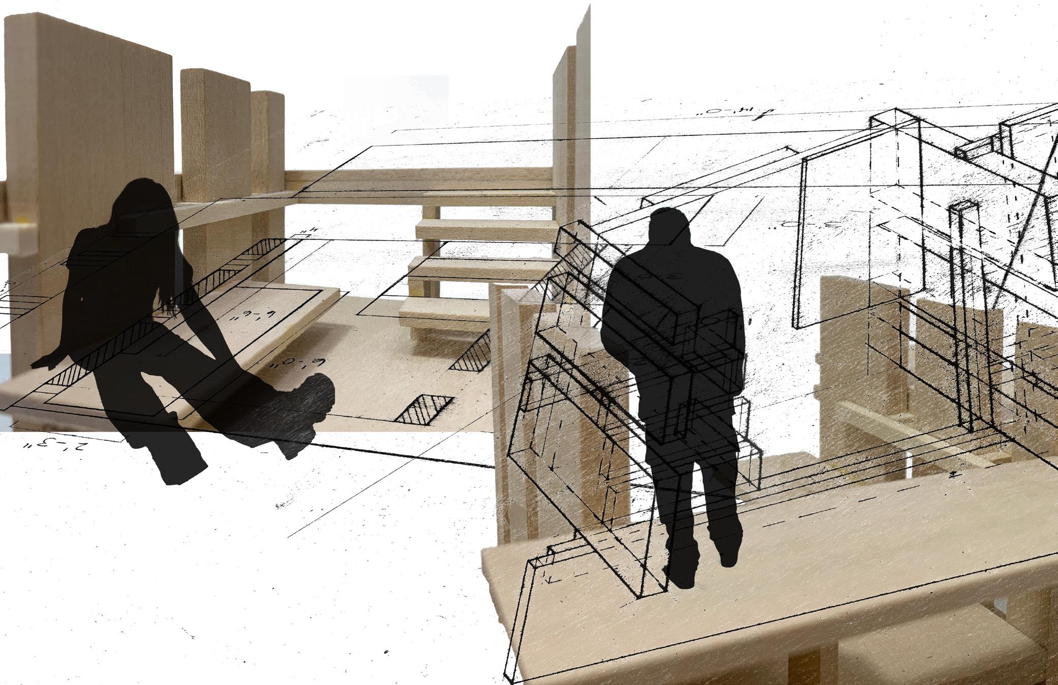
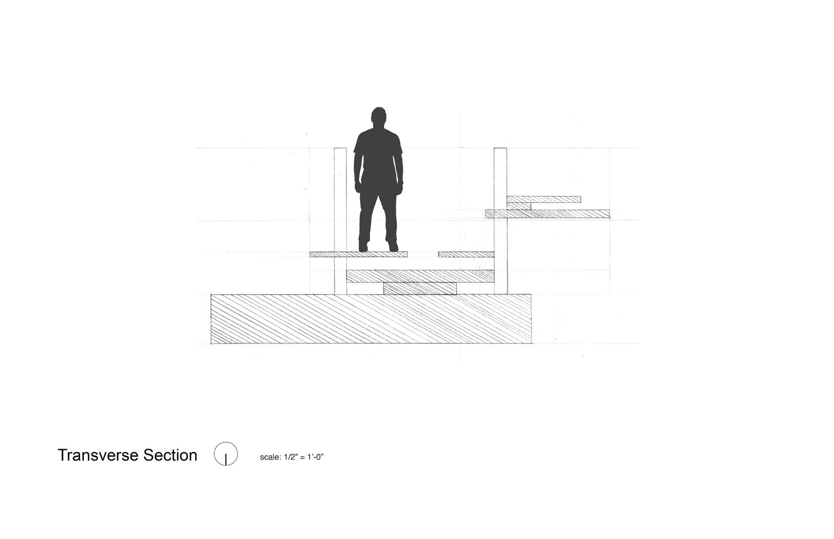
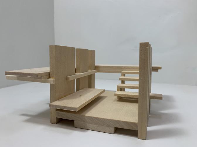
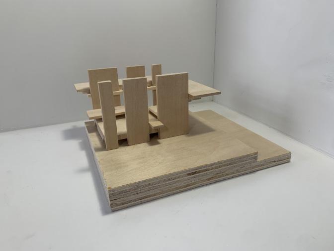
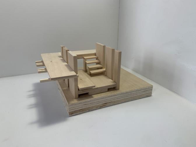
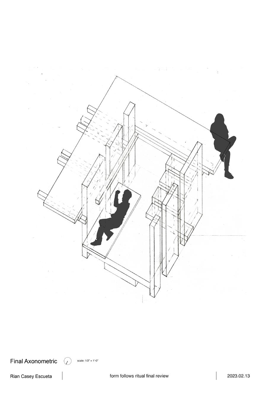
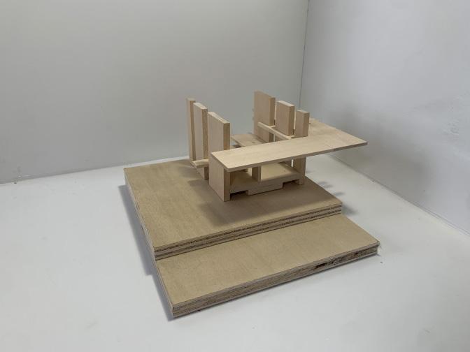
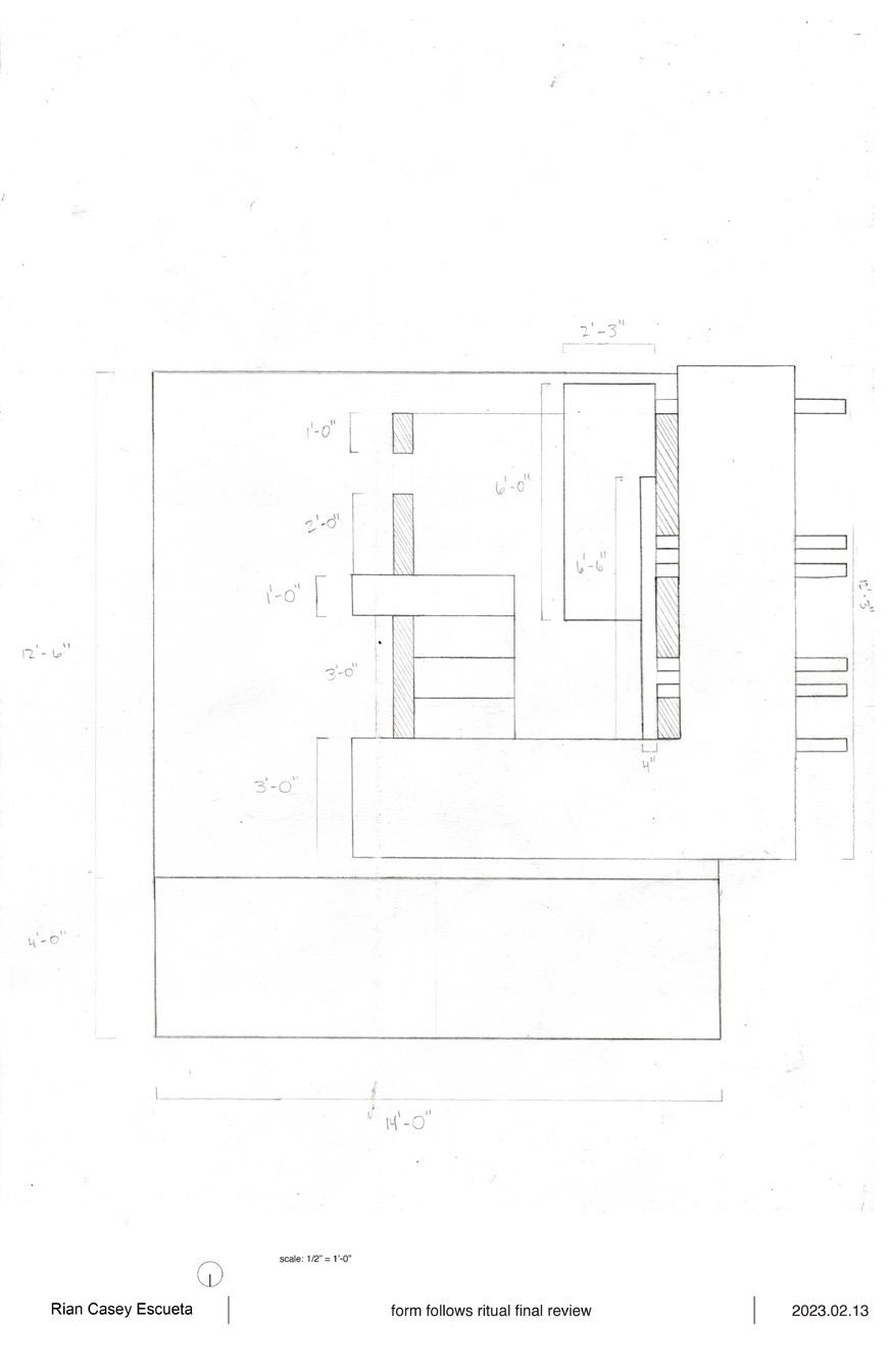
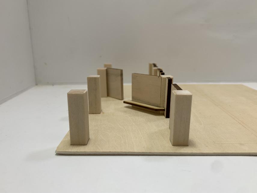
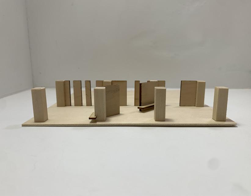
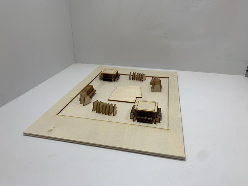
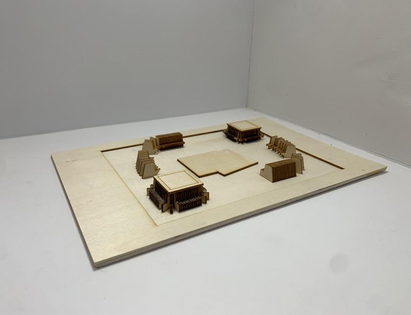
form follows ritual
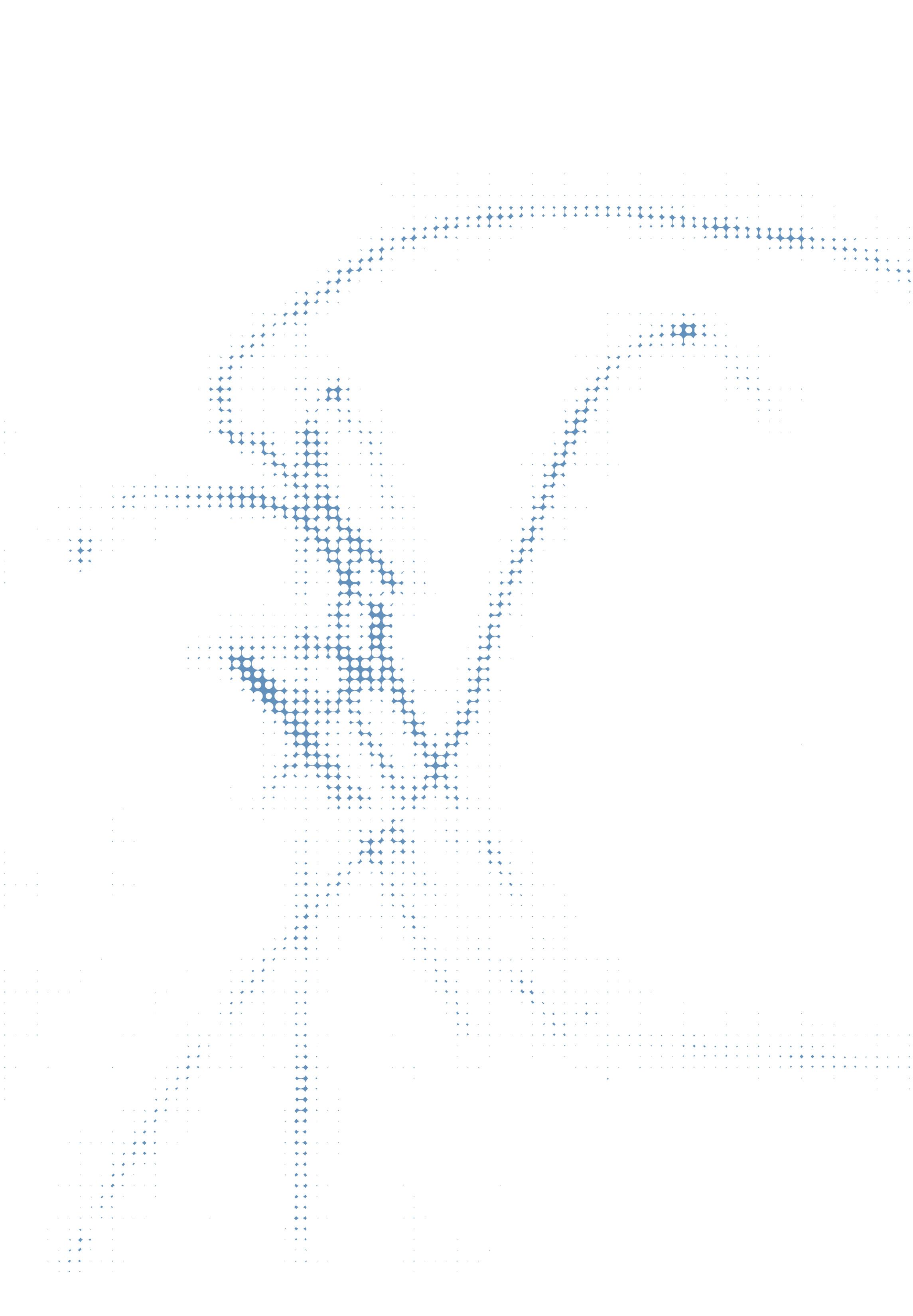
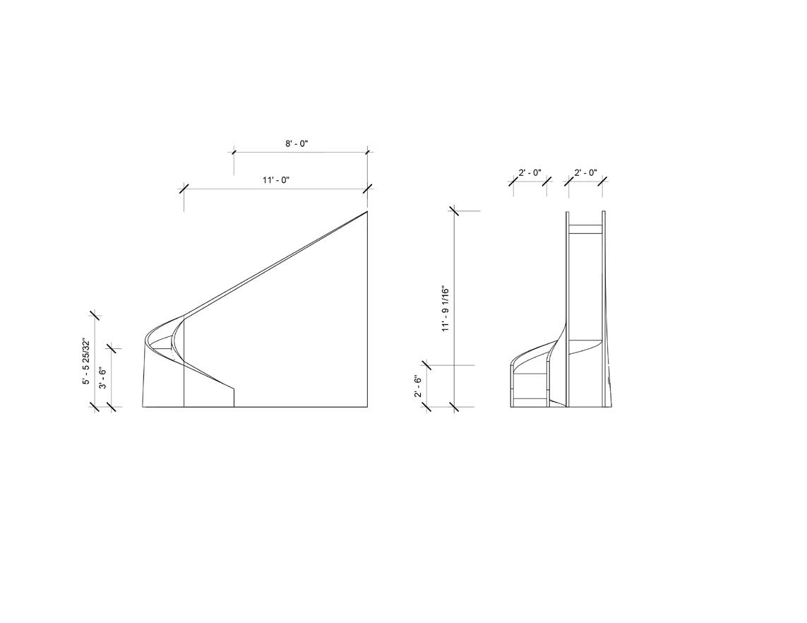
The project intends to expand upon observational research, and proportions of the human body. A further emphasis on the link between architecture and people, and specifically the connection between activity, form and space through the creation of a micro-structure accommodating walking, climbing, and resting.
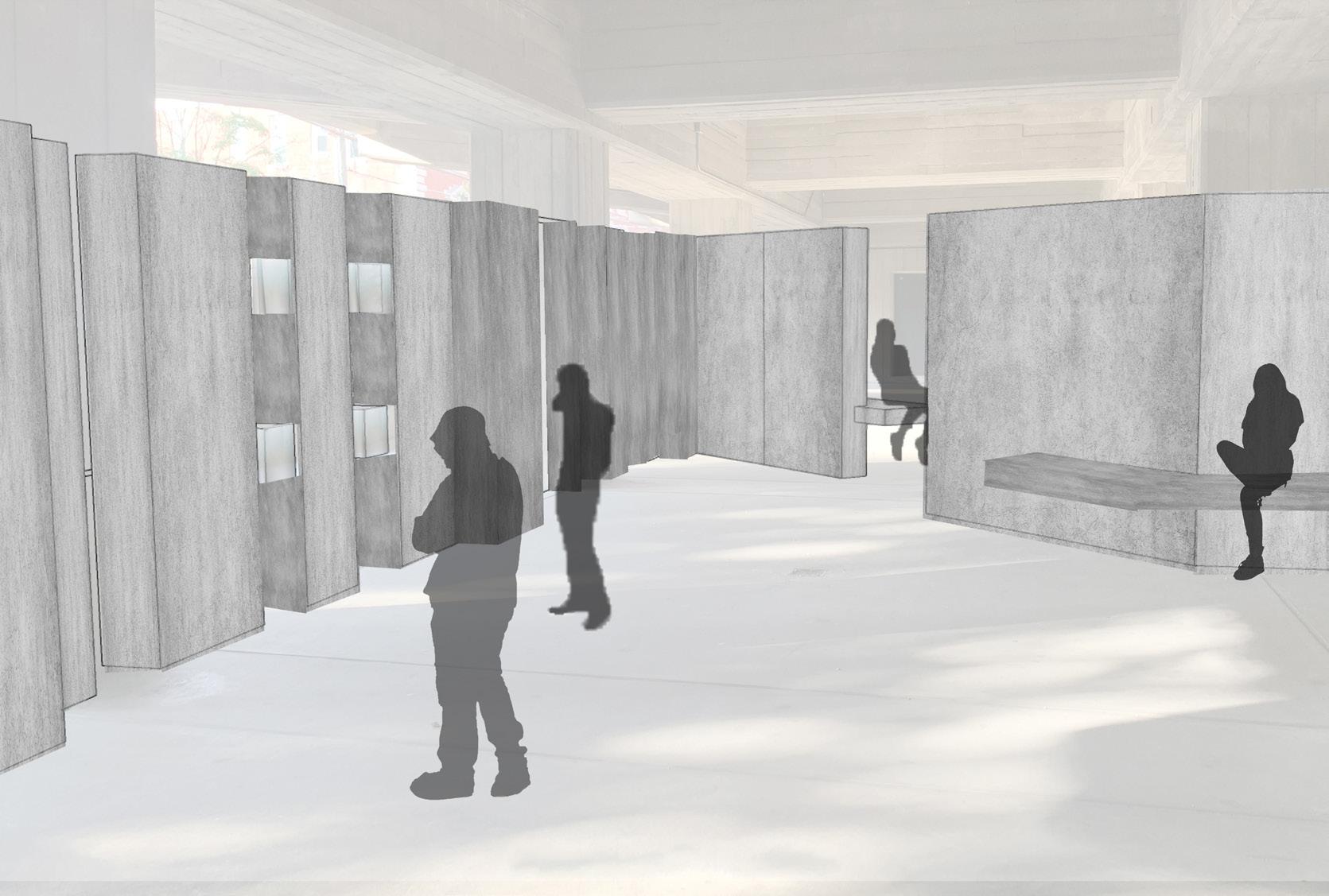
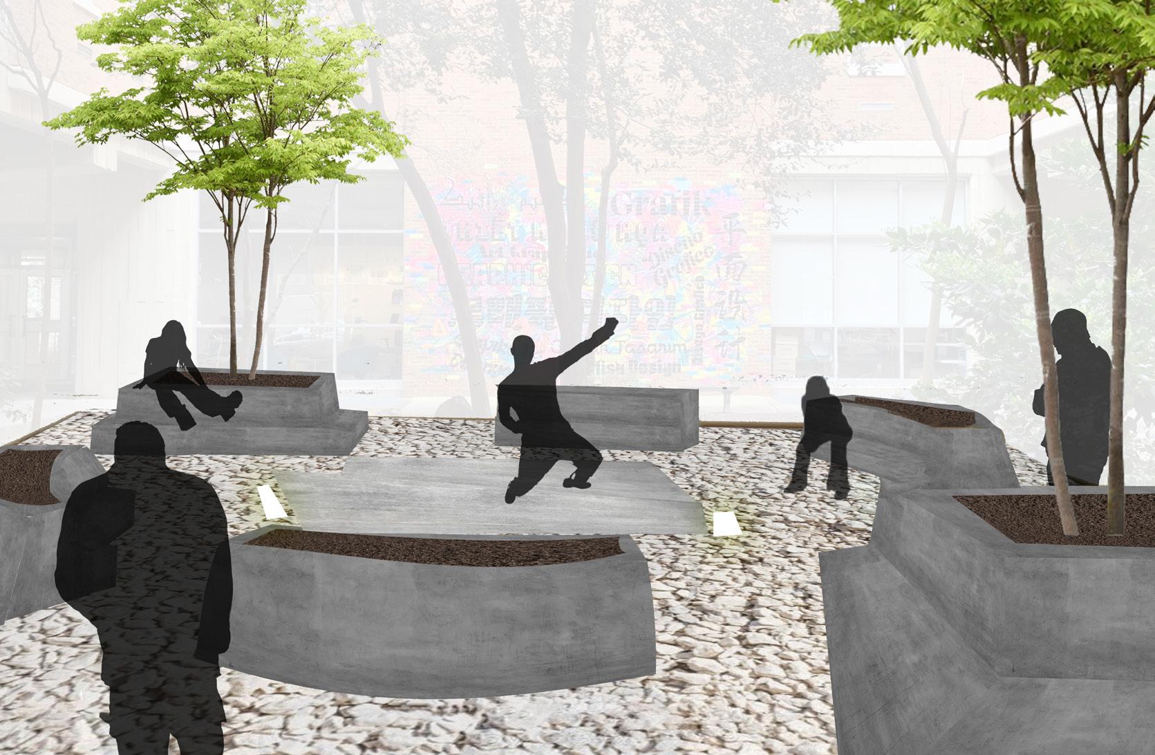
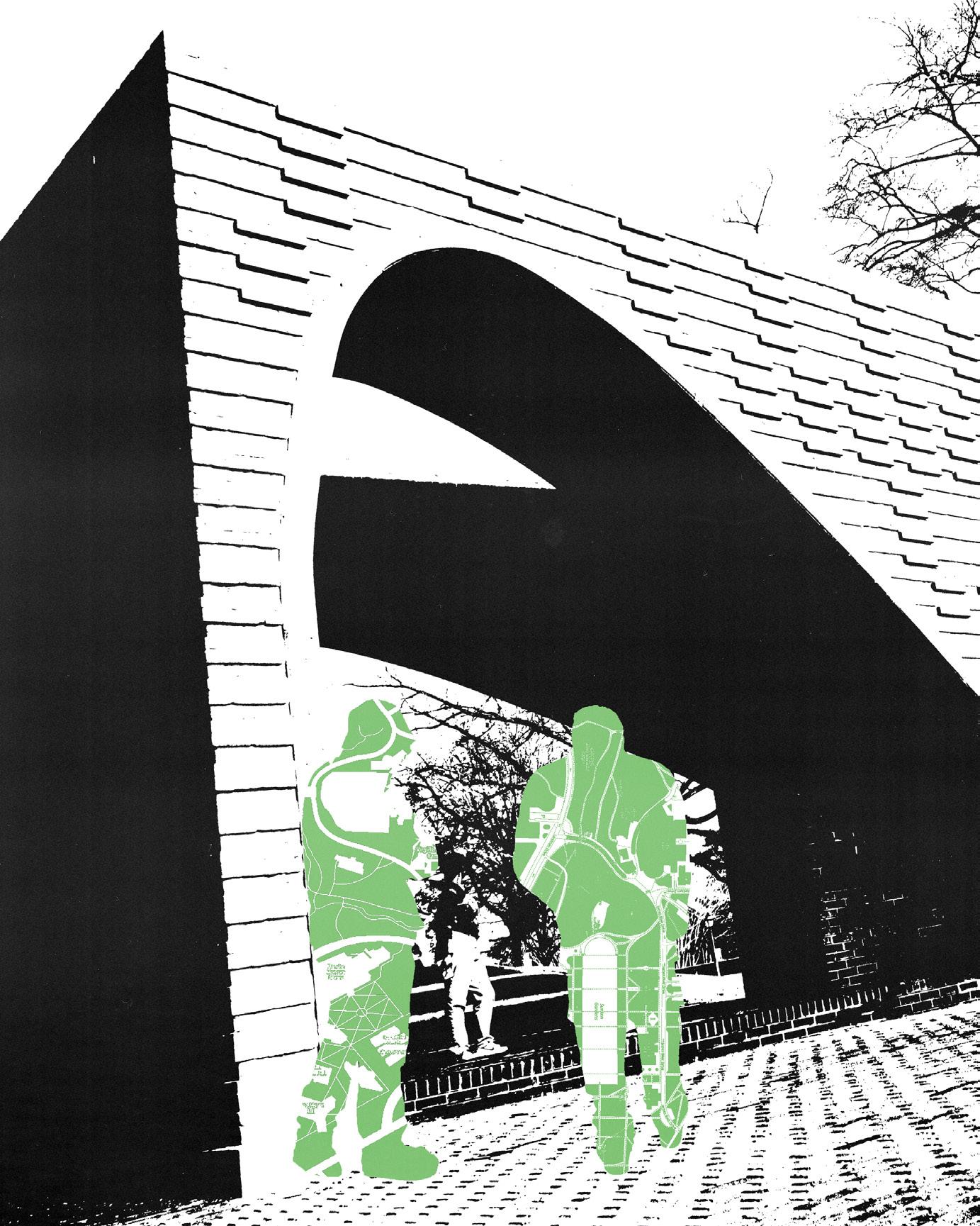
what is a wall ?
An element of division may become an expression of inclusion. The project asks students to redesign the Pollak courtyard into an inclusive, expressive performace space. A new, modified wall is introduced into the area acting as a welcoming space into the building.
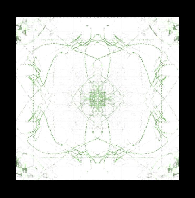
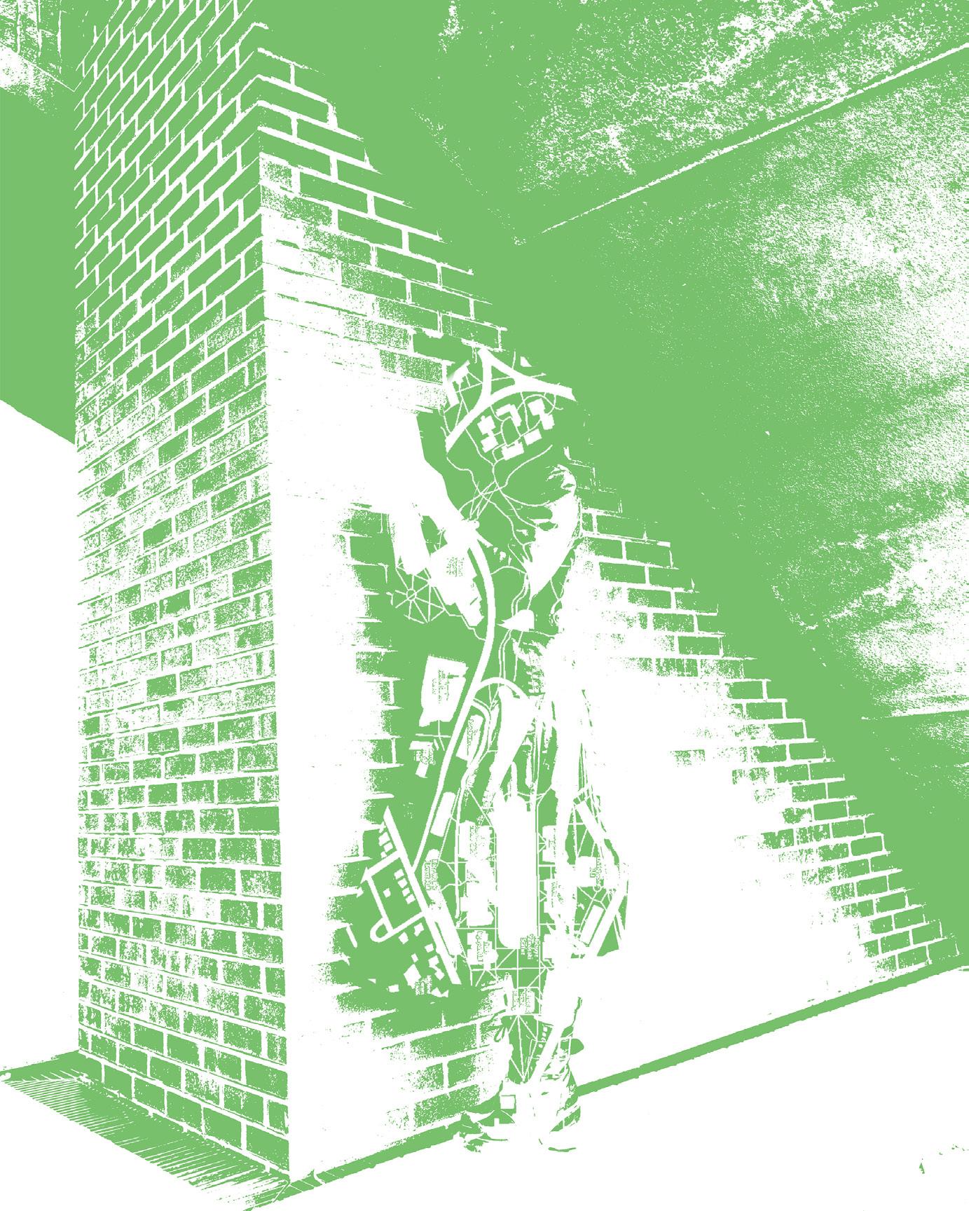
pattern project
Pattern is often used to symbolically to represent many things: people, beliefs, the natural world, history, and tradition. The predictability of pattern is important in establishing a historical tradition and cultural practice.
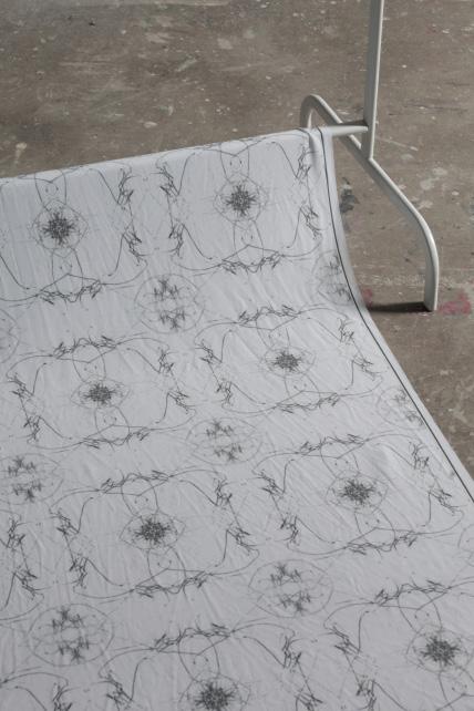
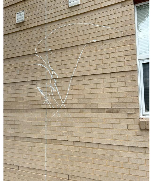
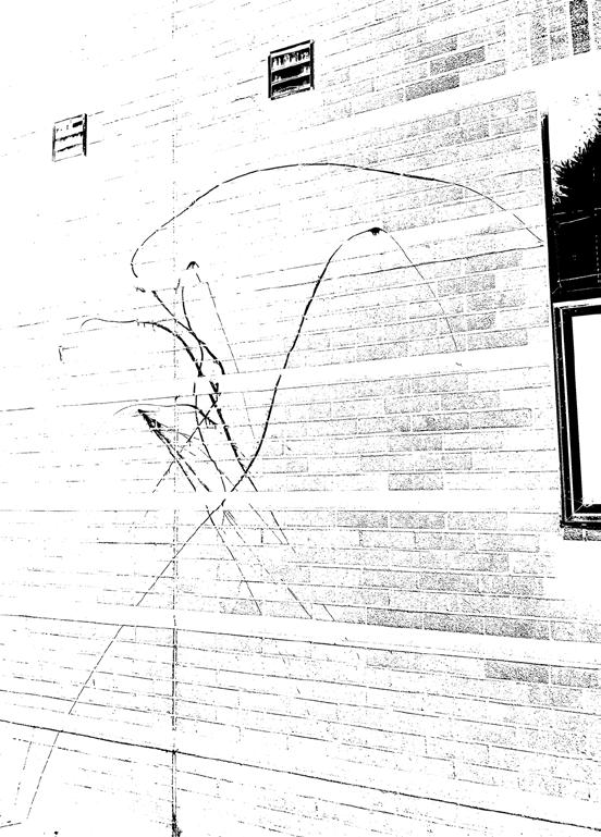
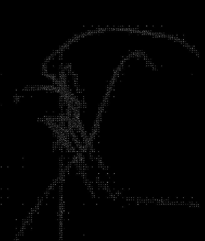
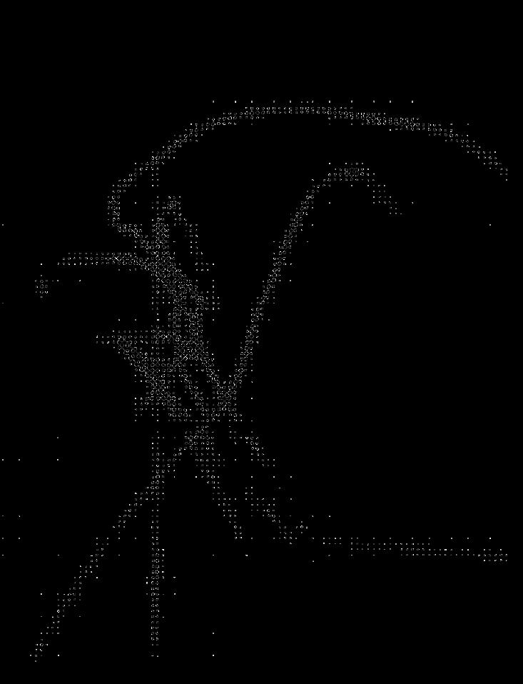
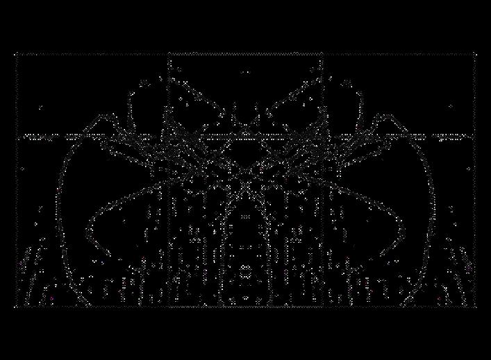
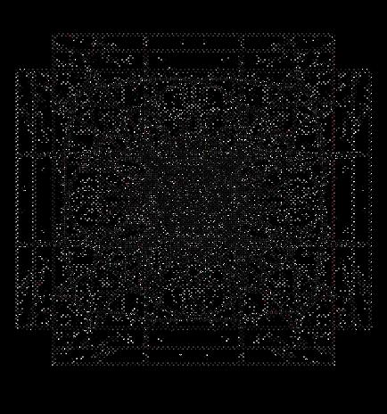
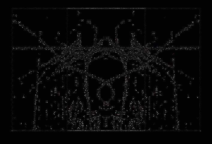
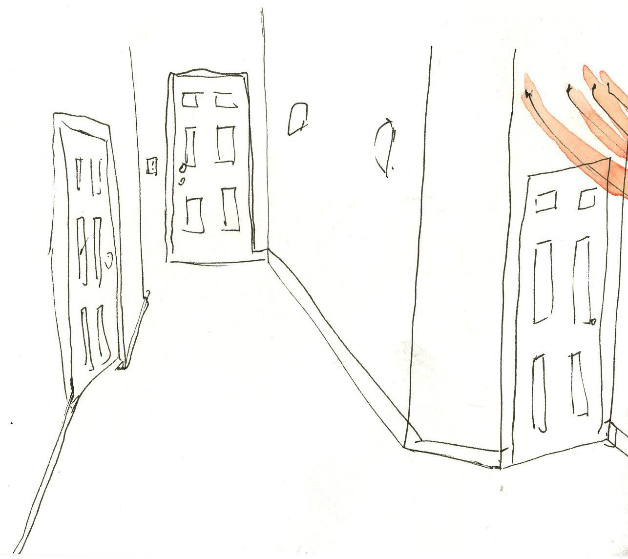
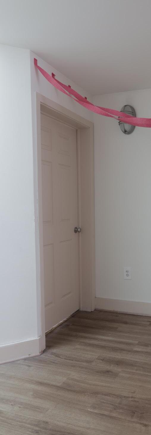
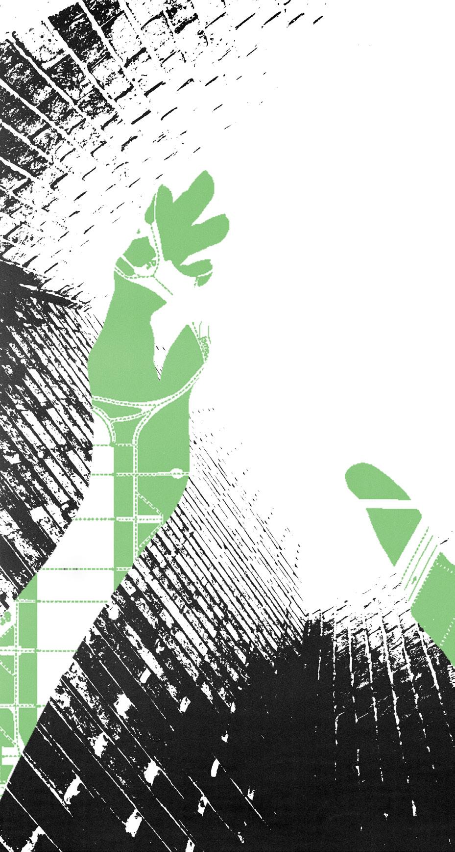
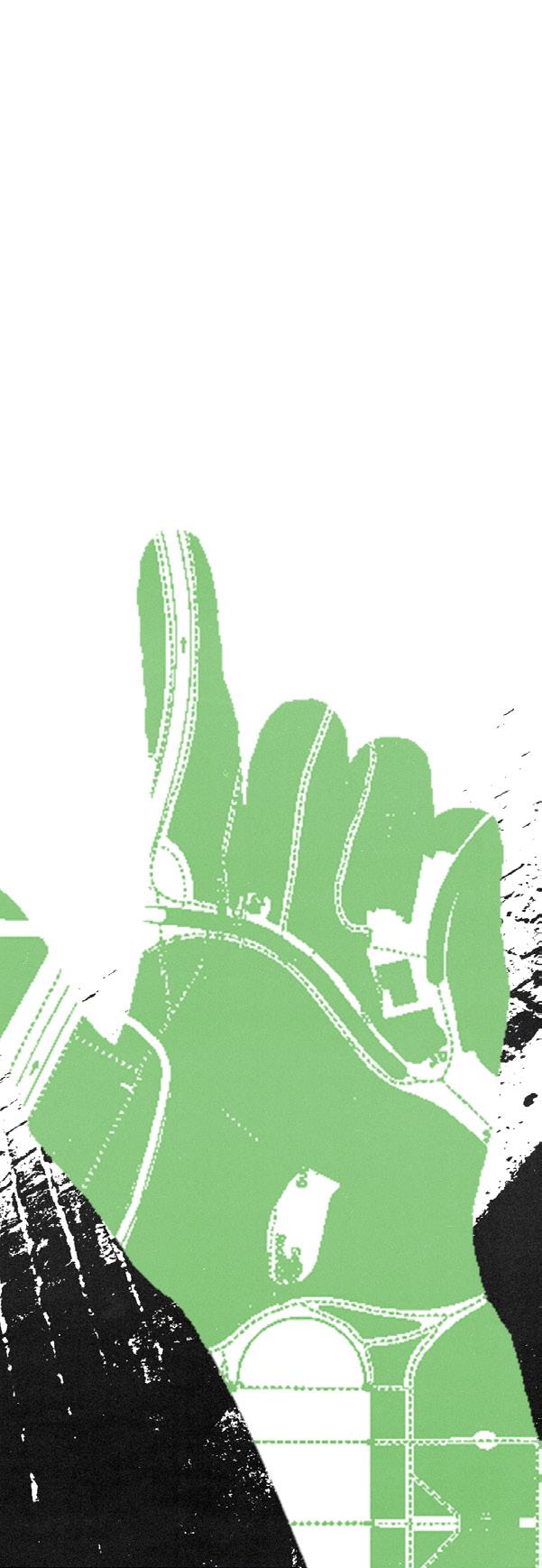
The project’s inspiration relies heavily on found “blemishes” or “happenings that occur to a built environment. Spaces are built with intention, however they are ultimately experienced and changed by those who inhabit the. Occurrences to the environment, for better or for worse, have the ability to transform a space beyond the initial design. The project seeks to document, then reinterpret and utilize these changes into a 30” x 60” repeat pattern.
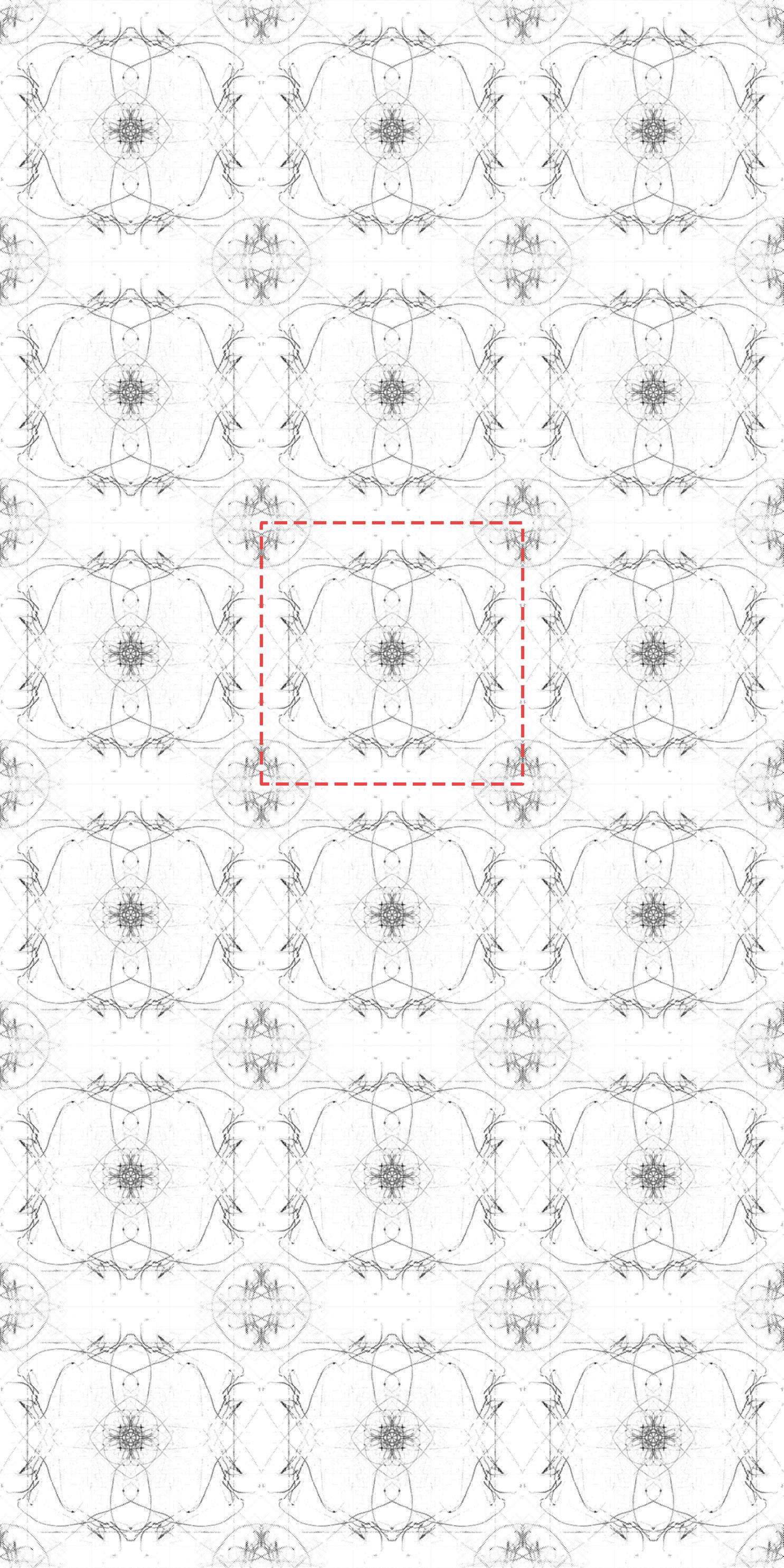
initial documentation isolation / threshold pixelation
The motif here is then modified slightly in position and scale to, again, find interpretations of found blemishes from the environment, to create entirely new figures.
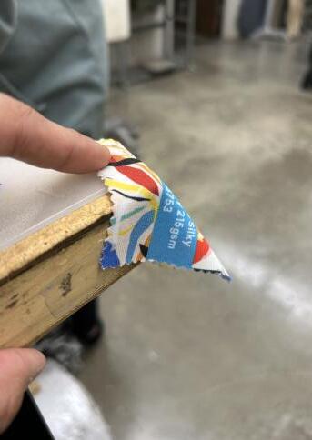
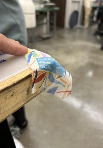
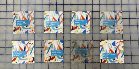
Paris Chiffon (left) and Solange Silky Jersey (right) were ultimately chosen due to their cost effective printing ability, color accuracy, drape ability and sheer quality.
Textile and paper both bring a plethora of advantages and disadvantages, however for the project I have chosen utilizing a cloth print printed digitally. Digital printing will be done through London Based Fabric manufacturer Contrado.
Out of the fifty, eight swatches were chosen due to their similar characteristics of sheer, translucency. Furthermore, they were picked with their color accuracy and ability to capture minute detail since a majority of my pattern holds immense detail.
user interface default
HEX CODE: #040404
R: 04
G: 04
B: 04
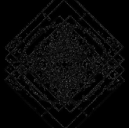
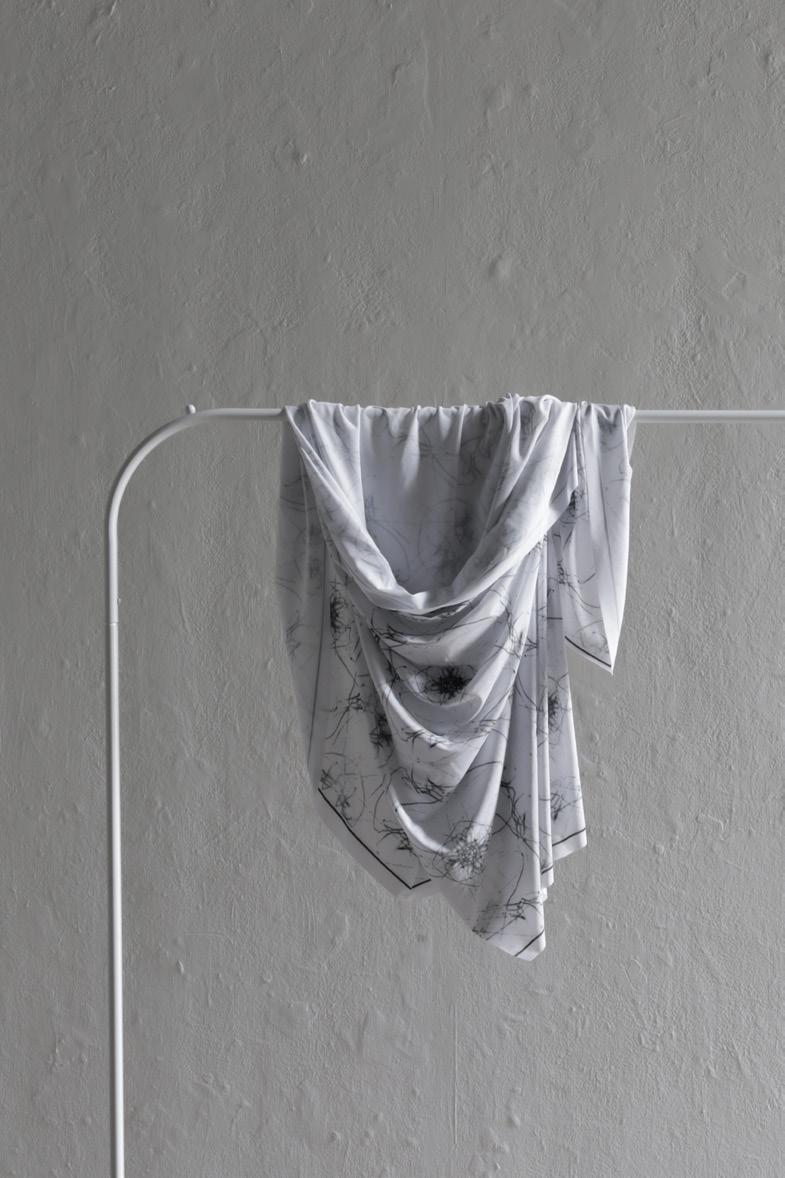
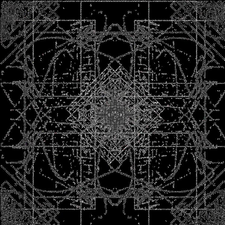
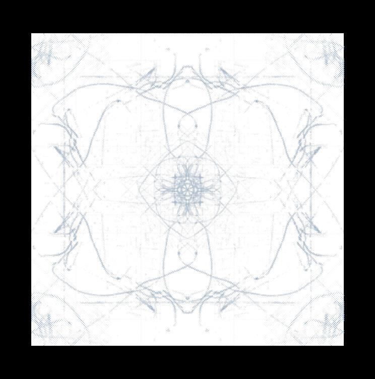
Pictured above is the final 30” x 60” pattern for the project titled user interface default, speaking to the digital language the project has been undergoing. The project is intended to act as a residential curtain drapery, playing with natural light and its own movement to further create new shapes.
blue HEX CODE #a4bfd8
R: 164 G: 191 B: 216
binary green HEX CODE #77c85d
R: 119 G: 200 B: 93
Two alternative colorways were developed for the project that respect the digital nomenclature of user interface default.
binary green references monochrome screens that were used on some of the first computers to display text. Moreover, the color became associated was popularized in Lilly and Lana Wachowski’s The Matrix (1999).
tv blue references recording artist Dijon and their song TV Blues released in 2017. The song itself recalls the nostalgia of being a child watching television with loved ones.
tv
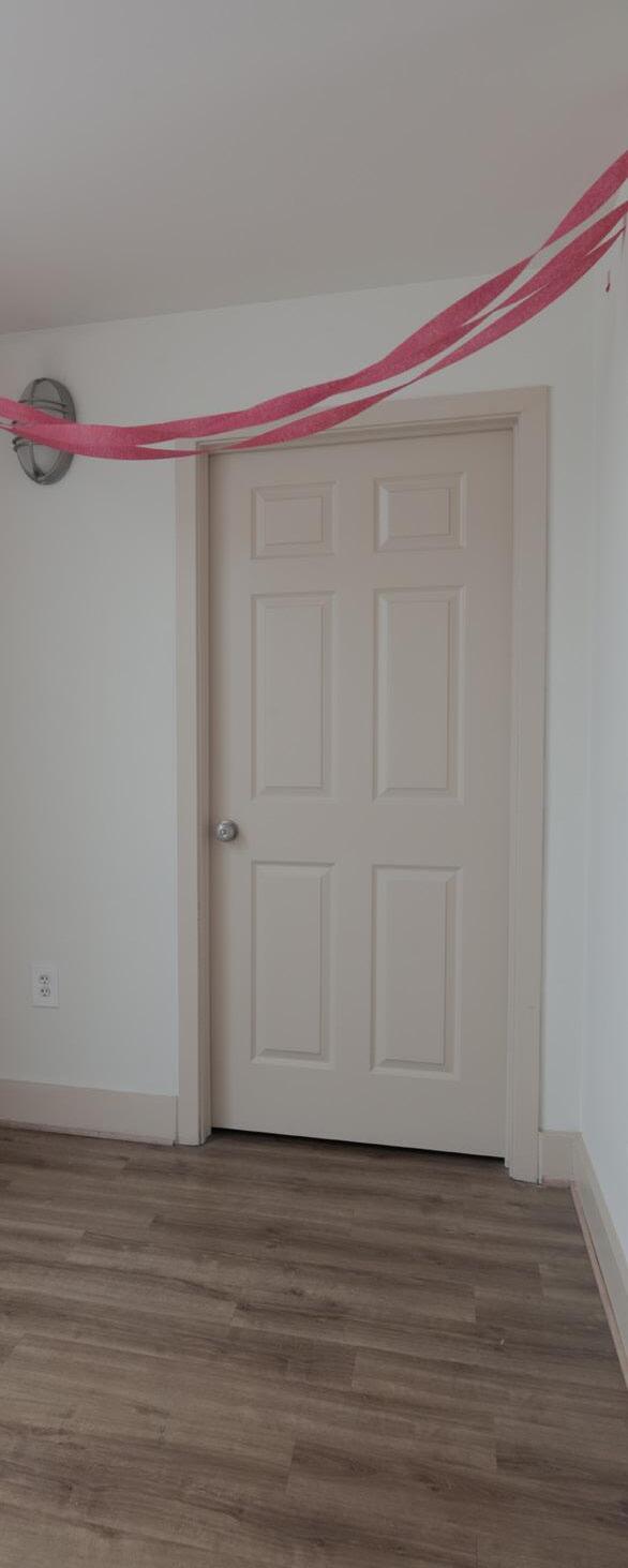
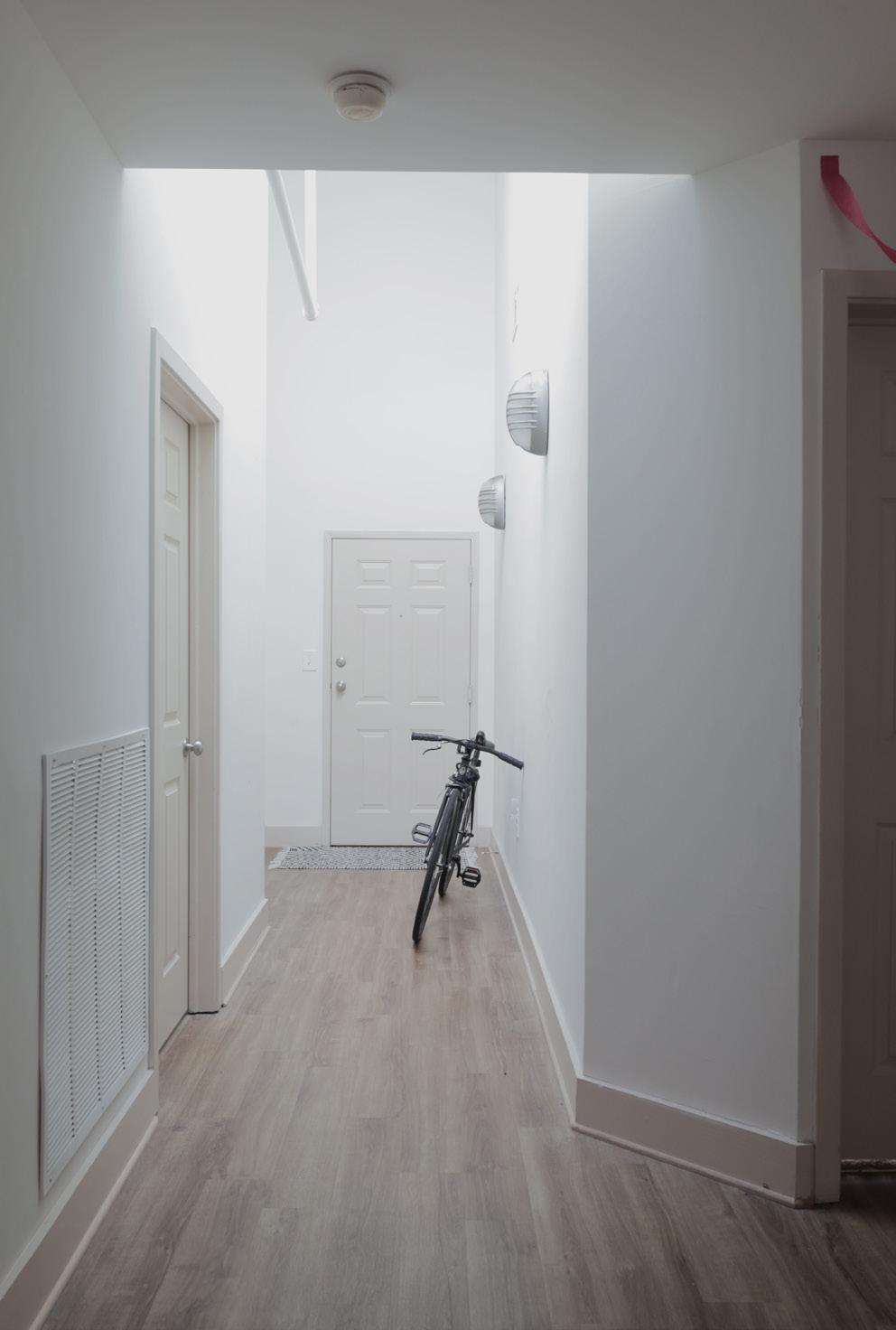
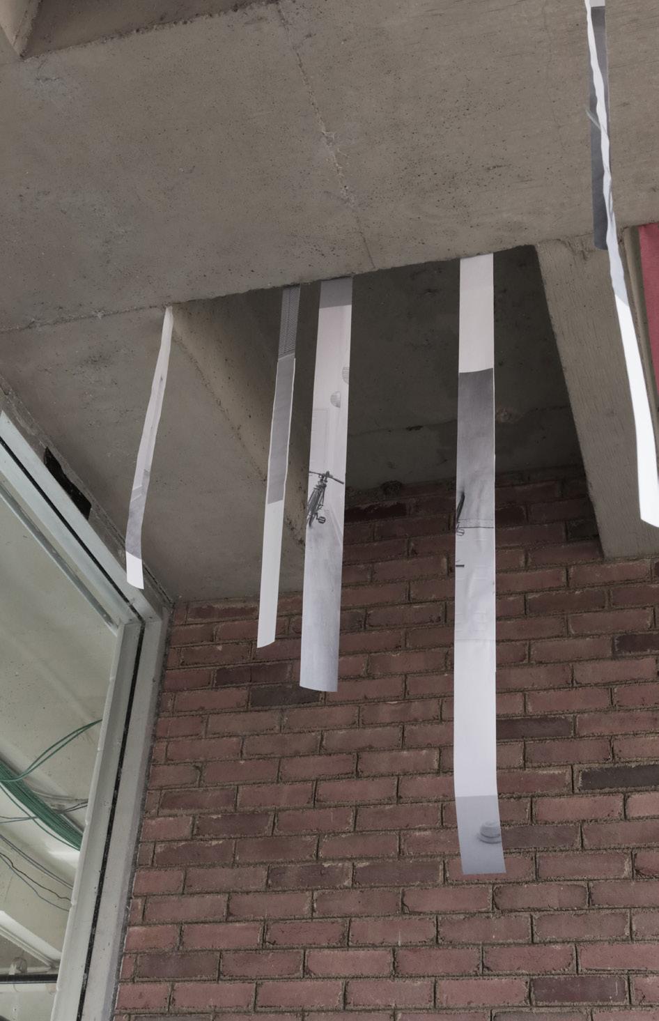
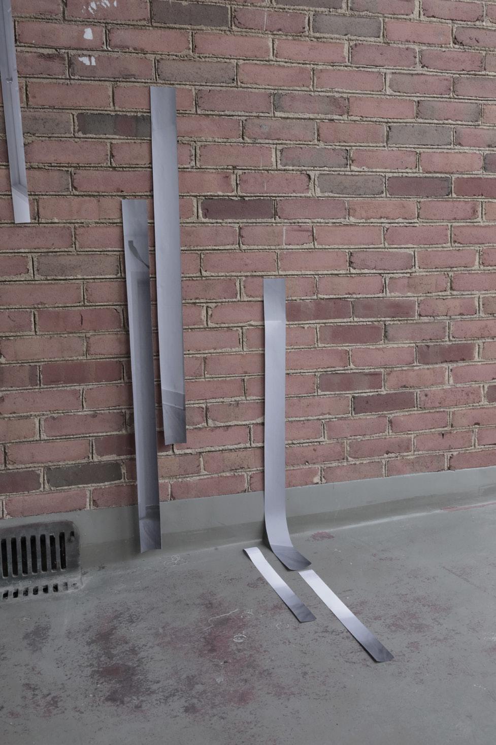
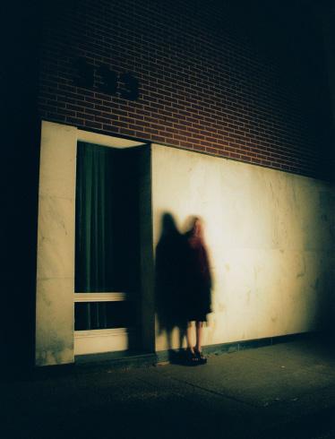
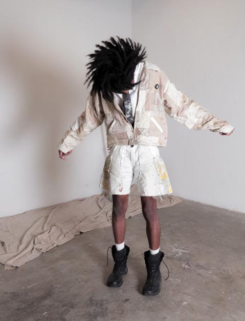
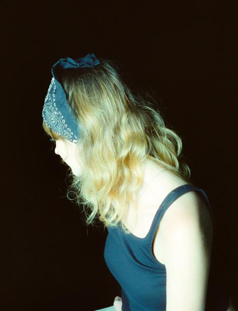
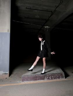
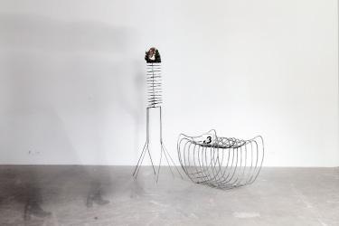
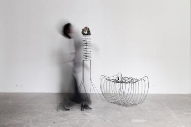
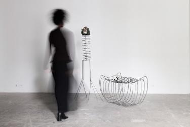
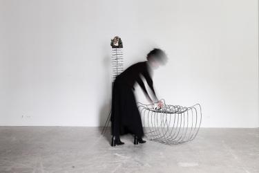
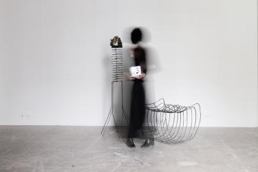
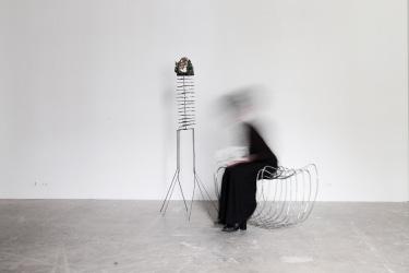
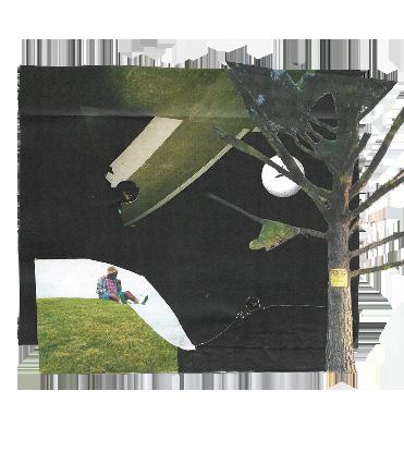
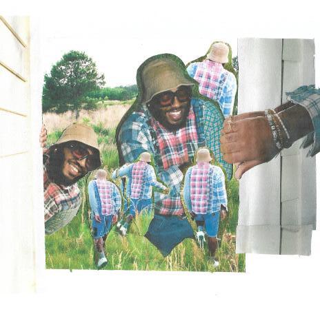
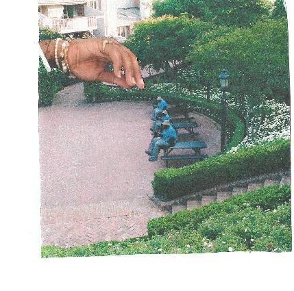
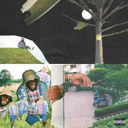
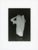
crafting narrativity
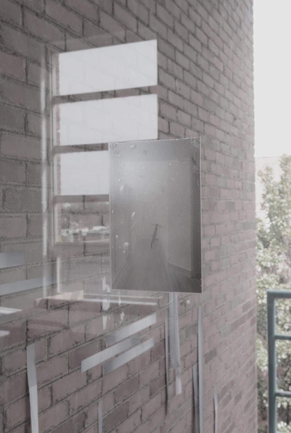
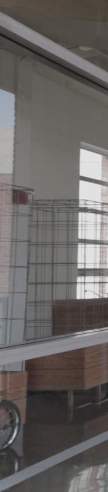
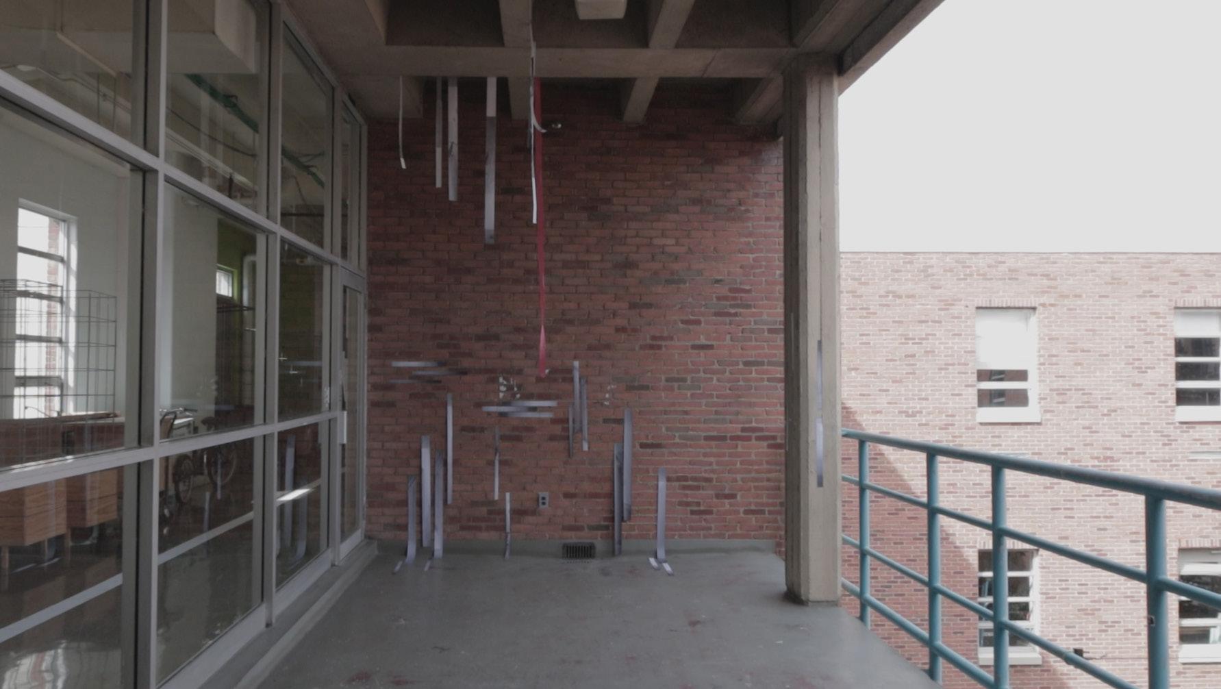
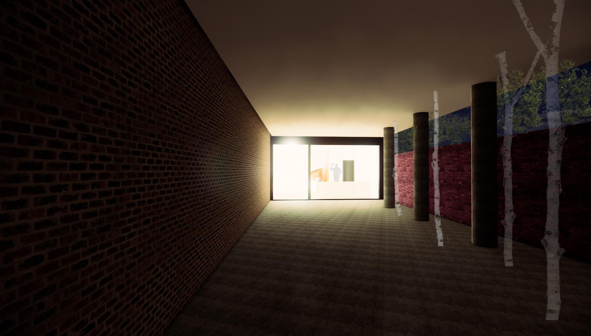
Experimental studio project that seeks to explore areas of transition, seeking to express values of the mundan, ordinary and the insignificant. Exploration of the project came primarily through photo documentation and site specific installation.
“for educational purposes only”
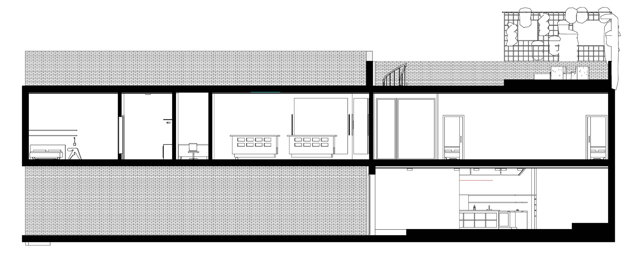
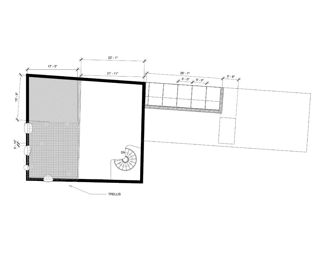
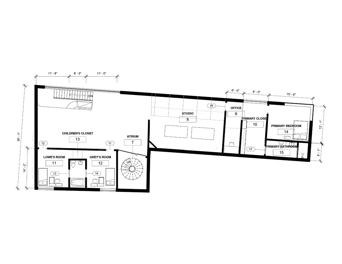
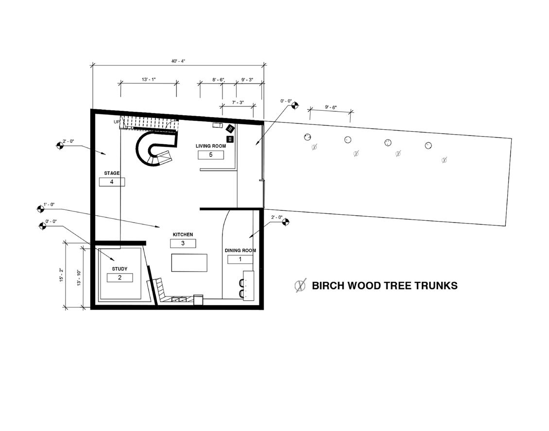
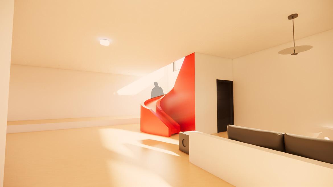
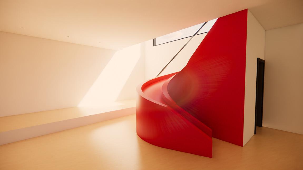
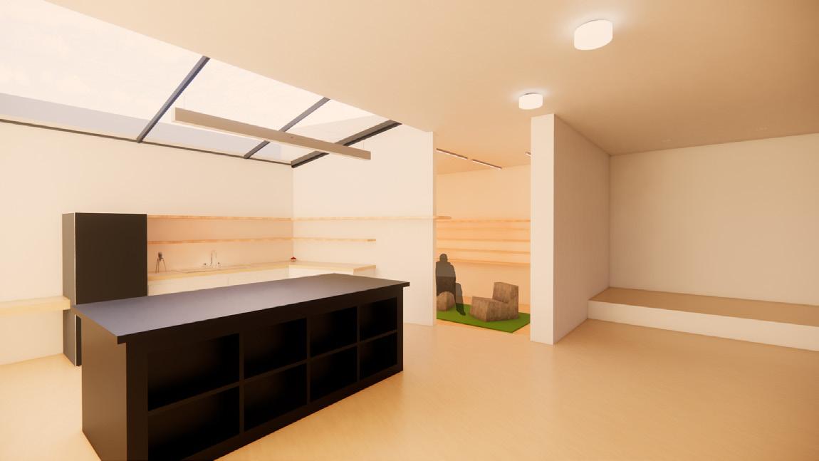
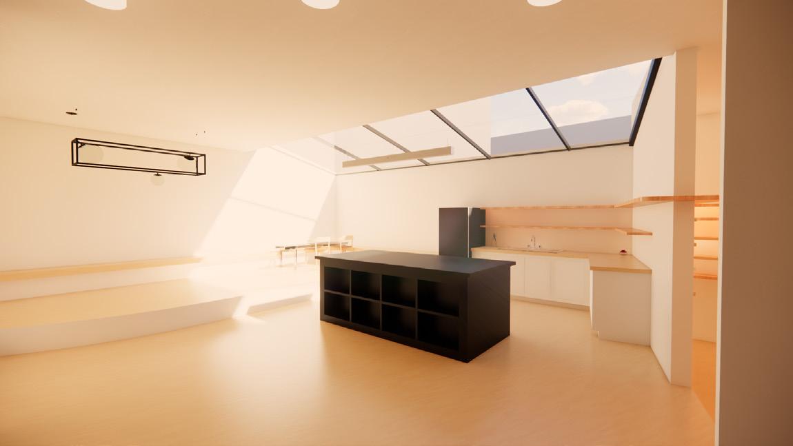
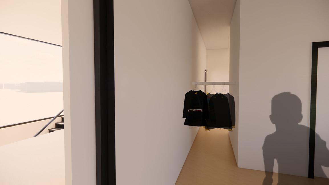
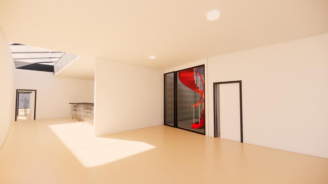
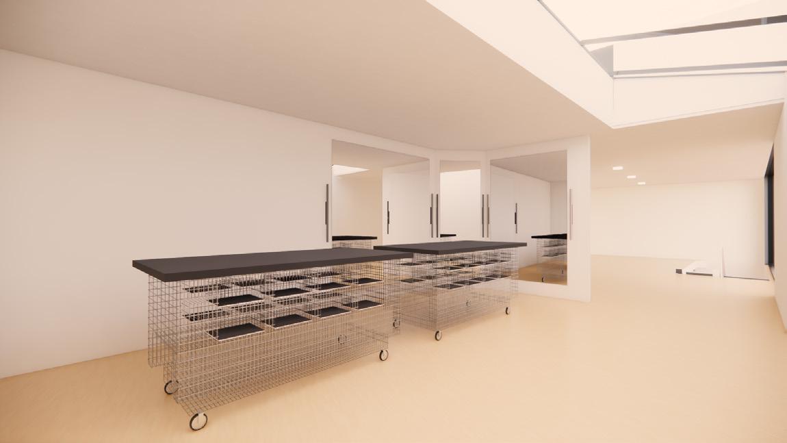
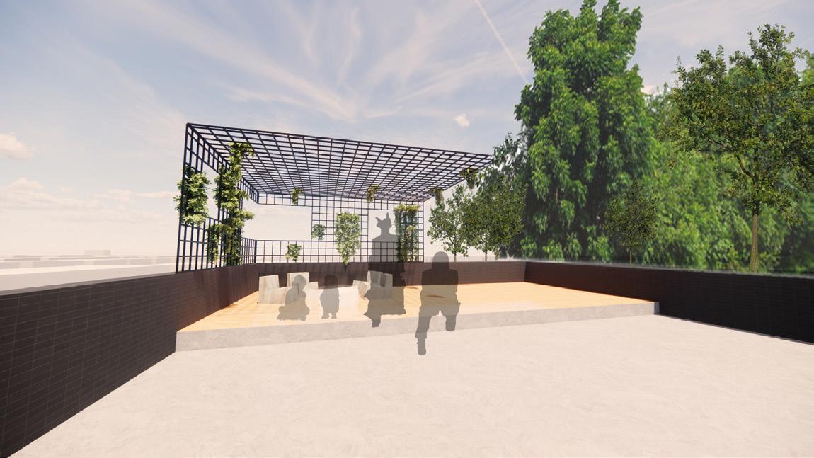
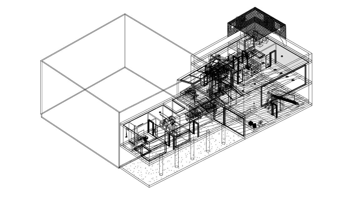
The project seeks to create a three story family residence in Stoke Newington, London, UK. The client purchased the site a decade ago and decided to have a full time home, accommodating a family structure while also including a space that contiunally fuses work and home.
Our client for the project is trained architect, and fashion designer Virgil Abloh. The project follows Abloh’s “three percent rule” - the exact ratio needed to twist a normative object or idea into something special.