Mediterra Market Trends


Prepared by Michael J. Timmerman,
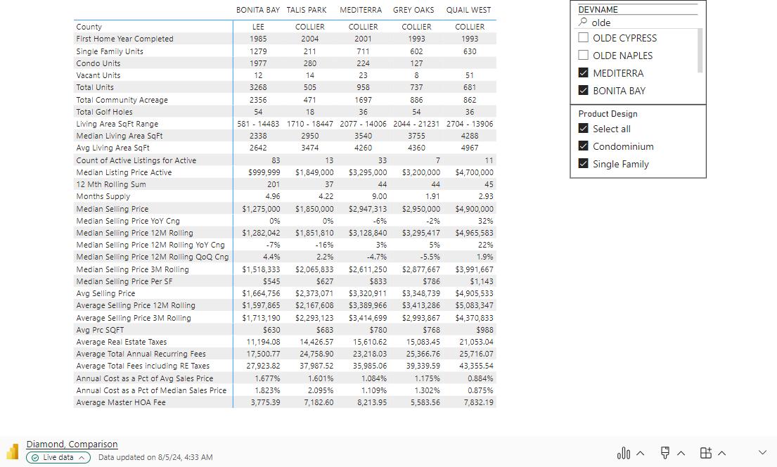
Mediterra

Prepared by Michael J. Timmerman,
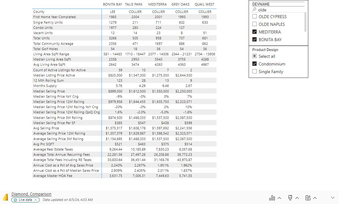
Mediterra - Condominium
Prepared by Michael J. Timmerman,
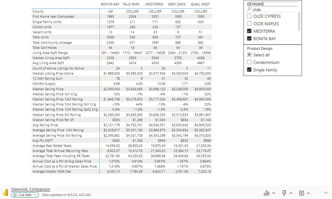
Mediterra – Single Family


AND HOW DO I READ IT TO GET MEANINGFUL INSIGHTS?

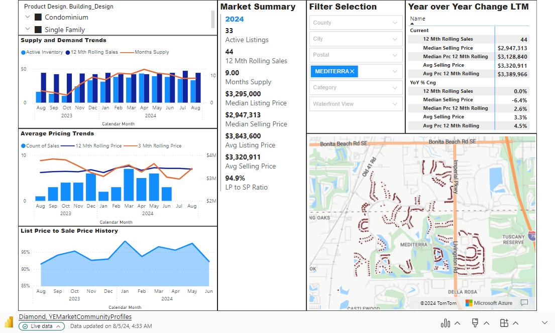
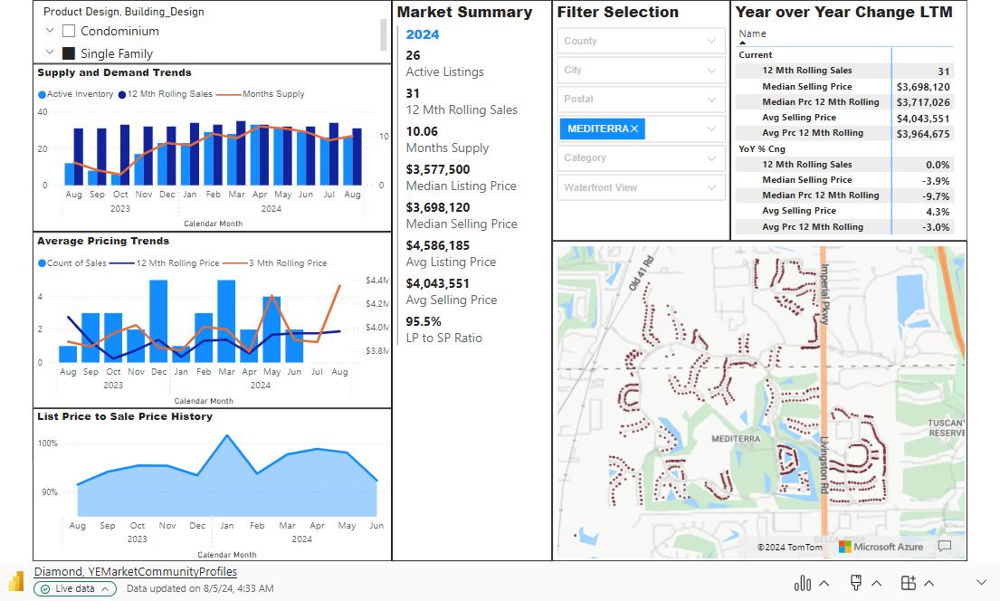
1. Product Design Filter – Select between Single-Family Homes and Condominiums.
2. Supply and Demand Trends – Light Blue Bars represent each month's active inventory. The dark blue bars represent the cumulative sales that have occurred over the past 12 months. The orange line represents the months supply. Months supply indicates how long it will take to sell the active inventory at the current monthly sales pace. The calculation is as follows:
Active Inventory – 2949 divided by Monthly Sales Pace –
822 = Sales per month – 3.59. In other words, it will take 3.59 months to sell the 2949 active listings at a pace of 822 per month. (822*3.59 = 2,949)
3. Average Price Trends – The blue bars represent the average sales price in the current month, the blue line represents the past 12 month average sales price and the orange line represents the past 3 months average sales price. Normalizing the each months sales by looking at the past 12 and 3 months provide long term and short term pricing trends.
4. List Price to Sales Price History – The graph shows the ratio of list price to sales price, or the discount or premium paid above or below the listing price for the current period.
5. Market Summary – This list of variables summarizes the current months trends based on the data from sections one to four.
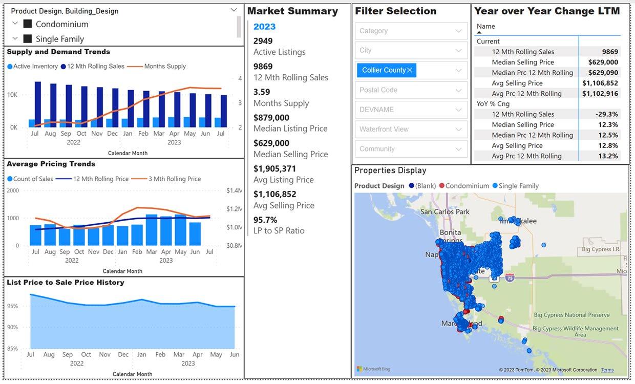
6. Filter Selection – Select variables for geography and property attributes.
7. Year over Year Change Last 12 Months (LTM) – This list shows the Current months market statistics on the top and the Year over Year change for each statistic on the bottom.
8. Properties Display – This map shows the location of each sales that occurred over the past 12 months.
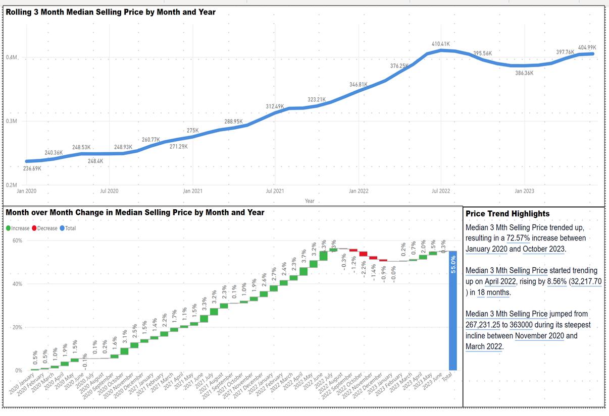
1. Rolling 3 Month Median Selling Price by Month and Year – The blue line shows the median 3 month rolling price for each month since January 2020. This date is the starting point of the market change since the start of the pandemic.
2. Month over Month Change in Median Selling Price by Month and Year – This waterfall chart shows the monthly change in the 3 month median sales price. Each month is color coded Green if the change is positive and Red if the change is negative. The solid blue bar on the right of the chart shows the total percentage change in median pricing from January 2020 to the current month. Understanding the trend in monthly change in median pricing provides insights into the long term direction of pricing and can help explain and measure how price changes are impacted by economic or weather events. In this case, the downward trend reflected the impact of Hurricane Ian on the residential real estate market.
3. Price Trend Highlights – This written summary provides highlights of the data in the two charts.
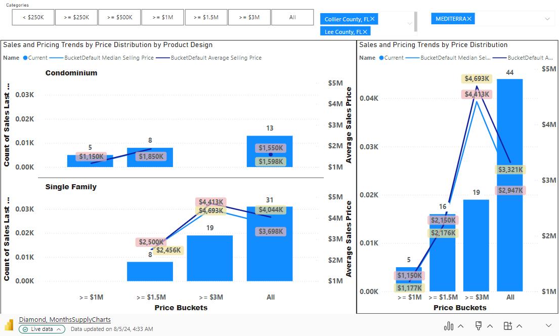
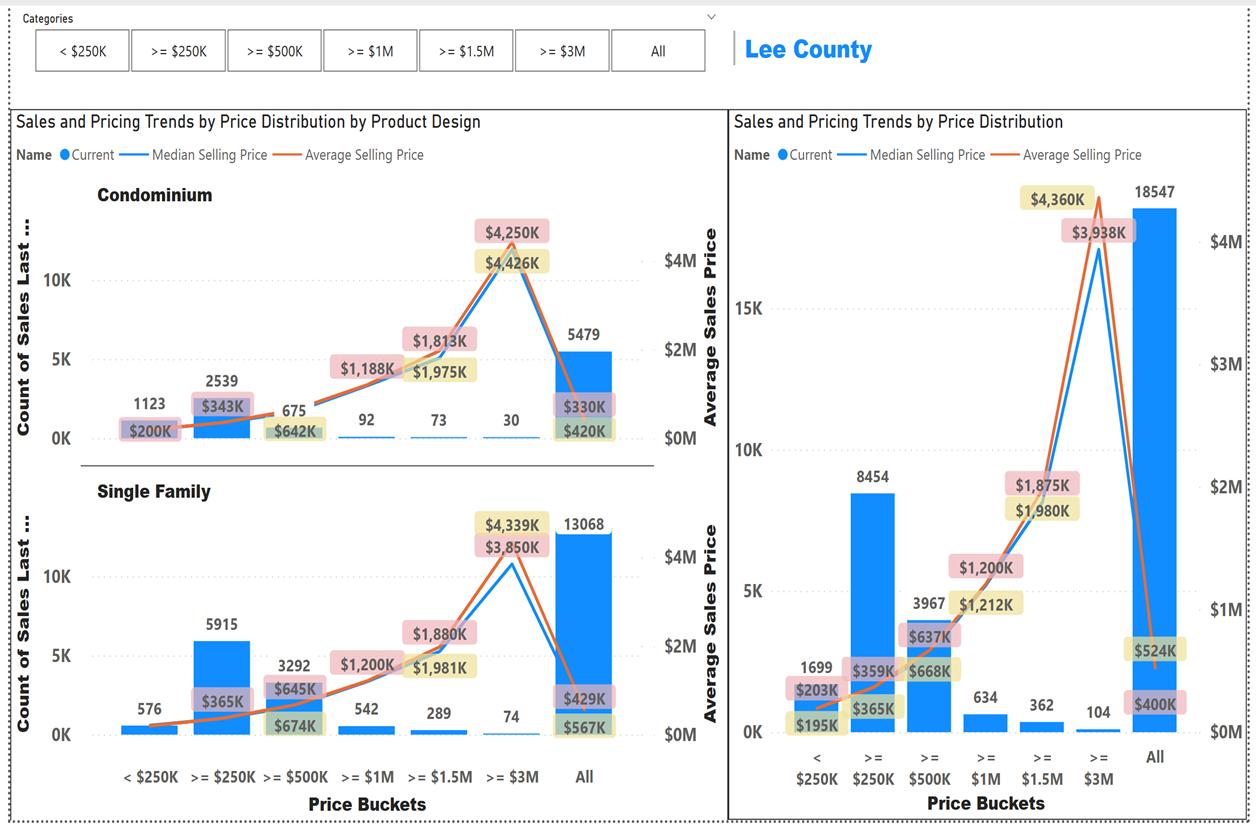
This set of graphs show the distribution of sales by price bucket or range. The ranges are; Less than $249K, $250K to $499K, $500K to $999K, $1M to $1.49M, $1.5M to $2.9M and Greater than $3M. The lines show the Median and Average Price of sales within each price range. This information provides insights into what price range is the most demanded in the market.
1. Sales and Pricing Trends by Price Distribution by Product Design (Condominium) – The blue bars show the number of sales that occurred over the last 12 months in each price band. The blue line shows the median sale price for each price bucket. The orange line shows the average sale price for each price bucket.
2. Sales and Pricing Trends by Price Distribution by Product Design (Single Family) – The blue bars show the number of sales that occurred over the last 12 months in each price band. The blue line shows the median sale price for each price bucket. The orange line shows the average sale price for each price bucket.
3. Sales and Pricing Trends by Price Distribution by Product Design (All Product Designs) – The blue bars show the number of sales that occurred over the last 12 months in each price band. The blue line shows the median sale price for each price bucket. The orange line shows the average sale price for each price bucket.
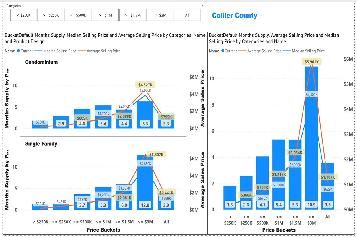
This set of graphs show the months supply by price bucket or range. The ranges are; Less than $249K, $250K to $499K, $500K to $999K, $1M to $1.49M, $1.5M to $2.9M and Greater than $3M. The lines show the Median and Average Price of sales within each price range. This information provides insights into the supply demand ratio for each price range.
1. Sales and Pricing Trends by Price Distribution by Product Design (Condominium) – The blue bars show the number of sales that occurred over the last 12 months in each price band. The blue line shows the median sale price for each price bucket. The orange line shows the average sale price for each price bucket.
2. Sales and Pricing Trends by Price Distribution by Product Design (Single Family) – The blue bars show the number of sales that occurred over the last 12 months in each price band. The blue line shows the median sale price for each price bucket. The orange line shows the average sale price for each price bucket.
3. Sales and Pricing Trends by Price Distribution by Product Design (All Product Designs) – The blue bars show the number of sales that occurred over the last 12 months in each price band. The blue line shows the median sale price for each price bucket. The orange line shows the average sale price for each price bucket.
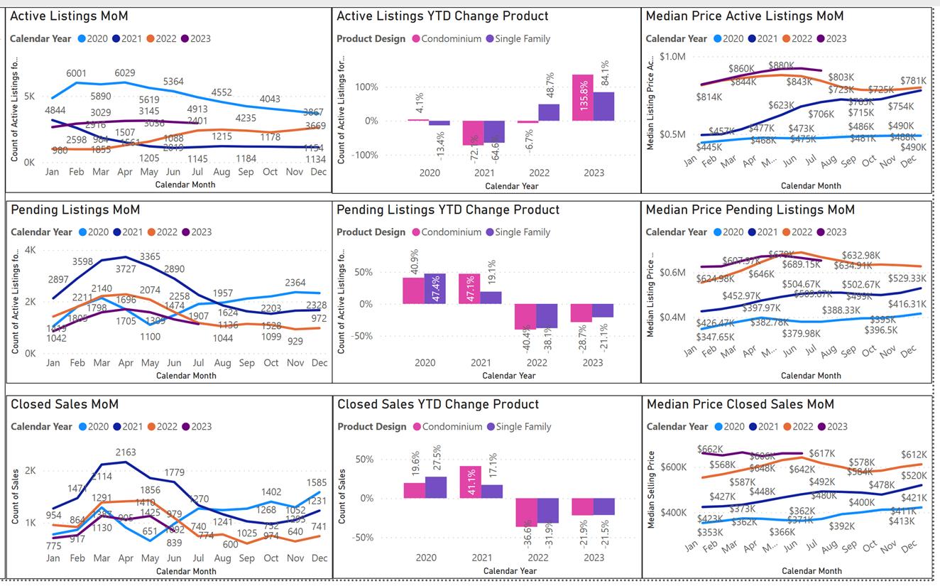
This set of graphs shows the activity by month for each property status, Active Listings, Pending Listings, Closed Sales.
The Blue boxes represent the three variables for this set of graphs.
• Monthly Activity Count – monthly count of properties by status.
• YTD Change by design – Percentage change in Monthly Activity Count by product design.
• Monthly Median Price – Median price by status.
The Red boxes represent the property status for each variable.
• Active Listings – Properties currently available for sale.
• Pending Listings – Properties that are under contract, but not closed.
• Closed Sales – Properties that have closed.
This set of graphs shows the Year over Year change by month for each of the three status categories. It’s insightful as it shows seasonal trends and most importantly how the market changed due to the pandemic and hurricanes.