PORTFOLIO
RESHMA INTERIOR DESIGN
CONTENT RESIDENTIAL VIII. BELMOND GREEN IX. RIVERSAIL X. SENGKANG WAY XI. ESTERIA 55-60 61-66 67-72 73-78
COMMERCIAL I. AN ACAI AFFAIR II. AROMA COFFEE III. DOUGHH IV. TAIMEI V. GR.ID VI. DARAZ VII. BK POH 1-14 15-22 29-38 39-42 43-48 49-54 23-28
AN ACAI AFFAIR
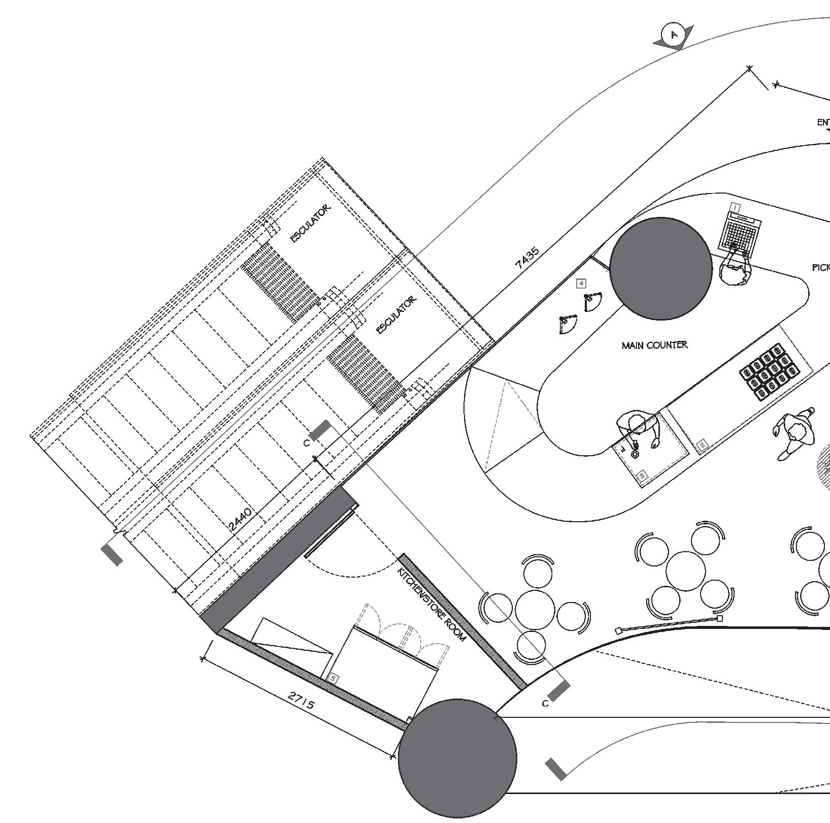
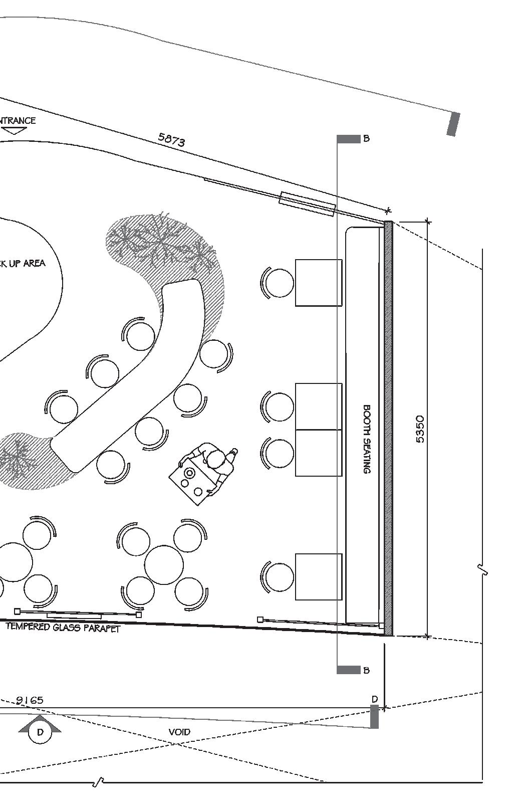
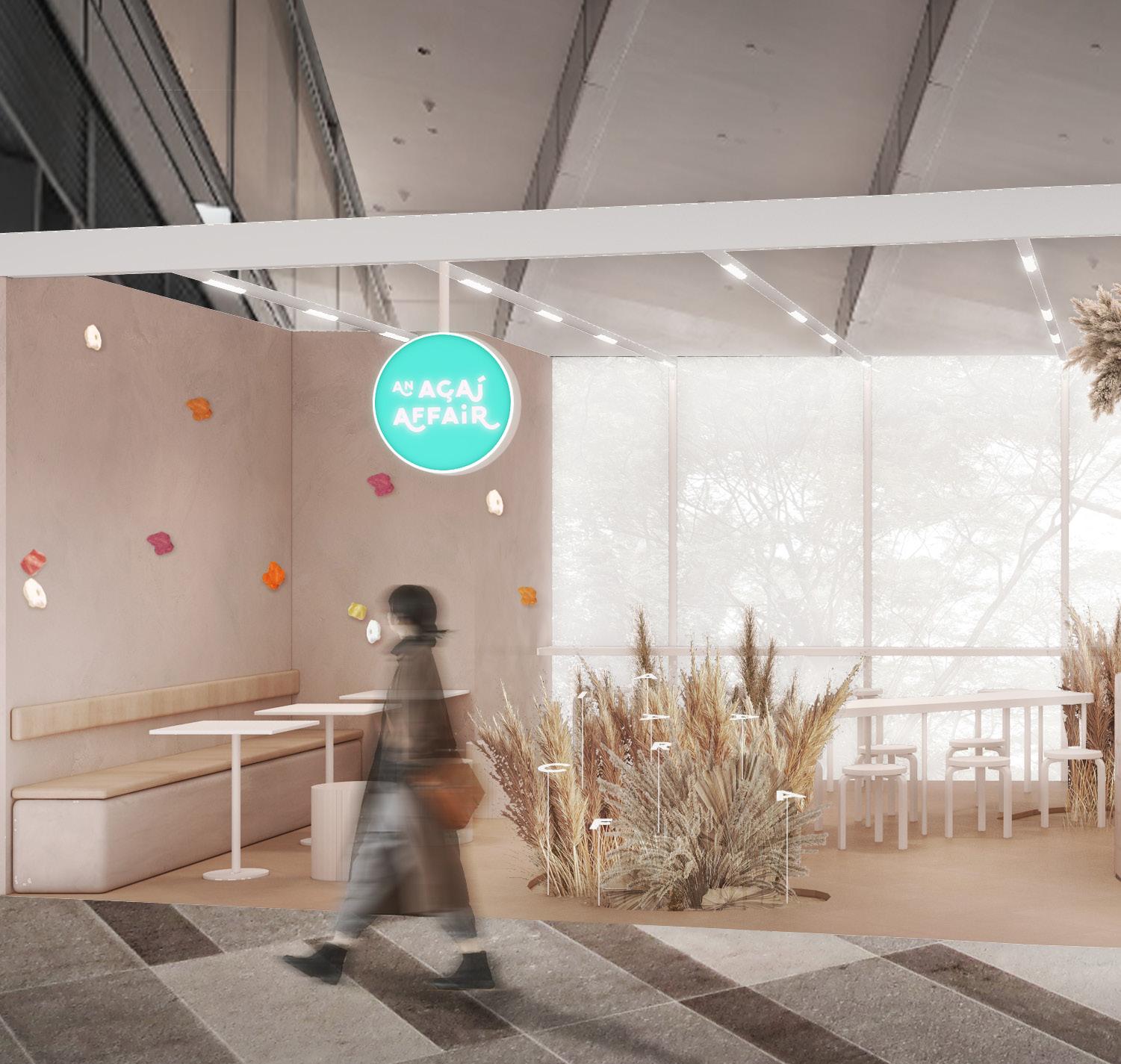
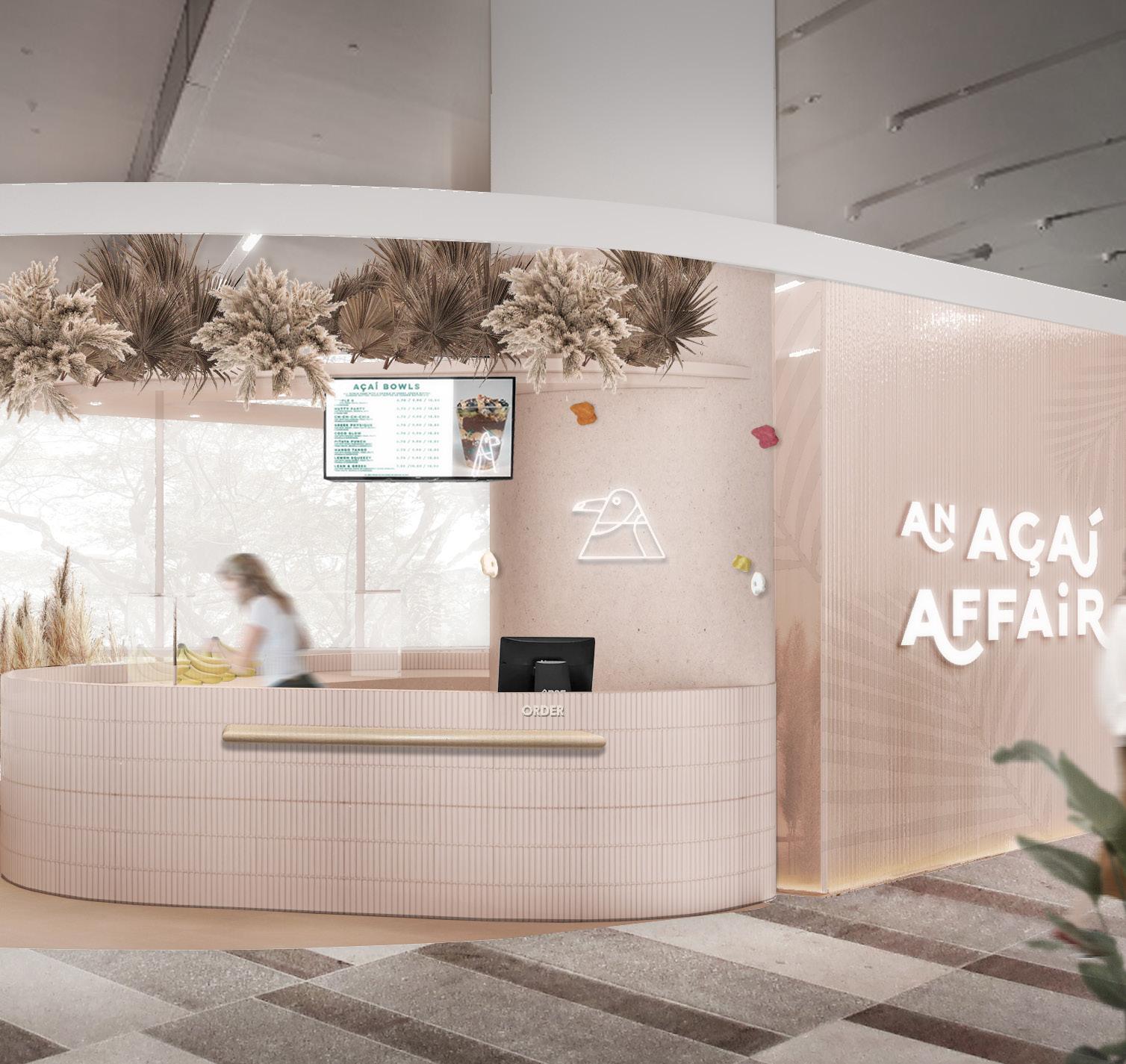
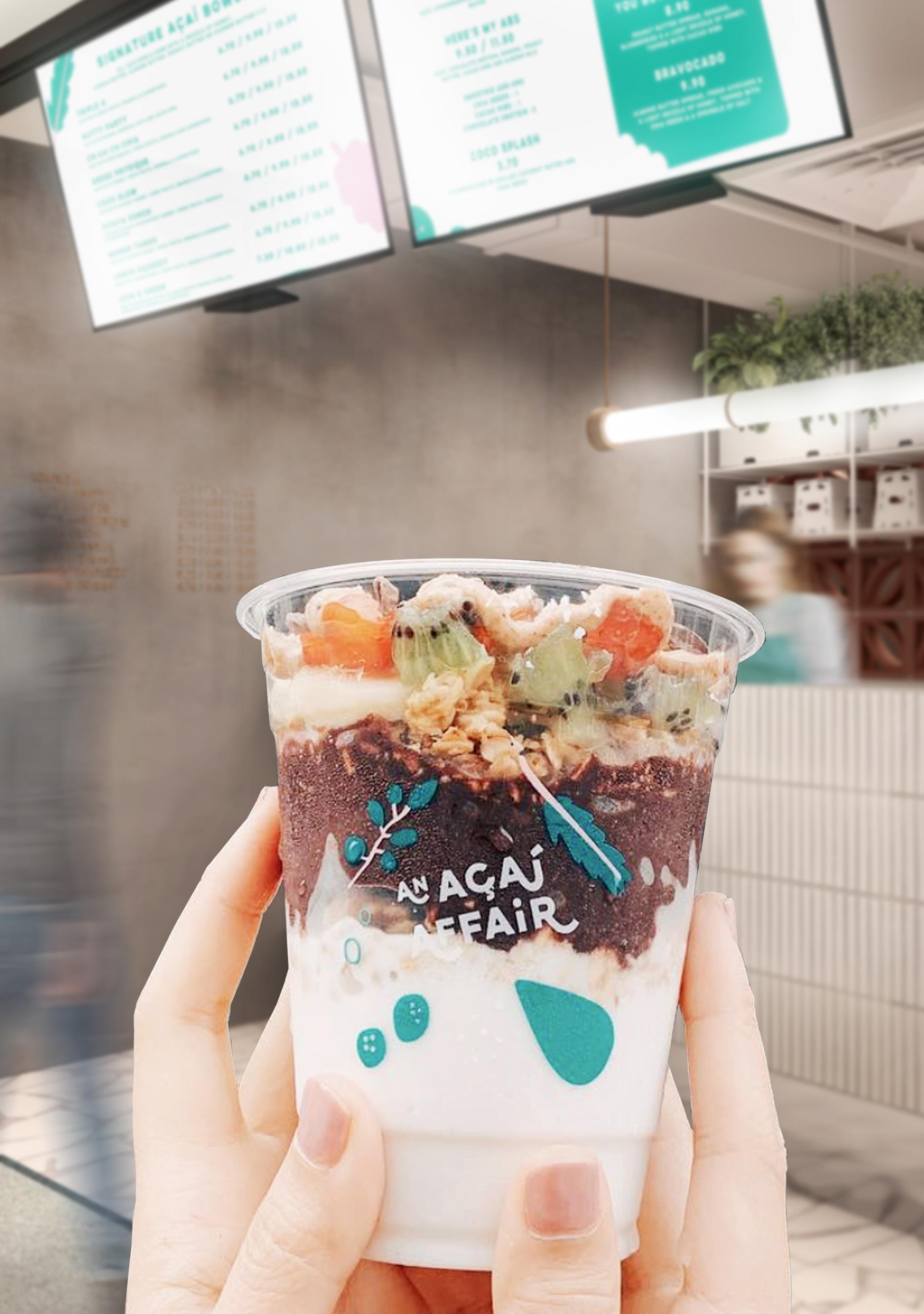
With their mission to elicit the mother nature in its organic form, the design proposal for this outlet at Star Vista embodies the organic nature of acai the ingredient in its various state. Acai being this violet fruit pulped to mix with all other natural ingredients, the space uses a tonality of it to bring the hue of Acai and explores the linear site in an organic transition.
01
F&B AT STAR VISTA

02
AAA 03
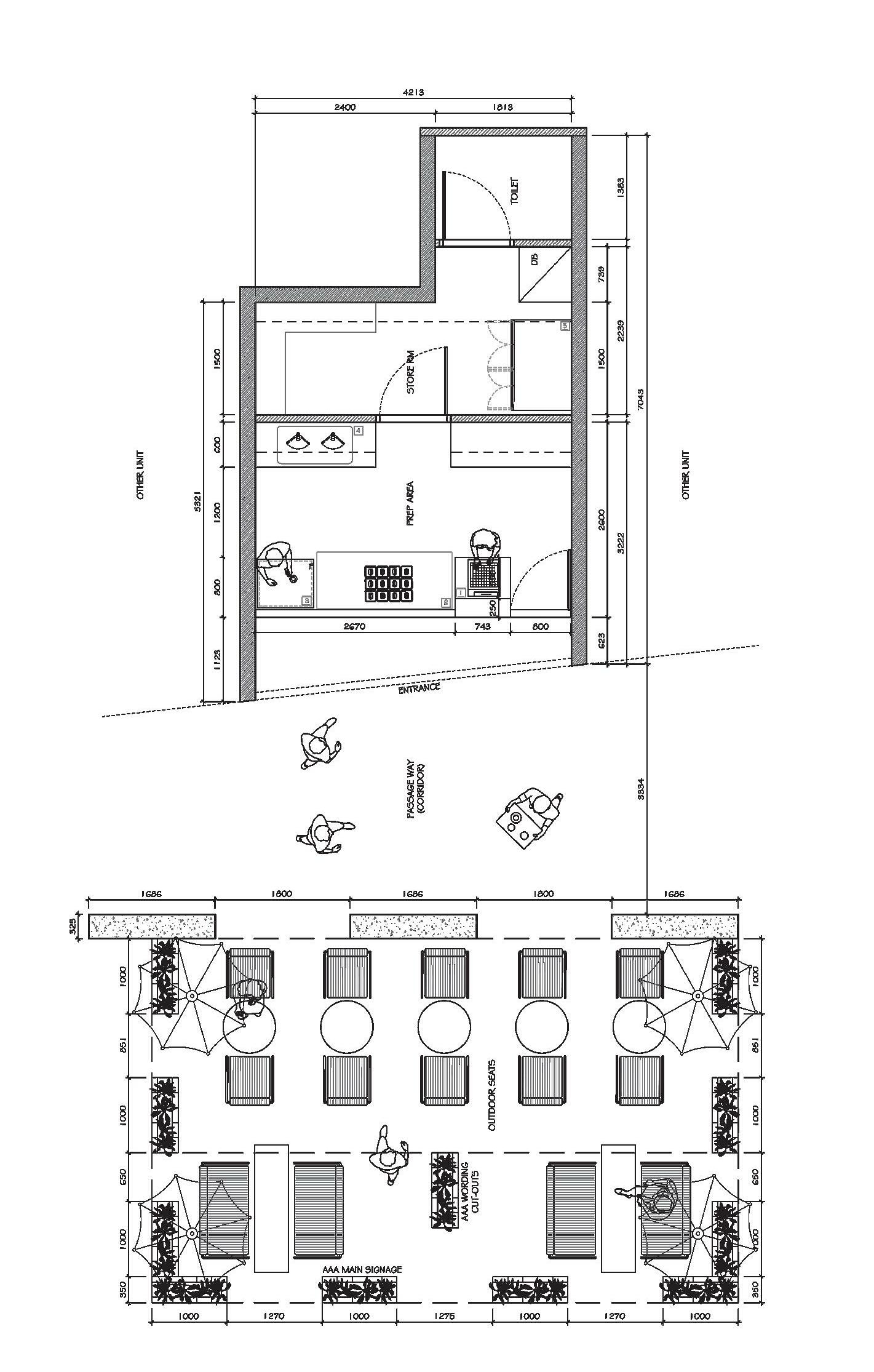
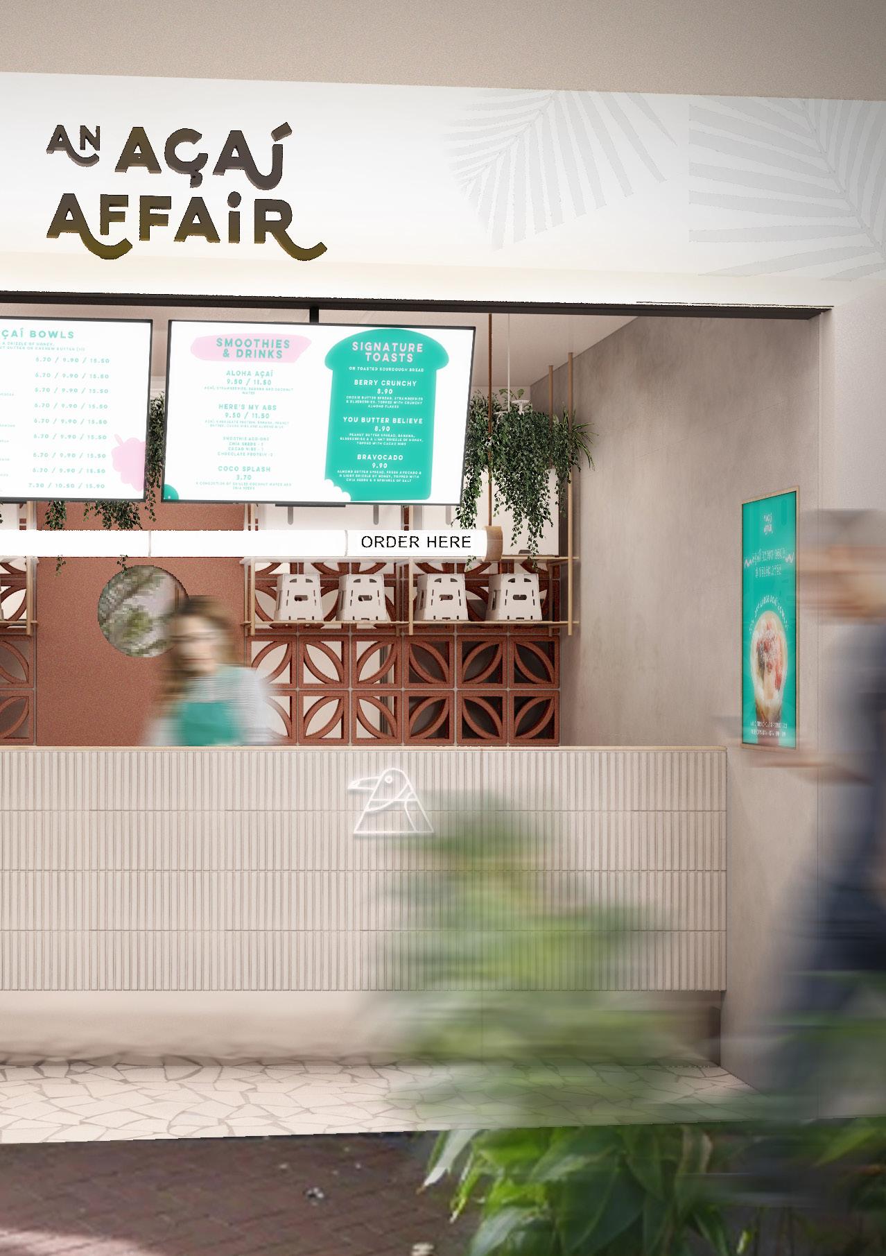
With the site being and open corridor space in a singapore’s first naturally cooled mall, it was integral to not enclose the shop fully to allow more ventilation and light into the space. Hence, the store has a more open layout and ceiling to allow more flow within the space. To stick with the organic concept of Acai, the space introduces an organic counter which becomes the focal point of the space. This denotes te rest of the form and seating arrangements, resulting in the meandering circulation of the space.
STAR VISTA 04
AAA 05
STAR VISTA 06


07
The materials used in the space are kept more natural and raw so as to mimic their ingredients. Keeping the tones similar, to evoke contrast, different textural elements are introduced to the space. This creates a harmonious blend while intriguing the passerby to have a closer look at the space while enjoying their acai - the space imitating Acai.

STAR VISTA 08
AN ACAI AFFAIR
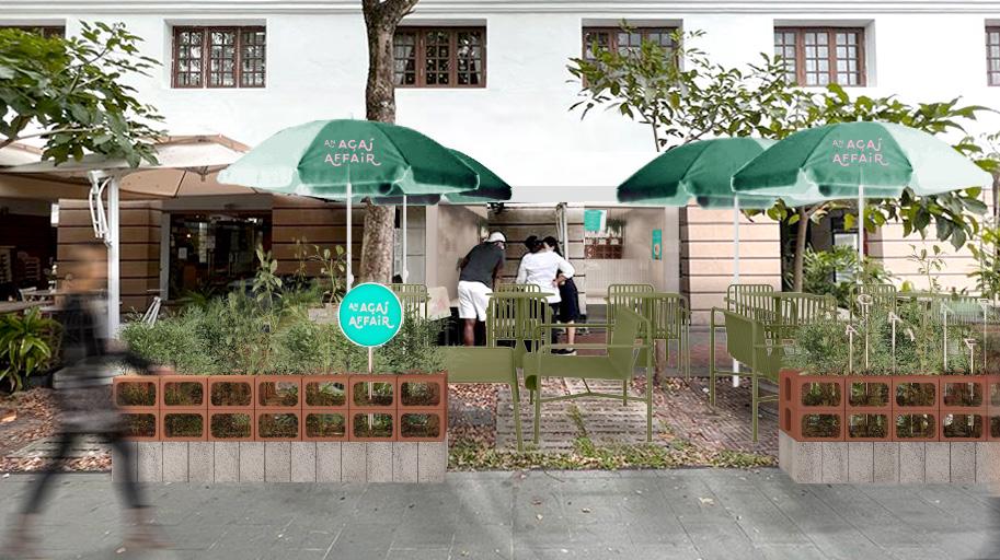
This outlet’s concept was to depict the nature of where acai comes from - the tropics. Thus, the space approaches in incorporating the nature in to create a more seemless flow of the outdoors and indoors. Nevertheless, to still maintain the concept of rawness introduced in the previous store, a similar openness in woven to the store in its layout and materiallity.
09 F&B AT ROBERTSON QUAY
10
11
Robertson Quay’s rows of stores comes with outdoor seatings which was important and aided to the concept of bringing the outdoors in. Therefore, the outdoor spaces were the navigating point to the actual store. This space is given a more free and loose ambience. This helps in keeping the store as the foreground and as the main imagery of the space. The layout of the store is kept neat and straight forward to flow with the site’s linearity.
ROBERTSON QUAY 12
13
The materiality introduced the spaces takes cues from its surroundings of the site. While raw cement texture and pristine white tiles of varying cracks and uniformity is implimented, the terracotta ventilation blocks are introduced in relation of the red brick pavement of the area. This creates a smooth transition of the public and commercial space - unifying as a whole.
14 ROBERTSON QUAY
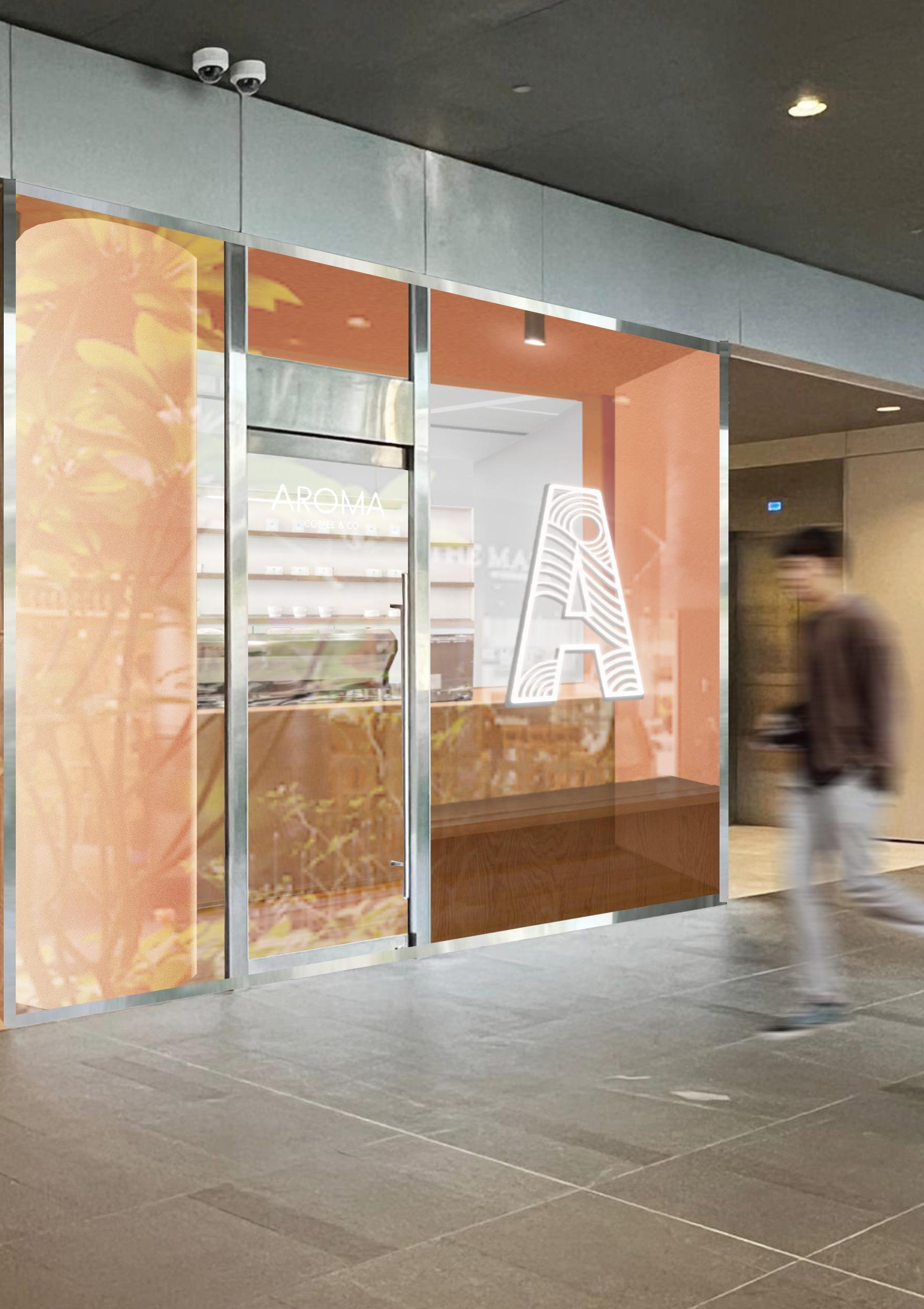
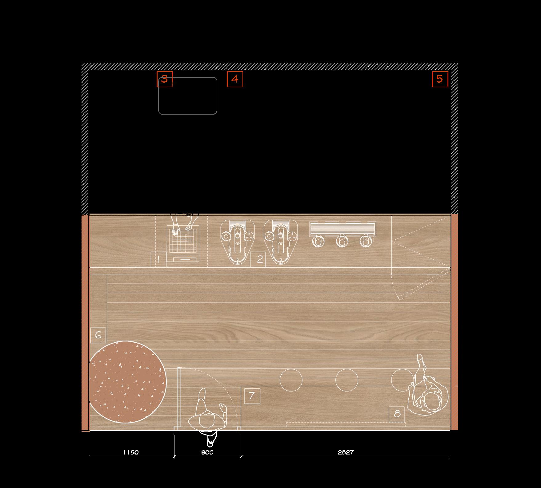
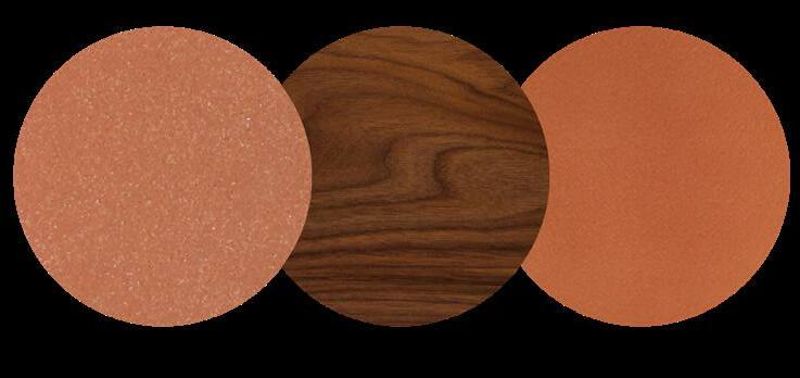
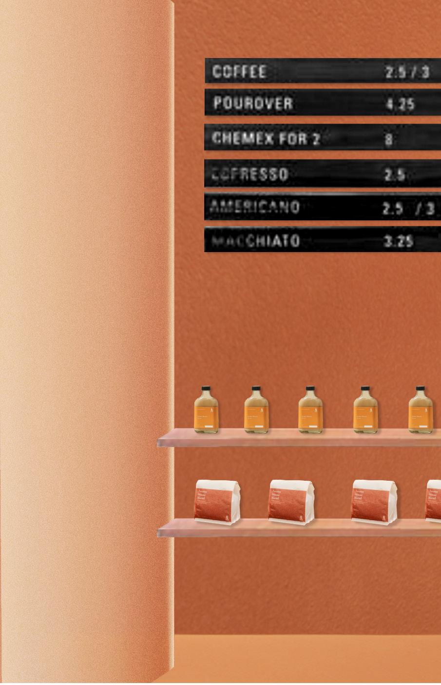
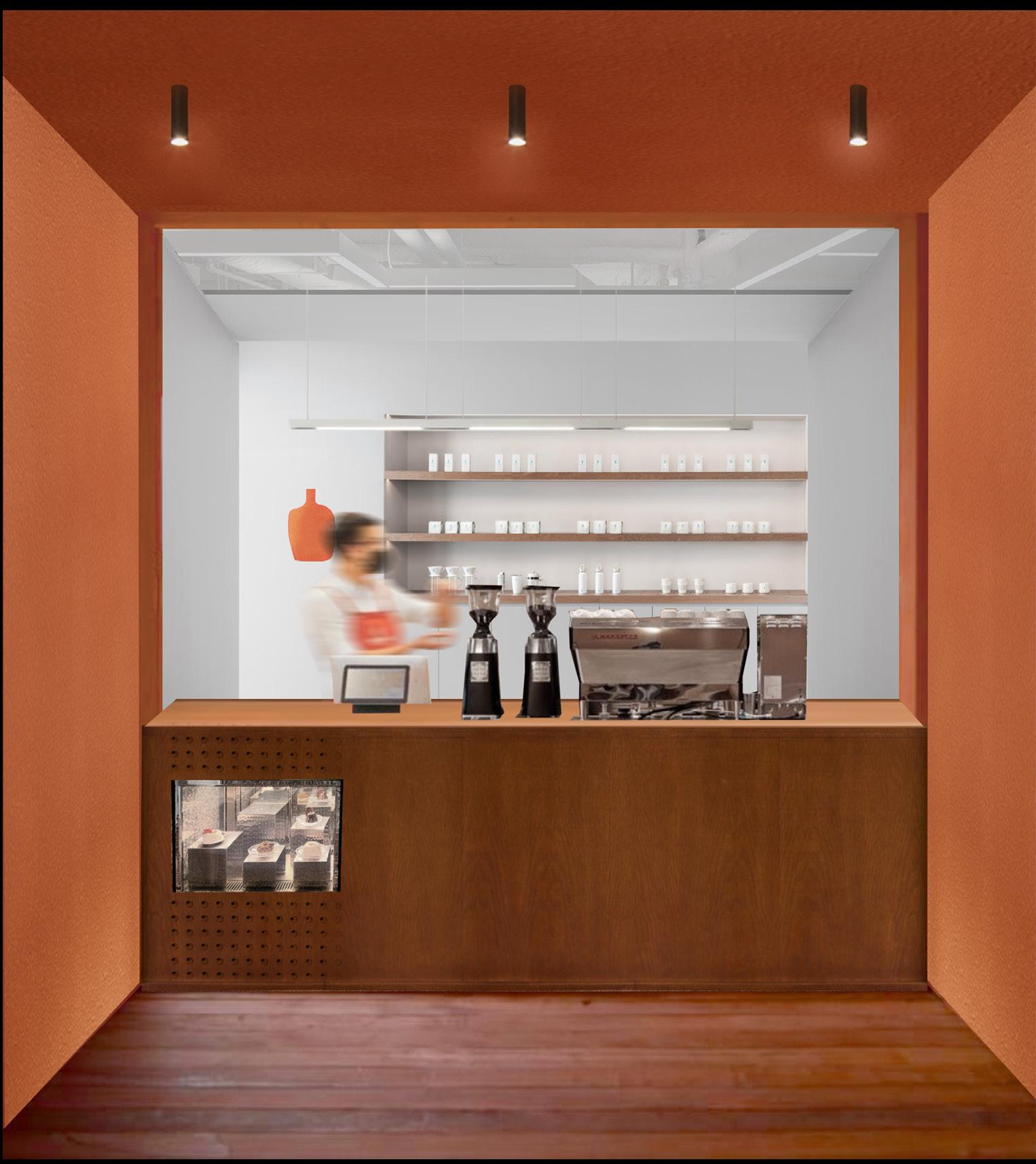
AROME COFFEE
Aroma is embodied by the terracotta branding colour, which outlines the storefront while the foreground remains pristine and white. This creates a frame like appearance as one views the shop from the outside, wanting to step in for a closer look. The materials used mainly are tinted wood, to give off the warmth and coziness of the quaint space. The application of various materials with the same tones texturizes the space, giving more depth despite the tinyness of the space.
15
F&B AT THE OASIS
16
AROMA 17
The layout is kept linear and neat to follow the shape of the store. The front portion of the store is liven with neutral tones of the brand, enticing the passerbys. It gives a warm embrace and atmosphere as one sips on their first morning coffee.
The back portion is kept white and clean which acts as a background to the store. This minimal foreground helps to emphasize the entrance.
THE OASIS 18
19 AROMA
20 THE OASIS
21
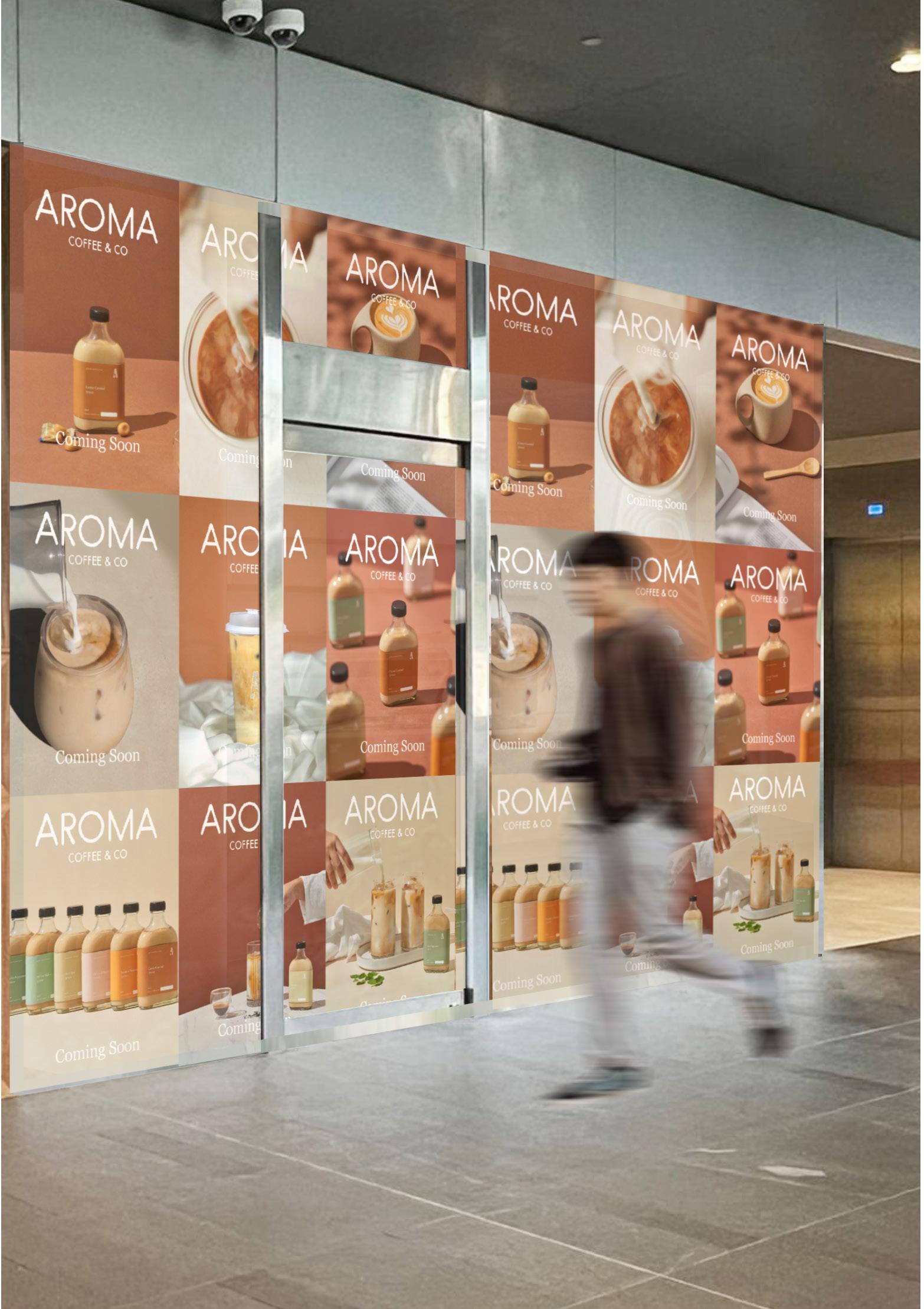
For the hoarding, a more playful approach can be used to let passerbys know aroma will be coming soon to create anticipation. Using current imagery and typography, this creates a more aesthetic graphic hoarding and making it more instagrammable.

22 THE OASIS
DOUGHH
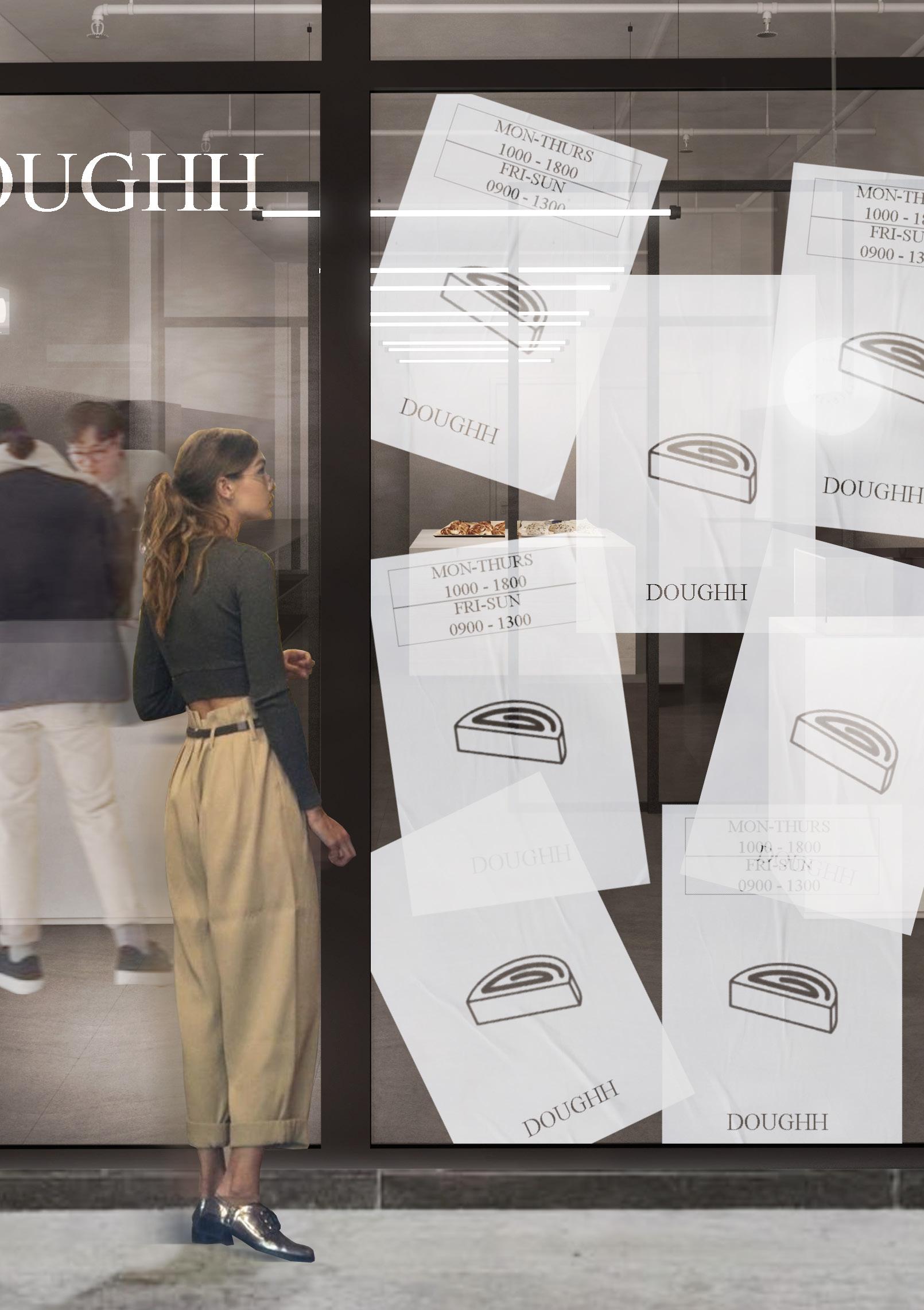
While serving prismatic array of doughnuts, Doughh approaches the space in as an industrial like kitchen to highlight its pastries. Everything is kept muted and desaturated in tones of monochrome. Exposed ceiling, stainless steel equipments, graphical signage and elements are infused into the space to extract the industrial atmosphere. White the frontage given clear view of the space, to evoke curiousity the glass facade is plastered with transcluscent graphical posters in a messy arrangement allowing pockets of spaces to peek through.
23
SPRINGWALK
F&B AT
24

DOUGHH 25
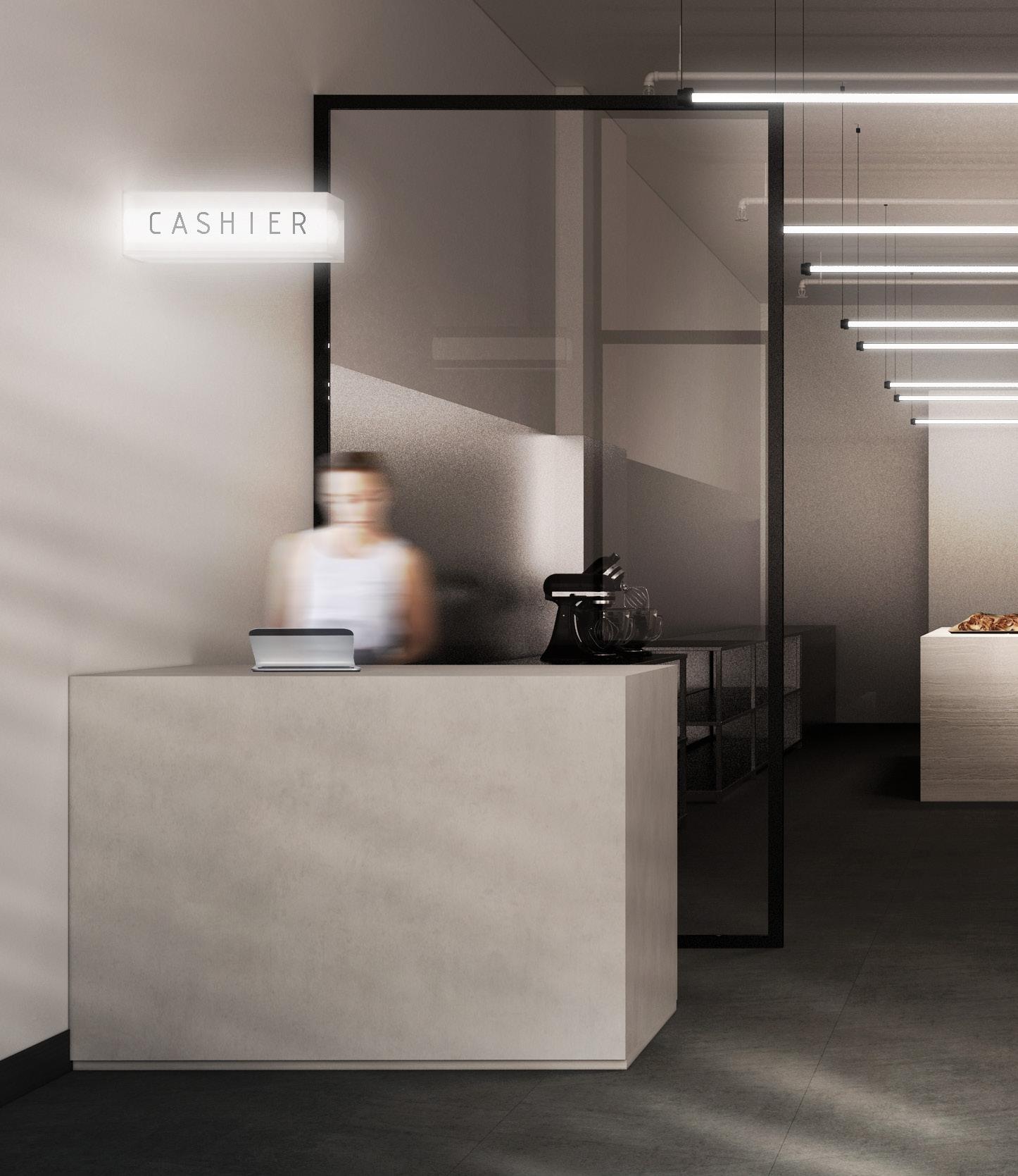
The layout is kept simple and linear to oblige with the site and allows transparency throughout as customers could view the process of the pastry making while waiting to pick up - the kitchen area transforming into a performative stage. The monochrome palatte of the space creates a industrial lab like atmosphere for the crafting of the delicate pastries.

SPRINGWALK 26
27 DOUGHH

28 SPRINGWALK
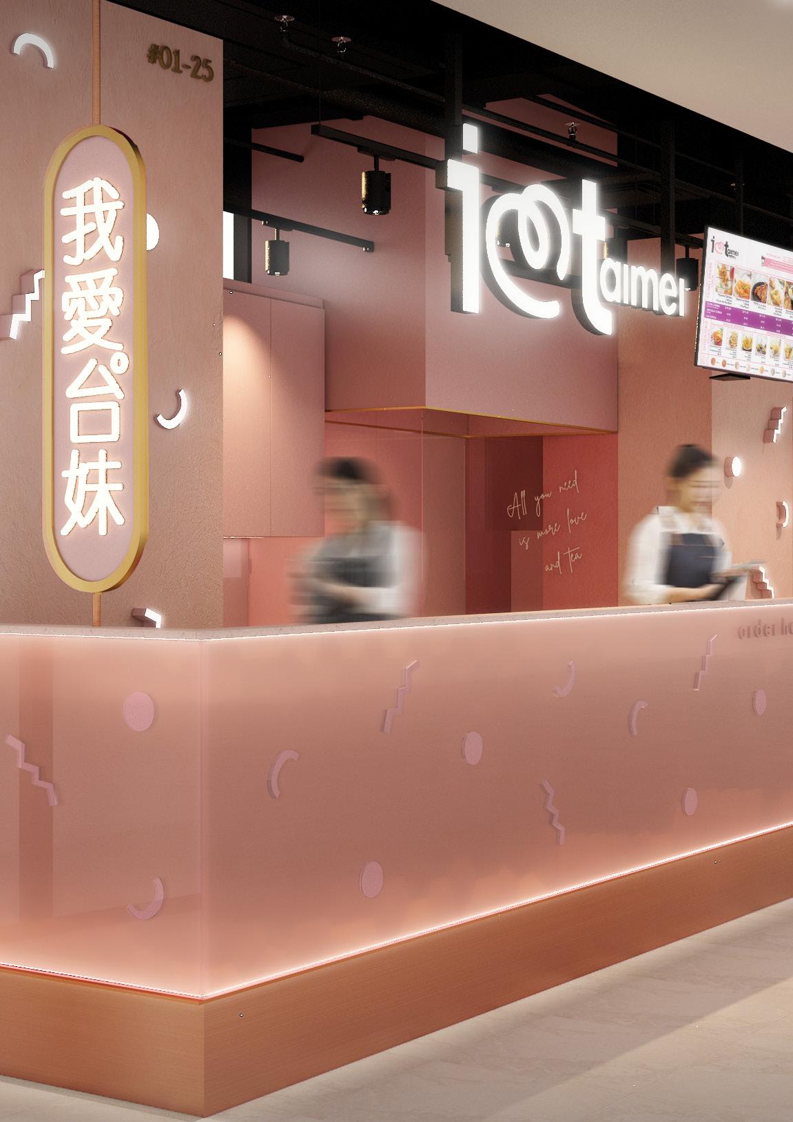
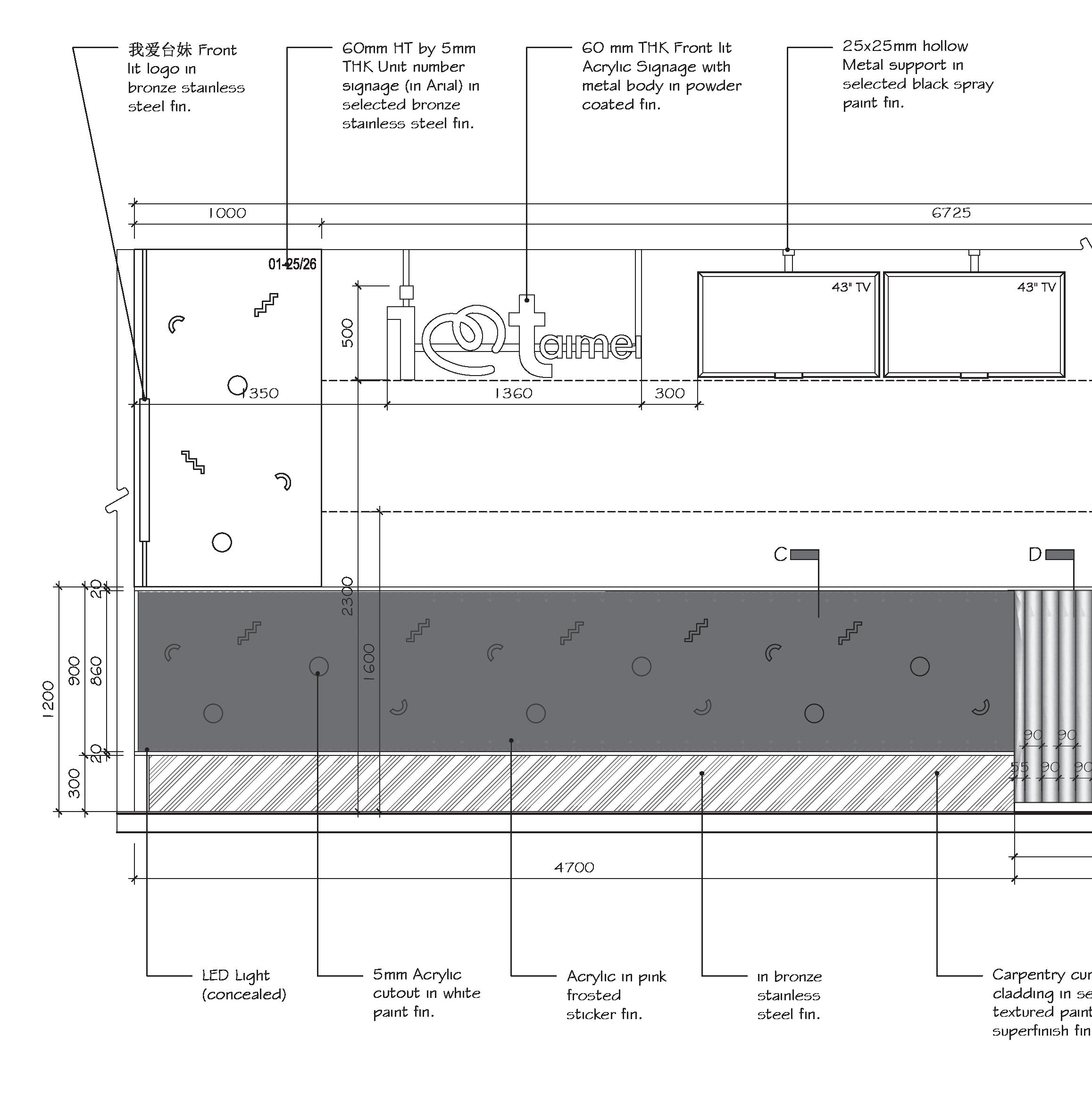
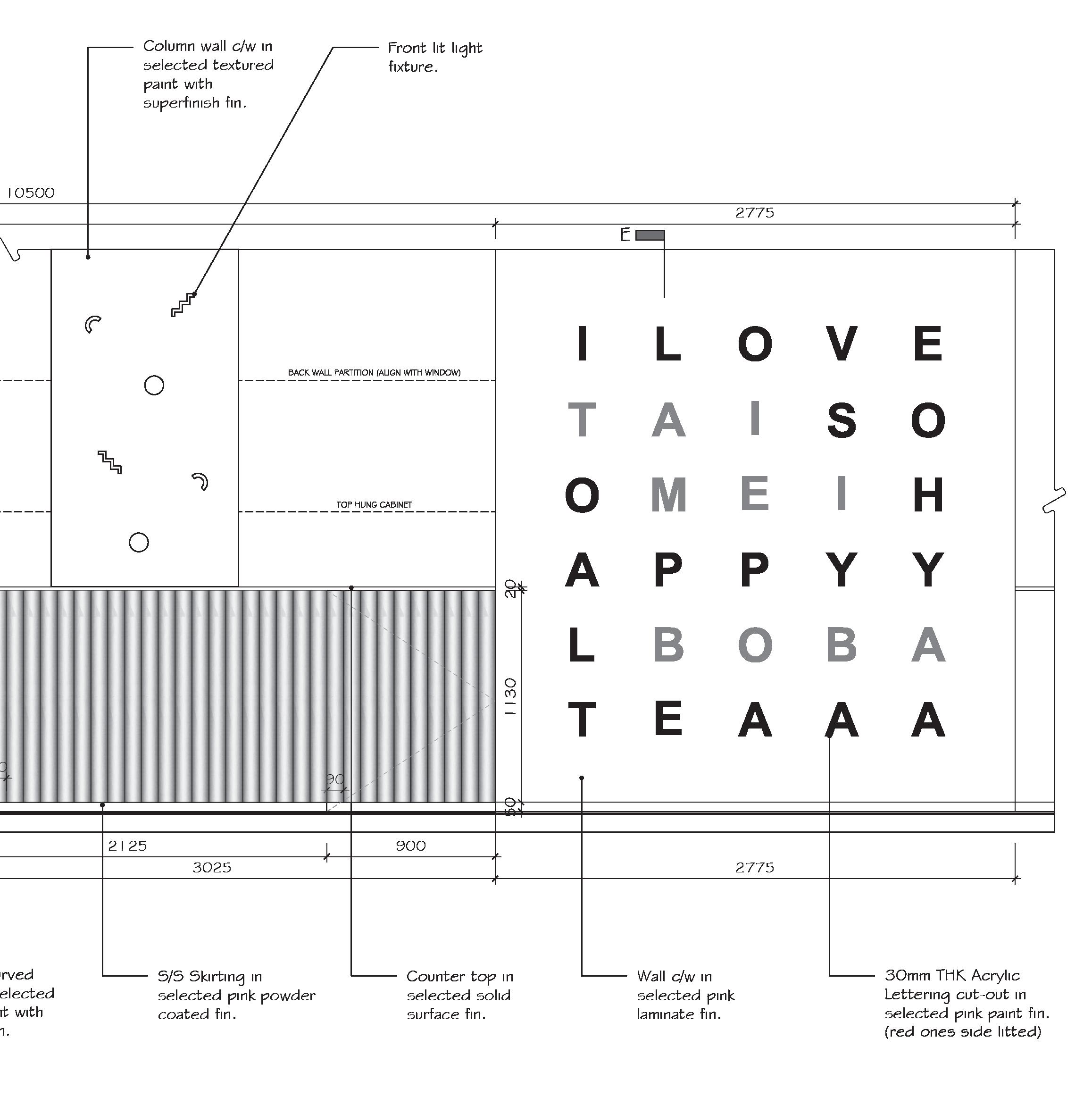
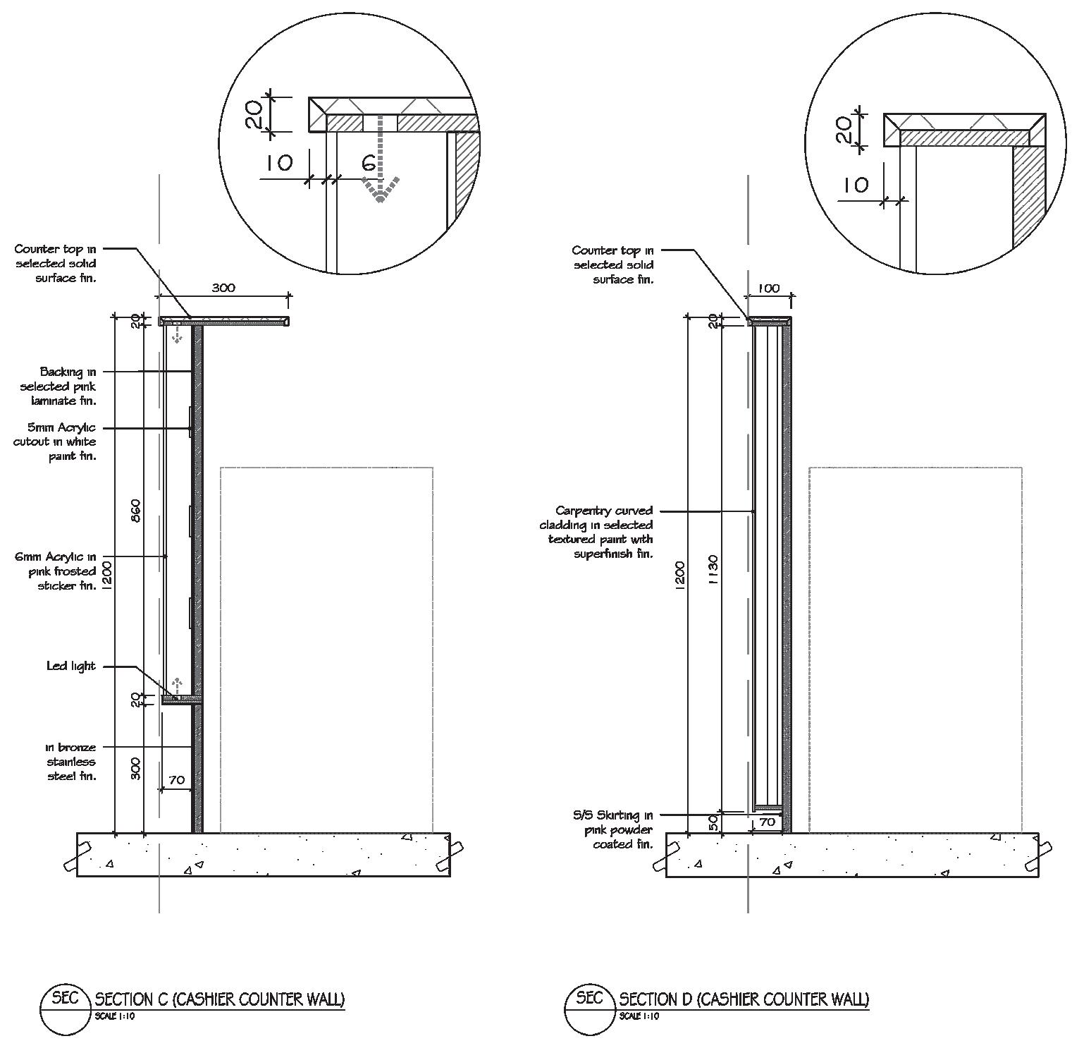
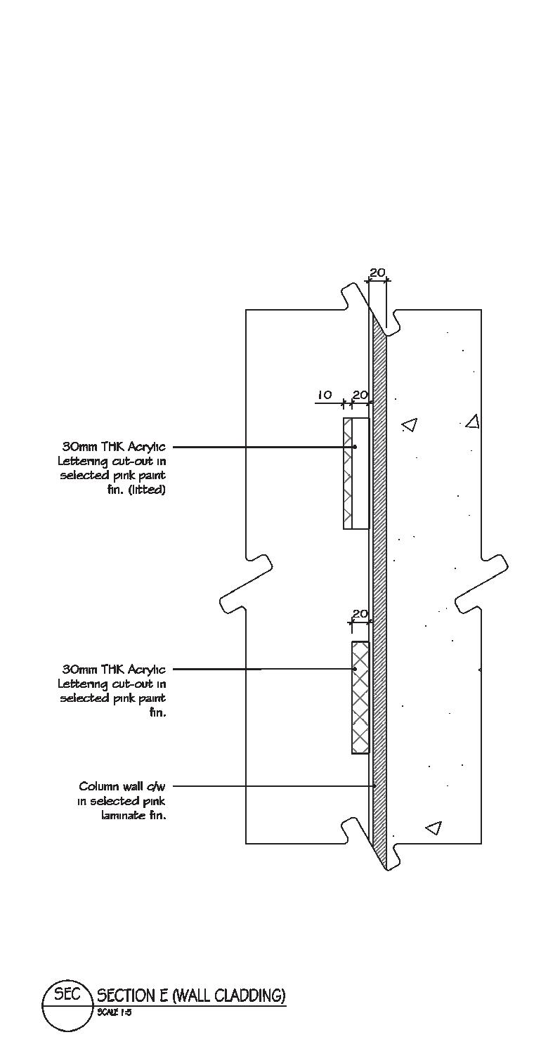
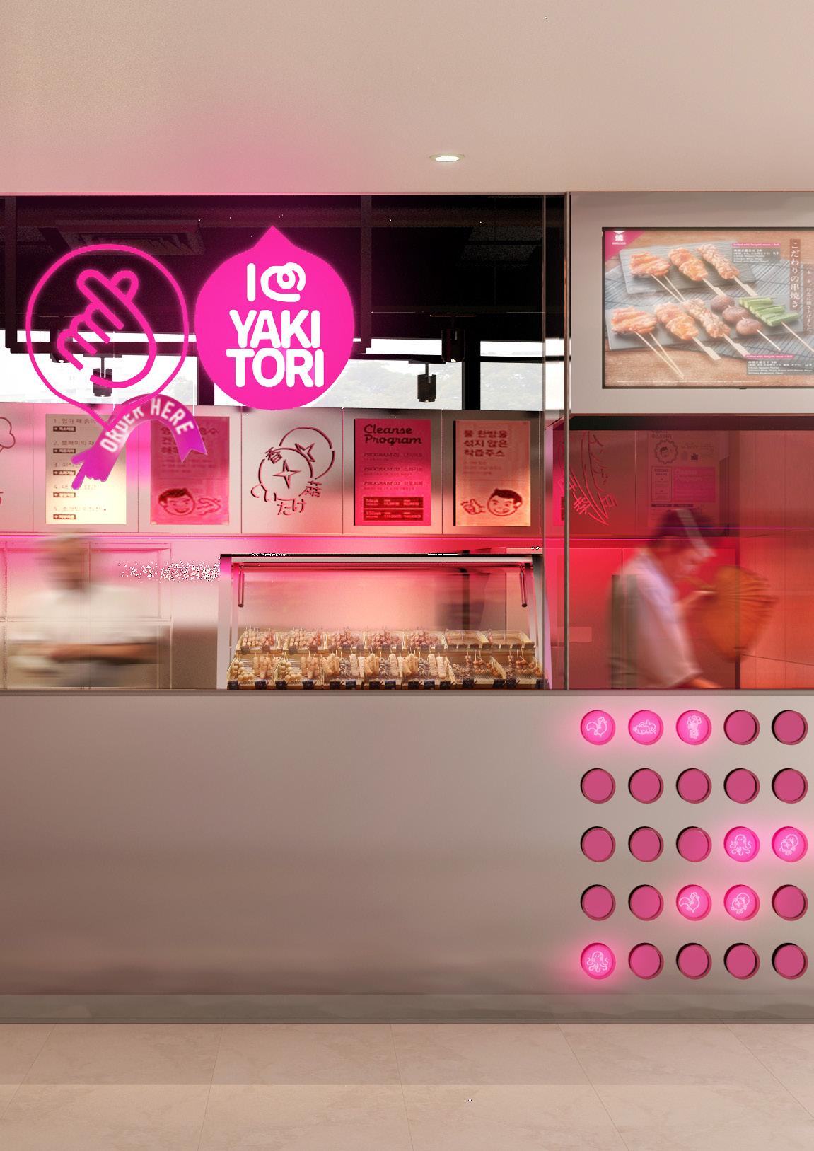
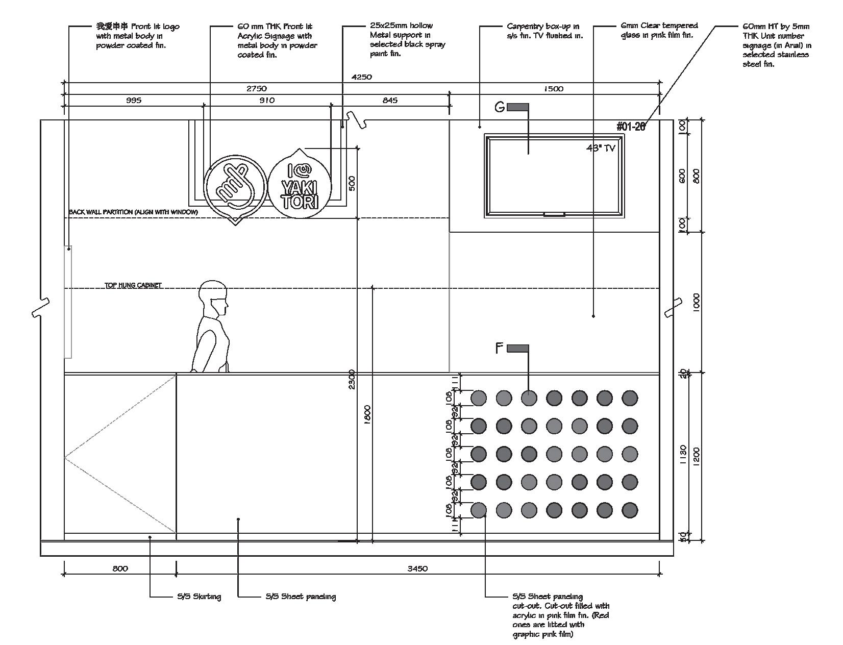
TAIMEI & YAKITORI
Remaking its branding elements, I Love Taimai and its sister brand I Love Yakitori was given the makeover by introducing new design elements to its spaces and interior branding. While retaining its pastel pink shades and bronze trimmings for Taimei, a more hot pink and stainless steel scheme was proposed for Yakitori. With the two stores adjacent to each other, the pink seems to gradients off to the next as a whole concept.
29 F&B AT HILLION MALL
30
TAIMEI 31
HILLION 32
33 TAIMEI
34 HILLION
35
36 HILLION
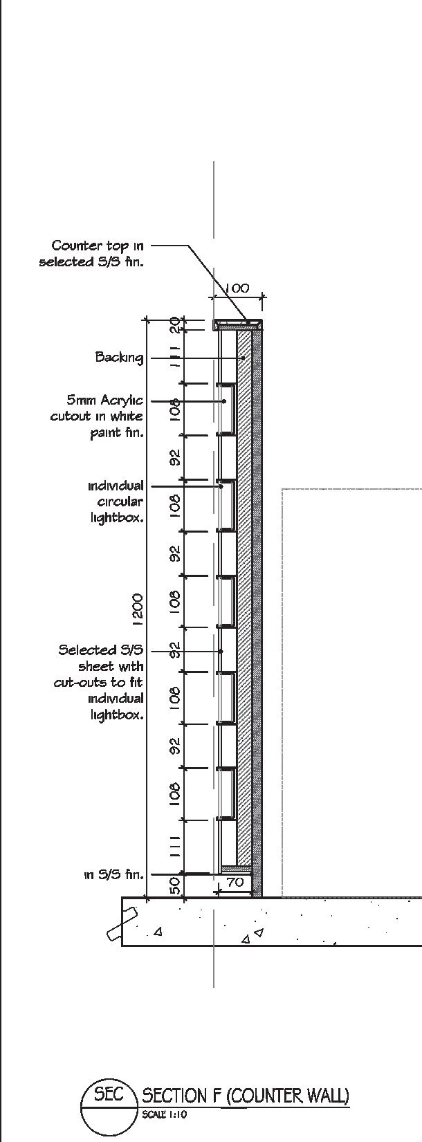
37 YAKITORI
38 HILLION
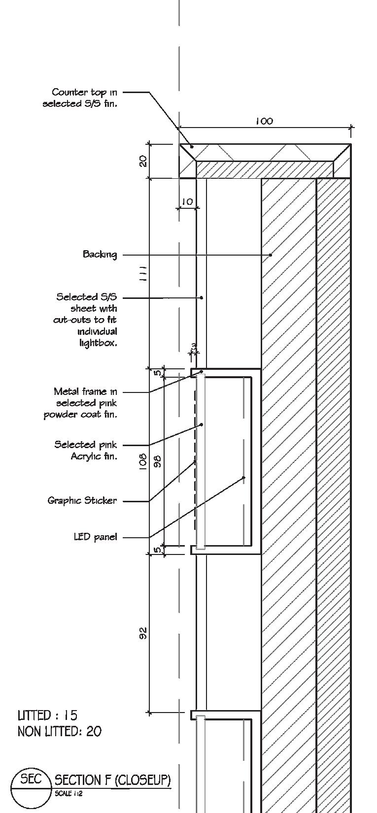
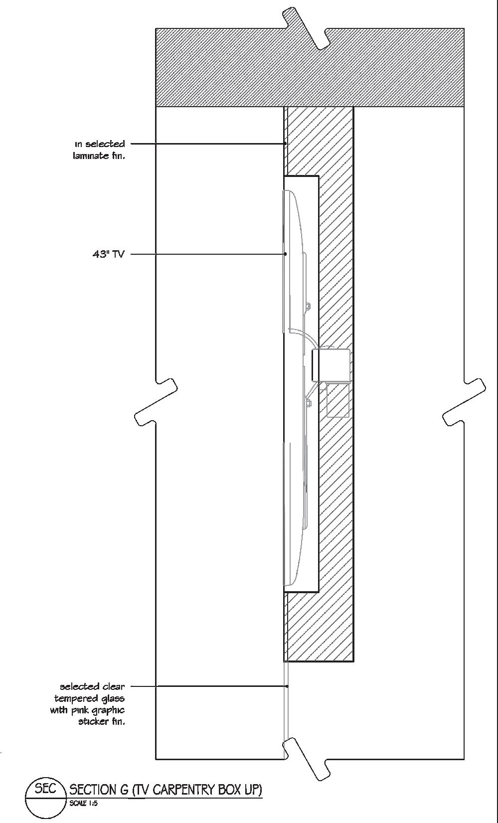
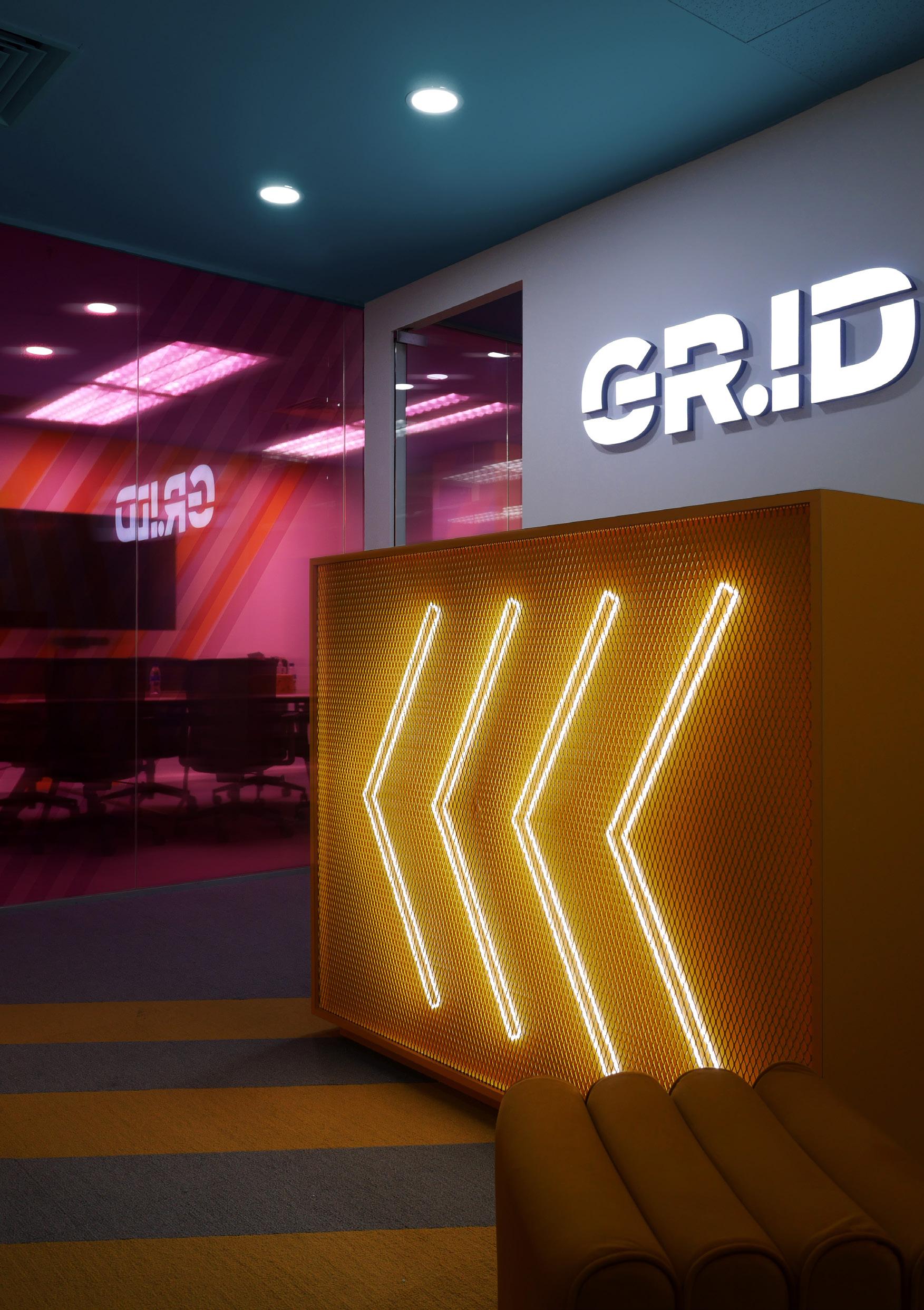
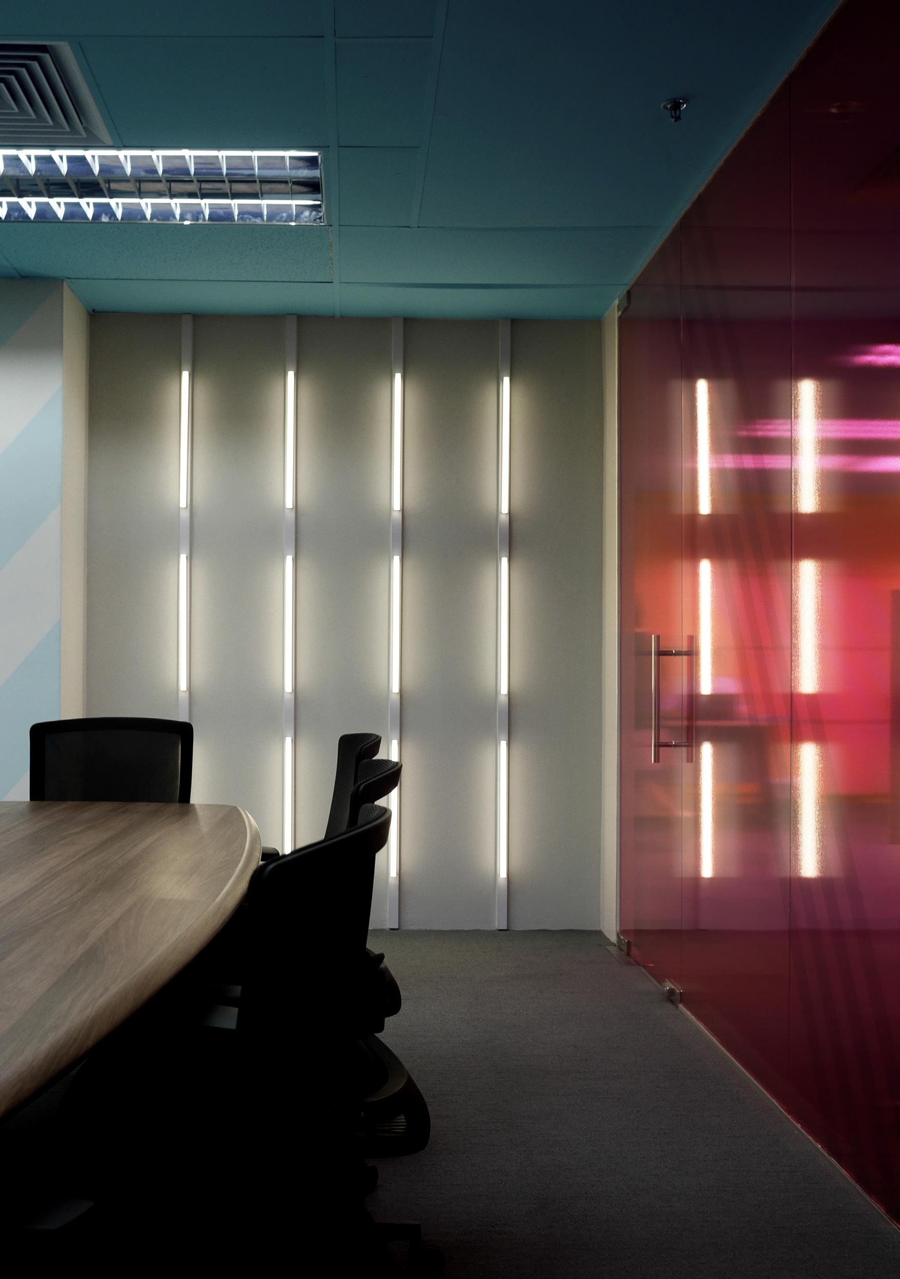
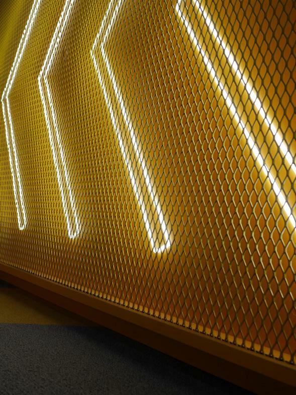
GR.ID
OFFICE AT GR.ID
Upholding its colourful and geometric aesthetics of the mall, the office brings in its vibrancy and play of lights in its space of work. Neon lights breathe life into the space when paired with materials that reflect and casts shadow as play. The colours bring in an eclectic atmosphere in the space, creating a fun environment to work in.
39
40
41
GR.ID 42
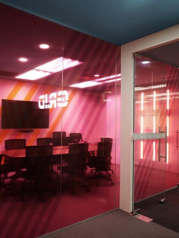
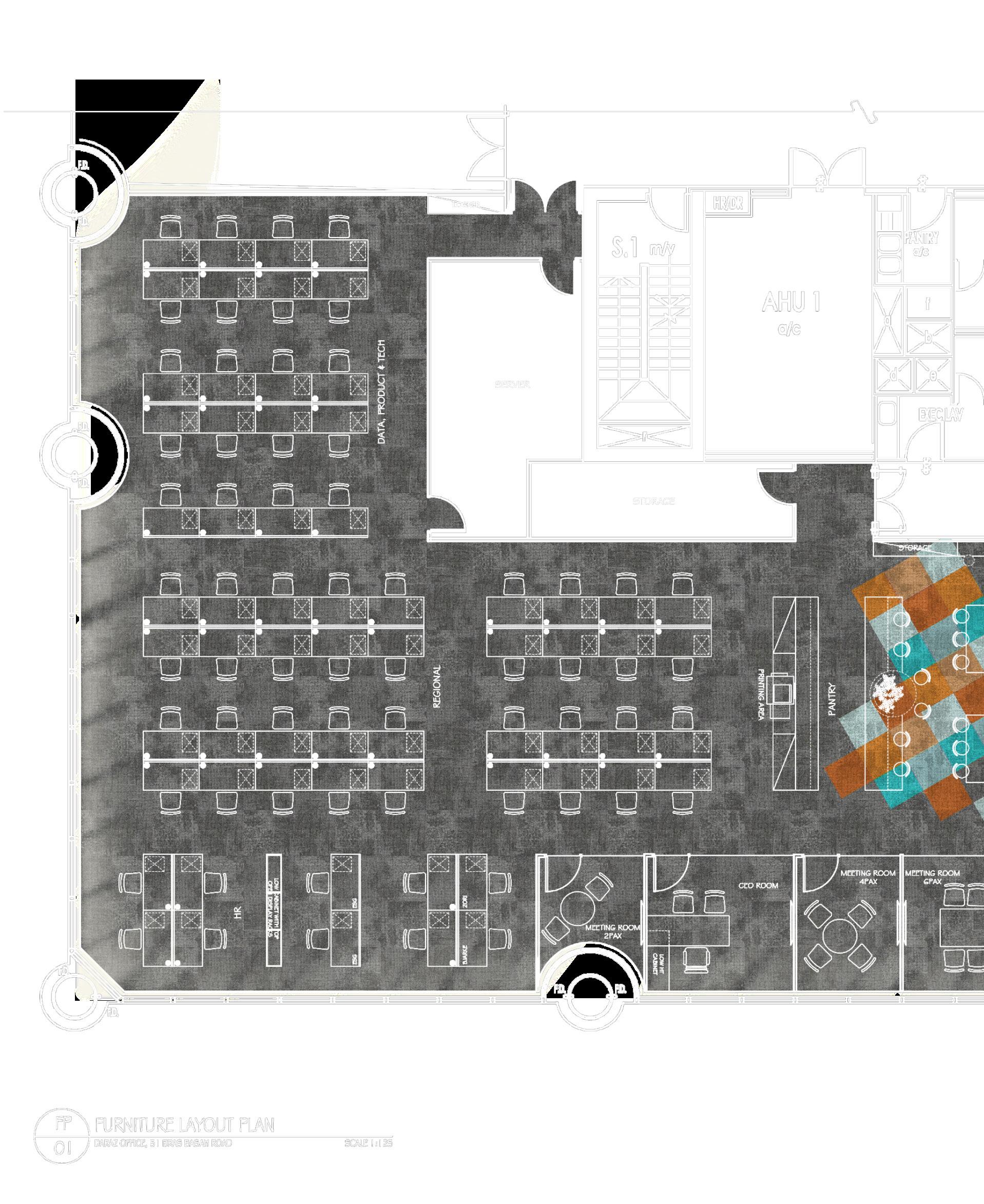
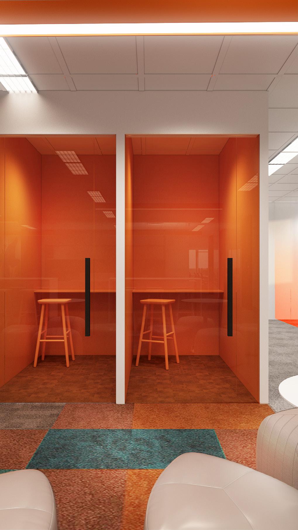
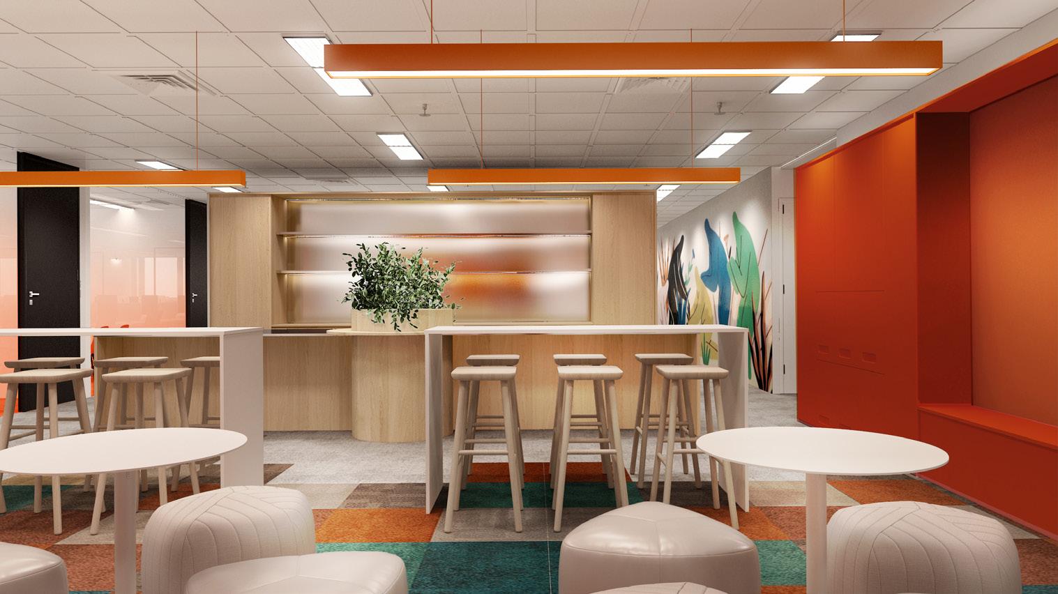
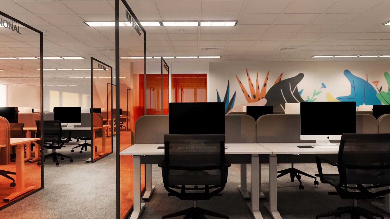
DARAZ
With the concept of synergy and liveliness, Splashes of orange tinge envelops the spaces of Daraz to mark its branding and identity. Orange not being its only vibrancy denoter, other colours consume bits and pieces through murals and furniture finishes in the common areas of unwinding and sharing.
43 OFFICE
AT LAZADA ONE

44
45 DARAZ
The zones are first segregated as private and public spaces to control the noise levels of the areas. It is also to commonize the activities of the areas and group them accordingly.
The spaces are then broken down to further segments to differentiate the departments.
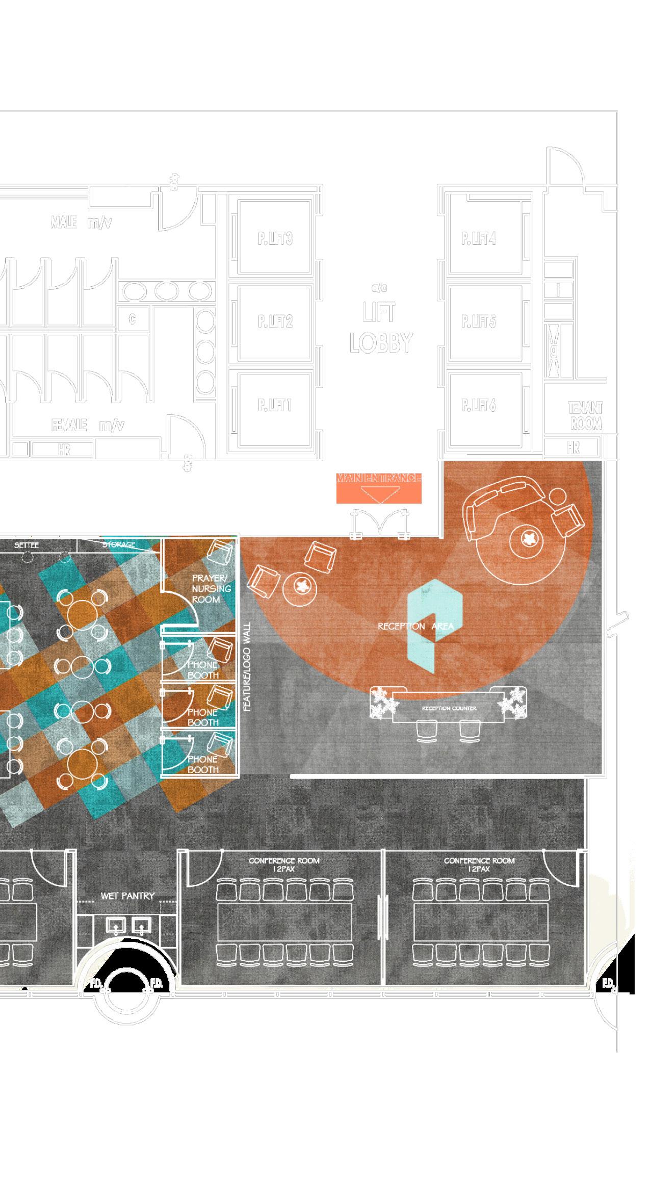
The layout is kept linear to the space. Thus, the furniture arrangements follow the alignment of the partitions to create clean circulations throughout the space.
The common areas have more colours introduced to the spaces, to create a lively atmosphere upon arriving. These colours are to be matched with the brand guide of Daraz.
46
LAZADA ONE
47 DARAZ
48 LAZADA ONE
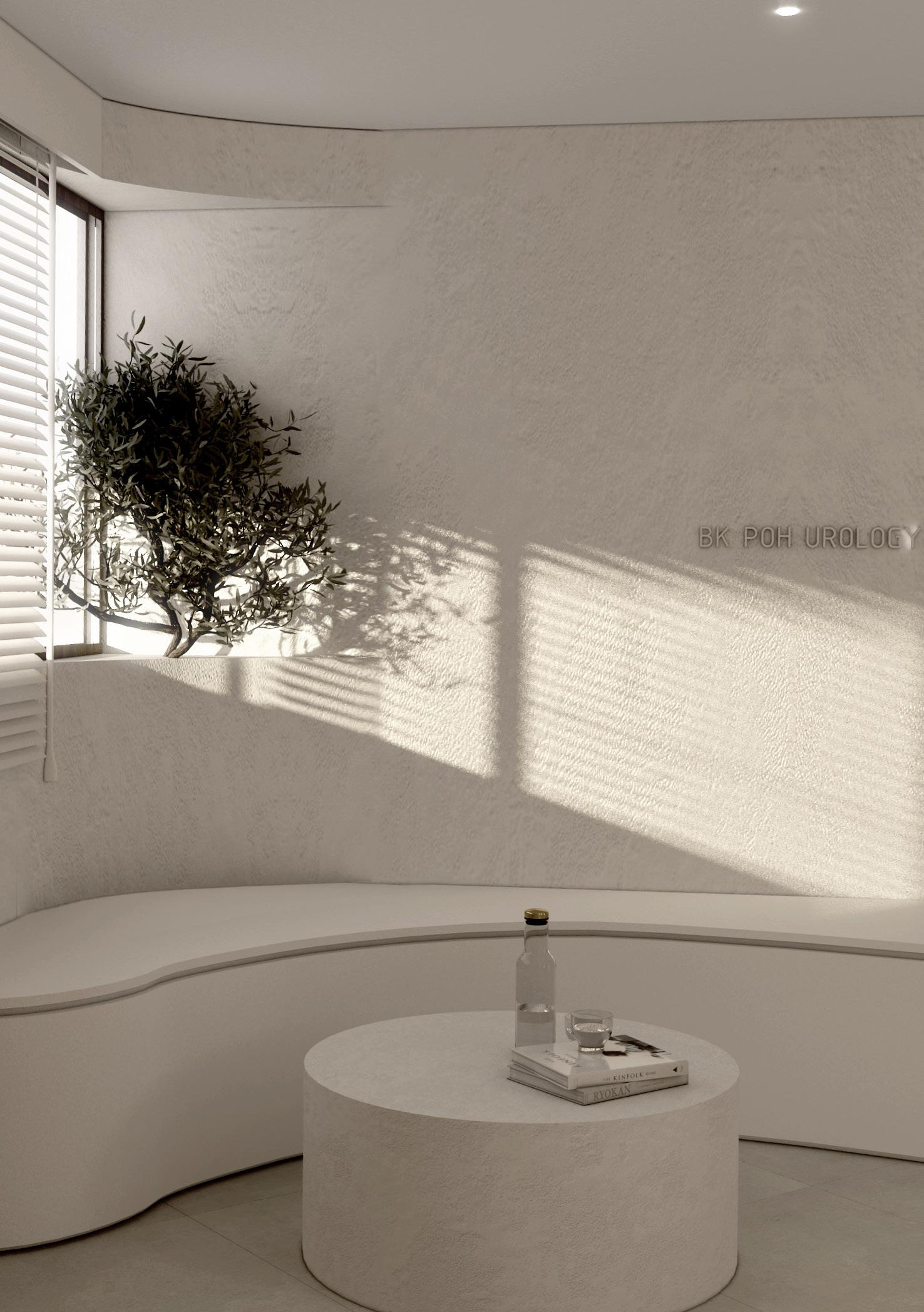
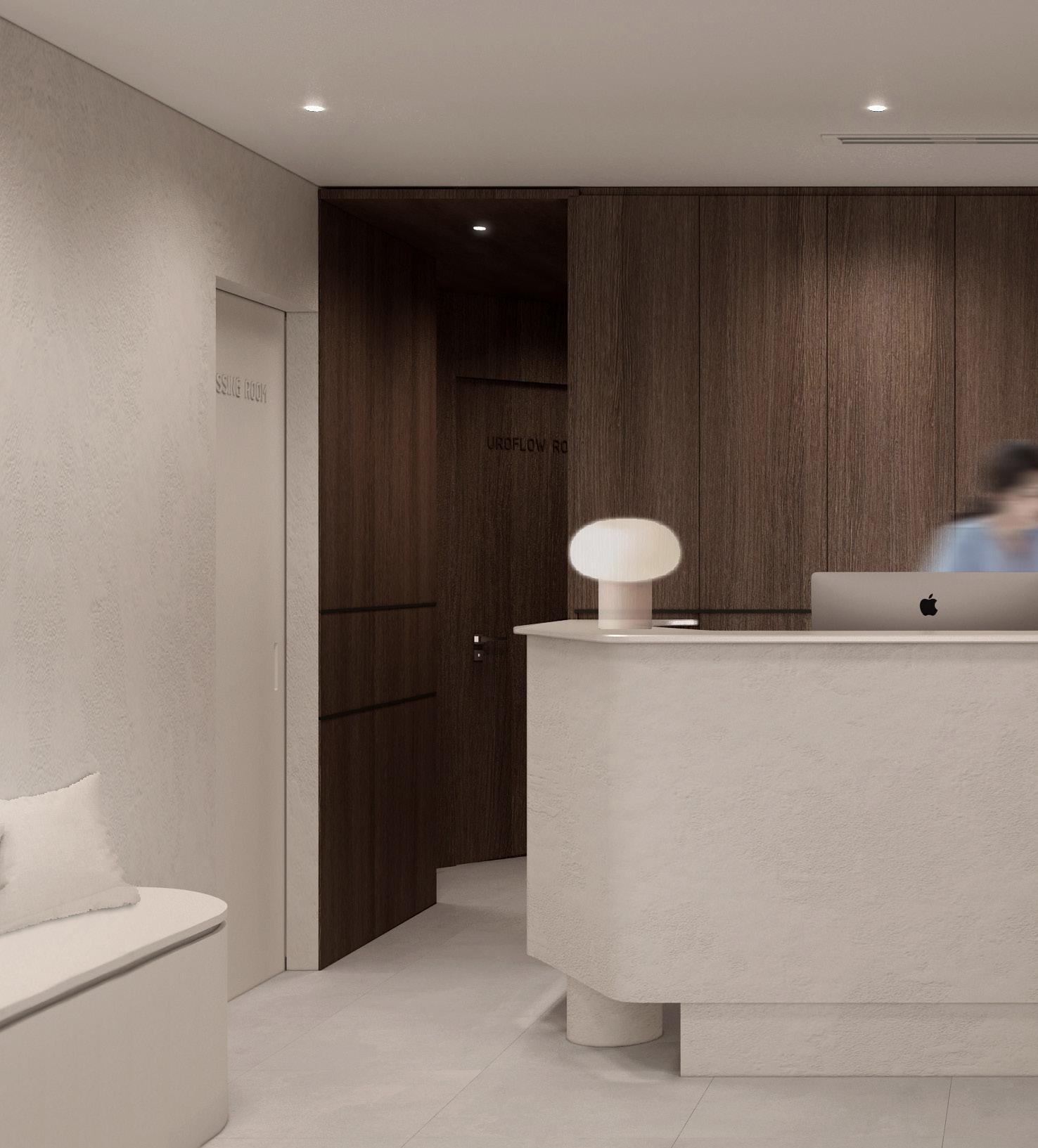
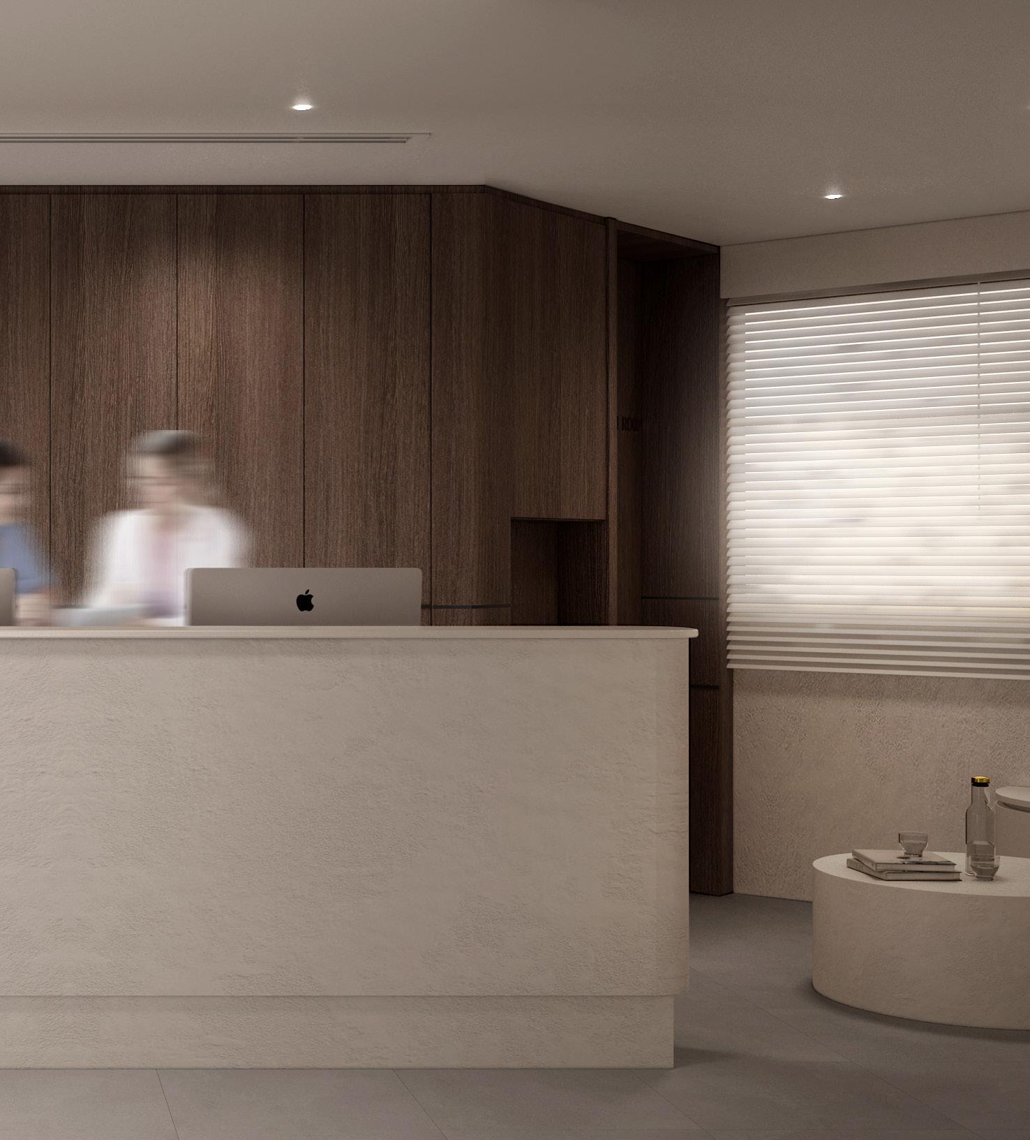
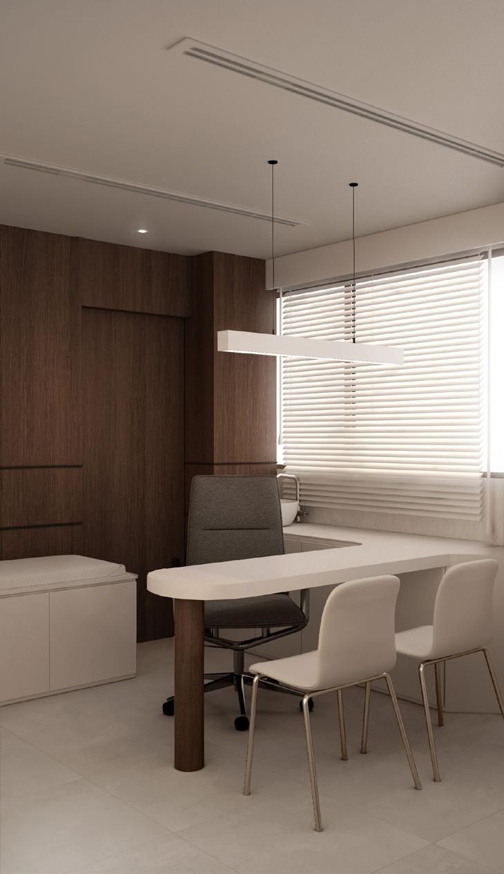
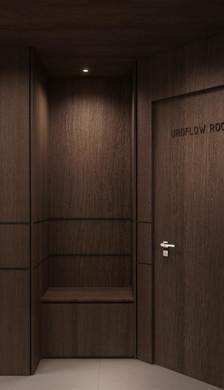
BK POH UROLOGY
The concept of the clinic is given a more tranquil approach - almost zen like. As people enter the space the visual segregation of the waiting area and consultation spaces are inevitably obivious through the textured white washed walls in opposition contrasting to the wood cladding wrapped. The calmness is then intangibly evoked in the space with subtle curves implemented aiding with the material play.
49 CLINIC AT GLENEAGLES
50
51 BK UROLOGY
52 GLENEAGLES
53 BK UROLOGY
Despite the angular oddness of the space, curvular aspects is introduced to the clinic to enhance and elicit the ambience of tranquility into the space. These help to ease the sharp corner and edges to smooth flow of walls despite the tight space. However, these organic flow is mainly retained in the public zones while the private zones retain its linar form for functionality and serious purposes.
54 GLENEAGLES
BELMOND GREEN
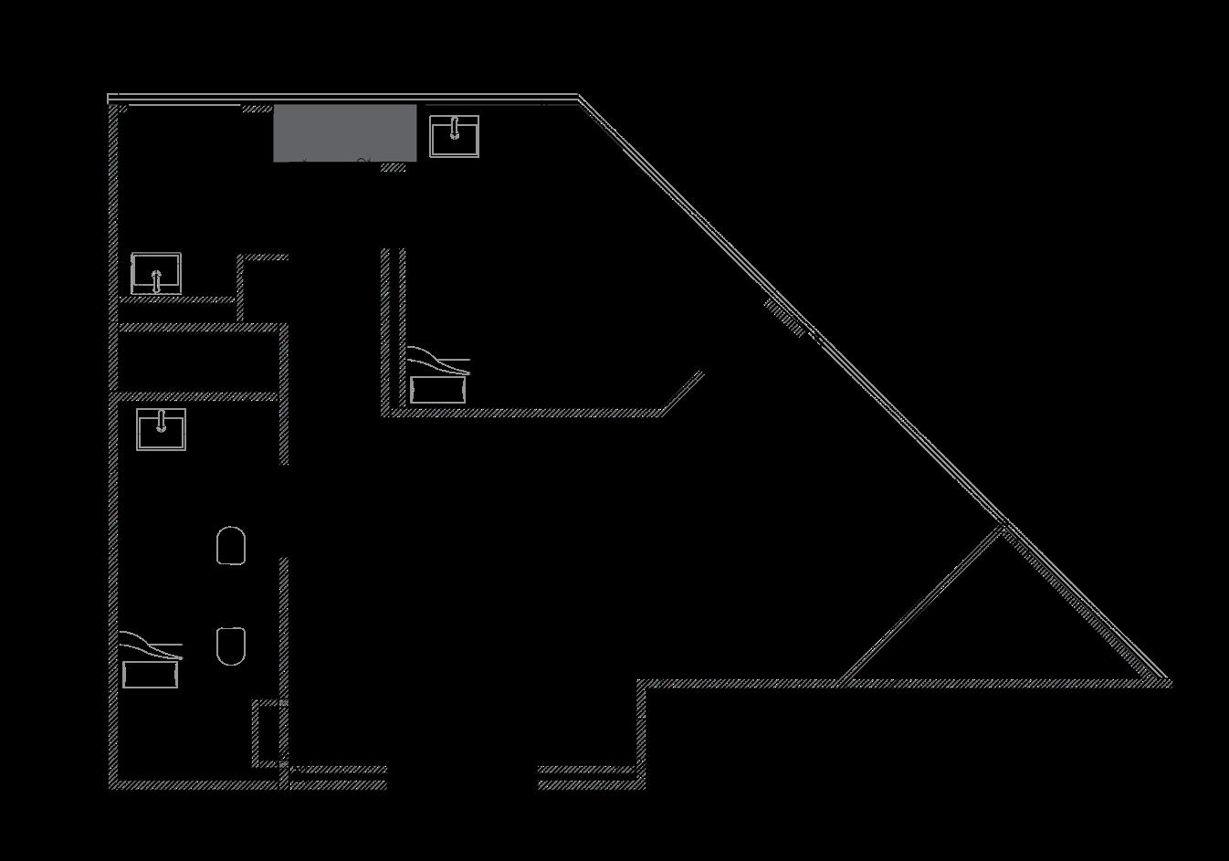
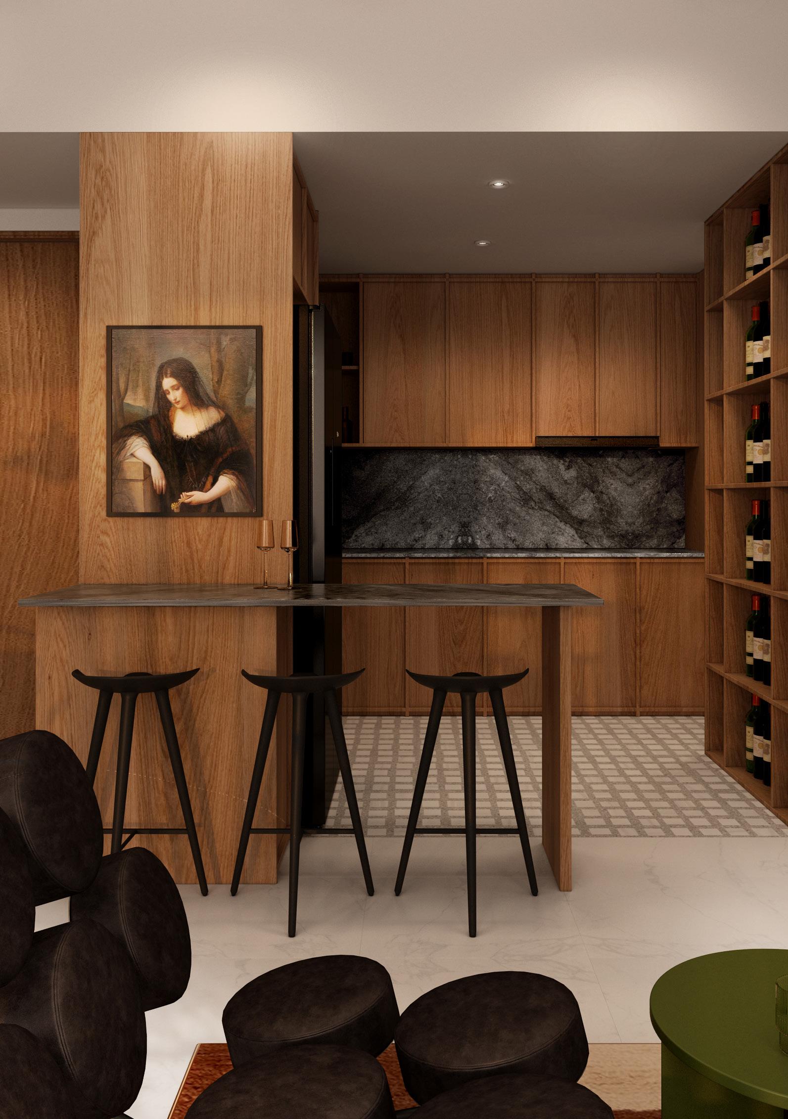
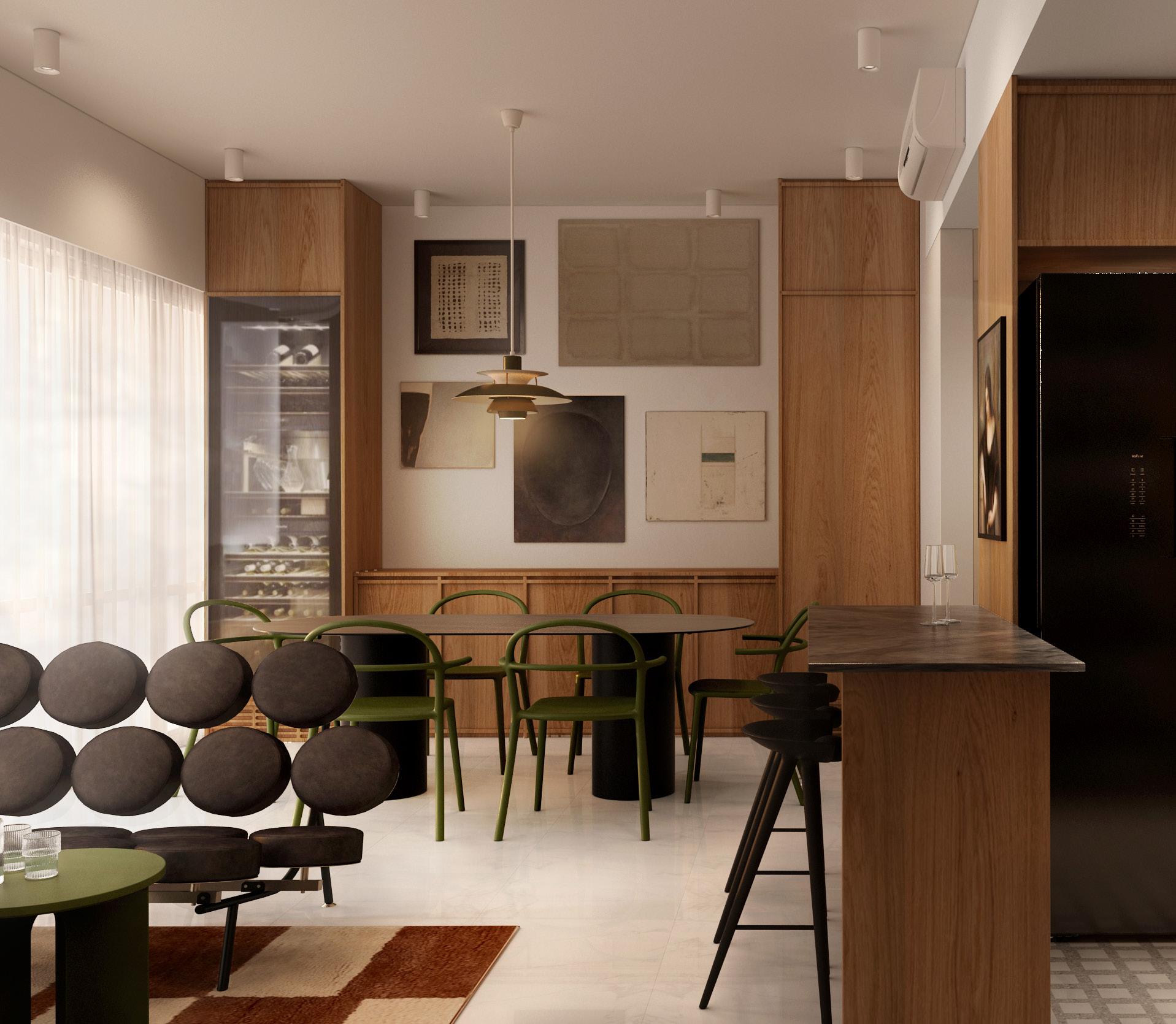
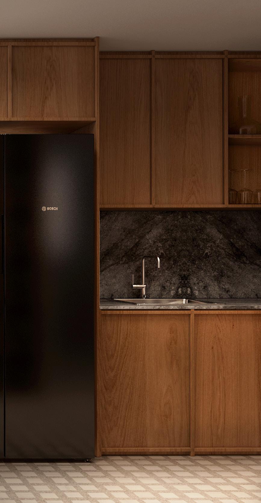
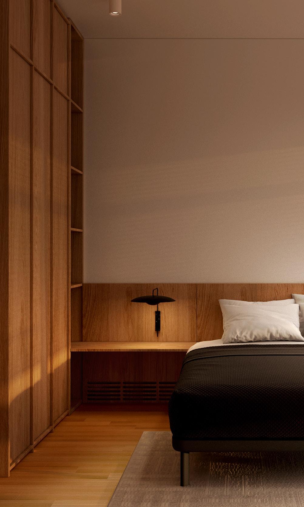
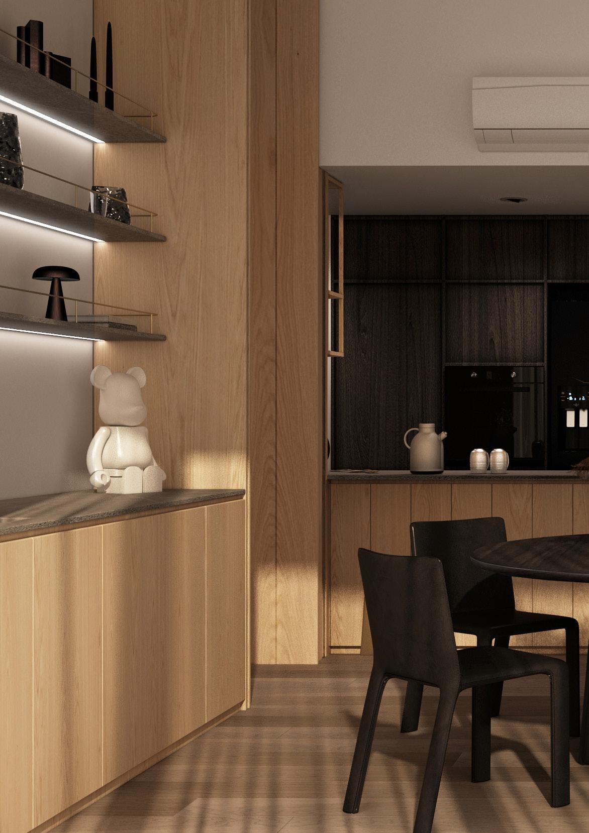
The condo is given a mid century rustic concept to highlight certain designer furniture pieces of the client and to enhance ella’s favourite shade of green selected furnitures with matching mid wood toned laminate that’s casted around the spaces. Matching with the warmth and coziness of the wood, shades of greys are infused in the material palette to diffuse and neutralise the space. The space is then further detailed with trimmings and perforations to bring depth and shadow to the works of carpentry bodying the space.
55 RESIDENTIAL CONDO
AT TANGLIN
56
57 BELMOND GREEN
58 TANGLIN
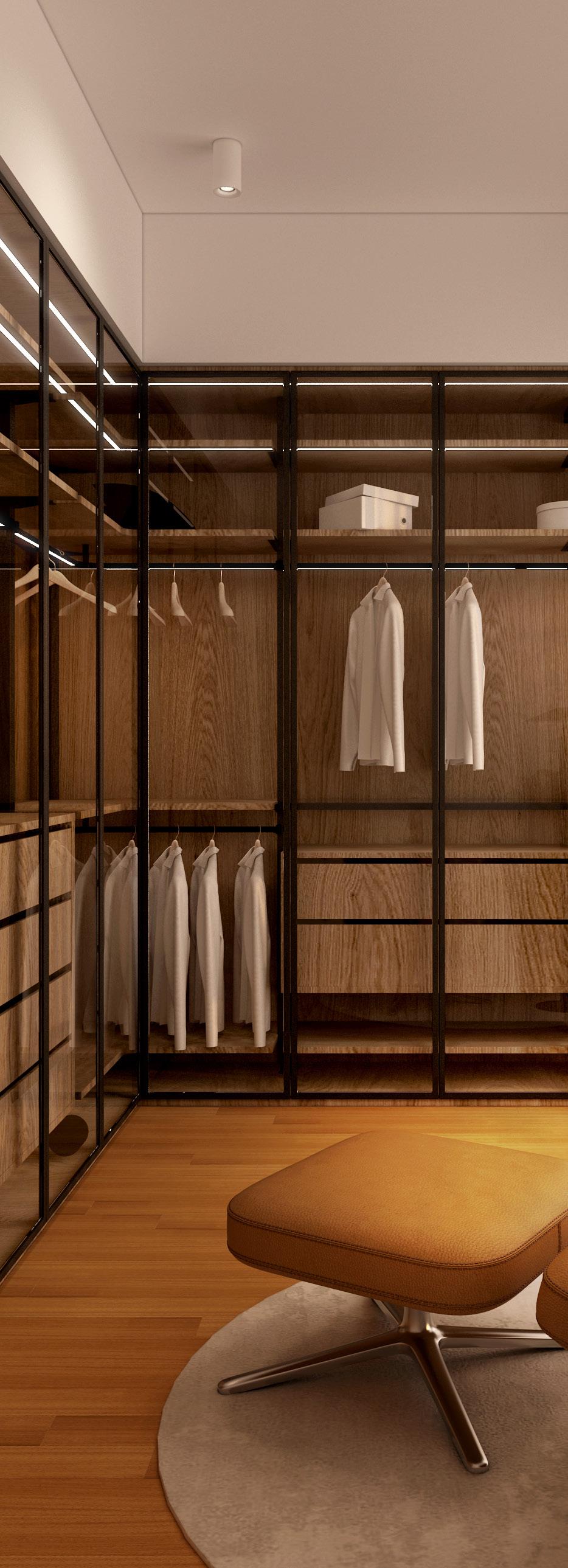
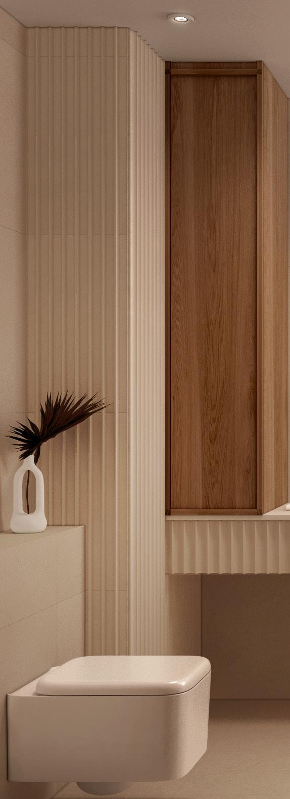
59 BELMOND GREEN
The layout is given an openess of visual connection especially in the common areas. This creates a sense of a bigger space as a whole, allowing acts of different users to simultaneously play and be seen. This openess allows more free flowing circulation and transition from the common and private spaces to be evident yet seamless.

60
TANGLIN
RIVERSAIL
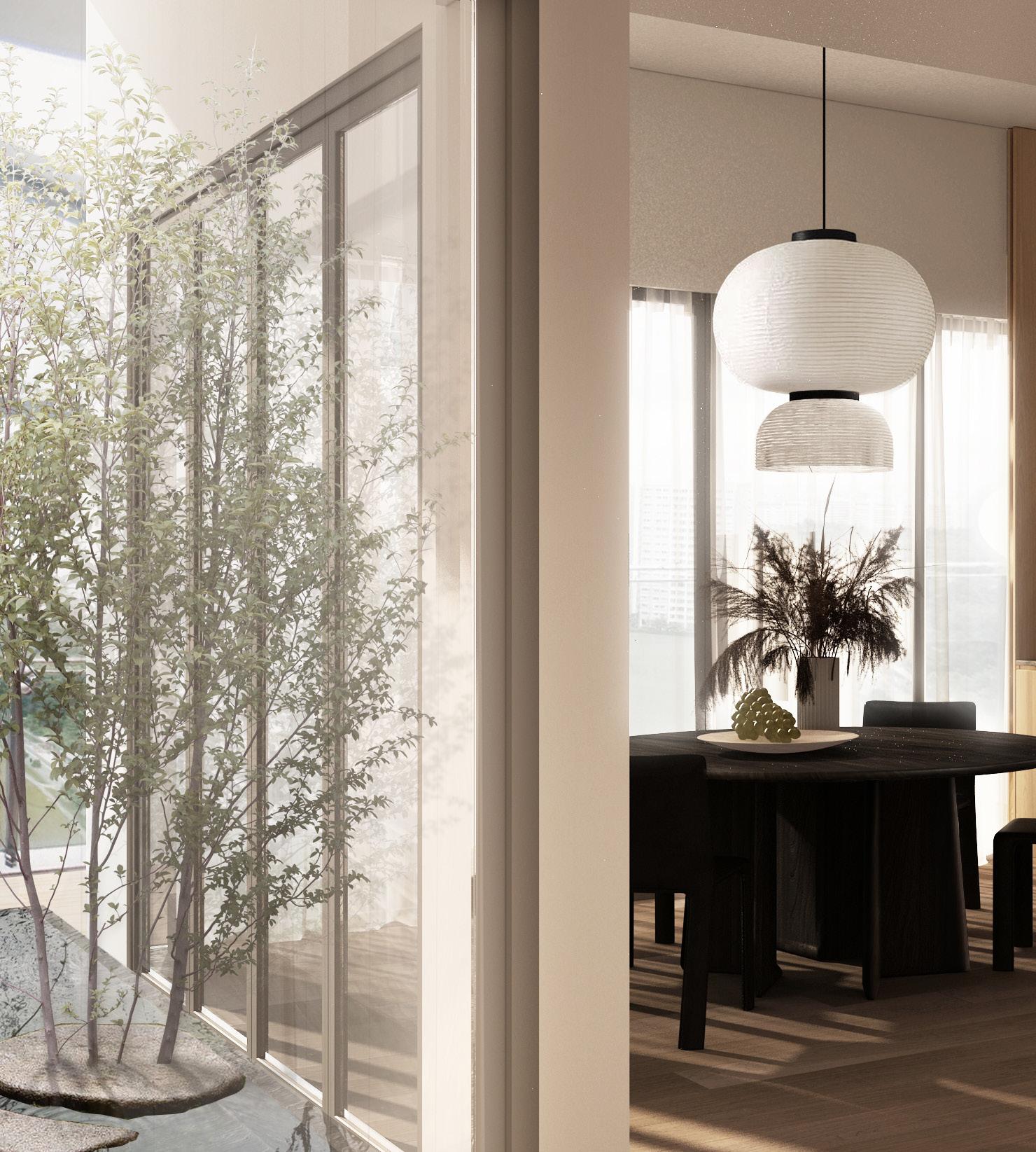
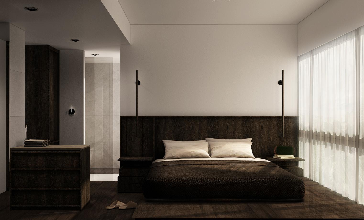
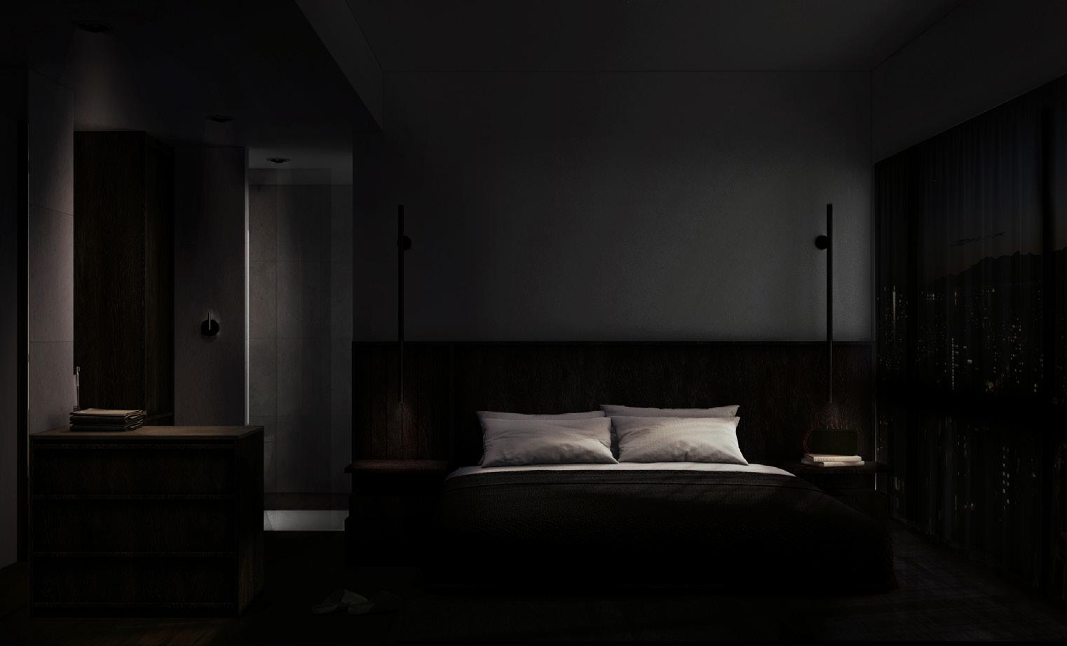
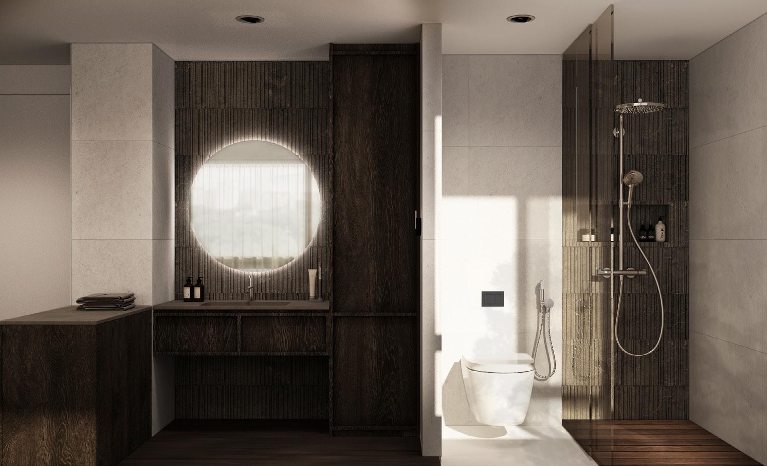
This unit’s approach and lifestyle is geared more towards japandi conept. Thus, a sense of lightness is induced through the warm light shade of wood in contrast with the dark black wood. As the space is bestowed with an open patio that sits between the living and kitchen area, this allows light to filter the space, basking warmth and stillness into the space. The room is given a contrast to the lightness of the common areas and plays the notion of ‘in praise of shadows’ duality of darkness.
61 RESIDENTIAL CONDO AT SERANGOON
62
63 RIVERSAILS

64 SERANGOON
65 RIVERSAILS

66 SERANGOON
SENGKANG WAY
Blues , green, red, - a spin-off of De Stijl is played in the concept of this space as to capture the eclectic and quirky nature of the clients, With white being the main canvas of the space, shades of the primary colours are instilled in the spaces in blocks.
67 RESIDENTIAL HDB
SENGKANG
AT
68
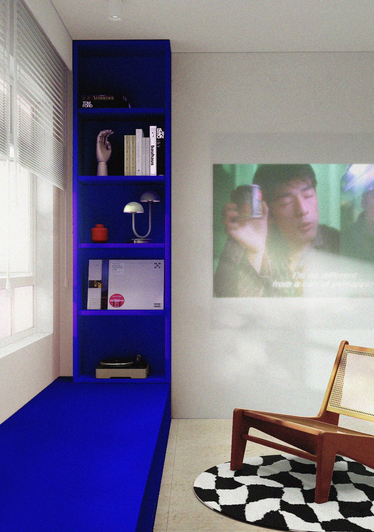
Upon entering the space, they are greeted by this cinema wall in indigo blue. This blue then cascades to the platform in the living area whch stages the projector and entertainment area. Hints of yellow are then speckled through fixtures. These yellow are then carried to the rooms and the continous link of the spaces and colours continues.


69 SENGKANG WAY
The spaces are connected through the recurring colours that link. With one main colour as prominent and the other as accent through furniture features.


70 SENGKANG
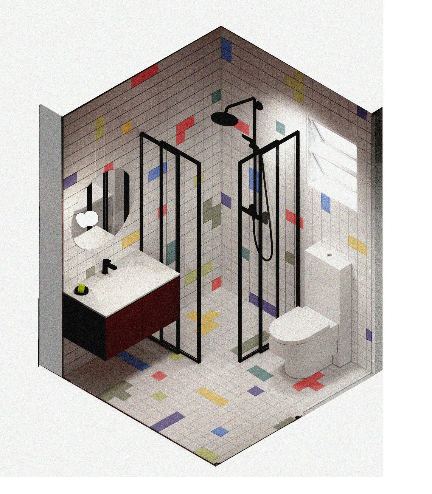
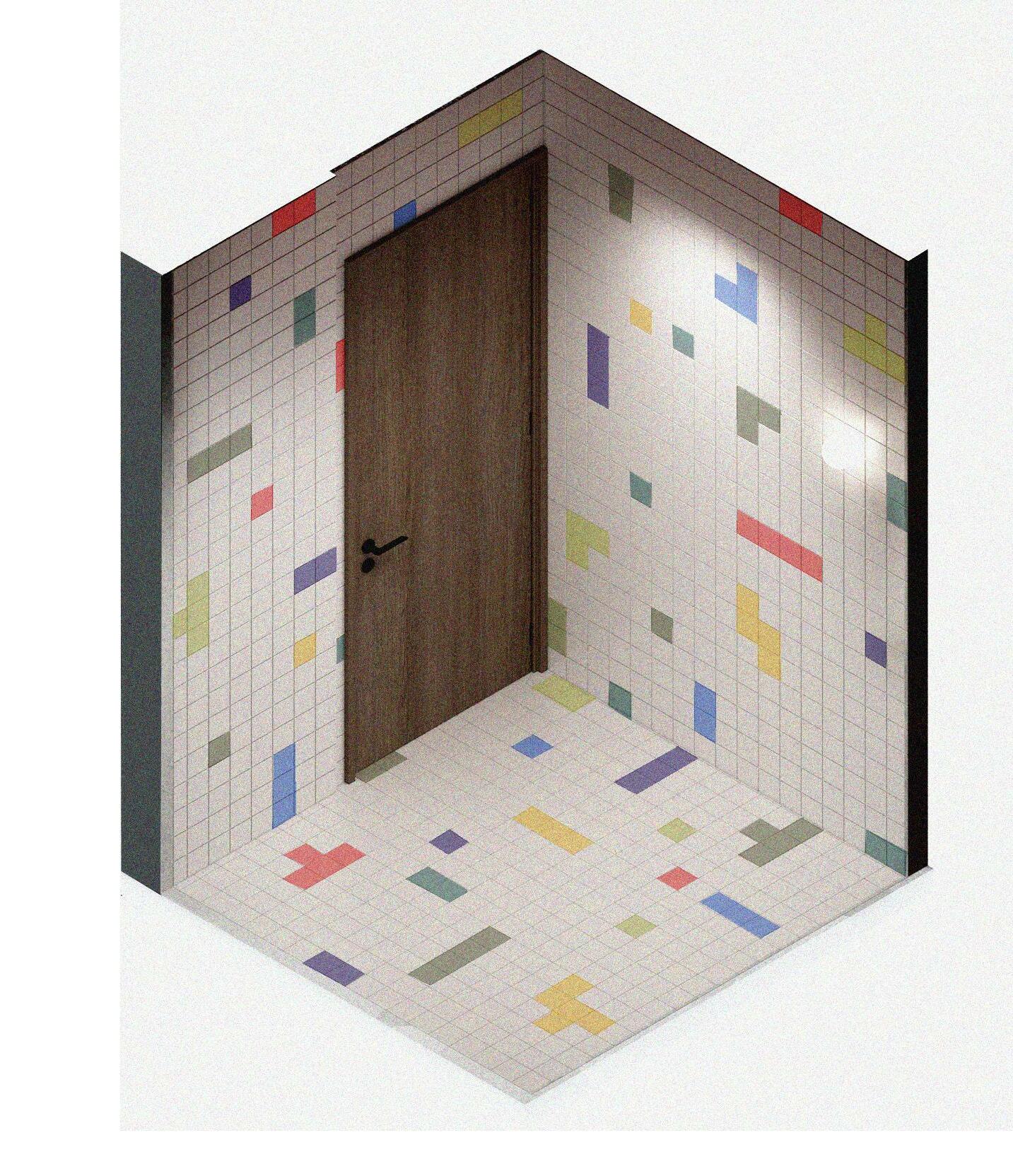
The toilets are given a playful concept of tetris - as if the pieces of puzzles are almost at play and falling. Coloured screens were also explored in this area for more visual sensory.
71 SENGKANG WAY
The kitchen as the lime green striking across with accents of the indigo peeking through groutings and fixtures.More quirkiness is instilled through odd and non uniformed wood cut out handles, spanning across the cabinets.

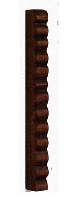
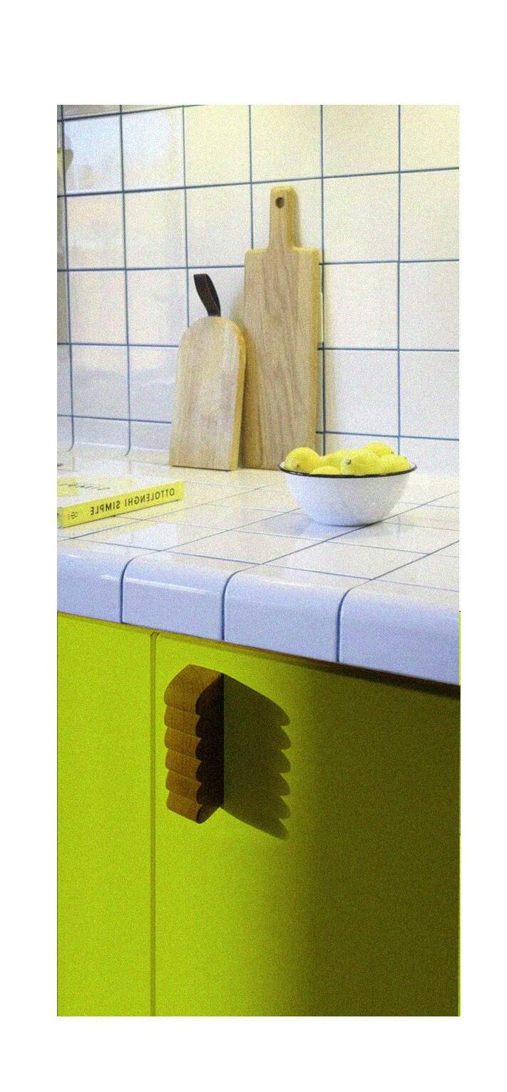
72 SENGKANG
ESTERIA
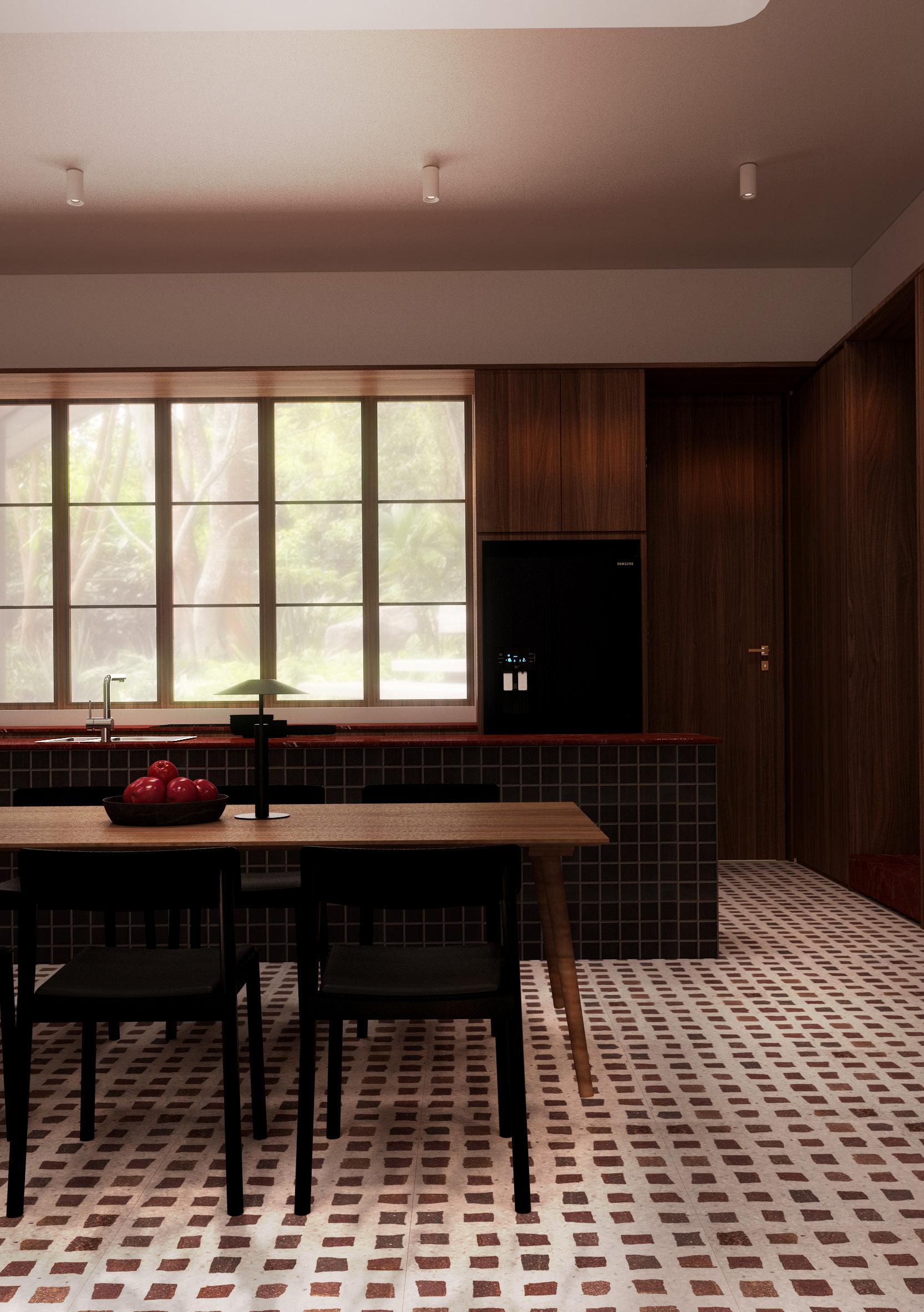
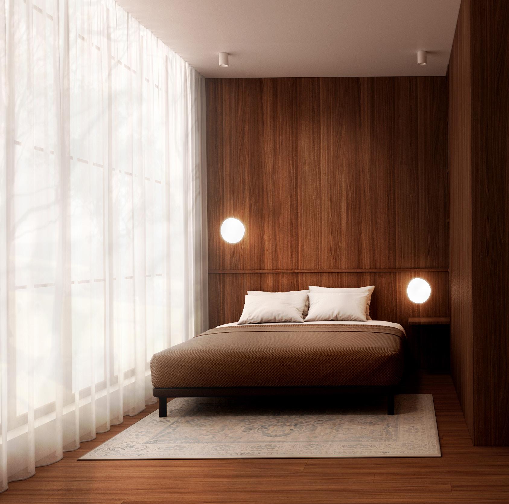
Warm dark wood with the accent of brick red. The home welcomes its dweller in a cozy embrace of skylight and the warmth oozing from its materiality. To give a flare hints of red is accented throughout to bring a luxurious yet harmonious detail to the space. The spaces are then furnished in matching dark aesthetics of the house to evoke a richness - weighing between the nostalgia and modern of the mid century modern concept.
73 RESIDENTIAL LANDED
74
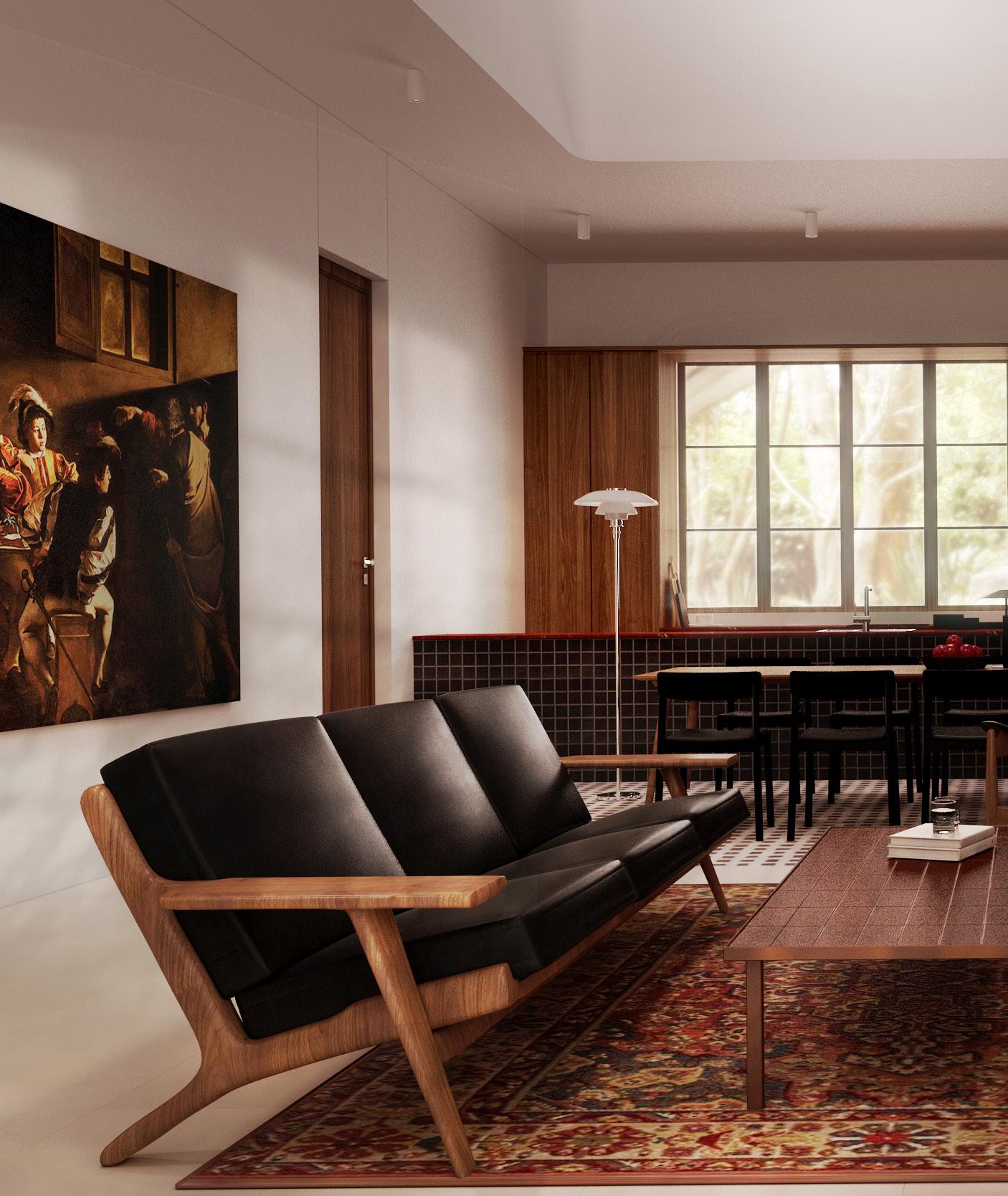
75 ESTERIA

76 INDIA
77 ESTERIA


78 INDIA
