C z CAPIz CAPI zAP I zCAP I
ByRenGuiman
Baskerville: The Bridge To Modernity
Ren Guiman’s Creation
Dissecting The Baskerville Typeface
Ten (More) Facts About Baskerville
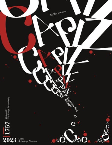
Capiz: A Heritage Nouveau
Ren Guiman’s Creation
Dissecting The Capiz Typeface
Capiz in Merch
Capiz Type Specimen Sheet
Baskerville
JOHN BASKERVILLE’S CREATION.
Baskerville, crafted by John Baskerville in 1757. John Baskerville designed the font to refine the style of old typefaces like “Caslon.” It emerged during the transitional phase between old-style and modern typefaces when readability for print was being perfected due to former density issues of older typefaces such as Blackletter. With John Baskerville’s perfectionist approach, it influenced the typeface’s design, resulting in sharp and crisp letterforms distinct from the more organic and calligraphic designs of the typefaces before it, it became less organic but not too straight such as those of modern typefaces. Notably, Baskerville found its place in various contemporary designs. It became a popular choice for elegant and formal documents. Beyond the written word, it has also made appearances in film, such as Ridly Scott’s “American Gangster” and Christopher Nolan’s “Interstellar,” as well as in diverse applications like film posters, book covers, and iconic campaigns such as Apple’s “Think Different.”
How the font was used.
Baskerville as a “transitional serif” conveys thinner serifs from that of old typefaces but not too thin to be classified under the modern typefaces. Its design showcases a pronounced contrast between thick and thin strokes. Notably, Baskerville introduces vertical stress in its letterforms, resulting in a more upright and geometric feel compared to older typefaces. Beyond its visual attributes, Baskerville carries connotations of elegance, formality, and refinement, often making it the choice for traditional and authoritative content, owing to its historical usage in classic literature and important documents.
Baskerville’s enduring appeal lies in its high contrast and sharp serifs, endowing it with a timeless quality that seamlessly straddles the realms of both classic and contemporary design, overall a neoclassical aesthetic.
American Gangster
The Baskerville typeface is named after its creator, John Baskerville.
John Baskerville was a printer, and typographer.
It was released in the 18th century, 1757 in Birmingham, England
Baskerville is connoted as an elegant, refined, sophisticated, and a sharp typeface.
Baskerville is a transitional serif typeface, sitting between old-style and modern serif classification.
Baskerville’s Unique “Q” has a long tail descending below its baseline makes a distinctive difference from other fonts.
It was created mainly to enhance and ease printing techniques due to the density issues from former typefaces such as Blackletter.
The typeface exhibits thinner serifs in comparison to old typefaces but not too thin and less organic to be classified under modern typeface.
Baskerville’s timelessness became an editorial favorite in editorial designs such as newspapers, magazines, and academic journals. Beyond written word, it has made appearances in films, such as Ridley Schott’s “American Gangster” and Christopher Nolan’s “Interstellar.”
C C C C C apiz
A Heritage Nouveau
Capiz
Capiz
023 3 3 4 6 9 9 1 7 8 5 5 5 2 2 2 2 2 0 0 2 6 6 0 4 4 1 1 0 2 2 8 9 4 3 3 7 7
When it comes to the inspiration behind the birth of this typeface, the designer emphasizes the enchantment of Vigan, Ilocos Sur, considering it a marvel, akin to a relic in the nation. Capiz, or oyster shells are commonly used as window panes holds a significant role in Philippine culture, particularly within the colonial architecture of the houses in Vi gan, Ilocos Sur.
Capiz
shells were employed as a glass alternative due to their unique translucence and durability. The intricate details within the interiors, the patterns of furniture materials, and the aesthetics seen in the details of the architecture, more particularly the craftsmanship of the capiz windows, served as a profound element of inspiration.
Capiz, a cultural gem.
Embedded within the Capiz typeface captures the essence of elegance and intricacy, reminiscent of the art nouveau movement, a personal favorite. The goal was to craft a font that exudes these connotations while authentically representing the identity and composite to the cultural gem of capiz in the Philippines. Reflecting these very charactetristics, The Capiz font embraces the roundness of the patterns seem emanate from the stem of these shells creating round organic wave like patterns especially when seen illuminated, and the thickness in its geometric design embodying the durability of the material’s usage.
The display typeface
Capiz being a dis� play typeface is recom� mended for such purposes, particularly for creative, bold, and decorative applicatinos such as titles and headings. The thick stems and curls in the typeface may pose the need for specific and detailed attention to the proper use of vertical spacing to ensure legibility.
Capiz shells are abundant mollusks found throughout the Philippines. Not only are the shells used for crafting window panes but the meat within these oyster shells is edible.
This versatile resource is also employed in creating various pieces of furniture, including chandeliers, lanterns, jewelry boxes, trays, and ornaments such as Christmas parols, making it a vital part of Filipino culture and craftsmanship.