We crafted a comprehensive brand bible meticulously centred on the essence of their brand mark. This detailed guide serves as a roadmap, encapsulating bit58’s unique identity, values, and visual elements, ensuring consistency and coherence across all their communication channels.


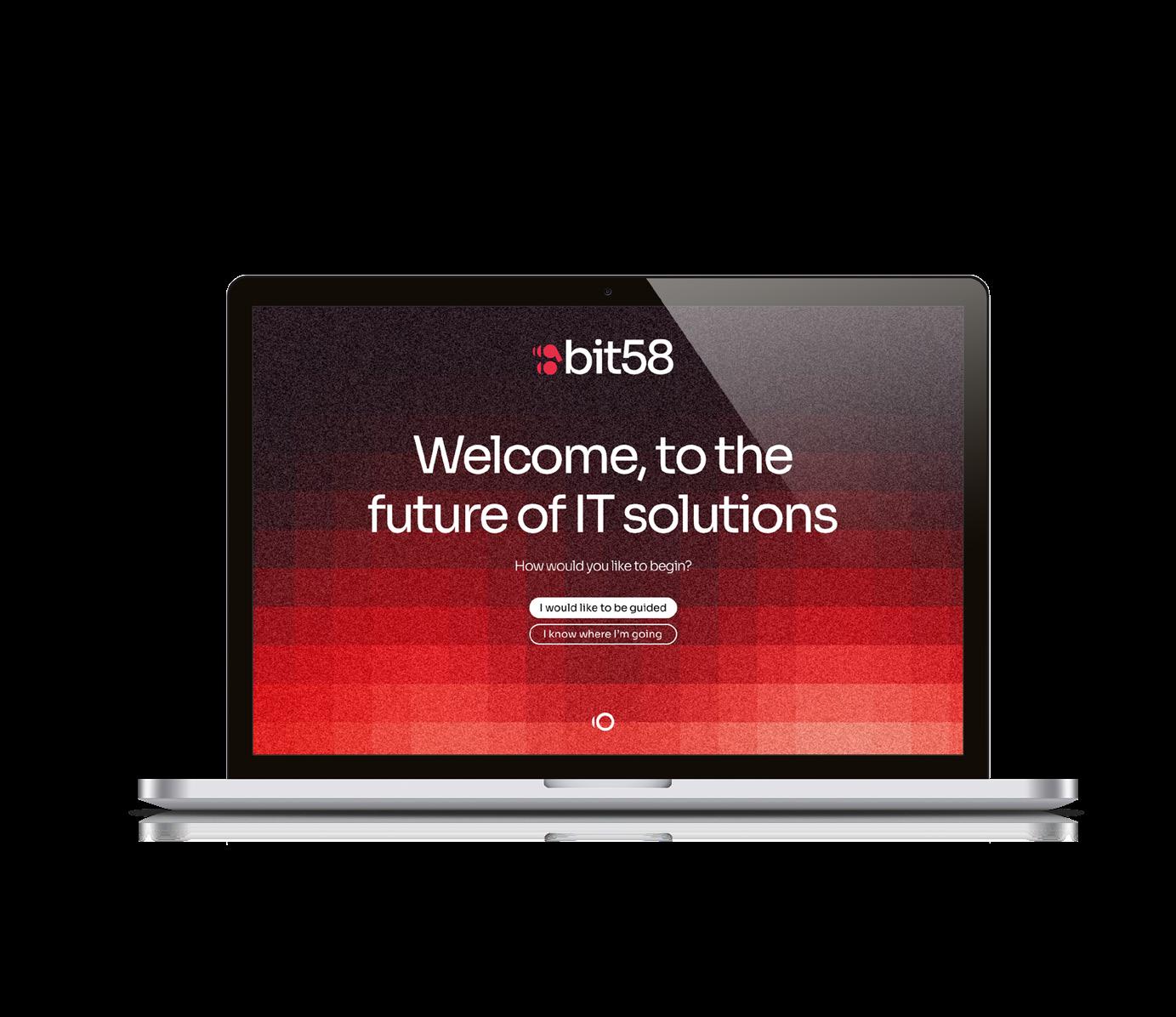
Additionally, we designed a bespoke website tailored specifically to showcase bit58’s extensive expertise in IT services. Through strategic layout, captivating visuals, and intuitive navigation, the website serves as a powerful digital platform, effectively communicating bit58’s strengths and capabilities to their target audience.
A Brand Purpose Workshop session was conducted with the team, to give us the foundations on which to build. Armed with the brand values, mission, vision, and purpose, we explored a range of options, with the final choice made by the client being the most positive and modern expression: codeBeam.
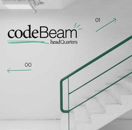
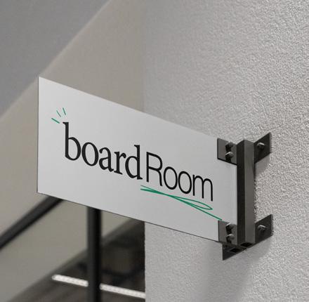
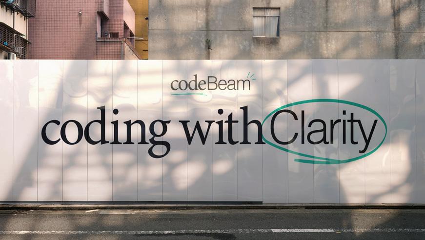
Using playful hand drawn illustration flourishes, we embellished the type mark to give energy and a youthful vibe. The codeBeam design philosophy was born from the need to visually represent the strap line ‘coding with clarity’.

The minimalistic approach to the design strips the unnecessary from the necessary and replaces it with hand-drawn scribbles that add an organic element to the brand.
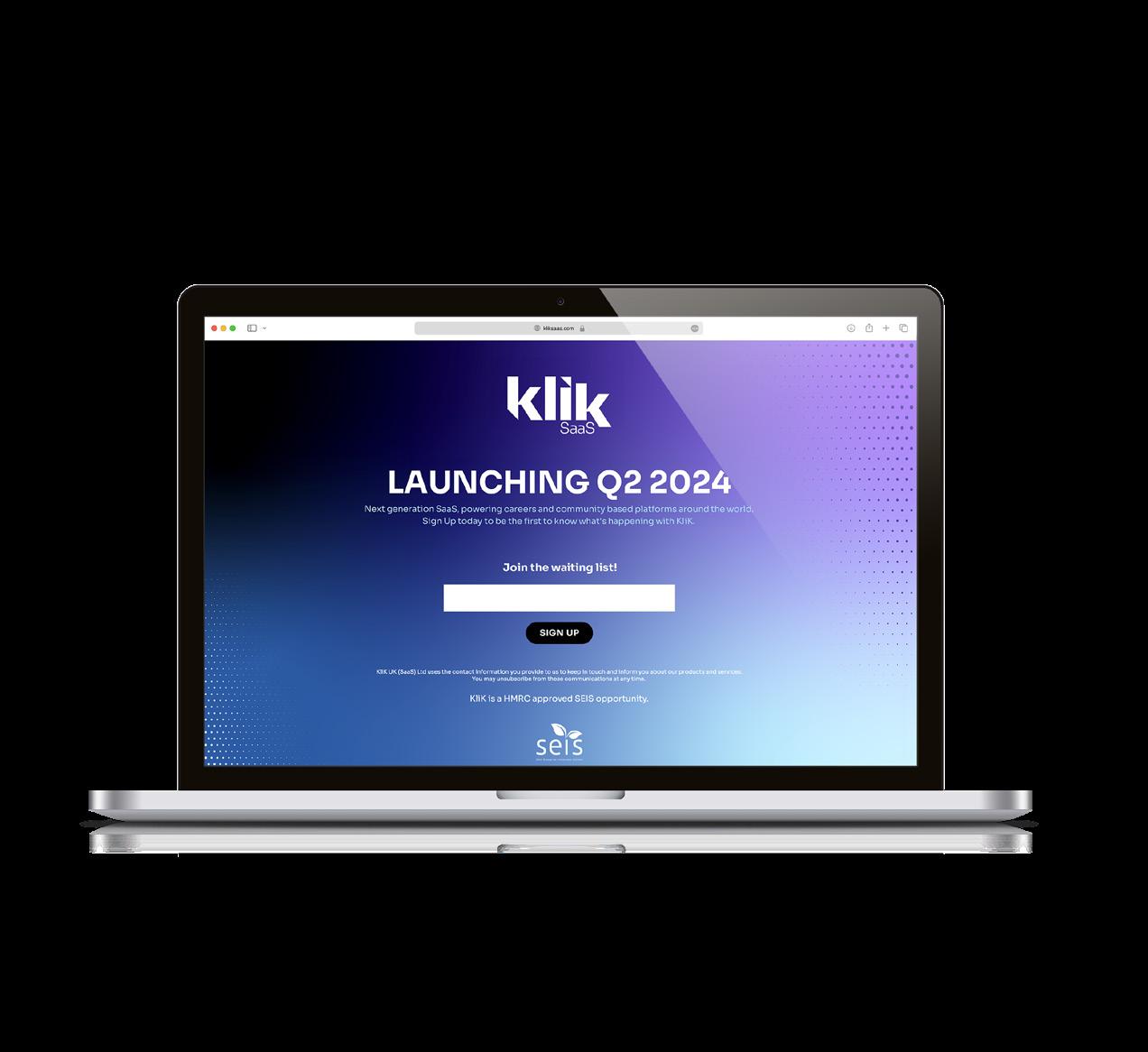
Embarking on an ambitious journey to redefine connectivity within digital spaces, we were tasked with the challenge of creating the KLIK brand from the ground up.
Our approach was holistic, beginning with a deep dive into the target market’s needs and motivations, which informed the development of a brand identity that resonates on both an emotional and functional level.
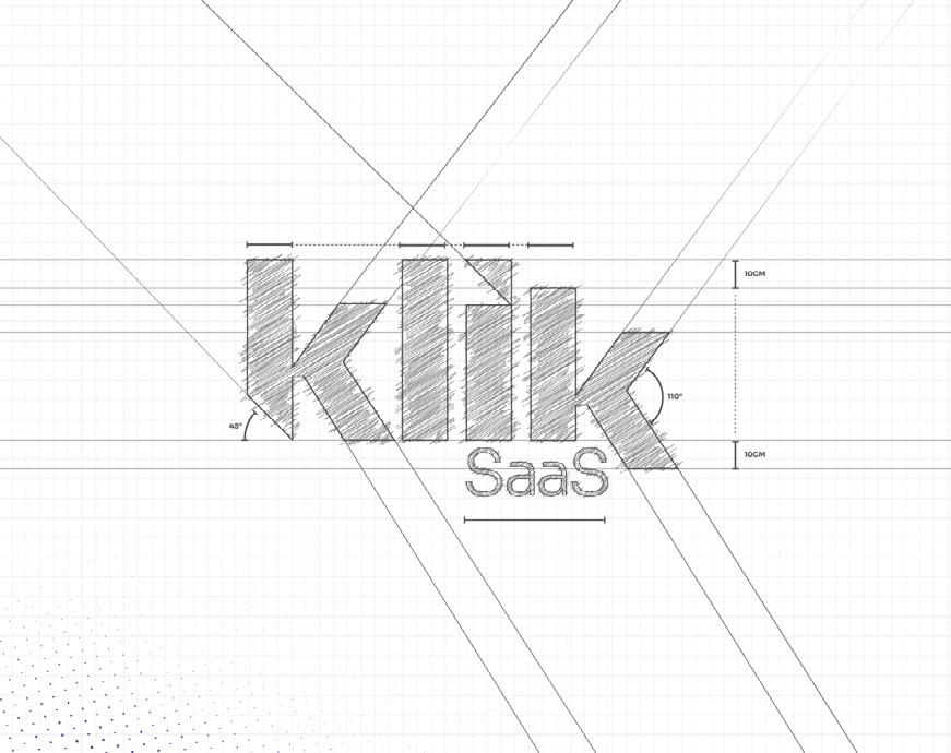
By delving deep into the essence of the Klik brand, we developed a comprehensive brand bible that encapsulates its core values and visual identity for future initiatives. Following this, we crafted a hypermodern website, meticulously designed to showcase Klik’s SaaS offering effectively.

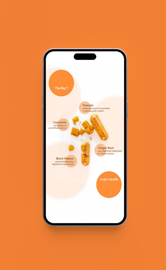
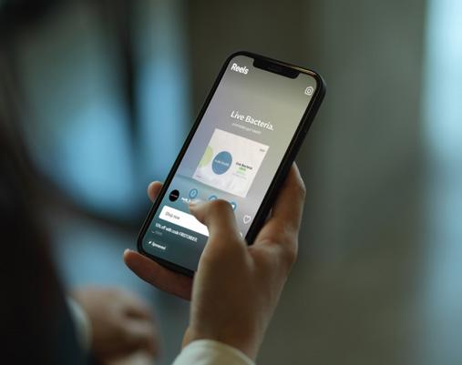
Nude Health wanted to enhance brand visibility, engagement, and conversions through a strategic, multi-platform advertising campaign executed across Google, Meta, and Taboola.
The campaign utilised a mix of ad formats, including reels, carousels, and static ads, featuring various creatives such as on-brand content and product showcases.
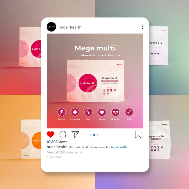
We executed a detailed and strategic multiplatform advertising campaign designed to maximise brand visibility, engagement, and conversions. Our approach included crafting and deploying a range of ad formats and creatives tailored to resonate with their target audience. The campaign leveraged advanced targeting algorithms and comprehensive keyword strategies to ensure optimal reach and impact
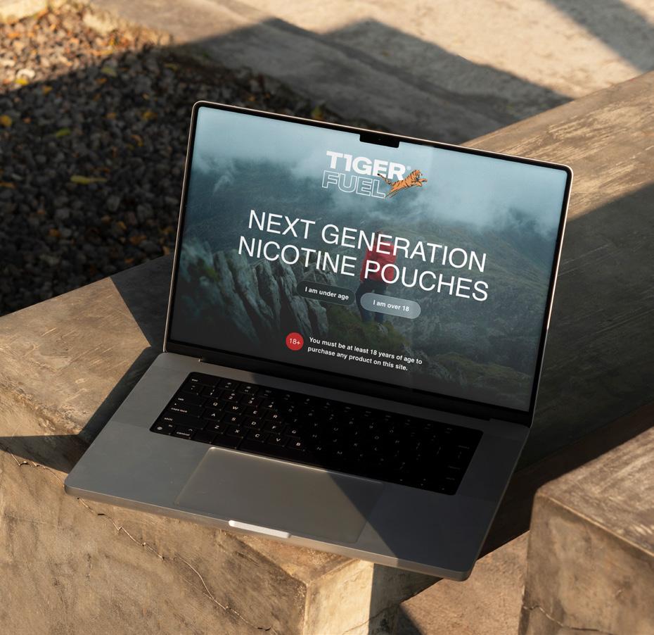
T1ger Fuel are driven by a simple purpose, to help others kick the habit of vapes and cigarettes. Their founder is on a mission to give everyone the ability to become smoke-free.
Our primary goal was to establish T1ger Fuel as the preferred brand for nicotine pouches among their target audience, creating heightened brand awareness and driving conversions.
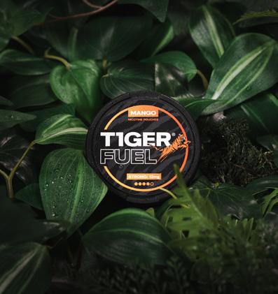
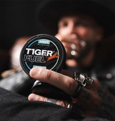
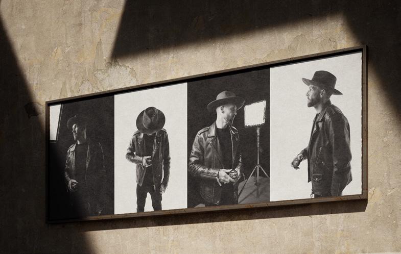
With a focus on the core logo, our team crafted a cohesive suite of brand assets tailored to each touchpoint, ensuring consistent and impactful brand representation.
The launch of the full ecommerce website has provided customers with a seamless online shopping experience, driving sales and expanding the brand’s reach. With a cohesive blend of creativity and strategy, T1ger Fuel has emerged as not only a purveyor of quality products but also a source of inspiration in its industry, poised for continued growth and success.
This comprehensive project involved redesigning their logo, creating brand icons, updating social media assets, and crafting brand guidelines to ensure consistency across all touchpoints. Additionally, we revitalised their vehicle wraps, brochure designs, and corporate ID assets to reflect their refreshed image.
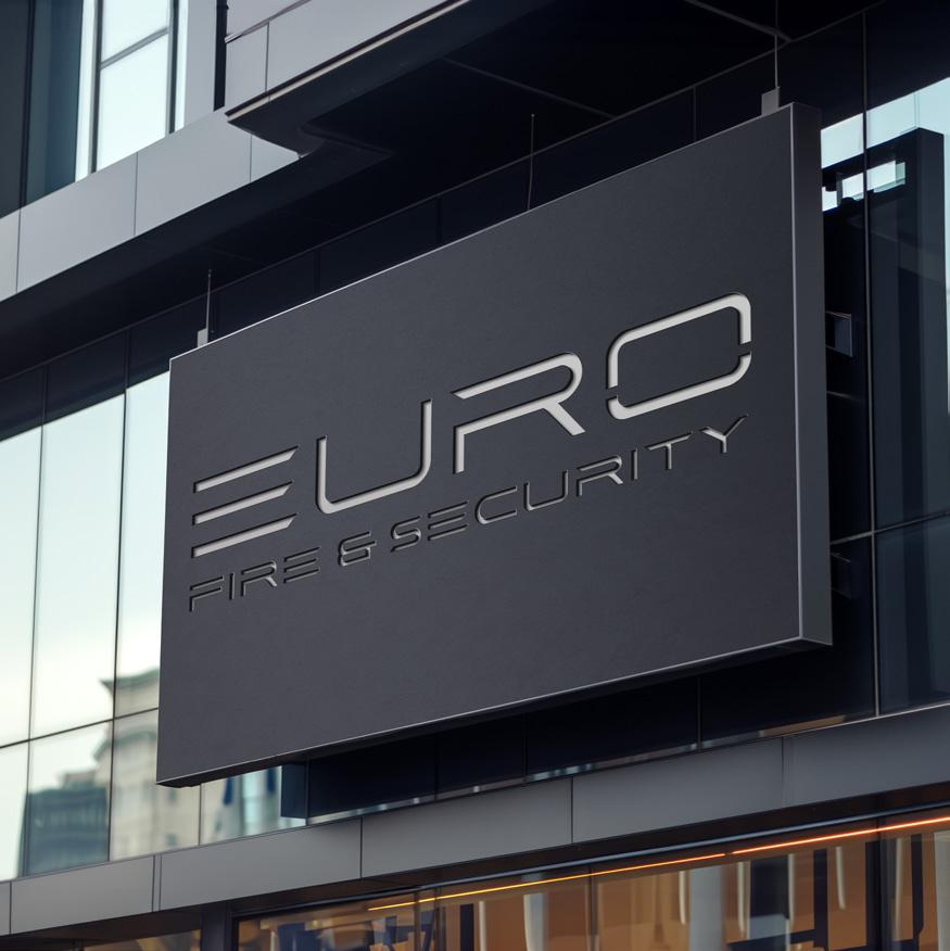
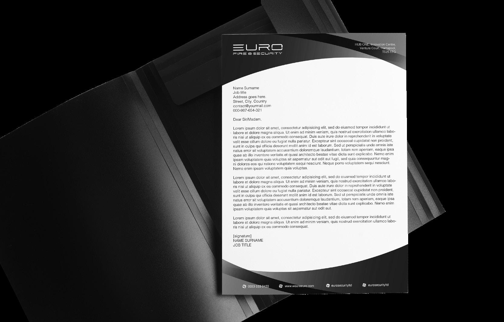
Through this brand update, Euro Security now stand poised to continue its tradition of excellence with a contemporary and captivating visual identity.
By modernising their logo and associated assets, we’ve ensured that the brand reflects their commitment to innovation and reliability in the security industry.
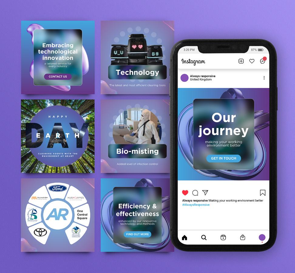
We rebranded Always Responsive through a Brand Purpose Workshop. The session included a cross-section of their team at different levels throughout the business, and we took them through different modules to get baseline data for our weighted index algorithm.
From there we defined and established their brand values, mission, vision, and purpose, which we then used as the guiding foundation to create the new brand mark and all other assets.The resultant brand has given them a moder-feeling, coherant feel across every touchpoint.
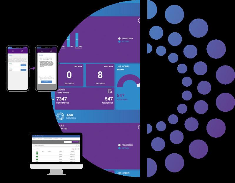
With the rebrand, we wanted to retain all of the good brand equity they’d already built, so we didn’t want to start with a blank sheet: evolution not revolution, and at it’s core it needed to reflect their new brand purpose: ‘no matter your workplace, we’re Always Responsive.’
The new brand is a sympathetic evolution from their old A&R Services, doing away with the ampersand, and replacing ‘Services’ with the more descriptive ‘Commercial Cleaning’.