Brand Guide

My project consists of developing a magazine (digital and print) focused on legends, paranormal stories, science fiction, and popular myths of Canada, with the aim of promoting Canadian culture and offering new immigrants an opportunity to learn about the traditions and stories that form part of the country’s identity, many of which are unknown to those who have just arrived. The magazine will feature stories based on local culture and in the public domain, allowing their use without the need for copyright permissions. Additionally, it will include a special
section where the best stories submitted by “readers” from diverse cultures and backgrounds, both temporary residents and citizens, will be published, promoting integration and connecting the cultural diversity of Canada.
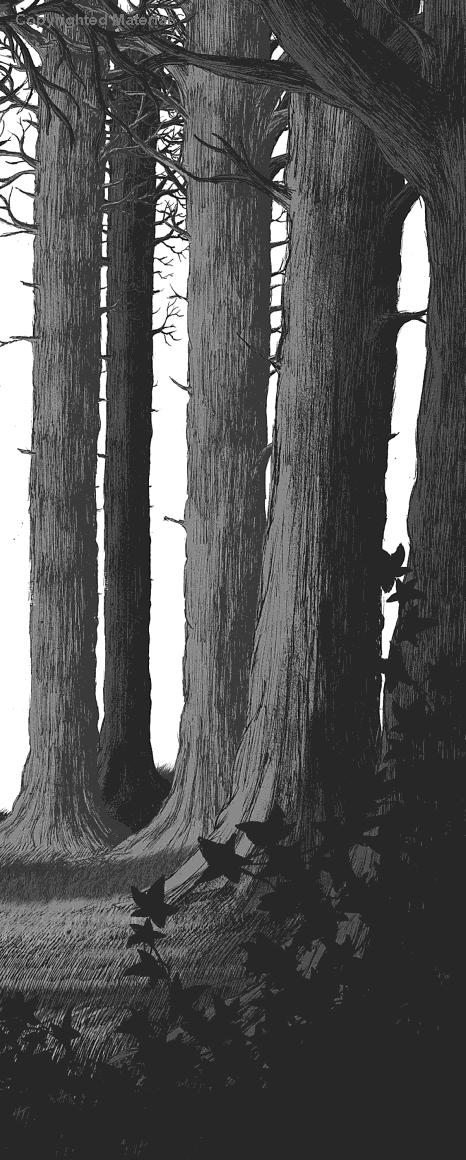
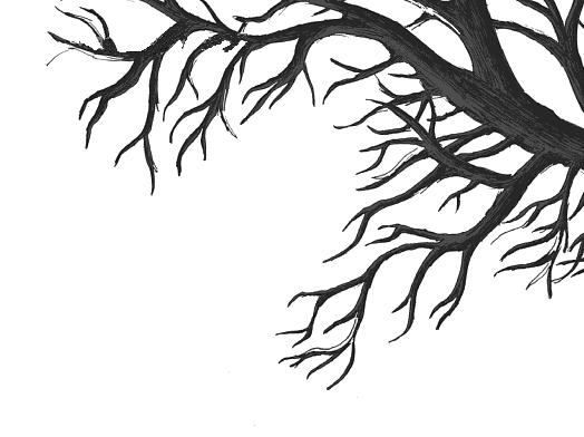
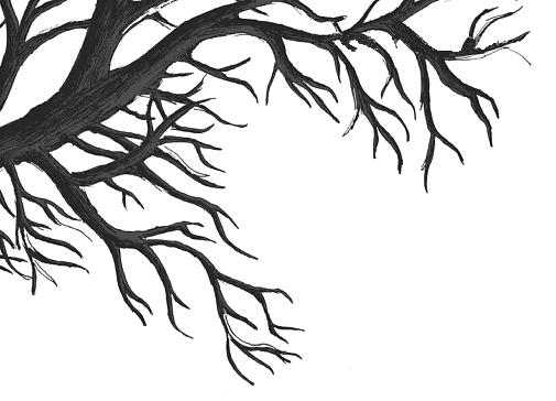
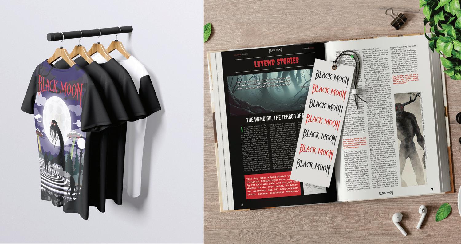
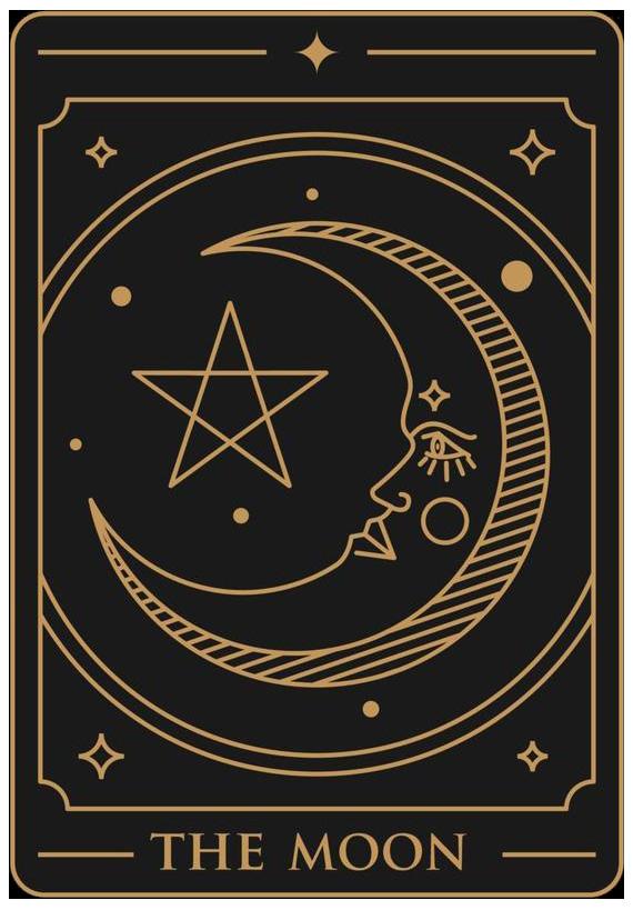
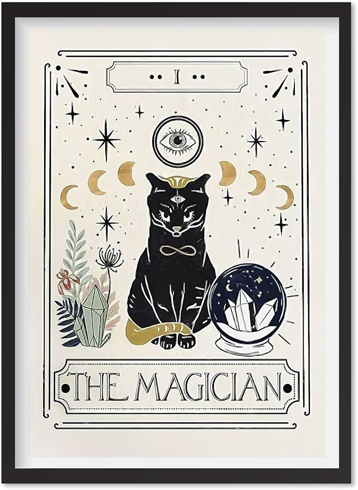
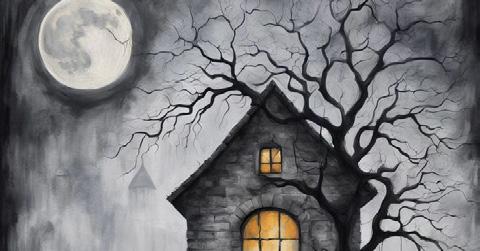
Illustrations and photographs will be used to complement the stories, creating an atmosphere of tension, suspense, and mystery to capture the readers’ attention and enrich their experience as they immerse themselves in these tales.
The tone of voice in writing is the way the author conveys their attitude and intentions through words, grammar, syntax, and overall approach.
In this magazine, a mysterious and suggestive tone will be used, leaving room for the reader’s imagination and contributing to the creation of suspenseful and psychological horror atmospheres. Additionally, a narrative
that alternates between the first person (I, we) and third person (he, they, she, etc.) will be employed to enrich the reading experience.
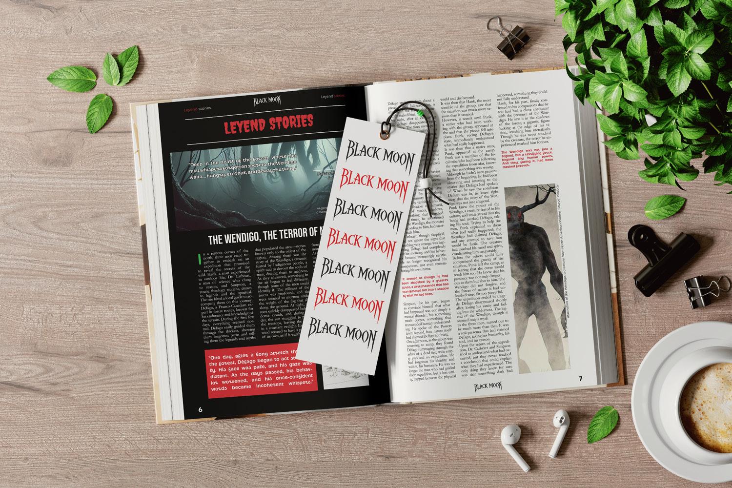
In cases where the illustrations are particularly dark, the text will be rendered in white or red to create a contrast that ensures readability against the background.
Additionally, in certain cases and when the background allows, light reflections may be added to the logo to enhance the atmosphere and improve its visibility.
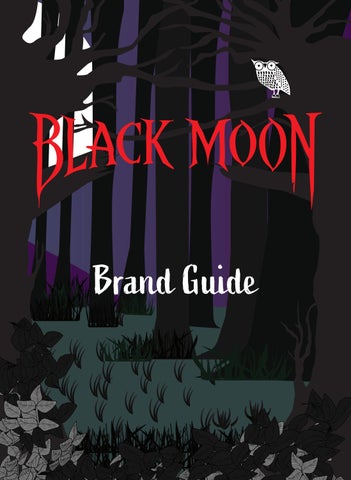
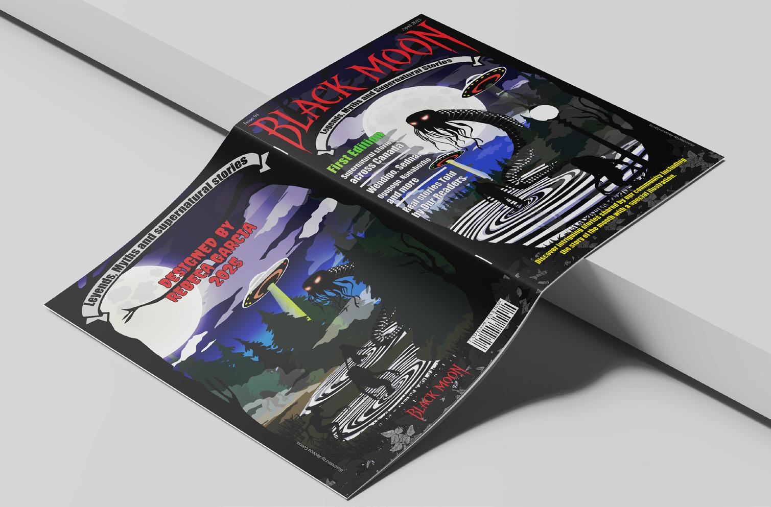
In many cases, such as on the cover of this edition, the logo is presented alone, without the illustration of the moon. This is because the cover includes several elements, and in order to maintain the visual balance of the magazine, only the “Black Moon” lettering is used. These can be implemented in any of the authorized colors from the palette, with the aim of contrasting appropriately with the various backgrounds used throughout the magazine.
The moon logo can be used in situations where advertising requires it to identify the brand. The crescent moon logo maintains the same visual language as the Black Moon logo, as it shares the irregular edges and a shape that evokes the image of flowing blood.
On the other hand, modifying the color of the logo will not be allowed, except for the five authorized colors, as any alteration would compromise the essence of the magazine, giving it a more childish appearance. Rotating the logo or placing solid color blocks in the background
to create contrast will also not be permitted, as various versions of the logo in different colors have been approved for this purpose. Finally, the original design must not be altered into a two-line format, as this completely disrupts the distinctive curvature of the logo.
The colors selected for the magazine’s color palette are bright and contrasting tones that stand out against gloomy and dark environments. Since this is a magazine with horror content, the atmosphere and illustrations will mostly consist of dark and neutral tones, such as black and white. Therefore, vibrant colors will be used to highlight key elements like titles and other graphic resources, in order to create contrast and establish a clear visual hierarchy in each story.
1.-#FFFFFF(White):
This color is used to ensure clarity and contrast in visual elements, especially when highlighting the logo and improving readability on dark or detailed backgrounds.
2.- #EE2228 (Bright Red): This red tone evokes intensity and danger, reflecting emotions such as fear and alertness. It is associated with suspense and psychological horror, key elements in the magazine’s stories.
6.- #69BD45 (Vivid Green): This green represents life and vibrant nature but can also symbolize uncertainty or threat in supernatural contexts. This color was selected to contrast and highlight elements like titles, among others.
7.- #FCEE25 (Bright Yellow): It is a striking, energetic, and highly visible color, which is why it is often used to highlight important elements, warning signs, editorial design, and advertising.
8.- #000000 (Black): Black is the color of darkness and void, essential for creating strong contrasts and generating an atmosphere of suspense and mystery.
Horror-style typography, to highlight the mysterious and terrifying character. Its slightly distorted appearance and angular shape evoke a sense of the supernatural and macabre, aligning with the central theme of suspense and psychological horror. When used for the titles, it creates a strong first visual impression, immediately capturing the reader’s attention.
A modern sans-serif typography with thick strokes, ideal for subtitles due to its readability and visual impact. Its use in subtitles maintains a balance between the traditional and the modern, helping to effectively guide the reader through the content.
It is a sans-serif typography that conveys dynamism and modernity. It is clear and easy to read, making it an excellent choice for subheadings. Its simple and direct style complements the more ornamental fonts of the titles and subtitles, ensuring that the visual hierarchy is clear and that the subheadings stand out without being too overpowering.

Aorem ipsum dolor sit amet, consectetur adipiscing elit. Sed do eiusmod tempor incididunt ut labore et dolore magna aliqua. Ut enim ad minim veniam, quis nostrud exercitation ullamco laboris nisi ut aliquip ex ea commodo consequat. Duis aute irure dolor in reprehenderit
in voluptate velit esse cillum dolore eu fugiat nulla pariatur. Excepteur sint occaecat cupidatat non proident, sunt in culpa qui officia deserunt mollit anim id est laborum.
Vestibulum ante ipsum primis in faucibus orci luctus et ultrices posuere cubilia curae; Integer id orci sed orci vehicula dictum. Nullam imperdiet nisl in ligula consequat, quis interdum nunc sagittis. Ut id arcu ac odio luctus viverra. Nulla facilisi. In hac habitasse platea dictumst. Suspendisse potenti. Maecenas ultricies, arcu a fermentum laoreet,
Lorem ipsum dolor sit amet, consectetur adipiscing elit. Sed do eiusmod tempor incididunt ut labore et dolore magna aliqua. “ Ut id arcu ac odio luctus viverra. Nulla facilisi.” quis nostrud exercitation ullamco laboris nisi ut aliquip ex ea commodo consequat. Duis aute irure dolor in reprehender.
Excepteur sint occaecat cupidatat non proident, sunt in culpa qui officia deserunt mollit anim id.
Lorem ipsum dolor sit amet, consectetur adipiscing elit. Sed do eiusmod tempor incididunt ut labore et dolore magna aliqua. Ut enim ad minim veniam, quis nostrud exercitation ullamco laboris nisi ut aliquip ex ea.