RAZELLA FREEMAN PORTFOLIO
CONTENTS STUDIO WORK 01 FALL 2021 SPRING 2022 CASE STUDIES 02 1ST YEAR 2ND YEAR FALL 2021 1ST YEAR 2ND YEAR FALL 2022 SPRING 2023 FALL 2022 ARTWORK 03 2019 - 2021
ROOF PLAN
SCALE: 1/32” = 1’-0”
The core concept of my boarding house is linearity and thinness as opposed to playfulness, both in terms of the form as well as the elevations. This is in combination with the experience of speed, that is, the visual impact of this building when driving past it. Formally, my project consists of two distinct, thin orthogonal bars that take up a lot of vertical space on the site. Both bars have a gridded façade that hits the ground and each room features double orientation, meaning that each unit will experience sunlight from both sides of the structure. The perfectly straight bar consists of two structures connected by a series of inhabitable balconies that function as a passage from private to public to create the illusion of a singular connected bar from a plan view. The first part of the bar is entirely residential aside from the first floor, meanwhile, the second part of the same bar is entirely public. This bar also features the intersecting “greenhouse.” The angled bar also follows the same residential pattern, but it is one continuous bar, and the first floor is also entirely public.


THIRD FLOOR PLAN
SCALE: 1/4” = 1’-0”
SECOND FLOOR PLAN
SCALE: 1/4” = 1’-0”
The goal of this single family home is to explore the concept of a bias regarding weight as it relates to the reimagining of the way a house is arranged regarding public and private spaces. My initial intent, when formulating this concept, was articulating a heavier left side and a lighter right side, heavier meaning there is physically more mass on the left side as compared to the right side. As the project grew more complex, the inherent privacy of the home became fully realized and eventually, the larger spaces that would typically be considered public became private, and the smaller spaces became more “public” while still maintaining an air of privacy. For example, the bedrooms on the second and third floors and the basement are the larger spaces in the house, but they function privately, and if a person were to enter the house through the main entrance, typically a very public space, they would be faced with a smaller, more intimate foyer. By flipping the traditional use of larger and smaller space, the house becomes almost entirely private. This is due to the fact that the majority of the programs becoming intimate spaces that are designed to encourage interaction between those who live within the home.
WEST ELEVATION
SCALE: 1/4” = 1’-0”
BASEMENT FLOOR PLAN SHOWING CONDENSED LIVING SPACE
SCALE: 1/4” = 1’-0”
SOUTH ELEVATION
SCALE: 1/4” = 1’-0”

INTERIOR PERSPECTIVE
EXTERIOR PERSPECTIVE


THIS SITE PLAN, WHICH IS BASED ON AN EXISTING SITE NEAR THE MENIL COLLECTION, WAS DESIGNED WITH SEVERAL IDEAS IN MIND. BEGINNING WITH THE PLACEMENT OF MY PAVILION WITHIN THE SPACE, WANTED TO MAKE THE STRUCTURE AS POROUS AND ACCESSIBLE AS POSSIBLE. THERE ARE ENTRANCES ON ALL SIDES, INCLUDING THE BACK, AS WELL AS ONES THAT LEAD FROM THE DRAWING INSTITUTE TO THE PAVILION. THEN, REGARDING THE PLACEMENT OF THE PLAN IN THE CENTER OF THE SITE, THIS CHOICE MAKES IT EASIER FOR PEOPLE TO ACCESS THE PAVILION FROM ALL SIDES. FINALLY, THIS SITE PLAN SHOWS HOW FEASIBLE IT WOULD BE TO CONSTRUCT THIS HYPOTHETICAL STRUCTURE, IN ORDER TO DRAW IN MORE PEOPLE, BOTH TO THE MENIL AND TO THIS PUBLIC SPACE, BUT IT WOULD ALSO INTEGRATE THE SURROUNDING NEIGHBORHOOD INTO THE COLLECTION.

NORTH ELEVATION 1/16” = 1’-0”
EAST ELEVATION 1/16” = 1’-0”
SOUTH ELEVATION 1/16” = 1’-0”
WEST ELEVATION 1/16” = 1’-0”
PLAN 3/32” = 1’-0”
THE GOAL OF THE FLOOR PLANS FOR MY PAVILION DESIGN IS TO SHOWCASE THE ROLE THAT THE COURTYARDS PLAY AND DIFFERENTIATE BETWEEN IRREGULAR AND REGULAR GEOMETRY, THIS FLOOR PLAN ALSO DISPLAYS THE POROUS WAY THAT THIS BUIILDING WAS DESIGNED. AND BY SHOWING THESE ELEMENTS THROUGH THE FLOOR PLAN, IT BECOMES EASIER TO UNDERSTAND THE WAY THAT PEOPLE CAN CIRCULATE THORUGH THE PAVILION. THE DIRECTIONAL ELEVATIONS SHOW DIFFERENT PERSPECTIVES OF THE PAVILION AND OFFER THE VIEWER A LOOK AT THE CONSISTENT GEOMETRY THAT IS PREVALENT THROUGH THE STRUCTURE.
SECTION A-A 1/16” = 1’-0”
SECTION B-B 1/16” = 1’-0”
SECTION C-C 1/16” = 1’-0”
SECTION D-D 1/16” = 1’-0”
ISOMETRIC 1/16” = 1’-0”
THE ROLE ISOMETRIC VIEW I CHOSE IS TO SHOW THE VARYING HEIGHTS OF THE WALLS AND HOW THEY INTERACT WITH EACH OTHER IN A WAY THAT ENCOURAGES THE VIEWER TO WANT TO WALK THROUGH THE PAVILION. THE SECTIONS CHOSE TO TAKE SHOW DIFFERENT EXPERIENCES THAT ONE CAN HAVE WHEN WALKING THORUGH THE PAVILION. FOR EXAMPLE, SOME OF THE SPACES HAVE THE SCULPTURES ON HIGH PLATFORMS WHICH WILL CREATE A SENSE OF AWE IN THE VIEWER. WHILE SOME OF THE SECTIONS SHOW HOW SOME PLATFORMS ARE SHORT TO MAKE THE SCULPTURE SEEM MORE INTERACTIVE.


From above, the density and magnitude of the city-block morphology is an unimaginable exercise in master planning and replication. From within, the uniqueness of each city block is a disorienting yet atmospheric pedestrian experience.What began as a utopian master plan championing publicly accessible green space has today become an enclosed and privatized neighborhood specifically lacking this publicly accessible green space. At the core of Cerda’s, the architect behind Barcelona’s city blocks, master plan was the creation of the manzana – a city block structure that had been meticulously studied and detailed. Originally, each manzana was to be built up on only 2 or 3 sides, with a depth of 20 metres and a height of 16 metres.
The goal of this case study was to analyze a precedent to investigate the relationship between typology and the organizing systems of housing. The conceptual drawings of case studies will foreground structure, envelope, and program through a critical framing of the building’s formal logics Some themes that were considered include: unit gradients, interfaces between public and private space, part-to-whole relationships, enclosure systems, organizing logics, etc.

Completed in 1959, THE John S. Chase residence is considered to be one of the most important works in his career. The home was designed in a style that was similar to other American courtyard residences in the 1950s but was considered to be rare in Houston. The Chase Residence is unique because its spaces were organized for social connection. For example, the courtyard introduces a sense of social life into the home. It allows for it to be viewed through the joined rooms while also serving as a place for gathering. There is also a very prevalent interplay between solids and voids. Solid spaces are designed to surround the central courtyard, which functions as a void. This home also has very distinct divisions between public and private spaces. Most of the private rooms are located on the extreme left side of the house while the public spaces and spaces that function as an overlap between both, are on the right side of the house.
Throughout the Winton Guest House, Frank Gehry displayed his unique brand of architecture with a groundbreaking and playful design. Completed in 1987, the Winton Guest House was recognized to be one of his most notable projects at the time. As a composition that intentionally conceptualizes architecture as art, from certain vantage points, the house appears to be a freestanding sculpture. The Guest House is composed of six distinct elements that are unified by their pin-wheeling effect off a core living room space. Each of the forms is standard, yet complex in its geometry as each part of the house can be divided into spaces that denote their function. Gehry gave almost every element of the composition a separate material identity. This is also clear in the way the forms stand on their own, each piece barely touching another, remaining pure.


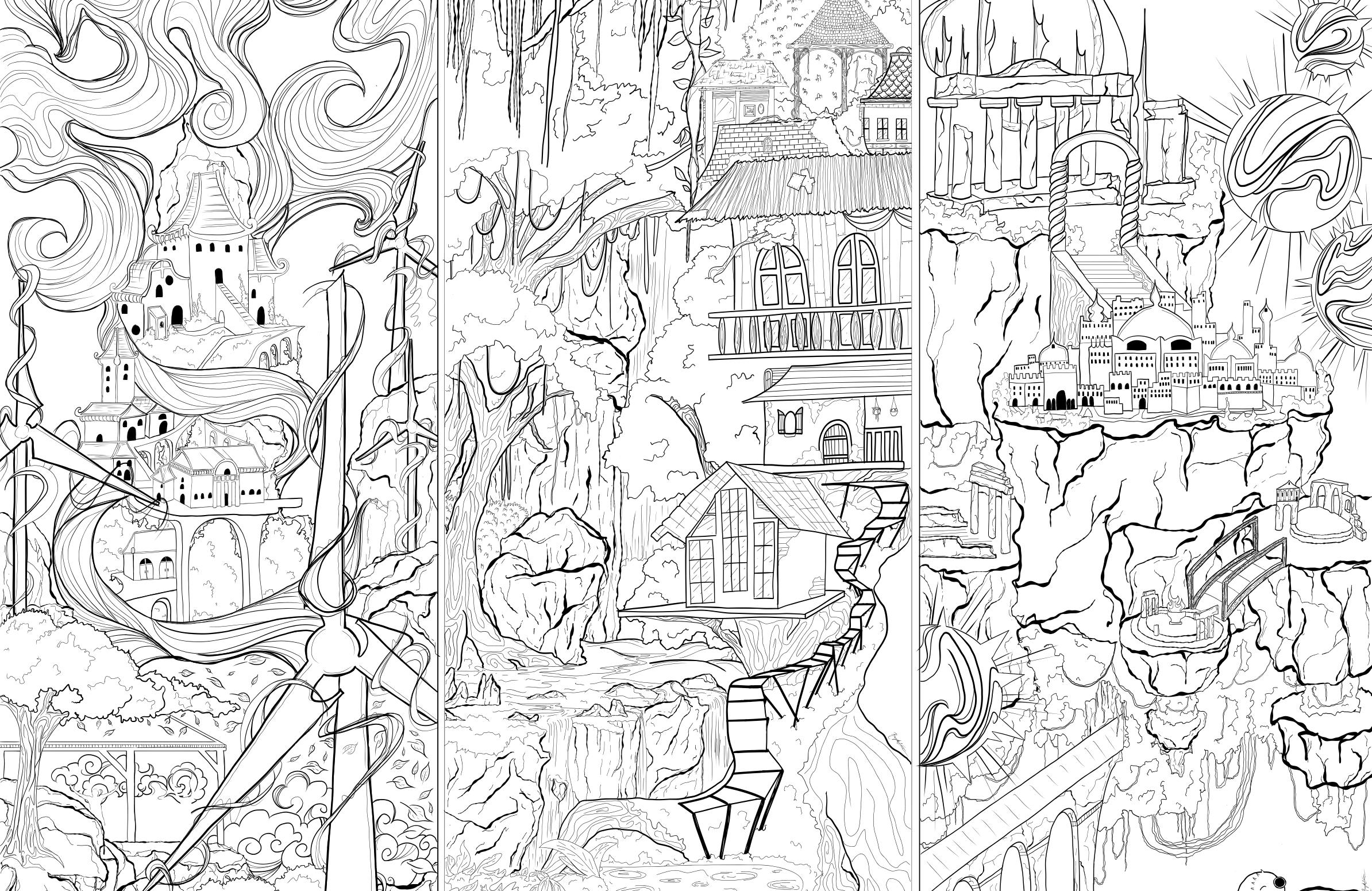
 ‘A FLOWER BLOOMS IN DARKNESS’ COLORED PENCIL + WHITE INK ON PAPER 8.5 X 11”
‘THE APPROPRIATION OF MUSIC III’ COLORED PENCIL + CHARCOAL ON COLORED PAPER 8.5 X 11”
‘HYPERFANTASIA DAYDREAMS ACRYLIC + INK ON CANVAS 11 X 14”
‘UNTITLED’ ACRYLIC ON FOAM BOARD PAINTED IN COLLABORATION
‘A FLOWER BLOOMS IN DARKNESS’ COLORED PENCIL + WHITE INK ON PAPER 8.5 X 11”
‘THE APPROPRIATION OF MUSIC III’ COLORED PENCIL + CHARCOAL ON COLORED PAPER 8.5 X 11”
‘HYPERFANTASIA DAYDREAMS ACRYLIC + INK ON CANVAS 11 X 14”
‘UNTITLED’ ACRYLIC ON FOAM BOARD PAINTED IN COLLABORATION


 ‘JUMPSUIT’
WHITE CHARCOAL + WHITE INK ON BLACK PAPER 8.5 X 11”
‘UNTITILED’ PENCIL AND WHITE INK ON PAPER 5 X 8”
‘MY BLOOD’ WHITE CHARCOAL + WHITE INK ON BLACK PAPER 8.5 X 11”
‘UNTITILED’ CHARCOAL ON PAPER 8.5 X 11”
‘JUMPSUIT’
WHITE CHARCOAL + WHITE INK ON BLACK PAPER 8.5 X 11”
‘UNTITILED’ PENCIL AND WHITE INK ON PAPER 5 X 8”
‘MY BLOOD’ WHITE CHARCOAL + WHITE INK ON BLACK PAPER 8.5 X 11”
‘UNTITILED’ CHARCOAL ON PAPER 8.5 X 11”