1 minute read
The Brand


VISUAL IDENTITY
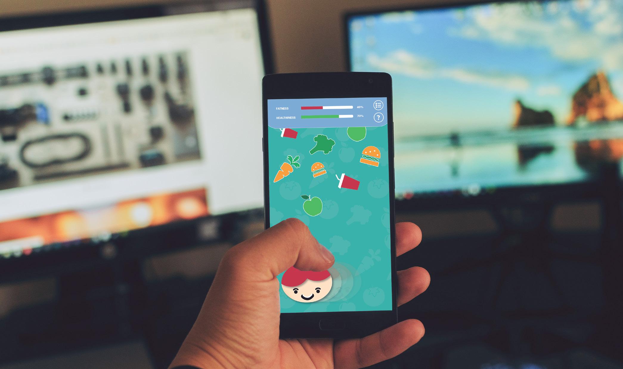
The visual graphic looks simple and minimal, it is strongly focused on the Messages, which are designed in bigger size and stand as the main heros in this campaign. The patterns used in the background represents the objects that related to the messages, including the vegetables, junk food, or physical activities. Multi colours will be used accross the designs, it helps them to stand out and attractive, and do not get confuse from the target audience. Different messages, different colours, and different patterns. However, the GREEN colour stands as the main colour for the campaign brand because it is represented healthy life perfectly.
Advertisement
TYPOGRAPHY CHOICE
Frutiger LT STD 75 BLACK
Aa Bb Cc Dd Ee Ff Gg Hh Ii Jj Kk Ll Mm Nn Oo Pp Qq Rr Ss Tt Ww Xx Yy Zz
to be used for the messages and the name of the campaign.
THE COLOUR PALETTES
#09a89e #5593c0 #9793be #d79a53 #94bd59
These colours communicate fun, friendly, and excitement. The campaign will be designed in diffrent colours in order to conncet and attract from kids and fit with the target audience perfectly
IMAGERY STYLE
The illustrator styles, geomatric shapes, vegetables, food, typographics and bright colours will be used in the design. The graphic is very friendly and fun for kids and, allso, the layout is clean, neat and minimal.
CAMPAIGN DESIGN RECOMMENDATIONS
1. Activities for kid such as, post-school exercises, free food, games and more 2. Train kids how to track their eating habits, and health everyday 3. Mobile game designs that contains the education of how to live healthy 4. Using effective messages for parents around childhood obesity