FOUNDATIONS IN DESIGN.
Portfolio of Fall 2024
Rae Yoon
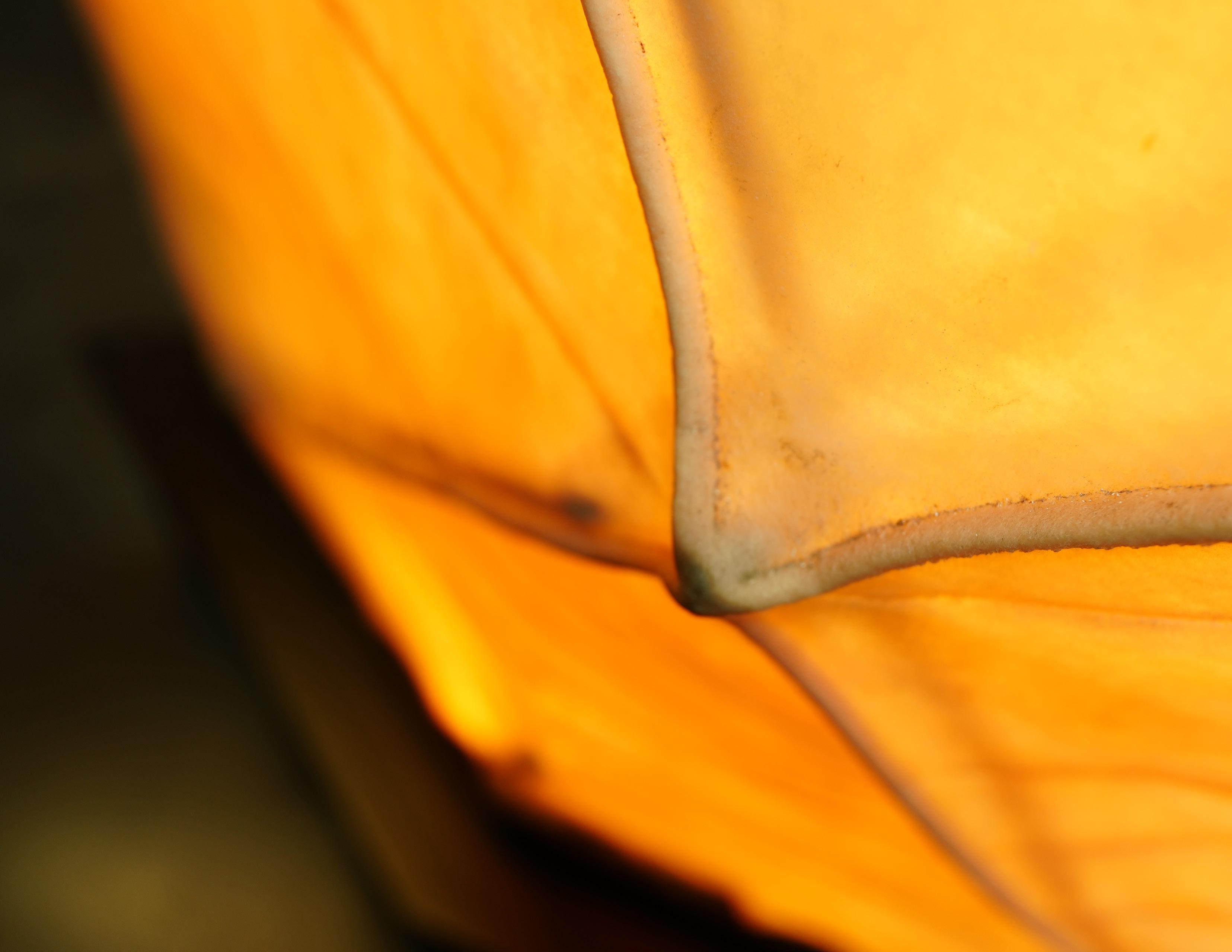
collection of square photos taken during the fall of 2025
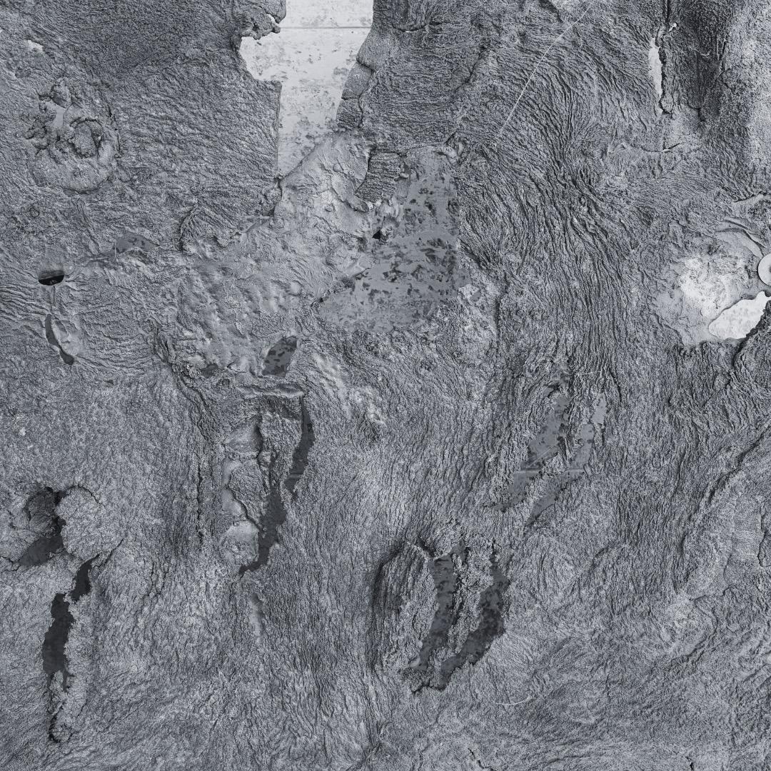
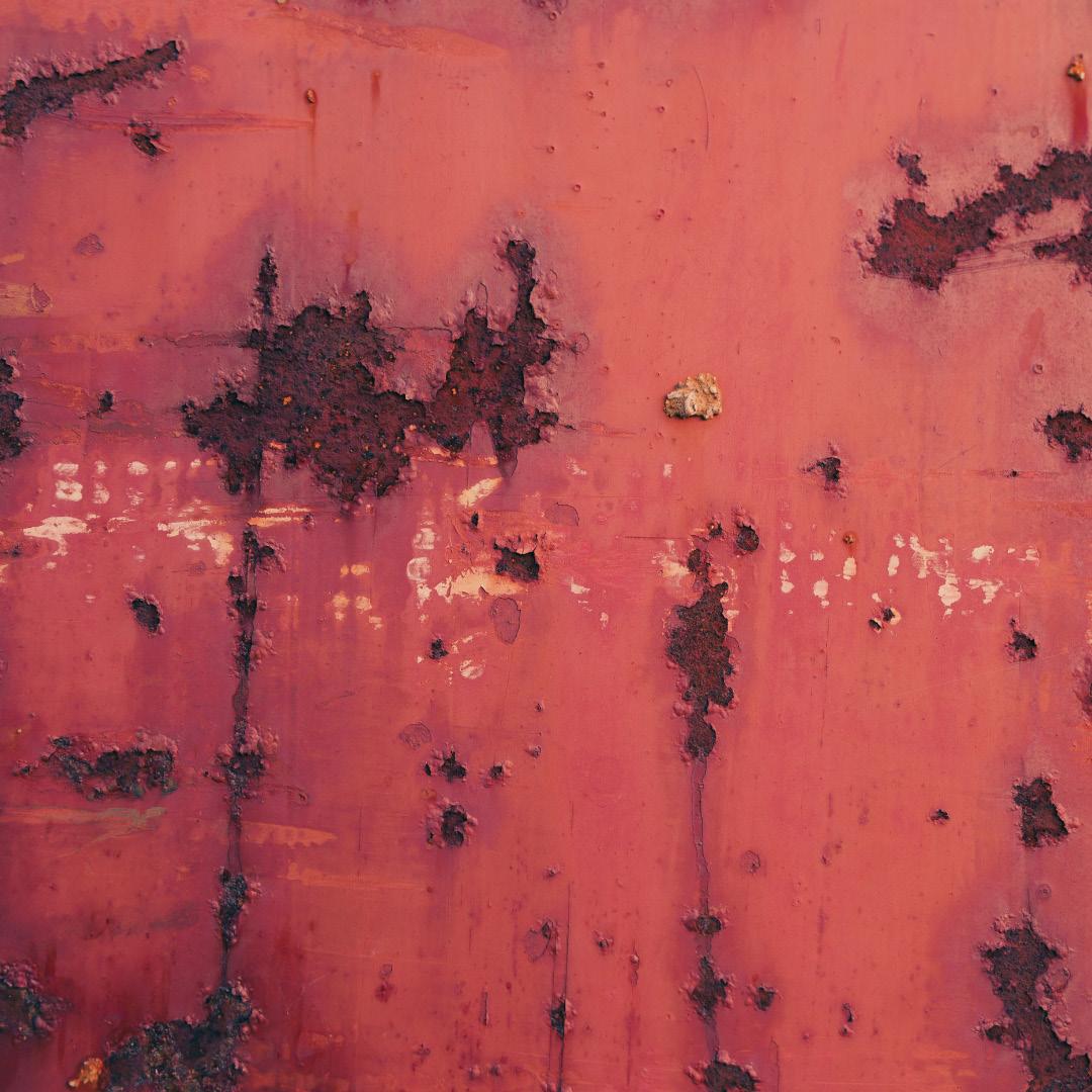
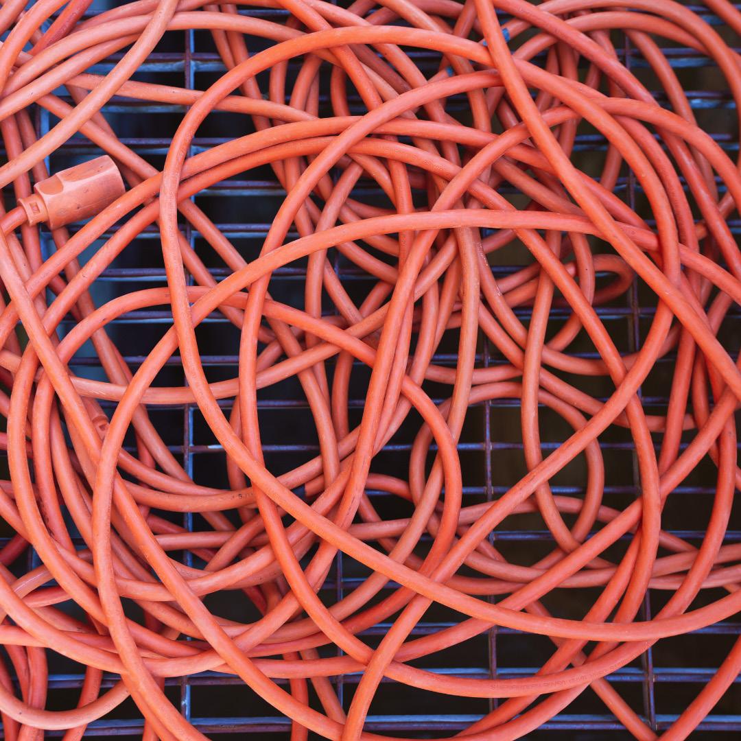
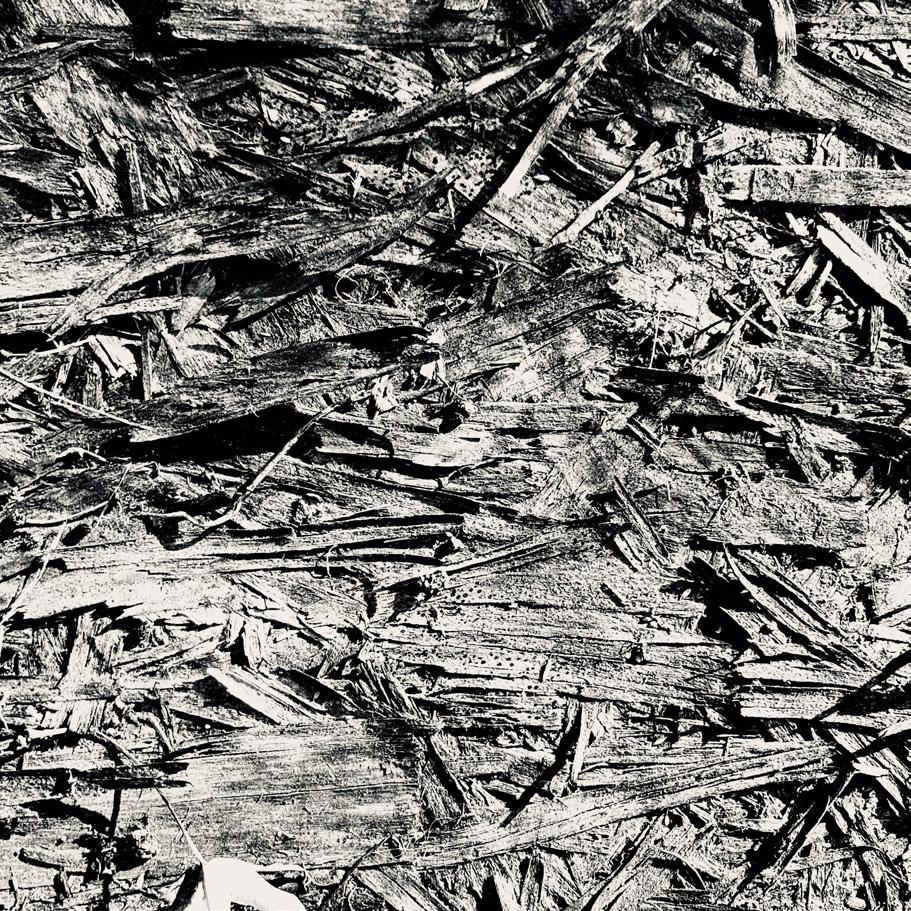
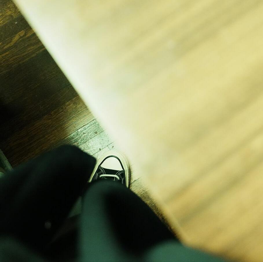
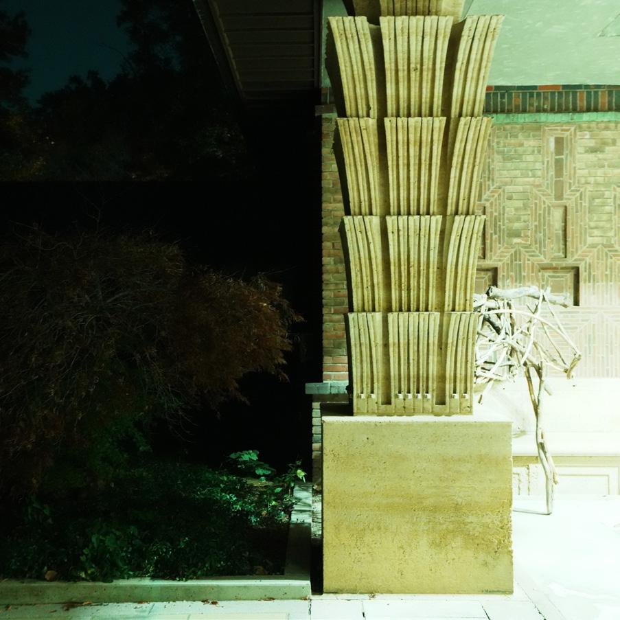
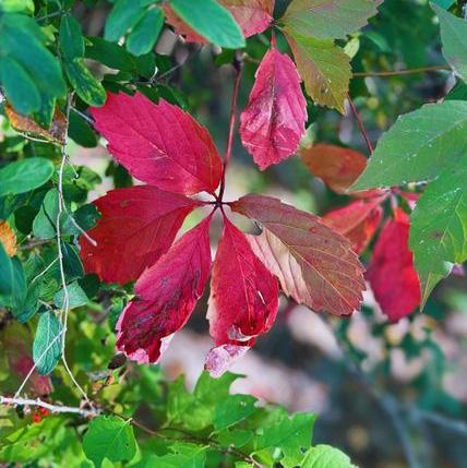
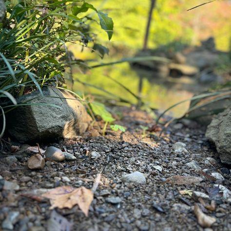
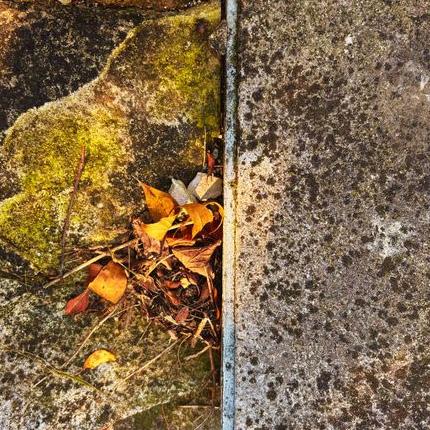
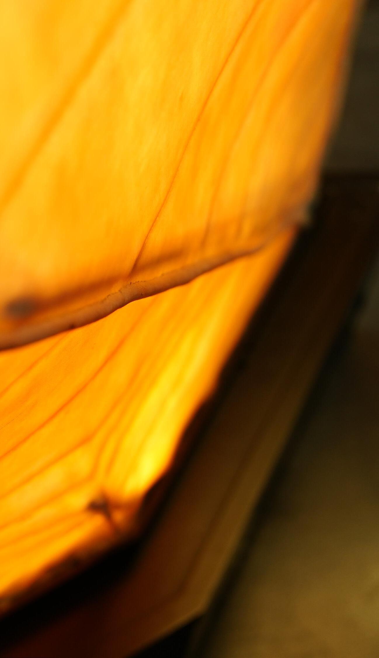
ORDINARY THINGS come to be “amazing sources of inspiration”. Any object, background, wall, or sky should actively encourage a designer to cluster ideas for immediate use or future innovations. For instance, the intentions behind taking square photos were to be attentive of evident “visual relationships” (color, value, texture, repetition, etc.) in a spatially limited, specific format of a 1:1 ratio. Several images have a radial composition, for example, the cycle (see Page 10), in which an object, color, or form becomes a central point. In taking Square Photos, I attempted to focus on the close and detailed, themes that contrast with photos that show the general space or object. More conflicting concepts such as nature and mankind can be seen among the images (see Page 5). There’s harmony, and there also is conflict in every scene we view. Designs of disorder create unity. To
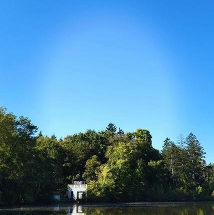
dispute is to be in unanimity. the illusion of light was an attempt to explore monochrome values— how light stands out in the dark. In regards to line orientation and hierarchy, they dictate where we look at in what order (See Page 8). In the three images above, the green and black hold an equal standing while the last two images on the bottom discord for space. In the sixth image, the blue sky demands for attention, then the green, and then the small white house that stands out among the trees. We find details in the ordinary and document them by photography, drawing, painting, and more.
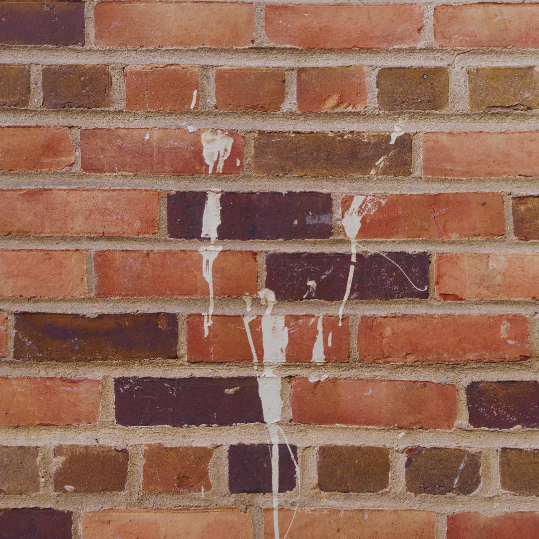
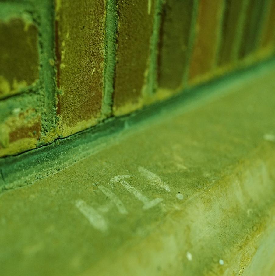
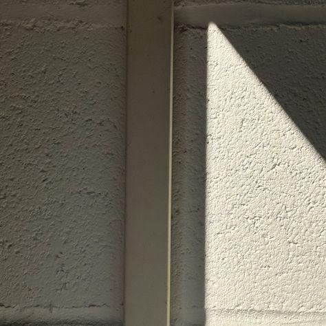
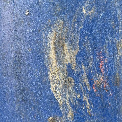
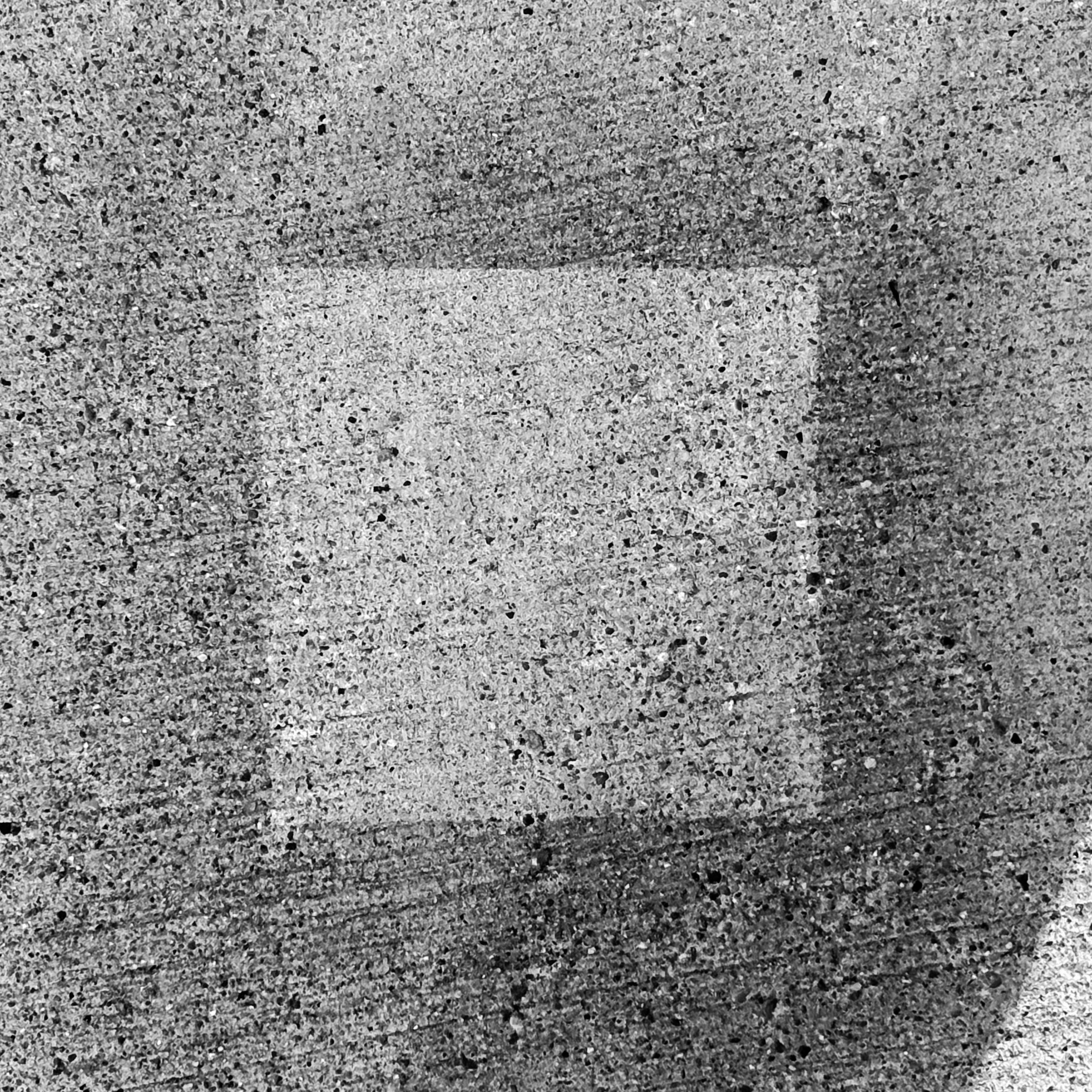
stained bricks white paint on brick wall.
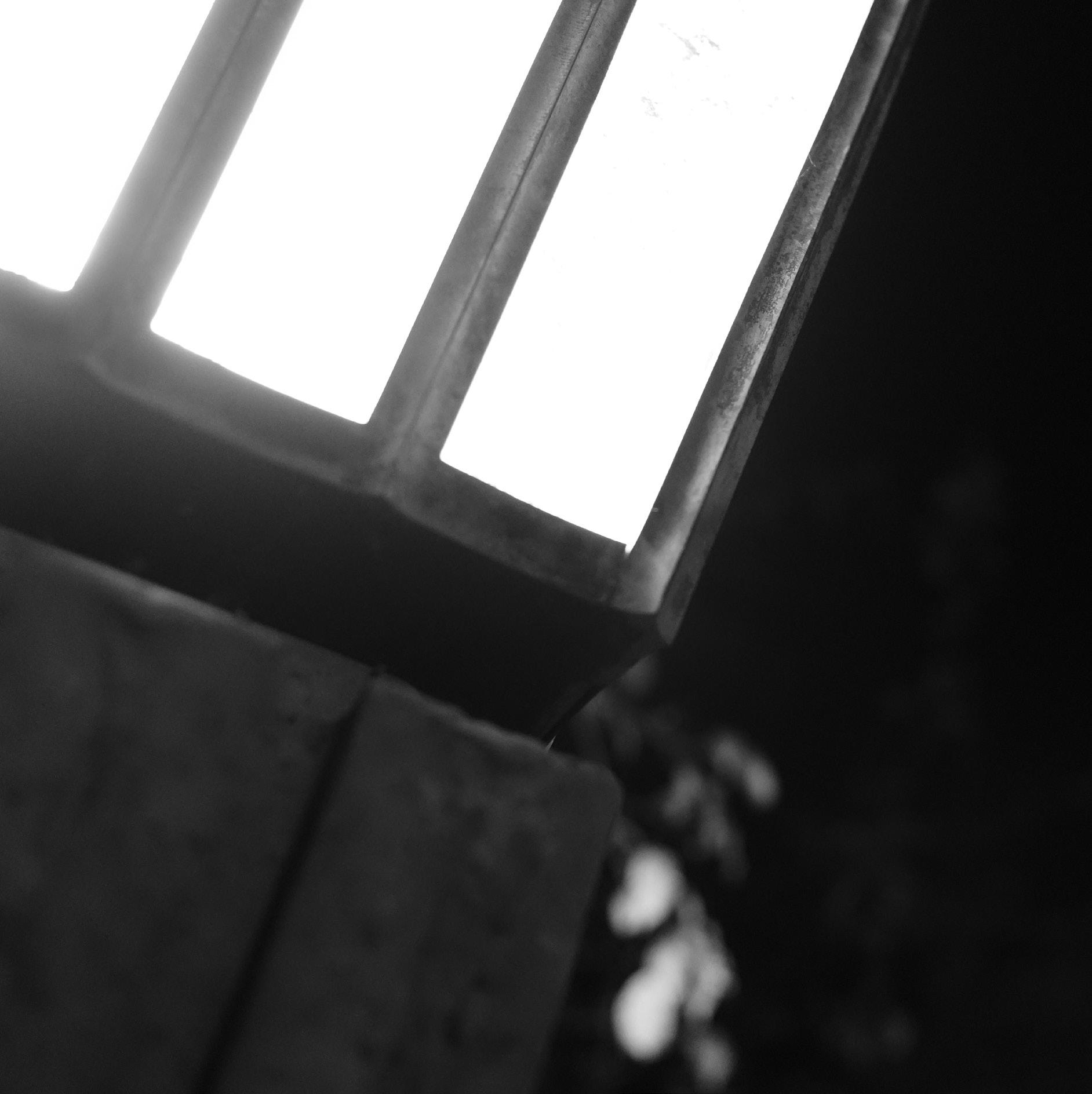
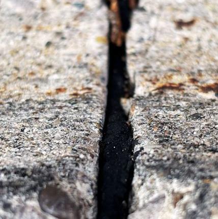
the illusion of light a picture presenting the disparity of positive and negative space, light and dark.
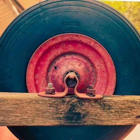
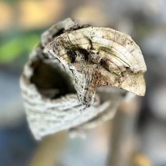
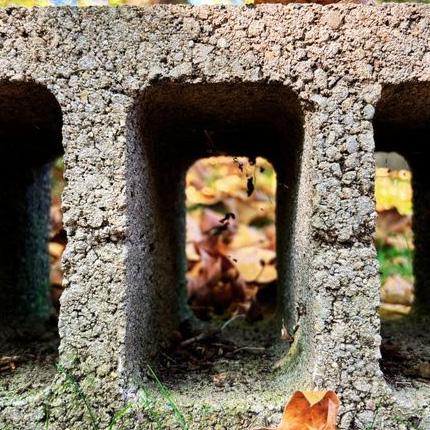
cycle
a slightly warm-toned monotone image.

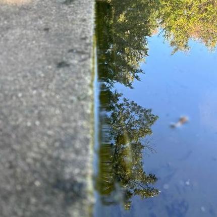
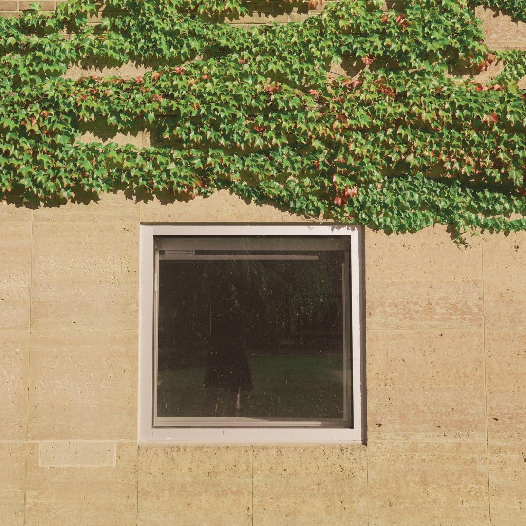
a reflection is a timeline a frame in a frame with a separate sense of space created with the beige wall and the green vines.
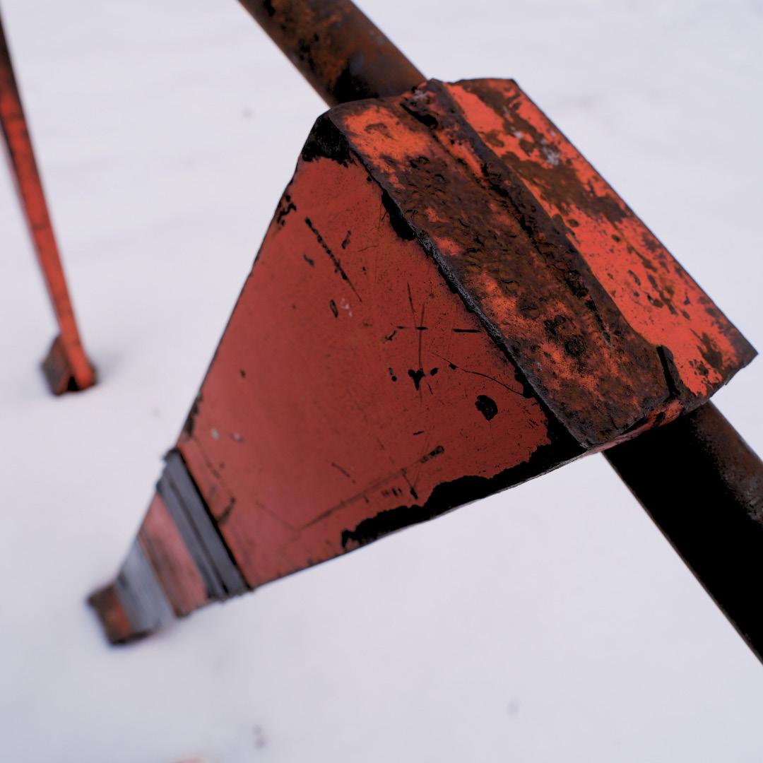
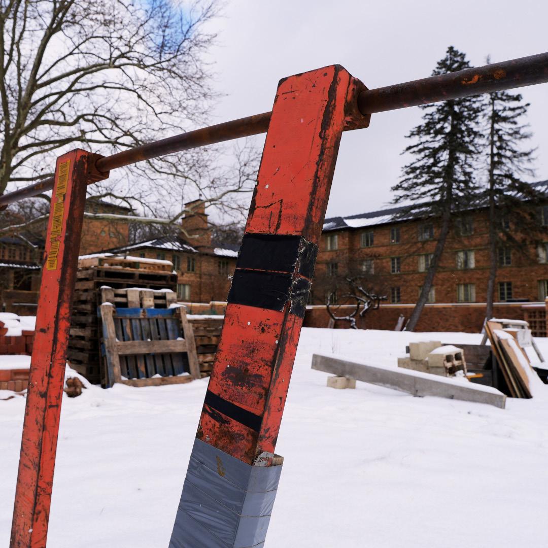
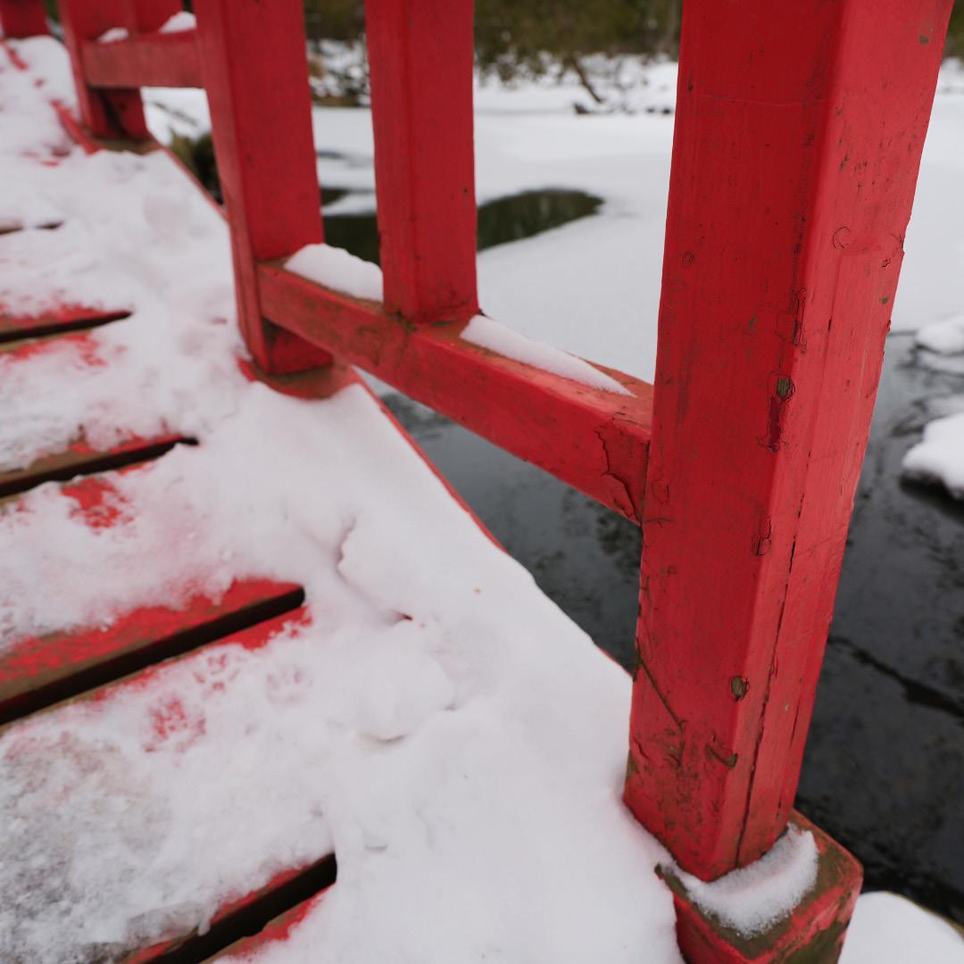
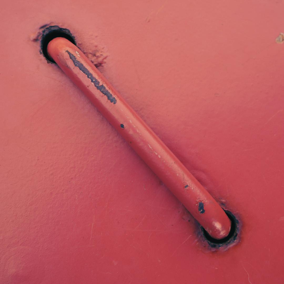
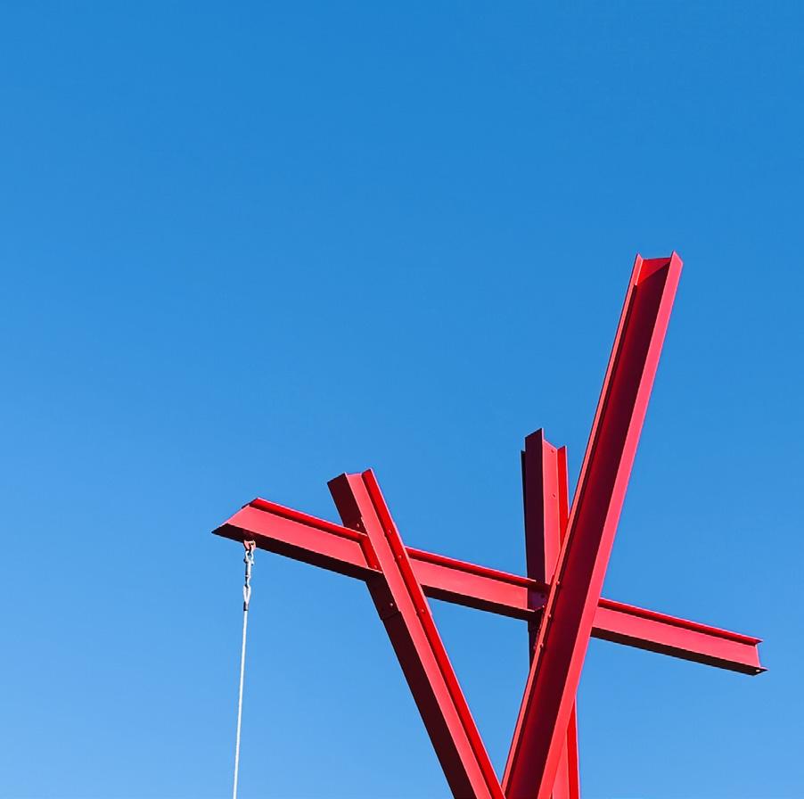
red pillars images taken on a snowy day. the stark contrast between red and white.
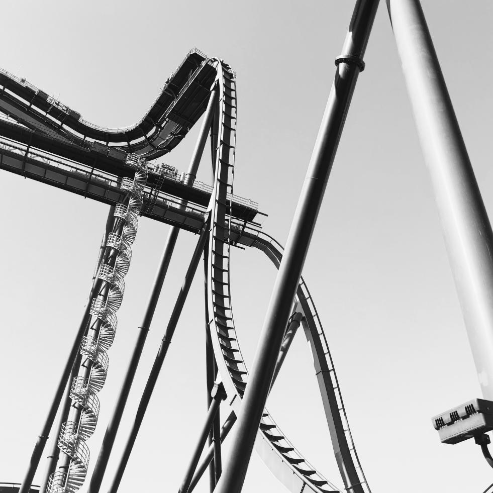
the moon, a hoax
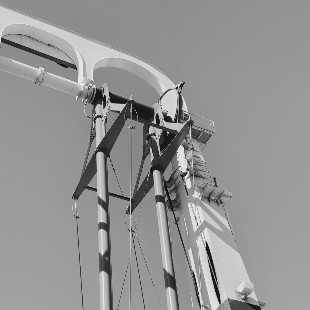
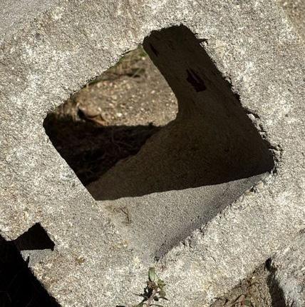
the juxtaposition between the artificial nature of the structure in the photo and what is visually represents.
This exploration began with practicing color pencils and harmonies between the colors (of orange, yellow, green, brown, and red). We drew gradients on strips and blotted dots on them. The second practice was to finish half of a leaf, attempting to “finish” the leaf as realistically as possible. The final piece (above) was to render the leaf image given to us on the golden ratio diagram.
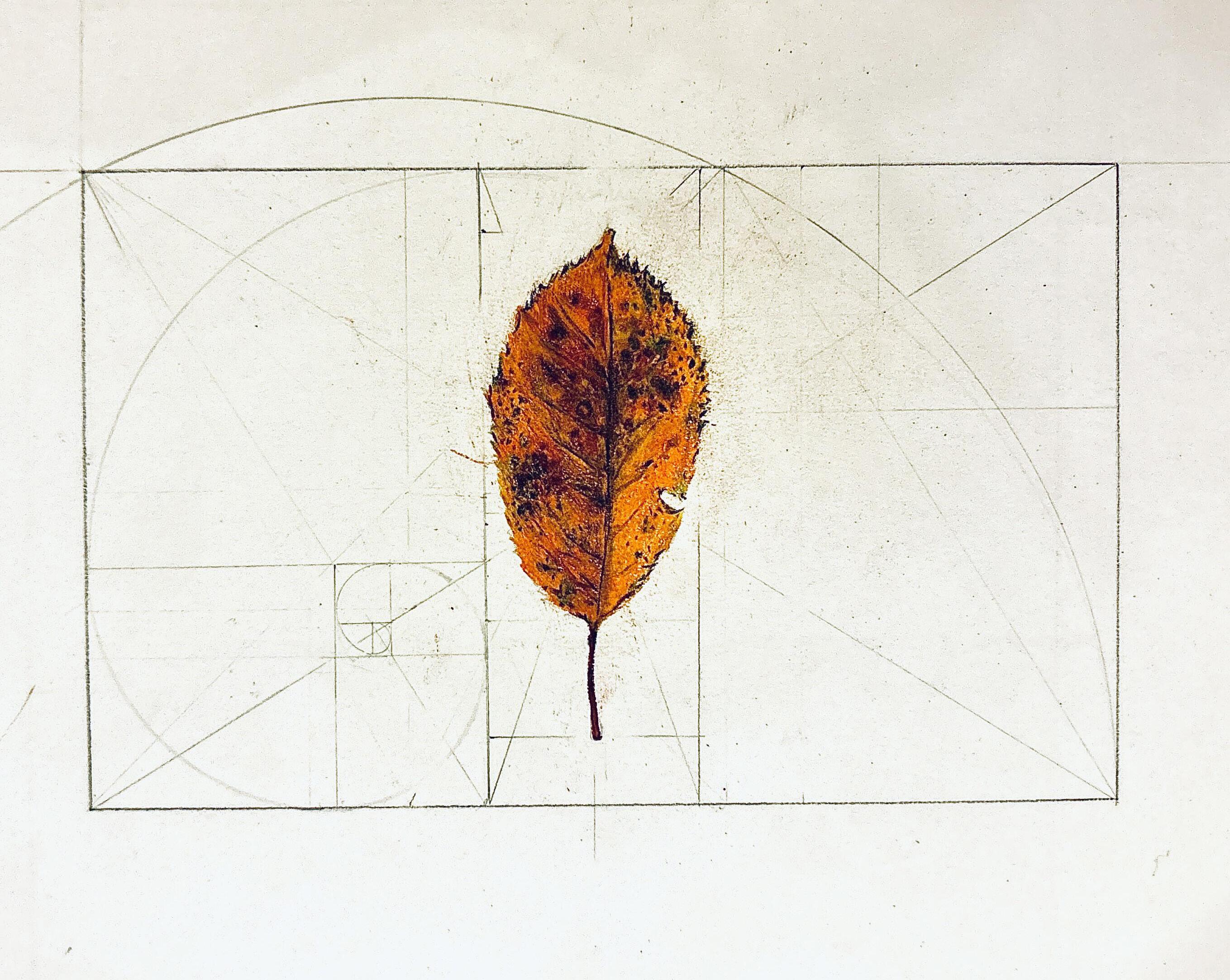
a leaf drawing on “the golden ratio”, a ratio between two numbers that equals around 1.618. color pencils, graphite
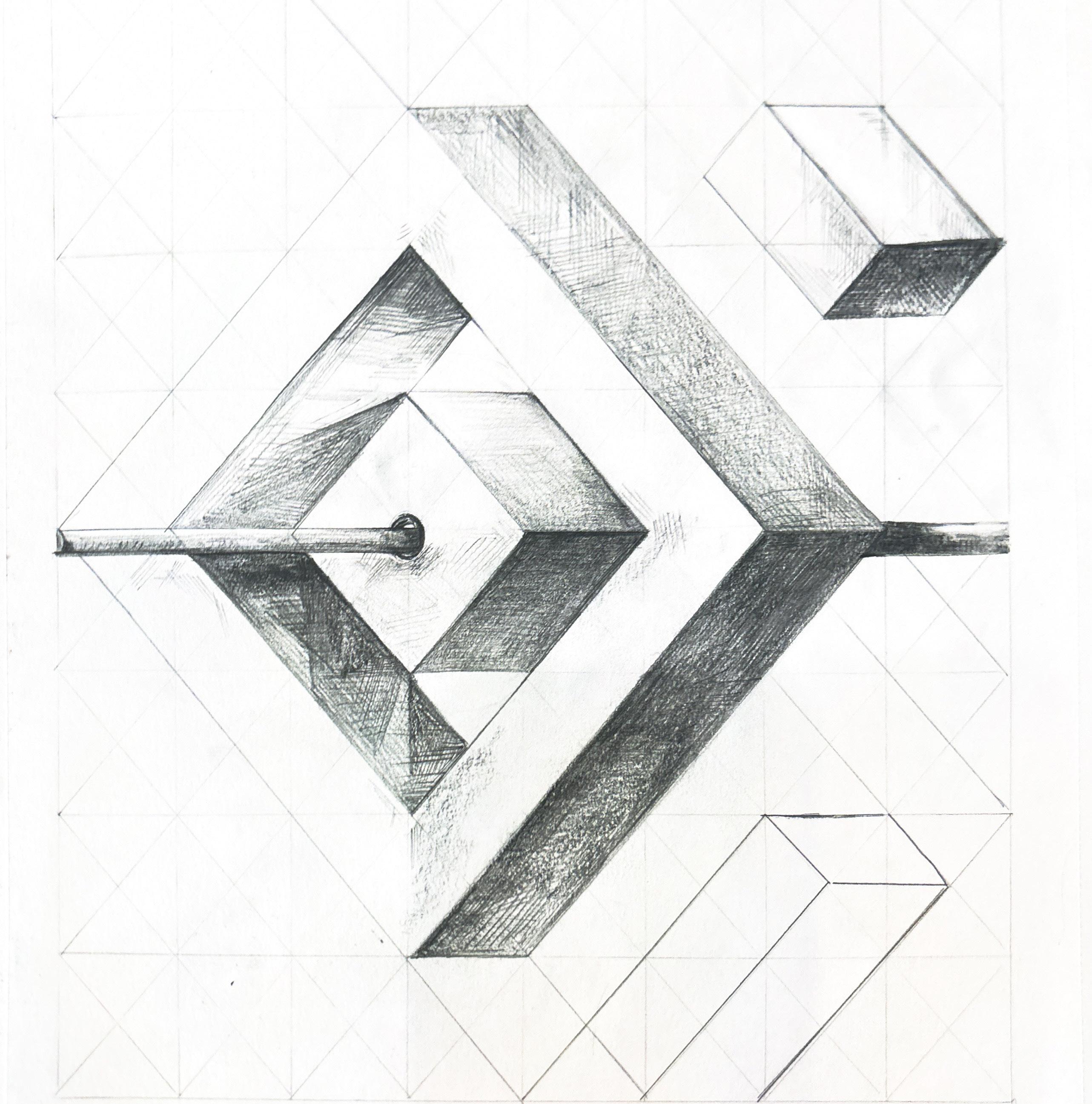
This piece was originally an exploration of grids. I wanted to draw something three-dimensional on my isometric grid (see Left), leading to new concepts such as shadow, space, and shape.
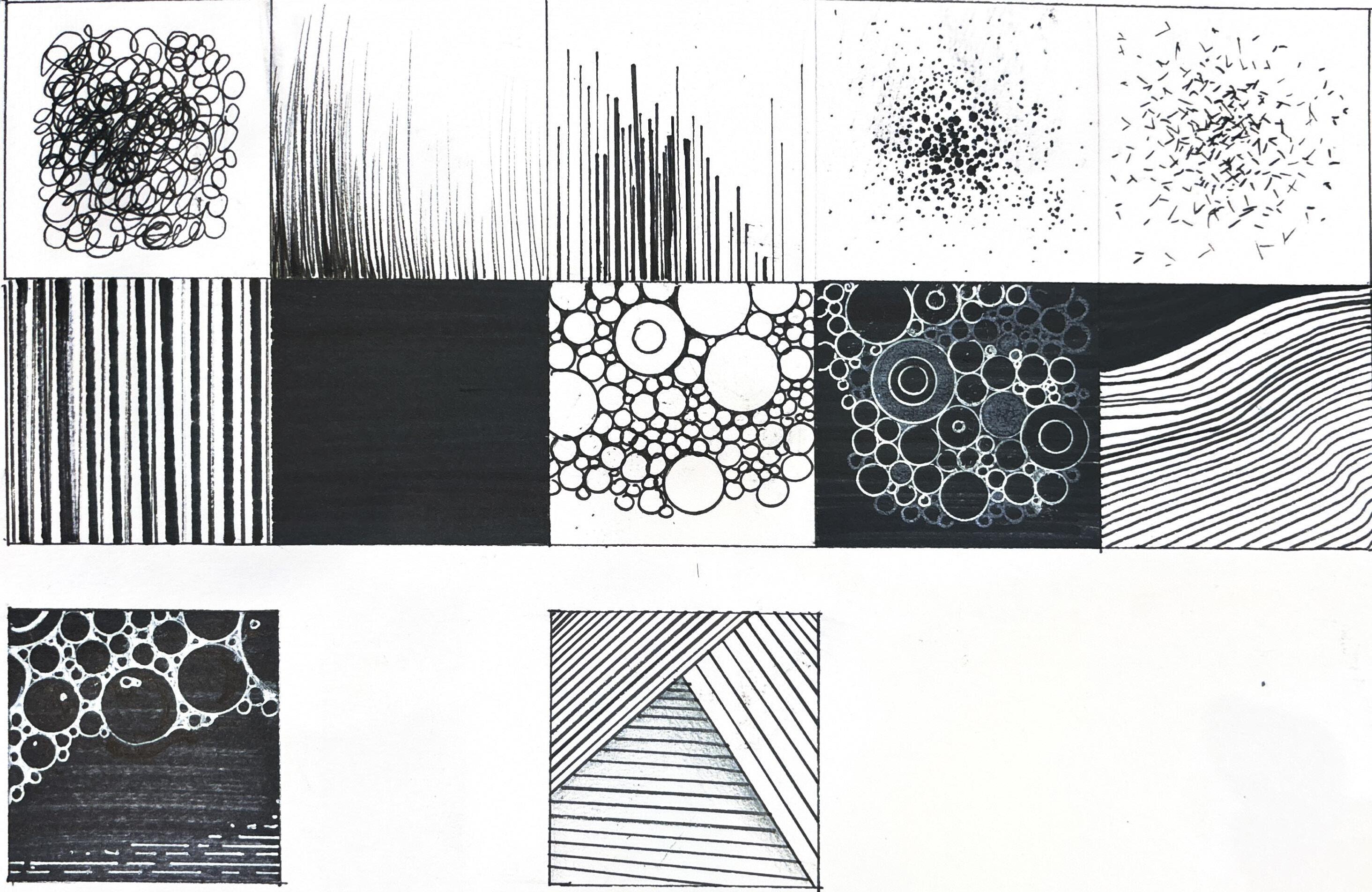
collection of various drawings created with mixed mediums during the period of fall 2025. Most include ink pens and ink washing.
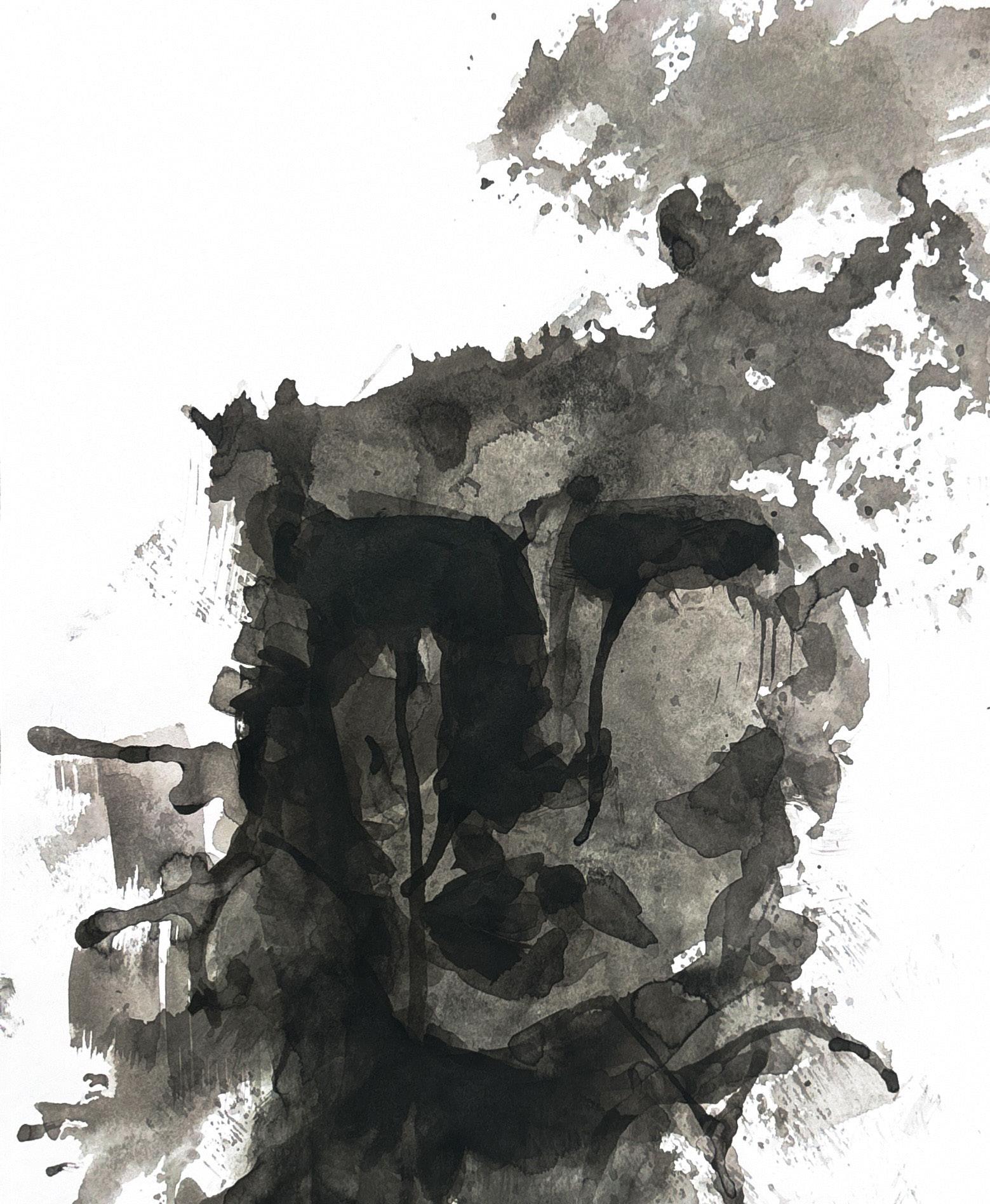
figurative ink work (1) a subtle image of a face painted with black ink, practicing values.
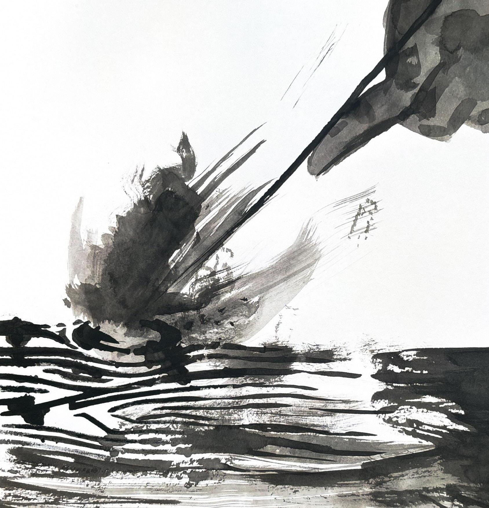
figurative ink work (2)
a visualization of fire dipped in water painted with black ink, practicing texture.
abstract ink drawing ink drawing visualizing the korean flag in an abstract manner. inspirations from korean tradition and architecture (e.g. roof above).
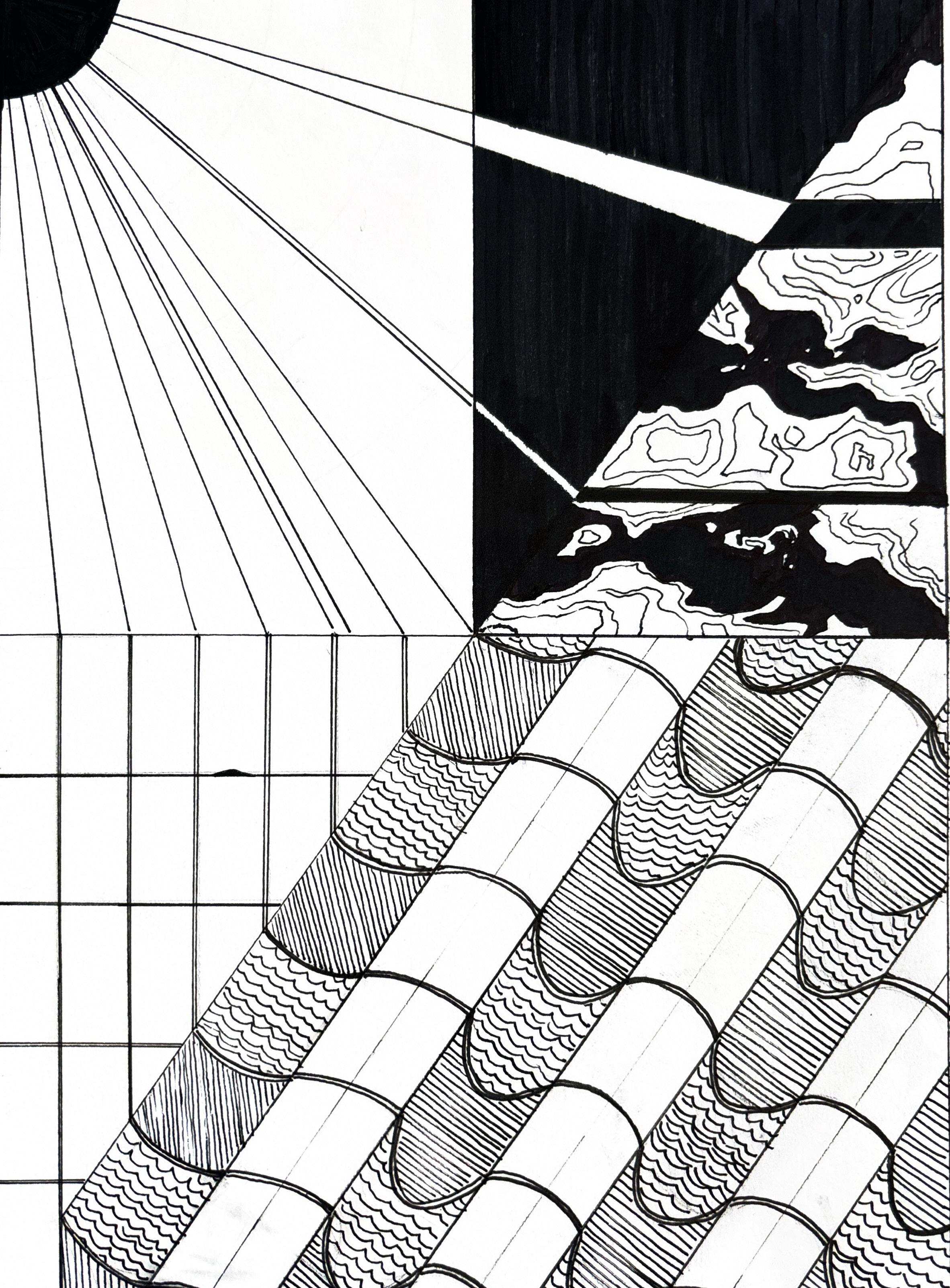
close & outside a visualization of the ground on a rainy day (above) and a map that includes the roads (in red) and a parody of a topographic map. I attempted to contrast the disparity between what we see in our daily lives (e.g. a normal day when it is raining) and the world from above (represented through a map).
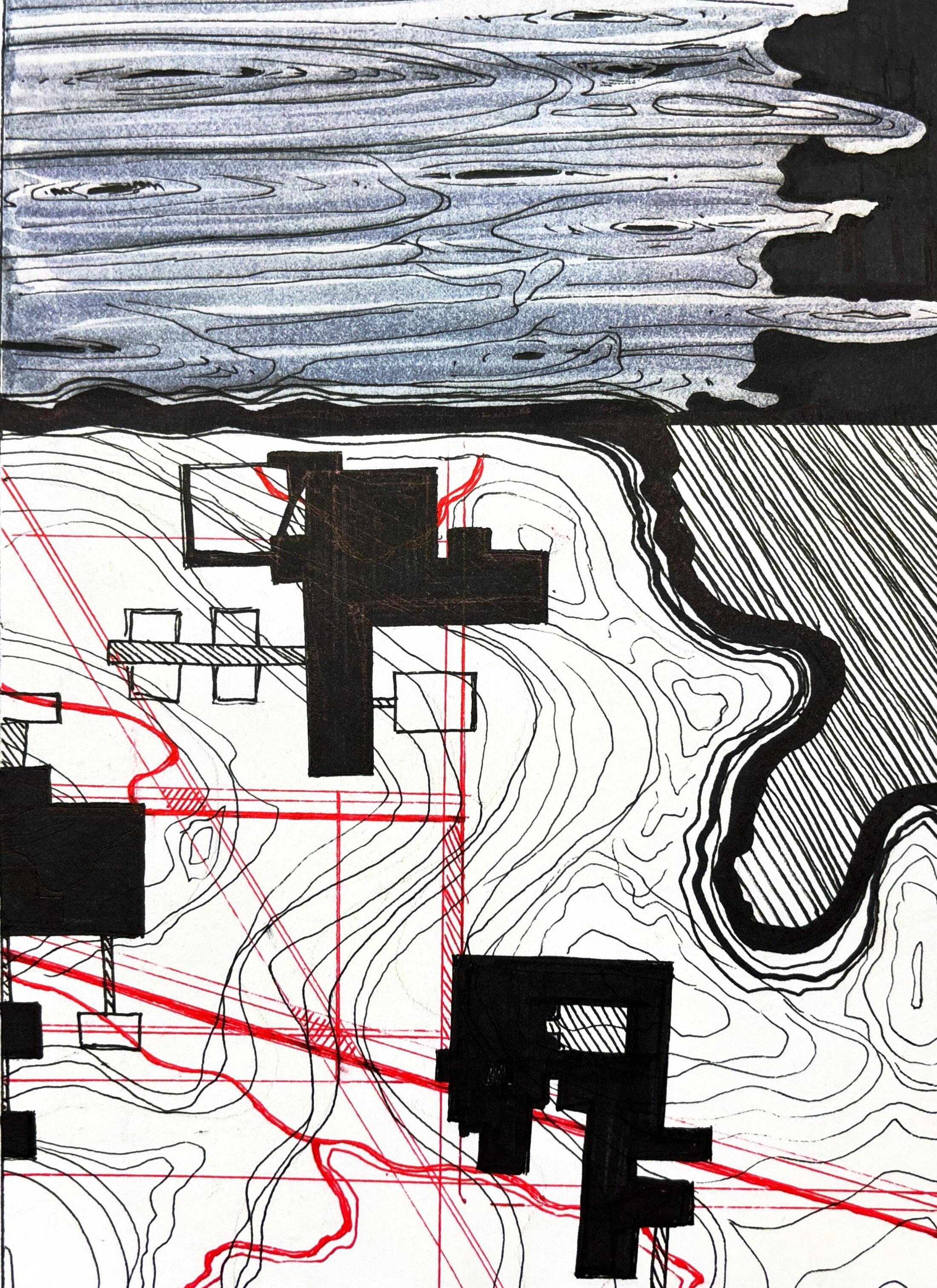
The first piece (See Page 24) was my first attempt in ink-washing. It is an abstract piece in nature, although a figure of a face can be seen. It can be interpreted through many viewpoints—when looking at it in a different angle, you see a man hitting an rock with a hammer. My second ink piece (See Page 27) looks more defined in form. While interpretations are possible, I wished to be more obvious with this work by using stamps and rough brush strokes to represent elements like water and fire. While it is a more definite piece, the tools used to make this was more varied. Returning from the holidays, I felt the need to draw out my hometown and country. Focusing on repetition and types of lines (diagonal, vertical, and horizontal), this “representation” is a homage to the Korean Flag. I’ve learned to memorize where blue and red lies in the flag’s inner circle by associating each with the sun and the sea. I illustrated that in a literal manner in my ink drawing, using thin sharpies and rulers to direct straight lines. “Close & outside” was an overall combination of concepts I learned in design. It has the topographic features of a map (from the Turkish map piece) while the circular lines above conjure up images of water puddles (exploration from Page 22).
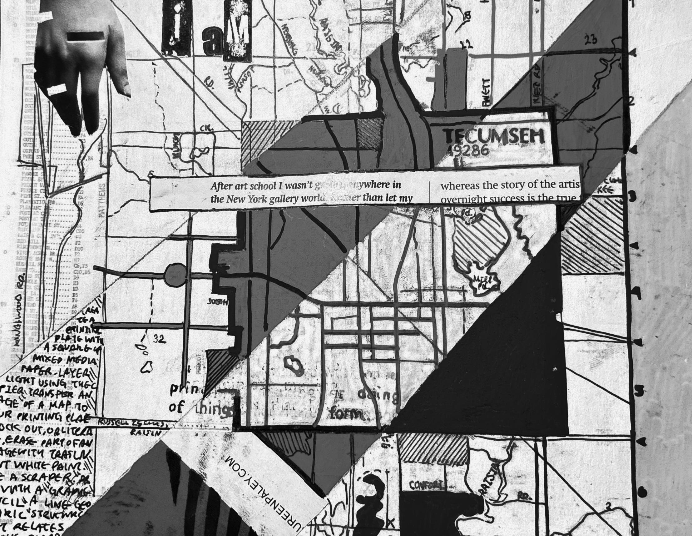
this is a mixed media piece that took inspiration from the turkish map fold. the image on the right is the surface design. copied map, scrap paper, acrylic markers, ink pens
PROCESS This is a monochrome picture of an colorful map piece that merges ink, markers, and scrap paper into one shape able to be folded into a three dimensional pyramid. I intentionally wanted to put the quote, “After art school I wasn’t going anywhere in the New York gallery world” and, “...whereas the story of the artists overnight success is the true...” as it accentuates the natural loneliness and puzzlement of this map. Although typically maps help us find destinations, the distortions made on the original paper rather confuse the viewer.
adobe illustrator
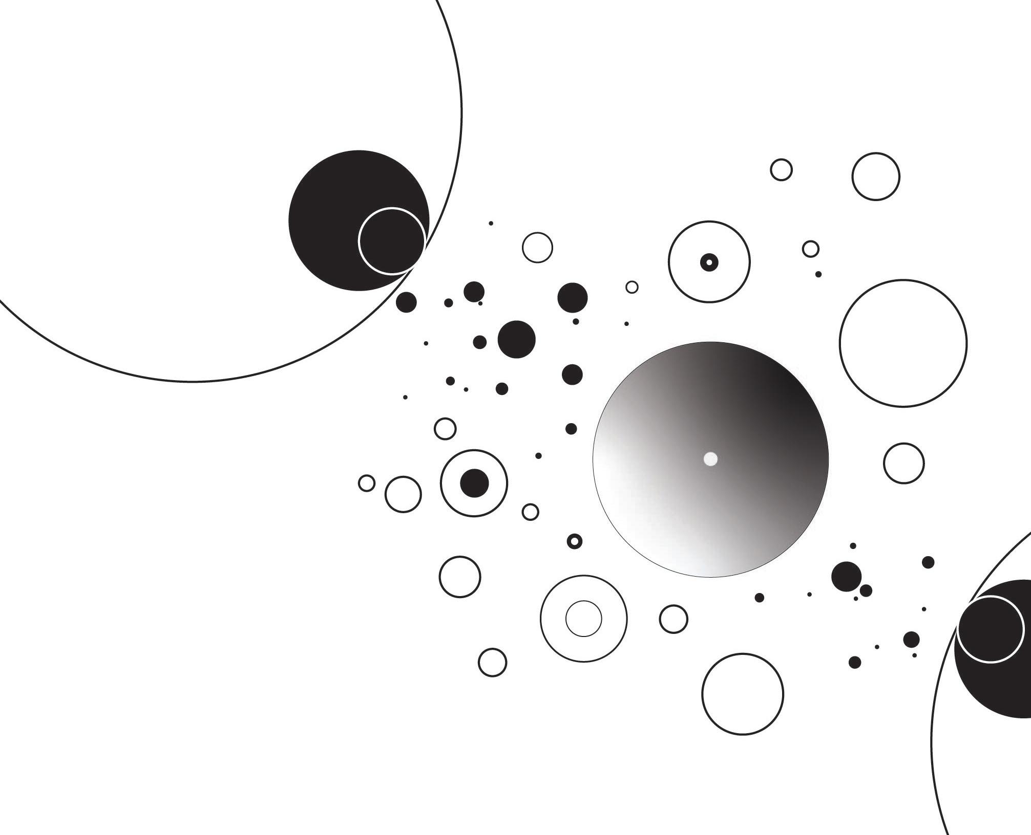
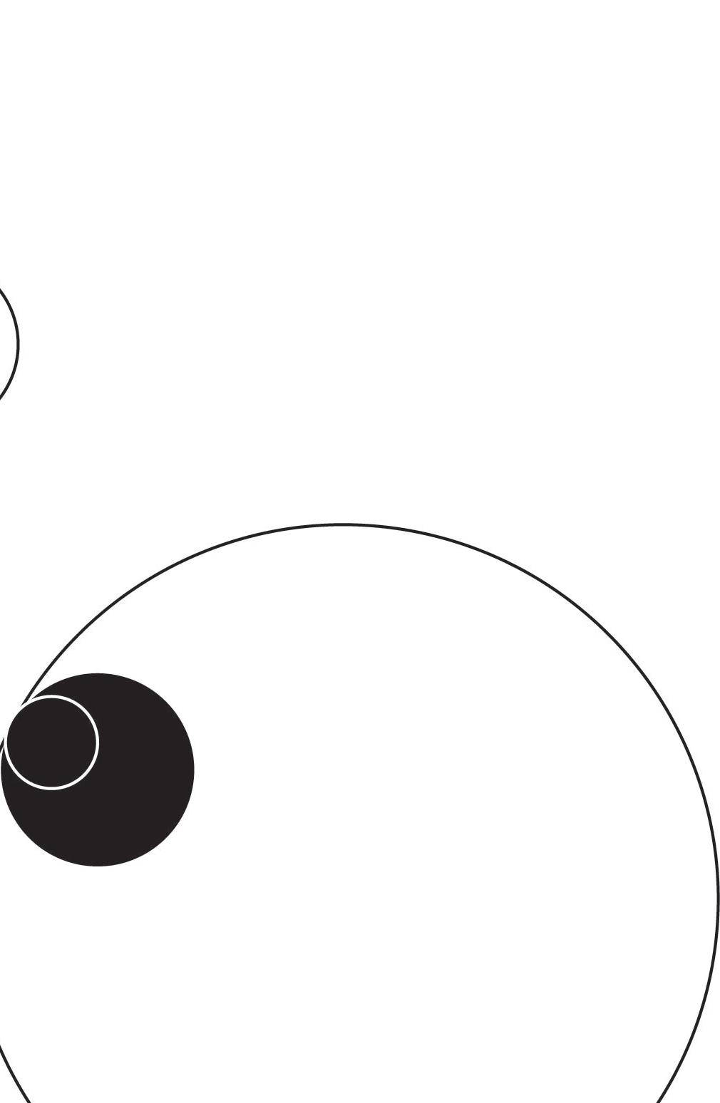
experiment with circles and elements related to shape size and line thickness
IRONY IS INHERENT in nature and structure. Complementary colors can be a pillar for harmonizing a visual, and I think this is as ironic as the act of design can be. However, the personalities of things we see everyday help represent what we wish to communicate. Borders create limits and destroying a boundary in a piece can symbolize rebellion. In a way, to design is to convince the audience into observing the elements we wish for them to see, to urge them to think a certain way. For instance, advertisements are designs that achieve a degree of interest through visuals and words. Similarly, the purpose of my ink piece (See Page 24) was to have people perceive the ink washes in any direction their eyes make them see towards. In having white space (negative space), I have ultimately convinced the audience to focus on this one image I wish for them to see. In my adobe
illustrator piece, the circles direct the audience look at the focal point of this piece (the gradient circle). There’s a clash between two of the same circles (the ones with a black circle in them that looks akin to a eye). They lean towards the gradient circle, thus building hierarchy through value and shape. In conclusion, design principles are embedded in our lives, deciding what we see, where we see them, and in which order we do so. Design is an act in which we categorize them and make use of them for messages of our own.