
CONTENT
1. Brand introduction
2. The Logo
2.1 Logo presentation
2.2 Use of the logo
2.3 How not to use the logo
3. The Tagline
3.1 Tagline placement
3.2 How not to use the tagline
4. Colour & Type
4.1 Primary colours
4.2 Secondary colours
4.3 Identification colours
4.4 Primary typeface + application
4.5 Secondary typeface + application
5. Secondary graphics
5.1 Graphic elements
5.2 Gaphic patterns
5.3 Secondary graphic application
6. Brand presentation
6.1 Photography
6.2 Combination with patterns
6.3 Combination with logos
7. Packaging
7.1 Product packaging
7.2 Package for tools
7.3 Promotional item packaging
8. Promotional design
8.1 Product zine
9. Spacial design
9.1 Signage and wayfinding
9.2 Product display and furniture
We are SALACIA, The safest choice of paint when it comes to creating colourful experiences .
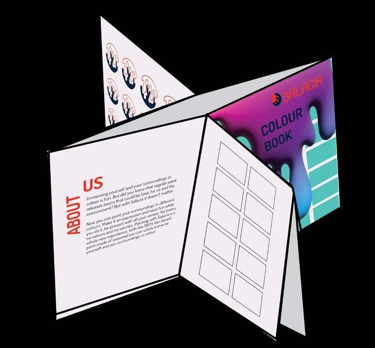
Immersing yourself and your surroundings in colour is fun. But did you know that regular paint releases toxins that could be toxic for us and the environment? But with Salacia it doesn’t matter.
Now you can paint your surroundings in different colours. Make it an expression and have fun while you do it, be present with all your senses. No toxins, no odours and no worries. Painting with Salacia is a whole new experience. With the 100% bio-based paint made of seaweed you can safely immerse yourself and you surroundings in colour.
Our values Mission Vision
• safety
• affordability
• responsibility
• change
To guarantee that your choice ensures you safety, quality and affordability when it comes to creating colourful experiences.
We strive to become a household name in the local paint industry that creates safe and colourful experiences. While contributing to the innovative growth of Sri Lanka.
2. The Logo
How do you know what to look for?
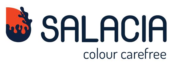
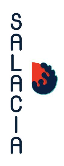
The Logo
It is always important to know what you’re looking for, whether it’s the name or even how it looks. Our logo says a lot, where it comes from, what it does and what it is.
Wordmark:


You got to know what to ask for so our wordmark is a very crucial part of the logo because in the industry brand recognition is what really speaks.
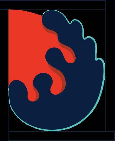
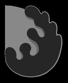
Symbol:
The symbol is a descriptive symbol which represents the journey and gives a clear message of the paint made of seaweed which will make your house feel like a safe bubble to add colour to.
Negative
Positive Gray scale
Horizontal Logo


Symbol Negative Negative Positive Positive Gray scale Gray scale
Vertical Logo
How do you use the logo?


The placement, composition and colours are important components of the logo which should not be altered to avoid calastrophe. The typeface, logo colours, addition of shadows, highlights, etc. should not be added.


Wordmark should not be smaller than the symbol
 Do not switch symbol colours.
Exception: Symbol can be placed with an outline.
Placement of the symbol against the word mark should not be altered.
Do not switch symbol colours.
Exception: Symbol can be placed with an outline.
Placement of the symbol against the word mark should not be altered.
3. The Tagline
Adding that extra little detail; The tagline
Our tagline ‘Colour Carefree’ gives our logo a little more personality but how does it sit? Only the tagline is allowed to sit within the breathing space of the logo because often it would be used as an unit.


Tagline breathing space
Stand-alone tagline should include the part of the symbol.
The tagline should not me placed vertically for a horizontal logo The tagline is not incorporated in the vertical composition.
 The tagline does not go on top of the logo.
The tagline sits on the opposite end of the symbol.
The tagline does not go on top of the logo.
The tagline sits on the opposite end of the symbol.
4. Colour & Type
The colours of our brand, adding colour to your life.

Primary:
The primary colours represent the reliability and safety, fun and presence. All the things about our brand that really matters. The primary colours are used for the logo, text, and backgrounds.
Secondary:
The chosen primary colours are for the less serious, the little things that are extra fun. The secondar colours are used in patterns, additional elements and other cool stuff.

We also use colour for identification.
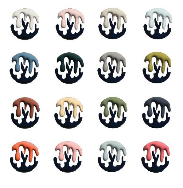
If you know or even if you don’t know which colour to buy, you can find a mark on the lid of the can which shows the colour that will soon be covering you walls.
This would be how they’re represented on the can based on the colour inside.

For the occasional information you do need to read, we use text & typography.
The primary typeface chosen was Century Gothic which comes in regular and bold. For the dramatics and emphasis it has italics.
Century Gothic Bold
ABCDEFGHIJKLMNOPQRSTUVWXYZ
abcdefghijklm nopqrstuvwxyz
1234567890
-(.,:?+!#)*”$£%”[/]&@</>
Century Gothic Regular
ABCDEFGHIJKLMNOPQRSTUVWXYZ
abcdefghijklm nopqrstuvwxyz
1234567890
-(.,:?+!#)*”$£%”[/]&@</>
Our headings are in bold while the body copy sits in regular. This typeface would be used for any printed documents, manuals, presentations, letters, etc. except packaging and merchandise.
Headline 1 -
The first headline which is in Century Gothic bold, sits at 18 point with a 20 point leading in the dark blue from the primary colours
Headline 2 -
The second headline which is in Century Gothic bold, sits at 14 point with a 16 point leading in the orange derived from the primary colour palette.
Headline 3
The third headline which is in Century Gothic bold, sits at 10 points with a 12 point leading in the teal presented in the primary colour palette.
Body copy
The body copy, presented in Century Gothic regular sits at 10 points with a 12 point leading in the dark blue from the primary colour palette.

The secondary typeface chosen was DOSIS. It is used in our packaging and our tagline as well. Dosis has a whole variation of weights .
Extra light
DOSIS Bold ABCDEFGHIJKLMNOPQRSTUVWXYZ
Semi Bold
Bold
Extra Bold
1234567890 -(.,:?+!#)*”$£%”[/]&@</> DOSIS Extra Bold ABCDEFGHIJKLMNOPQRSTUVWXYZ
Headline would be in dark blue or off white depending on the background and the body copy would be in teal.
1234567890 -(.,:?+!#)*”$£%”[/]&@</>
abcdefghijklm
nopqrstuvwxyz
abcdefghijklm
abcdefghijklm
1234567890 -(.,:?+!#)*”$£%”[/]&@</> DOSIS Regular ABCDEFGHIJKLMNOPQRSTUVWXYZ
nopqrstuvwxyz
nopqrstuvwxyz
Often the text on the packaging is typed out in Bold for headlines and in Regular for the body copy and if an interesting splodge comes along that would be in Extra Bold Light Regular Medium
5. Secondary Graphics
The elements that pop and adds the fun!
Secondary graphics individual elements
Secondary graphics adds the innovative, adds the fun. It has a 3D component with purple, blue and pink gradients.


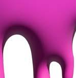


Refrain from using flat elements.

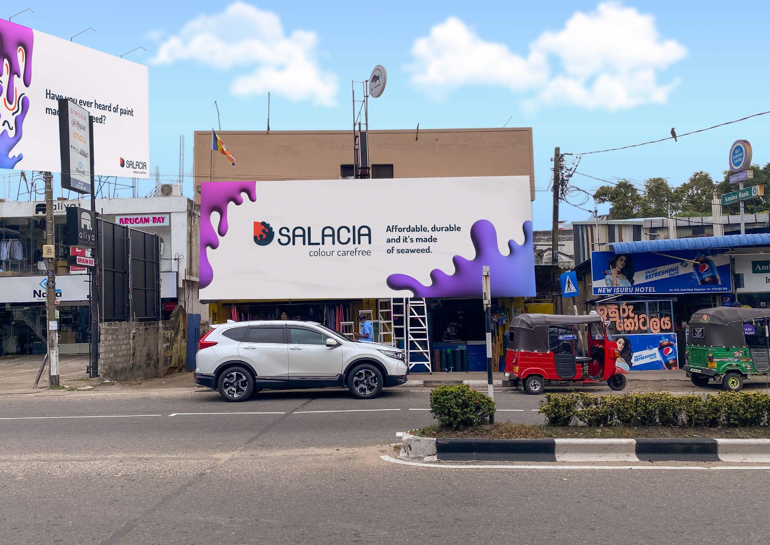
6. Brand Presentation
Our photography is meant to show the safe side of fun. A good balance of fun colours and elements is important.

Avoid cliche backgrounds and plain white background for product photography. Try to add patterns and prints or splodges of colour. Make it fun.


This is a safe space to have fun in and we want our product presentation to show that.

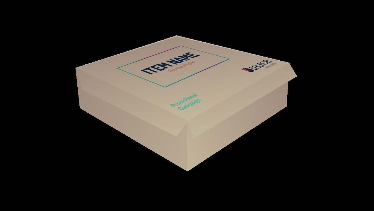
7. Packaging
Just making sure you recognize us on the shelves right off the bat.
Our packaging is a combination of the logo, 3D graphics, Type and other information. Having a cohesive design makes it easier for the consumer to recognize the brand.

Text on packaging uses the DOSIS typeface. And all packaging is made of recycle egg cartons or other recycled or re-purposed material.

Paint cans
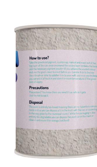
Paint is available is different amounts ranging from 250ML to 5L. The paint can is made of recycle egg cartons with a thin layer of plastic inside to prevent leakage and soaking.
Paint tools


Salacia has a wide range of paint but that isn’t the only thing we have. Salacia also produces eco-friendly and sustainable tools for the painting experience which needs to be cohesive with the bran visual.

Promotional package
During campaigns and other promotional events, we like to give our consumers a little something exciting. And that will be packaged as such.
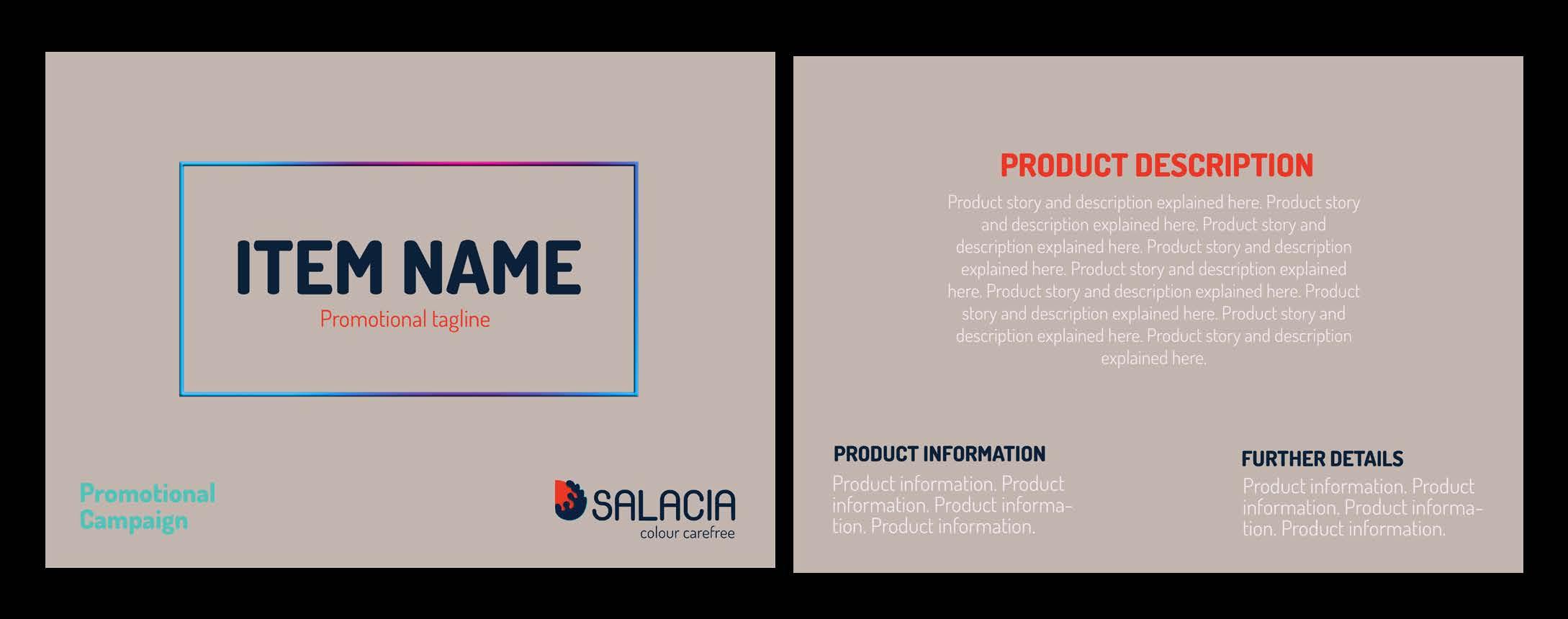
8. Promotional design
The
part where we’re trying to get the word out.
It is important that the consumer doesn’t confuse our content with any other paint brand. Our promotional design carries our brand on the outside.
Our Product zine.
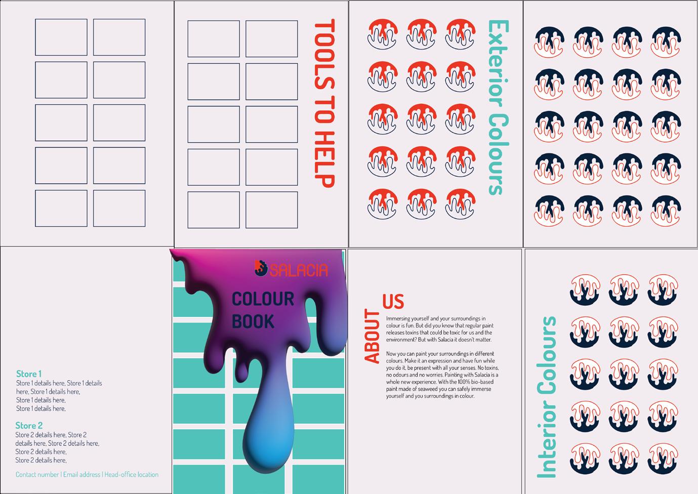
Our colour book/ product zine comes as a zine to usually add information about events and promotion happening on the other side.

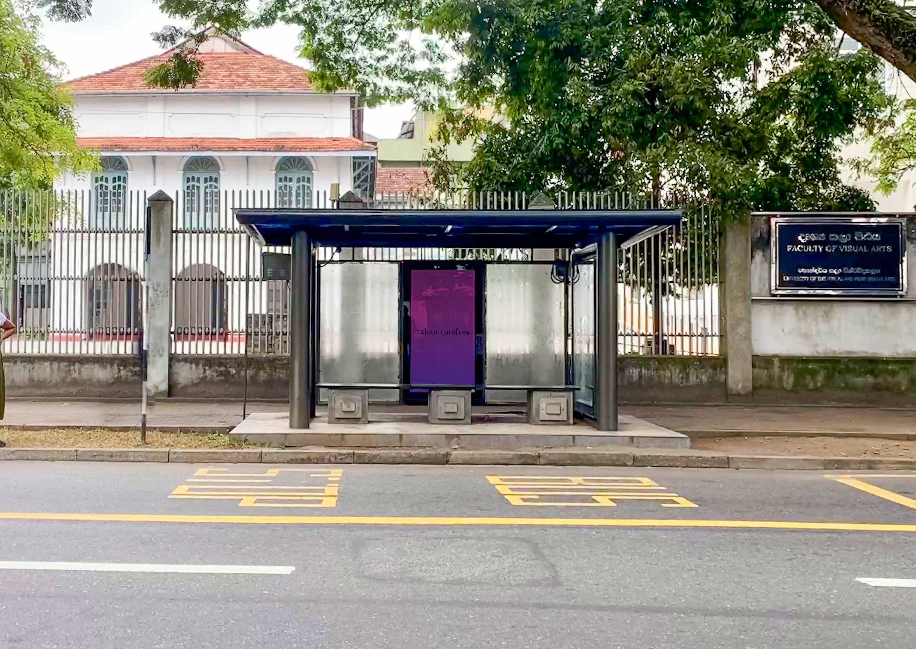
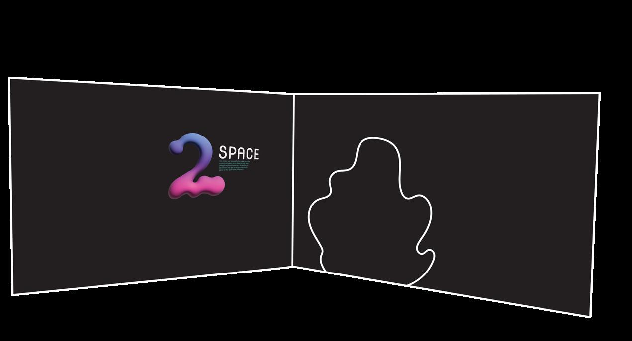
9. Spatial design
Using our paint to paint different graphical elements that carry out a cohesive brand image even within a space.
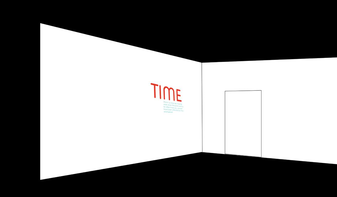
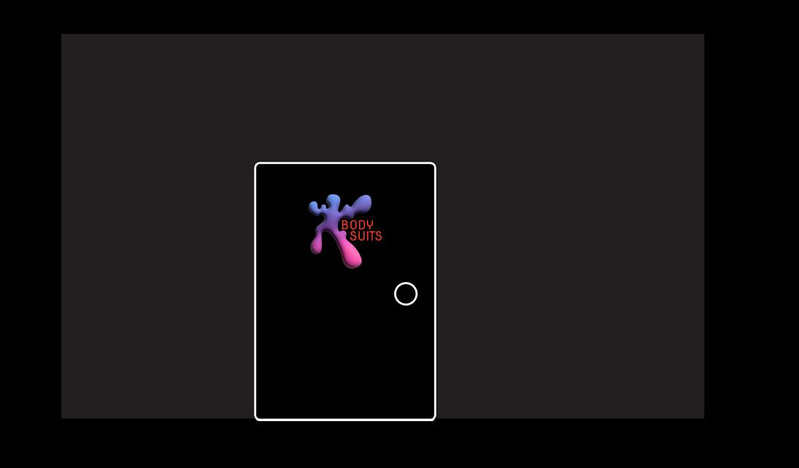
Signage and wayfinding
All our signage are painted onto walls like murals using Salacia itself.
Exterior signage
On the exterior the logo goes on the two sides with center space available if our concept store has an event or campaign to promote.

Obviously we’re using Salacia to paint our store walls but how do we make sure you know?
Interior signage
Interior signage is used to navigate through our concept stores and event spaces.


And that’s about all you need to know to keep the fun going safely.