Rachel Younker
Interior Design Portfolio
The University of Wisconsin - Stout
04
Restora Health Healthcare
Contents 26 Spence’s Restaurant
Steelcase - NEXT Corporate - Office
Lighting Design Education
“Solanine” Custom Luminaire Design 38 “Cedar” Seating Experience
Other Work Studio Art Designs
Canyon Hills Graphics Corporate - Office
Table Of
12
32
36
44
20
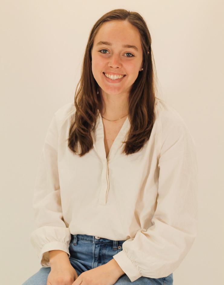
Hello!
My name is Rachel Younker and I graduated from the University of Wisconsin - Stout (CIDA Accredited) where I earned my BFA in Interior Design. I also double minored in Sustainability and Psychology.
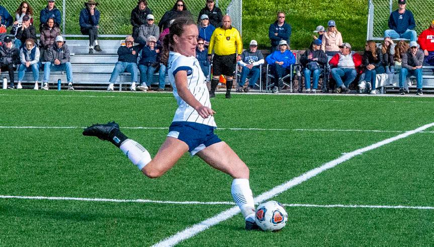
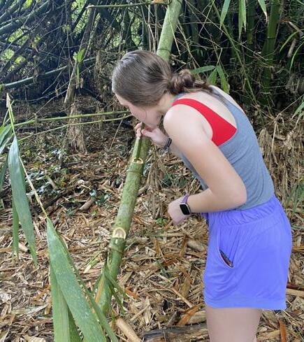
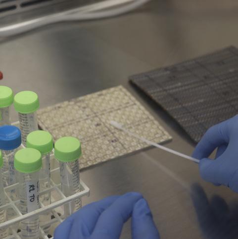
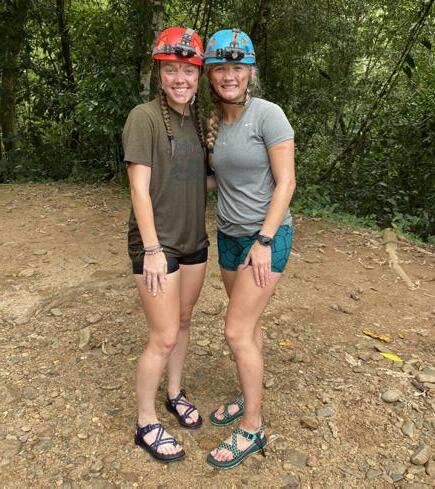
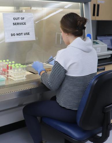
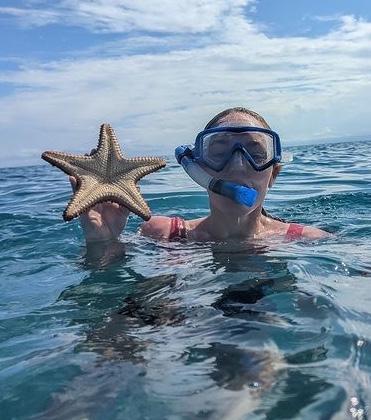
Some unique experiences I had outside of Interior Design while at UW-Stout include playing collegiate soccer, working on a microbiology study, and studying abroad in Belize!
I was on the team since freshman year, and was a captain for two years. Being a captain taught me leadership and mentorship. Athletics taught me time management and hard work, and also gave me some amazing opportunities.
Myself and three other students ran a study where we worked to test the antimicrobial properties of materials including upholstery, solid surface, porcelain tile, and more. This was something I never expected to do as an interior design major!
I studied abroad in Belize during win-term 2022. Some highlights were snorkeling, drinking water out of bamboo, hiking to waterfalls, exploring into an ancient Mayan cave, and swimming in bioluminescent algae!
Restora Health
Project Description
This is my Senior Studio Project where I created a Cancer Treatment Clinic with a very natural, warm, and healing atmosphere.
Design Concept Statement
Restora Health’s goal is to make each patient feel at ease when they enter the clinic. In a stressful time, warm wood tones, plants, and curving elements help to create a soft, natural, and inviting atmosphere, making patients feel more at home. Glass throughout the space allows for natural light and beautiful scenic views which helps boost mood and well-being, as well as privacy control in patient rooms.
Programmatic Concept Statement
The Restora Health Cancer Treatment Clinic will feel very warm and inviting, creating a safe space for patients and promoting a healing environment through biophilia and natural elements. The facility includes an infusion bay, therapy services gym, healing garden, and many resources for patients and their caregivers to support their treatment. The design invites patients to have a choice and feel comfortable in the clinic through lighting control, treatment space options, and an easy to understand layout with wayfinding.

Branding
4
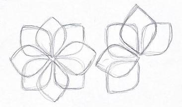
I wanted also The curved somewhat of a
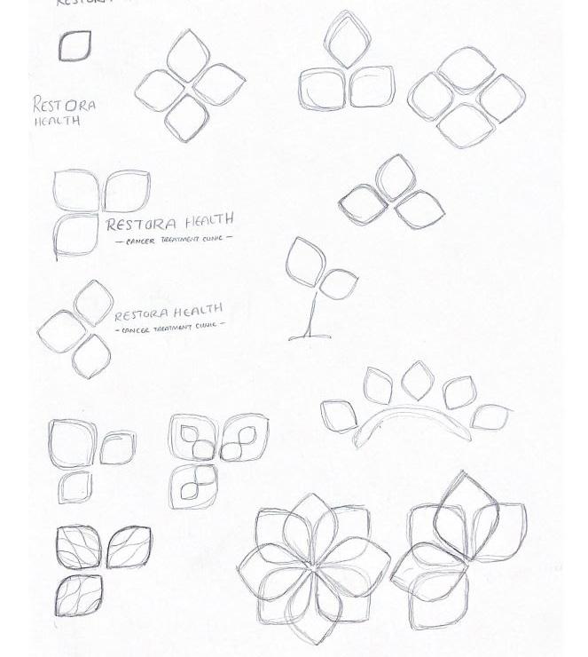
Branding / Logo Design
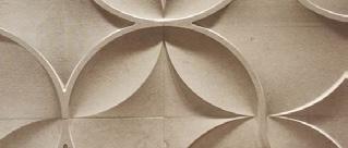
wanted Restora Health’s logo to be made up of simple shapes that referenced the natural world.
curved diamonds are similar to leaf forms and combined look somewhat like a flower. The soft curves also tie into the overall feel comforting environment.


Natural Healing
Safe
5
Key Location Research / Inspiration
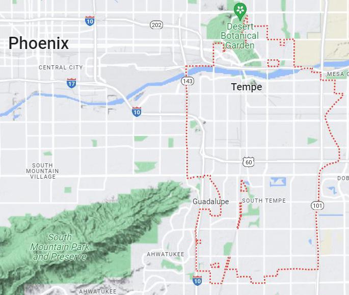
The clinic will be based in Tempe, Arizona, ideal because of the moderate climate and beautiful scenic views. This is a city full of both natural and man-made beauty. It is home to many galleries, museums, and a wonderful waterfront. Tempe is a hotspot for hosting concerts, dance and comedy shows, as well as outdoor festivals. The city is energetic and meets many interests, welcoming patients to the area.
Research + Tours
Part of the project was to tour real places that related to our spaces. I toured the Ronald Mc Donald House in Minneapolis and St.Paul MN, and the Prevea Cancer Center in EauClaire, WI. I learned about a lot of technical and staff needs on these tours.
I also interviewed 4 people as part of my research. I interviewed two now widows of cancer patients, a cancer survivor, and an Interior Designer that focuses on healthcare design. I learned a lot from these individuals, from things they loved to things they wished for in their experience, and tried to implement key things in my design.
Key Takeaways
Implement daylight + windows throughout the space to help reduce stress and increase hope
Promote staff efficiency with effective space planning
Specify durable and bleach cleanable materials
Give patients a feeling of choice and control throughout treatment (privacy, daylight, treatment environment, etc.)
Keep staff spaces more secure and private
Incorporate healing areas for the patients and their families, group spaces for engagement with others


End
Megan
6
Waiting Area Exterior
The building will be ADA compliant.

Blue, green, and purple will be the primary colors used as they promote a calm and relaxing environment.


Wood tones and beige/cream will make the space feel warm and home-like.
Natural light will be shown throughout the space using borrowed light to benefit core spaces. Healthy, sustainable, non-toxic materials and plants will be used throughout to improve indoor air quality.
Patients will have a sense of control during their treatment (privacy, daylight, environment, etc.)
End User Studies

Megan - Oncology Nurse
Megan is a happily married young mom of three. She and her husband Parker live a very active lifestyle. Megan cares so much about her patients she often forgets to take care of herself while at work. Implementing daylight into her working spaces and many resources for her to de-stress and find a minute of quiet time during her day will help her stay on top of her own well-being.


Angelo - Patient + Family
Angelo is a dad of three boys and a full time chef. He recently was diagnosed with colon cancer and will have surgery followed by infusion chemotherapy. Angelo and his family live in Oregon, but have decided to travel to Restora Health for treatment. Colon cancer can be very uncomfortable for patients, which is why bathrooms are accessible, and there is a lot of choice for patients during treatment.
Esther - Patient + Family
Esther was diagnosed with breast cancer, has already had a mastectomy, and is now going through radiation therapy. Esther and Greg are 63 + 65, and have four older kids. They live in Arizona and all but one of their daughters live in the area. Her family is very active in her care, and the facility should provide space for them to attend important milestones.
Key
Project Goals
7
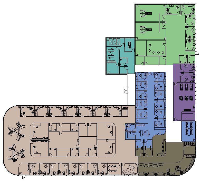
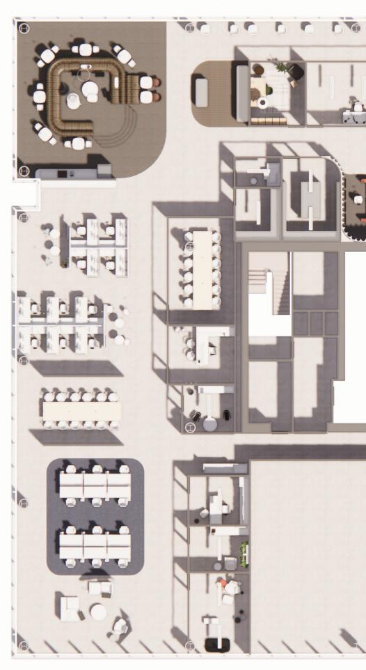
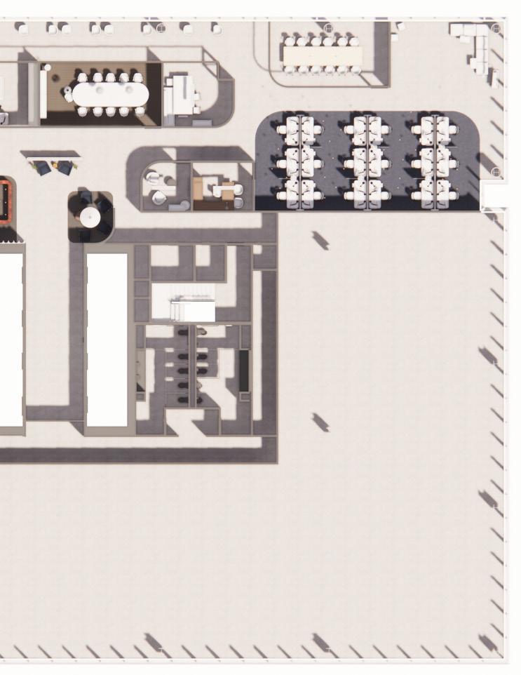
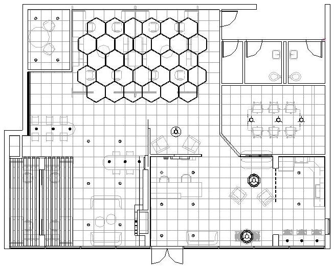
Zone Plan
Staff spaces are centrally located for ease of access to patients. Medical and Radiation Oncology are separated for less confusion with the caregiver spaces connected with a back hallway.
Partial Lighting Plan
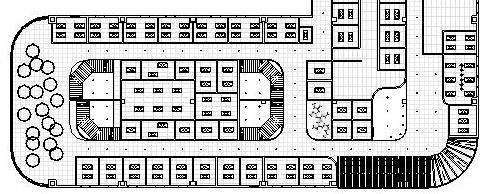
TOTAL SQ. FT. 22,500 Entry - 2,000 SQ FT Medical Oncology - 9,600 SQ FT Staff Spaces - 2,800 SQ FT Radiation Oncology - 3,900 SQ FT Therapy Services - 1,400 SQ FT Caregiver Spaces - 1,100 SQ FT Cycle
Carbon
General Spaces Entry / Vestibule Main Waiting Reception Mail/Print/Storage Conference Secondary Patient Bathrooms Family Bathrooms Staff Bathrooms Storage Electrical Mechanical IT Room Clean Utility Soiled Utility Crash Cart 1 2 3 4 5 6 7 8 9 10 11 12 13 14 15 16 Staff Spaces Physician Offices Head Nurse/Manager Counselor Nutritionist/Dietitian Financial Advisor Staff Breakroom Staff Changing Staff Mothers 17 18 19 20 21 22 23 24 8
Hydrogen
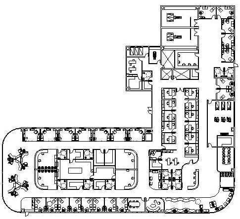
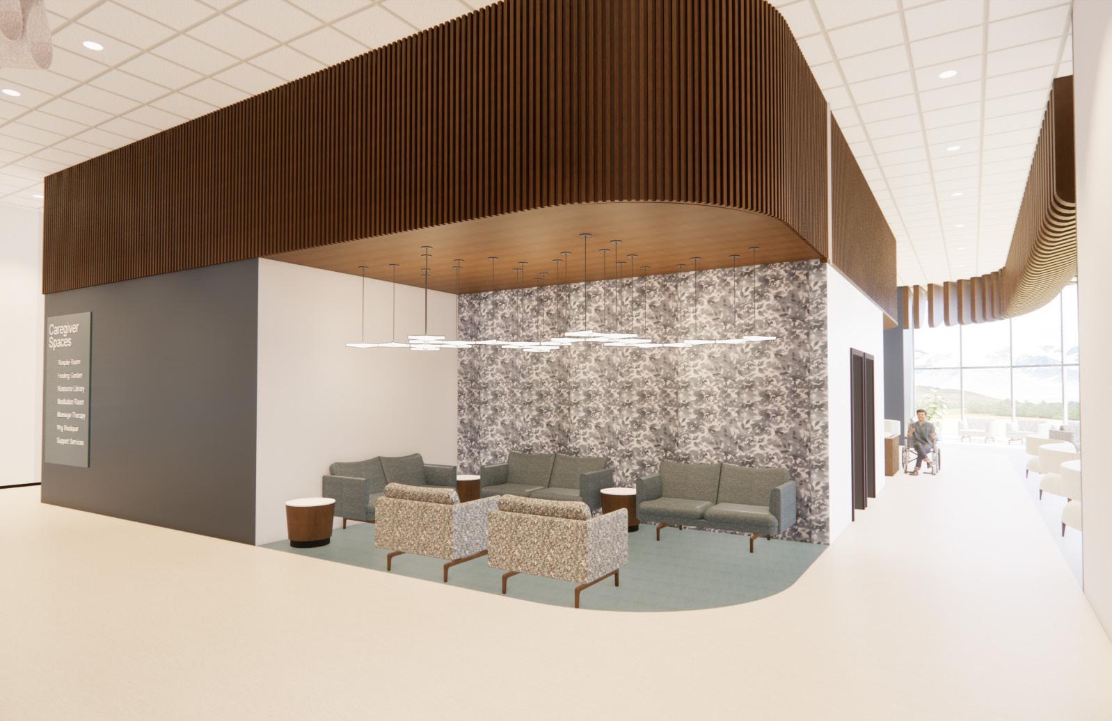
16 17 18 19 20 21 22 24 23 25 4 1 2 3 5 6 7 8 Spaces Vestibule Waiting Area Mail/Print/Storage Room Conference room Secondary Waiting Area Bathrooms Bathrooms Bathrooms Mechanical Utility Utility Cart Alcove Offices Nurse/Manager Offices Office Nutritionist/Dietitian Office Advisor Office Breakroom Changing Room Mothers Room Medical Oncology Exam Room Private Consult Group Infusion Bay Private / Semi Private Infusion Rooms Nurse Station Pharmacy Lab 25 26 27 28 29 30 31 Radiation Oncology Exam Room Private Consult Radiation room / Radiology lab Radiology control room 32 33 34 35 Therapy Services Gym Changing space/locker room PT Exam Rooms 36 37 38 Caregiver/Wellness Spaces Healing Garden Caregiver Respite Room Wall café/bar Resource/Patient Library Wig/cancer boutique Meditation Room Massage Therapy 39 40 41 42 43 44 45 10 7 7 7 9 9 36 37 38 7 32 33 32 34 34 35 13 11 12 10 45 44 42 43 40 8 29 28 41 26 7 7 10 10 10 29 14 15 31 30 29 29 29 27 39 9
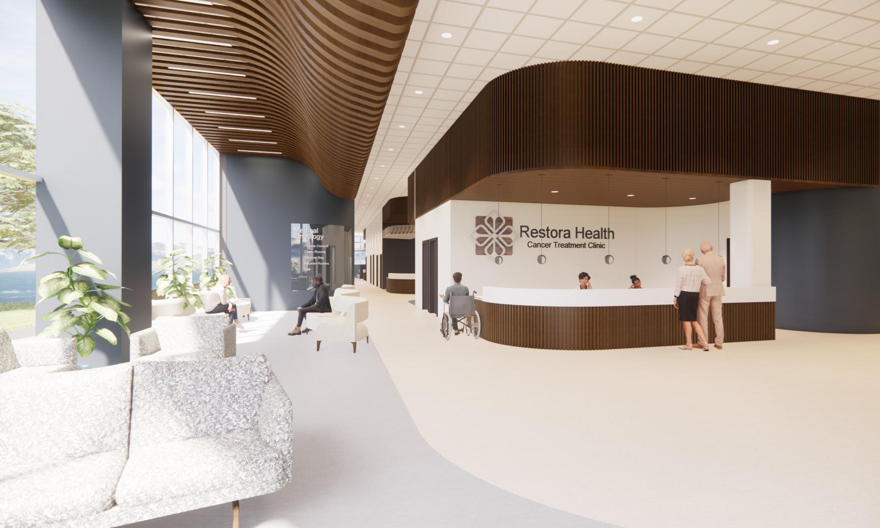
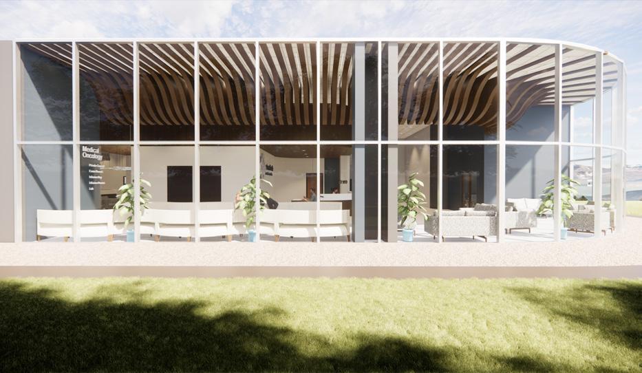
Reception + Waiting Area
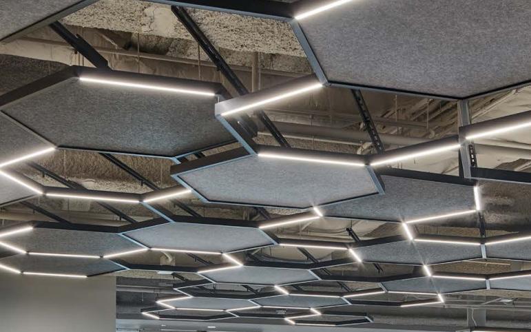
This view shows the entry as you come in to the Restora Health Cancer Treatment Clinic. I wanted to have a lot of natural light in this space as well as acoustic wood beams and slats on the ceiling to absorb some sound with the tall ceilings.
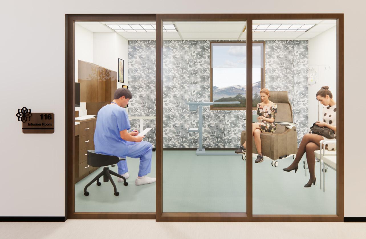
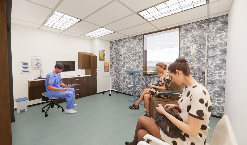
Private/Semi-private Infusion Room
The treatment rooms have the ability to be private or semi-private with switchable tinted glass, giving patients control. The sliding doors make it easier for patients to get in and out, and there is space for two guests.
10

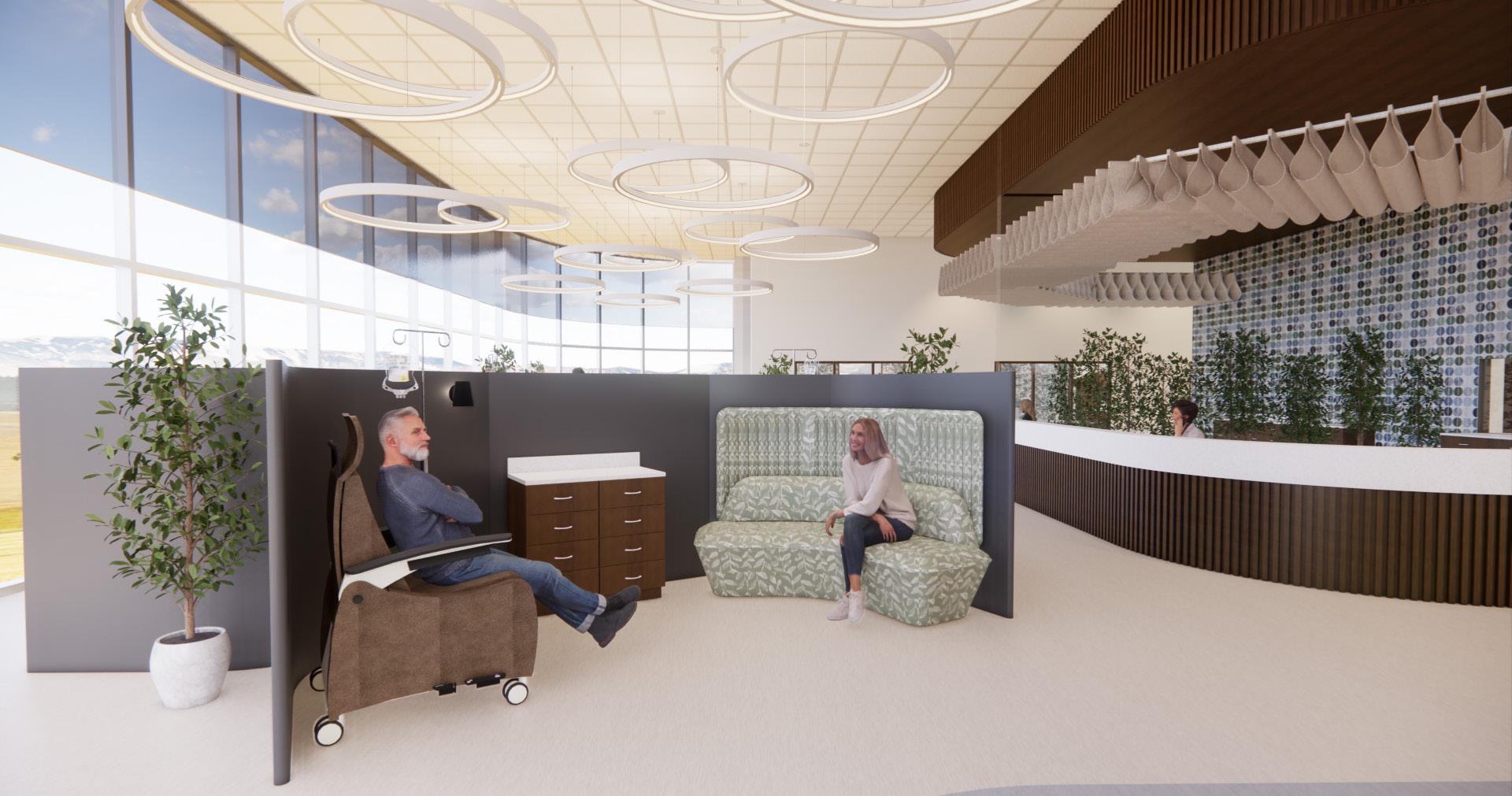
Infusion Bay
This is a semi-private space for patients to receive infusion chemotherapy treatment. The half walls allow for some privacy while still giving a group feel, ideal for patients who may not have someone with them, or want to be in a louder space. Nurses have full view of patients from the nurse’s station.
Secondary Waiting Area
Designed for return patients and their loved ones, this waiting area allows people to check in and have a more private area to wait for treatment.
11
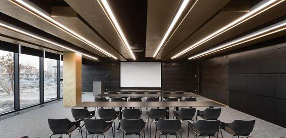
Steelcase - NEXT
Project Description
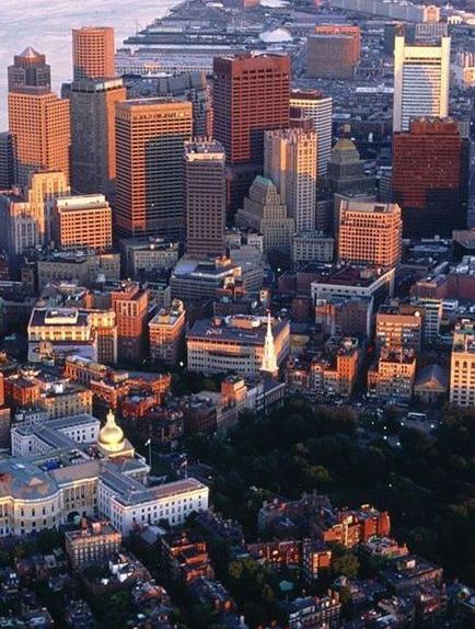
NEXT is a leading global consumer robot company based in Providence, Rhode Island They have decided to invest in a new Research and Development Hub in the heart of the thriving Seaport District of Boston, Massachusetts. The Seaport District, or Seaport, is part of the larger neighborhood of South Boston, sometimes known as the Innovation District.
The NEXT team is working hard to create consumer electronics and appliances designed to make homes easier to maintain and healthier places to live. Committed to discovery through technological exploration, they value innovation, authenticity, and connection. NEXT products are intuitive, sleek, stylish, and have eco-friendly features. A human-centered organization, NEXT aspires to be an inclusive and diverse company that embraces all walks of life and celebrates the greatness of individuals, helping to reach their full potential.
Design Concept Statement
NEXT wants to create an overall identity yet speak to the uniqueness of each of their locations. The new 12,000 square foot NEXT office reflects their brand and people and pairs that with inspiration from the Boston Seaport District. This new space promotes connection and inclusivity through human-centered design with the employees at the forefront. Geometric structure and linear forms paired with the flow of the river and harbor area mix well together to create a dynamic and engaging space. Bold lighting is used to capture the vibrancy of the city and the Seaport District.

Branding NEXT’s technology, core represented 12
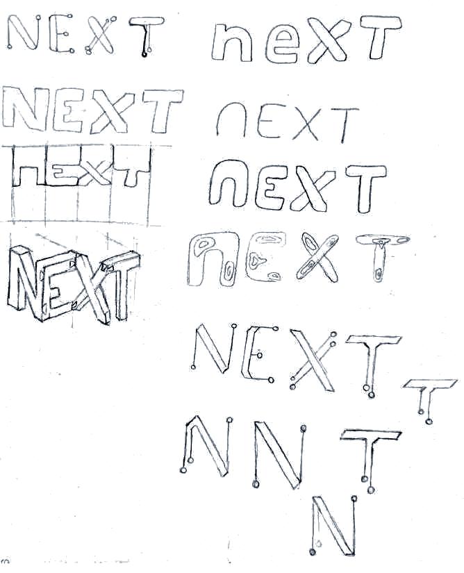
Branding / Logo Design
NEXT’s logo combines connection, technology, and location. These are values that the company wants represented to clients right away.


Human-Centric Connected Innovative
Geometric
13
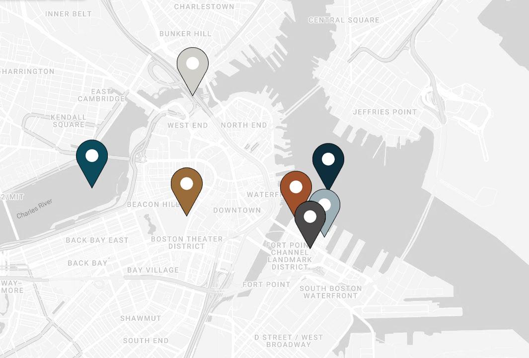
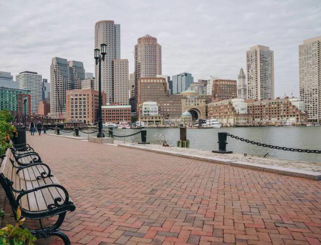
Location Research / Inspiration
These places are all located near the NEXT office. This is where I drew my color inspiration from, pulling in the history and uniqueness of the area.
The Seaport District has a lot to offer and I wanted to highlight some main landmarks and beautiful areas that the employees would see every day.
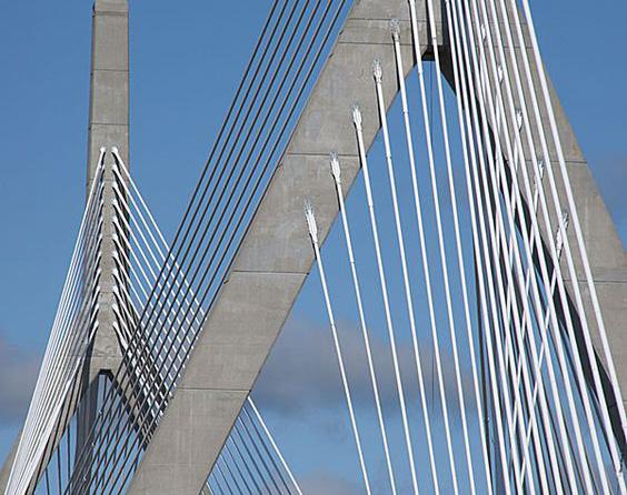
Zakim Bridge
The largest asymmetrical cable-stayed bridge in the world. Stretches over the Charles River, connecting northern Boston to Charlestown.
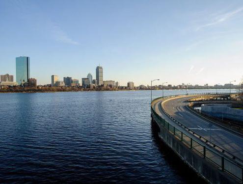
Charles River
Flows 80 miles from Hopkinton to Boston Harbor. A major source of recreation through activities on and alongside the river.
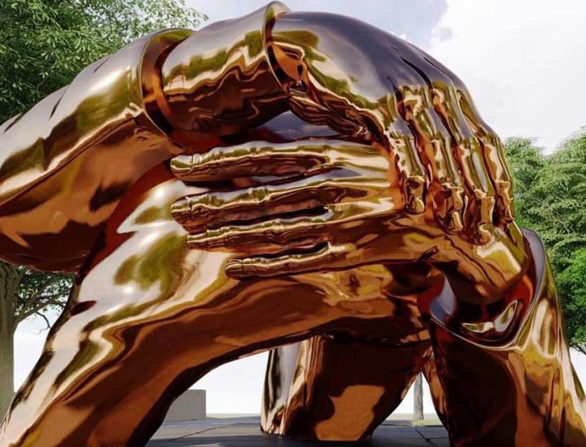
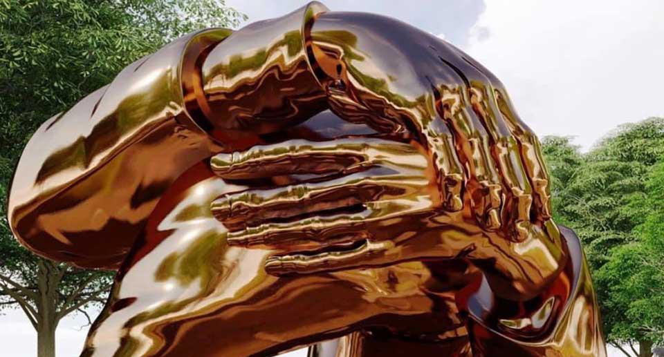
‘The Embrace’ Statue
An in-progress sculpture designed by Hank Willis Thomas and MASS Design Group. A memorial to Dr. Martin Luther King Jr., it shows Dr. and Mrs. King embracing. Their entwined arms are made from a mirror finish bronze.
The featuring performance. and
Institute
A walkway Boston sense
A Massachusetts square and 14
Boston
Boston
Suite 600
Boston, MA 02210
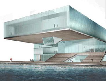
Institute of Contemporary Art
The ICA is a waterfront museum featuring leading visual artists and performance. Weaves together interior and exterior space.
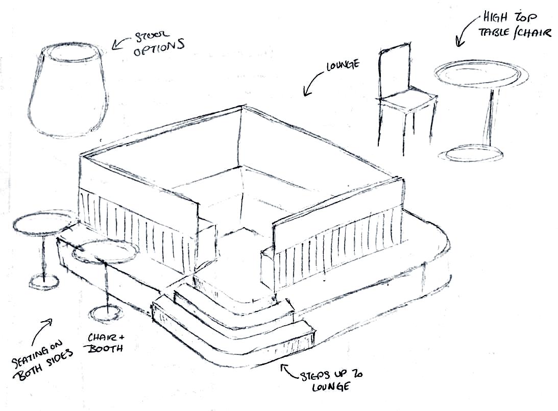
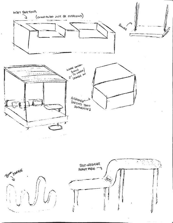
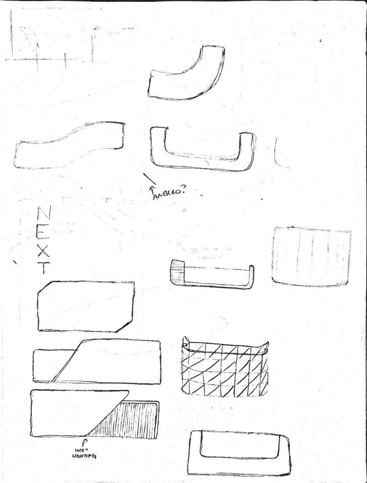
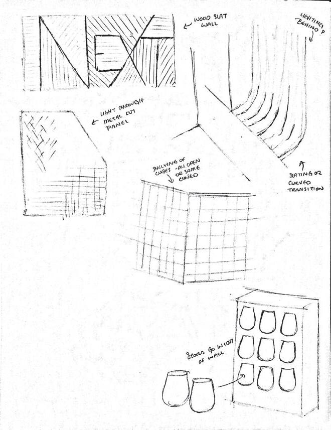
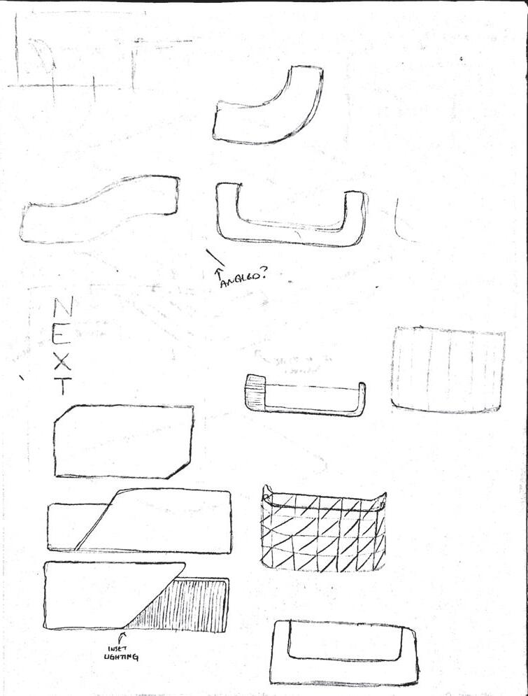
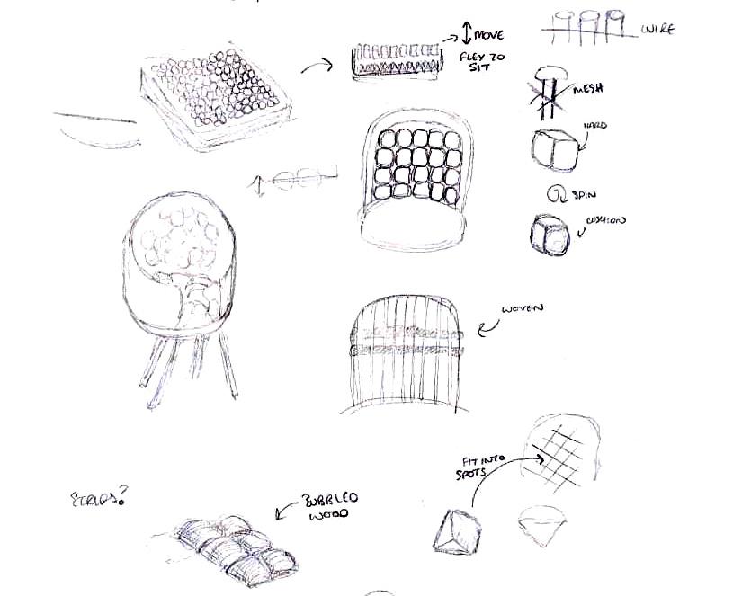
Sketches
In sketching I worked through what the work cafe would look like, understanding how the levels would work to create the most seating options possible. I also worked out my reception desk and the stool wall pictured in my renderings.
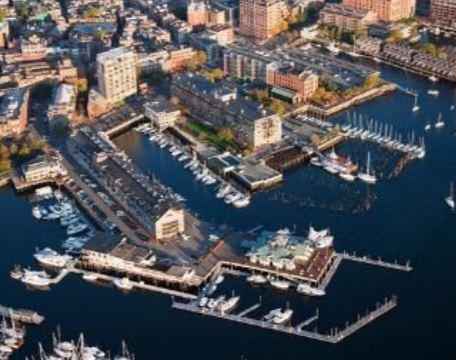
Boston Harbor
A natural harbor and estuary of Massachusetts Bay. Consists of 50 square miles, 180 miles of shoreline, and 34 harbor islands.
Boston Harborwalk
A near-continuous 43-mile public walkway that connects eight distinct Boston neighborhoods to create a sense of togetherness.

101 Seaport Blvd.
15
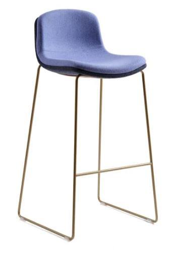
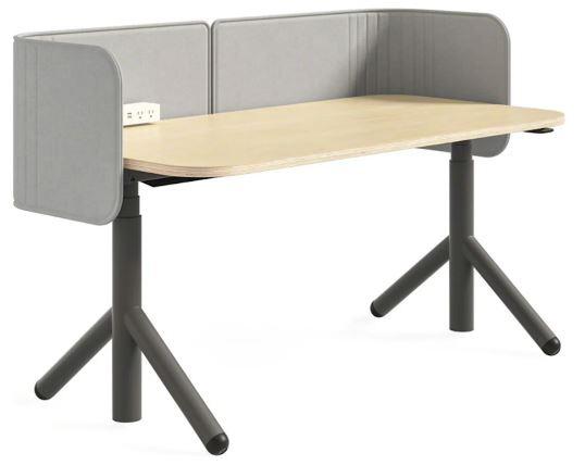
Key Furniture
The Steelcase competition required the use of a lot of their furniture. These are some key furniture pieces that I used in my space.

13 10 11 12
Corkdrop Stool
Amia Office Chair
Cubb Stool
Swivel
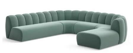
Sofa 14 15 16 17 18 19 20 21 22 23 24 25 26 27 Steelcase 16
Ology Desk
Cubb
Chair Belle
Legend
Reception
Phone Room
Design Director P.O.
Design + Engineering W.S.
Dedicated Team Space
Project Room
Individual Work/Get Away
Phone Room
Large Conference Room
Inclusive Design Lab
Home Office Lab
Retail
Work Cafe
Phone Room
Product Storage
Resource Center
Project Room
Private Office
Phone Room
Private Office
Mothers Room
Wellness Room
Test/Prototype/Design Lab W.S.
MTLS Innovation + Others W.S.
Dedicated Team Space
Prod. Man + Development W.S.
Dedicated Team Space
1 2 3 4 5 6 7 8 9 10 11 12 13 14 15 16 17 18 19 20 21 22 23 24 25 26 27 4 1 2 3 5 6 7 8 9 Steelcase Flex Collection Currency Enhanced N.I.C. 17
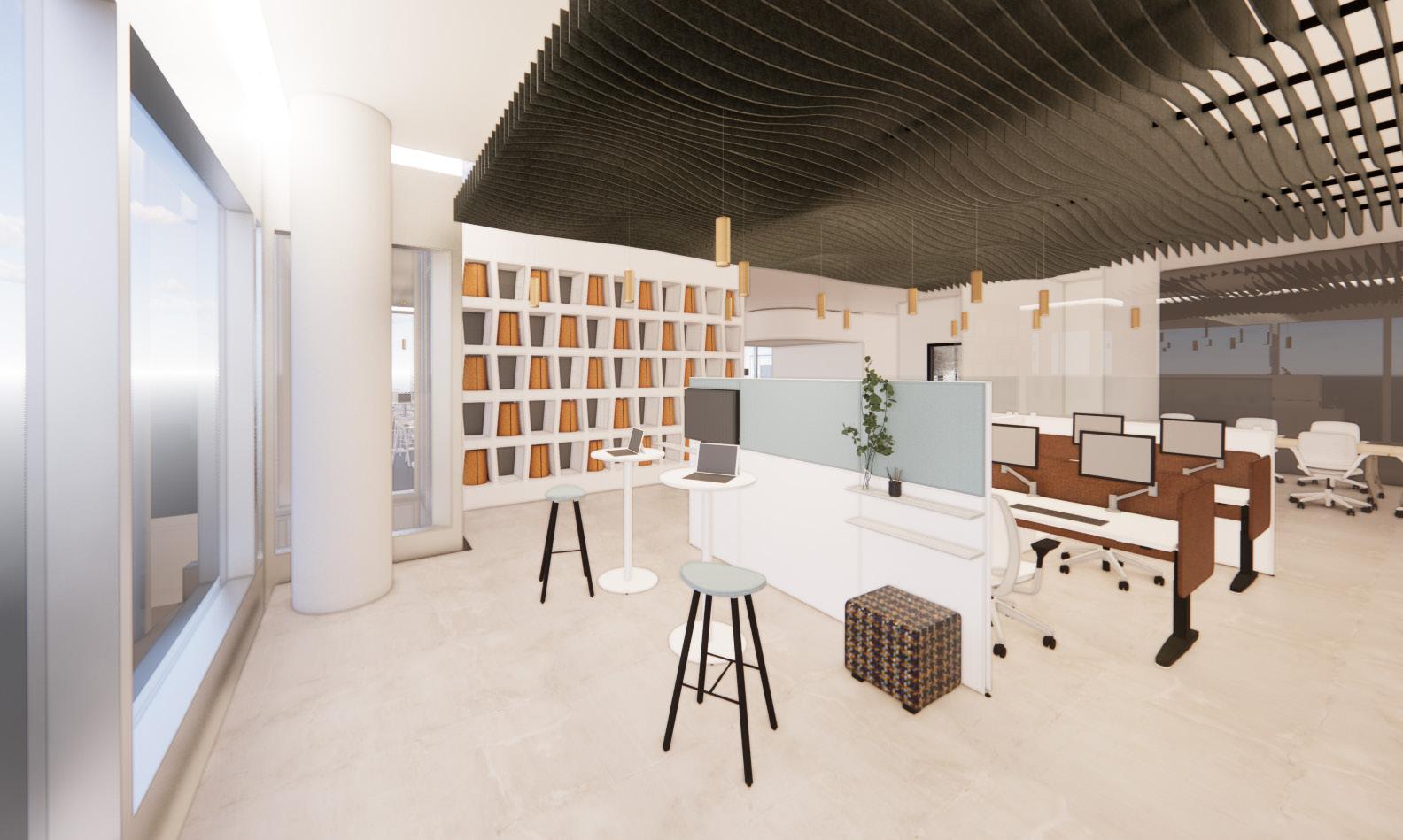
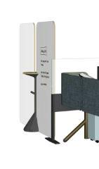
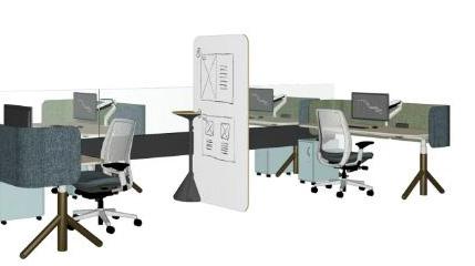
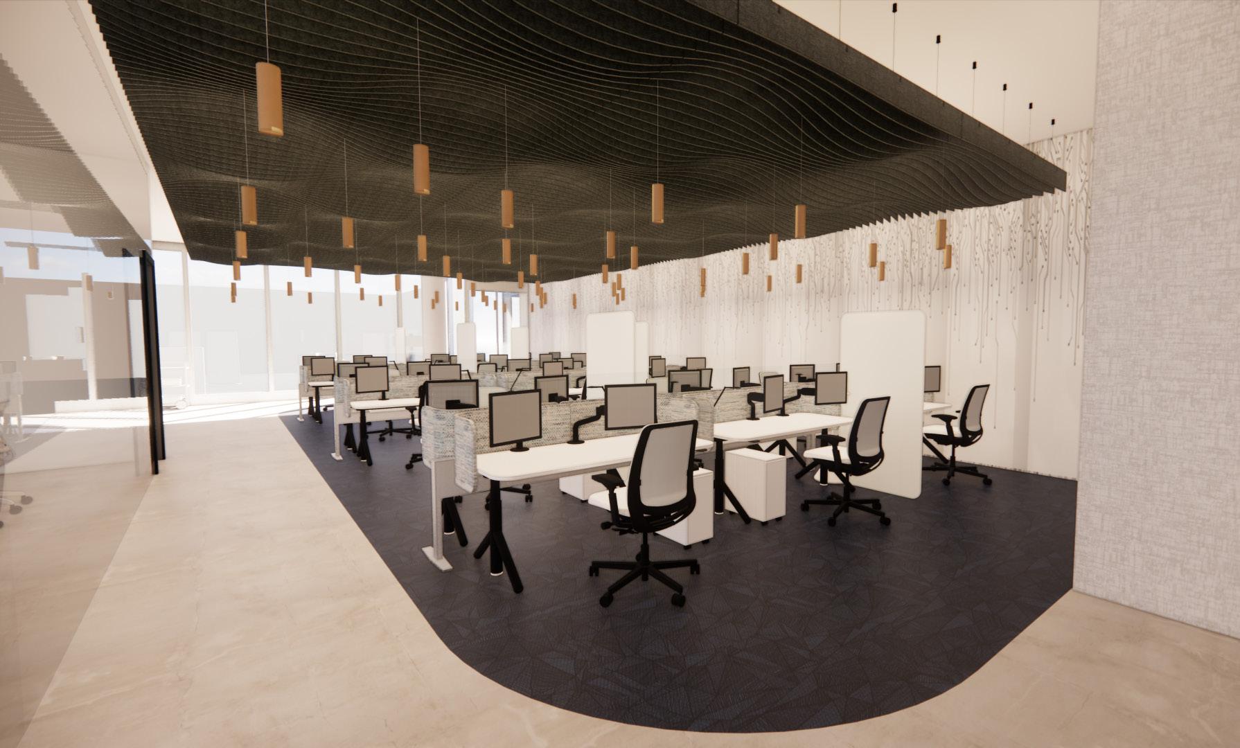
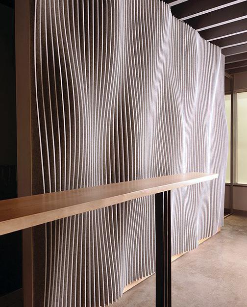
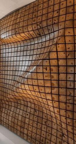
Collaboration Area + Workstations
This view shows a smaller collaboration area adjacent to the larger group of workstations. Acoustic baffles absorb sound and create a zone for the workstations The wall to the left is custom built to house stools which can be pulled out and used around the office as extra seating.

Work Cafe
The work cafe allows many people to work in this space at once in various ways. The upper booth seating allows staff to chat and collaborate with each other in a small group setting. The surrounding high top tables allow for individual work and booth seats provide inclusion and ADA compliance.
pop. provides on company’s 18
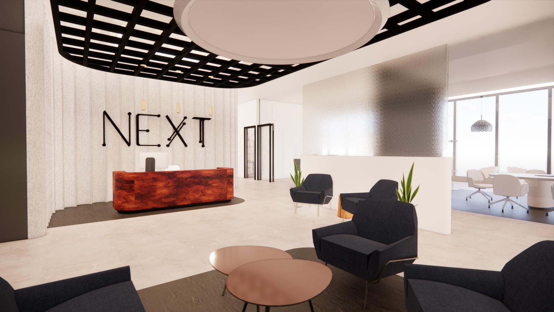
Entry/Reception
The entry is bright and open, welcoming guests into the space. A dropped metal grid helps to ground the space and the glass wall lets natural light into the space while still providing privacy to the adjacent conference room
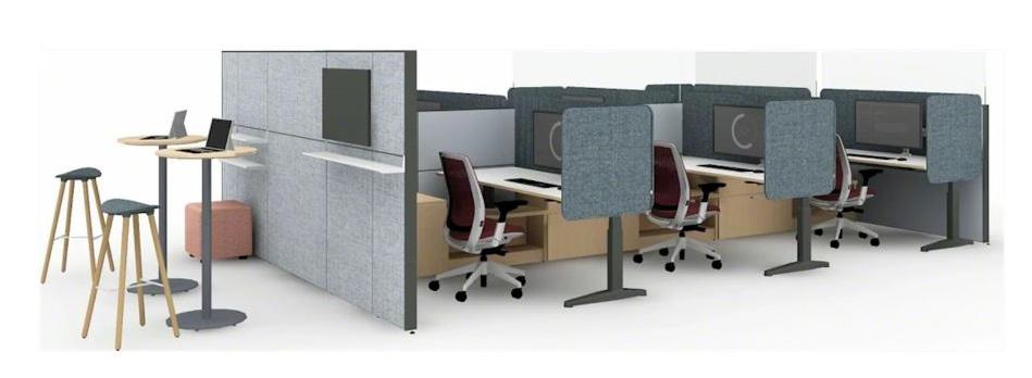
Workstations
Design + Engineering workstations are more neutral but bring in a blue floor to promote creative exploration and let projects pop. Steelcase’s whiteboard attachment between desks provides privacy and a writing surface. Custom wallpaper on the back wall brings in the company’s value of connectivity.
19
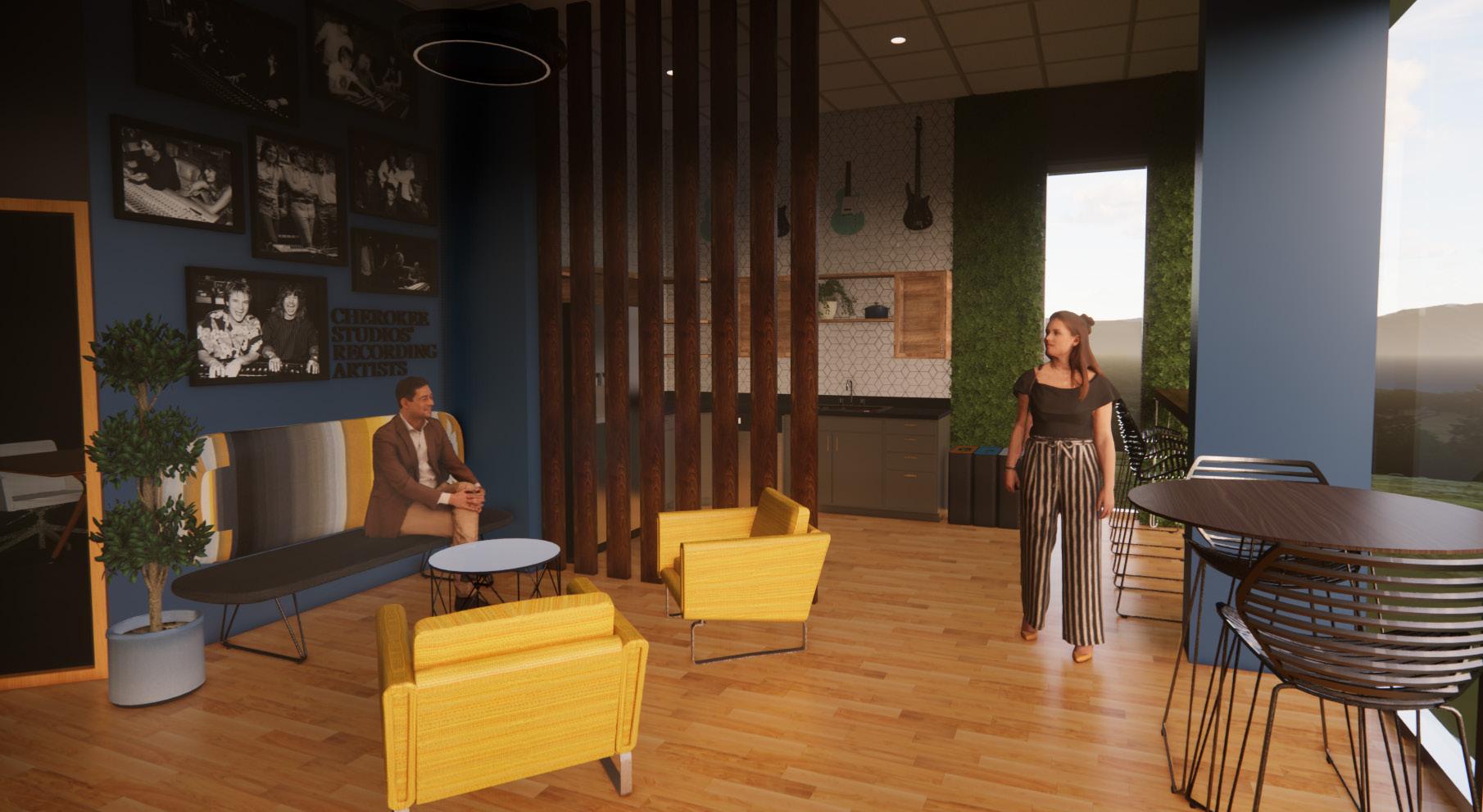
Canyon Hills Graphics
Project Description
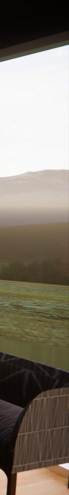
This is a new office space located on the first floor of an existing mixed use building, Cherokee Studios, located in West Hollywood, CA. The client’s graphic design firm, Canyon Hills Graphics, is well known for its print, digital, and environmental work in the music and film industries.
Cherokee Recording Studios also holds significant musical and Hollywood history, formerly known as MGM Studios, with artists from Frank Sinatra to David Bowie to Dave Matthews having recorded music on-site. Many of the employees and other residents in the building have an appreciation for this piece of history, which is implemented in the design.

20
Design The new Hollywood inspiring work Location Canyon located couple Westridge
Design Concept Statement
new design of Cherokee Studios reflects the history in the Hollywood Hills. Embracing the environment, this casual yet inspiring space offers a vibrant, creative, and collaborative work environment for employees.
Location Inspiration
Canyon Hills Graphics gets its name from the mountain range located nearby. There are many canyons located here, with a couple of the parks named Franklin Canyon Park and Westridge - Canyonback Wilderness Park.
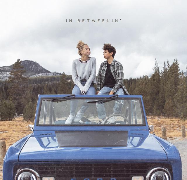
This project utilized the album cover In Betweenin’ by AUSTN as inspiration


Inspiring Graphic Natural 21
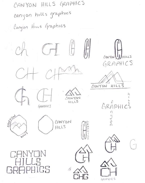
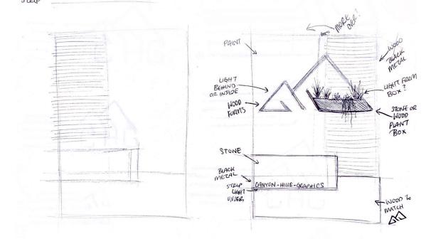
Logo Design Process
I wanted to simplify the brand down to “CHG” for Canyon Hills Graphics. I also wanted to include mountains in the logo, as the name of the firm is derived from the location.
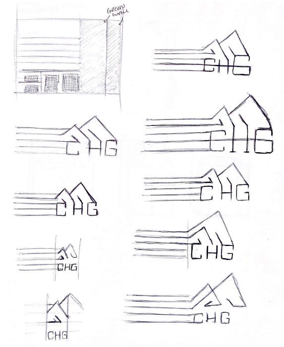
Sketches
Here I experimented with the design of the reception desk and library/resource area. I worked on the space as well as implementing branding.
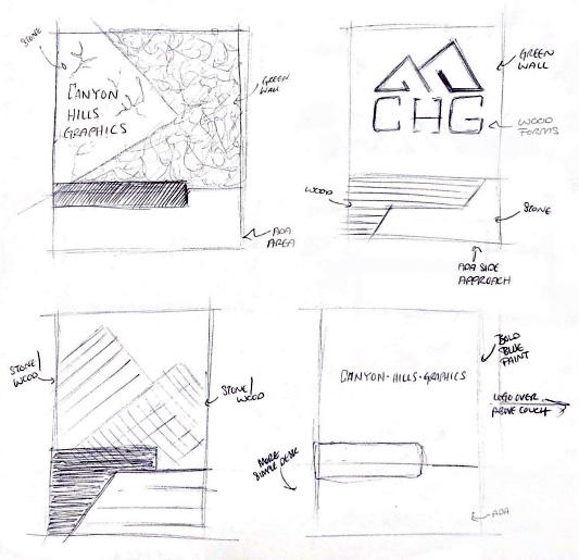
Final Direction

22
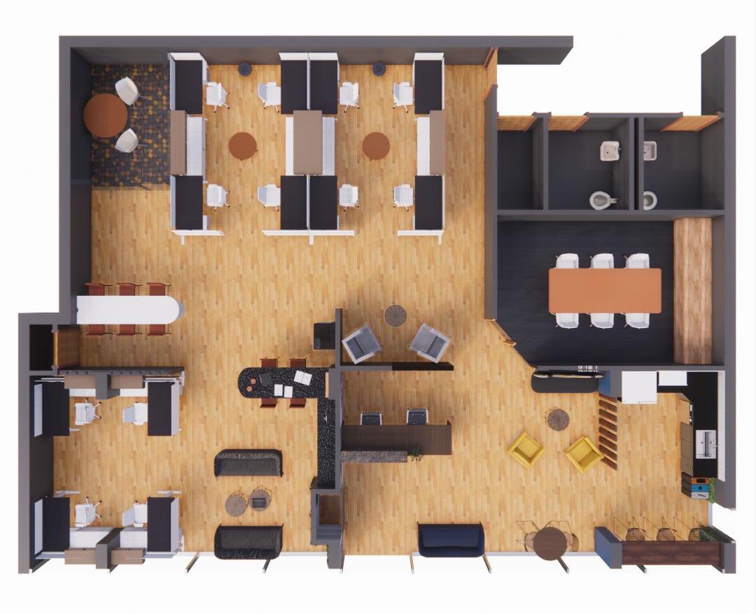
Legend
High Traffic Reception
Open Collaboration Area
Kitchenette
Medium Frequency
Group of eight workstations
Print Area
Library / Resource Area
More Private
Conference Room
Huddle Room
Group of four workstations
Key Fixtures

IT Closet Coat Closet 1 2 3 4 5 6 7 8 9 10 11 4
1 2 2 3 5 6 7 8 9 10 11 2 23
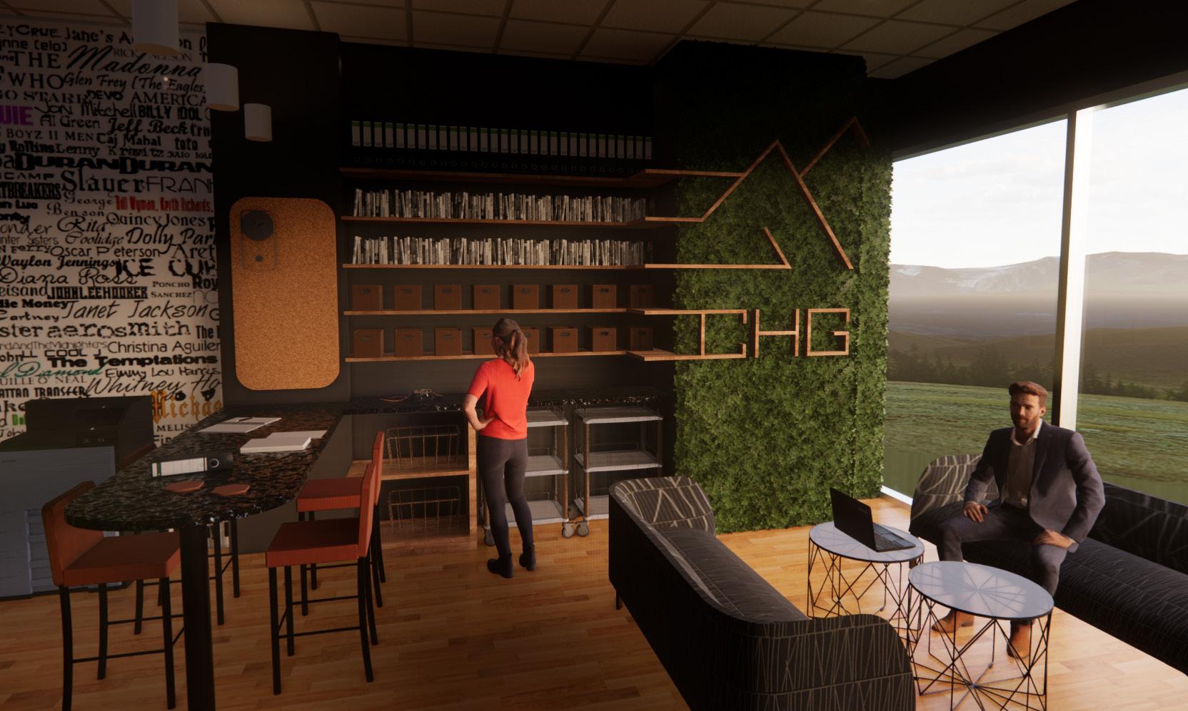
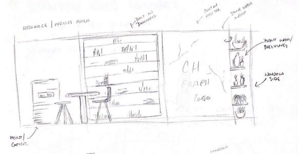
Library/Resource Area
This space serves as a collaboration area for employees as well as a storage area. Pulling the company branding in here serves a dual purpose through shelving and advertisement for patrons passing on the sidewalk outside of the building. The wall on the left honors the building’s history with a wallpaper incorporating names of important artists who recorded here.
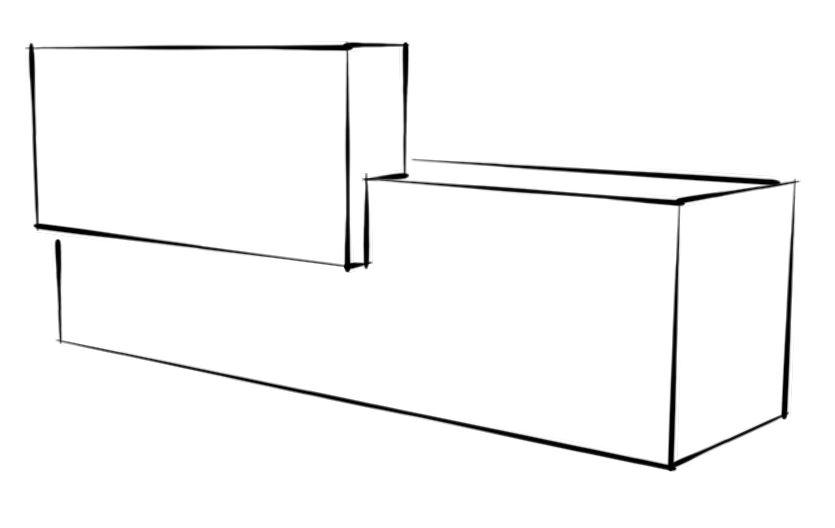
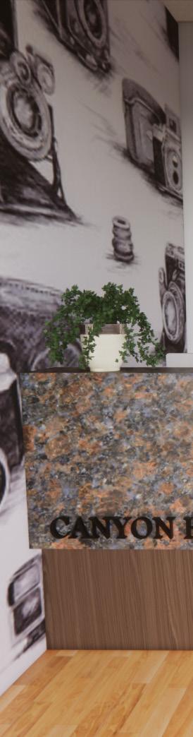
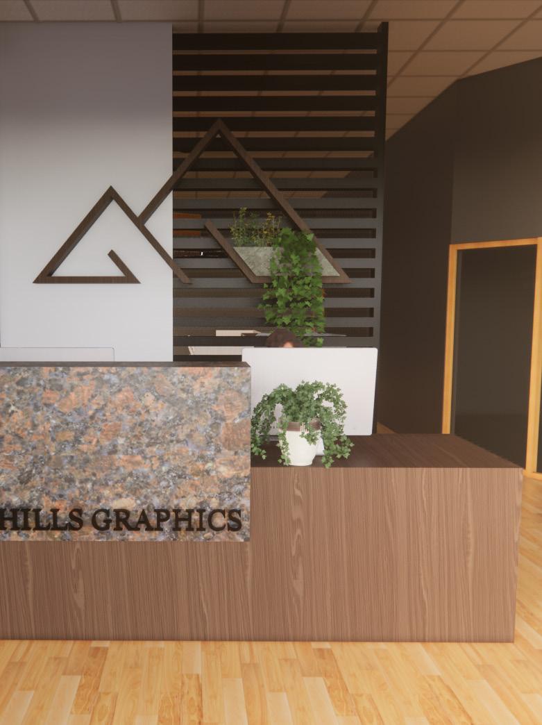
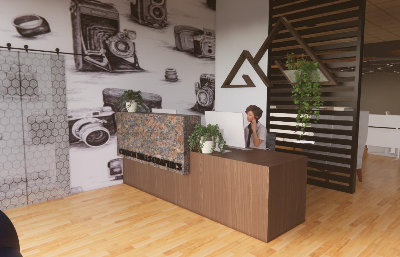
Custom Reception Desk
I designed this reception desk and built it in SketchUp. I wanted to create space for two receptionists, as well as make the desk ADA compliant but with a little privacy if desired. Canyon Hills Graphics’ logo is attached to a metal slat wall behind the desk to welcome guests and show the transparency of the company, but still provide privacy to the employees.
24
Collaboration Area + Kitchenette
Right off of the entrance, you find yourself in the waiting area and lounge collaboration space. The lounge features a photo wall of past recording artists which you pass going into the conference room to the left. The kitchenette is on the back wall taking full advantage of the natural light coming in.
25
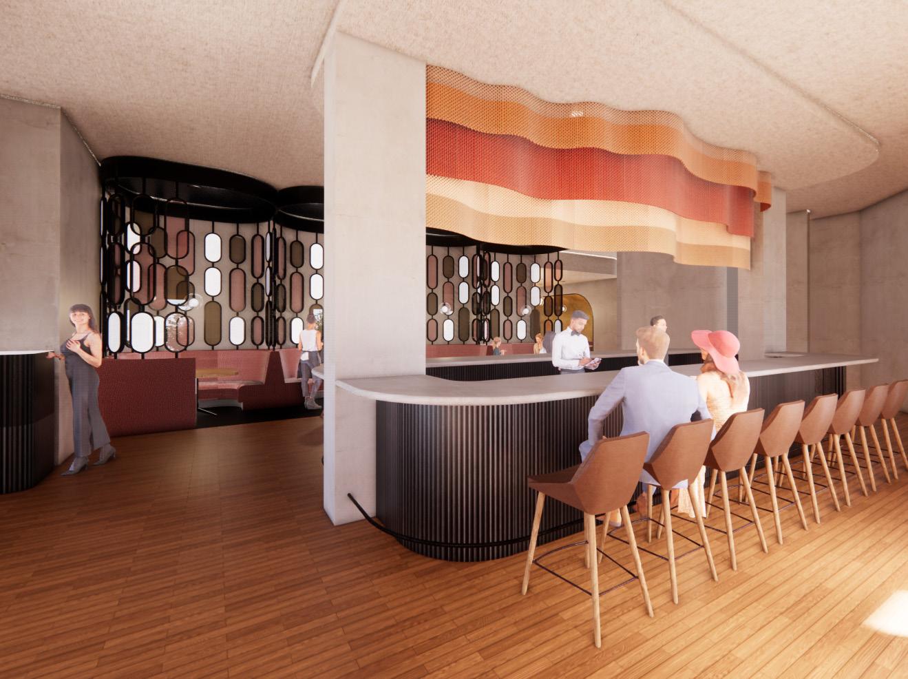
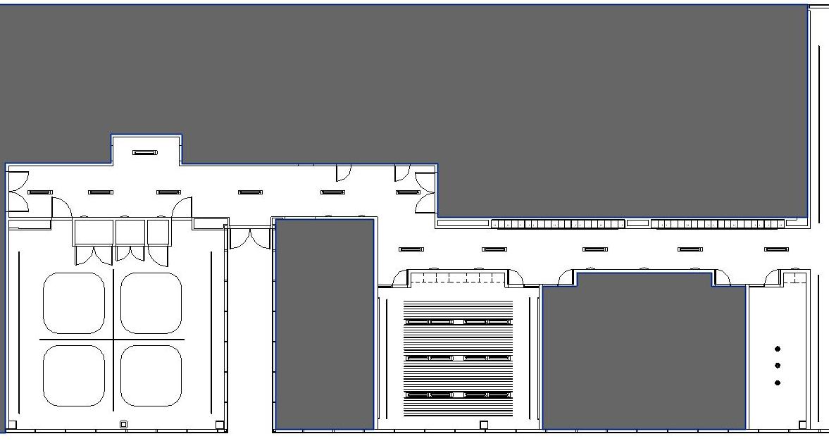
Spence’s Tapas + Cocktail Bar
Project Description
The client has hired you to verify the suitability of the site depicted in the plan provided for use as a restaurant. The design should focus on a lounge/bar with a light meal service
The atmosphere/aesthetic must reflect the concept of “cocktail lounge” but can do so in a contemporary manner. The menu and concept should be based on at least 1 item found from the archives department.
Design
This bar come cocktails.
Whiskey accented drinks. and
Historical In the Mrs. inspiration

26
Black
Design Concept Statement
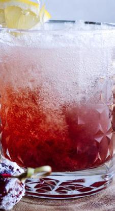
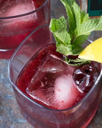
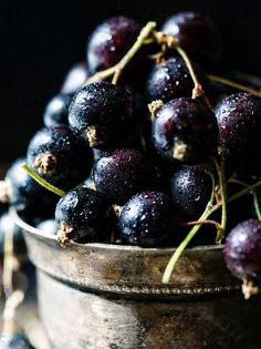
bar and lounge will be warm and inviting. Guests can come in to relax and enjoy a light meal and a few specialty cocktails. Spence’s signature drinks include their Cherry Whiskey and Black Currant Cordial. The warm woods are accented by deep purples and reds to highlight their featured drinks. Glass and metal elements are brought in to add detail form to the space.
Historical Elements
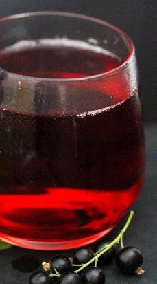
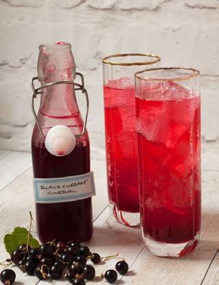
the UW-Stout Archives I discovered two drink recipes by Spence. I chose to name the bar after her, and I drew inspiration from the colors of the ingredients in these drinks. Warm


Inviting
Dynamic
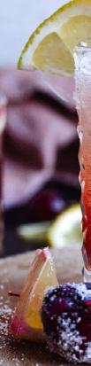
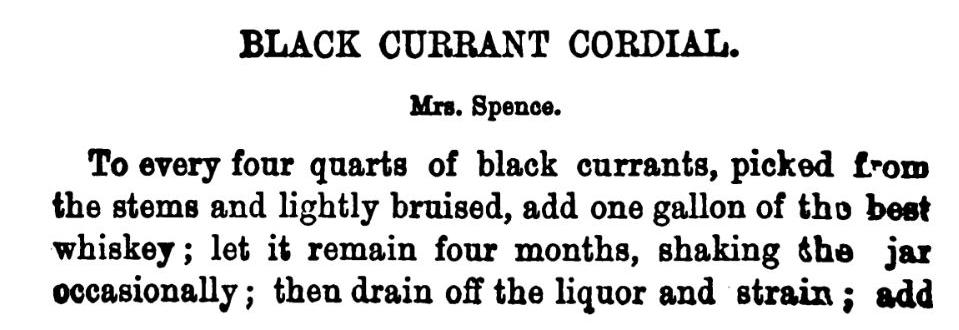
Black Currant Cordial
27
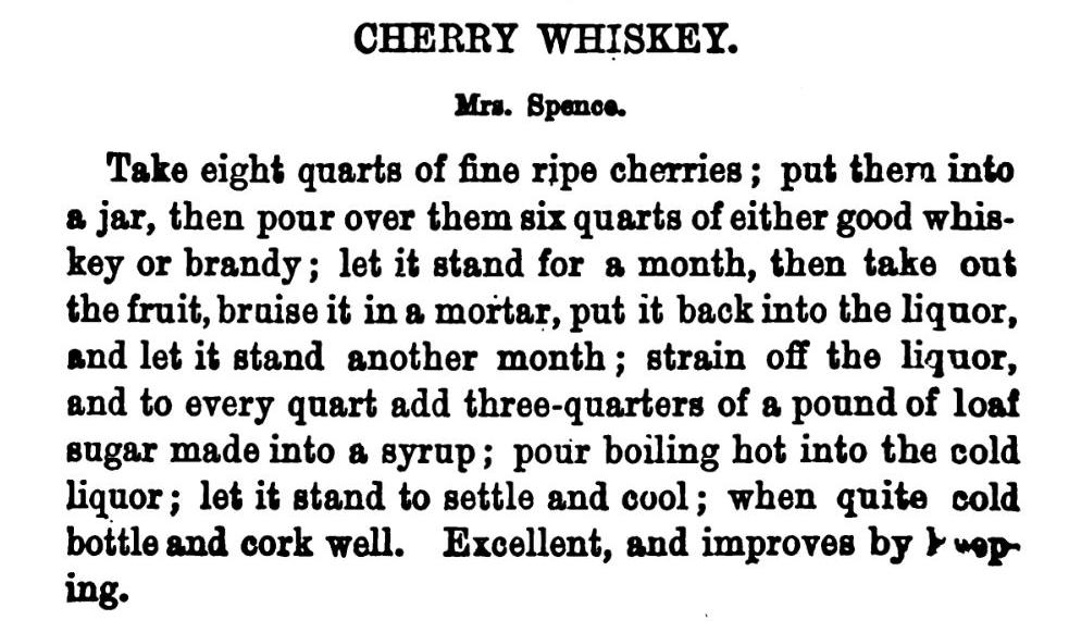
Cherry Whiskey

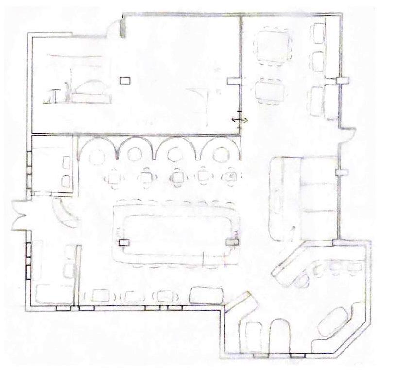
Sketches
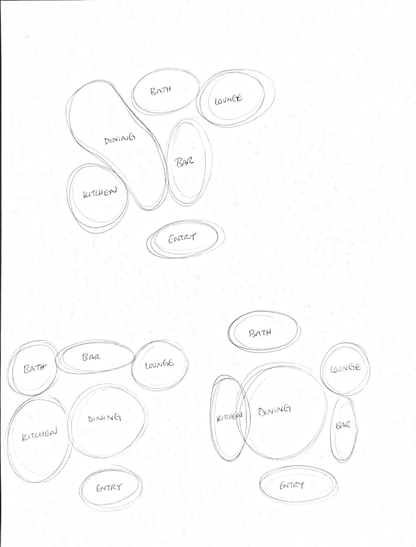
Space Planning Process
28
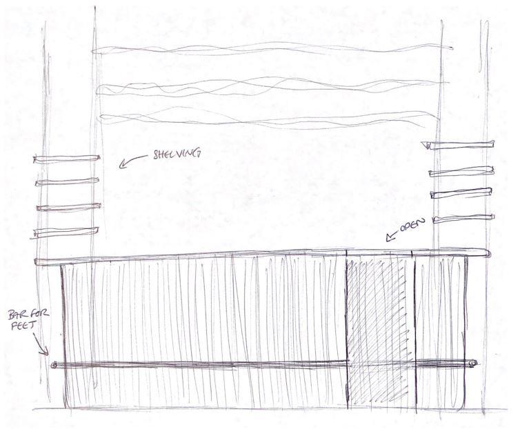
Booth seating sketch of final direction and bar elevation.
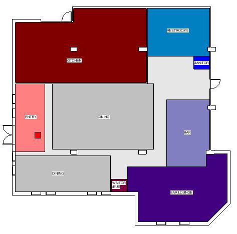
Legend
1 - Lobby
2 - Host Station
3 - Bar
4 - Dining Area
5 - ADA Compliant Bathrooms
6 - Lounge
7 - Waiter/Bus Station
8 - Kitchen (N.I.C)
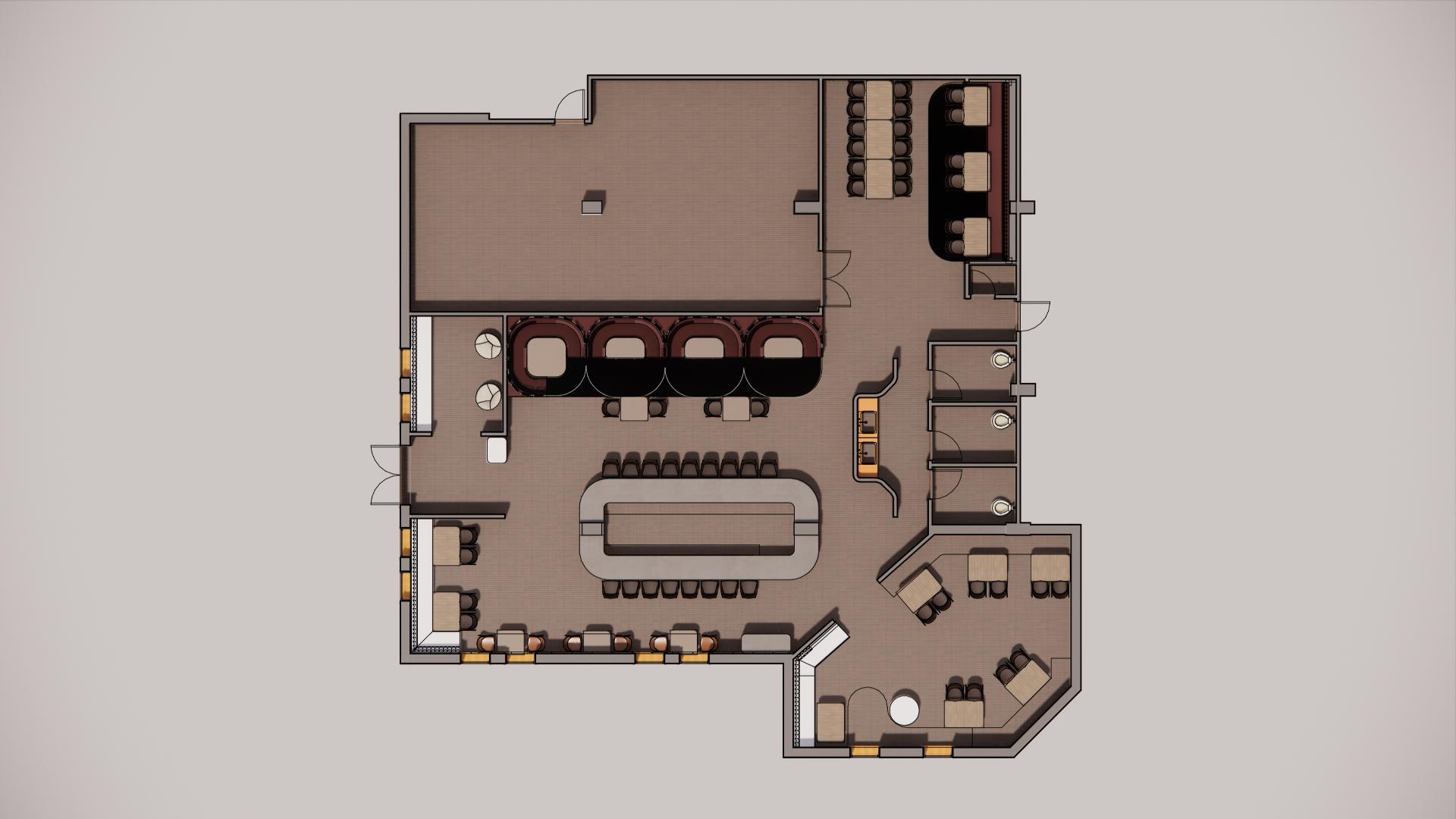
Floor Plan Implementing furniture and creating a final direction to move into Revit.
Programming
Total Seating (86 min)
- Bar + Lounge Seating (50)
- Have 61
- Dining Seating (36)
- Adjacent to kitchen
- Tables of 4
` - Some 2 tops, 1-2 6 tops
- Have 46
Lobby
- Seating for 4
- Hostess Stand
Bar Counter
- Counter 22 lineal ft min
- Have 33 lineal ft
- 2’ clear drink pick up area
Waiter/Bus Station
- 4’x5’
- Further from kitchen
- Counter 4 lineal ft min
4 1 2 3 5 6 7 8 4 4
29
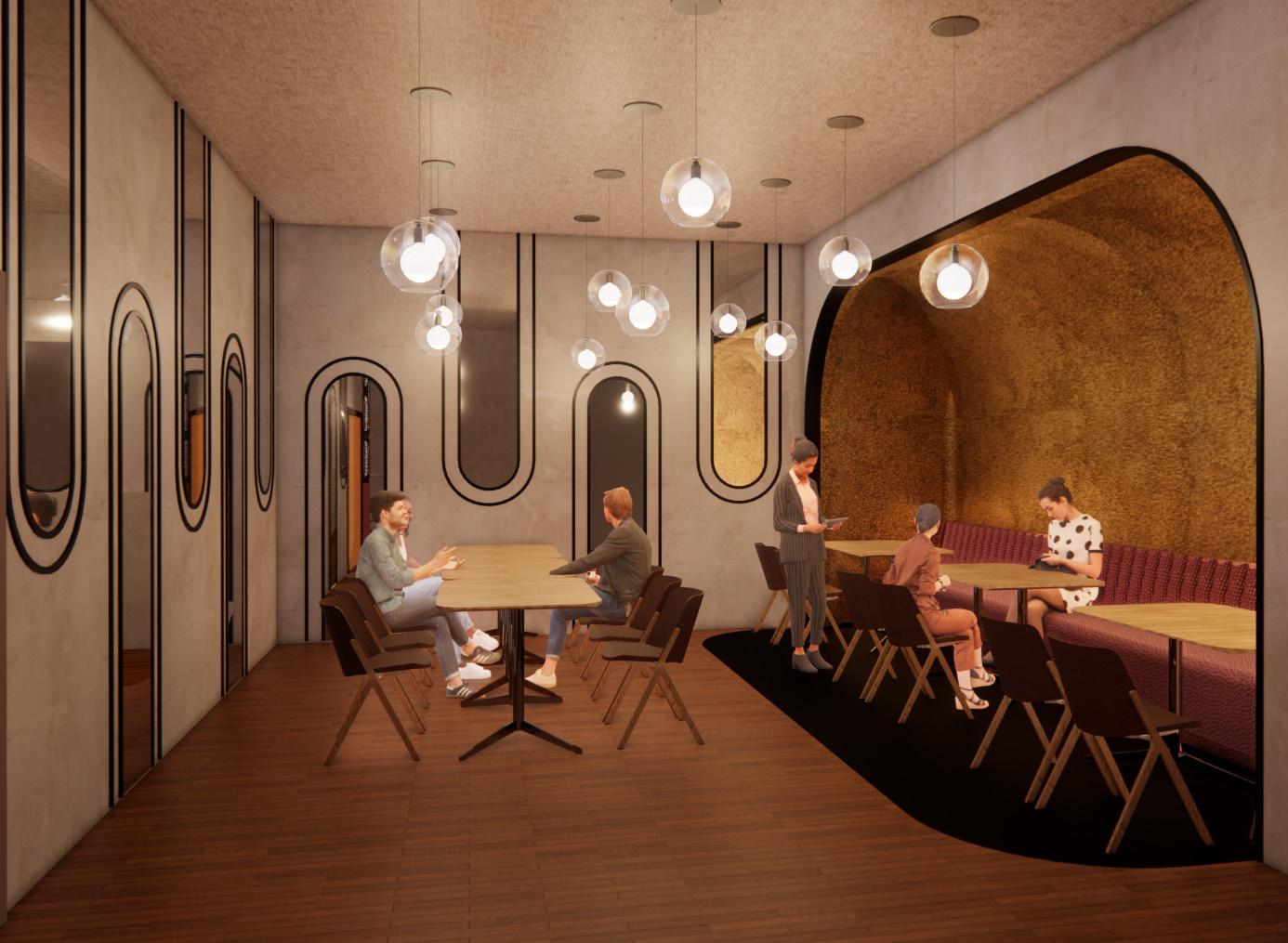
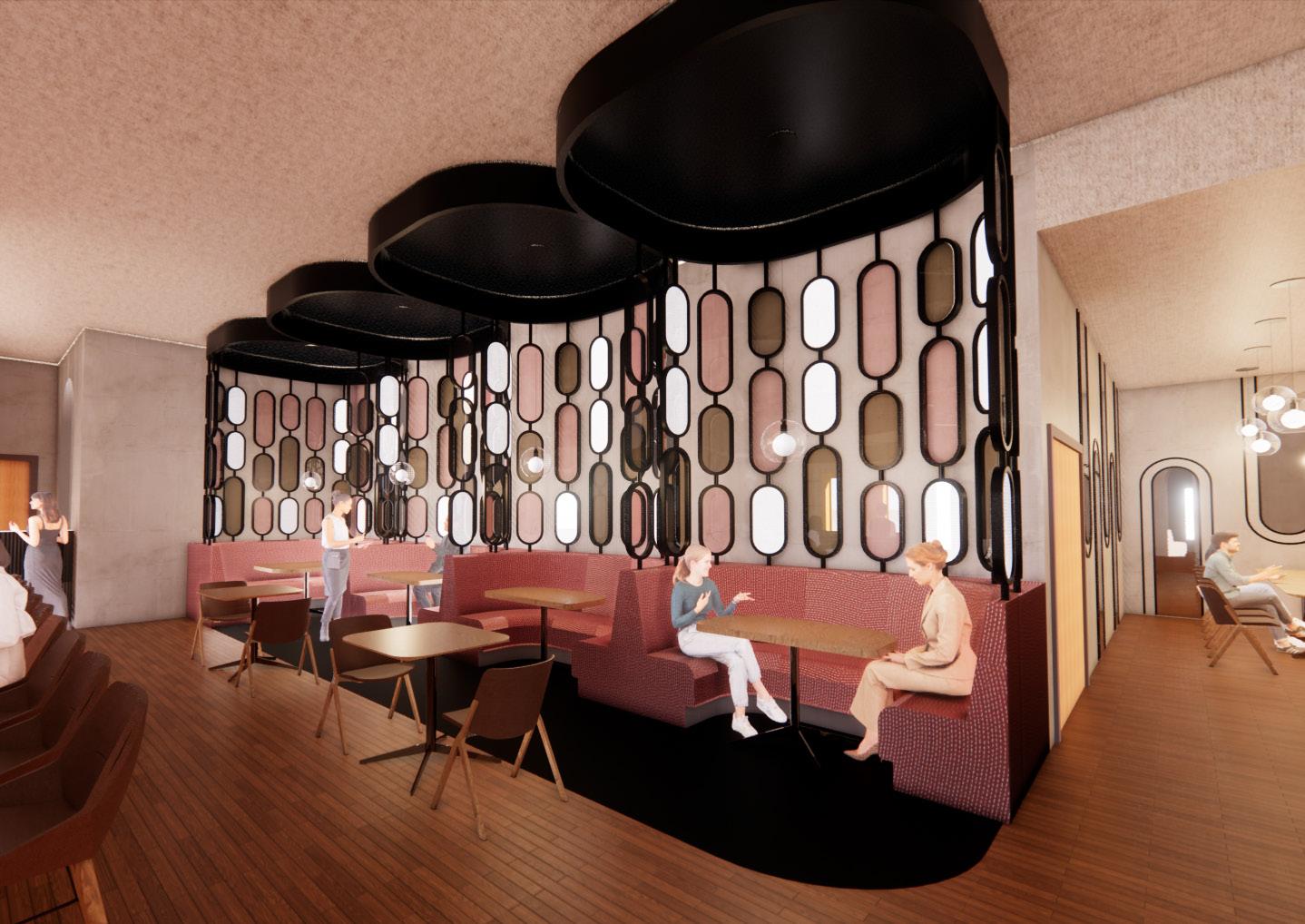
Dining Area
This space is meant to be very versatile. Right now, it is shown in a layout for one large group and three smaller four-tops within the cove booth seat. This furniture can be combined to accommodate a larger group, combining tables from the booth and open area, or create more smaller groups by separating the large table. Lighting here is spread throughout so as not to conform to one layout.
Custom Booth
I modeled the entire booth system here
Black metal frames each individual booth connecting the floor and ceiling with glass privacy while creating a transparent,
30
Seating
here in Revit. booth area, glass panes for open look.
Bar Area
I modeled the entire bar in Revit. The underside of the bar is wrapped with an acoustical paneling to trap sound. Woven metal mesh is hung from the ceiling to add visual interest and tie in the colors in the glass of the booths.
31
Lighting Design Project
Project Description
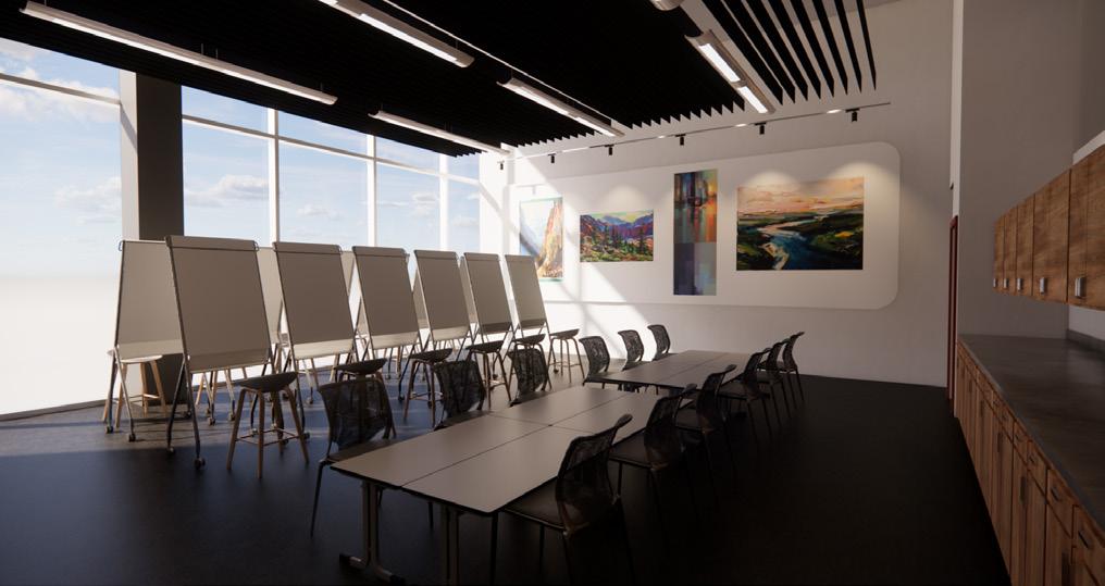
An educational building on a college campus in Portland, Oregon is conducting an interior renovation of a portion of the ground floor of the existing 3-story School of Design building for a new art program.
Design Concept
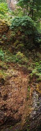
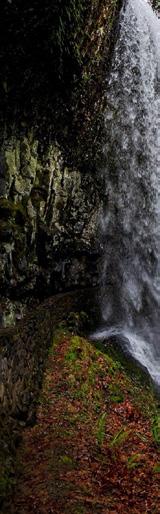
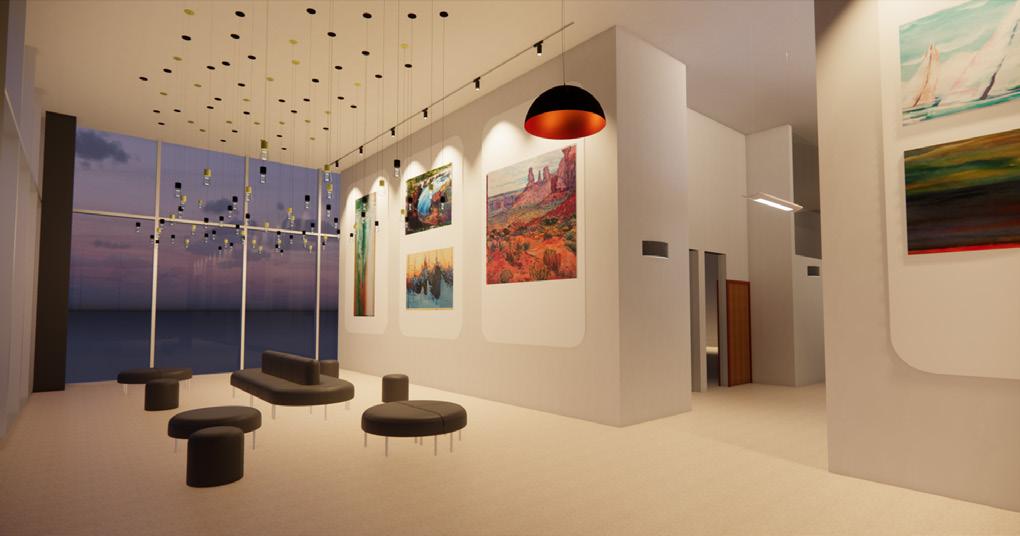
Portland, Oregon is known for their outdoor attractions and activities. The lighting design will embrace as much natural daylight as possible and effectively pair it with artificial light sources. The lobby will include multiple layers of light to fit a variety of needs and potential uses. This will be an engaging space tied together with warm, dynamic light sources that draw inspiration from the abundant natural waterfalls in Portland. Classroom and studio lighting will be functional and effective yet still aesthetically pleasing. Various layers of light will be implemented to highlight completed work, give more focus to in-process work, and illuminate the space in the absence of natural daylight. Overall this space will feel exciting and promote high quality design throughout to motivate and inspire students. Location Oregon the
Fixture
the half the lobby
32
coastline this surrounding Oregon’s Design
These into
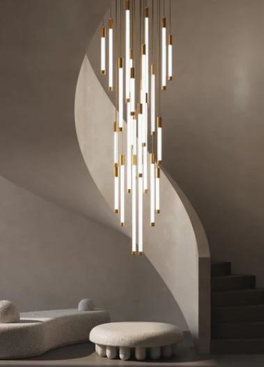
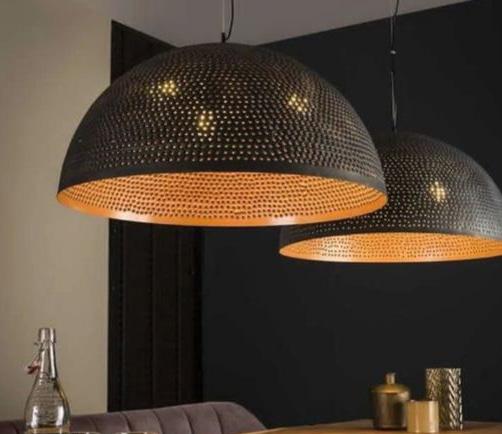
Waterfall
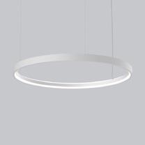
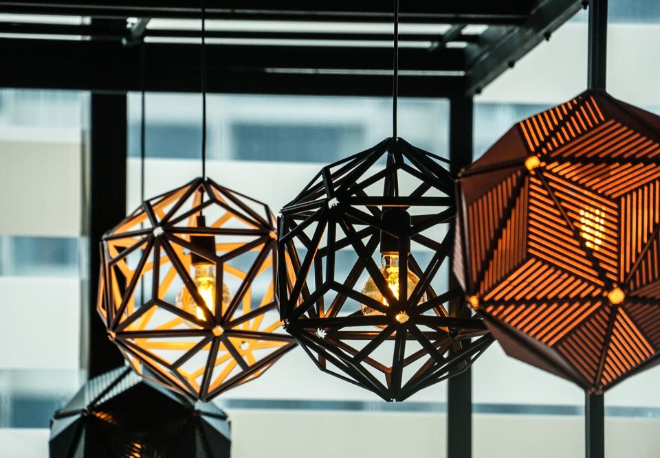
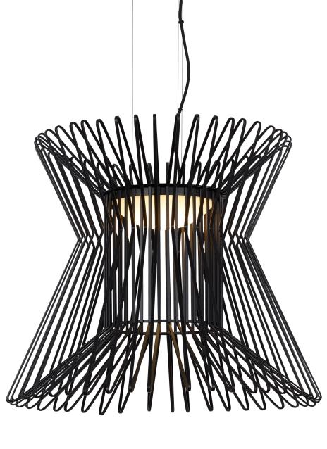
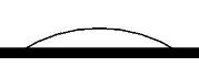
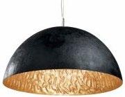
Fixture Inspiration
These lights bring in the linear and “falling” feel of waterfalls their shape and configuration. I also enjoy how grounded half dome light makes the space feel and implement that in lobby space.
Location Inspiration
Oregon has a very beautiful natural environment. From coastline to plains to mountains, Portland has it all. All of surrounding an engaging and diverse city. Inspired by Oregon’s extensive collection of waterfalls, the School of Design building pushes the boundaries of the natural world.
“The campus is in a heavily wooded area and has incorporated nature into their campus planning.”
- design brief
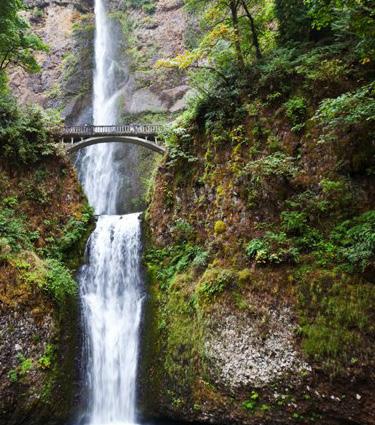
Waterfall Inspiration
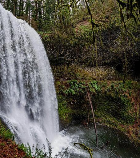


Warm Dynamic Linear
33


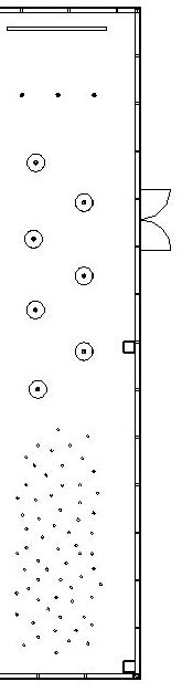
Lobby/Reception 0-20 Circulation A+B 5-10 Large Studio 20-100 Small Multipurpose Classroom 10-100 RECOMMENDED FOOTCANDLES POWER ALLOWANCE 6634 sqft 1.2 w/sqft 7960.8 allowed watts FIXTURE ID LUMINAIRE DESCRIPTION LAMPS/ FIXTURE # OF FIXTURES FIXTURE WATTS FIXTURES x WATTS P1 9.7" x 14" steel pendant, LED 1 3 11 33 P2 4.7" x 2.6" natural brass pendant, LED 1 38 4.3 163.4 P3 4.7" x 2.6" black aluminum pendant, LED 1 26 4.3 111.8 P4 1' x 1' 8.5" aluminum plated brass wire pendant, LED 1 1 12.5 12.5 P5 1' 10" x 2' 2" aluminum plated brass wire pendant, LED 1 2 11.4 22.8 P6 2'3" x 1' black metal exterior with brass interior, LED 1 7 8 56 T1 3-inch LED track head 1 53 21 1,113 T2 Ball track light strung on wires, MR16 1 10 6.5 65 W1 8.5" x 2' 2" aluminum frame with fabric shade, LED 1 11 44 484 S1 4' linear direct/indirect fixture, LED 1 24 41.3 991.2 ENERGY CONSERVATION SCHEDULE TOTAL WATTS = 3,052.7 P1 Suspended Pendant P6 Black + Brass Metal Pendant P2 Natural Brass Pendant T1 LED Track Lights P3 Black Aluminum Pendant T2 Ball Track Lights on Wires P4 1' x 1'8.5" Brass Wire Pendant W1 Wall Sconce P5 1'10" x 2'2" Brass Wire Pendant S1 4' Linear Direct/Indirect Fixture LIGHTING SYMBOL LEGEND W1 P4 P5 T1 T2 S1 W1 W1 W1 S1 S1 T1 T1 T1 T1 P5 T2 N.I.C. N.I.C. N.I.C. 2 3 4 5 6 Lobby Breakroom/Pantry Small Classroom 1 2 3 4 5 6 Large Studio Circulation A Circulation B Legend 34
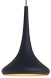
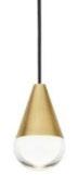
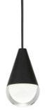
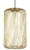
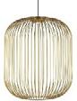
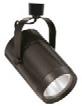
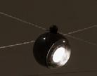
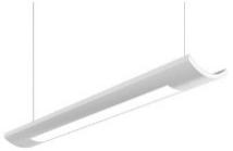
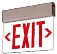


FIXTURE ID FIXTURE IMAGE DESCRIPTION MOUNTING MANUFACTURER PRODUCT NUMBER LUMENS LAMPING WATTAGE/V OLTAGE CRI/CCT DIMMING QUANTITY REMARKS P1 9.7" x 14" steel pendant Suspended Tech Lighting 700TDNOEBGLED930 480x LED 11W 120V 90 CRI 3000K Low voltage (120V) electronic 3x P2 4.7" x 2.6" natural brass pendant Suspended Tech Lighting 700TRSPCPA1RN B-LED930 344x Integrated LED 4.3W 120-277V 90 CRI 3000K 120-277V ELV or TRIAC 38x P3 4.7" x 2.6" black aluminum pendant Suspended Tech Lighting 700TRSPCPA1RBLED930 344x Integrated LED 4.3W 120-277V 90 CRI 3000K 120-277V ELV or TRIAC 26x P4 1' x 1' 8.5" aluminum plated brass wire pendant Suspended Tech Lighting 700TDKAI1BRLED930 638x LED 12.5W 120V 90CRI 3000K 120V ELV or TRIAC 1x P5 1' 10" x 2' 2" aluminum plated brass wire pendant Suspended Tech Lighting 700TDKAI2BRLED930 749x LED 11.4W 120V 90CRI 3000K 120V ELV or TRIAC 2x P6 2'3" x 1' black metal exterior with brass interior Suspended Faro Barcelona 29468x 800x LED 8W 120-240V 80 CRI 2700K 7x T1 3-inch LED track head Suspended Halo L808 1506x LED 21W 120V 90 CRI 3000K 120V ELV or TRIAC 53x T2 Ball track light strung on wires Suspended Bocci B74 MR16 6.5W 10x W1 8.5" x 2' 2" aluminum frame with fabric shade Wall Cooper Lighting cULus-1598 3918x LED 44W 120-277V 80CRI 3500K 10% dimming control 11x S1 4' linear direct/indirect fixture Suspended Cooper Lighting TD519201EN 5624x LED 41.3W 120-277V 90 CRI 3500K 24x tunable white 10002000 lumens E1 15" x 13" acrylic panel edge lit exit sign Surface Cooper Lighting REUSA18R LED 120/277V 10x P1 P2 P3
35
P6 T1 T1 1
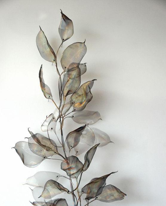
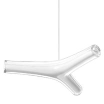
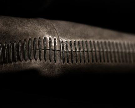
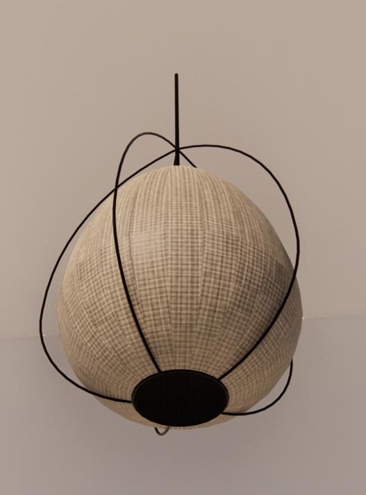
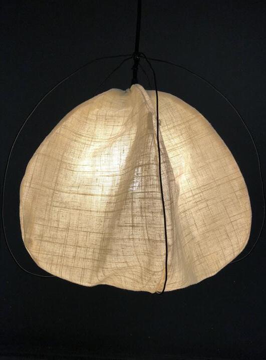
Solanine
Project Description
Design and create a full scale operable custom luminaire. The design should use biomorphic design as a guide for concept development, specifically selecting an object or entity from nature or a living organism.
Design Context
This fixture draws inspiration from natural elements. The overall form reflects that of something you would find on a nature walk or hike. Brought into a household item, this luminaire draws the natural world in for the viewer, adding visual interest to the space.

Design Concept
The design of this luminaire to complete the structure curvilinear lines create viewer’s eye around to diffuse the warm and soothing atmosphere. There is an emphasis holds inspiration from also known as Ground Lanterns due to their resembles a lantern
Research
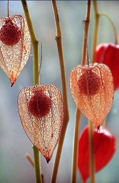
The Physalis Angulata annual plant belonging family Solanaceae. alkaloid toxin called in a harmless quantity leaves and stem. It reproduces by seed dark green and roughly shapes around the edge. sided and pale yellow, fruits are borne inside
Name Significance
I chose “Solanine” plants produce. Solanum, sounds similar, and word solamen, which soothing” and this is emulate in my luminaire.
Curved Uniform Pure
36
Concept Statement
luminaire uses uniform shapes structure of the piece. Clean, create repetition to move the around the luminaire. Linen is used warm light, creating a comforting atmosphere.
emphasis on biophilia, as the fixture from Physalis seed pods, Ground Cherries and Chinese their inflated calyx which lantern in shape.
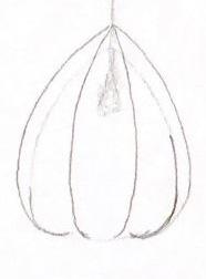
Preliminary Sketch
Sketches
Angulata is an erect, herbaceous, belonging to the nightshade Solanaceae. These plants possess an called Solanine which is present quantity and mostly found in the seed and has leaves which are roughly oval, often with tooth edge. The flowers are fiveyellow, and the yellow-orange inside the balloon-like calyx.
Refined Sketch
Directional Effects
SketchUp 3D Model - Prototype
Significance
because it is the toxin these Solanum, the genus name, is derived from the Latin which means “comforting or is something I wanted to luminaire.
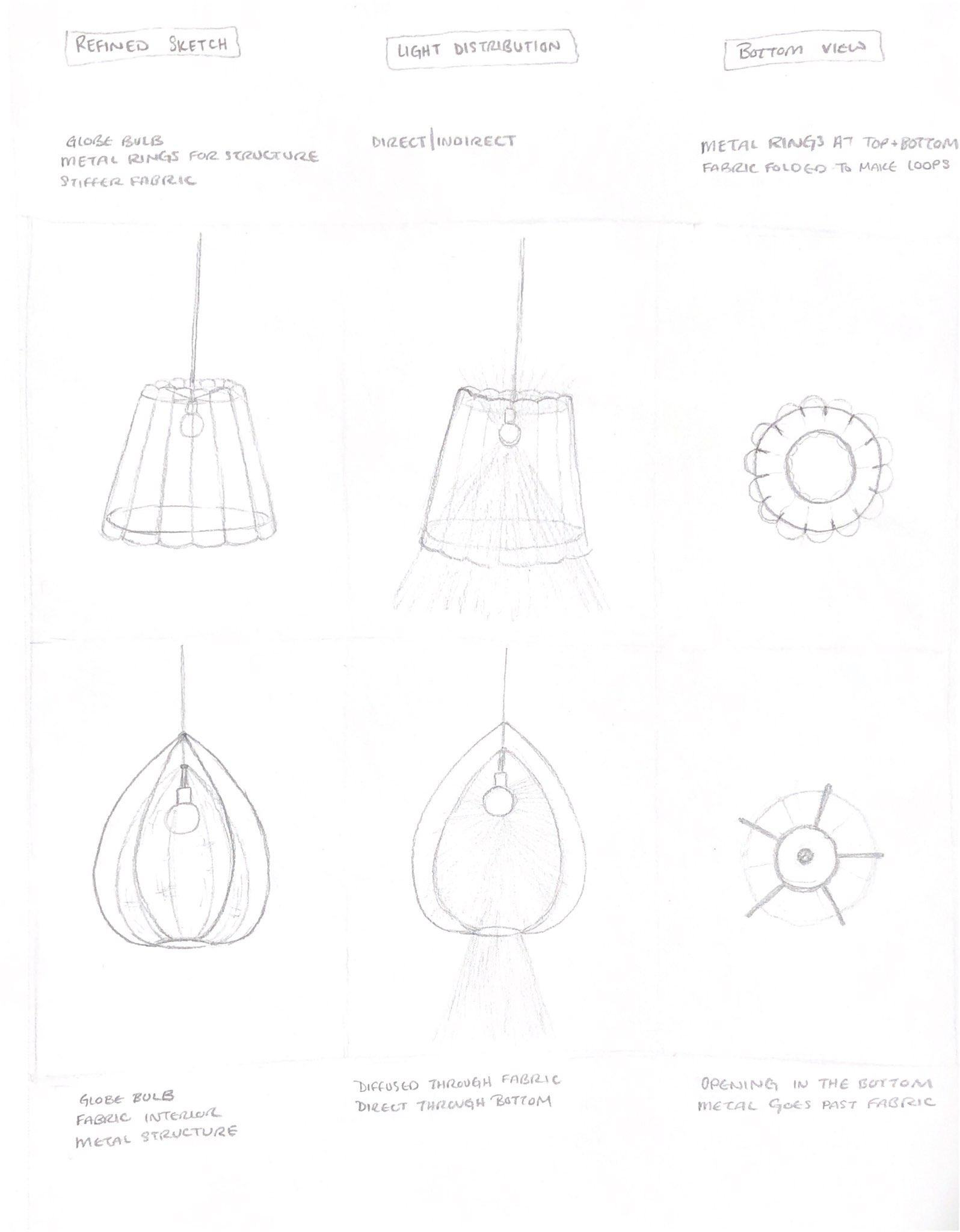
Final Model
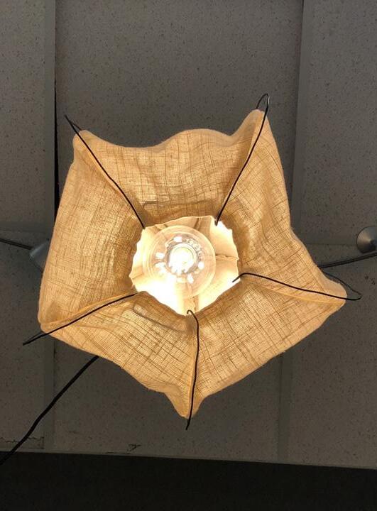
Learned from this model
I want to make sure that the linen structure is not too pointy.
Make sure the bottom of the wire pieces curve out and down more to more accurately represent the seed pod.
Materials Used
- Globe bulb
- Fabric interior
- Metal wire structure
Directional Effects
- Direct through bottom of fixture
- Diffused through fabric
37
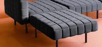
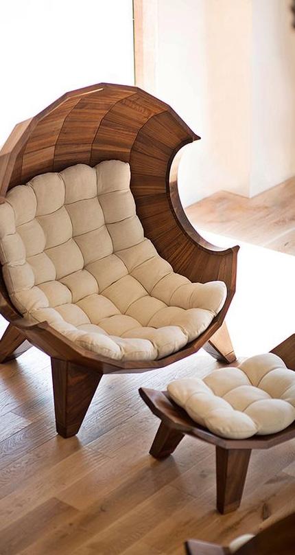
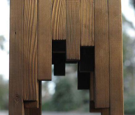
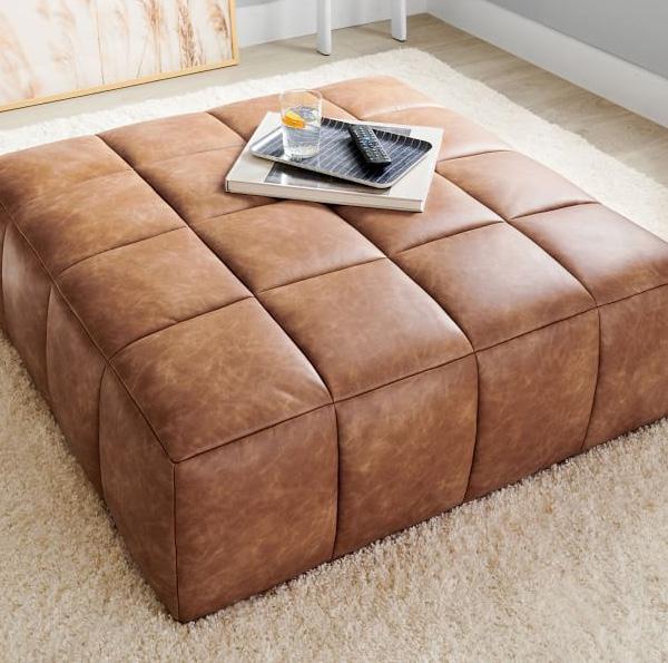
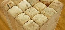
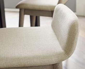
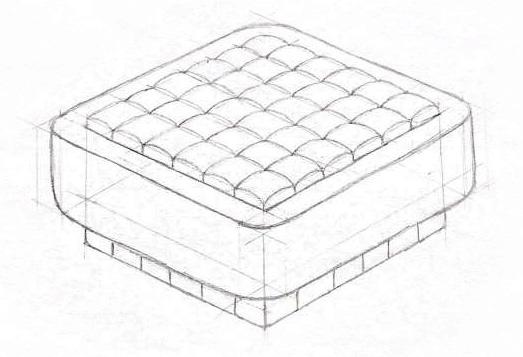
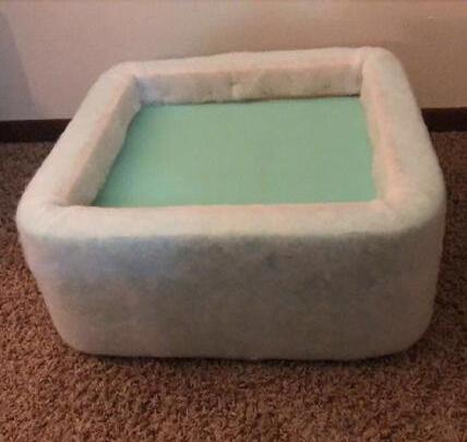
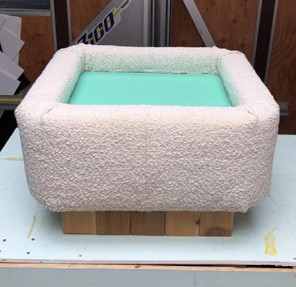
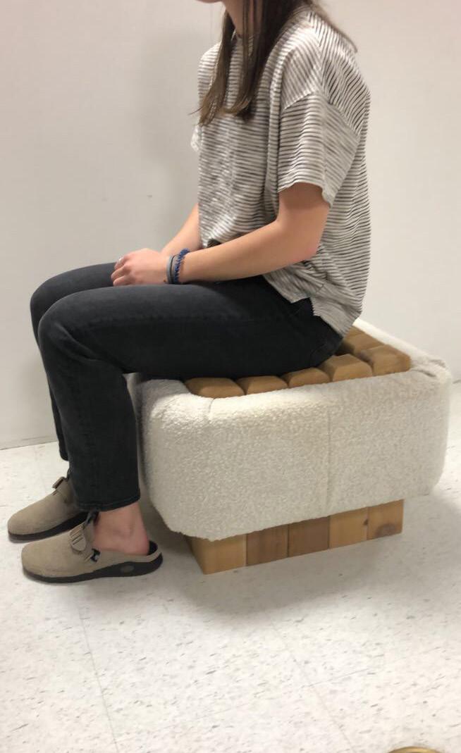
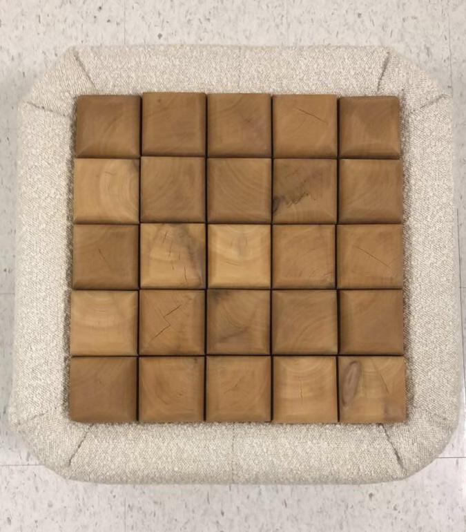
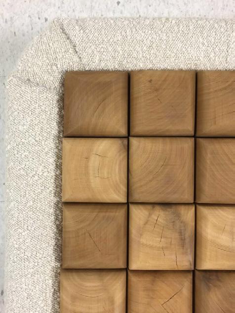
Cedar Design Intent
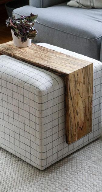
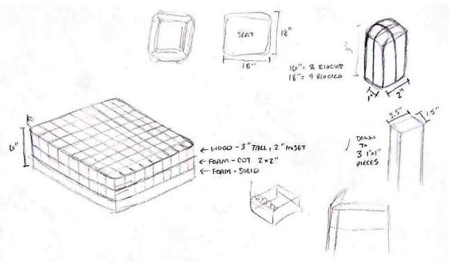
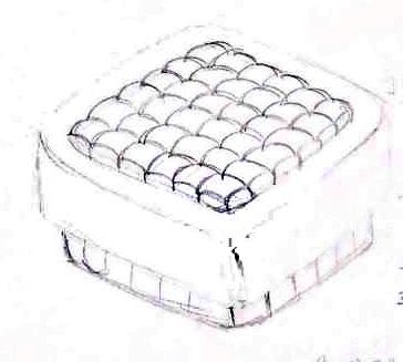
This seating experience will be a statement/sculpture piece. This would be something made for a consumer who enjoys fun furniture as art.
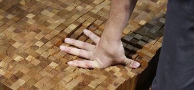
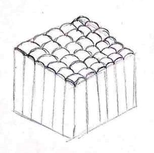
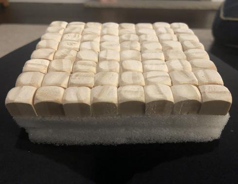
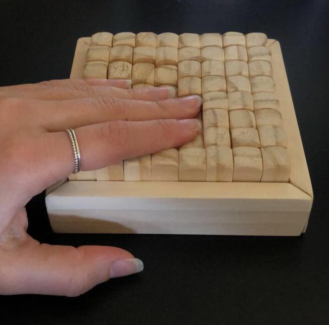
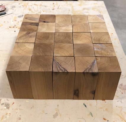
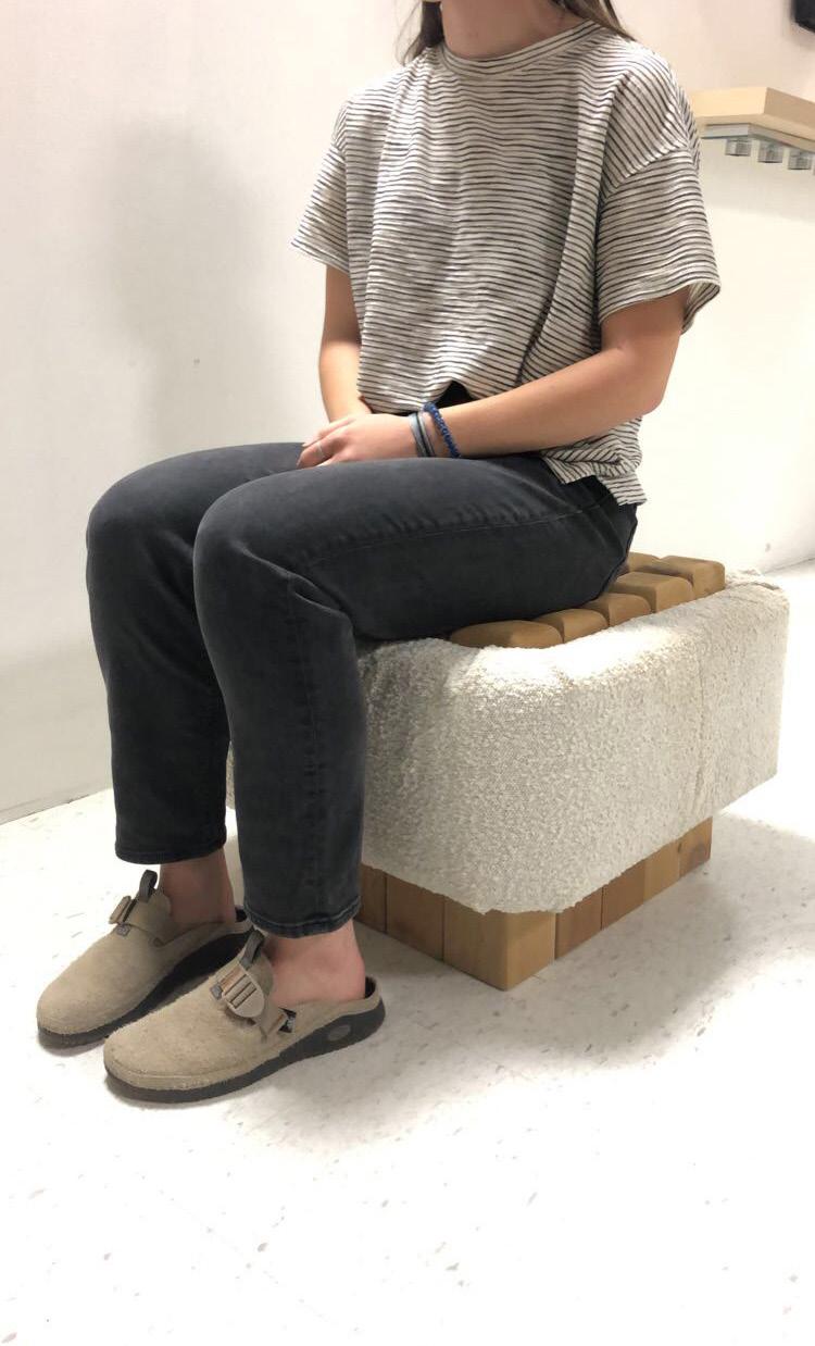
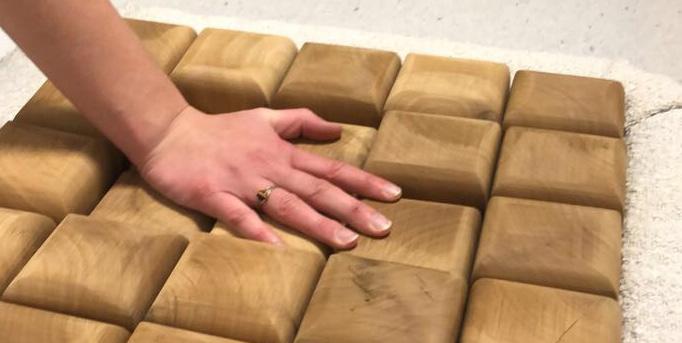
A goal of this project was to incorporate movement, so the seat moves when the user sits down. The seat is made up of separate wood blocks which allow it to move to fit the user.
The ottoman will be used as a statement piece that would invite and surprise guests. Guests may be hesitant to sit on this ottoman as it looks hard and stiff, but would surprise them upon sitting as it is actually very comfortable.
For those who have kids, this ottoman would also be an awesome sensory tool. The movement of the seat combined with the hard but rounded wood pieces and soft wrapped piece would be very interesting and engaging for them. Spatial
Human
38
Structure
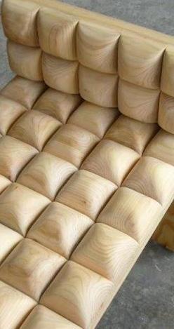
Human Contour / Contact
This ottoman from appearance is very rigid with a soft wrapped exterior.
The seat/surface is harder and could be used as a coffee table with a tray placed on top, but also as extra seating with guests over.
The ottoman will sink and conform to the user, creating a comfortable experience, but may not be a place someone would choose to sit for a long period of time.
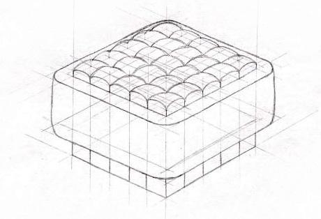
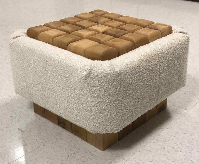
Spatial Context + Inspiration
This ottoman is meant for an indoor general residential space such as an office, sunroom, living/sitting room, etc.
It is small enough to transport, but is a little heavy, so it requires two people to move easily.
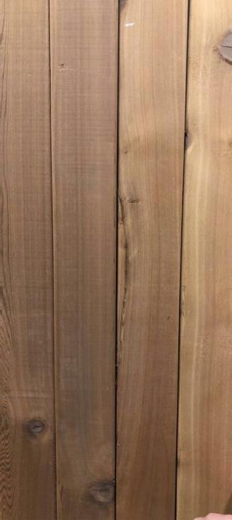
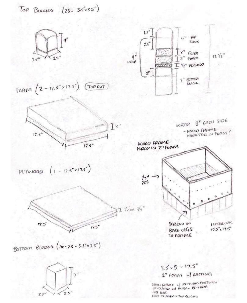
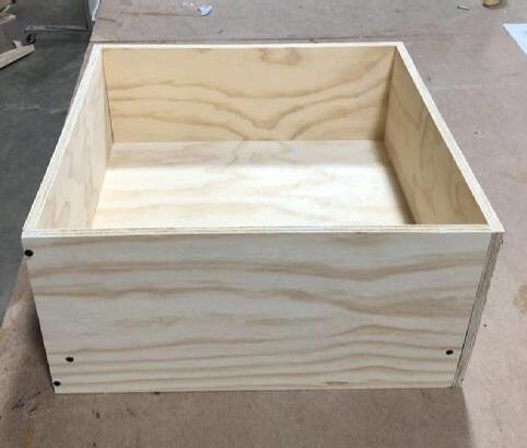
Structure / Materials / Aesthetics
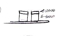
The base structure will be created out of 1/2” plywood.
4x4 cedar wood will be implemented as the movable pieces and base.
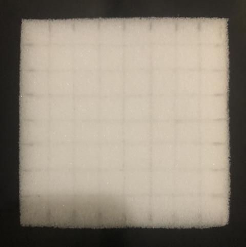
Two layers of 2” high density foam will be used to create the cushion layer and attach under the wood pieces in the seat.
2” foam will also be used to wrap the plywood along with batting, and then fabric over top for the upholstered portion.
The design will feel seamless and grounded.
1/2” plywood

 2” foam
39
cedar upholstery
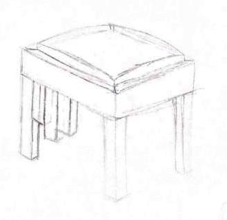
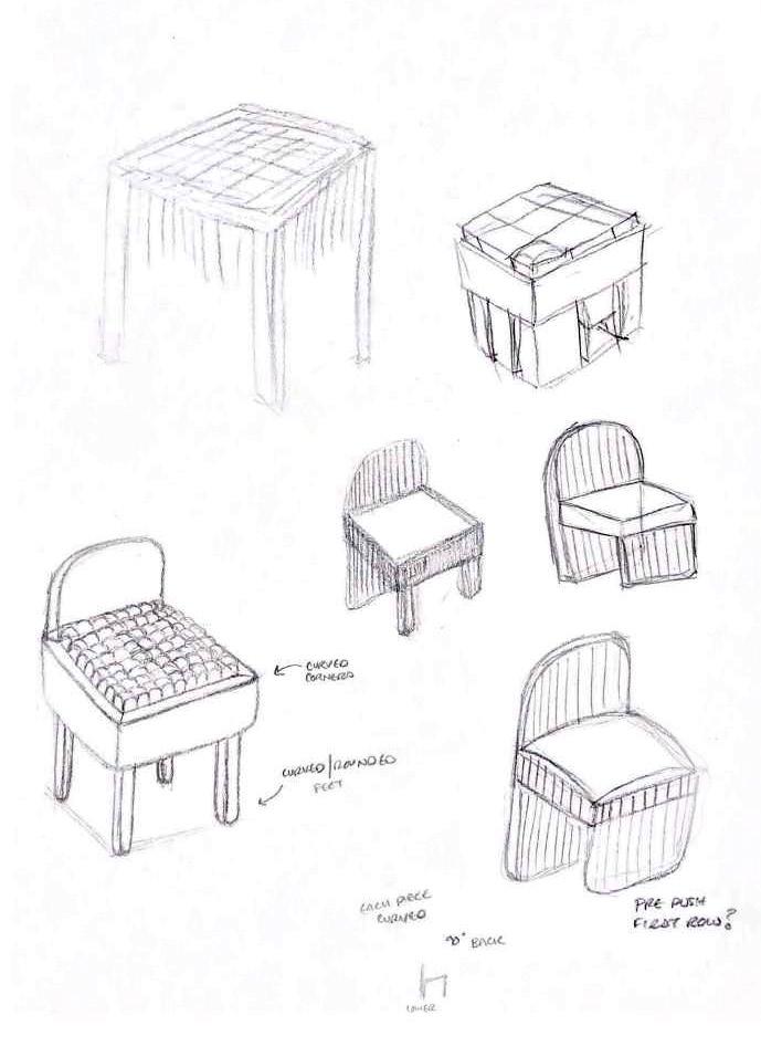
Initial Sketches - Understanding Movement
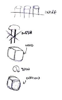
One of the key requirements was that this piece had to move. Here I am exploring different options.
Preliminary Sketches - Finding Form
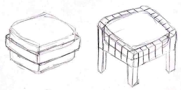
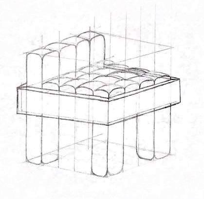
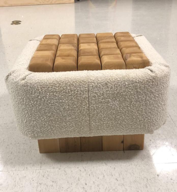
Here I worked to understand the material and how the form would be able to support weight. I played around with having four legs, no legs, and a front/back row. I decided to not use traditional legs, and let the form be flush with the ground, increasing sturdiness for the end user.
40
Final + Structural Sketches
This round of sketches allowed me to compare the visual look of two sizes. I chose the 5x5 block look, then sketched the structural components to get better measurements and move forward with my final model.
1/4” Scale Model - Seat
I wanted to test out how the seat would move before construction. In this model I cut the foam, but later decided that wasn’t necessary. This made me confident that the seat would function as planned.

41
In Process
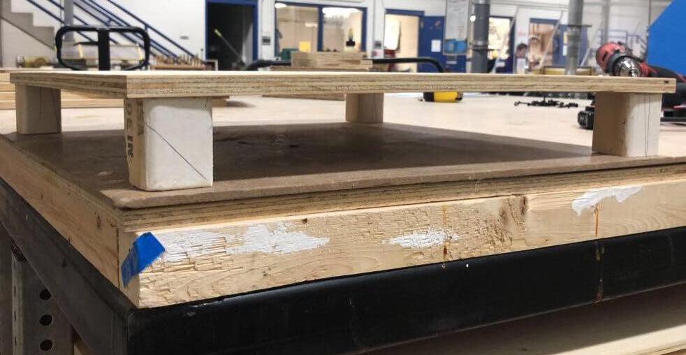
Plywood Frame
I cut the wood to size, then used 2” blocks to hold the base up while I used drywood screws to attach the sides. The 2” lift allows the base wood pieces to be more secure.
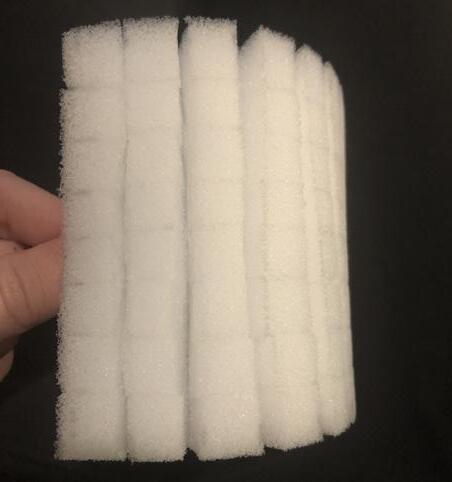
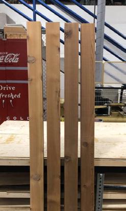
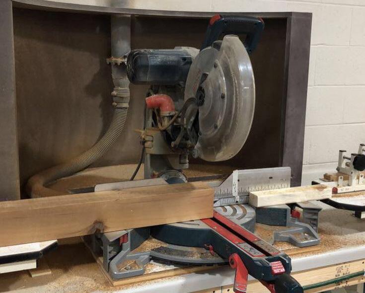
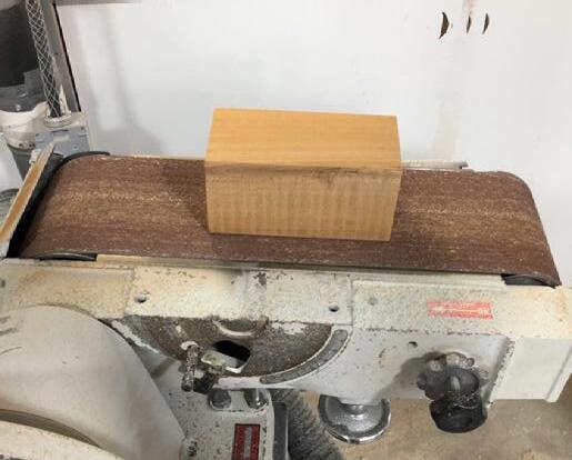
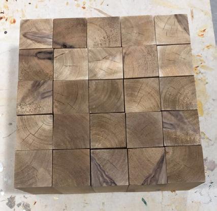
Cedar Wood - Cutting + Sanding
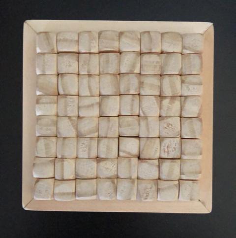
I cut four 6’ 4”x4” cedar beams down into twenty-five 4” blocks and twenty-five 7” blocks with a miter saw. I used a belt sander to clean everything up and make sure the edges were square.
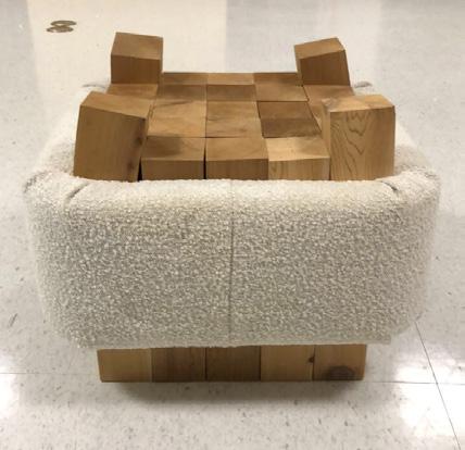
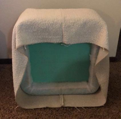
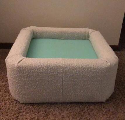
Wrapped Upholstery
I used 2” foam to wrap the sides of the plywood frame then covered it with batting using a staple gun. I cut and sewed my fabric to fit, slid it over top and used a staple gun to adhere the fabric, tucking the corners neatly.
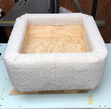
Cedar Wood - Base Assembly
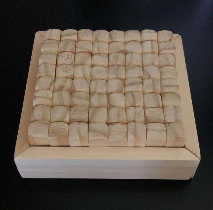
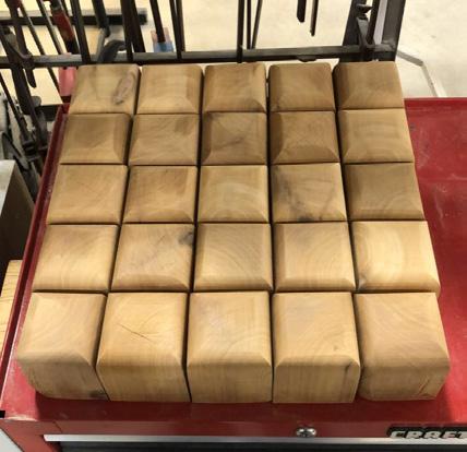
After assembling the 7” blocks into a grid, I placed the plywood frame on top. I then pre-drilled holes into the base, then screwed it together, adding the 4” of foam on top.
Cedar Wood - Seat Assembly
I tested out how the blocks fit and realized I needed to taper the edges of the corner ones. I then moved on to sanding the tops to be smooth.

42
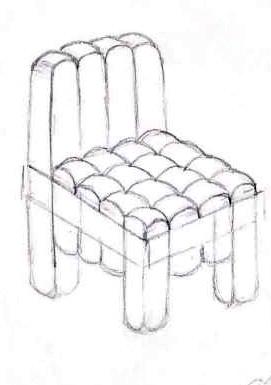
Final Product

43
Other Artwork
Work from Studio Art and Drawing classes at UW-Stout.
Printmaking - “Social Commentary”
Serigraphy
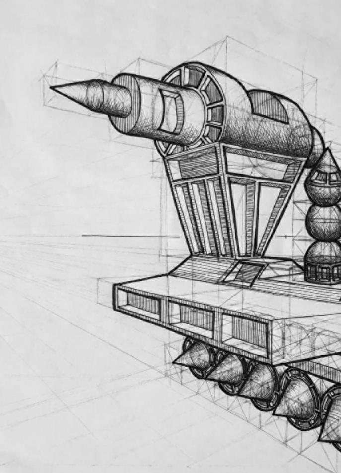
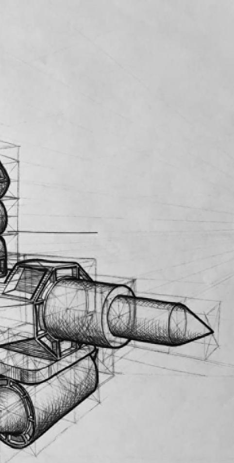
Drawing - Perspective Train 44
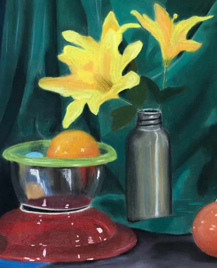
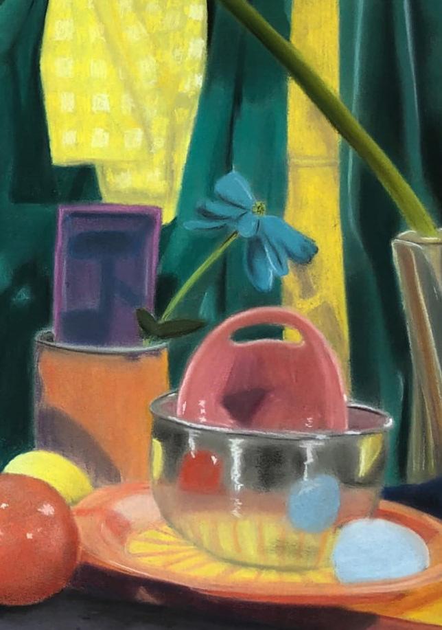
Drawing - Color Pastel
Still Life Design
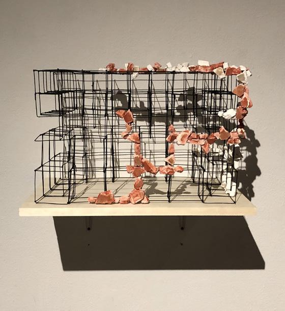
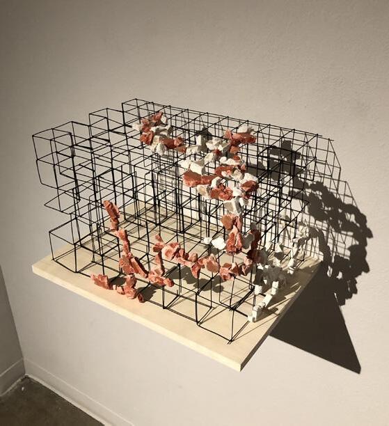
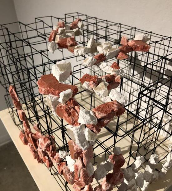
 Sculpture - Wire + Drywall
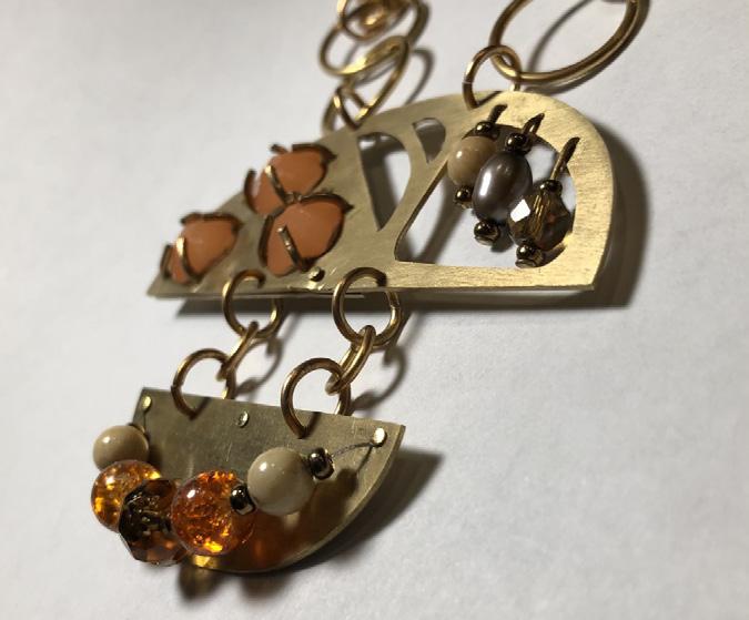
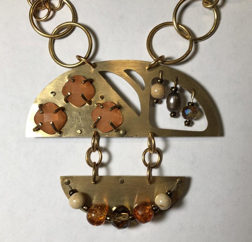
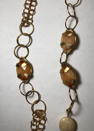
+ Jewelry - Recycled Materials Necklace
Metals
45
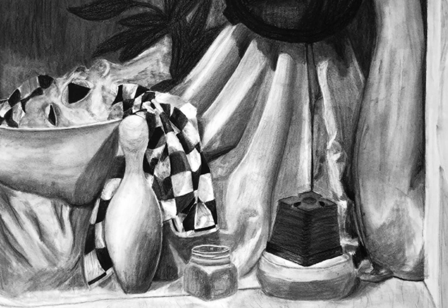
Drawing - Charcoal Still Life
Rachel Younker Interior Design Portfolio Thank You!
