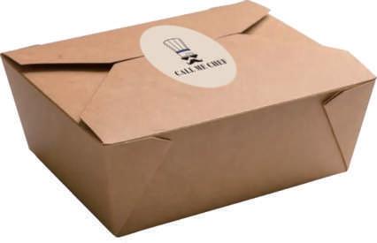
Call Me Chef Call Me Chef
Table of Content Our Brand Values Mood Boad Logo Color Palette Typeface Photography Design Examples 01 02 03 04 05 06 07 P 1 - 2 P 3 - 4 P 5 - 11 P 12 P 13 - 14 P 15 P 16 - 20

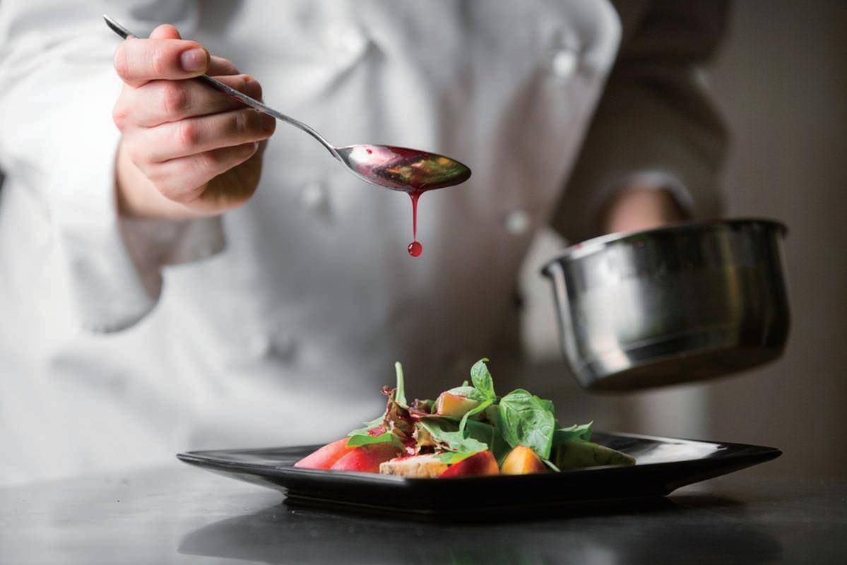
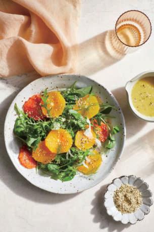
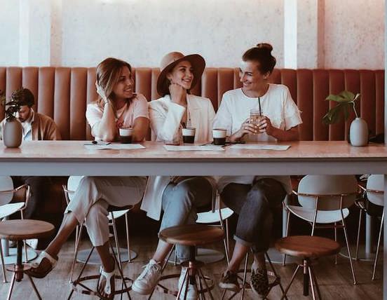
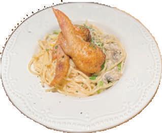
As we continue to develop to Satisfy diverse customers, our brand has also changed and improved. To achieve this, we are incorporating relaxation, listening, and freshness to combine them. We are confident with a "can-do" attitude and bring the best food to everyone. Also, we will listen to everyone's sug gestions to improve and satisfy everyone's needs.
“No one can question our ability to work”
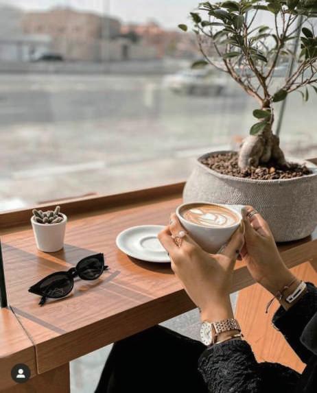
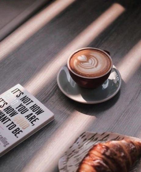
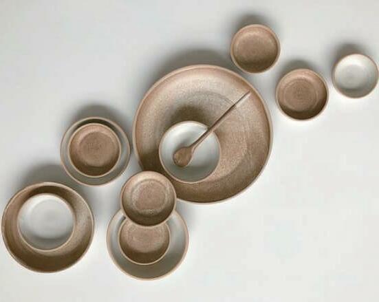
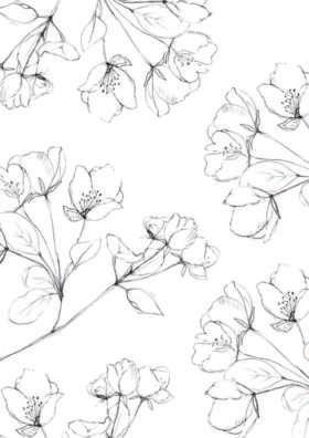
The inspiration wants to give customers a relaxing and natural modern feel. The logo represents our attitude toward food and wants to bring the best to everyone. The target audience is love to try new things hipster, therefore the typeface uses modern fonts.
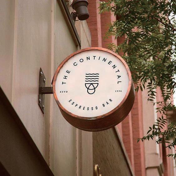
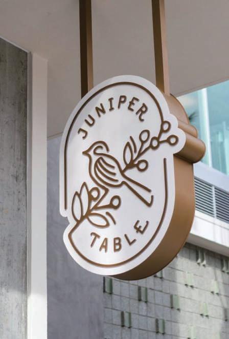
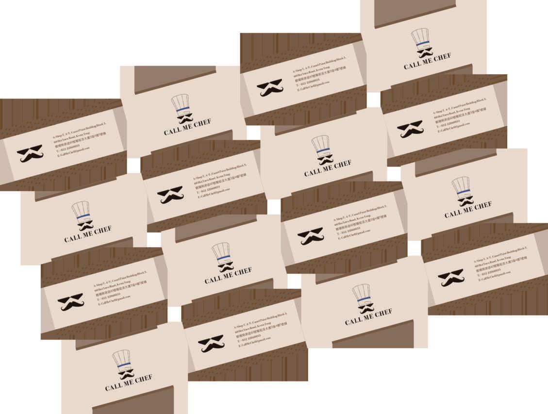
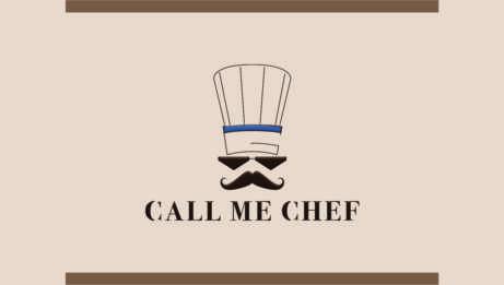
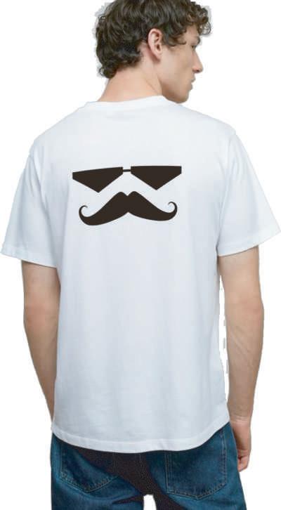
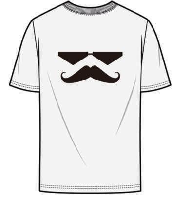
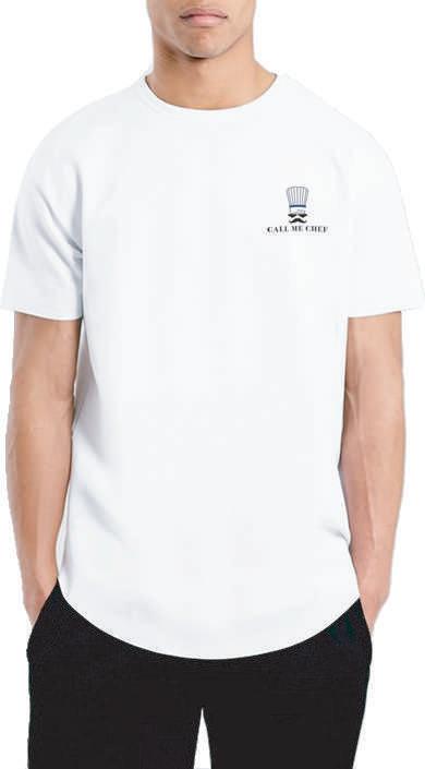
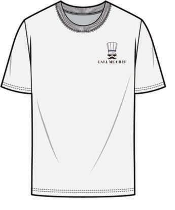
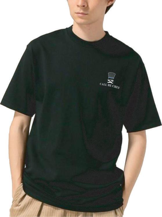
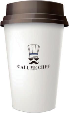
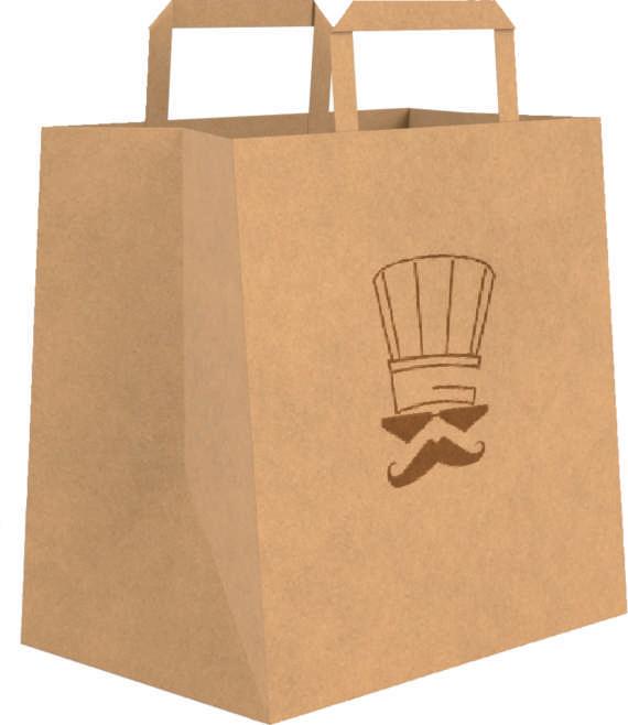
Call Me Chef's primary logo is a wordmark and character icon. The main lettering style has an elegant and modern logo vibe, and the character icon is wearing a chef hat man and have Le Cordon Bleu, and wearing shades is represent confidence in his own cooking.
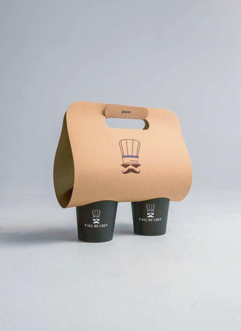
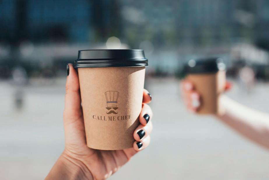
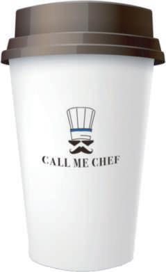
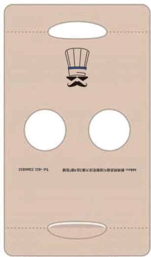
This is the main logo that will be used across primary brand applications. This trademark helps audiences easily identify Call Me Chef's storefront, products, web presence, ads, and other materials, and enhances the professionalism of the brand. The success of the brand depends on the logo being respected and attention in every application in accordance with these rules.
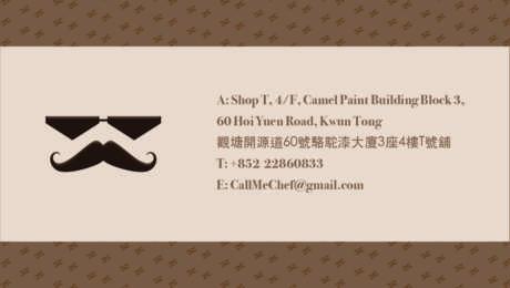
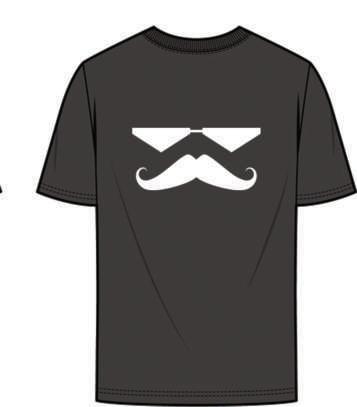
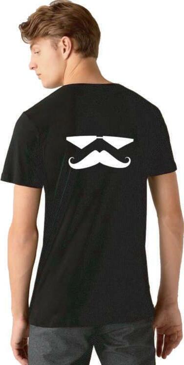
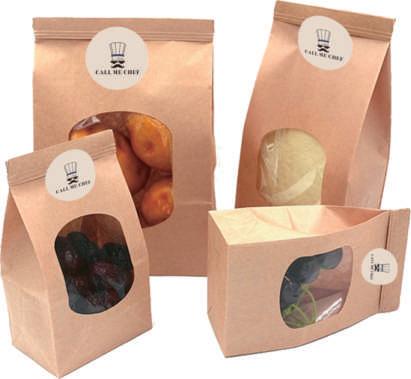
Call Me Chef's secondary badges can be used in replace of the primary logo (but should never be used directly next to the primary logo). For instance, don't use a horizontal or Icon logo as the profile picture if the primary logo is used for the header - it looks repetitive and isn't a good use of the brand elements.
The monogram symbol can be used when the full primary logo is not necessary or in cases where the brand name is already displayed in plain text. For example, the monogram could be used as a profile picture on Instagram since the username will be adjacent to it in plain text.

A
- Vertical
Always provide a minimal amount of space around the logo to ensure legibility. This area separates the mark from any competing graphic components, such as body copy or other logos, that might compete with the mark, clutter it, or decrease its impact.
Always provide a minimal amount of space around the logo to ensure legibility. This area separates the mark from any competing graphic components, such as body copy or other logos, that might compete with the mark, clutter it, or decrease its impact.
The minimum clear space is defined as the height of the letter "M".


THE QUICK BROWN FOX JUMPS OVER THE LAZY DOG the quick brown fox jumps over the lazy dog The Quick Brown Fox Jumps Over The Lazy Dog 1234567890!?()&*@#$
THE QUICK BROWN FOX JUMPS OVER THE LAZY DOG the quick brown fox jumps over the lazy dog The Quick Brown Fox Jumps Over The Lazy Dog 1234567890!?()&*@#$
THE QUICK BROWN FOX JUMPS OVER THE LAZY DOG the quick brown fox jumps over the lazy dog The Quick Brown Fox Jumps Over The Lazy Dog 1234567890!?()&*@#$
黑體 - 繁 - Medium- 45 pt
Bodoni - Book Bold - 24 pt
黑體 - 繁 - Medium - 24 pt
Bodoni - Book Bold - 20 pt
黑體 - 繁 - Medium - 20 pt
Bodoni - Book Bold - 16pt
黑體 - 繁 - Medium- 16pt
Bodoni - Book Bold - 14 pt
黑體 - 繁 - Medium - 14 pt
Bodoni - Book Bold - 12 pt
黑體 - 繁 - Medium - 12 pt
Bodoni - Book Bold - 12 pt