Portfolio
Quyen NguyenThe Manga Cafe and Onsen, Japan
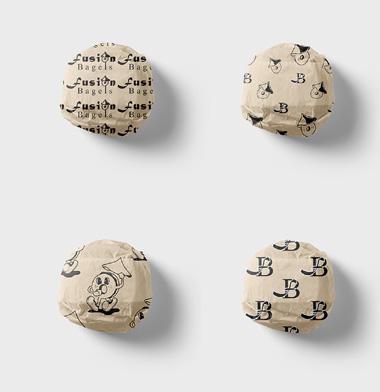
Fusion Bagels
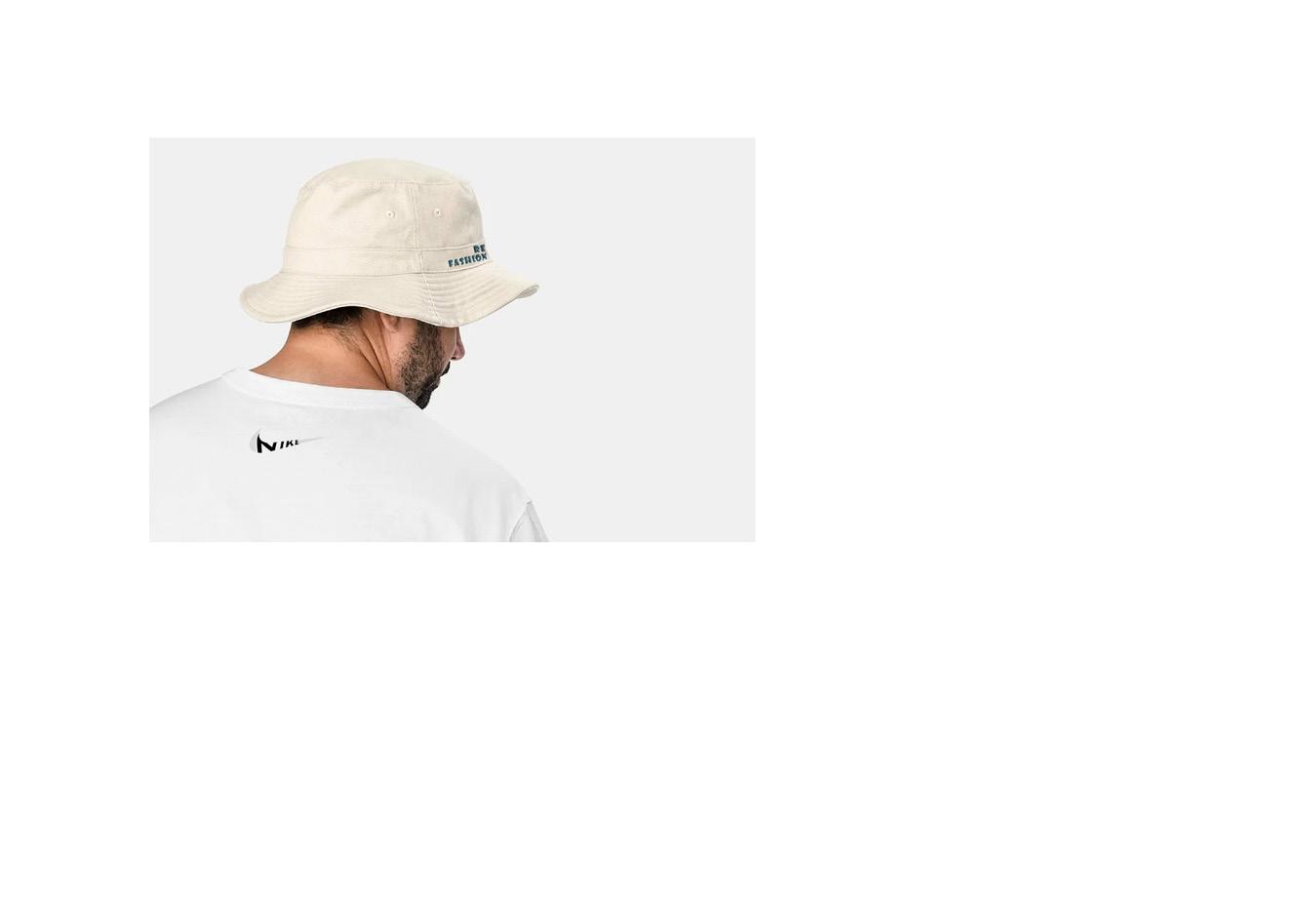
Re Fashion
Re-Use
Redesigning the Front Cover
Wonki
Nespresso - Coffee with Care
‘The Manga Cafe and Onsen’ Takeshita Street, Japan


Located in Takeshita Street, this building focuses on spending time rather than money. It has spaces where the consumers can stop and relax, creating memorable experiences. Moreover, it brings back traditional Japanese activities and construction techniques to celebrate the culture and provide an alternative to modernism. This building welcomes all ages into the highstreet allowing for a more intergenerational community.
https://youtu.be/P4PHR4FnCVM


‘Fusion Bagels’ Conceptual Branding Project

The branding project aims to establish a dynamic, memorable identity that represents the fusion of Asian and Western culinary traditions. It aims to create a unique culinary fusion that celebrates unity in diversity, while drawing in a diverse clientele who appreciate both traditions. The logo features a traditional Vietnamese hat on a bagel, creating a playful approach, where the East meets West. Furthermore, the development of the logo, colour palette, typography guidelines, signage, packaging designs, social media presence, and a marketing strategy are starting points to attract a diverse customer base.


This department store design focuses on sustainable fashion, where a workshop is run to repurpose clothing. My manifesto tackles the issue of fast fashion as it leads to millions of materials in landfills. It allows the community to congregate and reuse unwanted clothes.


In this project I looked into rebranding existing logos. Using ‘NIKE’ as an example, the typology is merged into their logo, creating a seamless and elegant design. As a result, I explored creating mockup designs on clothing and also illustrating the designs on a billboard. The difference in scale dramatically changes our perception, as one tends to look at signs as an advertisement technique, therefore not truly appreciating the detail. Retail businesses tend to have their designs on models as it brings the garments to life and allows one to picture how it would fit themselves.


This project highlights the recycling of objects, giving them a different purpose and perspective. Cutlery is bought in charity shops and then hand made into jewelry, showing how everyday objects can become valuable. This was a one day project, where the jewellery was made by hand, photographed and edited.


https://youtu.be/YhrNNNQzA90
This film is about an elderly man reliving his youth. He finds a photograph of his younger self by a windmill, standing with his old bike. From there the nostalgic journey begins where he goes back to the same place and makes new memories. It highlights attractions in Aarhus and cultural traditions one would come across whilst being there. The project was completed in a week from draft breifs, storyboarding, presenting to prducers, scouting actors, shooting and editing.

Production Timetable


Shot List
Script (Celtx)

I wanted the challenge to redesign one of my favourite books, ‘It Ends With Us’ by Colleen Hoover. The original cover illustrates flowers being ripped to pieces, which in my opinion does not capture the essence of the pot and characters. In my design the central illustration is of two people showing affection and incorporating a letter. Throughout the story the main protagonist, Lily, keeps a journal where she narrates a story of her first love. I think it is an important aspect to highlight as these diary entries are what brought plot twists and significantly impacted Lily’s life. In addition, the clean and simple typography allows the reader’s eyes to fall on to the text without strain. The green cover resembles Lily’s growth as a the story develops.


My interest in ceramics and creating pieces of my own is something I have been working on in my free time. The unique aspects are having distinguishingly different marks and blemishes. Thus creating ceramics that are one of a kind, adding to their beauty.


The aim of this project is to use the existing brand Nestle to tackle mental health issues amongst the elderly. Statistically 20% of 60 year olds and older suffer and with the rapid ageing population we need to take into consideration the impacts. I have rebranded Nespresso into creating an age friendly cafe. There they will be able to interact in making coffee, creating art from recycled coffee capsules and share the coffee culture from their different backgrounds. Nespresso Brand Issue Audience Mental Health The Elderly


