


Brand defines who we are as a company. Brand expresses our values and characteristics, both tangible and intangible. Brand is a shorthand that helps prospective clients understand who we are, what makes us unique, and why they should work with us.
A brand is established and maintained through multiple, consistent experiences. Brand guidelines ensure that whenever, and wherever, someone interacts with Project Courage, our brand is consistent, authentic and engaging.
Every single engagement is an opportunity to build and strengthen Project Courage’s brand. Aside from the obvious, like advertisements, websites, or collateral, consider these examples of opportunities to reinforce brand:
• Email Signatures
• Social Media Icons, Profiles and Photos
• Business Partnerships
• Events
HORIZONTAL LOGO

The Project Courage logo is the most fundamental part of our brand, and it represents our entire company, externally and internally. From websites and advertisements to stationeries and presentations, it functions as a personal sign-off on the ideas we’re presenting and sharing.
The Project Courage logo is set in a modern typeface. With no gratuitous ornamentation, this typeface is strong yet approachable, self-assured and reliable; qualities we’re happy to associate with our brand.
The relationship between the logo elements is pre-determined and fixed. Do not, under any circumstances, alter the proportions or placement of any of the logo elements independently.

.25 x
.25 x x
.25 x
.25 x
Clear space is the area surrounding the logo that must be kept free of other graphic elements. The minimum required clearspace is defined by the measurement “X,” as shown. This measurement is equal to the height of the logo.
Print min. Size: 2 in.
Screen min. Size: 200 px

We have established various minimum sizes for our logo to help it stand out as much as possible. While the minimum sizes shown here should accommodate most applications and reproduction techniques, make sure that our logo is never smaller than what can be clearly executed. Applications such as signage or merchandise may require larger sizes.

Our primary colors are strong, modern, and professional. They represent the Project Courage brand at its most basic level —our logo. In fact, these are the only colors that may be used to reproduce our logo.
R23 G55 B75 C97 M78 Y56 K34 17374B COLOR RGB CMYK HEX
R241 G191 B72 C5 M25 Y83 K0 F1BF48
Arpona Regular
Mundial Bold
Mundial Regular
Mundial Light

There are several reasons why we’ve chosen Arpona for our primary headline typeface. Arpona is noted for its contrast between thick and thin strokes, a characteristic often found in traditional serif fonts, which lends it an elegant and sharp appearance.
The Arpona font family is available on Adobe Fonts.
There are several reasons why we’ve chosen Mundial for our primary body copy typeface. Strong yet friendly, it helps us communicate ideas in a straightforward, confident manner. The openness and geometry makes it highly legible. It is also available in several weights, allowing maximum flexibility.
The Mundial font family is available on Adobe Fonts.

Open Sans Bold
Open Sans Regular
Open Sans Light
Our alternate headline typeface is PT Serif. PT Serif references the serif style of our primary headline typeface and should be used only within applications such as Word, PowerPoint, Excel, Google Docs, etc. when Arpona is not available.
The PT Serif font family is available on Google Fonts.
Our alternate body copy typeface is Open Sans. Open Sans references the clean look of our primary body copy typeface and should be used only within applications such as Word, PowerPoint, Excel, Google Docs, etc. when Mundial is not available.
The Open Sans font family is available on Google Fonts.

EXAMPLE OF HEADLINE IN ARPONA LIGHT
Arpona font is to be used for headlines and Mundial font for subheadlines and body copy for all printed and digital assets.
SUBHEADLINE OPTION
Nam renis simusda ndignia tiorum sum repe sitiis endandit est ut lit, quid unt. Otate velitibus dolupta tiorest placestrum lam quid quisi voloruntis dollese nimolor eictur aut ea que qui cus, etur? Quis res aut. Dolorem nis et dolupta quatus, simendi omnihitatiis quo eaquiatectam ullaccus remodisqui. sum cuptae eiustem atios adio beatent.
EXAMPLE OF SUBHEAD IN MUNDIAL DEMIBOLD
EXAMPLE OF BODY COPY IN MUNDIAL LIGHT
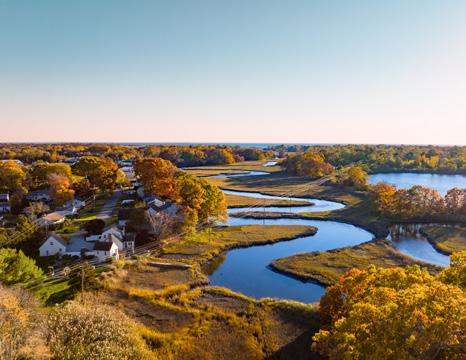
Examples of Good Imagery:


Examples of Bad Imagery:
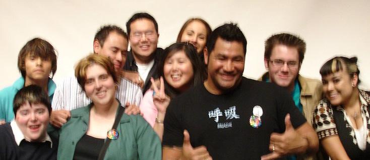
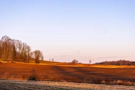


The imagery we use in our communications helps define the image that our clients, prospective hires and current employees will come to associate with Project Courage. Our imagery should reflect the sophistication and quality of our company.
Use of amateur shot imagery reflects poorly on the quality of our people and services. If your budget does not allow for quality imagery, then color, graphics, words, and quotes used creatively can be an effective substitute.
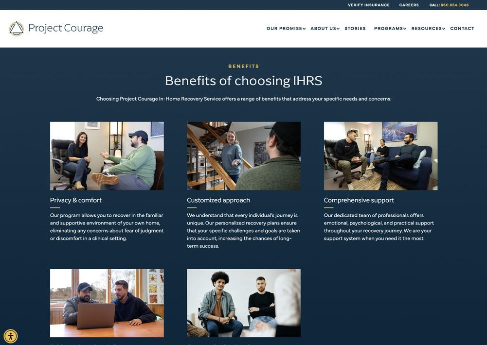
Images should feel natural and candid. Whenever possible, custom professional photography should be used. If custom photography is not available, then professional stock photography that also feels natural and candid may be used.

A linear gradient can be used as a background element for print and digital assets.
Brand Blue: #15374b
Darker Blue: #002338
Gradient Angle: 135°

A topographic graphic element can be used as a background texture on blue sections for digital and print assets.