Don Coomes
Travis Childers
Mira Hecht
P D Klein
Jean Sausele-Knodt
Madeline A.Stratton
Gaylia Wagner
Curated by Rula Jones
June 23 2023 -
August 25 2023
Introduction:
Eachoftheartistsincludedin Hue approachcolorinamyriadof ways. Inmanyoftheworks,coloristhepoint,thesingularsubject matter,whileinothers,coloriscarefullyconsideredwithinits contexttoform,textureandconcept.
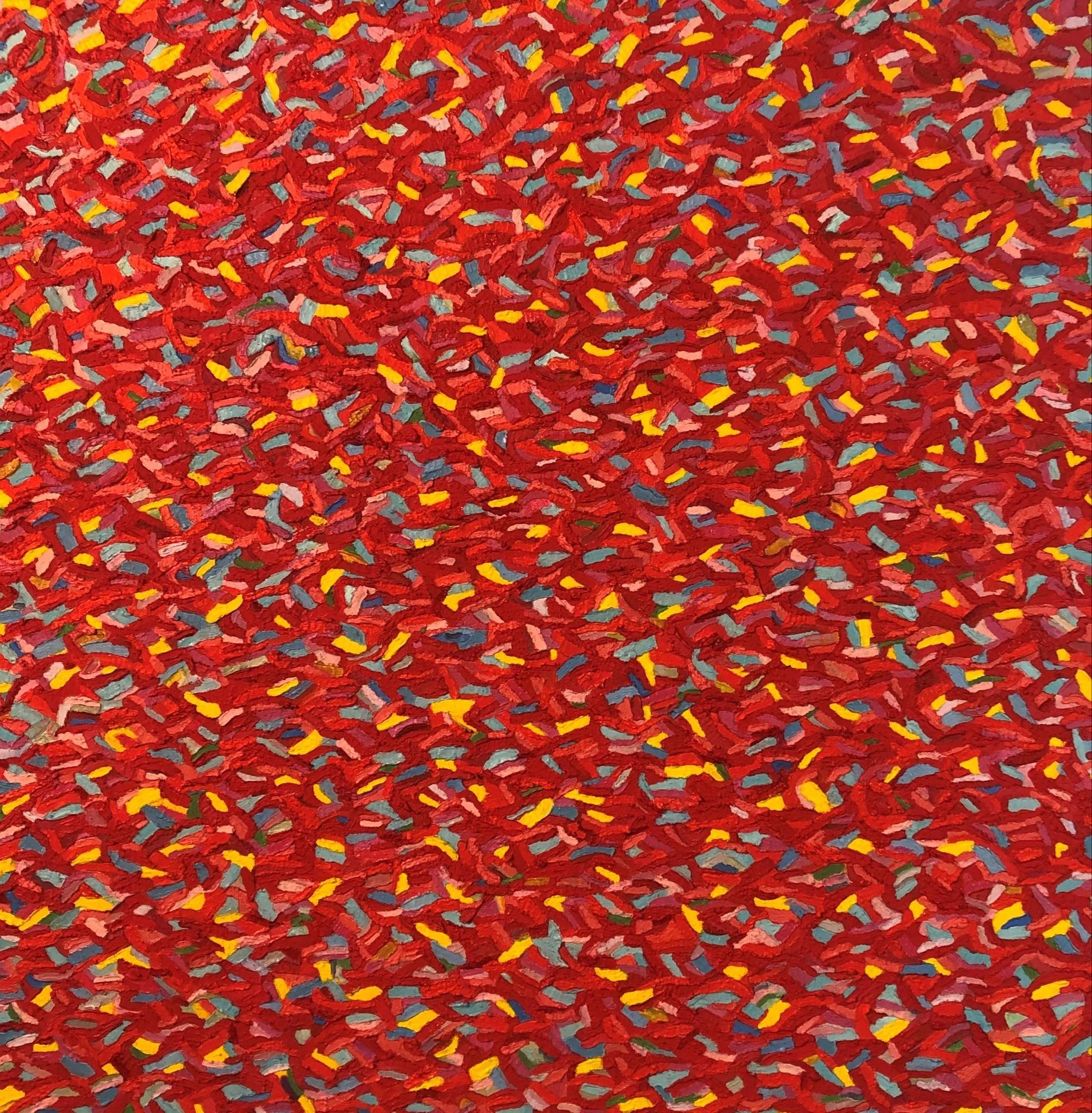
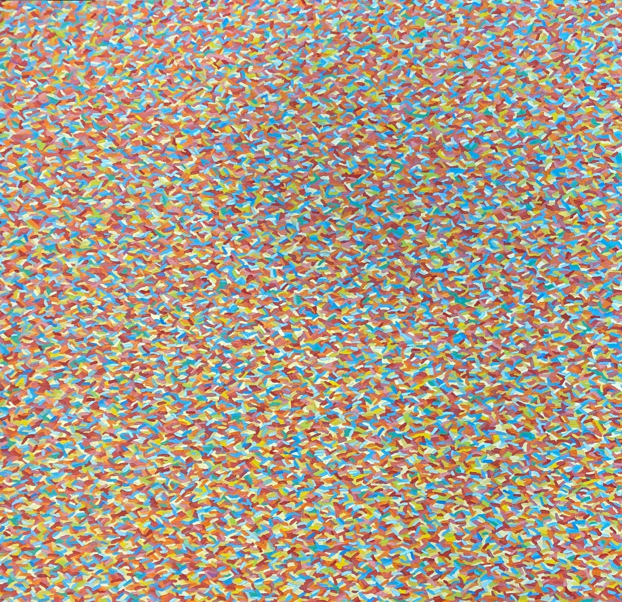
ForDonCoomes’work,overallcolorisconstructedthroughan overlaypatternofsmalldistinctbrushstrokesofothercolors.The effectcausesthecolorstooscillate.Paintisappliedassiduously anddistinctly,causingthepiecetoappear,almost,computer generated.
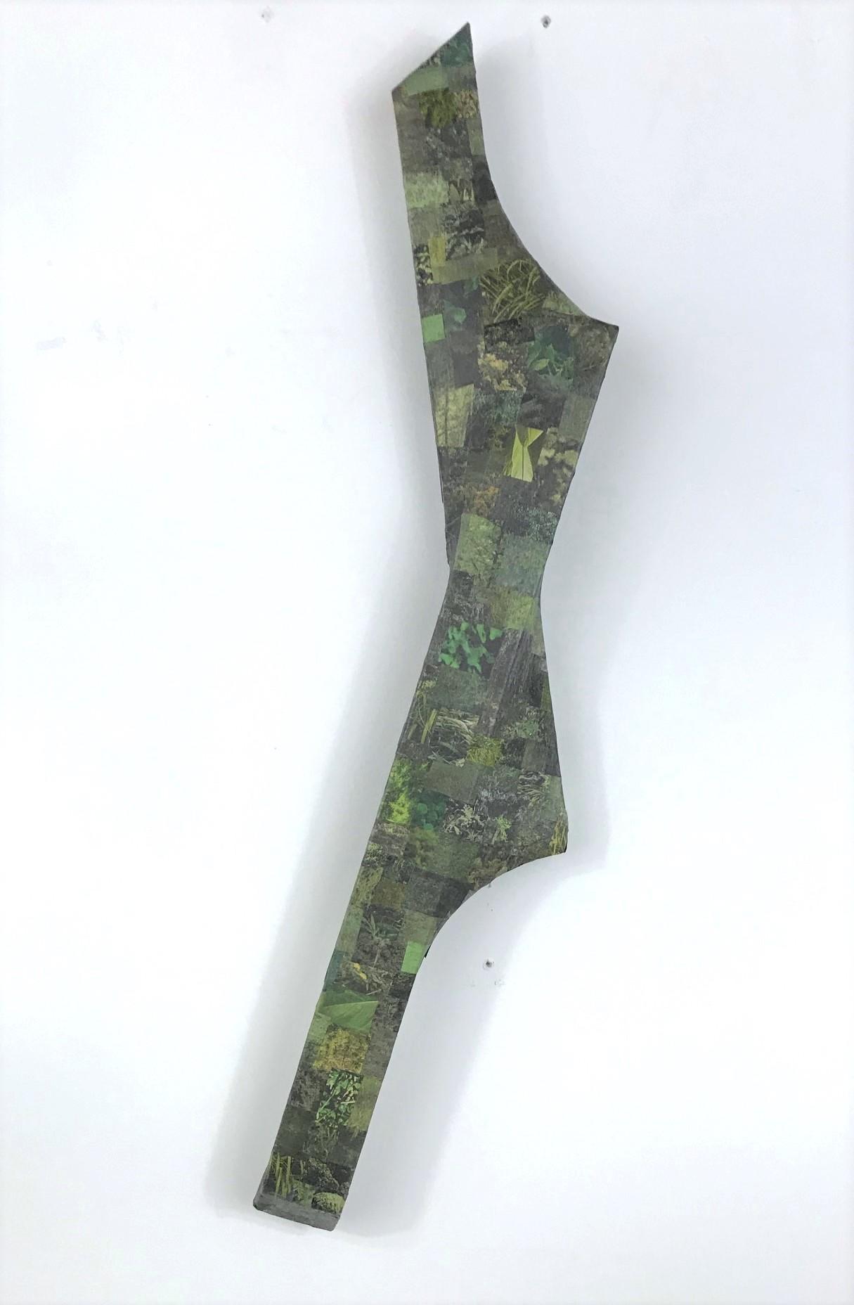
TravisChilders’workiscomposedofvaluesorshadesofasingular color. Heappropriateshiscolorfromreproducedphotographs foundinnewspapersandthencollagesthecolorsinaloosegrid formation,whichisthenoverlaidonto3-Dformsthatevoke islandsorirregularly-shapedplanets.Theresultingeffectsuggests theperspectiveoffarmlandfromabird’seyepointofvieworfrom anairplane.
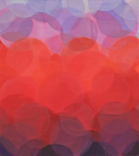
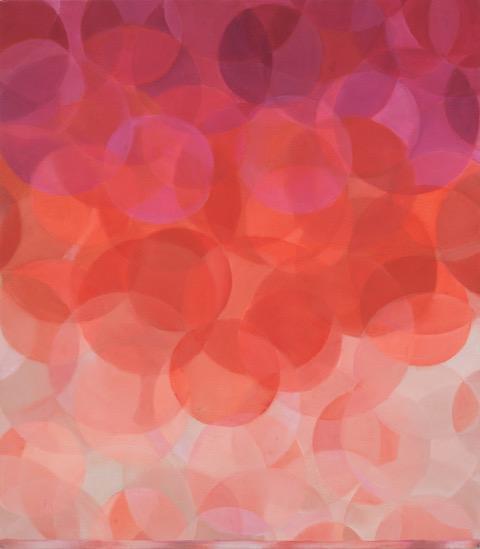
MiraHecht’sworkplayswithtransparencyandluminosityof color.Translucentspheresoverlapeachotherplayfullycreatingan illusionofchromaticeffervescence.
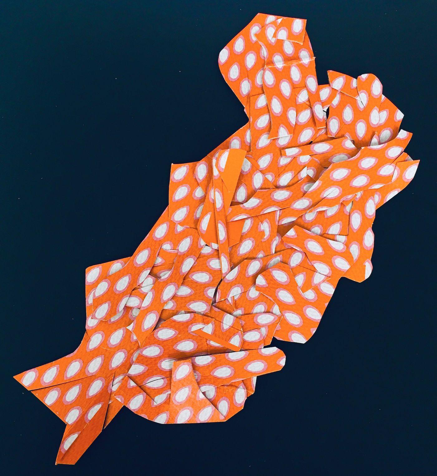
PDKlein’sworkusescolorindifferentways.Herassemblage worksexplorecascadingcolorsusinganintriguingarrayofbright foundobjects.Hercollagesofinterwovenmaterialsexplorebright patternsofcolorarrangedinabstractformations.
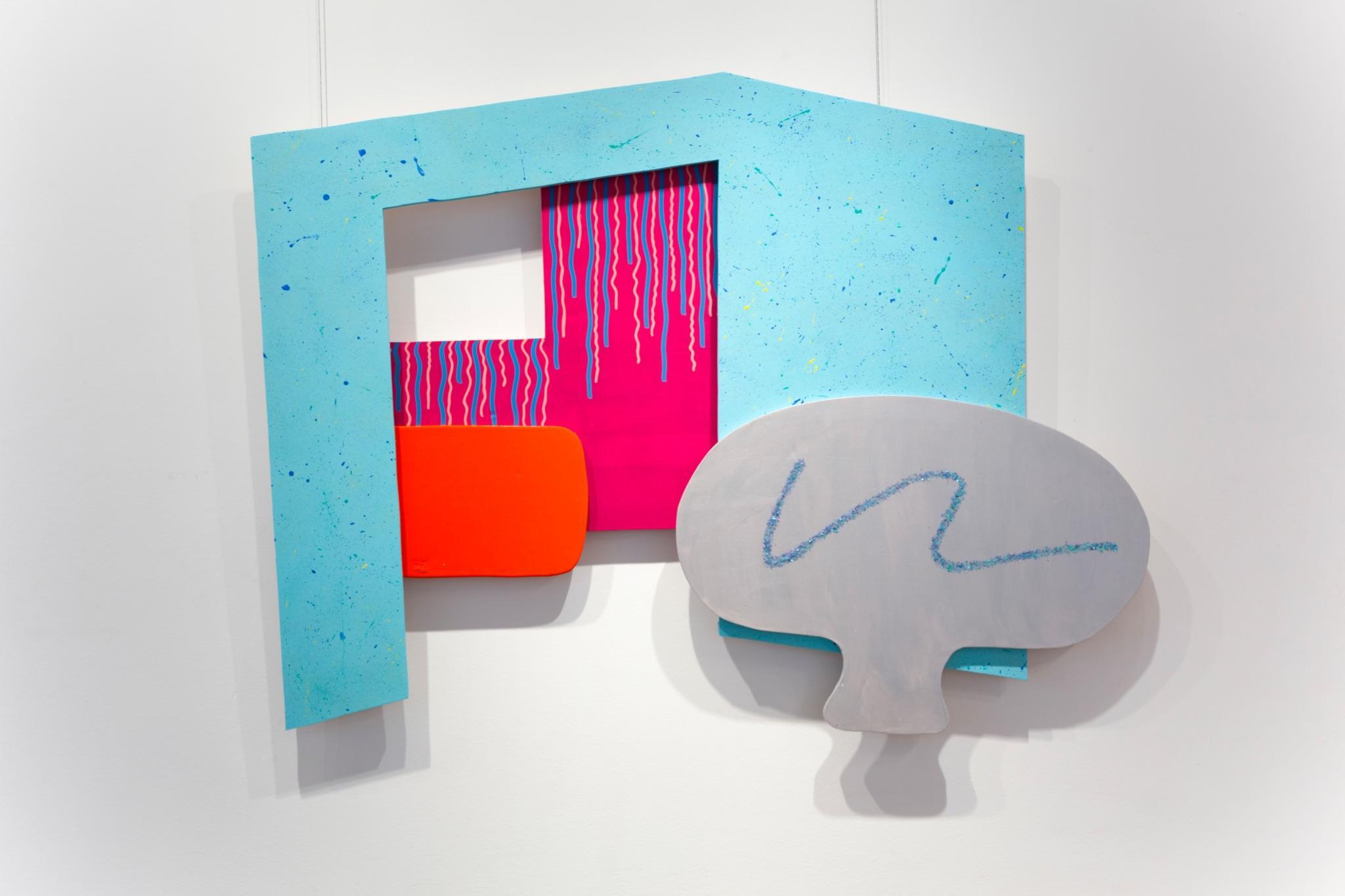
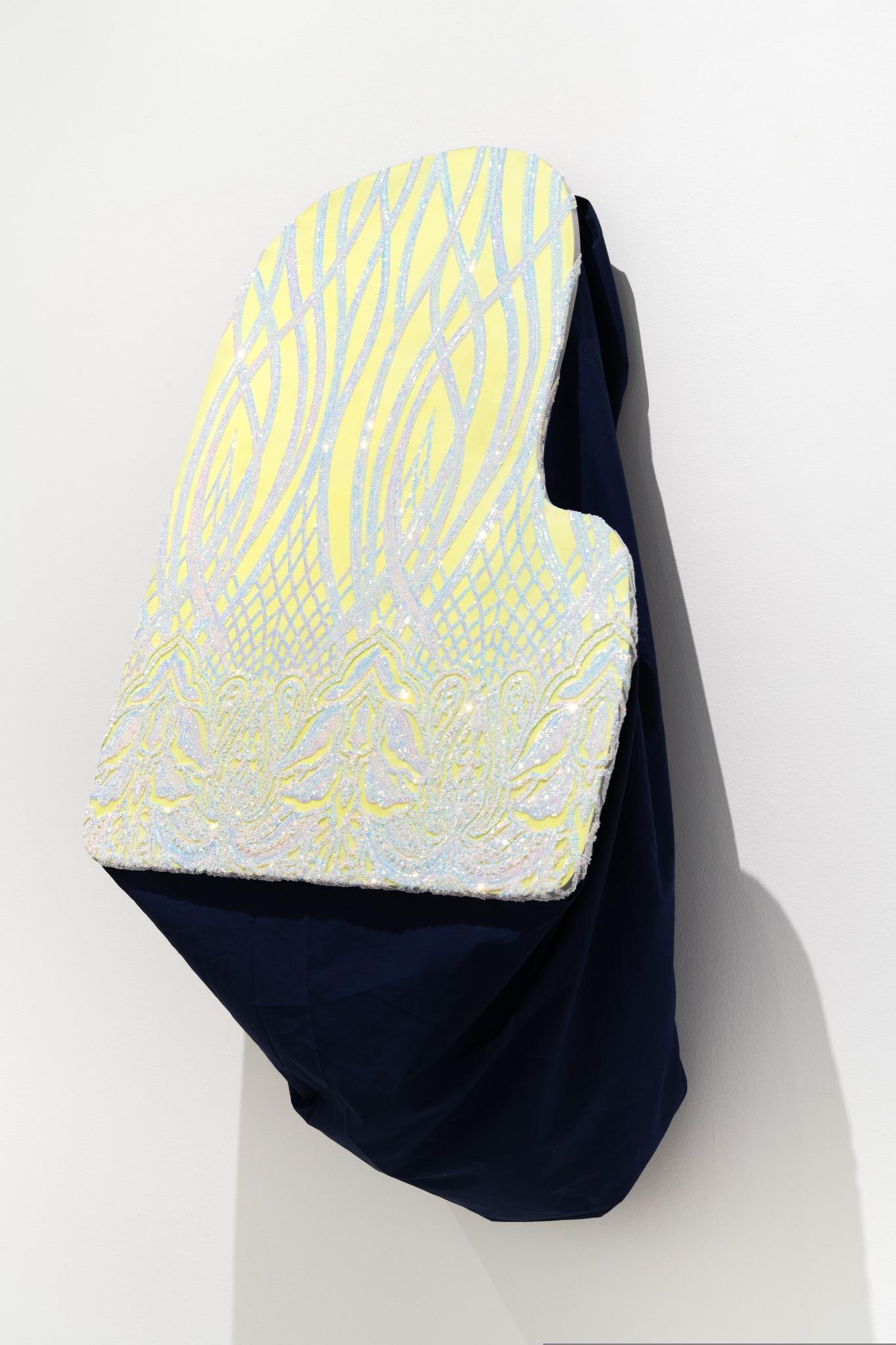
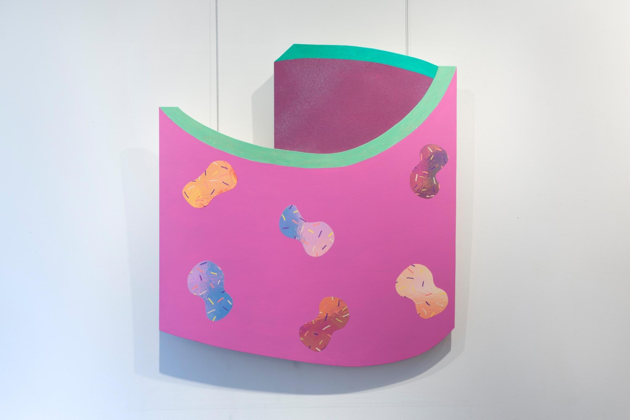
MadelineAStratton’sworkisabouttimeandplaceinmemory. Materialsusedarediverseandplayful.Brightflatcolorsplayfully contrastshiny,reflectivetextureswhilethedeceptivelyseemingly simpleconstructionsevokechild-likerenderingsof3-Dspaces.
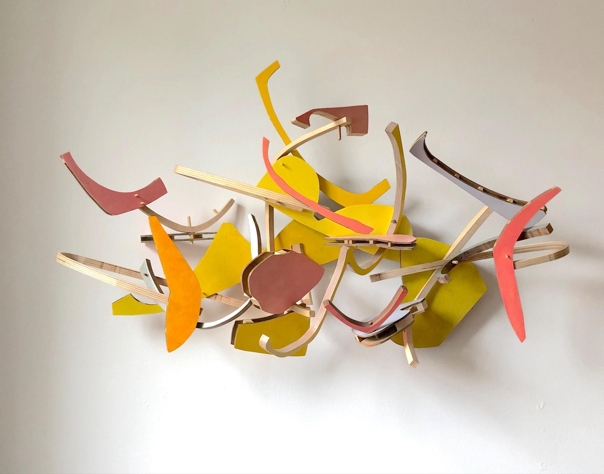
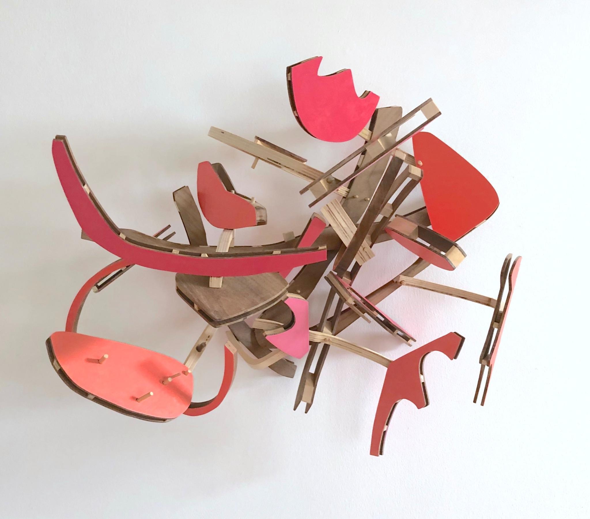
Complex3-DcompositionsinformcolorinJeanSausele-Knodt’s assemblages.Awhirlwindofforms,overlapandobscureeach other.Newcompositionalvariationsappeartoemergeasthe viewerchangesperspective.Thetwoworksintheexhibitionuse similarormonochromatichuesimpartingasenseofharmony.
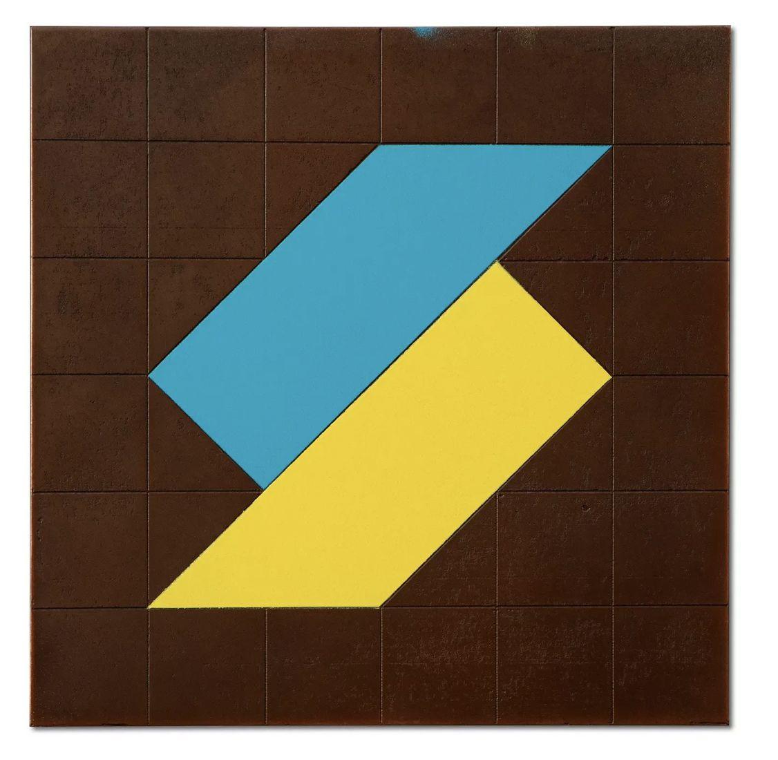
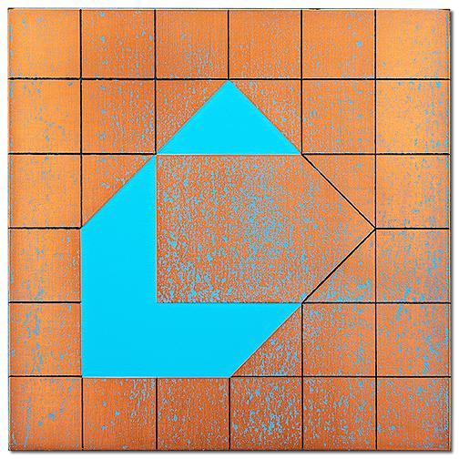
Color,geometryandsurfacearecarefullyconsideredinGaylia Wagner’sminimalworks.Thenuancesbetweenthesethree elementssuggestsanumericalormathematicalconsideration, whichinturn,evokesamusicality.
My work is non-objective and relies heavily on obtaining a final image through a process involving the use of color as well as texture that results from brush strokes or marks that are applied by hand to the painting surface. Texture is achieved largely through the brush marks, which distribute the paint applied unevenly. The colors used in the paintings are normally not predetermined; instead I base my color choices in response to the color(s) that already sit on the painting surface.
I employ an allover painting process in which I begin the application of a particular color at the upper left-hand portion of the surface. Using short brush marks that are loosely applied in a diamond-grid pattern, I apply paint going from left to right (and down) on the painting surface until the bottom-right portion of the surface is reached. This process is continued repeatedly until I determine that the painting is completed.
–DonCoomesBirthday Fun in Myrtle Beach, Don Coomes, oilonboard,12”x12”
Procrustean Card Table, DonCoomes,oilonboard,30”x30"
My relationship with color, like most relationships, is complicated. I tend to shy away from using too much color in my work because I feel it dominates a piece and has the potential to distract from an idea. But color is everywhere and one way or the other you have to consider it. When I do use color, I prefer to use it in a way that it appears in the real world. I cut out images from newspaper, such as plants and skies, and rearrange them to create new ways of seeing and dialogue. The color you see is the color you would see, although through a second source from being printed on newsprint.
Travis ChildersVegetation #6
TravisChilders.
Imagesofplantlifecutout ofnewspaperandcollaged ontostretchedandshaped canvas,archivaladhesive 19”x3”x3”
Vegetation #2
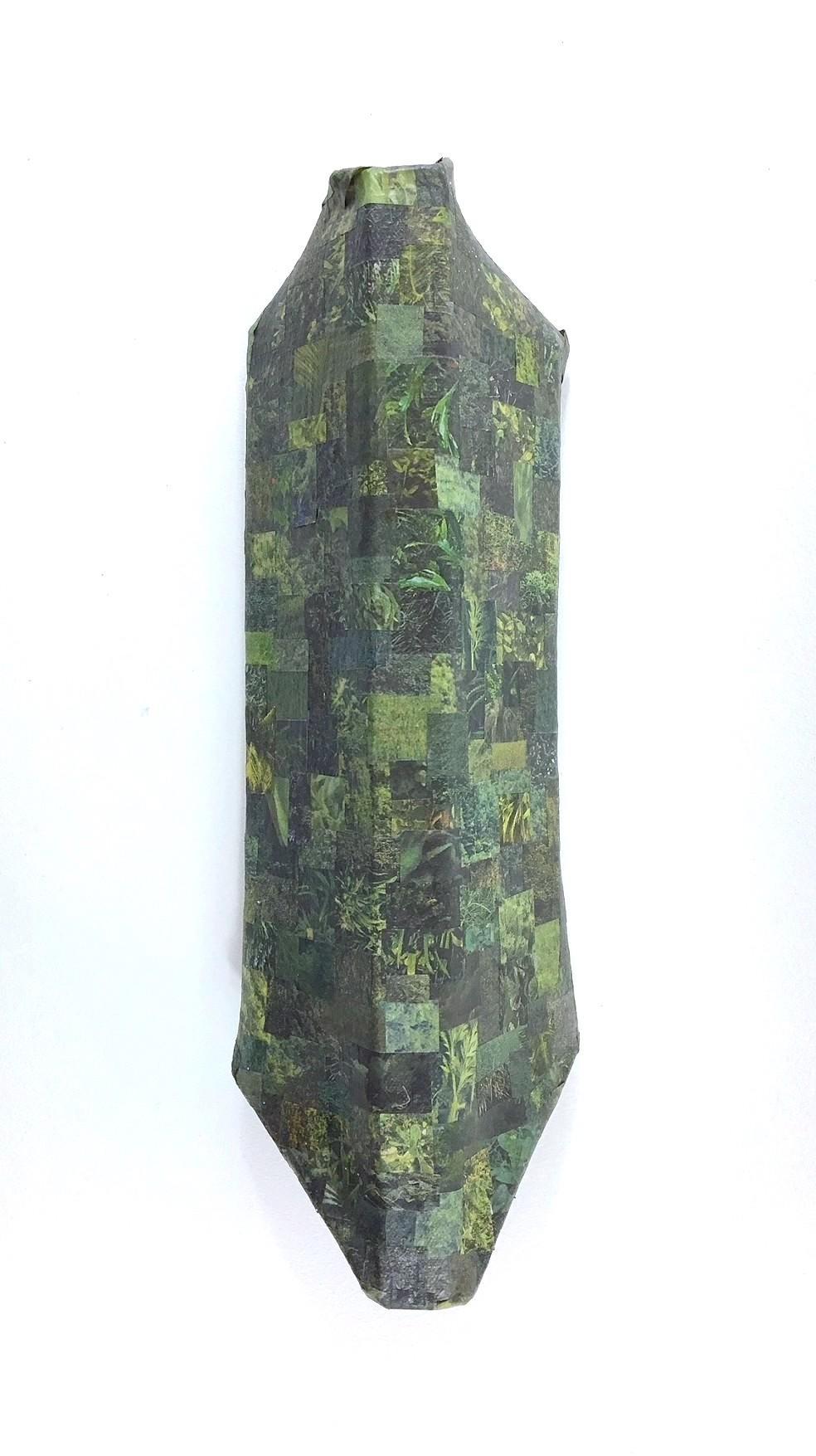
TravisChilders
Imagesofplantlifecutout ofnewspaperandcollaged ontostretchedandshaped canvas,archivaladhesive
13”x3”x3”
I think of color as a vital and exciting way to draw the viewer into the world I’ve created.
Each painting becomes an exploration of color relationships. Color brings a vibrant energy and aliveness to my work.
–MiraHecht
Beginning,MiraHecht,oiloncanvas17"x15"
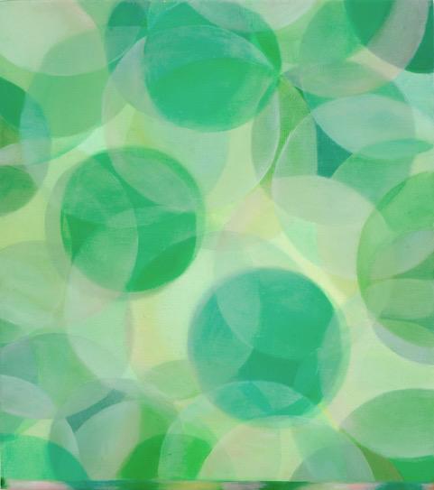 Mirage, MiraHecht,oiloncanvas17"x15"
Eye to Form is Love,MiraHecht,Oiloncanvas,24”x21”
Typically, I work in grayscale, black & white, and ‘non-hues’. However, I've recently been experimenting with vibrant color, and I find that color combinations and interactions add to the unexpected, aleatoric process of making, which underlies the work.
–PDKleinUntitled (midsummer), PDKlein
Mixedmediawall-mountassemblage

20”tallx2”widex2”deep
2023
Mixedmediawall-mountassemblage
 Untitled (WTF?!), PDKlein
19”tallx2”widex3.5”deep 2021
Untitled (crisscross), PDKlein Collage(paper&watercolor)
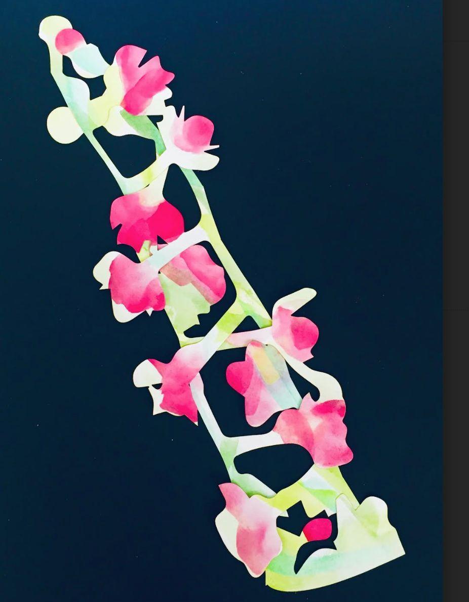
9”x9”framed 2023
Untitled (betwixe), PDKlein Collage(repurposedprinted cardboard)
9”x9”framed 2023
My work is an investigation of the memory and importance of domestic objects and spaces. Utilizing traditional media such as paint, textiles, thread, and printmaking, I challenge myself to create representations stemming from my memory. By creating silhouettes of objects and simplified structures of empty spaces, I aim to convey both absence and belonging. I search for ways to memorialize and find comfort in the objects of daily rituals and the spaces in which they take place. While drawing from places and times specific to me, I hope the viewer can enter into a reflective journey of their own space and memory.
–MadelineA.StrattonDominoes Falling on Linoleum Floors, MadelineA.Stratton, Acrylicandglitteronwood,45’x60”,2020.
She Knew What to Do,MadelineA.Stratton,fabric andFlasheonwood,49x27x15.5in.,2022.
Fake Walls for Real Flowers,MadelineA.Stratton,acrylic, fabric,andvinylonwood,36”x38.25”,2020.
Color certainly has been a primary focus in my studio, including trying to leave it out altogether. However, I find it usually takes center stage, revealing exciting possibilities of sequence, transition and gesture. Color helps to animate the way the eye moves through my assemblages as it punctuates the space with hue, value, temperature and intensity. Yet it can also create a messy chaos as countless ideas unfold, clash, need to be wiped out and resolved. Indeed, if the color works, the piece works. Even though my work has become progressively sculptural, I do continue to mix and apply color from a limited palette of oil pigment -and still often refer to the work as painting.
—JeanSausele-KnodtNew Community,JeanSausele-Knodt,19”x31”x11”, oilonblackwalnutandbirchplywood,2022.
Wishful Thinking,JeanSausele-Knodt,oilonblackwalnut andbirchplywood,19”x21”x10”,2022.
I use color in my artwork to draw the viewer’s eye to the subject. The flatter and more opaque the color, the more it contrasts with the reflection and depth of an unpainted metal surface. The colors I choose come from a limited palate of those tied to personal experiences, and the same ones are repeated throughout my work.
—GayliaWagnerTile Dream 001, GayliaWagner,etchedcopper, patina,sprayenamel,5.25″x6″,2016–2021
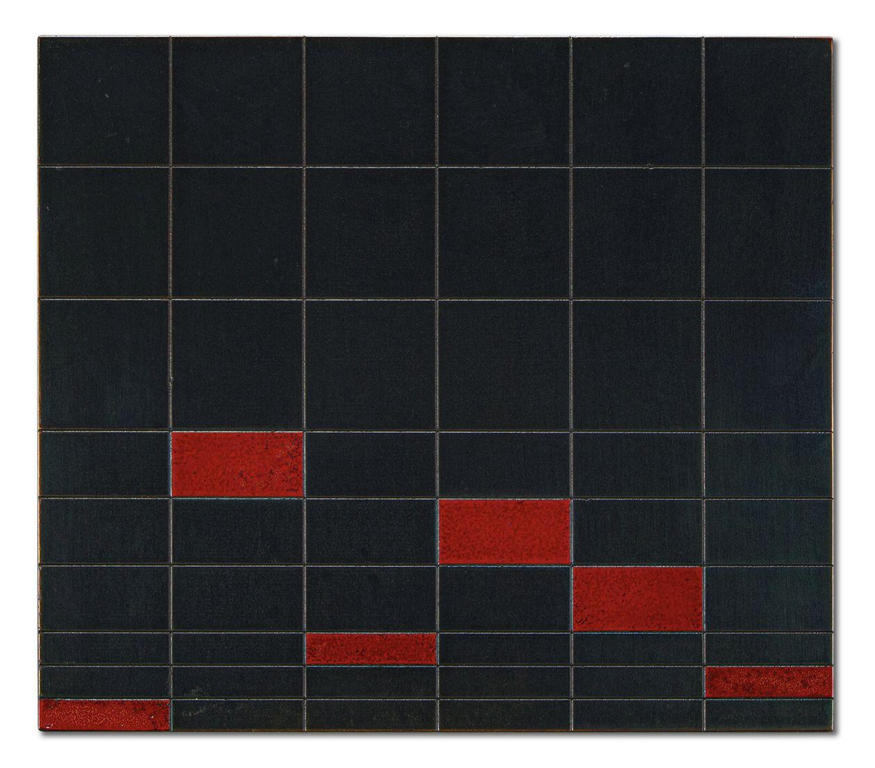
Approach and Recede Study 003, GayliaWagner, etchedcopper,patina,spraypaint,6”x6”,2020
Present#2
GayliaWagner etchedcopper,patina, tintedgesso,Indiaink, 6”x6”
2017
Future #2, GayliaWagner, etchedsteel,patina,tinted gesso,Indiaink, 6”x6”
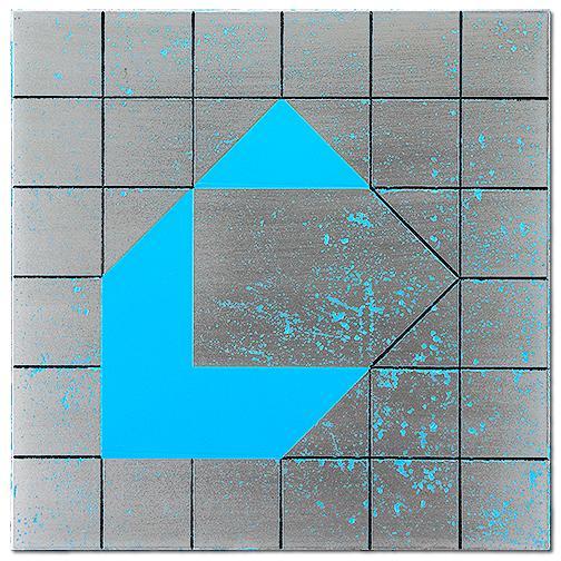
2017
HARD COPY CATALOGUE
is available for purchase
