Spring 2023 Process Book


 Preston Mack
1
Preston Mack
I’m Preston, a freshman at the University of South Carolina studying Media Arts and Art Studio. I enjoy working with both digital and physical media. Most of my experience is in traditional 2D media, like graphite and charcoal, but I now do a lot of work in digital design programs. Much of my work takes inspiration from my interests, as my best work comes from things I am passionate about. I particularly enjoy vaporwave aesthetics, the various subgenres of EDM, cars, and video games. In this process book, you’re sure to see the influence that these interests in particular have had on my work.

This semester, I took two different digital design courses: ARTS 102 (Design Technology and Con-
cepts) and MART 262 (Digital Compositing). I took this process book as an opportunity to display the work I did in both of those classes as a summary of my Spring 2023 semester.
I see this semester as a vital step in my career path. At this point, I have now broken into the fields in which I may work, and so far, I am proud of the work I have done. That being said, there’s still a full path ahead of me with much left to learn.
The first project for ARTS 102 involved six-word stories. The idea was to take six words, visualize them, and incorporate the text into the final image.
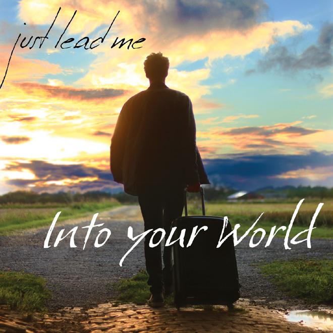
My first six-word story uses lyrics from the song Cities by Throttle. I wanted to portray the process of getting to know someone as an expedition. The compass is supposed to represent that connection, with part of the six words on the compass to represent an engraving - a motif left by
the person the explorer is learning about. The second part of the phrase is imposed on the table, in a more calligraphic typeface, similar to old maps or logbooks.
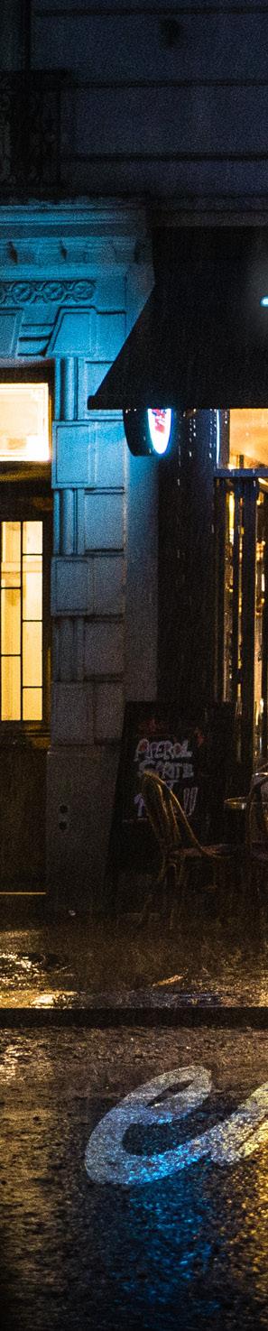
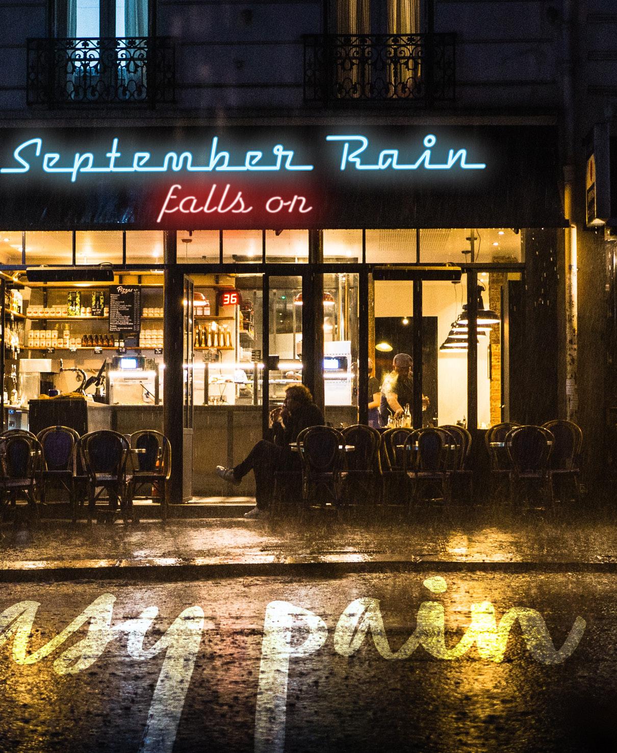
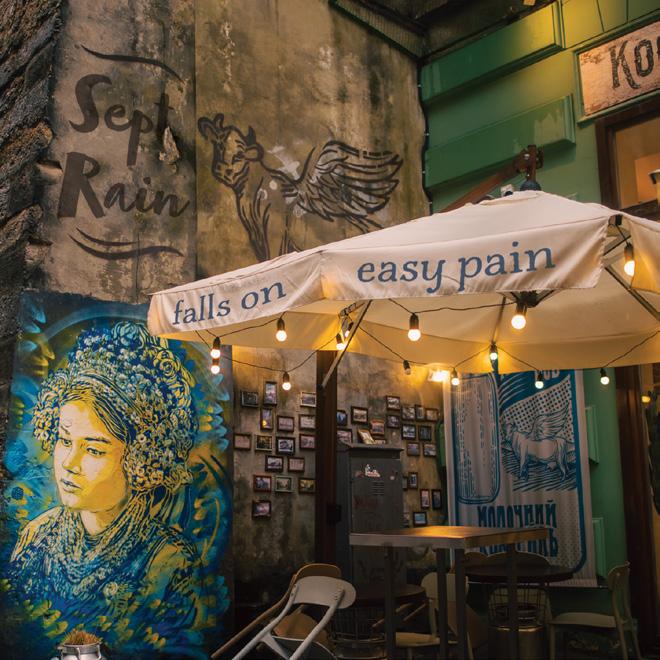
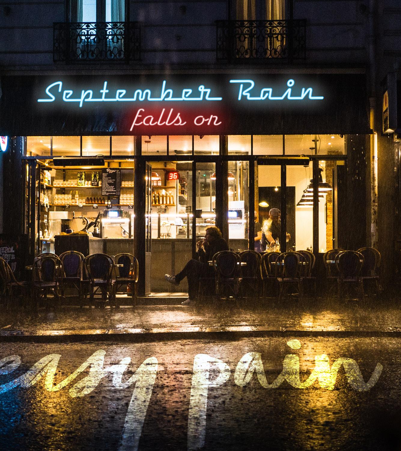
The second story uses lyrics from September Rain by Makoto Matsushita. I tried to emphasize the contrast of the bittersweetness of love and separation the song seems to speak of. The cafe represents warm comfort, and the rainy environment represents cooler sorrow. The typefaces were chosen to emulate neon signage and street markings.
These contain a few minor changes compared to the first final versions of the project, mainly to help readability of the text.
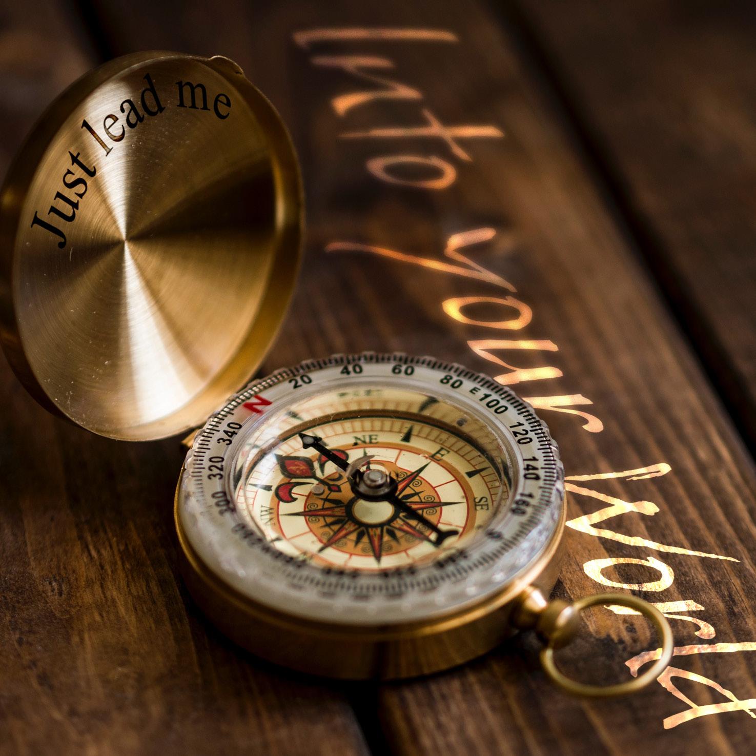
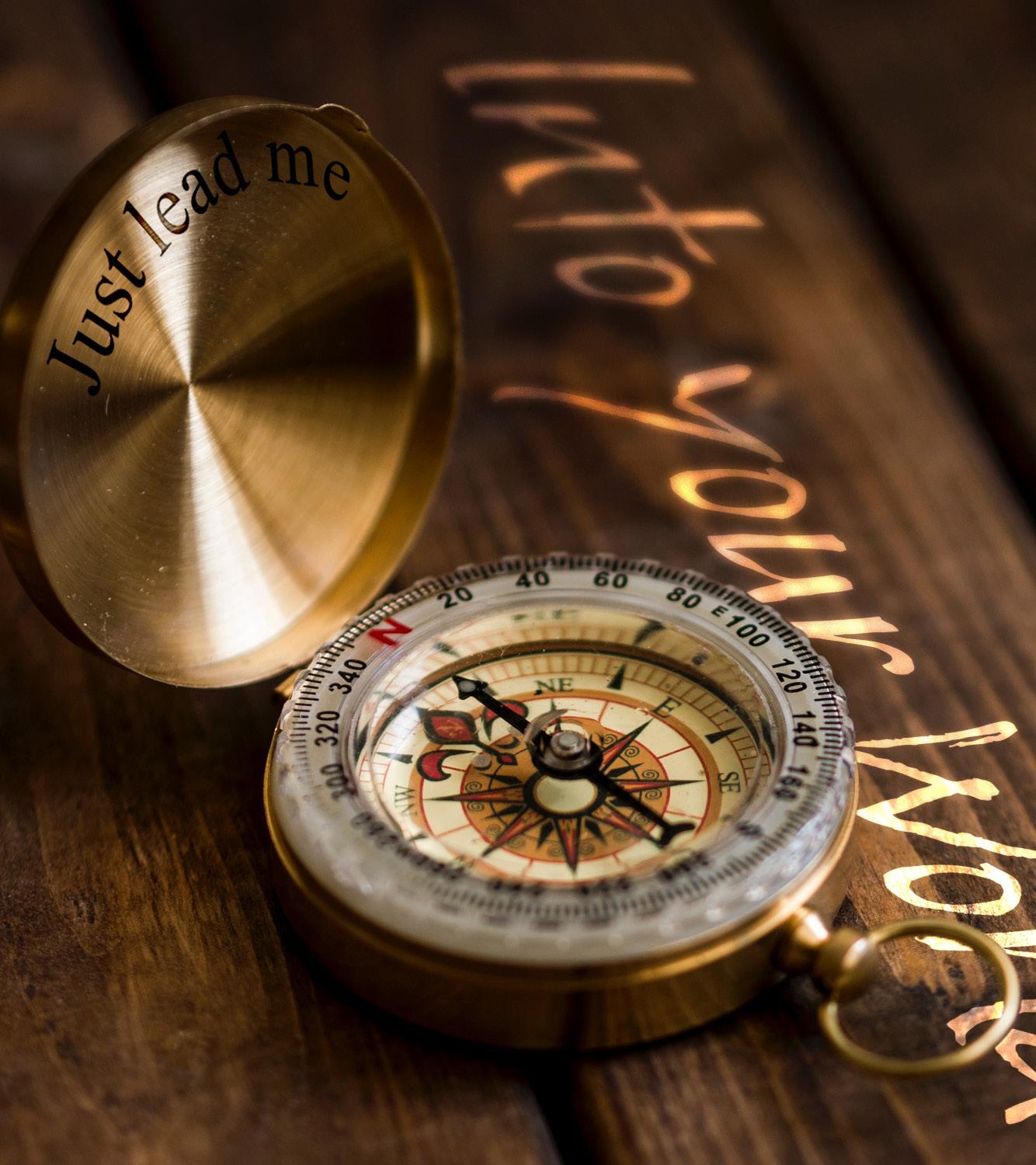
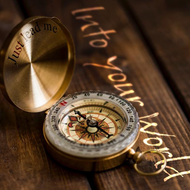
I previously mentioned the idea of an explorer wanting to learn more about someone through an “expedition”. The idea for this six-word story wasn’t always like this - initially, I had wanted to portray someone leaving an “old world” and stepping into a “new world”, as represented by the manmade brick path and the open sprawling landscape and sunset. After some feedback, I decided that this was a bit too literal for the lyrics, and went back to the drawing board. The “expedition” idea seemed to be a recurring one, and was a bit more conceptual in nature compared to the first idea. I decided to stick with it.
From my initial final work, I adjusted the text for readability. In the revised final work on the far right, compared to the middle image, you will notice darker text on the compass, as well as adjusted perspective and increased depth blur on the table text.
 Story #1 - Progression
A struggle I ran into during this project was finding six-word stories to create imagery for. I knew I wanted to work with music as my subject matter, but most music I listen to either has no lyrics or lyrics in another language. Eventually, I landed on September Rain by Maktoto Matsushita. City pop is a genre of music I particularly enjoy, and these lyrics stood out to me as they felt full of longing.
As previously mentioned, a rainy cafe was my subject matter for this six word story.However, the key image changed from a more open, patio cafe to a storefront with more rain in the late evening. I think the initial image (shown on the right) has its strengths, but I feel the final versions represent the contrast I want to show more strongly.
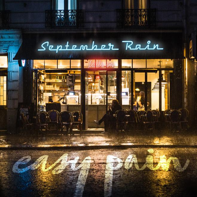
Between the initial (middle) and revised (left) finals, I adjusted the position and size of “falls on” so that it wouldn’t get lost in the bright storefront.
 Story #2 - Progression
 MART 262 Project 1, Image 1
MART 262 began with the task of compositing two separate images in Photoshop. The only requirements were that at least one had to be realistic in nature and at least one had to have an image implemented using green screen techniques.
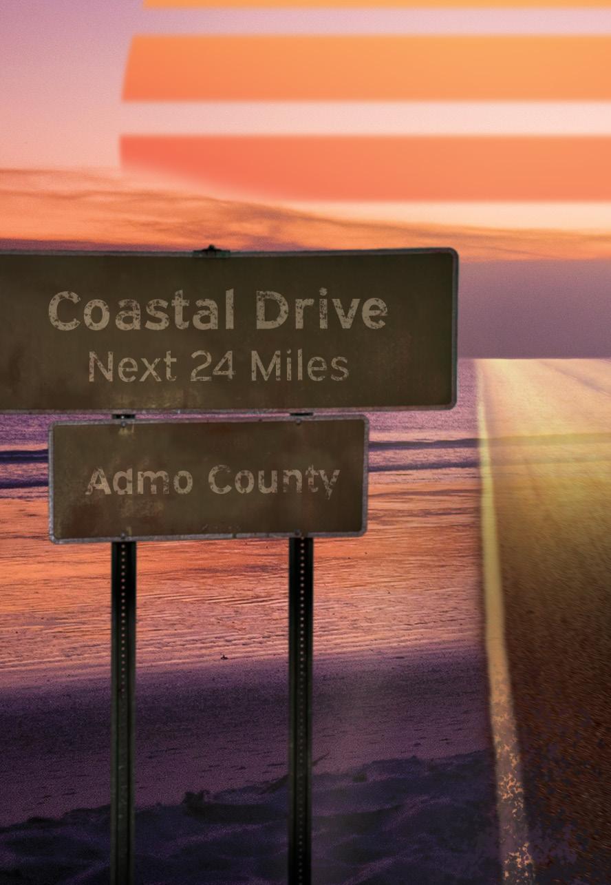
I mainly used this project to explore concepts inspired by music. No particular song inspired the
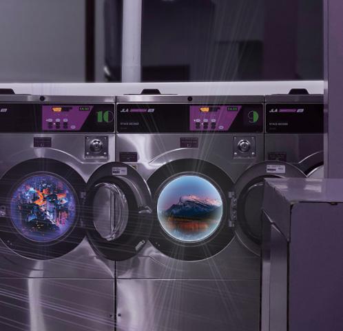
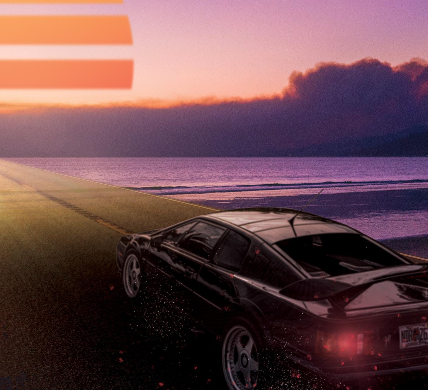
first image, shown above, but Coastal Drive by Admo did play some influence on it. The second image, shown on the next page, was inspired by Jolly Dry Laundromat by Hello Meteor. To explore these songs, I wanted to put a new twist on imagery I was familiar with. For the first image, the idea was to create a vaporwave styled image of driving into the ocean rather than a city. The second image mainly played on parity between a laundromat and fantastical teleportation.
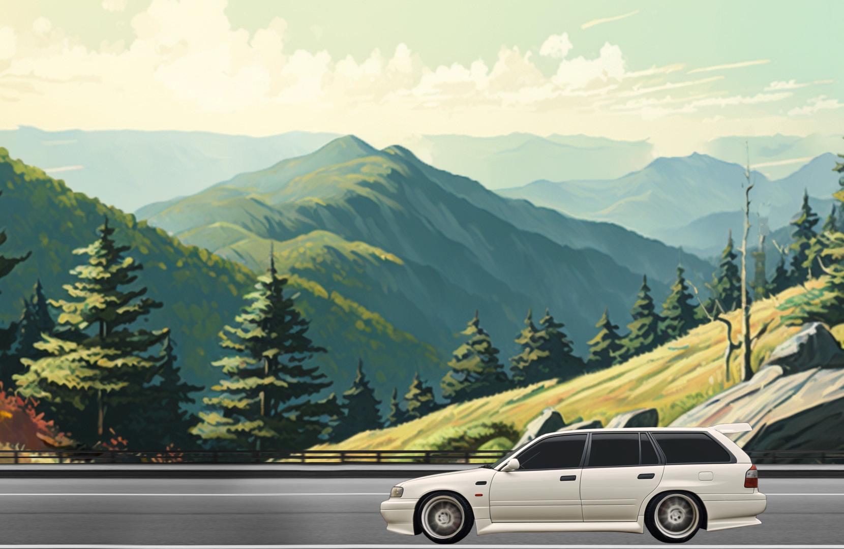
My inspiration from this scene came largely from vaporwave imagery. Originally, I knew I wanted to composite something in the vaporwave style, but I wanted to try a more original take on the genre. After some thinking, I had decided to do a car driving into the ocean with the stereotypical “vaporwave sunset” in the background. My reasoning was that typically, you would see cars driving through cities and by beaches, but I had never really seen a car actively driving into a body of water. The scene is comprised of four main images: the background of the beach at sunset, the road, the sign, and the car. The first main point of work was making perspective transformations to make the objects appear correct
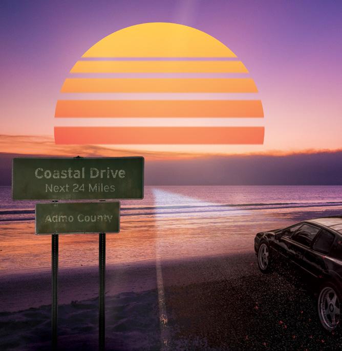
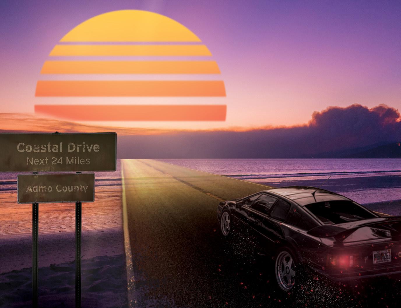
in context. The second task was to make adjustments to these images until they felt as if they truly existed in the environment. This included thinks the lens flares for the taillights, sand on the road, lens particle effects being kicked up by the car, and deterioration of the sign. Lastly, I transformed part of the road to make it look translucent and otherworldly, and I added the vaporwave sunset in the background.
Two adjustments can be seen between the critique version and the final version. The first is the road itself - I transformed it to make it read more easily as a road and not as a sun reflection. I also changed the blending modes and blur to help this. Lastly, I adjusted the interaction of the sun and clouds.
(Left) Critique Version; more pointed road perspective, less texture in road over water, strange overlap of sun on clouds.The previous image was only passingly related to a song. While compositing, I heard the song Coastal Drive by Admo, and I felt it fit the image I was making enough to reference it in the image. Laundromat Portals, though, was directly inspired by Jolly Dry Laundromat by Hello Meteor. The word “Laundromat” got me thinking about the doors on washing machines, and how childlike imagination could lead you to believe each had its own world inside of it. Maybe they could teleport you to other places. I decided to play on this parity for the second image. I found an image of washers and dryers in a dry-cleaning store, and I began to use selected layer masks to create circles showing different types of
landscapes. I also wanted to show someone climbing pensively out of one of the washing machines, as if they are an explorer that is perplexed by the whimsy of washing machine teleporters.
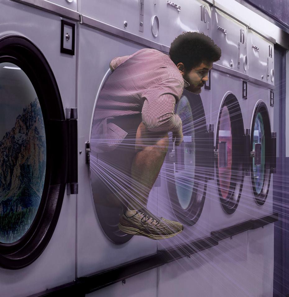
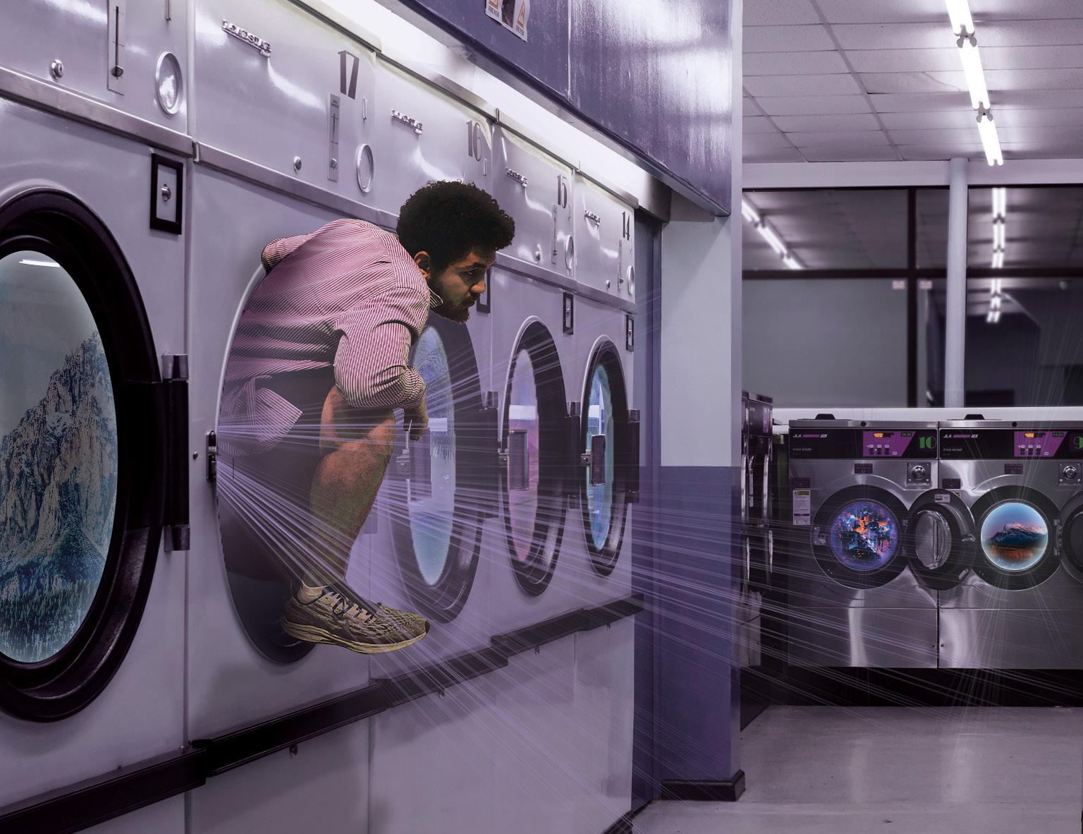
For effects, I wanted to keep the reflections from the glass doors though, to show that the doors to the portals were still closed. I also added lens flares to accentuate the open doors, as well as the person climbing out of the machine. This was meant to, in a way, show the “magic” of a portal inside a washing machine.
Changes for this project mainly concerned over- or under-visibility of certain effects, detailed in the caption.
(Left) Critique Version; darker windows, brighter lens flares, small shadow.This project concerned the creation of three different character faces purely using proportionally scaled letters of a typeface. Each face would fit the feeling or emotion given by the typeface itself.
My main challenge for this project was creating with depth and dimension - I wanted my type fac-
es to have characteristics that implied perspective and form. I did this mainly by using letters in ways that implied depth (some features cover up others), repeating letters for texture, and using letters in ways that imply form (such as the cheekbones seen to the right).
Interestingly, I usually began with
a letter that looked like a nose. I likely chose to do this subconsciously, as such letters could occupy much space and imply a general contour of the face, as it could satisfy other features such as eyebrows or beginnings of a mouth.
This face utilizes the sharp angles and refined serifs to create a stone-cold face that means business.
This face was originally a joke just to get my bearings for the project - it is a Moyai head made from a font many people dislike. I tried to exclude it from my final submission, but it still found its way in. I’m taking that as a sign to not exclude it here.
Each font that I selected had one letter in particular that I felt would work well as a facial feature. For Harrow Solid Italic, this was the capital J, which looked like glasses and the start of a nose when rotated. I decided to push the refined, almost snooty feeling of the font, which ended up creating a face that looks quizzical, yet has an undeniable air of old-timey fanciness.
For Kristen ITC, I really liked the capital Q. To me, it looked like it would be used as hair buns, which is what I started with. I went allin on the bubbly, cheerful nature of the font, which manifested itself in a feminine face that is very much on the “cute” side. I added some additional features, like blush lines and an earring, to really continue with the cute theme.
Lastly, I picked Castellar to contrast the more loopy, curvy fonts that I had selected. I began with a Z, which appeared as a nose and an eyebrow to me. I then used I’s, and L’s to make the hair. Lastly, I defined the form of the face using slashes, and an E for the chin. I believe this captured the feel of “stately businessman” I set out to create,
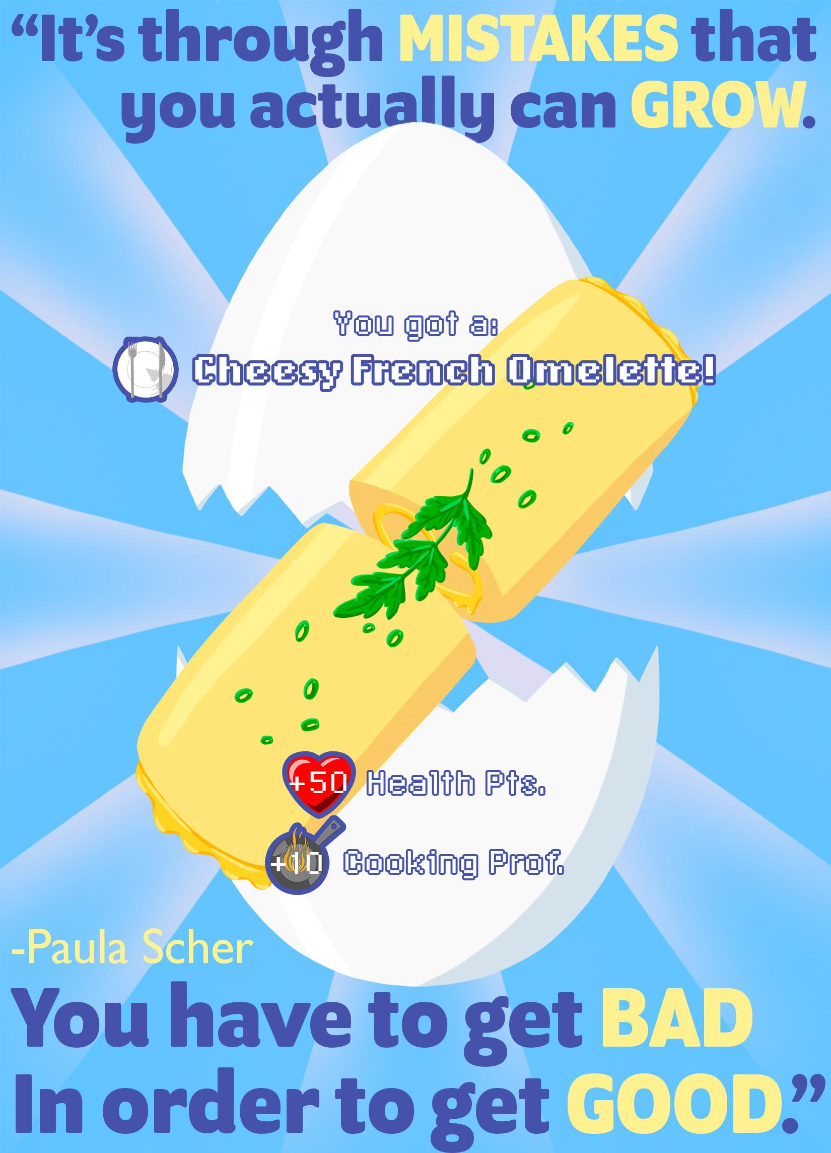
This project had us select a uote from which we would design a poster to advertise Graphic Design and Illustration at USC.
I chose a quote from Paula Scher, shown on the poster at the left. This quote resonated most with me because I’m used to seeing mistakes as just that, but they should instead be taken as learning opportunities.
One reason I felt like I had to use this quote was because I felt I had the strongest concept for it out
of all of the quotes. On my mood board, I had included an image of an omelette, because I associated the idea of learning from mistakes with the saying “you have to break a couple eggs to make an omelette.” This ended up being a fun route to go down for this project, and I was constantly trying to play off of the lightheartedness of the concept by making it similar to a video game “item get!” screen.
The one major problem I encountered with this project was the
text and typeface. I really wanted to organize it in a fun way, similar to some of the design choices of Paula Scher herself, but in the end, it really didn’t work well for the readability of the poster. I ended up going back and revising it to the version you see on the left.
On the next page are my original final poster, an early draft of the poster design, as well as my mood board.
The primary issue with this finished product was that the text was difficult to read, or at least, the proper order of reading the words was getting lost. The revised version, shown on the previous page organizes the text to be more readable upon initial glance.
Below: Poster Icons
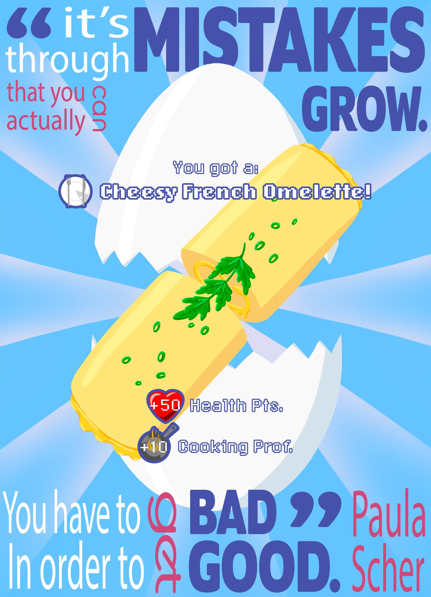

I tried to emulate video game icons that represent skills or stats. You can see what they’re supposed to represent on both final poster versions.

The prompt for the second project in MART 262 was rather open-ended. We would create a triptych - a series of images or works that can stand alone as an individual work, but can also come together as a larger series, which can represent a deeper meaning than each image on their own.
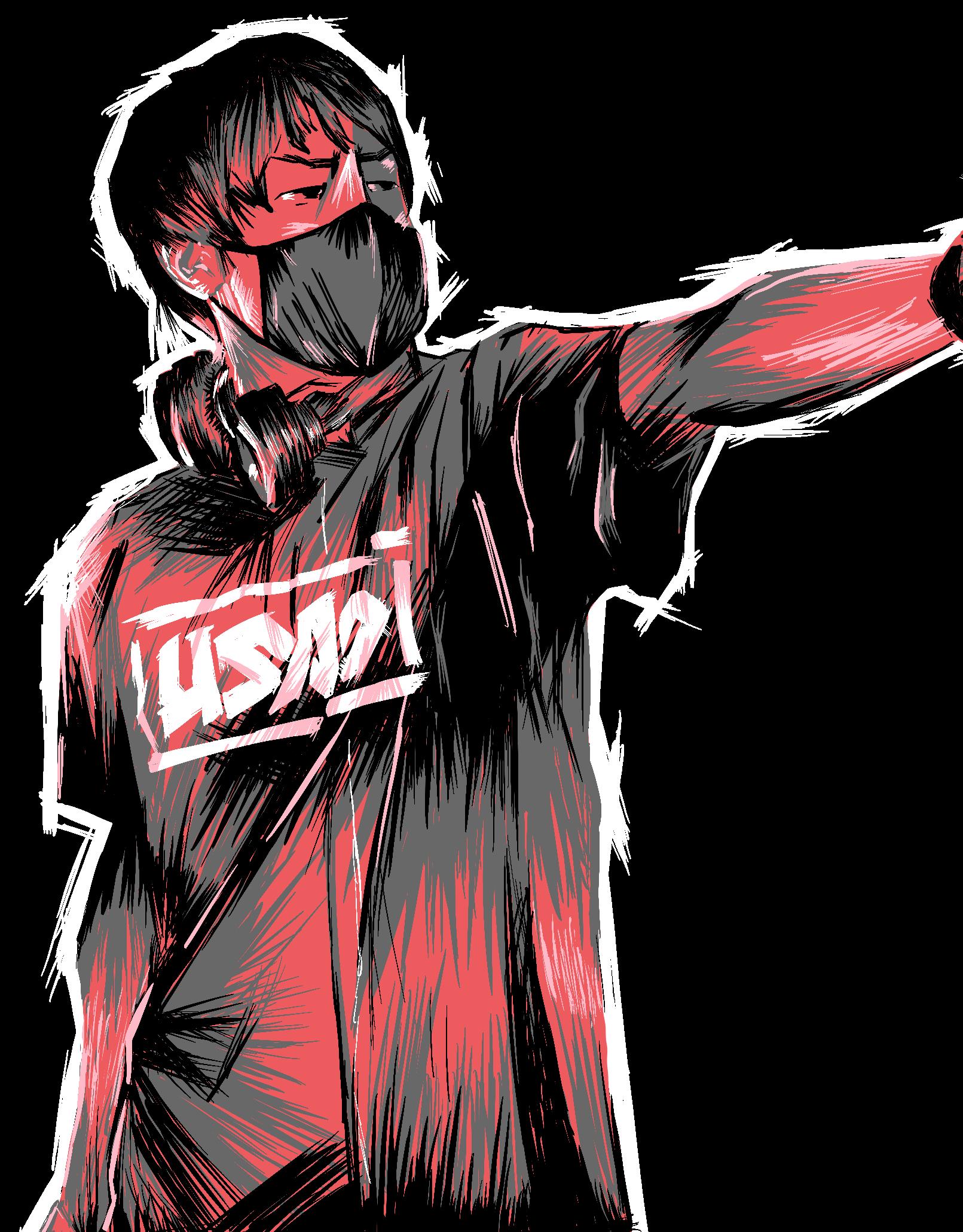
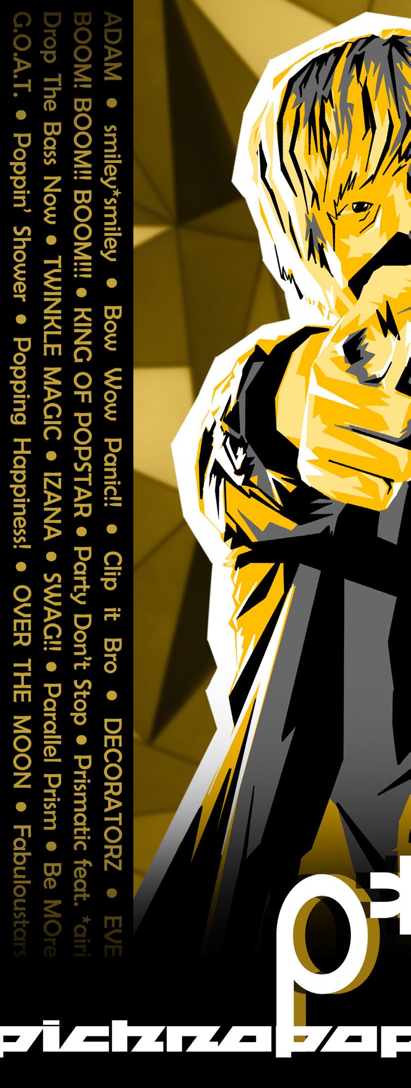
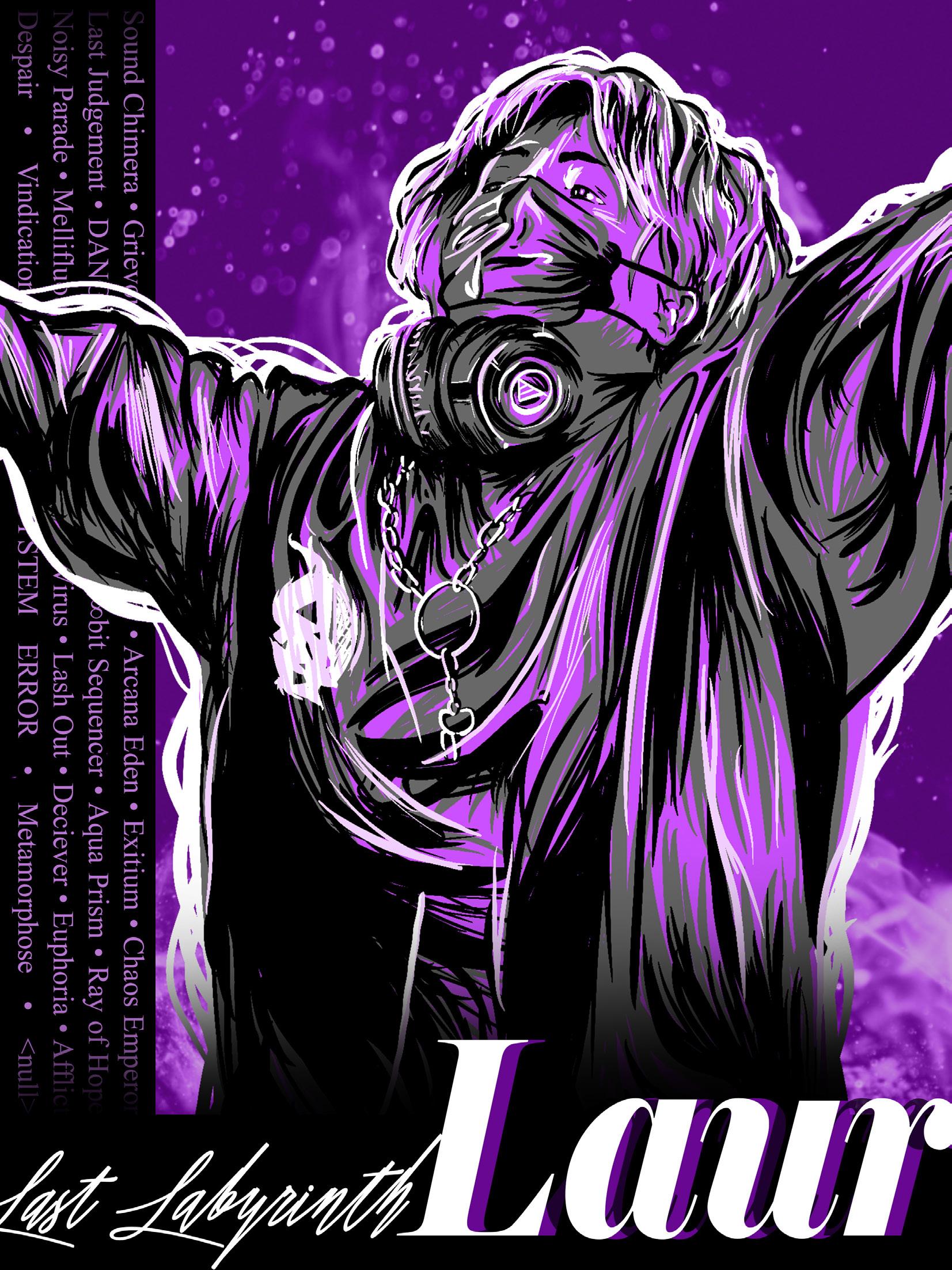
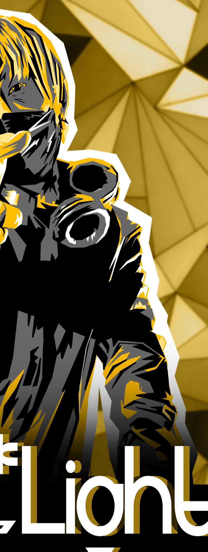
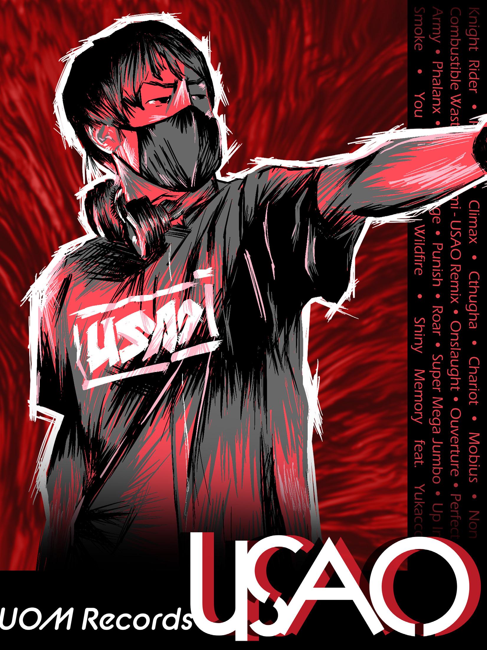
I knew almost immediately that I wanted to do a poster series as a tribute to Hardcore Tano*C. Hardcore Tano*C is a group of Japanese DJs who specialize in hardcore electronic music. They do tours and
I decided I would focus on style and implementation to strike a balance between individuality and conformity. Each poster would have the same color language and layout, but differ in brushstrokes, key
The first DJ in my poster series is Laur, whose music can be described as hardcore EDM with classical influence. To capture this mix of elegance and intensity, I used purple as a key color, with intermixing flowing strokes, and both serif and calligraphic typeface.
The second DJ is P*Light. His music is marked by happy, upbeat melodies and synths. To capture this, I used a bright yellow in combination with a geometric mark style, and finished off with fitting geometric typefaces.
The last DJ represented is USAO. I largely associate USAO with intense, driving composition, so I felt that red was the best choice. I then used jagged brushstrokes and italic fonts to continue the theme.
On the next pages, you can see all three posters.
Above: Logomark for Robot Lizard Gaming, a company that would sell gaming peripherals like mice, keyboards, monitors, and laptops. Takes inspiration from existing gaming tech companies like Razer.
Below: Logomark for Robot Lizard eSports, a brand that would run teams for various eSports. Takes inspiration from popular existing sports teams.
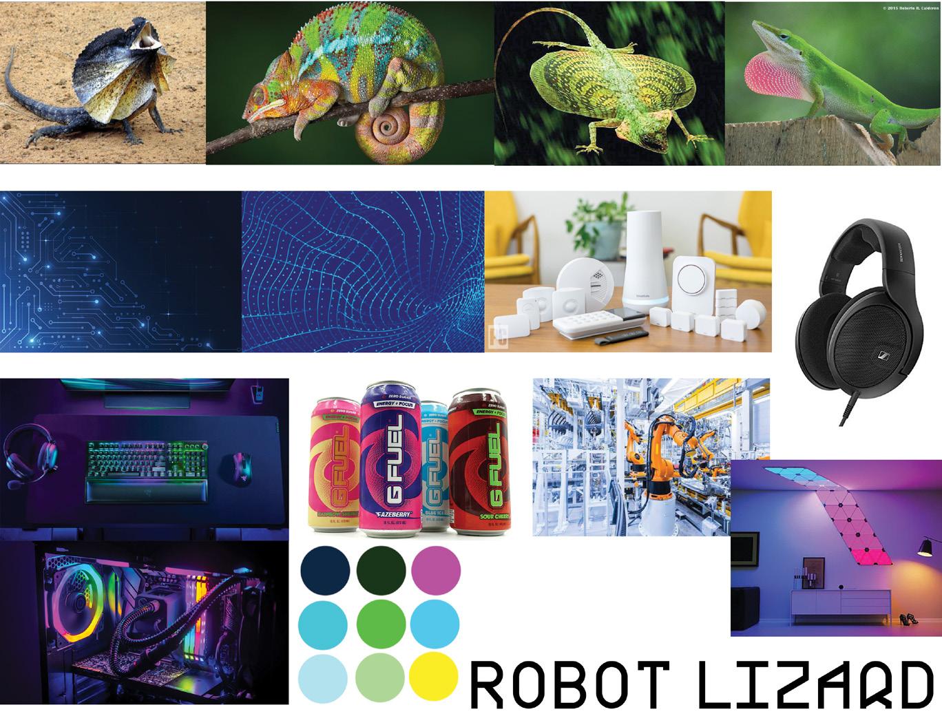
The lizards I selected were those I thought had distinct features I could design around (the chameleon’s tail, the gliding lizard’s wings, etc.), and the products I selecter were mostly relating to technology and gaming.
For the fourth project of Arts 102, each designer randomly selected two words (an adjective and a noun) and were tasked with creating a company (or companies) that would be represented by those words. Then, we would create logos for those hypothetical companies.
The words I was given were “robot” and “lizard”. I felt that these words could represent a number of different things, but I turned to technology and
gaming as my primary focus. You can see some of my preliminary ideas and concepts in my mood board above.
My two company ideas were a gaming peripherals company and an eSports team. Each takes cues from some pre-existing designs in the industry, and I designed with a clear idea for where the logos would be used. More about my process is detailed on the next page.
The color logo’s text was initially the same as the B&W logo, with no color. I later added the same rainbow gradient to give the design more cohesion.
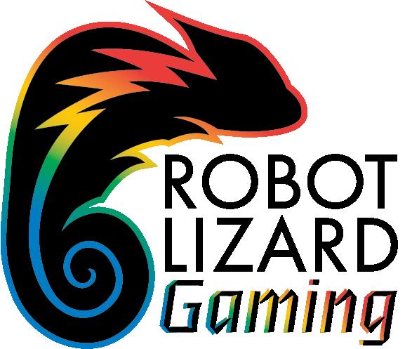
The primary ideas for this logomark were to draw connections between a chameleon, my lizard of choice, and gaming peripherals. Firstly, chameleons are commonly associated with color changing camoflauge. I thought this was an ideal connection to make with gaming peripherals, because lots of gaming keyboards include color changing LED lights underneath the keycaps. Further than that, I wanted to incorporate some sort of “robotic” aspect. Upon looking at pictures of chameleons, I latched
onto the striped pattern running across the length of their body. My thought was to change this into a lightning bolt to signify “power” and “electricity”.
Throughout my design process, I took inspiration from existing gaming company logos, as I wanted to make something that could go on a variety of products and still look clean and understated. This carried through to the text, as well. I chose a clean sans-serif for the first part, and then selected a more digital looking typeface for “gaming” to add a little bit of contrast.
ARTS 102 Project 1 Logo 1This logomark primarily revolved around conveying concepts rather than drawing connections. eSports teams typically want to represent themselves as powerful and unrelenting in competition, so I wanted to design something on the more “aggressive” end for this logomark. I figured a frilled lizard would be perfect, as they flair up to make themselves look tough as a defense mechanism. I exaggerated this by making the frills pointy and stark - they take up a large majority of the design. I also tried to give the
logo a sense of speed through the overall direction of the logo - the leading lines of the frills lead to the face, which also points to the right. An italicized, modern font would compliment this sense of direction well.
Lastly, I chose the colors based on the subjects I was representing. I used the light and dark blue to represent the cyber aspect associated with robots, and a yellow-orange-purple gradient to bring in some colors that look similar to an actual frilled lizard.
ARTS
Similarly to Logo 1, the color version of the logo was initially the same as the B&W logo. I later changed the text so the whole logo was in a horizontal format, since I felt it had better direction. I again added color to the text to help cohesion of the whole logo.
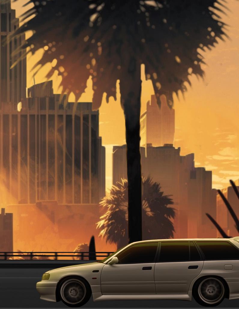
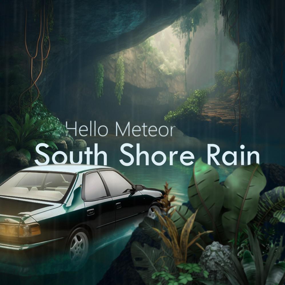
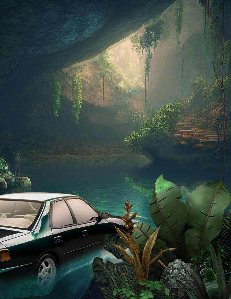
The assignment for this project was to create a looping album cover for a song. We would use AI art as our base imagery, Photoshop to separate our images into layers, and After Effects to animate our images. I chose South Shore Rain by Hello Meteor as my song. This song has a very chill, atmospheric vibe to it, and since it’s from the vaporwave genre of music, I wanted to make the imagery and animation somewhat liminal in nature. I wanted initially to have a car floating in a pooI. However, I
After completing the initial 10 second loop in After Effects, we put our finished animations into an AR program called Artivive. This had some restrictions, so there isn’t as much animation as the original animation, but you can still the 2.5D scene with your own camera.
Download Artivive on your phone and scan this image to see the augmented reality animation for yourself!

Scan the QR code below to see the original animation via YouTube!
ended up generating an underground lake with rainforest elements with AI, which I felt captured the feel of the song perfectly. I also felt that a car floating in the lake would be somewhat strange, matching the sometimes eerie feeling invoked by vaporwave.
I started with a parallax effect - this is the 2.5D effect you will see in the video. I also added a bobbing effect on the car, some waviness in both the water and the plant in the foreground, flashing hazard lights on the front and back of the car, and a green-screen rain video file over the top. I also added a rain-like character falling animation on the text, and a reverse rise for the song title.
Above are two different ways you can view this project yourself with your mobile device.
Top Left: Scene 1
Top Right: Scene 4
Bottom Left: Scene 6
Bottom Right: Scene 10
Our final project for MART 262 would test all of the image compositing and animation skills we’ve learned thus far. As of when this process book is written, it isn’t quite finished, and due to the nature of the project, it’s difficult to include a video in a book. However, I still wanted to showcase part of what the project looks like for the sake of documenting my work throughout the semester.
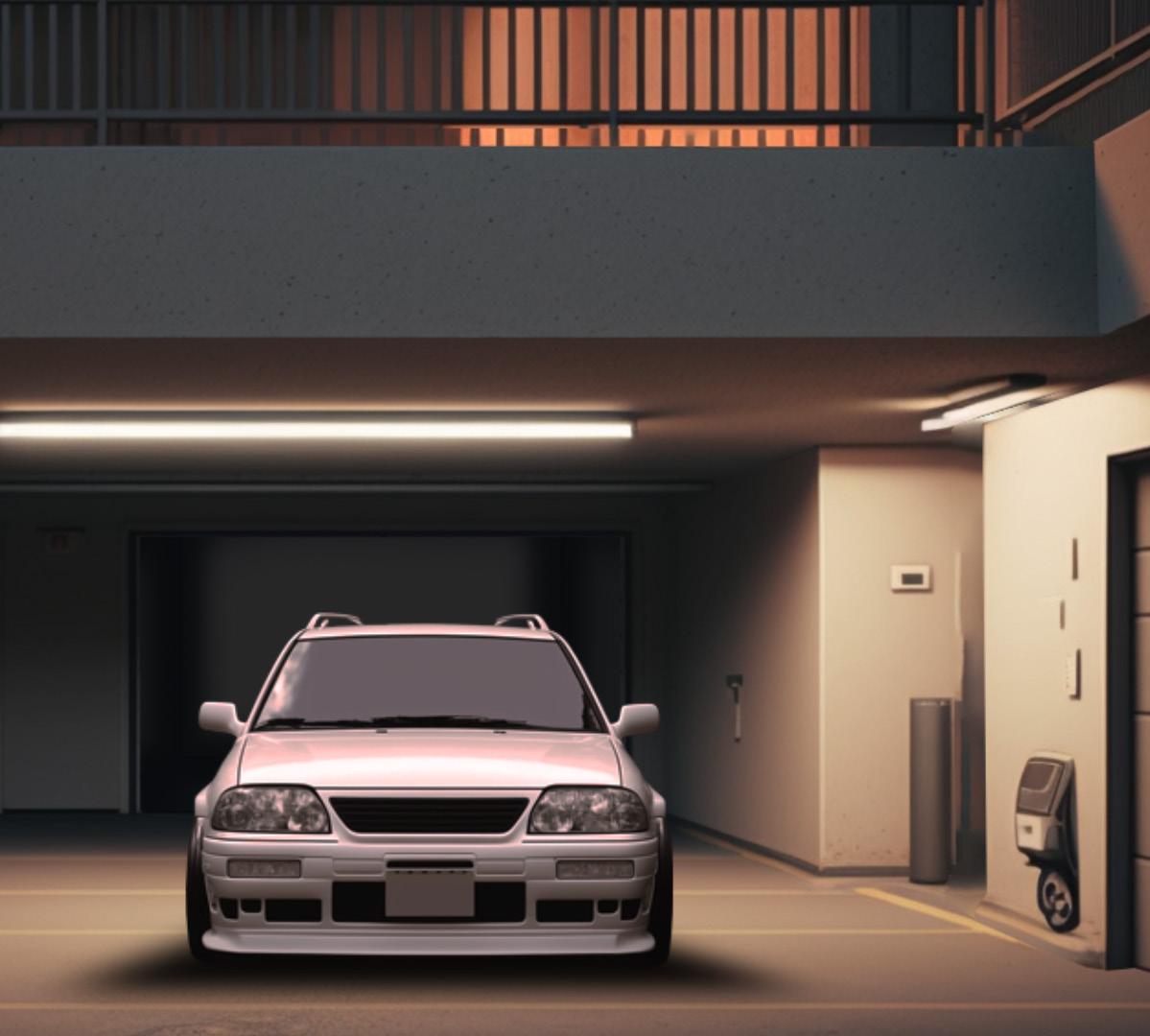
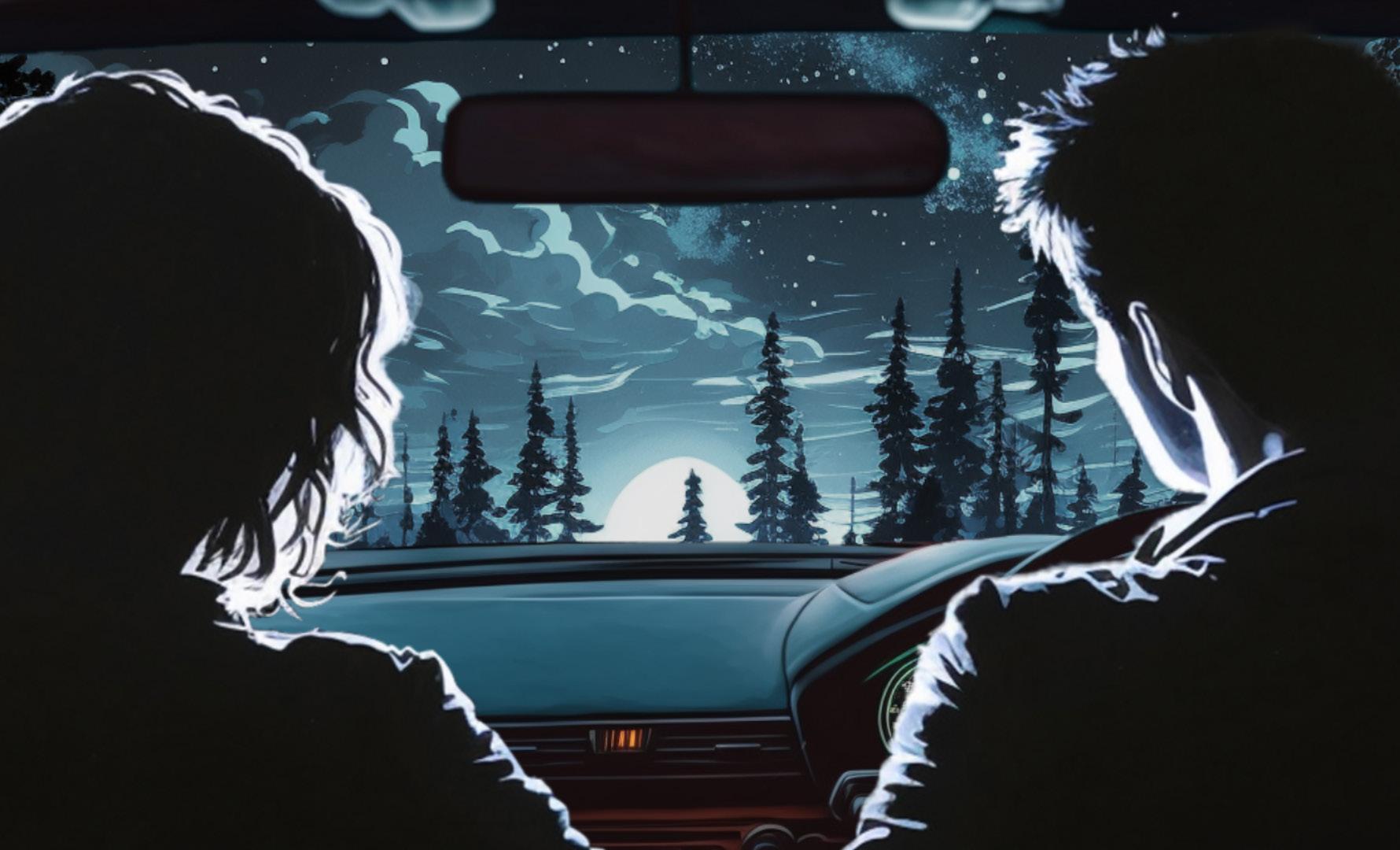
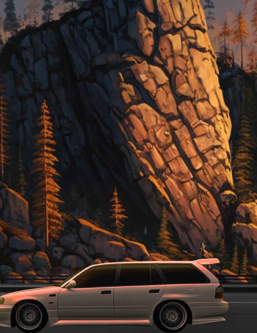
My final project is an animation to the song Toxic by t+pazolite, and it’s supposed to follow the journey of a person on their journey back home to meet their lover once more. Provided are four out of ten style frames; two more are found on the Intro page and the Colophon page.
Preston Mack
ARTS 102
Donna Smith
MART 262
Catherine Chi
University of South Carolina Columbia, SC Spring 2023
 Front and Back Cover Image
Credits to Linus Nylund on unsplash.com
Front and Back Cover Image
Credits to Linus Nylund on unsplash.com