
Experimentation distorting and cutting up the face in different ways to try and illustrate multiple perspectives and emotions. How the meaning behind the image can be manipulated through collage.


Biro pen and coloured pencil on A1 card, final outcome, in the study I have tried to convey ripping away the front or wall that young people put up displaying true emotions and the difficulties of mental health.The contrast between the black and white biro and the coloured pencil helps emphasis my message.


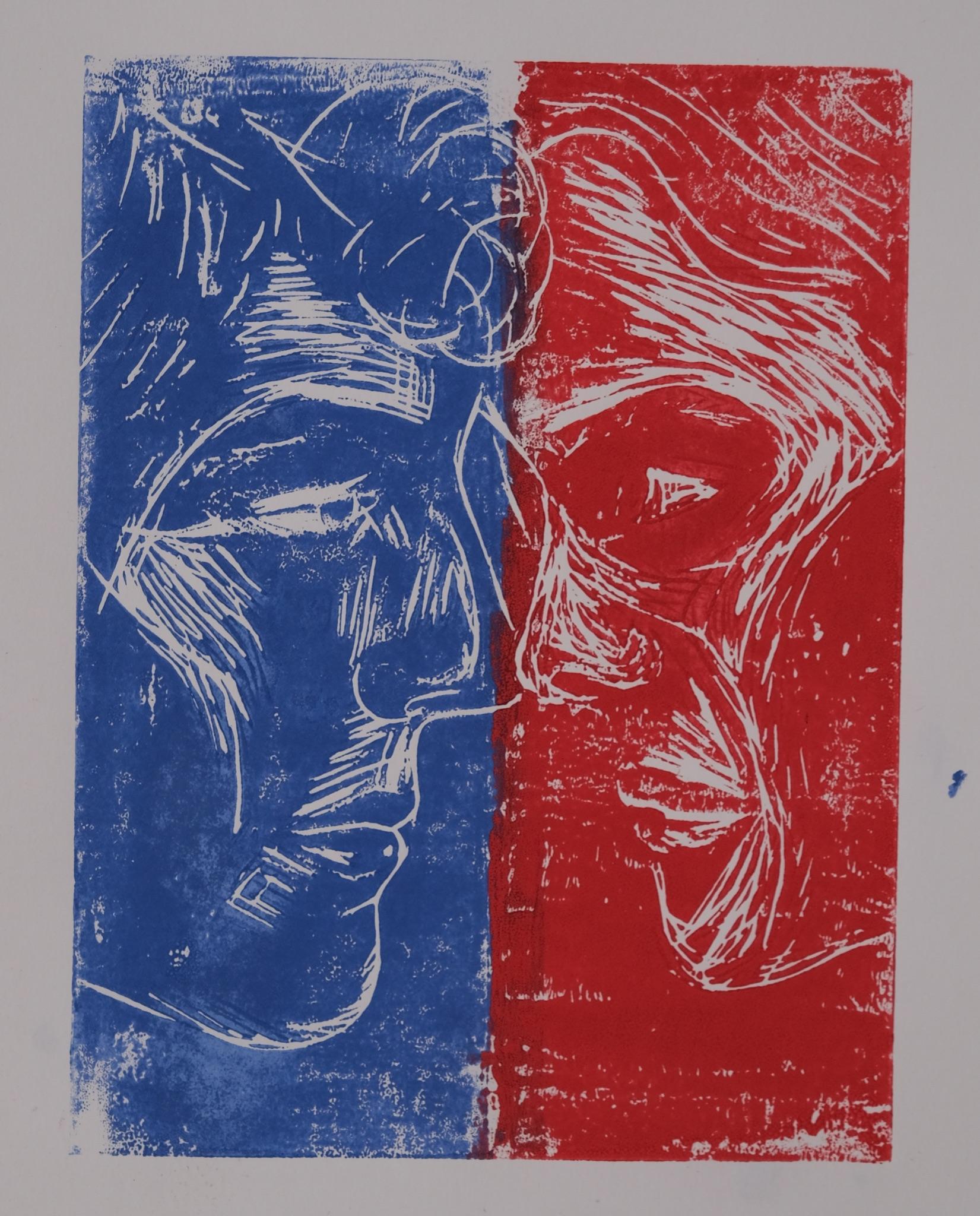
Considering effective composition for a final outcome and how to successfully arrange face together to display contrast in emotions.Also showing observational drawing


Final outcome onA2 card using coloured biro pens. Using different colours to represent positive and negative feels and emotions.


Mediums explored: acrylic paint, pointillism with biro, lino printing and oil pastel. Researching the connections people have with each other and why physical touch is so important to us.


Experimental mark making and textures using inks, bleach, paint marks and emulsion.


Textile developments and final outcome.


 Life drawing using charcoal soft pastels and oil pastels.


 Photography from walking around Rome and observing the city.
Researching the importance of positive and negative space in 3D form using shadows to help illustrate this supported by sketches.


 Exploring interior architecture in the built environment. Drawing from life on location.
Research on David Hockney and mid century art and design. In particular architectural shape and form.


 Sculpture inspired by assisted readymades made by Marcel Duchamp and Man Ray during the DADAart movement.


Detailed pencil study conveying the harsh characteristics of brutalism architecture.

I wanted to explore brutalism as I am interested in the social impact of the movement, that it came about out of a need for quick mass housing to clear urban poverty after WW2. I researched inspiring artistToby Patterson who manipulated his work through photomontage to depict a view of the urban landscape through skateboarding.

Screen printing final outcome contrasting the harshness of brutalism and the liveliness of Hockney’s pop art work both prevalent art movements in the 60s.


This sculpture was inspired by Russian Constructivism. I wanted to emphasise the tangible qualities of wood and spotlight mechanical shape and form of the engineered finish to the material. Bringing attention to its ability to stand strong and withstand force. I experimented with shadows and directional light to accentuate the geometric and uniform nature of the sculpture.


