

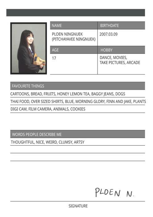
PITCHAYAVEE NINGNUEK (PLOEN)


“Can’t


Get Enough of You”
I aimed to create a cohesive visual identity for a CD and tape cassette using Photoshop and Illustrator. I drew inspiration from the aesthetics of retro rock band and modern designs to create a blend of contemporary and nostalgic designs. As I was still learning the program, I relied on experimentation and guidance from YouTube tutorials to ensure my ideas work.


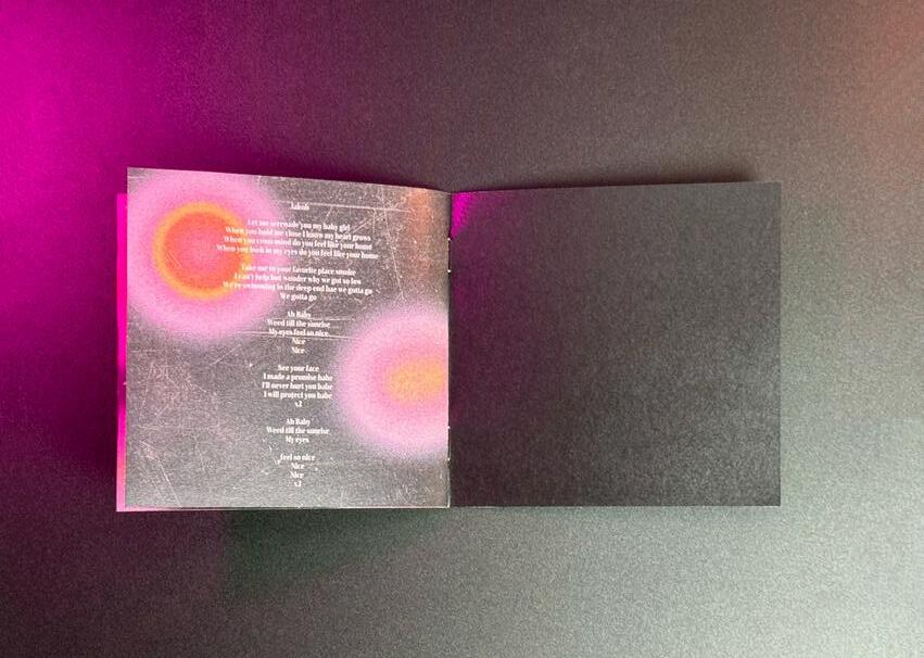
My background textures and designs were made through Adobe Photoshop, using tools such as effects gallery or paint brush tools and gradient map to achieve the vintage and retro look but also still keeping it contemporary.


To achieve the retro feel, my main colour palette revolves around muted and soft tones as well as blacks to compliment the retro feel. My final design for the CD and cassette tape covers are cohesive and compliments each other, the combination of retro and modern aesthetic designs created a unique visual design.


Chonburi
Font used
Identity - Self portrait


I was inspired by Andrew Cadima, as his use of monotone and individual colours effectively emphasises emotions. In my work, I aim to represent my personal identity by exploring the theme of embarrassment. Eye contact, being stared at, or public speaking makes me feel uncomfortable.
50x40cm


Honey Lemon in Motion


This wind mobile project is inspired by my fondness for lemon and citrus drinks. I illustrated the step-by-step process of honey lemon making, each elements symbolises a step in creating this drink. The letter “C” adds a playful touch to represent the richness of vitamin C in lemons. Each element, is crafted from the laser-cut plywood and acrylic helps reflect the refreshing essence of honey lemon drinks.
Scan for video


I started with hand-drawn sketches on paper, traced and added colour in Procreate to make it more refined, and then used a laser cutter to carve the designs onto plywood and acrylic.


Mockups Photoshop Experimentation


In this project, my aim is to create an advertisement campaign poster for Souri, a macaron brand based in Thailand. I wanted to visually communicate a vibrant and playful theme for the summer flavours of the macarons such as “Coco Tango”, I incorporated seasonal elements such as beach themes, striking colours or picnic setups.


Infographic


This is an infographic of auspicious Thai desserts and their meanings. Using Adobe Illustrator, I illustrated the desserts and added information alongside them. I focused on making it easily understandable whilst still capturing the audience's attention with the striking Thai tone colours.


Rebranding
I redesigned and rebranded the logo for a pet hospital called "Naka Pet Hospital" in Thailand. This logo is designed to appeal to customers of all ages, with an emphasis on approachability and a pet -friendly vibe.
I incorporated pets and animals into the design , while also distinguishing the logo from other pet hospitals. To highlight that Naka Pet Hospital also treats exotic animals, I integrated exotic animals into the combination mark.


Exploring Mixed Media


42 x 59.4 cm 29.7 x 42 cm 29.7 x 42 cm

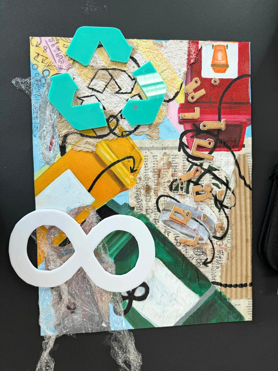


Mixed Media
For my AS level Art & Design exam piece, I explored communication through eco-friendly designs . I was inspired by David Salle and James Rosenquist dynamic and vibrant collage style, I incorporated recyable materials such as homemade paper, cardboard, and plastic wraps, and incorporating Thai typography to reinforce the message of "reuse it again." Encouraging viewers to reflect on sustainability and material repurposing in our daily lives.
Artist reference
Observational Drawing
I focused on observational drawing in still life using EE pencils, emphasising different textures and tonal variations. I selected everyday objects that could be found at home, arranging them into different compositions as I tried to capture realism through precise shading of highlights and shadows.


Photo reference Process
Lino Printing
In one of my A-Level Art and Design coursework projects, I experimented with lino printing while exploring the theme of food waste in Thai culture. I carved plastic soup bags, which are often encountered in Thailand and are harmful to the environment, as well as typical food waste symbols such as banana peels and apple cores.


Dance Jams
DanceJams photo book captures my journey as the leader of the school dance team. It showcases the energy, teamwork, and memorable moments of high school, turning them into a tangible form of passion and fellowship.


Photography
During my trip to Iceland, I photographed the natural landscapes and wildlife, capturing its beauty. Using Photoshop, I enhanced the colours to enhance the dynamic energy of the scenery, creating a vivid representation of Iceland’s unique environment.


Lens Model: E 28-75mm F2.8-2.8
Camera: SONY

Photography


This study captures the lights and vibrant atmosphere of Yaowarat (Chinatown), showcasing elements typically found in Thai night markets.
Camera: SONY

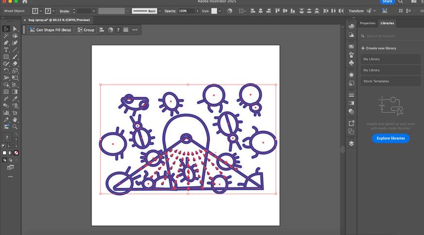
Pattern Pest Control
I used the pattern tool in Illustrator to create a repeated pattern effect. The repetitiveness reminded me of the number of insects typically seen during the summer or rainy season in a humid country like Thailand. I illustrated insects and bug sprays to convey the overwhelming presence of insects, through the repetition in the design.


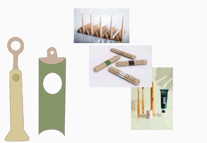
Product Design for Sustainability

Following the sustainability concept, EcoBam Brush is a sustainable bamboo toothbrush, designed with eco-friendly earth tones and recycled materials used for packaging to minimise plastic waste. It combines functionality with environmental awareness, encouraging sustainable choices.


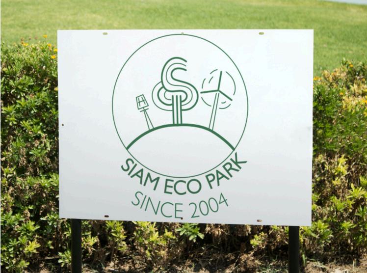
Logo Design
For this porject, I combined line drawing, flat illustration, and vibrant colours in a combination mark, emphasising communication through typography for a made up park in Bangkok called “Siam Eco Park”. To further promote the park’s eco-friendly and pet-friendly focus, I also designed advertisement posters.


Corporate Identity
I designed a corporate identity for Bangkok City Library, combining a classic heritage with modern design. The branding includes a bold "B" logo, applied to a Facebook page, e-book promotional posters, T-shirts, caps, and business cards. my initial sketches focused on elegance and sophistication to reflect the library’s identity.


Exploring Typography
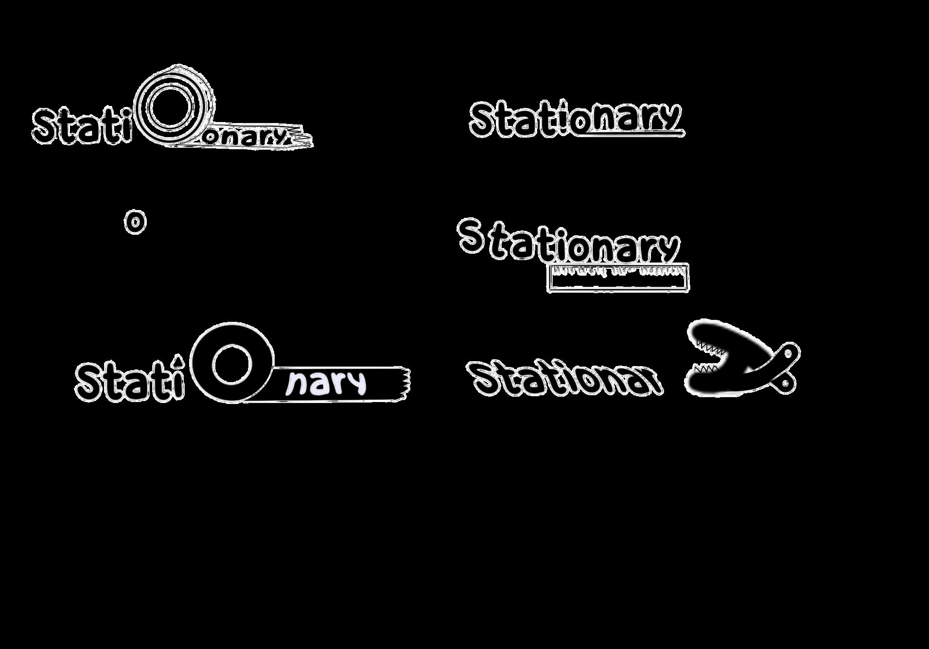


Inspired by Ji Lee's Word as Image, I designed typography that integrates illustrative elements to enhance meaning, making the words visually engaging and easy to read. Each design focuses on combining form and function, creating playful and thoughtful interpretations of everyday terms.
