Process
I enjoyed this week’s AI art project. I don’t have much experience using AI, although we covered it in my JOUR 101 class. I also got to protest on the picket lines in LA last summer for the writers/actors strike, which, in part, was protesting AI (maybe not 100% relevant, but it was a cool experience).
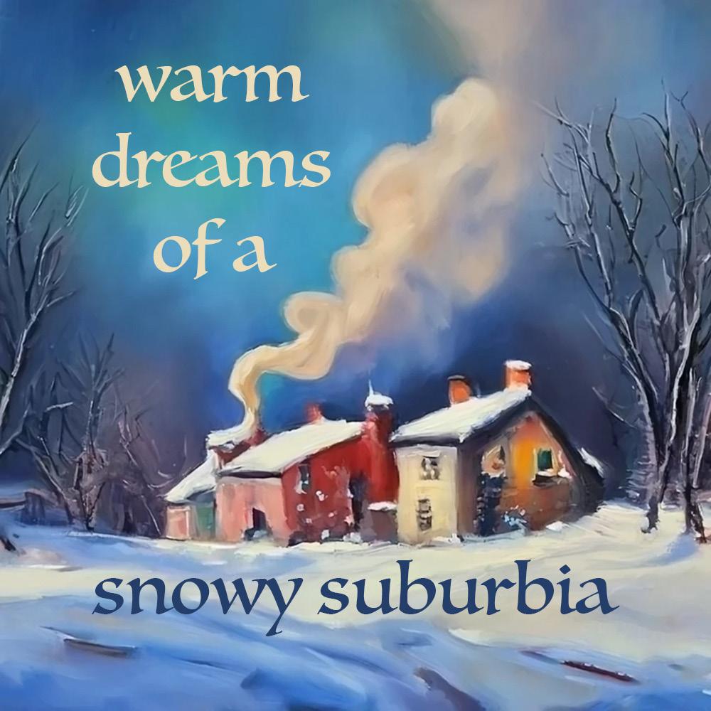
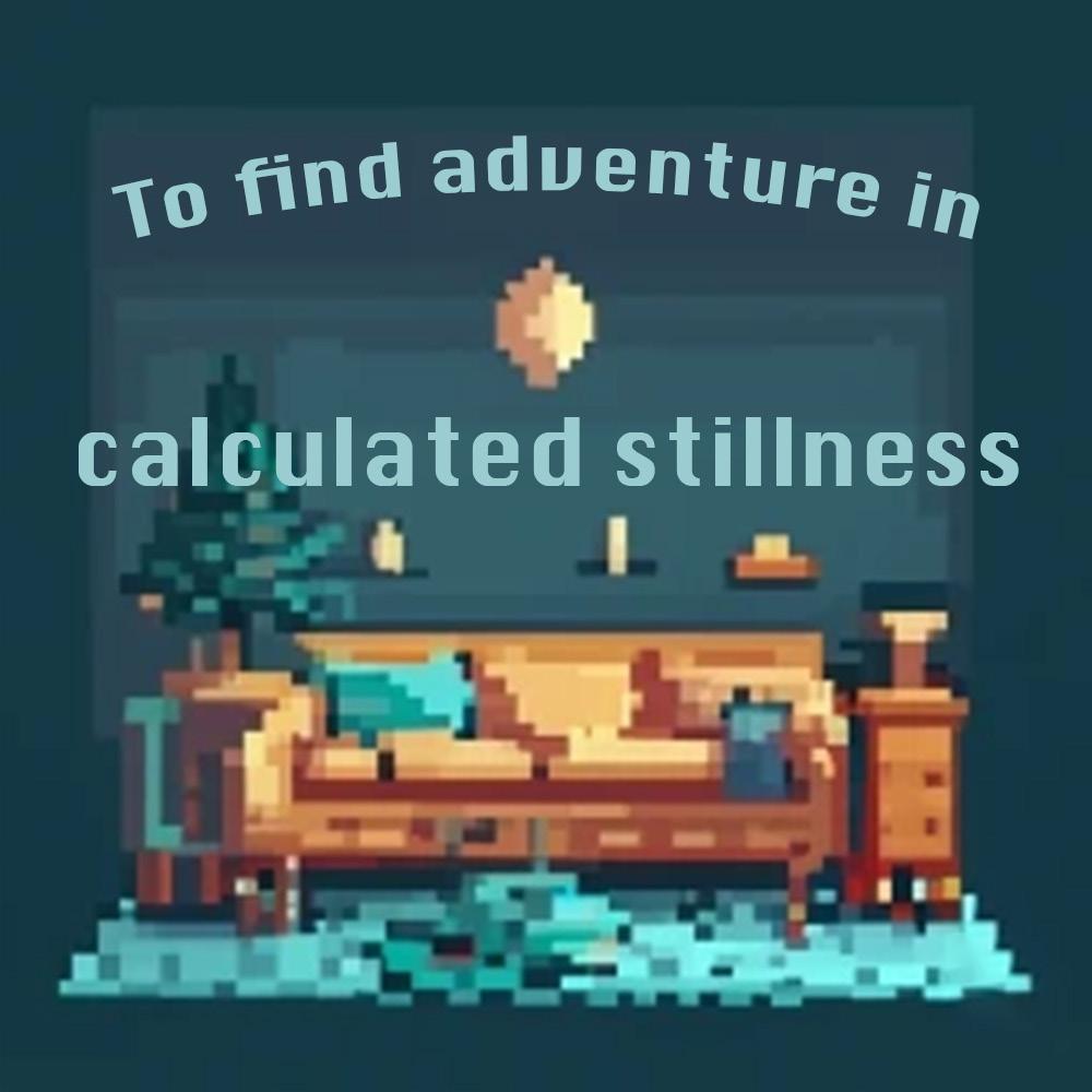
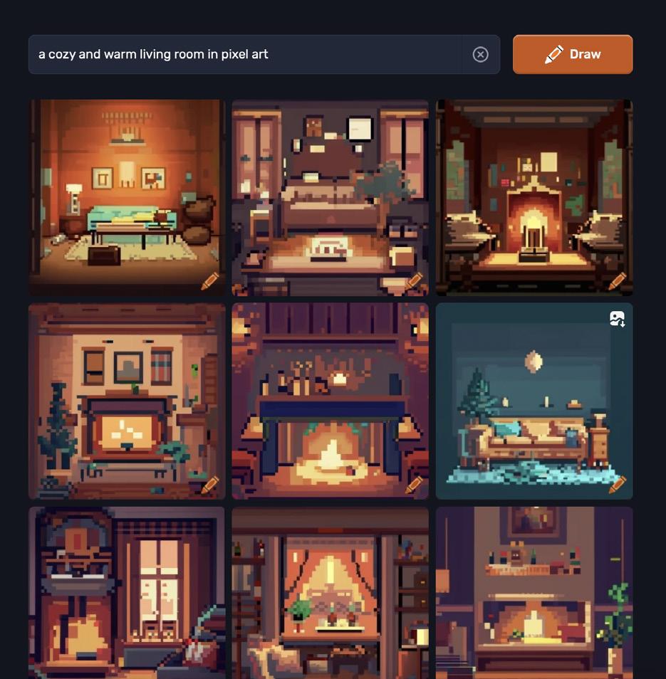
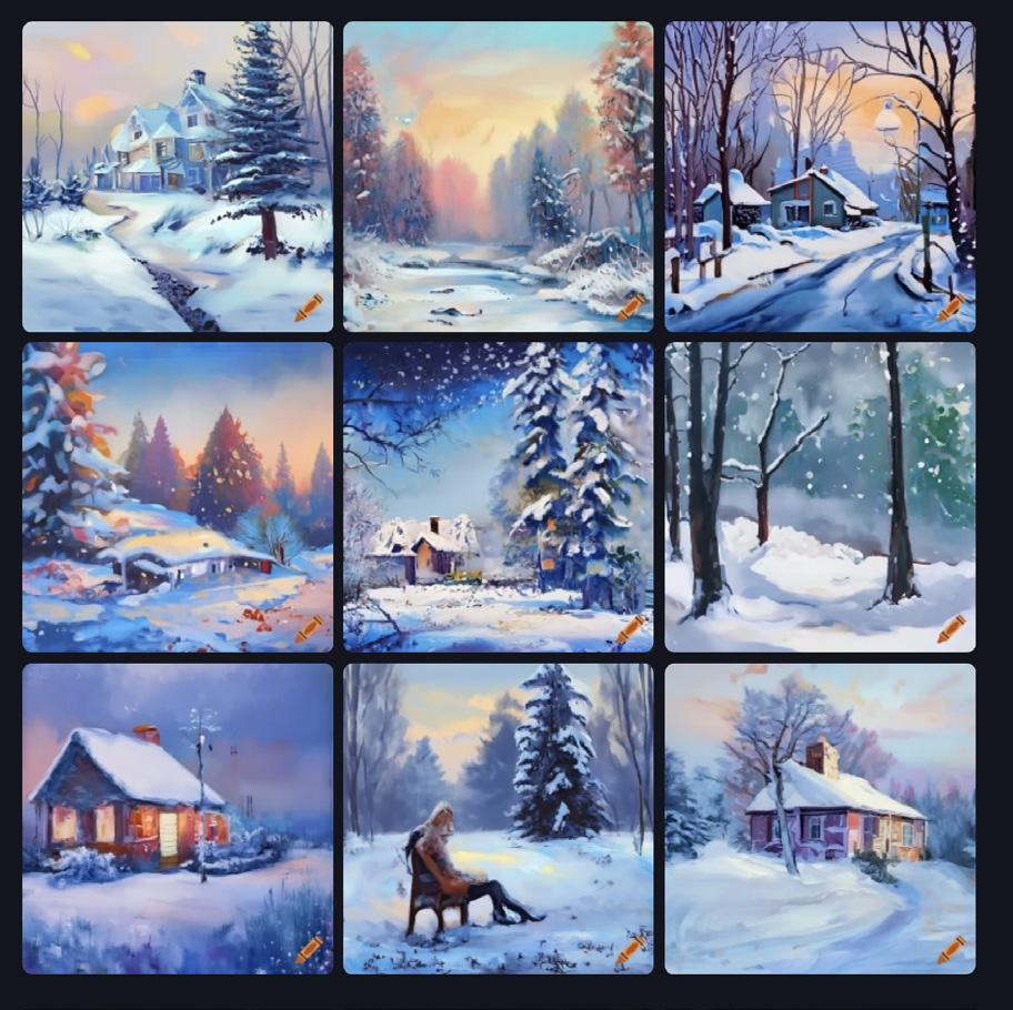
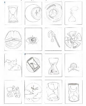
I found the AI generator to be a tad frustrating; I had to do many searches to find the pictures I settled on. However, I’m satisfied with my final pieces. During critique, many said that the pixel one reminded them of Stardew Valley, which I was happy to hear because I enjoyed that game. Someone also said the snowy one reminded them of the children’s book “The Snowy Day,” which is exactly what I was going for. Every winter when I was a kid, my family would have that book displayed on the mantle.
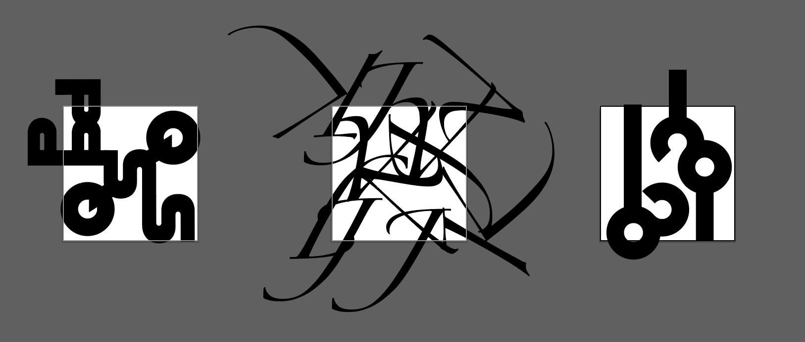
Although I like the final result, my classmate’s pieces have inspired me to think more outside of the box with typography. Many people used techniques that I didn’t even consider, like moving text behind the subject, changing colors when the text overlapped with certain features, or having the text “interact” with the picture. I hope I can employ some creative solutions like those in my future work.
9
06
Project 02
12
09
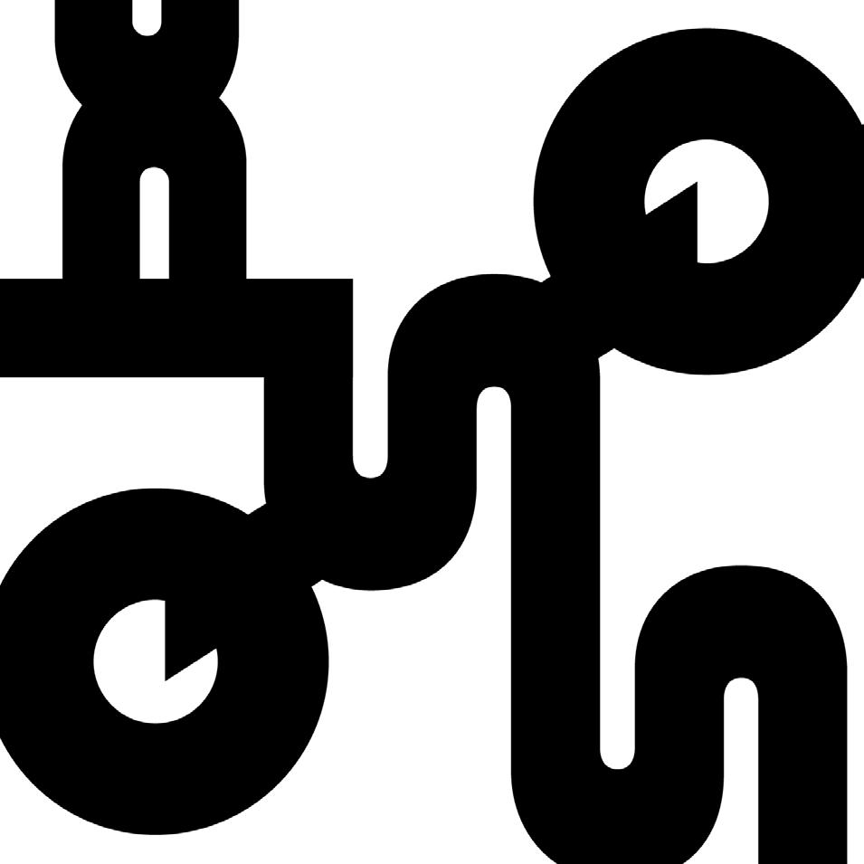
Alfarn, 200pt
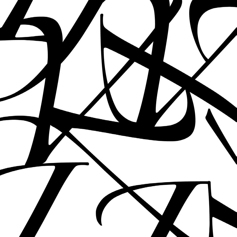
Zapfino, 200pt
While creating my pieces I had no clue how they’d look in the end. Since we didn’t have any type of planning or brainstorm phase, I just picked fonts that I found visually interesting and experimented with different letters and placement on the fly.
13 10
IBM Plex Sans Condensed, 180pt

14 11
Slightly misaligned letters that I failed to notice until after project finalization... I fixed this version displayed on the previous spread
Original second work
Comparing my progress photo to my finished pieces, you can see that my third piece was completely scrapped and created anew with a different font, size, and concept. I liked my original third piece, but I made it before I realized each piece needed its own unique font, so I decided to keep my first one and remake the third one.
Starting from square one, I decided to create something as visually distinct from my other two pieces as possible, and I’d say I succeeded. I had also noticed from the other classes’ work that not many had experimented with an especially small and thin font, so I decided to challenge myself. I think it turned out nicely. It involved a lot of symmetry and even spacing, which I just eyeballed, but I think it turned out fine.
15
Original third work
Final third work

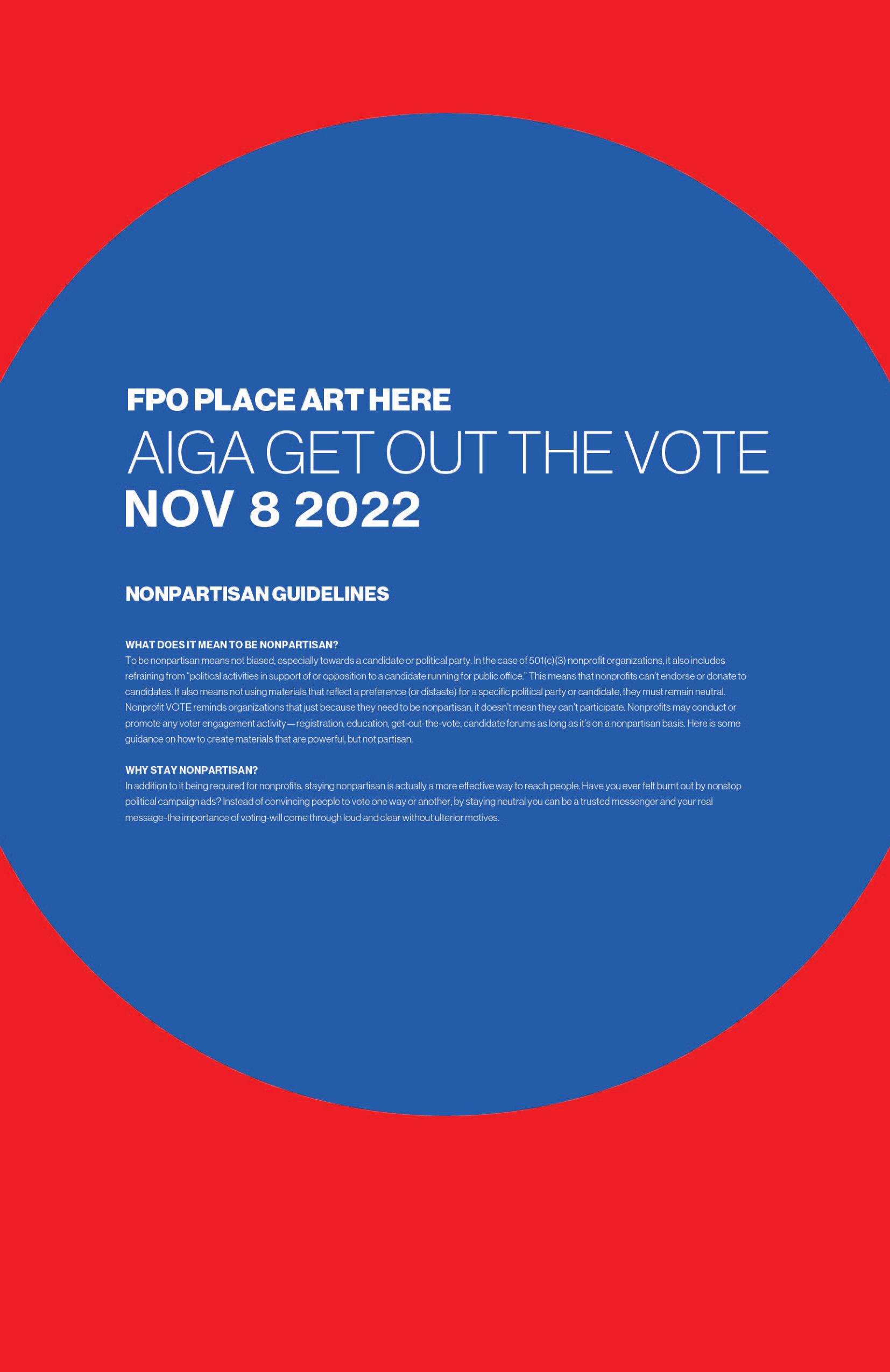
17 pro ect j03 Get Out the Vote Poster 14
Project 03


18
15 Poster design by First Last Name, City, State
I enjoyed working on a more long-term project that I could put more effort in and take more creative liberties with.
I’m pretty happy with how my design turned out. I had never tried to warp text in Adobe Illustrator before, so that was a fun new experience. I struggled a bit to decide on a color scheme for my piece... in terms of design, color has never come naturally to me. Luckily, I have experience using Illustrator from being a designer for the Daily Gamecock. Here’s a link to my page on TDG’s website. Illustrator is a complicated program, so I’m nowhere near well-versed on it, but I found that having that prior knowledge helped me execute this piece.
19
16

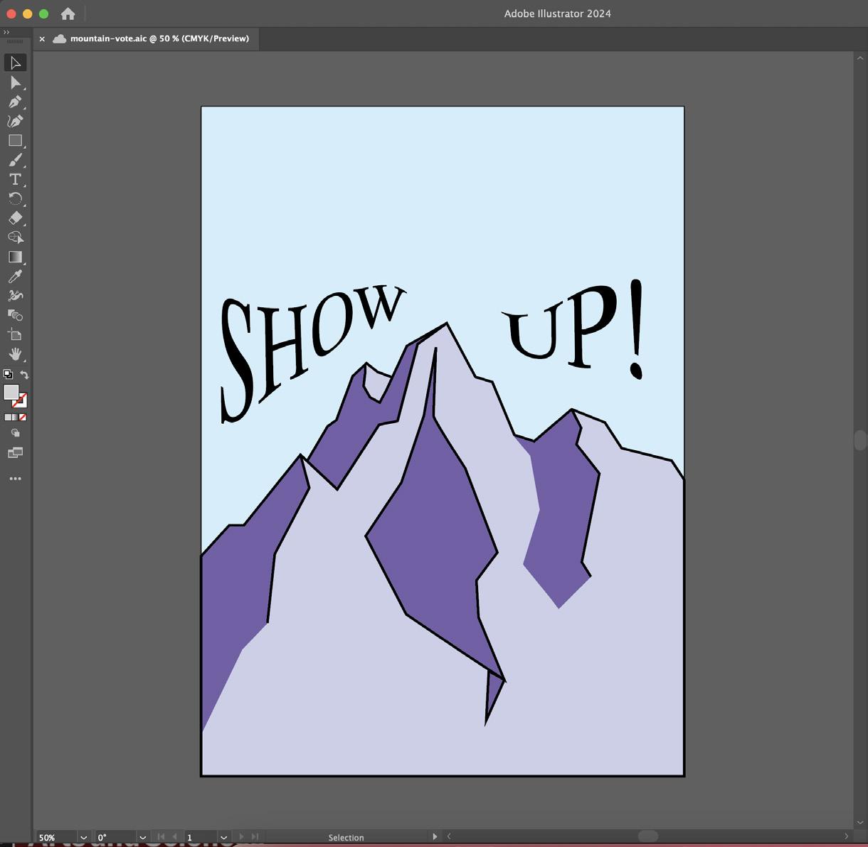
20 Initial linework Progress in Adobe Illustrator

21
18
Reference photo I used from National Geographic
23
20
pro ect j04 Character Logos


Final sketch, scanned

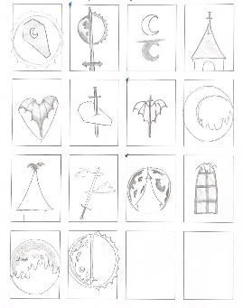
Initial “thumbnail” sketches
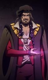
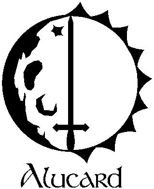
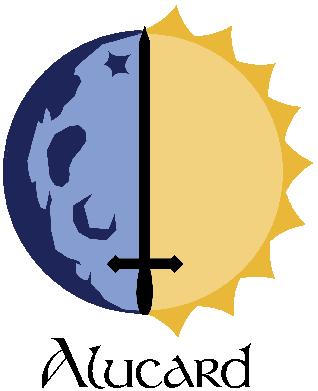
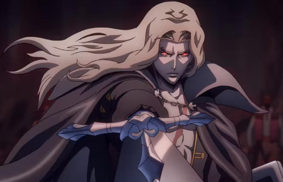
Alucard
Alucard is the halfhuman, half-vampire son of Dracula. I chose “Stonehenge” as my typeface because I wanted to use a gothic font, but one that was thin and regal to convey Alucard’s polished and mysterious persona.
The complementary color palette is meant to convey Alucard’s “split” identity.
Project 05
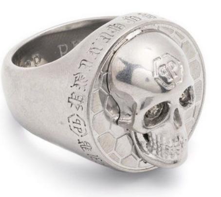
SYNTAX (visual elements & relationships)
Light silver, oval-shaped object. A solid circular shape is perpendicularly aligned. A rounded mound protrudes from the center. There are two circular recesses in the mound, reflected from the center on either side. Surrounding the mound are small, hexagonal shapes.
SEMANTICS: DENOTATION (specified)
Jewelry > ring > men’s gothic ring
SEMANTICS: EXPRESSION (feelings)
Gothic, intense
SEMANTICS: CONNOTATION (associations)
Heavy metal, rock
PRESENCE (contextual)
Little: tattoo shop, mosh pit
Lots: church, local southern boutique
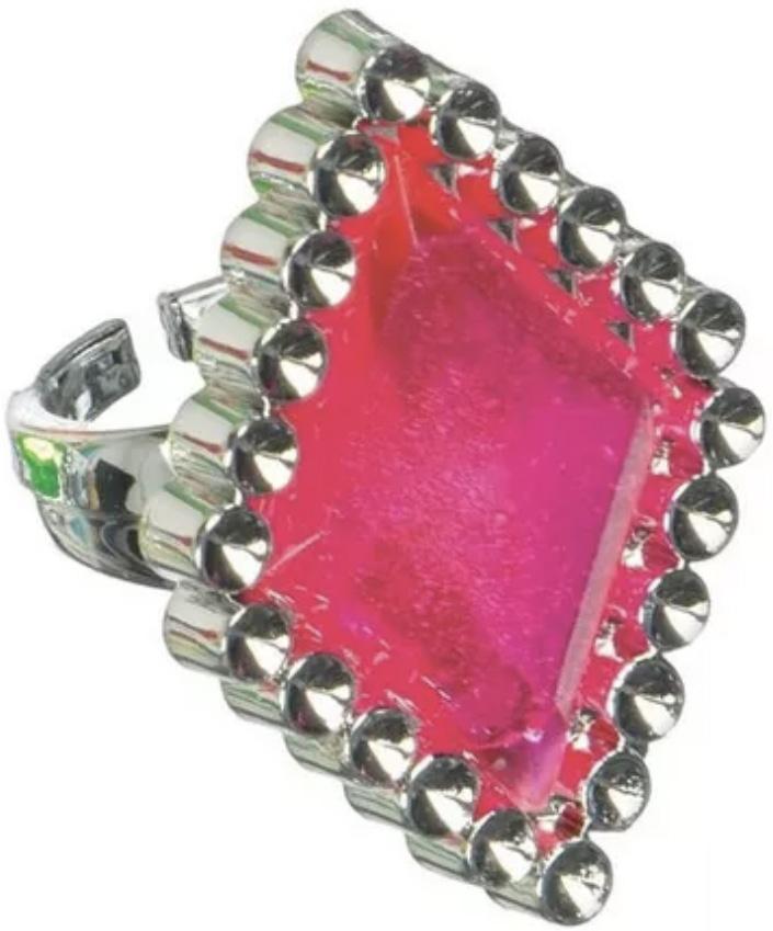
SYNTAX (visual elements & relationships)
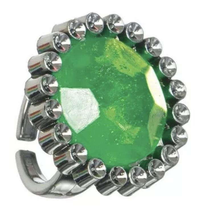
Silver and bright pink form. Primarily diamond-shaped. Border is lined with repeated silver cylindrical shapes. Behind the diamond is a silver-colored open cylindrical form.
SEMANTICS: DENOTATION (specified)
Jewelry > ring > plastic disposable ring
SEMANTICS: EXPRESSION (feelings)
Fun, youthful, kitsch
SEMANTICS: CONNOTATION (associations)
Kid’s birthday party, arcade, cupcakes, gift bag
PRESENCE (contextual)
Little: Dave & Buster’s
Lots: business conference, football locker room, job interview
32 28
relationships) diamond-shaped. cylindrical shapes. cylindrical (specified) (feelings) (associations) bag room, job relationships) circular shape is protrudes from the mound, Surrounding the (specified) (feelings) (associations)
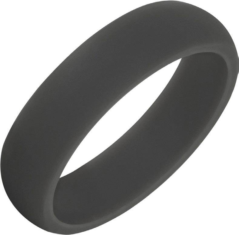
SYNTAX (visual elements & relationships)
A hollow cylindrical object that is open on either side. The object is gray.
SEMANTICS: DENOTATION (specified)
Jewelry > ring > silicone ring
SEMANTICS: EXPRESSION (feelings)
Plain, practical, utility, comfort
SEMANTICS: CONNOTATION (associations)
Comfort, sports, hipster, camping/hiking, dad/middle-aged man
PRESENCE (contextual)
Little: campgrounds, overpriced coffee shop, AutoZone
Lots: royal palace, beauty pageant
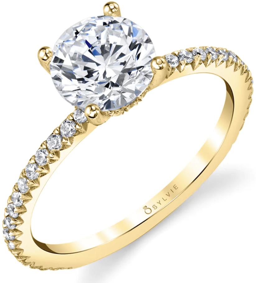
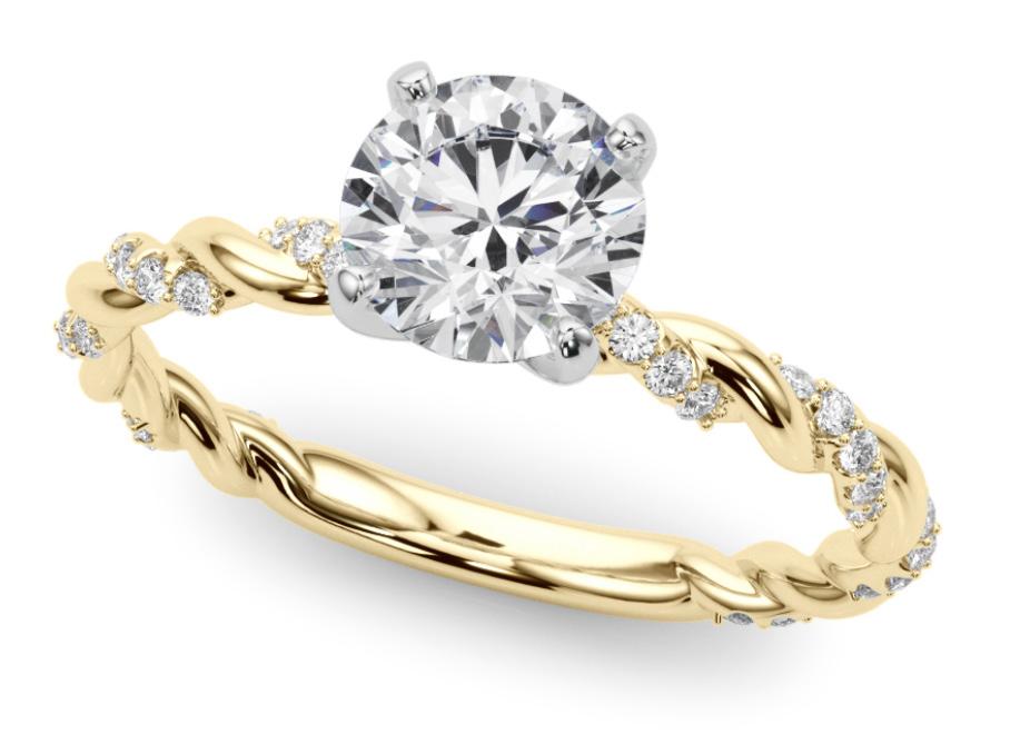
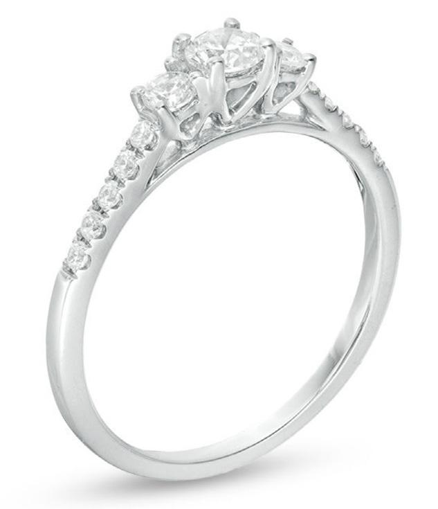
SYNTAX (visual elements & relationships)
A thin, hollow, cylindrical form that is primarily gold and white-silver. The outside of the form is lined with small, silver-white circles with a gold border. On the top point of the form is a large white-silver sphere. The sphere is smooth but contains an intricate geometric pattern within it. Four small gold spheres align with the center of each arc of the large sphere.
SEMANTICS: DENOTATION (specified)
Jewelry > ring > engagement ring
SEMANTICS: EXPRESSION (feelings)
Dainty, sleek, elegant
SEMANTICS: CONNOTATION (associations)
Marriage proposal, wedding, romance
PRESENCE (contextual)
Little: wedding
Lots: dump, farm
33
Process
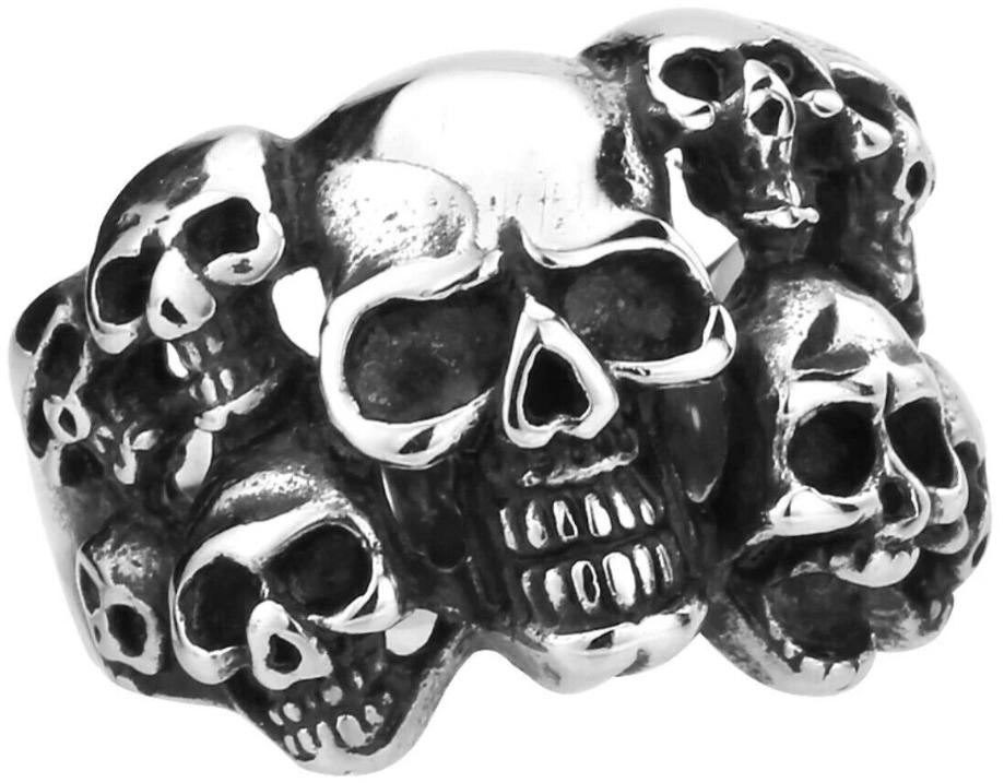
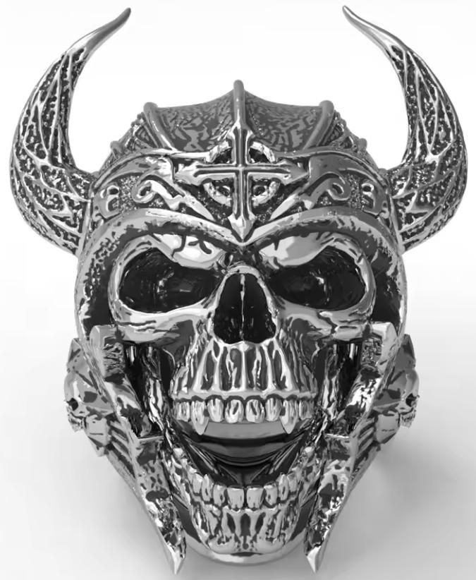
Other options for “gothic ring”
34
30
Other option for “party ring”
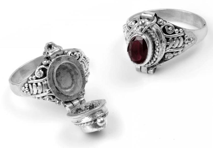
Unused type of ring– “poison ring”
Other options for “engagement ring”
35 31
Piper Kroll ARTS 102
Professor Daniel Machado University of South Carolina Spring 2024
36 Process Title Georgia, Bold, 50 pt Project Title Germania One, Regular, 280 pt Project Title B Georgia, Bold, 36 pt Project No. Birch Std, Regular, 280 pt Caption Myriad Pro, Italic, 12 pt
32
33
The grid