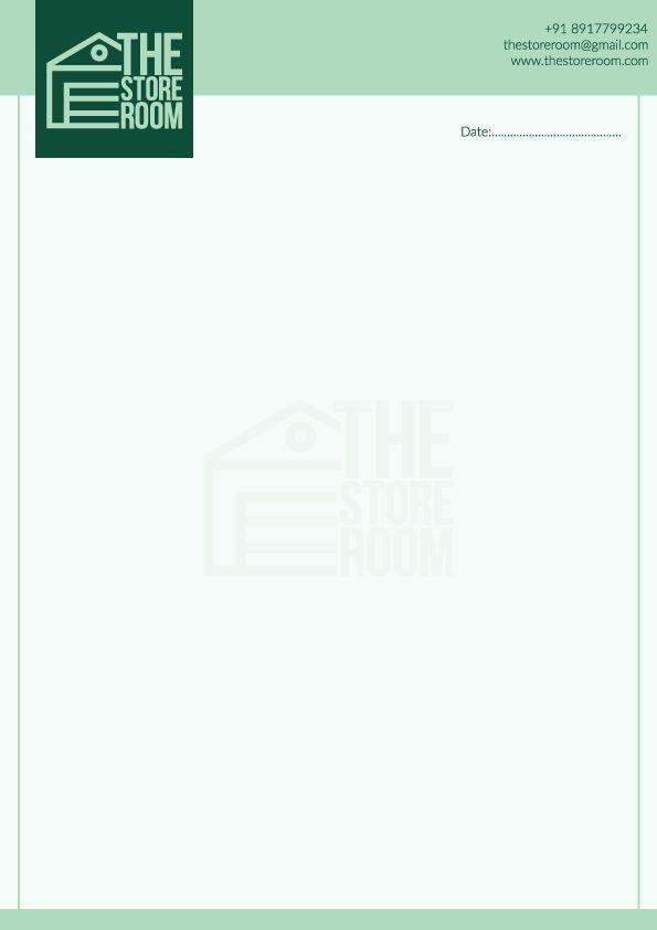
BRAND STYLE GUIDE THE STOREROOM

Upscaling people's lives via repurposing resources.
vision:
We inspire our customers to turn their dreams into reality with our first-class customer service, competitive pricing, and innovation which allow people to make their dream home a reality in our family of stores.
People, Quality, Service and Innovation.
objectives:
The ultimate goal is to declutter our homes by repurposing products that are no longer in use rather than purchasing new pieces, and obtaining pieces from thrift stores and factory outlets if needed, which not only saves money but also helps to achieve a positive environmental impact through such sustainable practices.
Colour used for adding aesthetical contrast in the main logo colours. It will mainly be used for light backgrounds in templates and promotional material.
One of the main contrasting logo colours which can be used as a background for text banners, iconography and other assets used as a template for promotional posts on social media.
The main contrasting logo background colour which can also be used as a background depending on the colour of the headings and main contents. The green colour represents sustainable actions/initiatives of the brand.
A darker shade of the Aqua deep colour which could be used as a darker contrast of the brand colours. This colour could be used as a font colour in some places or writing the main content. It can also be used for making assets if a darker colour is required to be illustrated.
A different hue colour but only from the cooler colour schemes in order to retaliate with the green colour schemes. This colour can easily be used as a background colour in big font/main heading creative pages. But it shouldn't be used as a font colour.


There should be no gradient in the background.
The background color should not be outside the brand colours.
The background color should not be outside the brand colours.
The background should not be cropped.
The logo should not be stretched.
The graphic should not be outside the background.