

TYSON OVERVIEW

We had to art direct the concept, narra ve, and aesthe c of TYSON’s 2022 EP campaign ‘Cherry’ for this brief. It was cri cal to envision our process through the perspec ve of an ar st producing music in 2022. The platform, the ar st’s vision, and their voice were the primary concerns for this brief.
We had to add depth to her idea and push it beyond its current manifesta on, interac ng crea vely with the future in terms of the Metaverse while ensuring that it is harmonious and authen c to her exis ng world. We want to make certain that her music reaches new and exis ng audiences with whom she can connect deeply and emo onally. We wanted it to be a delightful experience to discover her, as an ar st and her new songs.

RESEARCH
Direc on for the project & Inspira on
Inspira on for TYSON’s music video treatment came from iconic pain ng ‘The Birth of Venus’. The composi on of this iconic pain ng by Bo celli shows the rebirth of Venus where she is born from the sea foam, blown by the west wind, Zephyr, and the nymph, Chloris, towards one of the Horai, who prepares to dress her with a flowered mantle. The seascape, stunning for its metaphysical tone and almost unreal quality, is illuminated by a very so , delicate light. The people welcoming Venus onto the shore can signify the loved ones Tyson talks about in her album Cherry, who nurture and support her. Venus is shown nude, and is thus courageous yet vulnerable.

We see how Tyson herself reflects those quali es when she bravely talks about heartbreak in her songs. Venus is emerging from the water, and so she embodies the power of the sea. Water is essen ally femme and we correlate that with Tyson as she evolves into her womanhood.
We also thought of water as the guiding design element; Water came directly from the music itself - from the sounds and the textures of the produc on (reverb kicks, dissonance chords can be heard throughout). This also goes well in her lyrics, where she is self-reflec ng.
Song Breakdown & Analysis
SOUND:
• Mul ple electronic music samples
• From 90s : sultry RnB era : therefore evokes a feeling of nostalgia
• Ambient, soulful, low-fi beats


• Slow, laid-back
• Futuris c (Reference - Joyce Wrice : Rocket Science)
• Reverb Kicks : which can be used to be embody some sort of space and distance : a Soundscape
• The en re music takes mellower turns sonically, this can used to show a drama c transi on.
• Dissonance chords : then they get resolved
VOCALS:
• Emo onal, sensi ve
• Vulnerable yet courageous
• Sweet and juicy // FEMME : symbolic of cherry
MUSIC AESTHETICS:
• Sexy & Sensual
• Dreamy
• Confident + Vulnerable
VISUALS:
• Futuris c
• So light
• Sensual
• Water - flowy

EXECUTION Approach
Futuris c approach : “What will humans look like in the distant future?”
We asked and pondered upon this ques on to understand the futuris c approach we can take in the visuals treatment of her music video as well as her styling and costume and create a metaverse for her audience.

The ini al styling idea was to use hyperfuturis c styling elements and crea ng a hybrid morphed being that resembled futuris c human anatomy. It focused on using obscure looking flowers to create gills, or eye extension; Making use of prosthe cs; Using pearls, lace, net to create face masks. But later in the development we realised that it might come off as a li le gothic if we push the boundaries too far with the futuris c approach and hence we decided to tune down of the styling visuals and props and keep it more naturalis c and earthy.


Styling
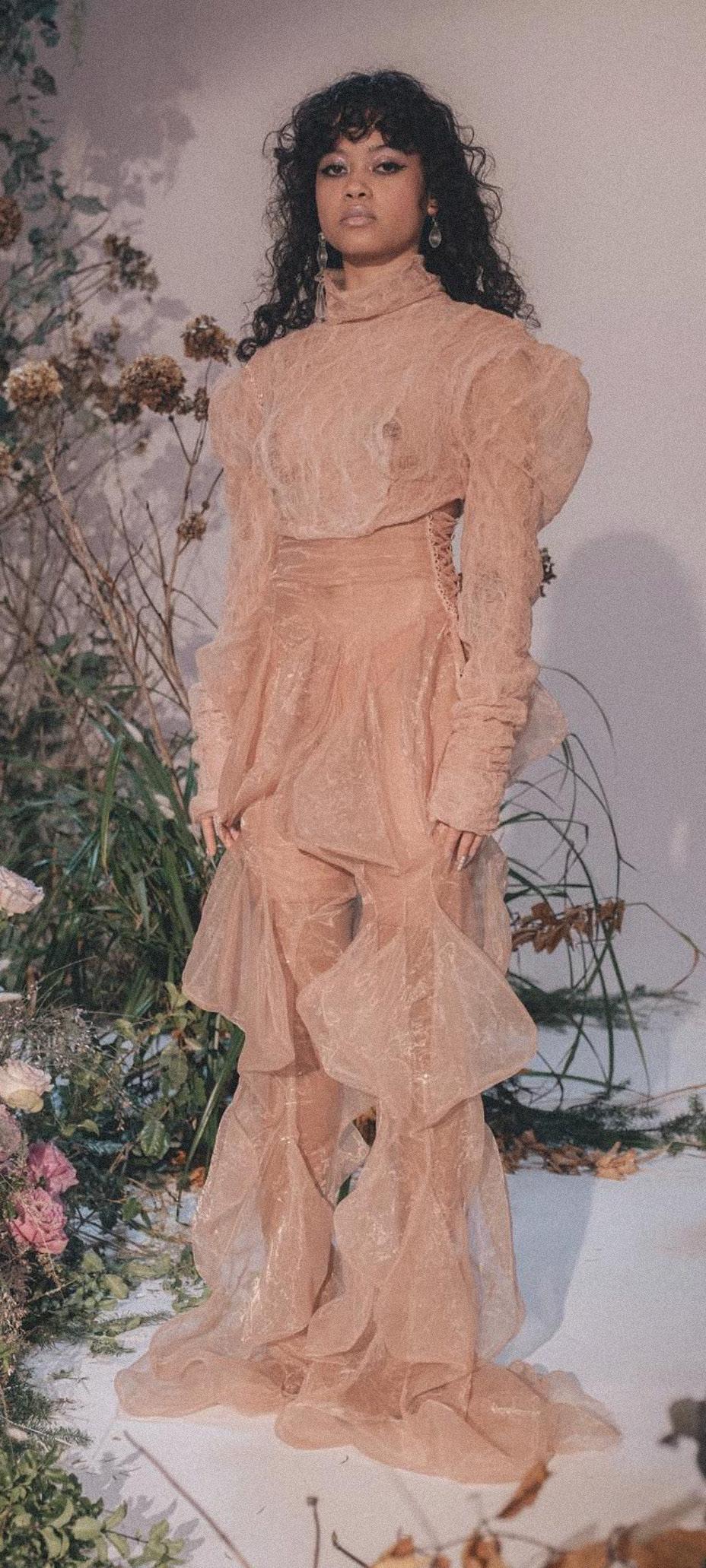
We wanted futuris c tech combined with so dreamlike translucent drapes for her look in the music video.

One of the inspira on for the look was the Thierry Mugler Spring/Summer 1989 show, tled ‘Atlantes,’ took place at Paris Fashion Week. Inspired by the deep seas, a group of models in jumpsuits with fish gills on the hips emerged as futuris c sea creatures. Jacket necklines were cut in the shape of waves, fins were a ached to sleeves, and peplum waists were made from transparent plas c. A swimwear sec on rendered in silver, shades of blue, and water print, was complete with fish gill detailing and fin-shaped bracelets. Sleeves of dresses came a ached to the bodice, whilst pulling down hems revealed jagged pockets reminiscent of shark teeth lined with colourful fabrics. The final segment of the collec on saw the likes of Jerry Hall and Linda Evangelista emerging as exo c fish in white and silver sequinned bodysuits with fin-like earpieces. The ears were accessorised throughout with pointy earrings enveloping the whole earlobe, and hair was sculpted into shell-like shapes.


Costume
The garments we sourced for TYSON’s look were designed by Elisa, who goes by the brand name Dreaming Eli. The translucent drapes, the fluid outlines and rippling pa erns give the impression of the ebb and flow of des. The nude colour pale e hints towards modest nudity, reflec ng Venus as shown by Bo celli, and she is yielding the power of the water.


Hair & Makeup
We wanted her skin to be dewy wet, with maybe pearls or droplets, giving the impression that she may have merged from water or forever has a sheen layer or water surrounding her (sugges ng she may have morphed with water as well)


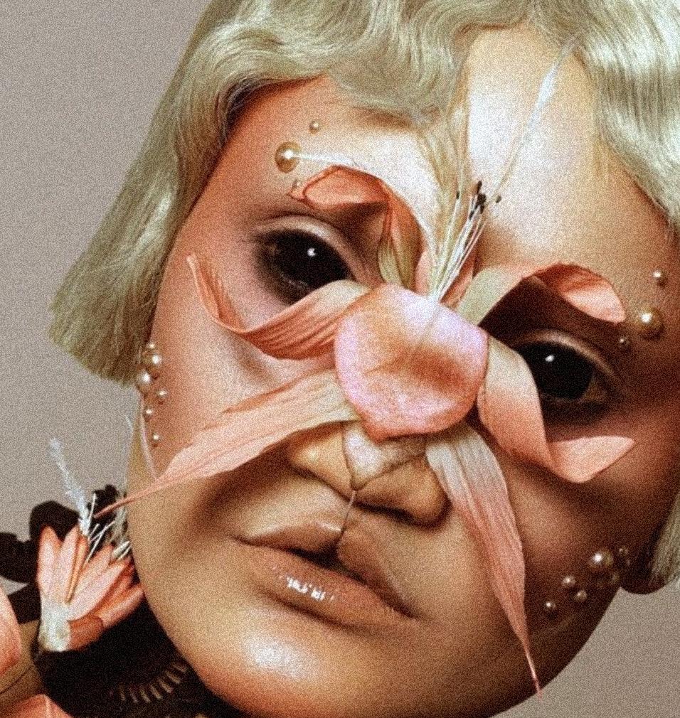
The hair is gelled and glossy. The contours of her forehead are styled with twirling and curled jelled hair, reminding of tree roots and give her a very mys cal and fantas cal feel.

Environment : Her Sanctuary

Her environment is ‘cherry’. We thought cherry is a poignant symbol of the environment - not only a physical space but also the people surrounding her - a metaphor for her safe space, as cherry is her family name. It is rooted in her ‘self’, which has made her evolve into the woman she is today.


We decided to shoot in the KEW gardens as we were par cularly inspired by the greenhouse. The greenhouse had this dampness, warmth and invi ng atmosphere, which shields you from the outside worldeverything that we heard in the music.


Op cs & Visuals

Inspira onal elements we wanted to mimic in the visual treatment :-

• FLOUROSCENT


• GLOW


• GRAIN
• HAZY
• 90S ANALOG VIBE
Refracted Op cs: Water is a visually exci ng material, it manipulates light in a way which creates dynamic effects. We wanted to play with this in our visual outcomes through the use of op cal or reflec ve materials such as prisms, textured glass, mirrors and lenses which emulate the lively proper es of water.
Individual Contribu on
• Adi Srivastava - Research for the album narra ve, Styling, Costume research and resourcing, Direc on for the Trailer video, Model and external collaborators Coordina on
• Elena Videva - Tyson Branding, Album Cover, Website prototyping
• Lilli Mathod - Styling, Costume research, environment research, Website, Videography and edi ng for the album trailer, Direc on for the trailer video
• Piyush Pa l- research for the album narra ve, Album cover and Branding research and prototyping, Research for Website Merchandise, Management, Planning and Organiza on for the project
• Yasemin Nergiz - Album narra ve research, Modelling for trial shoot
External Collaborators
• Simren Vernon - Model for the Shoot
• Abhinav Bhandari - Photographer
• Léna - Makeup ar st
• Elisa - Costume Designer
• Kew Gardens


Development
We prototyped mul ple approaches for TYSON logo and album cover to suit our interpretaion of her personality and her artwork. It was a difficult choice to narrow down the en re interpreta on and embody that through a logo.
The album cover was also a point of conflict considering the possibili es in the design approach but we managed to produce a logo and an album cover that all of us could agree upon.


OUTCOME

Branding : TYSON Logo


The TYSON logo is a modern take on the early 2000’s gothic typeface aesthe c, referencing the ar st’s music inspira ons. Through that we also created a symbol to represent her - which is used throughout website, merchandise and album.


‘Cherry’ Album Logo

We wanted the ‘Cherry’ logo to reflect the environment of the sanctuary and the feel of music.
The typeface used gives a fairytale/mys cal feel with the curves of the le ers reminding of tree roots - represen ng a narra ve in itself, already immersing you in the story told through the music.
The 3D chrome treatment of the type further emphasises the ar st’s connec on to water, again focusing on refrac on and reflec on.

ALBUM COVER
The album cover incorporates all of the important elements of the sanctuary, with the images directly reflec ng the storyline - front cover image is mysterious and refractedwe just see pieces of her face, and through
her gaze your are pulled into this magical, safe space. On the back cover you see her in full - showing her evolu on in full. Vulnerable, confident and worldly.


WEBSITE & MERCHANDISE
We see TYSON’s sanctuary as a metaverse we invite audiences to navigate through. We propose this to be accessed through her webpage, where you can read her stories, watch her live/ virtual shows, discover her musical journey and take a tour around her habitat. Our aim was to create a virtual space where her online following would want to spend their me. Click here to watch a short mock-up video of the website.


For the Merch we wanted to take elements from the environment and how we created it, for the audience to physically include themselves into the narra ve such as dragon fly specs to prism lenses which they can use on their phone.


VIDEO TREATMENT Album synopsis
We interpreted the album name “Cherry” as her space of self reflec on, growth and security. This safe space/sanctuary represents TYSON’s surrounding environment which nurtures and supports her to become the woman she was always meant to be.

TYSON takes the audience by the hand and guides them on this journey, naviga ng through the complexi es of life’s rela onships.
 Click here to watch the sample of the video treament


