

BEIJA OVERVIEW
The Beija brief concept and outcome focuses on producing a holis c campaign that evolves Beija’s crea ve approach to become more fluid and inclusive, while preserving and adding to their present consumer base. We as a group have fluctuated in and out of concepts throughout this brief, but we have been guided by a non-binary and inclusive approach to design and what the market requires. We delved into the fundamental no ons of inclusion and learned how to see it in a fresh perspec ve. Beyond gender and skin colour, diversity and inclusivity have numerous facets. It is also about age, locality, career, sexuality, and a variety of other micro demographic factors.
The inclusiveness movement has become a macro trend in the fashion industry, and brands are frequently swayed by tokenis c gestures. During Pride Month, we typically see a slew of firms release commercials featuring a varied cast of body-posi ve models or a rainbow filter, signalling their inclusiveness. While promo ng diversity is beneficial and contributes to a more progressive society, brands have a social obliga on to provide true and sincere support to underrepresented communi es which doesn’t solely focus on profits. Beija’s current posi oning is undeniably gendered, with a concentra on on catering to a female audience. Our goal was to challenge the brand’s sta c binaries that are currently being projected. The goal is for Beija to commit and push the boundaries of inclusivity.


RESEARCH
Direc on for the Project
Our approach was simply showing stories of people from different origins and walks of life that an assortment of diverse audiences can relate to, this campaign and crea ve direc on strives to promote naturality, vulnerability, sense of comfort, and diversity. This campaign isn’t just about a emp ng to overcome clichés; it’s also about reflec ng or embracing real people in the real world.
A report by visual content engine developer Stackla that surveyed 2,000 adults in the UK, US and Australia found that 86% of consumers say that authen city is important when deciding which brands to support. In the same survey, Stackla discovered that 57% of consumers believe that less than half of brands create content that resonates as authen c. Diversity and inclusion done well is less about checking a box, and more about recognizing that diverse people are complex, relatable human beings. The scale of these sta s cs suggests that diversity isn’t just a tokenis c box- cking exercise to appeal to minori es, but an impera ve for addressing the changing a tudes of society as a whole.
The words “diversity” & “inclusion,” while similar, don’t have the exact same meaning. As acclaimed diversity advocate Vernā Myers puts it, “Diversity is being invited to the party. Inclusion is being asked to dance”
But it is no longer enough to state a purpose anymore. With internet penetra on constantly on the rise and an ever-more vocal consumer base, companies need to think about moving towards true equity. This must come as part of a dual approach: in external marke ng and communica ons but also in internal organisa onal structure and work culture. The most effec ve way to promote diversity and inclusion is to be it.
Some brands have the ability to contribute in terms of inclusivity and diversity through their products and services, but it shouldn’t be a barrier for other brands to not support them if they are not able to contribute to it directly. This campaign focuses on the people and the stories they have got to share and how the brand stands up for them through their ideals and adap ng their principles and products for a gender-less future.

TARGET AUDIENCE
It’s very important to understand the nonbinary/trans community. LGBTQ+ consumer base has a very Gen z mindset even if they don’t belong to that genera on. This means they are over the “lifestyle brand” campaigns that sell emo onal stories.They are disillusioned by tradi onal marke ng and campaigns as it’s easy to see the

discrepancies in what’s being presented with no actual follow-through. The community is looking to make an actual change and engage with brands that understand the importance of the community’s representa on. For our proposal, we have considered three specific set of audience for whom the campaigns will be targeted towards.
• LGBTQ+ Community:In 2019, an es mated 1.4 million people aged 16 and up in the United Kingdom (2.7% of the popula on) iden fy as lesbian, gay, or bisexual (LGB). The global value of LGBTQ+ consumers is es mated at $3.6 trillion1 making them equivalent to the 5th biggest country in the world by GDP2. The audience is in fact rapidly ceasing to be a minority, a 2018 YouGov survey found 56% of 18-24 year olds in the UK no longer iden fied as 100% heterosexual. This is a community already a uned to spot tokenism and they speak with their wallets. Increasing corporate involvement in global Pride events and LGBTQ+ storytelling has been broadly well received, but we need to be cau ous of shallow a empts at ‘pinkwashing’ and focus on authen c story-telling.
• Trans-woman, non-binary and genderneutral people: A J. Walter Thompson Intelligence study found that 54% of Bri sh audience believe that depic ng transgender and gender- nonconforming people in adver sing is appropriately reflec ng the nature of modern society, and 65% of respondents agreed that ‘brands that show transgender people in ads are brave’. Adver sing is well-placed to normalise trans iden es in society at large and win the workplace.

• Women over 50: A group o en neglected by diversity ini a ves is older adults. People live, work, and play longer than ever before, but adver sers o en neglect to portray a group with such powerful spending power in a posi ve light. The AARP study found that 28% of adver sing portrayals of people over 50 were nega ve, compared to 4% of portrayals of those under 50. J. Walter Thompson Intelligence reported in 2018 that Bri sh people over 50 outspent their younger counterparts for the first me in 2015, yet 67% of their panel stated that adver sers only care about young people. It is baffling that adver sing o en neglects this group.

COMPETITOR’S ANALYSIS

We conducted primary research by studying exis ng brands that make genderfluid clothes and also conducted informal surveys with people around us who had different backgrounds.

The compe tor’s analysis was done in the context of product offerings and aesthe c approach of similar brands. The exis ng aesthe cs of gender fluid clothing in the market use random everyday mo fs as pa erns - such as fruits, animals, etc. Either that or solid colours. These were a common theme in collec ons launched by TomboyX, BoySmells or Lucky Skivvies. We wanted to explore what gender neutral aesthe c truly meant.

Customs
Origami
Lucky Skivvies
INDUSTRY STATUS
In 2022, inclusive marke ng is a no-brainer since it reflects the real world, not a fic onal world populated with unrealis cally ideal models. Diversity by its very defini on cannot just be one thing. It’s not just about gender, race or ethnicity. It’s about all of them and more. As an industry we o en talk about ‘diversity and inclusion’ as if they are one thing. But while we con nue o focus on making our work and crea ve more diverse, it is past me to look inward and truthfully examine whether the company culture offers an inclusive product-line and whether our brand mission accurately reflect our customers.
There is no one-size-fits-all solu on and that is what makes engaging more deeply with these issues difficult, exci ng and cri cal. A er all, our brands exist to make people’s lives be er. Let’s make sure we con nue to live up to that.

EXECUTION
Idea on for the outcome
A er thorough research and brainstorming, we decided to produce the following outcomes that will help our brief in a tangible, expressive and prac cal way.
1. Rebranding of logo and website : In order to make the brand more inclusive, the logo had to evolve to encompass the true sense go inclusivity.he current Beija symbol is designed specifically for a female audience, consis ng of a triangle with a line in the middle meant to depict a vulva. Change was essen al to a ract more and diverse audience for the brand. The new design has to reflect the true philosophies and ethos of the organisa on. The website also required a revamp in order to suit the aesthe c requirement and accommoda on of new audience that we intend to a ract.
2. New Inclusive product-line : When we see brand marke ng and product design going wrong in terms of inclusivity, it is usually because of the lack of a truly diverse product offerings that can a ract diverse audience. When designing for a par cular community or audience, it is essen al to have designers, and advisors from these communi es who can bring the first-person experience to the process. Using someone as a consultant as an a erthought for a par cular is not enough. They have to be part of the process and products the brand has got to offer. We decided to propose a new line of undergarments to their exis ng ones that
would cater to larger audience, with an aim to reposi on Beija as a faithful name in a fast-growing gender-fluid landscape.
3. Social Media S lls Campaign : It is essen al for the brand to give space and voice to the people of diverse background that it intends to target. The approach for this was by promo ng inspiring stories of people from these communi es, emphasising and embrace on the emo on of selfconfidence, comfort, self-esteem and selfapprecia on that the brand stands for and promotes.
4. Video Campaign : The video campaign is designed to introduce Beija’s new product-line. We intended to promote the line with the help of a performer/actual individual from the targeted audience through a performa ve piece, focusing on self-expression as the basis for their ac ons in the performance.
Individual Contribu ons
• Adi Srivastava - Narra ve for the Mia Campaign, New Product-line, Mia campaign Survey, Outreach Social Media s lls and Props resourcing
• Elena Videva - Website designing, Rebranding Strategy and designing, New Product-line prototyping, Beija Shoot BTS and Documenta on of the project
• Lilli Mathod - Mia Campaign direc on, videography, Inclusivity Pledge, Model Co-ordina on and Market Research
• Piyush Pa l - Mia Campaign research, Social Media Campaign, Presenta on Layout, Management, Planning and Organisa on for the project
• Yasemin Nergiz - Customer Journey, Market Research, New product-line designing and Demographics Survey
External Collaborators
• Mia Schmidt - Model for the Campaign shoot
• Raj Jedhe - Trial shoot assistant
Resourcing
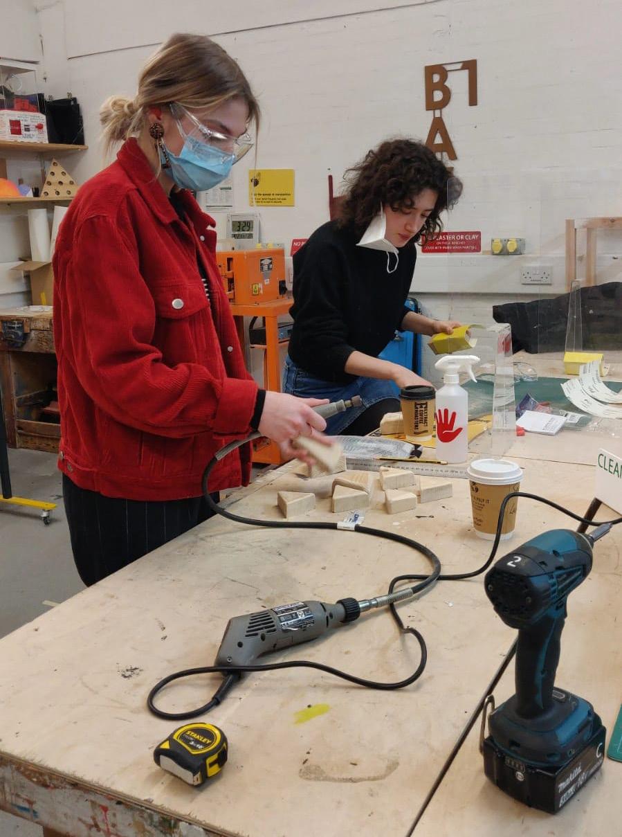
We had to research and explore new garments for the new product line proposal for the brand. We found a few brands that are catering to a wider inclusive customerbase and tried to understand the product development and considera ons. We used garments sourced from ASOS in the Mia campaign shoot. We also took this opportunity to use the facili es and resources made available by the university. We rented out ligh ng equipment and projectors for
the execu on of the campaign videos. We also used the 3D working space to create pebbles that we ini ally wanted to use as props in the campaign but later decided not to. I was also able to use the digital prin ng and book-finishing facility to create a physical social media proposal deck for the Beija brief. This brief also gave us the opportunity to take surveys from the demographic we wanted to target and it was essen al for us to develop the correct and well structured ques onnaire for the surveys and helped us develop our research approach to such interac ons.
DEVELOPEMENT

The ini al idea for the execu ons of the brief, we had planned a moving imagery lookbook and social media content series that use a ritualis c/community- based approach with inclusivity as a core value throughout the campaign. Our aim was to focus on the concept of a safe space through standard performance acts inspired by a physical theatre which involved reconnec ng with our bodies while transi oning between changing outfits. Throughout these performa ve acts, we wanted to redefine what the triangle represents within their logo. We had made some triangular pebbles (represen ng their logo) which we wanted to include in the performance. Ritualis cally speaking, we wanted to show how they could represent not necessarily the brand but their role in the community/performance, or even their rela onship with being in this space of transi on.

Though this idea had a tac le and tangible prop which was an interes ng intermediary metaphorical medium for the brand, it fringed upon a cult vibe that would’ve been counter-produc ve for the brand image. It also ran a risk of cultural appropria on of a par cular ritual which might even come off as insensi ve. This led us to scrap the ritualis c approach for the video campaign and focus on the ar s c form of self-expression through performa ve movement which was inspired by Kinesphere. This sphere is Rudolf Laban’s model for the space adjacent to the mover’s body. The centre of gravity of the body is also the centre of the kinesphere, which extends equally in all direc ons, establishing a boundary based on the areas of space that can be reached without taking a step. According to Laban, “all points of the kinesphere can be reached by simple movements, such as bending, stretching, and twis ng, or by a combina on of these.”

We also decided to move away from the triangular logo as it had a gendered undertone since its incep on. It helped us clarify our understanding and approach as well as it helped us remove the unnecessary complexity that we had added into the narra ve.
This change during the development of the project was an essen al realiza on as which added posi ve value as well as learning experience about the considera ons during developing an authen c narra ve.
BTS


OUTCOME Logo
Rebranding Strategy
When we discussed inclusivity, we understood we needed to start from scratch and adapt the logo to our philosophy of inclusivity. The current Beija symbol is designed specifically for a female audience, consis ng of a triangle with a line in the middle meant to depict a vulva. We opted to omit the usage of any symbol a er extensive research and brainstorming since we wanted the branding to reflect the fluid and inclusive culture we
were establishing. By excluding any shape and instead using the brand’s name as its emblem, the logo becomes more fluid and open to interpreta on.

The finalised typeface is called Dahlia.The irregularity of the characters, which include a combina on of capital and lowercase le ers, represents fluidity and inclusivity for all.


WEBSITE

We reimagined the website as well - simple with a more crea ve aesthe c, while also focusing on more interac ve components
like moving image & campaigns, rather than it having a commercially sta c feel.

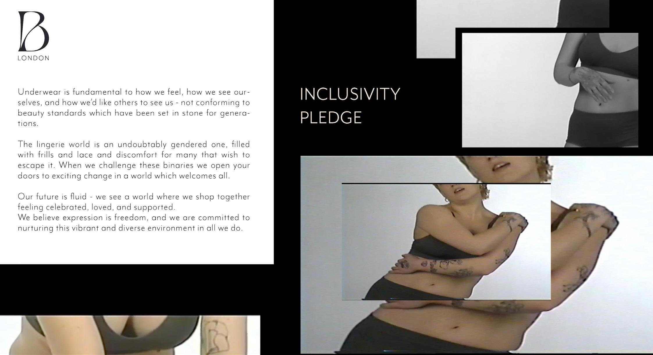
The website also showcases a new addi on to the already exis ng sustainability statement - an inclusivity pledge. Click here to visit the
Website. Click here to visit the Inclusivity pledge webpage.

NEW PRODUCT LINE


We decided to design undergarments that would cater to a larger audience, with the aim to reposi on Beija as a faithful name in a fast-growing gender-fluid landscape. It was important to understand what people from the community wish to wear on the daily and what they look for when buying undergarments. From silhoue es, fits, and size, to fabrics, feel, and aesthe cs.

MOVE
The aesthe cs of the new line, MOVE, were inspired from documen ng body interac ons via a thermal lens. If the tangible trace forms created by our bodily movements and the ones created through interac ons with others could be viewed through a thermal lens, the areas which would show interac on of body parts would be warmer than ones where there once was a movement happening. Such a view could be represented by a thermal gradient.
The meanings assigned to colours vary based on percep on and they are gendered. Colour gradients at their core, can stand to denote transi on and fluidity. In order to redesign the visual language for BEIJA, we incorporated gradients to depict the concept of non binary landscapes.


FABRICS & SILHOUETTES
Adjustable Strap Binder
Raceback Mild Compression Binder
BINDERS :(For trans men or anyone with breasts wan ng a masculine fla er cheat look). Made from the power-mesh fabric that doubles in the front for a more fla er fit. The fabric is strategically chosen to offer low to medium compression with just enough stretch to allow your full range of mo on and not restrict breathing. We’ve added adjustable straps at the shoulders to switch up the fit and avoid the dreaded armpit chafe which comes with regular side open binders. This is a more comfortable alterna ve to the tradi onal binder.


GENDER NEUTRAL UNDERWEAR: without the middle inseam to avoid wedgies or riding up with full bum coverage.

 Boy Short Trunk
GAFF : (For trans women or anyone with a penis wan ng a feminine cut undie). Again, all ,made with power mesh fabrics for compression and it is doubled in the front for a fla er look. All silhoue es have a wider middle sec on rather than tradi onal undies for a more secure fit.


FTM PACKER UNDERWEAR : (For trans men) featuring a deep pocket to securely and comfortably accommodate a so FTM packer. Made from stretchable bamboo fabric for a snug look
 Thong Gaff
High Waisted Gaff
Hipster Gaff
Cheeky Gaff
Classic Brief
Fly Packer Boxer
Thong Gaff
High Waisted Gaff
Hipster Gaff
Cheeky Gaff
Classic Brief
Fly Packer Boxer
SOCIAL MEDIA STILLS CAMPAIGN Outreach S
lls
We see this campaign to not only introduce the new line but reposi on Beija’s crea ve strategy. For Beija to promote inclusivity, there is a need to fully incorporate the term ‘inclusivity’ into their business model. Instead of non-commi al gestures and tokenis c strategies, Beija should use its platform to promote and showcase talents, crea ves and ac vists from the queer community.
Beija can provide a space for crea ves to talk about their prac ce, their works, and allow them to explore relevant topics such as body hair, menstrua ng, transi oning, etc. Not only does this allow the brand to give back to the community, it also adds value to their social media pages and increases audience engagement.

Tes monial S lls
It is in a tes monial format including oneline cap ons/quotes taken from the exis ng customer base with pictures in carousal or series. It is a balanced blend between commercial and homely appeal of the brand.
• Focusing on the everyday ritual one goes through every morning while ge ng ready for the day. Exploring naturalis c and candid movement of clothing oneself. Finding the natural moment and poses one finds themselves every morning when ge ng ready and choosing clothes. Exploring on the vulnerable moment you have with yourself when ge ng ready in your safe space.
• Focusing on the ‘feel good’ and selfapprecia ve moment you have with yourself in the morning, looking in the mirror and preparing yourself for the day. Focus on the naturality of where one

might enjoy their garment on a comfortlevel and visually (keeping away from the usual sex- appeal that is associated with it).
• Emphasise on the emo on of selfconfidence, comfort, self-esteem and selfapprecia on that the brand is enabling you to experience.
• Tell stories of people from different walks of life and ul mately focus on the self-care and self-apprecia ve moment of people crea ng an emo onal appeal.
In order to give an in-depth analysis for the social media campaign, I printed out a physical proposal deck to present it to the client. Click here to access the digital copy of that proposal deck.
VIDEO CAMPAIGN
When we dismantle, we create.
This is a campaign for Beija’s proposed new line of underwear. Catering to a more fluid individuals. Clips from the film are intended to be dispersed across all Beija’s online platforms, as well as to be shown in store.
This campaign proposal focusses on movement and self expression, to disrupt the sta c binary structures which the lingerie world is known for. This campaign aims to push what a campaign could be, by presen ng the real and authen c selfexpressive performance. Our aim with our ‘MIA’ campaign for Beija’s new product-line ‘MOVE’ is to present the beauty in fluidity to allow audiences to explore their own iden es when we take gender out of the conversa on.
This campaign and new product line aims to draw in a new audience that looks for comfort and flexibility when shopping for underwear. This is not intended to express the struggle of the non conforming genders but more to explore and celebrate the freedom in fluidity.
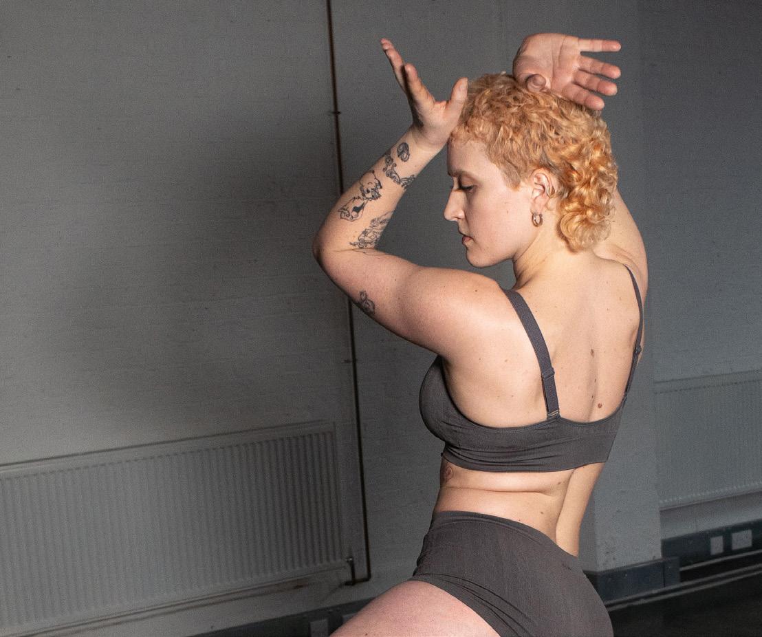
This campaign was guided by Mia; a movement ar st who’s prac ce takes on various forms such as aerial arts, boxing, yoga and video making all driven by her passion for the medium. We wanted to showcase Mia’s movements and her ideas. We proposed ques ons such as: What does
inclusivity mean to you?, What do you think a gender fluid world would look like?, What makes you feel empowered?, etc.
Our aim with the direc on was for Mia to explore the answers to these ques ons through expressions of movement. This pushes the idea into new territory, as we navigate the dialogue through movement and the power that comfort encourages.
This short film captures various improvised moments which were directed by us and Mia herself. This is a crea vely driven short film, which showcases a person who is happy and at peace with their iden ty. We believe Mia is someone to look up to not only for her talent, but her posi ve energy, ease of being herself and comfortable in her body - this is something to celebrate! This campaign not only invites new audiences, but expresses the essen als of how we want and need to feel when stripped down and vulnerable. This is a very important discussion, and we wanted to express this meaningfully and crea vely through Mia’s improvisa on.
Click here to view the video campagin


Future scope of the Video Campaign

We see this campaign to not only introduce the new line but reposi on Beija’s crea ve strategy. For Beija to promote inclusivity, there is a need to fully incorporate the term ‘inclusivity’ into their business model. Instead of non-commi al gestures and tokenis c strategies, Beija should use its platform to promote and showcase talents, crea ves and ac vists from diverse communi es. Beija can provide a space for crea ve to talk about their prac ce. Not only does this allow Beija to give back to these communi es, but it also adds value to their social media pages and increases audience engagement.
Our approach to this challenging brief has undoubtedly been fluid; we have jumped in and out of concepts, and we have been directed by the community and their needs. We’ve evolved and transformed this project into something we’re all really proud of and passionate about. We’ve been upfront and honest, and that’s how we’ve learned. We feel that our final outcome and proposal for Beija’s inclusivity brief is strong, and the ideas explored and research acquired should not be underes mated. We delved into the fundamental no ons of inclusion and learned how to see it in a fresh perspec ve.


