H e l l o ! M y n a m e i s P e y t o n , a n d I a m a
t h i r d - y e a r i n t e r i o r d e s i g n s t u d e n t a t
t h e U n i v e r s i t y o f N e b r a s k a - L i n c o l n . I
a m m i n o r i n g i n A r c h i t e c t u r a l S t u d i e s
a n d h a v e a n i n t e r e s t i n r e s i d e n t i a l a n d
p r o a c t i v e d e s i g n I w i l l c o n t i n u e m y
e d u c a t i o n i n a M a s t e r ’ s o f A r c h i t e c t u r e
P r o g r a m
TOP 5 QUALITIES
Creativity
Leadership
Communication
Problem Solving Organization
L E A D E R S H I P
Alpha Omicron PiCampus Relations Coordinator:
Designing and creating banners for every event, directing a committee to aid the banner-making process, organizing intramurals for the chapter, coordinating 170+ people for the daily events during Homecoming & Greek Week held annually.
Philanthropy & Sisterhood Video Creator:
Creating, editing, and finalizing the philanthropy video for recruitment services.
Recruitment Round Coordinator:
Organizing and overseeing 170+ members during sorority recruitment to ensure it runs smoothly and efficiently
P E Y T O N P R U E H
S
I N T E R I O R D E S I G N S T U D E N T
S K I L L S
Adobe Illustrator
Adobe InDesign
Adobe Photoshop
WORK EXPERIENCE
J u n 2 0 2 3 - P r e s e n t
A p p l e b e e ’ s l 4 5 5 5 S o u t h e r n H i l l s D r , S i o u x C i t y , I A 5 1 1 0 6
Waitress
P r e p a r i n g s e r v i n g a r e a , p l a t i n g r e s i d e n t s ’ m e a l s , a i d i n g r e s
2 0 2 0 - 2 0 2 2
D r i l l i n g P h a r m a c y l 4 0 1 0 M o r n i n g s i d e A v e , S i o u x C i t y , I A 5 1 1 0 6
Pharmacy Support
C h e c k i n g p h a r m a c y s t o c k , p l a c i n g o v e r - t h e - c o u n t e r o r d e r s f o r s t o c k , a n s w e r i n g p h o n e
c a l l s , p r e p a r i n g a n d p a c k a g i n g p r e s c r i p t i o n r e f i l l s a c c u r a t e l y , d e s i g n i n g g i f t s h o p d i s p l a y s , c l e a n i n g p h a r m a c y a n d g i f t s h o p , p r o c e s s i n g c u s t o m e r p u r c h a s e s ,
c o o r d i n a t i n g v a c c i n e a p p o i n t m e n t s
Q U A L I F I C A T I O N S
Dean’s List
George Beadle Scholar
ASID/IIDA Student Member
Nate Bicak
Associate Professor of Interior Design
Year 3 Year 2 Year 1 01 02 03
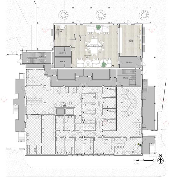
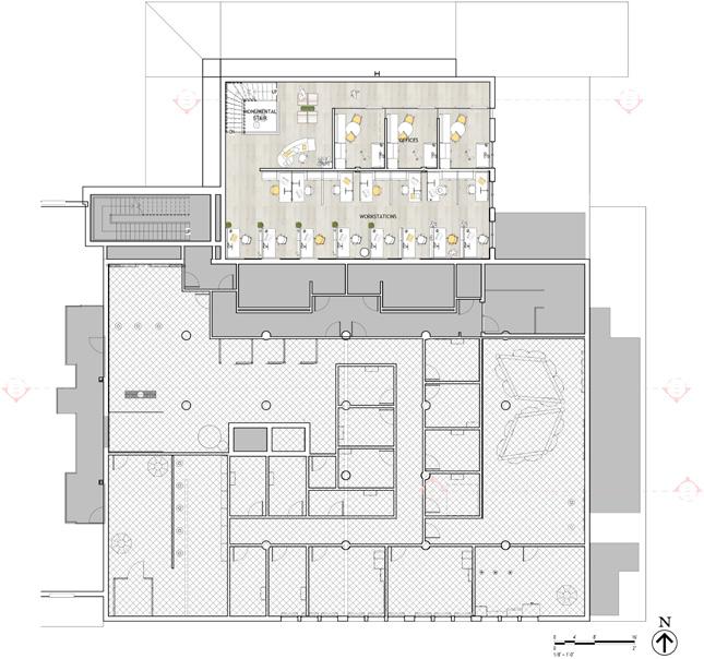
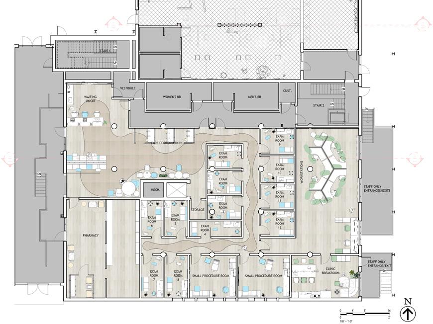
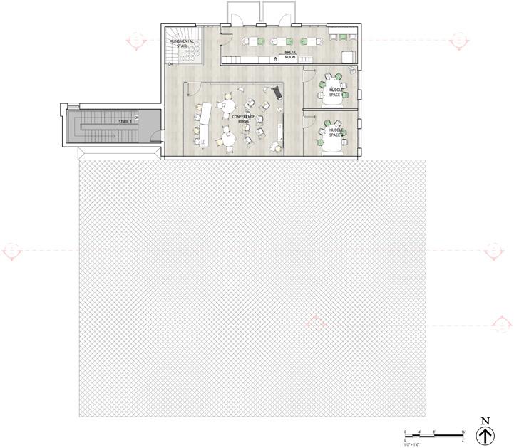
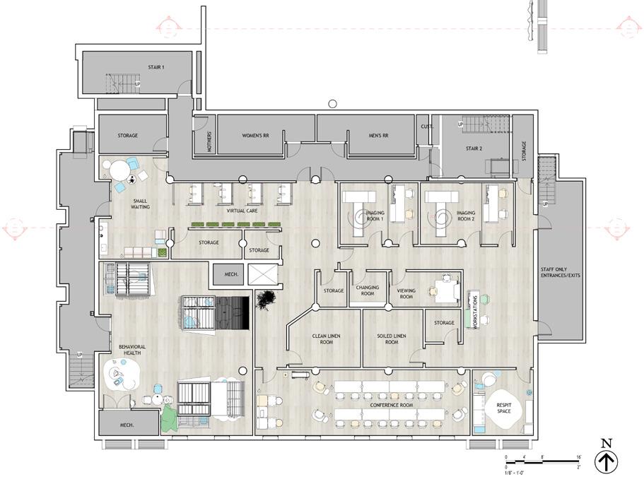
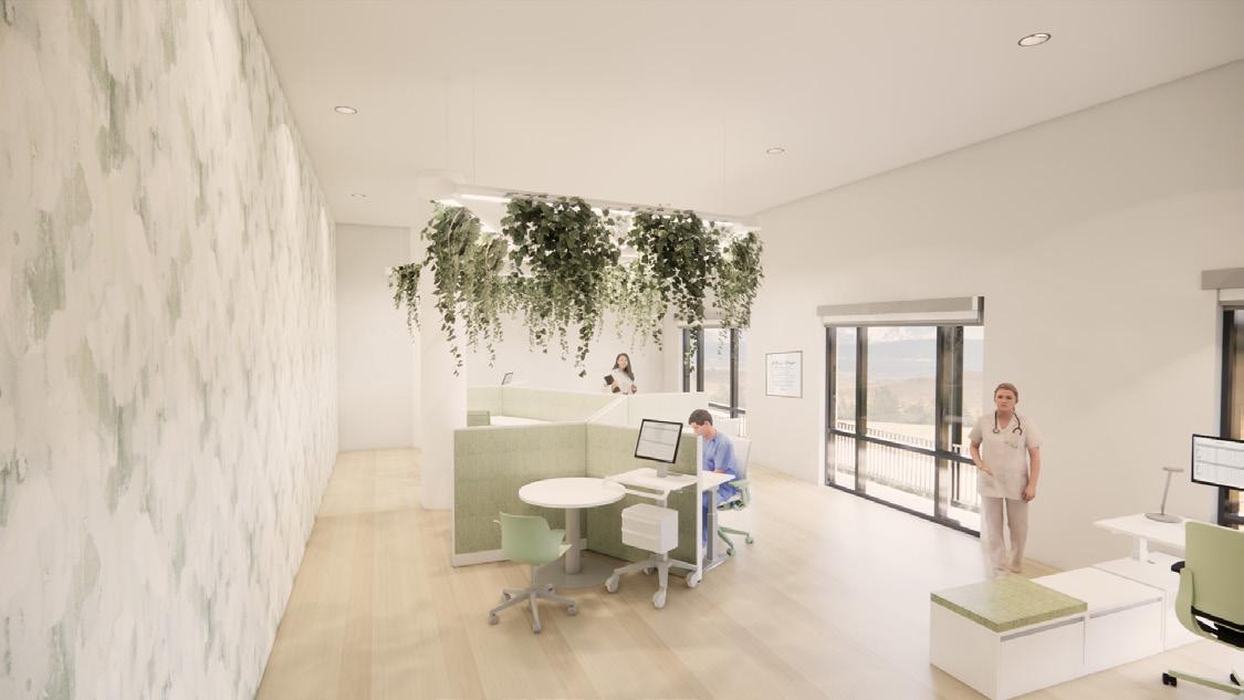
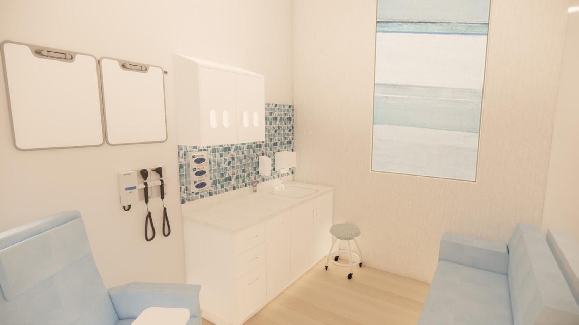
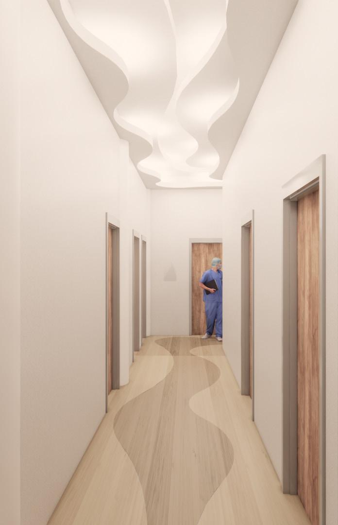
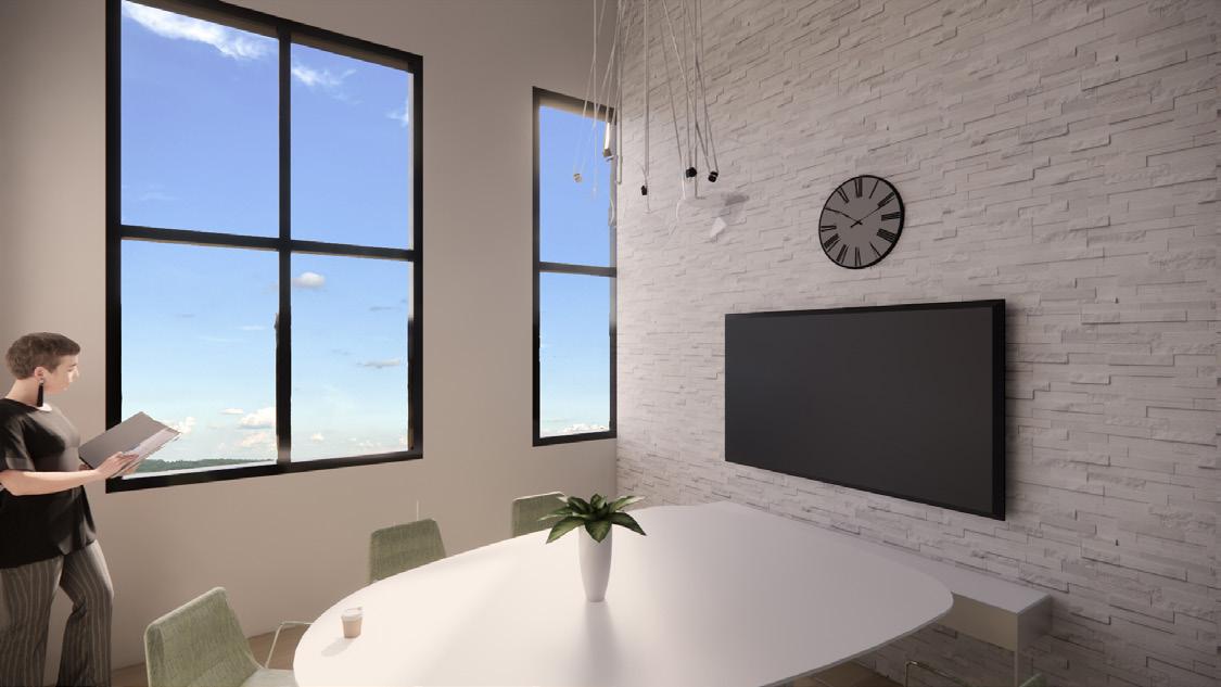
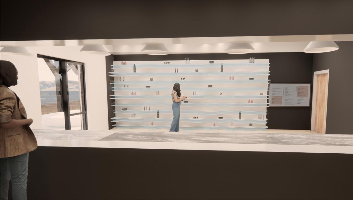
TELEGRAPH HEALTH CLINICS
PRELIMINARY WORK AND BRAND PACKAGE
DESIGN INTENTION
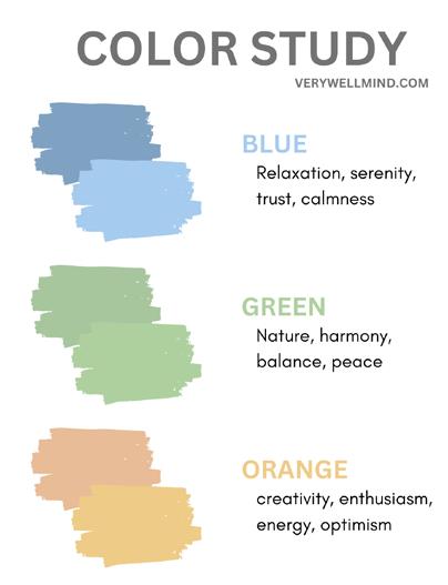
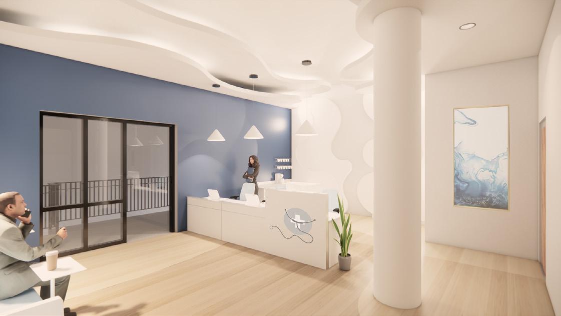
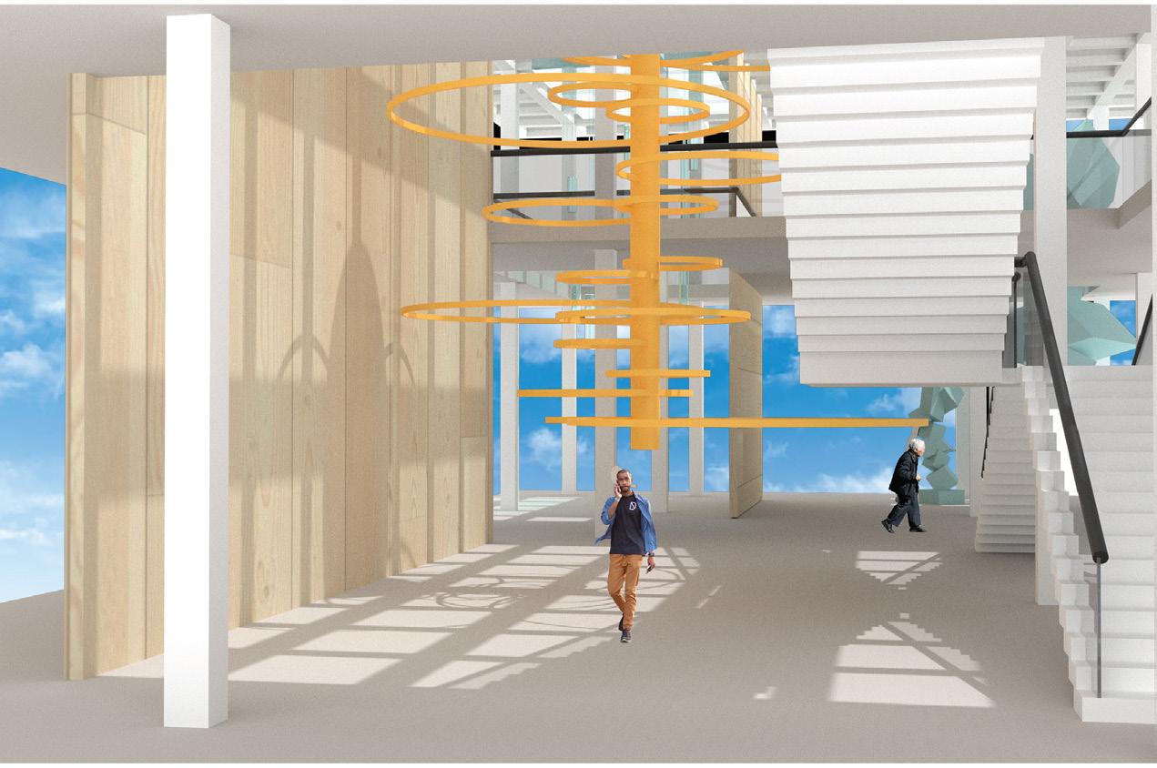
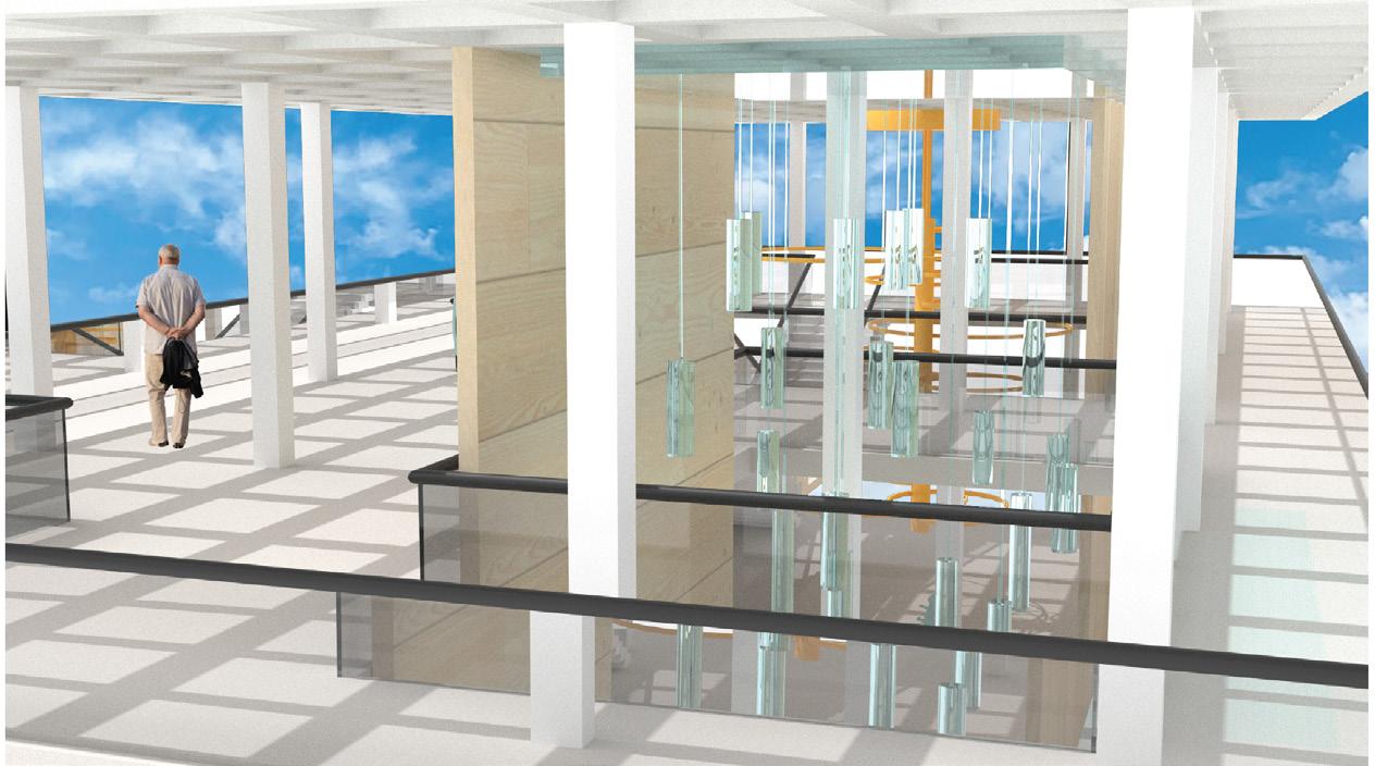
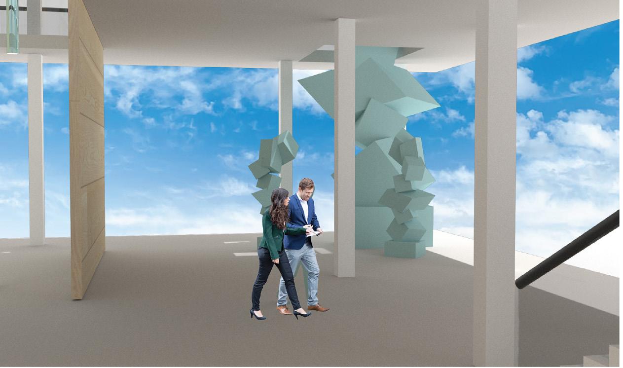
To create a healthcare space that fosters well-being, creativity, and positivity while addressing the needs of the users, patient comfort, psychology, and habits were considered when designing this space. This space influences users in an unconscious way through various implementations within the space, including color, spaceplanning, and shapes of elements. Each color was thoughtfully selected based on its emotional resonance: orange sparks creativity, blue promotes relaxation, and green fosters a connection to nature. This space also harmoniously blends organic shapes and patterns to introduce an element of lightheartedness into a traditionally serious environment. The design of the space ensures seamless circulation, subtly delineating public and private areas. Curved ceiling and flooring patterns enhance way-finding, guiding users intuitively through the clinic. These design elements aim to support users’ well-being in an indirect yet meaningful way, creating an environment that inspires comfort and positivity to fosters wellness.
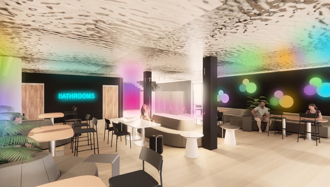
The inclusion of “wildcard” spaces provides a refreshing contrast to the conventional seriousness of healthcare, without compromising the clinic’s primary objectives. Inspired by extensive interviews with healthcare professionals, the behavioral health wildcard clinic re-imagines therapy, adding a dynamic layer of performance to the experience. Meanwhile, the community and retail spaces contribute a playful, wellness-oriented atmosphere, enriching the environment for all who interact with it. Overall, this thoughtfully designed clinic exemplifies how intentional spatial elements can transform healthcare environments, balancing functionality with creativity and wellness to enhance the experience and well-being of both patients and staff.
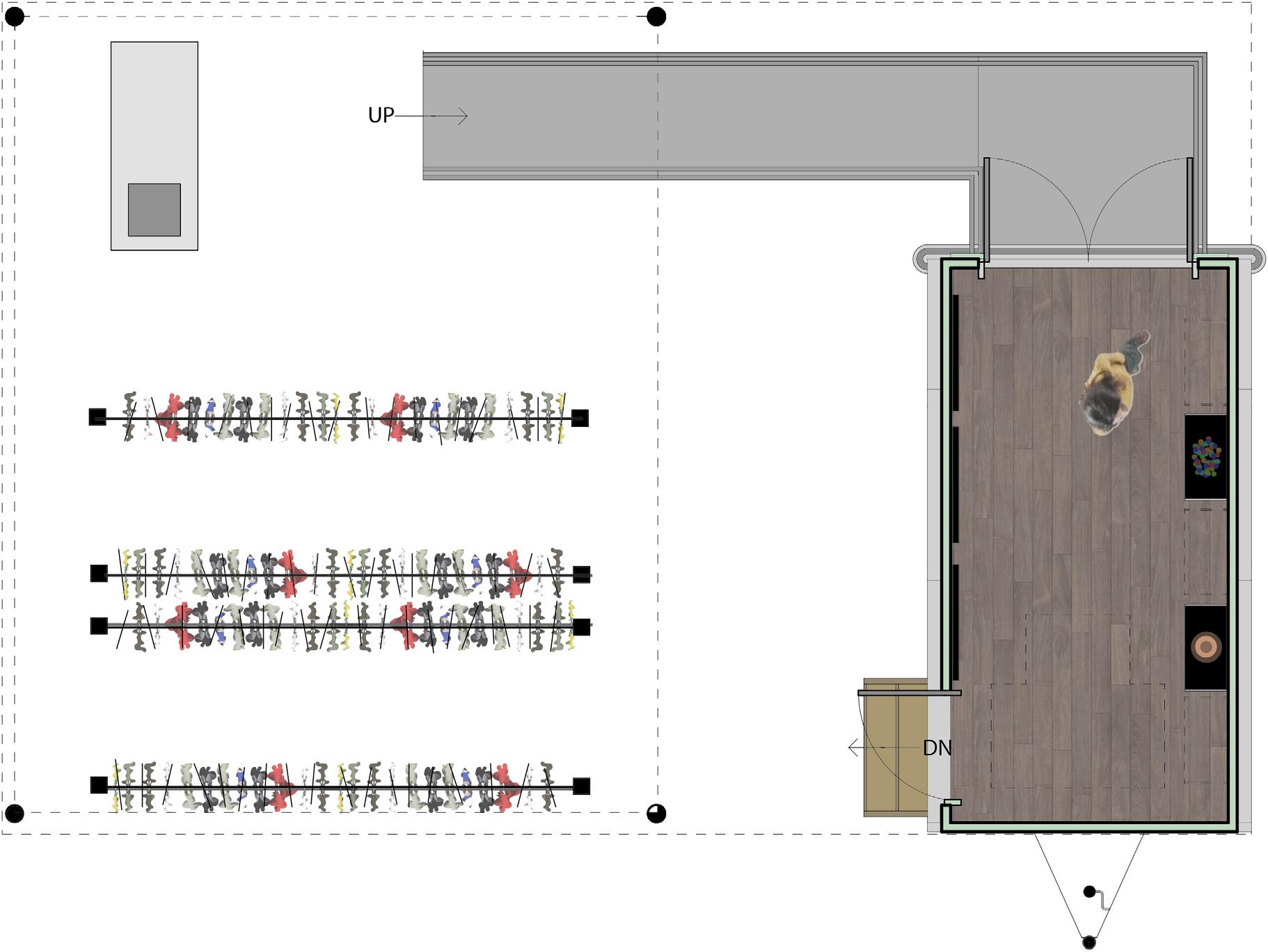
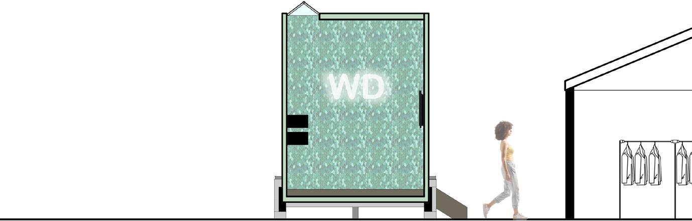
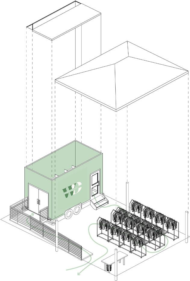
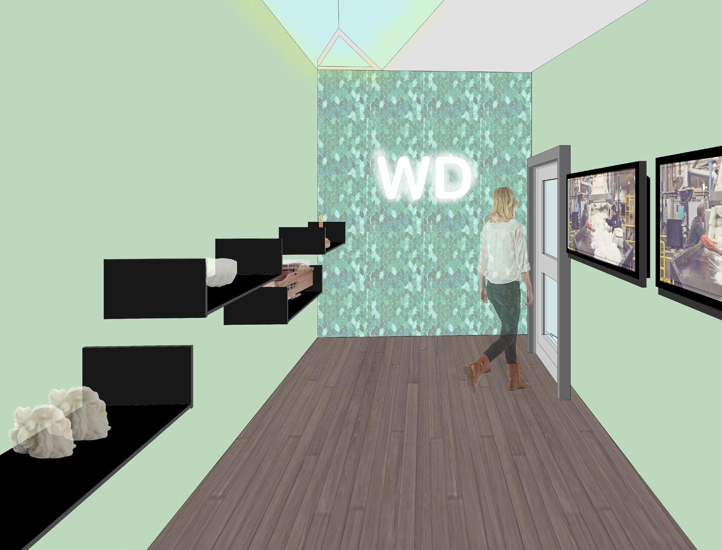
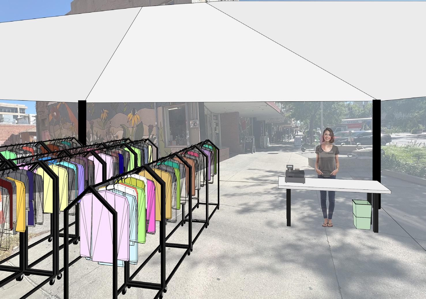
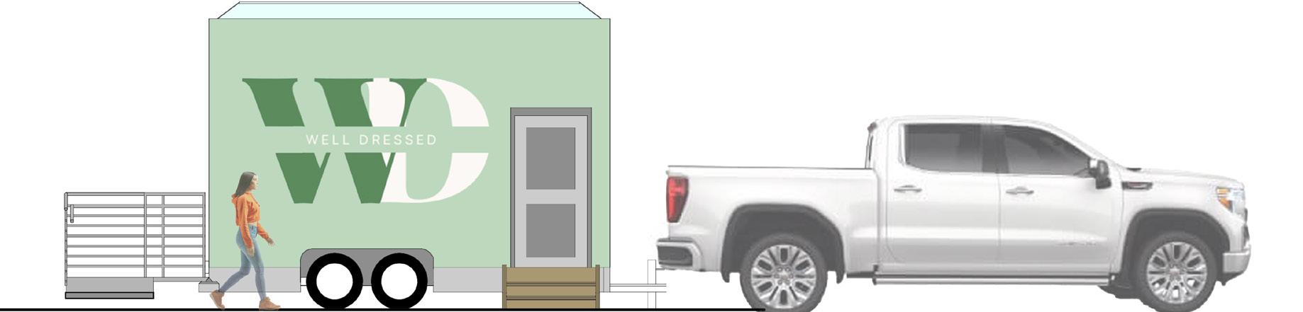
This mobile outreach service provides an opportunity for users to gain insight on the benefit of recycled clothing and then to make the decision to buy the clothing versus shopping at other boutiques. The site is right next to a popular boutique in Lincoln, Nebraska, hoping to persuade users to shop at this store and help the environment rather than to shop at the competitor’s store, which utilizes fast fashion. The circulation of the space drives users to first enter the trailer where they are educated and can discover the steps and benefits of recycled clothing. They are then driven to go shop through the recycled clothing where they can engage with the products and are provided service by the workers. The overall goal of this program is to reinforce stability and the environment while encouraging people to sway away from fast fashion and turn towards recycled clothing to help the wellness of the environment. The hope is for them to leave feeling educated, impacted, and content with their choice
PROCESS WORK
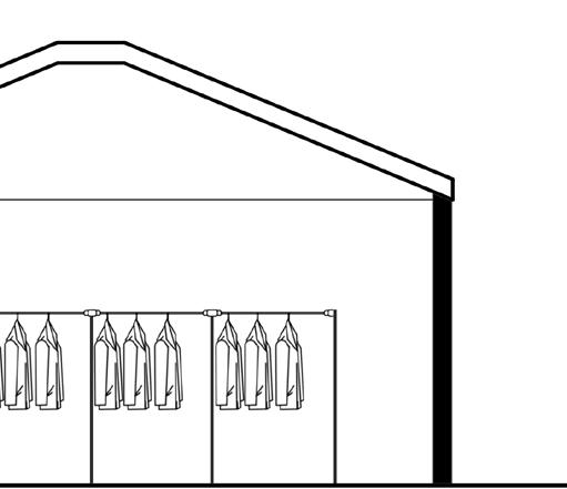
EXTERIOR
YEAR 2 02
USER PROFILE PROJECT
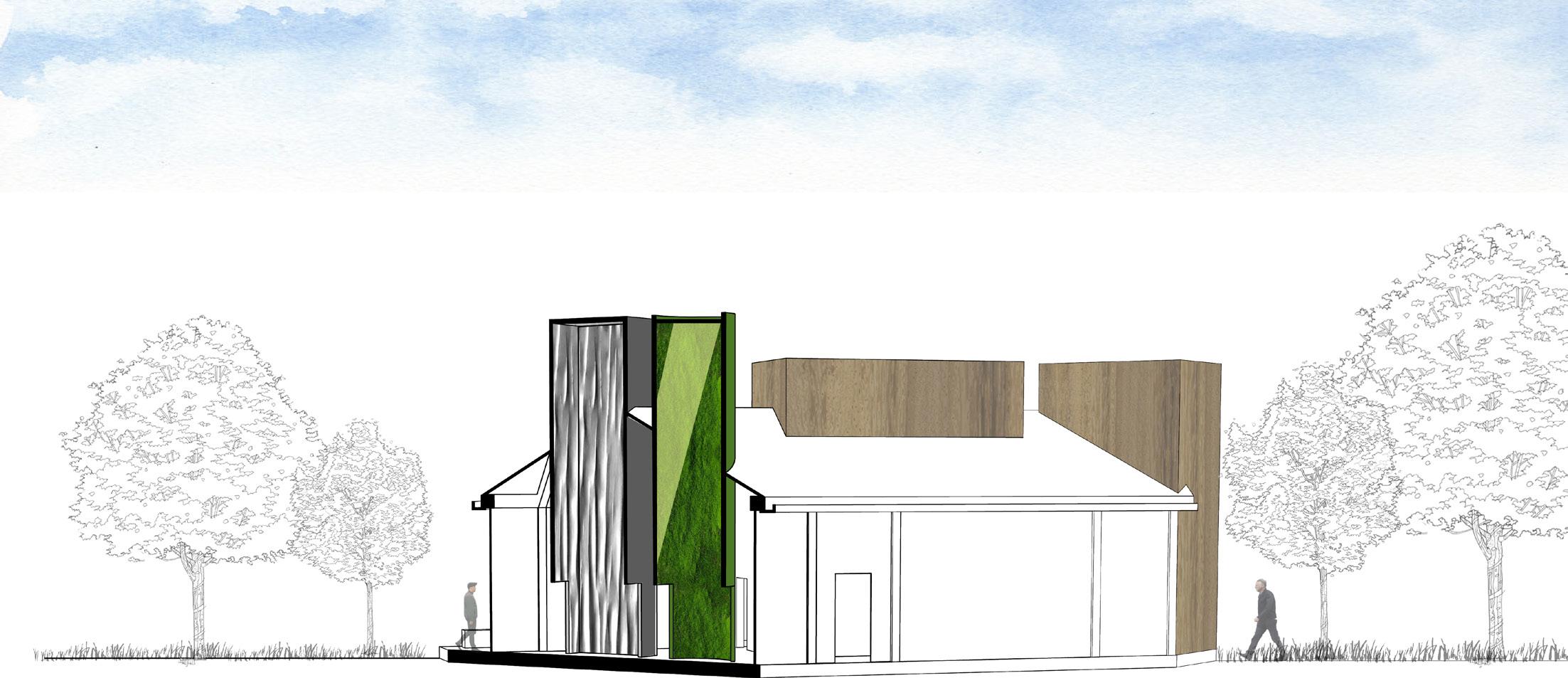
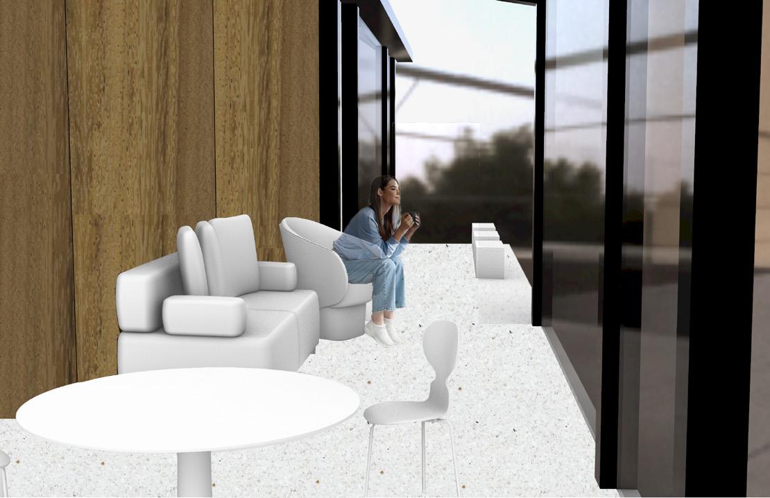
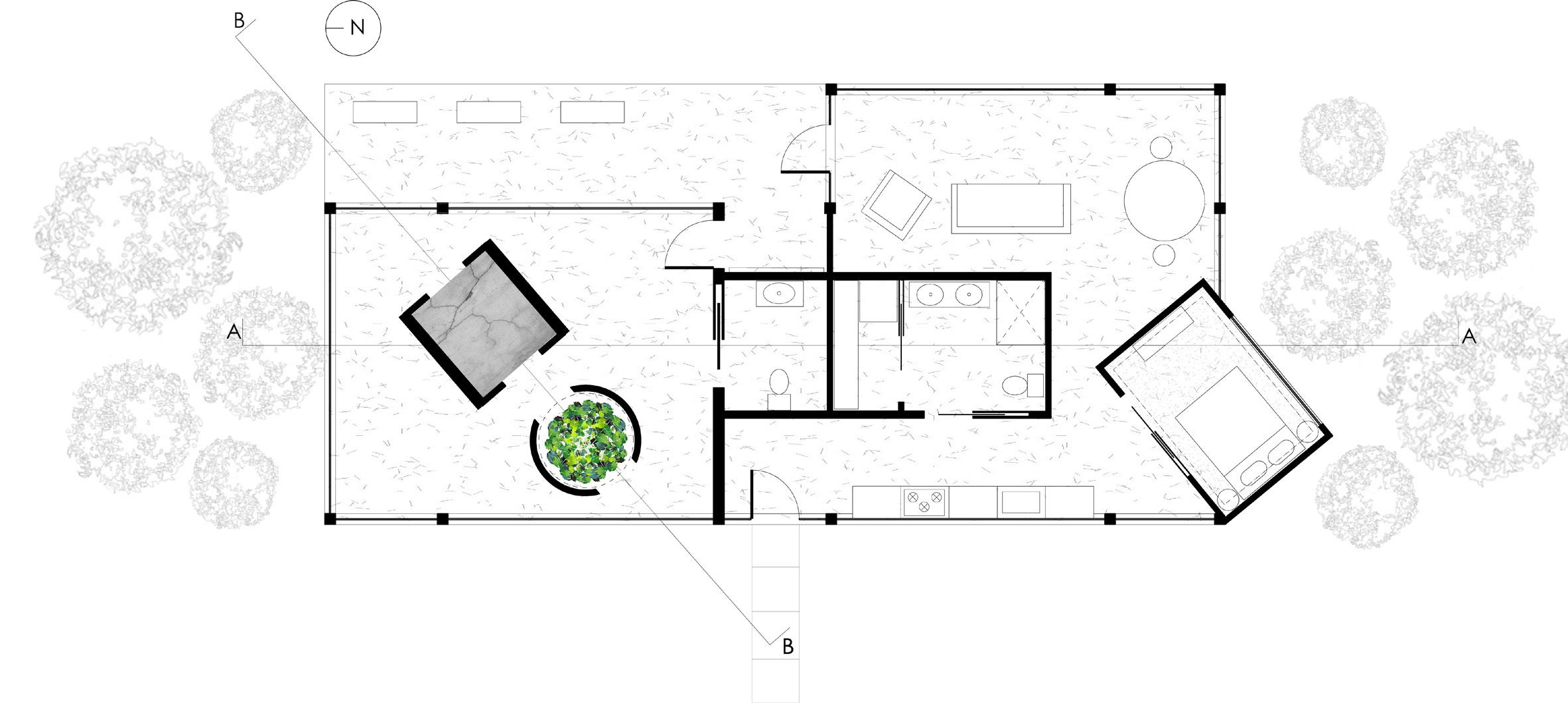
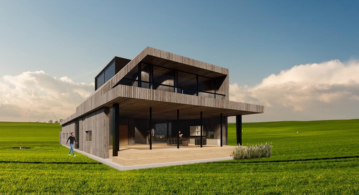
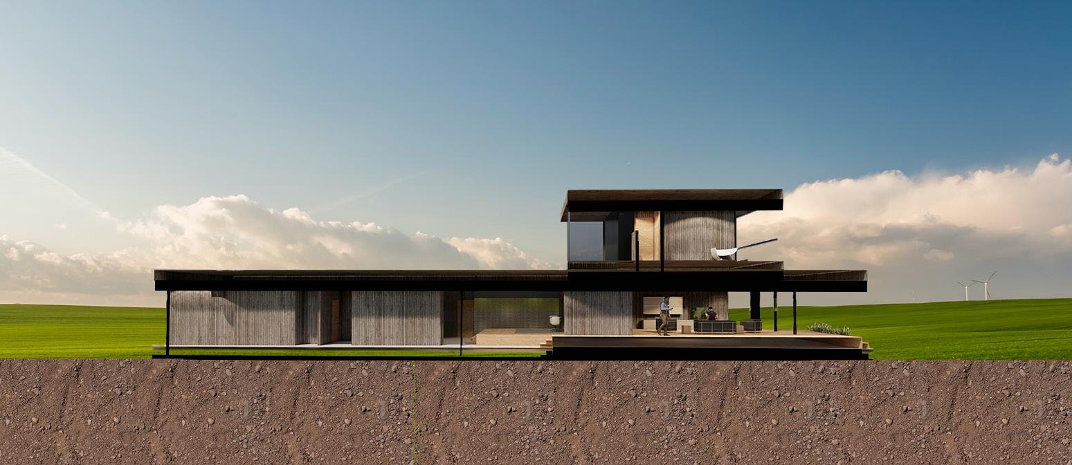
The design intention for this creative retreat is to establish an environment that emphasizes harmony between the interior and exterior spaces. To support this intention, the use of aperture through glass walls will provide the users with an uninterrupted view of the site. This design intention is relevant to the user because the user photographs landscapes at a large scale to provide insight into humanity’s living effects on nature. The use of exaggerated volumes
will provide users with a feeling like the scale that Burtynsky’s photos provide. The contrast between industrial and alive materials will aid the message that Burtynsky relays in his photographs. The overall material application of natural materials will support Burtynsky’s beliefs and opinions in his work.
USER PROFILE
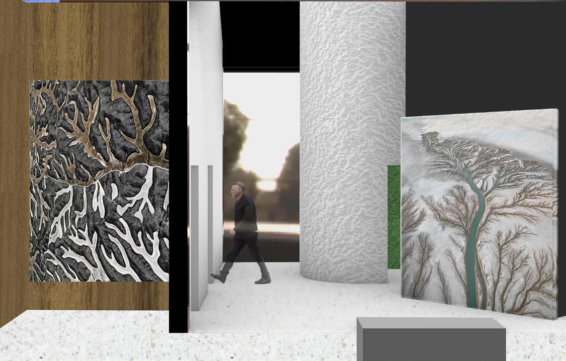
Edward Burtysnsky is a landscape photographer who shoots images of landscapes and develops them at a large scale. He aspires to show the transformation of mankind and the landscapes that were altered by the human hand through his photographs. He wishes for his images to show the impact of humans on the environment. He wants to show the scale of the destruction because while nature provides for humanity, it suffers. Edward has multiple different photography series of nature, including water, oil, salt pans, mines, quarries, urban mines, and many other natural subjects.
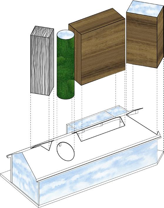
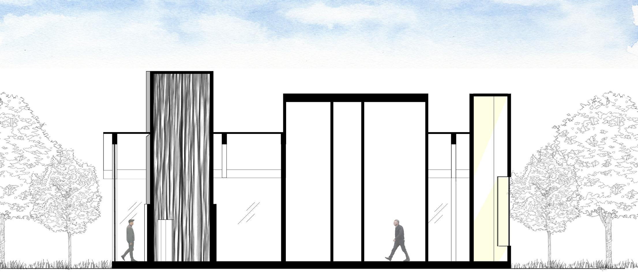
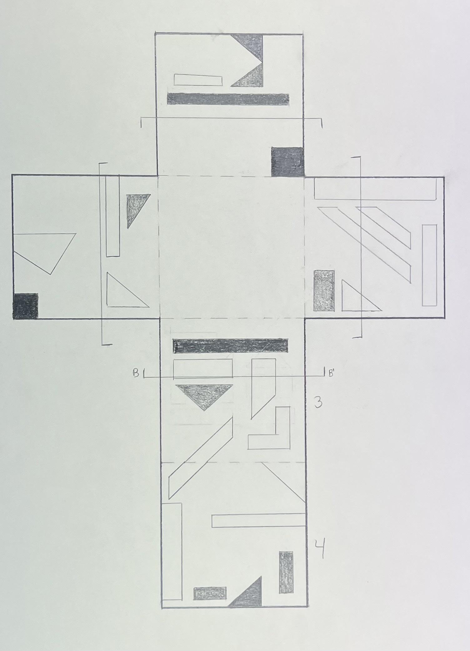
SPACIAL SYSTEMS DIAGRAM
The system diagram shows the volume, materials, and aperture of the spacial system. The volumes show the only enclosed areas of the home. The exaggerated volumes represent the user’s exaggerated size at which he develops his photos. The first volume is made of industrial materials. The second, circular volume is covered in natural greenery. The last two volumes are made of natural wood to demonstrate the intention behind the user’s photography. Lastly, the areas of the diagram that show the blue sky are made of glass, which shows the aperture in the spacial system. This aids one design intention goal of creating harmony between the interior and exterior spaces.
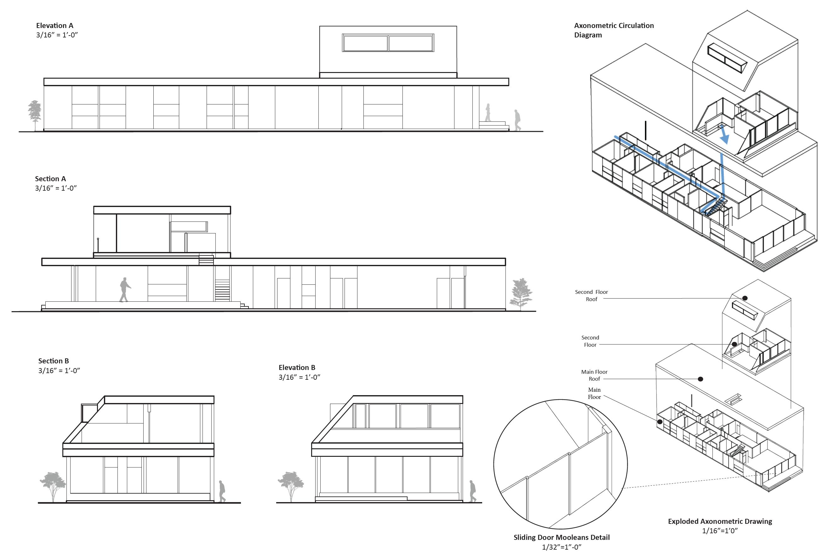
FLOOR PLAN: 3/16” = 1’0”
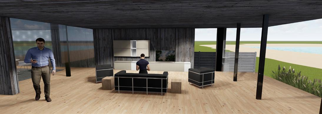
BATHHOUSE PROJECT
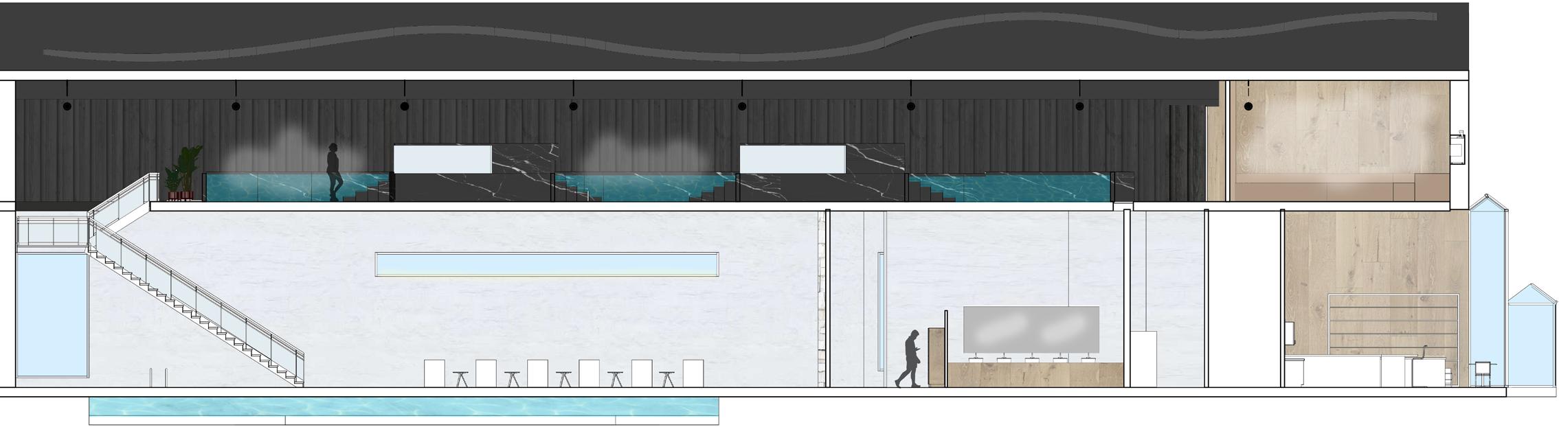
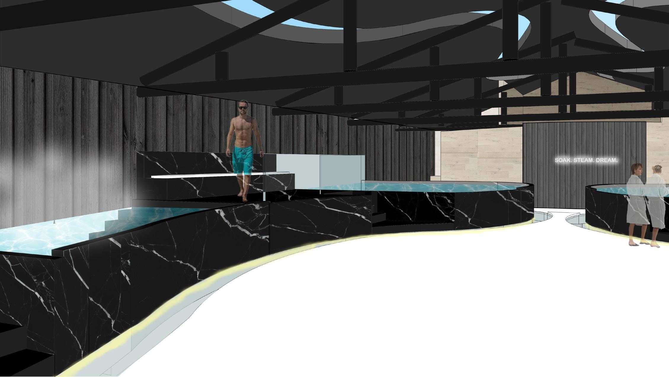
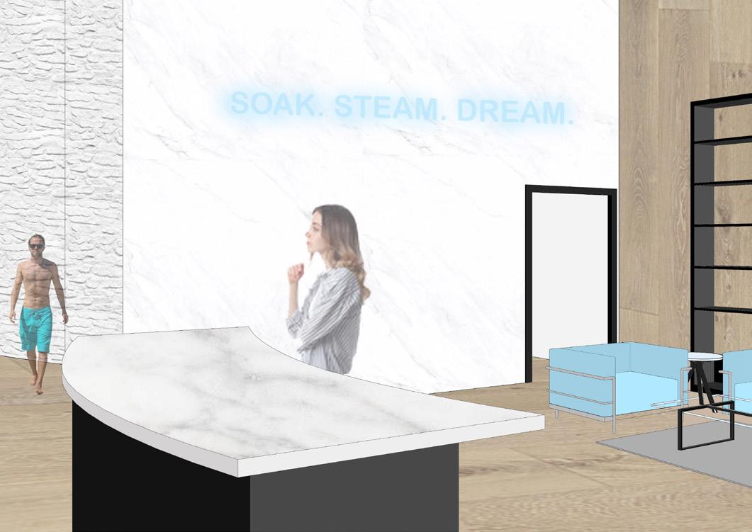
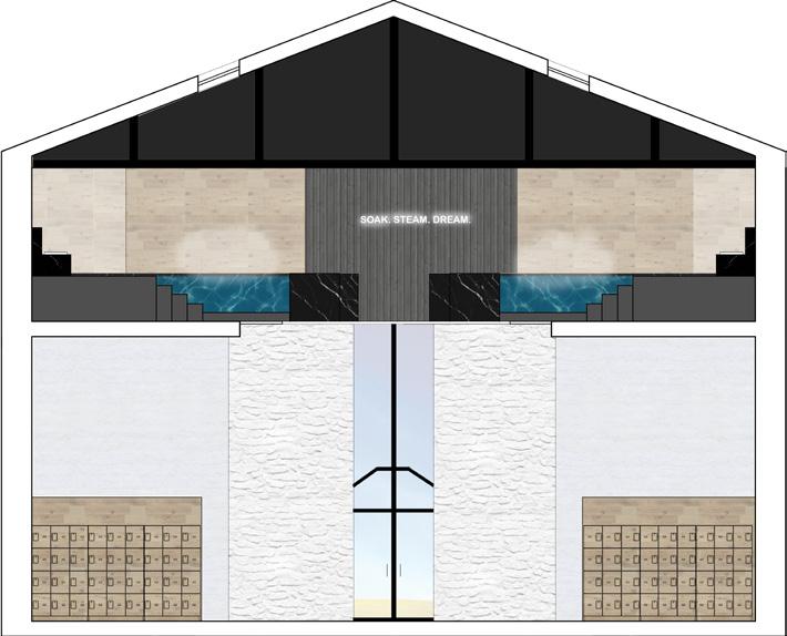
SOAK. STEAM. DREAM.
THE EX MATTATOIO IN ROME, A FORMERLY KNOWN SLAUGHTER HOUSE, WAS TRANSFORMED INTO A MODERN, PUBLIC BATHHOUSE FOR VISITORS TO SOAK, STEAM, AND DREAM. INSPIRED BY A COMBINATION OF HISTORICAL AND CONTEMPORARY PRECEDENTS, THIS BATHHOUSE USED CIRCULATION AND MATERIALS TO DRIVE THE DIRECTION OF VISITORS WITHOUT SPECIFIC STEPS. THE CURVED WALLS WERE INSPIRED BY A KOREAN BATHHOUSE TO MOTIVATE CIRCULATION. THROUGH APERTURE AND MATERIALS, THE BATHHOUSE CREATES PROGRAM WITH A WELCOMING, PUBLIC MAIN FLOOR, AND A MOODY, PRIVATE SECOND FLOOR.
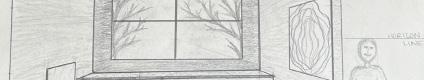
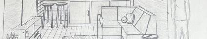
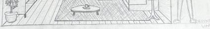
INTERIOR STRATEGIES
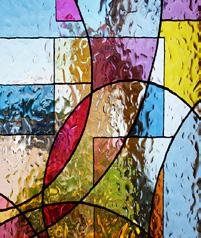
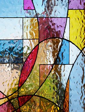
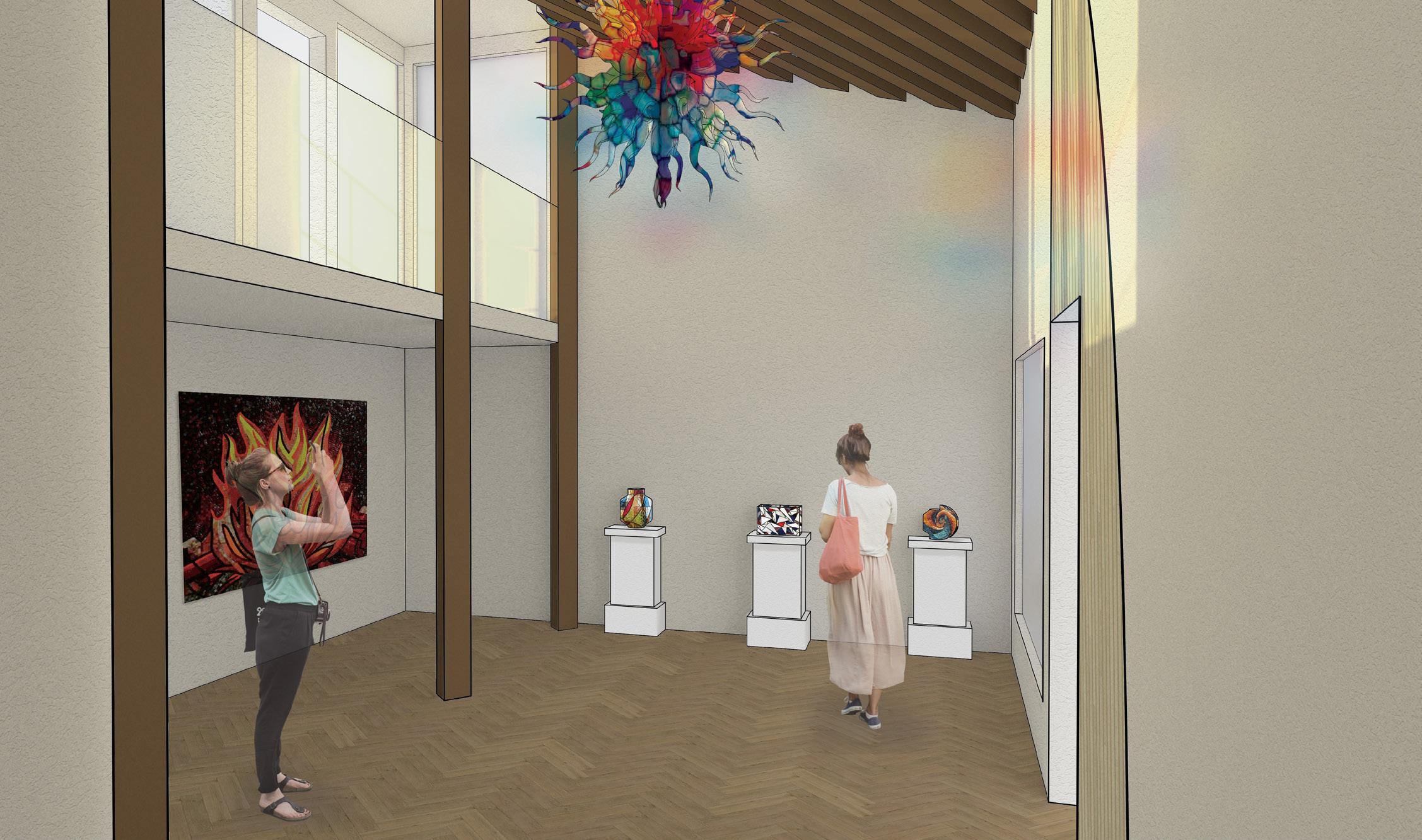
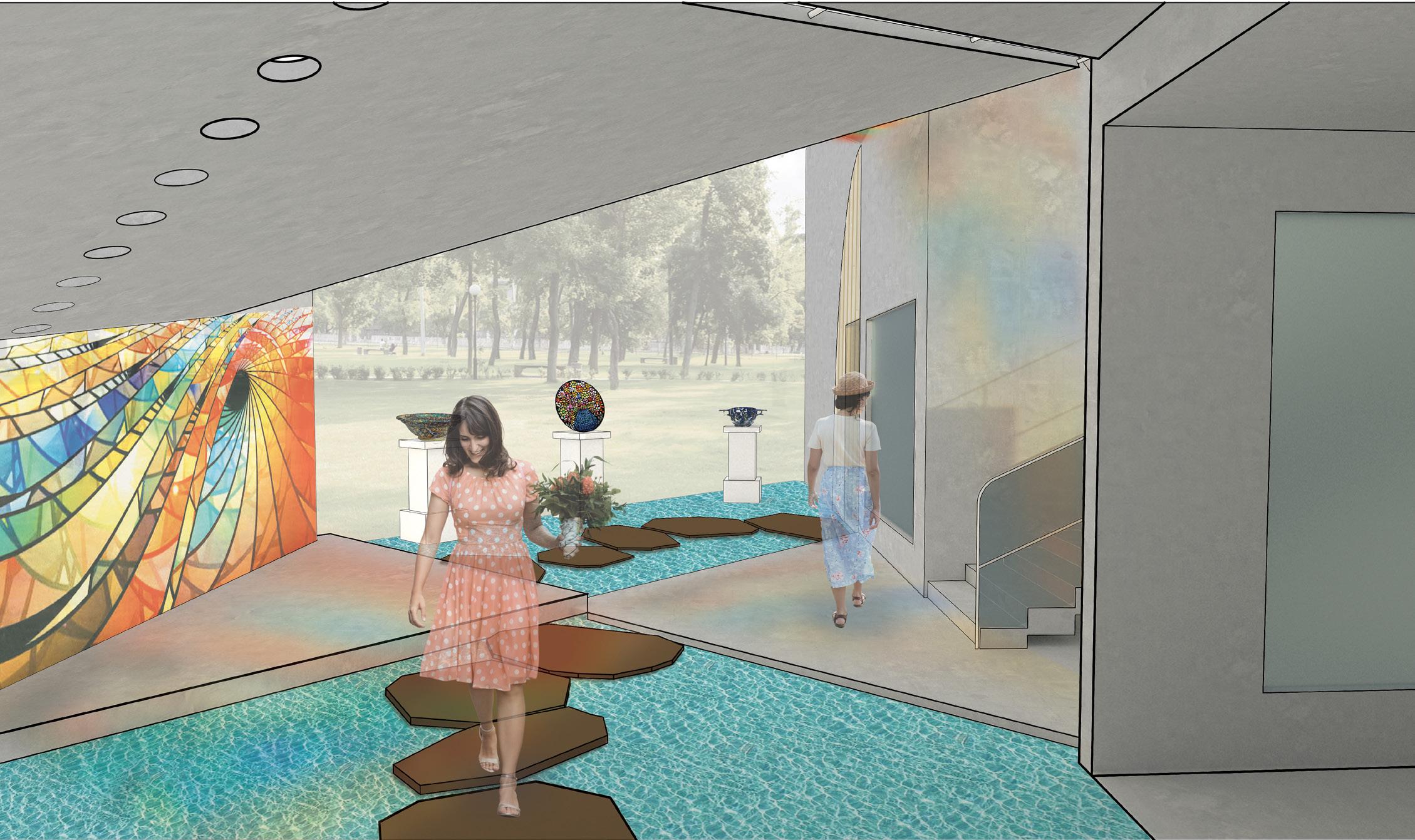
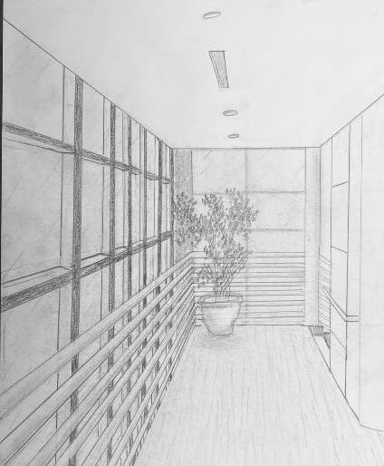
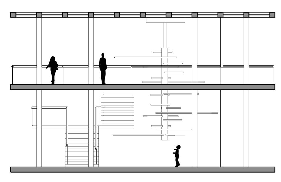
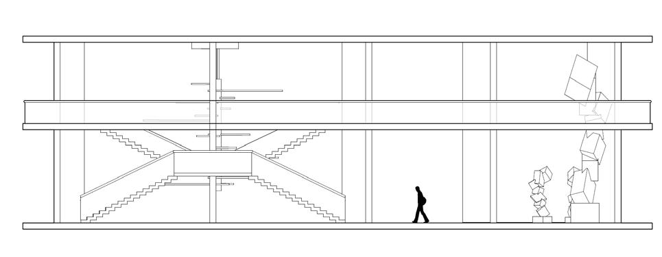
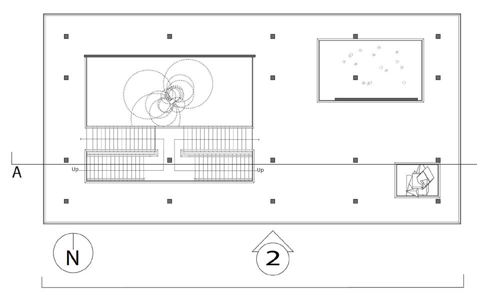
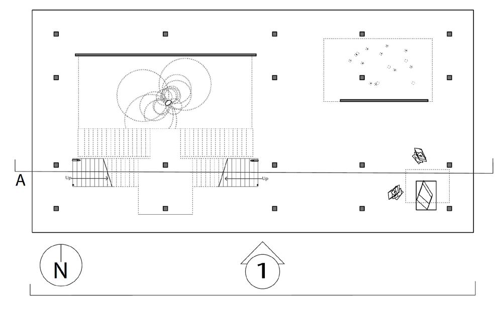
The instruction for this project was to design one space for a person to experience alone, another space for 8-10 people to experience. The design of this specific project was focused towards a mosaic glass artist with an area for a gallery, and an area for them to create their work. In the gallery, there is a feature ceiling with cascading beams, inspired by a previously studied precedent project. In addition, stairs lead the visitors from the exterior to interior of the gallery to allow them to see a different perspective of the artwork. Visitors can see the studio from the gallery through a procession of windows. An intention of this project was for there to be an experience at every stopping point. In various spots, visitors may see the artist’s work either in an overhanging plane or in the large overbearing wall. Stepping stone guide the circulation from one space into the next. To contrast with the sharp lines of the buildings and planes, circular apertures can be seen on the diagonal overhang of the studio space and an arched doorway into the gallery was added. The materiality of the space is neutral to provide emphasis and make the mosaic artwork the focal point.
AXONOMETRIC
PERSPECTIVE 1
PERSPECTIVE 2
PRECEDENT PROJECT
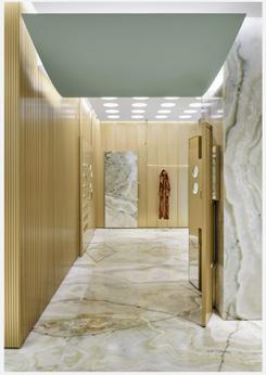
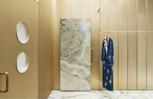
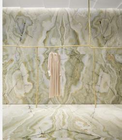
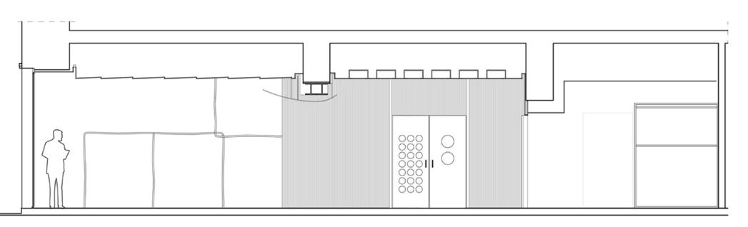
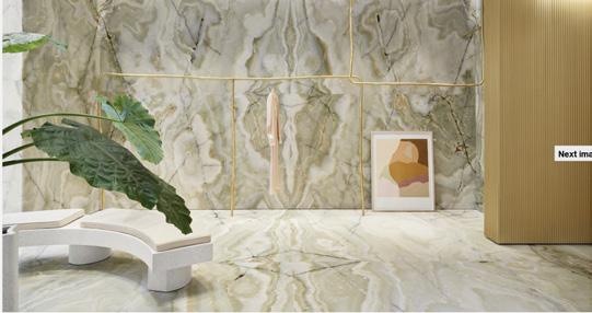
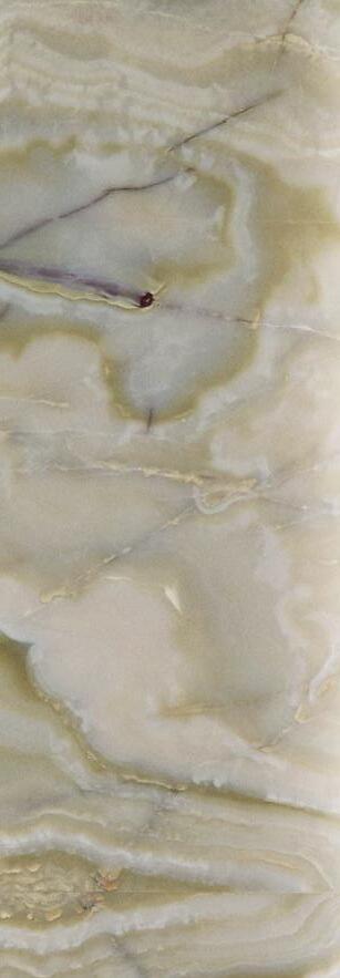
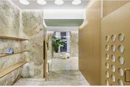
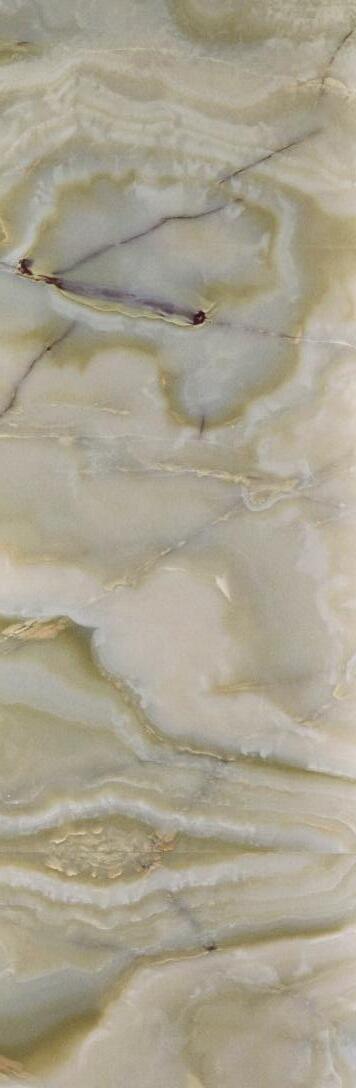
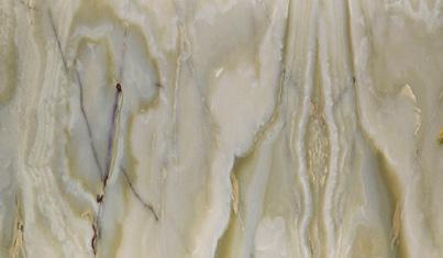
For this project, Giada Forte, a clothing boutique in Rome, was studied based on materiality and emphasis. The material palette in Giada Forte was minimal, with only bronze and green onyx materials. Because of this, emphasis was provided onto the clothing within the boutique. In addition, the program objects, such as the continuous bars for the clothing to hang on, continued to allow the clothing to be the focal point. Lastly, threshold was also studied within the boutique. A curved sage green ceiling feature was used within the threshold from the front to back of the building to allow a continuous transition from one space to the other. The hybrid drawing communicates the precedents within Giada Forte through applying materials to the floor plan and sections, as well as showing the program objects and the emphasis that they provide on the clothing.
forte_forte
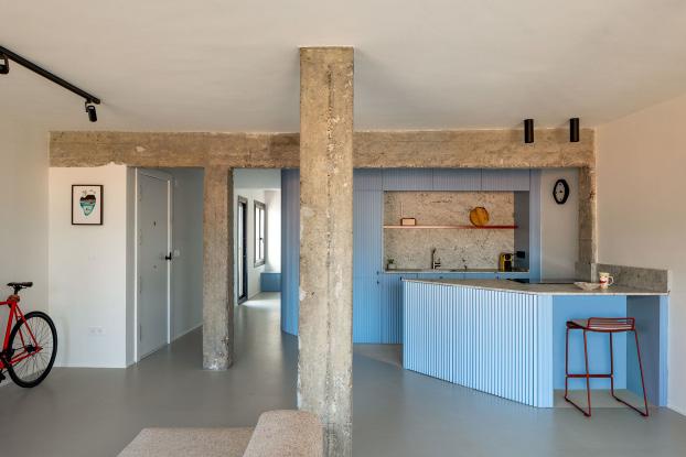
PRECEDENT PROJECT
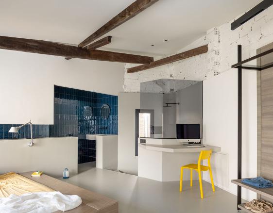
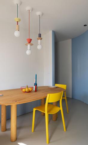
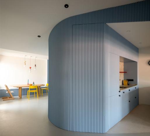
The Burgatoi Rennovation was designed for a young couple and their son with the key intention of creating a strong distinction between daytime (kitchen, dining, living) and nighttime (bed) space. It is a renovation of an original space. When the space was renovated, they changed the layout of the floor plan and removed multiple vertical elements to instead make a curved interior wall.
The layout of the domestic space has a correlation with the country’s social concepts. Firstly, everyday life in Spain is very relaxed and there are some important procedures that are done every day, most importantly the siesta. The siesta is followed by the main meal of the day (lunch) and this type of break in the day lasts from 2 – 3 hours. The house needs to be understood as a chain of continuous space, representing the flexibility it has. The house contributes to the comfort in daily life, yet the neutrality of the choice of materials used respects the context. The way of living in Spain is relaxed, similarly to the layout of the house. The small stretch within a corridor in the master bedroom which connects the spacious area during the day into a private area as the day progresses, this helps portray how different the night life in Spain is compared to the regular workday.
The design intention of the home was for the curve of the interior wall to mimic a smile. I found this to be one of the most interesting aspects of the home. Another interesting piece of the home is the layout of the bedroom. The bedroom and bathroom are all in one room unlike the typical bedroom/bathroom layout in America. Lastly, the color choices stood out to me because the vibrant colors contrast with the minimalistic furniture and modern designs. The home overall gives a calming but bubbly feel to its visitors. The Tenka Burgatoi Renovation is 1,184 square feet in comparison to the average size of 2,480 square