File Supply Specifications
Basic need to know information when supplying files for print, for both digital and offset presses.
FEB 2023
Contents Basic Requirements 4 Image & File Resolution Black Inks Dielines & Other Non-printing Entities Booklets Supported File Types Sending Files Bleed, Crop Marks & Safe Areas Colour Settings for Offset 5 6 7 8 9 10 11 12 Special Ink Set Up 13 White Clear Gold and Silver Metallics Fluro Pink 14 16 18 19 26 File Supply Checklist 28
Basic Requirements
4
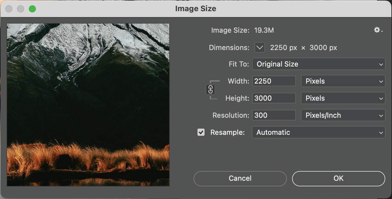
Image & File Resolution
Photographic Images
300dpi minimum - printing images with a lower dpi will result in blurry and pixelated images.
Logos/Icons/Graphics
Ideally these types of imagery should be in vector format. This allows it to be completely scalable and be enlarged infinitely with no loss of quality. Usual formats for these are EPS, AI, or PDF.
5 BASIC REQUIREMENTS
The resolution can be checked in Photoshop.
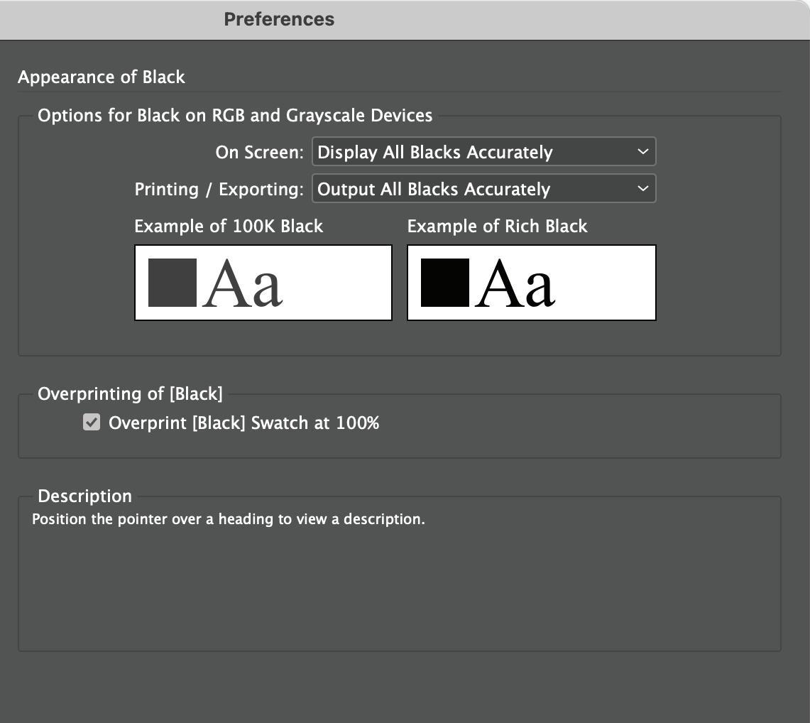
Black Inks
Large areas of black
Sometimes solid panels of black (C0 M0 Y0 K100) can look washed out or even dark grey in CMYK.
For large areas of black, we recommend that you set the colour to the following mix: C30 M30 Y30 K100, this will create a richer black.
Black text or thin black lines
For small areas of black and type, always use just K100, otherwise registration issues may occur when lining up multiple colours over one another on small text - resulting in blurry looking text.
Ensure your black settings in Adobe InDesign and Illustrator are set to [Output All Blacks Accurately] under Preferences > Appearance of Black.
On screen they may look the same, but printed the richer black will look stronger.
 C0 M0 Y0 K100 C30 M30 Y30 K100
6 BASIC REQUIREMENTS
Dielines & Other Non Printing Entities
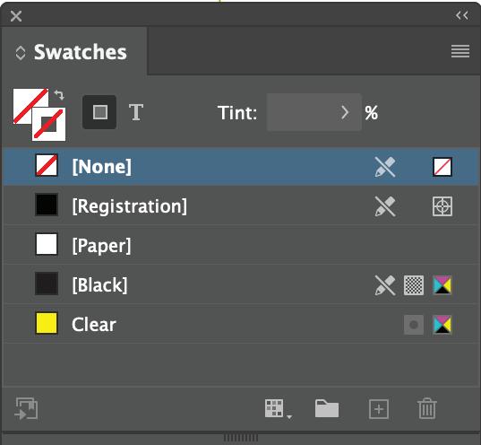
Dielines (Cut lines)
Our studio usually sets this up as a 100% cyan spot colour renamed as ‘Dieline’ or ‘Cut’ in the swatches and set to overprint.
Crease lines
Our studio usually sets this up as a green spot colour renamed as ‘Crease’ or ‘Fold’ in the swatches and set to overprint. This can also be shown as a dashed line in the stroke palette.
Clear / Overgloss
Our studio usually sets this up as a 100% magenta renamed as ‘Clear’ or ‘Overgloss’ (depending what coating you are using) in the swatches and set to overprint.
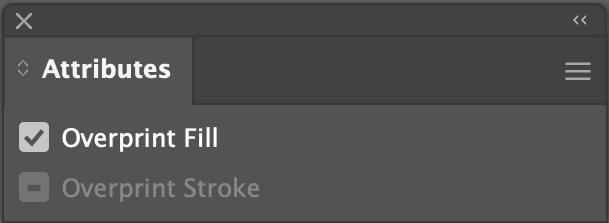
To turn overprinting on using InDesign go to Window > Output > Attributes and tick the Overprint Fill/Stroke.
To turn overprinting on using Illustrator go to Window > Attributes and tick the Overprint Fill/ Stroke.
Importance of overprint: When an object is set on overprint, it doesn’t knock out the image behind it, allowing us to turn the non printing entity off to print the artwork. When overprint has not been set, the non printing entity knocks out the image behind it causing it have missing artwork.

7 BASIC REQUIREMENTS
Booklets
Imposition
Supply your final file as a multi-paged PDF as single pages. Please do not supply your files imposed or as spreads. We will set up the imposition for printing.
Creep
For multi-paged saddle stitched jobs, please do not add creep. We will set up the creep during prepress.
Bleed
We require at least 3mm bleed set on file. For thicker booklets (80+ pages) 5mm bleed on the cover is preferred.
8 BASIC
REQUIREMENTS
Supported File Types
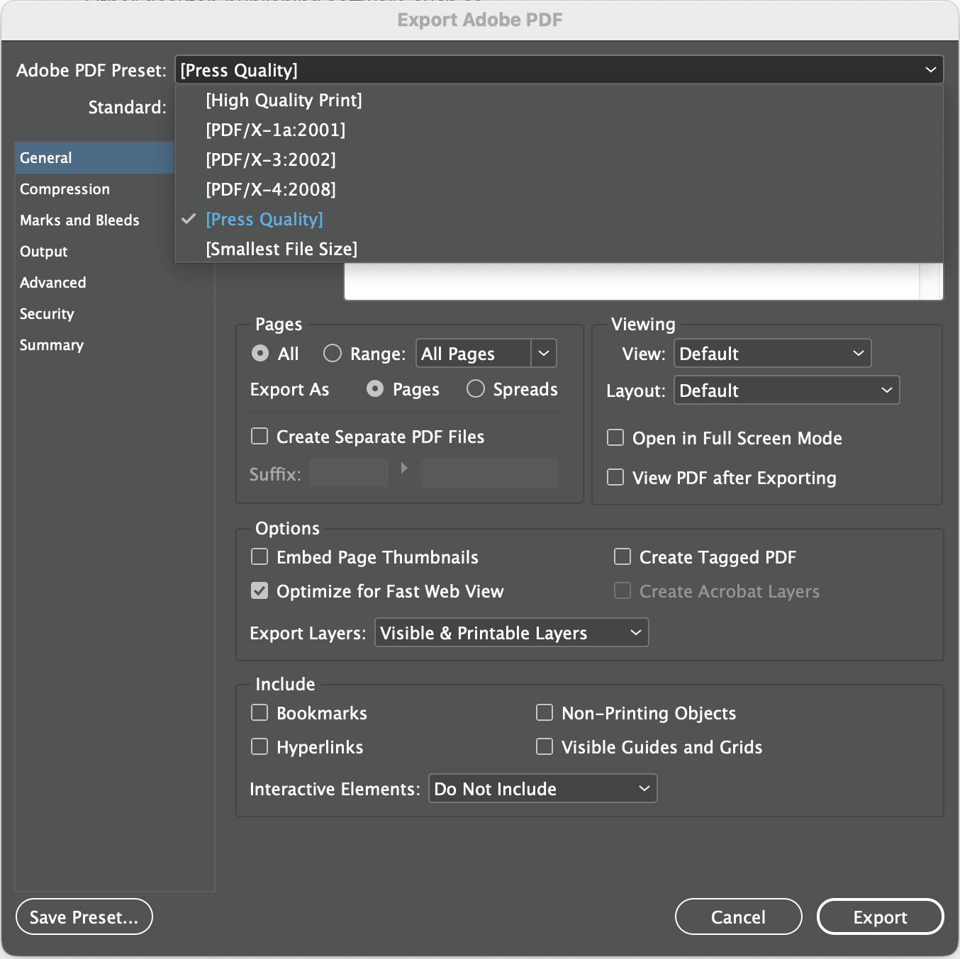
Our preferred file type is a Press Quality PDF
This can be saved from any of the industry standard graphics applications such as:
Adobe InDesign
Adobe Illustrator
Other desktop publishing software such as Microsoft Word may also have an option to save or export a PDF.
If the software you have created your artwork in can’t produce a PDF, then you may be able to save a ‘flattened’ graphics file such as a TIFF or JPG file for us to print from. If you are using this option, please ensure you have the artwork size set up at 100%, and save the files at 300dpi resolution.
Outlined files
Ideally your PDF should have the fonts outlined/ pathed. This will ensure there are no font issues that may be caused from fonts failing to embed. In InDesign and Illustrator, this can be done by selecting all text and using the ‘Type’ menu, select ‘Create Outlines’.
9 BASIC REQUIREMENTS
Sending Files
Files under 15MB
Artwork under 15MB can usually be emailed to your Account Manager.
Files over 15MB
For artwork files that are too large to email, you can courier or drop in the files on a USB.
Alternatively you can use our Sharefile service to upload your files, and inform your Account Manager.
You can upload to the Sharefile service here: https://gravitasmedia.sharefile.com/r-r55d73c38599486d9
Supplying open files
To avoid hold ups (i.e. file changes or colour adjustments), we recommend you also supply the working file with links and live fonts, as well as a outlined PDF file.
Use the ‘Package’ feature in InDesign and Illustrator.
For multiple files, ZIP your files before uploading.
10 BASIC REQUIREMENTS
Bleed, Crop Marks & Safe Areas
Bleed
For artwork that have colour printed to the edge of the page. Proper bleed area set up on all sides will prevent any white showing on the edge when the finished print is trimmed.
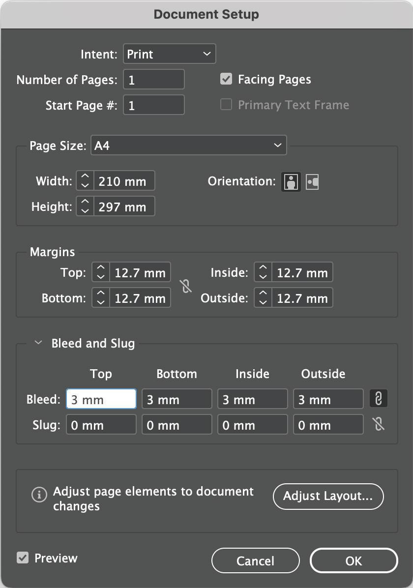
Standard bleed area: 3mm (for jobs under A3 size)
Extra bleed area: 5mm (for jobs A2 size or larger)
Safe Area
This is an area around all edges of an artwork that need to be clear of any crucial information or artwork.
Standard safe area: 3mm.
Crop Marks
These are lines that sit outside of the artwork and bleed areas to show us where the job will be trimmed. Auto generated cropmarks can be selected when exporting a PDF in InDesign or Illustrator.
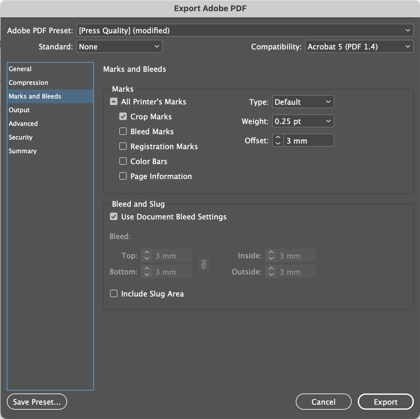
Make sure to change the default ‘offset’ value to the size of your bleed area (ie. 3mm), to ensure the cropmarks don’t intersect with your bleed area.
a
11 BASIC REQUIREMENTS
Bleed can be set up when initially creating
document, or under ‘Document Setup’.
Colour Settings for Offset
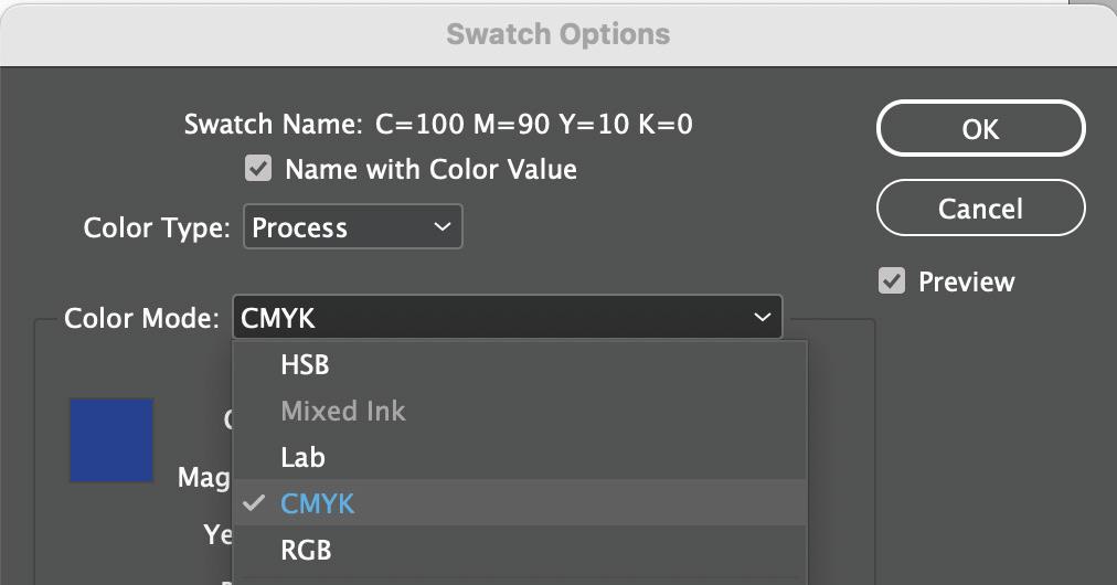
Colours
For Offset Printing, your file should be set up in CMYK or Spot.
Any RGB colours must be converted manually by you to CMYK or automatically when you export your PDF.
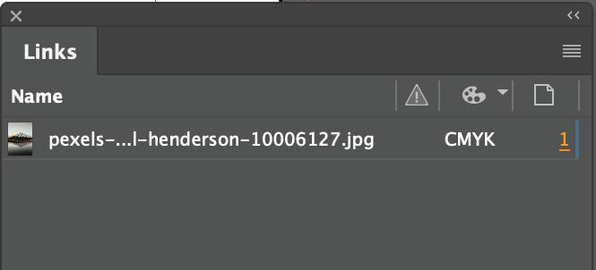
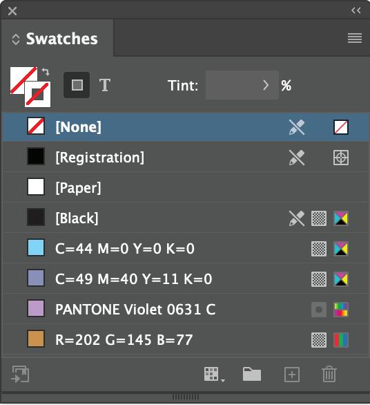
Checking your colour settings:
For photographic images - use the ‘Links’ Panel Options for a quick check through all your imagery. If any display RGB, open up the file in Photoshop and convert it to CMYK.
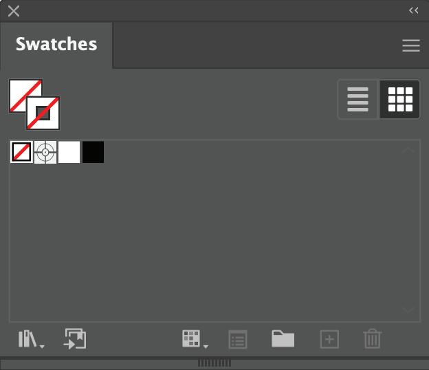
Colours within the file - check through your ‘Swatches’ Panel to ensure all colours are set up in CMYK or Spot. Icons that indicate the swatch used is RGB need to be edited by double- clicking on the colour.
12 BASIC REQUIREMENTS
Special Ink Set Up
13
White
Colour set up
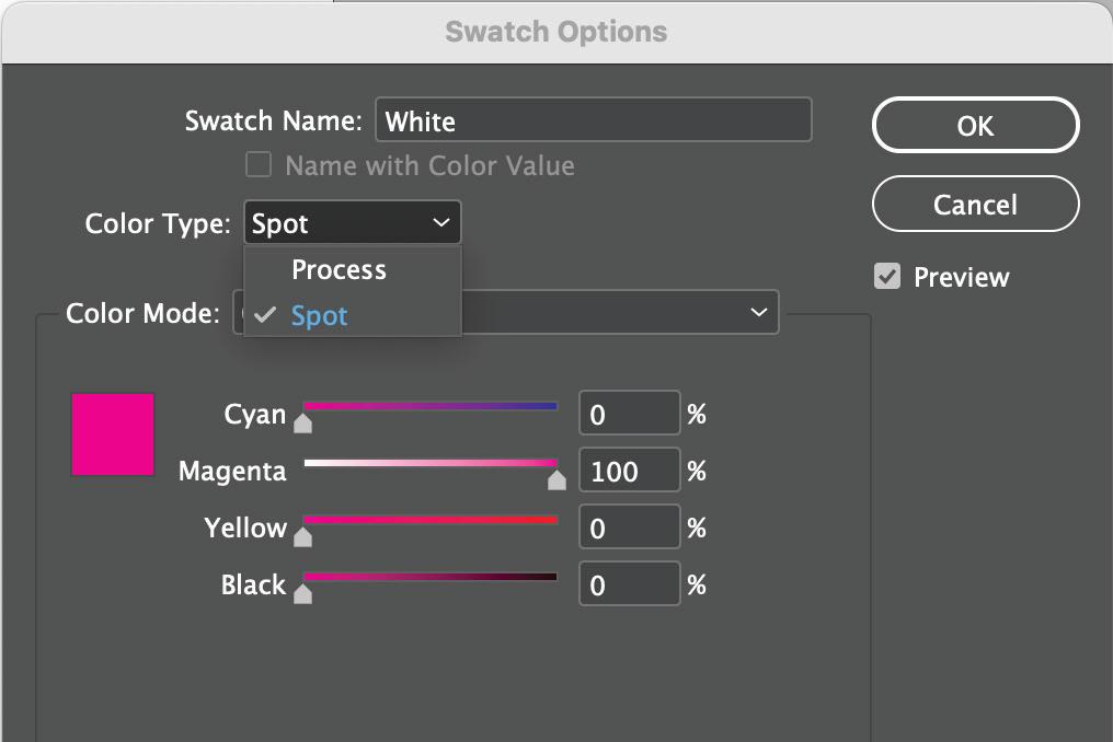
For White ink, your colour swatch should be set up as a spot colour.
Use a spot colour with 100% Magenta breakdown and rename to White with a capital ‘W’.
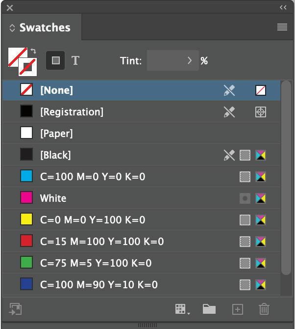
Colours within the file - check through your ‘Swatches’ Panel to ensure the white is set up as ‘White’.
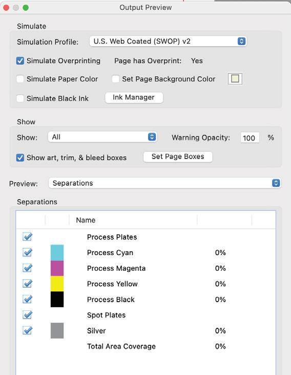
Check your spot colour is set up correctly. Open your Print Ready PDF in acrobat.
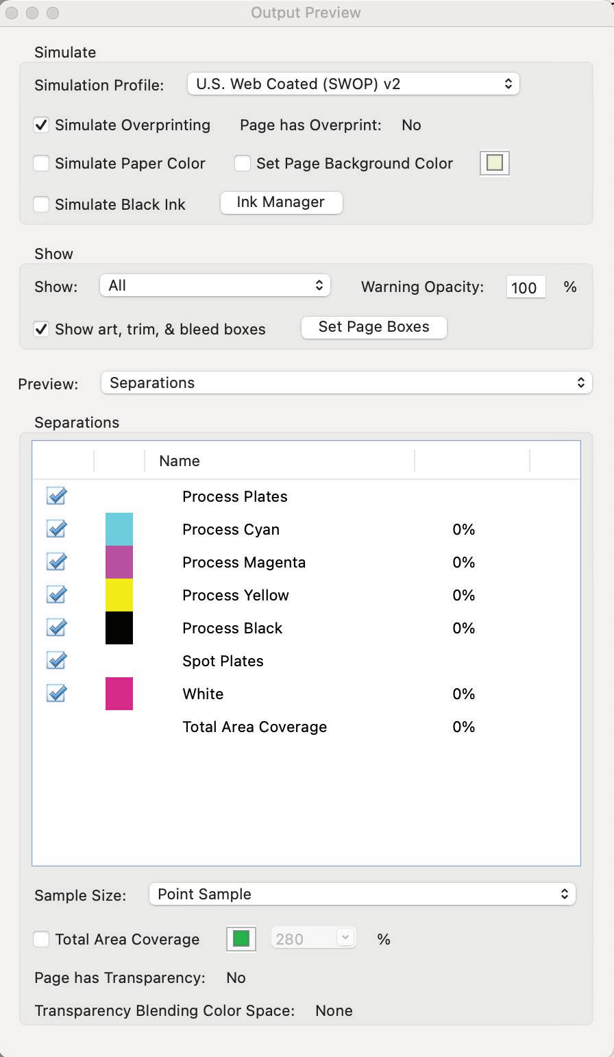
Open Output Preview window and check the separations. It should show CMYK, your White colour and any other Spot colours you have used.
Untick white and this colour will turn off in your PDF document so you can also check where ‘White’ is or isn’t in your file.
14 SPECIAL INK SET UP
Output Preview - Adobe Acrobat
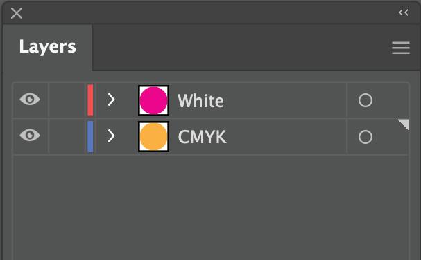
Underlay set up
White ink can be used as an underlay base coat for printing colour on dark media like black paper. In your working document, layers should be arranged so that all CMYK elements are underneath the white layer. The white layer should be applied on top with the containing elements using overprint attributes.
Overprinting attributes turned on is important, see page 7 for more information.
Check Overprint Fill - Attributes panel
The printer will read the file and automatically place down the white ink first and then the CMYK inks over top.
 White layer on top of the CMYK layer.
Paper
White Ink
CMYK
White layer on top of the CMYK layer.
Paper
White Ink
CMYK
15 SPECIAL INK SET UP
Clear
Colour set up
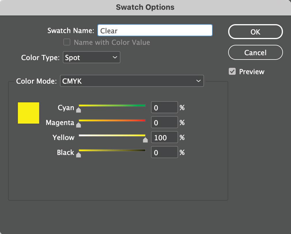
For Clear ink, your colour swatch should be set up as a spot colour as 100% Yellow and rename to Clear with a capital ‘C’.
Colours within the file - check through your ‘Swatches’ Panel to ensure the clear is set up as ‘Clear’.
Check your spot colour is set up correctly. Open your Print Ready PDF in acrobat.
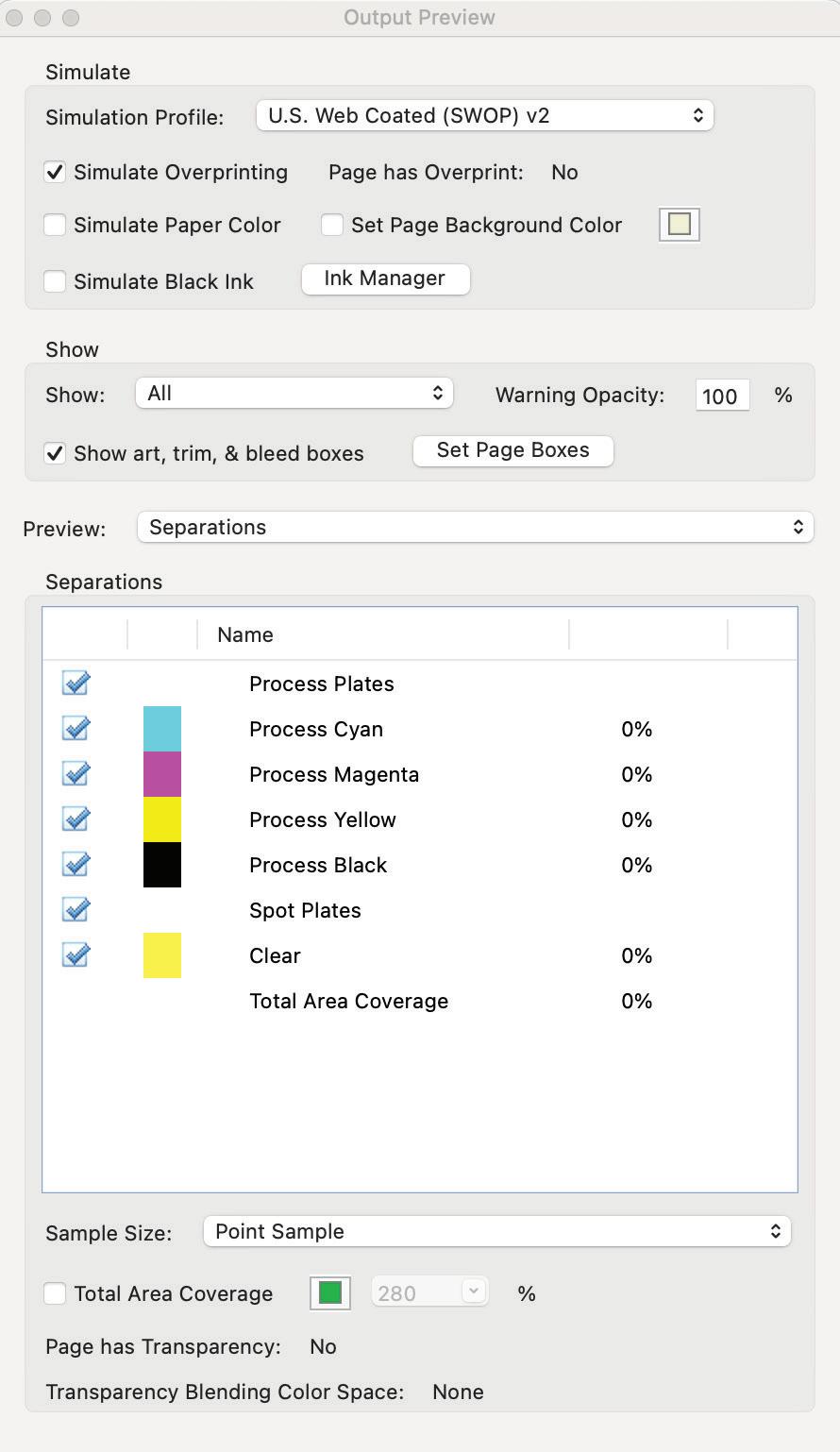
Open Output Preview window and check the separations. It should show CMYK, your clear colour and any other Spot colours you have used.
Untick clear and this colour will turn off in your PDF document so you can also check where ‘Clear’ is or isn’t in your file.
16 SPECIAL INK
Output Preview - Adobe Acrobat
SET UP
Overlay set up
Clear ink can be used as an overlay to create a gloss finish to elements giving a spot varnish look and feel. Flood an entire page for sheen or use spot application to make specific elements pop.
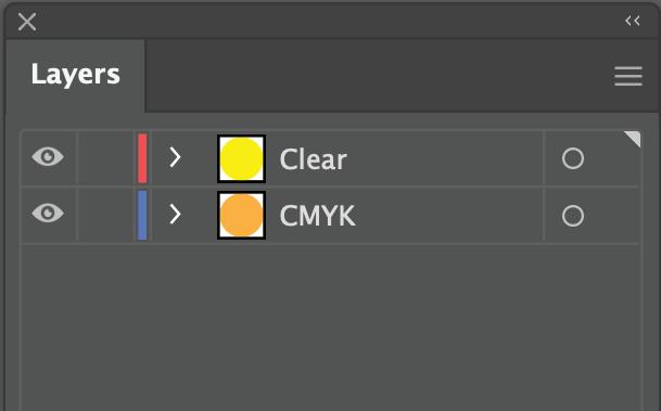
In your working document, layers should be arranged so that all CMYK elements are underneath the clear layer. The clear layer should be applied on top with the containing elements using overprint attributes.
Overprinting attributes turned on is important, see page 7 for more information.
Clear Ink
Paper
The printer will read the file and automatically place down the CMYK inks first and then apply the clear overgloss on top.
CMYK
Check Overprint Fill - Attributes panel
17 SPECIAL INK SET UP
Clear layer on top of the CMYK layer.
Gold and Silver
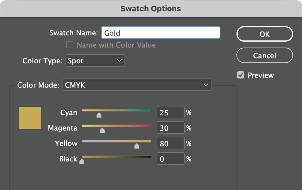
Colour set up
For Gold or Silver ink, your colour swatch should be set up as a spot colour with the following reccomended values and rename to ‘Gold’ or ‘Silver’ with a capital letter at the start:
Silver: C20 M10 Y10 K10
Gold: C25 M30 Y80 K0
These colour values don’t effect the output and are just for your visual reference only.
Colours within the file - check through your ‘Swatches’ Panel to ensure the Gold or Silver is set up and named correctly.
Check your spot colour is set up correctly. Open your Print Ready PDF in acrobat.
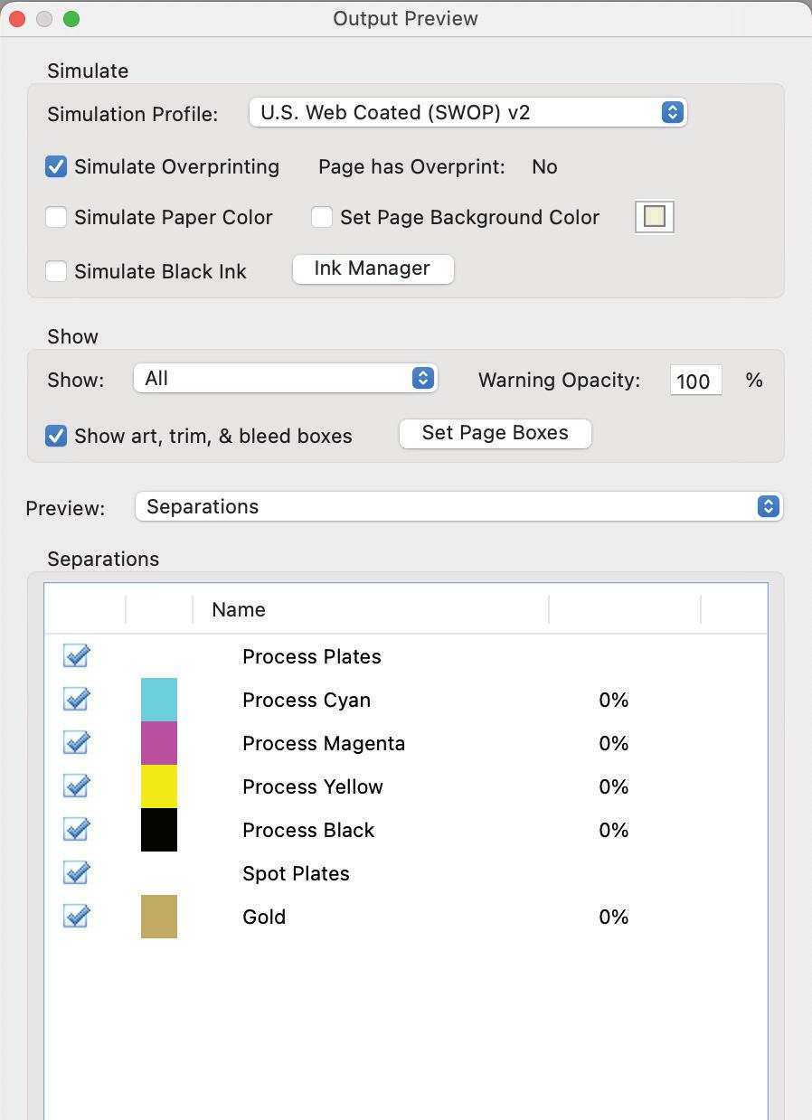
Open Output Preview window and check the separations. It should show CMYK, your Gold or Silver colour and any other Spot colours you have used.
Untick your Gold or Silver and this colour will turn off in your PDF document so you can also check where it is or isn’t in your file.
Output Preview - Adobe Acrobat 18 SPECIAL INK SET UP
Metallics
Metallic underlay (Gold or Silver)
When printing Gold or Silver as an underlay, a coloured metallic effect can be achieved. This is because the reflective ink (Gold or Silver) can be seen through the colour that is printed over top (CMYK).
Keep in mind: The more colour printed over top, the less reflective the metallic colour will be. This means for darker colours that require more ink coverage, it won’t appear reflective at all.
Set up
In your working document, layers should be arranged so that all CMYK elements are underneath the metallic layer. The metallic layer should be applied on top with the containing elements using overprint attributes.
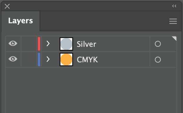
Overprinting attributes turned on is important, see page 7 for more information.
The printer will read the file and automatically place down the Silver or Gold ink first and then apply the CMYK ink on top.
Silver underlay is best for most lighter colours whereas a gold underlay is best for warm toned lighter colours.
Silver
CMYK Paper
Check Overprint Fill - Attributes panel
19 SPECIAL INK SET UP
Silver layer on top of the CMYK layer.
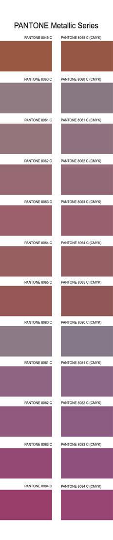
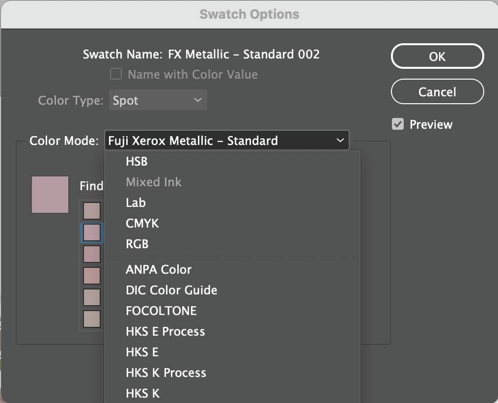
Metallic Swatches
Highly reflective metallic colours can easily be achieved by using pre-made metallic swatches from libraries such as:
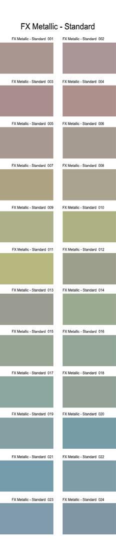
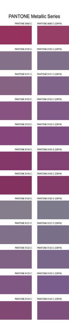
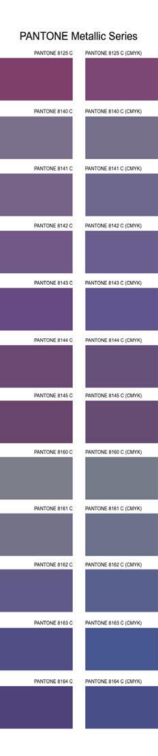
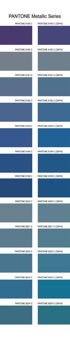
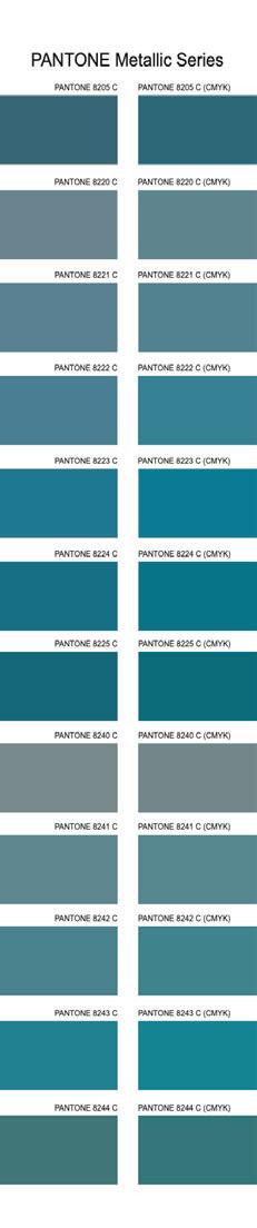
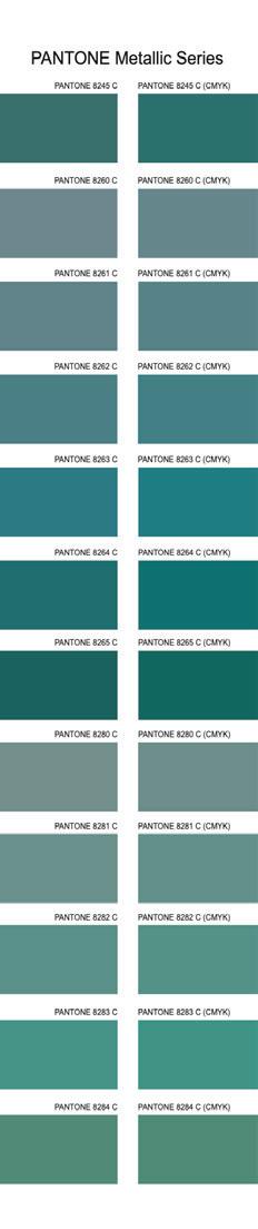
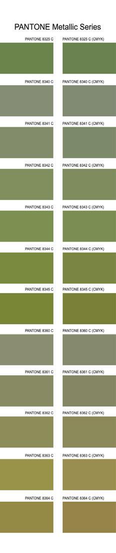
Pantone® Metallics Coated
Pantone® Premium Metallics Coated
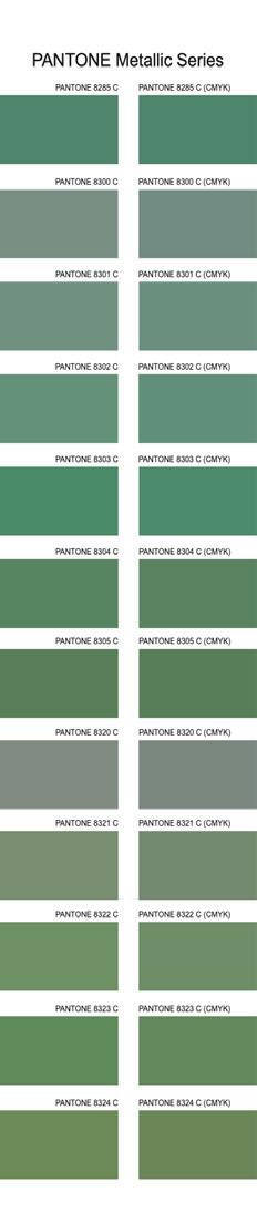
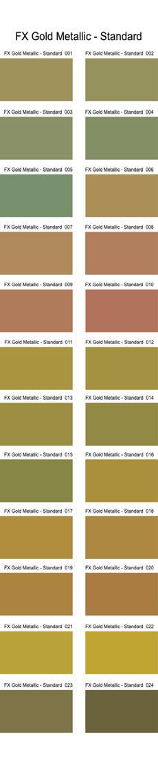
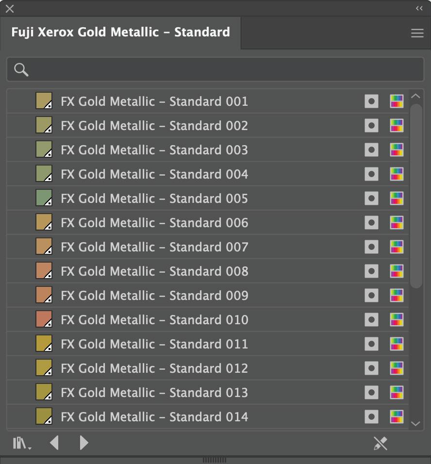
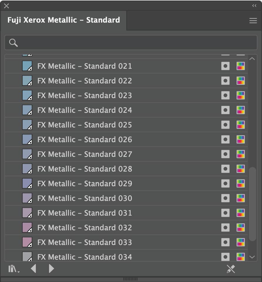
FX Metallic Standard
FX Gold Metallic Standard
The FX Metallic swatch libraries are not pre-loaded on need to be installed to your Adobe programs. Contact us for a supply of these swatch libraries as well as a physical copy of our metallic swatch book.
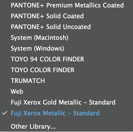
Installing FX Metallic Libraries
We can supply you the swatch library files for you to install called; ‘Fuji Xerox Metallic - Standard.ase’ and ‘Fuji Xerox Gold Metallic - Standard.ase’.

To install from Indesign:
In the swatches drop down menu click on Load Swatches... This will open a window to your files where you can click the .ase files you’ve been given and click open. They will now be accessable when choosing a spot colour.
To install from Illustrator: Go to Window > Swatch Libraries > Other Library...
This will prompt the same pop up window to allow you to select the supplied .ase files. Once installed you can find both libraries in the swatches drop down menu.
20 SPECIAL INK SET UP
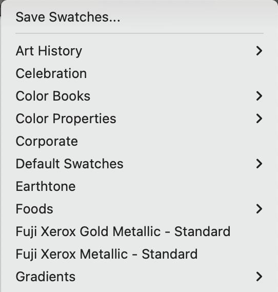
Pantone® Metallics Coated and Premium Metallics Coated swatch libraries are already installed on Adobe programs.
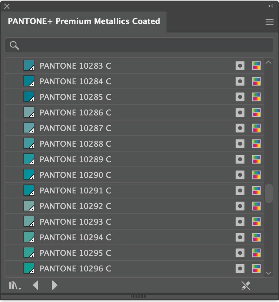
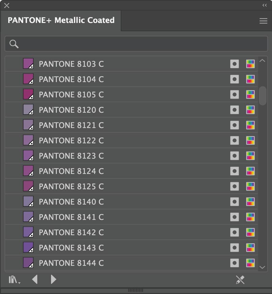
To access go to Open Swatch Library > Colour Books from the swatches drop down menu.
21 SPECIAL INK SET UP
Metallic Images
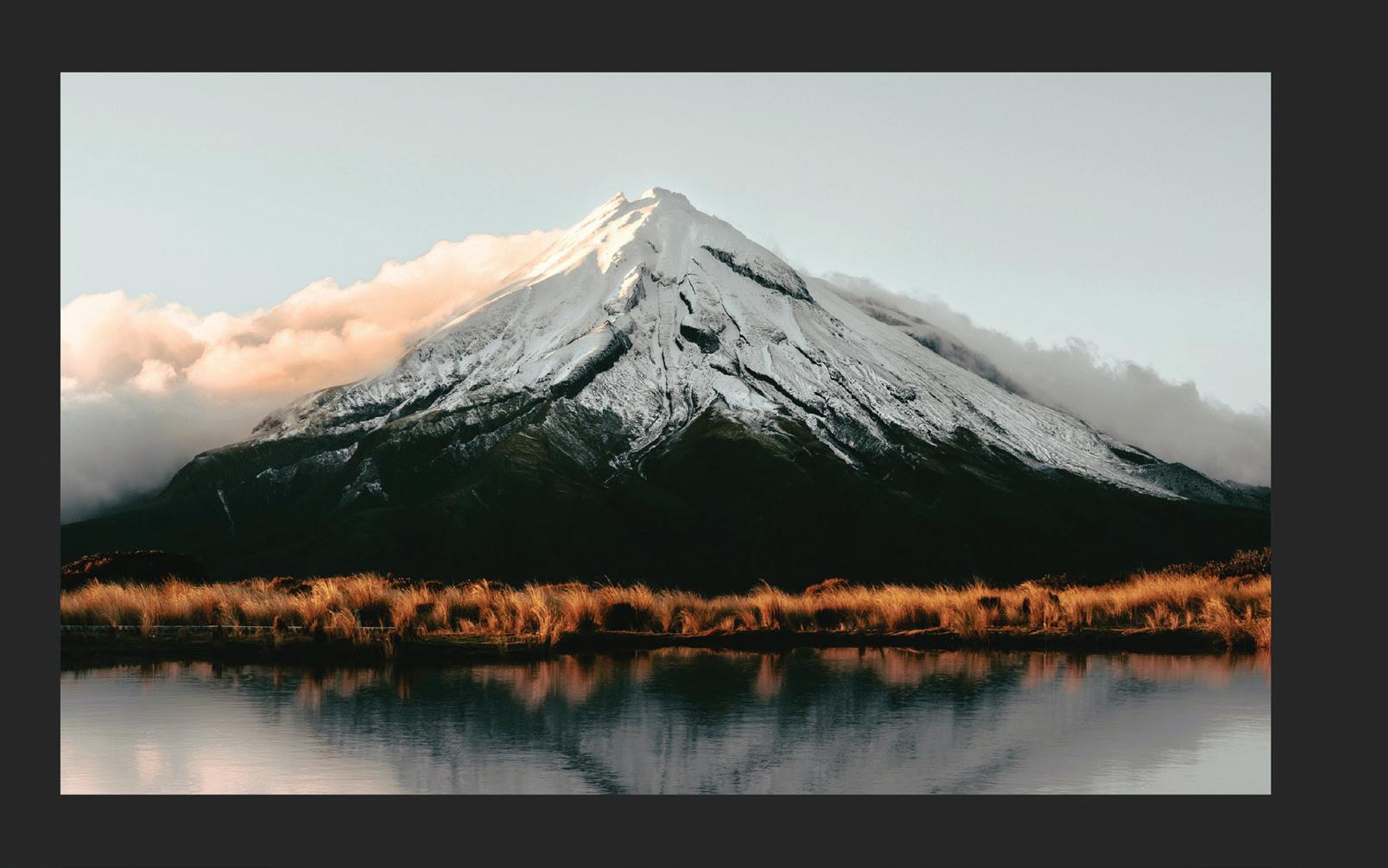
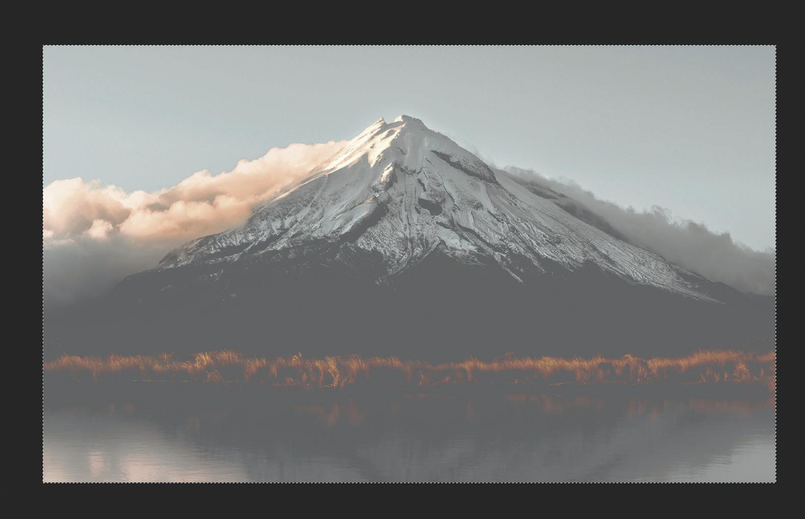
You can set up an underlay of silver for your images to achieve a metallic effect.

Using a solid box of 100% Silver will work but because silver ink is essentially a grey colour it can make your image look extremely dull and flat. The trick is to create a mask for the silver layer which reduces the amount of silver used in areas of high density (darker areas).
Here’s a step by step guide on how to set up a silver underlay for your image:
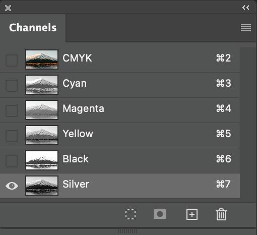
1. Open your image in Photoshop. From the Channel drop down menu, select New Spot Channel and name it Silver (with a capital ‘s’). For visual reference, make the colour 20C 10M 10Y 10K and Solidity 40% then select OK.
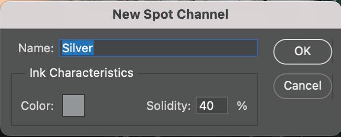
Note: Solidity and colour values entered here will not affect output colour. These are for onscreen visual reference only.
22 SPECIAL INK SET UP
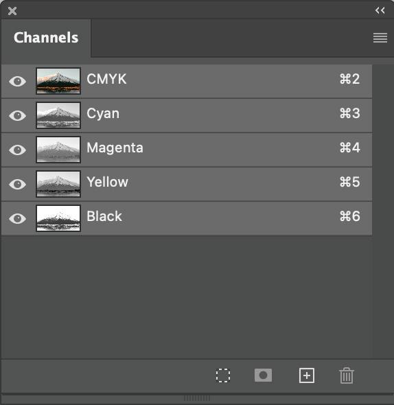
2. Click on the CMYK channel then select all (Command/Control A). This should show marching ants around your image. Copy (Command/Control C) then paste into the Silver channel.
3. De-select the CMYK channels from view. You should now see a mono version of your image.
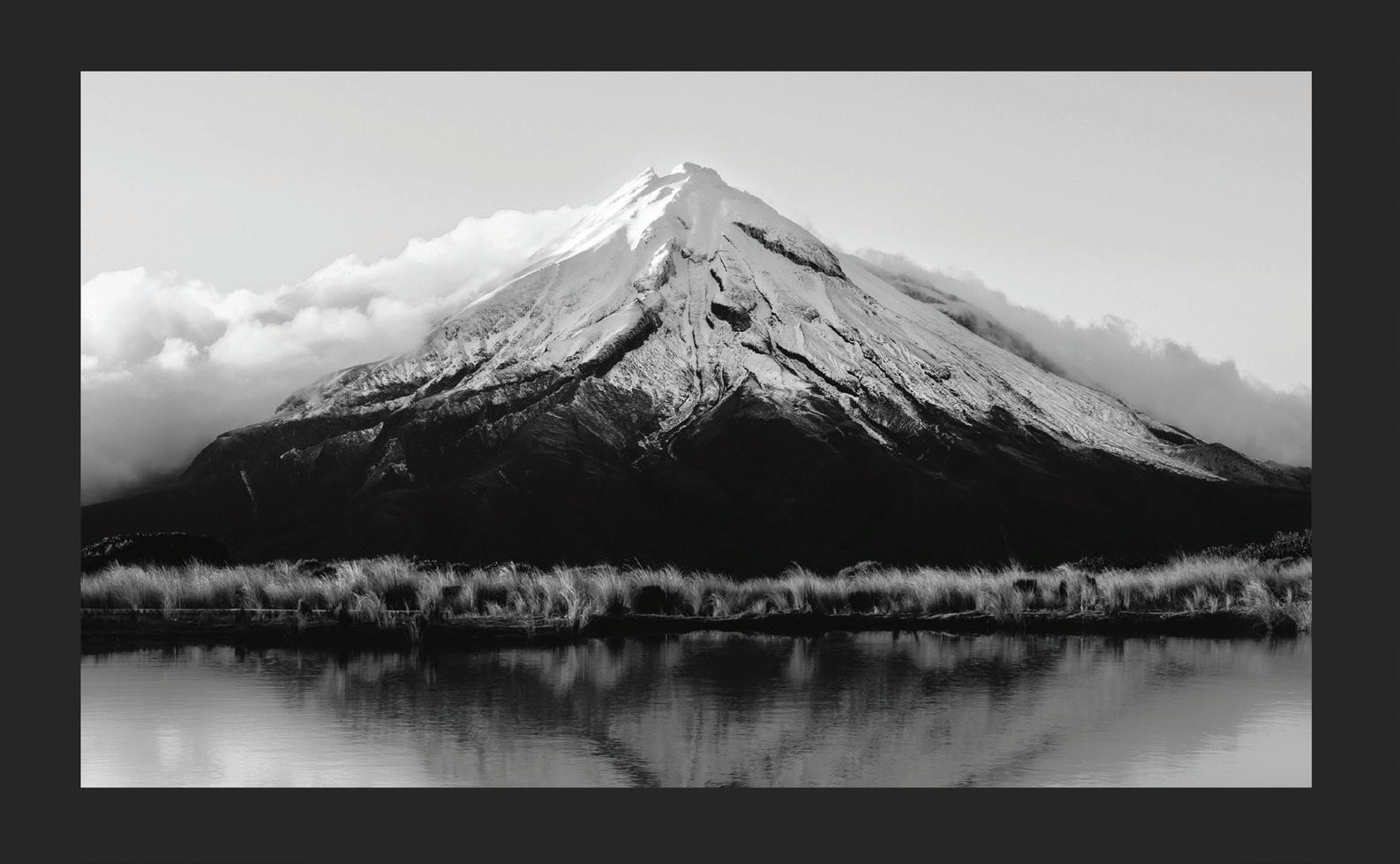
23 SPECIAL INK SET UP
4. Open the curves Window, go Image > Adjustments > Curves
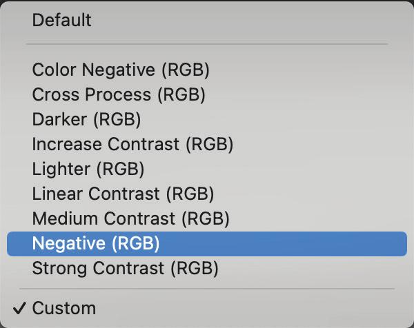
5. Select negative (RGB) curve from the pre-sets and adjust the input and output values as required.
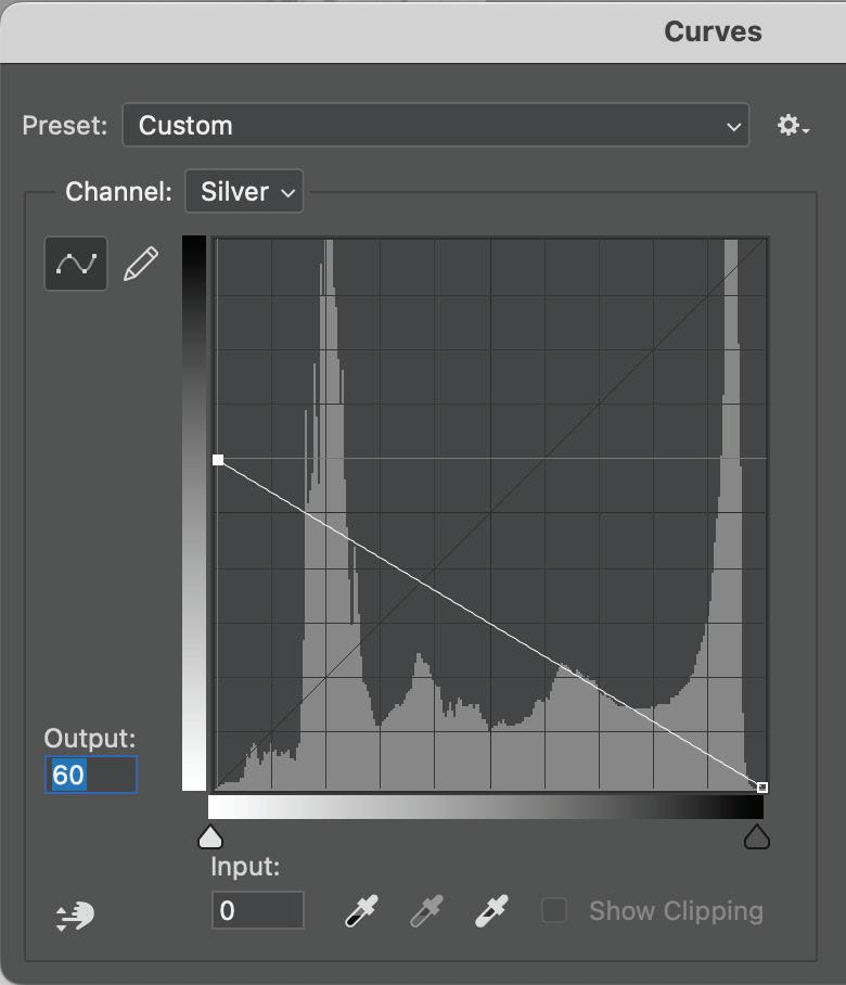
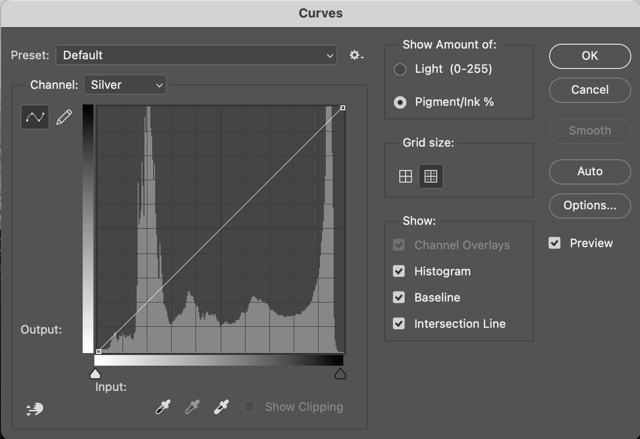
As a starting point, change the output to 60 and leave the input on 0. A press proof is reccomended for evaluation.
24 SPECIAL INK SET UP
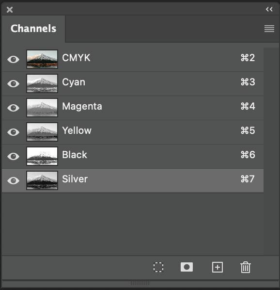
6. Turn on CMYK Channel visibility to view the result. Note - Onscreen view may appear flat or muddy. This is normal.
Save the image as a psd or TIFF.
7. Check your file once you’ve exported to PDF and use Adobe Acrobat to check that the silver underlay has been set up. Open Output Preview window and check the separations. It should show CMYK and the silver spot colour in your image. Done!
25 SPECIAL INK SET UP
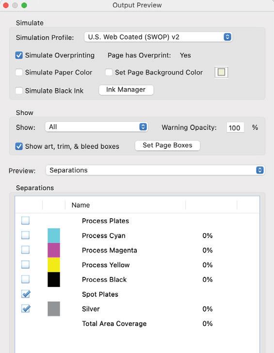
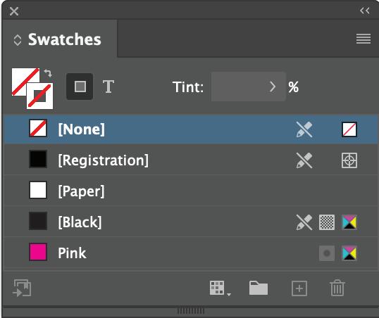
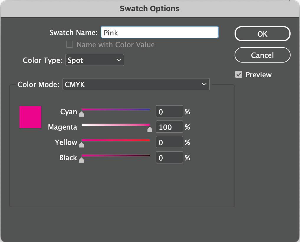
Fluro Pink
Colour set up
For Pink ink, your colour swatch should be set up as a spot colour as 100% Magenta and rename to Pink with a capital ‘P’.
Colours within the file - check through your ‘Swatches’ Panel to ensure the pink is set up as ‘Pink’.
Check your spot colour is set up correctly. Open your Print Ready PDF in acrobat.
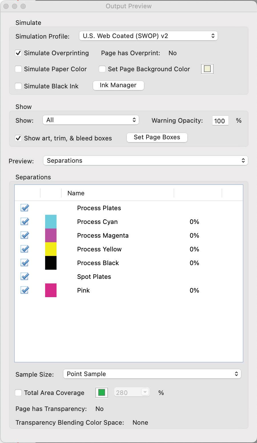
Open Output Preview window and check the separations. It should show CMYK, your pink colour and any other Spot colours you have used.
Untick pink and this colour will turn off in your PDF document so you can also check where ‘Pink’ is or isn’t in your file.
26 SPECIAL
Output Preview - Adobe Acrobat
INK SET UP
Pantone® Swatches
We can use fluro pink ink to expand the colour gamut and hit vibrant reds, purples, pinks and oranges.
It’s as easy as setting up your file with a Pantone® colour, the press will automatically add fluro pink ink to CMYK to match as close as it can to the chosen Pantone® swatch.
Here are some Pantone® colour libraries that contain pinks, oranges, reds and purples which can be achieved with our fluro pink ink:
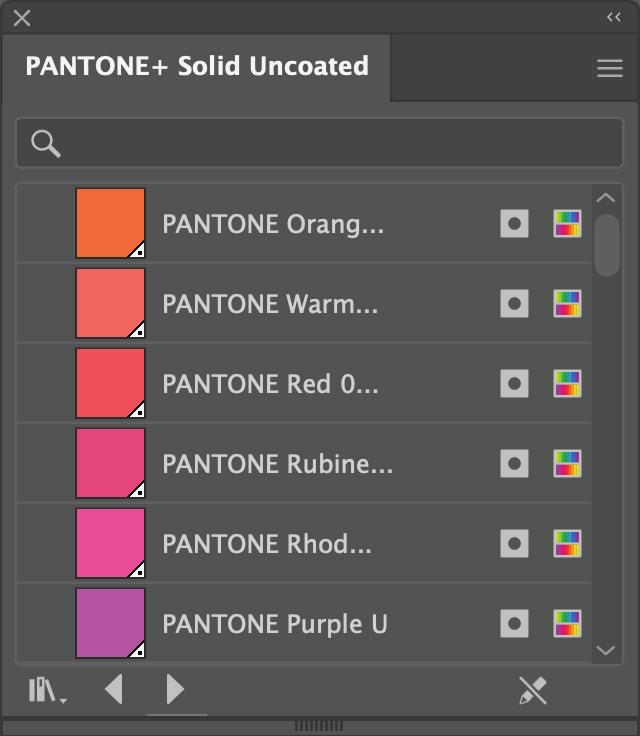
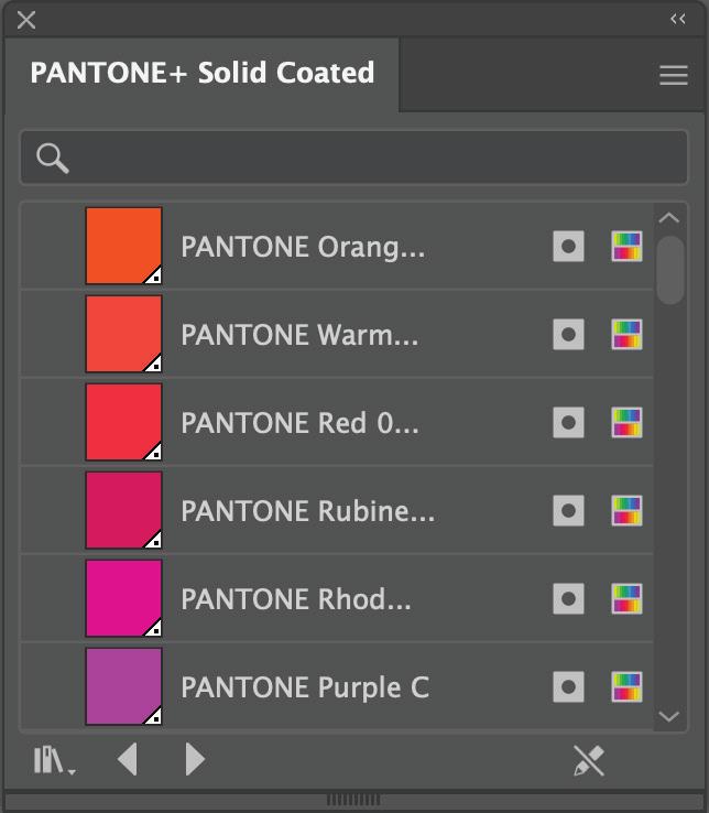
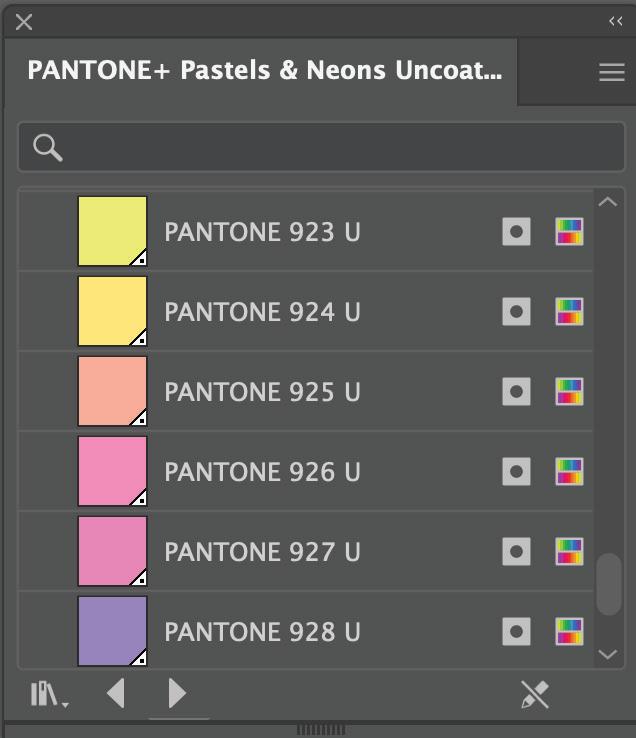
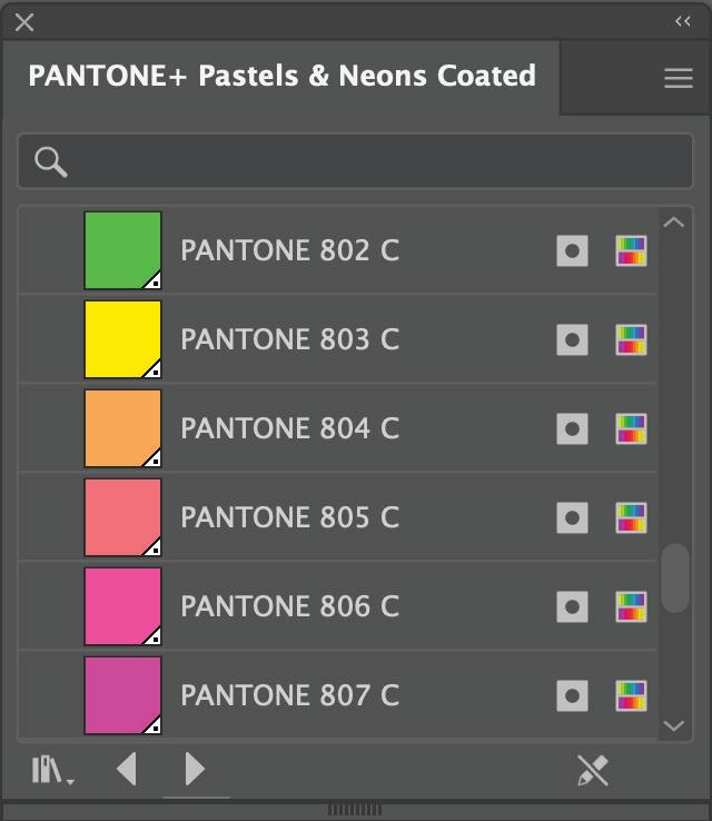
Pantone® Solid Coated/ Uncoated
Pantone® Pastels & Neons Coated/ Uncoated
27 SPECIAL INK SET UP
File Supply Checklist
Check your PDF before sending to the printer
Open your PDF in Adobe Acrobat. PDF files can be quickly checked using the Output Preview tool in Adobe Acrobat. The properties of your page elements can be inspected to find the colour space, resolution, graphics, ink levels, etc.
Checklist:
☐ Colours
CMYK, Pantone Spots, Specialty inks
☐ Size Page/artboard size is correct
☐ Bleed and cropmarks set up correctly
☐ Images are high resolution and are CMYK
☐ Dielines and crease lines are using a spot colour
☐ PDF has been exported as a Press Quality PDF file type
☐ Large files
Large files have been uploaded to our sharefile system: https://gravitasmedia.sharefile.com/r-r55d73c38599486d9
28 CHECKLIST
WWW.PCLGROUP.CO.NZ 0800 505 788
