ARTS 3650 TYPOGRAPHY
By Paula Corrales Marco

VIEW

By Paula Corrales Marco
VIEW
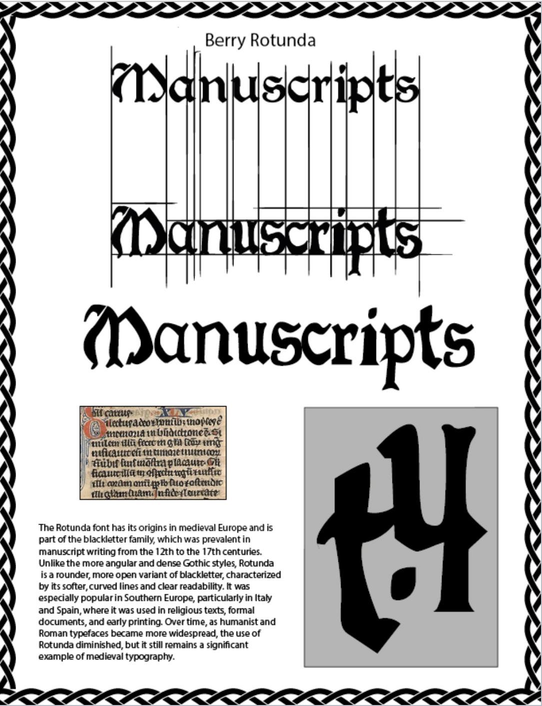
The first word is using the real font, Berry Rotunda. The second word is my tracing. Finally, a symbol using my lettering.
The first word represents my tracing using the pen tool in Adobe Illustrator. The second word is my drawing in Adobe Photoshop.

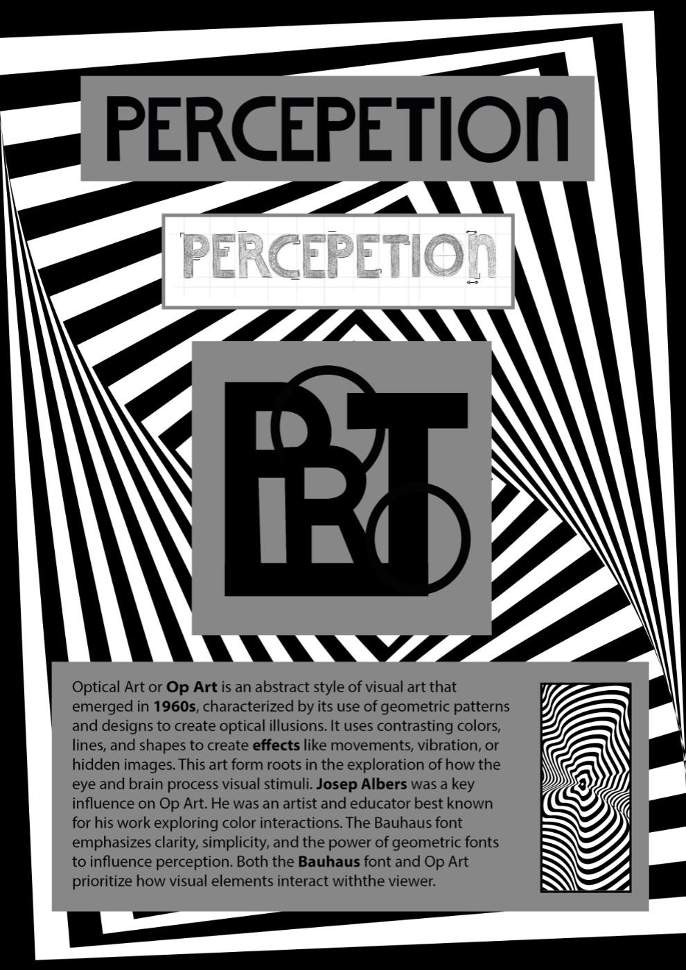
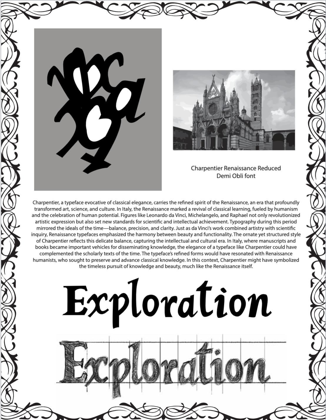
For this project, I did my background in Adobe Illustrator. In the middle, I created a symbol using my drawing.

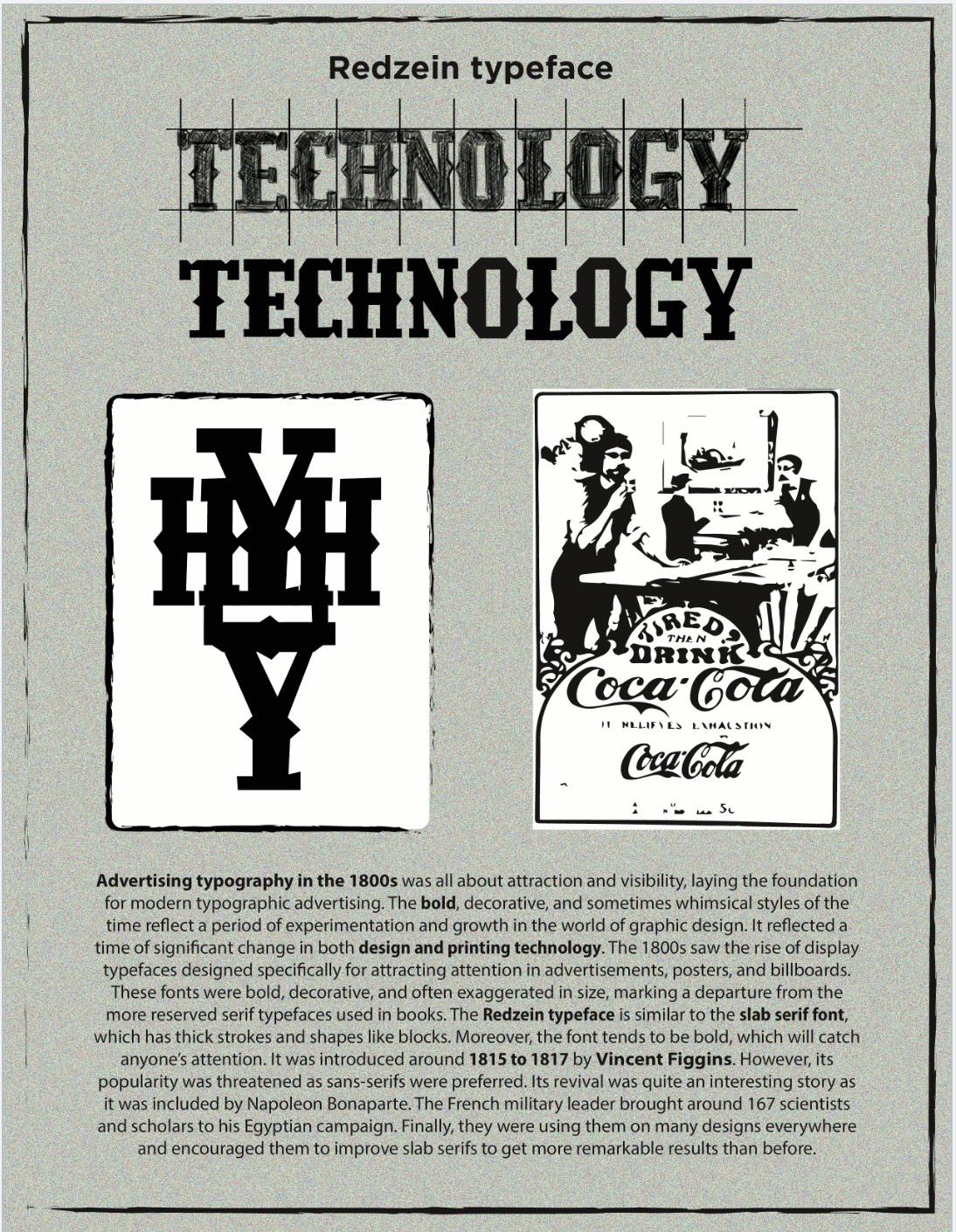
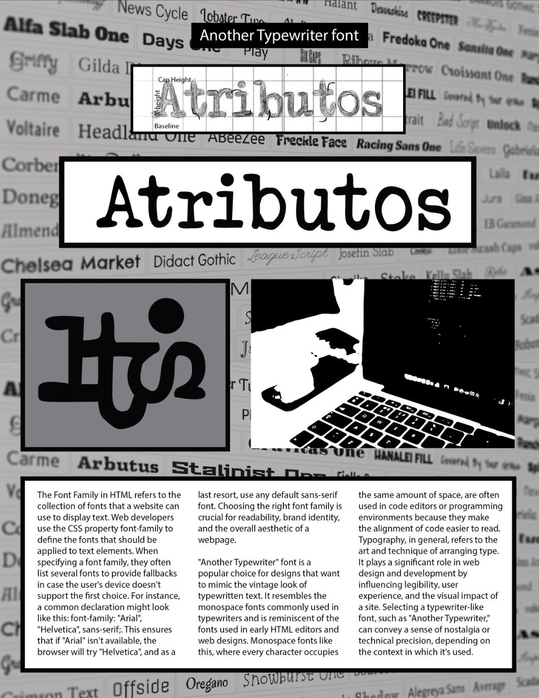
I started drawing the word technology, having the reference of the Redzein font. Then, I traced my drawing. Finally, I made a symbol.
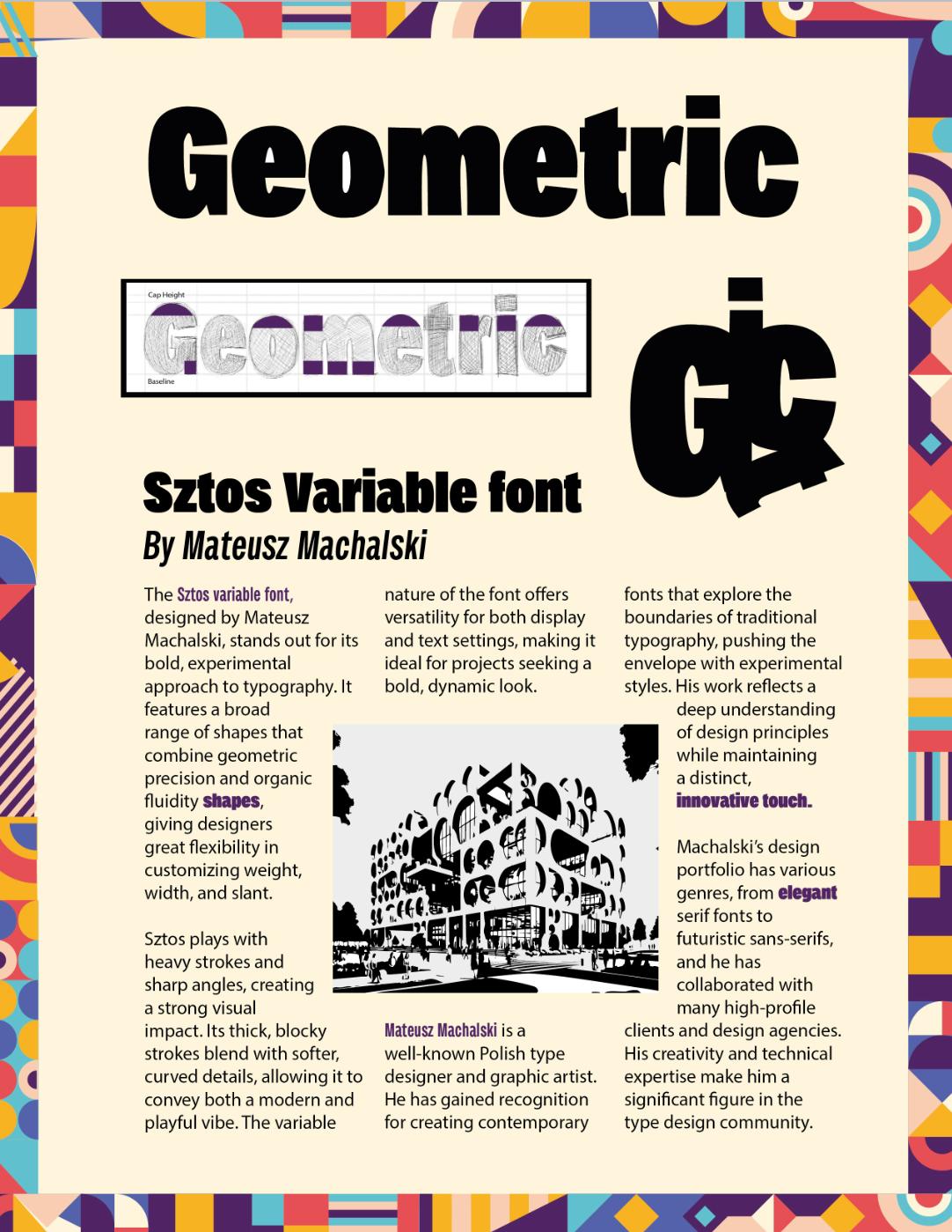
The Swiss design Style/International Typographic Style
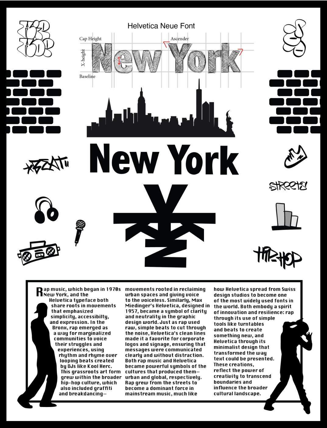
I did my background in Adobe Illustrator. In the middle, I created a symbol using my drawing. I used the Helvetica font reference for my drawing
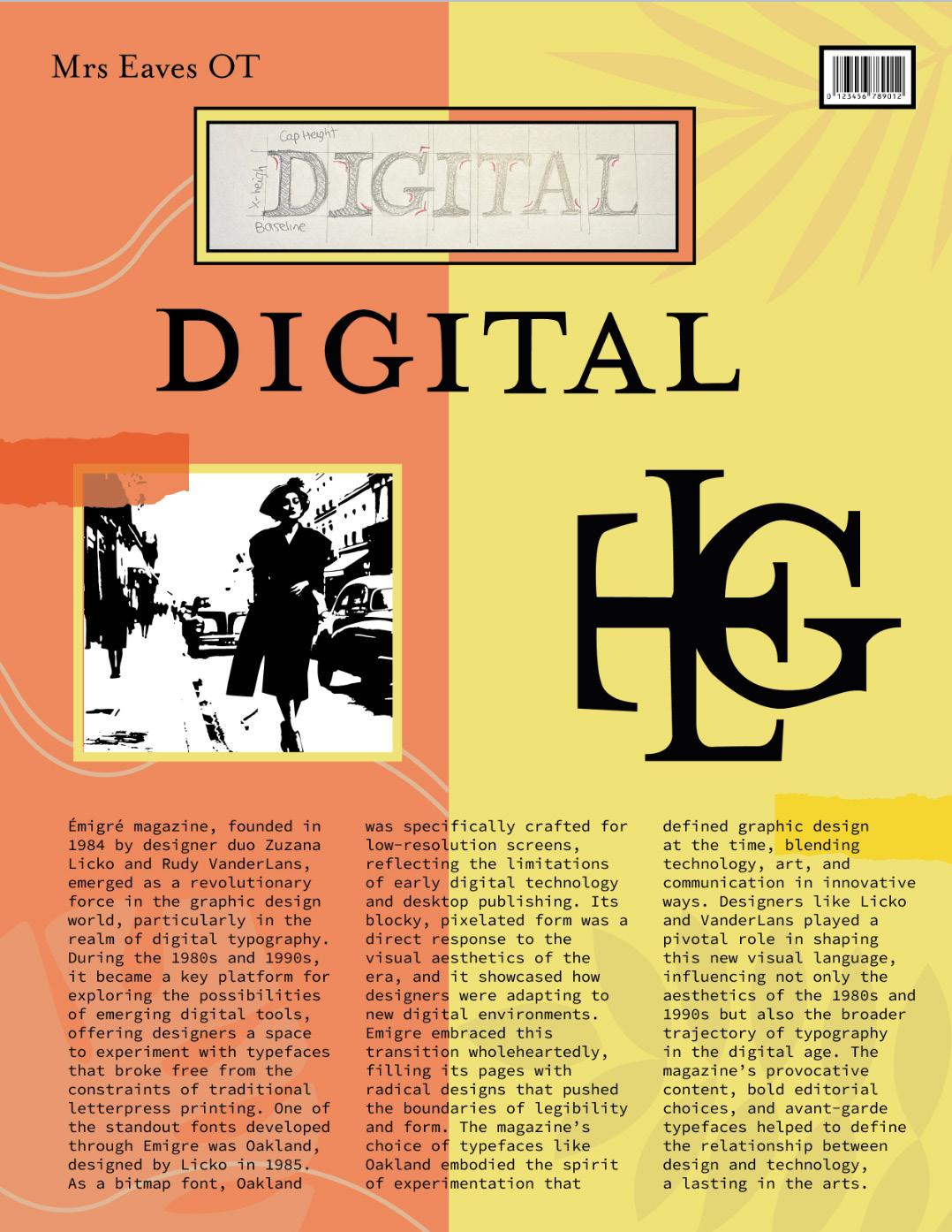
I started drawing the word digital. Then I traced my drawing using the pen tool. Finally, I created a symbol and a background.
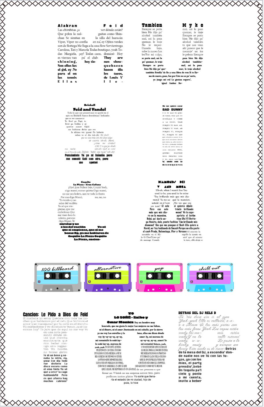
For this project, I made the same steps as before. For the information added, I created three columns and adjusted the page.
I created a frame in Illustrator using shapes. Then, I drew my word and traced it using the pen tool. Finally, I made the symbol.
In this assignment, the goal was creating a word with text inside. This text needed to have different styles and fonts.
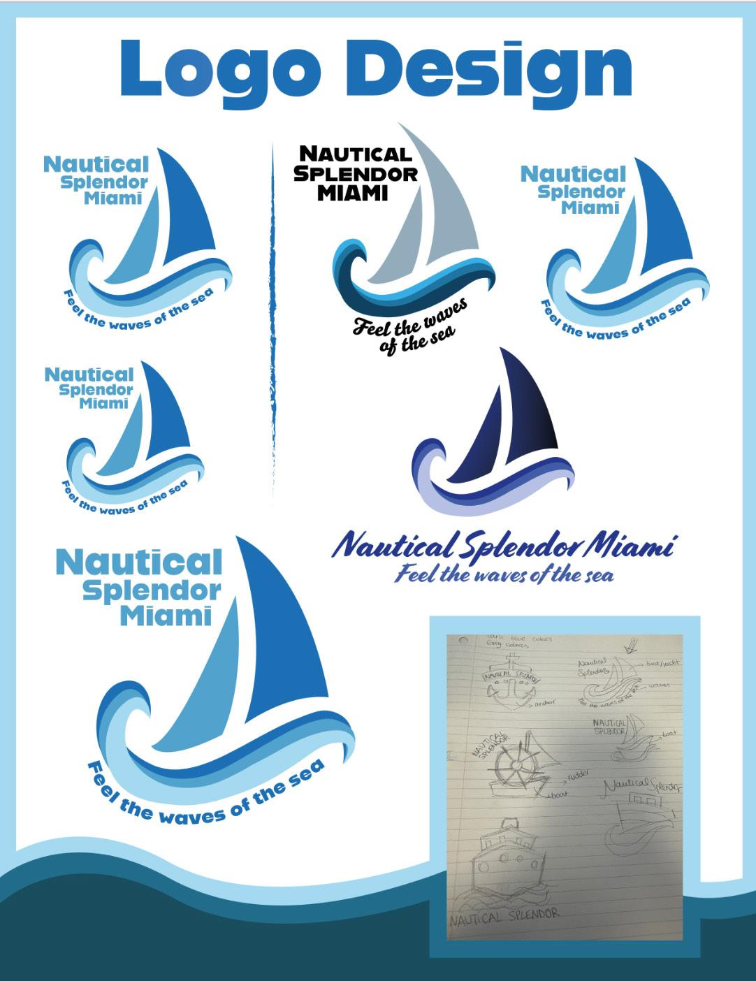
For this project, the goal was inventing a brand. Mine was Nautical Splendor Miami. We needed to create a logo with different colors and sizes.
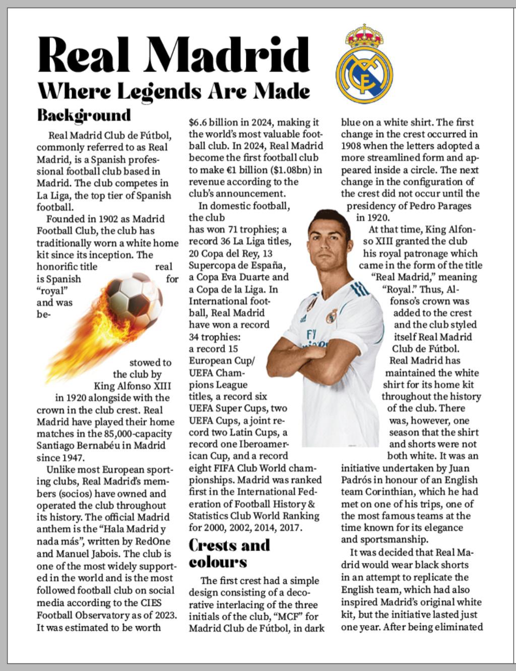
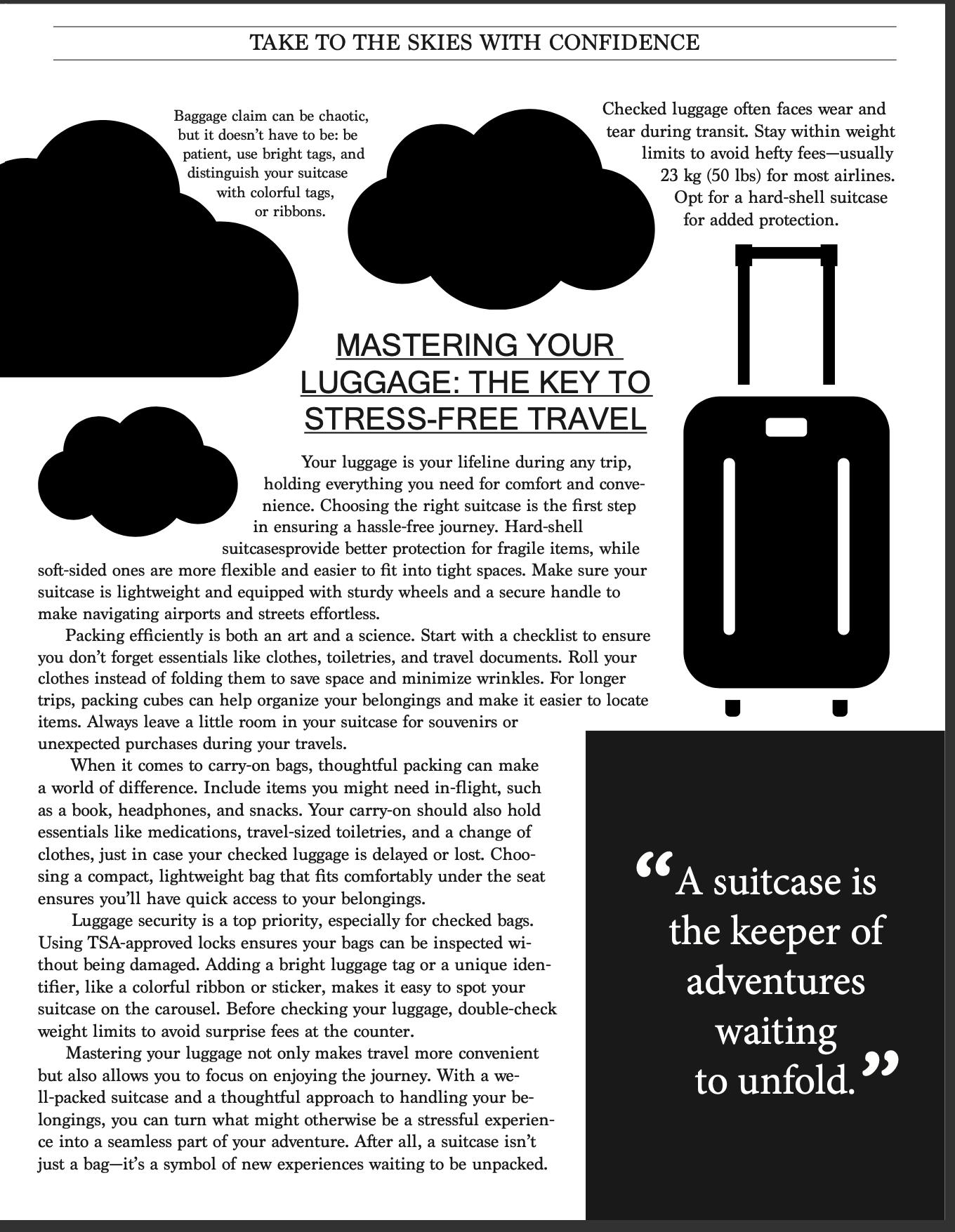
For this project, I created two pages for a magazine. I used different fonts and I wrapped some images to make it look creative.
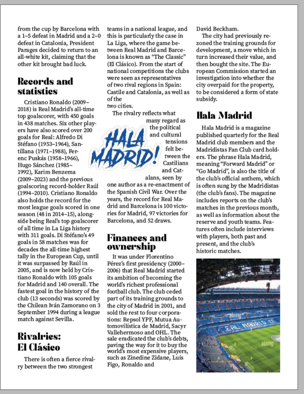
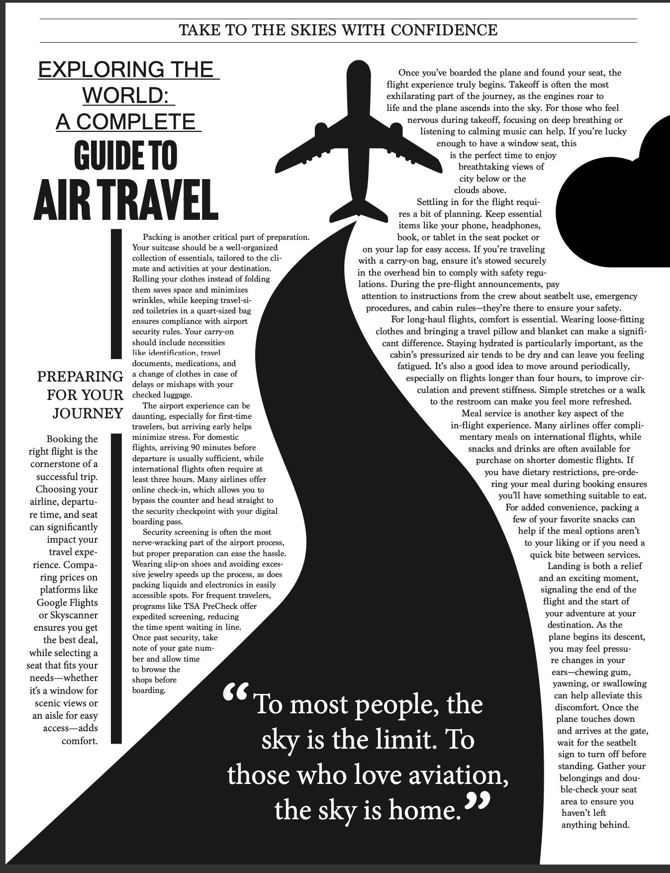
For this project, I created two pages for a magazine. I used different fonts and I wrapped some images to make it look creative and original.