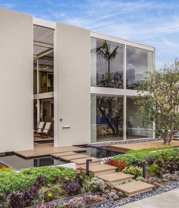
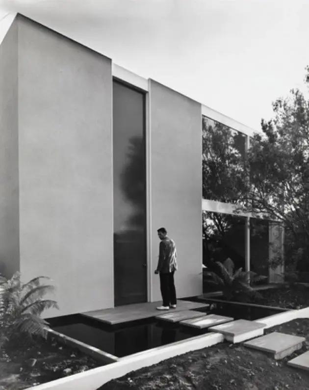
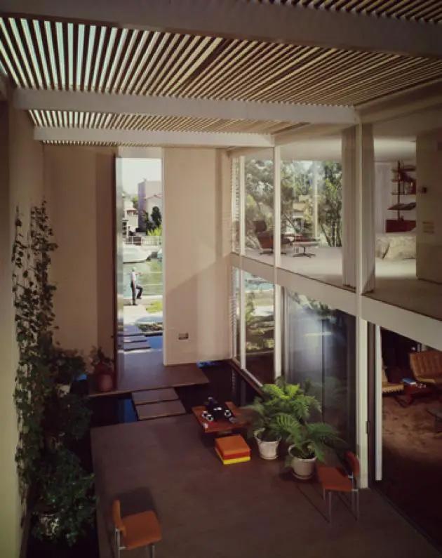
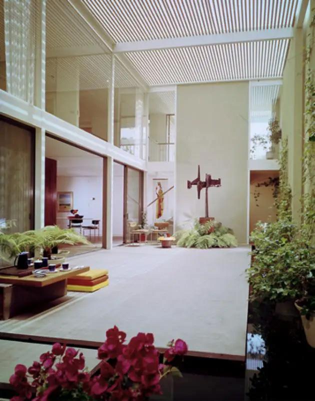
CASE STUDY HOUSE #25: THE FRANK HOUSE
Status: Built
Year: 1962
Location: Long Beach, CA
Architect/s: Killingworth, Brady & Smith
Site: 2BD/ 3BA
Area: 2,000 sq. ft
-The main entrance conisists of a 17 foot high front doorway.
-Consists of a living room, a utility room, a dining room, a kitchen, three bathrooms, & 3 bedrooms.
-Frank believed most of his visitors would be arriving by boat, so the architects situated the main entrance of the house on the canal face of the structure.
- The house is double the height of most other houses in the area.
-At first glance the exterior of the house could seem very unassuming.
-The interior of the house presents a closed facade to its exterior while intelligently creating its own sense of luxorious space within.
-Considered one of the most urban case studies.
-Interior light comes from slats in the roof over the two-story atrium, flashed by glass-walled living areas.
-The living room and master bedroom are situated in a way that enables their inhabitants to take full advantage of the view of the canal while another of the rooms serves a dual capacity as a study and a bedroom for guests.
PROJECT 02
Spatial Assemblies
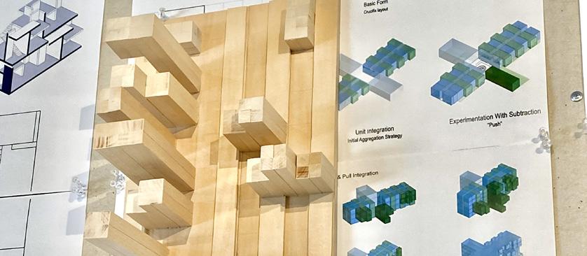
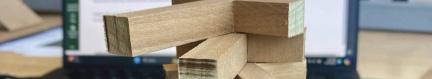
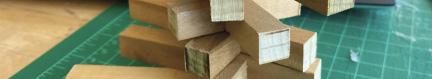
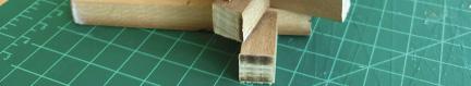
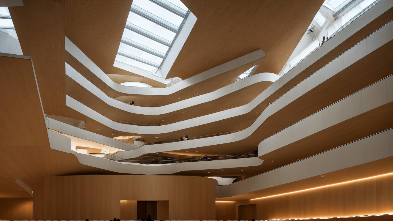
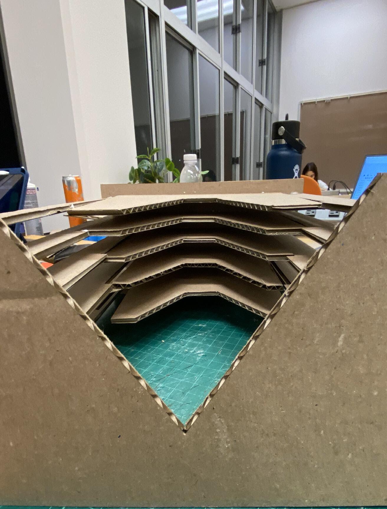
Isometric Project 02 spanned for about 2-3 weeks and this was our experimental phase. During this time I was exploring different architectural methods of aggregation like stacking, push & pull, and rotation. On this section, none of the work was finalized just yet but rather were a work in progress towards our final design.
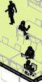
STUDY MODEL: STACKING & SHIFTING
VIEW
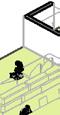
STUDY MODEL: ROTATING
VIEW
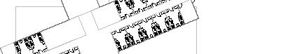
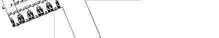
ISOMETRIC, ELEVATION, PLAN VIEWS ISOMETRIC, ELEVATION, PLAN VIEWS
First iteration, although interesting to view at, it was not as affective as an aggregation unit.
This is the second iteration that didn’t make it to the next step of the design process.
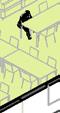
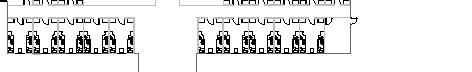
Plan View
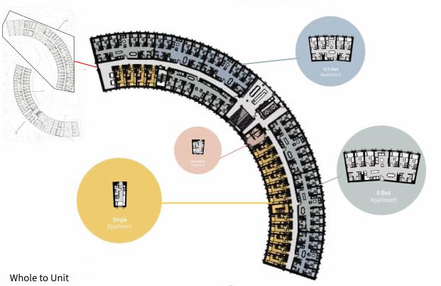
Initial unit-to-whole aggregation strategy.
PROJECT 03
Site Analysis
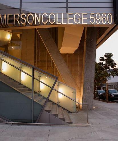
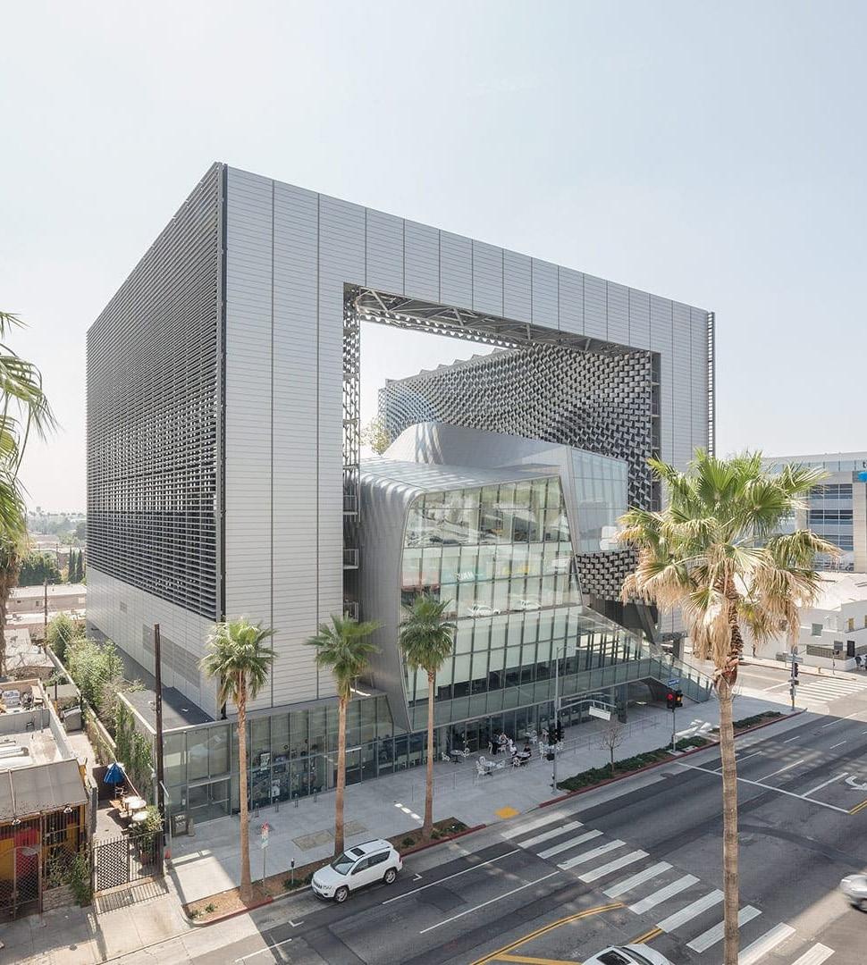
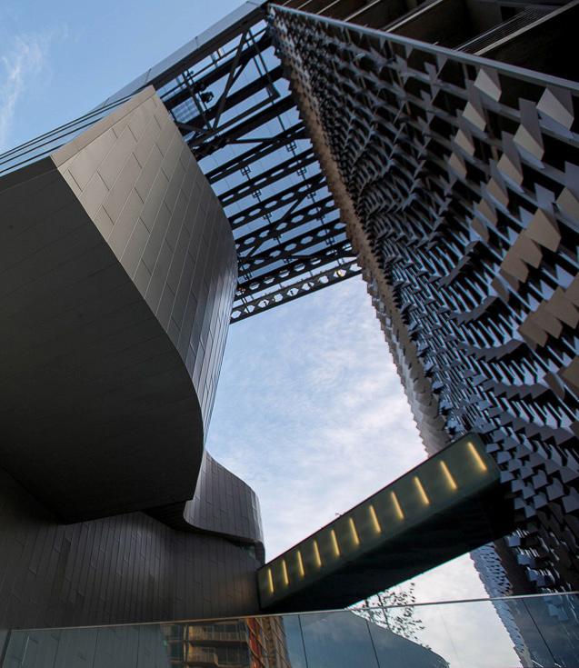
Emerson College
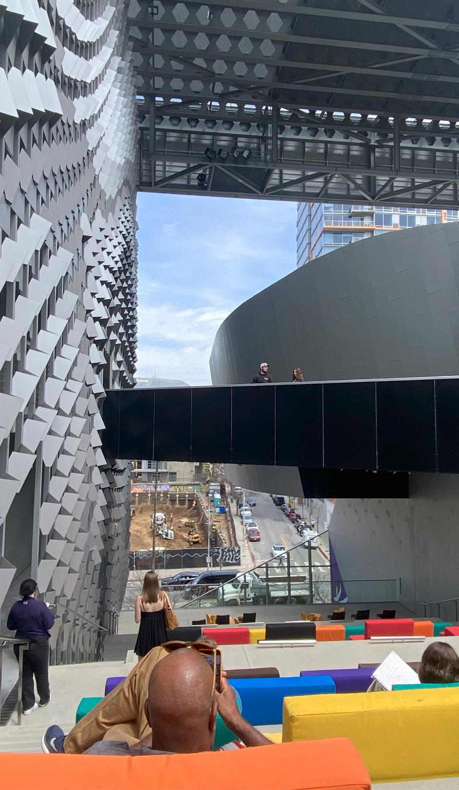
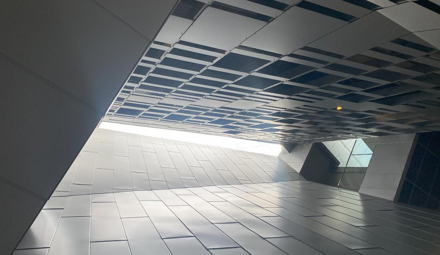
The site analysis portion of the quarter flew by. It consisted of a weekend long trip to Los Angeles, CA. During our visit to LA our professor, Pro, showed us around the city following a well planned itenerary. We explored the city and viewed many aesthetically pleasing and important architecrual structures. Our submital for this section consisted of a Derive and Documented Site analysis.
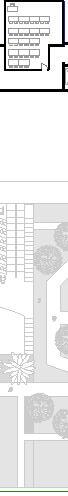
5960 W Sunset Blvd, Los Angeles, CA 90028
Site analysis
An aspect of site documentation that goes over a lot of peoples head is transportation, specifically parking. How accessible is the site by car? Well Emerson college has little to zero free parking. Sunset Blvd is very dense and busy, chances are that you willl have to pay for parking or you’ll have to walk pretty far to find parking.
A derive is a drawing, painting, collage, or documentation of the expierence that occurs as you walk and take note of what happens within and around the site. My approach showcases what an average padestrian would expierence walkin g towards Emerson College.
PROJECT 04
Housing Unit Intervention
Project 04 focused on further developing and woring towards midterm reviews. This quarter my reviewer was my former studio professor, Tom Di Santo. He gave me great constructive criticism that influenced some aspects of my final design. My work for this portion of the quarter was mostly diagrams and floor plans.
Process Diagram & Conceptual Plan
Sed ut perspiciatis unde omnis iste natus error sit voluptatem accusantium.
FRONT VIEW
1'-0"=1/16"
1'-0"=1/16"
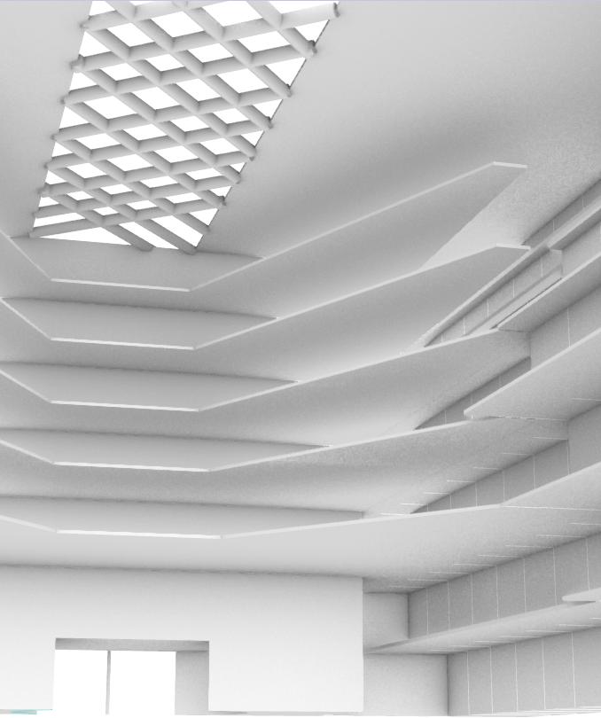
This was my first attempt at using Ai to create a redndering of my project.
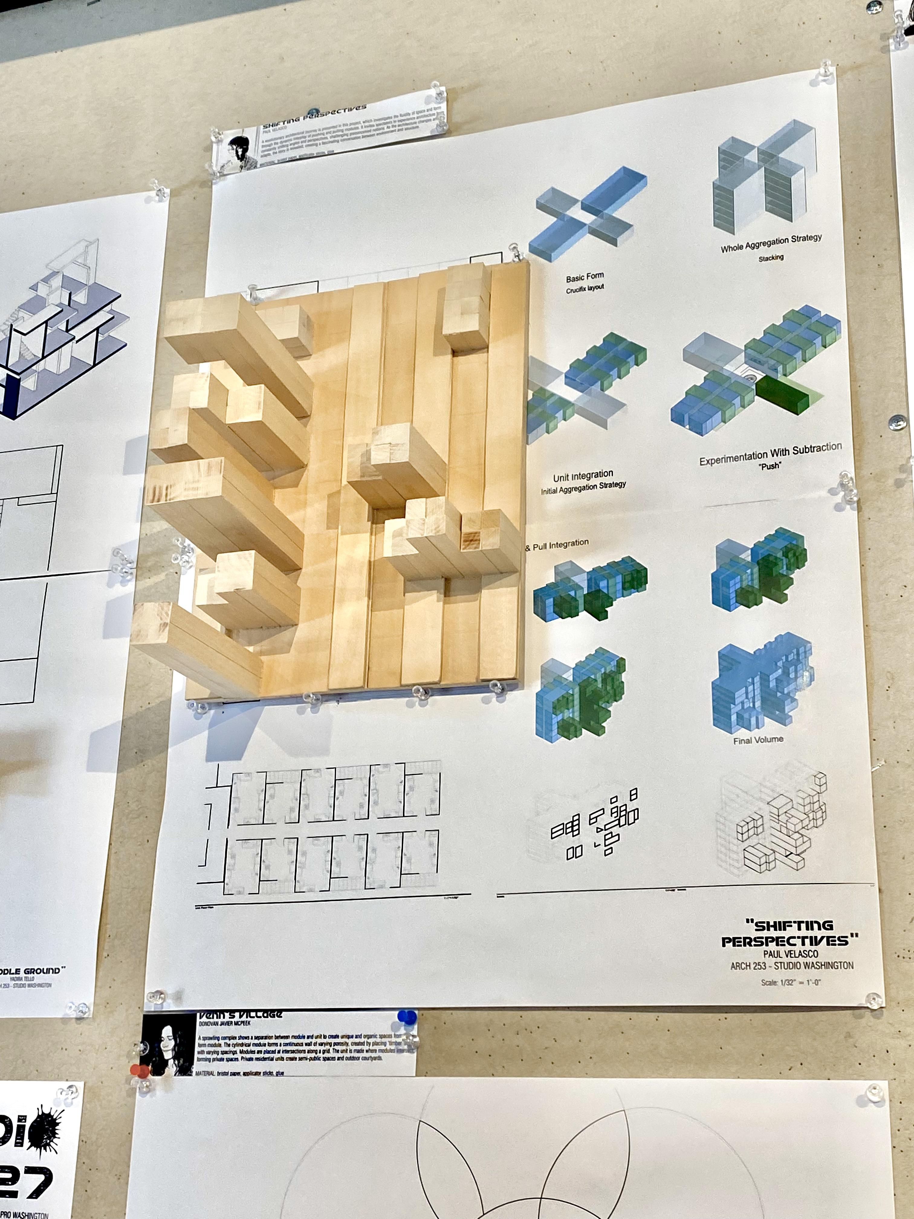
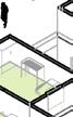
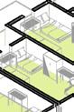
Above is a study model showing the tectonics of my project, “Shifting Perspectives.”
AI rendering
Study Model
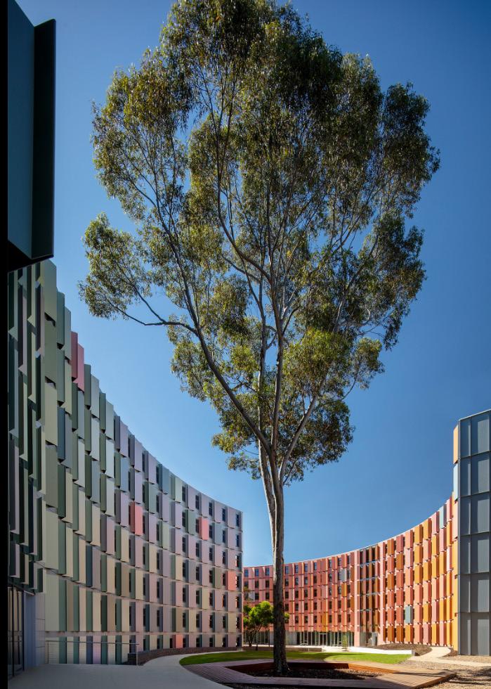
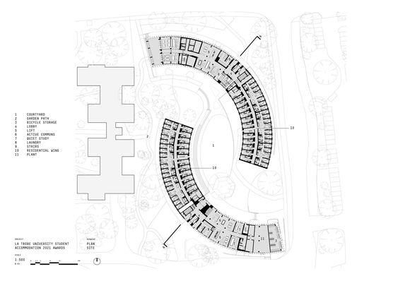
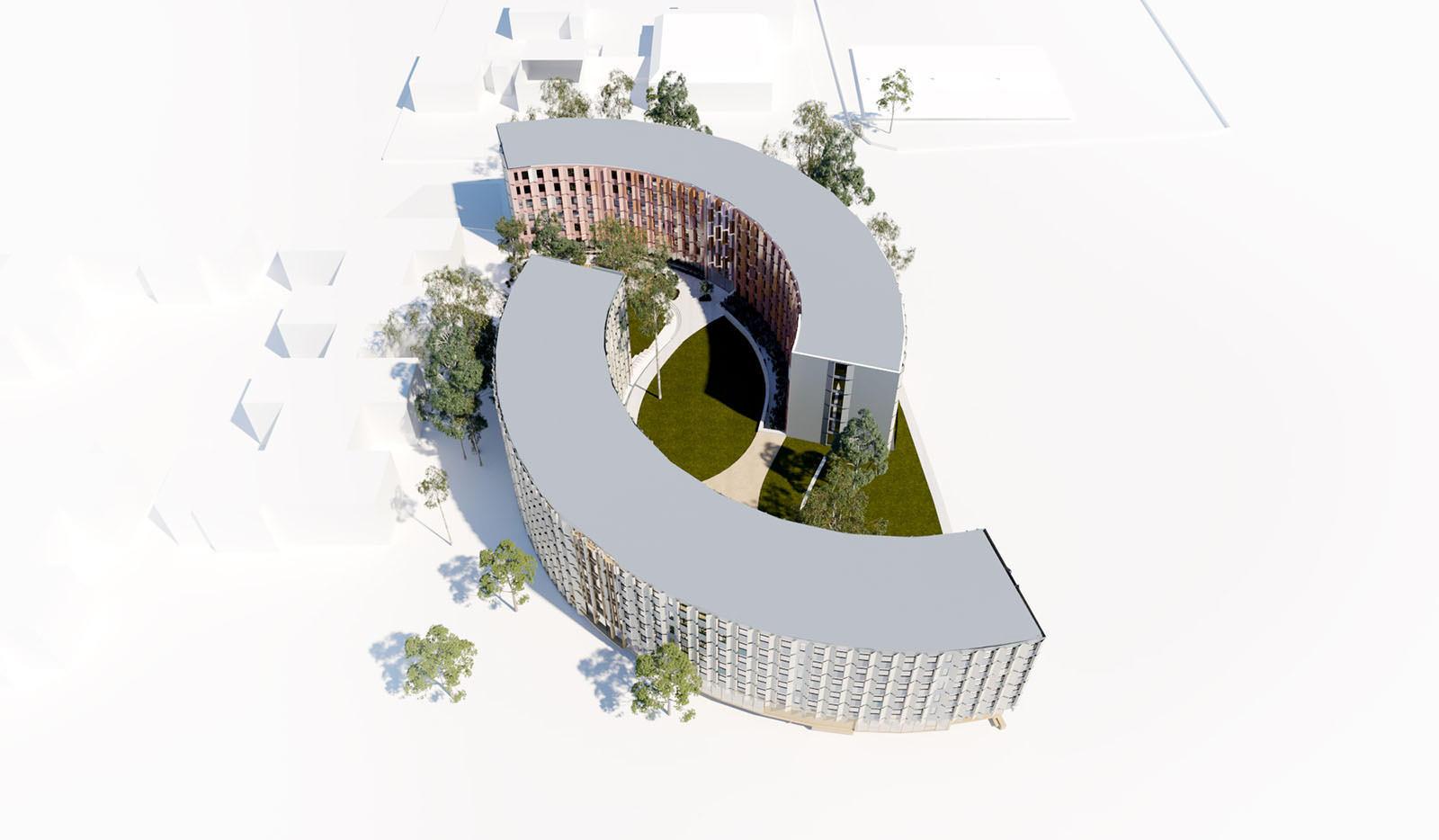
PROJECT 05
Study Housing Project
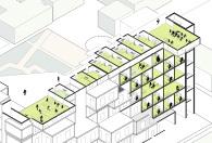
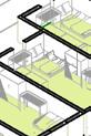
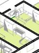
Project 05 was our final push towards finalizing our design. FInal decisions were made and executed on the drawings that were presented during final review. Around this time we also worked and finished a required deliverable, an axonometric drawing. Push & Pull was the strategy that I decided to finialize my design with. The push & pull is seen integrated within the units and common spaces. A central courtyard was another important aspect of my project.
“SHIFTING PERSPECTIVES”
FRONT VIEW
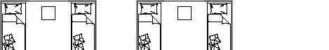
Floor Plan
Rendering
“SHIFTING PERSPECTIVES”
Paul Velasco ARCH 253 Studio Washington
To the right is the final version of the axonometric drawing. On the left there are two drawings, a section/perspective and an elevation drawing.
Rendering
Using brick would be unrealistic because of the cantilivering units. They would be left unsupported, for this to work it would be very expnsive and would require an excessive amount of material. Steel would be a better option.
The final rendering (ai) -was a product of exploring materials. I experimented with three other materials, but brick best show cased the push and pull methos from the exterior view.
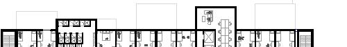
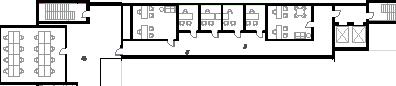
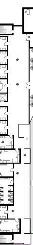
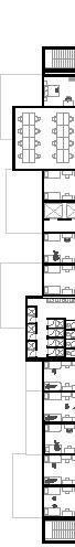
FLoor Plan
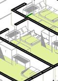
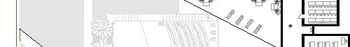
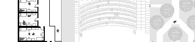
This is a detailed drawing of the bottom floor or the floor plan. Upon entering you find yourself at the fron desk, and soon after at the cafe. The cafe is divided into two sides. Both are connected by the kitchen. The kitchen in the center allows for students to acces their order at the counters on either side.
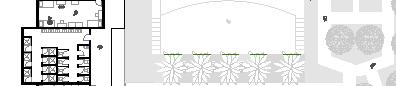
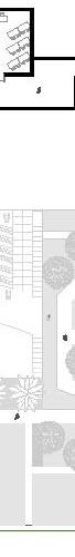
Exiting the cafe/cafeteria the guest will find themselves infront of the auditoriom. This is where public speaking events and other clubs events occur. Located on the left, is the entrance to the park portion of the site. Trees surround the paths that go through the greenery.
In terms of programatic aspects, on this floor you will also find communal kitchens and laudry room.
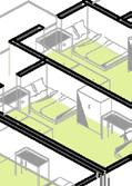
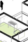
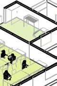
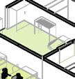
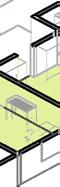
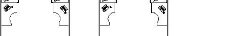
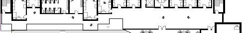
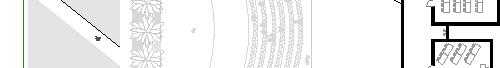
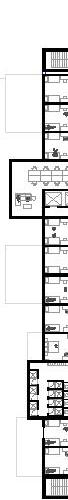
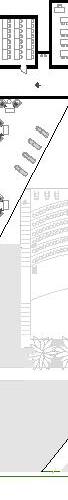
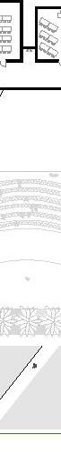
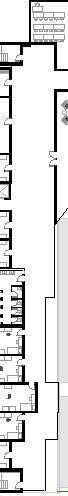
In sequence: 2nd Floor, 3rd/5th Floors, and 4th/6th Floors
Each floor consists of dorms in a Single, Double, and Tripple format. Also in these plans are study and common rooms, as well as communal bathrooms
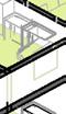
Model
Each floor inlcudes classrooms, with the seconfdfloor being the exception. Instead of classrooms it has offices in its place.
Each floor has access to two elvators and two egress stair cases.
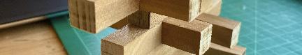
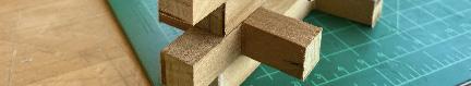
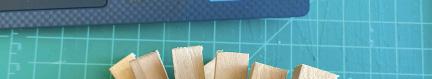
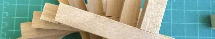
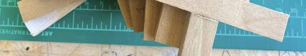
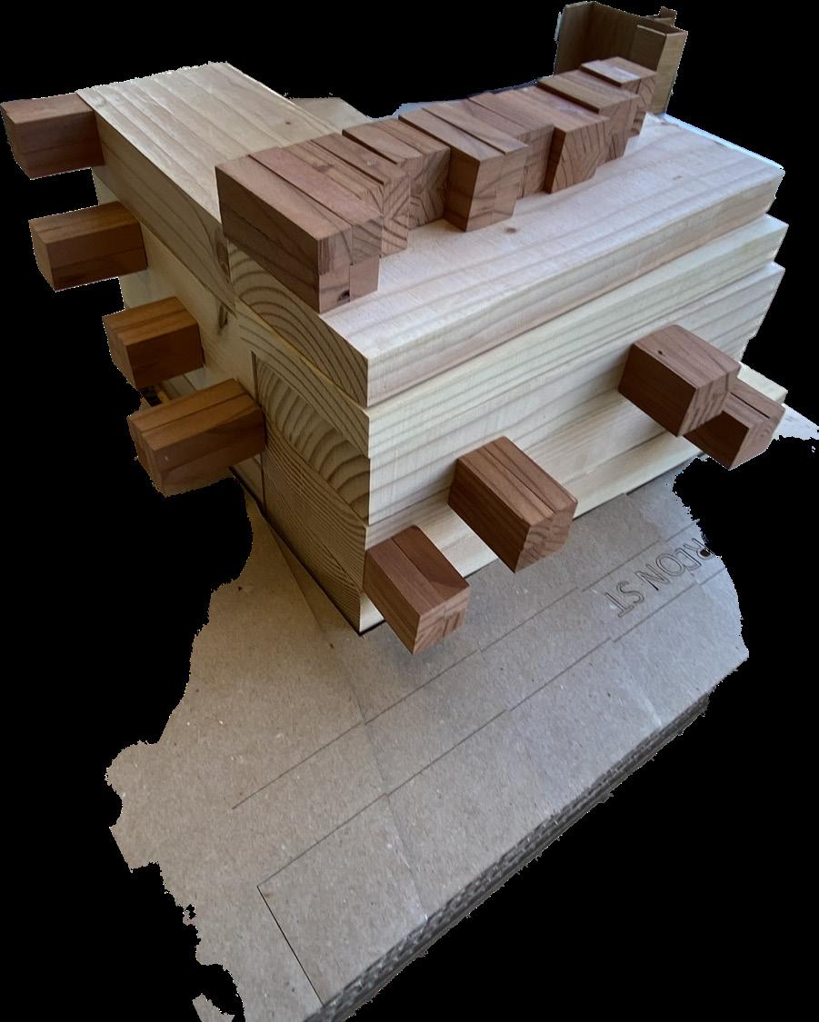
The final model was 1’-1/16” scale and it was also a massing model. I decided to make the model as heavy and dense as I could make it. I used wood to show case the density. In a different type of wood I showed the units. The usage of two different colors helped portray the relationship between Unit-to-Whole.