Patricia
| Portfolio | 1 PORTFOLIO O X O X O X O X O X O X X O X O X O X O X O X O O X O X O X O X O X O X X O X O X O X O X O X O O X O X O X O X O X O X X O X O X O X O X O X O O X O X O X O X O X O X X O X O X O X O X O X O O X O X O X O X O X O X X O X O X O X O X O X O O X O X O X O X O X O X X O X O X O X O M Y X O O X O X O X O X W O R K X O X O X O X O X O X O O X O X O X O X 2 0 2 3 X O X O X O X O X O X O
Eppl
X O X O


| Portfolio | 3 Adobe Creativ Suit and hand sketching skills with fluency in english and german. Keen to work proactive in a fast paced environment and excited to interact with professionals. High curiosity and personal learning abilitiy towards new design trends and techniques. Delivery Driver | Mar 2022 — current Österreichische Post AG - Salzburg, AUT Design & Productmanagement BA Univeristy of Applied Sciences - Salzburg, AUT Sep 2021 — current TOEFL - English Exam (score 102) | Nov 2022 Experience America: Make a Difference and Discover the U.S. UCLA Extension Mar 2020 — Jun 2020 Circular Design & Circular Economy Workshop Okt 2021 — May 2022 Cambridge English Level 1 Certificate in ESOL International (B2) Cambridge Assessment Jan 2018 — Jun 2018 High School Diploma High School for economic professions - Neumarkt, AUT Sep 2021 — current Legal Assistant | Nov 2020 — Aug 2021 Hübel & Payer Lawyers Firm - Salzburg, AUT Au-pair | Sep 2019 — Oct 2020 Cultural Care Au-pair - San Francisco, USA Restaurant Staff | May 2016 — Sep 2019 Cafe Universum - Salzburg, AUT • Properly load, organize, and secure equipment and orders, ensuring all items are delivered intact. • Manage time effectively to make deliveries on time, maintaining high customer satisfaction and driving safely in all types of weather.
Prepared pleadings and motions, organize documents, make filings with courts, and schedule depositions.
Transcribed dictation, prioritze incoming mail and maintain calenders.
Collaborated with attorneys on cases, providing research and client briefing drafts.
Provided
great and high-quality physical and
care
two children
provided
childcare responsibilities.
Patricia Eppl
•
•
•
•
an all-time
emotional
assistance to
an
various
activities, resolved, resolved
issues, and assisted kids
the development
learning skills.
Serving customers and providing a great service
&
Trained new staff members after
year
the company. 2023 2021 2020 2016 EXPERIENCE EDUCATION SKILLS COURSES & CERTIFICATES X O O O O X PATRICIA EPPL An organized, detail-oriented and passionate design & productmanagement student based in Salzburg and San Francisco. Posess strong
• Coordinated various
any problematic
in
of fundamental
•
in german
english. •
a
with
Eppl | Portfolio | 4 O X X O BUSINESS CARD SOLIDWORKS BOOK COVER T-SHIRT BRAND page 6 -7 page 14 - 15 page 8 - 9 page 16 - 17
Patricia
| Portfolio | 5 O X X O FLYER AIR POD MAX POSTER SKETCHES page 10 - 11 page 18 - 19 page 12 - 13 page 20 - 27
Patricia Eppl
Print Media.
Patricia Eppl | Portfolio | 6
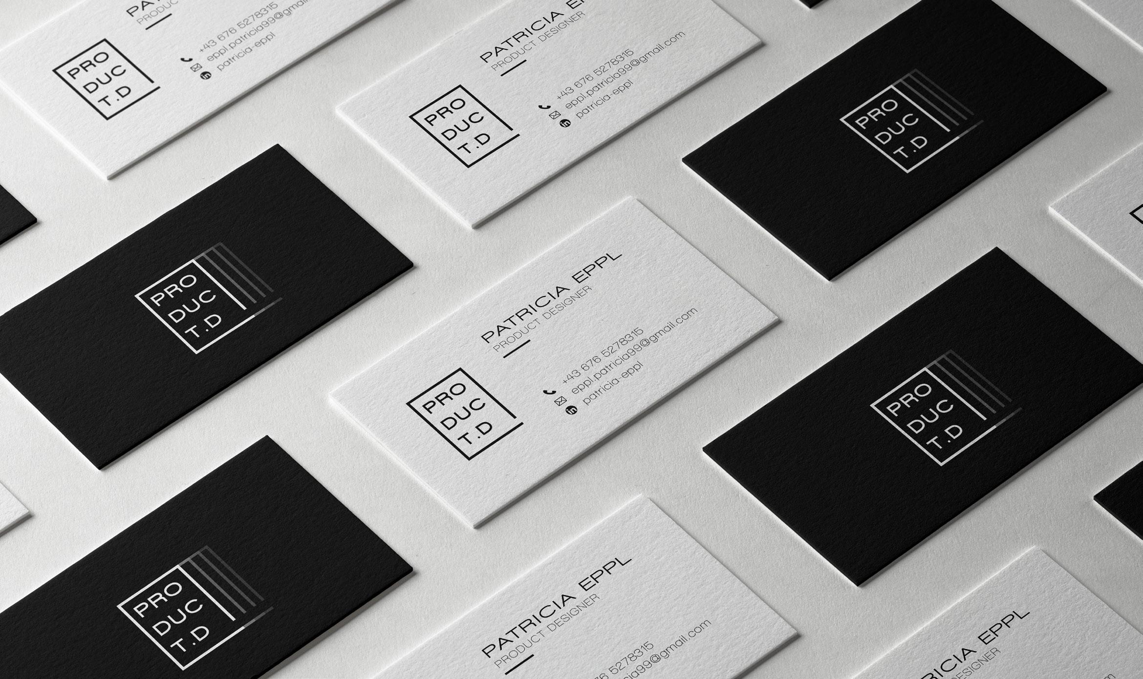
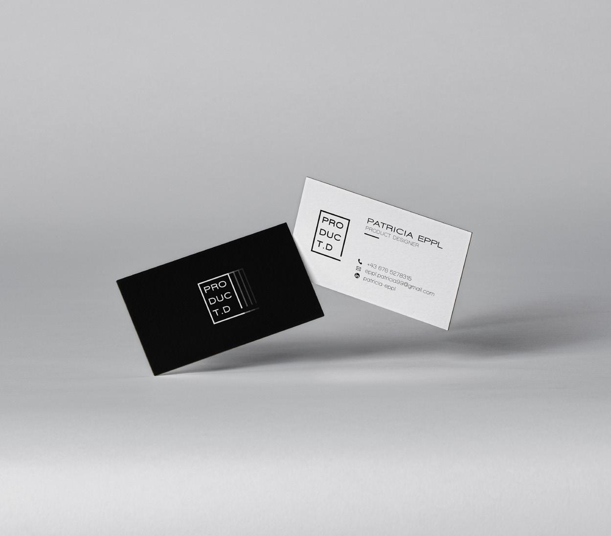
Business cards are less “cards” and much more portable advertisements with built-in callto-action and are great to visualize and practice corporate identities.

The focus of this project was learning how to use little space most efficiently while not making it look crowded, but still providing essential information.
While color can be a very helpful accessories to ones design, the focus here was to avoid color completely and focus on basic design principles like black and white effects.
For the back side of the card I used black effects to increase perceived values such as dominance and intimidate adversaries.
Whereas for the front page I implemented white effects in order to associate the card with goodness and security.
01 business cards
Patricia Eppl | Portfolio | 7
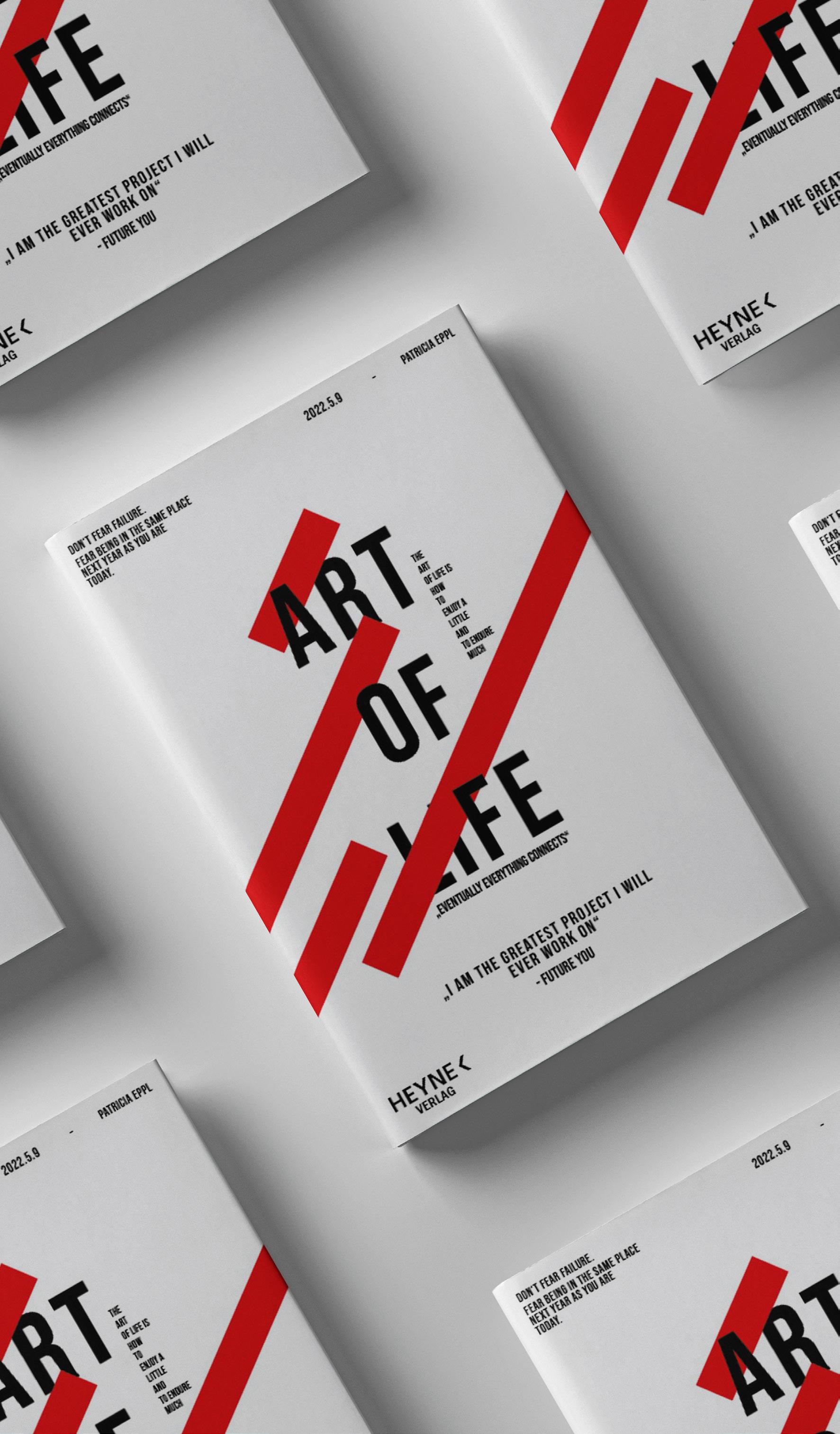
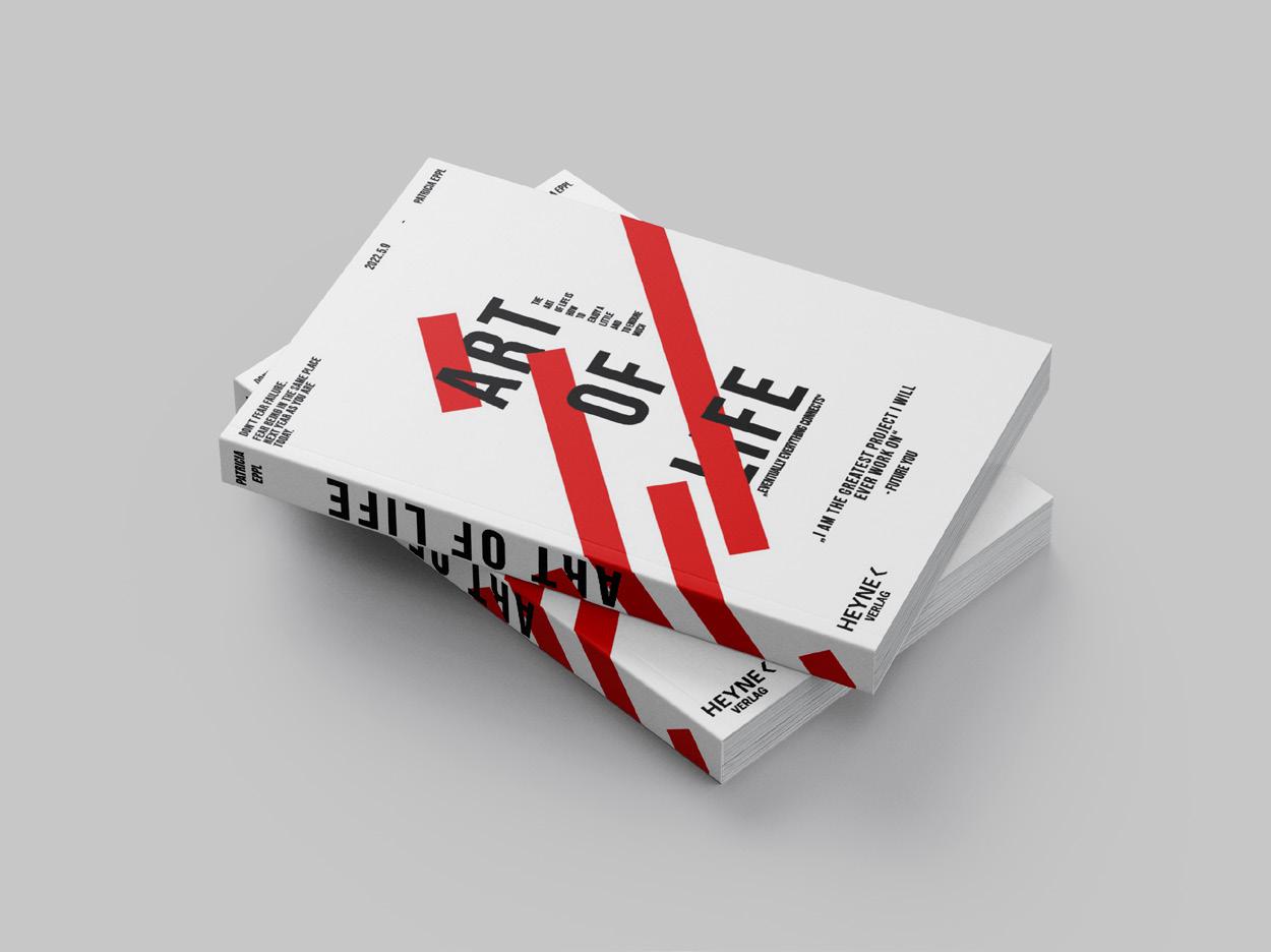
book cover.
Patricia Eppl | Portfolio | 8
mentary forms and colors. Trying to expand my possibilities with simple tools.
We’re told from childhood to “never judge a book by its cover.” But in reality, covers offer valuable clues to potential readers about what they may find inside a book.
Here I used the expectation effects principle in order to achieve the highest amount of interest towards the inside of the book. This is the most important aspect of designing a book cover.
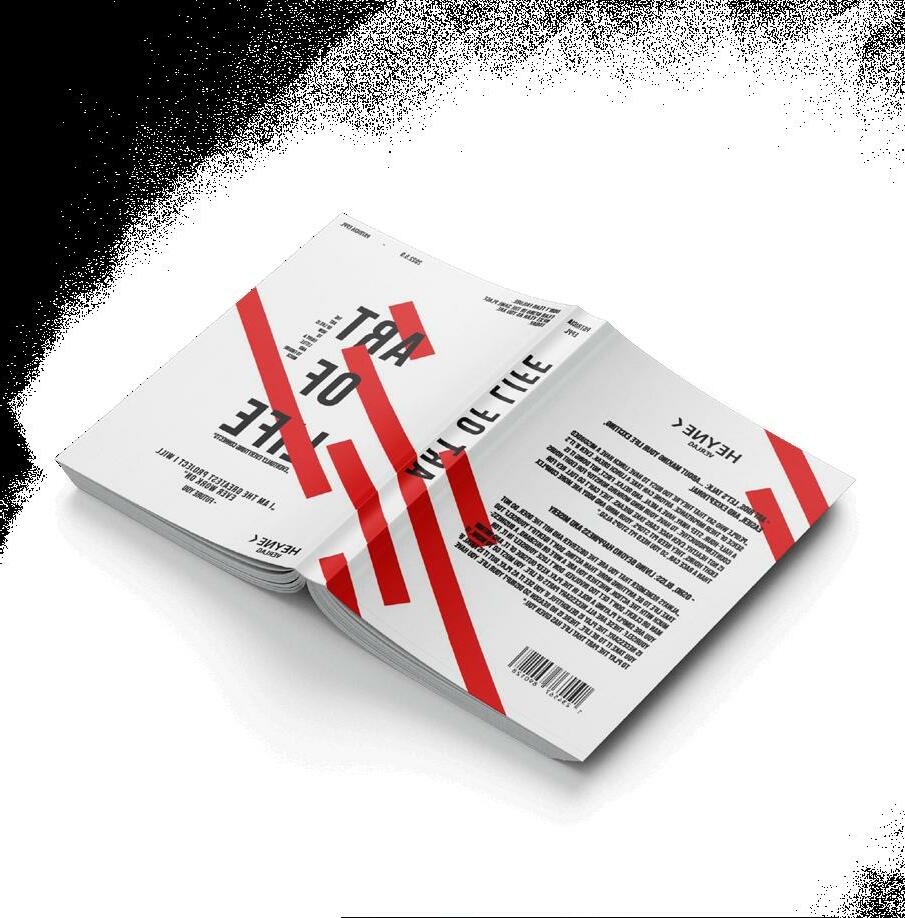
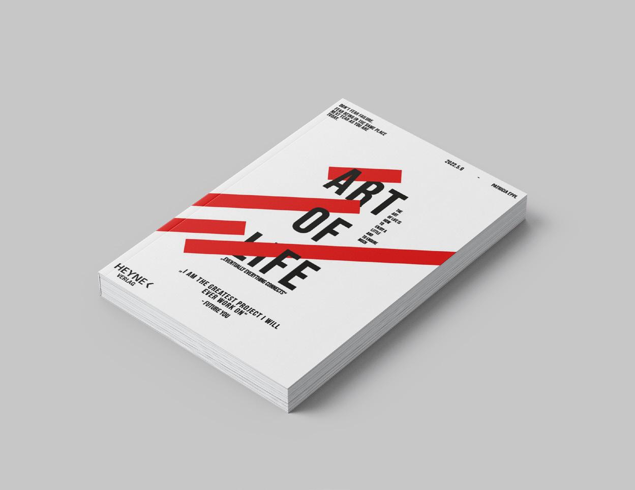
When people have expectations about something, it influences how they perceive and react to that thing.
print media
Patricia Eppl | Portfolio | 9
02
flyer design.
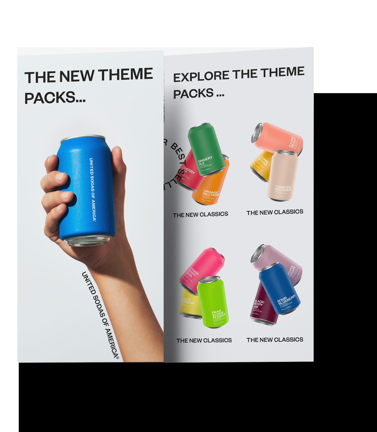
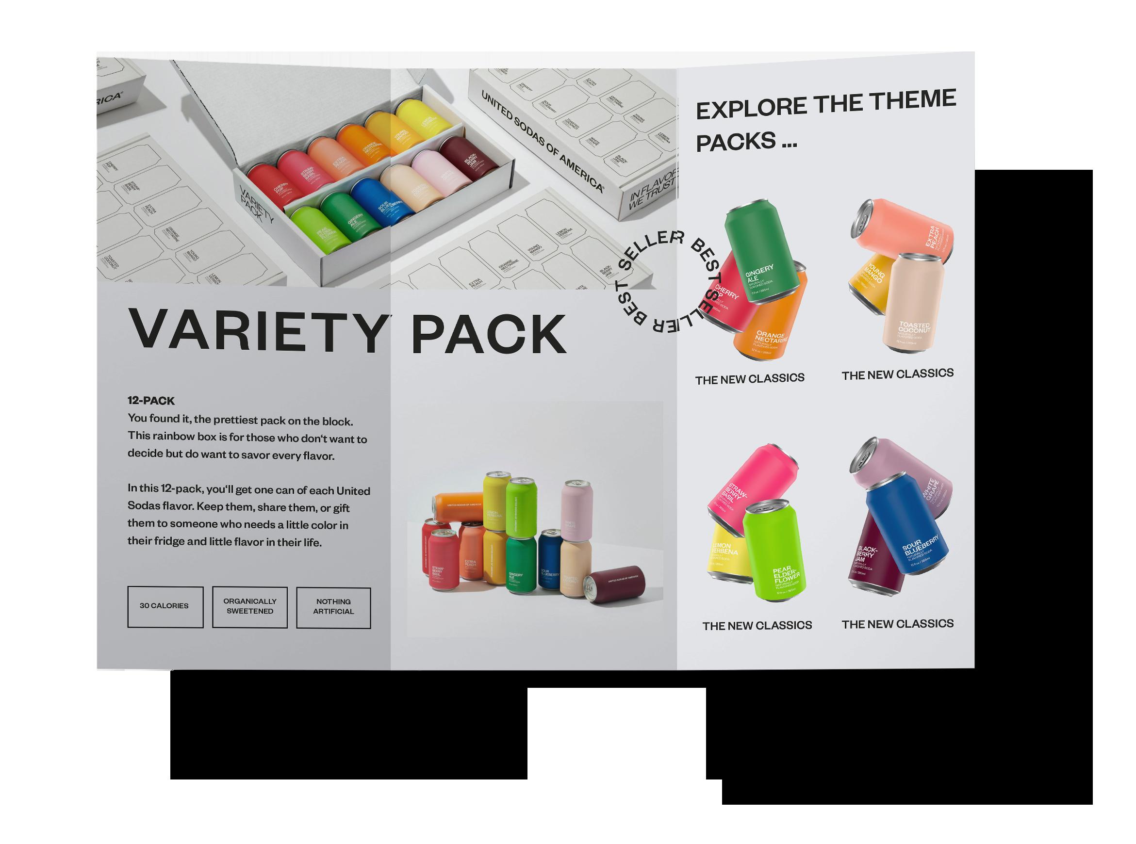
United Sodas of America is an early start up launched in May of 2020. Due to Covid19 the company focused mainly on building out it’s online
presence and have launched 12 flovors so far. With clean and colorful branding, a direct-to-consumer business model, and a variey of classic and unique flavors the
brand immediately went viral. In this project I implemented the brand identity into a simple three fold broshure reflecting the corporate identity.
Patricia Eppl | Portfolio | 10
03
front page back side pattern two pages combined as one act as a single page
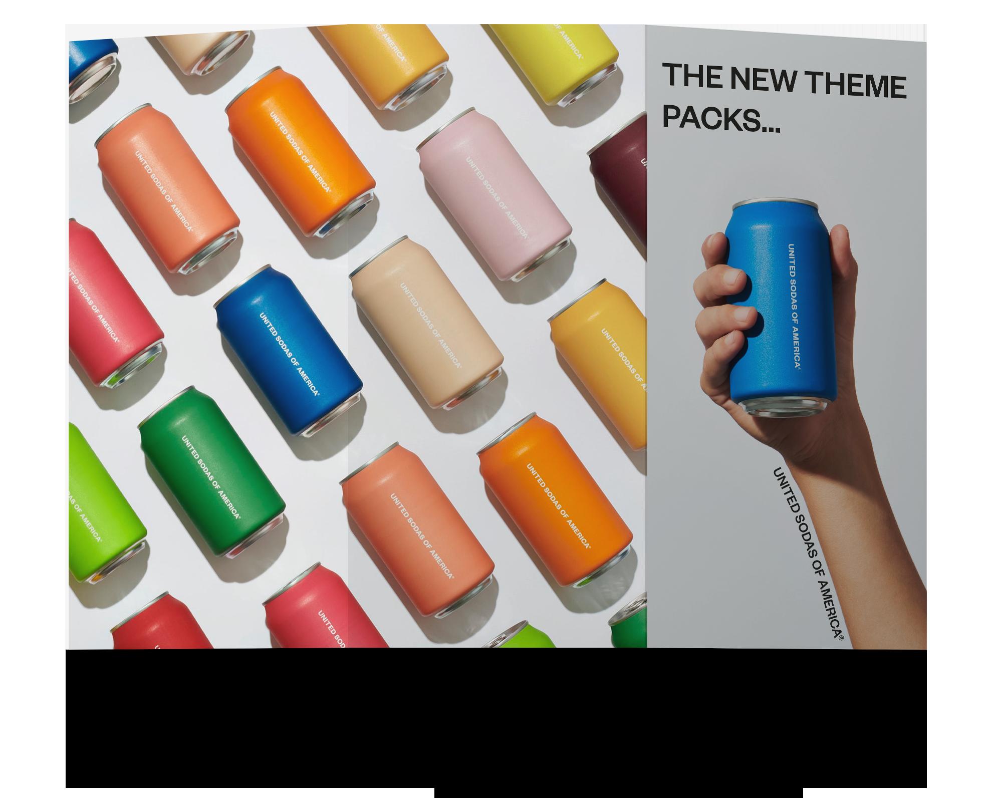
three fold
Patricia Eppl | Portfolio | 11
poster design .
Bold Chair:

Designer: BIG-GAME Distributor: Moustache Release: 2009
Barcelona Chair:

Designer: Ludwig Mies Van der Rohe & Lilly Reich
Distributor: Avalon Design Release: 1948
Patricia Eppl | Portfolio | 12
This project was dedicated to historical furniture design pieces, where we were given the choice of picking our own favorites. As seen on the designs I chose the Bold Chair by Big-Game (2009) as well as the Barcelona Chair by Ludwig Van der Rohe & Lilly Reich. My intention for this design was to choose two very different looking designer pieces but implement them into a poster that can represent them both equally without taking away any of their attributes. As a fun fact after designing the Bold Chair poster I now own one.


mock-ups
| Portfolio | 13
Patricia Eppl
04
3D Modelling Software
SOLIDWORKS

As a product design student, it is important to be able to create 3D models to visualize the desired design. This exercise did a great job introducing me
into the 3D shaping and rendering world. It tought me how to practice building real life objects and stack them together into one whole model. Following up
I used the software Solidwokrs Visualize (CAD) to render the entire file as well as fitting it into various background to adjust lighting and persepcitves.
Patricia Eppl | Portfolio | 14


Patricia Eppl | Portfolio | 15 CAD
modeling
We are expected to create a better future, so why not act?


The motivation for this project was based off the term resilience and how to spread awareness towards a more critical thinking as well as popular topics like climate change, air pollution, pandemics, and etc.
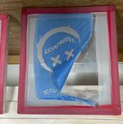


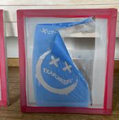
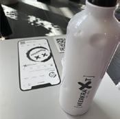


The assignment was to create a full brand out of scratch including designing the shirt, sourcing fabric, developing shirt patterns and sewing it all together. Our design is available on etsy and on our website veerkraxt.
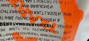
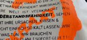
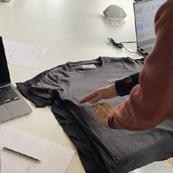


Patricia Eppl | Portfolio | 16
t-shirt brand.
04:28 Your Story Lorem Ipsum Dolor Sit Sit Amet veerkraxt Sazburg, AUSTRIA 218 986 likes veerkraxt VEERKRACHTE Produktion - Shirts coming soon!! View all comments 04:28 VEERKRAXT veerkracht Bekleidung (Marke) veerkracht/veerkraxt - resilience was dich nicht umbringt, macht dich resilienter! Edit Profile 8 Posts 12k Followers 2k Following [ ] VEERKRA T EST_2022 [ ] SHIRT MARKE AUS ÖSTERREICH [ ] VEERKRAXT - VEERKRACHT EST_ 2022 218 986 likes veerkraxt VEERKRACHTE Produktion - Shirts coming soon!! View all comments [ ]
We are Veerkraxt, a shirt brand from Austria.


Why are we Veerkraxt?
Because we stand for strength and resilience. Veerkraxt means resilience in Dutch and we need resilience to stand up to climate change, pandemics, etc. We must fight together and spread this message. That’s why we make t-shirts that we sew, print and design from materials discarded by commercial industries. This means that we meet all the requirements for a resilient shirt, as our process steps are totally transparent, so Veerkraxt in its own way - and should remind everyone that taking the first step into a more resilient world is not that difficult.

Caroline Gamper
Claudia Fuchs Marco Helpferer Sarah
Dorfner
A T-shirt project raising awareness for resilience.
Patricia Eppl | Portfolio | 17
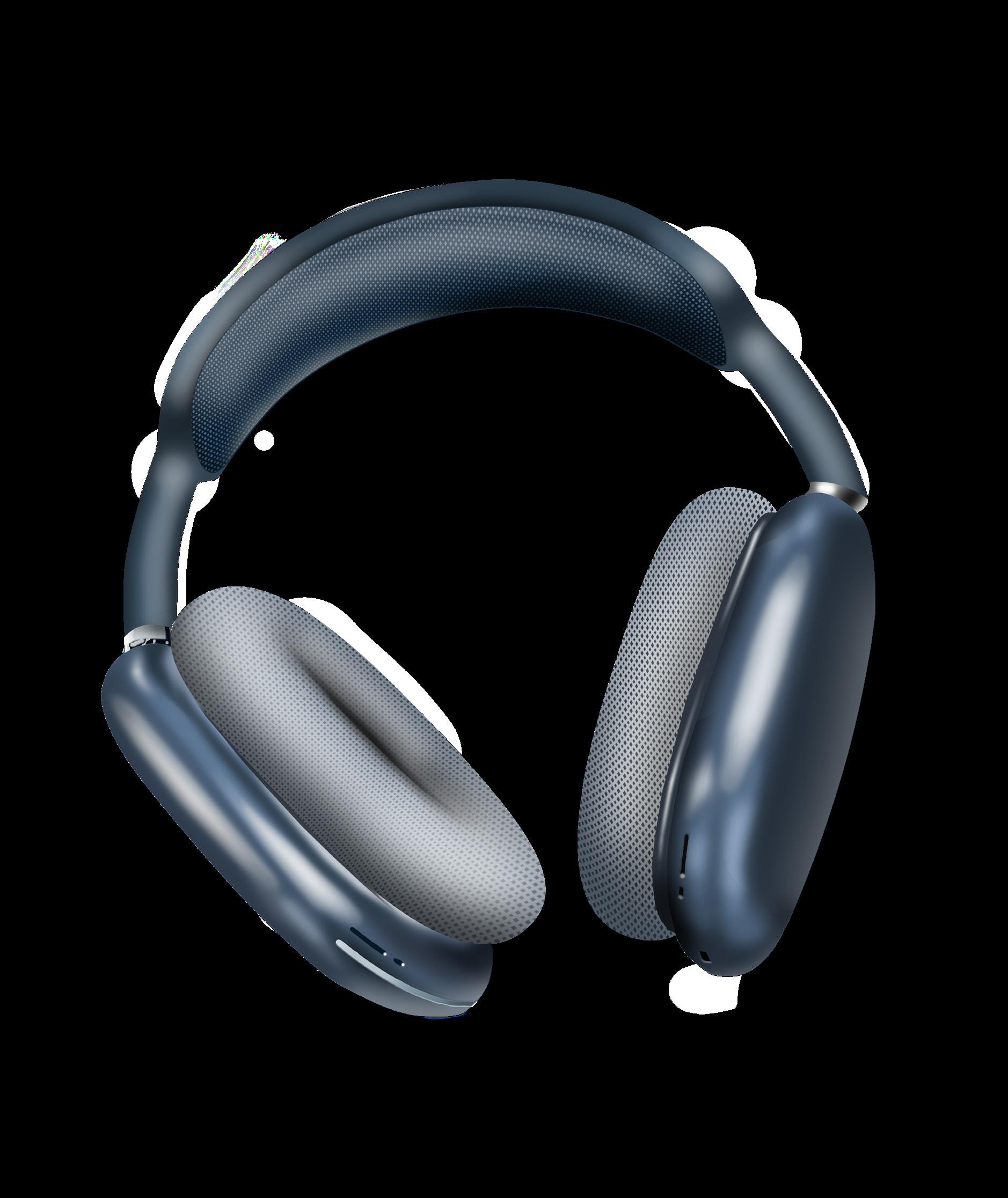
Air Pods Max
Patricia Eppl | Portfolio | 18
Air Pods Max
Minimalist design, high-quality sound,comfort and lightness it’s all about Air Pods Max
Assignment
This rendering was created for a 3D modeling class. The assignment was to render an electronic device of our choice on Adobe Photoshop. Which made me choose the Apple Air Pods Max in the color Sky Blue.
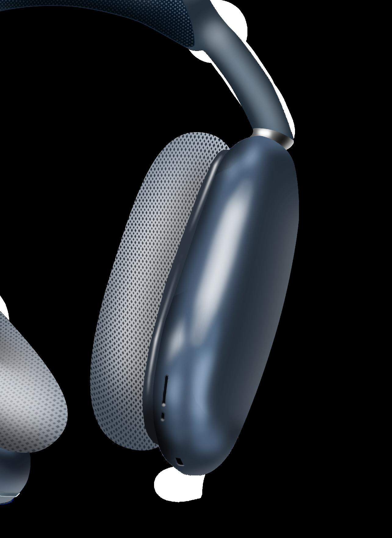
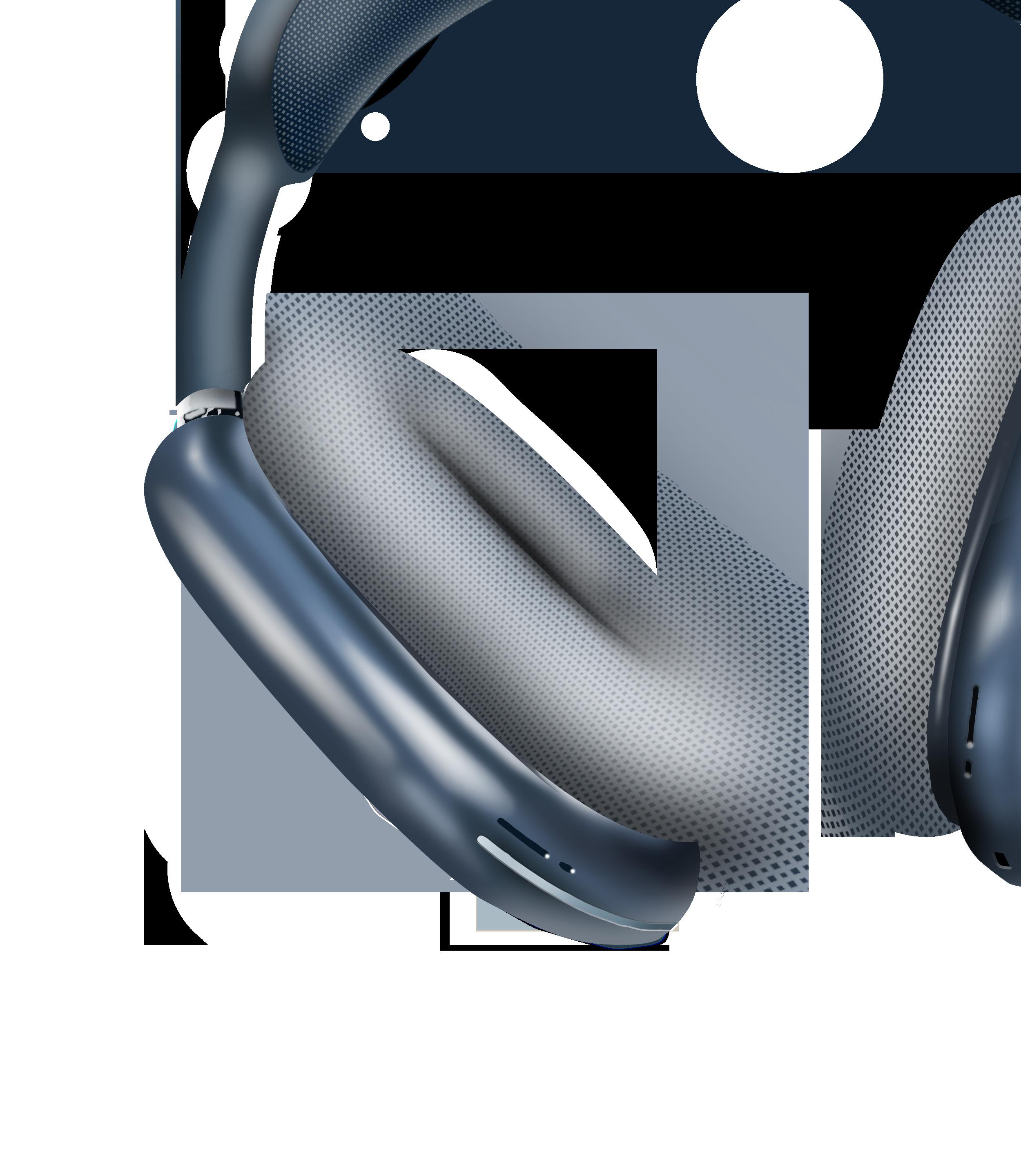
Photoshop Rendering
Patricia Eppl | Portfolio | 19
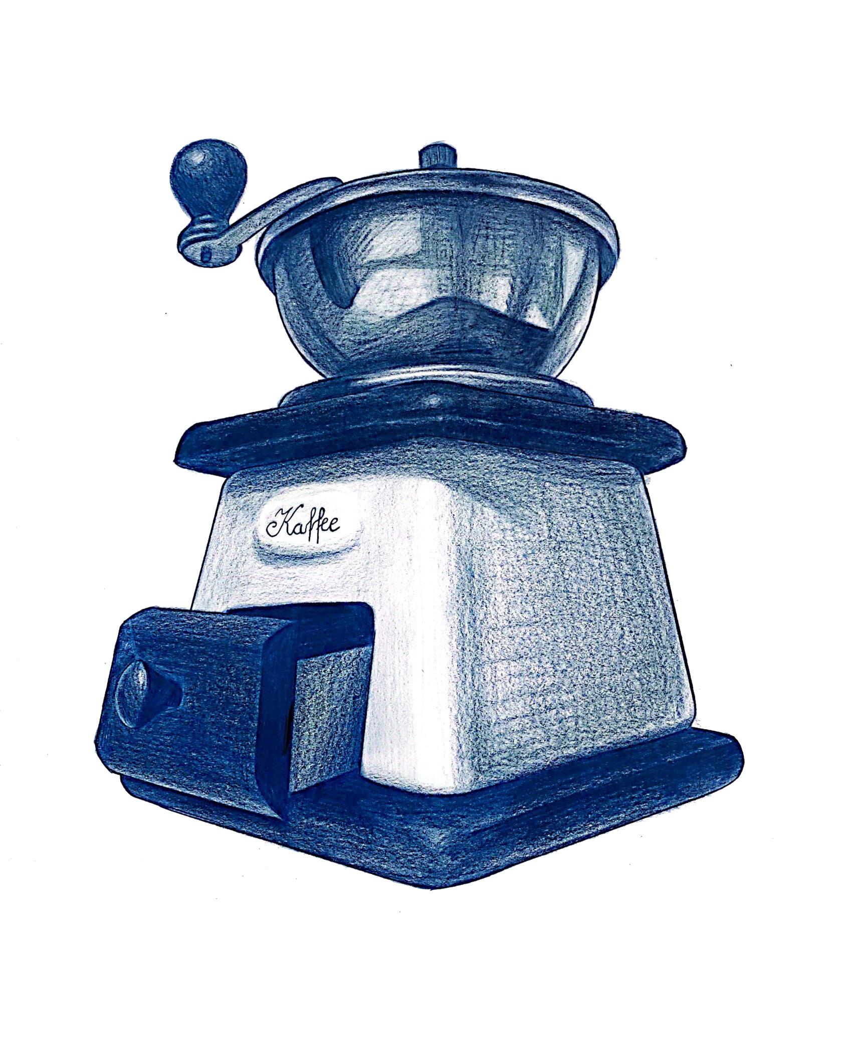
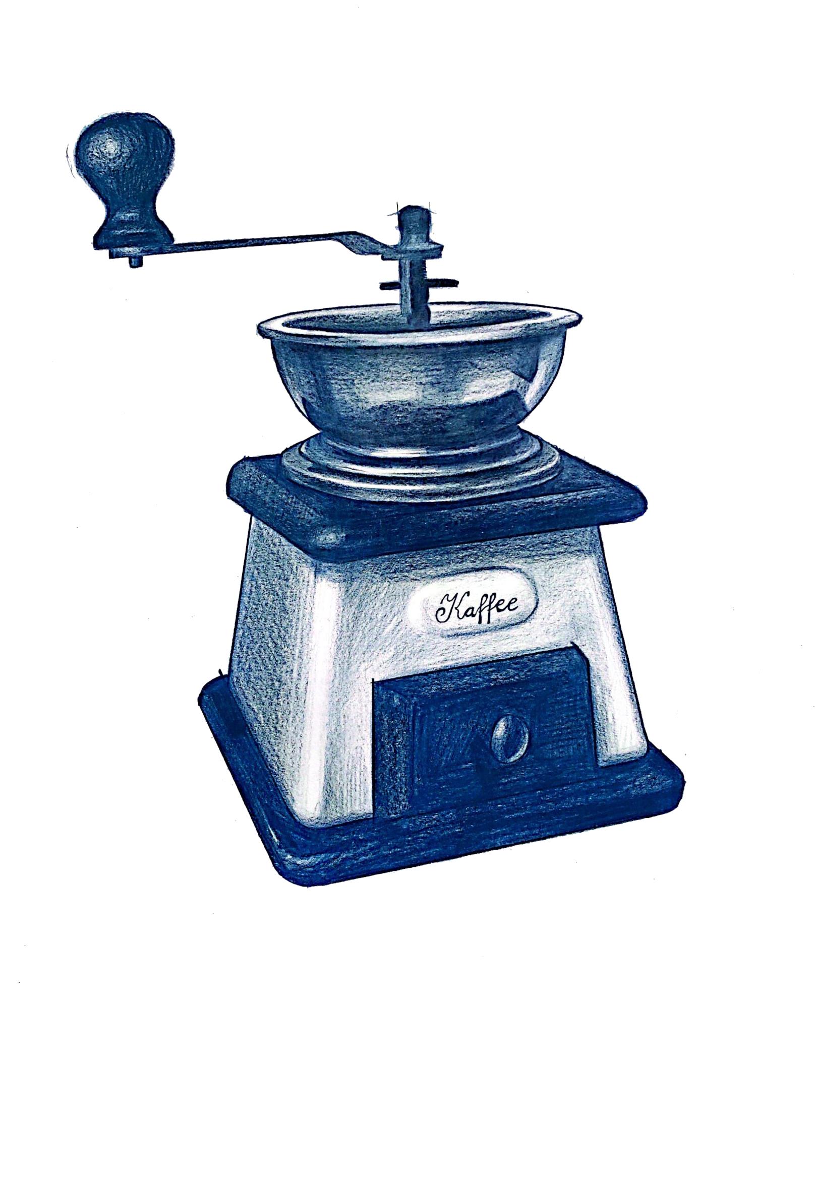
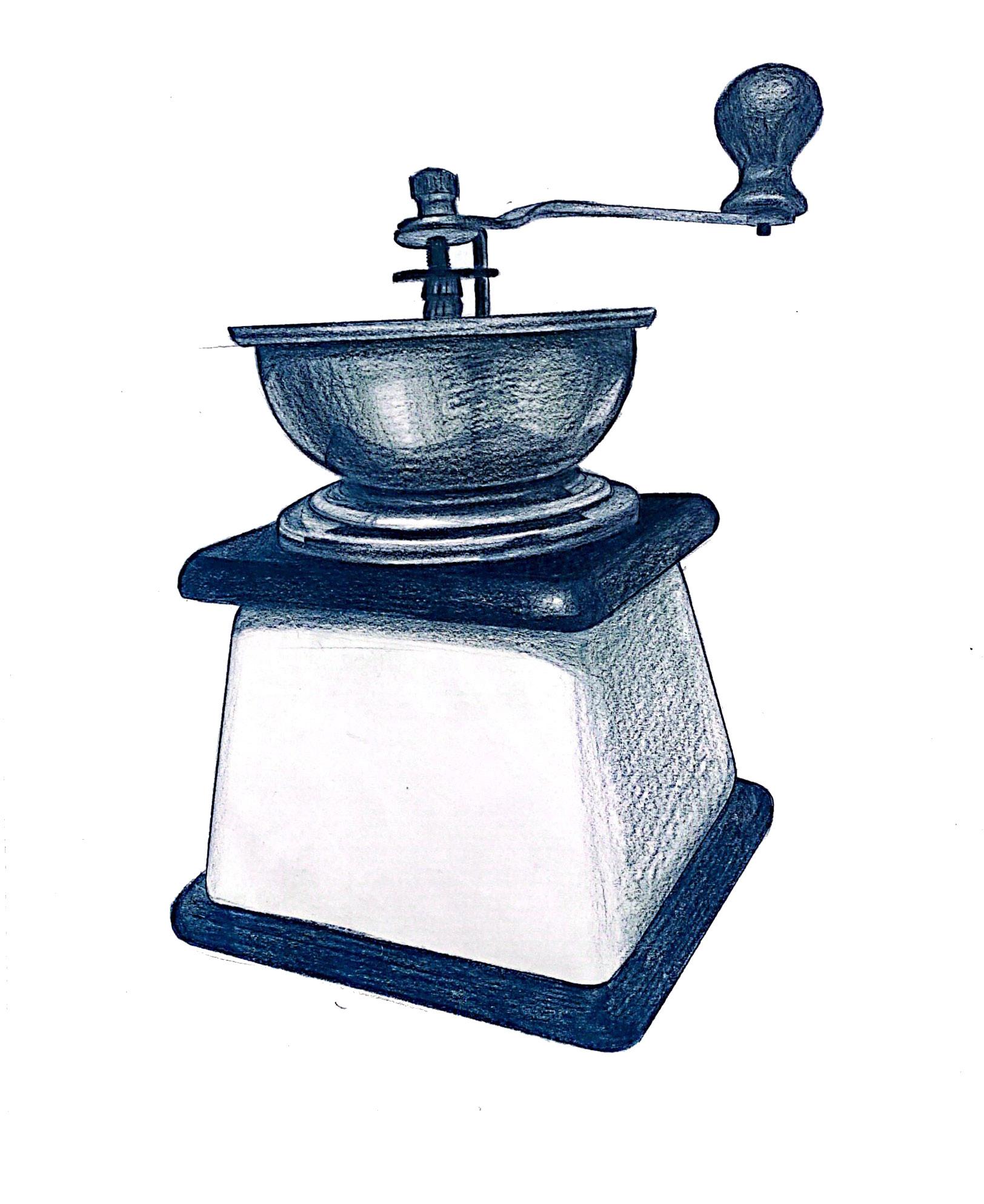
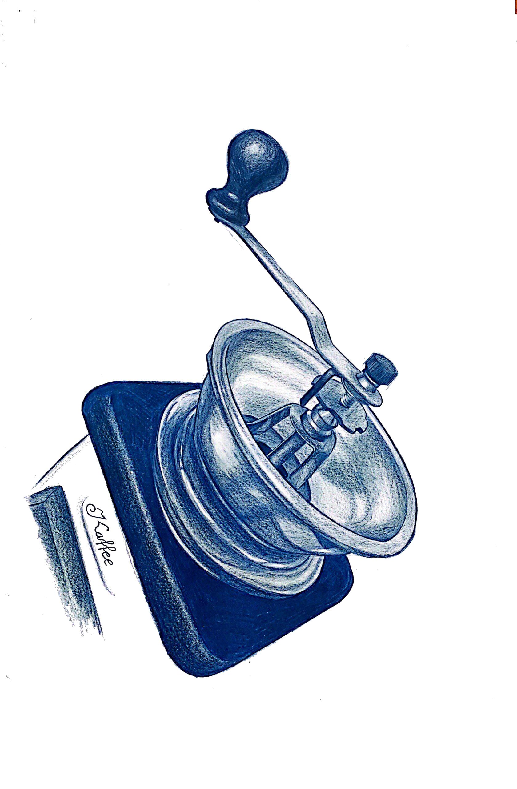
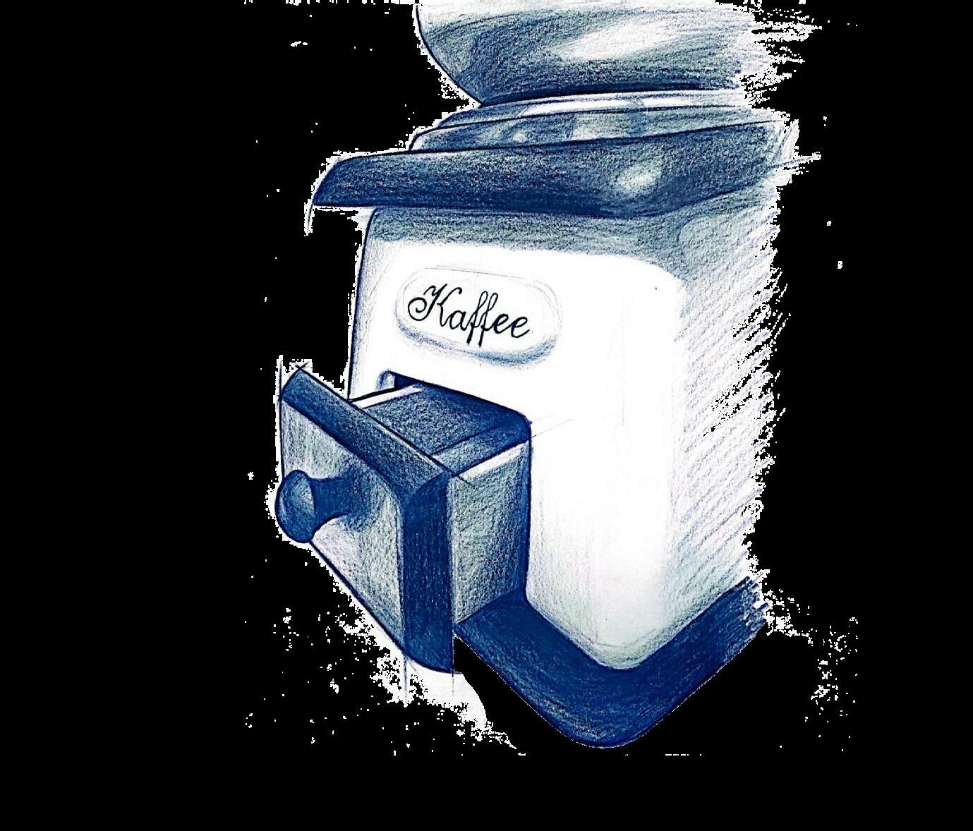
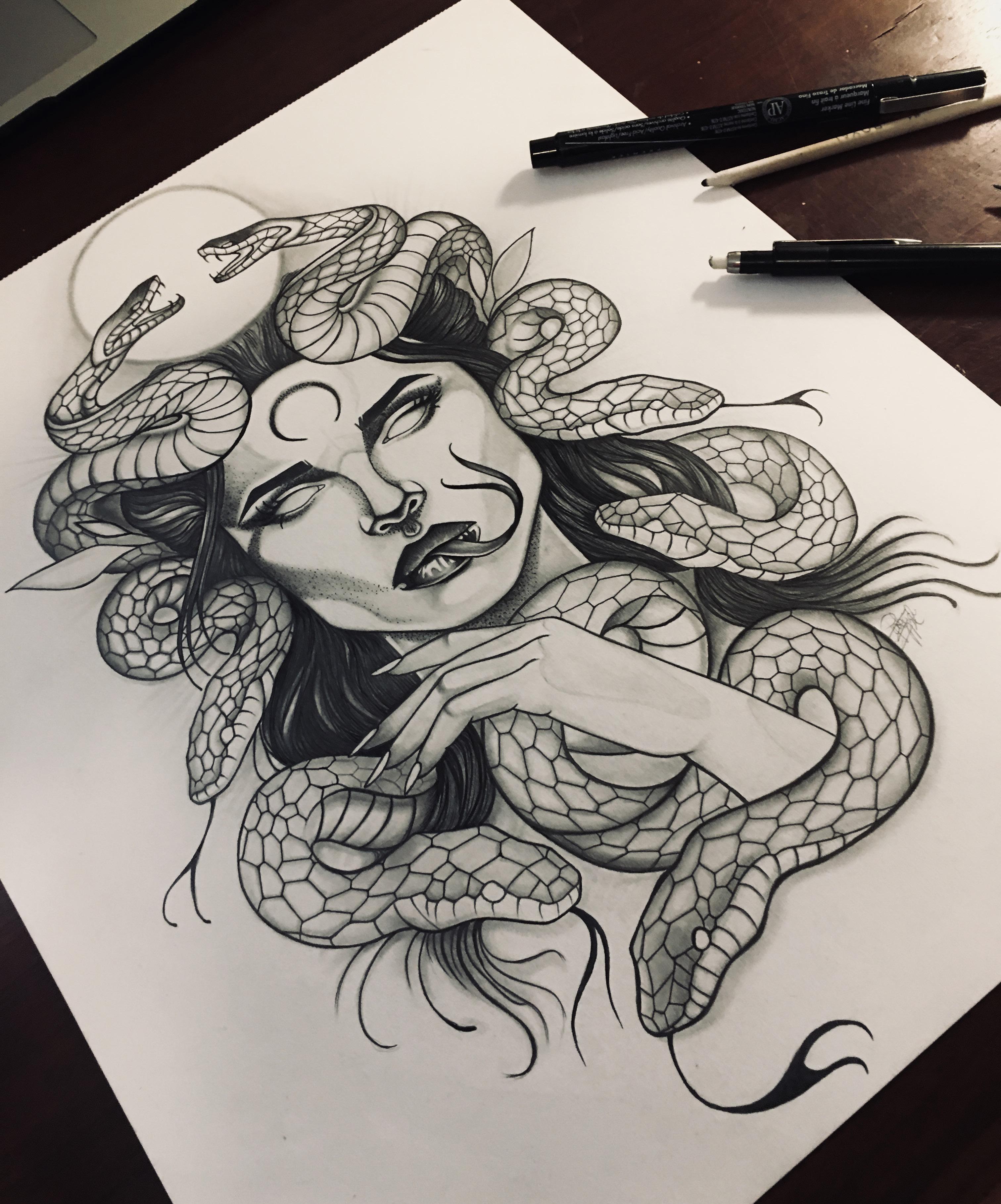
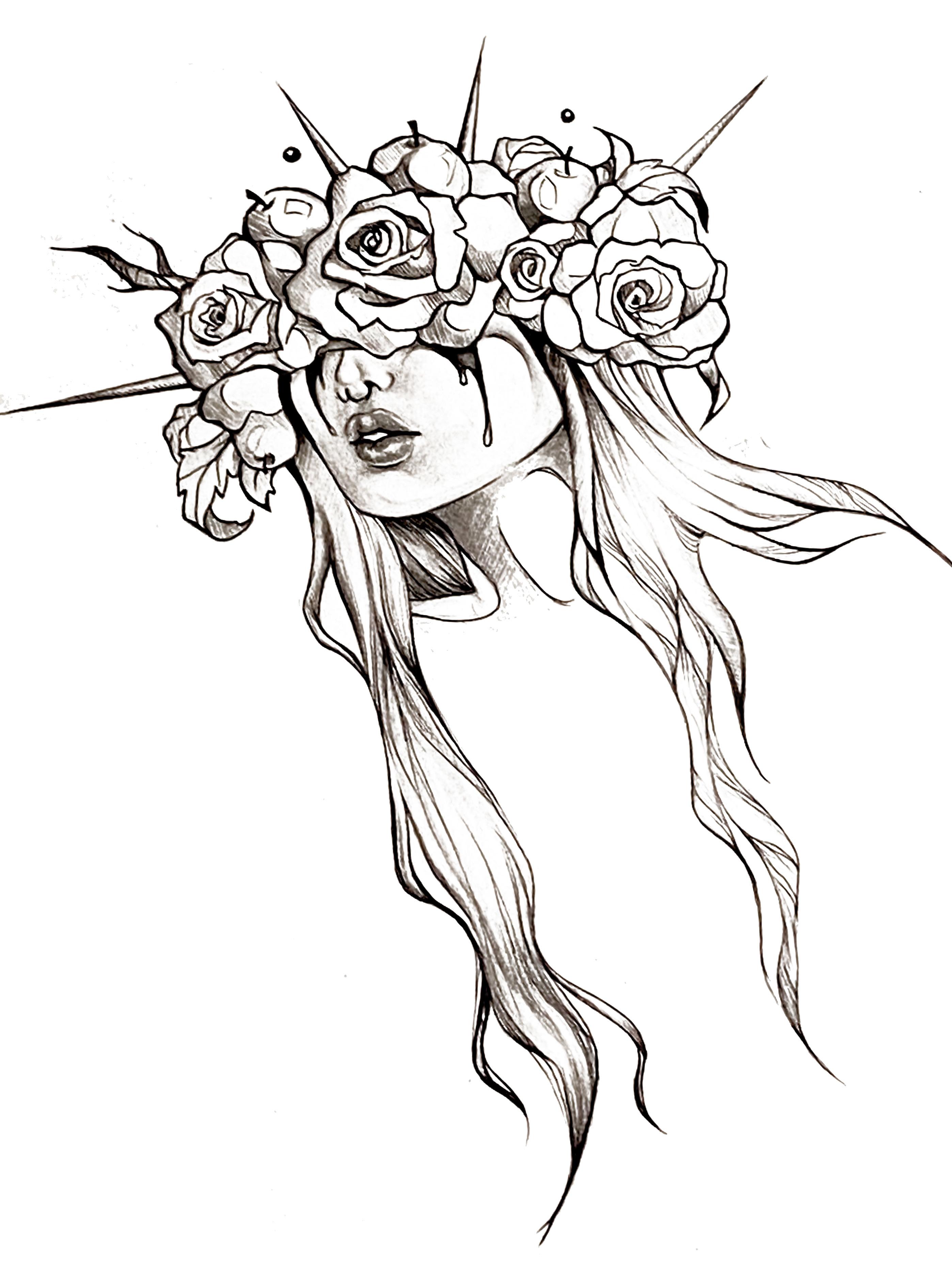
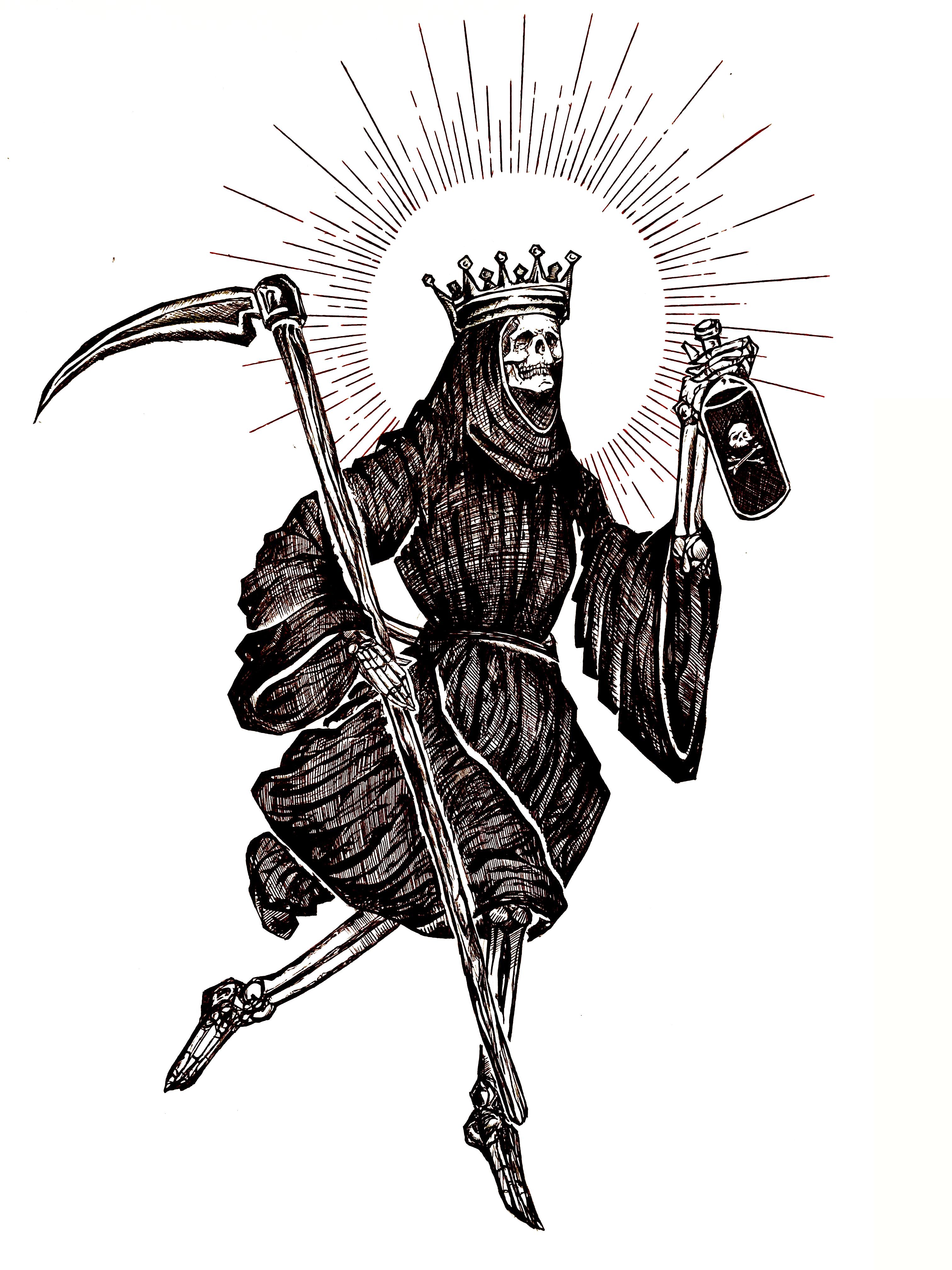
sketching
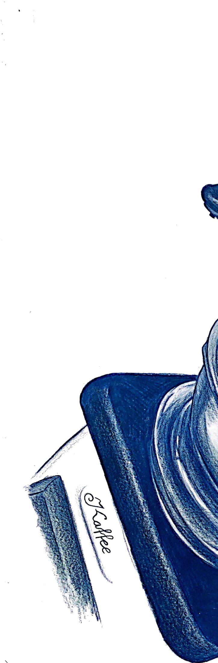
coffee grinder.
.
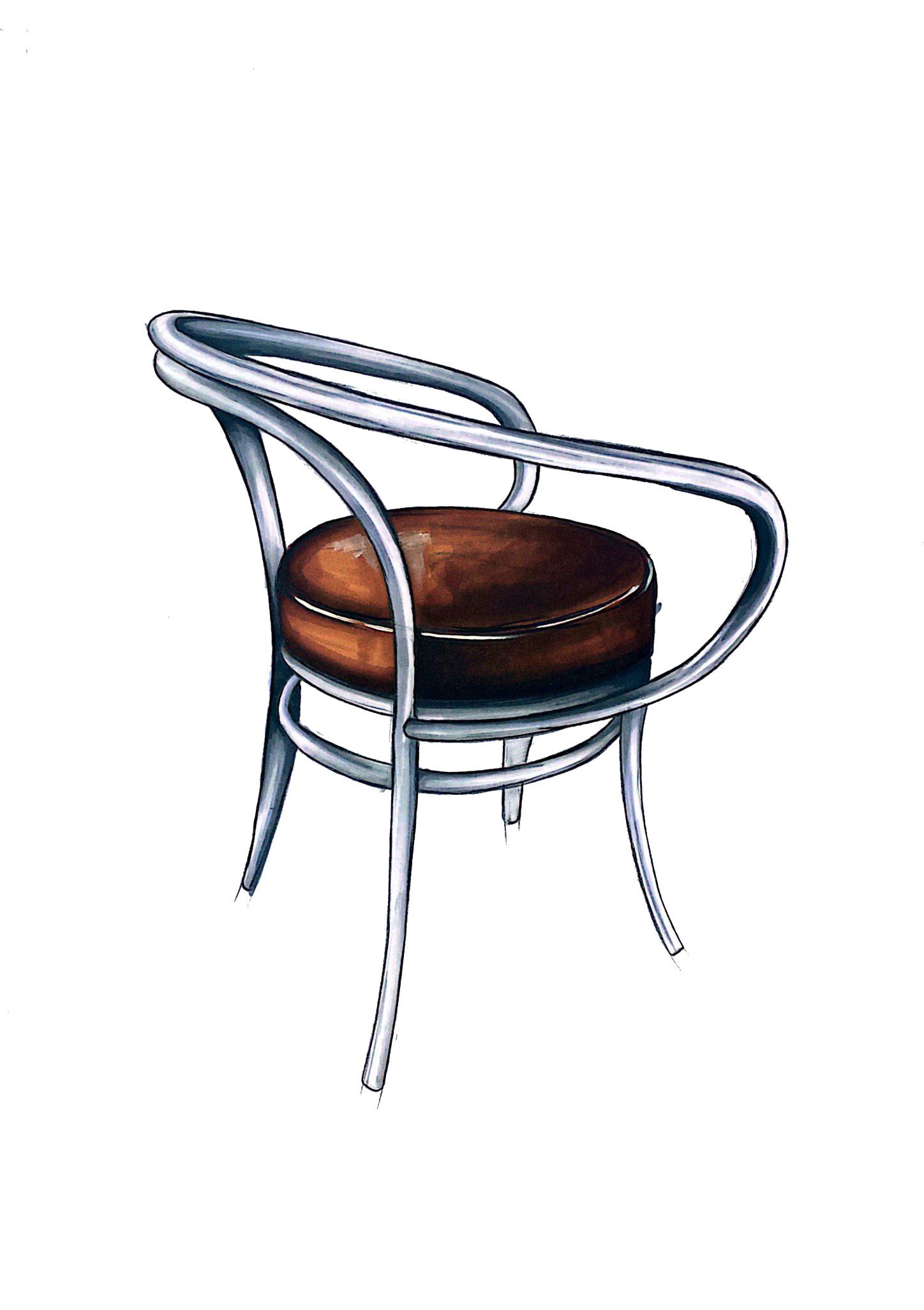
furniture hand sketch.
Patricia Eppl | Portfolio | 22
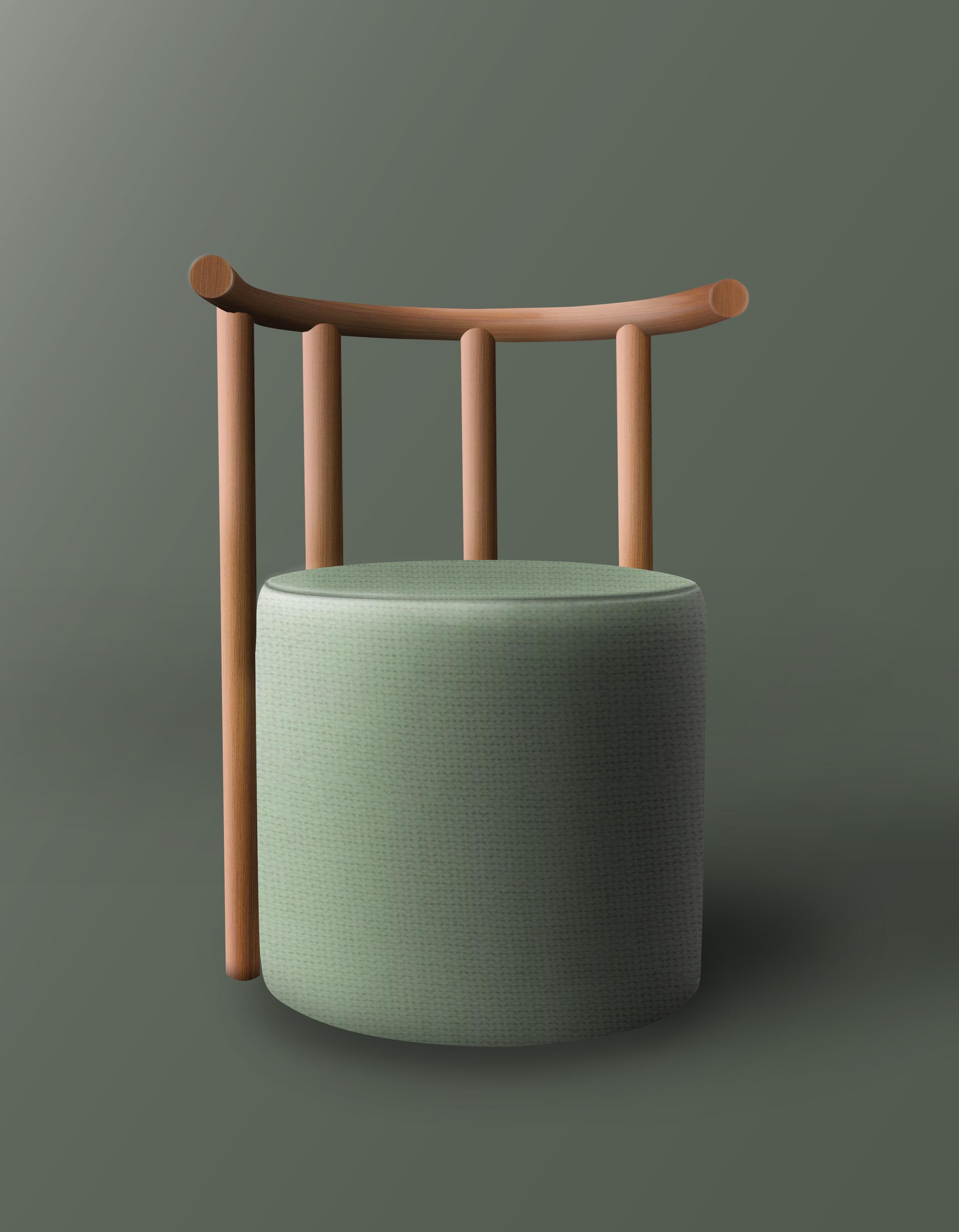
furniture photoshop rendering.
| Portfolio | 23
Patricia Eppl
car hand sketch.
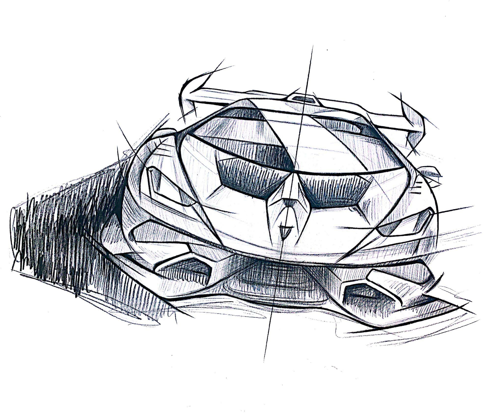
Patricia Eppl | Portfolio | 24
car hand rendering.
| Portfolio | 25
Patricia Eppl
Patricia Eppl | Portfolio | 26
Patricia Eppl | Portfolio | 27
Eppl | Portfolio | 28 X O X O THANK YOU. feel free to contact me (+43) 676 52 78 345 eppl.patricia99@gmail.com www.linkedin.com/in/patricia-eppl
Patricia